#edit: why did a couple of paragraphs duplicate
Note
How do you feel about the beef between Quackity and Dream going on Twitter right now?
does this man ever stop getting into drama/beef/accusations dear lord, christ, and the holy jesus
i have no idea how he still has apologists when he's CONSTANTLY causing infighting with other ccs only to handwave it all with an exaggerated "positive haha don't send hate!!" demeanor. why the fuck were you posting all of that on your public twitter??
look, maybe it isn't super mature for someone to shut down all communications and not reply to someone anymore, but it is in their whole right to whenever they want. maybe quack/ity WAS an asshole for not replying, maybe he has his own reasons, maybe he just doesn't want to be friends with dream anymore, and that's FINE. that's NORMAL.
what's even less mature is deciding to publicize the entire thing all because you didn't get a response in hopes of getting one. i think dream's a massive fuckin asshole.
quack/ity didn't say shit abt or to dream, that's the entire thing, so dream decides to call him out after finding out that quack/ity DOES NOT REPLY TO HIM PRIVATELY anymore.
in the same tweet, he talks about his dox, his stalkers, etc., in the same breath he complains about how quack/ity doesn't wanna reply to him, and how he is so heartbroken about it but it's all a misunderstanding i swear!!
"quack/ity is a good person but he has been ignoring me!! (psst hey fans go harass quack/ity for me so that he feels like he has to respond to me to get it to stop.) BUT HE'S A GOOD GUY I SWEAR!!"
now his fans are conflating the stalking, the doxxers, with quack/ity's fans, because it was done in the same breath, and what other possible reason could dream have had in mentioning them if the doxxers and stalkers weren't quack/ity's fans??
jesus christ actual teenagers (ran and tub) were more mature about drifting apart than this
#what the hell were my tags#days since dream last got in2 drama: 0#i don't really want to argue about it. because when people ask for my opinion i talk about things like i have a personal stake in it#i don't and it's not healthy for me SRY these r my thoughts and my thoughts is that i don't like dream!!!#he reminds me of these high school girlies that act all sweet to ur face but behind ur back he is talking the vilest rumors possible#edit: why did a couple of paragraphs duplicate
10 notes
·
View notes
Text
Artstuff
In the summer of 2010 John L. Bell emailed to ask if I would be available to do illustrations for the next issue of Oziana. I enjoyed working on the 2006 issue and happily said yes. Above are the covers by Charnelle Pinkney (2009) and Tim McGloughlin (2010). This was a double issue of the magazine, produced in flipbook style, combining both the 2009 and 2010 editions. My illustrations seasoned the story “Invisible Fence” by John L. Bell. We’d originally planned for me to do more illustrations but 2010 turned out to be chaotic – I was laid off from my day job and went back to school for “retraining” as a computer programmer. That left me with less time than expected. Deadlines loomed. Fortunately, John was able to rearrange the issue’s layout so the illustrations spread out evenly and cut down on printing costs. A review of the story can be found on Eric Gjovaag’s Wonderful Blog of Oz.
#gallery-0-6 { margin: auto; } #gallery-0-6 .gallery-item { float: left; margin-top: 10px; text-align: center; width: 33%; } #gallery-0-6 img { border: 2px solid #cfcfcf; } #gallery-0-6 .gallery-caption { margin-left: 0; } /* see gallery_shortcode() in wp-includes/media.php */
Story Seed #33
A sequel needn’t be a rerun: Alien 2
My previous story seeds featured story ideas that, basically, I’m giving away. If someone is inspired to grow a story from them they are wellcome to do so. No need to get my permission.
Using the ideas I’ll be mentioning in the next few weeks would require someone to get permission from the corporations that own the movies in question. The intellectual properties involved are not in public domain. All of these films have already had successful sequels. But part of the fun of having ideas is sharing them so …
Sequel (definition grabbed from Lexico): A published, broadcast, or recorded work that continues the story or develops the theme of an earlier one.
Alien. Terminator. Blade Runner. All three of these science fiction films had sequels. The sequels didn’t come immediately. They came years, even decades later. I enjoyed all the sequels as much, if not more, than the originals. That’s pretty rare. Most sequels are pale shadows of the originals. So my sequel ideas are suggestions, not of better stories, but of different directions the “franchises” could have taken.
Alien was released in 1979. It was the first released of the films I’m “sequeling” so I’ll write about it this week. It tells the story of the crew of the spaceship Nostromo, who are required to investigate a distress signal on an unknown world. They find an ancient spacecraft and pick up a deadly hitchhiker.
A sequel to Alien, Aliens was released seven years later. Ripley, the lone survivor of the Nostromo, accompanies a group of marines back to the planet of the alien ship and they must combat a nest of xenomorphs to escape. Like many sequels Aliens cements the pattern of the rest of the franchise. For Alien it’s humans vs. xenomorphs with a seasoning of corporate manipulation and evil. By focusing on the xenomorph, every Alien installment is a bug hunt. Part of what makes Alien such a great science fiction movie is that it suggests a much bigger world outside the confines of the story of the film. Space travel is common and a regular part of life. It’s not fast but it’s predictable. Android technology is good enough that human beings won’t be able to tell the difference between an android and another human. Extraterrestrial life has been encountered before. It’s not clear if humanity has met living extraterrestrial civilizations but the Nostromo’s crew doesn’t react as if evidence of extraterrestrial civilizations has never been found before.
Imagine if, in Alien 2, the story expanded out. Word of the space jockey’s ship has gotten out, either leaked by someone at Weyland-Yutani or because Ripley was found and told her story. Multiple expeditions have come to investigate the ship – a team from W-Y intent on officially staking their claim, a team from a rival corporation, and a contingent of military from a government enforcement arm. The jockey’s ship is ancient but it’s not dead and it contains more wonders and horrors than clutches of xenomorph eggs.
By focusing on the mysteries of the ship and the interaction between different human factions, Alien 2 could depict more of the big complicated universe suggested in Alien. The W-Y team would have more knowledge of the ship and the xenomorphs than the other teams. W-Y directed the Nostromo to the planet with the intention that it bring back a xenomorph or two, so clearly some other humans had found the ship in the past. Unfortunately (for them at least) their focus on the xenomorph will make them unprepared for other dangers and wonders presented by the ship.
H.R. Giger‘s designs for the xenomorph, the space jockey and the ship are some of the most alien looking depictions of extraterrestials to appear in the movies. Later designers were able to duplicate and extrapolate from those designs but no one surpassed them. They suggest completely non-terran biologies and non-human technologies. Why was the ship carrying all those xenomorph eggs? Where was it going? Are they weapons? Tools? A slave race? Lunch? The space jockey appears to have been killed by a birthing xenomorph. What went wrong?
If the xenomorphs are weapons, who or what were they meant to used against? Other space jockeys? Another alien race?
Does the space jockey’s civilization still exist? Have they advanced? Decayed?
The franchise did try to answer some of those questions in Prometheus, but by that time the xenomorph had become the toothy face of the series. It was too late to redirect the focus and, honestly, the answers the film presented were both uninteresting and didn’t make a lot of sense. The space jockey became just another humanoid ET who committed the ordinary human sin of creating the thing that would destroy it. More imagination was needed. Writers and designers who could think in cosmic terms should have been employed.
Imagine what the Alien franchise could have been if the alien xenomorph had been downplayed in the sequel and the focus had been on the alien space jockey and its alien ship instead. What wonders and terrors could we have experienced?
Other Newsletters
Technocult News by “Damien” focuses a lot on technology and, especially, how human prejudices and cultural blinders are incorporated into that technology. Damien gives me a regular reminder that technology is a created thing and its human creators build in flaws and dangers without realizing it. Our assumptions limit our thinking. Technology will always be used in ways we don’t consider so more consideration and inclusion of diverse designers and users when creating technology is ideal.
Lifestuff
A couple of weeks back my brother, Glenn, sent me a link to the proposed 42 words anthology. This week, instead of writing about my life like a good newsletterer, I wrote and submitted a story. It was an interesting exercise. First I wrote the shortest story I could think of based on my basic idea. Then I revised. And revised. The story had to be exactly 42 words. This paragraph is 74 words.
If the story gets accepted I’ll post about it. If it doesn’t I’ll post the story. I don’t have a time frame for either. After I submitted my entry I paid a little more attention to the rest of the blog and realized that submissions were first announced in July of 2018. As of February 8th they have accepted 483 stories. They are wanting 1764 stories. Only 1281 to go.
They’re accepting up to four stories per author. I may submit more. If you want to give writing a short short story a try, please do!
That’s if for this week. Enjoy each moment. If that’s not possible, enjoy as many moments as you can.
Tuesday Night Party Club #9 Artstuff In the summer of 2010 John L. Bell emailed to ask if I would be available to do illustrations for the next issue of Oziana.
1 note
·
View note
Text
Development

The first thing I did to edit the template was remove the existing image by selecting it and pressing backspace which deleted it. I replaced it with what I thought was one of my best phone mock-ups.

To upload it I clicked on the + and then ‘My image Uploads’, which brought up a screen where I could upload and store images from various places including my desktop.

To select the image that I wanted I clicked on ‘upload media’. It allowed me to chose where I wanted to source the image from, I clicked desktop and found my PNG phone mock up and pressed ‘choose’. This uploaded my image to my page and I was able to position it wherever I wanted by dragging it with the mouse. I decided that this was the best place for it, in line with the text.

Next by doing the same process of uploading images I added my final logo and strap line to replace the logo that was already in the template. I decided to keep it on the left as this is commonly where existing websites place it and I thought it would look out of place on the right.

Obviously I was not going to keep the original text so I deleted that and replaced it with ‘your all in one money saving App’ as this is what I called my App in my video. I did this by clicking on the text which brought up a ‘edit text’ box. This allowed me to adjust the text and change the sizing and font.


I also changed the colour of the last word by clicking the first A. I highlighted this word so people would understand that the website is for an App. I made it pink to link it to the logo.

Lastly for this page I changed the names in the menu by selecting the text and pressing ‘manage menu’.


Up popped this box which allowed me to edit the text.

To create the download box I went to the menu and selected the button option, this gave me a selection of different boxes that I could use. I used the third one as I liked the gradient on it.


To add the text I clicked ‘text’ in the menu which popped this box up where I could chose which size text to use.

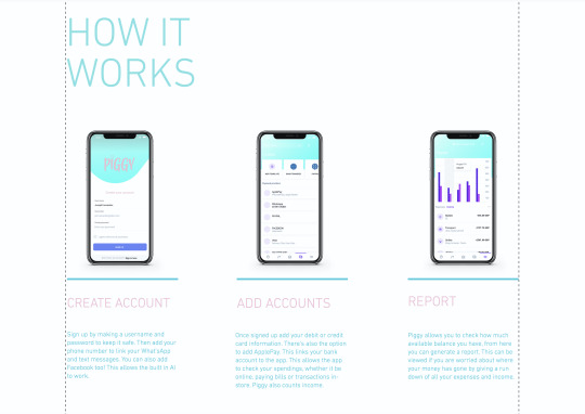
The next part of the website involved showing how the App works. I kept the text as I felt it worked well as the title for this section, I just moved it down a little by selecting it with the mouse and dragging. I was going to change the colour but I didn’t think there was any need to.

I thought that it would be a good idea to include all of my phone mock-up’s on the website to help explained how they worked. These took the place of the large numbers that were seen in the original template. To place the images in I went to add> Image> My image uploads> Upload Images> Desktop> Selected the PNG I wanted> Choose> This placed the PNG onto the screen where I dragged and positioned the image where I wanted it. Underneath each of the mock-ups I added a detailed description of what was on the screen. All the phones were in order of how the App works.

When I uploaded my images this is where they were stored.

I repeated the process for all of my PNG’s and aligned them accordingly. The website itself gives you guidelines and helps you to align them.

I decided to make no adjustments to this download button as I thought the colour worked nicely and I liked the simplistic design.

For this ‘about’ section of the website I was explaining the story of the campaign, the vision and the technology involved in detail. For ‘our story’ I said about how Poverty affects 14 million of us in the UK alone. That is 8 million adults, 4 million children and 2 million pensioners. This is due to lack of education, addiction to drugs and alcohol, people taking out loans and disabilities so people are unable to work. But the main cause being Debt because people are unable to track their spending. I then moves onto their vision: Piggy has a solution. W want to tackle Poverty with our all-in-one money saving App, that allows you to keep track of your spending, as well as upcoming bills. We want you to be able to check your bank account at a touch of a button. A piggy bank in your pocket, a place to store your money and keep it safe. But most importantly stops you from getting into Debt by helping you to save.

I also decided to add a bit about technology, its says Piggy uses AI technology to interconnect data. Not only does this help you to save by keeping track of your spending through your email, texts, WhatsApp, facebook and bank account giving you reminders, pop-up’s to put you off spending, it also used AI to interconnect with others using the App to find the best deals.
Most of the text was what I included within the campaign video, the rest were things I added which related to the App, how it works and the history behind it, why I have done it. All of the design was there already, I just edited it to relate to Piggy, I left the hexagonal designs the same, as well as the titles, I changed the colour of the title to pink and obviously replaced the body copy to my own.

I decided to add in my Hook as the ‘event’ to show that the website isn't just for the App but there is an event you can visit too. I also thought it was a nice extra and that showed off my Hook. A lot of websites that I looked at previously have a video on their website that is usually either their advert or event video.

I thought it would be best to include a safety section on the website as I didn’t include it in either of my videos, but I felt like it wouldn't be seen anyway, plus its a bit boring no one will want to read it. Using the tool to add text I typed out the word Safety and placed in at the top in the centre of the box. I found the two icons on an online icon website which I thought related well to what I was talking about. I downloaded them and saved them as PNG’s, uploaded them and placed them onto my website. For the pig I removed it from my final logo, saved it as a PNG and uploaded it and placed it on the right. I decided that I wanted to create a character or an icon for the website and I thought the best thing to use was the pig from my logo which I had already designed, I thought it worked really well. The line in the centre already existed on the page.
The safety information included basically explained that we are here to help if you have any questions, with the support link and the second paragraph of information was about encryption for personal information. I thought it was good to add on the end a bit about how Piggy does not share any personal information just so people know that none of their information will be shared.


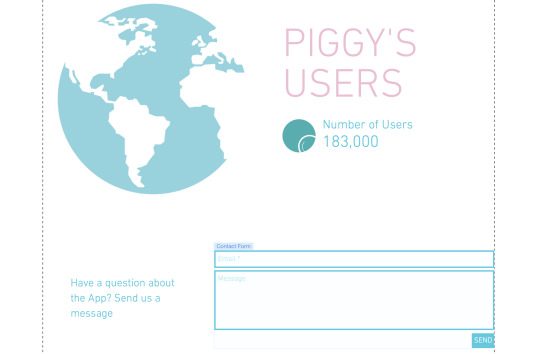
When researching I noticed that many of the websites include reviews, it is a way of showing peoples views of your App and sometimes this is what gets others to download your App. So I decided to make up some of my own as obviously the App is not a real thing. The title was already in place, I just adjusted it to say ‘reviews’. Underneath I added a couple sentences ‘join our growing group of savers and start saving now!’ and ‘So far we have helped 183,00 people, could you be the next one?’. People like seeing things like this and it gets them interested and then want to download the App. To create the boxes I used the shape tool and then adjusted the colour to pink. I duplicated the box 4 times using the duplicate option found in the tool menu on the right. For every other one I changed the colour, one dark pink, one light pink. Then using the text tool I typed out my made up usernames and reviews. I even added an icon to represent the person posting the review. Usually you see an account picture but I wanted to make mine different, plus these are made up people. When looking at the website Moneybox I got inspiration for the users section. I thought it would be a nice touch to the website, it lets people know just how many are currently using the App, so they think that it must be good. I found the globe on an icon website and downloaded it as a PNG. I uploaded it to the website and placed it on the page. The original colour was black which I thought was too harsh so I selected it clicked ‘effects’ and placed a blue effect over the top which made it appear blue. For the text I used the text option and typed out ‘Piggy’s User’s’ in capitals so it could be seen. Underneath using the text tool I wrote ‘number of users’ and the amount of people that had currently downloaded it. The circle is an animation and when hovered over the magnifying glass moves. The contact form was already in the template and actually works when you click in the box, you can fill it out and press send. I was originally going to delete this but I thought of a way I could incorporate it into my website. If they have any questions they want to ask they can ask them here and submit the form with their email so piggy support can get back to them.

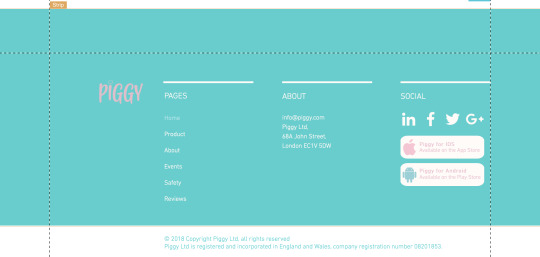
Lastly I adjusted the bottom section of the website to fit Piggy. I changed the logo and the page names to Home, Product, About, Events, Safety and Reviews as those are what my pages are labelled as. All the names were interactive, if you clicked them they would take you to that page, really cool!. I changed the About and added a made up address for Piggy and for social I kept the icons as they worked well and also they were linked so when you clicked on one it would take you to the Instagram page. I did not know how to re-link them so I left them how they were. I added the rectangles which when clicked would take you to the download in either the App Store or the Play Store depending on what phone you have. I found the icons on Flaticon and added effects to them to change the colour.
The whole website is very much interactive, as you scroll down there is a lot of movement. This is because I added effects to each object, text and image. To this I selected the item and clicked ‘effects’ and then ‘animation’.

Animation is selected green.

For all items I added a float in effect, apart from the pig character which I added a bounce in effect. As well as this most of the buttons work and are linked to other pages, social media pages and anchor points. I am really happy with the outcome.
0 notes