#constructivist graphic art
Text
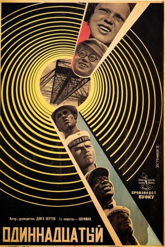
Georgii & Vladimir Stenberg
The Eleventh Year (directed by Dziga Vertov)
1928
#modern art#georgii stenberg#vladimir stenberg#stenberg brothers#constructivist movie poster#constructivist poster#constructivist graphic art#constructivists#constructivist art#constructivism#russian cinema#russian movies#russian avant garde#avant garde#art history#1920s art#1920s style#1920s russia#1920s movies#russian art#the eleventh year
11 notes
·
View notes
Photo
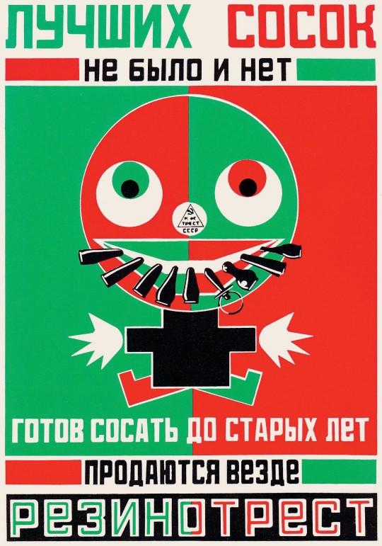
“Baby Dummies” created by Alexander Rodchenko and Vladimir Mayakovsky in 1923, was a unique propaganda poster in the style of an advertisement for dummies for children. Rodchenko, a Russian artist, and Mayakovsky, a Russian and futurist poet, worked together through 1923–28 during the recovery of the Soviet Republic after WW1 and the civil war.
#Propaganda#Vintage Poster#Poster Design#Graphic Design#Vintage Design#Vintage Illustration#1920s#1923#Constructivist#russian graphic desig#Soviet Poster#Soviet Design#Bauhaus#Constructivist Design#Construtctivism#Consturctivism Art#Alexander Rodchenko#Soviet Union
5 notes
·
View notes
Text
youtube
Watch the American Climate Leadership Awards 2024 now: https://youtu.be/bWiW4Rp8vF0?feature=shared
The American Climate Leadership Awards 2024 broadcast recording is now available on ecoAmerica's YouTube channel for viewers to be inspired by active climate leaders. Watch to find out which finalist received the $50,000 grand prize! Hosted by Vanessa Hauc and featuring Bill McKibben and Katharine Hayhoe!
#ACLA24#ACLA24Leaders#youtube#youtube video#climate leaders#climate solutions#climate action#climate and environment#climate#climate change#climate and health#climate blog#climate justice#climate news#weather and climate#environmental news#environment#environmental awareness#environment and health#environmental#environmental issues#environmental justice#environment protection#environmental health#Youtube
20K notes
·
View notes
Text
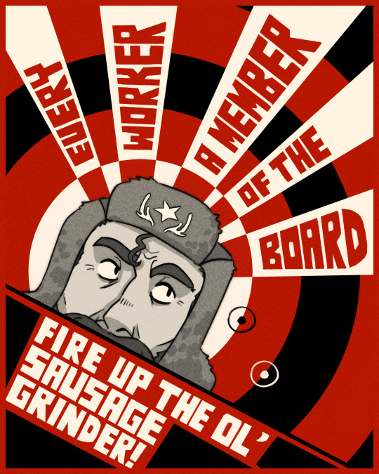

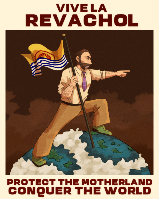

Disco Elysium political alignments based on historical graphic design styles!
Communist: Soviet Constructivist
Ultraliberal: Art Deco
Fascist: War Propaganda
Moralist: Swiss/International
#disco elysium#harry dubois#harrier du bois#graphic design#mine#god i miss my history of gd class it was so awesome#theres a lot of things that have been codified as the 'art deco' style that werent actually that prevalent in design from the 1930s#the ultraliberal poster is specifically inspired by the artist AM cassandre#i feel like his work is very definitive of the art deco style and feels way more authentic than like. the great gatsby movie or smth#i was not particularly excited to do the fascist one but i was so inspired by this concept and i wanted a complete set#i used american and british wwii posters as reference
2K notes
·
View notes
Text
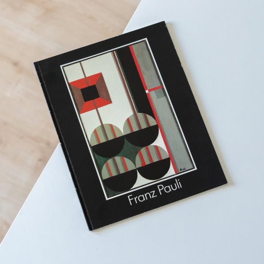

From time to time I discover largely forgotten artists and architects whose work immediately strikes me as original and which leaves me wondering why they aren’t better known. One such artist is Franz Pauli (1927-70), a painter and stained glass artist based in Cologne. In fact Pauli studied biology and art at the Cologne Werkkunstschule, the Düsseldorf Art Academy and Cologne University to become a teacher but never worked as one. Among his teachers were Otto Pankok in Düsseldorf and Friedrich Vordemberge-Gildewart in Cologne and especially the latter’s example of Constructivism had a lasting impact on Pauli: up until his untimely death Pauli refined his constructivist language towards a highly individual idiom characterized by distinctive sense of rhythm and order inspired by technical symbols and circuitry. This formal vocabulary he also applied in his manifold stained glass designs for churches in predominantly the Cologne, Paderborn and Essen dioceses.
The present little book, published alongside the artist‘s retrospective exhibition at Maternushaus Köln in 1988, contains a brief cross-section of Pauli‘s œuvre that includes stained glass works, graphics, paintings and gouaches. The latter are characterized by horizontal and vertical layers that sometimes even include figurative elements, a significant deviation from his other works. It seems that Pauli despite his largely constructivist art never completely abandoned figuration as it frequently appears in his stained glass works too. In spite of his early death the artist left a very interesting and diverse oeuvre that unfortunately is very much forgotten.
#franz pauli#constructivism#modern art#art book#art history#forgotten artist#book#exhibition catalogue
56 notes
·
View notes
Photo
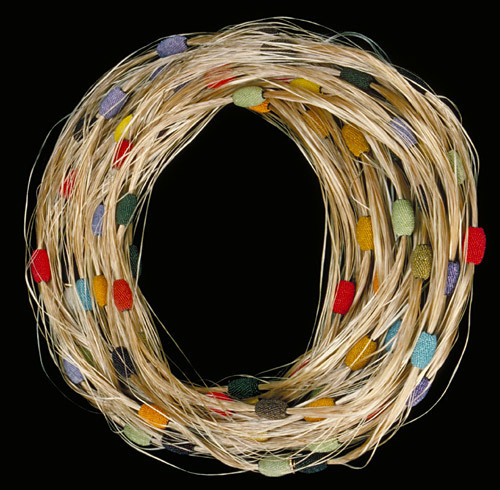
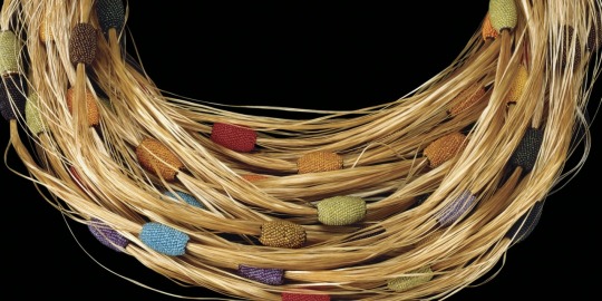

A necklace of yellow-colored material with solid colored beats throughout the necklace
Jacqueline Irène Lillie (French, b. 1941)
Austria, Vienna, 1992
Glass filaments, glass beads, knotted silk
Diam: 28.8 cm92.3.47, 7th Rakow Commission
Internationally recognized for her innovative, sculptural work in beads and mixed media, Jacqueline Lillie is the first artist to receive a Rakow Commission for jewelry.Originally inspired by the early 20th century jewelry produced by the Wiener Werkstätte (Vienna Workshops), Lillie’s interests have expanded to include African and native American jewelry, Russian Constructivist painting and graphics, Art Deco design, and the wide-ranging products of the Bauhaus. Her intention, she says, is not to revive earlier styles but to “produce work that reflects attention to minute detail and a subtle use of color.
”Lillie’s jewelry often takes the form of neckpieces or brooches constructed of single or multiple beaded spheres, ovals, and squares that she combines with metal. She also makes beaded bracelets and other articles of adornment. Her beading is characteristically tightly woven, usually in geometric patterns.
The Rakow Commission neckpiece is an unusual work for her in that she combines two distinctly different types of glass products: fiberglass monofilament and glass seed beads. The layers of glass fibers and multicolored beads are reminiscent of the lengths of trade beads strung on raffia palm fibers that are commonly found in West Africa. Yet, her necklace is a contemporary statement that emphasizes the versatility of glass, a material both traditional and modern.
https://info.cmog.org/rakow.../jacqueline-irene-lillie
11 notes
·
View notes
Text
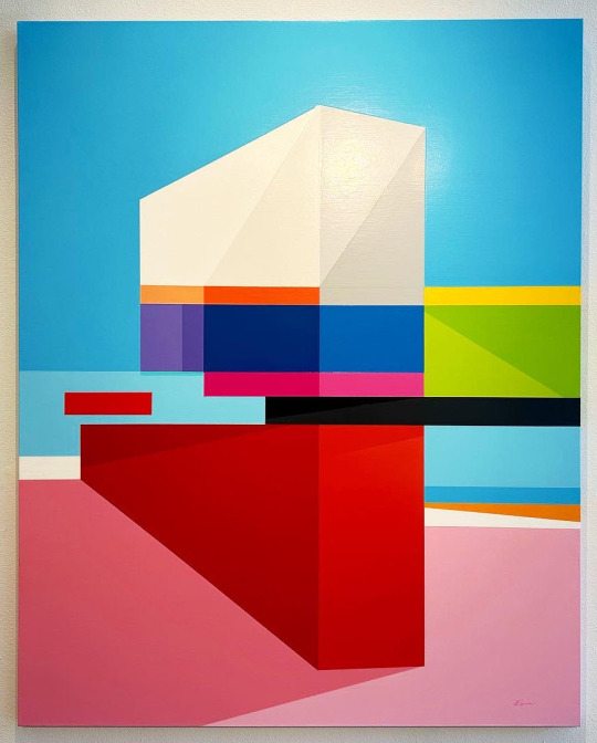
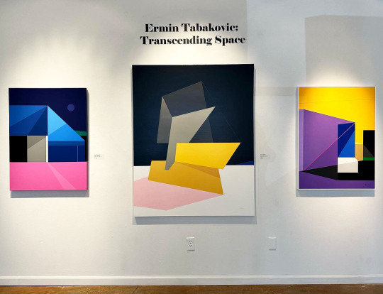
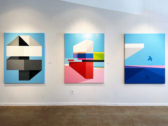
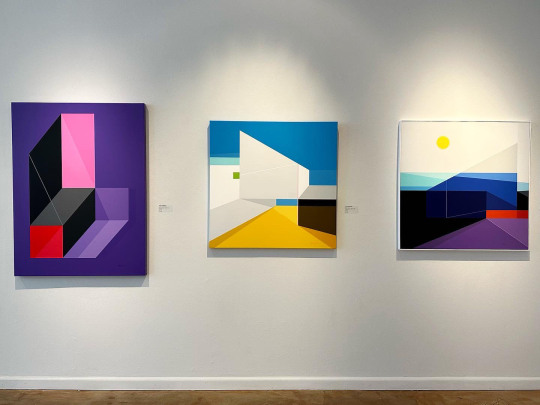
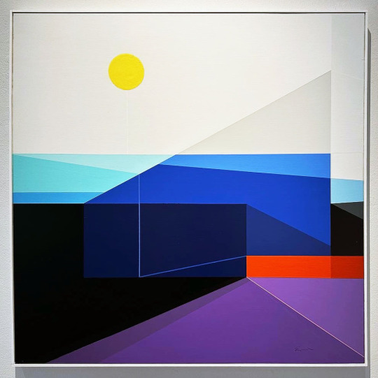
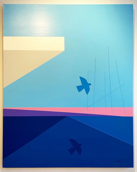
Ermin Tabakovic has created an intriguing world with his geometric paintings for Transcending Space, on view at Morean Arts Center in St. Pete.
From the gallery’s website-
Ermin Tabakovic was born in 1980 in former Yugoslavia (now Bosnia). In 1993 he and his family moved to Berlin, Germany where they lived between 1993-1998. As a teenager in Berlin, Ermin was involved in the city’s vibrant graffiti art scene and completed numerous murals. In 1998 he and his family emigrated to the United States, settling in the Tampa Bay area. Upon arrival in the US, Ermin took on painting and studied at St. Petersburg College where he focused on art and architecture. He went on to study art at the University of Central Florida in Orlando where he completed his BFA in Art Studio with Minors in Graphic Design and Art History.
Ermin actively exhibited his work between 2000-2008, taking part in many shows throughout Florida. He stopped painting in 2008 due to health issues and picked it up again in 2020 with a new vigor and a new vision. His new works are mature, colorful and bold representations of his core vision and aesthetic steeped in geometric form and a structural sensibility. Currently Ermin resides in Tampa with his wife Lisa and their beloved cat Maximus.
“Modern geometric painting has had a very big influence on my work, especially the Constructivist artists such as Malevich and El Lissitzky and the various other modern Art movements of the 20th century such as Cubism, Neoplasticism, Minimalism, and Surrealism. In my current work I tend to fuse all these different influences and combine them with my own personal aesthetic to create a new visual language that transcends the past and points to something new and different. We live in a digital age, so there is that digital touch to my compositions as well by using the hard-edge approach.
“I want the works to be visually striking, thus my use of vibrant colors, contrast, pure and robust geometric forms, clean lines, etc. I also like to add a surreal touch to my works to give them a sense of mystery and visual drama. Furthermore, I seek to create visual paradoxes by intertwining 2D and 3D space to add tension and ambiguity. My aim is to challenge the viewer’s perception of space and test the boundaries of what is possible by juxtaposing the seemingly impossible.”
This exhibition closes 10/26/23.
#Ermin Tabakovic#Morean Arts Center#Art#Art Shows#Florida Art Shows#Florida Artist#Florida Artists#Geometric Painting#Painting#St. Pete Art#St. Pete Art Gallery#St. Pete Art Shows
2 notes
·
View notes
Text
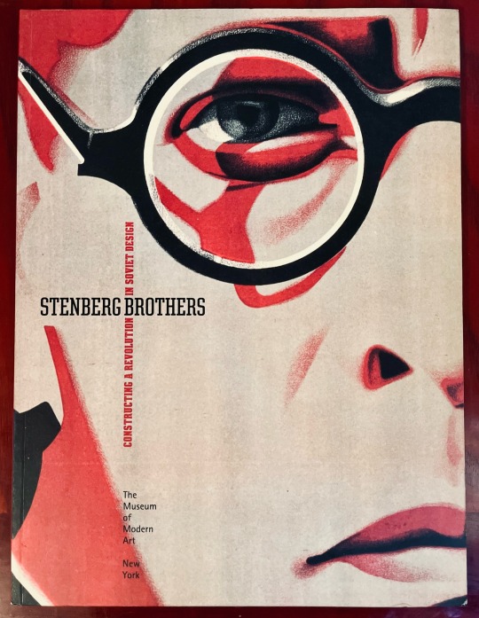
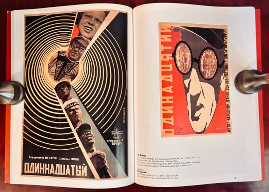
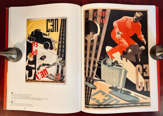
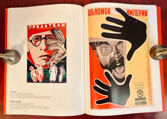
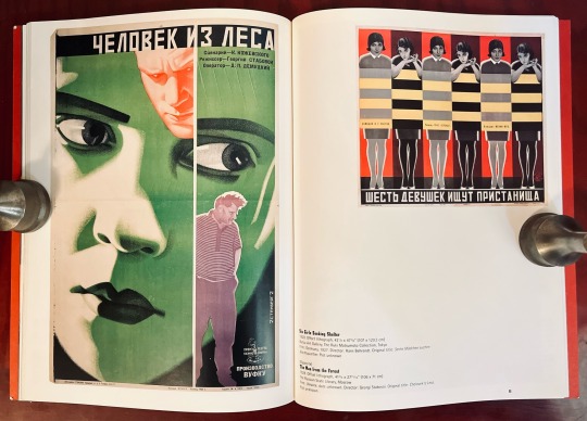
Book 502
Stenberg Brothers: Constructing a Revolution in Soviet Design
Christopher Mount
The Museum of Modern Art, New York 1997
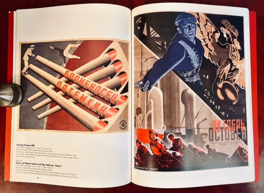
The Stenberg Brothers, Vladimir (1899–1982) and Georgii (1900–1933), are perhaps best known for designing posters for Sergei Eisenstein’s films. Their peak is an incredible body of work between 1924 and 1933 (the year Georgii tragically died in a motorcycle accident), that coincided with a revolutionary political and artistic period in Moscow. Working primarily in the constructivist style, the brothers’ visual language is stunning and, even by today’s standards, still seems radical.
Utilizing unusual color combinations, bold geometric compositions, modern typographical experiments, and Dadaist collage elements, the Stenbergs’ created some of the most graphically thrilling work of the 20th century. Considering that most of their graphic work was printed on cheap throwaway paper, it is in fact incredibly fortunate that so much of it has survived.
This book, published to accompany an exhibition at NY’s MoMA in 1997, is an excellent survey of the brothers’ work and a thrilling look into an incredibly influential era of Soviet graphic design.
#bookshelf#library#personal collection#personal library#books#bibliophile#book lover#illustrated book#booklr#graphic design
0 notes
Text
Manifesto CTS B Question1 (Week 11)
As defined by the Cambridge Dictionary, a manifesto is a documented expression of an organization's ideology, objectives, and strategies, typically associated with a political party. It is a document that an individual or group uses to make their values and beliefs known to others. It serves as a statement of purpose and a call to action, setting the course for future work and aspirations.
In our class, we collectively defined our manifesto as a group of graphic designers. The key points that stood out are:
Create, Don't Complicate: We believe in the power of simplicity and clarity in design. Our goal is to communicate ideas effectively, not to confuse or complicate.
Everything Has Been Done Before: We recognize that originality in design doesn't always mean creating something entirely new. It's about finding unique ways to reinterpret and reinvent existing ideas.
No Rules, It's Just Creativity: We embrace the limitless possibilities of creativity. There are no fixed rules or formulas in design; it's an open field for experimentation and innovation.
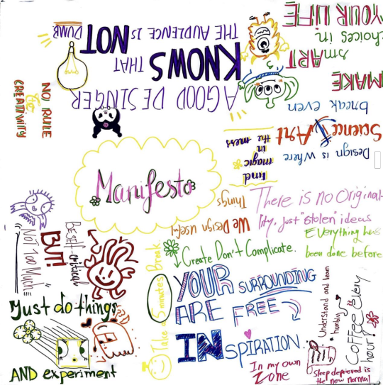
As a graphic designer, my manifesto is to communicate ideas effectively and beautifully. I believe in the power of design to simplify complex ideas, spark emotion, and create memorable experiences. Each project for me is an opportunity to solve a problem creatively, to learn something new, and to make a positive impact. I commit to high professionalism, respect for the client's vision, and a relentless pursuit of excellence in my craft.
As an example, I would like to share about one of my favorite Russian designers, Alexander Rodchenko. He is a significant figure in the world of Russian design and proposed his own manifesto, known as Rodchenko's Constructivist Manifesto. This manifesto emphasizes the following principles:
Art and Technology Fusion: Rodchenko believed that art and technology should not exist separately, but should be fused together in order to create new and innovative designs.
Design's Role in Society: He saw the designer's role as integral to the creation of a modern society. Designers, according to him, should actively participate in shaping society and influencing its direction.
Rejecting Old Traditions: Rodchenko's manifesto also called for a complete break from old artistic traditions. He believed that traditional art forms were unable to meet the demands of a rapidly changing, modern society.
Functionalism: Another key theme in the manifesto was the emphasis on functionality in design. Rodchenko argued that every design element should serve a practical purpose

In conclusion, a manifesto serves as a guiding light, a declaration of intent and belief systems. It grounds us and helps us maintain our unique identity in the world of design. It's a constant reminder of why we do what we do, our purpose, and our philosophy. Whether it's our class manifesto, my personal manifesto, or the Constructivist Manifesto by Alexander Rodchenko, they all emphasize the transformative power of design and its ability to shape and influence society. As designers, we carry the responsibility to create with purpose, innovate with consciousness, and impact with intention.
Word Count: 495 words
References:
Cambridge Dictionary - https://dictionary.cambridge.org/dictionary/english/manifesto
Alexander Rodchenko's art works - https://www.wikiart.org/en/alexander-rodchenko
Manifesto from class work by Alison, Alisa, Norman, Nia, Zongyi, Kelvin
0 notes
Text
Futura PT & Azo Sans
Futura is a classic geometric sans serif, one of the crucial typefaces of the 20th century. It remains relevant today and is widely used in logos, headings, web and print.
Futura was designed by Paul Renner for Bauersche Gießerei (Bauer) in 1927. The typeface is based on simple geometric forms and is close in the aesthetics to 1920s-30s constructivism and the Bauhaus.
Futura PT is the most complete Cyrillic version of Futura. It’s a type system of 25 styles: 16 regular and 9 narrow, from Thin to Extrabold. Futura PT has linear and old style figures, subscripts and fractions. The typeface supports more than 100 languages: Western and Central European Latin and the Cyrillic-based languages of the peoples of Russia and the CIS.
The Cyrillic version of Futura was designed by Vladimir Yefimov in 1991–1995. He partially redesigned the typeface in 2007, making it a wholesome consistent system, and Isabella Chaeva added new styles. The typeface was released under the name Futura PT. Isabella Chaeva returned to work on Futura in 2022. The typeface has three new styles, old style figures and extended Cyrillic support.
Rui Abreu is a Portuguese type and graphic designer. He studied Graphic Design at FBAUP (Faculdade de Belas Artes da Universidade do Porto), where he graduated in 2003.
In parallel with his interactive media designer job, Rui Abreu has been working on commercial fonts since 2006.
Azo Sans is a new geometric grotesque loosely based on the elementary forms of geometry. It is constructed in a geometric manner inspired by the constructivist typefaces of the 1920's, but is instilled with a humanistic quality. Azo Sans is full of nuances that soften the strictness of pure geometry, making the typeface more human and pleasant to read in longer texts.
Azo Sans was redesigned as Azo Sans 2 in 2018 with improved shapes, new OpenType features, and extended language support.
These are the two different typefaces that I am considering using for the main text within my animation. I am going to continue testing them through my work to decide which one I feel fits best with my work.
0 notes
Text
A-T-3 099 Art Of Noise - Into Battle
I was curious at how the Art Of Noise's Beat Box compared to The B Boys' Two, Three, Break (posted yesterday). They're both pretty abstract - AON get their name from Luigi Russolo's Futurist music manifesto “The Art Of Noises.” The Futurists had an obsession with machines and both The B Boys and AON are using machines to make music, the former record decks and an 808 the latter a Fairlight CMI sampler - so I was wondering how they'd mix together if you slowed Beat Box down a touch
The Art Of Noise
J. J. Jeczalik had been in the group Landscape and worked for Geoff Downes (The Buggles, Yes, and Asia) programming the Fairlight CMI, Anne Dudley was a keyboard player/string arranger working as a session musician, Gary Langan worked as an engineer at Sarm East Studios. They became members of Trevor Horn's production team in 1981 and with Horn as producer worked on ABC's Lexicon Of Love, Malcom McLaren's Duck Rock, and Yes's 90125. In 1982 Horn and his wife Jill Saunders (co-founder of SARM Studios) bought Basing Street Studios from Island Records and renamed in SARM West Studios. It was here where ZTT had it's offices. I've read part of the sale of Basing Street Studios was that Island would get the distribution deal for ZTT. ZTT - Zang Tumb Tuum, another Futurist reference - was launched in 1983, the label was founded by Horn, Saunders, Paul Morley, and Gary Langan
Like everything about Art Of Noise their are a few genesis stories and their debut release. These include the project came out of reworks of outtakes from the Duck Rock sessions, or the Red + Blue Mix of Yes's Owner Of A Lonely Heart was the template, and their debut shares samples that also appear on 90125, whatever it is, it could be all of those things or something entirely different, the production team of Jeczalik, Dudley, Langan, and Horn had a good thing going and the Art Of Noise was preparing for battle
The fifth member of Art Of Noise was the journalist Paul Morley who came up with the groups name (see above). In spectacular 1980s style Morley joined the group as a provider of concepts, art direction and marketing ideas. The group signed to ZTT (Morley also did the ZTT's marketing.) In machine music fashion there were no pictures of members of the Art Of Noise for their initial campaign. The title of the debut release Into Battle With The Art Of Noise references the content of Filippo Tommaso Marinetti's sound poem Zang Tumb Tumb. Every art student learns about the Futurists at A Level, well I did when I studied art, Zang Tumb Tumb is foundational artwork. The poem is an account of the Siege of Adrianople (Into Battle) 'Zang Tumb Tumb' is intended to mimic the sound of machine-gun fire. Typographically the poem is set Parole in libertà in a freeing expressive way. Graphic designers were referencing Futurists and Russian Constructivists on sleeve designs in the 80s, ZTT surprisingly didn't so much, it was more of the ideology. This brings us to probably what Zang Tumb Tumb author Filippo Tommaso Marinetti is best known for, that is co-authoring the Fascist Manifesto. An A Level art student will tell you, the Italian Futurists were fascists. You can also see Morley's approach as a nod to Tony Wilson at Factory Records and his comical bastardisation of Situationism. My uncle who was a teenager at the time and a fan of Frankie Goes To Hollywood (whose debut album was produced by these same people) proudly told me ZTT stands for Zang Tumb Tuum
The debut release Into Battle With The Art Of Noise comes out late 1983 in the UK
"The first of many Art of Noise releases to confound collectors with artist and title information incorporated in Paul Morley's oft-pretentious and sometimes-cryptic prose, "Into Battle" is, according to Morley c. 2009, 'neither an album or a single or an EP - just a length of music that we put on a 12" record.' At the time of release, ZTT's own advertisements called it a single, it had a single's catalog number, and it charted as such, prompting chart rules to be adjusted to clarify just how long a 'single' could be. The ZTT website refers to it as an EP, an album, or neither (just a 'record' or 'release'). Morley himself called it an EP during the Value of Entertainment concert in 1985. Meanwhile, the music press called it an EP or a mini-album. On the U.S. dance chart, the format was unspecified when listing it as the source of the long version of "Beat Box", but it later climbed the Black LPs chart, despite being advertised as a 12" by Island in January 1984
"The cover art [for Into Battle] is based on that of The Dave Brubeck Quartet's Time Further Out (1961), and incorporates a section of the panel "The Knights of Christ" from Jan van Eyck's "The Adoration of the Mystic Lamb" (1432)"
Different mixes of Beat Box are released as a single with the names Diversion 1 and 2 in 1984, Diversion 2 was released as Close (To The Edit) in the US. Close (To The Edit) also uses The Andrews Sisters sample used in The Army Now. "Although the original 10-minute version [of Moments In Love] appeared on both the Into Battle release in 1983 and the Who's Afraid album in 1984, "Moments In Love" wasn't released globally as a commercial single until 1985, when the song was featured on the Pumping Iron II: The Women soundtrack" The 1985 12" also has an edit of Beat Box (Diversion 1) now titled Diversion 10
Beat Box was popular in the US with black audiences, "they were awarded Best Black Act of 1984. Beat Box was the track that everyone went crazy over and boosted the EP to number one in the dance charts in the USA. Moments In Love made its first appearance on that record too, along with The Army Now that sampled the Andrews Sisters. Nobody had ever heard a record that had been created using what is now known as 'cut and paste' techniques before or an instrumental love song with the sound of hammers being hit instead of the sound of a drum. Art of Noise soon gained a huge cult following in the USA that has remained to this very day"
Moments In Love has been sampled to death since its release, including Moments In Soul by J.T. And the Big Family in 1989 when Italian DJs were putting Soul II Souls Back To Life beat behind anything and everything
The Art Of Noise - Beat Box (Into Battle version)
youtube
The Art Of Noise - The Army Now
youtube
The Art Of Noise - Moments In Love (Into Battle/Who's Afraid version)
youtube
#1983#art of noise#trevor horn#anne dudley#paul morley#electronic#sample#cut and paste#hip hop#london#uk#80s music
0 notes
Text
Assignment Number One
For this assignment, I chose to research Barbara Kruger and her style of art.
Intro to the Artist-
Barbara has been an active observer and commentator on contemporary culture. Using her background in graphic design, she creates bold pieces of work using a distinct style of font and images combined. Kruger grew up during the booming of advertising, and her work directly questions the “norms” surrounding the images used and the meaning that has been attached to them.
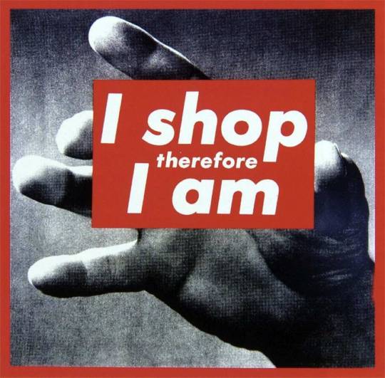
We talked briefly about Kruger and saw two examples of her work, this being one of them. Kruger's work is analogical, forcing viewers to make connections between the images and words she uses, and reflect that onto current times to understand what her work is commenting on. In addition to the connections that are asking to be made, there are semiotics at play. The more knowledgeable the viewer is, the more meaning they can find in her art. In this example, the shape that holds the phrase "I shop therefore I am", is resembling a credit card, which connects to the phrase about consumerism. To fully understand the meaning, the viewer must also be aware of the play on the philosophical phrase "I think therefore I am". This displacement of a philosophical statement adds weight to the take on consumerism and the power of a person depending on their spending ability.
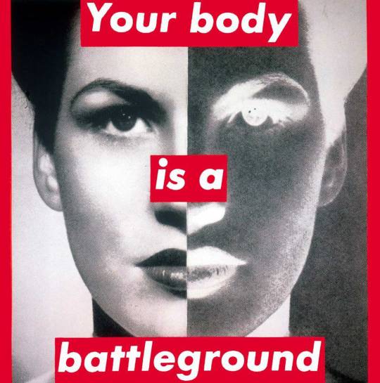
Barbara has strong influences of constructivist styles, and this example uses those very strongly. There is little going on in the picture, and the words stand in bold font in front of the image. The eyes are drawn to the words, and the image behind them gives it meaning. As seen in her other work, this piece directly comments on issues current with the times when it was created. This untitled piece was made in 1989, and was created in support of reproductive rights for the Women's March that year. "This image is simultaneously art and protest." (https://www.thebroad.org/art/barbara-kruger/untitled-your-body-battleground)

This last piece is referred to as one of Kruger's most raw and potent pieces of work. The original work sizing up to be four by five feet, it is a rather large statement. This image blown up gives it the grainy, newspaper look, and the words resemble a headline. The commentary behind this image links to the subject- the atomic bomb, as well as the state of advancements and destruction in "science" at the time. The source that I read to learn more about this piece mentioned the weight that society ties to science, and the narratives that can be pushed by such weight and power.
Barbara Kruger's commentary on culture and society as a whole is executed through powerful images and simple phrases, that when combined, create extremely bold ideas. Her work highlights brutal truths seen in everyday society, and forces viewers to think of the culture that surrounds them.
1 note
·
View note
Text
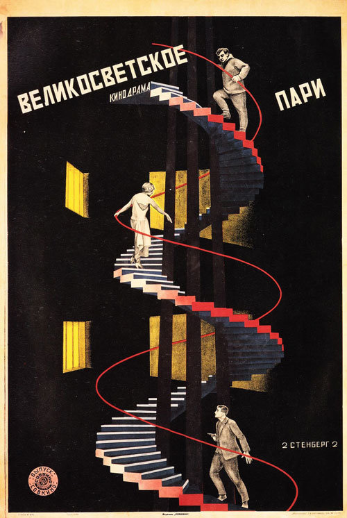
Georgii & Vladimir Stenberg
High Society Wager or The Weather Station (German film)
1927
#stenberg brothers#vladimir stenberg#georgii stenberg#constructivist movie poster#constructivism#german movie#german cinema#constructivist graphic art#graphic arts#commercial art#art history#modern art
14 notes
·
View notes
Text
Bruno Munari Research Paper
“A designer is planner with an aesthetic sense”. This sentence quote from Bruno Munari (Milan, 1907– Milan, 1998) who is one of the people I have been most influenced by in my design learning journey. David Reinfurt insists that "Bruno Munari is a bit too well-known in the United States for children’s books. He’s less well-known for the breadth of his work" (53). He was one of the most independent and influential figures in the history of twentieth-century international art, design, graphics, and film. Associated with the second wave of the Italian Futurist movement, and one of the founders of the Italian movement for concrete art—Movimento Arte Concreta (MAC), his multifaceted practice allowed him to contribute to all fields of the visual arts, as well as literature, poetry, and teaching. He is considered one of the protagonists of programmed and kinetic art. His works contributed fundamentals to many fields of visual arts, and much high applicability with his research on games, didactic method, movement, tactile learning, kinesthetic learning, and creativity.
Claude Lichtenstein and Alfredo Haberli depict Bruno Munari as "a life as art" (9). According to Italian Modern Art, Munari was born on 24 October 1907 in Milan, he was raised and grew up in a family with a ten year younger brother Giordano Munari. In 1913, Munari moved to Badia Polesine (Veneto), where his parents converted a small palazzo that had belonged to the dukes of Este into an inn. From the guests at the inn, this is the first time Munari has heard of futurism. He shared about this story that "and thus I began to draw, but without any knowledge, inventing" (Claude Lichtenstein & Alfredo Haberli, 274). Munari returned to Milan in 1925, his uncle found him a position as a graphic designer. Munari's career his career began budding while searching around in bookstores, he meets the futurist poet Munari meets the futurist poet Escodamé (pseudonym of Lescovich), who introduces him to Filippo Tommaso Marinetti. Munari joined the second generation of Futurists (those born around 1900, including Depero, Dottori, and Soldati, and becomes especially close to Prampolini). Munari started to display his works in many exhibitions in 1927, and then he began his endless creative journey. In 1930, he worked as a graphic designer with Riccardo Castagnedi (Ricas), and from 1938 until 1943, he worked as a graphic designer for Mondadori, as well as for two of Mondadori’s magazines, Tempo Magazine, and Grazia. It was during this period that Munari created advertising collages for magazines and created sculptures and his abstract-geometrical works, but it was also the time when he strengthen his love for writing and publishing. After World War II, Munari became disillusioned by Italian Futurism due to its Fascist tones and decided to disassociate himself from it, and in 1948, Munari, along with Gillo Dorfles, Gianni Monnet, and Atanasio Soldati founded the Movimento Arte Concreta (MAC). It is during this time, the late 1940s and 1950s, that Munari developed a strong and playful style, away from a purely futurist or constructivist influence; a truly modernist style that is skeptical about futurist ideas, an approach that explores new materials and times defies logic, and that is much more narrative. Later in his life, Munari became increasingly interested in the design and publication of children’s books, as well as in designing toys, though he had been producing books for children since the 1930s. For his books, he often used textured and tactile surfaces, and cutouts to facilitate the teaching about touch, movement, and color through kinesthetic learning.
One of typical Munari's works can be specifically mentioned in his "useless machines", which represents a completely different understanding of technology and its function in the modern age. Although associated with the Futurism movement at the time, this work went quite further and was more in line with other major trends such as Russian Constructivism or Bauhaus. These are objects hung in the style of Man Ray's famous lampshade, Munari thought that instead of drawing squares, triangles, and other geometric shapes that still give a realistic feel, why not liberate abstract forms from still paintings and hang them in the air, piecing them together so they could live in the environment with us. With "useless machines", he was interested in exploring the constant time-space, how to make the work of art could interact with the environment and change accordingly. Making art to become truly dynamic, Munari was one of the first in Europe to create kinetic art which has become a dominant trend all over the world in the '50s and '60s. What's interesting about these sculptures is that they're built with very light materials like paper, thin wooden slats, and silk thread. I agree that design is an experimental process which means we must experiment until figuring out the best way to jump into. Thus, I was inspired by Munari when he constantly experiments. He experimented with so many things that he became his own, and completely different from anything else out there.
"The designer of today re-establishes the long-lost contact between art and the public, between living people and art as a living thing", this quote from Design as Art is Munari’s 1966 book of essays bringing together his thoughts and musings on design and art. It is also one of my favorite design books and I often refer back to it for inspiration. Munari insisted that design be beautiful, functional, and accessible, and this interesting book sets out his ideas about visual, graphic, and industrial design and the role it plays in the objects we use every day. Some of the subjects to which he turns his illuminating gaze such as lamps, road signs, typography, posters, children's books, advertising, cars, and chairs. The book made me think more about how to see the world and how to make forms from many things around us. Draw A Tree is Munari's illustrated book for children which I am fond of and was inspired by Leonardo da Vinci’s centuries-old diagrammatic study of tree growth. According to Maria Popova notes that "Munari — who made some wildly inventive 'interactive' picture-books before the Internet was born and who saw graphic literacy as the bridge between living people and art as a living thing." Observing the transformation of the tree and illustrating them through drawings has opened my mind about how to observe things around me and make new things out of them.
In sum up, Bruno Munari was among the most inspirational designers of all time, described by Picasso as “the new Leonardo.” His works are ahead of their time and have high learning value. He is also the person who has inspired and influenced a lot in my design style.
--------------------------------
Works cited
“Bruno Munari”. Casati Gallery. https://www.casatigallery.com/designers/bruno-munari/, Accessed 15 November 2022.
“Bruno Munari: The Child Within”. Italian Modern Art. https://www.italianmodernart.org/exhibition/bruno-munari-the-child-within/, Accessed 15 November 2022.
Lichtenstein, Claude & Haberli, Alfredo. A Visual Reader on Bruno Munari. 1st ed, Lars Müller Publishers, 2001.
Munari, Bruno. Design As Art. Illustrated ed, Penguin Classics, 2019.
Popova, Maria. “Drawing a Tree: Uncommon Vintage Italian Meditation on the Existential Poetics of Diversity and Resilience Through the Art and Science of Trees”, The Marginalian. https://www.themarginalian.org/2021/11/05/drawing-a-tree-bruno-munari/, Accessed 15 November 2022.
Reinfuirt, David. A *New* Program for Graphic Design. Inventory Press/D.A.P, 2019.
0 notes
Text
Photomontage Research
The alluring art of photomontage.
Photomontage work includes various types of image editing in which multiple photographs are cut up and combined to form one new image. This can involve cutting up printed images, which is how magazine editors used to design publications before digital design software existed — creating layouts called pasteups. But now, digital design tools like Adobe Photoshop make it easier than ever to bring imaginative scenes to life using existing imagery, without paste or paper cuts. When performed digitally, photomontage can also be called compositing.
Photo collages bring dreamlike visions to life.
Fine art photographer and visual artist Edwin Antonio describes photomontage as “a vision, a dream that an artist has, which takes multiple images to create.” Graphic designer and collage artist Lana Jokhadze agrees. “Photomontage gives you the opportunity to create works of art from anything that’s on your mind,” she says. “I used to imagine that I was sitting on a different planet, looking at the sun and Earth side by side. With digital photo collage, I can transfer a vision like that to the screen.”
Photomontage took off in the early twentieth century.
Collaging might conjure images of a teenager in the nineties, decorating their locker with magazine clippings of mass media stars. But this type of mixed media art has deeper roots that started with subversive German artists in the surrealist movements of the early twentieth century, around the time of World War I.
It all started with combination printing.
Back in the mid-nineteenth century, combination printing, an early type of photo manipulation, paved the way for photomontage. Combination printing was the process of developing one image using multiple negatives. This process was necessary because it was difficult to get various light levels to expose well at the same time, but it soon led to photographers creating more imaginative photographic images than ever before. Art photographer Oscar Rejlander helped pioneer early experimentation in combination printing and went on to create the first well-known photo montage, The Two Ways of life, in 1857.
Modern collages follow in the footsteps of Dadaism.
German Dadaists in the mid- to late 1910s, like Hannah Höch, John Heartfield, Raoul Hausmann and Kurt Schwitters, used photomontage as a way to make images that channeled their anti-fascist beliefs. Similar were the artists in the Russian constructivist movement, such as Alexander Rodchenko and Gustav Klutsis, who incorporated typography and graphic design in their angular collages. During the same era, Man Ray and Salvador Dali were associated with cubism and the surrealist painting movement; they created dream-like photomontages that played with perspective and the human form. Photomontage then became a facet of pop art into the seventies and eighties, adopted by British conceptual artists like John Stezaker and David Hockney, who explored patterns, repetition and the recycling of commercial images. Look up work by these artists for inspiration.
https://www.adobe.com/mt/creativecloud/photography/discover/photomontage.html
1 note
·
View note
Text
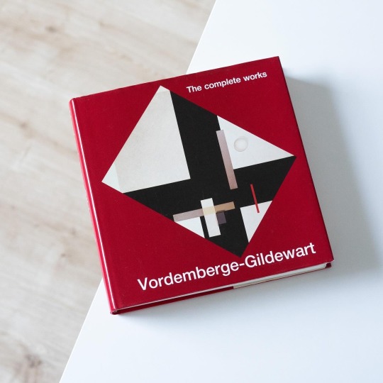
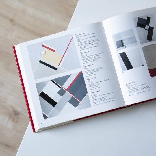
A key protagonist of constructivist art in Germany was Friedrich Vordemberge-Gildewart (1899-1962), a multitalented painter, sculptor and graphic artist and, interestingly, one of the few German members of the Dutch De Stijl group. Vordemberge, born in the town of Osnabrück in Lower-Saxony, in 1919 moved to Hannover, then and later the unofficial capital of abstract art in Germany, to study architecture, a study he was never to complete. He quickly got in contact with the likes of Hans Arp and Kurt Schwitters and in 1927 was one of the founding members of „die abstrakten hannover“, a circle of artists including Schwitters, Carl Buchheister and Rudolf Jahns. In the years following Vordemberge developed a very consequential abstract idiom revolving around basic geometric forms, a formal vocabulary he also occasionally translated into reliefs, typography and stage designs. Being avant-garde Vordemberge after 1933 fell through with the NS regime and was marked „degenerate artist“, a stigma that led to his emigration to Amsterdam in 1938. Nonetheless VG continued to be present in both solo and group exhibitions internationally. After the war Vordemberge and his wife received the Dutch citizenship and in 1952 he started teaching at HfG Ulm as head of the visual communication department.
A wonderful way to follow the artistic development and career of the artist is the old but gold volume “Vordemberge-Gildewart – The Complete Works”, edited by Dietrich Helms and published by Prestel in 1990: not only does it included all of the artist’s known works including photoworks and lithographs but it also ventures out into his architectural and commercial works that are addressed in two of the eight essays included in the catalogue. A complete exhibition roster and a thorough bibliography round out this still singular publication on what is one of German constructivism’s most significant artists.
#friedrich vordemberger-gildewart#catalogue raisonne#monograph#art book#vintage book#constructivism#modern art#de stijl#book
20 notes
·
View notes
Photo

A new personal project by Hawaii, titled “Cross Fader.”
#hawaii#debut art#cross fader#dutch masters#dutch#painting#geometric#print#conceptual#constructivist#digital#graphic#landscape#posters#illutration
1 note
·
View note