#but the wider washi tape is good enough
Text
started 2 paintings don't ask me how many i finished
#also two but not the ones i started today algksl#soon i will have enough to have a gallery wall on my room divider#rn it has 3 in the middle panel and i could add 6#the washi tape it's the best at keeping them up tho#but the wider washi tape is good enough#ine of the ones i put up isn't actually finished but i got sick of the smell if nail polish#glittery nail polish and a needle does so much i love it#i don't have a glitter pen so i just figured it out#haven't figured out how to utilize glittery eyeshadow tho#but now i have my linocut coffee cup orint a vase of orange flowers and some autumnal sketches with glitter accents#that i can see from my bed :)#i painted a huge pink flower too and that's on my bookshelf rn#all the tutorials are producing a lot of stuff but when i try smth on my own i seem to mess up algksl#but i managed to improve a landscape i painted from a reference (a postcard i got from the trift shop)#it looks less flat now
1 note
·
View note
Text
Love Sickness (Marcus Pike x F!Reader)

Summary: Marcus tries to tell you he loves you. Warning, this is soft. SO SOFT.
Pairing: Marcus Pike x Fem Reader
Rating: General
Word Count: 1K
Masterlist
You loved Sundays. No work and a chance to spend the whole day uninterrupted with your favorite person, Marcus Pike.
You were at your apartment this Sunday, sitting across from one another at the table in your living room. It was too small to be considered a ‘dinning room’ table, big enough for only two people but you didn't mind. It was cosy and right next to a window that had a great view of the city. Today the mid-afternoon sunlight filtered in nicely.
After clearing the table of your breakfast plates, Marcus’ chocolate chip pancakes, of course, you spread out your planner supplies and were busy filling in dates for the following week. Marcus brought you both a second cup of coffee and placed a quick kiss to your forehead before he sat down across from you, reading on his tablet.
The silence between you was comfortable and pleasant and allowed you to go deep into thought, thinking about all of the things you had to do the coming week. You placed a sticker here and some washi tape there and were about to underline ‘pick up dry cleaning’ when you felt Marcus’ eyes on you.
You stopped and looked up, giving him a smile. He winked at you and went back to reading. Not thinking anything of it, you went back to your task, glitter pen in hand. However a few moments later, you felt his eyes on you again. This time you decided to ignore it, thinking maybe he was looking at the clock on the wall behind you but as the minutes passed you realized that couldn’t possibly be the case, especially since there was a clock on his tablet. Finally you looked up, eyes locking with his.
“Baby, what’s with the staring?”
He shook his head, “I’m not..”
“You are too! What is it, is there something on my face?” You felt around but didn’t feel any chocolate left over from breakfast.
“No honey, your face is perfect,” he said quietly.
“Then why,” you were about to ask him again when you looked up at him and this time, really looked at him. His pointer finger on his right hand kept tapping on the table nervously and his shoulders looked stiff. His face even looked a little pale. You were concerned immediately.
“Marcus, you don’t look so good right now. Are you feeling ok?”
“I’m feeling just fine,” he replied too quickly.
You crossed your arms over your chest, leaning back into your chair, “Are you sure? I say this because I care but you look like you could pass out any minute.”
Marcus huffed, “Well, if I do look a little, out of sorts, it’s your fault.”
You gasped, “My fault? Care to elaborate? ”
He shook his head but you could see the beginnings of a small grin on his face, “No honey, you definitely gave it to me. I believe what I have is a case of… love sickness.”
You rolled your eyes and were about to reply with a smart comment when what he said struck you. Love sickness. Was he trying to tell you something?
You put your stickers down and looked up at him, a small smile on your lips.
“Love sickness?” You asked, making sure to put the emphasis on love when you said it.
Marcus just nodded, suddenly very interested in the tiny string at the bottom of his henley now that you seemed to have caught on. He kept tugging at it, not able to meet your eyes.
Your grin grew wider as you hesitantly asked, “Is it, the type of sickness that gives you butterflies when you look at the other person even though you see them all the time?”
“Oh yeah, lots of those,” he said, a slight blush coloring his cheeks.
You noticed he had stopped tapping and took his hand in yours, intertwining your fingers.
“And you can never be close enough, even when you’re holding hands and they’re right there in front of you, right?”
Now it was your turn to stare, willing his eyes to meet yours. When he the finally did he nodded shyly.
You brought your hands up to your lips, kissing the back of his hand softly, “Well, Marcus, I think it might be contagious because I’m pretty sure I have it too.”
You stood up and walked around the table to where he was sitting, taking a seat on his lap.
“Really?” he whispered.
You wrapped your arms around his neck and brushed his nose with yours, “Really.”
He buried his face in the crook of your neck and you felt him smile. Oh, you had it bad for this soft man.
“I wanted to tell you for months,” he began, looking up at you and running a his thumb along your bottom lip, “tell you, that I love you. But I just couldn’t find the right time but then I looked at you today and you looked so cute with all of your stickers and tape and I just had to say it, I couldn’t not say it and am I making sense? I feel like I’m talking so fast—”
You cut is rambling short with a giggle and then a kiss, making sure to put everything you felt into it. When you finally broke away you found yourself beaming, this time at his dazed expression.
“I love you, too.”
#allmahfeels#my fic#marcus pike#the mentalist#the mentalist fanfiction#marcus x reader#marcus pike x you#marcus pike x reader#marcus pike fanfic#pedro pascal characters#pedro pascal
128 notes
·
View notes
Photo

Starfall Mountains
Alternate title: Reasons Not to Buy the Dirt-Cheapest Acrylic Paints You Can Find
I normally do like to keep an inexpensive stash of acrylic paint around because even though acrylic paint is not a medium I dabble in often, it much like fabric/puffy paint can come in surprisingly handy. And every once in awhile I will use it for it's intended purpose just to stretch my artistic muscles.
Well, one of my art students recently started asking questions about acrylic painting and through giving them what advice I could (knowing arguably too much about acrylic painting for someone that rarely if ever does so) I felt that familiar artistic itch settle into my brain. And then I remembered that between my own one-off projects and a couple that my mom borrowed my small paint stash for, the stash that I had is down quite a few tubes that are just completely gone/empty. And what colors are left (mostly browns and greens, maybe a yellow) are not terribly pretty or useful colors.
Thus my wandering art supply eyes started watching for some cheap acrylic paints to add to and replenish the stash. And admittedly to a certain extent, I wanted to take the rare occasion to take a stab at making a proper painting, partly just to see if I could do it and partly so I wouldn't just be throwing my student to the wolves with my advice.
I found such paints in the form of an 8-pack set of 9.5 ml. tubes from Dollar General. The set was $4.
Now, I know and can accept that this set was not meant to be artist-quality by any stretch of the imagination whatsoever. What bothers me is that my pre-existing stash was a very cheap set that was probably at best meant to be student-quality paint (and there's a good chance that's being generous) and you can get craft paint from Walmart for less than $1 for much larger tubes, and both options are more pigmented than these paints were.
Do not be fooled by the results before you; I am fortunate enough that I have a moderate amount of artistic skill, pretty good knowledge of the medium (at least for someone that doesn't use it often), and I've done enough experimenting and encountered enough problems before to be comfortable trying to power through and work with what I had. If I were a humble beginner with much more limited knowledge of art supplies and how to use them, I highly suspect this would be one of those supplies capable of turning someone away from that type of art supply, if not art as a whole, in its entirety.
If you've ever used finger paints for kids--you know how in the container and one congealed drop of the paint it looks like a nice, solid color, but then when you start to spread the paint around it's way more transparent and you have to really commit to get the color pay-off you were expecting? That's an accurate description of these paints.
The thing is that they aren't totally lacking in pigment. They're about as pigmented as cheap watercolors or gouache. The problem with that is that they are still acrylics at the end of the day--the paint binder is a plastic, which means they dry relatively quickly and typically will not reactivate after they've dried. So if you want the same experience but a medium that's easier to work with, watercolor or gouache would be a better option.
But it gets weirder.
I noticed that these acrylics dry a little on the slower side compared to what I'm used to, which is a mixed bag. It helped with blending a little, but it also made the lack of pigment more frustrating, as it meant I had to wait longer for the paint to dry between layers, which I needed in order to make sure I was A. covering the canvas and B. getting the color payoff I wanted.
Additionally, it is probably a very good thing that I was using a small 4"x6" canvas board and not one of the 8"x10" canvases I have on hand, because the size of the paint tubes combined with the lack of pigmentation means I very likely would've run out of one or some of the colors. (Almost definitely I would have run out of white because white is always my most overused color).
To a certain extent, I did expect to have to layer and do a lot of "put paint on, cover it up. put paint on, cover it up, put paint on--" you get the idea. Acrylics, even when they are better pigmented, can be a more challenging medium to work with because of the aforementioned quicker drying time. But even so I feel like the work I had to do to get good color pay off, decent coverage of the canvas, and smooth blending all at once was still a little more than I should've had to put in.
The most egregious and obvious offenders of this would be the orange behind the mountains and the snow/ice caps on the mountains, the latter of which I'm still not totally happy with, but I kept going back and forth with it and eventually just said "y'know, that looks pretty okay, I'm tired of messing with it, and I'd love to not use up the entire tube of white on this one small painting, so I'm done with that." The orange I think turned out fine, though the transition between it and the rest of the sky is a little harsh for my liking. (I'd say it doesn't match the reference photo but that's not really fair as overall I took quite a few intentional and unintentional creative liberties between my reference photo and the final product.)
Anyway. Once I had layered enough various shades of purple and bluish-white on this thing to make an eggplant and blueberry salad jealous and fed myself up with the mountains, it was 4 a.m. and I was tired and so I decided to let what I had dry overnight and then finish it the following day.
I did wrap my tiny 6-well palette up in a plastic baggie to preserve the mixed paint that hadn't already dried just in case I looked at the painting with fresh eyes and couldn't help but touch it up some more. But fortunately, that didn't happen.
Instead, I used some washi tape to make a mask over the mountains and then broke out a bottle of white ink to splatter some stars across the sky, because I knew the white acrylic paint was a serious risk that was likely to not work out the way I wanted it to. (In this case. I have used white acrylic paint before that would've probably worked just fine using the same splatter method, but I didn't want to take the risk with how not-pigmented this white was.) And then I went in with white gel pens to emphasize a few stars, add some white spots in that I wasn't able to do with the paint, and I did end up adding a little extra highlight to some of the mountains in the vain hope of making them look a little better.
This is where the title comes in; I think I got a little carried away with the highlight on the mountains vs. the stars in the sky, and so instead of the traditional "snowfall/snowy" mountains, I thought calling them "starfall" mountains might make more sense based on the visuals.
One that was done and I was confident that everything was dry, I went over the whole thing with some gloss-finish ModPodge (which smells horrible by the way; the matte-finish ModPodge has a way less offensive smell to me), in two coats, and then re-applied my gel-pen signature in the top corner because for some reason the ModPodge just kinda wiped it off.
I don't like ripping on a supply so hard, and I'm sure if you look at some other supply tests of mine that it's pretty obvious I try very hard to give the benefit of the doubt when I can. These just disappointed me on so many levels. Don't get me wrong; the end product still turned out decent, but that's because I more or less know what I'm doing. As I said before, I'm not confident that a beginner wouldn't be totally frustrated by these paints.
And yet I can't deny that they're probably fine for younger kids that don't really care about proper acrylic painting, and that's really who they're probably for anyway.
If nothing else, I can say this experiment has pushed me towards getting a better quality, wider color-selection set of acrylics to keep in my stash, because I really don't see these working out as a good stash set for me. It's going to be a tricky decision though, because I want something that'll give me the option to do a proper acrylic painting like this if I want to, but has a price I can justify even if I don't use the paints terribly often. So we'll see how that turns out for me further down the road.
I really don't think I'll ever be primarily an acrylic painter (not because of this particular experience--there's just something missing that doesn't draw me into the medium like other mediums have drawn me in before), but sometimes you get an artistic itch and you just have to scratch it, and I have to admit that I don't think I've fully satisfied this itch just yet, so there may be more acrylic paintings to come out of me yet.
____
Artwork © me, MysticSparkleWings
____
Where to find me & my artwork:
My Website | Commission Info + Prices | Ko-Fi | dA Print Shop | RedBubble | Twitter | Tumblr | Instagram
2 notes
·
View notes
Text
Australian Witchy Supplies Stores
Kmart
Kmart is hands down my favourite place to shop. You can get all sorts of witchy things from Kmart, you just have to know where to look. Kmart stock candles of all sizes from just $1AUD. I've also found essential oils for $3AUD and oil diffusers for about $20AUD. In the arts and crafts area Kmart has a great range of notebooks, stationery, stamps, stickers, washi tape, paper embellishments; basically anything you'd need to start or add to your grimoire. Also in the craft area, I have picked up some suede lengths that I've hung crystals on and turned into necklaces & bracelets. Kmart has a selection of coloured ribbons that could be used to decorate your altar or to tie in your hair. In the home decor area I've spotted some cute little shelves that would be perfect to display crystals on as well as little drawers to keep them safe in. There's always cute little dishes & jewellery trays that would be perfect for crystals or keeping witchy trinkets in. If you're not bothered by what your storage shelves/drawers look like, the storage section has everything you'd ever need from tiny jars to big heavy duty containers. In the gardening/outdoor section you can find plant seeds and basic beginner gardening equipment as well as potting mix, pest control stuff and even cute pots to start your seedlings in. I have found some lovely pieces of witchy clothing from Kmart (bell sleeved shirts, cardigans, flowy maxi skirts) - if you're petite like me don't forget to look in the girls section, my best friend found the cutest celestial themed skirt from the girls section that fits her perfectly even though she's 21. The girls section also has a waaay better sock selection than the ladies area, we have both picked up some black frilly socks and I've noticed brightly coloured striped socks for anyone daring enough to wear them haha. Finally, don't forget to check out the accessories section - there's always cute witchy hats and a wide variety of jewellery and hair accessories starting from just $1AUD.
Big W
Big W is another Aus Wide department store that sell lots of cool witchy bits & pieces. Big W also sell candles although they probably aren't as cheap as the Kmart ones. I've noticed wax/oil burners at Big W as well. In the home decor section there's always little trinket trays - I've found lovely little ceramic bowls in the kitchen section for about half the price of the trinket trays so don't be afraid to scout around in other areas for multipurpose items. While you're in the kitchen section take a peek at the selection of jars and glassware. I always check out the herbs and spices racks/jars/storage. If you're after basic grimoire supplies, Big W should definitely have what you're after; notebooks, pens, basic craft bits & office supplies. Big Ws gardening section is (IMO) better than kmarts as it has a wider range of gardening accessories and they stock higher quality brands. Same as Kmart, Big W sometimes has cool witchy clothes in the clearance section (I always try to buy things on sale to save $$ [also keep in mind we don't have coupons in Aus!]). Another thing that Big W does better than Kmart is the book section. I bought my very first tarot deck from Big W (its a fairy themed deck by Doreen Virtue) for $15AUD. They usually have 4 or 5 different tarot decks to choose from as well as angel oracle decks and kits. I bought an awesome dream interpretation book from Big W just the other day. Finally, Big W ALWAYS has jewellery on clearance for as little as $0.50 - don't be afraid to buy some pieces of jewellery and DIY them to be a little more witchy or personal to you.
Spotlight/Lincraft
Probably the biggest craft stores in Aus, Spotlight and Lincraft stock literally EVERYTHING arts & crafts wise. Both stores have such a wide variety of stationery, pretty craft papers, stickers, fabrics, beads, pens, paints etc etc. Too much to list haha. Spotlight has a decent selection of candles although be prepared to spend some $$ here because they are pretty pricey. I always check out the Spotlight home decor section because they have really pretty bits and pieces.
Discount Variety Stores
Almost every town/city in Aus you can find at least one discount store. These are the BEST places for candles, incense, essential oils, oil burners, IMO. You can get any of the above for under $5AUD. I've even seen herbs and sage sold at various discount stores. Occasionally discount stores stock crystals (tumbled rocks or sometimes raw crystals in a little set). The arts and craft area usually has all your grimoire needs and then some - don't forget to look in the cards and wrap section; some wrapping paper has really pretty designs sometimes better and cheaper than stickers. This is usually where the ribbons are kept as well, in my experience discount stores have a better ribbon selection than Kmart and Big W. Discount stores generally have a gardening section; seeds from $2AUD, basic gardening tools, basic pots and basic pest control. Probably the best thing about discount stores is the glassware and jars area. You can pick up the tiniest little jars from $0.50 with cork stoppers or twist top lids to big solid 10L jars. If you want LITTLE TINY jars always have a look in the craft section, sometimes they have glitter in them but you can always decorate your grimoire with the glitter or incorporate it into your makeup to empty the jars. Organza or drawstring bags can also be found in the craft isle. It's usually where the sealable bags/zip lockbags are kept - these could be really useful for keeping seeds in, dried herbs, dried flowers etc. The craft area has lots of bits and bobs including little packets of bells, which are sometimes hard to find. Finally, as well as bells most discount stores sell wind chimes - pretty noises to attract faeries.
Officeworks
If you need a one stop shop for just your grimoire needs, Officeworks is it. They stock literally everything you could need from paper, notebooks, pens, pencils, art supplies, office supplies like glue, staplers, erasers etc etc etc. The coolest thing I've found in Officeworks is parchment paper, it was $6AUD for 20 sheets of high quality parchment paper. If you have an online grimoire, Officeworks still has everything you could need from memory cards, USBs, external hard drives to actual laptops, tablets etc.
Woolworths/Coles
The supermarket is where I buy all my herbs and spices (well the common ones, anyway). Right beside the herbs and spices you can usually find the salt - a basic protection tool for every witch. Supermarkets also sell matches and sometimes unscented candles. Finally, the tea and coffee section is my very favourite section in the supermarket. My local Woolies stocks almost every common tea variety you can think of and if theres a tea flavour not available I check my local T2 or Teacentre.
Australian Geographic
This is a shop I wouldn't think many witches would bother checking out, but please do next time you pass by one. I picked up the prettiest agate bookends on sale and it was hard not to buy ALL of them haha. Aus Geo also have a decent selection of books, some particularly interesting ones on rocks, minerals, fossils as well as a TONNE of astrology books. Also they have the best selection of telescopes if you're really into star gazing.
QBD
This is the only book shop I've found that have a good selection of witchcraft, wicca, divination and the occult books. If you're not sure where to look, I find all the witchy books in the New Age section. There's usually a wide variety of tarot decks and kits as well so if you're a beginner tarot reader this is where I'd look for your first deck - pick whichever one calls out to you. There's no right or wrong first tarot deck, you can always try others if the first one doesn't vibe with you.
The Book Depository
This is my favourite online book shop. All of my most interesting and informative witchy books have been bought from the Book Depository. Shipping is free worldwide. Please check this site out if you're on the hunt for witchy books! You can also get tarot decks off the Book Depository.
Op Shops
Op shops, donation shops or second-hand stores is probably where I have found some of the most unique, cool witchy bits ever! All of my crystals live in delicate crystal bowls that I have sourced from several different op shops for just $0.50- $2.00. I keep my sea shells in second hand vintage teacups. Almost every doily in my house is from an op shop or passed down from my mum/grandma. I picked up an awesome vintage tarot book recently from an op shop - you really never know what you will find you just have to start looking and be willing to dig for the gold.
Aliexpress/Wish
This is another place I shop that I'm not sure many witches would think to look on. Aliexpress is where I buy most of my crystals, you can literally find any crystal on there for pretty decent prices. I have bought rose quartz, amethyst, clear quartz, labradorite, celestite, tigers eye, blue goldstone, aura quartz, citrine and carnelian pieces both raw and tumbled off aliexpress and have yet to have any issues at all with any order. Shipping takes a while but when I'm paying a couple dollars for a hunk of amethyst I don't mind waiting. Wish also has a decent selection of crystals as well as rune stones and crystal balls. Both apps have reeeally cool inexpensive jewellery, crystal necklaces, woven bracelets - I've also found really pretty vintage looking brooches and pins.
Other
Finally, if you are ever holidaying or live by a beach you are pretty much guaranteed to find a hippie crystal shop. Some of my most magical crystals were found at little locally owned stores by the beach.
I hope this list was helpful to any of my fellow Aussie Witches ! If you have any recommendations to add, please don't hesitate to let me know 😄
🔮🌙🔮🌙🔮🌙🔮🌙🔮🌙🔮🌙🔮🌙🔮🌙🔮
#australian witch#witch#witchcraft#witchmasterpost#witchcraft 101#wicca#wiccan#witch supplies#witch on a budget#budget witchcraft#budget witchery#queen of boheme bos#aus witch#aussie witch#baby witch#witchling#witchy supplies#kmart#kmartaus#bookdepository#qbd#aliexpress#wish
129 notes
·
View notes
Photo

My Favorite Journaling Supplies
MAJOR Disclaimer: I am DEFINITELY NOT suggesting these will work well for anyone other than myself. I am crazy picky about paper, pens, and all things stationary and I understand that other people are also crazy picky and probably have VASTLY different ideas of what is the best. This is more of a post for the nosy, and especially for @tarotprose.
Notebooks:
Moleskine Hardcover, lined, is my current jam. I use the “large” notebooks, which are actually 8.25 x 5 inches. They are similar to many other A5 sized notebooks on the market, just a tad narrower. I may be “upgrading” to the A5 Leuchtturm 1917 in future months because the pages are a tad wider and the pages are pre-numbered... if Moleskine runs out of cute Star Wars covers.
Moleskine Cahiers, also lined and large, were my jam for about three years. One of the reasons I have semi-brand loyalty to Moleskine is the ivory pages. I have pretty severe photo sensitivity at times and have managed to get headaches from paper that is “too bright.” (To be fair, it also had neon green lines, but once was enough.)
Travelers Notebook covers -- see that floral fabric notebook in the post header? That’s actually a Star Wars themed Moleskine, but it is wearing a Travelers Notebook cover from The Pink Cow Boutique. I also have a really lovely one from Lyra & Co, which I have abused enough to hold up to eight Moleskine cahiers at a time. :D Not technically notebooks, or even something “necessary” for journaling, but I love me a cute notebook cover.
Plum Paper has an excellent range of planners and notebooks that are extremely customizable They are much more affordable than similar notebooks and have some of the best paper quality I have ever encountered. I am really fond of their coil bound notebooks! I use them off and on when I am between systems and just needing a change.
Cute Stuff:
Yozo Craft is where I get most of my washi, stickers, and other cute shit. Etsy and Ebay also feature some great sellers of asian stationary and stickers, but nine times out of ten Yozo has what I want and has it at a good price. Sometimes @towertumblng and I will build up a list and place a big order together to better justify international shipping, so it never hurts to find a friend who also like the cute shit.
Writing Utensils:
BIC Mechanical Pencils in .7 and .5mm are my go to when in the mood for pencils. It’s more or less a running gag among my friends that I shed these pencils everywhere I go... and I buy different colors periodically so I KNOW how long they’ve kept a pencil before returning it to me. I’ve been using these suckers since middle school and this may well never change.
Staedtler Triplus Fineliners are my favorite writing pens-- and they come in about a bazillion colors, which never hurts. The campus store at my first college sold these pens individually rather cheaply, so I used to buy myself a new color whenever I was feeling blue. If you like very fine tipped marker pens these might be your jam.
Pentel R.S.V.P. (VERY SPECIFICALLY the fine tipped ones, are you noting a trend?) Until I picked up a purple one of these suckers from my mom’s desk two years ago I had basically sworn off ball point pens. I still hate ball point pens, except these ones. They don’t skip nearly as bad as other ball points and I like the way they write. I am almost a believer, except literally every other ball point pen in the world still continues to disappoint.
Zebra Mildliner highlighters are (mostly) not florescent! These guys are the only highlighters I own, I threw out all the others I ever owned when they arrived. On top of being great for those of us who can’t handle the brightest of highlighters AND being super cute... they have two tips! One is the classic bold chisel tip you get with most highlighters and the other is more of a classic marker tip, making them fun for writing and underlining as much as they are for highlighting.
White-out tape. Literally doesn’t matter what brand, I am just done with liquid white-out for the rest of my life. Also: white label stickers work really well in a pinch.
11 notes
·
View notes
Text
Studio Saturdays: Mixed-Media Planner, Part 2
Hello, and welcome to Part 2 of our Create Along on how to make a mixed-media planner. I hope you had fun making your covers, and that you enjoyed the shortcut of working with a repurposed book. In today’s installment, we’ll finish the covers and then bind the book with a very easy stitch that has a big “wow” factor. In Part 3 next Saturday (January 28th), we’ll decorate the pages, and you’ll be on your way to documenting your creative life in 2017.
This planner is inspired by the one Dawn DeVries Sokol made for her article “Creative Days Ahead” in the January/February issue of Cloth Paper Scissors magazine. Although she used a Moleskine journal in the article, she often makes her journals from scratch. I love how Dawn’s unique approach to creating a planner makes it part art journal, part planner, and all her. Using her techniques, your planner will reflect your artistic style as well. If you missed Part 1 of this Create Along and want to catch up, you’ll find it here.
Here’s what you’ll need for this week’s installment:
• Bookcloth
• Scissors or craft knife and cutting mat
• Ruler
• PVA glue
• Glue brush
• Bone folder
• Book text (optional)
• Collage papers or decorative papers
• Other decoration for the cover, such as labels, stickers, or vintage postage stamps (optional)
• Paper for the pages (see below for specifics)
• Graph paper (optional)
• Thin awl
• Artist’s tape or washi tape
• Waxed linen thread, about 7 yards (you may need more or less, depending on the height of your book). I recommend 4-ply waxed linen.
• Bookbinding needle or darning needle with an eye large enough to accommodate the waxed linen thread.
When last we left our planners, both the front and back covers were done, but the spine was untouched. Although the spine on your book is (hopefully) intact and in good shape, this book is going to get a lot of wear and tear over the course of a year, so it should be super sturdy. That’s why I decided to cover the existing spine with an extra layer of bookcloth. Bookcloth is paper-backed fabric, and it’s often used in bookbinding because it’s extremely strong and wears well, especially for the hinge. The hinge is where the cover and spine connect, and this area gets a lot of use.
Place your covers in front of you, right side up. To cover the outer part fo the spine, cut a piece of bookcloth 1 ½” higher than your cover, and 2 ½” wider than the spine, and the spine of your book should be about 2″. My book is 2″ wide at the spine, 6″ wide from the spine to the foredge (the front edges of the cover), and 9 ¼” high, so my outer spine bookcloth piece measured 4 ½” wide x 10 ¾” high. The bookcloth should be cut with the paper grain running vertically; you can determine this by bending the sheet of bookcloth one way, and then the other way. The way that it bends more easily is the grain direction. Whenever paper is going to bend or fold as it’s being used, the grain should always run parallel to the bend. With the paper side of the bookcloth toward you, spread PVA glue over the entire piece, working from the middle out. I usually do this on top of some scrap paper. Then, place the bookcloth over the spine, centering it. There should be about ¾” hanging from the top and bottom of the spine.
Attach the bookcloth to the spine, pressing it with a bone folder to make sure it’s adhered in the gutters, those little valleys where the covers and spine meet. Pick up the covers and check for good adhesion; if there are edges lifting up, lift up the bookcloth, spread on more glue, and press it back in place.
Cover the spine of the planner with bookcloth to make it extra sturdy.
Flip the covers over, place a fresh sheet of scrap paper under the covers, apply more glue to the overhanging flaps, and adhere them to the inside, again pressing with the bone folder.
Glue the flaps of the bookcloth to the inside of the spine.
Cut another bookcloth piece for the inside of the spine, also with a vertical grain. This piece should be the same width as the bookcloth piece you just adhered, and ¼” shorter than the covers (mine was 4 ½” wide x 9″ high). Glue the paper side with PVA and lay it over the inside of the covers, over the spine, matching up long edges. Press with a bone folder to adhere. Place a few sheets of scrap paper under and over the spine, place everything on a table, and put a heavy weight on top, like a stack of books. This is an important step and prevents the covers from warping. Leave for a few hours to dry.
Gluing another piece of bookcloth on the inside of the spine further reinforces it.
I wanted a little something extra on my covers, so I cut some pieces of book text paper ½” wide and glued them to the seam where the bookcloth and the cover meet, on both the front and the back. I also added a vintage label and a vintage postage stamp to the front.
I chose to collage the inside covers, using a variety of book text pages, some printed napkins, and stamps, and adhered the papers with PVA. You can choose to use just decorative paper, or paint the inside covers—it’s completely up to you. I glued the papers about 1/8″ in from the top and bottom and foredge side, and about ¼” away from the gutter. Don’t apply paper over the gutter, since that will make the book difficult to open and close. When everything was in place, lay scrap paper over the covers, weight them again, and let them dry for a couple of hours.
I collaged the planner’s inside covers, but they can be covered with any type of paper.
During the dry time, I cut my inside pages. The type of paper you choose should be based on how you plan to use your planner. I knew I’d be using wet media like paint, gesso, and watercolor, so I used fairly heavyweight (98-lb) paper from a Canson XL Mix Media Pad. Test a few different types of paper to see what works for you.
To determine the page size for your planner, measure the pages from the text block of the book you repurposed, and double the width. If those measurements aren’t available, subtract ¼” from the height of the book, and measure from the flattened spine to the foredge, and subtract ¼”. Your pages will be that height x double the width, and then folded in half. Based on my dimensions, my pages are 12″ wide x 9″ high. You’ll need 36 folded sheets to form 7 signatures (a group of folded pages nested together) of 5 folded pages each, with one sheet left over for a punching template. You’ll be able to fit two months in each signature, and then have one signature left over for notes, drawings, or whatever you’d like. Try to cut the paper with the grain parallel to the height of the pages.
Folded pages nested together for a signature.
I promised you that this binding is easy, and it is. The binding is by book artist Keith Smith, with one variation. One trick that I use when binding books is to create a sewing template using graph paper. I’m comfortable eyeballing certain things, but when it comes to binding a book, I like my stitches nice and even, and I find that using 1/8″ graph paper (8 squares to the inch) makes the task of plotting the holes so much easier. I first mark off the exact size of the spine on the paper, then determine how many signatures I’ll need (in this case, 7). With a 2″ spine, it was easy to plot 7 rows spaced ¼” apart. This leaves a lot of room between signatures, but there’s a reason for that: I want to include a lot of extras in my planner, like small envelopes, ephemera, and maybe some tipped-in pages, so I’ll need room for the pages to expand.
I created 10 horizontal rows of holes, from top to bottom; the first two, which form the anchor stitch, are spaced ½” apart, and the rest are 1 ¼” apart. You can space your stitches any way you like. Each vertical row is sewn separately, and you can mix up the spacing and the thread colors if you want to create a different pattern.
Once I had the sewing template done, I cut it out along the border, and placed the leftover folded sheet of paper on top, centered it, and made a mark along the fold at every hole. I unfolded the sheet, carried the mark across the fold, and wrote a ‘T’ on top, so I wouldn’t transpose the template. I also marked a ‘T’ on top of each signature.
Use the sewing template to plot the holes for your signatures.
To punch the signatures, place the template, with the marks now inside, into the middle of one signature. Holding it open at a 45-degree angle, hold an awl parallel to the table, and punch through the template and signature at each hole. The goal is to come out right on the fold, but if you’re a little off, that’s fine, it won’t matter. Repeat this process on the remaining six signatures, and remember to remove the template from the last signature.
Punch holes with an awl at each mark, going through the template and the signature.
Place the covers, right side up, on a cutting mat. Center the sewing template over the spine on the outside. Tape it in place with low-tack artist’s tape or washi tape (don’t cover any marks).
Tape the template to the spine of your planner to hold it in place.
Poke a hole with the awl at each mark. Carefully lift the template off, and re-poke any holes that aren’t very visible.
Punch a hole with an awl at each mark, going through the spine.
Time to bind! Thread the needle with a length of thread about 2 ½ – 3 times the height of the cover, and don’t knot the end of the thread. Pick up the first signature, place it along the first row of holes on the inside, and take the needle into the second hole from the top, from the inside, going through both the signature and the cover, and leaving about a 3″ tail.
Take the needle through the top hole to the inside, going through the signature and cover, and make the threads tight by pulling both the tail thread and the working thread opposite each other and parallel to the spine. Never pull straight up!
Take the needle back through the second hole again from the inside, and back through the top hole from the outside. You should now be on the inside of the signature, and there should be two stitches between the first and second holes on the outside. If they’re twisted, make them parallel.
Pull the stitches tight again, and tie a double (square) knot at the second hole from the top. You’ve just created the anchor stitch.
Take the needle down to the next hole (third from the top), through the signature and cover, to the outside. Slip the needle from right to left under the double stitches you just made.
Pull the thread downward until it’s snug.
Quick tip: If you have trouble going back into the cover and signature from the outside, re-poke the hole from the inside with the needle; this widens it a bit.
Slip the needle under the double stitches again, going from right to left.
Pull until the the loop you just made is tight around the anchor stitches, and enter the hole you just exited (third from the top), going through the cover and the signature. Try not to split the thread as you re-enter the hole.
Tighten the thread by pulling it parallel to the spine in the direction you’re sewing, and enter the next hole down from the inside, going through the signature and cover. Repeat the process you just did, always slipping the needle from right to left under the double stitches, pulling the thread tight, and slipping the needle under the stitches again. Re-enter the same hole, pull the thread parallel to the spine to tighten, and enter the next hole down from the inside. Repeat the sewing all the way down until you’re on the inside of the signature at the last hole. Here’s how things should look after sewing the first signature. Note how none of the stitches are twisted:
At the last hole, you’ll need to tie the thread off. To create a half-hitch knot, slip the needle under the last stitch, and pull until you get a loop.
Take the needle through the loop, pulling downward, until you create a knot. Repeat, and trim this thread and the tail thread to about ¼”.
That’s all there is to the binding. Repeat the sewing for six more signatures, and you are done, my friends. Next up: We’ll decorate the pages, using a variety of easy and gorgeous mixed-media techniques, and we’ll get this planner started. If you have any questions about the materials or techniques, or the meaning of life, please leave them in the comments. See you next week!
Learn a few bookbinding tricks, and you can make your own planners, art journals, and sketchbooks. These resources from North Light Shop have tons of ideas and techniques!
Get everything you need to start making accordion books, including an instructional video, with this great Accordion Book Bundle!
See Dawn DeVries Sokol’s article on making creative planners in the January/February issue of Cloth Paper Scissors magazine.
Learn how to create unique backgrounds and bind no-sew books in this Backgrounds to Bindings video with Kari McKnight Holbrook.
Discover how easy it is to make a stunning custom sketchbook cover with a variety of mixed-media techniques in this Art Lesson by Sandrine Pelissier.
The post Studio Saturdays: Mixed-Media Planner, Part 2 appeared first on Artist's Network.
from Artist’s Network http://ift.tt/2iVHkPz
http://ift.tt/2jKjQkM
0 notes
Photo
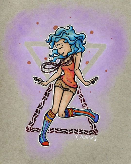
Dancing Beads
I'll be honest with you guys, I've had a rough past couple of days. Heavy anxiety hanging over me like a thick fog, making it difficult to think straight, let alone work. That's why I submitted a WIP shot of this drawing earlier in the week. It was technically finished, but I just didn't have the stamina and focus to get it ready to post on Wednesday, and I pretty much knew that I wouldn't have it in me to make something else new to go up today.
That said, I am feeling a little bit better and I hope that means I'm coming around the bend and will be truly back and ready to rock in another day or so.
In the meantime, let's talk about the artwork, shall we?
This is sort of an extended OOTD (Outfit Of The Day) drawing in a similar vein as this first OOTD drawing I ever did, OOTD: Witch Socks. I say extended and cut "OOTD" out of the title this time because of A. This drawing was done over 2-3 days and B. I obviously was no longer wearing the outfit by the time the drawing was finished. And also, secret reason C. I didn't actually wear this outfit out of the house; I just liked the way the colors worked together and thought it would make for a cute drawing. And honestly, even for someone like me who enjoys dressing eccentrically, I think this would've been a little too far over the edge to wear out and about anyway. (I promise it looks a lot more socially acceptable in the drawing than it did in person)
It's funny though, my last OOTD drawing was heavily inspired by the socks I was wearing that day, which looked like witch boots (hence the title it had), and this time my funky socks are once again a key point, but this piece got named after the pose and a different accessory.
...And I just noticed that this OOTD also has a pose where my head is in-profile facing the left...huh...
Anyway; the key player here is the little plastic shiny red bead necklaces. They aren't much here in the drawing, but they're what set this whole thing in motion. My mom was cleaning out her purse and found them, remembering that she'd meant to give them to me when she initially brought them home from something they did at work, and since I was right there I just slid them on until I could put them away properly. (I have something of a small collection of bead necklaces like this for reasons unbeknownst even to me.) And at some point I was just feeling really good and kind of cute/kooky that day, and that's more or less where the idea to draw my outfit was born.
From there, I'm not really sure where the pose came from other than the very loose/swinging nature of the necklaces and I wanted something fun and dynamic. And I swear I've tried to draw or seen this pose somewhere before, but if I did it must've been something I never posted because I sure can't find it in my gallery. (Although it was at this point that I pretty much knew what the title for this was going to be )
And to be fair, I'm not sure the proportions/anatomy came out exactly right. At first, I thought the legs (or at least the calves) were too short, but then I re-evaluated and decided the arms were too long, so I shortened them and I feel like for the most part that fixed/evened things out. I just really didn't want to have to re-draw the feet because I felt like they (especially the one on the left) came out really good the first time.
Weirdly enough, the hands didn't give me a ton of trouble the second time around, as I worried they might. And I also didn't have that much of a struggle getting the profile of the face right, which is unusual because of all the ways to draw a face, that's usually the one I have the most trouble with. Then again, I guess I shouldn't be that surprised since a while ago when I was last drawing people more consistently I did do more profile faces and hands than usual, but I don't know. It's just kinda weird to not have that much trouble with them when in the past they've been main problem areas for me, at least during the sketching phase.
Either way, as far as the actual drawing part goes, I think the most difficult thing this time was the bodice area because I wanted to get the proportions pleasing to the eye, but the tank top to still have reasonable folds, and the overall flow to work with the rest of the piece. But even that still wasn't too bad. The beads also took a while, since I was indeed fully committed to drawing every individual bead, but that really wasn't difficult, it just required patience.
Little did I know, the difficulties would come in transferring the sketch to where I wanted it.
I think I've gotten my fill of alcohol markers, given three of my most recent drawings were little kitties done almost exclusively in those, and so that combined with just not having done much with colored pencils in general lately (other than as smaller detail things or using water-soluble ones more like paint than pencils), I decided to do a bit of a return-to-form and make use of an extra piece of toned gray paper I've had waiting around to be used since like March, and do some good ol' colored pencil work.
The joke was on me because I was very quickly reminded why I haven't used the gray paper a ton, especially compared to the toned tan paper I have; for reasons I can't figure out, it's incredibly hard to see through the paper to transfer lines, even with my lightbox on the brightest setting!
So after several minutes of disappointed pondering, I dug out a charcoal stick I've had sitting in a "junk" art supply box (of which I have two; they're just boxes where the random stuff I don't really use or reach for very often that I don't have a good way to organize ends up) for the last half of forever and scribbled on the back of where I'd already transferred the lines once onto a regular piece of white paper (having hoped the black ink lines would be easier to see through the gray paper, which they were, but it still wasn't enough) and then used a mechanical pencil with the point shoved in to transfer the lines onto the gray paper.
It's a very round-about way to do it, but it worked.
And I went with the charcoal this time instead of trying the gelato trick that I learned with my Fly By the Moon piece because I thought the gelatos might not work all that great with the colored pencils, and I also thought they might make more of a mess trying to transfer onto regular paper instead of onto canvas. This ended up being a good choice also because the charcoal I was able to mostly erase/lift after I touched up the transfer in a few places and then I went back in with proper ink lines to make sure I wouldn't lose them once I started coloring.
The lines finally taken care of, I could finally get to the fun part: coloring.
And after some behind-the-scenes swatching experiences made them seem better than I had previously remembered, I decided to use my Schpirerr Farben colored pencils. Though I did make the mistake of using my white Prismacolor as a base for the skin.
Not that it was a mistake because a white base wasn't needed (it was, and for everything else I used the white from the Schpirerr Farben set as a base), but because the Prismacolor pencil being wax-based, where the Schpirerr Farbens are oil-based, there was a conflict of texture in the layering. Kind of luckily though, I went too dark with the shading on the skin originally and had to work in more layers to fix that, and in that process, I think I managed to get the texture thing mostly under control.
I did purposely use that in the hair though, since hair normally has...well, you know, noticeable texture.
Otherwise, coloring was a pretty basic colored pencil experience (for me, anyway). I'd put down a base, then the base color, then work on the shading, and as I did certain parts I'd go back and adjust others based on what felt right.
I have to say, I think the main drawback to the Schpirerr Farben pencils is really that they only come in 72 colors. I was able to do some mixing and shading and things to get the colors to where I needed them to be (the purple-y blue and red-orange colors on the socks, in particular, I had to mix to get), but I was really missing the wider selection I get from Prismacolor (150) or the Faber Castell Polychromos (120). Which isn't a huge deal, but it is a point for having multiple sets of pencils (or if you're the brand and not the consumer, making larger sets/adding new colors), even if you're loyal to a particular set/brand. Especially if the pencils play well together; the more you have, the wider color range you have to pick from.
Other than that, I can confirm they do still layer and blend really nicely without much fuss (as had been my impressions back when I first talked about them). They're just soft enough that it always surprises me when I go to add a layer and the color goes on better than I thought it would because I figured I'd reached my limit on layers already.
Considering they've recently branched out and made a watercolor set recently, I'm not sure as to how much stock I should put in Schpirerr Farben possibly returning to their pencils and making more colors...Does the watercolor thing mean they've closed the book on the pencils and want to focus on other supplies now, or does that mean there's hope that they'll continue to innovate on their products, including potential upgrades to the pencils? I'm not sure.
Either way, once I finished coloring the figure in, I went back over the ink lines where I'd gotten colored pencil over them and they'd faded/washed out as a result, and then did the white outline with my white gel pen.
Then I left the drawing alone overnight because it was missing something, but I wasn't sure what and I couldn't think of anything that night.
When I came back to it the next day, I ended up deciding on something slightly complicated; A soft purple PanPastel background with one triangle shape masked/blocked out, and one triangle done in washi tape. This would end up evolving from the second triangle just being bigger to it being a slightly different kind of triangle and going in the opposite direction. And also I changed my mind on which washi tape to use about three different times, finally settling on this metallic-printed on for a little more intrigue when you see the piece IRL. (Even though here on the scan it just looks dark and borderline out of place )
Then to "blend" the metallic into the drawing as a whole better, I added the little dots in the background around the head with a gold shadow gelly roll, since in-person the color looks really close to the metallic print on the tape and the dots kind of tie in the "beads" theme a little better. (Again, this doesn't translate as well into the scan, but I kinda knew that was a risk with both things when I put them down.) And I did go over a few of the beads on the necklaces with the same pen to tie everything all together.
Then I signed it with my white gel pen, and I felt much better about calling it finished.
And you know, it has its flaws and all, but I am pretty happy with how it turned out anyway. It's a little more simple and there's not a ton of deep meaning or impactful influence behind it or anything, it's not terribly experimental, but it's still a fleshed out, polished drawing. And I really enjoy that, as it gave me more room to just kind of hone in on and practice skills I'm already fairly comfortable with, and sometimes that's just what you need in art, you know?
I'm not sure what I'll end up making to post next--I've got some ideas, of course, (never a shortage of those around here ) but I've been a little too muddled to settle on anything just yet, so we'll just have to wait and see. For now, I'm trying to focus more on being gentle with myself until I seem to be back up to snuff to really buckle down on stuff.
____
Artwork © me, MysticSparkleWings
____
Where to find me & my artwork:
My Website | Commission Info + Prices | Ko-Fi | dA Print Shop | RedBubble | Twitter | Tumblr | Instagram
0 notes
Last Seen Blogs

tranthongrealestate
Bất động sản Trần Thông

ccl4l253
Craziest of Cat Ladies

tonight-get-science
Untitled

robiniartaisha
Untitled

miyako47
answers customers