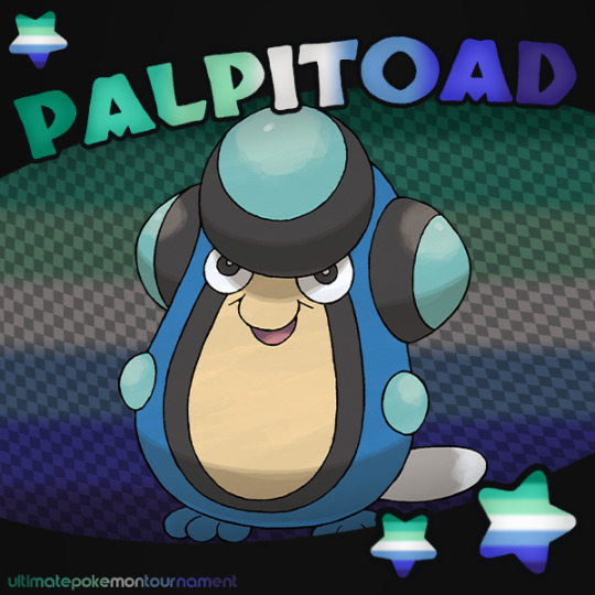
#best underdog that resembles a pride flag
Text
Best Underdog That Resembles a Pride Flag 🏳️🌈🏳️⚧️
Round 1 - Match 13
Our Contestants:
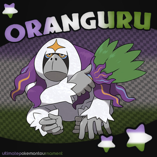

This poll is part of an event that allows the early eliminees from the main tournament have more time in the spotlight!
114 notes
·
View notes
Text
The best and worst olympic logos of all time
Racing around the corner is the 23rd Winter Games of the XXXI Olympiad (which is confusing, but so is curling, so let’s move on). In total, there have been 48 winter and summer Olympic games and an amazing variety of logos to go with them.
As we look ahead to the upcoming Olympic games, what better time to look back on some of the best (and worst) Olympic logos of the past? Here at 99designs, we’re fans of a little friendly competition, and in classic Olympic style, these logos are getting their shot at the gold, the silver or the bronze. Let the games begin!
Best use of the Olympic rings
—
The original interlocking rings logo was designed by Baron Pierre de Coubertin in 1912. Each of the rings represent the five continents: Africa, Asia, America, Australia and Europe (maybe geography wasn’t Coubertin’s strong suit…)
The iconic Olympic flag. ViaWikipedia.
The colors aren’t random, either. According to Coubertin,
“the six colors [including the flag’s white background] combined in this way reproduce the colours of every country without exception. The blue and yellow of Sweden, the blue and white of Greece, the tricolor flags of France, England, the United States, Germany, Belgium, Italy and Hungary, and the yellow and red of Spain are included, as are the innovative flags of Brazil and Australia, and those of ancient Japan and modern China. This, truly, is an international emblem.”
It’s a striking, inclusive design, and it’s no surprise that many host nations have incorporated it into their own Olympiad logos. But some have incorporated it better than others.
Logo for the 1936 Summer Games. Via Wikimedia
Bronze
The minimalist approach might have stuck the landing if not for some serious missteps. First, there’s the fact that the interlocking Rings symbol is squished flat, as if by the weight of the eagle. More importantly, the eagle appears to be dominating the Rings, not merely resting on them.
The spirit of international sport feels subordinated to the host nation. Is it any surprise this was designed in Nazi (Nationalist Socialist) Germany? It’s clear that this logo is not a winner.
Silver
Logo for the 1956 Winter Games. Via Wikimedia
This logo does a much better job incorporating the Olympic rings. They float over the Alps, fitting neatly in the circular emblem for a pleasing composition. The text around the edge reads neatly and clearly, even if you don’t actually know what it says. The edges of the logo—probably meant to suggest a snowflake—is a bit overly complex. It doesn’t quite work with the perfectly circular logo.
Funnily enough, the lack of snow on the depicted mountain was reflected in real life. For the first time in Winter Olympics history, there was not enough snow to ski! The Italian army had to truck it in from other parts of the mountain.
Gold
When it comes to meaningful incorporation of the Olympic rings, the logo of the 1948 Olympics must be the clear winner. There had not been an Olympiad in over a decade, due to a great tragedy for humanity: the Second World War. Bringing back the Olympics in the spirit of human achievement and international friendship was a sign that the world was recovering.
Logo for the 1948 Summer Games. Via Wikimedia
Before the outbreak of war, London had been chosen for the 1944 Olympics. To see the city (here symbolized by Big Ben) was a triumph. But note that the Olympic Rings stand in front of the Houses of Parliament—not beneath it—and the text “XIVth Olympiad” arches over it. The host city is important, but the international community is more important still.
Best use of the Olympic flame
—
The Olympic flame was first used (in the modern era) during the 1928 Olympics. But the tradition of a firery relay, originating in Greece, didn’t begin until the 1936 Olympics. Now it’s as much a part of the Games’ iconography as the Rings.
Logo for the 1956 Summer Games. Via Wikimedia
Bronze
This emblem has a classic feel—a simple border flanked by olive branches of peace.
But the Olympic torch stabbing Melbourne is maybe not the best choice. How big is that torch? Are the Rings floating in the atmosphere? And from a composition standpoint, the need to incorporate the host nation has led to too many competing elements.
Logo for the 1996 Summer Games. Via Wikimedia
Silver
This logo cleverly evokes a grecian column with the Olympic rings and the number 100 (for the 100th anniversary of the modern games.) The flame rising up to become stars is rather confusing; it’s not as if stars are particularly associated with the Games. Still, like gymnastics and figure skating, we’ll give them points for style.
Gold
Sydney’s logo might be my favorite in Olympic history. The bold colors and swooping lines feel energized and exciting. The typography perfectly matches, making the entire logo harmonious.
Logo for the 2000 Summer Games. Via Wikimedia
They even managed to subtly reference the host city by mimicking the shape of the Sydney Opera House in the flame. Perfect score for this logo.
Best use of athletic imagery
—
The Olympic motto, also coined by Rings designer Coubertin, is Citius, Altius, Fortius, which means “Faster, Higher, Stronger.” Celebrating athletic achievement has always been the center of the game. Coubertin expressed it beautifully in his creed: “The most important thing in the Olympic Games is not to win but to take part, just as the most important thing in life is not the triumph but the struggle.”
These logos attempt to realize those ideals by portraying athletes striving to be their best.
Logo for the 2008 Summer Games. Via Wikimedia
Bronze
This emblem is called “Dancing Beijing,” for obvious reasons. It’s a stylized version of the Chinese character jīng, 京, which means “capital” (Beijing being the capital of China). But when you think of the Olympics, do you think of dancing? It’s a great concept for nationalism, but maybe not the best for athletics.
Logo for the 1928 Summer Games. Via Wikimedia
Silver
This more realistic depiction of an athlete fits the style of the time (you probably can’t see the onion on his belt, due to the Dutch flag running across the bottom).
He extends an olive branch as a symbol of peace, an important aspect of the Games in the interwar years. Not sure why his eyes are closed, though. You should look where you’re going when you run.
Gold
The “Snowflower” (so nicknamed because it resembles both a flower and a snowflake) depicts athletes practicing various sports.
Logo for the 1998 Winter Games. Via Wikimedia
The vibrant colors and fluid shapes feel active and energized. The lines draw your eye to the center, as if they’re all coming together, exemplifying the community spirit of the Games.
Best Winter Olympics logos
—
The Winter Olympics are sometimes the forgotten stepchild of the Summer Games. Fewer countries are able to host them, and fewer people watch the broadcasts. But if you learn nothing else from sports: never underestimate the underdog.
Design-wise, the Winter Games use their icy exterior to their advantage—with logos featuring stunning winter iconography. The most popular, of course, is the snowflake, but designers have found many creative ways to make you feel the chill in the best possible way.
Logo for the 1980 Winter Games. Via Wikimedia
Bronze
This mountainous logo goes for the abstract approach while staying recognizable.
The column supporting the Olympic rings doesn’t quite fit (it makes the whole thing look like a rooftop with an unusually large chimney), but the upward movement still feels aspirational and powerful.
Logo for the 1936 Winter Games. Via Wikimedia
Silver
This logo doesn’t go for the easy and obvious snowflake; instead, it gives us a circular badge with an intriguing, abstracted mountain.
We’ve got to take points off for the borderline comic sans typeface, but overall this stylish interpretation of the Garmisch-Partenkirchen Alps invites olympians to conquer their slopes.
Gold
This logo represents a snow crystal and a sun rising over a mountain—all in an abstract, geometric style.
Logo for the 2002 Winter Games. Via Wikimedia
The yellow, orange and blue colors represent the varied Utah landscape, capturing both the essence of its arid host city and that of winter. The end result is a logo that manages to evoke the desert, the mountains, the snow and southwestern art all in one icon.
Best use of patriotic imagery
—
While the Olympics seek to bring the peoples and nations of the world together, the host country can rightfully feel pride in putting on such a complex and elaborate event. Incorporating national symbols, like flags and landmarks, can be effective, so long as it’s tasteful. Remember, the important thing is the world community, not any one nation.
Logo for the 1952 Winter Games. Via Wikimedia
Bronze
The building in the background (resembling a factory) represents the city hall of Oslo, which doesn’t look much better in reality. Why you would put blocky, local government architecture on your symbol of international sportsmanship is beyond me. The fact that it doesn’t mean anything to anyone outside of Oslo doesn’t help. No gold medal for this logo.
Logo for the 1932 Summer Games. Via Wikimedia
Silver
This logo is trying really, really hard.
The Rings are entwined with an olive branch, the Olympic motto on a scroll, all over Captain America’s original shield. It’s very busy and very much of its era, but it still feels appropriately impressive. You can really imagine athletes sweating it out under this emblem.
Gold
This bold design is evocative even without much text. Japan’s red Rising Sun is instantly recognizable over the Olympic Rings.
Logo for the 1964 Summer Games. Via Wikimedia
The solid color makes it feel cohesive, rather than diminishing the Rings’ original color scheme (as with other logos mentioned above). The bold, sans serif font compliments the logo’s striking look.
Best alternative Olympic logo
—
With more than 45 Summer and Winter Games now undergone, it can be difficult to create an original logo utilizing the same old iconography of Rings, Flame and dudes throwing stuff. So these designers have decided to go a different way altogether, using abstract shapes and colors to evoke the Olympic spirit, while still designing something new.
Logo for the 2014 Winter Games. Via Wikimedia
Bronze
A simple wordmark can be a great choice in some cases, but this typeface is just…tacky.
And including a url in your logo is a bit gouche, but making it the entirety of your logo? Come on, guys. If you want to win the Olympic logo games you need to make more of an effort.
Silver
Logo for the 1998 Summer Games. Via Wikimedia
The motto of the 1988 Summer Games was “Harmony and Progress,” and you can see how this logo embodies that. The curved lines make a cohesive composition with the traditional Rings. The fading trail gives a sense of forward movement.
But that progress isn’t in an arbitrary direction: they’re swirling to the center, coming together, just as the athletes do from all over the world.
Gold
This is one of the most active and exciting of all the Olympic logos, like a twirling ribbon or swirling tornado.
Logo for the 2022 Winter Games. Via Wikimedia
Designer Lin Cunzhen says, “The upper part of the emblem resembles a skater and its lower part a skier.” It’s a sleek and festive logo that matches the feeling of the more colorful winter sports. A winner for sure.
A big round of applause for the winners
—
There you go, we’ve crowned our gold medalists in the Olympic logo games. Which ones are your favorites? And which ones should have been disqualified? Let us know in the comments below.
The post The best and worst olympic logos of all time appeared first on 99designs Blog.
via 99designs Blog https://99designs.co.uk/blog/famous-design-en-gb/olympic-logos/
0 notes
Text
The best and worst olympic logos of all time
Racing around the corner is the 23rd Winter Games of the XXXI Olympiad (which is confusing, but so is curling, so let’s move on). In total, there have been 48 winter and summer Olympic games and an amazing variety of logos to go with them.
As we look ahead to the upcoming Olympic games, what better time to look back on some of the best (and worst) Olympic logos of the past? Here at 99designs, we’re fans of a little friendly competition, and in classic Olympic style, these logos are getting their shot at the gold, the silver or the bronze. Let the games begin!
Best use of the Olympic rings
—
The original interlocking rings logo was designed by Baron Pierre de Coubertin in 1912. Each of the rings represent the five continents: Africa, Asia, America, Australia and Europe (maybe geography wasn’t Coubertin’s strong suit…)
The iconic Olympic flag. ViaWikipedia.
The colors aren’t random, either. According to Coubertin,
“the six colors [including the flag’s white background] combined in this way reproduce the colours of every country without exception. The blue and yellow of Sweden, the blue and white of Greece, the tricolor flags of France, England, the United States, Germany, Belgium, Italy and Hungary, and the yellow and red of Spain are included, as are the innovative flags of Brazil and Australia, and those of ancient Japan and modern China. This, truly, is an international emblem.”
It’s a striking, inclusive design, and it’s no surprise that many host nations have incorporated it into their own Olympiad logos. But some have incorporated it better than others.
Logo for the 1936 Summer Games. Via Wikimedia
Bronze
The minimalist approach might have stuck the landing if not for some serious missteps. First, there’s the fact that the interlocking Rings symbol is squished flat, as if by the weight of the eagle. More importantly, the eagle appears to be dominating the Rings, not merely resting on them.
The spirit of international sport feels subordinated to the host nation. Is it any surprise this was designed in Nazi (Nationalist Socialist) Germany? It’s clear that this logo is not a winner.
Silver
Logo for the 1956 Winter Games. Via Wikimedia
This logo does a much better job incorporating the Olympic rings. They float over the Alps, fitting neatly in the circular emblem for a pleasing composition. The text around the edge reads neatly and clearly, even if you don’t actually know what it says. The edges of the logo—probably meant to suggest a snowflake—is a bit overly complex. It doesn’t quite work with the perfectly circular logo.
Funnily enough, the lack of snow on the depicted mountain was reflected in real life. For the first time in Winter Olympics history, there was not enough snow to ski! The Italian army had to truck it in from other parts of the mountain.
Gold
When it comes to meaningful incorporation of the Olympic rings, the logo of the 1948 Olympics must be the clear winner. There had not been an Olympiad in over a decade, due to a great tragedy for humanity: the Second World War. Bringing back the Olympics in the spirit of human achievement and international friendship was a sign that the world was recovering.
Logo for the 1948 Summer Games. Via Wikimedia
Before the outbreak of war, London had been chosen for the 1944 Olympics. To see the city (here symbolized by Big Ben) was a triumph. But note that the Olympic Rings stand in front of the Houses of Parliament—not beneath it—and the text “XIVth Olympiad” arches over it. The host city is important, but the international community is more important still.
Best use of the Olympic flame
—
The Olympic flame was first used (in the modern era) during the 1928 Olympics. But the tradition of a firery relay, originating in Greece, didn’t begin until the 1936 Olympics. Now it’s as much a part of the Games’ iconography as the Rings.
Logo for the 1956 Summer Games. Via Wikimedia
Bronze
This emblem has a classic feel—a simple border flanked by olive branches of peace.
But the Olympic torch stabbing Melbourne is maybe not the best choice. How big is that torch? Are the Rings floating in the atmosphere? And from a composition standpoint, the need to incorporate the host nation has led to too many competing elements.
Logo for the 1996 Summer Games. Via Wikimedia
Silver
This logo cleverly evokes a grecian column with the Olympic rings and the number 100 (for the 100th anniversary of the modern games.) The flame rising up to become stars is rather confusing; it’s not as if stars are particularly associated with the Games. Still, like gymnastics and figure skating, we’ll give them points for style.
Gold
Sydney’s logo might be my favorite in Olympic history. The bold colors and swooping lines feel energized and exciting. The typography perfectly matches, making the entire logo harmonious.
Logo for the 2000 Summer Games. Via Wikimedia
They even managed to subtly reference the host city by mimicking the shape of the Sydney Opera House in the flame. Perfect score for this logo.
Best use of athletic imagery
—
The Olympic motto, also coined by Rings designer Coubertin, is Citius, Altius, Fortius, which means “Faster, Higher, Stronger.” Celebrating athletic achievement has always been the center of the game. Coubertin expressed it beautifully in his creed: “The most important thing in the Olympic Games is not to win but to take part, just as the most important thing in life is not the triumph but the struggle.”
These logos attempt to realize those ideals by portraying athletes striving to be their best.
Logo for the 2008 Summer Games. Via Wikimedia
Bronze
This emblem is called “Dancing Beijing,” for obvious reasons. It’s a stylized version of the Chinese character jīng, 京, which means “capital” (Beijing being the capital of China). But when you think of the Olympics, do you think of dancing? It’s a great concept for nationalism, but maybe not the best for athletics.
Logo for the 1928 Summer Games. Via Wikimedia
Silver
This more realistic depiction of an athlete fits the style of the time (you probably can’t see the onion on his belt, due to the Dutch flag running across the bottom).
He extends an olive branch as a symbol of peace, an important aspect of the Games in the interwar years. Not sure why his eyes are closed, though. You should look where you’re going when you run.
Gold
The “Snowflower” (so nicknamed because it resembles both a flower and a snowflake) depicts athletes practicing various sports.
Logo for the 1998 Winter Games. Via Wikimedia
The vibrant colors and fluid shapes feel active and energized. The lines draw your eye to the center, as if they’re all coming together, exemplifying the community spirit of the Games.
Best Winter Olympics logos
—
The Winter Olympics are sometimes the forgotten stepchild of the Summer Games. Fewer countries are able to host them, and fewer people watch the broadcasts. But if you learn nothing else from sports: never underestimate the underdog.
Design-wise, the Winter Games use their icy exterior to their advantage—with logos featuring stunning winter iconography. The most popular, of course, is the snowflake, but designers have found many creative ways to make you feel the chill in the best possible way.
Logo for the 1980 Winter Games. Via Wikimedia
Bronze
This mountainous logo goes for the abstract approach while staying recognizable.
The column supporting the Olympic rings doesn’t quite fit (it makes the whole thing look like a rooftop with an unusually large chimney), but the upward movement still feels aspirational and powerful.
Logo for the 1936 Winter Games. Via Wikimedia
Silver
This logo doesn’t go for the easy and obvious snowflake; instead, it gives us a circular badge with an intriguing, abstracted mountain.
We’ve got to take points off for the borderline comic sans typeface, but overall this stylish interpretation of the Garmisch-Partenkirchen Alps invites olympians to conquer their slopes.
Gold
This logo represents a snow crystal and a sun rising over a mountain—all in an abstract, geometric style.
Logo for the 2002 Winter Games. Via Wikimedia
The yellow, orange and blue colors represent the varied Utah landscape, capturing both the essence of its arid host city and that of winter. The end result is a logo that manages to evoke the desert, the mountains, the snow and southwestern art all in one icon.
Best use of patriotic imagery
—
While the Olympics seek to bring the peoples and nations of the world together, the host country can rightfully feel pride in putting on such a complex and elaborate event. Incorporating national symbols, like flags and landmarks, can be effective, so long as it’s tasteful. Remember, the important thing is the world community, not any one nation.
Logo for the 1952 Winter Games. Via Wikimedia
Bronze
The building in the background (resembling a factory) represents the city hall of Oslo, which doesn’t look much better in reality. Why you would put blocky, local government architecture on your symbol of international sportsmanship is beyond me. The fact that it doesn’t mean anything to anyone outside of Oslo doesn’t help. No gold medal for this logo.
Logo for the 1932 Summer Games. Via Wikimedia
Silver
This logo is trying really, really hard.
The Rings are entwined with an olive branch, the Olympic motto on a scroll, all over Captain America’s original shield. It’s very busy and very much of its era, but it still feels appropriately impressive. You can really imagine athletes sweating it out under this emblem.
Gold
This bold design is evocative even without much text. Japan’s red Rising Sun is instantly recognizable over the Olympic Rings.
Logo for the 1964 Summer Games. Via Wikimedia
The solid color makes it feel cohesive, rather than diminishing the Rings’ original color scheme (as with other logos mentioned above). The bold, sans serif font compliments the logo’s striking look.
Best alternative Olympic logo
—
With more than 45 Summer and Winter Games now undergone, it can be difficult to create an original logo utilizing the same old iconography of Rings, Flame and dudes throwing stuff. So these designers have decided to go a different way altogether, using abstract shapes and colors to evoke the Olympic spirit, while still designing something new.
Logo for the 2014 Winter Games. Via Wikimedia
Bronze
A simple wordmark can be a great choice in some cases, but this typeface is just…tacky.
And including a url in your logo is a bit gouche, but making it the entirety of your logo? Come on, guys. If you want to win the Olympic logo games you need to make more of an effort.
Silver
Logo for the 1998 Summer Games. Via Wikimedia
The motto of the 1988 Summer Games was “Harmony and Progress,” and you can see how this logo embodies that. The curved lines make a cohesive composition with the traditional Rings. The fading trail gives a sense of forward movement.
But that progress isn’t in an arbitrary direction: they’re swirling to the center, coming together, just as the athletes do from all over the world.
Gold
This is one of the most active and exciting of all the Olympic logos, like a twirling ribbon or swirling tornado.
Logo for the 2022 Winter Games. Via Wikimedia
Designer Lin Cunzhen says, “The upper part of the emblem resembles a skater and its lower part a skier.” It’s a sleek and festive logo that matches the feeling of the more colorful winter sports. A winner for sure.
A big round of applause for the winners
—
There you go, we’ve crowned our gold medalists in the Olympic logo games. Which ones are your favorites? And which ones should have been disqualified? Let us know in the comments below.
The post The best and worst olympic logos of all time appeared first on 99designs Blog.
The best and worst olympic logos of all time syndicated from https://www.lilpackaging.com/
0 notes
Text
The best and worst olympic logos of all time
Racing around the corner is the 23rd Winter Games of the XXXI Olympiad (which is confusing, but so is curling, so let’s move on). In total, there have been 48 winter and summer Olympic games and an amazing variety of logos to go with them.
As we look ahead to the upcoming Olympic games, what better time to look back on some of the best (and worst) Olympic logos of the past? Here at 99designs, we’re fans of a little friendly competition, and in classic Olympic style, these logos are getting their shot at the gold, the silver or the bronze. Let the games begin!
Best use of the Olympic rings
—
The original interlocking rings logo was designed by Baron Pierre de Coubertin in 1912. Each of the rings represent the five continents: Africa, Asia, America, Australia and Europe (maybe geography wasn’t Coubertin’s strong suit…)
The iconic Olympic flag. ViaWikipedia.
The colors aren’t random, either. According to Coubertin,
“the six colors [including the flag’s white background] combined in this way reproduce the colours of every country without exception. The blue and yellow of Sweden, the blue and white of Greece, the tricolor flags of France, England, the United States, Germany, Belgium, Italy and Hungary, and the yellow and red of Spain are included, as are the innovative flags of Brazil and Australia, and those of ancient Japan and modern China. This, truly, is an international emblem.”
It’s a striking, inclusive design, and it’s no surprise that many host nations have incorporated it into their own Olympiad logos. But some have incorporated it better than others.
Logo for the 1936 Summer Games. Via Wikimedia
Bronze
The minimalist approach might have stuck the landing if not for some serious missteps. First, there’s the fact that the interlocking Rings symbol is squished flat, as if by the weight of the eagle. More importantly, the eagle appears to be dominating the Rings, not merely resting on them.
The spirit of international sport feels subordinated to the host nation. Is it any surprise this was designed in Nazi (Nationalist Socialist) Germany? It’s clear that this logo is not a winner.
Silver
Logo for the 1956 Winter Games. Via Wikimedia
This logo does a much better job incorporating the Olympic rings. They float over the Alps, fitting neatly in the circular emblem for a pleasing composition. The text around the edge reads neatly and clearly, even if you don’t actually know what it says. The edges of the logo—probably meant to suggest a snowflake—is a bit overly complex. It doesn’t quite work with the perfectly circular logo.
Funnily enough, the lack of snow on the depicted mountain was reflected in real life. For the first time in Winter Olympics history, there was not enough snow to ski! The Italian army had to truck it in from other parts of the mountain.
Gold
When it comes to meaningful incorporation of the Olympic rings, the logo of the 1948 Olympics must be the clear winner. There had not been an Olympiad in over a decade, due to a great tragedy for humanity: the Second World War. Bringing back the Olympics in the spirit of human achievement and international friendship was a sign that the world was recovering.
Logo for the 1948 Summer Games. Via Wikimedia
Before the outbreak of war, London had been chosen for the 1944 Olympics. To see the city (here symbolized by Big Ben) was a triumph. But note that the Olympic Rings stand in front of the Houses of Parliament—not beneath it—and the text “XIVth Olympiad” arches over it. The host city is important, but the international community is more important still.
Best use of the Olympic flame
—
The Olympic flame was first used (in the modern era) during the 1928 Olympics. But the tradition of a firery relay, originating in Greece, didn’t begin until the 1936 Olympics. Now it’s as much a part of the Games’ iconography as the Rings.
Logo for the 1956 Summer Games. Via Wikimedia
Bronze
This emblem has a classic feel—a simple border flanked by olive branches of peace.
But the Olympic torch stabbing Melbourne is maybe not the best choice. How big is that torch? Are the Rings floating in the atmosphere? And from a composition standpoint, the need to incorporate the host nation has led to too many competing elements.
Logo for the 1996 Summer Games. Via Wikimedia
Silver
This logo cleverly evokes a grecian column with the Olympic rings and the number 100 (for the 100th anniversary of the modern games.) The flame rising up to become stars is rather confusing; it’s not as if stars are particularly associated with the Games. Still, like gymnastics and figure skating, we’ll give them points for style.
Gold
Sydney’s logo might be my favorite in Olympic history. The bold colors and swooping lines feel energized and exciting. The typography perfectly matches, making the entire logo harmonious.
Logo for the 2000 Summer Games. Via Wikimedia
They even managed to subtly reference the host city by mimicking the shape of the Sydney Opera House in the flame. Perfect score for this logo.
Best use of athletic imagery
—
The Olympic motto, also coined by Rings designer Coubertin, is Citius, Altius, Fortius, which means “Faster, Higher, Stronger.” Celebrating athletic achievement has always been the center of the game. Coubertin expressed it beautifully in his creed: “The most important thing in the Olympic Games is not to win but to take part, just as the most important thing in life is not the triumph but the struggle.”
These logos attempt to realize those ideals by portraying athletes striving to be their best.
Logo for the 2008 Summer Games. Via Wikimedia
Bronze
This emblem is called “Dancing Beijing,” for obvious reasons. It’s a stylized version of the Chinese character jīng, 京, which means “capital” (Beijing being the capital of China). But when you think of the Olympics, do you think of dancing? It’s a great concept for nationalism, but maybe not the best for athletics.
Logo for the 1928 Summer Games. Via Wikimedia
Silver
This more realistic depiction of an athlete fits the style of the time (you probably can’t see the onion on his belt, due to the Dutch flag running across the bottom).
He extends an olive branch as a symbol of peace, an important aspect of the Games in the interwar years. Not sure why his eyes are closed, though. You should look where you’re going when you run.
Gold
The “Snowflower” (so nicknamed because it resembles both a flower and a snowflake) depicts athletes practicing various sports.
Logo for the 1998 Winter Games. Via Wikimedia
The vibrant colors and fluid shapes feel active and energized. The lines draw your eye to the center, as if they’re all coming together, exemplifying the community spirit of the Games.
Best Winter Olympics logos
—
The Winter Olympics are sometimes the forgotten stepchild of the Summer Games. Fewer countries are able to host them, and fewer people watch the broadcasts. But if you learn nothing else from sports: never underestimate the underdog.
Design-wise, the Winter Games use their icy exterior to their advantage—with logos featuring stunning winter iconography. The most popular, of course, is the snowflake, but designers have found many creative ways to make you feel the chill in the best possible way.
Logo for the 1980 Winter Games. Via Wikimedia
Bronze
This mountainous logo goes for the abstract approach while staying recognizable.
The column supporting the Olympic rings doesn’t quite fit (it makes the whole thing look like a rooftop with an unusually large chimney), but the upward movement still feels aspirational and powerful.
Logo for the 1936 Winter Games. Via Wikimedia
Silver
This logo doesn’t go for the easy and obvious snowflake; instead, it gives us a circular badge with an intriguing, abstracted mountain.
We’ve got to take points off for the borderline comic sans typeface, but overall this stylish interpretation of the Garmisch-Partenkirchen Alps invites olympians to conquer their slopes.
Gold
This logo represents a snow crystal and a sun rising over a mountain—all in an abstract, geometric style.
Logo for the 2002 Winter Games. Via Wikimedia
The yellow, orange and blue colors represent the varied Utah landscape, capturing both the essence of its arid host city and that of winter. The end result is a logo that manages to evoke the desert, the mountains, the snow and southwestern art all in one icon.
Best use of patriotic imagery
—
While the Olympics seek to bring the peoples and nations of the world together, the host country can rightfully feel pride in putting on such a complex and elaborate event. Incorporating national symbols, like flags and landmarks, can be effective, so long as it’s tasteful. Remember, the important thing is the world community, not any one nation.
Logo for the 1952 Winter Games. Via Wikimedia
Bronze
The building in the background (resembling a factory) represents the city hall of Oslo, which doesn’t look much better in reality. Why you would put blocky, local government architecture on your symbol of international sportsmanship is beyond me. The fact that it doesn’t mean anything to anyone outside of Oslo doesn’t help. No gold medal for this logo.
Logo for the 1932 Summer Games. Via Wikimedia
Silver
This logo is trying really, really hard.
The Rings are entwined with an olive branch, the Olympic motto on a scroll, all over Captain America’s original shield. It’s very busy and very much of its era, but it still feels appropriately impressive. You can really imagine athletes sweating it out under this emblem.
Gold
This bold design is evocative even without much text. Japan’s red Rising Sun is instantly recognizable over the Olympic Rings.
Logo for the 1964 Summer Games. Via Wikimedia
The solid color makes it feel cohesive, rather than diminishing the Rings’ original color scheme (as with other logos mentioned above). The bold, sans serif font compliments the logo’s striking look.
Best alternative Olympic logo
—
With more than 45 Summer and Winter Games now undergone, it can be difficult to create an original logo utilizing the same old iconography of Rings, Flame and dudes throwing stuff. So these designers have decided to go a different way altogether, using abstract shapes and colors to evoke the Olympic spirit, while still designing something new.
Logo for the 2014 Winter Games. Via Wikimedia
Bronze
A simple wordmark can be a great choice in some cases, but this typeface is just…tacky.
And including a url in your logo is a bit gouche, but making it the entirety of your logo? Come on, guys. If you want to win the Olympic logo games you need to make more of an effort.
Silver
Logo for the 1998 Summer Games. Via Wikimedia
The motto of the 1988 Summer Games was “Harmony and Progress,” and you can see how this logo embodies that. The curved lines make a cohesive composition with the traditional Rings. The fading trail gives a sense of forward movement.
But that progress isn’t in an arbitrary direction: they’re swirling to the center, coming together, just as the athletes do from all over the world.
Gold
This is one of the most active and exciting of all the Olympic logos, like a twirling ribbon or swirling tornado.
Logo for the 2022 Winter Games. Via Wikimedia
Designer Lin Cunzhen says, “The upper part of the emblem resembles a skater and its lower part a skier.” It’s a sleek and festive logo that matches the feeling of the more colorful winter sports. A winner for sure.
A big round of applause for the winners
—
There you go, we’ve crowned our gold medalists in the Olympic logo games. Which ones are your favorites? And which ones should have been disqualified? Let us know in the comments below.
The post The best and worst olympic logos of all time appeared first on 99designs Blog.
The best and worst olympic logos of all time published first on https://www.lilpackaging.com/
0 notes
Text
The best and worst olympic logos of all time
Racing around the corner is the 23rd Winter Games of the XXXI Olympiad (which is confusing, but so is curling, so let’s move on). In total, there have been 48 winter and summer Olympic games and an amazing variety of logos to go with them.
As we look ahead to the upcoming Olympic games, what better time to look back on some of the best (and worst) Olympic logos of the past? Here at 99designs, we’re fans of a little friendly competition, and in classic Olympic style, these logos are getting their shot at the gold, the silver or the bronze. Let the games begin!
Best use of the Olympic rings
—
The original interlocking rings logo was designed by Baron Pierre de Coubertin in 1912. Each of the rings represent the five continents: Africa, Asia, America, Australia and Europe (maybe geography wasn’t Coubertin’s strong suit…)
The iconic Olympic flag. ViaWikipedia.
The colors aren’t random, either. According to Coubertin,
“the six colors [including the flag’s white background] combined in this way reproduce the colours of every country without exception. The blue and yellow of Sweden, the blue and white of Greece, the tricolor flags of France, England, the United States, Germany, Belgium, Italy and Hungary, and the yellow and red of Spain are included, as are the innovative flags of Brazil and Australia, and those of ancient Japan and modern China. This, truly, is an international emblem.”
It’s a striking, inclusive design, and it’s no surprise that many host nations have incorporated it into their own Olympiad logos. But some have incorporated it better than others.
Logo for the 1936 Summer Games. Via Wikimedia
Bronze
The minimalist approach might have stuck the landing if not for some serious missteps. First, there’s the fact that the interlocking Rings symbol is squished flat, as if by the weight of the eagle. More importantly, the eagle appears to be dominating the Rings, not merely resting on them.
The spirit of international sport feels subordinated to the host nation. Is it any surprise this was designed in Nazi (Nationalist Socialist) Germany? It’s clear that this logo is not a winner.
Silver
Logo for the 1956 Winter Games. Via Wikimedia
This logo does a much better job incorporating the Olympic rings. They float over the Alps, fitting neatly in the circular emblem for a pleasing composition. The text around the edge reads neatly and clearly, even if you don’t actually know what it says. The edges of the logo—probably meant to suggest a snowflake—is a bit overly complex. It doesn’t quite work with the perfectly circular logo.
Funnily enough, the lack of snow on the depicted mountain was reflected in real life. For the first time in Winter Olympics history, there was not enough snow to ski! The Italian army had to truck it in from other parts of the mountain.
Gold
When it comes to meaningful incorporation of the Olympic rings, the logo of the 1948 Olympics must be the clear winner. There had not been an Olympiad in over a decade, due to a great tragedy for humanity: the Second World War. Bringing back the Olympics in the spirit of human achievement and international friendship was a sign that the world was recovering.
Logo for the 1948 Summer Games. Via Wikimedia
Before the outbreak of war, London had been chosen for the 1944 Olympics. To see the city (here symbolized by Big Ben) was a triumph. But note that the Olympic Rings stand in front of the Houses of Parliament—not beneath it—and the text “XIVth Olympiad” arches over it. The host city is important, but the international community is more important still.
Best use of the Olympic flame
—
The Olympic flame was first used (in the modern era) during the 1928 Olympics. But the tradition of a firery relay, originating in Greece, didn’t begin until the 1936 Olympics. Now it’s as much a part of the Games’ iconography as the Rings.
Logo for the 1956 Summer Games. Via Wikimedia
Bronze
This emblem has a classic feel—a simple border flanked by olive branches of peace.
But the Olympic torch stabbing Melbourne is maybe not the best choice. How big is that torch? Are the Rings floating in the atmosphere? And from a composition standpoint, the need to incorporate the host nation has led to too many competing elements.
Logo for the 1996 Summer Games. Via Wikimedia
Silver
This logo cleverly evokes a grecian column with the Olympic rings and the number 100 (for the 100th anniversary of the modern games.) The flame rising up to become stars is rather confusing; it’s not as if stars are particularly associated with the Games. Still, like gymnastics and figure skating, we’ll give them points for style.
Gold
Sydney’s logo might be my favorite in Olympic history. The bold colors and swooping lines feel energized and exciting. The typography perfectly matches, making the entire logo harmonious.
Logo for the 2000 Summer Games. Via Wikimedia
They even managed to subtly reference the host city by mimicking the shape of the Sydney Opera House in the flame. Perfect score for this logo.
Best use of athletic imagery
—
The Olympic motto, also coined by Rings designer Coubertin, is Citius, Altius, Fortius, which means “Faster, Higher, Stronger.” Celebrating athletic achievement has always been the center of the game. Coubertin expressed it beautifully in his creed: “The most important thing in the Olympic Games is not to win but to take part, just as the most important thing in life is not the triumph but the struggle.”
These logos attempt to realize those ideals by portraying athletes striving to be their best.
Logo for the 2008 Summer Games. Via Wikimedia
Bronze
This emblem is called “Dancing Beijing,” for obvious reasons. It’s a stylized version of the Chinese character jīng, 京, which means “capital” (Beijing being the capital of China). But when you think of the Olympics, do you think of dancing? It’s a great concept for nationalism, but maybe not the best for athletics.
Logo for the 1928 Summer Games. Via Wikimedia
Silver
This more realistic depiction of an athlete fits the style of the time (you probably can’t see the onion on his belt, due to the Dutch flag running across the bottom).
He extends an olive branch as a symbol of peace, an important aspect of the Games in the interwar years. Not sure why his eyes are closed, though. You should look where you’re going when you run.
Gold
The “Snowflower” (so nicknamed because it resembles both a flower and a snowflake) depicts athletes practicing various sports.
Logo for the 1998 Winter Games. Via Wikimedia
The vibrant colors and fluid shapes feel active and energized. The lines draw your eye to the center, as if they’re all coming together, exemplifying the community spirit of the Games.
Best Winter Olympics logos
—
The Winter Olympics are sometimes the forgotten stepchild of the Summer Games. Fewer countries are able to host them, and fewer people watch the broadcasts. But if you learn nothing else from sports: never underestimate the underdog.
Design-wise, the Winter Games use their icy exterior to their advantage—with logos featuring stunning winter iconography. The most popular, of course, is the snowflake, but designers have found many creative ways to make you feel the chill in the best possible way.
Logo for the 1980 Winter Games. Via Wikimedia
Bronze
This mountainous logo goes for the abstract approach while staying recognizable.
The column supporting the Olympic rings doesn’t quite fit (it makes the whole thing look like a rooftop with an unusually large chimney), but the upward movement still feels aspirational and powerful.
Logo for the 1936 Winter Games. Via Wikimedia
Silver
This logo doesn’t go for the easy and obvious snowflake; instead, it gives us a circular badge with an intriguing, abstracted mountain.
We’ve got to take points off for the borderline comic sans typeface, but overall this stylish interpretation of the Garmisch-Partenkirchen Alps invites olympians to conquer their slopes.
Gold
This logo represents a snow crystal and a sun rising over a mountain—all in an abstract, geometric style.
Logo for the 2002 Winter Games. Via Wikimedia
The yellow, orange and blue colors represent the varied Utah landscape, capturing both the essence of its arid host city and that of winter. The end result is a logo that manages to evoke the desert, the mountains, the snow and southwestern art all in one icon.
Best use of patriotic imagery
—
While the Olympics seek to bring the peoples and nations of the world together, the host country can rightfully feel pride in putting on such a complex and elaborate event. Incorporating national symbols, like flags and landmarks, can be effective, so long as it’s tasteful. Remember, the important thing is the world community, not any one nation.
Logo for the 1952 Winter Games. Via Wikimedia
Bronze
The building in the background (resembling a factory) represents the city hall of Oslo, which doesn’t look much better in reality. Why you would put blocky, local government architecture on your symbol of international sportsmanship is beyond me. The fact that it doesn’t mean anything to anyone outside of Oslo doesn’t help. No gold medal for this logo.
Logo for the 1932 Summer Games. Via Wikimedia
Silver
This logo is trying really, really hard.
The Rings are entwined with an olive branch, the Olympic motto on a scroll, all over Captain America’s original shield. It’s very busy and very much of its era, but it still feels appropriately impressive. You can really imagine athletes sweating it out under this emblem.
Gold
This bold design is evocative even without much text. Japan’s red Rising Sun is instantly recognizable over the Olympic Rings.
Logo for the 1964 Summer Games. Via Wikimedia
The solid color makes it feel cohesive, rather than diminishing the Rings’ original color scheme (as with other logos mentioned above). The bold, sans serif font compliments the logo’s striking look.
Best alternative Olympic logo
—
With more than 45 Summer and Winter Games now undergone, it can be difficult to create an original logo utilizing the same old iconography of Rings, Flame and dudes throwing stuff. So these designers have decided to go a different way altogether, using abstract shapes and colors to evoke the Olympic spirit, while still designing something new.
Logo for the 2014 Winter Games. Via Wikimedia
Bronze
A simple wordmark can be a great choice in some cases, but this typeface is just…tacky.
And including a url in your logo is a bit gouche, but making it the entirety of your logo? Come on, guys. If you want to win the Olympic logo games you need to make more of an effort.
Silver
Logo for the 1998 Summer Games. Via Wikimedia
The motto of the 1988 Summer Games was “Harmony and Progress,” and you can see how this logo embodies that. The curved lines make a cohesive composition with the traditional Rings. The fading trail gives a sense of forward movement.
But that progress isn’t in an arbitrary direction: they’re swirling to the center, coming together, just as the athletes do from all over the world.
Gold
This is one of the most active and exciting of all the Olympic logos, like a twirling ribbon or swirling tornado.
Logo for the 2022 Winter Games. Via Wikimedia
Designer Lin Cunzhen says, “The upper part of the emblem resembles a skater and its lower part a skier.” It’s a sleek and festive logo that matches the feeling of the more colorful winter sports. A winner for sure.
A big round of applause for the winners
—
There you go, we’ve crowned our gold medalists in the Olympic logo games. Which ones are your favorites? And which ones should have been disqualified? Let us know in the comments below.
The post The best and worst olympic logos of all time appeared first on 99designs Blog.
0 notes
Text
Best Underdog That Resembles a Pride Flag 🏳️🌈🏳️⚧️
Round 1 - Match 1
Our Contestants:
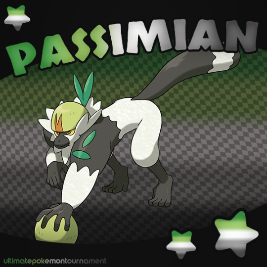

This poll is part of an event that allows the early eliminees from the main tournament have more time in the spotlight!
#uptunderdogtournament#pokemon#polls#best underdog that resembles a pride flag#passimian#iron hands#gen 9
56 notes
·
View notes
Text
Best Underdog That Resembles a Pride Flag 🏳️🌈🏳️⚧️
Round 1 - Match 18
Our Contestants:
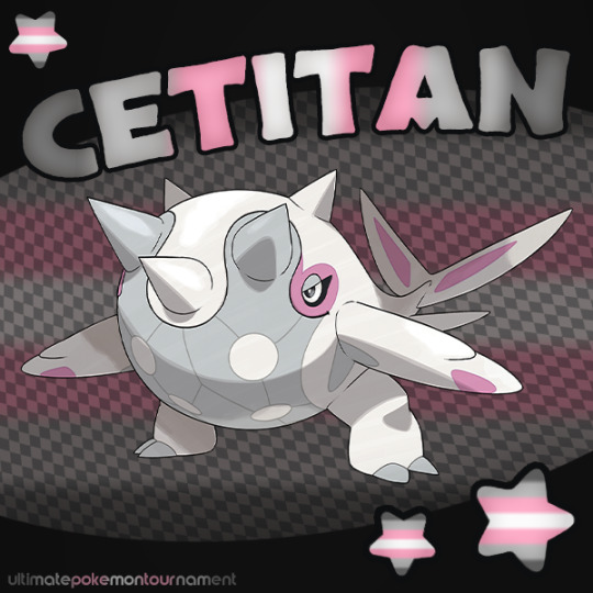

This poll is part of an event that allows the early eliminees from the main tournament have more time in the spotlight!
#uptunderdogtournament#pokemon#polls#best underdog that resembles a pride flag#cetitan#vullaby#gen 9
51 notes
·
View notes
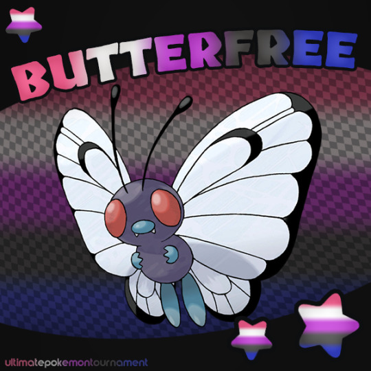
Text
Best Underdog That Resembles a Pride Flag 🏳️🌈🏳️⚧️
Round 1 - Match 3
Our Contestants:


This poll is part of an event that allows the early eliminees from the main tournament have more time in the spotlight!
38 notes
·
View notes
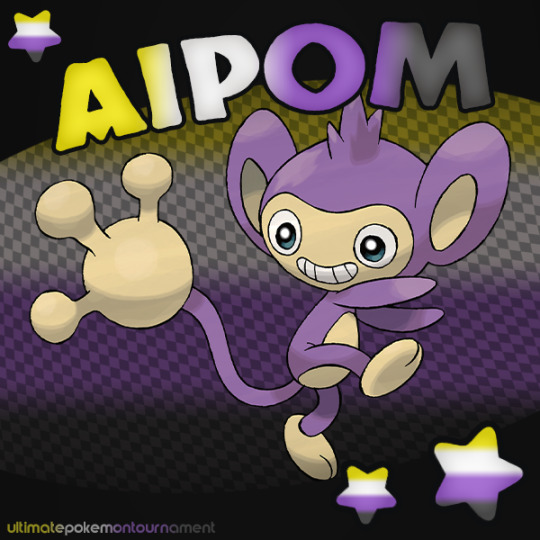
Text
Best Underdog That Resembles a Pride Flag 🏳️🌈🏳️⚧️
Round 1 - Match 2
Our Contestants:

This poll is part of an event that allows the early eliminees from the main tournament have more time in the spotlight!
35 notes
·
View notes
Text
Best Underdog That Resembles a Pride Flag 🏳️🌈🏳️⚧️
Round 1 - Match 29
Our Contestants:


This poll is part of an event that allows the early eliminees from the main tournament have more time in the spotlight!
20 notes
·
View notes
Text
Best Underdog That Resembles a Pride Flag 🏳️🌈🏳️⚧️
Round 1 - Match 15
Our Contestants:

This poll is part of an event that allows the early eliminees from the main tournament have more time in the spotlight!
28 notes
·
View notes
Text
Best Underdog That Resembles a Pride Flag 🏳️🌈🏳️⚧️
Round 1 - Match 14
Our Contestants:
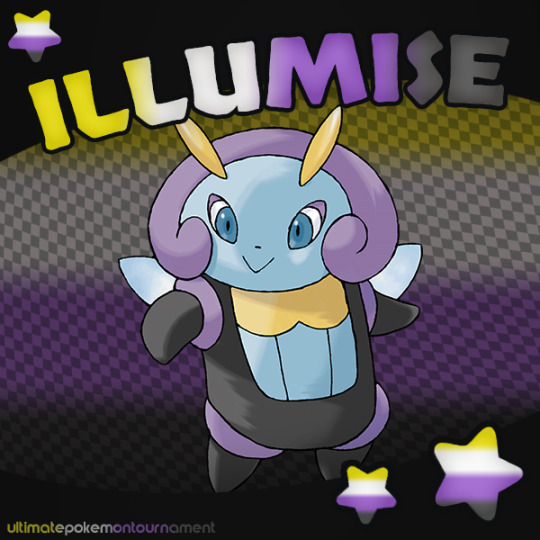
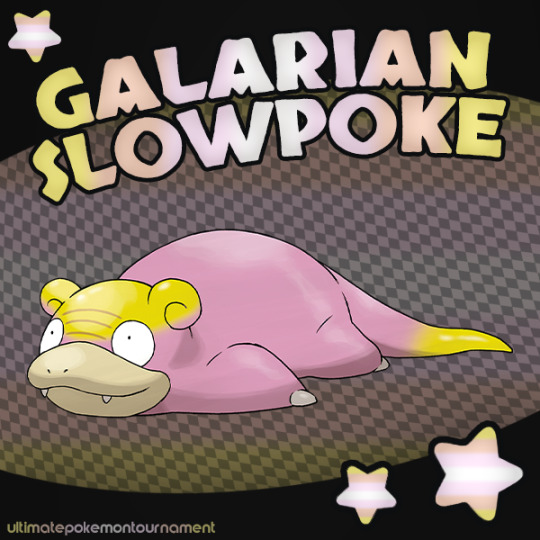
This poll is part of an event that allows the early eliminees from the main tournament have more time in the spotlight!
#uptunderdogtournament#pokemon#polls#best underdog that resembles a pride flag#illumise#galarian slowpoke#gen 8
23 notes
·
View notes
Text
Best Underdog That Resembles a Pride Flag 🏳️🌈🏳️⚧️
Round 1 - Match 30
Our Contestants:

This poll is part of an event that allows the early eliminees from the main tournament have more time in the spotlight!
19 notes
·
View notes
Text
Best Underdog That Resembles a Pride Flag 🏳️🌈🏳️⚧️
Round 1 - Match 26
Our Contestants:

This poll is part of an event that allows the early eliminees from the main tournament have more time in the spotlight!
19 notes
·
View notes
Text
Best Underdog That Resembles a Pride Flag 🏳️🌈🏳️⚧️
Round 1 - Match 22
Our Contestants:
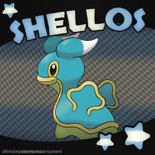
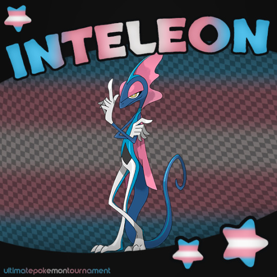
This poll is part of an event that allows the early eliminees from the main tournament have more time in the spotlight!
#uptunderdogtournament#pokemon#polls#best underdog that resembles a pride flag#shellos#inteleon#gen 8
23 notes
·
View notes
Text
Best Underdog That Resembles a Pride Flag 🏳️🌈🏳️⚧️
Round 1 - Match 21
Our Contestants:

This poll is part of an event that allows the early eliminees from the main tournament have more time in the spotlight!
20 notes
·
View notes
Last Seen Blogs

sidlow
Untitled
escritanacidade
Escrita na Cidade

masterliszt
Fishing Traveler

https-f4iryone
𝖪𝗂𝗍𝗍𝗒 𝗀𝗂𝗋𝗅

fataledame
Natasha Romanoff.