#because i was colorpicking directly from the source
Note
can i ask for more dragon pearl?
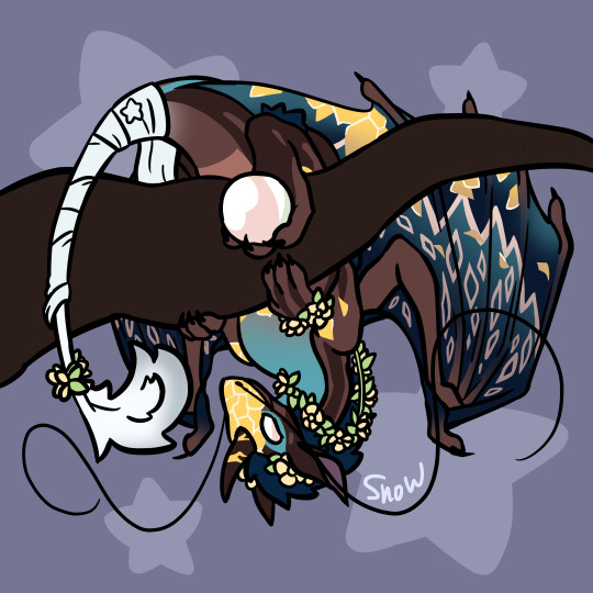
Day 59
Today's Pearl design is by @incorrect-hermits, or @snowstorm174!
I've been wanting to draw a Pearlcatcher Pearl for a while now, but didn't have a design because I dont play Flight Rising nor am I good at those kinds of designs, but Snow has a design and a project for Pearl already! She is absolutely gorgeous.
#daily pearl doodles#pearlescentmoon#flight rising#ig lol#this really brought me back to like three years ago#when i was doing a lot of sylestia commishes and requests#since i was doing them real fast#(and also i was not as good in art lol)#i generally didnt do shading#or i did the airbrush shading that looks bad#so it gets very busy and kinda wild#and im feeling the same vibe for this art lmao#like really bold colors and the thick lineart doesnt make it any better#because i was colorpicking directly from the source#i did have a lot of fun with this tho#mod morph#moons from other planets
198 notes
·
View notes
Text
honestly heres my little hot take but i dont like those palette challenges and request games. i think that too often artists will just colorpick directly from the palettes given and the resulting art feels flat and unfinished. i think that when using those palette challenges you should at least try playing around with those colors a bit more.
like okay. this one i pulled randomly off of pinterest for example (BY THE WAY. FOUND THE SOURCE. its striped-tie on dA as far as i can tell) :

great groups of colors. lots of variety. but what happens when we turn the saturation all the way down and we look at the VALUES of the colors:

you have to understand that this does not apply to every palette challenge, nor does this critique apply to every palette within this one challenge. but notice how so many of these are either only lights, or only mid tones, or only darks?
your art needs (READ: subjectively, though quite often) highlights, lowlights, AND mid tones. it helps draw attention to where the viewers eye should be looking. and when every tone is right around the same light level, this makes it hard for the viewer to distinguish where in the piece they need to look and what is considered most important.
however, what looking at these palettes in black and white removes is the way colors can act as focal points, and i'm aware of that. so let's look at one from this list that does this effectively. sorry for the quality here lol.

so this is a palette i think does a good job. we can look at it in black and white as well to check for the values:
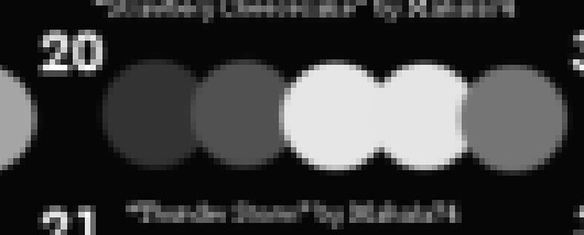
you will notice how this palette has a dark tone, a darker mid tone, a lighter mid tone, and two highlights. within these highlights, the yellow stands out dramatically. this is a great way to practice color, lighting, and how using blue hued grays and one warm hue can create an interesting and contrasting color composition.
i don't know, i really just wish when artists used these palettes that they played around more with the colors in those palettes themselves, because sometimes i see artists who are INCREDIBLY SKILLED with drawing fumble when grabbing these because they dont quite understand color theory and how it works.
POST NOTICE: personal opinion on palettes and color theory. if you enjoy using these and you find them helpful to you then go for it. this post is not crafted with intent to blow up, this post is made for me to ramble about palettes and thus the argument is not very strong because it has not been proofread more than once.
33 notes
·
View notes
Last Seen Blogs

getanews
Get A News

scottsdalehappyhours
Scottsdale Happy Hours

flawlesscraftsindia
Flawless Crafts

sdn-5-masbagik-utara-blog
Mas Didot

mrsr77
Entdeckungsreise