#and regarding colour palettes and such i find this combination more appealing to my eyes
Text
Ok we all know that Chilchuck's type is blondes but if you take this design as his wife (it hasn't been confirmed but it would make sense)
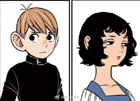
and if you ship him with Senshi

then you end up with some very funny but interesting thoughts about his tastes.
#I AM THE ONLY ONE WHO SEES THE SIMILARITIES#chilchuck is literally the sexist stereotype of wanting blondes for hook up and brunettes for commitment#this tag is for a joke ok#BUT LOOK AT HIM#chilchuck looks at black curly hair and goes yep i am gonna get attached to you#and regarding colour palettes and such i find this combination more appealing to my eyes#dungeon meshi#chilsi
28 notes
·
View notes
Text
Giving Instructions
I chose to make an illustration on the category “getting to my house”. Ironically I got a bit lost with this exercise, it was the first project somewhat similar to the representative illustrations of the last course section, so I was a little overwhelmed trying to apply advice from my tutor feedback along with deciphering the instructions. I have a slightly different way of interpreting language than others since I’m on the autistic and adhd spectrum so one of the key challenges of a distance learning course is making sure I’m reading the instructions properly and staying focused on the brief instead of getting kind of carried away in other directions that I might find more immediately rewarding. So because I can find it hard to follow instructions, a task about giving instructions with as few words as possible was tricky! Balancing informative and aesthetic interests was challenging too, since if I was looking for directions I’d find the clearest map possible. Similarly as someone who plays musical instruments, it’s easiest to learn music from sheet music...and making a cup of tea is such a basic thing I don’t know why you’d need instructions for it. These were my initial personal reactions at least. Just now writing this I’m thinking, ok, so who would the audience be for tea-making instructions? And actually they could be useful to a lot of people - people learning to make tea, or people who benefit from visual reminders for everyday executive functioning tasks. Or for a specific tea recipe, like a London Fog or chai or fruit iced tea. Or if the tea-making steps were presented in a really striking graphic design it might work as a print to hang up in the kitchen for people who are really into tea? With hindsight and these factors in mind I think with “Getting to my house” I chose the most complicated and challenging category for me personally, and there’s probably a good lesson to learn here about starting my Learning Log posts off right at the start of the project so I can work through some of these things as I go instead of after.
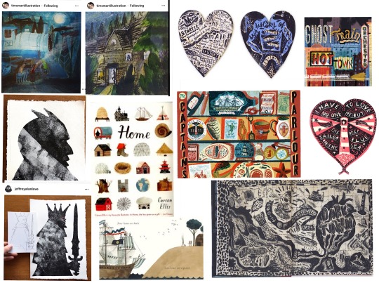
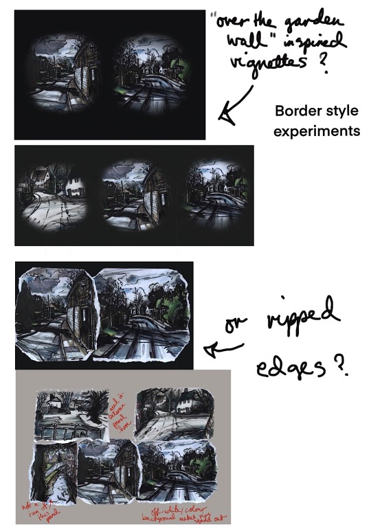
Initial artist research, style inspiration
Johnny Hannah’s Darktown - suggested by my tutor, a fictional town formed of memories and inspirations and obsessions. I thought maybe I could be inspired to represent my home town in a similar way, bring in some of this magic realism and let my inspirations and experiences colour my depiction of my way home. Looking at his art style, together with Tim Smart’s, another artist suggestion from my tutor, served as a reminder that illustration can be bold and anarchic and expressive and that interesting mixture of aesthetic “flaws” and technical prowess. I particular loved the wonky perpestive and atmosphere of these pieces by Tim Smart, they feel so atmospheric and dramatic from his use of lighting, coupled with bold colour and scribbly textures. I also was really enjoying Jeffrey Alan Love’s use of strong shape/silhouette and texture. These three artists inspired me to try a way more messy and expressive illustration style in this exercise.
Style exploration/mark-making
Mini studies from Carson Ellis’ “Home”, some from details of Darktown book (A)
Determining steps (B)- after some brainstorming notes I drew a map of the village to get my bearings a bit. Some very big and scrawly paper sheets trying to work it out. Eventually I went very very literal and took photographs along the whole route home to refer back to in the hope I could figure out which shots would be most key in giving someone else directions.
More markmaking and style experiments kind of following on from my Carson Ellis and Johnny Hannah studies (C) none of these really appealed to me, at this stage I was just playing with mediums and seeing what stuck.
James Gurney Light and Colour house watercolour painting (D)
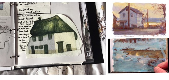
After my more cartoony experiments I tried painting a house on my route home with watercolours in a more realism-inspired technique, and I found this really rewarding. I’m really attracted to super bold zingy colours but this can get in the way of creating the kind of moodier atmospheres I’d like, so I’ve been reading James Gurney’s “Colour and Light” and watching his gouache process videos to learn how he creates these gorgeous heightened, almost magic realism paintings. As I was painting this house I tried to begin to apply what I’ve learned from him regarding how atmospheric light affects colour saturation and temperature, and how your eyes can trick you as to what colours you’re actually looking at.
Specifically with my green and white house painting, I found I actually needed a cold blue gray for the longer wall, with a little bit of purple added to warm it up just as it comes to meet the side of the house lit by the sun. For this wall I used a warmer creamy sand tone wash.
James Gurney on the benefit of “gross” colours - “More paintings suffer from the “fruit salad disease” of too much pure colour rather than from murky mud....the cure is good value organisation...a well-placed gray makes pure colour sing.”
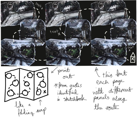
Final inspiration moodboard for drawing my route steps - Johnny Hannah kind of folk-punk roughness, Andrew Wyeth-inspired dirty smudgy winter textures and restricted colour palette, bringing in a bit of gothic dark folktale inspiration from the art style of the animated show Over the Garden Wall, which combined a painterly grisaille style rendering with large swathes of block fill shadow for the background art. This had the dual benefit for the background artists of restricting the amount of painterly detail and looking really really cool and spooky.
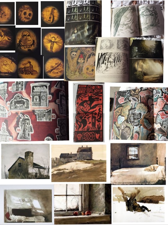
I did some more style experiments following the ideas above, from this moodboard (E) I also had an idea inspired by Johnny Hannah of using quotes/song lyrics/poem extracts. I could use these to tell a story along the route, I like the scrawly handwriting writing with a brush pen makes (F).
Really rough route thumbnails (G)
Drawings from my route photo steps - plastic wallet
Digital work below - layout experiments/format
Development ideas
1 note
·
View note
Text
Week 2
During this week, it was my first week in fully diving into the final major project and what outcomes I could be envisioning/ creating.
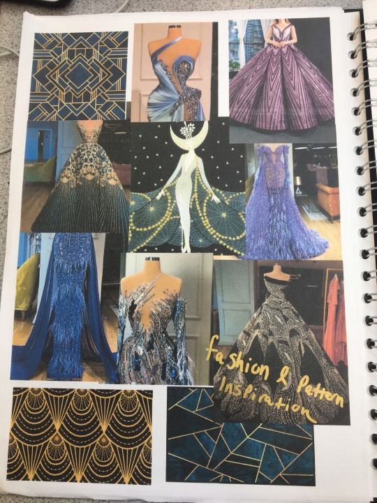
For my project, I personally thought the idea of challenging myself to push my skills I already am familiar with to the most extreme I have done so far. I have always had such a passion for theatrical/ fashion gowns and garments embellished with beads, jewels and crystals. They are beautiful and stunning works of art and labour in my eyes which really inspire me to try and learn those skills so I can create what I am most passionate about. I knew at this point I wanted to do the theme of ‘Patterns and Palettes’ and had the idea of being able to translate those abstract or refined patterns onto the surface of a garment using all of the same materials as these big costumes/ gowns use. I often tend to work in my own colour palette which normally consists of pinks, purples, silvers/ white, blue and occasionally red & black. For me theses colours for some reason are very calming and beautiful to me - the more pastel and paler then the more soft, gentle and calming whereas the more vibrant, bold and rich colours really get me exited and I love the way they stand out in every day to day life. A lot of my projects I have done for my final major projects in the past have been either reds, blacks, whites and very slight hits of others colours such as pink and green on details but never a really rich, bold and striking outcome so I decided after looking at the colour wheel and palettes, that I would work with bold and vibrant purples and blues with their complementary colours which are yellow/ golden shades. This is a combination I’ve never worked with before but always have wanted to so what better time to experiment and go for it. Most of my inspiration for the style or shape of the garment and beading work was mainly scrolling through Pinterest on different images and boards to find inspiration.

Once I had got some inspiration to look at and my new colour pallet, I decided to do some rough sketches and designs inspired by what I had seen but also incorporating elements from visual inspiration to create my own style peice. Two of my designs I used my set colours but my other one was done with Red, black and white just to see if I may have liked the colour combinations better but I was firmly keen on my already decided colours. To also get a bit of an experimentation to start, I decided to include with my sketches some mock up patterns made with or similar materials I myself would be using in the process of creating this outcome. It was also a way for me to see how my ideas would be seen and if I needed to change a tone of a colour more lighter or darker to make the most important thing which is the ‘patterns’ to be able to come across prominently and be seen clearly.
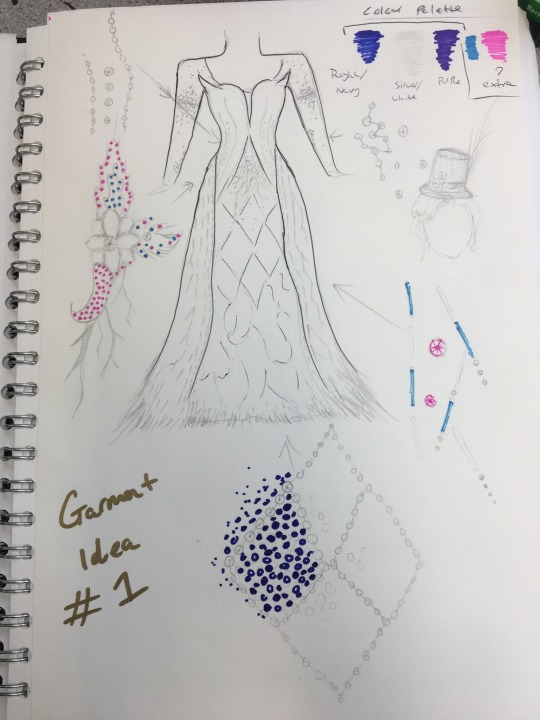


After I had done my designs, I decided on one final idea that I personally thought would be a challenge but also a fun concept to proceed with. To get a full and “life like” representation/ visualisation of what the garment will hopefully look like at the end of this project, I created a digital photoshop rendering of my desired outcome. This was really a way for me to truly see if I liked the outcome enough to proceeding which I was very happy to do so.

Once I had my concept in my head and confident I wanted to go through with it, during our online study groups I had to explain a rough idea on what I wanted to create to in which I received positive feedback which I was very happy about. Afterwards, I then started working on my project proposal which due to the fact I was so keen and passionate about what I wanted to create, I found it easy to explain and talk about. Until it was marked and commented on by Sophie, I wouldn’t known whether it was okay or not but I am fairly confident it is around 70/80% good and explains it well.
Point of My Project:
The whole point of this project and specifically creating a garment is a personal way of mine to express what I am most passionate about and love creating. Its almost a ‘mostly’ calming and sometimes tiring but rewarding experience and I get such an buzz and excitement to create and bring my ideas to life in a 3D physical way that is appealing to the eye. About 80/90 percent of the garments I make are for me to wear on which I plan to do so with this. In another way, this is another personal part of my of how I love to express myself. When I get completely dressed up and transform either with all of the compartments together or separately, I feel my most confident and powerful. Its another form of an escape and a happy place. I feel for this project, It would be a good chance for me to wear the garment and all the other elements to go with the complete look as a whole and showcase who I truly am but also to showcase the garment in all of its glory. Although maybe not everyone will understand that it is a personal way of expressing myself and the reason behind it, I myself know the real reason and as long as it makes me happy then that's the most important part. On a slightly smaller side note, one of the reasons I have also chosen purple as one of my main colours is, not only do I feel like it is such a beautiful and rich colour that I have spoken a bit about beforehand but again, it is another personal reason which comes from my mum. My mum is my biggest supporter and allows me to fully be myself no matter what and she has called my her “Purple Prince” ever since I started dying my hair purple and the fact that she knows its one of my favourite colours. It is a simple little saying but means so much to me. I want to do her proud of what I achieve so having this little but meaningful reason behind it just makes it extra personal to me.
Week 2 Evaluation
Media, skills, processes and techniques - Evaluative section on – Media, skills, processes and techniques that were used/explored – what was learnt – how wide ranging research informed this - and how these met the purpose of the proposal? First section – your planning, themes, specialism and how you have been working.
During this week i experimented with designs and the incorporation of sewing and physical experimentation with creating patterns on certain designs for my outcome. I also used photoshop to create a digital rendering of my final chosen design. Internet sources e.g. google and pinterest were also used for visual research/ inspiration regarding the theme ‘ Patterns and Palettes’. The small sewing part was just an expermination to see and learn what kind of materials I would be working with and how they perform in creating the designs etc.
Purpose/ theme/concept – Evaluative section on the FMP development – the thought processes – the struggle to solve a problem the journey of change and learning – why decisions were made and for what purpose - what is the point/function of the work?. How the FMP could be further developed in ambitious and innovative ways?
I decided in the end to go with a colour scheme/ palette that are my own personally favourite colours and combinations. To me my colours are very stimulating to me in which they keep me feeling passionate and excited but also calm so in a way the whole colour palette and concept throughout will very much be a representation of my passion and what makes me happy. The journey wasn't too difficult in the sense to create ideas but only 1 design in the end really gave me an excited feel determined and passionate to see this through. My first two other designs just didn't end up grabbing me to them in the end, although they would have been interesting and different/ contrasting outcomes, I really wanted to challenge myself to create all of the patterns myself and push myself to create the most elaborate garment to date. I feel creating the patterns myself will allow the outcome to be as custom and as personal to me much more rather than using for instance already patterned fabric in which the scale of my outcome mostly likely would then be too overpowering to try and incorporate as many patterned fabric areas as much as possible.
What are you planning for next week? – How and what are you doing?
For next week I plan to go back to any feedback from my proposal and experiment more with the/ similar materials I will be working with throughout my project. This will then enable me to get back into the motion and headspace for the amount of time, effort, precision and detail that will be in my project.
Evaluation methodology - Evaluative section on the processes of evaluation, feedback, peer assessment, critical reflection and how this IMPACTED on the creative and technical processes.
The feedback i received from Sophie helped me explain my idea/ concept fully to the best of my ability and made me aware of any areas that needed strengthening or visual representation to back up any form of inspiration I took from something.
0 notes
Photo

This is the first mood board I have done regarding research into the themes that I wish to take inspiration from. I wanted to source images from a variety media; movies, art, etc. I tried to get images featuring different aspects of environments, locals and colour choice.
Image Breakdown
One key thing I like to do when I generate mood boards is to breakdown the images and identify what components stand out to me. This helps me to better understand key aspects of a visual style and why it appeals to me.
Image:
1. I highlighted a few things in this image that drew my attention and appealed to me. One part was the headphones hanging from the ceiling above the seats. What I liked about this was that the image is taken from Alien: Covenant within a spaceship. Why is this significant to me? Its because although this version of humanity has progressed to the point of space travel and extremely advanced AI, there are still remnants of technology that we are used to seeing today. This plays into the appeal I have with retro-futurism.
Another thing I highlighted was the Hula doll on the control station. Although this doesn’t have anything to do with the visual style, it is the simple addition of character that makes the scene more life-like and makes the scene more believable in a subtle way. This type of thing is something I will be adding to my scene for certain.
The next things I highlighted were more to do with the structure of the scene. I really liked the mechanical and industrial appearance of the scene with the inclusion of hydraulics and/or suspensions systems. The materials featured also cement this industrial theme.
The final things I highlighted in this image was the touch-pad located by the door and also the control panel. What I liked about the touch-pad near the door is that it is a blend of technology with the industrial structure, an interesting visual motif. The reason why I highlighted the control panel was in one part because of the interesting use of lighting but mostly it was because of the use of dials and buttons. For me this is another example of a type of retro-futuristic design, although this version of humanity can travel far into space they are still using technology we use today, it is an indication of how it is easy for designers to become accustomed to technology we use today and not question or imagine whether we will still be using this technology in a century from now. This is not to say it a bad design, on the contrary I find this type of design very interesting.
2. This image was smaller with less features but a couple aspects did stand out to me. The main component of the image that caught my attention was the use of buttons, dials and small LED digital displays. I have already mentioned why I find this visual choice interesting and it remains true here. The digital displays are appealing to me as they are reminiscent of digital alarm clocks from decades past. Due to my liking of retro-futurism and the way designers have blended old technology with civilisations, civilisations that are many years more advanced than us in certain aspects, these small displays catch my eye. Additionally I like the variety of switches the artist used in the control panel. Although I have no idea what the individual buttons and switches do, I can tell from their appearance that they control multiple different functions.
This image also highlighted to me how much I liked the lighting of the control module in the first image.
3. The third image is much more busier than the previous image I looked at and there is a selection of things I found interesting. The first thing that really caught my eye was the bus section. I find the artists use of the classic British red bus with the track system really interesting and eye-catching. It is,again, because of the mix of old technology within a somewhat futuristic scene I believe. The fact that this running theme that keeps drawing my attention is telling me that I should put big consideration into how I can incorporate this style in my scene.
Along with this I also highlighted other parts that I liked. One part was the use of pipes along the side of the building. Although this isn’t something mind blowing I just liked the way it broke up the building and it communicated to me a thought that the area was somewhere a bit run down or not as potentially high-end as other parts of this fictional city. On a similar note to the Hula doll in the first image the pipes add a bit of character to the scene not in the same way as the Hula doll but with a similar effect.
In the image as a whole I like the architectural design of the buildings and their features and the locations of said features. Also the inclusion of the phone/power lines makes the scene more believable and communicates subconsciously that this environment is alive.
4. Although this image doesnt neccessarily depict a futuristic setting there were a few features that caught my attention. The main part of the image that I found visually intriguing was the set of displays stacked asymetrically on top of one another. Although the design of the displays isnt really what im looking for, it doesn’t match my intended visual theme, I do like the way they are positioned. For me the way the displays are arranged adds a lot of character to the scene and makes my mind wonder as to the backstory of the scene. This specific part of the image is going to stick with me I feel, especially when designing and thinking of composition within my environment.
I also highlighted the windows in the image as I thought the small pieces of glass arranged in a formation akin to bricks was an interesting concept.
5. I found the whole of this image interesting in terms of its arrangement and visual style. However the visual style is not something I want to mimic. I can appreciate how each component of the scene looks like it belongs there, nothing in this image looks out of place. Although I don’t want to emulate this visual style I do however want the assets in my scene to match the overall theme and not look out of place, just like the components of this assets.
I highlighted two specific parts of the image that I would say drew my eye first. I highlighted the bed as I think it is an interesting design and a design that matches the scenes theme well. The second part I highlighted because I liked the layout of the components on the face of the object. Although by no means jaw dropping or of much significance, I did find myself inspired when thinking of ideas regarding radios and computers in a retro-futuristic style.
6. I included this image because I love the visual style and appearance of this digital bilboard. The limitations of the technology generating it add a lot of character and aesthetic that I really enjoy.
7. This image I found interesting as it depicted a scene within a car with a futuristic setting. The main things within the image that caught my attention were the displays. I particularly like the design of the upper orange display, its position and contents are well thought out.
Additionally with this scene, I found the mix of digital displays at the front of the car and what looks like a taxi charge meter a nice contrast. This makes me imagine that this society has advanced technology but the basic functions and requirements of specific actions, like being charged a taxi fare, require the old but effective technologies we are used to in real life.
8. This image featured a variety of things that I found quite interesting and inspiring. Firstly I find the design of the displays to be well done and thought out. The display aren’t so technologically advanced that they look too far-fetched but they do look realistically advanced when judging by our current technological predictions, whilst also maintaining an interesting visual design. You can have an educated guess as to how the displays work thanks to the way they are designed by the artist, something I also want to keep in mind when designing and creating my assets.
I also highlighted the wires coming from the highest display. I did this because it made the scene look a bit more functional and that this scene is actually a real place and all the various components in the scene all work and have functions. These little details make the scene feel more realistic.
The first part of the image that stood out to me was the floor. I like the way the viewer is able to see below the floor in some areas, revealing hints as to how the the scenes structure works. The lighting was nice and it simply looks visually interesting to me.
9. I like the overall scene in this image, there is a lot of detail and character present. The main things that stood out to me however were the neon signs. Although the scene is dark and grimey, the neon signs don’t look out of place. Neon/ emmisive lights are definitely something I will be including in my environment, just not in the same way that they are used in this image.
10. What drew to this image was the colour scheme mainly. The colour palette selection is something very similar to the palette I intend on using. The bright pink and blues is a classic colour combination of synthwave inspired designs and definitely something that works well together in this visual theme.
2 notes
·
View notes
Text
The Hottest Fashion Fashion Trend Fad Of Wigs 2011.
Carnations are actually preferred throughout the planet as they last for a long time after being reduced and come in a wide variety of different colors. Just as along with the hot pinks coming back stylishly, metallic nail polish colours are at the same time. When was the final time you was aware of brown hair being a fad or a fad? See sequel for methods to make use of history colours and also graphics in the website information itself.
The questions, which our company initially viewed on Layout Taxi, exams your capacity to match up colors through tone, concentration and also even more. When administered to skin layer in a type of mix will definitely give a rigorous glow and colour on your face, the yellowish brownish dirt very wealthy in minerals.

To find your usual eye shade, make an effort monitoring your eyes in daylight. The concept of the appeal of the Prometheus ship is actually established, right now Ridley is certainly not just clothing his characters thematically, yet additionally he's balancing the different colors versus the history of click the following website streamlined layout of the ship.
Secondary palette utilizes colour such as orange, purple and also eco-friendly which are actually helped make through integrating key colours. White is actually crystal clear as well as transparent, incorporating the features of all shades and none. By sight the steady adjustment of different colors that may take place when you are actually Utilizing a Loreal hair colour product you will definitely achieve an idea of the end shade result.
The colour of bridal gown has actually altered throughout the years and sinister ones were typically chosen. Contents regarding or even regarding Glasses, Contacts, Glaucoma, Styes, Reddish Eye, Lasik Surgical Operation, Pink Eye, Sunglasses, Dry Eyes. The Venezuelan Black-Hooded Red Siskin receives its dazzling colouring by its diet which is actually high in carotenoids.
Ladies wearing shoes in common color like white, dark, or even brownish shades are more self- self defense as well as certainly not therefore available. BLUE- cool color liked typically coming from International folks suggesting rely on and also dependability. There are four various colors that people may categorize folks in. They are actually reddish, blue, yellow as well as eco-friendly.
Around 1997, brighter colors began to make a comeback as the stock market was actually once more flourishing and folks fit in relations to financial resources. When you are actually purchasing bell peppers to prepare for your infant, try to find ones that are deeply and also brilliantly coloured, along with tight skin layer devoid of imperfections.
Insides are limited to tone-over-tone combinations, along with hues of brownish, cream and also clean white. The magenta pigment absorbs greenish illumination, as well as yellow pigment absorbs blueish light. On my 'Shades and also tones' pages, I have made use of RGB to contrast different colours, and also I've used portions of colour strength which seem to me to provide the depiction which is most very closely related to a specific shade.
As well as today the variety of colours and texures in coatings in addition to prompt drying out and also non-toxic makes painting an effortless, quick as well as low-cost to embellish any sort of area. The premium of the gemstone is actually pointed out to become figured out by the number of colours displayed as well as the consistency of the pattern.Black opal is one of the most favoured as well as valued coloured opals.
If you're considering enhancing your house this time yet may not be very sure what will certainly look nice, you might intend to take a look at our list of the leading 5 most well-known X-mas light-toned colors of the period. For lots of people, the possibility to have actually coloured design extraction made with virtually pain-free laser treatments is much more attractive than having repeated chemical peels carried out.
I additionally acquired coming from all of them the brown eye different colors and also while I carry out possess some attributes arising from both my moms and dads, I possess a different character entirely. Mentioning personalization, Marble also discharged a collection of brand new message watch faces to match the brand-new colors, which need to be actually readily available on the Pebble appstore beginning today.
0 notes
Text
Volume PS4 Review

Developed by Mike Bethell games and released worldwide for the PS4 & Steam on 18th August 2015, with the Vita version arriving the following January, Volume is an appealing indie title accumulating of three things. Firstly, its source material revolves around the old English legend of Robin Hood and his fight for equality for the people of England by stealing from the elitist corporation and their allies and giving the economic power back to the people. Thrown into the concoction is the effective stealth action gameplay made popular by Hideo Kojima’s classic Metal Gear Solid franchise on the original PlayStation back in 1998, all be it in a futuristic setting with connotations of potential outcomes of modern popular culture such as YouTube & Twitch. Finally, there is the creative innovation of a developer who wanted to create something which some could argue by today’s standards of gaming is rather outdated.
Throughout my complete play through of the game which clocked in at around 10 hours or so, I was exceedingly impressed by the use of gameplay mechanics as well as the development of them as more and more tools are introduced. Level Design is cleverly adjusted to suit the mechanics of the new skills picked up by the player, and an evident pattern is visible as the game goes on. Every time a new skill is introduced there are levels dedicated to training the player how to utilise their new found power in this computer simulated environment, as well as how not to do so. Following on from this, shortly after our exposure to these new mechanics there are levels which can be tackled in a number of ways offering up to us a choice in how we feel is best to deal with the scenario. In one such instance, the game offered me a tool which could be used to distract the guards by making a sound away from my intended path, conveniently forcing the guard to investigate it (not corresponding with stealth video game clichés at all!), however I could also use a trip wire so that as soon as the guard detected me he would be stunned by my strategically placed trap.
The way in which Volume handles player progression is a breath of fresh air when compared to the 40+ hour open world/sandbox titles plaguing the industry at the moment, and although it has little depth in comparison, the short 2 minute bursts of gameplay offer immediate reward for little time investment. The short bouts of trial and error gameplay in some cases is most welcome, considering I am still having consistent nightmares over the stresses of collectible hunting and the heartache of hard-hitting narratives such as The Last of Us and The Witcher III. Every other level seemingly in the game world of Volume there is a change-up of the aesthetics mainly taking the form of colour palette swaps to prevent the player from becoming bored and disengaged, as well as numerous sarcastic conversations between the AI Alan (Love it) and Locksley which caused me to giggle, which if you played the game in chunks as I did is a welcome addition. The game utilises many tactics to try and grasp the player’s attention and this is exemplified in the controller layout, as there is a dedicated button to restart the level for when I knew I screwed up and did not want to waste a full 5 seconds going to the menus. This combination of fluent gameplay and short investments of time is an addictive partnership as we have seen in other games such as rocket league, and it is because of this that the game is always an option when deciding what to play after work if you do not have the time to sink into a classic RPG. In my opinion this is where Volume really displays its character the most as the game is seemingly self-aware of the video game difficulty curve (beginning with tutorial and peaking at a pinnacle of difficulty) and openly mocks its inevitable adhering to it. A simple act of admitting to its audience that the game has to have tropes reminiscent of its genre, yet does not want to insult the playerbase by conjuring some illogical reason for the mechanic to exist is refreshing in my eyes, and after having it pointed out for me in a comedic way in the form of the ‘oddity’, I brushed it off and never questioned it again.
Although the narrative is where other reviewers have had issues with the game, and although I do not necessarily agree with them I can at least see how their opinions regarding the story of the game can affect player experience. Gamespot’s Mike Mahardy agreed with this sentiment going as far as to say that the short character interactions regarding the narrative unfolding were jarring and removed him from the tense gameplay, incidentally making him care little for what was being said and perhaps the story in general. Although I agree that these interactions were semi-annoying at times as they occur mostly during gameplay, personally I enjoyed the establishment of context and although they did run on for a minute at times, I simply listened to its conclusion and then reset the level to carry on my experience. However, as a gamer I like to have some context as to what I am doing within the game world which is most likely why I did not find these exchanges a hindrance. One of the few issues I had with Volume is the checkpoint system in game, and IGN’s Brendan Graeber also felt that this flawed an otherwise good game, saying in his review that the checkpoint system left very little challenge to be met by the player.
All in all I would have to say that Volume was an experience which I enjoyed, gameplay was great and the inclusion of a level creator prolongs the experience somewhat, but at times the infrequent buggy AI, the below par character models in the little cut scenes that occur, and the occasional audio clipping affects it’s overall lasting impact. However, it is still a very well made product worthy of a purchase for your PlayStation Vita as I feel this is where the game would perhaps shine brightest in the games market.
7.8/10
#Volume#Mike Bethell#Mike Bethell Games#PS4#PS Vita#Indie#Game#Indie Games#Video Games#PS Store#Matt#MattTryNotToDie#Review#Critic#Stealth Action
0 notes
Text
Fenty Beauty have a line of Shimmer Sticks and today, I am going to be talking about, swatching and showing you face pictures of the Starstruck Shimmer Stick!!!
PHOTO GALLERY!!!
Click image for full sized view
#gallery-0-7 { margin: auto; } #gallery-0-7 .gallery-item { float: left; margin-top: 10px; text-align: center; width: 33%; } #gallery-0-7 img { border: 2px solid #cfcfcf; } #gallery-0-7 .gallery-caption { margin-left: 0; } /* see gallery_shortcode() in wp-includes/media.php */
Starstruck is a Shimmery Champagne Gold Shade
Starstruck Swatches
FACE PHOTO PRODUCT GALLERY!!!!!
Click image for full-sized view
The Fenty Beauty Shimmer Stick in Starstruck is a luminous highlighter in stick form. The consistency of the highlighter is extremely soft, light, thin and slightly creamy. The texture is so different than any other highlighting stick I have tried, and it feels very dry and has no wetness or stickiness to it.
The finish is described as cream to powder and you can certainly notice this because the consistency is so dry and has no wet or damp feel to it. However, I would class the formula as more of a cream and certainly NOT a powder, but it is an extremely thin and dry cream that doesn’t have the consistency you typically think of when you hear the word creamy in relation to highlighting sticks.
Starstruck has high pigmentation and a high glow/shine intensity , and it is certainly more of a bright, intense highlighter and not a sheer one. The ratio of glitter to pigment is even, meaning there is a perfect mix of colour pay-off to shimmer/glitter pay-off and unlike some of the highlighters in the Fenty range (like Trophy Wife), it doesn’t have crazy levels of glitter that far exceed the pigmentation. It is also a glitter/shimmer that is built into the actual formula, meaning you will obviously not get any visible glitter fall-out (again, this is in contrast to Trophy Wife, which has tones of visible glitter).
You can wear the Starlight shimmer stick pretty much everywhere on the face and body, making it an extremely versatile product. You can obviously apply it to the cheek area as a highlighter, but it also works extremely well on the eye area as an eyeshadow and as a lip topper, aswell as a body highlighter and probably a million other things.
In terms of application, I did notice a few things. Firstly, you need to be in good lighting when you are applying it, and you will see different results in different lighting and mirrors. When I was first using it, I noticed that it wasn’t coming up in the slightly dark, dull lighting I was applying it in. However, when I looked at my face in good, bright lighting, I noticed that I had actually put way too much on, and I had WAY too much product on my face. It was an absolute mess and ever since then I have made sure to apply this under bright lighting.
There are multiple methods and ways you can apply the highlighter. Firstly, you can swipe and/or dab the product directly onto the face, cheek or eye area using the actual stick, which is my preferred method because of how simple and easy it is. This method will not be an option for makeup artists who need to follow proper hygiene practices, and applying stick products directly to the face is considered by some as unhygienic. This is because the top of the product can hold onto things that were on the face from the previous application, but for the general consumer, I do not find a problem with applying it directly using the stick itself. What I do in order to try and keep the top layer of the product nice and relatively clean is to make sure that I swatch it on my hand/arm after I have applied it, which strips off the top layer that has just been directly on the face. Using a makeup wipe or something similar to wipe it over is also an option.
The second way you can apply Starlight is by using a makeup brush like a flat top or buffer brush. Here, you would dip into the stick and coat the brush, and then you would apply it directly to the face/eye area and build it up using the brush. Another option is to apply the product to the fingers, and then dab it wherever you want.
While all methods produce the same/similar results, applying the product straight to the face using the stick is going to give you a more pigmented finish more quickly, whereas you will have to keep going in and building it up using a brush, which will take longer. Using the fingers to apply the product is also a more quick option than using a brush, but ultimately, all methods of application will give you a high colour pay-off, the only thing that varies is the amount of time it takes to build it up.
There are also TWO ways (what I mean by ways is method) , to apply the Starlight highlighting stick -using swipping motions and dabbing/patting motions. When you swipe a product on, you are running it down ,up or across the face in one, slick move. When you dab/pat product on, you are buffing the product into the skin in little jumpy motions. Both of these methods work extremely well with the Starlight shimmer stick, but they do produce slightly different results.
If you swipe the product on the face, you get a extremely pigmented result pretty much straight away. If you dab/pat the product on, you gradually build the pigment up bit by bit. I usually use a combination of these two methods, first swiping things on to build that initial layer up, and then going back in using dabbing motions to add intensity and to blend the product out a bit.
In regards to using a brush/the fingers to further blend the product out on the face, you have two options. You can leave it as it is because when the product applies, it applies pigmented but sheer enough that it already looks blended out. If you want to diffuse the product more into the skin, you can pick up a buffer brush and work/blend the product in more so it’s not as noticeable. It will just depend on how much colour pay-off you get on application, and sometimes you will get a harsh line and you may need to blend things out a bit more and sometimes you won’t.
The packaging of the shimmer stick’s twisty tubes is absolutely amazing. They feel so so sturdy – the actual packaging and the stick of product both feel extremely strong. You get NO resistance or tugging when you apply it to the face, it just glides onto the skin without fight and feeling like it’s going to break, which is a MASSIVE problem with highlighting sticks as most brands make them so so thin that they are very flimsy and break when faced with just the tiniest bit of resistance. This is how you do any type of cream stick, you make it strong so it doesn’t feel like it will snap, and I give massive props to Fenty for this! In terms of functionality and appearance, the sticks are magnetic so can be connected with other sticks, and they are extremely visually appealing and feature beautiful nude packaging with halographic, reflective writing.
I am extremely happy with the Starlight Shimmer Stick by Fenty Beauty!! It has a beautiful, light, non-messy formula and applies extremely easy to the face. It can be used for so many things, and I love it so much as a highlighter, as an eyeshadow and as a lip topper. It is the perfect tone and shade for me and my pale skin, and while it is certainly pigmented and very opaque, it is such a soft subtle, white/yellow shade that is extremely flattering. The packaging is extremely sturdy and the consistency of the product is not weak, meaning the sticks can handle the resistance you get when you apply it directly to the face.
All in all, I LOVE this shimmer stick by Fenty Beauty and am keen to try more shades in the Shimmer Stick range!!
[supsystic-tables id=102]
What do you think of the Fenty Beauty Shimmer Stick in Starstruck?? Let me know in the comments below babes!!!
Sephora AU Online Site Link
Sephora USA Online Site Link
Fenty Beauty Online Site Link
Subscribe to Blog via Email
Enter your email address to subscribe to this blog and receive notifications of new posts by email.
Join 3,412 other subscribers
Email Address
/* Custom functionality for safari and IE */ (function( d ) { // In case the placeholder functionality is available we remove labels if ( ( 'placeholder' in d.createElement( 'input' ) ) ) { var label = d.querySelector( 'label[for=subscribe-field-widget-4-0-0]' ); label.style.clip = 'rect(1px, 1px, 1px, 1px)'; label.style.position = 'absolute'; label.style.height = '1px'; label.style.width = '1px'; label.style.overflow = 'hidden'; }
// Make sure the email value is filled in before allowing submit var form = d.getElementById('subscribe-blog-widget-4-0-0'), input = d.getElementById('subscribe-field-widget-4-0-0'), handler = function( event ) { if ( '' === input.value ) { input.focus();
if ( event.preventDefault ){ event.preventDefault(); }
return false; } };
if ( window.addEventListener ) { form.addEventListener( 'submit', handler, false ); } else { form.attachEvent( 'onsubmit', handler ); } })( document );
Huda Beauty Desert Dusk Palette Eyeshadow Looks!! x 14 different looks
Kylie Lip Kit’s- Matte Liquid Lipsticks + Lip Liners- Review + Swatches (x23 Shades)
My Beauty/Makeup Favourites September 2017
Fenty Beauty Killawatt Highlighter in Trophy Wife Review + Swatches
Beauty News End of September/Start of October 2017
Archives
October 2017
September 2017
August 2017
July 2017
June 2017
May 2017
April 2017
March 2017
February 2017
January 2017
December 2016
November 2016
October 2016
September 2016
August 2016
July 2016
June 2016
May 2016
April 2016
March 2016
December 2015
November 2015
August 2015
July 2015
May 2015
Fenty Beauty Match Stix Shimmer Skinstick in Starstruck Review, Swatches + Face Pictures Fenty Beauty have a line of Shimmer Sticks and today, I am going to be talking about, swatching and showing you face pictures of the…
0 notes
Last Seen Blogs

lorawulf
Whimsy Wulf

crazyboyviking
Sans titre

waynedunlaptheorgandonor
we need more guts 🤔

expedicoes-conscienciais
Expedições Conscienciais

monvengurl
@Ramona_J