cloudytreefolk
Illustration Learning Log
Learning log for Isabelle Spain's Illustration degree with OCA
25 posts
Don't wanna be here? Send us removal request.
Last Seen Blogs
xpurplefists-blog
black woman . yeah

omnisoft
Untitled
various-things
Various Things
bilrost
♅

trendingguy
Untitled
Text
animal stylising drawing
Objective-with-personality drawing
Weirdo collage version/versions
Drawing from weirdo collage version
0 notes
Text
character design
Step 1 - character research moodboards
This exercise reminded me how much I love story-telling and and world-building! I loved creating my characters. I wanted to make two characters from the same story, because then I’d get to create a bit more of a story around them and see if I could design them to look like they’re from the same world and go together, but fulfil the brief of creating two very different characters.
I did a lot of free sketching, drawing different expression and writing the characters in my head at the same time, then wrote a character/story treatment, before finalising my character designs.
Drawing characters’ faces and bodies
I can draw faces viewed straight on pretty comfortably from imagination, anything else I am really not confident with and typically use a lot of reference, which is ok when drawing a random person but not so much when you’re creating a character as a 3d object of sorts that needs to be rotated and viewed at any angle or perspective and be recognised as the same character. Maybe I could sculpt my characters’ heads quickly out of clay to have a rough reference?
Faces can feel like the most important part of the character since that’s the first place we look for emotions and social cues on others, so it’s tempting to focus more on this part than any other when drawing characters, and this is what I did at first. I looked at Andrew Loomis’ guides for drawing bodies proportional to heads, and tried a couple of different body proportions for my characters to see which would fit best with how I’d designed their faces and personalities and where they might be on the spectrum from realistic adult proportions to squishy cartoon more child-like proportions and found they fit best with the latter.
My characters aren’t cute disney kids, more like grubby, weird non-human small gnome/pixie creatures and to reflect this I didn’t want them to be twiggy and balletic but quite stocky and blocky, especially my goblin character. I wanted my mushroom character to feel relatively more graceful, and alien-like (like mushrooms and fungi often do) so I like his mixture of chubby, rounded main body and noodle-y arms and fingers, it reminds me a bit of Adventure Time character designs and the way they feel very alien.
As with the proportions, I wasn’t sure where the style of my characters’ hands would fit between realistic or cartoony, so I did some studies of Fleischer cartoons and Disney’s Ariel’s hands just to try some different approaches, neither were very suitable but they helped me find what I didn’t want.
Things I enjoyed/further development ideas
I loved doing the free character drawings at the start, trying out different ways emotions might show on their faces and trying to make them super expressive so that someone looking will instinctively read the emotion I’m trying to portray. This way of acting through a character reminds me of how stop-motion animators have described animating their characters and acting through their movement choices. I’ve done a bit of stop-motion animation before and would love to do more. I’d also really like to draw more designs of my characters’ world, where they live and objects they would interact with. I’ve been watching and very inspired by videos by sculptor “Ace of Clay” on YouTube, including a series where he sculpts 3D models of characters drawn by viewers, and I’d love to learn from his sculpting process to make maquettes/3D designs of my characters.
0 notes
Text
Museum posters - designing for diverse audiences
3 posters for a museum for children 5-9, teenager 13-16, general adult audience
Create an image centred around an object designed for each age group
Screenshot and put in thumbnail/contact sheet of museum research photos.
Folk museum research notes
Folk arty “naive” style object drawings from memory - I really like the character of these, thick chunky rough lines, bit childish in a great way, I like the graphic quality of the lines and flat shapes of the museum artefacts. I’m interested in producing stamps, Lino or otherwise, from the photos and from my drawings, and playing with overlapping them. I like the very simple strong colour palette- black and white always has such a visual impact and looks stylish, can be aged up for all the audience brackets. But then the rough chunky colour pencil lines have a playful, folky and textural quality, like charcoal, candle smoke, soot, things we all associate with history and historic everyday life.
Lino-print experiments and free experimenting -type up this process
Saul Bass- like vibes...
Mind-map of real-world museum exhibit/event posters - ones aimed at children, teens and adults. look at Cambridge museums posters/advertising products. Cambridge Bridging the Binary LGTBQ+ museum tours - go on one?
mid-century modern design seems still very The Thing for artsy adult-orientated event advertising.
Will the 3 pieces be a “family” or very different, will it be recognisable that they’re about the same place or not, is that important,
Explore visual approaches - representational, abstract, diagrammatic, narrative? Add created characters or narrative aspects? Decorative interpretation, original historic or geographical setting? Consider viewpoints, framing, poster design, placement of content in format.
Thumbnails and line visuals
Avoiding generalisations and stereotypes choose media, textures and colour palettes for each audience.
Colour thumbnails and layouts
Consider the content in its applied purpose as poster
Produce finished artwork for at least one, maybe two of the posters.
0 notes
Text
Identifying tools and materials
Step 1 of this exercise was to collect examples of different illustrators’ work who all use different media.
-photo of mindmap
- type up mindmap notes underneath
I chose to focus on the work of Sam Heimer and Phoebe Wahl.
-Sam Heimer analysing and work process
————————
-Phoebe Wahl analysing and work process
————————
Preparing my line visual
I used my line visual and lighting visual/value layout from the black and white gothic seashore exercise. I needed to re-work that drawing more anyway because my black and white visual was not as clear as I’d like it to be and the perspective was a bit muddled. The write-up of this re-visiting can be found now in the learning log entry for the original project.
Rendering in the style of Sam Heimer
Rendering in the style of Phoebe Wahl
Digital version/re-visit of Sam Heimer style illustration - inks layer, colour try-outs, old comics printing textures
Outcome and thinks
0 notes
Text
Assignment - Making a Poster
Research, brainstorming and moodboards
I designed a poster for Chvrches, a synthpop/indie rock band. I started by making a visual collection of band concert posters to get an idea of what’s out there, then listened through Chvrches most recent album a few times and read interviews and articles about the themes and concepts behind the album, song lyrics, and visual content of the band including album artwork, music videos, photo shoots and posters to get a sense of their iconography and visual identity.
I feel like with pop music from the 1950s bands and recording studios have become more aware and intertwined with the art and illustrating worlds and how fruitful this relationship can be commercially and creatively. A strong example that springs to mind is The Beatles and how they used evolving visual language to theme albums and films, signposting new creative eras for the band (Britrock A Hard Day’s Night, more hippy Help era, Sgt. Peppers, Yellow Submarine, stripped back the psychedelics for The White Album and Let it Be). More current bands and pop artists use drastic changes in visual language to signify new phases too - My Chemical Romance in the mid2000s going from general emo vibes to Goth Marching Band to Futuristic Desert Latex Rockers - Taylor Swift’s new music video for the single “Me” where a snake, the symbol from her last visual/musical phase, literally transforms into butterflies, the symbol for her new phase. So I also researched the musical, lyrical and visual thematic timeline of Chvrches through their album covers, music videos and posters to get a sense of their journey.
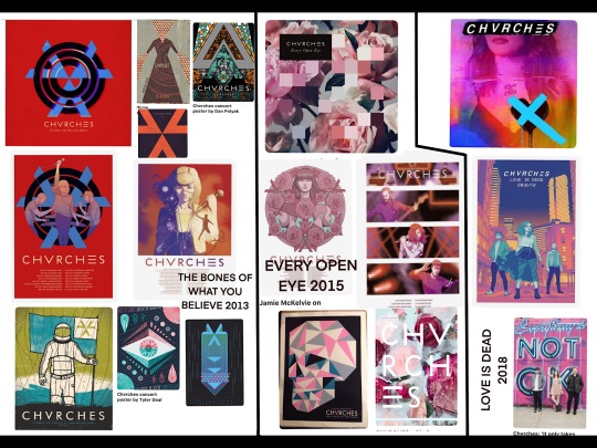
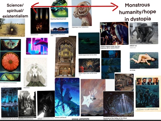
I came up with some ideas that applied more generally, associated with Chvrches across their whole timeline and probably a bit more geared towards their first album, looking at the combination of classical kind of spiritual imagery mixed with science fiction and dystopian themes in their music and lyrics.
Their third album lyrics have a bit of a different focus, more specifically about humanity in conflict with itself or being disenchanted with humanity. The genre of the music is leaning more towards pop and exploring their 80s influences in a different way.
Below - markmaking while listening to “Love is Dead” album, colours inspired by the album cover.
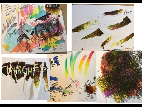
I went through some collections of artwork and inspiration I’ve been building up over time and picked out images that I felt resonated with the themes I’d identified in Chrvches’ music. This moodboard collected ideas I might use for the content of my poster.
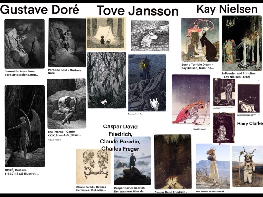
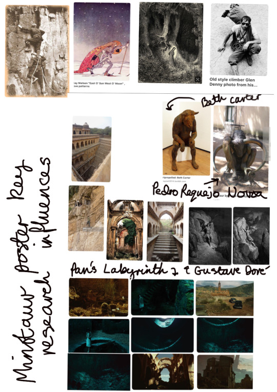
I created another moodboard of artist inspiration and ideas for the style and tone of my poster, which came to mind while I was making the content moodboard. Gustave Doré for his illustrations for The Divine Comedy and Paradise Lost, literature I associate strongly with grappling with humanity and morality and spiritualism. Tove Jansson for her similarly dense linework and exploration of psychological/existential themes in the later Moomin books. I feel like her swirling ink shading really draws you into the emotion of the scene and the character, the environment matching the emotion in pathetic fallacy. Kay Neilsen for his illustrations of classic folk tales, which have a kind of fable-like association for me. Particularly his illustration on a man in a red cloak striking out through the night in snow shoes really struck me with this idea of a quest for humanity, which I felt reflected Chvrches’ theme of searching for light in dark times.
Thumbnails - interactions of elements from content moodboard and style moodboard (labelled A).
I picked these two to develop because I felt they were the most effective in portraying my themes and appealed to me compositionally. In the left thumbnail there’s an minotaur climbing down from ruins into a grotto with a glowing crystal at the bottom with plant life growing around it, fed by it’s light. this was my interpretation of the “quest for redemption/humanity’s worth” theme, with a dystopian scene at the top, then a quest through a dark grotto/labyrinth, then light and life at the bottom, so the image has a beginning, middle and end structure, in keeping with classic fables and folktales. I was inspired by Pedro Requejo Novoa’s minotaur sculpture (which you can see a bit clearer in a moodboard below) and his nuanced and humanising portrayal of an ancient monster from mythology. I liked the idea of having a monster as the protagonist of my design, because when we’re looking for good in humanity we’re looking for good in ourselves too, so it’s his quest for redemption and worth being portrayed.
The thumbnail on the right shows my idea of having some sort of warped, monstrous creature skeleton, like a dinosaur turned dragon, long dead and withered away but protecting a glowing crystal/egg which could still hatch. I was thinking about themes of life in death or from death, like the phoenix myth, and therefore sparks of good in bad (again this idea of finding redemption or worth in warped/monstrous humanity).
Some of my other thumbnails were very inspired by 20,000 Leagues Under the Sea and John Carpenter’s The Thing, the first text being preoccupied with humanity and technology’s potential for good or evil, the latter featuring a lot of body horror, mutations and monstrosities of the human form.
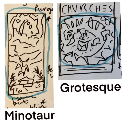
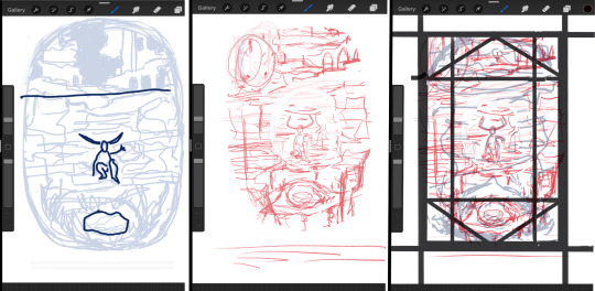
Moodboard below looking at poster design and ways of placing an illustration into a poster format, I also drew some thumbnails to see how my “minotaur” and “grotesque” designs could work as a poster (B).
Producing line visuals
Minotaur moodboard - key influences (and refs?)
Then minotaur layout process - drawing up and value studies (C)
Grotesque key influences - layout
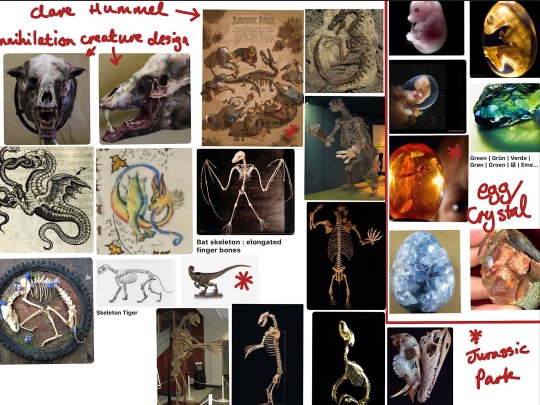
Annihilation film - the creature and production design of this film is incredible. Features an alien process “infecting” an ecosystem and plant, animal and human life, creating beautiful and disturbing amalgamations of the three.
Jurassic Park - the idea of preserved life in a little glowing piece of amber and humanity interfering/disrupting natural life
Medieval quasi-fantastical monster designs, chimeras of different animals
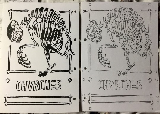
Originally I was planning to draw my creature as a dinosaur/dragon, but I thought my design would imply monstrous humanity if the skeleton I designed had more mammalian than reptilian features, like a shorter, rounder skull. I used references from a tiger, historic cave bear, dog and monkey skeleton, used a kind of bat wing/seal flipper skeletal structure for the hand, then the lower leg, foot and claw is from a velociraptor as a reference to the kitchen scene in Jurassic Park where the velociraptor clicks her claws against the floor.
Layout process (E)
Line visual/Layouts
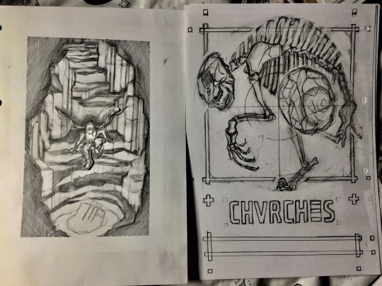
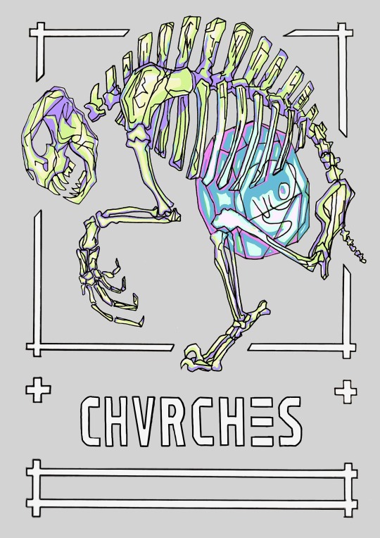
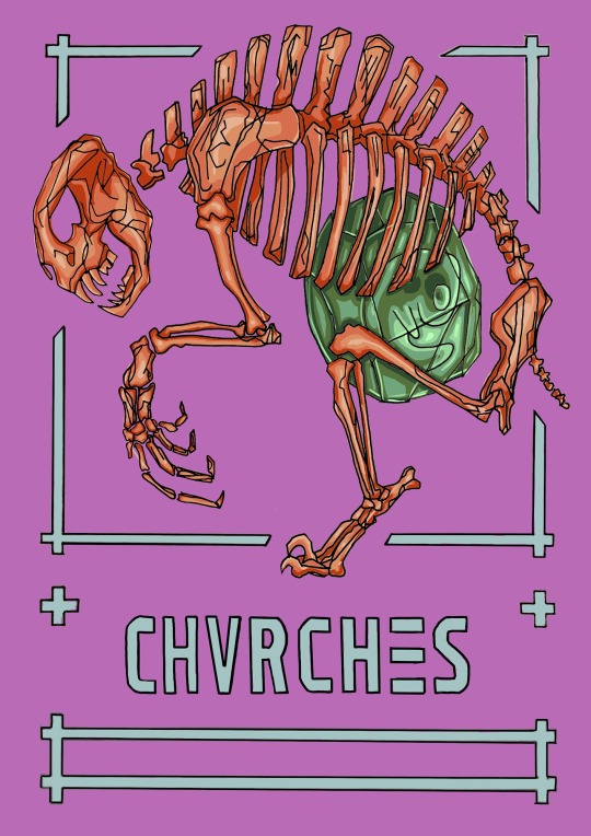
I picked my “grotesque” line visual to work up into a rendered piece. I had designed it as a poster from the start, whereas with the “minotaur” design I still had to figure out formatting, text placement etc. I also felt a lot more confident drawing a skeleton and crystal egg rather than a whole grotto scene with depth and perspective and trying to make the character look like they’re interacting with the environment, this is a bit technically beyond me at the moment so it just didn’t look as convincing as the skeleton design. There’s a lot to be said for simpler elements arranged and drawn more sophisticatedly instead of attempting something really complicated and not quite pulling it off.
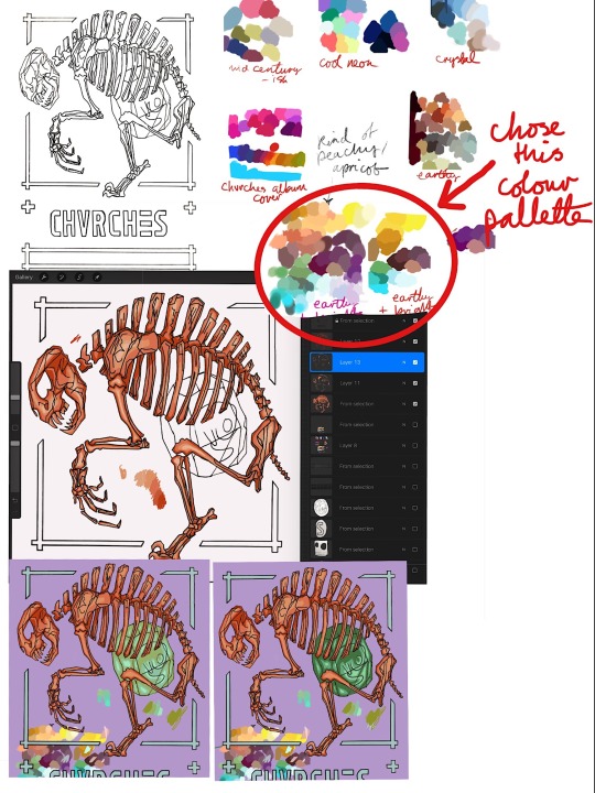
Colour and rendering key influences/ideas
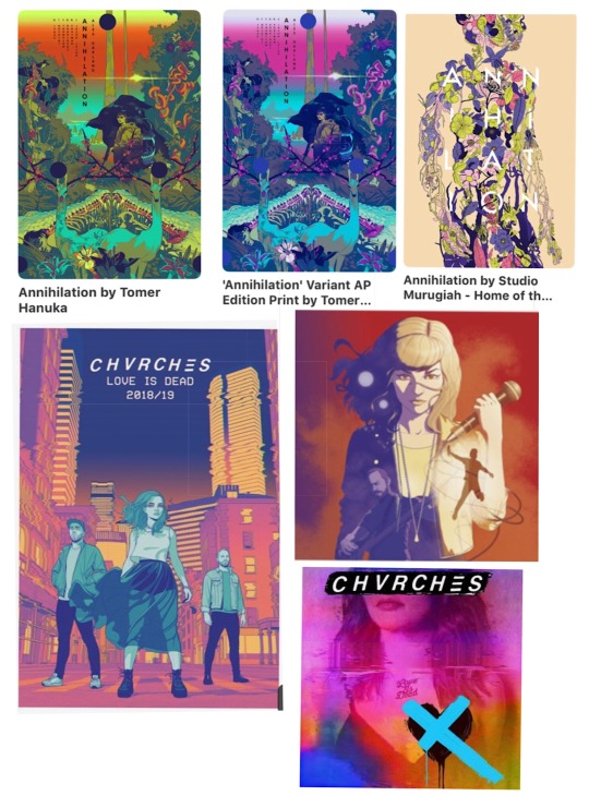
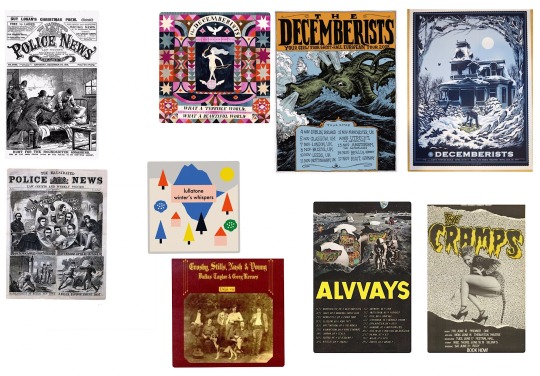
I went back to my earlier research on Chvrches’ graphic design and looked at Jamie McElvie’s posters created over the course of the band’s career. I liked the idea of trying to make my fit in with their band aesthetic, and noted down some key visual elements that were present in his latest poster and the band’s latest album cover:
- clean line art, flat blocks of colour with cell shading
- neon bright bold colours but a little muted, some more muddy tones like in bottom right corner of album design (this combination also present in these artist posters for Annihilation)
- mostly warm tones of pink, red, orange, yellow, contrasted with blue and green pops
Below I tried two different types of line art, the first is more my regular style, using my favourite brush pen and keeping things spontaneous and a bit messy, thick lines. With the second I tried s style inspired by Jamie McElvie’s - geometric, thin lines, clean and sharp. I used this second style for my poster.
Colour/background colour experiments
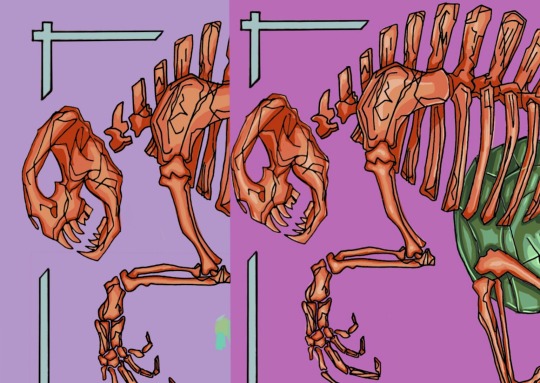
Trying different amounts of cell shading layers. I’m still not sure whether I prefer the left or the right, the extra highlight on the right adds this eye-catching pop, but having just three layers on the left might be stronger for its simplicity.
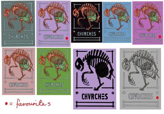
Outcomes
0 notes
Text
Giving Instructions
I chose to make an illustration on the category “getting to my house”. Ironically I got a bit lost with this exercise, it was the first project somewhat similar to the representative illustrations of the last course section, so I was a little overwhelmed trying to apply advice from my tutor feedback along with deciphering the instructions. I have a slightly different way of interpreting language than others since I’m on the autistic and adhd spectrum so one of the key challenges of a distance learning course is making sure I’m reading the instructions properly and staying focused on the brief instead of getting kind of carried away in other directions that I might find more immediately rewarding. So because I can find it hard to follow instructions, a task about giving instructions with as few words as possible was tricky! Balancing informative and aesthetic interests was challenging too, since if I was looking for directions I’d find the clearest map possible. Similarly as someone who plays musical instruments, it’s easiest to learn music from sheet music...and making a cup of tea is such a basic thing I don’t know why you’d need instructions for it. These were my initial personal reactions at least. Just now writing this I’m thinking, ok, so who would the audience be for tea-making instructions? And actually they could be useful to a lot of people - people learning to make tea, or people who benefit from visual reminders for everyday executive functioning tasks. Or for a specific tea recipe, like a London Fog or chai or fruit iced tea. Or if the tea-making steps were presented in a really striking graphic design it might work as a print to hang up in the kitchen for people who are really into tea? With hindsight and these factors in mind I think with “Getting to my house” I chose the most complicated and challenging category for me personally, and there’s probably a good lesson to learn here about starting my Learning Log posts off right at the start of the project so I can work through some of these things as I go instead of after.
Initial artist research, style inspiration
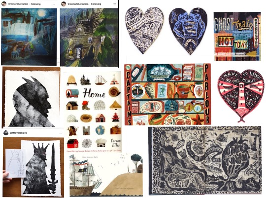
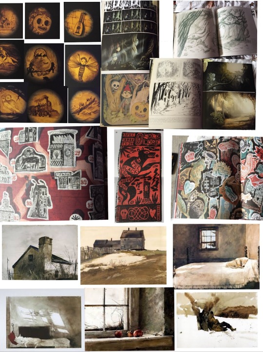
Johnny Hannah’s Darktown - suggested by my tutor, a fictional town formed of memories and inspirations and obsessions. I thought maybe I could be inspired to represent my home town in a similar way, bring in some of this magic realism and let my inspirations and experiences colour my depiction of my way home. Looking at his art style, together with Tim Smart’s, another artist suggestion from my tutor, served as a reminder that illustration can be bold and anarchic and expressive and that interesting mixture of aesthetic “flaws” and technical prowess. I particular loved the wonky perpestive and atmosphere of these pieces by Tim Smart, they feel so atmospheric and dramatic from his use of lighting, coupled with bold colour and scribbly textures. I also was really enjoying Jeffrey Alan Love’s use of strong shape/silhouette and texture. These three artists inspired me to try a way more messy and expressive illustration style in this exercise.
Style exploration/mark-making
Mini studies from Carson Ellis’ “Home”, some from details of Darktown book (A)
Determining steps (B)- after some brainstorming notes I drew a map of the village to get my bearings a bit. Some very big and scrawly paper sheets trying to work it out. Eventually I went very very literal and took photographs along the whole route home to refer back to in the hope I could figure out which shots would be most key in giving someone else directions.
More markmaking and style experiments kind of following on from my Carson Ellis and Johnny Hannah studies (C) none of these really appealed to me, at this stage I was just playing with mediums and seeing what stuck.
James Gurney Light and Colour house watercolour painting (D)
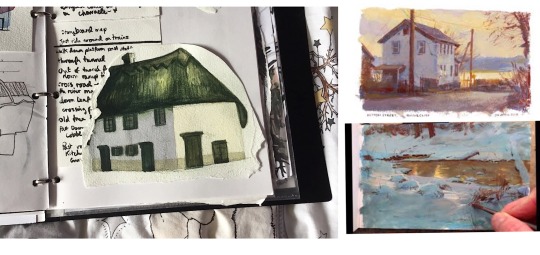
After my more cartoony experiments I tried painting a house on my route home with watercolours in a more realism-inspired technique, and I found this really rewarding. I’m really attracted to super bold zingy colours but this can get in the way of creating the kind of moodier atmospheres I’d like, so I’ve been reading James Gurney’s “Colour and Light” and watching his gouache process videos to learn how he creates these gorgeous heightened, almost magic realism paintings. As I was painting this house I tried to begin to apply what I’ve learned from him regarding how atmospheric light affects colour saturation and temperature, and how your eyes can trick you as to what colours you’re actually looking at.
Specifically with my green and white house painting, I found I actually needed a cold blue gray for the longer wall, with a little bit of purple added to warm it up just as it comes to meet the side of the house lit by the sun. For this wall I used a warmer creamy sand tone wash.
James Gurney on the benefit of “gross” colours - “More paintings suffer from the “fruit salad disease” of too much pure colour rather than from murky mud....the cure is good value organisation...a well-placed gray makes pure colour sing.”
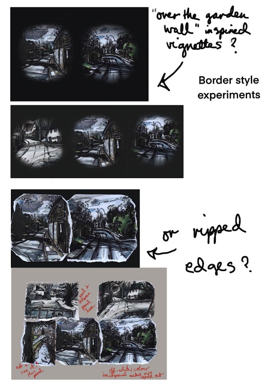
Final inspiration moodboard for drawing my route steps - Johnny Hannah kind of folk-punk roughness, Andrew Wyeth-inspired dirty smudgy winter textures and restricted colour palette, bringing in a bit of gothic dark folktale inspiration from the art style of the animated show Over the Garden Wall, which combined a painterly grisaille style rendering with large swathes of block fill shadow for the background art. This had the dual benefit for the background artists of restricting the amount of painterly detail and looking really really cool and spooky.
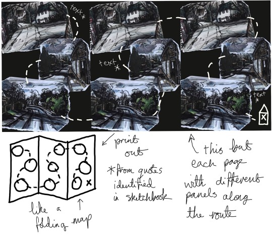
I did some more style experiments following the ideas above, from this moodboard (E) I also had an idea inspired by Johnny Hannah of using quotes/song lyrics/poem extracts. I could use these to tell a story along the route, I like the scrawly handwriting writing with a brush pen makes (F).
Really rough route thumbnails (G)
Drawings from my route photo steps - plastic wallet
Digital work below - layout experiments/format
Development ideas
1 note
·
View note
Text
Viewpoint
I made a collection of objects around the theme of “workshop”. These items came from my dad’s camping gear and toolbox, and a carpenter’s chest handed down to him after my grandfather died , originally owned by my great grandfather. I have a lot of childhood memories of woodwork projects in my great uncle’s workshop, watching him turn wood on a lathe or saw up bits of tree on machines that could take your arm off whilst he puffed on an old tobacco pipe. So for my interpretation of “workshop” I wanted to bring the sense of family history and lineage these objects brought to me, along with some of my childhood fascination with these now rarefied oddments and turnscrews of mysterious purpose and cosy memories.
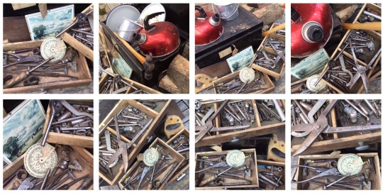
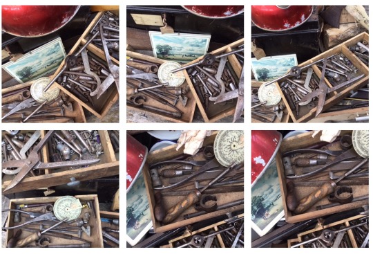
Favourite compositions from photographing the objects in a square format.
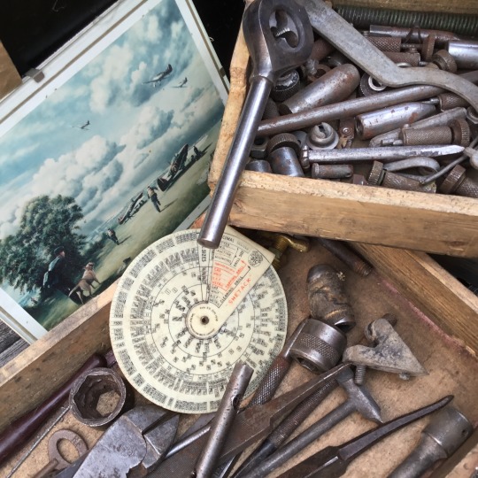
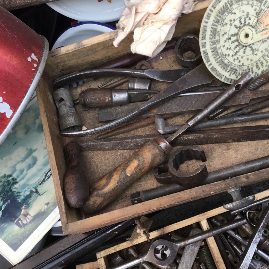
Favourite favourites - I like the naturalism of these, they feel like photos of a messy real workshop table instead of some carefully arranged objects on a garden bench, feels like if you zoomed out the rest of the workshop would be there. They both have the print with the ww2 planes, which I feel is really key to suggesting the identity and experiences of the men who owned/own these items - my great grandfather and grandfather living through wartimes and my dad’s interest as a historian. The close-ups on the tool chest draws show the focus and fascination these tools held for me, like a wunderkammer/cabinet of curiosities, and I like the worn metal and wood textures and cosy warm brown tones.
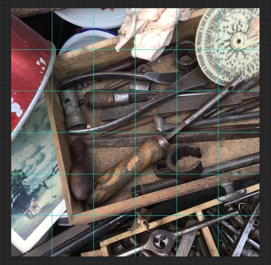
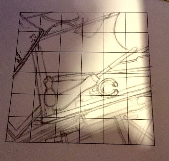
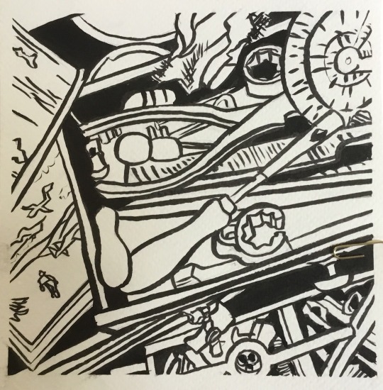
I found it really hard to produce an accurate and nice-looking line visual from my photo. I tried using a grid over my image and sketch to help with accuracy, which did help get down the proportions and placing of the main structural elements - drawers and frame- but got in the way when I was trying to fill in intricate details of the weird old tools in the drawers. After sketching with the grid, I tried to ink in the lines in a more free way so the drawing looked more organic, but there’s just so much detail and noise with this drawing it’s hard to know what you’re looking at. One of the aims of this task was to communicate an idea or interpretation of your chosen theme, and I don’t think my line drawing communicates the ideas and feelings I identified at the start of this post. Part of my difficulties with this task was a certain amount of confusion regarding the steps that were laid out, and I think my work here will benefit from a second go after tutor feedback.
0 notes
Text
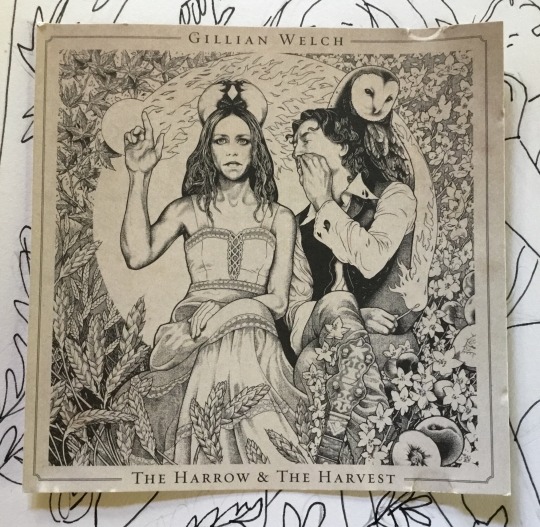
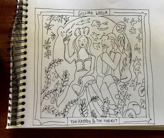
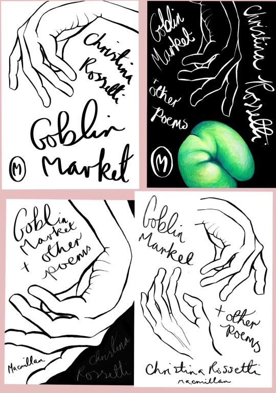
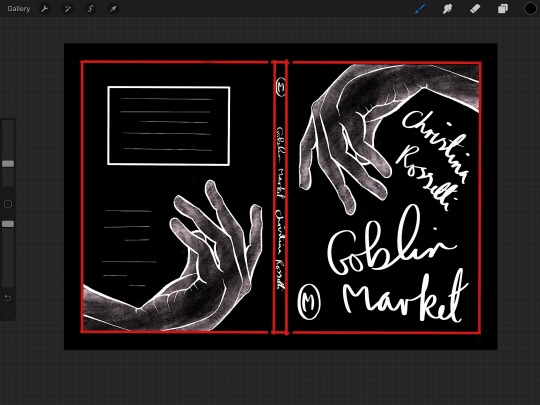
Making a mock-up book cover
To make my mock-up book cover I repurposed my illustration for Christina Rossetti’s “Goblin Market” created earlier in this unit and returned to my earlier visual elements/visual interpretation of the text.
I began by collecting a random hodgepodge of book cover designs on a pinterest board, contemporary and historic, no specific genre, to begin a research index for future reference and collect inspiration. Three examples I was drawn to all had relatively(or apparently) simple designs, a minimal amount of visual elements and colours. I feel like these designs are really strong in a quiet, non fussy sort of way, with a main visual element illustrating the title very direct and representationally.
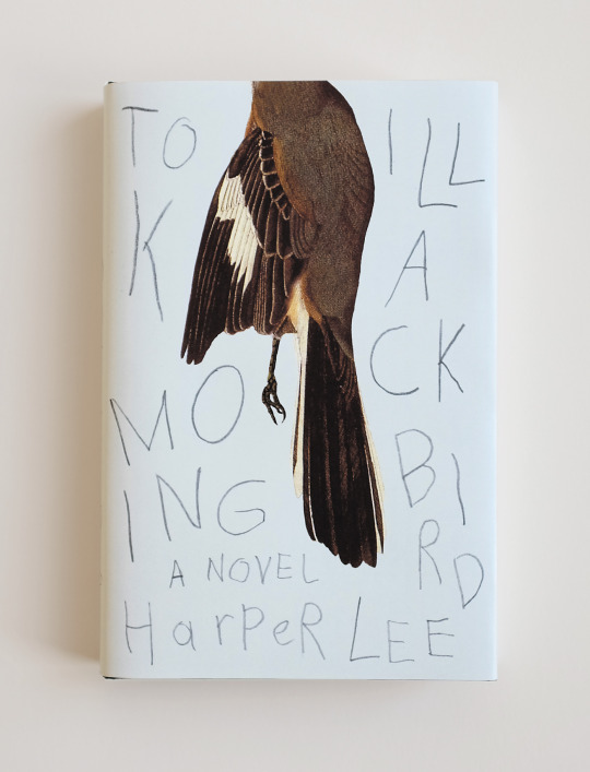
To Kill a Mockingbird cover - Jason Booher
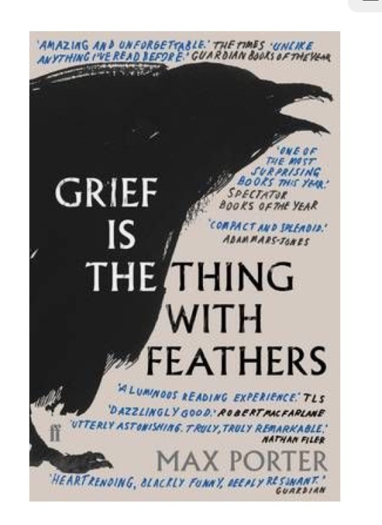
Grief is a thing with Feathers cover - Faber and Faber
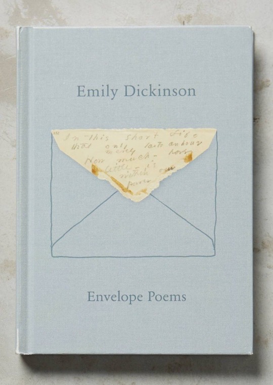
Emily Dickinson - Envelope Poems
And some random designs I liked -
Original goblin market work
“Apples and quinces,
Lemons and oranges,
Plump unpeck’d cherries,
Melons and raspberries,
Bloom-down-cheek’d peaches,
Swart-headed mulberries,
Wild free-born cranberries,
Crab-apples, dewberries,
Pine-apples, blackberries,
Apricots, strawberries;—
All ripe together
In summer weather,—”
“Currants and gooseberries,
Bright-fire-like barberries,
Figs to fill your mouth,
Citrons from the South,
Sweet to tongue and sound to eye;
Come buy, come buy.”
“Laura stretch’d her gleaming neck
Like a rush-imbedded swan,
Like a lily from the beck,
Like a moonlit poplar branch,
Like a vessel at the launch
When its last restraint is gone.”
“With clasping arms and cautioning lips,
With tingling cheeks and finger tips.”
- selected extracts from “Goblin Market” by Christina Rossetti
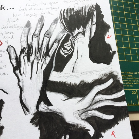
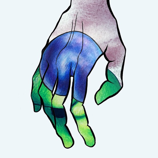
In my original work based on Goblin Market, I focused on descriptions of the luscious fruit, and descriptions of the characters. It’s a very sensual poem, so I felt the colours and textures were really important. I sought to create a contrast between the elongated, yearning and spare limbs/hands (“Like a moonlit poplar branch, like a vessel at the launch”) a bit pale and cold/flushed (“tingling cheeks and finger tips”) and the super-colourful, shiny bright plump fruit.
Designing the book cover
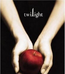
As detailed above, I was attracted to book cover designs that just two of three colours and used simple shapes in a really strong, graphic way, so I tried using only the hand drawings from my earlier work and title/author text as my design elements to play with. I really liked the designs above that included hand written fonts, it feels more personal, like you’re reading directly from the author’s notes (especially with the Emily Dickinson cover and the To Kill a Mockingbird cover - especially especially with the latter as it’s canonically written by the main character as an account of her childhood). I tried including a piece of the Goblin fruit on one of the rough covers but it reminded me a lot of the cover of “Twilight” by Stephanie Meyer, and although both texts are arguably about dubious relations with supernatural creatures I didn’t want the cover to look like I was trying to shoehorn a new edition of “Goblin Market” into the same genre and audience.
I had some struggles with software limitations, or more accurately my own limitations of understanding the Procreate app. I ended up eyeballing measurements to make my own book cover + spine template which was really not ideal. I need to do some more research into how to use this software so I can work to a more professional-ish standard moving forward.
Two outcomes, evaluation
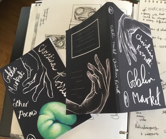
It was really rewarding to see how the designs came to life when folded up into a physical mock up, I can really see the value of this exercise as a visualisation tool for the final product, and I can definitely see myself making mock-ups again for future projects before getting things (zines, self published short comics, notebook designs?) professionally printed.
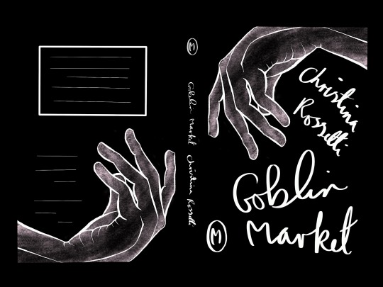
This version is my favourite outcome. I love the position and graceful movement of the hands and how they mirror each other around the book, and I feel like the positioning of the author’s name and title works well. I’m not sure about the font - I think it looks good, but it doesn’t really say much about the book contents, genre or period context. It would have been a good idea to find examples of handwriting around the time of the publication of the poetry volume, maybe even Christina Rossetti’s actual handwriting, to base the style off of and give a more historical tone (copperplate?). I think adding some textured skin tone shading to the hand added a lot more interest and physicality, sensuality of the “tingling cheeks and fingertips” in the poem. The hand looks ghostly, which fits with the poem’s narrative of a girl viscerally wasting away after consuming the goblin’s fruit.
0 notes
Text
Image Development
I really loved this exercise. An area for me that needs some work is exploring more options for an illustration before committing to one idea, and this was fantastic for learning how much just cropping an image can affect an illustration, without even going into image content. I found picking words and creating titles for the new edits really inspiring too, and made it easier to link the edits to artist and media research I’m inspired by, such as genres of film and literature by following the “text” link. I could then study the related visuals of these films or genres to apply to my re-interpretation of the image.
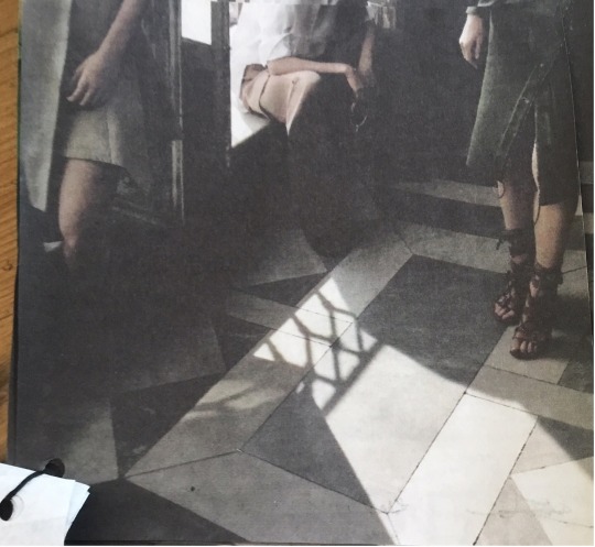
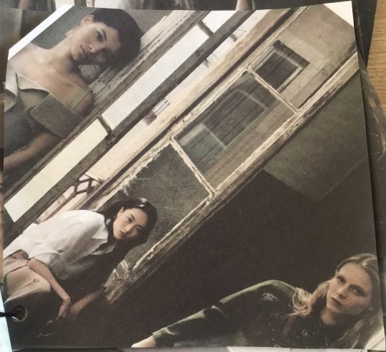
I found that cropping my magazine image strongly altered how it read in regards to dynamics between the characters and between the characters and their environment, depending on how much of either characters or background was cropped out. My chosen image had three figures, and by narrowing the image I could allow the central figure to have more power in the hierarchy, or share power between the three figures to make them more of a balanced team.
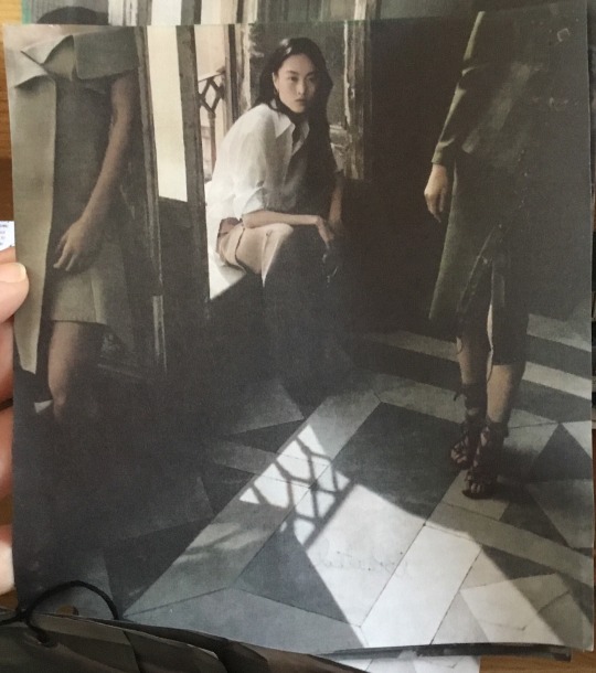
Cropping out heads and some of their bodies to be out of frame focuses all attention on the central figure, they feel most powerful in the hierarchy (title picked - Henchmen)
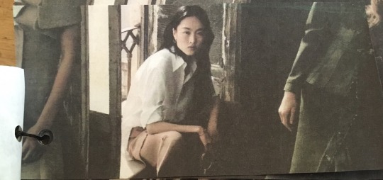
Environment and side figures have a little more agency and power here, tho having their faces be partially obscured still keeps central figure dominant in the hierarchy, this is the main character (title - Courtiers)
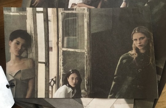
More of a balance of power here, the side characters are fully realised. Title picked - Warm welcome.
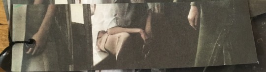
Choosing to focus the “lens” on other parts of the figures beyond their faces changed how the image read too. Cropping the faces out entirely to show waist- down hands and legs of the figures made them feel mysterious and intriguing, almost predatory? Sloping around their shady corridor environment. Having a tight crop on just faces created a sense of a narrative strongly focused on their personalities and relationships, whilst including more of the background created a sense of place and forces at work beyond the central three figures, they are in and affected by an environment rather than dominating.
- Secrets
- Isolated - thinking about how being in a position of power can be isolating. The central figure here is hemmed in on either side by the faceless bodies and the frame is cropped tightly above and below her figure, it feels a bit claustrophobic and trapped.
Prowlers - all faces are hidden, refusing the viewer an emotional connection in the image, just long limbs haunting the environment.
Slanting the image produced some interesting noir-esque connotations, drawing on ideas of mystery, femme fatales, spies and underworlds. There’s a bit of a Third Man vibe coming from the 30s/40s noir films and the German expressionism cinema before that with the very strong values present in the original magazine image.
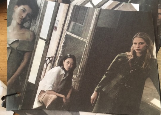
Title picked - A-Team
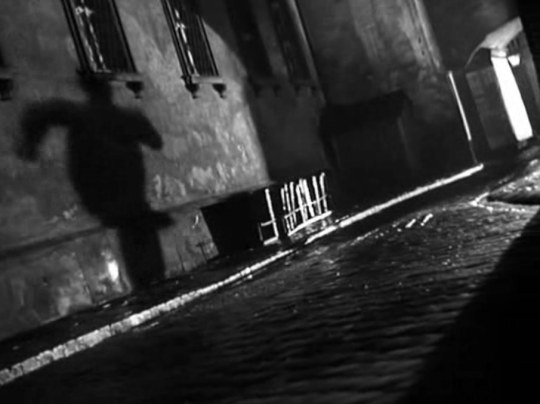
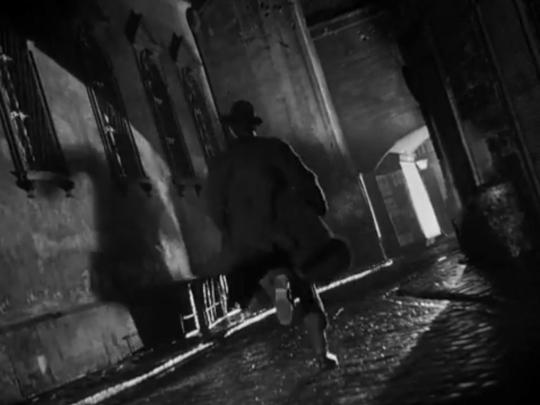
Dutch angle shots from The Third Man, from “deutsch” - German, from usage of this type of shot in German expressionism films.
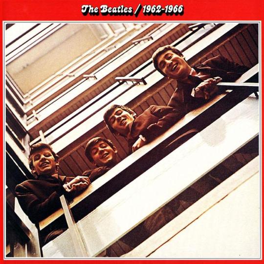
A version I cropped into a square shape gave the suggestion of an album cover, specially reminded me of this Beatles album cover.
Title picked - Forces/ We’re in a band (in this image the three figures look the most balanced in hierarchy/power than in all the other edits, rotating the image put their faces into a diagonal line where they feel equal)
I picked the image I’d titled “Courtiers” (“a person who attends a royal court as a companion or adviser to the king or queen) or “Noblésse” (the nobility of a foreign country) for my redraw. I was interested in exploring this idea of being in power over others but isolated in that role at the same time, and combining that with ideas about historic European noble courts and 40s spy rings suggested by some of my other edits. These themes reminded me of the book “A Skinful of Shadows” by Frances Hardinge, set in the English Civil War in the 17th century. The narrative takes place against the backdrop of a “shadow war going on where (many of) the spies and notable members of the network on both sides seem to have been female,” (Frances Hardinge). In a Waterstones’ interview with Hardinge, Martha Greengrass wrote “the historical setting for this novel also allows for different opportunities to explore the ways in which women..disguise parts of themselves in order to adhere to the strictures of society, or subvert them.” Frances Hardinge based some characters and events in “A Skinful of Shadows” from real-life historical figures including Jane Whorwood, a royalist agent and gold smuggler, “Parliament Joan” and Katherine and Elizabeth Murray, a mother and daughter of a secret royalist organisation “The Sealed Knot”. One noteworthy historical event involved the smuggling of documents and gold in barrels of soap.
In my research I came across the word “Châtelaine”, which has come to mean “a woman in charge of a large house”, from the same word meaning a “set of short chains attached to a woman’s belt, used for carrying keys or other items”, and I thought this was a more interesting title for a piece inspired by 17th century female spies.
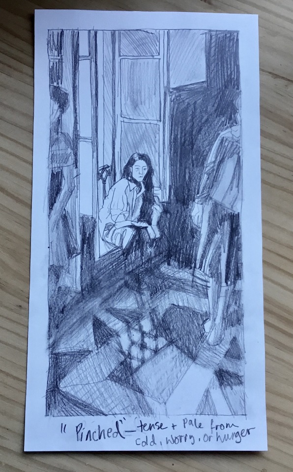
This version below was going to be the sketch for “Châtelaine” but I thought it worked as it’s own, different interpretation of the original image. Using “Pinched” as the title, I thought the black and white palette, rough, scribbly textures and cold light coming through the window, the positioning of the disinterested side figures and the taught expression of the central figure illustrated this word well. The environment looks cold, spare, sooty and smudgy, and I scrawled the title in the same pencil as the drawing to continue this impression.
Development ideas
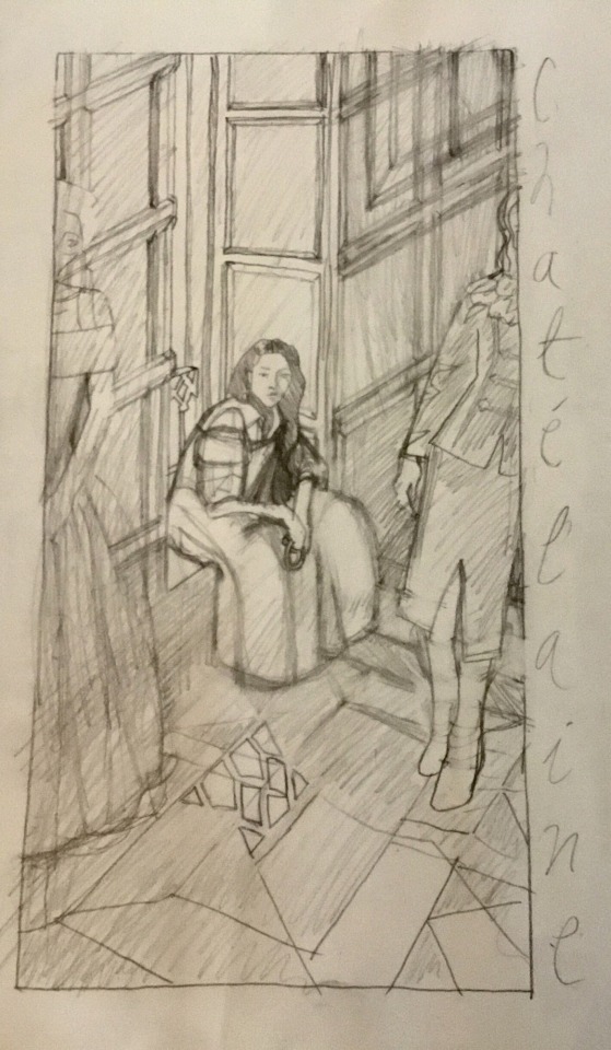
I also began this sketch to illustrate the title “Châtelaine”, from my research in 17th century female spies. The plan was to edit the sketch into a 17th century scene by changing the figures’ clothes to period-appropriate fashion, change the walls to historic wood panelling and have the central figure holding a châtelaine in her hands. Then to represent 20th cent. spy/noir iconography I’d exaggerate the lighting of the original image to be really strongly contrasted, moody and architectural, (see The Third Man caps above) and either have a black and white monochromatic palette, or monochrome sepia tones for a more old-timey feeling.
1 note
·
View note
Text
Abstract Illustration
I chose the instrumental song “Faena” by The Gypsy Kings as a basis for this project and made some sheets of experimental mark-making whilst listening to the song. I was thinking of the lush tones of the acoustic guitar melodies and the way they intertwined to create a texture of sound. The music felt delicate and trickling, which suggested water and nature and cool shady greenery to me. The piece of music is a little bit plaintive and playful at the same time, shifting around the minor/major key divide, so I wanted my mark-making to try and be subtle and sensitive, not bombastic like a full major key song might suggest.
My first worksheets (A) suggested a texture of tangled streamers and flowing ribbons, and I found using an x-acto knife to cut swoops and curves of paper felt natural and conducive to the mood of the song, so continued using these elements in my second phase of worksheets (B) . I also did some pencil studies of trickling water textures, to try and incorporate this into my paper-cuts. It was really challenging to try and depict the crystalline water using just black and white tones, the images seemed too stark and severe for the song. My favourite outcome from this second phase of experimentation was a paper-cut that I created with no plan at the outset, beginning with a few “ribbons” and adding more and more intertwining strands, playing with the negative spaces, shifting whether I used black or white for the negative or positive “lines”. I cut this abstract shape put and found it resembled a treble clef, a symbol used in writing sheet music (C).
In my third phase of experimentation (D) I tried to be more intentional with my mark-making, trying to re-create specific forms from previous pieces, but I felt these pieces were less interesting. The ribbon strands were more regular in shape, less interesting straggly/gangling threads, too uniformly curved. I tried laying the paper-cuts over different coloured paper, and re-introduced colour used in my very first worksheets. I also researched some calligraphy hands I might use for adding text to the album cover, that were suggested to me by the flowing ribbons present in my experiments so far. I tried creating a mock up album cover (E) combining all these different aspects. I liked some areas of the ribbon designs, (though they still felt a bit less spontaneous and lively than designs from the previous phases) and I thought it would be good to carry forward the cool blue, turquoise, to warm green colour gradients, but overall I found this mock up way too busy and over complicated. The strength of the ribbon design was overpowered by the strong background paper tones, the green felt too strong and it just didn’t feel at all balanced - your eyes get kind of stuck in the middle section with the black and the initials.
I went back to the guidelines for this exercise and followed the instruction to zoom in and pick out squares of texture from my initial worksheets. I went through and took photographs using a square setting on my camera, and found this really fruitful - it brought back an element of spontaneity and happy accidents I felt I really needed to return to. From these images, and taking colour inspiration from my first worksheets, I tried stitching some small embroidery pieces using satin stitch (G). The way this particular stitch really catches the light to have a ribbon-like shine felt fitting to the ideas of ribbons and water I’d been playing with. Since embroidery is such a time consuming medium I kept my samples pretty small, but I really like the larger black square (H), though the stitched ribbons are a little bit uneven, the colours and shapes feel fresh and organic. I also created a finalised papercut from the treble clef design I liked from my earlier experiments.
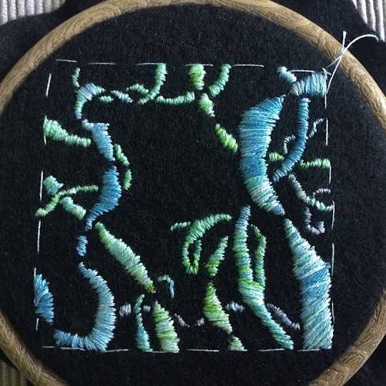
Evaluation and development ideas - would this work as a Gipsy Kings’ album cover?
Yes I think so. I haven’t seen embroidered album covers before, but I have seen book cover designs using high quality photography of hand embroidered details, like with the artist Chloe Giordano’s work. I think the treble clef image is perhaps a bit too stark and sober for the band’s music, which from the album I listened to ranges from lively and colourful and exuberant to delicate and pensive. The designs I produced that I think have the most potential to work up into a cover are the blue and green embroidered black square, or one of my square close-up photos of my papercut texture over silver metallic card - I love the way the white paper layer casts shadows over the silver to give it a real water-like quality and a 3-d dimension. To create a suitable album cover for the Gypsy Kings from these designs I would like to research and analyse their actual album cover designs, along with covers from other artists, then with this information edit my work digitally to tweak colours and shapes, try out placement and font for any text on the cover.
0 notes
Text
Reading an image
List the contents of the picture
Dragon with a pile of gold and a throne, cave, piles of knight’s amour and weapons, two children with a flaming torch.
What is the image about. What is it saying? Work out the narrative and identify the story.
Two children sneaking into a dragon’s lair, being very quiet and cautious. Be careful of the sleeping dragon!
Describe palette and tonal range used. Note which colours are hot and cold, where elements are detailed or textural. Is there any connection between hot colour and the importance of this element in telling the story? Identify the hierarchy in the image.
The colours in this image are really bright and appealing, using a strong contrast of hot and cold tones. The dragon is bold red, symbolising heat and danger, and it’s pile of treasure is gold - these two colours are used again on the roof of the cave where it’s lit by the childrens’ torch, reinforcing the association of fire and dragons, like a prediction of what may happen if the dragon wakes up. The detailed stalactite texture on the cave’s ceiling further adds to this association by resembling flickering flames. The childrens’ faces are rendered in warm tones too, lit up dramatically by the torch light and encircled by the cold blue mouth of the cave. This draws the viewers eye to the human element of the story; this is where our interest and empathy lies. Green is used as a mid-tone of sorts, from a spectrum of warm-toned yellow-green for elements of strong narrative importance (the throne, children’s clothes) to cooler greens where the knights‘s armour begins to fade into the cold toned, blue and purple dark cave setting.
The dragon is the largest element in the image, emphasising his power and importance in the narrative. The children are tiny compared to him, which emphasises their vulnerability and gives a sense of threat. The children are placed to the left of the dragon, so the images “reads” when viewed through a typical Western perspective from left to right; we can clearly tell the children are moving towards the dragon. If the image were split into four quarters down the middle, the dragon and the flaming red roof are diagonal from each other, further emphasising their association. The bulk of the finer detail in the image is in the lower left quarter, with the children and the armour, contrasted diagonally with the clear space in the upper right corner where the dark cave fades to murky blue.
I would say the hierarchy of the image is: flaming stalactite roof (showing the lurking threat of the dragon) dragon and childrens faces, then old knight’s armour, then the cave setting.
0 notes
Text
Illustrating visual space
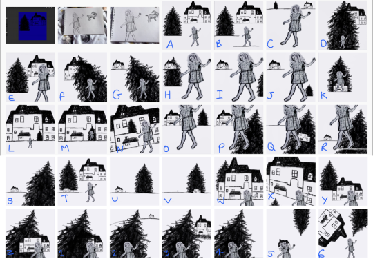
How does your sense of the image and it’s meaning change when the figure is smaller than the other elements?
I think the scale and position of the character has a huge impact on how a viewer reads a scene emotionally and how a wider narrative is suggested. When my character is smaller she feels less powerful and less in control of her environment. The forces represented by the tree and house (perhaps nature and wilderness vs. family, order and society) feel more dominant and powerful. The relationship between the larger and smaller elements isn’t necessarily antagonistic, it could represent a normal state of childhood; being small in a big world. I think other image dynamics could be used to further define the relationship between elements, like colour, lighting choices, figure body language. I chose to draw the house and tree elements (especially the tree) in a scribbly chaotic style so to me they suggest a darker mood, but the girl’s pose feels carefree, so to me this offsets the “big equals powerful, small equals weak” message a little in an interesting way. (Written focusing on L, D, F and G)
When the elements are at different angles to each other and the frame, what dynamic is suggested?
The diagonal elements guide the eye along like an arrow, like in 6 where the roof and treetop point you towards the girl, and in F and G where the tree guides you in a line from the bottom right corner up towards the house in the top left. In 2, the tree guides the eye up the hill to the house but the girl is angled in the opposite direction. I feel like this gives her a rebellious character against the forces of the tree and house and what they represent. Or she could be read as foolhardy, ignoring the tree pointing her back to safety.
If all elements are completely horizontal and vertical in relation to the frame what dynamic is suggested and what sensation does it communicate?
Feels calmer than diagonal thumbnails, the elements are balanced in hierarchy (especially when their scale is in balance too, like in A and B). When the elements are arranged in a line it suggests a timeline of events or progression of a story.
Which is your favourite composition? Explain why you feel it is most successful.
U and V are some of my favourites because I feel the compositions are very simple but tell a story. In U and V I enjoyed keeping the angles simple and square to the frame, but then playing with the scale of and space between the elements in order to suggest more interesting narrative dynamics at work. So in U, where the tree is massive and unruly and the tiny figure of the girl is aligned with the house, the tree feels more powerful over the other elements, however there’s still a bit of a sense of equilibrium from the symmetry between the house and the tree. In V, the tree and house are aligned, and the tiny figure is out on her own. To me the dark tree feels like an ominous presence over the house, or a representation of the house’s inherent darkness.
0 notes
Text
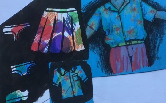
Using reference - 50s interior
Make an illustration of someone sitting in a chair surrounded by typical artefacts to give a teenager an idea of the 1950s
Notes interpreting the brief:
Educational/informative purpose but in a colourful, interesting and appealing way. I don’t think my regular, heavy on the block shadows style will be a good fit here, the style needs to be legible and not exactly diagrammatic but more in that direction.
Idea development process
Doodles where I was initially thinking about drawing an isometric room, maybe a teen’s bedroom, with poster and memorabilia up everywhere.
Mark-making/doodling from reference, focusing on California “Googie” or space age road signs, thinking about retrofuturism and tiki culture, kind of tacky and fun
Testing styles and colour palettes in studies from reference.
The juke box in the bottom right is in something like my more usual style with the thick dark lines and shadows. As I suspected it wasn’t really a good fit, the lines felt overbearing with the pattern detailing and colours needed to create a period-specific aesthetic. That was the first study I did, along with the purple and green tiered table (again, too thick lines). I was a lot happier with the style of the turquoise sofa and the red-blue-green tiered table, using thin clear ink lines for just the bones of the objectand using coloured pencils to create tone and texture. The grain of the coloured pencil felt appropriate to 50s-style earthy/simple/experimental textures, and the clean (if a bit wobbly) pen lines created the very legible, diagrammatic-ish style I felt was more suitable.
Some quick studies of people sitting in different positions to refresh and practise, and a bit of experimental mark-making where I scribbled loose patterns that were a bit 50s inspired, then drew clothes on top to create a kind of incidental print. Looking at these now having finished the illustration I think this would have been an idea worth pursuing more, for an alternative go at this brief focusing more on fabric artefacts and surface/pattern design of the time. Developing a style from these experiments may have resulted in a looser, livelier and more stylistic illustration, not as dense and stiff?
Doing a last few studies to tweak the style, especially figuring out how drawing people in this style might work before working up the final illustration - see notes in sketchbook
Final illustration
In this exercise I struggled a bit with combining the brief with elements that personally inspire me, and probably, definitely, did a lot of over-thinking and complicating. Although I’m mostly happy and proud of the illustration on a personal level I think I veered/extrapolated a bit too far from the brief, especially if this was client work. I was quite daunted by the idea of visually summarising the 50s so tried to narrow it down a bit by focusing on specific aesthetics, and I find creating work around a narrative easier when I’m really stuck. I also struggled with the idea of representing the 50s without resorting to stereotypical depictions of straight white middle class Americans with the like, happy little housewife, the successful businessman husband, cookie cutter children. I’m a lot more interested in social history of disenfranchised groups but it was all just a lot to juggle in trying to create what should really be a simple illustration of carefully selected artefacts.
So eventually settled around the concept of focusing on the developing youth culture of the 50s (since this is a piece for teenagers), with my main influence being the film Rebel Without a Cause and it’s consideration of traditional roles and expectations of society and how we might feel misplaced in these. The characters in my illustration are based on James Dean’s and Sal Mineo’s characters, developing how their characters are homosexually coded in the film. So the final concept I arrived at was a young 20s gay couple in the late 50s living in California with exteriors and interiors inspired by space age/retrofuturism and tiki/tropical style.
50s design insp. elements in final illustration:
- midcentury-modern furniture: sofa, tv cabinet, plant stand, boomerang-shaped table. Pale wood, geometric shapes, flowing light design, simple shape cut-outs
- 50s tech: record player, tv in tv cabinet
- surface patterns: curtains, bowl, vase and cushions. Geometric shapes, starbursts, boomerangs with connecting lines, scribble-pattern Formica tabletop
- googie/space age/retrofuturism: mainly the sign outside the window with the synthetic moon providing the main light source for the scene. Starburst elements of patterns
- paper ephemera: record covers, esp. “blue moon” cover (to link in with sign), Rebel without a cause poster (turned out kind of crap), horror/sci-fi comics, cartoon hearts and music notes in scene
Side aims for this piece, going alongside the brief, how I want to personally challenge myself based on where I am in general art practise:
Create a scene with atmospheric lighting and colour, people with normal-looking anatomy that look like they’re in the scene, develop technical skills including perspective, how light affects local colour (building on theory from reading James Gurney’s Colour and Light, create a piece that just gives you a vibe or a feeling when you look at it from atmospheric effects (light, colour palette, colour temperature gradients).
Things that don’t work/could be better:
- anatomy of the Sofa Guy, either his hand is too small or his head is too big, he doesn’t look quite right
- some of the colour layering got pretty muddy, especially in the shadow areas of the floor and poster, as a result of being very new to thinking about light affecting local colour and un-used to using colours on the grey-brown-tan spectrum
-perspective on the popcorn bowl is wrong, should be more of a top-view
- record sleeves, comics and poster. I wish I’d been more accurate with these, based them off real life 50s items and kept the details very clear, it would make the 50s references and the “Blue moon” theme easier for the viewer to recognise.
Summing up and referring back to the brief
I’m generally really happy with it as an illustration. Although I’m really un-practised in these things I think I managed to get the perspective ok and I really like the composition and colours, with the plants guiding you into the middle of the room, the cold light in the middle, warm shadows, it feels atmospheric like I was hoping for. I like the anatomy and pose of the character on the floor, it was tricky to get the angles of his jaw looking right from the back but I think it turned out ok, and I love the shape of his hair, it looks really fluffy and thick.
However as a response to the brief I don’t think it’s a super great fit. I can see the 50s influences in it from my research but I’m not sure it would scream “50s” to another viewer, it’s more of a look at a niche part of 50s design rather than depicting the most typical artefacts possible. This appeals to me a bit more personally, I love representations of history that question our tropes of the past, visual and otherwise, again this was my struggling between the brief and what personally inspires me. If I tried this exercise again, I think I’d keep to the brief with the content/typical artefacts and go more experimental with style and mediums used, since the brief doesn’t specify anything there (addition - this is what I did later with the “Choosing content” assignment, where I wasn’t super inspired by the brief either, worked really well). I think I’d pick one area to really focus on, like surface pattern design, developing a style from this bit of experimentation done much earlier in this assignment (below).
0 notes
Text
Objective/Subjective drawing
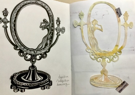
Take 1, I re-read the exercise instructions and found I’d missed half of them off so I’ll have another go at this. The idea was that the pencil and ink drawing was the objective version, the papercut the subjective, but I got caught up and made the black ink shading very dark and blocky so it looks quite subjective too! I think maybe these terms are much more a scale and relative to the individual artist/viewer/culture/time period the artwork was created in. For instance cave art looks stylistic to us, but at the time may have been seen as objective technical reproductions since it was the only thing around.this might work the other way too, medieval artwork with wonky perspective may be seen by us as objective for the time period due to a lack of technical knowledge, but there’s no way of knowing for sure it wasn’t a stylistic choice.
0 notes
Text
Generating ideas
Spider diagrams
Fun and successful, I was able to come up with a lot of ideas on my own through word and memory association, asking others for their word associations worked well too. It was interesting to see how people’s personalities came across in their replies, for instance my Dad’s were based in personal memory and species of birds, a lot of mine were from associations with books and films. I was a bit impatient writing down the more obvious words because I wanted to get to more interesting/alternative interpretations, but when coming up with ideas I think it’s important to recognise group/mainstream connotations too if you’re drawing for an audience.
Turning words into pictures
I found I was a bit stilted in this part of the exercise, it was hard to not be a perfectionist and just doodle ideas fluidly. I was frustrated because with the short amount of time spent on each image and not using reference it was hard to depict the images in my head. Something to try again, taking a little bit more time over each image and working in a more relaxed flow, and maybe starting with mindmap then going to this process instead of straight in.
Moodboards
I chose the word “Wild”, and stuck to using just fashion mags and National Geographics, not printing anything out from online. At first I found this limiting, but overall I found the limitations lead to a more interesting selection of visual ideas, in order to create something that didn’t look fashiony or national geographicy. I picked out extremely vivid natural textures and colours, clashing reds, greens, orange and blues, and somewhat offputting physical elements like eyes, hair, fur, straw, teeth and weirdly shaped vegetables. I was thinking about an interpretation of “wild” that ignored regular interpretations of beauty, subtlety, order and maybe taste in favour of something more crazy, chaotic, gross, vibrant and uncontained. I also included some unnatural cloth textures like bright blue fake fur and a 60/70s-reminiscent print that has similar clashing, hot and vibrant but earthy colours. I really enjoyed making the moodboard and I like it as a concept piece. It would be good to try working this concept up into a final piece to see if making a physical moodboard contributes more to my ideas process than my regular use of Pinterest boards for the same purpose - maybe the limitations might take me in a different direction, since it’s easier to find images matching the ones in your head online (sometimes!)
0 notes