#and even premade templates you can copy/paste
Note
waddles in your inbox
Hiya! Regarding PluralKit, do you have advices/tips on how to make a neat/aesthetic descriptions? Inspirations for examples on how to make one, or like- a copy paste of the template? Sorry if I'm asking a lot whoop-
🪺 (She/Her) & 🍎 (He/Him) & 🌀 (She/Her) & <3 (She/Her) Began Writing
😐🏹 (He/Him), 😐📖 (He/Him) Finishing.
Hi, sorry for the lateness of answering this ask. And thank you for sending in an ask! ❣️ And don't worry you're not asking too much!
So pluralkit is a bit tricky when it comes to making descriptions as for some systems it might be difficult to keep your information below the character limit. We even ourselves struggle with making a very pleasant aesthetic bio for pluralkit ourselves.
Our main tips are limited with Pluralkit bios specifically; but we might be able to get something!
Actively conversate and make sure you know what you're wanting, what you need, and what you can leave out! If you can't convey everything in just the bio of your pluralkit page, possibly try working that information into individual headmates/sysmates bios!
Take advantage of online guides like discord servers that help with aesthetic pluralkit bios, and definitely maybe dip your own toes into the idea of making your own!
A lot of premade templates exist by simply googling "Pluralkit/Tupperbox System Bio Templates". Tumblr as a million, but there are few and very far between, especially taking into account syscourse and people making templates specifically for and only for traumagenic systems, limiting the resources.
We personally definitely recommend using these carrds here as its something of a common practice to use symbols that are from other languages like Japanese or Arabic as aesthetic symbols for rain or stars, and it messes with screen readers.
Make sure to take and leave as you will! We honestly in most advice asks here asking about how to organize and such will offer as much inspiration as we can! While also encouraging people to seek what they want to display if they have an idea, and leave what you as a system don't wish to explore.
So we actually are going to put our own template making skills to use and make a broad base template any system can use!:
✷ Welcome to [System] !! ✷
Our name is [name], and this is our introduction to our [platform name]! Below is information on our system, boundaries, and fun links we/other sysmates enjoy!
ıllı ────── ıllı
**General Information**
**Name?**
⟡ Name(s), Nicknames
**Age?**
⟡ Age range or Age
**System &/ Body Gender?**
⟡ Gender Terms (with possible Links)
**System &/ Body Orientation?**
⟡ Orientation Terms (with possible Links)
**System Terms/Origins?**
⟡ System Terms/Origins/Modifiers (with possible Links)
**Status/Relationship?**
⟡ Taken/Single/Private/Etc
Possible notes: Notes
ıllı ────── ıllı
**Boundaries**
**Do NOT Interact If..:**
⟡ Following Boundaries
**DO Interact If..**
⟡ Following Boundaries
**Ask to Interact If..**
⟡ Following Boundaries
Possible Notes: Notes
**System Terms**
**Do Not Refer to us as..**
⟡ Terms
**Please refer to us as..**
⟡ Terms
**Ask if you can refer to us as..**
⟡ Terms
ıllı ────── ıllı
**Fun Information**
**Fandoms/Hobbies**
⟡ Fandoms & Hobbies
**Where else to find you?**
⟡ Individual sysmates blogs/socials/etc & System socials and such
This was a quick template that we will put in the comments as it's own thing hopefully. Thank you again for you again for your ask! And hopefully this helped in some way! And we FINALLY finished this after months. So we apologize for how long this took.
We will be uploading a self Indulgent post about a how to privacy guide, then will start being more active on this blog!
11 notes
·
View notes
Text
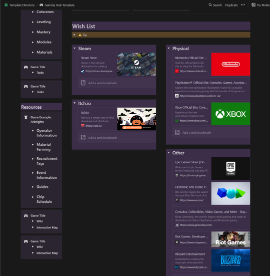
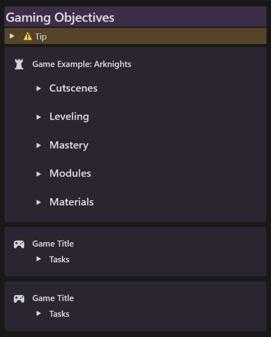
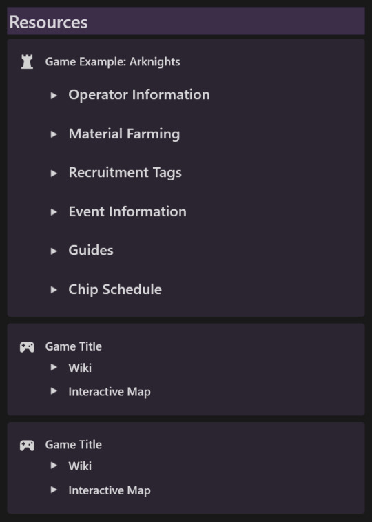
Game Library and Objectives Template
A Gaming Template for Notion
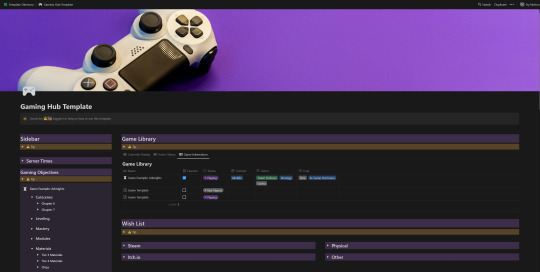
Have you been looking for a place to catalogue your game library? Or perhaps you want to keep all your gaming goals on an easy to navigate page? Well, look no further!
I'm officially sharing the gaming template I personally use to track my own game progress and goals as well as my entire game catalogue. As someone who plays a lot of games that require memorizing an ungodly amount of information Arknights, I need a second brain to store it all in. I set up a Notion page to help me keep track of all those resources, schedules, and information.
Hopefully it will come in handy for you as well! Continue reading for the template link and a run down of the key features.
Key Features
This template includes:
An easy to navigate hub for all your gaming needs, complete with drop down Wish List and Side Bar.

A gaming sidebar Complete with clocks set to common server time zones! Clock widgets were set up using Apption and can be customized if you make a free account.

Side bar also includes spaces to copy and paste frequently checked Game Objectives and Resources. Blocks can be synced from your Game Pages in the Game Library so that changes made in one Synced Block will also show up in the other.
A Game Library Database complete with 3 premade views and sort-able tags including Platform, Genre, Play Status, Cost and a Favorites category.

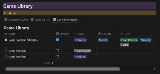
Premade Game Page template is available for every new entry to your Game Library Database so you won't have to set each one up over and over. I've even included an example so you can see how I organize my game info! I highly recommend it for any strategy based game with a lot of components.
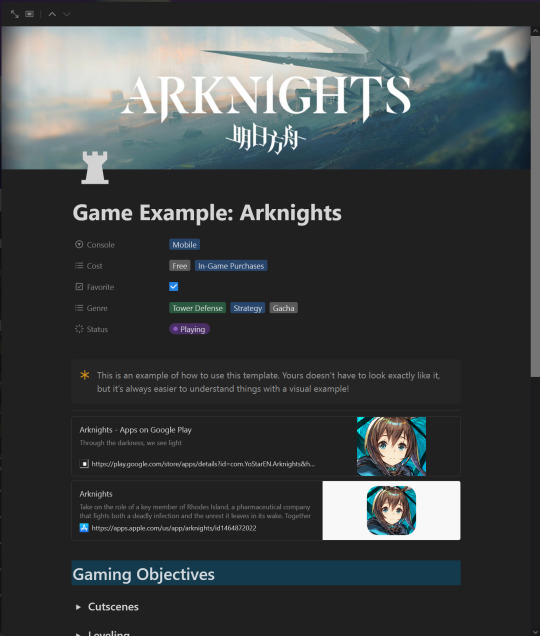

And best of all? I've included Tips to help you navigate and use all the features available in the template.

You can preview and duplicate the template Here!
Happy Gaming! For more Notion templates, check my Notion tag!
#888xiinotion#notion template#notion templates#arknights#Including that last tag because that's what I personally use this template for#That and Project Zomboid#notion
10 notes
·
View notes
Text
Happy Addons for Elementor Pro 2.5 Nulled Free (Pre-Activated)

Happy Elementor Addons Pro Nulled is an all-inclusive package for every level of users. With its incredible features, now you can do stuff once possible only by professionals! The elements in this pack are well structured and consistent – it works beautifully with other widgets to create beautiful design together. These customizable blocks perfectly fit your existing website designs; they’re flexible too which allows them modify any look & feel desired.
Happy Addons for Elementor Pro Nulled Free
If you're planning to use happy addons pro nulled on more than one website, you may want to consider purchasing the pro version. The premium version includes Cross Domain Copy Paste and upcoming Site Sync features. The different pricing tiers also include support response time. The free tier will only require a single email to a support team. The five and 1,000-site options have a six-hour wait period for your request. The premium version has unlimited features, including a downloadable template and a live demo.
Happy Addons Nulled Free
Besides being free, HappyAddons offers a pro version. This includes premium features such as the upcoming Site Sync and Cross Domain Copy Paste. Each pricing tier includes the support response time. For the free version, you can get support within a day. The paid version is limited to twelve hours, and the 1,000-site version will receive a response within six hours. Depending on your needs, HappyAddons will help you build a site that is unique to your brand and your business. You can even use it on multisite sites. You can purchase the pro version for one, five, or 1,000 sites.
The premium version also includes features such as Cross Domain Copy Paste and the upcoming Site Sync. In addition, the pro version also includes a feature that speeds up front-end page loading. In addition to speeding up your front-end page load, happy elementor addons pro license key is an excellent choice for building a professional WordPress site. The free version is available for individuals and small businesses alike. For businesses, it allows you to easily add new sections to your Elementor site. Previously, you had to use the standard feature for creating new pages. But now you can add nested sections to your Inner Section. You can also add line icons to your pages.
Happy elementor addons pro nulled is available in three tiers. The premium version offers features such as site synchronization and cross-domain copy-paste. The free version allows you to install the plugin on a single site. The paid version, however, includes additional features. Moreover, the premium version includes the Cross-domain copy-paste feature, which is a must-have for every modern WordPress site. Lastly, it is a powerful tool for WordPress websites.
Features
- Smart integration
- Get support whenever you need
- Comes with a rich set of features
- Quick presets
- Shuffle Through 400+ Presets
- Cross-Domain Copy Paste
- Unlimited Section Nesting
- Use our Premade Sections
- Fast growing addons pack
- Comes with cohesive elements
Download Link
Read the full article
0 notes
Text
stories through the memories
I think the main part of us just adores the system of memories in ts2. Even having the same group of situations we always watch with interest what new memory our sim gets.
And actually Maxis used this amazing system to show us the past of their characters, to show us the stories of premades (and that's why we love so much play with their sims, we know not only their personality and interests, but also the past, which helps the player to fully analyze the life of any premade). Of course, very often we see 'a standard template' of memories that have every Maxis sim, it depends on their age, status, career achievements, number of children, etc. Usually premades have mamories about learning toddler skills, about grades in school, birthsdays, being the best friend with future wife/husband, a first kiss, a new job (a raise at work), woohoo, baby (babies), a death of parents... We all know this memories so well.
But in some cases, The Sims 2 creators gave their sims unique memories and/or told a whole neighborhood story using this system. And I would like to discuss these kinds of unusual situations. Perhaps someone didn't attach much importance to this...
Why Monty and Capp hate each other?
That's a classical example how we can told even a tragedy through the memories in ts2. When Patrizio and Consort were teens they had a really strong friendship, but Contessa (Patrizio's girlfriend) fell in love with his best friend and they broke up. Iinteresting detail: Patrizio don't have a memory about Contessa's cheating, so she just have left him. But, despite this, a bitter enmity started... And now all (almost all) Monty can't stand not only Consort and deceased Contessa but their children and grandchildren. And maybe you notice that for Monty Culinary is a family carreer, however, initially Patrizio worked with Consort, but their conflict seems to have led to Monty being fired. And now it's 'a clan' of chefs.
What kind of person is/was Bella Goth?
We all know who Bella Goth is. We even have her ‘clone’ in Strangetown. And this ‘clone’ has her biography and personality, but not memories. Even so, we can still learn about the Lady in Red's past...through the past of other sims.
Mortimer’s memories told us he and Bella have been the besties since childhood. As the teenagers, they started dating and even snuck out together. So romantic, I think.
‘Snuck out’ memory is rarely for premades (I remember only four sims). In addition to Mortimer (of the nonteen sims), Kimberly Cordial also has it. However, it’s because of the fact the Cordial twins are similar to the Pleasant twins. Thus this memory is ‘a copy’ of Lilith's memory (she snuck out with Dirk).
Based on Cassandra's memories, Bella was a careful mom who taught her daughter all the toddler skills. Of course, don’t forget about Bella's coolest act – she rejected Don. All these little details help us learn about really famous but still an unplayable sim.
Love is in the air? Maybe… But isn't in the memories.
I have already mentioned that every premade has 'a standard template' of memories. And often a married premade/premade in relationships remembers how he/she/they fall in love with their partner, often but not always. Sometimes sims don’t have this kind of deep feelings.
Stella Roth doesn’t love her husband.
Regan and Cornwall Capp have a lot common, including a mutual lack of romantic feelings for each other.
Dina Caliente obsoletely doesn’t need this nonsense Love memory to put a ring on a hand of a rich Mortimer. And Mortimer still remembers only one love.
A teenage drama
Lilith and Dirk are the only premade teen couple who has Made out memory (with each other). This’s the most ‘serious’ romantic act for teens in ts2, their last step (even adult/elder premades didn’t do it while they were teens). I think it shows Dirk and Lilith are truly close and have a really hot relationship.
Jacob Martin (Riverblossom Hills) is the only one teen who has an ex (Jules O'Mackey). And by the time you first play with his household, Jacob is in a relationship with another girl Sandra Roth. It’s unusual for teenagers who sometimes have several crushes at the same time, but not a breakup.
As teens, Daniel and Mary-Sue Pleasant had a little complicated relationship (that not a surprise at all). Mary-Sue rejected a very first kiss by Daniel. This’s very ironic, in the past, Daniel has persistently sought love from Mary-Sue. But now it's he who can finally destroy their marriage.
In Desiderata Valley the families Aspir and Bell are truly close friends. Even their kids already get along well with each other. Curiously, Victor and Hannah shared their first kiss and, in their turn, Elizabeth and Issac shared their first kiss. While now we have two another marriage couples: Victor & Elizabeth, Hannah & Issac. Maybe it’s a sign from Maxis and their children would be a good match or it’s about parents who may rethink their marriage lives.
What about all this toddler skills?
In my opinion the memories about teaching the toddler skills sometimes can explain relationship between children and their parents. For example, thought these memories we found out the twins Lola and Chloe were raised by their stepmom Glabe Curious (while one of their biological father divorced her and left his alien babies). We remember Bella tough Cassandra all toddler skills (while more often both parents do it together). And there’re more examples of such good parents, like, PT9 did the same for Johnny or Hero Monty and her daughter Beatrice, etc. But sometimes children don't get enough attention from their parents. Lilith Pleasant hasn’t learned the toddler skills, while her twin sister owns all three. We can see neglect from parents to one of the sisters. And that explains the bad relationship between them. Many of the kids in the Capp family also didn’t learn the toddler skills (like Regan). Or Albany and Goneril's kids usually only learn two toddler skills. Most likely this’s because the Capp families always have many children and the parents don’t have time for each of them. Or Maxis were too lazy to add all three memories.
Another interesting memories
Legendary Olive Specter has her famous memory about Woohoo with Grim Reaper. And actually you won’t find another premade with so many memories of the weddings, engagements and deaths of grooms/husbands, I also don't remember another sim whose kid was taken away by a social worker.
Betty Goldstein is the only one sim who has a memory about WooHoo with Mystery Sim. Now we know Mystery Sim is not a virgin.
First PT9’s memory is his first met with Jenny. He doesn’t have any memory from his home planet. My headcanon: PT9 erased his own memory (using alien technology) to forget his ‘Pollinator career’.
All memories of premades from Riverblossom Hills are green (even memories about parents’ death). Obviously, this’s the developers’ mistake. However, I prefer to think Riverblossom Hills is some kind of creepy utopia. Where all sims positively perceive each event.
I hope this post inspires you to play with your favorite premades again. Perhaps you also analyzed their memories and can complement/fix my thoughts.
#ts2#pleasantview#bella goth#mortimer goth#ts2 pleasantview#ts2 veronaville#patrizio monty#consort capp#riverblossom hills#lilith pleasant#desiderata valley#pt9#strangetown#ts2 strangetown#olive specter#sims 2#the sims 2#ts2 premades#ts2 lore#maxis
15 notes
·
View notes
Text
How to create a PowerPoint for school while struggling with executive dysfunction
Note: this is my method it might not work for everyone
Step one: search the topic in google/whatever search engine you use. Scroll thru the websites that pop up and click on the ones that look promising/are talking about your topic. Don’t fall into the “this looks like it could be helpful but I'm not entirely sure so I won't click” trap. Just click everyone that looks somewhat promising and isn’t sus. It's not yet your job to see which ones you’ll actually be able to use. Right now your just gathering websites that COULD be a source. Then bookmark all of this in a folder for your project in your bookmarks bar. Now step away and take a break/ do whatever you want to do.
Step two: Now you're going to sort. Well, start sorting. Do a quick scan thru the website and see if it actually is usable. For example, maybe you searched for “1950s farming techniques” and one of the websites you clicked on is talking only about the pros of their farming techniques but you're talking about the cons? Then un-bookmark that website and throw it away.
Note: you may feel bad about having to get rid of so many sources that you had previously collected. Don’t. those were just sites that you that might help. Some you were correct on and will help, some you were wrong on. Nothing wrong with that.
Step three: go over to PowerPoint and look thru their themes. Bookmark the once that you think looks cool/relate to what you're talking about.
Step four: go thru the themes you bookmarked and narrow them down to two or three.
Step five: choose between the themes and select the one you will use for your PowerPoint and unpin the other one/s/.
Step six: click that theme then click create PowerPoint. After that look at the requirements for the project. Does it have a minimum number of slides? That put that many slides in your PowerPoint.
Note: some themes will come with some premade template slides showing what you can do. Don’t delete them. Just simply move them to the bottom of the PowerPoint. They might be helpful later on.
Note 2: don’t forget to put in a sources/works cited slide at the end. don’t worry you aren’t filling it in yet.
Step seven: label each slide. That’s it. This lets you map out what you are going to talk about and in what order.
Step eight: scan thru the websites. When you see the website talking about something you have a slide for, then place a link to the website on that slide. if the website doesn't talk about anything you have a slide for then get rid of it.
Step nine: choose a slide to start with. Click the links that slide has and copy and paste the relevant raw info onto that slide. It will be rewritten later.
Note: it might be helpful to do something like writing “raw info” or changing the font color so you’ll remember that it needs to be rewritten.
Note 2: don’t forget to put a link to the website on your sources tab while doing this.
Step ten: look at the raw info and turn it into bullet points. Bullet point the main info and any important facts.
Note: while doing this keep an eye out to see if you have any repeating info. Multiple sites may say the same fact. If this is the case then delete the extra info.
Step eleven: did your theme come with premade template slides? If it didn’t then you can skip this step, but if it did then look at them and see if you can use any of them. If you can use any of them then do so. It will make your presentation look neater, prettier, and more professional. Delete the slides you can’t use.
Step twelve: go back onto the web and see if you can find any photos related to your topic. If you can then place them in the slide they will fit the best with.
Step thirteen: this is when you should check the requirements. Some teachers prefer for your slides to just have bullet points/ have so many or less words. Some don’t care. If your teacher doesn’t care and you want your slides to be in sentences/ paragraphs then this is when you convert those bullet points into sentences like the english converted everyplace they touched into catholic/christian/protestant/whatever religion they were at the time of contact. With varying degrees of success. But don’t worry about that. Don’t worry if some of your sentences are a bit choppy right now, there will be a time for you to fix them up later. If your teacher wants your presentation as bullet points, then leave them alone on the PowerPoint and use them to write the first draft of your script.
Step fourteen: this is when you edit everything you’ve written that needs fixing and make it flow/sound better.
Step fifteen: add in all of the bells and whistles.
Note: if your using transitions then make sure you use ones that work well together. For example wipe, split, morph, and fade work pretty well together in my personal opinion.
Step sixteen: check to make sure that you have everything that's required in your PowerPoint. If you don’t then make sure to add it in.
Step seventeen: marvel at how easy it was to do this school project.
Note: this was written assuming you have at least 16 days to do the project and can do one step a day. If you have more than 16 days, then you can break the bigger steps up (like steps 2,9,10, and 13) and spread them across two or more days. If you have less time then do some of the smaller steps (like steps 3,4,5,6,7,12,14,15, and 16) in the same day.
Note 2: What I categorized as big steps and small steps is based on my experiences and were included as examples so people could get an idea of what I was talking about. If they are not big steps/small steps for you then don’t treat them as such.
Note 3: Step 2 can actually be a big step, small, step, or a medium-sized step. How long it takes step two to be completed depends on how many websites you gathered in step one. I just like gathering a lot of websites so I know that even if a lot ends up thrown away, there is guaranteed to be a few that will work.
#school#school advice#executive dysfunction#executive dysfunction advise#advice for school#advice for people with executive dysfunction#as you may have noticed#i go to school#and that means a lot of projects#and sometimes those projects are powerpoints#you may have already figured out that i also have executive dysfunction#so here's how i deal with those two facts#enjoy
4 notes
·
View notes
Photo

As you’ve probably heard, I’m making a haunted house in the castle I recently inherited from my uncle Louie! The party starts in October and will run every Saturday of the month and all weekend at the end of the month!
To get invited, just copy the form below the cut into a reblog with your info and click the join link! If you are using a new muse without a blog yet please reblog this from your main rp or mun blog. You can join as a guest, or be a part of the event with your own room as an actor, be a dj and play music for the guests, or help out in one of the party rooms. Please reblog using the info under read more rather than the person you’re reblogging from, different positions have additional relevant questions! Have a question? Ask me here!
The tag for this event is #InkysHauntedCastle

Copy and paste the below sign up form into your reblog with your answers filled out. Please leave the asterisks on the template, then you can just copy and paste your answers from here into the Discord intro channel with proper formatting! If you are bringing multiple muses please fill out the form only once, then reblog your post on those muse’s blogs (if they have one). Once you’ve signed up you can join the server here.
If you’re not sure how to fill out the form please take a look at this sample post!
Basic Sign Up Form
**Joining as a**: (Guest / Actor / Host / DJ / Party Planner / Moderator)
**Mun Name** (pronouns):
**Muse Name** (pronouns):
**Muse Species/Character Base**:
**Fandom of Origin**:
**Skills**:
**Short Bio**:
(No more than a paragraph)
(Please also include an image of your muse)
If you are a guest the above information is all you’ll need, now you’ve just got to join the Discord server here: https://discord.gg/rr5HGNZ! If you signed up for additional roles please copy the appropriate sections below into your reblog as well. Think of it as an audition!
If you are bringing multiple muses please choose ONE to serve as your main muse to work in the haunted house (the others can be guests, especially if you’d like an excuse to try out a new muse.) Your main muse should be listed first on your entry form.
Haunted House Actor
What section do you want to work in:
Options: Haunted House / Carnival / Hades / Dark Maze / Graveyard / Anywhere short on people / New Suggestion! (Please tell me what it is)
What costume will your muse be wearing:
Please include a narrator’s flavor text that would appear when a guest enters the room (This description should give the mun an idea of what the room looks like as well as what their muse can interact with and do):
Please give me a short writing sample of what your muse might say when a guest enters your section of the Haunted Castle (A scripted scene between 2 or 3 muses is allowed. This is different than the above as multiple characters may be in the same room, with the narrator giving the flavor text you wrote above):
And now two things your muse might say/do to keep the action in your room going:
Would you want to be the entrance host if one is needed? Experienced RPers only please: (Yes/No)
What is an entrance host? You would be at the very front of the haunted castle’s haunted rooms. You would be responsible for letting people into the haunted house in the order they started waiting in line, and making sure groups had the right number of people by either adding people who came by themselves or splitting up groups. It’s your responsibility to make sure they understand how to use commands to get from room to room and answer any questions they have in character about the haunted house section of the castle. The Haunted House cannot operate without a host. Most of the time that will be me! With extra hosts, the house can run even in my absence when IRL things need me.
DJ
Would you like to use an existing playlist (easiest) or would you like to make your own playlist: (Premade / either / Mine)
Do you have experience streaming music on Discord or using bots to stream playlists? (Yes/No)
If you would like to make your own playlist please submit the url to a youtube playlist between 10 and 50 songs you think party goers would enjoy (keep it PG-13 please) :
Is there a theme to your playlist: (i.e. Halloween, Ballroom music for muses dancing in the ballroom, Industrial Music, Carnival, etc.)
If you signed up to play your own playlist but are asked to use an existing playlist (such as the ambient track for muses in the haunted house) would you be okay with this: (Yes/No, I only want to play my playlist)
Party Planner
What will your muse be doing to help with the party rooms:
Options: Flavortext catalyst for interesting situations / serving food / bartender something else?
Moderator
Why do you want to be a moderator:
Do you have any prior experience helping with an event:
Here’s a few questions that will give me an idea how you’d handle an uncomfortable situation. Assume that when these scenarios happen you are the only mod online.
A guest is being passive aggressive to other mun. No one has complained yet. What would you do:
Someone is having their muse drink to the point of vomiting, and is amusing themselves by throwing up on the other muses. People seem uncomfortable in character and out of character but haven’t complained yet. What would you do:
A muse is being roleplayed to do things such as use a knife to hack at their demon tail and horns while the muse cries. If no one is interacting with them they’ll start hurting themselves again saying, “If I didn’t look so ugly I would have friends like everyone else.” until another muse comes over to give them attention. Someone has messaged the DMs saying this makes them feel uncomfortable. What would you do:
A user messages you saying that someone joined they don’t like and to please kick them out of the event. What would you do:
An argument breaks out in the mun area of the chat, and what started as two people arguing now has six people arguing. As it continues, more people join in the argument to give their opinion and join in- the situation is quickly getting out of control. What would you do:
A mun tells you they feel left out and don’t know how to get started in the game. They’re kind of shy. What would you do:
127 notes
·
View notes
Text
Five FREE or CHEAP Tools to Grow Your Business for Makers and Creative Entrepreneurs
Disclosure: Some of the links included below are affiliate links. This means at no additional cost to you, I will earn a commission if you click through the link and make a purchase.
We hear it all the time. “It’s too expensive to start a business!” Well I am here to tell you that YES it can be expensive but it doesn’t have to be. In my group of maker friends I am the person they come to when looking for a solution to a problem. I am always researching apps, listening to podcasts, reading books and discovering new tools that can help me grow my business.
So here it is the top 5 tools I use to bootstrap my business.
Canva: This app will change your life if you struggle with making content. Canva works on a freemium model, the most important parts are free but if you want to do specific things then you can upgrade your account. Canva is a graphic design website and app that allows you to use premade templates or build your own for all different applications. I use it for making my Youtube thumbnails, instagram stories, Facebook posts, blog post banners, posters, menus, etc. If you don’t see the type of template you are looking for just google canva + template type and you will likely find it.
Freshbooks: I do social media posting for clients and having a way to easily invoice them is a lifesaver. Clients can even pay by credit card right on the invoice! On their lowest plan you get upto 5 clients at any one time, so if you are no longer working with someone you can delete the client but all the information stays in your records. On top of the invoicing you can also build and send estimates, track expenses, time track and bill to the client, and generate reports for an accountant. I just uploaded all of my expenses for the last six months and it took me less that an hour! There is also an app so almost everything can be done on the go. If you want to try Freshbooks feel free to use my referral link here, there usually a 30 day free trial happening at any given time. Freshbooks plans start at $15 USD/month
Podcasts and Youtube: I have learned pretty much everything I know on social media from Podcasts, and Youtube. The content is free and you can listen to a podcast while driving or doing something else. I subscribe to a wide variety of accounts and feeds that cover a huge selection of topics and success levels. My top Podcasts and Channels will be coming soon in a post.
Ebates: Ok so I understand that this one doesn’t make much sense but stick with me. I buy things on Amazon and VistaPrint regularly and that adds up. Ebates gives me cashback and often tells me when there is an awesome discount code for VistaPrint. If I have to buy the things anyway I might as well save some money, right? Don’t have Ebates? If you sign up with my affiliate link here you get a bonus $10 until Sept 30, 2018.
Tag-O-Matic: Tag-O-Matic is a free app that allows you to type in a keyword/hashtag and find other related or often used together tags. You then check off the ones you want (up to 30) and the app allows you to copy the list into Instagram to paste on your latest post. It has seriously helped me to be discovered in the hashtags, and grow my following. The app also takes a lot of the guesswork out of what hashtags to use, which comes in handy when your brain is not cooperating. All you need is to know the top 4 or 5 tags you want to use and Tag-O-Matic can usually fill in the blanks. Download on Google Play Download on App Store
What I want to know is; do you have any apps or tools I should be using? How have they helped you?
1 note
·
View note
Video
youtube

power point help
About me
Working With Analysis In Microsoft Powerpoint
Working With Analysis In Microsoft Powerpoint Insert Layouts –Insert one slide for every of the layouts in this presentation. Multiple sections shall be created for presentations with a couple of slide grasp. PowerPoint is one of the parts of the Microsoft Office suite that is used for thus many functions all over the world by businesses of all sizes and industries. PowerPoint is presentation software that uses a graphical approach to create presentations in the form of slideshows. These are meant for use alongside a verbal presentation as a visible assist and are utilized in various enterprise conditions in addition to at colleges and schools. Action buttons are constructed-in shapes you'll be able to add to a presentation and set to link to a different slide, play a sound, or perform an analogous motion. When somebody clicks or hovers over the button, the selected motion will occur. Action buttons can do many of the same issues as hyperlinks. The consumer knew the factors they wanted to make however needed assist bringing the ideas to life on visually participating slides. Let’s say your presentation wowed your audience a lot that they requested copies of your slides so they can reference them later, or share with others. Because you created a presentation meant to be shown, not read, likelihood is that your file gained’t make sense to somebody who wasn’t within the room. А two-hour PowerPoint tutorial with One Skill who will train you the way to create a modern presentation design and will prevent tons of money you'll spend on premade templates. Based on what’s stylish proper now in presentation design, the video consists of 10 very trendy wanting slides with a step-by-step rationalization of tips on how to obtain the fashionable look. It’s a fun type but could be difficult to tug off. Once you could have designed your slides you must review your planning and take into consideration whether you need to refine the construction of your presentation. PowerPoint offers a number of options that can allow you to. Animating elements of slides and utilizing Slide Transition are two of probably the most powerful features that PowerPoint provides. Seasoned audio system, often giving a presentation that they’ve carried out lots of occasions, can common 5 slides per minute. These are fast-paced quick hit images that actually hold the viewers thinking and engaged. we've an current template, fashion information and imagery. we require someone with good excel and powerpoint expertise to put it altogether, roughly 30 slides. the powerpoint will be easy as importing inventory photographs and replica-pasting the excel graphs. the particular person would need to be out there ASAP to work onsite in camperdown for a day for us to monitor consistency with fashion guide and desired finished product. In addition to being printed as physical aids in these conditions, they can also be fashioned into photo albums, have music added to them, and even be distributed through a CD or DVD. An worldwide Social Media Management firm wished to create a succinct presentation to make use of in digital pitch situations. The slides wanted to obviously explain how they carry worth to their Fortune 500 purchasers and hold viewer attention, even while competing with distractions in their real workplace environments. However, it is rather straightforward to overdo your use of these options and create a presentation where the animation distracts your viewers from the content of your presentation. This allows for non-linear presentations, richer detail of content, and a better overview of advanced visual messages. PowerPoint presentations consist of a variety of particular person pages or ” slides,” with particular person slides containing textual content, graphics, sound, video, or other objects that can be organized by the presenter. Another device you can use to connect to a webpage, file, e mail handle, or slide is known as an action button. The complete channel could be very helpful containing superb PowerPoint tutorials and ideas for customers of all ranges. We have recently completed a survey of 36 questions. we'd like the survey information to be loaded into an historic excel spreadsheet (pre-present) monitoring prior yr knowledge from the identical survey, then compiled into a powerpoint presentation. Their simple-to-perceive style makes them particularly helpful for self-operating presentations at booths and kiosks. Students put together presentations for multiple causes, including some fundamental slides for necessary topic so that they will evaluate the course content quickly on the time of examination.
0 notes
Text
Diy Graphic Designs - Alpha Vault
New Post has been published on http://autotraffixpro.app/allenmendezsr/diy-graphic-designs-alpha-vault/
Diy Graphic Designs - Alpha Vault
Buy Now


Your Graphics Need Help!
GET 2,000+ Conversion-Boosting Graphic Templates
Easily and Quickly Create High Converting Sales Pages In Minutes…
Without Spending A Dime On A Graphic Designer!
Why Should I Use DIY Graphic Designs?


Boost Your Sales and Conversions
Use these ready made graphic design templates to attract more attention, retain traffic and eventually make more sales.
Save Thousands of Money on Graphic Designers
Never waste thousands of money again on another graphics design. Using ready made templates is the smart way.
No More Stressful Delays on Your Projects
No more unnecessary delays, waiting or endless revisions. Be the boss of your own business!
Edit These Templates
With a Peace of Mind
Use Powerpoint or Open Office to edit an element. You don’t have to use Photoshop or any other expensive software.
How To Use These Ready Made Graphics?
Here are a few excellent tips how you could take advantage of these pre made graphics to save time,
money and boost your sales!
It’s true, you don’t have to be a “graphics professional” or a “technical genius” to design them either!

Mind-Blowing Facebook Cover Templates
Attract thousands of Facebook likes for your page and acquire a massive following,
which means, free traffic and instant credibility and increased sales!

Mobile Friendly Capture Pages
Start taking advantage of highly optimized and mobile friendly capture pages to rapidly increase sales conversions,
grow your own list, and create a steady, reliable internet income!

High Quality Ecover Graphics
Quickly design a high quality, professional ecover designs for your next best-selling info product.

Eye-Catching Designs
Simply copy & paste private collection of conversion boosting designs to increase your sales.

Web 3.0 Design Template
Take advantage of the newest trend in design without having to code a single line! Immediately use one of our top
quality minisite graphics and templates that are proven to draw more sales and conversions.

Modern Mascot Graphics
Using mascot graphics is a modern and excellent marketing tool that will help you stand out from thousands of competitors.
It enhances your sales pages so you can get more attention, improve sales and make more money online!
That’s just a tip of the iceberg! Keep reading…
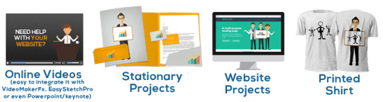
These Pre Made Graphics Works Flawlessly With:
VideoMakerFX
EasySketchPro
Explaindio
LeadPages
OptimizePress
PowerPoint
Keynote
Facebook
Dear Internet Marketer,
Ever wanted to boost your conversions?
Ever dreamed of redesigning your primitive-looking sites into sales monsters?
If you are currently struggling with:
Waiting for weeks or even months on your graphics to be delivered…
Getting frustrated seeing “Paint quality” work…
Losing your arm and leg on overpriced graphic designers…
Trying to find the “right” graphic designer through a typical trial and error…
Never getting anything done on time and screaming how you hate outsourcing…
Spending money on cheap and amateurish graphic templates which you are ashamed to use…
I’m about to reveal to you how to…
Save Thousands of Money and Yet Get the Best Graphics Designs, Stop Waiting For Days or Weeks Just For a Project to be Delivered,
and Simply Take Full Control of Your Business!
Here’s a quick look at this year’s typical prices for the average-looking graphics:
Minisite Design – $150
Ecover Graphics – $50
Landing Page Design – $200
WordPress Site – $300
Facebook Cover Graphic – $50
10 Banners – $80
But it gets worse. Even though design prices seem to increase every time, finding the “perfect” graphic design can be a real challenge.
And then, just in case you do find the “perfect” designer, you may be surprised to wait 2, 3 or even 4 weeks to get your first revision done…
Now, It’s Time to Design Your Own High Converting Graphics… Do it Less Than 5 Minutes, With Absolutely No Photoshop Skills Required!
So, what’s the trick?
You can save thousands of your hard-earned money by taking advantage of ready made graphics design templates.
Smart online and offline marketers are saving tons of cash by making use of ready-made graphic design templates.
They know they don’t have to waste money on expensive graphic designers.
Any time they need graphics for their projects, they just use the ready-made templates. No more waiting for designers.
They can deploy faster and they have full control over their business!
And now you can do the SAME… for the FRACTION of the price that others pay!
Imagine Swiping My “Hand Picked” Collection Of Premium Quality, Conversion Boosting,
Done-For-You Graphic Templates That Will Transform You Into A Superstar In Your Own Niche!
Let me unveil to you my highly-guarded, giant collection of ready-to-use graphics and pre-designed templates worth thousands of dollars!
Most of these premade graphics templates are very new which guarantees 100% freshness and 100% uniqueness.
Be assured that this will help you quickly brand yourself uniquely and get ahead of the pack!
Presenting… “DIY Graphic Designs – Alpha Vault“

Stellar Quality
Each graphic was designed with extreme care to create a feeling of professionalism, credibility and trust.
This will convince your prospects to buy what you’re selling.

Designed For Marketers
This graphics package is designed with online marketers in mind.
Great for busy website owners and affiliate marketers who are promoting products using graphics.

Organized & Easy to Find
Whenever you need a graphic template for your project, it’ll only take seconds to find exactly what you need.
Next, just make some customizations and your ready to go! It’s that simple.

Make Own Graphics Without Photoshop
All graphics are best edited using Photoshop. No Photoshop software? No problem. You can use Microsoft Powerpoint.
You can also use online editors like Pixlr.com
Template 1: Facebook Cover Templates
Template 2: Youtube Cover Templates
Template 3: Google Plus Cover Templates
Template 4: Social Icon Badge
Template 5: Mobile Squeeze Pages
Template 6: Web 3.0 Minisite Template
Template 7: 10 Minisite Templates
Template 8: Ecover Templates – Vivid Bundle
Template 9: Ecover Templates – Dark Bundle
Template 10: Kindle Cover Templates
Template 11: Vector Stamps
Template 12: Banner Templates
Template 13: Graphical Headlines
Template 14: Viral Quotes
Template 15: Vector Backgrounds
Template 16: Headers
Template 17: Feature Boxes
Template 18: Mobile Responsive Landing Pages
Template 19: Add-Cart-Buttons
Template 20: Ready to Print Flyers
Template 21: WSO Sales Page Design
Template 22: Flyers
Template 23: Business Cards
Template 24: Pricing Tables
Template 25: Royalty-Free Photos
Template 26: Mascot Characters
Template 27: Hand-Written Fonts
Template 28: Text Layer Styles
Template 29: Powerpoint Presentation Templates
Template 30: Character Pack
Get Access To DIY Graphic Designs!
What Makes DIY Graphic Designs
Unique From Any Other Design Packs?
1
99.9% Unique, Brand-New Graphics – Most of the designs were created lately and are completely NEW.
Renew your site’s look and feel with these instant, high-quality graphic templates now!
2
Quick and Easy to Edit – These ready made graphics are quick and easy to edit. In fact, some files won’t require Photoshop.
If you need to edit the PSD files but don’t have Photoshop, you can use Photopea.com.
3
Comes With Full Developer’s License – Design high-quality graphics for your own clients for quick income.
Create high-class, high-converting sales pages, web banners as well as video backgrounds that will surely impress your clients!
4
Based On The Latest Design Trends – All the templates are based on the latest fancy trends so
be assured that your site always looks new, modern and highly appealing! That means your customer will respect you more and be willing to send you more money!
Convinced? Well, This Is Just The Tip Of The Iceberg!
I’m confident that after inspecting the contents of this awesome, uniquely designed premade graphics templates you
now appreciate the enormous value that this package has.
But wait, there’s more!
For a Limited Time Get 8 Special Bonuses
Completely FREE But Only If You Act Now!
FAST-ACTION BONUS #1
A Quick Report On Where to Find Free Graphics Online
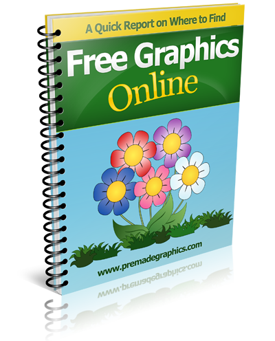
Revealed inside this short report are not so popular places on
the internet where you can find free but high quality royatly free images, patterns/textures, vector graphics, icons, backgrounds, fonts, and many more!
FREE to Use Royalty Free Images
FREE Patterns and Textures
FREE Vector Graphics
FREE Icons
FREE Fonts
FREE Mock Up Graphics
FREE Cool Text Generator
FAST-ACTION BONUS #2
412 Web Icons
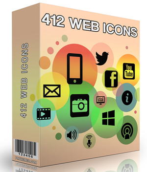
This package is a big collection of over 400 website icons that you can use to enhance your blog, website, landing page, and sales pages.
It comes with the newest and high quality feature icons and designs you haven’t use yet.
All icons comes in .CHS format (Photoshop Custom Shape), PSD format, and PNG for easy editing and usage.
FAST-ACTION BONUS #3
Big Bundle Of Mascot Cartoon Characters

You’ll get over 20 sets and 200 different niche mascot characters – all designed and created by professionals!
Create your own mascot in 60 seconds and boost your conversions by up to 150%. You can use these mascots for:
FAST-ACTION BONUS #4
Web Banners Bundle
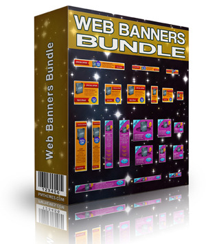
Upgrade your old-looking banners with modern and prefessionally designed web banners. You’ll get 30 sets of ready made web banners templates in PSD (Photoshop) format.
Each contains up to 12 different banner sizes.
Banner sizes includes: 120x240px, 120x600px, 125x125px, 160x600px, 180x150px, 200x200px, 234x60px, 250x250px, 300x250px, 336x280px, 468x60px, and 728x90px.
FAST-ACTION BONUS #5
Big Bundle of Background Graphics
This is a huge collection of ready made background graphics that you can use for your website, PowerPoint slides, and video presentations.
Blueprint Backgrounds
Blur Backgrounds
Bokeh Blur Backgrounds
Clean Paper Backgrounds
Colorful Diagonal Lines
Colorful Stage-Backgrounds With Curtain
Colorful Studio
Fancy Showcase
… and many more!
FAST-ACTION BONUS #6
PSD Logo Templates
Have you ever tried to create a logo for your website or for a client? If so, then you know how hard it can be!
Now you can get 300 high quality logo templates in Photoshop format (PSD). Also included are .rdw formats (Real-Draw).
Absolutely free when you buy this DIY Graphic Design Package.
FAST-ACTION BONUS #7
Amazing Infographics
Get over 250 very cool infographics that you can use for your marketing efforts!
This new set of ready-made infographics template comes in PSD and PNG format for easy editing and usage.
With this graphics, you can enhance not just your creativity but also your Facebook and Twitter followers and eventually your profit.
FAST-ACTION BONUS #8
Step-By-Step Video Tutorials on
HowTo Customize Your Graphics

If you’re new to working with graphics, you can watch included video tutorials on how to quickly edit and customize these graphic templates.
Within minutes you be able to do some changes and make a particular design template completely unique. It’s going to be a lot of fun using Photoshop!
NOTE: If you don’t have Photoshop, you can edit most of the graphics by using a free online graphic editor called Pixlr.com.
For each graphic inside DIY Graphic Designs package, an additional “No Photoshop” version is included so that you will be able to edit it on Pixlr.
Additional video tutorial on how to customize your graphics in Pixlr is also provided.
For Such An Exclusive Graphic Package
You May Expect to Pay $199, $299 Or Even $499…

The fact is, it’s totally worth such a price.
I’ll make it simple for you.
The total cost for all this premade graphics templates is well over: $1,000.00
Think about outsourcing just 100 unique sales page graphics. For $14 a pop that’s $1,400 right here!
Well, you may opt to design the graphics all by yourself and spend days or even weeks simply trying to learn how to use Photoshop. It’s your call.
The other option is to buy expensive, commonly used graphic templates from marketplaces like graphicriver.net.
But be ready to shell out more money than what you are willing to spend.
Before revealing to you the final price, let’s sum it up together.
What You’ll Receive…
Number of Graphics
TEMPLATE #1 – Facebook Cover Templates
21
TEMPLATE #2 – Youtube Cover Templates
11
TEMPLATE #3 – Google Plus Cover Templates
18
TEMPLATE #4 – Social Icon Badges
6
TEMPLATE #5 – Mobile Squeeze Pages
2
TEMPLATE #6 – Web 3.0 Minisite Template
1
TEMPLATE #7 – 10 Minisite Templates
10
TEMPLATE #8 – Ecover Templates – Vivid Bundle
3
TEMPLATE #9 – Ecover Templates – Dark Bundle
4
TEMPLATE #10 – Kindle Cover Templates
5
TEMPLATE #11 – Vector Stamps
35
TEMPLATE #12 – Banner Templates
28
TEMPLATE #13 – Graphical Headlines
22
TEMPLATE #14 – Viral Quotes
21
TEMPLATE #15 – Vector Backgrounds
5
TEMPLATE #16 – Headers
22
TEMPLATE #17 – Feature Boxes
21
TEMPLATE #18 – Mobile Responsive Landing Pages
5
TEMPLATE #19 – Add-Cart-Buttons
1
TEMPLATE #20 – Ready to Print Flyers
7
TEMPLATE #21 – WSO Sales Page Design
1
TEMPLATE #22 – Flyers
2
TEMPLATE #23 – Business Cards
12
TEMPLATE #24 – Pricing Tables
5
TEMPLATE #25 – Royalty-Free Photo
25
TEMPLATE #26 – Mascot Characters
10
TEMPLATE #27 – Hand-Written Fonts
8
TEMPLATE #28 – Text Layer Styles
5
TEMPLATE #29 – Powerpoint Presentation Templates
39
TEMPLATE #30 – Character Pack
12
SECRET TEMPLATE #31 – Hand-Written Graphics
520
FAST-ACTION BONUS #1 – A Quick Report On Where to Find Free Graphics Online
FAST-ACTION BONUS #2 – 412 Web Icons
400+
FAST-ACTION BONUS #3 – Big Bundle Of Mascot Cartoon Characters
200+
FAST-ACTION BONUS #4 – Web Banners Bundle
360
FAST-ACTION BONUS #5 – Big Bundle of Background Graphics
100+
FAST-ACTION BONUS #6 – PSD Logo Templates
300
FAST-ACTION BONUS #7 – Amazing Infographics
25
FAST-ACTION BONUS #8 – Step-By-Step Video Tutorials on How To Customize Your Graphics
Total Number of Graphics
2,272+
2,272+ graphic templates could easily cost you more than $1,000 in the graphics market.
Yet you won’t need to pay that much! Not even $200 or even $97… Not $67 either.
Take Full Advantage Of An Insane Discount
and Get Full Access Right Now!
Since this is a brand-new offer, I’d like to give you the opportunity to try it out almost risk-free…
Today is such a special day for you…
So here’s the deal: your total investment today will not be $67.00, although that should be the regular price.
Today, You Can Download All DIY Graphic DesignsFor Only $19.95…
Yes, you read it right. For just $19.95 you are granted full access to this awesome collection of the latest and
high quality graphics design templates including all the bonuses!
That’s a crazy bargain! A whooping 70% discount.
Just think about it for a second. You’ll get a lifetime, unlimited access to 2,272+ stellar-quality graphic templates for
less than $0.027 EACH!
Here are the main reasons why I’m charging only $19.95 for this premium package.
TRUE REASON #1
$19.95 is a price most people can afford. With that, I’m able to capture a wider market and get more customers.
In the future, I’ll then be able to offer them more high quality graphics products and eventually expand my business.
TRUE REASON #2
I want every individual to have the opportunity to try my proven conversion boosting graphics.
I love seeing people go from ZERO to amazing success, and I want the same for you too!
If you still can’t wrap your head around this expense, skip getting a coffee at Starbucks once this week and it’s paid for.
Love It Or You Get 100%
Money-Back Guarantee

Guarantee #1
Try “DIY Graphic Designs” risk free for 60 Days and if for some reason you are not totally satisfied with these awesome graphic products,
feel free to contact us using our Contact Form
and I’ll gladly refund your money with no questions asked, no hassle!
Guarantee #2
If you actually used these graphic templates on your projects and you won’t notice any significant changes, feel free to contact me and I’ll refund all your money.
DIY Graphic Designs Team

Here’s another reason why it’s an absolute no-brainer:

Money Back Guaranteed
Full 60 Day Money Back Guarantee.
No Questions Asked

100% Secure Checkout
Verified and Secure Checkout via Clickbank*.
Pay Via Credit Card or PayPal
Frequently Asked Questions

Would I Need Photoshop To Edit These Graphics?
Many of the graphics do not require Photoshop. There’s a separate folder for No-Photoshop version which you can open using a free online graphic editor like Pixlr.com. With this free tool you’ll be able to edit your templates quickly and easily. There’s also a super simple video training that show you how to edit the templates!
Many designs are also “plug-and-play” templates. That means, you can just copy and paste on your site!
How Do I Access My Products After Purchase?
Immediately after payment, you will be given a special link to finish your registration and setup your username and password. As soon as that is completed you will be able to login and download all products promised in this page including bonuses and product updates.
It was set this way so that you can always return and redownload everything. No more worries about losing your graphics just in case there’s a computer crash.
Do You Own A Full License To All The Templates?
Yes! I have the full rights to all the graphics listed here. For images, we only used royalty free images from free resources which allows us to include in this pack.
Does It Work On Mac/Windows?
Yes, the graphics work on both Mac and Windows.
Can These Templates Be Used In WordPress/OptimizePress/LeadPages?
Yes, you can use these graphics anywhere. For WordPress, simply use the upload option.
Is There Any Recurring Payment?
No. This is a one time payment only. No hidden cost. No Sales B.S. Access all graphics for lifetime.
Do You Provide Any Support/Trainings?
YES, absolutely! Once you get your package you’ll receive a tutorial video where you’ll learn how to edit the templates. You can always contact me for help, just send me a message and I’ll answer any issues within 24 to 48 hours.
Does It Come With Developer’s License?
YES, it comes with a developer’s license. Feel free to use it on unlimited projects of your own or on clients projects.
To Your Success,
DIY Graphic Designs Team

P.S. Keep in mind that we are taking on all the risk with our 60-day no questions ask, no hassle money back guarantee.
You see, I’m 100% confident that you will really like and use what you receive when you buy the “DIY Graphic Designs – Alpha Vault“…
You have nothing to lose and all kinds of profits to gain!
Get “DIY Graphic Designs – Alpha Vault” Risk-Free!
P.P.S. Think for a moment how much time and money you will be able to save with this beautiful sets of graphics.
No more wasted time trying to find the right graphic designers and no more waiting for weeks. Finally, you will be able build professional grade websites,
create your own client-attracting porftfolio, or turn your old and dull-looking design projects into high-quality work that demands respect from your
colleagues as well as competitors.
YES! I Want To Turn My Website Into (Beautiful) Money Machines!
Get Access To DIY Graphic Designs Now!
*ClickBank is the retailer of products on this site. CLICKBANK® is a registered trademark of Click Sales Inc., a Delaware corporation located at 1444 S. Entertainment Ave., Suite 410 Boise, ID 83709, USA and used by permission. ClickBank’s role as retailer does not constitute an endorsement, approval or review of these products or any claim, statement or opinion used in promotion of these products.
0 notes
Text
5 Ways To Build Your Website

Websites used to target a single type of user, typically browsing the Internet using a standard web browser on a desktop or laptop computer. That era ended nearly a decade ago, driven in large part by massive adoption of the smartphone. The rise of tablets further increased the number of ways to build a website for mass consumption, and the imminent arrival of wearable technology in the consumer marketplace looks to throw yet another option into the mix for consumption of online content.
The question, then, is how can a site administrator effectively build a website that accommodates one, or all, of these platforms? The answer is to select from five popular ways to build your website, choosing themes that specifically target one device or adapt the code to fit all screens at all times. The top five ways to make this happen each have their own pros and cons.
1. Choose a Responsive Template that is “Screen-Aware”
Perhaps the most popular option chosen by today’s website administrators when deploying a new site is to opt for a responsive template that can detect screen size and adapt its design elements accordingly. WordPress has been a hotbed of activity in this area for several years, driven in large part by its overwhelming popularity and the massive size of its web developer community. WordPress currently comes with no less than three default themes that all leverage the power of responsive XHTML and HTML5 design. These themes detect a screen resolution and adapt design elements, like the navigation and sidebar, accordingly.
On a desktop screen, the template appears in its “natural” state, with multiple sidebars next to each other and a large header or navigation area. As the site shrinks down for a tablet screen, the sidebars may reduce in size or the navigation may get smaller. The header image may be eliminated. For smartphones, the sidebars stack on top of each other, the header is dramatically reduced in size, and the navigation typically becomes a menu instead of an on-screen series of links. This method is popular because it accommodates all devices and comes standard with WordPress. Many third-party templates have understandably copied this technique.
2. Build a Responsive Site Using Basic Responsive Templates
A fully developed template may not be the best choice for all website administrators. Some more seasoned website owners may want to more fully customize their responsive site and, for those administrators, a basic template is the choice worth making. A basic responsive template only comes with the code that reduces the site’s size to accommodate mobile devices. It does not feature colors, specific design choices, or specific layouts. All of that work is done by the website’s owner as they leverage their design and programming expertise.
These basic templates are a great way to not only design an entirely new look for a website, but also to adapt an existing design to the demands of mobile devices. Many website owners find themselves having to convert an old design to new standards so that mobile users can fully enjoy their content. A basic template allows for the copy-paste of major design elements into a new, responsive framework that will more durably stand the test of time as even more forms of mobile communication are introduced in the future.
3. Start with a Blank Slate and Code the Old Fashioned Way
Wireframe templates that leverage responsive designs have become common for intermediate-level designers, but many of the more seasoned professionals prefer to do things the old fashioned way and code their website by hand. For a responsive site, this means manually coding the website’s HTML5 code, its CSS stylesheet, and the JavaScript often required to adapt the design to the whims of a mobile browser used by smartphone and tablet operating systems. Though this might seem like a lot of work for something as simple as a web design, the manual approach to site design has its advantages.
First and foremost, manual programming allows website administrators to create their own framework for website elements, their shapes, their sizes, and other features. Designers who want to “break the mold” with their new site design will have to adopt this approach in order to get beyond the restrictions of premade site themes or basic responsive templates that allow only for filling in the blanks. Despite its rather intense amount of required work, this method is the one most likely to make a site appear truly unique and dynamic when users visit it for the first time after the new design as been completed.
4. Try a Website Builder or Automated Installer Tool
Another option that is increasing in popularity, especially among website administrators who are new to design itself, is that of a website builder or an automated installer. Perhaps the most popular automated installer tool is Fantastico, which is included in most cPanel installations at today’s biggest web hosts. Fantastico allows new site owners to enter just a few basic pieces of information, including their desired username, password, and site theme, and then it takes care of installation behind the scenes.
The whole process is completely automated, taking somewhere between 10 seconds and two minutes. The result is a fully installed copy of WordPress, a configured template that meets the user’s needs, and an administrator login that they’ll easily remember. The installer also does all of the database configuration needed to get the site off the ground.
Site builder tools are also popular additions to cPanel installations at major web hosts. While many do not offer integration with WordPress and other major content management systems, they do allow users to select a site template and use “what you see is what you get” editing. As a result, creating a new site design is as easy as dragging, dropping, typing, and publishing. In many cases, these websites can even be built in a way that lets them adapt to the smaller screen sizes of today’s most popular mobile devices.
5. Desktop Website Design Software
Microsoft once built the world’s popular website design software in its Microsoft FrontPage application, but those days are long over. Today, the desktop design space is dominated by major, standards-compliant software choices like Adobe Dreamweaver. Applications like Dreamweaver function in a similar way to site builder tools offered within web host control panels. They’re based on the desktop, however, and require routine licensing and updating.
The benefit of these programs is that they integrated with images already saved to a user’s computer, they allow for a local copy of the design to be saved as a backup, and they connect directly to a user’s website server so that they can directly upload website files and images as needed. The added stability and customized permitted by these tools makes them a compelling way for novice site owners to create a design that reflects their own sensibilities.
Five Great Ways to Build Your Website
Building a website has never been easier. Whether it’s the advanced nature of building a site from the ground up, coding it manually with several different programming languages, or simply using a desktop site builder tool, users have many options to choose from as they determine their site’s appearance. Better yet, major content management tools like WordPress often include their own themes and customization options, making it even easier to blend a compelling site design with unique, authoritative content.
The best combination of these available tools and site design methods will result in a website that adheres to web standards, dynamically presents content to end users, and caters to their desire for an intuitive online experience.
If you need support with your SEO performance and Web Designing, experts of Web Designing Services St Petersburg, FL can help you, just drop your comments in the comment section.
0 notes
Text
Etouch Email Marketing Application
New Post has been published on https://intramate.com/php-scripts/etouch-email-marketing-application/
Etouch Email Marketing Application
LIVE PREVIEWGet it now for only $29
WE HAVE ADDED A REGISTRATION FORM TO ETOUCH
Start making money by easily developing your database leads, by location, business category. filter your leads, sale your leads. Etouch works 100% with LinkedIn.
Etouch is a brilliant Idea of having all marketing tools in one place, versatile, robust and most of all very expandable. In short a smart web application for businesses. In fact, Etouch is the only Marketing Web Application that has most of the sought-after functionalities.
Etouch provides with a unique solution to manage all your Linkedin contacts, by using the search option FIND, you can search your contact by company and then you can regroup all the searched contacts within the same company, then you can build your marketing strategy based on either the company name or the job title or even both.
This functionality is very practical for those seeking to target certain business segmentations such as Human Resources Managers, CEO’s, Suppliers, Decisions makers etc.
Etouch is by far the only bulk email applications that make it easy for users to create a beautiful newsletter or marketing campaign, thanks to its customized CKEditor everything is within reach. You can add premade templates in a click of a finger, you can even add your own templates or HTML section as click and drop.
With its social icons & share, you can include your preferred social media networks easily.
Etouch combines exclusive functionalities, which makes it easy to build your network with respect to your market segmentation. For instance, LinkedIn Vcards importer, you can import your LinkedIn contacts directly into Etouch using Vcards formats, from there you can start your segmentation per group (Suppliers/ Leads/ Sales Managers and so on) using the merge option, furthermore. You can export your contacts to PDF Label formats, Etouch support the following Avery formats:
5160-5161-5162-5163-5164-8600-L7163-3422.
You can also use the drag & drop campaigns scheduler to send targeted emails on holidays or any social events.
tracking your campaign got also easy, thanks to both native email behavior tracking and URL shortener API integration, you can make divers colorful barcodes and QR codes to implement directly into your campaign, each is trackable for a better understanding of the success of your marketing strategies.
To make your templates easily interpreted and fast we have included an inline CSS that convert each template to the right format.
Working images as adding texts and patterns are also supported, thanks to Aviary integration, basically, you do anything with it.
Etouch can support multiple SMTP servers, capable of working in parallel and also jumping to the next available server as soon as your established limit is reached.
Etouch consist of the following features:
– Multi-users / Languages (French/English and can easily support any other language).
each user has his distinct account, only the master admin have an access to users area.
– Unlimited Subscribers.
– Unlimited Groups (Deep List Segmentation).
– Unlimited Campaigns.
– Unlimited Smart SMTP Servers Relay: SMTP, PHP Mailer, Gmail (Auto Detect & Bounce Servers Limits).
-SendinBlue SMTP API support.
-MailJet SMTP Relay Support
-Amazon SES Relay Support
– Bounce Mail Handler (PHP Library should be enabled).
– Parallel Delivery (In respect to each server limit).
– Address Validator & Finder.
– Export to Multiple formats: VCARD, CSV, EXCEL, PDF, & Most used Avery Labels.
– Ajax Subscribers CSV Load (for Copy Paste).
– Easy members import using CSV or Linkedin VCARD.
– Find Subscribers based On Language, Address, Status or Groups.
– Spammers Banning System.
– Smart Campaign Scheduler Calendar.
– Single & Double Optin.
– Customizable forms.
– Responsive Template.
– AutoResponder.
– Unsubscription.
– Internal Activity Log Table.
– Campaigns History, Export, and Duplication.
– Campaigns Activity Tracking, Bounce, Open, Unsubscribe, Sent, Unsent etc.
– Advanced Graphical Statistic Reporting.
– Groups Merge.
– Admins Activity Logs.
– Form script Integration (Installation).
– Files Management System.
– Adobe Aviary Image Editing.
– Native Captcha Spam System.
– Google Recaptcha.
– Cache Memory Limit Control for faster processing.
– Send Emails in Batches.
– CKEditor/CkFinder with beautiful Plugins: Social Icons, Google Map, QRCode, Ipsum, Media Share Links).
– Custom Pre-Built Templates easy Insertion.
– CSS Inliner (Emogrifier) on Campaign Processing.
– Free Professional URL Shortener API Code, with QRCode, Barcode, (with color Schemer).
– Links Stats/Graph.
– Subscribers Imports Limit Control for faster processing.
– Campaign Web Version.
– Subscribers Tags (First Name, Last Name, Address, City, Zip Code, State, Country, IP Address, Web etc..).
Many more.
A demo is available for testing at http://gbcnetwork.com/demo_v2
username: admin
password: pass
Documentation is also available at http://gbcnetwork.com/documenter
We are also available for any customization or support for this script.
Please be advised that we do not proceed with any refunds, therefore, it is important to test it prior to any purchase, we guarantee, it is as it is working on our demo. Thank you again for your business.
LAST UPDATE 21 Jan 2019:
– Users registration form added to the script.
– Now the script supports SendinBlue API/ Mailjet API
– German special characters.
– Fixed Google Map search location, by adding an API Key
– Listing automatic ruling
– Mobile forms
Please test prior to purchase and make sure that you have the right PHP version. As we do not process any refund
Thank you
LIVE PREVIEWGet it now for only $29
0 notes
Text
Email Invitation Templates: How to Create and Use Them
So, you’ve got an event and you want to send out email invitations, but you don’t know where to start or what to say.
No worries. I’ve got plenty of ideas to help you out.
In this article, I’m going to share some of my favorite email invitation templates, explain why I like them, and give you some helpful advice as to what to include in them.
From a New Year’s bash to a Friends-mas celebration (and even wedding invitations), we’re going to explore a full year of email invitation templates together!
And by the time we’re finished, you’ll be able to confidently create, and edit, your own email invitation templates.
But before we get to all of that, let’s start with the basics:
What should an email invitation include?
Every invitation, no matter the event, has to include certain information — who, what, where, when, how:
Who is hosting the eventWhat the event isWhere the event is atWhen the event is happeningHow the invitee is to respond
In addition to those basics, a good invitation also describes the event in a manner that entices its invitees to become attendees — through imagery and text; what we refer to as “content.”
One of the main advantages of sending out party invitations via email is that your invitees can respond immediately, directly from the email invitation, via a link that you insert into your email invitation template.
If you’re thinking about sending out an announcement instead of an invitation, take a look at our 1-2-3 Guide to Announcement Emails.
What are event invitation templates?
Event invitation templates are basically just another kind of email template. Most often, email providers like Constant Contact have a whole slew of invitation email templates to choose from. While I’ll be sharing some of those templates in this article, what I’m sharing is just the tip of the iceberg, so-to-speak.
To find premade event templates in your Constant Contact account, just type in “event” in the template search bar.
Besides having pre-made event templates to choose from, you can also create an invitation from a regular email template, or build your own from scratch, or have one made for you. Don’t worry, I promise that I’ll let you how, before we’re done.
Don’t have a Constant Contact account? Give our email templates a try with a free 60-day trial.
Now that we’ve got some basic information out of the way, let’s take a look at some great invitation email templates.
Examples of invitation email templates January – Happy New Year!
New Year’s Eve is when we say goodbye to our past and look towards our future. We think about making resolutions (which we rarely keep), but most importantly we gather with friends and family whom we wish to spend the coming year with.
The passing of one year to the next can be heavily laden with sentiment (and subtext), but your invitation should be filled with anticipation, excitement, and exultation — just like your party.
And that’s the key to an invitation:
An invitation should be a preview of the event it heralds. (Tweet this)
This template is my favorite for a New Year’s soiree.
Now, before you start questioning my sanity, let me explain why.
The basis of this email template is classic. The image at the top has lovely, looping (yet crystal clear) writing. The exterior border has an eye-catching gold-shimmer, zig-zag pattern, which invokes both elegance and fun. And the layout (the configuration of building blocks that make up the email) of the template conforms to best practices — with one picture, less than 20 lines of text, and a company logo prominently displayed (without overshadowing the focus of the content).
What? This isn’t an invitation?
With a little imagination, it is.
With a few color changes, some different text (what writer’s call “copy”) and a call to action, this email template is now an invitation to a fundraising event for a nonprofit, hosted by a real estate company. Yes, you can fit all of that into an invitation with less than 20 lines of copy too!
February – Valentine’s Day
An event doesn’t have to be a party. “Event” is basically synonymous with “occasion.” It can be anything that’s new or special with your business.
So, for Valentine’s Day, your event could be a fundraiser for an animal shelter, an online sales event, or whatever else you can think of.
March – St. Patricks’ Day
Ah! The luck of the Irish!
This holiday is so lucky, it has an invitation template that’s perfect for a grille, pub, restaurant — any place that’s serving green beer on the big day.
What makes this invitation template so great is that it has all of the pieces already in place: company logo at the top — so readers can instantly confirm who the email is from; an image to catch the eye; followed by the actual invitation; an enticing image and description of what’s going to be at the event; finished off by an image of people attending the party (last year). This event invitation template also has space at the end for extra information to be added. In this case, charitable contribution information.
And my favorite part of this template? It looks brilliant on mobile!
With all of that already set up, all you have to do is type your copy over the placeholder text in the template.
April – Easter Besides being a great layout, this template has the cutest little background of hand-drawn bunnies, holding eggs.
I love this template because it’s lively, simple, and straight to the point. There’s no beating around the bush with this one. And very little copy that needs to be written by you.
To use this template as-is, just update the date and time, change the address, update the links, and “voila!” — done!
With that said, each component of the template is customizable.
Don’t want the church icon? Put your logo in its place.
Not sure about the colors? Change them.
Have your own Easter image to use? Remove this one and add yours.
If all you want from this template is the adorable bunny outer background (which you can’t get anywhere else), then you can strip the rest down to its core and rebuild it any way you like.
Easter email invitation template stripped down to two “spacer” blocks.
It’s up to you.
Now, I know that not everyone celebrates Easter, but that doesn’t mean you can’t celebrate spring or Earth Day.
Just like this invitation to get free yoga classes, your invitation doesn’t have to say “You’re Invited!” to be inviting. May – Cinco de Mayo
In the United States, Cinco de Mayo brings with it parties, margaritas, and tacos. And while Constant Contact’s Cinco de Mayo invitation templates are geared for Mexican restaurants hosting parties, it’s a breeze to customize them to your own company or organization.
June – Wedding Invitations
I know this was the one you couldn’t wait to see. After all, sending out a wedding invitation via email is still considered unconventional, but it can be done — and beautifully.
Since it is so unconventional, you won’t find a premade template under a search for “wedding”. However, you will find some lovely templates to work with by searching under other categories.
For instance:
This one comes up under “Invitation,” “Event,” and “Save the Date” —
This one is marked for “Mother’s Day.” But, depending on your colors, this is a great option as well:
I love the image of lilacs that’s exclusive to this template.
This is another template that I like for a summer wedding invitation:
I like this one because of the soft, understated flowers that trim the top and bottom of the template. I can’t get those on any other template. And although it doesn’t look like a wedding invitation, it doesn’t take long to change that.
July – Fourth of July
Okay, this is where I confess. This template is probably my favorite because I love the main image.
There are other, flashier Fourth of July templates out there, and I know this particular email invitation template doesn’t fit everyone. As an avid camper, this email template evokes an emotional response in me — every time I look at it.
Your invitation should evoke an emotional response if possible, and appropriate.
If you ignore the main image, the rest of the invitation is pretty straight forward. However, I want to point out that this is an example of a very informal invitation. As such, even though the “what” is clear, the “where” is implied. As long as your readers are familiar with your business, location, and facilities, it’s fine to not state the address in the body of the invitation. Also, the “when” is ambiguous — this particular invitation template gets away with that only because they’re inviting attendees to “come early” to camp on the property.
August – Back to School
For those of us in the United States, the kids usually start heading back to school in late August. And while it may not seem like a time to celebrate, school fundraisers seem to start earlier and earlier in the year.
With that in mind, although the placeholder copy in this next example says September and October, using it in August isn’t that far fetched.
If you’re not a school that needs to get started on your fundraising right away, think about having a special event for parents to celebrate sending their kids back-to-school. Or host a sales event for your readers to spruce up their wardrobe for the coming weather change. Or make an occasion of the first PTA meeting of the year.
Check out this postcard-style invitation for the Grand Opening of a building:
The possibilities for an event are endless — make one up!
September – Labor Day
The ideas I listed for August can work for September as well, but if you’re looking to host something special for Labor Day, let me suggest this template:
I like this particular template because it’s reminiscent of a backyard bbq. It’s also fun, bright (but not overwhelming), and it has all the important sections mapped out for you. Easy-peasy.
October – Halloween
I have a couple of favorite Halloween email templates.
This first one is set up for a sales event, but I love the layout and the fact that the entire template looks like one complete image, with text placed inside layers of dirt. Too fun!
This second one contains a .gif, and although it’s set up for a coupon, it doesn’t take much to change it into an invitation.
November – Thanksgiving, BlackFriday, Small Business Saturday, Cyber Monday, & Giving Tuesday
The month of November has a lot going on! And I’m not afraid to admit that it can be a little overwhelming.
Tip: Create and schedule your holiday season invitations early. That way you won’t have to worry about them when things get hectic.
There are so many great templates to choose from for each of these special days, that I found it impossible to find just one or two to share. So, here’s five:
Thanksgiving – I love the backdrop image on this one, and the fact that the text overlay can be changed makes it extremely versatile. Black Friday – This is my favorite template for Black Friday because it’s incredibly clean and neat, with an outstanding call-to-action button (the only part of the template that isn’t black or white). Small Business Saturday – I like this template because of the little “main street” image in the middle. Enough said. Cyber Monday – My favorite part of this template is the outer background. I can’t get that anywhere else. Giving Tuesday – This particular template is incredibly versatile. The main image is one that can fit almost any nonprofit. No matter if you’re looking for donations or volunteers, this one can make a great invitation to help. December – Christmas, Hanukkah, Kwanzaa, Chrismukkah, Friends-mas…
Whatever the occasion that you’re celebrating, there’s a template for that. Well, you might have to make your own for Christmukkah or Friends-mas, but by now you know exactly how to do that. But, just in case, here are a couple of templates to consider:
I love this template for Chrismukkah because it has a great Hanukkah background, as well as accents, and it’s super easy to add Christmas elements to it.
What about Friends-mas?
This template is just plain fun! And with some content changes, it’s a Friends-mas invitation!
How to create a completely customized email invitation
So, maybe you’ve used all the templates, or you just didn’t find anything that suited your needs. No problem. You can create an email invitation from scratch, or have one built for you.
Create an email invitation yourself
Creating your own template from scratch is much easier than it may sound. If you already have some pictures you’re thinking about using and have a couple of colors (like your brand colors) in mind, you’re ready to go!
Just start with a blank template.
Constant Contact’s blank template contains a single image placeholder.
Set your inner and outer backgrounds in the design tab and use the drag-and-drop blocks to build your template.
For this example, I inserted an image for my outer background, added a headline, a two-part block, a divider, and the social media icon set.
Once you have a layout that works for you, you can start inserting your images and writing your copy.
For more information on creating your own email template, check out our article: How to Create an HTML Template.
Have an email invitation template made for you
If you don’t have the time or inclination to create an email invitation from scratch, but you want something different and unique to your event, reach out to Constant Contact’s professional services team. The design team can create a unique email invitation template for you, where you can then insert the images and write the copy yourself. Or, you can have a member of the full-service team create the design and write the copy for you.
What to look for in an email invitation template
Whether you want something really simple and easy to put together, or you want an event invitation that is highly customized, there are a few things to pay attention to when looking for the right template for your event:
Outer background patterns. Not every background pattern is available for every template, so if you fall in love with a certain background, find a way to make that template work for you.Back-drop images. These are what I call the images that have text block overlays (the main image of the Easter template is a prime example of this type of image). These images are only available in the template they’re shown in, and they can’t be replaced, only removed — by deleting the block that they are part of.Accents. These are the little things that make each pre-made template unique. From the hearts on the Valentine’s Day template to the curly little dividers in the St. Patrick’s Day template, there are a plethora of little things like that which can’t be found on other templates.Exclusive imagery. These are images inside any given template. Each image is specific to that template, and while they can easily be replaced, resized, and removed, they can’t be moved from one template to another. The mustache, beard, and belt of “Santa” in my last example are all exclusive images. Annual Events and Consistency
If you’re planning an annual event, use the same template every year (unless you have theme changes). That way, everyone who received an invitation last year, will instantly recognize the invitation again next year, and that alone can get people to click that “Register Now” button.
And this is something that I cannot emphasize enough:
When it comes to online marketing, consistency is key. (Tweet this)
So, if you have a branded template that you use now for your newsletters. Think about how you can keep some of the main components (e.g. logo placement, and brand colors), but jazz it up to make it into an invitation.
You can create a unique email invitation for your event
With a bit of creativity, any email template can be made into an invitation.
And now that you’ve seen a variety of email templates, and I’ve shown you how they can be made into invitations with just a few changes, you too can create your own email invitation template. So get out there and start getting your subscribers excited for an amazing event!
Log in to your Constant Contact account to get started today! If you don’t have a Constant Contact account yet, sign up for a free 60-day trial.
The post Email Invitation Templates: How to Create and Use Them appeared first on Constant Contact.
Read more about this at blogs.constantcontact.com
https://coolarticlespinner.com/email-invitation-templates-how-to-create-and-use-them/
#b2b#b2c#content#emaildesign#emailmarketing#emailtemplates#eventmarketing#nonprofit#uncategorized#marketing
0 notes
Text
How to Create Unique Designs Using Before and After Pseudo Elements in Divi
As web designers we are always looking out for new ways to add individuality to the websites we create. Divi provides endless opportunities to produce unique layouts but there are always little additions we can include to bring a design together. This is where CSS pseudo-elements come in really handy.
What are CSS pseudo-elements?
Put simply, a CSS pseudo-element can be utilised to style specific parts of an element. There are five types of pseudo-element that do different things. For the purpose of this post we’ll be looking at ::before and ::after.
These two pseudo-elements are used to insert something before or after the content of an element. This is particularly useful since we can use them to add extra visual elements to existing images, text and anything else!
So why would we use these pseudo elements? Before and after are perfect for unlocking design possibilities without needing to add more elements or modules. Equally, they are useful for adding additional elements without having to touch html templates or core theme files.
How do you use before and after elements with Divi?
If this all sounds a little confusing so far, do not worry! If we were to use ::before and ::after when writing the CSS code from scratch, it would look a little like this:
Imagine we have a line of text with the class “text-example” – the CSS to style and customise this line would be:
.text-example {*This is where you add the styles*}
Now if you wanted to add and style a ::before or ::after element, the CSS would look like this:
.text-example::before {*This is where you add before content and styles*}
.text-example::after {*This is where you add after content and styles*}
Fortunately Divi provides easy access to ::before and ::after pseudo-elements with much less hassle. In fact, if you have ever opened up the “Advanced” tab for any module to add custom CSS code, you’ll have seen the areas that we are referring to.
These boxes provide a quick shortcut to add and customise content before and after any existing Divi module and we can utilise them to create some really flexible and interesting designs.
Sneak Peek
This is what we’ll be creating in this tutorial:
Example 1
Example 2
Example 3
Getting Started
For this tutorial we just need a copy of the Divi theme and a blank slate. To begin with we’ll create a new page and, after adding a page title, click on the visual builder.
Now we’re ready to begin!
Example 1: Numbered blurb modules using Pseudo Elements
The blurb is probably one of the most flexible Divi modules at your disposal. In this instance we will use pseudo elements to add numbers before each blurb to create a step by step “how it works” section. We’ll also add an arrow shape to the right to indicate the process.
What we’ll be creating:
Although this design will work with any blurb design, we’ve borrowed the blurb section from the Web Agency Layout. If you’d like to use these as a starting point you can access the Web Agency Landing Page by creating a new page and accessing the front end builder.
When your page loads you’ll have an option to use a premade layout, one of your saved layouts or build from scratch. Select premade layout and use the search bar to find “Web Agency” Layouts. The blurb section in this tutorial can be found on the Landing Page.
Once loaded, the only difference between the premade layout and our example is that we’ve changed the background of each blurb, the title and text font colour and added a little padding.
Once you’ve changed these settings on one blurb, you can right click on the module and use the “Extend Styles” to apply them to the other three.
Now that we’ve customised our four blurb modules to look as we want them, it’s time to add some code to create the numbered element. However for this design to work we first need to add one line of css to the Main Element custom css box.
overflow: visible;
This will simply allow any elements we create in the next steps to be visible wherever they overlap the edges of our blurb module.
Once you’ve done this, open up the module options and navigate to the “Advanced Tab”. Within the “before” box, add this CSS snippet:
content: '1.'; /* Adds the number 1. as before content */ font-weight: bold; font-size: 80px; opacity: 0.7; /* Makes the number slightly transparent */ color: blue; /* Changes the color of the number text */ position: absolute; z-index: 9999; left: 0; /* Positions the content 0px away from the left border */ Top:-20px; /* Positions the content 20px above the top border */
Once you have added this code snippet you’ll see the number appear to the top left of the blurb module. You can amend the number’s position by altering the “left:” and “top:” lines or change the color and font size of the number within this CSS snippet.
Once you’ve completed this for the first module, go into the three new blurb modules and change the “content:” line to:
content: ‘2.’;
content: ‘3.’;
…and so on.
Now that we’ve got our numbers sorted, we need to add a little bit of css to create the arrow shape.
Open each module and enter this into the After box within the Custom CSS area:
content: ''; display:block; height:60px; /* Size of the shape */ width:60px; /* Size of the shape */ position:absolute; top:40%; right:-30px; z-index: -1; background-color: #e8e8e8; /* Colour of the shape */ transform: rotate(45deg); -ms-transform: rotate(45deg); -webkit-transform: rotate(45deg);
Now your four blurbs should look like this:
Example 2. Adding unique shapes to your existing modules
This design relies on simple but effective little code snippets that are added to both the ::before and ::after custom CSS boxes within each text module.
The beauty of using pseudo-elements here is that we can integrate unique shapes and objects to our existing modules without needing to add any additional elements or modules to our page. Because these pseudo-elements are contained within our existing modules, they don’t add any extra space to our designs and remain looking great on all devices.
What we’ll be creating:
To create the initial layout we need to add a regular section with a three column row, set to default width. Once you’ve done this, add a text module to one of the new columns.
Again, you can style this text module as you’d like however if you are following along, these are the steps to achieve this design:
Open the text module options and add your text content and a background image or background colour as required. We’ve used a normal background image with a transparent gradient on top:
Next, configure the following design options:
1.Top padding: 120px & Bottom padding: 120px
2.Text Alignment: center & Text color: #ffffff
3. Heading Alignment: center & Heading color: #f5ee5d
Now that we have all of the visual aspects in place for your first text module, it is time to add the CSS to make the magic happen. In the Advanced tab of the text module, add the following code to the “before” box:
content:''; height: 30px; /* change the size to suit your design */ width: 30px; /* change the size to suit your design */ display: block; position: absolute; border-top: solid 3px #f5ee5d; /* change the colour to suit your design */ border-left: solid 3px #f5ee5d; /* change the colour to suit your design */ left: 20px; /* change the position to suit your design */ top: 20px; /* change the position to suit your design */
And then add the following code to the “after” box:
content:''; height: 30px; /* change the size to suit your design */ width: 30px; /* change the size to suit your design */ display: block; position: absolute; border-bottom: solid 3px #f5ee5d; /* change the colour to suit your design */ border-right: solid 3px #f5ee5d; /* change the colour to suit your design */ right: 20px; /* change the position to suit your design */ bottom: 20px; /* change the position to suit your design */
Once you’ve added these code snippets to the module you will see our fancy new shapes added.
If you wondering what this CSS does, it’s actually quite simple. All we are doing is creating a transparent square that is positioned 20px away from the top and left (and bottom and right) of the text module. We then add two borders to these squares to create the arrow effect.
When you’re happy with the look of this first text module, simply copy and paste it to fill the other columns and change the text content, background and styles to suit.
The bonus of this method is that it will work with pretty much any Divi module with a little customisation. If you want to be more fancy, try adding some additional CSS to rotate, skew and customise the ::before and ::after elements even further. Have fun!
Example 3. Adding icons and descriptions to tab titles
Within this design we will take advantage of the ability to add an image icon before some existing content as well as a small text description below. This is perfect for customising the Divi tabs module a little further than you are normally able to.
Note – Although adding content via css is great for design, it isn’t readily indexed by search engines (although Google does in fact index CSS and Javascript content, it takes much longer and is unreliable at present. Search engines like Bing and DuckDuckGo do not index this content at all). For this reason your content should be minimal and you should not rely on it to influence your ranking potential.
What we’ll be creating:
First of all we need to add our standard section and a 1 column row, followed by the Divi tabs module itself. Within the tabs module, we only need to add our titles and content to each tab as we’ll be handling the styles in the next steps.
Once our content is in place, we need to begin adding content to the ::before element of the module. Since we cannot add custom CSS to specific tabs using the method we’ve followed above, we’ll need to accomplish this slightly differently.
Open up the tabs module options and within the Advanced tab give the module the class “fancy-tabs”.
Once you’ve added this CSS class we need to do a little preparation. To add some icons or images to your tab titles we obviously need to add these to WordPress. Go to the Media tab in the WordPress dashboard and upload your chosen icons as you normally would.
With your images uploaded, we need to click on each one and copy the URL that WordPress has generated for us. Go through each of your images and copy and paste these URLs into a document or your chosen notes application.
With the URL’s of your chosen images at hand, go to your Divi Theme Options within the Divi menu in the WordPress Dashboard.
At the bottom of this page you’ll see a box where you can add your own custom CSS. It’s within this box that we’ll be pasting some CSS code.
The following snippet will add the images above each tab title. Simply copy and paste this snippet into the custom CSS box and replace the content between (and including) the asterisks (e.g. *Replace this with the URL for your first image*) with the URLs you noted earlier.
.fancy-tabs .et_pb_tab_0 a::before { content: url(*Replace this with the URL for your first image*); padding-top: 20px; display: block; } .fancy-tabs .et_pb_tab_1 a::before { content: url(*Replace this with the URL for your second image*); padding-top: 20px; display: block; } .fancy-tabs .et_pb_tab_content a::before { content: '' !important; }
If you return to the page with your tabs module on, you should now see that the images have been added above each title – success!
So what about adding descriptions? Fortunately this is quite simple as well. Right below the code you have just copied into your custom CSS box, paste the following:
.fancy-tabs .et_pb_tab_0 a::after { content: 'this is a description'; font-size: 10px; padding-top: 5px; display: block; } .fancy-tabs .et_pb_tab_1 a::after { content: 'this is a description'; font-size: 10px; padding-top: 5px; display: block; } .fancy-tabs .et_pb_tab_content a::after { content: '' !important; }
As before with your images, you’ll need to replace “this is a description” with your own content. Returning to the page with your tabs module on you’ll see we now have fancy descriptions too!
Finally, we just have to apply a little more CSS to achieve the complete design shown above. Again, copy the following snippet into the same custom CSS box:
.fancy-tabs .et_pb_tab_content a:after { content: '' !important; } .fancy-tabs .et_pb_tabs_controls li { width: 50% !important; } .fancy-tabs .et_pb_tabs_controls li a { width: 100% !important; text-align: center; } @media (max-width: 768px) { .fancy-tabs .et_pb_tabs_controls li { width: 100% !important; } .fancy-tabs .et_pb_tabs_controls { padding: 0 !important; } }
This code centers your tab text and images and increases the width of your tabs to cover the entire module.
We also added some CSS to ensure the tabs look good on all devices – if you’d prefer to not have your tabs full width and stack on mobile, we’ll need to go back and surround the original CSS code in a media query. This means that on devices the size of a tablet and wider we add the descriptions and icons, however on smaller devices we will revert back to the Divi default styling.
To do this, copy the amended CSS code below and paste it into your custom CSS area in the Divi theme options panel:
@media (min-width: 769px) { .fancy-tabs .et_pb_tab_0 a::before { content: url(*Replace this with the URL for your first image*); padding-top: 20px; display: block; } .fancy-tabs .et_pb_tab_1 a::before { content: url(*Replace this with the URL for your second image*); padding-top: 20px; display: block; } .fancy-tabs .et_pb_tab_content a::before { content: '' !important; } .fancy-tabs .et_pb_tab_0 a::after { content: 'this is a description'; font-size: 10px; padding-top: 5px; display: block; } .fancy-tabs .et_pb_tab_1 a::after { content: 'this is a description'; font-size: 10px; padding-top: 5px; display: block; } .fancy-tabs .et_pb_tab_content a::after { content: '' !important; } .fancy-tabs .et_pb_tab_content a:after { content: '' !important; } .fancy-tabs .et_pb_tabs_controls li { width: 50% !important; } .fancy-tabs .et_pb_tabs_controls li a { width: 100% !important; text-align: center; } }
Adding more tabs
In this instance we have created a tab module that includes 2 different tabs, however in practice we sometimes require more than this. If you are in a position whereby you are seeking to create more than 2 tabs, we will need to amend the code you’ve just added.
As you can see from the snippet, Divi automatically assigns a class to each tab title – the first starting with 0 (.et_pb_tab_0), increasing by 1 each time (.et_pb_tab_1, .et_pb_tab_2 and so on). We’ve already taken care of the first two tabs, so when adding more we can simply copy and paste a section of the code for every new tab:
.fancy-tabs .et_pb_tab_0 a:before { content: url(*Replace this with the URL for your first image*); padding-top: 20px; }
and change the number in the class (.et_pb_tab_0) to 2, 3, 4 etc. You’ll need to do the same for your descriptions too.
The final amendment we need to make is to adjust one more line of CSS. Take the number of your tabs and divide it by 100. Note down this number and navigate to the following section in your custom CSS:
.fancy-tabs .et_pb_tabs_controls li { width: 50% !important; }
and swap the 50% with your answer. This will ensure your tabs are equally spaced across the width of the module.
For example, if you are creating a third tab, the additional CSS code you need would be as follows:
.fancy-tabs .et_pb_tabs_controls li { width: 33% !important; }
In closing
And there we have it, three great ways to utilise CSS ::before and ::after elements to create new design possibilities. Hopefully this guide will inspire you to explore how you can use pseudo-elements in your future creations – the opportunities really are endless!
The post How to Create Unique Designs Using Before and After Pseudo Elements in Divi appeared first on Elegant Themes Blog.
😉SiliconWebX | 🌐ElegantThemes
0 notes
Text
Fictional Websites Reviewed
The moment you notice some movie or TV show has decided that your area of tech or websites building is relevant to the story, and they are going to degrade it!
(This is your yearly reminder that CSI: Cyber was a thing, and that NCIS once had two people type on the same keyboard to “hack faster”.)

Oh dear God…why?
Thankfully, the representation of web design hasn’t been nearly as ham-fisted as that of information security. Sure, there are plenty of badly designed websites in movies and TV, but it’s getting better. Some may hate to hear this, but we probably have pre-made templates and frameworks to thank for that, because it now requires less effort to create a passable-looking prop site.
For the heck of it, I went down memory lane (and did some Googling, if you must know) to list some of the best and worst web design that our fictional universes have to offer. Some of them exist only in fleeting screenshots of shows, while others have real, live builds up right now. Some exist in both worlds.
Here they are, for your enjoyment. (Note: Some of these are old, and not all have working HTTPS. Just sayin’.)
1. Chumhum
There’s a moment that every techy in every corner of the tech industry knows all too well. It’s that moment when you see that some movie or TV show has decided that your area of tech is relevant to the story, and by golly they are going to butcher it in the cheapest and most simplified way possible
Ah, The Good Wife. Was it a bit soap-ish? Yes. Was it also littered with stunning performances by amazing actors? Was the sometimes-over-the-top drama balanced by interesting characters, and genuinely hilarious moments? Yes to all of that.
Protagonist Alicia Florrick represents a tech company or two in the show, and many plot points revolve around web technology and the information age. One of the most notorious examples is that of Chumhum, a Google stand-in that copies the dead-simple aesthetic, but adds a cuddly mascot. The screenshot featured here is of a live mockup that is integrated with DuckDuckGo, a search engine with a mascot of its own.
My ranking: I can’t fault the UX or aesthetics for much beyond maybe the small height of the text box. I mean, how complicated do you want your search?

2. Trask Industries
In X-Men: Days of Future Past, Trask Industries is a corporation dedicated to dealing with “the mutant menace”. For all that, their website looks like a fairly standard corporate presentation-style site with a heavy emphasis on background video and simple animation.
My ranking: It’s a bit JavaScript-heavy for my personal taste, but the aesthetic itself feels understated in a clam and professional way. I am gonna give it extra points just for the photos/video of Peter Dinklage, and say this is one of the better ones.
3. Masrani Global Corporation
The Masrani Global Corporation site (from Jurassic World) has a sort of low-key corporate feel like Trask Industries, and much less in the way of fancy flourishes. It feels a lot like a premade template.
My ranking: It’s rather middle-of-the-road. While perfectly serviceable, it feels like they spent about as much money refining the details of their site as they did on not letting dinosaurs eat people. It loses a couple more points for having a splash video. Seriously, who does that? People who are bad with dinosaur security, that’s who.
4. Pawnee
The City of Pawnee’s website (Parks and Recreation) is what you get when you use a government budget on the cheapest, oldest HTML 4 template you can find. It’s got illustrations, very small photos, very little in the way of typography, and even less in the way of layout.
My ranking: As a website, it’s terrible. And because it’s terrible, it’s the perfect prop. It’s exactly what you’d expect a small-town website originally built in the ‘90s (probably) to look like.
5. Pied Piper
Let’s bring it to the tech sector with Silicon Valley. This is Pied Piper’s website. It’s simple, it’s corporate, and it all looks exactly like it was designed by a developer who has a general idea of how modern websites look, but hasn’t practiced a lot.
My ranking: As a website, it gets the job done. What really sells that “designed by a developer” feel for me is the typography. It has all the basic elements of a good website without the polish you get with experience.

6. War of 1996
Ah Independence Day 2. It’s a perfectly mediocre movie with a website to match. The design is presentational and modern, but kind of stuck in the ‘90s. I feel like that’s appropriate, though, since web design and many other aesthetic disciplines might stagnate with interstellar war on the horizon.
My ranking: It loses points for auto-playing audio, even if it’s epic music and that fantastic Independence Day speech from the first movie. It’s alright, otherwise.
7. Save Walter White
The Save Walter White website (Breaking Bad) looks like it was built with GeoCities in mind. Since it’s supposed to have been built by Walter’s son, who is most decidedly not a professional. He just wants to save his dad. I think we can let this one slide.
My ranking: It’s awful. It’s ugly. That’s appropriate.

8. John Watson’s Blog
There’s a moment that every techy in every corner of the tech industry knows all too well. It’s that moment when you see that some movie or TV show has decided that your area of tech is relevant to the story, and by golly they are going to butcher it in the cheapest and most simplified way possible
John Watson’s Blog was created to market the BBC’s Sherlock. While it certainly wasn’t a perfect show, they did pay great attention to detail in crafting the world. This would include what appears to be a standard blog theme that could run on any platform.
My ranking: It’s one more of those sites that I couldn’t call “pretty”, but it doesn’t need to be. It needs to hold words and make them readable.
9. Grade my Teacher
Last, and definitely least, we come to Grade my Teacher from How I Met Your Mother. This one doesn’t even warrant a ranking. It’s abominable. It’s an image mockup on a repeating background. Approximately half an hour of Photoshop work went into this, and then they called it a day.
Look, if it was just going to be a static prop (nothing wrong with that), why would they bother making it live? This low-effort “website” should have stayed purely fictional.

Read the full article
0 notes
Text
9 Fictional Websites Reviewed
There’s a moment that every tech nerd in every corner of the tech industry knows all too well. It’s that moment when you see that some movie or TV show has decided that your area of tech is relevant to the story, and by golly they plan to butcher it in the cheapest and most simplified way possible.
(This is your yearly reminder that CSI: Cyber was a thing, and that NCIS once had two people type on the same keyboard to “hack faster”.)
Oh dear God…why?
Thankfully, the representation of web design hasn’t been nearly as ham-fisted as that of information security. Sure, there are plenty of badly designed websites in movies and TV, but it’s getting better. Some may hate to hear this, but we probably have pre-made templates and frameworks to thank for that, because it now requires less effort to create a passable-looking prop site.
For the heck of it, I went down memory lane (and did some Googling, if you must know) to list some of the best and worst web design that our fictional universes have to offer. Some of them exist only in fleeting screenshots of shows, while others have real, live builds up right now. Some exist in both worlds.
Here they are, for your enjoyment. (Note: Some of these are old, and not all have working HTTPS. Just sayin’.)
1. Chumhum
Ah, The Good Wife. Was it a bit soap-ish? Yes. Was it also littered with stunning performances by amazing actors? Was the sometimes-over-the-top drama balanced by interesting characters, and genuinely hilarious moments? Yes to all of that.
Protagonist Alicia Florrick represents a tech company or two in the show, and many plot points revolve around web technology and the information age. One of the most notorious examples is that of Chumhum, a Google stand-in that copies the dead-simple aesthetic, but adds a cuddly mascot. The screenshot featured here is of a live mockup that is integrated with DuckDuckGo, a search engine with a mascot of its own.
My ranking: I can’t fault the UX or aesthetics for much beyond maybe the small height of the text box. I mean, how complicated do you want your search?
2. Trask Industries
In X-Men: Days of Future Past, Trask Industries is a corporation dedicated to dealing with “the mutant menace”. For all that, their website looks like a fairly standard corporate presentation-style site with a heavy emphasis on background video and simple animation.
My ranking: It’s a bit JavaScript-heavy for my personal taste, but the aesthetic itself feels understated in a clam and professional way. I am gonna give it extra points just for the photos/video of Peter Dinklage, and say this is one of the better ones.
3. Masrani Global Corporation
The Masrani Global Corporation site (from Jurassic World) has a sort of low-key corporate feel like Trask Industries, and much less in the way of fancy flourishes. It feels a lot like a premade template.
My ranking: It’s rather middle-of-the-road. While perfectly serviceable, it feels like they spent about as much money refining the details of their site as they did on not letting dinosaurs eat people. It loses a couple more points for having a splash video. Seriously, who does that? People who are bad with dinosaur security, that’s who.
4. Pawnee
The City of Pawnee’s website (Parks and Recreation) is what you get when you use a government budget on the cheapest, oldest HTML 4 template you can find. It’s got illustrations, very small photos, very little in the way of typography, and even less in the way of layout.
My ranking: As a website, it’s terrible. And because it’s terrible, it’s the perfect prop. It’s exactly what you’d expect a small-town website originally built in the ‘90s (probably) to look like.
5. Pied Piper
Let’s bring it to the tech sector with Silicon Valley. This is Pied Piper’s website. It’s simple, it’s corporate, and it all looks exactly like it was designed by a developer who has a general idea of how modern websites look, but hasn’t practiced a lot.
My ranking: As a website, it gets the job done. What really sells that “designed by a developer” feel for me is the typography. It has all the basic elements of a good website without the polish you get with experience.
6. War of 1996
Ah Independence Day 2. It’s a perfectly mediocre movie with a website to match. The design is presentational and modern, but kind of stuck in the ‘90s. I feel like that’s appropriate, though, since web design and many other aesthetic disciplines might stagnate with interstellar war on the horizon.
My ranking: It loses points for auto-playing audio, even if it’s epic music and that fantastic Independence Day speech from the first movie. It’s alright, otherwise.
7. Save Walter White
The Save Walter White website (Breaking Bad) looks like it was built with GeoCities in mind. Since it’s supposed to have been built by Walter’s son, who is most decidedly not a professional. He just wants to save his dad. I think we can let this one slide.
My ranking: It’s awful. It’s ugly. That’s appropriate.
8. John Watson’s Blog
John Watson’s Blog was created to market the BBC’s Sherlock. While it certainly wasn’t a perfect show, they did pay great attention to detail in crafting the world. This would include what appears to be a standard blog theme that could run on any platform.
My ranking: It’s one more of those sites that I couldn’t call “pretty”, but it doesn’t need to be. It needs to hold words and make them readable.
9. Grade my Teacher
Last, and definitely least, we come to Grade my Teacher from How I Met Your Mother. This one doesn’t even warrant a ranking. It’s abominable. It’s an image mockup on a repeating background. Approximately half an hour of Photoshop work went into this, and then they called it a day.
Look, if it was just going to be a static prop (nothing wrong with that), why would they bother making it live? This low-effort “website” should have stayed purely fictional.
Add Realistic Chalk and Sketch Lettering Effects with Sketch’it – only $5!
Source p img {display:inline-block; margin-right:10px;} .alignleft {float:left;} p.showcase {clear:both;} body#browserfriendly p, body#podcast p, div#emailbody p{margin:0;}
9 Fictional Websites Reviewed published first on https://medium.com/@koresol
0 notes
Last Seen Blogs

chloerebecca
Photography

slasherpegger
Frauleen

lettre-sans-destin
Lettre sans destin

dyingdelphiniums
does this even count as art

south-lish
South Park Yaoi Dish