#and dare I say it could also be very pre-christmas 1990 red
Text


DREAM LOVER (1993)
#angel baby#james spader#dream lover#*#this is so boyfriend!jimmy#and dare I say it could also be very pre-christmas 1990 red
91 notes
·
View notes
Photo

Touching the Void.
Searching for cinema that soothes? Ella Kemp suggests it could be as simple as looking for a film poster with a white background.
How many weeks has it been? When did any of us last go blindly into a cinema and take a chance on something new? Film-watching in the time of Covid-19 has changed. The immediate and never-ending news of the world is frightening. Is it still, and more than ever, okay for me to sink into movies to alleviate my mood, just for a bit? How is that even possible when the world has come to a standstill?
We are forced to adapt, and it has taken some time for my attention span and emotional capacity to adjust. But I think I might have found a solution, and I have the meticulous list-makers of Letterboxd to thank. It was Izzy’s list of comfort movies that first lit the fuse. Specifically, the second, third and fourth row; films including Billy Elliot, Clueless, School of Rock.
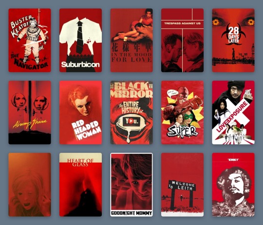
Fifteen stark posters, speaking one truth: We are vulnerable and nervous. What we need is a film poster with a white background to assure us the movie exists entirely to serve and soothe us.

Part of Izzy’s ‘comfort movies’ list.
List-making on Letterboxd has never been more prolific. Pandemic movies, overdue filmography catch-ups, comfort movies galore. Everyone categorizes and logs their watches differently, but Izzy’s pattern speaks to me with an epiphanic answer. I’ve always admired successful color-coding, but now I see its crucial function.
As I scroll for distraction, for something guaranteed to be good (because I cannot and will not be subject to any uncertainty I can avoid), I see the rainbow. The pale blues of Studio Ghibli, Wong Kar-wai’s passionate reds, the pastels of Netflix Original breezy romances. Like some kind of cinematic ikebana, countless Letterboxd members have mastered the art of arranging film posters. There are standouts: the staggering oeuvre that is Gordon’s chromatic roundup of favorite posters; the comprehensive color-graded history of women directors via their best posters, courtesy of Vanessa; and the penchant for beige in the year 2015, as spotted by Letterboxd co-founder Matthew Buchanan.
A selection of Gordon’s favorite movie posters.
But when I see these 300 examples, color-coded by typography and accents by Sera Ash, I recognize that white movie posters are the ones most likely, in this very strange time, to take care of me. I see it in three distinct filmmaking periods: Disney animations from the 1940s and 50s, the video marketing for cult comedies of the 1980s and 90s, and the alternative marketing materials of my favorite films of the 2010s. Each poster is straightforward and inoffensive. It captures the story, but never dares to impress or intimidate beyond basic description.
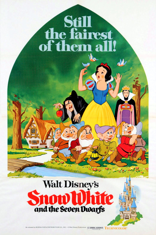
A 1975 re-release poster for ‘Snow White and the Seven Dwarfs’ (1937).
In 1937, Snow White and the Seven Dwarfs announced the birth of Walt Disney’s feature-length empire. While its original theatrical poster is also mostly white, it is represented on Letterboxd by a 1975 re-release poster depicting a peek through the keyhole: a curved triangle framing Snow White, the dwarves, and the two sides of the jealous queen, against a vivid green forest. In the bottom corner, a castle. To the left, the title—her name in red cursive, theirs in black. These simple images come together to present an elementary summary of the ingredients within. The white frame showcases the seminal animation craft without suggesting the viewer diverts their eye anywhere else.
This technique was common across other animated titles, collected in lists like dantebk’s Disney animated classics. Pinocchio toys with the hyperreal relationships between characters alive and wooden, human and animal—but does so on a plain canvas, so that the magic remains within reach. Dumbo, Bambi, Cinderella, Peter Pan—each follows suit. Whether with the mustard yellow of a circus tent, the faint sketches of grass tufts, the gold dust of an enchanted fairy godmother or the ink blue of a midnight starry sky, these colors (indicative of each defining scene-setter or mood-maker) only pepper a blank background, and so make their significance ever greater with the most sporadic touches.

A selection from dantebk’s list of Disney animated classics.
Live-action knockouts from these decades—films like The Shop Around The Corner and The Red Shoes—embrace painted recreations of their protagonists (Margaret Sullivan and James Stewart as festive lovers in the former, Moira Shearer as a tortured ballerina in the latter) and use the color red as a signifier of romance, against a plain white page, to set the mood. Slashes and splashes of red have been used to create a vibe in genre cinema for many decades—a trend deftly chronicled in this list by Rocks.
As far as we know, the underpinnings of digital photography began in the 1950s, and the first published color digital photograph dates back to 1972, when Michael Francis Tompsett shot a photo of his wife Margaret for the cover of Electronics magazine. Consumers got their hands on the gear in the late 1990s, but movie studios really started to make the most of sharp digital photography and stark white backgrounds for their striking posters from the late 1980s onwards. Because, never mind the multiplex, the video store is where you wanted your comfort fare to stand out in the 1980s and 90s.
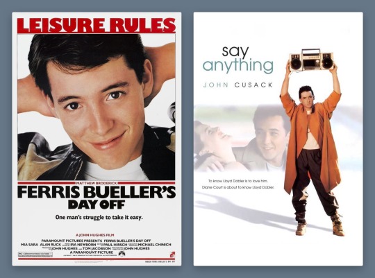
Ferris Bueller’s Day Off (1986) and Say Anything… (1989) form a handsome, trend-setting 1980s pair. While the theatrical poster for Cameron Crowe’s Say Anything… deigned to include John Cusack’s co-star, Ione Skye, by the time of the film’s video release, the focus is clearly on pre-High Fidelity Cusack, as proud underachiever Lloyd Dobler, smouldering lopsidedly under the weight of a boombox. It’s the singular image of the film to this day.
Meanwhile, Matthew Broderick as Ferris-slacking-Bueller is making the most of his title activity, arms behind his head, a proud smirk on his face. Nothing else matters except that these charismatic young stars are stepping up to leading-man status. The white background accentuates the star power of these new boys in town, embracing the limelight in one fell swoop.
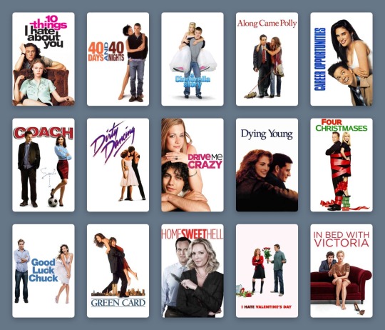
Star power is everything: beautiful people doing simple things against empty backdrops, because what could be more important than the regularity of symmetrical bone structure, of familiar charm? The trend boomed in the 1990s and 2000s, in films widely embraced by casual moviegoers. The sort who list “watching Netflix” as a Sunday activity on dating profiles and use the Christmas holidays to rewatch comedies they have memorized over dozens of half-attentive viewings (absolutely zero judgement here!).
The vast majority of these films have white posters. Who is your soothing cup of charm: Tom Hanks on a bench, nothing more nothing less, from 1994’s Forrest Gump? Or Heath Ledger, effortlessly cool, leaning on the brown corduroy armchair Julia Stiles sits in for the 10 Things I Hate About You poster from 1999? (The 90s harnessed the increased appeal of having two lookers just sitting and posing against a plain background, as demonstrated in this chilling list by Ashley.)
Ashley’s list of couples posing in front of a white background.
Will Ferrell had been earning his stripes as an actor for years, but he changed the movie comedy game as Buddy the Elf in 2003. There’s plenty of visual humour in Elf, but Ferrell’s coat-stand posture bedecked in festive green velvet and those tights is… enough. A white background lets the ridicule slide, just.
How many Disney series really deserve a whole movie—and one that stands the test of time? Lizzie McGuire, resting on her tiptoes with a swinging suitcase in hand, sells The Lizzie McGuire Movie like no idyllic views of Rome ever could. It’s reaching out to an audience loyal to the character, one who will follow her to the ends of the Earth, or at least to another continent. Hilary Duff could be doing almost anything on this poster and it would achieve the same effect—so long as the white background remains plain enough to keep eagle-eyed fans on the main event at all times.
It’s surprising that the star-making system only let Meryl Streep appear in a tiny box, one of four character tiles, on the poster for The Devil Wears Prada in 2006. But the design here taps into 1940s animated sensibilities, giving prominence to a devilish red Macguffin larger than the humans. It still achieves the same function—a glossy, glamorous design with the accessible sell of a quotable, star-fuelled comedy.
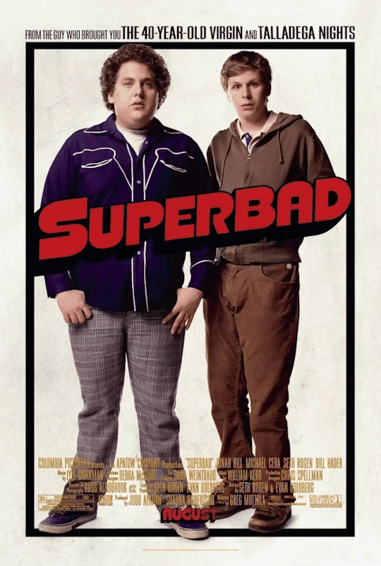
Red may be the color of romance and the devil; it’s also the color of comedy. Exhibit A: the 2007 gross-out comedy Superbad, whose star power—marking the emergence of Jonah Hill and Michael Cera—is used to an opposite and impressive effect on its poster. The awkwardness of these teen boys—lanky, unkempt, insecure—is what cinches the comedy. The simplicity of the poster design, with their uncomfortable posture against, well, nothing at all, further anchors their incapability of facing the world in any confident way, shape or form.
There are countless more examples, like Marley & Me, Bridesmaids, 27 Dresses (notice how the red type is replaced by pink when the film’s plot veers toward the altar). But to understand the curious and timeless appeal of the white movie poster, what happened to it in the 2010s cements its adaptable strength.
As the art of graphic design has continued to bloom, the aesthetic argument for the colorless color-block movie poster has shifted to embrace a film’s context. Consider Danny Boyle’s Steve Jobs, the enjoyable 2015 drama that provided Michael Fassbender one of the most under-celebrated roles of his career, playing the late Apple co-founder. The poster turns the canvas into a blank screen: the title is typed, the text insertion point poised, waiting for the next key press. As Jobs, Fassbender occupies the bottom right corner, in profile, thinking.
This starkness makes sense: what’s next, Steve? It offers a rare example of a poster from the past decade that fully leans into the monochrome aesthetic entirely on purpose—to serve the restrained and unequivocal need for white. (And it’s interesting to compare with the marketing narrative for an earlier film about another tech leader: observe how Jesse Eisenberg’s Mark Zuckerberg eyeballs us from The Social Network’s dark-mode poster.)

Comfort movies don’t own the white poster, of course. Jordan Peele’s Get Out toys, both in its marketing and its delivery, with the binaries of black and white. It’s deployed on-screen with sophisticated horror, and this extends to its two most graphic poster variants.
While one poster sees Daniel Kaluuya’s character, Chris, sat on a chair split vertically between black and white, the all-white poster allows only a center-frame letterbox to reveal Chris’s enormous eyes, accompanied by an all-caps type treatment. The vast expanse of white only makes the image more menacing, framing the claustrophobia so effectively. The landscape crop is a device that defines stern dramas as much as arthouse comedies, as documented by Haji Abdul Karim in their expansive list.
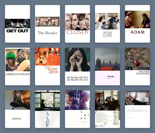
Haji Abdul Karim’s list of white-with-landscape-image posters.
But back in the ‘comfort’ realm, we’re seeing more and more that the marketing wants to have it both ways—the negative with the positive; the art house audience and the multiplex crowd. As genres blend, demographics collapse and audiences become more fluid, a film’s advertising needs to speak more languages.
Two ultra-comfort films from last year demonstrate this idea well. The poster for Judy sees a backlit Renée Zellweger finding her light, receiving her applause. Black is the key color, right down to the classic little black dress; the eye is drawn to the title, spelled out in red sequins. It’s showbiz, it’s drama. Though the film itself fudges a few of the more uncomfortable facts of the star’s story, it’s still honest about her addictions.
In the white-background version, which was more widely distributed, Zellweger, in a floral dress, turns away from the light. The name still sparkles, but in softened gold. There’s no less glamor, the stakes in the film are just as high, but she’s perhaps more accessible like this. The focus, as it was in the 90s, 80s, 40s, returns to the main event.
Greta Gerwig’s Little Women, too, played with dark and light. The indie queen released her previous film, Lady Bird, via design-conscious distributor A24, and Gerwig’s singular aesthetics promised that her Little Women remake would be worlds away from all the others. But when the first images for the film were released, the marketing campaign was questioned by die-hard Gerwig fans.

Both of the group posters are curiously stripped back, freezing Louisa May Alcott’s beloved March sisters in a moment. In the darker image, they gaze out a window, secure in their festive domestic bubble, but set on what’s beyond. There’s more to life, and the film, than this room. It feels more lush, painterly, certainly more dramatic.
Whereas the white poster, at first, seemed like a mistake. It took one of the first images teased from the film and just... dropped it onto a poster. The March sisters look as if solidified by clay, entirely undynamic and at odds with the fluidity and warm soul Gerwig had made herself known for in her filmmaking.
And yet, nothing matters more than these characters. Beth, Jo, Meg and Amy are holding each other, happy, each in their own favourite color, and there is nothing more to fight over. The white-poster alternative lets the 2010s viewer stay attached to the most important part of the film.
The lessons here? A white poster is a vital sign that you’re safe here. You’ve made the correct choice. Attention spans are dwindling, options are expanding, focus is difficult. The promise of a white frame tells me what matters, what is good, where I should place my time and my value. For now.
#movie poster art#poster design#film poster#film poster design#movie marketing#movie design#white posters#comfort movies#comfort films#letterboxd lists#Letterboxd#little women#judy#ferris bueller#disney#graphic design
12 notes
·
View notes
Text
hi guys. sorry for the long absence. i've had various r/l things going on, including a new job -- but tbh i’ve also found it hard to have fannish feelings about anything except the end of the band of my life, kent. the following is an incredibly tl;dr explanation. please don't feel obliged to read it; i think i wrote this mainly for myself.
i. origins
there are two stories, i guess. one begins in 2003 with teenage!jan discovering a curiously-labelled song on file-sharing software. someone had frontloaded the filename with familiar bands: REM, radiohead, the smashing pumpkins, etc. so i downloaded what turned out to be the english version of kent's 747, and realised i had to listen to more of their work.
i soon discovered they were a swedish band, and that their english experiment had been short-lived. but their swedish songs were fantastic (both before and after i looked up the lyrics), so i kept listening.
and they say the town's become silent and ugly and deserted, darling
that it's going to be a long cold winter
i've learnt that longing is worst when one's slept like a child
through an ice-cold winter
you're my hero for you dare to be honest
you're my hero for you're just as weak as me
come and help me, i need you -- again, again, again (x)
i ordered all their albums online -- you know it's love when you stop pirating. for most music loves, it might have stopped there. except for the other story, which starts in the late 1980s (or officially in 1990).
i read about the band's origins, and there was something compelling about that, too. how they grew up in a small grey industrial ghost town, where music was an escape. how they had lofty dreams and moved to stockholm and tried and failed and kept trying for years, until they got their big break. how they went from strength to strength after that, winning awards and a devoted fanbase, and eventually being called "sweden's biggest rock band". (but also how, after two english-language albums and gruelling international tours, they had to give up on that front.)
i loved them with the intensity teenagers are capable of. i read all i could find in english, and then (back when machine translation was poor and google translate didn't even exist yet) read more with the help of a swedish-english dictionary and what grammar i managed to learn.
kent also had a close relationship with their fans. their frontman, joakim berg, frequently hung out on their official forum. ahead of each album release, the band took questions directly from fans and answered them (often hilariously) on their website -- which, incidentally, was a fansite that the band noticed and asked to become their official website.
in 2005, they released their first new album since i'd started listening to them: du & jag döden or 'you & i, death', a masterpiece from the irresistible opening track all the way till the magnificent album closer, which remains my favourite song ever. i pre-ordered the album online and played it on loop for days and have never recovered.
do you remember our blood-oath, our law?
our stupid crusade against an equally foolish town
i remember everything like nails against glass
but you just laugh at me, reduce everything to a joke
yet i see in your anxious posture, your hunted gaze that it feels
that it's a long way home (x)
ii. journeys
in the autumn of 2007, kent released their next album, tillbaka till samtiden; i went to the UK for university, on a scholarship. that december, i went to sweden and saw kent live for the first time -- something i'd never imagined would be possible, back when i first discovered their music. it was magical. they were magical. that energy, those songs i'd loved for years, the crowd roaring along on all the classic lines -- singing but darling we’ll all die someday with thousands of other fans, not in sadness but in triumph. but also: jocke's incredibly dorky dancing, the band's camaraderie on stage, how they connected with the crowd. i fell a little in love with their guitarist, sami sirviö, and his dramatic guitar-playing -- something from which i have never recovered either.
the next spring, i travelled alone to sweden to see them again, three times.
kent wasn’t just the soundtrack to my ~formative years; they’re linked inextricably to the start of my uni-era travels, and to trips i’ve taken since. they were also a constant, of sorts: one could always expect another album within a couple of years. there was always something to look forward to.
and the thing about kent -- and being a kent fan over the years -- is that they have always moved forward. unlike some bands which retread the same sonic territory, kent saw each new album as a musical departure from the next (often to their fans’ dismay; but kent always said that they made music for themselves, and i admired that kind of integrity, too). their lyrics also evolved: from adolescent anxiety and desperation, to urban isolation and middle-aged middle-class angst (not least given their working-class origins), protesting against a society that seemed to be losing its old ideals of solidarity and kindness.
in late 2009, during my final undergraduate year, they released the album röd. in the easter vacation before my final exams, i went to sweden and norway for four concerts. i didn't know when i would get to see them again.
(just half a year after röd, they casually released another album, en plats i solen. other things they’ve done: released songs for charity, from a quietly devastating song about domestic violence for Save the Children, to one for the National Organisation for Women's and Girls' Shelters in Sweden; released a song for free online as a christmas present for fans, without the knowledge of their record label, and laughed with fans on the forum about that; taken shoe-selfies on a couch together.)
darling, that we want most of all
is something that can never be ours
november is a wall of wet concrete
where a naive dream of escape is born
to crash and then die
but heroes and heroines stay standing
they spit hard into the wind
and they warm our hands
so we don't lose our grip
on the love we have a right to (x)
i returned from the UK and started work in 2011. in 2012, kent released jag är inte rädd för mörkret, which opens with one of their most beautiful songs. (instead of doing promotional interviews, they held a press conference and invited fans and forum regulars and bloggers, not just the media.) i flew alone to stockholm that summer, for a concert on a sprawling green lawn. the setlist was incredible and included one of my favourite songs, which i'd hoped for years to hear live. there were fireworks at the end. the forty-minute walk back towards town, amongst other fans, felt like it took no time at all.
2014 started out tough for me for various reasons, and kent's new album tigerdrottningen was very welcome, though i didn't manage to see them live that tour. they were more political than ever before. their first single was a blistering critique of sweden today; at a summer festival they held (yes, they held their own festival, and invited artistes they loved -- mostly women, incidentally, something the media noticed but the band themselves never pointed out), they exhorted the crowd to vote the right-wing SD party out of parliament. my favourite track off the album describes stockholm as a "guaranteed solidarity-free New Moderate desert" -- but also contains a verse that gains a lot of poignancy in retrospect:
i hear the bass from the car at the red lights, i know that song
like a knife to the heart -- i wrote it 200 summers ago
i stand as if frozen at the crossing, and regret (x)
iii. endings
on 13 march 2016, kent posted a video full of references to previous albums and songs.
youtube
after 26 years together, they were calling it a day.
their final album, då som nu för alltid, was a summary and a farewell. they said goodbye with a final tour: 28 gigs in four months across four countries.
i used half my annual leave to catch five concerts in october. each one was amazing. from the breathtaking introduction and epic visuals, to the setlist, to -- of course -- the band themselves. how much energy they poured into their music. the smiles they traded on stage, how they’d play while facing each other. how jocke presented his fellow band members to the audience, night after night, and told stories from their earliest days together; how, night after night, he told them he loved them.
the band members' love for each other, how they call themselves a family and have always felt it was them against the world -- that's one of my favourite things about them. and i have a lot of feelings about the stories jocke told: how he and sami went from disliking each other at first sight to sharing a rockstar dream; how he and bassist martin sköld spent hours talking about everything in life; how important their drummer, markus mustonen, was in making them feel like they were finally a real band.
the farewell tour was also filled with love between the band and the fans. how jocke bantered with fans near the front. how, in setlist staple jag ser dig ('i see you'), the fans got their moment on the big screen. how the fans have always taken jocke's cue during set-ender 747, turning stadiums into seas of waving arms, right after jocke sings to us, repeatedly, you keep us alive -- additional lyrics only present in live renditions of the song. how, after each concert, the band came down and gave out roses to fans in the front row.
in december, i flew out again for their last three concerts in stockholm. during the first two, for which i had standing tickets, there was just such a pure joy and euphoria at being there, in the moment, with fellow fans, amid their music. they performed a completely new song, because kent is the sort of band which does that sort of thing during their last three concerts ever.
at their final concert, on dec 17, i had a seated ticket for the only time this tour. i watched their farewell from a distance, but that also allowed me to grasp the scale of this: being there amongst 38,300 fans, saying goodbye together. during the ironic political ballad sverige we held up our phones, as we'd done throughout the tour, and the arena was full of stars.
the day after, the band released a final video, a beautiful summary of the farewell tour which included the voices of fans. it was a music video for the song which ends their last album, and which also closed every concert that tour: den sista sången or 'the last song'. just to make the message perfectly clear, the song (and by extension, every farewell concert) ends on these lines:
this is the last time, the last time we're meeting
the last song, the last song i'm giving you (x)
youtube
iv. epilogue
on dec 26 and 27, a two-part documentary on the band's final years was released. it's a very well-made documentary, from cinematography to its on-point song choices, filled with interviews and amusing moments, giving a summary of the band's history and a look at the long farewell stretch. the documentary also contained some sad revelations about why the band had chosen to call it a day, and i spent january and february processing this, basically.
on feb 28, kent won their final two swedish grammy awards. they gave cute thank-you speeches and joked around in the backstage interviews. it provided a kinder sort of closure, compared to the documentary's bittersweet ending.
i still have far too many feelings about these guys and their journey. but it's now been a year since the farewell announcement, and though i'll never get over this band, i should really move forward too.
#this really ended up tl;dr#and yet i could still write a million more posts about#kent the band#though i... won't#also yes i know i've been extremely fortunate and privileged#to be able to afford to catch so many of their concerts#anyway i... will try to return to tumblr now#if i remember how haha
9 notes
·
View notes
Last Seen Blogs

heartagram-vv
heartagram

norinorichan
Keep Floating~

riyf
- SPARKYSTARZ CREATIONS -

thecouncilsinsideblog
Sin's (Not) Sex Dungeon

infinitystoner
infinity stone(r)