#Zenicons
Text


Anime icons.
#kakashi#kakashi hatake#Kakashi icons#icons#anime icons#narutoicons#noragami#noragamiicons#ikihiyori#Hiyori#hiyogami#edit#hokage#zen#zenicons
81 notes
·
View notes
Text
̨𖥔 ִ ་ ، ˖ ࣪𝐀𝐤𝐚𝐠𝐚𝐦𝐢 𝐧𝐨 𝐒𝐡𝐢𝐫𝐚𝐲𝐮𝐤𝐢𝐡𝐢𝐦𝐞☁️ ་ ، ˖ ࣪ ་ ˖ ʿ
﹆ׂׂ ˖. 𝑍𝑒𝑛🔮𝑊𝑖𝑠𝑡𝑎𝑟𝑖𝑎 ֺ ָ ֙⋆
𖤐₊˚. 𝑆ℎ𝑖𝑟𝑎𝑦𝑢𝑘𝑖♡᭄᭄⃯
˖࣪ 𓂃 ִֶָ ‹ 𝕨𝕠𝕦𝕝𝕕 𝕪𝕠𝕦 𝕥𝕒𝕜𝕖 𝕥𝕙𝕚𝕤 𝕙𝕒𝕟𝕕,𝕤𝕙𝕚𝕣𝕒𝕪𝕦𝕜𝕚 ?


·⸧ׅׄ⸦ ⸧ׅׄ⸦ ⸧ֽׂׅׄ⸦ ⸧ׂׅ⸦ ⸧ׅׄ⸦ ⸧ׅׄ⸦ ⸧ׅׄ⸦ ⸧ׅׄ⸧ׅׄ⸦ ⸧ׅׄ⸦ ⸧ֽׂׅׄ⸦ ⸧ׂׅ⸦ ⸧ׅׄ⸦ ⸧ׅׄ⸦ ⸧ׅׄ⸦


🩰◗ ꔛ . 𝔽𝕠𝕣 𝕞𝕖,𝕓𝕖𝕚𝕟𝕘 𝕨𝕙𝕚𝕥 𝕪𝕠𝕦 𝕟𝕠𝕨 𝕚𝕤 𝕥𝕙𝕚𝕟𝕘 𝕠𝕗 𝕗𝕒𝕥𝕖
1 note
·
View note
Text
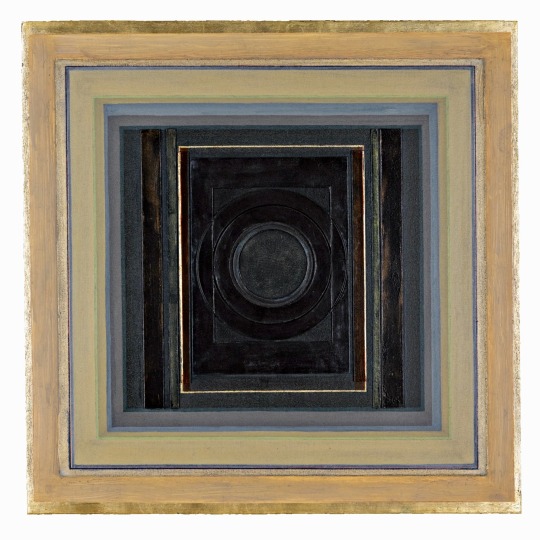
Paul Feiler
Zenicon XXI
oil, gold and silver leaf, gessoed board on canvas
Sotheby’s
73 notes
·
View notes
Photo

ZENICON 1.0 ZENICON 1.0 - Quickly unveil menu bar icons. (Demo)Read More
0 notes
Photo
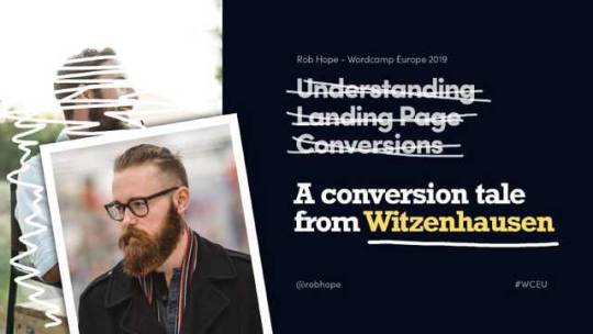
Understanding Landing Page Conversions (A tale from Witzenhausen)
This article was derived from my WordCamp Europe 2019 talk about Landing Page conversions.
We start by trying to understand what our user is thinking and anticipate what they are expecting to see in our Landing Page – resulting in improved conversions.
And for fun, in the light of the event being held in Germany, I decided to adapt my talk into a tale about Yannick from the quaint town of Witzenhausen – hope you enjoy the story!
Firstly, what (exactly) is a Landing Page?
A Landing Page is the webpage where your user lands up after your marketing efforts. eg. CocaCola have an Instagram Story promotion saying “Swipe Up to stand a chance to win a trip of a life time”. You swipe up and land up on the competition Landing Page, not the website home page.
It’s also worth noting a good Landing Page has only one objective – in this case inputting your email, hitting the enter button and BAM – that’s what we refer to as a conversion.
See the beauty of a Landing Page is the effectiveness of getting your visitor to do one thing. Ok, let’s get going…
A conversion tale from Witzenhausen
Meet Yannick. Yannick is a millennial hipster.
How do we know Yannick is a millennial? Well, he’s born in 1990.
How do we know Yannick is a hipster? No, it’s not his gorgeous beard. It’s because he only drinks pour-over coffee. According to Yannick, all other coffee is scheisse.
But it’s not all good times for 29 year old Yannick. Each month he runs out of his beloved Chemex Coffee Filters.
And because he lives on a sunny hill in the quaint town of Witzenhausen (about 115km from nearest city Hanover) he has no easy access to replenish the coffee filters when they run out.
I know what you are thinking? Why not just use normal coffee filters? Did I not mention Yannick is a millennial…
So like any young and ambitious millennial would do when they run out coffee filters – he hops online to order some right? Pah! Nope. He heads to Twitter and Tweets:
twitter.com
THEN he heads over to Google and searches:
google.com
…and because our marketing team is on the ball, we have a Google Ads campaign running excluding major German cities saying:
google.com
Yannick thinks. Woah… that’s me.. I’m in the country! So he clicks the relevant ad… arriving at our Landing Page.
Setting the Objective
Now remember what I said before, a good Landing Page has only one objective and in this case, for Yannick to subscribe to get delivered monthly coffee filters aka a conversion.
Before we dive into the Landing Page construction, let’s step back quick. I could list 50 things to do and not to do but there is really one fundamental question to ask at this point: What exactly would Yannick want to read for him to be persuaded to enter in his Credit Card details and start a coffee filter subscription with us?
Let’s go. We always start with…
1. Intro copy must resonate with the user problem
Not many of you know but I’ve reviewed over 7000 Landing Pages over the past 10 years and you’ll be blown away at what I see each day. Can you image the conversion difference between Yannick arriving at a Landing Page that begins with:
Common non-targeted Landing Page intro copy
and this:
Relevant Landing Page intro copy
… with an image of the actual Chemex Coffee Filters and an actionable CTA subscription button?
Yannick is thinking woah, das ist wunderbar! (and begins reaching for the credit card in his pocket)
But of course intro copy plus an alongside image is generally not enough to get a conversion in 2019. Yannick of course has questions.
Second step…
2. All content must answer doubts
What would Yannick, the 29 year old German man with the gorgeous beard, be thinking at this point? Let’s brainstorm a few…
How can I pay? Is Payment safe? So we add credit card logos in the footer:
Landing Page Credit Card Logos
How many filters are there? We already included the amount in the intro copy subtext but we understand Yannick is in a rush and probably skims content – as do 90% of the others. So we paste a badge on the intro product image with an amount, clear as day:
Landing Page Credit Card Logos
Are the filters the shape I like? We add a minimal but clear strip of images:
Landing Page Image Gallery
Is it easy to cancel subscription? We add the subscription policy right under the subscription CTA button as well as under the credit card logos. Those are probably 2 areas of our Landing Page that Yannick would think about it:
Landing Page Cancellation Policy
He might want a little more detail on this as subscription cancellations are known to be sticky – so let’s add a Learn More link (seen above) that smooth scrolls to our Landing Page FAQ section:
Landing Page FAQs
In that FAQ section we also add more information about plastic packaging as ya know… what about the baby Turtles!
Step three…
3. Build trust with Testimonials
Don’t underestimate the power of a great testimonial from an opinion leader.
Let’s quickly step to the side and imagine you are designer looking for icons. You arrive at a Landing Page for ZenIcons. In the middle of the icon previews is a testimonial from a Product Designer from Spotify saying these are my go-to icons for all my personal side projects:
Landing Page Testimonial by an Opinion Leader
Bang – they must be quality. Where do I pay?
Stepping back to Yannick – what would his ideal testimonial look like?
A bad testimonial looks like this, anonymous with little value:
Landing Page - Bad Testimonial example
A good testimonial is by a real person highlighting a product or service feature. Here is another bearded dude in a coffee shop talking about the subscription:
Landing Page - Good Testimonial example
A great testimonial is by a real, relative person or opinion leader highlighting a feature but also answering a doubt. Here is a Barista from the small town of Nuremberg talking about the subscription but also how much he appreciates the non-plastic packaging. Because, you know, the turtles:
Landing Page - Great Testimonial example
Yannick is besides himself and almost ready to pull the trigger but its 2019 and attention spans are like dust (he’s actually wanting to check if anyone liked his Tweet earlier).
Step four, last step..
4. Create haste
We’ve answered all the potential doubts but the most difficult one to combat is if they can get the same product or service cheaper somewhere else. So we increase the perceived value and put a limit on it. Here are some examples.
Add a discount in your pricing table, only valid for that month:
Landing Page - Timely discount haste
Add a limited stock quantity under the purchase CTA button:
Landing Page - Limited quantity haste
And in Yannick’s case, we’ve added a countdown timer right on top of the CTA button, offering a free bag of Arabian mountain beans if he subscribes in the next 12 hours:
Landing Page - Countdown timer plus free product haste
Yannicks heard those Arabian beans are legit and doesn’t want to miss out on this time-sensitive opportunity! So along with all the relative content and answered doubts, he whips out his credit card and bam we have a subscription conversion
Let’s quickly recap
We took the time to understand our user and created intro copy that resonated with the user problem and offered a solution right away:
All our content was crafted based on potential doubts:
We built trust with great testimonials by real people:
… and lastly boosted the conversion with a little bit of strategic haste:
Note how there is no newsletter sign up, no advertising, no links to other website pages and no other products for sale. By anticipating what our user would like to see in our Landing Page, we have minimized the content, to maximize the conversion.
Hope you enjoyed the article!
“By anticipating what our user would like to see in our Landing Page, we have minimized the content, to maximize the conversion.”
Tweet this
by Rob Hope @robhope via One Page Love http://bit.ly/2WWfpmg
0 notes
Text
IKON ZENICON
IKON ZENICON
ZENICON adalah aplikasi baru yang cepat memperkenalkan ikon menu bar yang tersembunyi oleh menu aplikasi. Pernah ingin klik ikon Bar menu yang tersembunyi di balik menu pada komputer Apple? ZENICON membuat mudah!
Catatan: ini hanya perlu dilakukan sekali. Ketika pertama kali menjalankan ZENICON, CMD-klik ikon ZENICON (persegi kosong) dan memindahkannya dari sisi kiri menu bar ke…
View On WordPress
0 notes
Text
Zenicon Infoway Pvt. Ltd. in Cochin, Computer Sales and Services
Zenicon Infoway Pvt. Ltd. in Cochin, Computer Sales and Services
Adrress #39/6639, Mahatma Gandhi Road, Cochin-0. Contact Person Antony Phone/Mobile Numbers 0484 – 2357813, 0484 – 3077953, 9846300111 Location Mahatma Gandhi Road City Cochin Email Id [email protected] Website Working Hours Mon – Sat 9.00am to 6.00pm Keywords: Computer Sales and Services Enquire Zenicon Infoway Pvt. Ltd.using below form: The Business-Organization Zenicon Infoway Pvt. Ltd.…
View On WordPress
#Computer Sales and Services in 39/6639#Computer Sales and Services in Cochin#Zenicon Infoway Pvt. Ltd. in Cochin
0 notes
Text
ZENICON (ZENICON)
ZENICON (ZENICON)
ZENICON to nowa aplikacja, która szybko prezentuje ikony paska menu, które są ukryte w menu aplikacji. Czy kiedykolwiek chciałeś kliknąć ikonę paska menu, która była ukryta za menu na komputerze Apple? ZENICON sprawia, że to łatwe!
Uwaga: Należy to zrobić tylko raz. Przy pierwszym uruchomieniu zenicon, CMD kliknij ikonę ZENICON (pusty kwadrat) i przenieś ją z lewej strony paska…
View On WordPress
0 notes
Text
ZENICON
ZENICON
ZENICON é o novo aplicativo que rapidamente revela ícones da barra de menus que estão escondidos pelos menus do aplicativo. Já quis clicar em um ícone de barra de menu que estava escondido atrás de menus em um computador Apple? ZENICON facilita isso!
Nota: Isso só precisa ser feito uma vez. Ao executar o ZENICON pela primeira vez, o CMD-clique no ícone ZENICON (um quadrado em branco) e…
View On WordPress
0 notes
Text
ZENICON
ZENICON
ZENICON es la nueva aplicación que desvela rápidamente los iconos de la barra de menús que están ocultos por los menús de la aplicación. ¿Alguna vez has querido hacer clic en un icono de la barra de menús que estaba oculto detrás de los menús en un ordenador Apple? ZENICON lo hace fácil!
Nota: Esto sólo necesita ser hecho una vez. Cuando ejecute ZENICON por primera vez, haga clic en el…
View On WordPress
0 notes
Text
ZENICON
ZENICON
ZENICON is de nieuwe app die snel menubalkpictogrammen onthult die worden verborgen door app-menu's. Altijd al op een menubalkpictogram willen klikken dat achter menu's op een Apple-computer was verborgen? ZENICON maakt dat gemakkelijk!
Opmerking: Dit hoeft maar één keer te gebeuren. Wanneer cmd voor het eerst naar HET ZENICON-pictogram (een leeg vierkant) klikt en het van de linkerkant…
View On WordPress
0 notes
Text
ZENICON
ZENICON
ZENICON adalah aplikasi baru yang menggunakan ikon bar menu dengan cepat yang disembunyikan oleh menu aplikasi. Pernah mahu klik ikon bar menu yang disembunyikan di belakang Menu pada komputer Apple? ZENICON memudahkan yang mudah!
Nota: ini hanya perlu dilakukan sekali sahaja. Apabila pertama kali menjalankan ZENICON, CMD-klik ikon ZENICON (sebuah dataran kosong) dan pindahkannya dari…
View On WordPress
0 notes
Text
ZENICON ZENICON
ZENICON ZENICON
ZENICON est la nouvelle application qui dévoile rapidement les icônes de barre de menu qui sont cachées par les menus de l’application. Vous avez toujours voulu cliquer sur une icône de barre de menu qui était cachée derrière les menus sur un ordinateur Apple? ZENICON rend cela facile!
Remarque : Cela ne doit être fait qu’une seule fois. Lors de la première exécution ZENICON,…
View On WordPress
0 notes
Text
ZENICON
ZENICON
ZENICON is the new app that quickly unveils menu bar icons that are hidden by app menus. Ever wanted to click a menu bar icon that was hidden behind menus on an Apple computer? ZENICON makes that easy!
Note: This only needs to be done once. When first running ZENICON, CMD-click the ZENICON icon (a blank square) and move it from the left side of the menu bar to the far right.
Download…
View On WordPress
0 notes
Text
زينيكون
زينيكون
ZENICON هو التطبيق الجديد الذي يكشف بسرعة عن رموز شريط القائمة التي يتم إخفاؤها بواسطة قوائم التطبيق. من أي وقت مضى يريد النقر فوق رمز شريط القائمة التي كانت مخبأة وراء القوائم على جهاز كمبيوتر أبل؟ ZENICON يجعل من السهل!
ملاحظة: هذا يحتاج إلى القيام به مرة واحدة فقط. عند تشغيل ZENICON لأول مرة، انقر فوق رمز ZENICON (مربع فارغ) ونقله من الجانب الأيسر من شريط القائمة إلى أقصى اليمين.
تحميل…
View On WordPress
0 notes
Text
제니콘 (것)
제니콘 (것)
ZENICON은 신속하게 응용 프로그램 메뉴에 의해 숨겨진 메뉴 바 아이콘을 공개하는 새로운 응용 프로그램입니다. 이제까지 애플 컴퓨터의 메뉴 뒤에 숨겨진 메뉴 모음 아이콘을 클릭하고 싶었어요? 제니콘은 쉽게!
참고: 이 작업은 한 번만 수행하면 됩니다. 처음 제니콘을 실행할 때 CMD는 ZENICON 아이콘(빈 사각형)을 클릭하고 메뉴 모음의 왼쪽에서 맨 오른쪽으로 이동합니다.
맥용 제니콘 다운로드
다운로드
View On WordPress
0 notes
Last Seen Blogs

ginny-on-the-road
Ginny on the Road

rama7u7-blog
ramawitch

jepaullover
literally him


fy-kimi
FuckYeah Kimi