#Vivziepop lacks basic fundamentals
Note
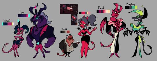
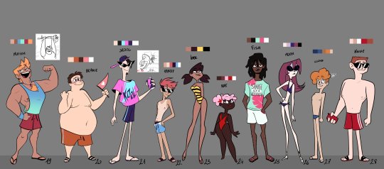
This is gonna be a long read but have you ever noticed how some of the human characters and background demons look either plain or like they don’t belong in the same show? Okay hear me out, because i know the critical community sometimes praises the designs obviously not done by viv. And i wouldn’t be surprised if they look a bit plain to give the animators that deal with viv’s wrist suicide designs a break. But it’s a really subtle way of showing just how bad of a director and artist viv actually is. When you try to replicate her style without all the details, it looks really boring because she only has three body types, and two eye types. It’s also a bit off putting because why are some demons like the main ones sharp, monstrous and detailed, but others look generic. Plus with the humans, some of them don’t look like they’d become demons if they died, their silhouettes aren’t very similar, which makes stolas human look even weirder when his proportions aren’t seen in the humans.
This might seem nitpicky, but even basic shows have background characters that don’t overshadow the main yet look like they all fit in one style because other shows have clear style guidelines while leaving room for varied features i.e powerpuff girls, rick n morty etc. Viv probably can’t direct the animators for shit. It also doesn’t have to be plain if the appeal is interesting details. Rise of the teenage ninja turtles has even better animation! And detailed colorful designs with all characters!, it just knows how to simplify it into base shapes and details that still let the design show through. Here’s one artist take that shows how easy it’d be https://www.tumblr.com/aimasup/716642713709264896/sorry-for-the-gushing-this-banana-is-the-only they have other redesigns too. If she was actually a good artist, but no the HH redesigns for prime look worse and somehow has more details! basically she’s a bad artist and so’s the show. And has anyone noticed this?
this is a worth while read, thank you anon~!
okay- yes let’s talk about Viv’s background character designers, to be fair these guys are REALLY good artists imo. They understand coding, body language and telling stories through the simplest designs perfectly fit for animation.


The reason why they look so off (in comparison of Viv’s style) is just that, these artists are experienced in animation design it’s their JOB-

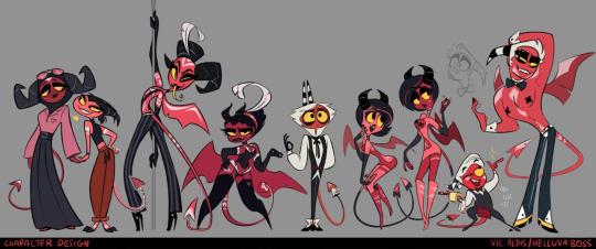
Viv just got lucky in the animation scene cause normally her art wouldn’t fly. Random unimportant patterns with random rips in every outfit??? Where’s the uniqueness? Where’s the story? They all are the same body shape and same fashion sense which peeves me the most.


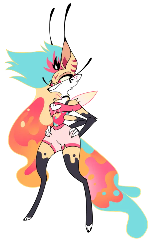
These are just her wolves— it gets worse with her more humanoid designs…


The illusion of difference with ✨COLOUR/eyelashes-✨ but seriously… look at their noses and face shape.. the Eurocentric beauty standards zapped her with its laser beams- button nose and sharp jaws.
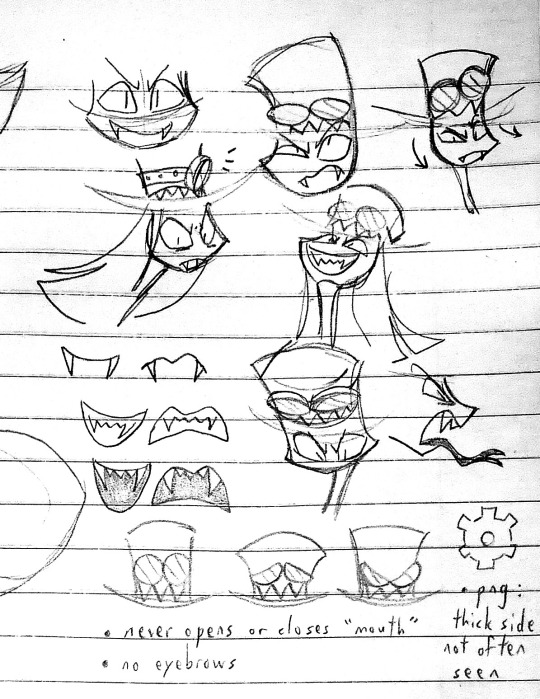
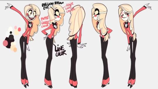
as for the design you linked it makes me so HAPPY, the deconstruction ? The dedication? This person could definitely have a job in design, it’s a designers job to take away the useless and keep the most important features- to simplify and make sacrifices for the sake of proper turn arounds (which Viv struggles so hard at cause her hair/faces can only be viewed usually in one direction…)

Chad fan-designer VS
Beta Viv who struggles with a 360 turn around…. (Dear lord look at her eye lashes changing size every direction and her hair lines not making any sense—) she’s so lucky her animators made it out alive.
#Vivziepop lacks basic fundamentals#vivziepop critical#Art deconstruction#Art critique#hazbin hotel critical
132 notes
·
View notes
Last Seen Blogs

guysstay
GUYS STAY

foodloversameem-blog
BEST_STREETFOOD
aaaaaaaaaaaa-a
welcome to the adventurer's spring...

vukukibut
Untitled
guysstay
GUYS STAY