#TheColourProject
Text
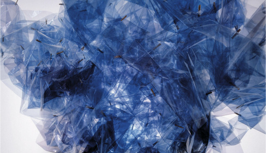
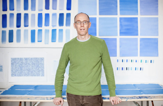
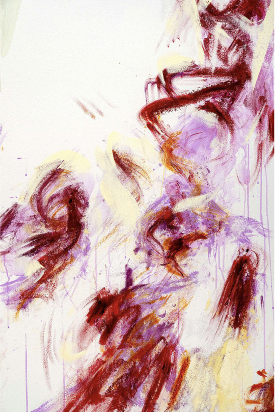
Spencer Finch
Working in watercolour, drawing, sculpture, photography, and installation, Spencer Finch attempts to faithfully recreate his impressions of natural phenomena and the landscapes that surround him. The artist observes, documents, and studies colour and light effects with scientific precision. He distils his findings into ethereal works—most notably large-scale installations that filter or transform natural light, or create synthetic light effects. With both a scientific approach to gathering data and a true poetic sensibility, Finch’s installations, sculptures and works on paper filter perception through the lens of nature, history, literature and personal experience.
Finch has completed several large-scale public projects notably ‘Trying to remember the color of the sky on that September morning’ at the 9/11 Memorial Museum in New York City in 2014. He is a recipient of the American Federation of Arts’ Cultural Leadership Award (2014) and his work is held in numerous museum collections.
📷
1. Spencer Finch, Sunlight in an Empty Room, detail, 2004, (Passing Cloud for Emily Dickinson, Amherst, MA, August 28, 2004), Lisson Gallery
2. Spencer Finch, Study for Reflections I, 2021
3. Spencer Finch, Study for Saiph, 2019, Lisson Gallery
4. Spencer Finch, Trying to remember the color of the sky on that September morning (detail). Installation at the 9/11 Memorial Museum, Watercolour on paper, 2014
5. The artist Spencer Finch at his studio in Brooklyn. Michael Kirby for New York Times.
#SpencerFinch#ArtWords#Beautiful#Art#Light#Installation#ArtGallery#911Memorial#NewYork#Landscapes#Nature#NaturesPalette#Colour#Blue#Chroma#ColourPalette#ColourStudies#ColourTheory#TheColourProject#London
0 notes
Text
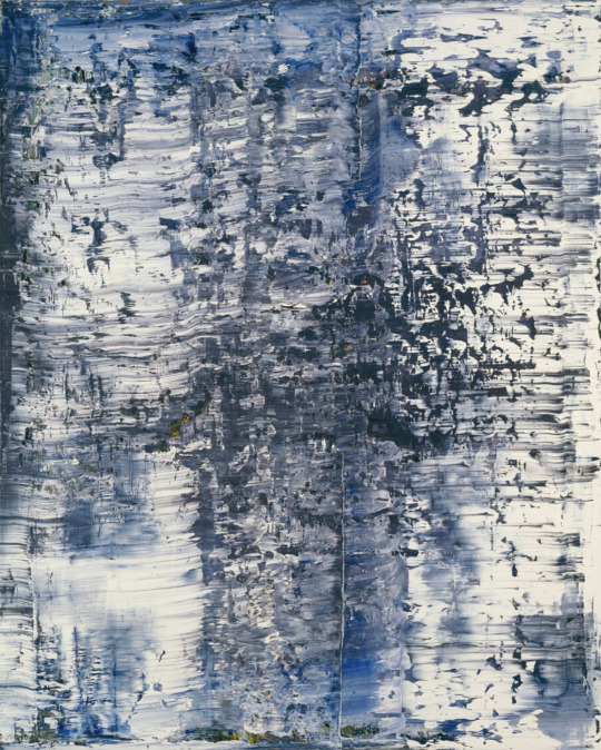
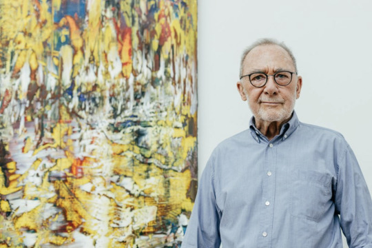
Gerhard Richter
“Art is the highest form of hope” - Gerhard Richter
Gerhard Richter was born in 1932 in Dresden, Germany. Throughout his career, Richter has negotiated the frontier between photography and painting, captivated by the way in which these two seemingly opposing practices speak to and challenge one another. From exuberant canvases rendered with a squeegee and acerbic color charts to paintings of photographic detail and close-ups of a single brushstroke, Richter moves effortlessly between the two mediums, reveling in the complexity of their relationship, while never asserting one above the other.
Richter revisits – not without an ironic distance – the history of painting, romantic and sublime themes, and geometric and lyrical abstraction. More than a parallelism, this coexistence between figuration and abstraction is like a mise en abyme, echoing the material depth of the “scratched” surface and of photographic elements perceived through other layers, or the mental depth in form of certain titles that refer to atmospheres, natural elements or people’s names. Rather than being reductive and conceptual, this lifetime’s research is radical in the way it hesitates between erasing and revealing.
➡️ Don’t miss the exhibition Gerhard Richter | Overpainted Photographs, at Sies + Höke in Düsseldorf, which presents 65 works dating from the years 1989 to 2018, illuminating this important part of Richter's œuvre.
📷
1. Gerhard Richter, Ice (1), 1989, Art Institute of Chicago.
2. Gerhard Richter at the Albertinum, Dresden in 2017. © Gerhard Richter 2021. Photography by David Pinzer, SKD
#GerhardRichter#Artist#ArtWords#Beautiful#Art#Painting#ColorChart#AbstractPainting#PostwarArt#ContemporaryArt#Nature#NaturesPalette#Pigments#NaturalPigments#Colour#ColourPalette#ColourStudies#ColourTheory#TheColourProject#London
1 note
·
View note
Text
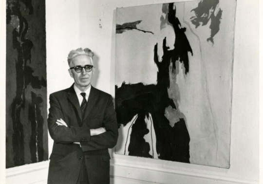
Clyfford Still
Clyfford Still had a unique artistic vision and was unwilling to compromise it for money or recognition. As he evolved as an artist, Still’s works transitioned from recognizable images and landscapes to more abstract shapes, colours, and lines to express ideas and feelings on huge canvases. He wanted people to get lost in his works and make their own interpretations of his art.
‘My paintings have no titles because I do not wish them to be considered illustrations or pictorial puzzles’, Still wrote. ‘If properly made visible they speak for themselves.’
📷
1. Clyfford Still, PH-247, 1951, Clyfford Still Museum
2. Clyfford Still at the Albright-Knox Art Gallery, unknown photographer, 1959, Clyfford Still Archives.
#ClyffordStill#AbstractExpressionism#Artist#ArtWords#Beautiful#Art#Painting#Nature#NaturesPalette#Pigments#NaturalPigments#Colour#Blue#Chroma#ColourPalette#ColourStudies#ColourTheory#TheColourProject#London
1 note
·
View note
Text
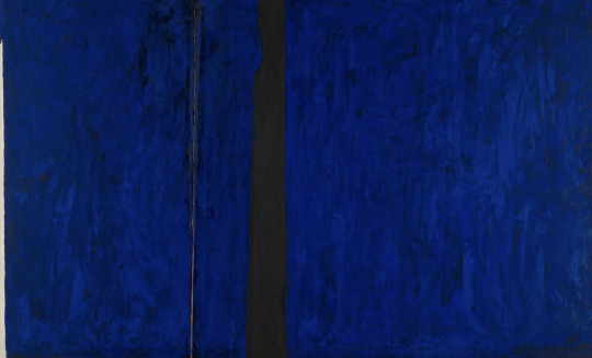
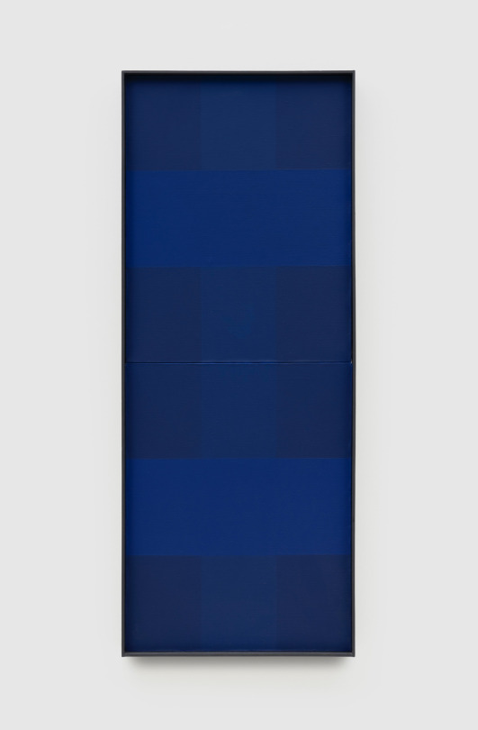
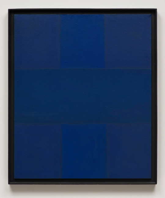
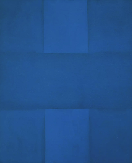
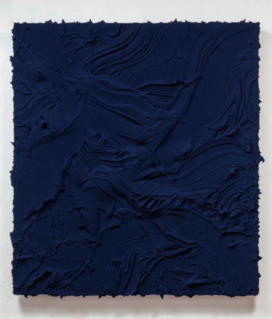
Ad Reinhardt
“Art is art. Everything else is everything else.” - Ad Reinhardt
Ad Reinhardt was one of the most relentless defenders of the purity of abstraction. He felt that art should be divorced from everyday life and viewed art making as a pure, disinterested, and ethical pursuit. His early painting and collage features bold, geometric shapes and patterns that he pared down into allover compositions of staccato marks in an increasingly limited range of colours. These eventually led to monochromatic blue and red paintings ordered by strict geometric arrangements and, finally, to his Black Paintings. His focused body of work and his emphasis on restrained and repeating compositions make him a progenitor of Minimalism and Conceptual Art.
The monochromatic dark blue of Abstract Painting, Blue, with its barely perceptible differences in colour tone, relates solely to the flat surface, the rectangular shape of the canvas support, and the properties of pigment. Reinhardt’s rationale for such “pure painting” was that, being entirely independent of every other aspect of life, it would be incorruptible. Such aesthetic integrity would, he hoped, gird art against the threat of being used to deliver political messages, whether of the right or the left. Reinhardt made abstract paintings that would be ends unto themselves, because he did not want art to be exploited as a means for some other political or ideological purpose.
📷
1. Ad Reinhardt, Abstract Painting, Blue, 1953, Pace Gallery
2. Ad Reinhardt, Abstract Painting, Blue, 1952, The Museum of Contemporary Art, Los Angeles
3. Ad Reinhardt, Abstract Painting, Blue, 1952, The Museum of Contemporary Art, Los Angeles
4. Ad-Reinhardt,1943. Photograph: Dan Keleher
#AdReinhardt#Artist#AbstractExpressionism#WednesdayWords#ArtWords#Beautiful#Art#Painting#Nature#NaturesPalette#Pigments#NaturalPigments#Colour#Blue#ColourPalette#ColourStudies#ColourTheory#TheColourProject#London
0 notes
Text
Derek Jarman
You say to the boy open your eyes
When he opens his eyes and sees the light
You make him cry out. Saying
O Blue come forth
O Blue arise
O Blue ascend
O Blue come in.
— Derek Jarman, Blue, opening lines
Blue 1993 is a film by the British artist and filmmaker Derek Jarman which features a single static shot of the colour blue with a voiceover and musical soundtrack. The voiceover, written by Jarman, consists of a diaristic and poetic text documenting his AIDS-related illness and impending death at a time that he had become partially blind, his vision often interrupted by blue light. The film is Jarman’s last feature and was completed only a few months before he died.
Jarman felt that he had previously failed to address AIDS through film in the way he had done through his late paintings. By accompanying a field of blue with a richly layered soundtrack, he finally succeeded in addressing this subject with film by creating an elegiac journey towards a zone of immateriality.
Jarman explained in a late proposal for the film: ‘The monochrome is an alchemy, effective liberation from personality. It articulates silence. It is a fragment of an immense work without limit. The blue of the landscape of liberty.’
🎥 Installation view, Derek Jarman, Blue, 1993, taken during the final sound mix at De Lane Lea, Dean Street, London, in late 1992. Photo by Liam Daniel. Courtesy & © Basilisk Communications
#DerekJarman#Artist#Birthday#OnThisDay#ArtWords#Beautiful#Art#Painting#Nature#NaturesPalette#Pigments#NaturalPigments#Colour#Blue#ColourPalette#ColourStudies#ColourTheory#TheColourProject#London
0 notes
Text
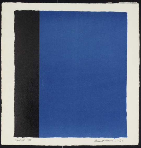
Barnett Newman
“I depend entirely upon color.” - Barnett Newman, interview with Frank O’Hara in 1964.
Regarded as among the most independent and courageous artists of the Twentieth Century, Barnett Newman was distinctly influential at two critical junctures in American art: first among his peers and later with the next generation of artists who sought the means to redefine and celebrate painting in their own time. One of the great writers and philosophers during the creation of Abstract Expressionism in the 1940s and early 1950s, Newman was deeply admired by his colleagues and friends such as Mark Rothko, Jackson Pollock, Clyfford Still and Adolph Gottlieb.
In Newman’s devotion to a single colour and reductive use of demarcation with his sparsely employed zips, his work was deemed provocative and shocking, even among his fellow artists at the time of his 1950 and 1951 exhibitions. By the late 1950s, Newman had begun to show his work again and his 1959 exhibition at French & Co. in New York was a revelation to artists such as Frank Stella.
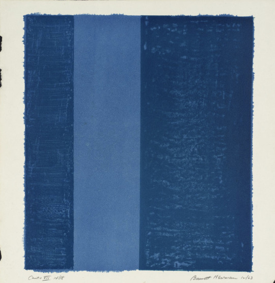
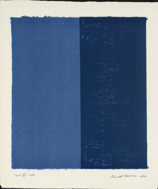
Newman had been introduced to lithography by his friend the painter Cleve Gray in 1961 when he made his first lithographs in black and white at the Pratt Graphics Workshop in New York. The present series of 18 lithographs, was made in 1963-4 and includes his only prints in colour. Newman explained that lithography posed for him the challenge of the relationship between the imprint and the paper it is on, with the inevitable intrusion of the paper frame.
📷
1. Barnett Newman, Canto VII, 1963-4, Lithograph on paper, Tate
2. Barnett Newman, Canto VIII, 1963-4, Lithograph on paper, Tate
3. Barnett Newman, Canto IX, 1963-4, Lithograph on paper, Tate
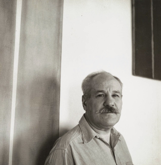
4. The artist Barnett Newman. Photograph by William Vandivert, c. 1951. The Museum of Modern Art Archives, New York.
#AbstractExpressionism#MondayMotivation#MondayBlues#MondayThoughts#ArtWords#Beautiful#Art#Painting#Nature#NaturesPalette#Pigments#NaturalPigments#Colour#Blue#ColourPalette#ColourStudies#ColourTheory#TheColourProject#London#Artist
1 note
·
View note
Text
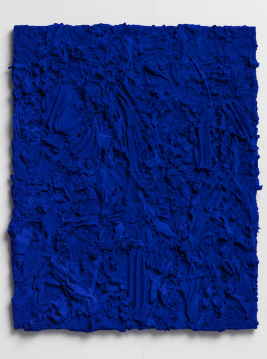
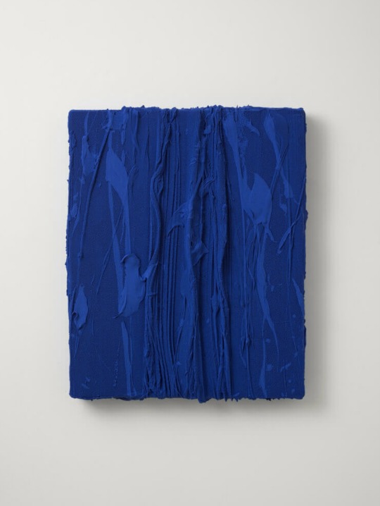
Jason Martin
“It has to carry some light overall, so in the result has to emanate, has to have a sense of its own, a life of its own” – Jason Martin, on the process of painting, Lisson Gallery.
Jason Martin channels a minimal approach to painting through an expansive yet controlled use of colour, brush and medium. In his work – situated between Minimalism and Abstract Expressionism – the artist employs manifold methods of applying paint to address the essential question of illusion and the rhetoric of paint application.
Martin presents us with a paradox. The marks, the gestures, present themselves as quick, furious events, and synchronously as remote relics of some past occurrence. The paintings are dense material objects, with the simultaneity of a photograph, yet through the associations read into the colour and nature of the pigments. His works constitute a consciously controlled aesthetic and a conceptual statement. The nature of his non-representational work constantly stimulates the viewer’s imagination
Jason Martin was born in Jersey, in the Channel Islands, in 1970 and lives and works between London and Portugal.
📷
1. Jason Martin, Untitled (Ultramarine blue), 2021, Mixed media on aluminium, Lisson Gallery
2. Jason Martin, Heroes & Villains, 2013, Mixed media on polyester sailcloth (ultramarine blue), Thaddaeus Ropac
3. Jason Martin, Untitled (Oriental blue), 2021, Mixed media on aluminium, Lisson Gallery
4. Jason Martin, République, 2016, Mixed media on aluminium, Thaddaeus Ropac
5. The artist Jason Martin.


#JasonMartin#LissonGallery#ThaddaeusRopac#ArtGallery#FeatureFriday#ArtWords#Beautiful#Art#Painting#NaturesPalette#Pigments#NaturalPigments#Colour#ColourPalette#ColourStudies#ColourTheory#TheColourProject#London
0 notes
Text
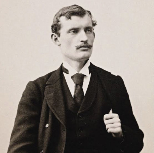
Edvard Munch
“The colours live a remarkable life of their own after they have been applied to the canvas” - Edvard Munch
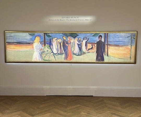
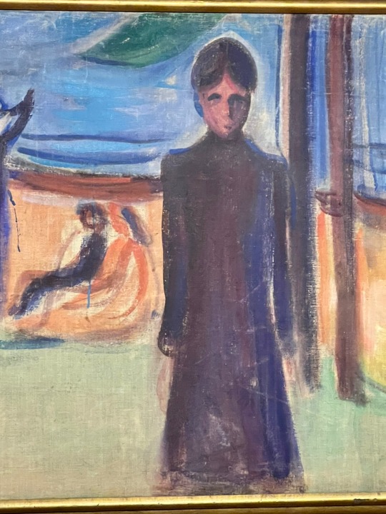
Edvard Munch’s singular vision resulted in vivid, psychological artworks as he battled his demons and the eternal pull between life and death on canvas. In 1906, at a turning point in his life, Munch was commissioned to paint what is now known as “The Reinhardt Frieze”, installed on the walls of impresario Max Reinhardt’s avant-garde theatre in Berlin with twelve major canvases – in an immersive installation that was one of the first of its kind, and trailblazed the relationship between performance and art.
At just over four metres wide, Dance on the Beach is the monumental culmination of the series. In the foreground of the canvas are two of the artist’s great loves, affairs with both of whom ended in heartbreak. It is the only example from the Reinhardt series remaining in private hands, with all of the others held in German museum collections.
As part of a tumultuous journey in the lead up to and during the Second World War, the painting was last on the market 89 years ago, when it was acquired at auction by Thomas Olsen – who assembled an unmatched collection of around thirty works by the artist, including one of four versions of the infamous The Scream. Having been identified as once having belonged to Professor Curt Glaser, a major cultural figure in 1930s Berlin who was forced to flee, it is being sold by agreement between the two families.
🎨 1 -2. Edvard Munch, Dance on the Beach (The Reinhardt Frieze), 1906-07, Sotheby’s London
📷 3. Edvard Munch. Photo: Fine Art Images/Heritage Images/Getty Images
#EdvardMunch#Sothebys#TopicTuesday#ArtNews#ArtNewspaper#Beautiful#Art#Painting#Nature#NaturesPalette#Pigments#NaturalPigments#Colour#ColourPalette#ColourStudies#ColourTheory#TheColourProject#London
0 notes
Text
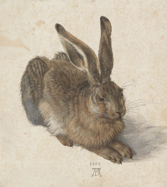
Year Of The Rabbit
🐰Happy Lunar New Year!
The Lunar New Year marks the first new moon of the Lunisolar Calendar. 2023 is the Year Of The Rabbit, a symbol of beauty, hope and longevity in China’s zodiac. Here we look back on 5 rabbit themed works by artists who inspire us.
📷
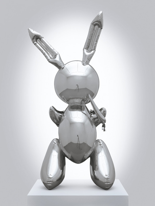
1. Jeff Koons, Rabbit, 1986, Christie’s Auction
2. Sherrie Levine, Rabbit, 2018, Xavier Hufkens
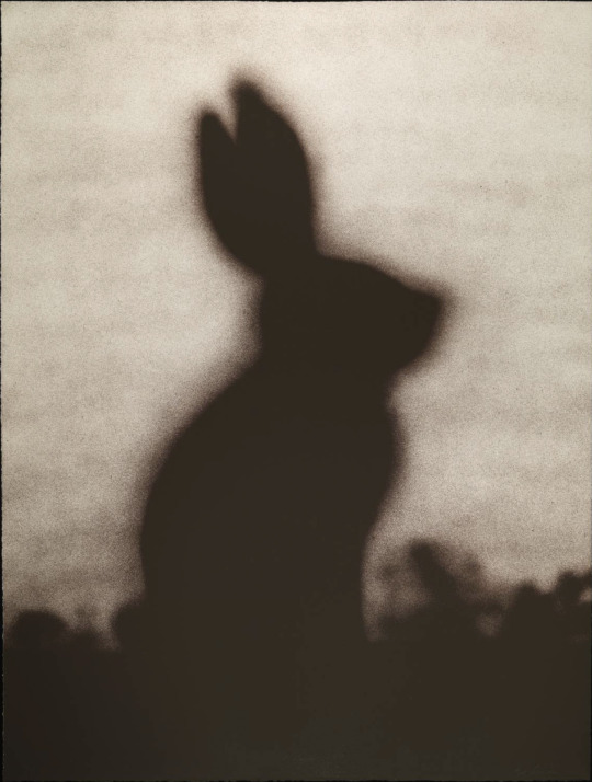
3. Edward Ruscha, Rabbit, 1986, Tate Collection
4. Albrecht Dürer, Young Hare, 1502, Albertina Museum, Vienna
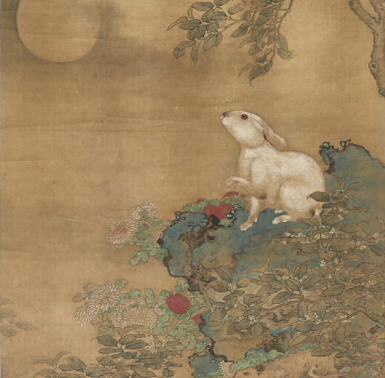
5. Huang Guan, Rabbit Gazing the Moon (Detail), 16th Century, Christie’s Auction

#HappyLunarNewYear#ChineseZodiac#Rabbit#Beautiful#Art#Painting#Sculpture#ContemporaryArt#Nature#NaturesPalette#Pigments#NaturalPigments#Colour#ColourPalette#ColourStudies#ColourTheory#TheColourProject#London
0 notes
Text
Megan Rooney
'I'm interested in colour and how it is attached to memory. The ways in which it can both forge and summon an environment. When I see a colour that makes a strong impression on me, I try and commit it to memory, and this always relates to a place and to a story.' - Megan Rooney
An enigmatic storyteller, Megan Rooney works across a variety of media – including painting, sculpture, installation, performance and language – to develop interwoven narratives.
The subjects of her works are drawn directly from her own life and surroundings, while her references are deeply invested in the present moment. She addresses the myriad effects of politics and society that manifest in the home and on the female body. Recurring characters and motifs form part of a dreamlike narrative that is never fixed, but obliquely references some of the most urgent issues of our time.
The artist's distinctive palette, strong sense of materiality and evocative use of colour are central to her practice, uniting her work across media. As curator Anna Lena Seiser describes, 'colour becomes a wildfire, a living element that morphs and overlaps with other bodies, swallows them up, takes hold of the space and weaves everything together.'
🎨
1. Megan Rooney, Blue Departure, 2021, Thaddaeus Ropac.
2. Megan Rooney, Swaying like a Sunday choir, 2019, Thaddaeus Ropac.
3. Megan Rooney, With Sun (detail), 2022. Courtesy: © Megan Rooney and Fondation Louis Vuitton. Photograph: Charles Duprat.


#FeatureFriday#ArtWords#Beautiful#Art#Painting#FemaleArtist#ContemporaryArt#NaturesPalette#Pigments#NaturalPigments#Colour#ColourPalette#ColourStudies#ColourTheory#TheColourProject#London#LouisVuittonFoundation#Paris#ThaddaeusRopac#ArtGallery#LondonGallery#MeganRooney
1 note
·
View note
Text
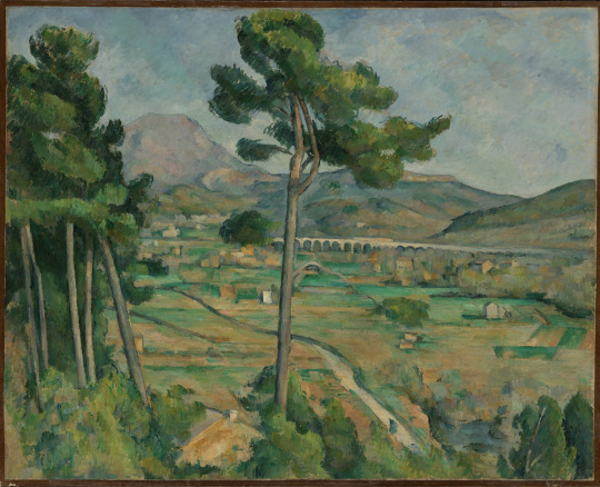
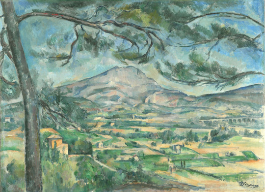
Paul Cézanne
“I lack the magnificent richness of colour that animates nature” - Paul Cézanne was born in January 19, 1839.
One of the most influential artists in the history of modern painting, Paul Cézanne has inspired generations of artists. Generally categorized as a Post-Impressionist, his unique method of building form with colour and his analytical approach to nature influenced the art of Cubist, Fauves, and successive generations of avant-garde artists.
‘Still Life with Apples and a Pot of Primroses’, a mature work, reveals Cézanne’s artistic evolution and mastery of this style of building forms completely from colour and creating scenes with distorted perspectival space. The objects in this painting forms completely from colour and creating scenes with distorted perspectival space. The objects in this painting, such as the fruit and tablecloth, are rendered without use of light or shadow, but through extremely subtle gradations of colour.
The Montagne Sainte-Victoire, with its distinctive craggy, broken top, dominates the countryside surrounding Paul Cézanne’s hometown of Aix-en-Provence in southern France. For him, it embodied the rugged landscape and people of Provence. Cézanne painted and drew the mountain from different vantage points throughout his career, each time finding a new mood or atmosphere.
🎨
1. Paul Cézanne, Still Life with Apples and a Pot of Primroses, 1890, The Metropolitan Museum of Art
2. Paul Cézanne, Mont Sainte-Victoire and the Viaduct of the Arc River Valley, 1882 -1885, The Metropolitan Museum of Art
3. Paul Cézanne, Montagne Sainte-Victoire with Large Pine, 1887, Courtauld Gallery

#PaulCezanne#Artist#Birthday#ArtWords#Beautiful#PostImpressionsim#Art#Cubism#Fauves#Painting#Nature#NaturesPalette#Pigments#NaturalPigments#Colour#ColourPalette#ColourStudies#ColourTheory#TheColourProject#London
0 notes
Text
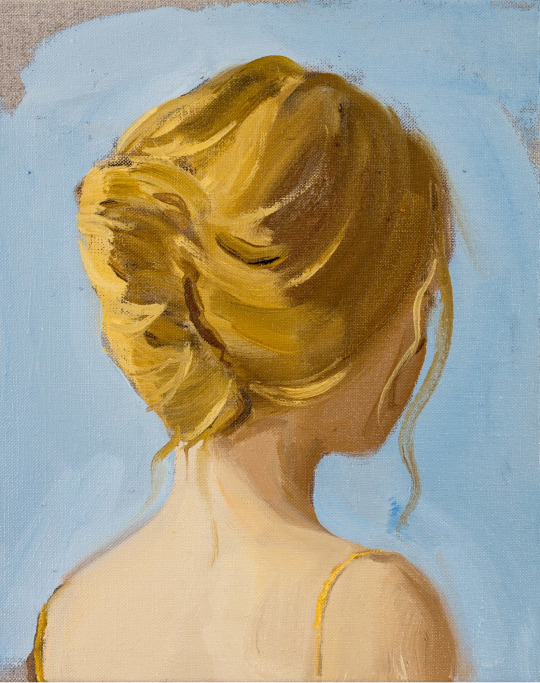
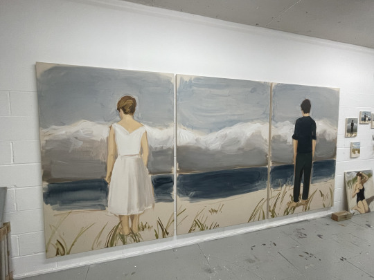
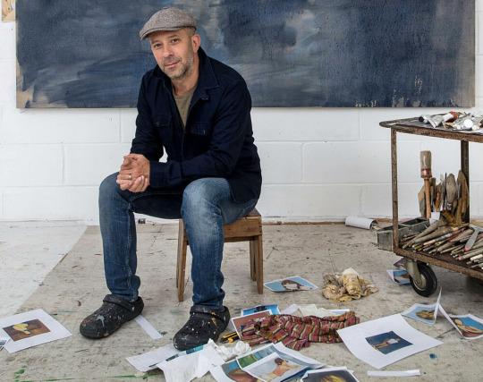
Gideon Rubin
Gideon Rubin is inspired by photographs from old photo albums, photos of celebrities or paintings by old masters. The artist is seeking the type of narrative that lends itself to interpretation. The artist’s figures are intended to trigger his viewers’ memories, rather than to represent specific identities. He uses sandy tones, grey blues and off-whites that he applies with broad brushstrokes. Concentrating on canvas or raw linen and roughly-cut bits of cardboard, Rubin often leaves entire areas of these materials untouched so that these often become an integral part of the work, occasionally bringing motifs and letters already printed into the composition.
There is much about Rubin’s paintings themselves that carry or rather transmit something crucial about optimism. Amidst the tender introspection and melancholia that accompanies some of his images and the sheer joy and sensuality that radiates from others, Rubin’s special capacity is to remind us about longing and desire, about loss and lament – and about hope and what it means to feel.
Gideon Rubin is an Israeli painter (b. 1973) who is now located in London. He is represented by Galerie Karsten Greve Paris, Cologne, St Moritz; Hosfelt Gallery, San Franscisco; Fox Jensen Gallery, Sydney and Fox Jensen McCrory, Auckland; and Alon Segev Gallery, Tel Aviv. In 2014 he received the 'Shifting Foundation' grant.
Rubin's work is included in a number of prestigious international collections, including: Museum Voorlinden Collection, The Netherlands; Herzliya Museum for Contemporary Art, Israel; McEvoy Foundation for the Arts, San Francisco; The Zabludowicz Collection, London; Ruinart, France; Fondation Frances, France; Rubin Museum, Israel; Collezione Maramotti, Italy; The Collezione Fondazione, San Patrignano, Italy.
🎨
1. Gideon Rubin, Blonde, 2020, Hosfelt Gallery.
2. Gideon Rubin, Sunset, 2022.
3. Gideon Rubin, work in progress.
4. Gideon Rubin in his studio, London 2020. Photo: Richard Ivey.

#GideonRubin#SpiritNowLondon#ArtistStudio#ContemporaryArt#Memories#Time#Art#Painting#TheColourProject#London
0 notes
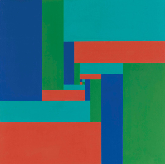
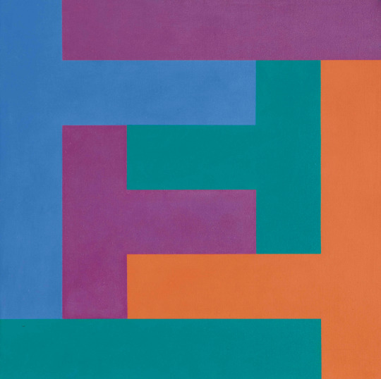
Text
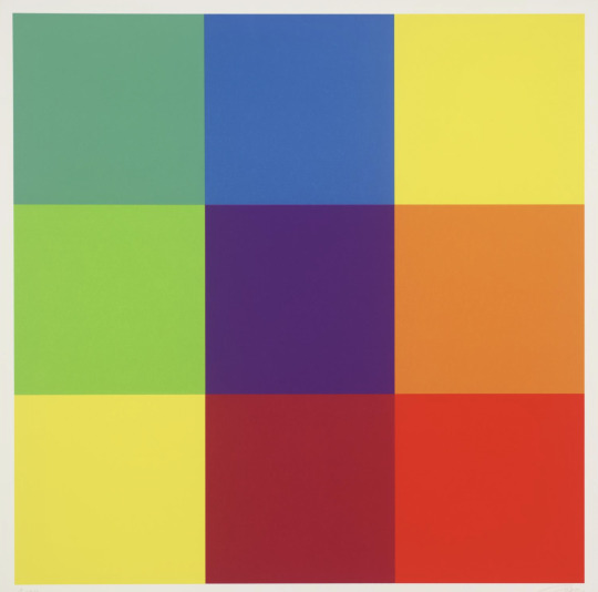
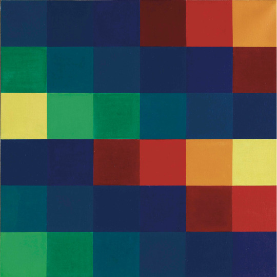
Richard Paul Lohse
‘The attitudes implicit in Lohse's work, including strong and still radical ideas about society, are very interesting, both as to what is older and what newer. The squares and rectangles comprise schemes that repeat or vary with colours that correspondingly repeat or vary. This way of working which now is common to lots of us, didn't exist before Lohse and some others. It's not the way that Mondrian, Malevich, or Van Doesburg worked. In Lohse's work there is the end of the European compositional tradition, a good end, and also there is the beginning of much that is still beginning to develop.’ - Donald Judd, 1988
Richard Paul Lohse was a Swiss painter and graphic artist and one of the main representatives of the concrete and constructive art movements. In 1918 he joins the advertising agency Max Dalang where he trains to be an advertising artist. Lohse, the autodidact, paints expressive, late cubist still lifes. In the 1930s his work as a graphic artist and book designer puts him among the pioneers of modern Swiss graphic design; in his painting he works on curved and diagonal constructions.
1943 marks a breakthrough in Lohse's painting: he standardises the pictorial means and starts to develop modular and serial systems. In 1953 he publishes the book "New Design in Exhibitions", and from 1958 he is coeditor of the magazine Neue Grafik/New Graphic Design. Important exhibitions and publications bring Lohse's systematic-constructive art and constructive graphic design worldwide acclaim. He died in Zürich in 1988.
🎨
1. Richard Paul Lohse, Untitled, 1981, Tate
2. Richard Paul Lohse, Sechs systematische Farbreihen von gelb zu gelb, 1955/65, Christie’s Auction
3. Richard Paul Lohse, Bewegung von 4 kontrastierenden Gruppen aus einem Zentrum, 1952/62, Christie’s Auction
4. Richard Paul Lohse, Progression von Winkelgruppen, 1968, Christie’s Auction
0 notes
Last Seen Blogs

manlywo
Untitled
qeeezus
Dollface

genderings
archive of gendering's coined terms
niceyniceyzoozoo
Welcome To Me And The Shapes I Can Throw

myvisaguide
My Visa Guide