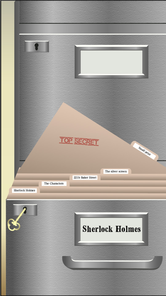
#IXD304
Text
Sherlock Holmes Typography Research
For my project I wanted to find a font style that would suit the theme of Sherlock Holmes during the Victorian era. Below are some of the fonts I have found that I could possible use as it would match the theme I want to go. Some of the fonts I have included are related to sherlock Holmes as some fonts are used for the movie titles from 2009-2011 and the game series 2016
https://www.fontspace.com/
https://fonts.adobe.com/
Victorian Decade
TO begin my research I wanted to see what other artists have used as a typeface for Victorian projects and came across a few Victorian styled typefaces that I wanted to make a note of so if i decided to change up my project I could look at this more inspiration.


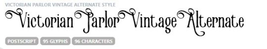
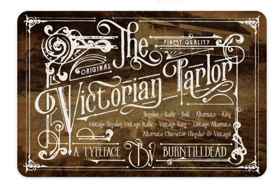
Victorian Parlor

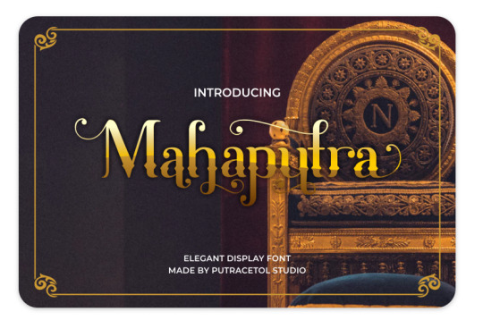
Mahaputra


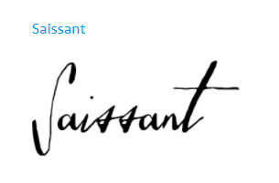
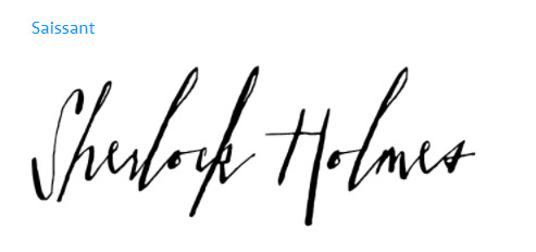
Saissant
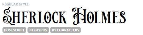
This typeface is used in the movies and it caught my eye for many reasons. The way this typeface is designed makes it feel that its been wrote with charcoal and gives off a strong and artistic feel due to the extended serifs used mainly in the S and T.
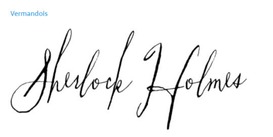
Vermandois
This typeface was used for the sherlock Holmes games although through discovering more of it through research I feel that this font would be too disjointed to read and would cause problems for the reader as it may be too complex for content on a page, although could make an appearance for a title or heading.

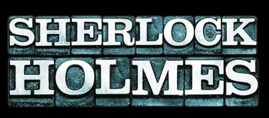
Clarendon BT Pro Heavy
This font style was used for the movies. I has very clear blocked letters which provides power to the name of the title and directs the users attention to the title
Attic Antique

This font provides a distinctive vintage feel which would suit the timeline for the era that I want to create my project. I feel that this style of font would suit headers and title pages and it has strong bold letters that are clear to see but also come with a slight fade you would find on an old document due to the ink fading overtime.
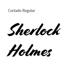
Cortado
This is another typeface I found that I appreciate due to the boldness and stroke like lettering. I feel it may be too bold for the content I will include because I want the style of my project to feel more elegant and gentle in approach and this typeface in my opinion comes off as strong and bold in projection. I may use this for a title page or may decide to fade the opacity of the font to match my art style I want to go with, I will take a more in depth look of what this font will look like when i replace my content with this style to see how it is portrayed but it is one of my favorites I have found during this research period.
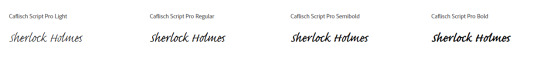
Caflisch Script
I appreciate this typeface as it shows off its elegance and appreciation for type. I am edging towards choosing this typeface for the content of my project as it matches the elegance and sway that I want to provide my project with.

3 notes
·
View notes
Text
Introduction to Animation on Procreate

I really like the idea of using a GIF or a subtle animation in a website. From the research I had done on other narrative websites, a lot of them used simple animations which really captured my attention. One of the main advantages of using a GIF in your website is the size. A GIF is relatively small in size compared to other file formats which means it won't compromise the sites loading times.
Another advantage of using a GIF is that the background can be transparent which works well when importing it onto a background image on the site. I think animated GIF's are a great way of entertaining the viewer, it's much more interesting than a flat image.
I had never tried much animation before. Trying new things in design can often be daunting as I don't like to waist too much time on one small thing. However, I found a simple tutorial on YouTube which showed me how to animate easily using Procreate which I am somewhat familiar with already.
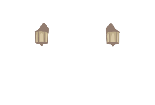
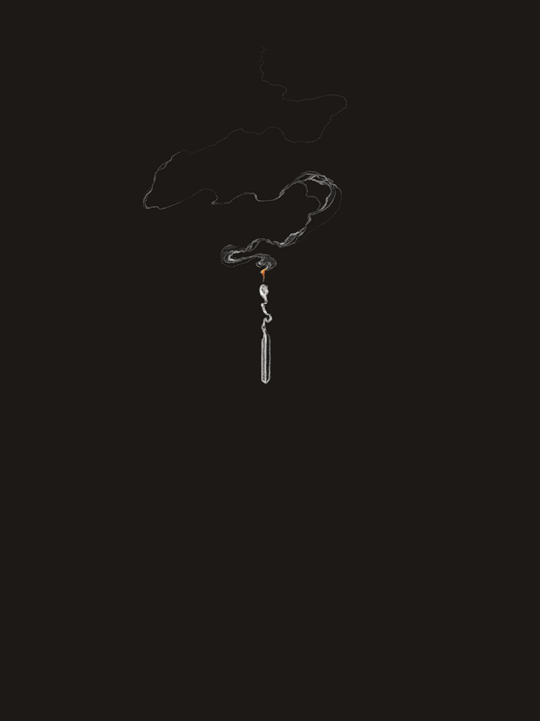
I chose to animate flickering lights in my '221 Baker Street' section. It was a lot easier to animate than I had thought, it was just a matter of changing the lights in each frame slightly, looping the images and experimenting with the timing of frames per second.
Here is what I came up with -
From this
To this
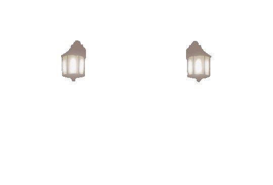
I am really happy with how it turned out, I didn't take too long and I didn't think it would be so easy to do. I will definitely include GIF's in my future projects.

l also designed this magnifying glass GIF to use in my footer based on the Sherlock Holmes theme. It says 'Thank You' as you reach the end of my narrative website.
1 note
·
View note
Text
Map Update
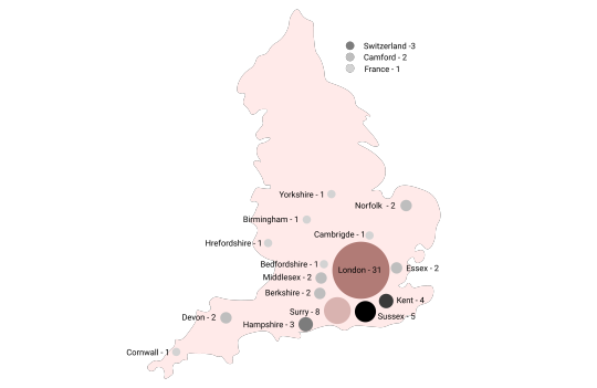
Originally on my stats and statistics page i created the infographic below labelled version 1. This infographic displayed a clear and easy to understand range of stats but lacked to show where these places are. This was pointed out to me through some feedback that I had received. this then made me explore the option of adding a map of England with the same data but displayed where these locations are on the map. below you will be able to see version 2 which i designed and upgraded too later down the line. Overall I feel that this is a much stronger infographic and matches the theme of the website while being much more aesthetically pleasing to the user.
Version 1

Version 1
1 note
·
View note
Text
Mycroft Holmes

While they might look utterly maddening, illustrating those pinstripes was so much fun. I love how the wrinkles in the fabric creates the illusion of light and shadow.
16 notes
·
View notes
Text
Research & Progress
After completing research on some futuristic user interfaces, I decided to create a futuristic user interface which would contain a more "professional" and "calm" colour scheme; nothing too crazy like pink mixed with yellow because I feel like that didnt really suit the project nor my personal taste.
I based my colour scheme on a futuristic user interface approach which will use the mixture of a dark blue, white, orange and red to form the website. Most of the colours have been chosen from Call Of Duty because I personally really enjoyed playing that game in the past and it was one of the most wow-ing interfaces created with its simplicity. I feel like this colour scheme is most suitable as with it I can colour code content such as heroes and villains and highlight content such as the movies through the use of the orange.
https://www.spov.tv/portfolio/call-duty-advanced-warfare/
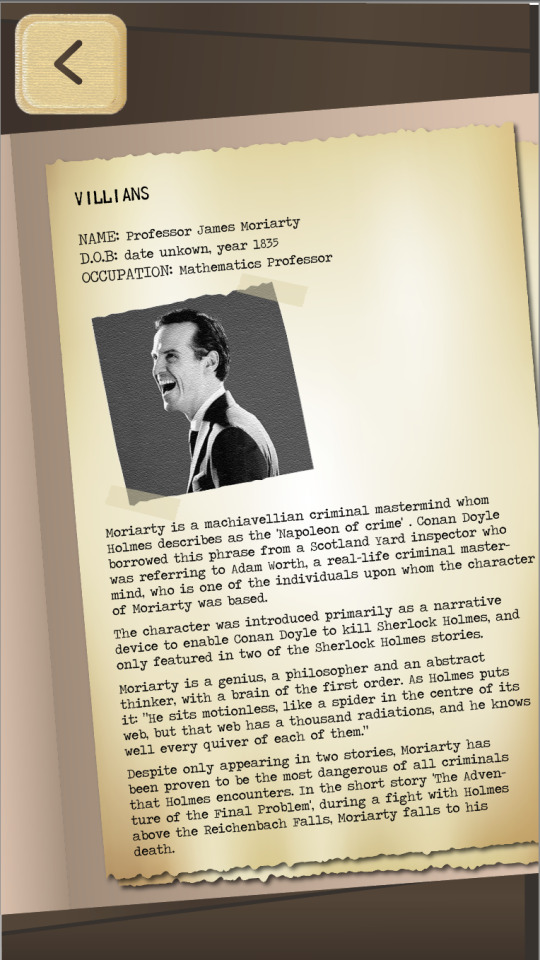
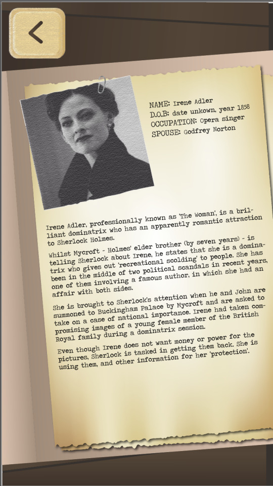
The characters that I will include are Dr. Watson, Sherlock Holmes, Jim Moriarty and Irene Adler. I decided to stick with four characters because that way the webpage will not be too overwhelming.
https://i.pinimg.com/originals/5a/aa/11/5aaa1101eb02777fb6bf1af83ec58f3e.jpg
https://vignette.wikia.nocookie.net/sherlock2010/images/7/70/AdlerPulver.png/revision/latest?cb=20160724054817
https://static.tvtropes.org/pmwiki/pub/images/moriarty_james_3139.jpg
https://cdn-static.denofgeek.com/sites/denofgeek/files/styles/main_wide/public/andrew_scott.jpg?itok=Fk3O-9MU
After looking at the BBC series of Sherlock Holmes, even though I have seen it before, seeing it again I realised just how close my colour scheme is to that displayed within the BBC series', what a coincidence! I feel like this fact simply makes my colour scheme even more suitable for a 21st century-style interface approach.
https://www.bbc.co.uk/programmes/b018ttws
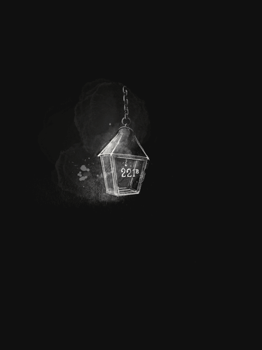
This is the image I used to show 221 Baker Street in real life...
https://i.pinimg.com/originals/9b/cb/05/9bcb05efe4dae1b4d2798f0b0aa80140.jpg
I wanted to add something that would add more into the colour scheme without messing with the font colour because after making the text for heroes and villains orange and red, I felt like they took away from the appeal of the site and so instead I took some inspiration from retro-style photos I found on the internet and some shops I took a look into. I feel like this approach makes the website look more unique and appealing without ruining the use of colours. Instead of featuring the red, I have replaced it with a darker grey that still manages to stand out while not being too distracting.
https://www.photobox.co.uk/shop/prints/retro-prints https://inkifi.com/us/prints/retro-prints.html
6 notes
·
View notes
Photo
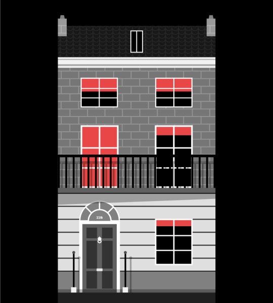
221 B illustration
Illustration of 221B Baker St created for my Sherlock project. Since I am going for a film noir aesthetic, it only made sense to use a monotone colour pallet with a hint of red as a nod to sin city. I learned a few new tricks while completing this design. Mainly how to properly use the swatches panel to save time when creating repeated patterns. This was used to create both the brick and roof tile patterns.
4 notes
·
View notes
Text
IXD303 & IXD304 Links
IXD303
newspal. iPhone App Prototype
Research posts
IXD304
Heroes & Villains iPad Prototype - Final
Heroes & Villains Prototype - First Draft
Research Posts
3 notes
·
View notes
Text
Sherlock Holmes Style tile
After finding out what colour scheme and typography that I would be using for my Sherlock Holmes website, I began putting together a style tile to help me, get an better idea of the overall look and feel of the website but also to help me communicate to my peers on what the ideas is about.
So first I began sketching ideas on what my style guide should look like:

Then after having a idea on what it should look like, I started bring it too life in Adobe illustrator, Here is the final result:

2 notes
·
View notes
Text
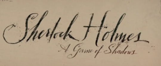
Classic Movie Posters
This famous story has been adapted to screen and other media for years. Many people have played these characters but have tried to sticky closely to how the characters have been written. These are some of the early films produced during the 1940′s. These movie posters are very different to your typical poster of the modern era as they have a hand drawn quality to them. It might be an interesting concept to use this style as a theme for my product. For each of these movie posters I’ll put in the movie biography to give it a little bit of context.
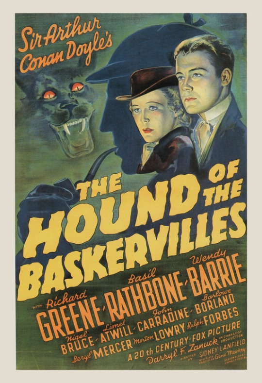
IMDb
Sherlock Holmes and Dr Watson investigate the legend of a supernatural hound, a beast that may be stalking a young heir on the fog-shrouded moorland that makes up his estate.
Director: Sidney LanfieldWriters: Ernest Pascal (screenplay), Arthur Conan Doyle (novel) (as Sir Arthur Conan Doyle)
Stars: Basil Rathbone, Nigel Bruce, Richard Greene.

IMDb
When a Nazi saboteur jeeringly predicts to the nation new depredations, via their radio 'Voice of Terror', the Intellegence Inner Council summons Sherlock Holmes (Basil Rathbone) to help in the crisis. Holmes and his companion, Dr. Watson (Nigel Bruce), are visited the first night of their investigation; a man falls dying from a knife wound on their doorstep. His last word leads Holmes into the slums where he encounters Kitty (Evelyn Ankers), the sweetheart of the slain man.
Director: John RawlinsWriters: Lynn Riggs (screenplay), John Bright (screenplay)
Stars: Basil Rathbone, Nigel Bruce, Evelyn Ankers

IMDb
The master sleuth hunts his archenemy, Professor Moriarty, who is planning the crime of the century.
Director: Alfred L. Werker (as Alfred Werker)Writers: Edwin Blum (screenplay), William Absalom Drake (screenplay) (as William Drake)
Stars: Basil Rathbone, Nigel Bruce, Ida Lupino .
IMDb is really good at finding all the films related to the series and puts them in a chronological timeline. From this you can see the evolution of movie posters from past to present. Its really sad to see how posters now are very generic with no real characteristic or personality in the design. They use very striking typography which very bold and takes up a large proportion of the poster. The combination of photographs, colours, type and drawings makes them a lot more interesting to look at. I think I would definitely consider using some of these ideas in my own project.
2 notes
·
View notes


Text
Simplicity
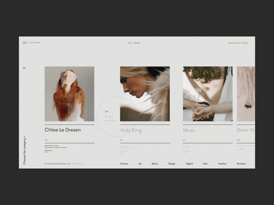
This is an animated art works and news platform for people who feel connected to creative fields.
I think the animations and masking effect looks beautiful and how well it incorporates the whole website. I’m usually not a huge fan of animation sequences, especially when you’re trying to get somewhere/reading several sections and the animations keeps reloading over and over, but if it’s just showed once when you refresh, then I think that’s perfect.
The layout is otherwise classy and minimalistic and gives the content a lot of space to breathe all while being interesting and worthwhile.
By Zhenya Rynzhuk for Sochnik.
1 note
·
View note
Text
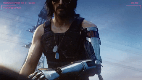
CYBERPUNK 2077
Something else Paul suggested would be good for me to look into is, Cyperpunk 2077. Cyberpunk 2077 is a highly anticipated role playing game, which in fact has Territory Studio on board with creating their branding and marketing, they worked closely with CD Projekt to create a retro punk aesthetic that matches with the ‘attitude and energy’ of the game.
vimeo
The route they’re taking with Cyberpunk 2077 is quite interesting, they’re touching on the fact that when people think ‘cyberpunk’ there is always going to be a little bit of stereotypical neon signs, techwear and of course cybernetic enhancements. With this game they want to address that while there are the given minor differences, there is the want to translate how corporate dominance and social inequality come into play. While the game is dominated by one style, throughout there will be apparent differences, making it easy for you to recognise exactly where you are in the game.
youtube
In the game there are four distinct eras, Entropism, Kitsch, Neo-Militarism and Neo-Kitsch. Each of them secure themselves as the backbone of the city’s visuals, they also manage to adapt certain aspects from one another be it because of wealth or out of necessity.
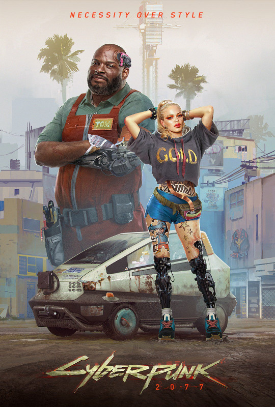
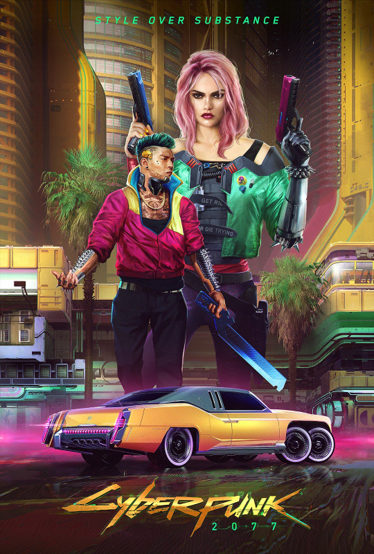
To help generate an even stronger buzz about the game they created posters for each of the eras, translating exactly what you’d expect from their aesthetic.
ENTROPISM
“Necessity over style.” The first of the design eras and exists whole heartedly because of a global financial crisis which happened previously in the Cyberpunk lore. The buildings are almost decrepit in appearance because those living here can’t afford to modernise.
‘their design was very practical, it wasn’t about looking great, it wasn’t about decoration, it was about pure practicality, using cheap materials, things are very cornered, and a colour palette that’s really subdued.’
KITSCH
“Style over substance.” Gradually their society began to progress, recovering from the stock market crash and stepping away from the familiar grey’s they’d grown to know. Kitsch was the counter-cultural movement against Entropism, expressing happiness and recovery through bold colours and bright plastic.
NEO-MILITARISM
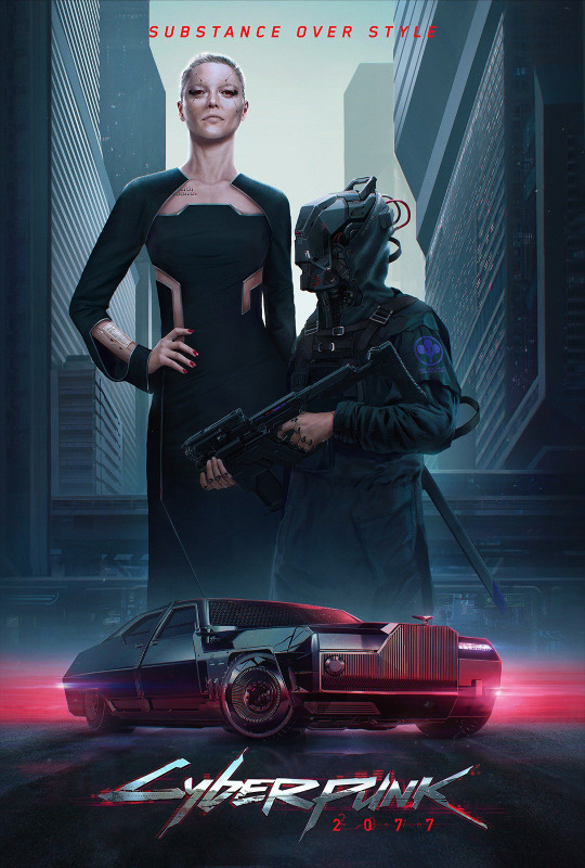
“Substance over style.” as familiar as self expression had become it didn’t last, power-hungry corporations found this as an opportunity to take advantage of the ‘weak and corrupt’ governments to gain power and control.
“In the city centre, which is very corporate, you’ll mostly see neo-militarism, this is a time when the corporations were very powerful so it impacts the style of the people.”
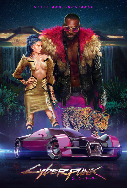
NEO-KITSCH
“Style and substance” The most recent of the eras, the complete opposite of the original Kitsch era. The aesthetic is to be matched to how rich you can appear, disregarding anything it had to do with cultural motivation. Although the colour palettes have a touch of similarity, that’s where the similarities end, Neo-Kitsch is all about natural fabrics in clothing alongside wood and marble being used in architecture.
“In Neo-Kitsch they use these natural materials because that’s the most expensive stuff you’ll find in Night City, If you see someone walking around with animal print that has to be Neo-Kitsch. It’s the most recent style that most rich people are wearing because animals are really rare in Night City, most are extinct.”
WHY LOOK INTO THIS?
I feel like it was definitely a good idea to do research into this because it shows the futuristic aesthetic in a different light, it’s interesting to see how it can be used when it comes to games compared to film and television. It’s also intrigued me to possibly including the idea of different factions inside my ebook, what if for every section of information it follows a different neo-noir aesthetic?
...and how could I resist looking into Cyberpunk 2077 when Keanu Reeves is in it?
1 note
·
View note
Text
Dr John H. Watson

I really love the way fabric turns out in this style. They’re supposed to be candid illustrations and I do think they give that feeling.
16 notes
·
View notes


Photo

Changes
The main thing that I decided to change which owuld alter the pacing of the website is how far away each "section" is from the next. I did this by adding more space before the next section begins but also made each section more easily distinguishable by adding an orange, horizontal line below each title.
5 notes
·
View notes
Last Seen Blogs

oldsmobile98
women I would like to hit

gyancastle
Gyan Castle Fan art

akupunyasuklah
Untitled

lapined
rabbit's heart.