
lauraisblogging
laura campbell
another ixd student
218 posts
Don't wanna be here? Send us removal request.
Last Seen Blogs
jeanyjanez
Jeanyjanez

sand-eye
SAND EYE
sand-eye
SAND EYE
sand-eye
SAND EYE

gossipgirlforever1
🌸 GOSSIP GIRL 🌸
Text
WHAT COULD HAVE BEEN DONE BETTER?
I feel like as a group we had a good understanding of each others productivity and we were also able to communicate our ideas to one another well, to then finally combine them together to create one big project.
Though in saying that it was a struggle to work on a group project remotely, the main issue was with being able to arrange group Zoom calls and stay connected. Another thing we had to overcome was people’s schedules, like myself for example who works 3-4 days a week it was hard to work around everyone else’s tight schedules. While we did have our struggles I think we still managed to get a strong grasp on our project and create something great, had we more time I think we could’ve taken things even further.
In conclusion, for the next time I participate in group I’m going to make sure that collectively we’ll all be sharing our ideas and opinions openly and make communication a priority, as this definitely prepares us for the work place. In the grand scheme of things I’m happy with where we took our project and I hope you like ‘Habit’ as much as we do!
0 notes
Text
THE VISION
After all of us had completed our pieces of work we had to collectively come together as a group and decide where this app could potentially go from where we are now.
These are the main points we want to focus on in the potential future:
Full Prototype - Once we get the app fully prototyped we would like to do some initial user testing. Based on that feedback we would make any changes that are needed then we would build a working beta. Which then would be given out to more users to test and review before the final lunch of the app.
Developing It Further - We want it to become a helpful tool for younger people to use to improve their mental well-being during this hard period of time and then to be continually used after it is over.
Promotion - Since it is targeted towards younger generation the most effective place will promote this app would be on social media e.g. Instagram, TikTok, Facebook.
Cost Vs Free - As our target audience is students it’s in our best interest that we make sure their lack of income is being considered, it shouldn’t be expected of them to pay for this service. If you sign up with your University details you’ll be set for all the Habit benefits.
0 notes
Video
ANIMATING THE SCREENS 3 OF 3
This was probably the hardest out of the 3 that I ended up animating, in XD I was struggling to find the perfect way to conclude the sliding animation. Although I was able to get the perfect effect with the actual ball sliding down, I wasn’t happy with how it just stopped on the sun page. To help me feel a little more content with it I decided to have the green line travel down the screen, which I feel ties things up a lot better.
In my opinion this definitely creates the idea of being interactive that I desired with this design, overall I’m happy with how my animations worked out.
0 notes
Video
ANIMATING THE SCREENS 2 OF 3
This animation was fun to do and I felt it was one of the most important ones to include, to make sure I had an accurate idea of how breathing works I did a quick Google search and apparently it takes 2 seconds to breathe in and two seconds to breathe out. So as I was animating I made the ease in and out around 2 seconds, I personally think it works well and really adds something else to these screens.
0 notes
Video
ANIMATING THE SCREENS 1 OF 3
After I finished with the initial design of my screens I decided it’d be a good idea to take it a little bit further and animate them how I wanted them to look. This animation is the simple intro to the application so as the user first opens it up this is the first thing they see, after Scott’s simple rotating circle logo.
I felt it was important to animate some of my design as it helped me back up the reasons that I designed things a certain way.
All of my screens were animated in Adobe XD and I was then able to include the iPhone mockup using After Effects, mocking them up helped me further visualise my work.
0 notes
Photo


DESIGNING THE SCREENS - 4 OF 4
This is the final section for the onboarding, as you can see I’ve designed it so that the sliding ball animation finishes on this page creating the idea that the onboarding is beginning to wrap up. Just as I’d mentioned in my sketches I felt it was important to include illustrations accompanied by inviting text to help the user feel a little more inclined to use the application, making the user feel welcome was key for us.
As you can see I continued with the use of the dark blue and pink text, this was a key point of consistency for us. Another thing that ended up being a consistent point for us was the 3 dots at the point, if you keep your eyes peeled for Calum’s screens you’ll see what I mean.
Overall I was quite happy with how these screens turned out, the text at the bottom also sorta worked as a tagline and gave the users the final idea of how this application was going to help them out. I think if we were going to take this application further again I would really like to try animating these icons as I think it would give them that extra something.
0 notes
Photo


DESIGNING THE SCREENS - 3 OF 4
Continuing on with the onboarding we wanted to make sure the user understood that what they were signing up for was definitely going to be catered towards them, the content being personal was a big thing for us.
As you can see we wanted our users to interact and choose what they struggle with and what they need help with, we also needed to make sure the information they were being given was appropriate and considering their age demographic. Throughout their usage of the applications they’ll be able to add things that apply to them or do the opposite, there’s room for a lot of further development.
Another fun aspect of this section is how I plan to animate it, as I mentioned in my sketches I want to create a sliding animation in the background making a further connection with the user and showing how they progress.
0 notes
Photo


DESIGNING THE SCREENS - 2 OF 4
Following on from the sign up screens I moved on to creating these three screens which I would say slowly introduce the users to the application and why it’s been created, I felt it was key for the idea to give a personal tone to Habit.
As you can see across the three screens there is a slight difference, that being that only one of them has the big outer circle, the reason being that I wanted to replicate breathing. For this section of the application I had a vision of it being animated, almost as if it’s picking up how the user breathes which in itself is another way our application adds a personal touch.
Just as the previous screen I made sure to continue with the same colours to remain consistent and it’s something our group wanted to continue with throughout the app. The simple use of pink in the short sentences I feel work well to draw the user in ‘always’ highlights that ‘Habit’ is always going to be there, ‘global’ shows the user that they’re not alone and ‘track’ almost teases what the application is for.
0 notes
Photo


DESIGNING THE SCREENS - 1 OF 4
With a logo, colour scheme and font settled on our next step was to begin designing, my responsibility was the onboarding as I’ve mentioned before in my sketches. From my sketches I began to design my work, the only real development from the sketches was the change in the first screen, this obviously changed based off the logo Scott designed for us.
I decided to keep my final design quite similar to the sketches I’d created as I felt it was a strong concept idea, the hardest point for me at this stage was deciding what colours I was going to use for each section. The reason I decided to use green for the large circle is because its known to be quite a calming colour, it’s also not commonly used when it comes to other mental health apps. I wanted our application to be consistently good and bring something different to the table with each screen.
This sign up process might seem quite shorthanded, but the reason for this is that long-handed sign ups are a massive pain point when it comes to design. I kept the sign up boxes simple and made sure they complimented the green background, the rounded corners also helped create a little bit of contrast.
0 notes
Text
THE LOGO
As for coming up with a logo this was a sort of universal task, we let everyone have the chance to come up with a logo, all we knew is that we wanted it to match with the overall look of our design and colour scheme.
Scott Hogsett was actually the one who ended up coming up with our logo, he decided to go the route of animating and combing some circles together. I think it works very strongly and will work well with the rest of our application.

0 notes
Text
FONT CHOICE
When it came to deciding on a font we thought it was best if we chose something similar to the likes of what is seen in other mental health applications, we wanted it to be simple and legible. One of my favourite legible fonts is Circular and thankfully for us it works well with our idea, we also decided to ONLY use it and experiment with different font weights to make the most out of the font.

0 notes
Text
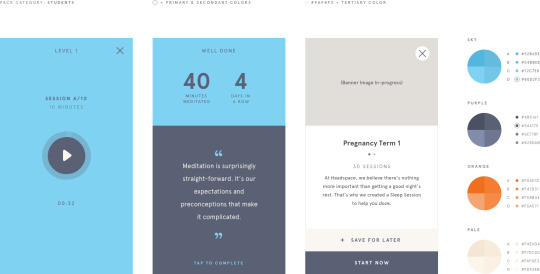
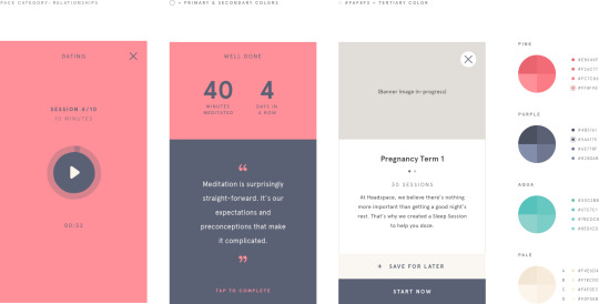
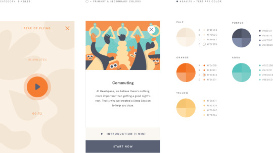
BRAND COLOURS
With brand colours we weren’t sure of exactly what we wanted to do, we had eyes on Headspace and Breathwrk for inspiration.
HEADSPACE
My favourite thing about Headspace is how they use colours and illustrations, it stands out to me as they’ve made sure to combine a bunch of different colour palettes which DO compliment each other to use across the different sections of their application. Depending on the Headspace pack you use, you’ll experience a different colour palette.
FOUNDATION

HAPPINESS

HEALTH
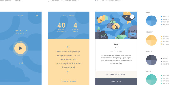
SPORT
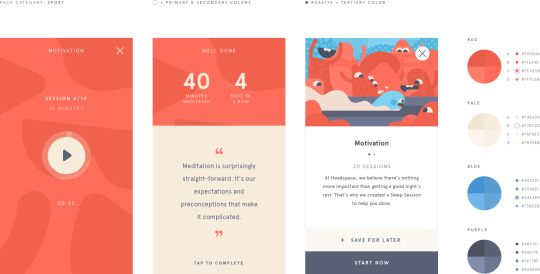
KIDS
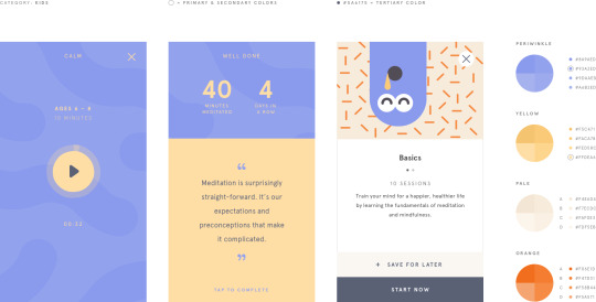
PERFORMANCE
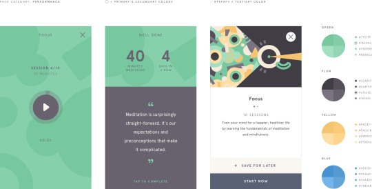
HEADSPACE PRO

STUDENTS
RELATIONSHIPS
SINGLES
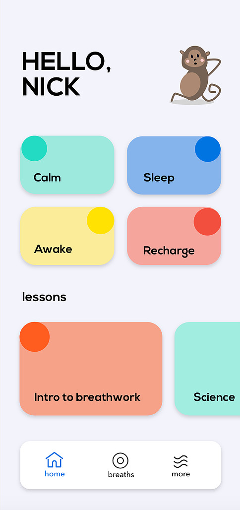
BREATHWRK
Although Breathwrk doesn’t have a colour palette as complex as Headspace I still think it’s very well done, it uses different tones of the same colour and they all translate well. Each colour corresponds with something different and it’s something my group could definitely implement into our work.
OUR COLOURS
After looking at some other colours we started to narrow our path and decide what we felt would work well for our ideas and the vision we had, these are the colours we settled on. We liked them because they reflected some of the ways Headspace would use their colours, but it’s still something different.
They’re a spectrum of colours, pastels can be used for main elements of content with stronger shades highlighting information.

0 notes
Text
BRAND NAME?
When it came to deciding on a name this was something we collectively struggled with as a group, we wanted to find something that highlights what are application is for but in a subtle way. We went through a range of different names such as:
Track
Smart
Headhabit
Though then we really considered these options we felt like we were overthinking the idea and relying too heavily on being creative with the name. After many Zoom calls and messenger discussions we ended up settling on Habit, we felt it reflected our idea in mind as we want to help create something that helps our users practice good habits.
After figuring out brand names the next steps for us were choosing brand colours, fonts and of course a logo.
0 notes
Text
SKETCHES
When it came to doing sketches we weren’t too organised when decided who was going to be doing what, but we all wanted to make sure we all had the chance to do a bit of designing. I decided that I would take the chance and try figuring out how to do the onboarding, we wanted to make it inviting and almost interactive to attract users.
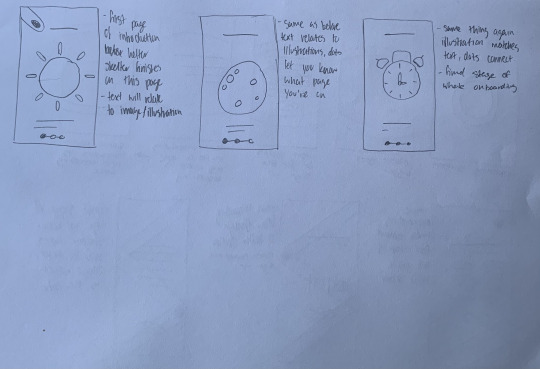
Here is the set of sketches I did, across these screens I covered the general sign up. Things start out with two simple circles which are animated and get bigger as you open the app, once this happens the simple sign up/sign in section appears. After signing up you’re taken through a quick lil about the app, with the biggest circle resizing to replicate breathing, I thought this would be a nice touch and make things personal for the user. The final section on this page is what I was most excited about, the line and ball in the background is to help continue on from the big circles in the previous screens. As the user goes through the onboarding the ball begins to travel down the screen, the onboarding in this section covers what the user struggles with, their age and then a simple here’s what we’ve curated just for you!

This is the final set of screens for the onboarding, as you can see I’ve made sure to continue on with the ball/line to finish it off and conclude. Here I wanted to bring an element of illustration into the onboarding similarly to how Headspace would do, the illustrations I decided to sketch out will match with a piece of text relating to the application at the bottom. As well as the illustration there’s also the element of the 3 dots, this will help the user understand where they are and could become consistent throughout the design.
I feel as though these sketches give me a decent understanding of how I could design my screens using Adobe XD
0 notes
Text
WHAT’S OUT THERE? IS THERE A GAP IN THE MARKET?
As I mentioned in my previous post, I like to stay on top of my work so I took it upon myself to begin doing some slight research for a simple pitching presentation. With our idea it’s obviously important to get an understanding of what kind of services or applications are already out there and whether or not there’s a gap in the market. Almost everyone knows of Headspace so I made it my starting point for my research and worked from there.
HEADSPACE
Headspace is one of the most well known apps for managing your mental health, this application aims to help users manage their anxiety, poor sleeping patterns and relationships.
For paying customers you’re offered guided meditation videos targeted towards you specifically, though if you’re simply interested in trying it out there are introductory sessions which are cover more general topics.
If you’re a student with Spotify Premium you get free access to Headspace within the one plan!

CALM
Alongside Headspace is Calm, it’s another well known meditation app which more or less offers the same features.
Calm takes the approach of dividing up your meditation days, focusing on different elements everyday. This way Calm is trying to implement meditation into everyday life, creating a routine.
Much like Headspace you’re able to customise what areas you want to focus on most.

MYLIFE
MyLife is another meditation application that stood out, it’s free and has optional in app purchases allowing you freedom with your choices.
Just like the previous you’re given the options to choose what you need assistance with and MyLife will recommend the activities best suited for you.
Their goal is to implement mindfulness into your daily routine be it through meditation, breathing or yoga.
This research may not look like much in a Tumblr post, but it felt effective enough to include in the presentation and gives a solid outline of the services already out there.
IS THERE A GAP IN THE MARKET?
This research helped provide the answer to this question, when it comes to mental health a lot of applications take a similar route of meditation but that doesn’t work for everyone and there’s never a specific audience.
This provides us with the room to create our service/application specifically catered towards young people and advise them on how to manage everyday life, especially in the midst of a pandemic.
We hope to include a customisable experience for the user to make sure that it’s personal to them.
0 notes
Text
TAKING THE LEAD
With this project I felt it was important to lay out a sort of foundation for everything as I didn’t want the project to end up running away from us, by this I mean I decided to make an early start to the presentation and begin titling slides considering all the potential things we’d need to include.
I felt this an important to consider as our group wanted to focus on elements of design, we wanted to showcase our idea in the best way possible to Big Motive and I needed to make sure we’d the content in our presentation to back it up.
WHAT DID I DO?
I started off by choosing fonts I felt worked together in Google Slides, we decided to use it as it was software we were confident in using and it was easy to rely on. As a reference I referred back to my favourite project from second year aka ‘flicks’, I looked at how I had organised my presentation and figured out what would be important to include in this pitch.
I settled on a few title slides, this would generalise the content across the slides after as well as leaving room to speak about what we did. Here are the titles I decided on:
The Topic
Current Market
The Audience
The Process
Brand Identity
The Application
The Next Step
Within each of these titles there will of course be subheadings, but I believe this created the necessary foundations for our project and helped outline the potential things we would need to include.
As I’m someone who’s always determined to stay on top of her projects I found I worked best by adding whatever work I’d done, to the presentation as I did it. This helped outline what still needed done and helped me better manage my productivity rate.
0 notes
Text
DEFINING THE IDEA
After completing our user personas our next task was to narrow down exactly what we wanted to create for our service. We came to the conclusion that an application would work best and we wanted to help students aged 17-22 manage a better routine in life, this would cover the likes of:
Sleeping Patterns
Exercise
Work life balance
Goal setting
Learning how to cope
Looking at the target age bracket it may seem a bit broad BUT, the reason for this is that students aged 17-18 are getting ready to leave school or tech and need to be prepared for the jump in routine. This is what we hope our application can help with.
0 notes