#I did the ctrl+Zing
Text
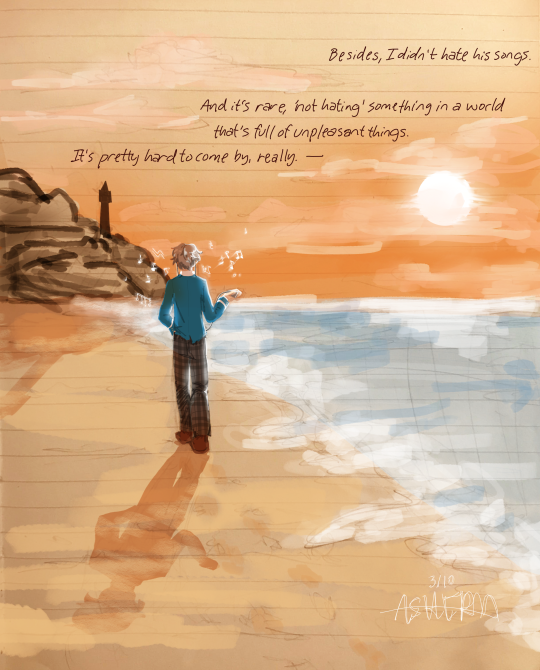
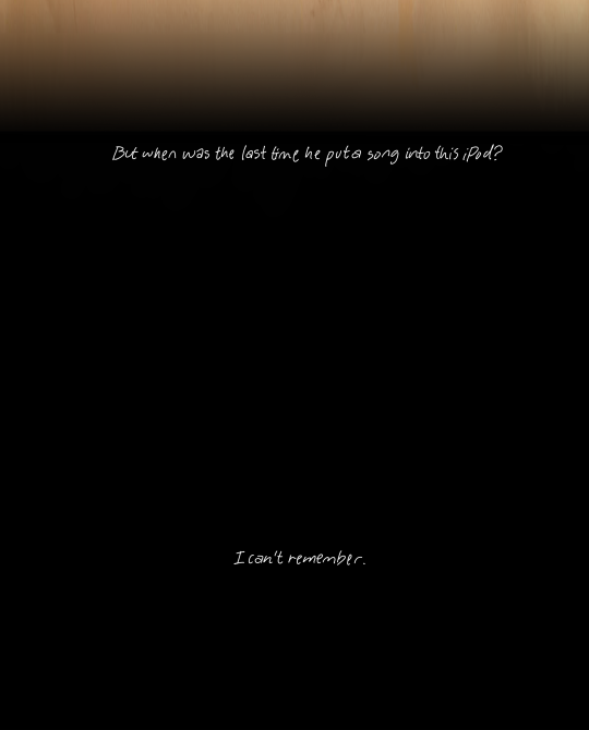
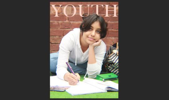
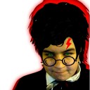
—“But the things he left behind, no matter how small they may be, still remain. Within this iPod, within the perishing Knights... and within my heart.”
Lionheart, Izumi Sena
#izumi sena#sena izumi#izuleo#leo tsukinaga#enstars#ensemble stars#lionheart#izumi fanart enstars#enstars fanart#izuleo fanart#ashera's thoughts ⁉️#art#my art#OH MY GOD.#I DID IT.#HIIII TIA ARE YOU PROUD OF ME#NOTE TO SELF. STOP FUCKING CTRL+Zing EVERYTHING WILL DISAPPEAR IF YOU DO THAT (this is the secondtime EVERYTHING HAS DISAPPEARED. godDAMMIT#OHUHG. oh my god. how are people NORMAL after reading this i d didon't get it#IZUMI IZUMI IZUMI IZUMIU IZUMI ZISUMI IZUMI!!!!#stupid stupid little izumi “and I'm a sourpuss so I can't demonstrate positive feelings towards someone in an honest manner.” sena#I hate (love) him#crying screaming sbbing ove r them (it's one four something am)#IM RLLY PROUD OF THIS ONE!!! I dont think i'll keep with it..? maybe just for bgs? but it was suuper fun to draw and try for a more rendere#-ish style (cue ashe's fluctuating art style SHAKES TABLE BANGS HEAD ON THE DOOR AUUGUHGHHHHH)#ALSO! IF ANYONE WAS WONDERING!! this was the stupid font that made me rethink my life choices#yeah. dumbass me merged the fuckin layer and then closed the application SO I OCULDN'T EVEN USE THE BACK BUTTON#I kinda referenced off of an existing font so this is NOT my real handwriting LMAO#OK ANYWAYS I LOVE THE SUN idk its just suuuper nice. cool fade and hazy look and all that#this was supposed to be low effort but. well. REMEMBER WHEN IZUMI FUCKIN BROKE DOWN THE DOOR AND STARTED BLASTING SILENT OATH-#hey tumblr WHAT DO YOU MEAN MY TAGS GOT CUT OFF
206 notes
·
View notes
Photo
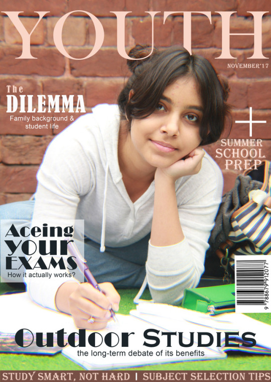
Preliminary Magazine Cover Page:
This being my first ever lesson on Photoshop, I was quite thrilled as I had been meaning to learn it for quite a while. Unfortunately, procrastination would get the best of me every single time and hence, it was a class I was looking forward to greatly. So without further waiting here’s to my first of, hopefully, many projects on Photoshop.
Step 1:
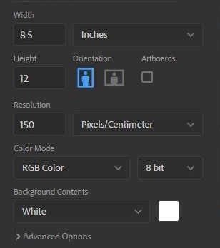
Once I’d opened up Photoshop, the first step was to decide the dimensions of the magazine itself. Thereby, from the File Menu on the top left, I selected ‘New’ (Ctrl N for shortcut) and the above pop up menu appeared. From here my respected teacher advised us all of us to go with a standard as we were quite lost on the on the ratio we wanted for our magazines.
Hence, I kept the dimensions to 8.5 inches by 12 inches for a comfortable fit of all my content while keeping it to a casual size for readers themselves. While I could have gone for a higher resolution than 150 pixels/cm, I opted for this resolution in order to keep the file as smooth as possible as this was only the practice phase and hence, did not require actual printing. Lastly, I chose an 8 bit RGB Colours because they felt the most natural to a first time Photoshop user like myself while keeping the conventional white background for the base layer.
Step 2:
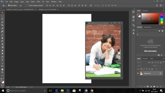
After pressing the ‘Create’ button a plain white background of 8.5*12 inch dimension appeared before me. The next step was to add the cover photo itself. From the File Menu I pressed ‘Open’ (Shortcut: Ctrl O) and selected my image from its allotted folder and it appeared as shown above.
Originally I had assumed that you just open the cover photo and type away but my teacher easily cleared away the confusion explaining that it caused serious issues at the time of printing as the cover wasn’t to the magazine scale itself but the cover photo’s. Meaning by, chances are you’ll end up with a poster rather than a magazine.
Next you select the ‘Move’ tool from the top of the left vertical menu (as shown selected in the above screenshot) and while holding the photograph you drag onto the white background (the result of which is shown below).
Due to the size of the picture it ended up not fitting into the background and this is where the ‘transformation’ tool comes in.
Step 3:
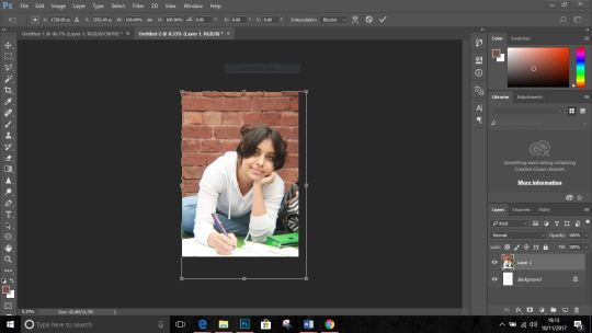
By pressing Ctrl with ‘T’ the selected layer can be transformed or simply readjusted to fit the appropriate size. Once you’ve resized, press enter to close the transformation.
A useful tip that was given to my class was that when transforming the layer, only the corners should be used along with the Shift key so the layer does not get lose it proportions. Also any mistake make can be undone by by Ctrl, Alt Z.
And the most significant one. Save your progress. Please. ‘Ctrl S’ or from the File Menu select ‘Save’ or ‘Save As’.
It should look like the below given screenshot.

Step 4:
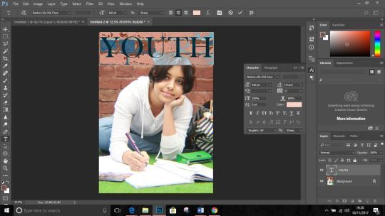
Now that the cover photo was adjusted, it was time to move on to the masthead. For this I make use of the ‘Text’ tool as shown selected in the lower half of the vertical toolbox as ‘T’. Owing to the fact that the magazine was based on ‘Student Life’ I chose’ Youth’ as the name of my magazine.
Step 5:
After the mashed was decided I used the ‘Polynomial Laso’ tool to overlap the ‘T’ in ‘Youth’ to create a eye-catching effect while opting for the classy ‘Millennial Pink’ as the colour of my mast head so the magazine cover would instantly to catch the attention of the targeted audience. (As shown below).
Step 6:
Now that the mast head was decided and done the next thing to do was create and write catchy cover-lines. After going through the painful process of squinting at my laptop and rearranging and replacing the cover lines for like 10 times I finally decided on the placement of the buzzword, the strip and the cover lines.
For one particular cover line, I had to overlap it over a translucent white rectangle (made using the 'Rectangle’ tool after which I reduced its opacity to 50% from the right workspace, so that the shape wouldn’t stand out too much) to make the cover line really pop out. I chose to keep the main cover line front and centre to immediately draw the audience’s attention.
Lastly, I added in a barcode by using the ‘Move’ tool after downloading the png, to give the magazine a professional zing.
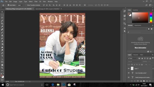
(final look of my magazine.)
0 notes
Photo
Daniel got me a wireless tablet and it's VERY nice and smooth but watching him learn to tablet is even better.
1 note
·
View note
Last Seen Blogs
asuddensway
a sudden swāy

zombiezo
zombie

kiritsubo83
Cose a caso

fruityloopsxoxo
Our World Jiminie
karenfordonte
Caring For Donte