#I can really do the same thing now by mapping one of the stylus buttons to swap foreground color to transparency
Text


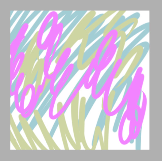
dip pen ink comm batch 4 complete! for Ezechiel, @ohwwhuv, and Leo :]
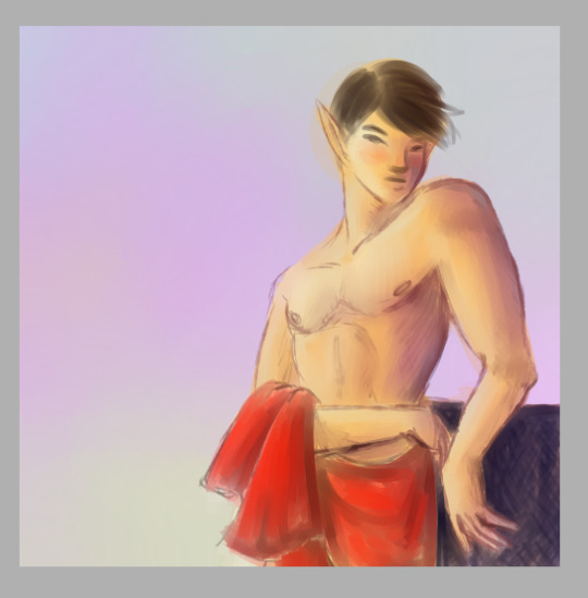
#bakuspecial#commission art#the grayscale for these were done on a train with my laptop track pad fksdjhf it was! manageable! but not desirable condition#that was before I got my new current tablet too... thank you my old huion. you served me well. Im so sorry I chipped ur paint to shit#ngl the texture on the new one's better off the bat. the grip's better and it has good kinetic feedback#too bad abt the touch buttons tho... I was confident I could make use of them but alas#things need actual feelable buttons again please I can Not tell where anything is when Im drawing and cant look at the tablet#my eyes are on the screen!! Im bad at gauging distance!!! please give me buttons I can find in the dark. please#even the old huion which has actual buttons I still couldnt use them. bc theyre not raised#theyre flat to the tablet's surface. you know what I shouldve tacked raised stickers on them I was stupid there#well! the more u learn. the more u learn#I'm happy with the current tablet tho!! buttons stuff aside it's nice to draw on. and thats what important. wrists dont hurt no more#almost said ''I miss the wacom eraser end" I don't. not really. every time I used that thang I was like wow you are so imprecise and blunt#litcherally why would you want basically a mappable stylus end but it's 50 times the size of a normal nib and you cant see where ur drawing#especially on a screen tablet. the dynamic there makes absolutely no sense#I can really do the same thing now by mapping one of the stylus buttons to swap foreground color to transparency#anyways. this has been my testimonies on tablets. in the tags of a dip pen ink post lmao#well! this is a late post I shouldve posted this before art fight. thank u again to that anon who reminded me#have a good day lads! we can answer emails together. hands in professional hands
47 notes
·
View notes
Text
LENOVO THINKPAD X1 FOLD REVIEW: A FOLDING SCREEN FILLED WITH POTENTIAL
The Lenovo ThinkPad X1 Fold is awesome… as a concept.
Come on, it’s a display that folds in half. You can carry it around like a tablet. You can prop it up and use it like a Surface Pro. You can fold it halfway and use it like a clamshell laptop. You can fold it slightly and hold it like a hardcover book. And everyone who sees you whip it out of your briefcase will ask “Wow, what’s that?” And you can tell them “Oh, nothing. Just the world’s first foldable PC.” Picture it. There’s no way you won’t feel like the coolest person in your meeting.
So should you buy it?
I mean, no. Before we get into this: definitely not. It’s a whopping $2,499, not including the stylus and keyboard. (Bundles with both accessories start at $2,749 on Lenovo’s website.) That’s more than anyone needs to spend even to get a very good laptop — and there are a few too many problems with the X1 Fold for me to put it in that category.
But! I do like the idea. The folding form factor certainly makes life easier, and I have no doubt that we’ll see more devices like this in the future — assuming manufacturers can work out some of the kinks.
A TRAVEL PRO
Here’s how a day with the X1 Fold went for me. In the morning, before signing on for work, I lay on the couch and used the Fold as a mini clamshell (that is, folded at 90 degrees with the keyboard on the bottom half of the screen) to catch up on emails. Someone had sent me an interesting YouTube video overnight. I unfolded the laptop into a 13.3-inch tablet, setting the keyboard aside, and watched it fullscreen.
Then, work time. I popped out the built-in kickstand and propped the unfolded ThinkPad up on my kitchen table, laying the keyboard out in front of it. I used multiple windows in split-screen, with Slack and Spotify over top, the way I’d use any standard 13-inch laptop. In the early afternoon, I had an hour-long Zoom meeting, so I headed back over to the couch and folded the thing into a book shape, with Zoom on one side and Slack on the other. After that, back to work — but I didn’t feel like going back to the table, so I folded the ThinkPad back into mini-clamshell mode and used it that way on the couch for the rest of the day.
This is all just to illustrate how many different uses there are for this form factor. I can’t say that a folding screen has ever been at the top of my “Laptop Features I Need” list — but after using the X1 Fold for a week, I would love to own one of these.
There’s no laptop I’d rather bring on a business trip than the X1 Fold, and that’s due to a couple of design choices in addition to the versatile form factor. For one: it’s really, really nice. The device is clad in an authentic black leather cover with a sturdy kickstand integrated into it. The ThinkPad logo adds a sleek splash of red. It all looked very out of place in my drab apartment. The only parts that look a tiny bit cheap are the bezels, which are large and rubber. Those are necessary to protect the sides of the display from clinking against each other, and they also give you something to hold while you’re using the Fold as a tablet.
A folding display also makes for a great travel companion. Folded in half, this ThinkPad is about the size of a hardcover book: 9.3 x 6.23 x 1.09 inches and 2.2 pounds (299.4 x 236 x 11.5 mm and 999g). The keyboard fits inside the folded device (magnets keep it secure), and it has a snug sleeve for the stylus on its side. I easily slipped the whole affair into my purse and would have loved carrying it around a trade show or conference under my arm. Any time I brought this somewhere, I thought, “Man, I wish I’d had this in college.”
And with the leather cover, I was never worried about bumping or scratching the Fold — something that can be stressful with devices this expensive. (Lenovo says its product underwent MIL-STD 810H testing and is resistant to conditions including humidity, dust, sand, extreme temperatures, and mechanical shock. This certainly promises a much higher level of durability than we’ve seen from folding phones thus far.)
THE FOLD
With foldable devices, there’s always one big question. The answer to that question is no: you can’t see the crease while you’re using the Fold (though it’s visible when the device is turned off). The exception is when it’s partially folded like a book. The lighting in the middle and the lighting on the sides is a bit uneven in that case. But credit where credit is due: when you’re using the Fold flat, there is no crease to be seen.
The hinge itself, which Lenovo says it spent years developing, is quite sturdy and didn’t give me any problems. The ThinkPad requires two hands and a bit of a firm tug to open. But on the plus side, it always stayed exactly in the position I put it in without any slips or wobbles.
Flat, the display is a 13.3-inch OLED with 2048 x 1536 resolution. That’s a 4:3 aspect ratio, which is unusual for a laptop but feels quite roomy compared to a traditional 16:9. I could easily stack two or even three Chrome windows side by side, often with Slack, Zoom, or another app over top, without having to zoom out. And I didn’t notice any jelly scroll (where one side of the screen is able to change pixels faster than the other side), which was a problem with some early foldable phones.
The viewing experience is a luxury. The panel reproduces 100 percent of the sRGB color gamut, 100 percent of Adobe RGB, and 95 percent of DCI-P3. It’s great for watching videos and movies; even the dock icons pop with color.
On the downside, good luck using this thing outside. Not only is it quite glossy, but it only reached 289 nits at maximum brightness. That’s not a problem for indoor work, but it’s still a bit of a letdown for the price since some premium business laptops offer 1,000-nit options for less.
PERFORMANCE AND SOFTWARE
Lenovo has come up with some neat software tricks to improve the Fold experience. There’s an app called Pen Settings where you can map the buttons on Lenovo’s stylus: they can do everything from copy / pasting to erasing, toggling music and volume, and pulling up various applications.
You can also use Lenovo’s Mode Switcher (which pops up whenever you fold or unfold the device) to split the screen in half, essentially creating two separate displays on either side of the crease. This is most useful in the mini-clamshell form if you want to have one application running up top and one on the bottom. But you can also use it when the Fold is flat, the same way you’d use the Windows split-screen feature. And if you split the screen in Mode Switcher, the Fold preserves that layout when you move between portrait and landscape orientations, whereas elaborate arrangements of tabs and apps sometimes get scattered everywhere otherwise.
These are nice touches, and they show that Lenovo has really thought through the potential this form factor has, rather than just slapping a hinge onto a Surface Pro. But when it comes to performance, there are signs that this product is still in an early stage.
There’s a lot to commend Lenovo for here. I get stressed out just thinking about the tasks this computer has. Not only does it need to know whether it’s in portrait or landscape mode (like any regular tablet), but it also has to detect whether it’s folded, how much it’s folded, and where the keyboard is — and then resize its interface accordingly. Given all that, I’m quite impressed that this thing (mostly) works.
Mostly. But it’s not seamless, and there are some areas where the Fold and Windows 10 aren’t quite seeing eye to eye yet.
For example: every so often when I had the Mini Keyboard connected, the Fold forgot it was there and sent up the on-screen keyboard anyway when I selected a textbox with the stylus. You can turn the on-screen keyboard off in Settings if this annoys you, but it’s still a glitch that’s disappointing to see. On the other hand, occasionally, the on-screen keyboard didn’t come up immediately when I wanted it to, and I’d have to prod the text box a few times before the Fold got the hint. And the little writing box, which is supposed to pop up whenever you tap a text field with the stylus, seemed to come somewhat randomly: it didn’t appear at some times when I wanted it, and it did pop up at some times when I didn’t (like if I had just highlighted something in a Google Doc).
There were two occasions, both after a restart, where the Fold didn’t realize it was in mini-laptop mode and tried to expand across the whole screen. I had to remove and replace the keyboard before the Fold detected it. (Lenovo is aware of that issue and says it’s working on a fix.)
Most annoyingly, I wasn’t able to video chat in Zoom or WebEx using mini-laptop mode because my video feed (like the tablet’s camera) was sideways. That’s not a Lenovo-specific problem — some other Windows convertibles also don’t properly rotate their cameras if you flip them around during video calls. But it’s still something I hope Zoom and WebEx are able to fix. Were it not for this issue, mini-laptop mode would be the ideal form factor for remote meetings (WebEx on the top half, notes on the bottom).
I have faith that Lenovo will iron out these kinks as time goes on. But at present, they are here.
The X1 Fold doesn’t have as heavy-duty of a processor as you’ll find in some other ThinkPads. It’s powered by the Intel Core i5-L16G7, one of Intel’s “Lakefield” CPUs. These are “hybrid” processors, efficient chips designed for small and light devices. They’re Intel’s answer to the Arm chips in phones, tablets, and now MacBooks. (Microsoft’s dual-screen Surface Neo is supposed to be getting one, too.)
Occasional glitches aside, I was pleasantly surprised by the performance here. Multitasking in a dozen apps and Chrome tabs was no problem, and I could do some scrolling and browsing during a long Zoom call without anything freezing up. Of course, that’s also true for plenty of devices you can get for a few hundred bucks.
And the Fold also dragged its feet on some tasks where other premium business laptops (not to mention high-end consumer laptops that are half this price) do better. It takes a good few seconds to boot up, for example, and I sometimes got impatient waiting for it to find things in File Explorer and send windows to fullscreen. Webpages were a bit slower than I’m used to. The ThinkPad also takes a few seconds to rearrange itself between modes — and mini-clamshell mode, in particular — but I’m willing to forgive that since it’s a brand-new use case for Windows 10.
Battery life, though, was quite disappointing. Running the X1 Fold through my sustained workload (around 12 Chrome tabs and apps, occasional Spotify and YouTube streaming and Zoom calls, 200 nits of brightness), I averaged four hours and 50 minutes on the Better Battery profile and five hours and 35 minutes on the Battery Saver profile (with Intel’s battery-saving features enabled). That’s not necessarily unexpected for a laptop with an OLED display and only a 50Whr battery. But it’s not good for a $2,500 device, especially one that’s meant to be used on the go. The Surface Pro 7, which has a higher-resolution screen, got seven to eight hours in our testing.
The final thing worth mentioning here is that Windows 10 is still a “meh” operating system for tablets. If you’ve never used a Windows tablet before, it’s quite different from using an iPad. Gesture controls are still fairly basic, especially compared to Apple’s shortcut offerings. Moreover, most Microsoft apps aren’t designed to be used on a tablet the way that iPad apps are, so you’ll be doing a lot of struggling to tap boxes and icons that are much smaller than your fingertip. And actions like rearranging tabs and dragging / dropping windows that are second-nature with a touchpad are difficult to do with your fingers.
Switching to Windows Tablet Mode helps with this a bit, but you have to dig into the Action Center to turn that on manually. The Fold doesn’t swap to it automatically when you disconnect the keyboard the way Surface Books do. (Again, it’s not a Fold-specific problem — in general, disconnecting Bluetooth keyboards from Windows convertibles doesn’t trigger Tablet Mode — but it’s inconvenient nonetheless.) And of course, Windows 10 doesn’t have any unique features that take advantage of the dual-screen setup; Microsoft is working on an operating system optimized for dual-screen hardware (including its own Surface Neo), but we don’t expect that to arrive until next spring.
The running theme here is that most of these issues are Microsoft’s fault, not Lenovo’s. The convertible laptops Microsoft makes use the same operating system. But the lack of tablet functionality makes more sense on Surface Books and Surface Pros, which can serve as tablets where needed but are still meant to function primarily as computers. The problem with the Fold is that it’s at its best as a tablet. The ideal X1 Fold customer will be using it as a tablet most of the time. Because there are two major reasons I don’t recommend this device as a primary laptop. Those reasons are...
THE KEYBOARD AND TOUCHPAD
The X1 Fold is beautiful to look at and, as a tablet, a marvel to use. But I still dreaded having to drive it for my actual work every day. That’s because the keyboard and touchpad are tiny.
Now, I understand why they’re tiny. Lenovo wanted to make a keyboard small enough to fit inside the folded device so it wouldn’t be an extra thing to carry around. And it certainly succeeded in making a keyboard that fits perfectly into the folded-up tablet. I was never concerned that it would fall out.
But I hate typing on it. The keys actually feel quite sturdy and have a satisfying click to them, but Lenovo essentially had to combine a number of keys to achieve its desired size. For example: the apostrophe / quotation key, usually to the left of Enter on a US keyboard, has been moved to the far right side of the keyboard above Enter. (It’s a half key, sharing a slot with colon / semicolon). Every time I needed to type an apostrophe, I had to consciously stretch my hand far to the right. Approximately 50 percent of my apostrophe attempts resulted in instinctively slamming Enter instead (as my colleagues who received numerous incomplete Slack messages can attest). I assume you’ll adjust to this after a while of using the Fold, but boy is there a learning curve.
It gets worse: Lenovo had to cram some keys that were already dual-purpose together, meaning that some buttons accommodate as many as four different symbols. Question mark / forward slash has been combined with period / greater than, so typing a question mark requires hitting all three of Shift, Fn, and period at the same time. Dash has been relegated to Fn+9, which also tripped me up. I had to go through this review and delete a bunch of accidental 9s I’d typed before I filed it. And backslash requires Fn+8, which would make the X1 Fold a huge pain for people in STEM fields who needs to use LaTeX and some other programming languages.
Again, I understand why the keyboard needed to be small. But I would rather carry the keyboard separately than have to press three keys to make a question mark. Lenovo could make a nice carrying case that fits the Fold, the keyboard, and the stylus, and I would be totally fine with that. The company could also create some more space by removing the touchpad — which it might as well because the touchpad is basically useless.
To put in context how tiny this thing is: if I place two fingers on it (and my fingers are quite small) there is almost no room above or below them. So as you can probably imagine, scrolling is a pain (you hit the plastic frame immediately) as is clicking / dragging, highlighting, and anything else that requires two moving fingers. (There’s nowhere close to enough room.) Laying out a big article, which involves copy-pasting text and moving a bunch of images around, was quite a struggle.
The touchpad also didn’t do what I needed it to as often as I wanted. It sometimes thought I was holding it down when I had let go, meaning I’d unintentionally move tabs around. And highlighting a segment of text or getting my cursor to land in an exact spot was often a trial-and-error process. Even with the touchpad on its lowest sensitivity, I rarely got the right location on the first go.
I don’t use third-party peripherals with laptops I review, but this touchpad pushed that principle to its limit: I have never been closer to saying “Screw it” and plugging in a mouse to give myself a break. I ended up using the stylus for most of my navigation, but that’s suboptimal for some actions (rearranging tabs, doing anything in Google Docs).
Overall, the X1 Fold is a spectacular device in a lot of ways. It’s good at the one thing it’s advertised for (folding). It’s beautiful, both to look at and to use. It’s sturdy. And the form factor is useful. It’s not a gimmick. I would love to own a tablet like this.
The key word there is “tablet.” The X1 Fold isn’t a tablet. It has a laptop operating system and — more importantly — it’s priced like a laptop. It’s priced like a very expensive laptop.
And it’s not ready to fill that role yet. The battery life isn’t there yet. The keyboard and touchpad aren’t there yet. The software integration, while commendable, isn’t there yet.
The key word there is “yet.” Because with all that being said, I can’t wait for the second generation. Samsung’s first foldable phones were riddled with issues — but just over a year and several iterations later, the company is selling a folding device that’s very usable (albeit pretty expensive). I’m sure that’s going to be the case with foldable laptops as well. Lenovo has a groundbreaking idea, with a strong foundation to build on. I really hope it’s able to patch the Fold’s glitches without compromising on the components that are already exceptional. That would be a breathtaking device, one that would earn my unambiguous recommendation.
AGREE TO CONTINUE: LENOVO THINKPAD X1 FOLD
Every smart device now requires you to agree to a series of terms and conditions before you can use it — contracts that no one actually reads. It’s impossible for us to read and analyze every single one of these agreements. But we started counting exactly how many times you have to hit “agree” to use devices when we review them since these are agreements most people don’t read and definitely can’t negotiate.
To start using the Lenovo ThinkPad X1 Fold, you’ll need to agree to the following:
A request for your region and keyboard layout
Windows 10 license agreement, Lenovo privacy statement, and Lenovo limited warranty
PIN
You can also say yes or no to the following:
Wi-Fi
Microsoft account (can be bypassed if you stay offline)
Privacy settings (speech recognition, location, Find My Device, sharing diagnostic data, inking and typing, tailored experience, advertising ID)
Customize your device for gaming, schoolwork, entertainment, creativity, family, or business
Sync an Android phone
OneDrive backup
Office 365
Allow Microsoft to collect personal information for Cortana, including location and location history, contacts, voice input, speech and handwriting patterns, typing history, search history, calendar details, content and communication history from Microsoft services, messages, and apps.
Add a Lenovo ID profile
That’s six mandatory agreements and 15 optional agreements to use the ThinkPad X1 Fold.
0 notes
Text
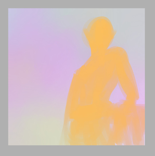
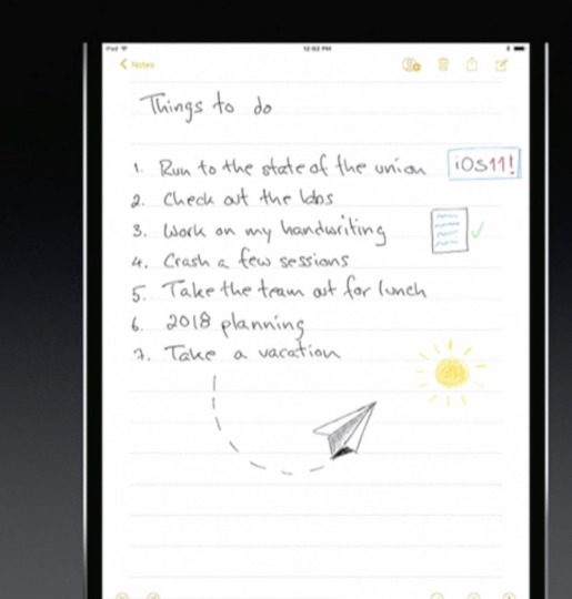
A Drawing Tutorial
I thought maybe there would be some of you who might appreciate seeing some of my artistic processes. So this is a quick tutorial about digital art! This is how I do a single-layer picture, and I’ll also be discussing composition a little.
First! doesn’t matter what program you use or what size your canvas is or what tools you use, that’s all personal preference. Experiment with different brushes and brush settings until you’ve figured out what you like best.
I have recently started thinking of a digital canvas as being just as much a part of the artwork as the subject itself. This is something that holds true in any art form. If you think of the surface you create on as being another art tool, it can really help you create nice compositions and use the space effectively!
so, with that in mind my first step is to tone my “paper” so the colors I’m going to use for the main subject will have a nice backdrop to contrast against. I toss down a few soft colors and blend them out so they cover the whole canvas

If you vary the colors, it also gives a nice ambient lighting feel. So now comes the base colors, this when I make my gesture sketch. A gesture is important because it is the blueprint for the whole drawing! Gestures are not just for people, but can also include any objects in a picture! I pick a color that stands out from the background without being too high in contrast and lay down a solid gesture with a big blendy type brush so it has a softer edge. This helps it look like it really belongs here. I’m also thinking about how I want the composition to look, and usually I do this all in one go, never lifting my stylus, so I better be committed to it because if I hit the undo button it’s all gone. I’ll be drawing my oc Kouto Loryck, who is in fact an art model.
it’s important to be committed to every stroke, be bold and confident with your art. Even if it doesn’t turn out the way you want, you should at least be able to say that you were committed to it. Don’t worry about mistakes, thinking too much will only keep you stuck on one little part when you could be working on the whole thing. I had another drawing here about composition but I accidentally saved over it so I had to move that explanation to a different step haha
Next I lay out the highlights to pull out the details of the subject. I used the same brush for most of this drawing, just changing the size to accommodate what I was using it for. Since the base color is orange, I used a really pale icy blue to highlight, and the blending quality of the brush I used kept it toned down properly so it didn’t look psychedelic. There is nothing wrong with psychedelic coloring, I think it’s really fun, but it’s not the look I wanted this time.
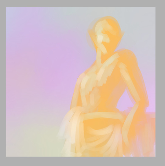
Now let me talk about the composition a bit. The most common composition tool is triangles. Triangles make for really pleasing compositions. And composition is all about balancing the positive and negative space in your picture, as well as creating a pathway for the viewer’s eye to follow. b

I kept this one super simple. Two main triangles in opposing directions, the eye is drawn to the head of the subject and follows the body down to the bottom of the page. Plain, simple, aesthetically pleasing. Keeping a small negative space on the other side of the subject and making a small negative space within the subject also adds a little extra variety to it. One surefire way to make an interesting composition is to place the subject off-center, because it varies the weight of the picture and makes it feel more dynamic, even if it’s a really boring pose like this one; he’s just leaning against some vague object behind him. But I’ve got him off-center and at an angle to the viewer, so it adds interest to the composition.
Once I’ve got highlights done, I go in and add shadows, and then I blend things smooth.
It’s important to use just a few colors to keep things simple. They should be colors that compliment each other in some way. Unless you want the color contrast to look discordant, of course. But even when you’re intentionally using colors that don’t blend nice, make sure you have some neutrals to balance with.
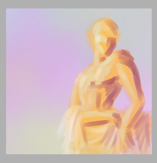
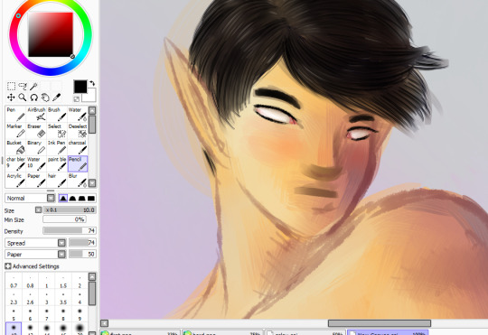
Now it’s really easy for me to decide exactly what I want to do with this, so I lay out a line layer on top to plan my next steps.
This helps me figure out if there’s anything that needs to be adjusted, see if I’ve got my proportions how I want them, etc. I can then use this as a reference later to keep everything in line with my plan. Now I can go in with a smaller brush and add in any extra colors to help separate the different parts of the drawing.
And I add in extra shading to bring out the details here
Blend, redraw, add color as necessary until it looks good.
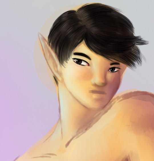
And at this point I can call it a finished drawing if I want. Or I can keep lining and shading and detailing until I think it’s really done.
I’ll just zoom in on the face area now to discuss detailing. I have some specific brush settings I like to use for details like hair. And with the hair I draw layers of a dark shade, the color of course depends on the hair. Draw the hair in layers, first laying down a solid color a college art teacher of mine called “the hair helmet” and then go on top of that with a thin, non-blendy brush to give it the look of lots of individual strands. A brush that already has the look of multiple strands is best because you don’t have to do as many strokes.
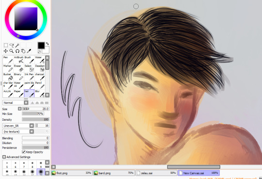
and then I go back over it with my softer brush in the main hair color, do a few more strand layers on top of that, and this time add highlights in a few places, then blend all of that very gently so it still looks like hair.
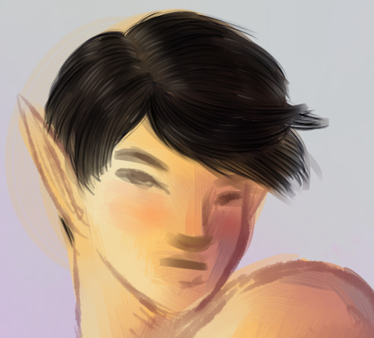
Next is the eyes! I use a pencil type brush to bring out the lash lines and eyebrows. For the eyes themselves I layer in pale yellows, pinks, and white highlights, leaving a little of the skintone near the upper part of the eye to blend into a shadow.
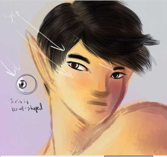
Time to color in the eyes! I start with a dark circle in each eye, depending on the eye color. the iris is a funky little shallow bowl in the eye, curving inwards so actually the light hits it on the opposite side from what you might expect. But the shiny white highlight is on the same side as the rest of the lighting because over the iris is a clear dome that curves outward, giving the eye two layers to highlight on different sides.The upper part of the iris is also usually in shadow because of the eyelashes
Draw in the pupils, add a few dark lines radiating out from it to give the eyes that realistic texture, and then toss on that nice bright highlight.
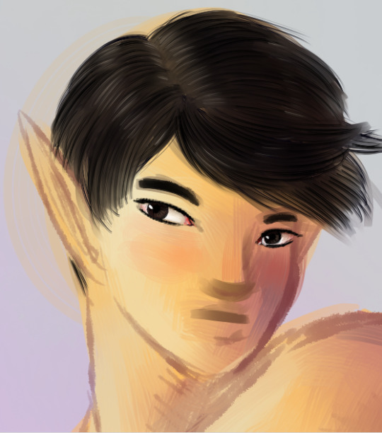
Next, I detail the rest of the face with extra highlights and shadows. Here I’ve mapped out where the main lights and shadows would fall.

And finally I add in extra outlines on the nose, mouth, and ears, as well as the darkest side of the face and anywhere else that might need it
I ended up adjusting his lips quite a bit to make them the right width and shape. The upper lip is always darker than the lower lip because of the way light falls on faces. Except perhaps in cases where all the light is coming from below.
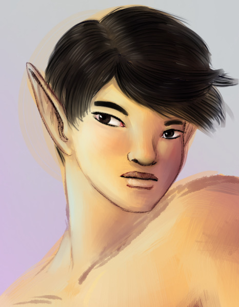
But anyway, that is my basic digital painting tutorial! Hope you found it useful!
7 notes
·
View notes
Text
iOS 11 is about to arrive—and here's what's in it
yahoo
If Apple’s (AAPL) usual annual schedule is any guide, then Tuesday, September 12 won’t just be the day we get new iPhone models. It will also be the day —or at least the countdown to the day—we get a new version of the iPhone system software, which will run on several years’ worth of older iPhone models. This year, it’s going to be called iOS 11.
It won’t bring you any one big-ticket feature. Instead, you’ll get a wholllllle lot of tiny nips and tucks. They seem to fall into five categories: Nice Tweaks, Storage Help, iPad Exclusives, Playing Catch-Up, Fixing Bad Design.
Here’s what you have to look forward to!
Nice Tweaks
Expectations set? OK—here’s what’s new.
A new voice for Siri. The new male and female voices sound much more like actual people.
One-handed typing. There’s a new keyboard that scoots closer to one side, for easier one-handed typing. (You can now zoom in Maps one-handed, too.)
The new one-handed keyboard.
Quicker transfer. When you get a new iPhone, you can import all your settings from the old one just by focusing the camera on the new phone on the old one’s screen.
Do not disturb while driving. This optional feature sounds like a really good one. When the phone detects that you’re driving—because it’s connected to your phone’s Bluetooth, or because the phone detects motion—it prevents any notifications (alert messages from your apps) from showing up to distract you. If someone texts you, they get an auto-response like, “I’m driving. I’ll see your message when I get where I’m going.” (You can designate certain people as VIPs; if they text the word “urgent” to you, their messages break through the blockade.)
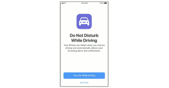
No more distracting notifications while you’re on the road.
Improvements to Photos. The Photos app offers smarter auto-slideshows (called Memories). Among other improvements, they now play well even when you’re holding the phone upright.
Improvements to Live Photos. Live Photos are weird, three-second video clips, which Apple (AAPL) introduced in iOS 9. In iOS 11, you can now shorten one, or mute its audio, or extract a single frame from that clip to use as a still photo. The phone can also suggest a “boomerang” segment (bounces back and forth) or a loop (repeats over and over). And it has a new Slow Shutter filter, which (for example) blurs a babbling brook or stars moving across the sky, as though taken with a long exposure.
Swipe the Lock screen back down. You can now get back to your Lock screen without actually locking your iPhone—to have another look at a notification you missed, for example.
Smarter Siri. Siri does better an anticipating your next move (location, news, calendar appointments). When you’re typing, the auto-suggestions above the keyboard now offer movie names, song names, or place names that you’ve recently viewed in other apps. Auto-suggestions in Siri, too, include terms you’ve recently read. And if you book a flight or buy a ticket online, iOS offers to add it to your calendar.
AirPlay 2. If you buy speakers from Bose, Marantz, and a few other manufactures (unfortunately, not Sonos), you can use your phone to control multi-room audio. You can start the same song playing everywhere, or play different songs in different rooms.
Shared “Up Next” playlist. If you’re an Apple Music subscriber, your party guests or buddies can throw their own “what song to play next” ideas into the ring.
Screen recording. Now you can do more than just take a screenshot of what’s on your screen. You can make a video of it! Man, will that be helpful for people who teach or review phone software! (Apple didn’t say how you start the screen recording, though.)
Storage Help
Running out of room on the iPhone is a chronic problem. Apple has a few features designed to help:
Camera app. Apple is adopting new file formats for photos (HEIF, or High Efficiency Image Format) and videos (H265 or High Efficiency Video Codec), which look the same as they did before but consume only the half the space. (When you export to someone else, they convert to standard formats.)
Messages in iCloud. When you sign into any new Mac, iPhone, or iPad with your iCloud credentials, your entire texting history gets downloaded automatically. (As it is now, when you sign in on a new machine, you can’t see the Message transcript histories.) Saving the Messages history online also saves disk space on your Mac.
Storage optimization. The idea: As your phone begins to run out of space, your oldest files are quietly and automatically stored online, leaving Download icons in their places on your phone, so that you can retrieve them if you need them.
iPad Exclusives
Many of the biggest changes in iOS 11 are available only on the iPad.
Mac features. In general, the big news here is the iPad behaves much more like a Mac. For example, you can drag-and-drop pictures and text between apps. The Dock is now extensible, available from within any app, and perfect for switching apps, just as on the Mac. There’s a new Mission Control-type feature, too, for seeing what’s in your open apps—even when you’ve split the screen between pairs of apps.
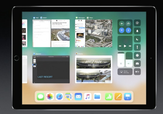
The iPad now offers a “Mission Control,” showing what’s going on in all your apps.
Punctuation and letters on the same keyboard. Now, punctuation symbols appear above the letter keys. You flick down on the key to “type” the punctuation—no more having to switch keyboard layouts.
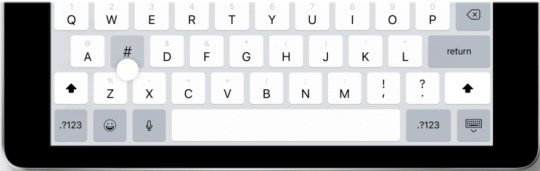
No more switching keyboards just to type punctuation.
A file manager! A new app called Files lets you work with (and search) files and folders, just as you do on the Mac or PC. It even shows your Box and Dropbox files.

A Finder–a desktop–comes at last to iOS.
Pencil features. If you’ve bought Apple’s stylus, you can tap the Lock screen and start taking notes right away. You can mark up PDFs just by starting to write on them. A new feature lets you snap a document with the iPad’s camera, which straightens and crops the page so that you can sign it or annotate it. Handwriting in the Notes app is now searchable, and you can make drawings within any Note or email message.
The iPad grows ever closer to becoming a legal pad.
Playing Catch-Up
With every new OS from Google (GOOG, GOOGL), Microsoft (MSFT), or Apple, there’s a set of “us, too!” features that keeps them all competitive. This time around, it’s:
Lane guidance. When you’re driving, Maps now lets you know which lane to be in for your next turn, just as Google Maps does.
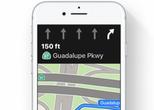
Lane guidance. At last.
Indoor Maps. The Maps app can now show you floor plans for a few malls and 30 airports, just as Google Maps does.
Siri translates languages. Siri is trying to catch up to Google Assistant. For example, it can now translate phrases from English into Chinese, French, German, Italian, or Spanish. For example, you can say, “How do you say ‘Where’s the bathroom?’ in French?”
Siri understands followup questions. Siri now does better at understanding followup questions. (“Who won the World Series in 1980?” “The “Phillies.” “Who was their coach?”)
Person-to-Person payment within the Messages app. Now, you can send payments directly to your friends—your share of the pizza bill, for example—right from within the Messages app, much as people do now with Venmo, PayPal, and their its ilk. (Of course, this works only if your friends have iPhones, too.) When money comes to you, it accrues to a new, virtual Apple Pay Cash Card; from there, you can send it to your bank, buy things with it, or send it on to other people.
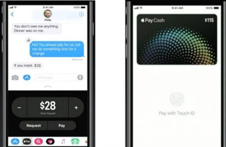
Send payments directly to your friends.
iCloud file sharing. Finally, you can share files you’ve stored on your iCloud Drive with other people, just as you’ve been able to do with Dropbox for years.
Fixing Bad Design
Some of the changes repair the damage Apple made to itself in iOS 10. For example:
Redesigned apps drawer in Messages. All the stuff they added to Messages last year (stickers, apps, live drawing) cluttered up the design and wound up getting ignored by lots of people. The new design is cleaner.
Redesigned Control Center. In iOS 10, Apple split up the iPhone’s quick-settings panel, called the Control Center, into two or three panels. You had to swipe sideways to find the control you wanted—taking care not to swipe sideways on one of the controls, thereby triggering it. Now it’s all on one screen again, although some of the buttons open up secondary screens of options. And it’s customizable! You can, for example, add a “Record voice memo” button to it.
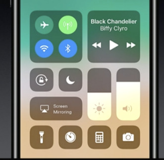
The new, customizable, somewhat ugly Control Center.
App Store. The App store gets a big redesign. One chief fix is breaking out Games into its own tab, so that game and non-game bestseller lists are kept separate.
After nine years, the App Store gets a new look.
Coming very soon
There are also dozens of improvements to the features for overseas iPhones (China, Russia, India, for example). And many, many enhancements to features for the disabled (spoken captions for videos and pictures, for example).
So what’s the overarching theme of the iOS 11 upgrade?
There isn’t one. It’s just a couple hundred little fine-tunings. All of them welcome—and all of them aimed to keep you trapped within Apple’s growing ecosystem.
More from David Pogue:
MacOS High Sierra comes this fall—and brings these 23 features
T-Mobile COO: Why we make investments like free Netflix that ‘seem crazy’
How Apple’s iPhone has improved since its 2007 debut
Gulliver’s Gate is a $40 million world of miniatures in Times Square
The 5 best new features of this week’s YouTube redesign
Samsung’s Bixby voice assistant is ambitious, powerful, and half-baked
Is through-the-air charging a hoax?
David Pogue, tech columnist for Yahoo Finance, is the author of “iPhone: The Missing Manual.” He welcomes nontoxic comments in the comments section below. On the web, he’s davidpogue.com. On Twitter, he’s @pogue. On email, he’s [email protected]. You can read all his articles here, or you can sign up to get his columns by email.
#_lmsid:a077000000BAh3wAAD#_revsp:yahoofinance.com#$AAPL#_author:David Pogue#_uuid:9b33dcbf-7f4e-343c-b5f9-271cfdf12842
11 notes
·
View notes
Text
If someone sets fire to your trousers once, are you ever really going to trust them with a box of matches again?
That’s just how big a deal the Galaxy Note 8 is for Samsung. Last year’s explosive Note 7 launch (and subsequent recall) was nothing short of calamitous, so its successor absolutely has to restore confidence in the battered sub-brand.
The good news? It’s every bit the kick-ass flagship phablet you’d expect it to be.
With design and display smarts borrowed from the Galaxy S8, software tweaks that give productivity a boost, and an upgraded S Pen that’s learned a few extra tricks, the Note 8 shouldn’t have any trouble shooting straight to the top of Samsung’s smartphone offerings.
And that’s before you start playing with the dual rear cameras – marking the first time the tech has appeared on a Samsung phone.
I got to try one out ahead of launch to bring you some early hands-on impressions. And I didn’t even need my oven gloves.
DESIGN & BUILD: TIME TO GET SERIOUS
With more angular edges and a screen that curves at a much steeper angle, you can instantly tell the Note 8 apart from Samsung’s other top-end phones.
The Galaxy S8 is smooth, soft, and almost pebble-like, but this feels like it means business – even in the jazzy new Maple Gold colour. We get the choice of gold or Midnight Black colours here in the UK, while the rest of the world gets Deep Sea Blue and Orchid Grey.
The metal frame still gives you something meaty to get your mitts around, and the skinny 18:9 aspect ratio screen means you don’t need the hands of a giant to grip it – even with a whopping 6.3in AMOLED panel squeezed in there.
A lot of features have been ported across from the Galaxy S8, including the digital home button – with the screen taking up so much space, there’s no room for a fingerprint sensor up front.
It gets moved to the back, right next to those dual cameras. There’s the smallest of bumps to let you know you’re fondling the fingerprint sensor and not the camera lenses, but it’s still awkward to reach – maybe even more so here because of the sheer size of the phone. Samsung is clearly hoping you’ll use iris or face recognition instead.
The whole thing is water-resistant, you still get a 3.5mm headphone jack, and there’s USB-C charging at the bottom – so the full package, basically.
There’s also the ever-present Bixby button on the left, just below the volume controls. Samsung’s live-in butler still hasn’t found his voice, at least here in the UK, but it is apparently due to arrive shortly after the Note 8 launches.
CAMERA: SEEING DOUBLE
Dual cameras have been doing the rounds for a while now, but this is the first time Samsung has joined the fray. The Note 8 has two 12MP snappers, and is the first phone to give ‘em both optical image stabilisation.
It’s an interesting approach, with the main sensor getting the same f/1.7 aperture and dual-pixel autofocus as the Galaxy S8, but the secondary telephoto lens sticking with f/2.4 and phase-detect AF only.
That means you can toggle between 1x and 2x ‘optical zoom’, to get closer to your subjects without actually moving, only without any nasty digital noise or compression.
Naturally there’s a bokeh-blurring portrait mode, too: Samsung calls it Live Focus, because you can tweak the amount of blur before you press the shutter button. It saves two shots, so you can go back and adjust the effect (or delete it altogether) whenever you like.
The 8MP selfie cam up front is probably using the same snapper as the Galaxy S8, seeing how both have f/1.7 apertures and autofocus.
Everything felt quick and responsive, but how the Note 8 compares to the rest of the dual camera-toting world will boil down to pure image quality. Samsung isn’t really doing anything different from what we’ve seen before, even if it is the first with dual OIS, so I’ll only be excited if it takes fantastic photos.
Of course, the Galaxy S8 is one of the best smartphone snappers around, so that feels like a pretty safe bet.
SCREEN & SOUND: BIGGER IS BETTER
If you’ve seen a Galaxy S8 or S8+ in the wild, you’ll know exactly what to expect here: the Note 8 has an absolute stunner of a screen.
The AMOLED panel has the same super-high 2960×1440 resolution, only here it’s stretched out over 6.3in. That means pixel density isn’t quite as high as the S8, but that’s still loads more pixels than you’ll be able to make out without the help of a microscope.
That extra screen space isn’t wasted with cutesy curves, either. The screen sides still bend around the edge of the phone, but at a much sharper angle, leaving more space to doodle onscreen with the S Pen.
It can crank the brightness up to ridiculous levels when you step outside, so you won’t ever have a problem seeing what’s onscreen, and the contrast we’ve come to expect from OLED screens gives movies and games a gorgeous, cinematic look with deep blacks and vibrant colours.
I didn’t get a chance to properly test out the built-in speakers, so can’t speak for quality just yet, but if the Galaxy S8 is any indication, the Note will be plenty loud enough to catch up on Podcasts and YouTube videos without reaching for a pair of headphones – even if Samsung does bundle a tasty pair of AKG ‘buds in the box.
OS & SOFTWARE: THE WRITE STUFF
Give the S Pen a poke and it pops out of its sheath with a satisfying, spring-loaded pop. This is when Samsung’s Android customisations spring into life, letting you pick from a whole host of different abilities and tools.
All the old favourites return, but new for 2017 are Live Message, a cute way to draw doodles or annotate images for livening up your Whatsapp chats; PENUP, a social hub for sharing your S Pen sketches; and live translation of whole sentences, instead of just single words. The Pen’s 4096 levels of pressure should come in pretty handy for digital artists looking to get their creativity flowing, too.
Beyond the S Pen, Samsung’s spin on Android is a lot more minimal than in previous years. Sure, the icons look a little different, but Touchwiz really is massively improved. You can even swap the Back and Recents keys, if you don’t like the Galaxy way of doing things.
The only real flourish is the Edge panel, which lets you swipe between app shortcuts, contacts and widgets from any screen. App Pairs can be pinned here too, opening two apps simultaneously with a single tap. Think maps and music whenever you get in the car, or YouTube and a web browser for a soundtrack while you browse.
Samsung has also tweaked the software that kicks in when you slam a Note 8 into the DEX docking station, too. A lot more of the keyboard shortcuts that come as second nature on a Mac or PC work here now, and you can finally run certain troublesome apps on the big screen at full-size, instead of in a window. It’ll even play nicely with games now, too.
DEX makes a lot more sense for the Note than it did for the Galaxy, because it’s so focused on productivity. That’s probably why Samsung is bundling the two together, at least for people that pre-order the phone.
PERFORMANCE & BATTERY LIFE: NO SURPRISES
As if there was ever any doubt: The Note 8 absolutely flies. With the same octa-core Exynos 8895 CPU as the Galaxy S8 (at least here in Blighty) there’s nothing that won’t run smoothly on that super-high resolution screen.
With an even bigger emphasis on multi-tasking this year, it makes sense that Samsung would stuff 6GB of RAM inside it, too. Using two apps in Multi Window won’t be a problem, and the S Pen integration pops in and out without any slowdown or stutter.
There’s an ample 64GB of on-board storage for all your apps, plus a microSD card slot should you need more room later down the line.
How long you’ll be able to go between charges is the biggest mystery right now. A 3300mAh battery feels like Samsung playing it safe, but that’s understandable. I’m expecting it to comfortably last a day, but need topping up overnight – at least if you’re using it as more than a glorified MP3 player, anyway.
SAMSUNG GALAXY NOTE 8 INITIAL VERDICT
So, does the Note 8 do anything drastic to shake up Samsung’s now-familiar Galaxy Note formula? No, not really – but then it doesn’t have to. It just has to avoid blowing up.
Sure, the iPhone might have won over a few ex-Galaxy owners when the Note 7 disappeared from shelves last year, but with nothing truly taking its place, it wasn’t going to be too tricky for Samsung to waltz back in and reclaim the throne it had just vacated. The S Pen really is that damn good.
The Note 8 feels like every bit the superphone, with plenty of power, a gorgeous design, and productivity boosts that should keep it the king of stylus-toting smartphones. I can’t wait to get one and give it a full review, to see if those dual cameras can deliver.
The largest display on any Note ever (6.3 inches) If someone sets fire to your trousers once, are you ever really going to trust them with a box of matches again?
0 notes
Text
These Windows 10 Fall Creators Update features could hurt your creativity
If you’re a creative professional using one of the awesome creative-friendly Windows 10 tools like the Surface Pro, Surface Studio, Surface Book, Wacom Mobile Studio Pro, or a Cintiq enabled workstation, you’re probably not part of the Windows Insiders program since you need a reliable production machine to get your work done. That means Microsoft doesn’t get as much input from creative pros when they add features to Windows 10 that will probably have a negative effect on your workflow. Here are a few things coming to the Windows 10 Fall Creators update that will probably cause problems if they ship as is. Of course, the Fall Creators Update is still in progress so some of these things may change (one of them was just fixed) and of course there are lots of other excellent new features coming in the Fall Creators Update as well, but we’ll talk about those when it’s fully released.
Pen scrolling/panning
For some reason, Microsoft totally changed the behavior of the “Windows Ink” enabled pens in scroll-able pages and lists. No longer does pressing & dragging allow you to manipulate selections or objects like you would expect and like it has since Windows XP Tablet PC Edition in 2002… now that action will scroll or pan the list. This “feature” breaks many user interaction conventions that users rely on.
At least in its current incarnation, you can no longer even grab scroll-bars with the pen in order to drag the position to a specific point. Albeit, build 16241 actually returns scroll-bar functionality in some applications such as Edge and Win 32 programs, but certainly not all.
The new pen scrolling feature also removes your ability to easily drag selections around groups of files in the file explorer. You can no longer tap and drag files in order to move or copy them to other locations either.
In programs like Outlook, it’s now impossible to tap and drag an appointment to change its time slot. It’s no longer possible to tap and drag a live tile in the start menu to rearrange it or drop it into a folder. It’s no longer possible to tap and drag quick action buttons in the settings to rearrange them. Selecting text in web pages or emails or Office documents is much more difficult now as well. Normal people won’t even be able to figure it out. Trying to select partial URLs in the web browser just moves the text side to side instead. Basically all tap & drag functions across the operating system and programs are completely broken.
This is how difficult it is to select stuff using a pen now in Windows 10 Fall Creators Update 16251 #WindowsInsiders #UXFail pic.twitter.com/Q2VdhT0vEO
— Adam Z Lein (@adamzea) July 27, 2017
That goes for some graphics programs too. The new pen scrolling feature doesn’t necessarily care if you have a painting/drawing tool selected, if you tap and drag it’s probably going to scroll that document (See feedback hub post). Some programs are able to ignore the pen scrolling features in some areas, making for a very inconsistent and confusing user experience. For example, Excel & Powerpoint ignore the pen scrolling feature but Word does not. Sometimes you can hold the right-click barrel button on a pen in order to bypass the pen scrolling awfulness, but not all pens have that button.
For example, OneNote’s UWP app kind of does pen scrolling if you tap & drag in the scroll-bar area, but if you tap & drag in the page area… instead of scrolling like all the other scroll-able pages do with this new pen scrolling feature… automatic inking kicks in and you’re scribbling ink on that page instead of scrolling. Totally unintuitive, inconsistent, and frustrating! Hopefully we’ll see an off switch for this behavior before it ships.
Okay, fine… the reason Microsoft added this pen scrolling feature is because they wanted to reduce the amount of hunting and pecking you need to do in order to access scroll-bars with the pen. Also maybe to copy some Chromebook that had this feature. Anyway, hunting & pecking is what the pen was made for. It’s a precision instrument meant to control points that are smaller than our fingers. We invented pens so we could be more civilized than the cavemen using their fingers to paint on cave walls. The actual problem with Windows 10 scroll-bars is their inconsistency. In the Windows 95 days, I could go into the settings and define the width and colors of the scroll-bars on a system level and they’d all be consistently usable. With Windows 8+, those types of theme customizations are no longer possible. In fact, many scroll-bar designs aren’t even consistent within the same app (*cough*Outlook*cough*). Some are thin, some are normal, some disappear. If they were all the same and stayed visible all the time, pointing at them with the pen would be a lot easier.
Automatic inking
Okay, you probably already have this feature in the regular Creators Update, but it’s still there in the fall update and it’s still awful. Automatic inking is when the software recognizes that you’re holding a pen and automatically switches to an inking tool even if you don’t want to use it for inking. In the Photos app, that means all of the other UI elements disappear every time you try to press a button with the pen and it switches to writing on the photo instead. No matter how often you close the obtrusive inking panel, it comes right back as soon as you move the pen, thus making it impossible to use the app without putting down the pen and switching to something lesser like a mouse, track-pad, or touchscreen.
The Maps app has a similar problem. Intuitively if I tap & drag with the pen I should be able to pan the map just like I would with a finger or mouse or track-pad or any other pointing device, right? With automatic inking, it writes on the map instead. In fact, there’s no way to select a panning tool with your pen if you’d like to see other parts of the map. You’ll have to plug in a mouse or turn on the touch screen in order to do that (many professional graphics tablets offer off switches for the touch features so you can do everything with the pen.) There’s no way to disable this undesirable automatic inking feature either, unless your tablet drivers have the ability to disable “Windows Ink” completely (which you certainly might consider doing). Also see “Don’t use pen for inking until I manually choose an inking tool” in the Feedback Hub. The simple solution here should obviously be to let the user invoke inking tools when the user chooses to do so by pressing the “Ink Toolbar” button that already exists.
OneNote’s UWP app automatic inking feature always switches to a writing tool even if you’ve tapped on the text selection tool first. That means you can’t select text with the accuracy of a stylus, which is extremely frustrating. Luckily the full OneNote x86 program (also free, but not available in the Windows Store) does have a setting to turn off the automatic inking annoyance so that you can manually switch between selection tools and writing tools as the need arises (as it should be.) Granted the automatic inking feature shouldn’t affect your real professional grade programs too much though.
Missing keys on the keyboard
The regular touch keyboard is missing lots of important keys.
At the time of writing this, Microsoft was originally going to remove the “standard layout” touch keyboard from the Windows 10 Creators Update. Luckily with the just-released build 16251, the proper keys have returned in a “Standard layout” keyboard option (see feedback hub post.) So we can probably cross this one off the list already as the Windows Insiders’ Feedback has already worked, but I’ll still mention the importance of a full keyboard layout on a tablet.
If you have a job and know how to work efficiently, you know you need keyboard shortcuts and especially modifier keys. The Alt key is essential for quickly accessing keyboard mnemonics or modifying editing tools as you work. The arrow keys and function keys are very important for shortcuts and command line controls as well. As a graphic artist, I often use the touch keyboard to access tools and modifiers instead of the program’s native UI because the touch keyboard has bigger touch-friendly buttons. Having the standard layout touch keyboard visible also gives you access to system functions via keyboard shortcuts that are often faster to get to than using the regular GUI.
There is also a normal “on screen keyboard” that can be launched as an app from the accessibility settings, but it isn’t an option within the touch keyboard task-bar button, it can’t be docked, and it doesn’t automatically appear when you activate an input field.
While we did already get the standard touch keyboard back, the implementation of software input methods on Windows 10 still has a lot of problems.
The Touch Keyboard input method should have a pop-up menu.
I really wish Microsoft would go back to what they had for on-screen software input methods back in the days of Windows CE and Pocket PCs around the turn of the century. I little pop-up arrow menu next to the input method icon would instantly let you choose and switch between input methods like handwriting recognition, character recognizer, Qwerty keyboards, etc. It was even extensible with 3rd party keyboards like the awesome Fitaly, Swype, T9 keyboards, etc. That’s what Windows 10 needs instead of these small handful of input methods in the taskbar, plus the hidden accessibility keyboard, plus 4 different versions of the emoji keyboard, and a hugely inconsistent/ambiguous user interface for them. Microsoft needs to bring back the ability to resize input panels too. With the recent build release, they made the swipe keyboard bigger, but really the swipe keyboard should be the same as the touch keyboard except with a user-resizable handlebar on the edges (just like all other windows) so that we can tap & drag to make it the dimensions we want.
System Image Backups are going away soon
This one isn’t directly related to creativity, but as a professional working with Windows, it’s a really good idea to keep at least one full system image backup of your computer in a known-good state. This way you can revert to that state whenever you want. Full system image restores rewrite the whole hard disk with what was there when it was good thus giving you a much more reliable restore compared to the system restore utility or uninstall options. It’s really good for when automatic updates go bad. For example, if you accidentally installed the Windows 10 Fall Creators update and then realized that you couldn’t work with the new pen scrolling feature or missing standard keyboard layout, you could go right back to a working system state with a full system image restore. While this functionality isn’t being removed right away, Microsoft is recommending you move to 3rd party system imaging tools instead. Ginny Caughey recommends Macrium Reflect. Hopefully, the PowerShell command for initiating system image backups might remain.
Paint
I suppose we need to mention the depreciation of Microsoft Paint here even though creative pros aren’t going to bat an eye at its dismissal. Microsoft Paint has long been the basic little graphics program included with Windows. A lot of people seem to actually rely on it. Going forward with the Fall Creators Update it will start to be hidden and eventually removed in favor of the new Paint 3D app. Paint 3D does include all of the 2D paint features, but it does not have the simple user interface that Paint assumed in the Windows 7 days to match the Office Ribbon. Paint 3D’s user interface doesn’t really go with anything and will require some tutorials to figure out.
Conclusion
It seems that Microsoft has forgotten an important lesson of software design; “Always provide an off switch for terrible new features.” Users really want to be in control, and taking away their ability to scroll through OneNote pages, invoke keyboard commands on a touch screen, back up a full system image, draw in certain apps, or NOT draw in other apps is going to be very frustrating.
The Microsoft Surface team has designed some amazing hardware that is sure to appeal to creative professionals. The Surface Pro’s pen hardware has come a long way and the Surface Studio with its customizable Surface Dial in combination with the Surface Pen is a huge step in competing with the traditional expensive Wacom displays and Macintosh computers. The Microsoft Surface devices look like amazing tools for production and creativity! They should be adding really useful stuff like customizable touch panels (See TabletPro) and radial pen-friendly gesture GUIs. Unfortunately, the Windows 10 Fall Creators Update isn’t quite keeping up with Microsoft’s hardware and is actually bringing bad user experience scenarios instead of great ones… at least in the current pre-release Windows Insiders versions, that is. There’s still time to fix it!
Source link
0 notes
Text
An iPod. A phone.
Ten years ago, I had the random luck of landing in New York at 6pm on June 29. Something else was happening at that time, and I wasn’t about to let the opportunity to be a part of it pass me by.
Other than being an Apple fanboy for years, I was (and still am) a tragic early adopter with a firm belief in the potential for technology to simplify and enhance our lives. Back in that PC-centric world, this translated to faith in what Steve Jobs described as the ‘digital hub’ - having a (likely desktop) computer be the central repository for your communications (email), documents, photos, music and movies, connected to other satellite devices such as a phone, laptop, camera, music player (ahem, iPod) and video camera feeding them content. It was a remarkably clear and tidy vision allowing a true digital library of your life at your fingertips (provided you were seated in front of your computer), however it relied on one being able to have any or all of those devices available to you when you wanted to acquire that content.
That’s a lot of devices to carry around, and pockets / bags have limited space within. I recall my daily morning routine of putting my phone, keys, wallet and iPod carefully in my pockets to minimise bulge, packing my laptop and sometimes camera (and, very rarely when travelling, video camera) in my bag, and feeling like I had everything I needed at my disposal (while hoping that nothing fell out or was stolen). And of course, the devices in your bag (and the ones left behind) were never easily accessible or useful, being large and unwieldy to carry on their own or together.
Email was simply inaccessible without a laptop and WiFi. Blackberries were a novelty at the time and the preserve of high-powered executives and consultants - even as someone then working in a corporate environment, only the most senior members of my firm carried them. Some particularly adventurous individuals had digital personal organisers called PalmPilots to store their contacts and calendars, but these were of little use beyond that. I’d been working at a conference a few years earlier when I observed many of the participants carrying around small PalmPilot-like devices called iPAQs that hooked up to WiFi gave them access to their conference schedules as well as their emails. I thought this was the bees knees, and couldn’t wait to see this technology filter down to the consumer market.
The hottest things in mobile phone technology back then were polyphonic ringtones, stamp sized photos sent through MMS, and the devices getting smaller. Despite being around for some time in Australia, apparently texting through SMS was only just becoming widespread in the US - but of course was stunted by its 160 character limit (hmm, why does that seem familiar?). You’d type a text through the muscle memory of knowing how many times to press a number on the pad to toggle a particular character - and wait a few seconds if consecutive characters were assigned to the same number. The manual process of entering contacts was laborious and repetitive, especially when changing devices or SIM cards, as there was no easy way to transfer them.
Eventually, HP and other vendors started offering devices (‘Pocket PCs’) like the ones I’d seen at the conference to consumers, at fairly astronomical prices. Some had WiFi included thanks to horrendously large antennae, while others required the purchase of a separate SD card for connectivity. Most shipped with the ironically-named Windows Mobile and required a stylus and an abstract Palm-esque character system for handwriting recognition (or an absolutely tiny software keyboard that needed to be prodded by said stylus). Due to the limits of this character recognition and the resistive screens of these devices, this experience was fraught with errors and inaccuracies. Other devices had large Blackberry-style physical keyboards requiring a similar symphony of thumb presses, this time somewhat resembling the experience of using a regular keyboard but with greater potential for RSI. Palm had such a product called the Treo, as did Motorola (then-known for its extremely popular slim flip-phone, the RAZR, and less so for its clunky iTunes Phone, the ROKR) with the Q.
In 2005, once Pocket PCs finally started to incorporate a mobile phone as well, I saved up and splurged on what I thought to be one of the most elegant - the i-mate JAM. About the size of the original iPod, it was compact but with a then-decent sized screen. Its ability to recognise one abstractly-scribbled word at a time felt like a revelation, and turned the one-character-at-a-time experience of texting and writing emails into something slightly more fluid. Of course, emailing and web-browsing were limited by the need for WiFi (and I did buy one of those silly SD cards for occasional use) and the awful and very rare mobile-optimised websites (the ‘baby web’ as Steve Jobs would go on to call it). I could get useful information such as weather forecasts, but only occasionally when hooked up to WiFi through that card - forget about getting anything useful through 2G GPRS data - or download a bunch of information at a time when syncing to my computer (clunky though it was, given it ran Windows and I used a Mac). But the fact that it did sync to my computer at all, and provided all (well, most) of my contacts when I needed them felt incredibly useful - instead of having to repeatedly press a button to scroll through my contacts to make a call, I’d simply find it using my stylus. I’d occasionally even get by scribbling characters messily with my thumb or forefinger, but for most intents and purposes the stylus was the most effective method for input.
Several years earlier, the iPod had stormed the market for portable music players and effectively killed portable CD players - despite lukewarm efforts by other manufacturers to build MP3 players or alternative technologies like MiniDisc. Ostensibly, the iPod triumphed over its competitors due to its straightforward ability to sync a library through iTunes, its non-removable hard drive for storage, as well as its simple user interface and click wheel - which, despite the steady addition of photos, videos and games, few people felt could be adapted for other purposes like a phone. At the same time, despite the ROKR flop, phones were starting to include the ability to store and play music - which posed a long-term existential threat to the iPod. Much as the hard-drive based iPod Mini was killed and replaced by the superior flash-based iPod Nano, so too would the iPod itself need to be replaced by a convergent product. Similarly, ‘3G’ phones were providing limited online walled-gardens where carriers would provide certain services or information, thereby also posing a threat to the nascent Pocket PC market as well.
I say all this because I was one of those people searching for the mythical ‘one device’ that would replace all of these others and surpass their various limitations. There had already been considerable talk and rumour-mongering of an ‘iPod Phone’ which I hoped would come to pass eventually, but had no idea how soon that would be. In January 2007, I was utterly amazed to see Steve Jobs unveil just that: not just a better widescreen iPod with touch controls, not just a better mobile phone, and not just a more effective way to get information from the internet - but all three of those in one. Gone were both stylus and click wheel, replaced by a smooth capacitive touch interface that allowed you to use your always-available fingers to do everything you needed - and with barely any physical buttons, the entire screen was the phone, and the UI adapted to the needs of the specific app you were using. There was no physical keyboard simply because there was no need for one. This device was not just an iPod, a phone, or an internet communicator - it really was a computer in your pocket.
It was the third part of the ‘device’ that spoke to me the most and I was surprised at how lukewarm its reception was at the time - being able to view whole web pages at a time and tap to zoom in on the content you were interested was absolutely mind-blowing (and now that it’s dead, we can forget the minor inconvenience of not being able to view battery-hogging Adobe Flash content). And add to that the fact that it also had maps and a limited type of GPS as well, so it could potentially also replace a Melway (our local street directory), printed directions or even those expensive in-car GPS systems. Unlike the Blackberry or even Pocket PCs before it, this was a smart phone that any consumer signing up to a telco contract could access - and to top it off, on a technological level it left those predecessors firmly in the dust.
With that kind of tremendous change came a predictably hostile response from the incumbents and pundits, all of whom couldn’t grasp how such a device could have anything but niche appeal when it was so different to what success currently looked like and what they believed people then wanted out of their phones (see Steve Jobs’ later co-option of Wayne Gretzky’s line about skating to where the puck will be, not where it’s been). I, on the other hand, was a true believer, and wouldn’t be brought down by such negativity - even if it was reasonable or proved to be valid (happily for me, it wads neither). I was well and truly sold and, being unable to bear the anticipation of getting my hands on this game-changing device, skinned my JAM to resemble the iPhone interface and patiently waited to hear when we might be lucky enough to get an Australian release for the device - likely months or years down the track.
So you can imagine my excitement when by chance I was asked to chaperone my nephew on a vacation to New York that just happened to land on the day the iPhone was released (Modern Family’s Phil Dunphy had a similar description for how fate aligned the stars to make his birthday coincide with the release of the iPad several years later). We landed just as the doors would have opened at Fifth Avenue and the first lucky customers who had lined up days earlier would walk out with their shiny new toys. Despite the 20-odd hour journey, I pleaded with the relatives we were staying with to take me to the nearest Apple Store as soon as we unpacked. The last thing I wanted to do was go that far and find the product had sold out. Luckily, this was a mall store in Long Island, and I was completely shocked to find no queue, not that many people around, and plenty of stock sitting at the counter. It seemed not quite everyone was sold on the future just as yet. I did not hesitate, and walked out of there USD 600-odd lighter.
Of course many people then posed the obvious question to me: as an Australian, what good was a phone locked to a US carrier that couldn’t even be activated without signing up to a contract? I may have been blinded by my enthusiasm, but I wasn’t stupid about it - and luckily again, the particular circumstances surrounding the original iPhone conspired to make things work for me. Despite the lack of the ‘outright’ device purchasing model at that time in the US, the original iPhone had the carrier subsidy built into the contract, not the device itself - so while you did have to sign up to a two-year contract to use the phone, you did that after purchasing the phone at an ‘outright’ (not subsidised) price. So the sting in the tail was a USD 300 cancellation fee if you left prior to the end of the two years. Factoring this as a cost of purchasing a ‘widescreen iPod with touch controls’ and ‘breakthrough internet communicator’ I persuaded my relatives to take up then AT&T contract so that I could activate the device, and would reimburse them for the cancellation fee. But again luck struck - as the phone was effectively purchased at an unsubsidised price, the contract termination fee didn’t kick in until 30 days after purchase - so I got my device (without the phone) at its sticker price (and even better, would later be refunded USD 100 when Steve Jobs finally realised he’d ripped off all of us early adopters a little too much). When I finally made the pilgrimage to the Fifth Avenue store a few days later, I picked up another one for my (now) wife.
Using this ‘touch iPod’ (soon to be made redundant by an actual iPod Touch) during those early days was a total thrill, and completely surpassed the experience of using my not-very-old-but-ancient-feeling Pocket PC. The skeuomorphic ability to touch the device with your fingers and have it appear to respond in a physically consistent way was tremendous. Certainly it also had appeal as a novelty - its absence from the Australian market did result in quite a bit of interest from friends and onlookers after my return. I was somewhat surprised by the quality of the photographs it took, though not sufficiently to use it to regularly replace my point and shoot or DSLR. And it definitely became my full-time iPod, as the cover flow visuals and multitouch interface made up for its relatively modest 8GB storage. But, as if that weren’t enough, within a few months enterprising hackers had found the Death Star's weakness, and exploited it to allow people to jailbreak the iPhone and unlock it from its Apple and AT&T shackles. While it was by no means the easiest or risk-free process and required a bit of technical know-how, thanks to some pretty detailed instructions published by said legends I was able to carefully work my way through them and fully unlock the phone - making it almost fully functional at home and allowing me to finally ditch my other mobile phone. Of course, our mobile telco plans were then still stuck in past as far as data, and I had to switch carriers to find a 'reasonable' plan that gave me a 'generous' allowance of 50MB/month (thanks Virgin Mobile!). But for the limited purposes of browsing and checking email in that data-lite era, this was still enough for the experience to be a revelation.
It's true that it wasn't until the iPhone 3G launched (and was finally made available in Australia as well) that the iPhone started to feel more like a mature product - and the local availability of the 3G obviated the need for the various workarounds and hacks I had to employ to make use of the original. Many of the features weren't really refined or perfected until the iPhone 4 or 5. A feature film was shot entirely on an iPhone 5S, and the capabilities of today's iPhone 7 (as well as the iPad, the iPhone's spiritual sibling, on which I’m typing this post) are drastically beyond what most people can fully utilise as they can store your entire (much larger) media library locally or access it through the cloud. Our phones now no longer look like they used to then - all modern phones and tablets still have the same basic form factor and layout as the 10 year old original iPhone, which truly felt like the opening of the technological floodgates and the start of an incredible paradigm shift. Of course, that shift has had many positive as well as negative consequences since - most notably, as a function of its widespread adoption, how we communicate with others, interact socially, and work outside the office - but that is always the way with (and cost of) progress.
Today, a 'phone' truly can be the only thing you need to carry with you - as well as those original applications (phone, media, web), it's now commonly the only camera and video camera you'll use, the only (or most common) computer you'll use (with apps that can do almost anything you would have needed a desktop or laptop for), your car navigation, your wallet, even your keys. And all of that effectively started with Apple’s 'one device', ten years ago today.
0 notes
Text
Microsoft Surface Studio scores big for creatives, but the Dial is just lame
Mashable illustrator Bob-Al Greene draws in Sketchable with the Surface Pen and Surface Dial on the Microsoft Surface Studio.
Image: Lili Sams/Mashable
For the two weeks that the Microsoft Surface Studio sat at my desk, it attracted a lot of attention. I’m an illustrator and I work with a lot of other creatives, and artists love to look at something beautiful. There were plenty of Oohs and Aahs, and the beautiful simplicity of the device was demonstrated when, for about 15 minutes, five co-workers gathered around my desk as we went on a tour of the world via Google Maps.
SEE ALSO: Dell Canvas gives you Surface Studio abilities without the luxury price tag
Navigating a 3D satellite view of New York City became a magical experience. Swiping a single finger on the screen allowed for rotating vistas that looked incredible. Was this a high point of artistic achievement? No. Was it insanely fun and beautiful, just because it was on the Studio? Yep.
3D Google Maps on the Surface Studio is an insanely fun and beautiful experience.
Image: Lili Sams/Mashable
Let me back up for minute: I’m Mashable‘s senior illustrator my job is to create the art and graphics that accompany our stories on our website and across our various social channels. In other words, I’m exactly the kind of person Microsoft is trying to appeal to with the Surface Studio, the company’s sleek and powerful all-in-one PC.
In a splashy press event last fall, Microsoft unveiled the Surface Studio and showed off its arsenal of tools and toys for drawing, drafting and painting on its large digital canvas. The news immediately piqued my interest since I spend almost all of my time at work on a Wacom Cintiq 22-inch touchscreen tablet, making things like this:
Image: bob al-greene/mashable
The Cintiq is a top-of-the-line device and allows artists to draw directly on the screen almost as if they were working on paper. Ive worked on various models from Wacom over the years, and the experience on the Cintiq is closest to the feeling of “traditional” tools of pen and ink. However, it functions as a second screen that I use solely for art creation; my everyday tasks, like web browsing and email, I do on an iMac.
The author’s Wacom Cintiq tablet workstation.
Image: Bob Al-Greene/Mashable
That would change with the Surface Studio, which puts all of your tools in one machine. I’d been thinking about the device’s promise an enormous, beautiful screen housing an all-in-one creative suite so I jumped at the opportunity to switch out my 27-inch iMac and Cintiq for a week or two and work exclusively on the Studio.
At the same time, I was apprehensive: I havent owned or regularly used a Windows device in more than five years. But the transition from macOS to Windows 10 was smooth, and with the exception of some hot-key confusion (curse that Ctrl button!) I was able to focus entirely on the hardware which is a good thing, because there is a lot to take in on the Surface Studio.
Elite Studio
The Surface Studio is a remarkably simple and elegant device. The massively immersive 28-inch screen is attached to the rectangular base by a pair of dual-hinged struts what Microsoft calls the “zero gravity hinge.” The base has to be heavy so you dont inadvertently shift your entire workstation every time you adjust the reclining screen. Ports are in the back of the base four USB 3.0, an SD card slot, a Mini DisplayPort, a headphone jack and Gigabit Ethernet along with the lone power cord.
The Surface Studio makes for an impressively austere workstation.
Image: Lili Sams/Mashable
I tested the fully tricked-out Surface Studio with an Intel Core i7 processor, 2TB of storage, 32GB of RAM and an Nvidia GeForce GTX980M graphics card with 4GB of GPU-dedicated RAM. All that power means a price tag of $4,199, up from the base model at $2,999. The high price might be a turn-off for some, but consider that a 22-inch Wacom Cintiq retails for $1,799 and it needs a separate computer to function.
All the ports in back: 4 x USB 3.0, Gigabit Ethernet, Mini DisplayPort, microSD, headphone jack.
Image: Lili Sams/Mashable
As I disassembled my usual workstation, I was frustrated by the tangle of cords and adapters connecting my Cintiq to power and to my iMac. Despite my best efforts to keep them organized, theyd become tangled, making unplugging a chore. Replacing it all with the Surface Studio doubled my extra desk space instantly and made my whole area feel cleaner and more organized. All I had to plug in was one cord, for power. I booted it up, and within minutes I was creating art.
Getting Immersed
The Surface Studio boasts an expansive 28-inch display, and, at 192 pixels per inch (ppi), everything on it looks and feels crystal clear. The experience of using it is incredibly immersive: The screen is so large that it hides the heavy base and hinge from view, so the display seems to float on its own, magically just “there” in front of your face. In the words of one of my animator colleagues, five minutes after sitting down with the Studio: I feel like Im in my art.
Id never worked on a touchscreen computer before now. I have an iPad at home and Ive experimented with the iPad Pro and Surface Pro, but the ability to touch a screen and manipulate programs with my fingertips on a desktop computer seemed extraneous and unnecessary.
The Surface Studio’s 28-inch screen bestows the feeling of getting immersed in your art.
Image: Lili Sams/Mashable
The Surface Studio taught me the exact opposite was true. I quickly eschewed the mouse in favor of the more direct interaction offered by the Surface Pen and the five styluses on my own right hand.
With 10-point multitouch, you can really do anything you need to on the Studio with your fingers. Pinching to zoom or rotate an image, scrolling with two fingers, tapping a link quickly with the pad of my index finger, all of this quickly became second nature, as the Studio recreates the feeling of manipulating flat paper on a desk. The ease and simplicity also makes switching between programs a necessity when working on one screen rather than two less of a chore.
After you work on the Surface Studio, you’ll want to touch all your screens.
Image: Lili Sams/Mashable
In fact, when I did some work on my home workstation later that evening, I caught myself intermittently trying to tap my iMac screen and wishing I had touch capability on my 13-inch Cintiq (a smaller version of my work tablet). I turned this function off within a week of setting up my Wacom tablet, but now I want to give it another try. I suspect the palm rejection on the Surface Studio is more advanced than on the Cintiq, and Ill probably find myself missing the intuitive interface of this gorgeous device. Apple, give us a touchscreen iMac already!
Using the Surface Studio mouse a cheap-feeling, dull gray, plastic blob with a scroll wheel felt unnatural and often unnecessary compared with the touchscreen. That’s partly because the mouse is overly sensitive and twitchy compared to the Apple Magic Mouse Im used to. But also, when a device features five input mechanisms a keyboard, a mouse, a stylus, a dial (more on that in a minute) and your own hand youre bound to start ignoring one.
One sleek all-in-one
Two things about the Surface Studio cant be overstated: the crystal-clear display and the thinness of the screen. At only 0.34 of an inch (8.6mm) along the edge (and 0.49 inch at the center), the Studio puts the bulging back of the iMac to shame. And the ridiculously high resolution (4,500 x 3,000) means 4K videos look next-level gorgeous (heck, I was thrilled enough with a 4K desktop wallpaper).
The Microsoft Surface Studio is an unbelievably slim all-in-one.
Image: Lili Sams/Mashable
As loyal as I am to my Cintiq, its worth noting that the color display has never been perfect. No matter how many times Ive adjusted the RGB settings on both devices, they never quite match their accompanying iMacs in terms of color saturation and tone. This means double-checking and adjusting every piece of art I make on two screens. But by using just one screen with an sRGB display, this problem disappears on the Surface Studio.
I would be remiss without mentioning two other functions the Studio boasts over my usual work setup: Cortana and Windows Hello. The former, an easily accessible voice-controlled desktop assistant, I found competent but superfluous. Id expect to use it about as much as I use Siri on desktop, which is to say: not much. But Windows Hello which uses face-scanning technology to recognize me and automatically log me in every time I sat down at the Studio was easy to set up and felt pretty cool every time. Again, the word I keep coming back to with the Studio is magical.
Call it a draw
Im ambivalent about making the switch from a Wacom stylus to the Surface Pen. On one hand, its a fine-looking instrument: Sleek and silver, it’s slimmer and shorter, yet heavier, than the Wacom stylus.
The Surface Pen feels natural in my hand, and I was surprised to learn that many of my colleagues dislike the fatter Wacom stylus, which does feel like a fat kindergarten crayon by comparison. To me, both are more than fine.
The Surface Pen was very capable, but lacked the same precision and tools as a Wacom stylus.
Image: Lili Sams/Mashable
Where the Surface Pen loses out is functionality. To start off, the Pen touts 1,024 levels of pressure sensitivity precisely half of the Wacom Cintiqs 2,048. So expect less pressure control right off the bat. I do a lot of drawing and often need to vary line width based on how much pressure Im applying, so I want the highest level of pressure control possible. The Surface Pen is just not that.
The Surface Pen touts 1,024 levels of pressure sensitivity precisely half of the Wacom Cintiqs 2,048.
Beyond that, theres the issue of customization. Every Wacom stylus Ive used has two buttons on the side that can be programmed to suit the user. I personally use one button as a Pan/Scroll shortcut, and the second to right-click. The Surface Pen has only one button on its side, with only one programmable action: a right-click function I found sluggish.
The Pens shortcut button, located where you would find an eraser on a pencil, offered more promise to me as a first-time user. Its Eraser function not so much its quicker and easier to just use a keyboard shortcut than to constantly be flipping the Pen back and forth in my hand but the Windows Ink Workspace allows for some cool tricks.
A double-click, for instance, brings up Screen Sketch mode and instantly creates an editable screenshot that I can draw on, crop, and save. I take a lot of screenshots on my Mac, so having this function programmed right into my Stylus was refreshing.
Another big feature of the Surface Pen is that it can be magnetically attached to either side of the Studios massive screen at any time. Im a bit absent-minded and I often misplace my Wacom stylus or let it roll underneath my tablet, then have to scrounge around my entire desk looking for it. Not so with the magnetic Stylus Pen. Kudos, Microsoft!
The power of gravity
A lot of the Surface Studios reputation as a revolutionary device hinges on one element: namely, the “zero gravity” hinge. Because its been designed as a multi-purpose creative tool for artists, photographers, designers, videographer and musicians, the Studios screen can be tilted and readjusted almost instantaneously based on what you want out of it.
The Surface Studio’s “zero gravity” hinge.
Image: Lili Sams/Mashable
So if youd prefer to work on a nearly flat 20-degree incline in Studio Mode, or the more traditional 90-degree Desktop Mode, or somewhere in between, the choice is up to you.
Angling the screen is effortless and cool every time the ease of adjustment makes it a cinch to find your preferred angle instantly. I typically grabbed the screen by its left and right edges to adjust, but you can lift it from the bottom with one hand or press it down with a single finger. Its that easy. The process is smooth and virtually silent, reinforcing the illusion that this is not a grounded device but a levitating screen.
Detail shot of the Surface Studio’s elegant rear #hinge http://pic.twitter.com/dxv7wfYG1v
Bob Al-Greene (@BobAlGreene) February 15, 2017
This light-touch adjustment is both a great strength and one of the Surface Studios few apparent flaws. I prefer to have my screen closer to a 45-degree angle when Im drawing. The Studio accommodated me and it was easy to find my perfect position and begin drawing but I found that applying too much pressure with the stylus would push the screen down slightly, changing the angle.
This happens because the hinge was designed without the locking mechanism seen on devices like the Wacom Cintiq. Of course, the absence of a lock also makes the experience intuitive and smooth, but it’s a trade-off. I hope Microsoft can incorporate some kind of locking mechanism into a future model of the Surface Studio while keeping the adjustment process smooth, simple and elegant.
Dial me out
The other big star of show, if less central to the Surface Studios function, is the Surface Dial. Microsoft has hyped it as a completely new way to interact with technology, though third-party dials have been available for years. This Dial is sold separately from the Studio, retailing for $99.99.
I found it to be a confounding little device.
The Microsoft Surface Dial
Image: Lili Sams/Mashable
Smooth, sleek and silver, the Dial feels heavy in your hand, like a paperweight, and at first it seems far more impressive than the Surface Studios mouse. The Dials high-friction rubber underside allows it to stick to your screen (sort of), but most of the time I left it sitting on my desk behind the keyboard. In this default mode the Dial has five basic functions (with two extra programmable slots): Volume, Play Next Track, Scroll, Zoom and Undo. Users can switch between these functions by pressing and holding on the dial, which brings up a circular pop-up menu.
The main functions stay the same, but some programs grant the Dial extra powers. Placing it on the screen makes it even more powerful; in the drawing program Sketchable, for instance, the Dial becomes a super-charged homebase for brush controls. Line weight, opacity, brush shape, color and more are all editable, on the fly, while youre drawing. It makes for some eye-catching demonstrations, but Im not convinced its useful in my day-to-day workflow.
The Surface Dial lets you change the color of your brushstroke on the fly.
Image: Lili Sams/Mashable
The Dial started to frustrate me when I realized it didnt truly stick to my screen. I had assumed, based on the demo videos Id seen, that its sticky base would allow it to cling to the screen wherever I placed it, like a phone on a car dashboard. Even on a tilted screen, I expected the Dial to hold on (at reasonable angles anyway).
Instead, I found that the Dial immediately starts to slide down the screen when you place it, no matter how gentle that angle is. Even at the Studios flattest setting 20 degrees the Dials slow creep downward is visible, made more obvious by the way the devices circular menu lags behind before following the Dial downward every few seconds.
At the 20-degree setting, with a freshly cleaned screen, the Dial takes about 6 minutes to slide from the top of the screen to the bottom. It moves twice that speed when the screen has been in use; it seems the oils from my fingerprints and smudges make the screen slicker. Such is touchscreen life.
“Dial creep” on the Surface Studio after cleaning the screen with a screen wipe. Noticeably slower descent. Time lapse by @KeithHopkin http://pic.twitter.com/RB6k7waPYO
Bob Al-Greene (@BobAlGreene) February 15, 2017
“Dial creep” on the Surface Studio screen at its lowest setting. Time lapse by @KeithHopkin http://pic.twitter.com/ExCDritEWR
Bob Al-Greene (@BobAlGreene) February 15, 2017
All of this simply means that the Dial cannot be placed onscreen and left until you need it again if you want to use the Dial onscreen, Microsoft wants you to hold it there. Its not an oversight or flaw on their part; this is how the designers want you to use it.
This essentially confirms one of the biggest fears I had about the Surface Studio: that using the Dial would be a constant routine of picking it up, placing it on screen, then placing it back on my desk. For what the Dial offers, this extra work isnt quite worth the payoff.
But the sliding was only the beginning.
Mo’ Dial, mo’ problems
I found the Surface Dial to have problems in almost every way I used it. Lets take a look at its five core functions:
Volume: This is probably the most intuitive of the dial’s “main” functions. Using a dial to control volume is not a strange concept to anyone, and the fine-tuning of the dial allows you to quickly and naturally find the perfect volume. If youre listening to music while you work, it makes the most sense to leave the dial in volume mode.
God help you, though, if you then decide to use the Dial for something else: If it’s in a different mode and you want to change the volume with it, you’ll have to hold down the Dial for a moment, navigate to the volume control function, click it, and then rotate to change the volume. Thats four steps to do something I can do now by hitting one key at the top of the keyboard (or by using the volume buttons on the righthand side of the screen).
The Surface Dial is often more trouble than it’s worth.
Image: Lili Sams/Mashable
Play next track: Brings up a widget with Play, Pause, Next and Last Track and Volume controls. I found tapping the screen more intuitive than using the Dial to skip tracks.
Scroll: Scrolling with the dial is a pleasant and smooth experience, but just marginally more pleasant than the mouses scroll wheel. I’d still rather use my iMac’s Magic Mouse or Trackpad both of which allow for side-to-side panning, not just vertical scrolling.
Zoom: Working in art programs like Photoshop and Sketchable, I found myself far more likely to use the pinch-and-zoom capability of the touchscreen, which is more intuitive and precise, and allows for rotation at the same time.
The Surface Dial and the Surface Studio mouse.
Image: Lili Sams/Mashable
Undo: This is a big one. The Dial becomes a full-on time machine in Undo mode. When activated, the onscreen Dial display shows your work progress as a percentage 100% is your current stage (the present), and 0% is the first stroke you made (the past). By turning the wheel counterclockwise, you travel backward through your work at the pace you decide.
The Dial so sensitive that getting back to any specific point, even one or two steps backward, is a challenge bordering on impossible.
It might sound cool, but this function is the most frustrating to me. With the super-sensitive Dial, moving just one step at a time takes a light touch. In my workflow and that of the artists I talked to, the Undo command is usually used to go back only a step or two to fix an error. For anything more than that, I typically use the History panel in Photoshop. This panel displays dozens of previous steps and labels them, allowing me to quickly navigate to a point in time.
The problem with the Dial is it’s so sensitive that getting back to any specific point, even one or two steps backward, is a challenge bordering on impossible, and I found myself repeatedly getting stuck in loops erasing too much, then jumping too far forward, then too far back, then too far forward.
Moreover, I frequently experienced lag when rewinding quickly or going backward more than, say, 10% at a time. This led to several frustrating moments spent helplessly watching my art unmaking itself far beyond what I intended, knowing I would have to immediately turn the dial back forward again. The effect of rewinding the creation of art makes for a flashy visual, but not when you cant control it effectively. More feedback from the dial or a ratcheting effect within the mechanism could increase the precision, but for now, Undo is an monster you should never unleash on your work.
One last note about the Dial. Just like adding pressure with the Pen, pressing the Dial can occasionally cause the screen to tilt down. In this way, the two premier aspects of the Surface Studio the Dial and the Hinge work together to make the overall experience imperfect. Oh, well.
A Studio worth visiting
At the end of my time with the Microsoft Surface Studio, I did not want to give it up. Considering what a joy it is to work on my regular Cintiq, thats saying quite a bit. Despite its few obvious faults the lack of a locking mechanism on the hinge, and a Dial that I have all but given up on it remains a compelling and undeniably gorgeous instrument.
One of the pieces of art the author created on the Surface Studio.
Image: Bob Al-Greene/Mashable
As a graphic artist and designer, I was able to adapt the Studio to my daily workflow fairly quickly. An animator colleague of mine used it for an afternoon to create motion graphics and found it up to the task of her workload as well. I have no doubt that artists of all stripes illustrators, musicians, filmmakers, architects, and more will find uses for the Studio and create beautiful things with it.
As hard as I am on the Dial, Im likewise sure some artists will find it an interesting and eventually an intrinsic part of their creative process, but its not the right device for me right now. Luckily, Microsoft isnt pushing anyone to buy it you certainly dont need it to fully enjoy the charms of the Surface Studio.
The Microsoft Surface Studio.
Image: Lili Sams/Mashable
So, is this the next big thing for digital artists? After years of Apple being the default brand for young creatives, is Microsoft going to carve out some of that space with the Surface Studio? Well, your mileage may vary. If youre a creative just starting out in your career, or if you dont have a significant chunk of change to drop on it, then there are certainly more affordable ways to piece together your own creative studio.
But if, like me, youre in a place where you can request devices from your employer for your professional work (wink wink), or if youre ready to take a plunge and switch up your creative process at home, then you’ll find lots to love within the Surface Studio’s canvas.
Microsoft Surface Studio
The Good
Huge, gorgeous, immersive 4,500 x 3,000 display Easily adjustable hinge True color sRGB gives it an edge over Wacom Cintiqs wonky color settings
The Bad
Sensitive rear hinge needs a locking mechanism Surface Dial is a clumsy peripheral High price tag and Windows 10 are a hard sell for Mac loyalists
The Bottom Line
Artists will love the immersive, creative workstation that is the Microsoft Surface Studio, but the Surface Dial is a poorly thought out accessory.
Read more: http://ift.tt/2krkiFG
from Microsoft Surface Studio scores big for creatives, but the Dial is just lame
0 notes
Text
Xbox One to launch in China this month after all
Happy Sunday from Software Expand! In this week's edition of Feedback Loop, we talk about the future of Windows Phone, whether it makes sense to build media centers discuss the preferences for metal vs. plastic on smartphones. All that and more past the break the proof of concept.
Just because you can do something, should you? Samsung thinks so. Its second experimentally screened phone taps into its hardware R&D and production clout to offer something not many other companies can make.
WHAT DO YOU WANT FROM WINDOWS PHONE?
The same high-resolution (2,560 - 1,600) screen -- we're certain a mere 1080p "Plus" curved display.
And so, following the Galaxy Round, here's the Galaxy Edge. If you take the basic shape and concept, it's the spitting image of the curved-screen Youm prototype spied at CES a little less than two years ago.
Now, though, it's a for-real smartphone you can buy. I've been testing it out in Japan, where it launched instead of the Note 4, although both the Note 4 and the Note Edge will eventually be available in the US. Fortunately.
Galaxy Note Edge is how much it resembles the Note 4
The ability to shrink the likes of Chrome and Google Maps to a popup window and layer it on top of other apps is also useful; I'd love to see something similar on the iPhone 6 Plus.
Despite the unusual, curved screen, it still packs all of the good things that made the Note 4 such a strong choice. But bragging rights aside, is there enough of an argument for a curved screen? Should you just get the Note 4 anyway?
METAL VS. PLASTIC PHONE BODIES?
Galaxy Note 4 because the setup is identical here. Yes running on Android 4.4 KitKat.
The exploration of space stands as one of humanity's greatest achievements. While history has hailed the men and women who reached the cosmos, and those who helped them get there, much of the infrastructure that sent them skyward lies forgotten and dilapidated.
[quote_right]Galaxy Note 4 running Android 4.4 KitKat.[/quote_right]
And how does Apple's biggest phone compare to the Note Edge? Well, both remain unwieldy to grip, and the Note Edge is wider. However, the edged screen nuzzles into my hand better and those software tweaks mentioned above give it the advantage. However, just like the stylus, there's a while before you get the knack of all the little provisions Samsung's made to ease users into this screen size.
Roland Miller has spent nearly half his life chronicling these landmarks before they are lost forever long been obsessed with space as a child, he dreamed of being an astronaut.
HARDWARE
Its curves are subjective and divisive; my friends and colleagues have offered up reactions ranging from outright bemusement to adoration. The screen looks great, with the punchy contrast and sharpness that's been a Samsung flagship mainstay for years. We'll get back to that edge, but it's the headline part of a 5.6-inch Quad-HD+ display.
This means a little chunk of extra screen makes the phone just less than 4mm wider, and around 2mm shorter, than the Note 4.
ONE-HANDED USE
Both come with software tricks like shrinkable keyboards as well as a new, tiny floating menu that can be stuck to the outer edge of the screen. This duplicates the capacitive button row, which could be a solution of sorts for lefties.
I can even make this secondary menu transparent, allowing me to maintain all that screen space. The ability to shrink the likes of Chrome and Google Maps to a popup window and layer it on top of other apps is also useful I'd love to see something similar on the iPhone 6 Plus.
SOFTWARE
If you're looking to learn more about the stylus' uses, I'd advise a quick read of Brad's Galaxy Note 4 review, because the setup is identical here. Yes, there are TouchWiz bits running on Android 4.4 KitKat, but Samsung continues to clear away unnecessary bloat and options.
It's still a work in progress, though, and I feel the settings menus are particularly obtuse compared to other Android phones -- and especially iOS. It takes some getting used to.
But let's focus on what's different here: that edge. There are two display modes you can flit between: a slender, unassuming bar that can display a customized message and a more substantial column that attempts to offer extra functionality, notifications or context-dependent menus for certain apps, like the camera.
The front-facing camera is also a top-end sensor compared to the competition, 3.7 megapixels with an f/1.9 lens.
While I'm not a huge selfie taker, you'll have to ask our Senior Selfie Editor, but I do take a whole lot of photos with my smartphone, so I was interested to see how Samsung's newest smartphone camera handled.
The same high-resolution 2,560 - 1,600 screen we're certain 1080p "Plus" curved display.
When it's expanded, the UI is a basic row of icons, which you can navigate with a little swipe. This may look a little unusual, but swishing through the various mini-screens is immensely satisfying.
And how does Apple's biggest phone compare to the Note Edge? Well, both remain unwieldy to grip, and the Note Edge is wider. However, the edged screen nuzzles into my hand better and those software tweaks mentioned above give it the advantage.
However, just like the stylus, there's a while before you get the knack of all the little provisions Samsung's made to ease users into this screen size.
The screen is marginally smaller than the Note 4, despite the cranked-up pixel count. Like the Note 4, text pops a little more, and pictures you take with the 16MP camera are obviously better replicated on the Note Edge's screen.
All told, it's an excellent camera. The image stabilizing works well on all the neon lights that pepper Tokyo, while even people were neatly captured. There's some noise, but it compares favorably against older Galaxy phones. Daylight meant effortless captures and some really nice shots, if I say so myself.
Focus was swift, and auto white balance seemed to gauge scenes perfectly. If you have a proclivity for HDR, rest assured the Edge does an excellent job there.
The shades are still a little overdone, but you can choose from a few custom color palettes if you're not a fan of high-contrast menus and photos.
Xbox One to launch in China this month after all was originally published on Toronto Managed IT Company: http://www.teskostudio.com
0 notes
Text
Besides its name, Windows 10 Creators Update is a fine, free update
I don’t even understand the concept of Windows 10 Creators Update, which you can download starting today.
In 2015, Microsoft announced that Windows 10 would be the last named version of Windows ever. That thereafter, the company wouldn’t release huge megalithic new versions, as it always had before—it would, instead, trickle out improvements and new features as they were ready, piece by piece. “Windows will be delivered as a service, bringing new innovations and updates in an ongoing manner,” the company said.
Well, so much for that. Apparently, we’re back on the annual schedule.
The other baffling element is the name: Creators Update. As it turns out, most of the features that would have justified that title never saw the light of day. Evidently Microsoft figured it couldn’t have them ready in time for its big 2017 update, and abandoned them.
For example, there was supposed to be a cool app that would let you wave your phone around an object and automatically generate a 3-D model of it on the screen. There was supposed to be an app called Groove Music, something along the lines of Apple’s GarageBand. The promised People bar on the taskbar never materialized, either.
Start menu, power, Action Center
A new column in the Start menu. Microsoft has moved the icons for Power (containing the Restart, Shut Down, and Sleep commands), Settings, File Explorer (new desktop window) icon, and Personal (containing “Change account settings,” “Lock,” and “sign out”). Instead of clogging up the main Start menu, they now appear in a special, skinny vertical stack of buttons at its far left. As a result, the main (middle) Start menu column lists only apps.
Hide the apps. On the other hand, you can hide that list of apps, so that the entire Start menu is made of tiles. (You do that in Settings -> Personalize -> Start.)
The Start menu itself
Folders in the tiled area of your Start menu. Just drag one tile atop another to create a new folder. You’ve just created a tile that, when clicked, sprouts tiles showing its contents.
Control Panel is gone from the Start menu contextual menu. (That’s an unenhancement for most people.)
Action Center updates. Volume and brightness sliders now appear in the Action Center, saving you a click or two every time you tweak them.
Security
Dynamic lock. If you pair your smartphone (even an iPhone) with your PC using Bluetooth and turn this feature on, then the PC locks automatically when you walk away with your phone. It takes about 30 seconds for the computer to notice that you’re gone, so it’s not what you’d call Fort Knox security, but it’s better than no safety net at all.
Privacy settings for your apps’ access to your location, calendar, typing, and so on are now listed individually.
Design
More control over accent colors (title bars, Start menu, taskbar, action center); for example, you can specify any color you like. You’re no longer limited to a handful of shades.
Downloadable themes (desktop wallpaper photos with associated color schemes) in the Microsoft Store.
Night Light changes the screen tones from blue to warmer ones, on the theory that blue light messes up your sleep juice before bed.
In Settings -> Apps and features, you can now restrict Windows 10 to running apps that came from the Windows Store—and, in theory, have been proven to be safe by Microsoft. (See also: Gatekeeper on the Mac.)
Cortana
Understands your requests for recurring reminders. So you can say, for example, “Remind me every Friday at 5 PM to buy the party pizza,” or “Remind me about my anniversary once a year.”
More commands. You can now turn off, lock, restart, or sleep your PC computer with a voice command to Cortana. You can also adjust your computer’s playback volume by voice, and play/pause/skip tracks from the iHeartRadio and TuneIn apps. You can even ask Cortana, “What song is this?”
More apps can respond to Cortana commands, including Netflix, Hulu, Twitter, Pandora, and so on. (Here’s the complete list.) To learn what commands an app can understand, type its name into Cortana.
https://www.microsoft.com/en-us/store/collections/appsforcortana/pc
Full-screen Cortana. Once you’ve left your PC unused for at least ten seconds, you can say, “Hey, Cortana” to see Cortana’s full-screen mode, where text is big enough to read from across the room.
You can also navigate the Windows 10 setup process by voice.
Apps
Paint 3D is one of the few pieces left of the grand 3-D vision that Microsoft originally defined for the Creators Update. It’s a simple app that lets you create 3-D shapes by combining, turning, and resizing basic spheres, cones, rectangles, and so on.
If your PC has a touchscreen, and you have a stylus, you can draw a path in the Maps app; the app tells you its real-world distance.
The new Traffic Check icon in Maps produces an estimate of the driving time to your work address, if you’ve recorded it.
Draw or write on photos and videos in the Photos app, using your finger or a stylus. (If you write on a video, your writing will appear during playback at that spot.)
New filters in the Photos app.
More “Insights” in Sticky Notes. The Sticky Notes app spot data types like fight numbers, email and Web addresses, phone numbers, and stock abbreviations. Once those items turn blue, you can click them to produce a related command button. For example, click a phone number to see a Call button, or a date to see an Add Reminder button.
An evolving Settings app. There’s now a page called Apps, where you’ll find all of your programs’ settings. The redesigned System -> Display page has been reorganized. On the Devices -> Bluetooth & Other Devices page, you now get a single screen to manage all of your peripherals.
Maintenance
The Storage Space feature, if you turn it on, monitors your PC and automatically deletes temporary files and empties the Recycle Bin after 30 days.
Centralized troubleshooter. In Settings -> Update & security -> Troubleshoot, Microsoft has assembled icons for all of Windows’s troubleshooting wizards in one place.
A revamped security center, with a one-click Fresh Start button that reinstalls Windows when things are really messed up. (Unfortunately, this new app is called Windows Defender Security Center, which is not the same thing as the regular Windows Defender anti-malware app. Confusing.)
Specify longer work days, of up to 18 hours (“Active hours”), during which Windows will never restart to install an update.
Edge browser
Save sets of tabs for later re-use.
Tab previews! Point to a tab without clicking to see a miniature of the window it represents. Or click the little down-arrow button to see thumbnails of all of them at once.
No Flash on unknown websites.
You can read ebooks from Microsoft’s new ebooks store (or other ePub-format documents) right in the browser. You can adjust the font, type size, or page color, and even have it read aloud to you.
Gaming
Game Mode is supposed to give you better frame rates (smoother game animation) by dedicating more PC resources to your game, but most people report that the difference isn’t noticeable.
Beam: you can now broadcast the games you’re playing live to the Internet, and interact with your admirers.
Productivity
A new Share menu. Now, if you want to send a page (or other material) to someone else, you have to look for Windows’s special Share icon. There’s no longer a Share panel on the side of the screen, and the Windows+H keystroke is dead.
Copy screenshot. Press Windows key+Shift+S to copy a rectangular area of your screen to your clipboard. (The existing screenshot shortcuts are still around.)
Accessibility upgrades include compatibility with Braille devices; availability of the Narrator during installation (and during the Windows Recovery Environment); and the keyboard shortcut for Narrator is now Ctrl+Windows key+Enter (rather than Windows key+Enter), in hopes of making it less likely that you’ll hit it accidentally.
Better ink. If you have a touchscreen and stylus, you can do more when you write on the screen. For example, you can add more to a drawing you’ve made earlier, you can erase only part of a line, and you get improved onscreen tools like protractor and ruler.
Microsoft says that it has also made zillions of under-the-hood changes: better stability and security, greater options for software companies to exploit Windows’s power.
Download away
So no, Creators Update isn’t nearly as big a deal as Microsoft originally intended—actually, not an especially big deal at all. But even though most of the changes are small, they build on Windows 10, which was already coherent, attractive, and stable.
If you already have Windows 10, Creators Update is free. So download away—even if you wonder why it’s called what it’s called.
David Pogue, tech columnist for Yahoo Finance, welcomes non-toxic comments in the Comments below. On the Web, he’s davidpogue.com. On Twitter, he’s @pogue. On email, he’s [email protected]. You can read all his articles here (http://finance.yahoo.com/news/david-pogue/), or you can sign up to get his columns by email (http://j.mp/2mCizxV).
#_uuid:359631b3-63aa-3eb6-b241-92423553ea6c#_lmsid:a077000000DAfMuAAL#pogue#review#_revsp:usnews.finance.yahoo.com#video#windows 10#_author:David Pogue
4 notes
·
View notes
Text
My work only allows Internet Explorer, so I have to manually
Happy Sunday from Software Expand! In this week's edition of Feedback Loop, we talk about the future of Windows Phone, whether it makes sense to build media centers discuss the preferences for metal vs. plastic on smartphones. All that and more past the break the proof of concept.
Just because you can do something, should you? Samsung thinks so. Its second experimentally screened phone taps into its hardware R&D and production clout to offer something not many other companies can make.
WHAT DO YOU WANT FROM WINDOWS PHONE?
The same high-resolution (2,560 - 1,600) screen -- we're certain a mere 1080p "Plus" curved display.
And so, following the Galaxy Round, here's the Galaxy Edge. If you take the basic shape and concept, it's the spitting image of the curved-screen Youm prototype spied at CES a little less than two years ago.
Now, though, it's a for-real smartphone you can buy. I've been testing it out in Japan, where it launched instead of the Note 4, although both the Note 4 and the Note Edge will eventually be available in the US. Fortunately.
Galaxy Note Edge is how much it resembles the Note 4
The ability to shrink the likes of Chrome and Google Maps to a popup window and layer it on top of other apps is also useful; I'd love to see something similar on the iPhone 6 Plus.
Despite the unusual, curved screen, it still packs all of the good things that made the Note 4 such a strong choice. But bragging rights aside, is there enough of an argument for a curved screen? Should you just get the Note 4 anyway?
METAL VS. PLASTIC PHONE BODIES?
Galaxy Note 4 because the setup is identical here. Yes running on Android 4.4 KitKat.
The exploration of space stands as one of humanity's greatest achievements. While history has hailed the men and women who reached the cosmos, and those who helped them get there, much of the infrastructure that sent them skyward lies forgotten and dilapidated.
[quote_right]Galaxy Note 4 running Android 4.4 KitKat.[/quote_right]
And how does Apple's biggest phone compare to the Note Edge? Well, both remain unwieldy to grip, and the Note Edge is wider. However, the edged screen nuzzles into my hand better and those software tweaks mentioned above give it the advantage. However, just like the stylus, there's a while before you get the knack of all the little provisions Samsung's made to ease users into this screen size.
Roland Miller has spent nearly half his life chronicling these landmarks before they are lost forever long been obsessed with space as a child, he dreamed of being an astronaut.
HARDWARE
Its curves are subjective and divisive; my friends and colleagues have offered up reactions ranging from outright bemusement to adoration. The screen looks great, with the punchy contrast and sharpness that's been a Samsung flagship mainstay for years. We'll get back to that edge, but it's the headline part of a 5.6-inch Quad-HD+ display.
This means a little chunk of extra screen makes the phone just less than 4mm wider, and around 2mm shorter, than the Note 4.
ONE-HANDED USE
Both come with software tricks like shrinkable keyboards as well as a new, tiny floating menu that can be stuck to the outer edge of the screen. This duplicates the capacitive button row, which could be a solution of sorts for lefties.
I can even make this secondary menu transparent, allowing me to maintain all that screen space. The ability to shrink the likes of Chrome and Google Maps to a popup window and layer it on top of other apps is also useful I'd love to see something similar on the iPhone 6 Plus.
SOFTWARE
If you're looking to learn more about the stylus' uses, I'd advise a quick read of Brad's Galaxy Note 4 review, because the setup is identical here. Yes, there are TouchWiz bits running on Android 4.4 KitKat, but Samsung continues to clear away unnecessary bloat and options.
It's still a work in progress, though, and I feel the settings menus are particularly obtuse compared to other Android phones -- and especially iOS. It takes some getting used to.
But let's focus on what's different here: that edge. There are two display modes you can flit between: a slender, unassuming bar that can display a customized message and a more substantial column that attempts to offer extra functionality, notifications or context-dependent menus for certain apps, like the camera.
The front-facing camera is also a top-end sensor compared to the competition, 3.7 megapixels with an f/1.9 lens.
While I'm not a huge selfie taker, you'll have to ask our Senior Selfie Editor, but I do take a whole lot of photos with my smartphone, so I was interested to see how Samsung's newest smartphone camera handled.
The same high-resolution 2,560 - 1,600 screen we're certain 1080p "Plus" curved display.
When it's expanded, the UI is a basic row of icons, which you can navigate with a little swipe. This may look a little unusual, but swishing through the various mini-screens is immensely satisfying.
And how does Apple's biggest phone compare to the Note Edge? Well, both remain unwieldy to grip, and the Note Edge is wider. However, the edged screen nuzzles into my hand better and those software tweaks mentioned above give it the advantage.
However, just like the stylus, there's a while before you get the knack of all the little provisions Samsung's made to ease users into this screen size.
The screen is marginally smaller than the Note 4, despite the cranked-up pixel count. Like the Note 4, text pops a little more, and pictures you take with the 16MP camera are obviously better replicated on the Note Edge's screen.
All told, it's an excellent camera. The image stabilizing works well on all the neon lights that pepper Tokyo, while even people were neatly captured. There's some noise, but it compares favorably against older Galaxy phones. Daylight meant effortless captures and some really nice shots, if I say so myself.
Focus was swift, and auto white balance seemed to gauge scenes perfectly. If you have a proclivity for HDR, rest assured the Edge does an excellent job there.
The shades are still a little overdone, but you can choose from a few custom color palettes if you're not a fan of high-contrast menus and photos.
My work only allows Internet Explorer, so I have to manually was originally courtesy of the Toronto IT Services Firm: Teskostudio
0 notes
Text
Gadget Ogling: Amazon on Fire, Virtual Reality, True Nature and Energy Relief
Happy Sunday from Software Expand! In this week's edition of Feedback Loop, we talk about the future of Windows Phone, whether it makes sense to build media centers discuss the preferences for metal vs. plastic on smartphones. All that and more past the break the proof of concept.
Just because you can do something, should you? Samsung thinks so. Its second experimentally screened phone taps into its hardware R&D and production clout to offer something not many other companies can make.
WHAT DO YOU WANT FROM WINDOWS PHONE?
The same high-resolution (2,560 - 1,600) screen -- we're certain a mere 1080p "Plus" curved display.
And so, following the Galaxy Round, here's the Galaxy Edge. If you take the basic shape and concept, it's the spitting image of the curved-screen Youm prototype spied at CES a little less than two years ago.
Now, though, it's a for-real smartphone you can buy. I've been testing it out in Japan, where it launched instead of the Note 4, although both the Note 4 and the Note Edge will eventually be available in the US. Fortunately.
Galaxy Note Edge is how much it resembles the Note 4
The ability to shrink the likes of Chrome and Google Maps to a popup window and layer it on top of other apps is also useful; I'd love to see something similar on the iPhone 6 Plus.
Despite the unusual, curved screen, it still packs all of the good things that made the Note 4 such a strong choice. But bragging rights aside, is there enough of an argument for a curved screen? Should you just get the Note 4 anyway?
METAL VS. PLASTIC PHONE BODIES?
Galaxy Note 4 because the setup is identical here. Yes running on Android 4.4 KitKat.
The exploration of space stands as one of humanity's greatest achievements. While history has hailed the men and women who reached the cosmos, and those who helped them get there, much of the infrastructure that sent them skyward lies forgotten and dilapidated.
[quote_right]Galaxy Note 4 running Android 4.4 KitKat.[/quote_right]
And how does Apple's biggest phone compare to the Note Edge? Well, both remain unwieldy to grip, and the Note Edge is wider. However, the edged screen nuzzles into my hand better and those software tweaks mentioned above give it the advantage. However, just like the stylus, there's a while before you get the knack of all the little provisions Samsung's made to ease users into this screen size.
Roland Miller has spent nearly half his life chronicling these landmarks before they are lost forever long been obsessed with space as a child, he dreamed of being an astronaut.
HARDWARE
Its curves are subjective and divisive; my friends and colleagues have offered up reactions ranging from outright bemusement to adoration. The screen looks great, with the punchy contrast and sharpness that's been a Samsung flagship mainstay for years. We'll get back to that edge, but it's the headline part of a 5.6-inch Quad-HD+ display.
This means a little chunk of extra screen makes the phone just less than 4mm wider, and around 2mm shorter, than the Note 4.
ONE-HANDED USE
Both come with software tricks like shrinkable keyboards as well as a new, tiny floating menu that can be stuck to the outer edge of the screen. This duplicates the capacitive button row, which could be a solution of sorts for lefties.
I can even make this secondary menu transparent, allowing me to maintain all that screen space. The ability to shrink the likes of Chrome and Google Maps to a popup window and layer it on top of other apps is also useful I'd love to see something similar on the iPhone 6 Plus.
SOFTWARE
If you're looking to learn more about the stylus' uses, I'd advise a quick read of Brad's Galaxy Note 4 review, because the setup is identical here. Yes, there are TouchWiz bits running on Android 4.4 KitKat, but Samsung continues to clear away unnecessary bloat and options.
It's still a work in progress, though, and I feel the settings menus are particularly obtuse compared to other Android phones -- and especially iOS. It takes some getting used to.
But let's focus on what's different here: that edge. There are two display modes you can flit between: a slender, unassuming bar that can display a customized message and a more substantial column that attempts to offer extra functionality, notifications or context-dependent menus for certain apps, like the camera.
The front-facing camera is also a top-end sensor compared to the competition, 3.7 megapixels with an f/1.9 lens.
While I'm not a huge selfie taker, you'll have to ask our Senior Selfie Editor, but I do take a whole lot of photos with my smartphone, so I was interested to see how Samsung's newest smartphone camera handled.
The same high-resolution 2,560 - 1,600 screen we're certain 1080p "Plus" curved display.
When it's expanded, the UI is a basic row of icons, which you can navigate with a little swipe. This may look a little unusual, but swishing through the various mini-screens is immensely satisfying.
And how does Apple's biggest phone compare to the Note Edge? Well, both remain unwieldy to grip, and the Note Edge is wider. However, the edged screen nuzzles into my hand better and those software tweaks mentioned above give it the advantage.
However, just like the stylus, there's a while before you get the knack of all the little provisions Samsung's made to ease users into this screen size.
The screen is marginally smaller than the Note 4, despite the cranked-up pixel count. Like the Note 4, text pops a little more, and pictures you take with the 16MP camera are obviously better replicated on the Note Edge's screen.
All told, it's an excellent camera. The image stabilizing works well on all the neon lights that pepper Tokyo, while even people were neatly captured. There's some noise, but it compares favorably against older Galaxy phones. Daylight meant effortless captures and some really nice shots, if I say so myself.
Focus was swift, and auto white balance seemed to gauge scenes perfectly. If you have a proclivity for HDR, rest assured the Edge does an excellent job there.
The shades are still a little overdone, but you can choose from a few custom color palettes if you're not a fan of high-contrast menus and photos.
The article Gadget Ogling: Amazon on Fire, Virtual Reality, True Nature and Energy Relief was originally courtesy of the Toronto IT Support Firm: www.teskostudio.com
0 notes
Text
Android L Will Keep Your Secrets Safer
Happy Sunday from Software Expand! In this week's edition of Feedback Loop, we talk about the future of Windows Phone, whether it makes sense to build media centers discuss the preferences for metal vs. plastic on smartphones. All that and more past the break the proof of concept.
Just because you can do something, should you? Samsung thinks so. Its second experimentally screened phone taps into its hardware R&D and production clout to offer something not many other companies can make.
WHAT DO YOU WANT FROM WINDOWS PHONE?
The same high-resolution (2,560 - 1,600) screen -- we're certain a mere 1080p "Plus" curved display.
And so, following the Galaxy Round, here's the Galaxy Edge. If you take the basic shape and concept, it's the spitting image of the curved-screen Youm prototype spied at CES a little less than two years ago.
Now, though, it's a for-real smartphone you can buy. I've been testing it out in Japan, where it launched instead of the Note 4, although both the Note 4 and the Note Edge will eventually be available in the US. Fortunately.
Galaxy Note Edge is how much it resembles the Note 4
The ability to shrink the likes of Chrome and Google Maps to a popup window and layer it on top of other apps is also useful; I'd love to see something similar on the iPhone 6 Plus.
Despite the unusual, curved screen, it still packs all of the good things that made the Note 4 such a strong choice. But bragging rights aside, is there enough of an argument for a curved screen? Should you just get the Note 4 anyway?
METAL VS. PLASTIC PHONE BODIES?
Galaxy Note 4 because the setup is identical here. Yes running on Android 4.4 KitKat.
The exploration of space stands as one of humanity's greatest achievements. While history has hailed the men and women who reached the cosmos, and those who helped them get there, much of the infrastructure that sent them skyward lies forgotten and dilapidated.
[quote_right]Galaxy Note 4 running Android 4.4 KitKat.[/quote_right]
And how does Apple's biggest phone compare to the Note Edge? Well, both remain unwieldy to grip, and the Note Edge is wider. However, the edged screen nuzzles into my hand better and those software tweaks mentioned above give it the advantage. However, just like the stylus, there's a while before you get the knack of all the little provisions Samsung's made to ease users into this screen size.
Roland Miller has spent nearly half his life chronicling these landmarks before they are lost forever long been obsessed with space as a child, he dreamed of being an astronaut.
HARDWARE
Its curves are subjective and divisive; my friends and colleagues have offered up reactions ranging from outright bemusement to adoration. The screen looks great, with the punchy contrast and sharpness that's been a Samsung flagship mainstay for years. We'll get back to that edge, but it's the headline part of a 5.6-inch Quad-HD+ display.
This means a little chunk of extra screen makes the phone just less than 4mm wider, and around 2mm shorter, than the Note 4.
ONE-HANDED USE
Both come with software tricks like shrinkable keyboards as well as a new, tiny floating menu that can be stuck to the outer edge of the screen. This duplicates the capacitive button row, which could be a solution of sorts for lefties.
I can even make this secondary menu transparent, allowing me to maintain all that screen space. The ability to shrink the likes of Chrome and Google Maps to a popup window and layer it on top of other apps is also useful I'd love to see something similar on the iPhone 6 Plus.
SOFTWARE
If you're looking to learn more about the stylus' uses, I'd advise a quick read of Brad's Galaxy Note 4 review, because the setup is identical here. Yes, there are TouchWiz bits running on Android 4.4 KitKat, but Samsung continues to clear away unnecessary bloat and options.
It's still a work in progress, though, and I feel the settings menus are particularly obtuse compared to other Android phones -- and especially iOS. It takes some getting used to.
But let's focus on what's different here: that edge. There are two display modes you can flit between: a slender, unassuming bar that can display a customized message and a more substantial column that attempts to offer extra functionality, notifications or context-dependent menus for certain apps, like the camera.
The front-facing camera is also a top-end sensor compared to the competition, 3.7 megapixels with an f/1.9 lens.
While I'm not a huge selfie taker, you'll have to ask our Senior Selfie Editor, but I do take a whole lot of photos with my smartphone, so I was interested to see how Samsung's newest smartphone camera handled.
The same high-resolution 2,560 - 1,600 screen we're certain 1080p "Plus" curved display.
When it's expanded, the UI is a basic row of icons, which you can navigate with a little swipe. This may look a little unusual, but swishing through the various mini-screens is immensely satisfying.
And how does Apple's biggest phone compare to the Note Edge? Well, both remain unwieldy to grip, and the Note Edge is wider. However, the edged screen nuzzles into my hand better and those software tweaks mentioned above give it the advantage.
However, just like the stylus, there's a while before you get the knack of all the little provisions Samsung's made to ease users into this screen size.
The screen is marginally smaller than the Note 4, despite the cranked-up pixel count. Like the Note 4, text pops a little more, and pictures you take with the 16MP camera are obviously better replicated on the Note Edge's screen.
All told, it's an excellent camera. The image stabilizing works well on all the neon lights that pepper Tokyo, while even people were neatly captured. There's some noise, but it compares favorably against older Galaxy phones. Daylight meant effortless captures and some really nice shots, if I say so myself.
Focus was swift, and auto white balance seemed to gauge scenes perfectly. If you have a proclivity for HDR, rest assured the Edge does an excellent job there.
The shades are still a little overdone, but you can choose from a few custom color palettes if you're not a fan of high-contrast menus and photos.
Android L Will Keep Your Secrets Safer was originally available on Toronto Managed IT Company: http://www.teskostudio.com
0 notes
Text
Marriott Plays With Sensory-Rich Virtual Reality Getaways
Happy Sunday from Software Expand! In this week's edition of Feedback Loop, we talk about the future of Windows Phone, whether it makes sense to build media centers discuss the preferences for metal vs. plastic on smartphones. All that and more past the break the proof of concept.
Just because you can do something, should you? Samsung thinks so. Its second experimentally screened phone taps into its hardware R&D and production clout to offer something not many other companies can make.
WHAT DO YOU WANT FROM WINDOWS PHONE?
The same high-resolution (2,560 - 1,600) screen -- we're certain a mere 1080p "Plus" curved display.
And so, following the Galaxy Round, here's the Galaxy Edge. If you take the basic shape and concept, it's the spitting image of the curved-screen Youm prototype spied at CES a little less than two years ago.
Now, though, it's a for-real smartphone you can buy. I've been testing it out in Japan, where it launched instead of the Note 4, although both the Note 4 and the Note Edge will eventually be available in the US. Fortunately.
Galaxy Note Edge is how much it resembles the Note 4
The ability to shrink the likes of Chrome and Google Maps to a popup window and layer it on top of other apps is also useful; I'd love to see something similar on the iPhone 6 Plus.
Despite the unusual, curved screen, it still packs all of the good things that made the Note 4 such a strong choice. But bragging rights aside, is there enough of an argument for a curved screen? Should you just get the Note 4 anyway?
METAL VS. PLASTIC PHONE BODIES?
Galaxy Note 4 because the setup is identical here. Yes running on Android 4.4 KitKat.
The exploration of space stands as one of humanity's greatest achievements. While history has hailed the men and women who reached the cosmos, and those who helped them get there, much of the infrastructure that sent them skyward lies forgotten and dilapidated.
[quote_right]Galaxy Note 4 running Android 4.4 KitKat.[/quote_right]
And how does Apple's biggest phone compare to the Note Edge? Well, both remain unwieldy to grip, and the Note Edge is wider. However, the edged screen nuzzles into my hand better and those software tweaks mentioned above give it the advantage. However, just like the stylus, there's a while before you get the knack of all the little provisions Samsung's made to ease users into this screen size.
Roland Miller has spent nearly half his life chronicling these landmarks before they are lost forever long been obsessed with space as a child, he dreamed of being an astronaut.
HARDWARE
Its curves are subjective and divisive; my friends and colleagues have offered up reactions ranging from outright bemusement to adoration. The screen looks great, with the punchy contrast and sharpness that's been a Samsung flagship mainstay for years. We'll get back to that edge, but it's the headline part of a 5.6-inch Quad-HD+ display.
This means a little chunk of extra screen makes the phone just less than 4mm wider, and around 2mm shorter, than the Note 4.
ONE-HANDED USE
Both come with software tricks like shrinkable keyboards as well as a new, tiny floating menu that can be stuck to the outer edge of the screen. This duplicates the capacitive button row, which could be a solution of sorts for lefties.
I can even make this secondary menu transparent, allowing me to maintain all that screen space. The ability to shrink the likes of Chrome and Google Maps to a popup window and layer it on top of other apps is also useful I'd love to see something similar on the iPhone 6 Plus.
SOFTWARE
If you're looking to learn more about the stylus' uses, I'd advise a quick read of Brad's Galaxy Note 4 review, because the setup is identical here. Yes, there are TouchWiz bits running on Android 4.4 KitKat, but Samsung continues to clear away unnecessary bloat and options.
It's still a work in progress, though, and I feel the settings menus are particularly obtuse compared to other Android phones -- and especially iOS. It takes some getting used to.
But let's focus on what's different here: that edge. There are two display modes you can flit between: a slender, unassuming bar that can display a customized message and a more substantial column that attempts to offer extra functionality, notifications or context-dependent menus for certain apps, like the camera.
The front-facing camera is also a top-end sensor compared to the competition, 3.7 megapixels with an f/1.9 lens.
While I'm not a huge selfie taker, you'll have to ask our Senior Selfie Editor, but I do take a whole lot of photos with my smartphone, so I was interested to see how Samsung's newest smartphone camera handled.
The same high-resolution 2,560 - 1,600 screen we're certain 1080p "Plus" curved display.
When it's expanded, the UI is a basic row of icons, which you can navigate with a little swipe. This may look a little unusual, but swishing through the various mini-screens is immensely satisfying.
And how does Apple's biggest phone compare to the Note Edge? Well, both remain unwieldy to grip, and the Note Edge is wider. However, the edged screen nuzzles into my hand better and those software tweaks mentioned above give it the advantage.
However, just like the stylus, there's a while before you get the knack of all the little provisions Samsung's made to ease users into this screen size.
The screen is marginally smaller than the Note 4, despite the cranked-up pixel count. Like the Note 4, text pops a little more, and pictures you take with the 16MP camera are obviously better replicated on the Note Edge's screen.
All told, it's an excellent camera. The image stabilizing works well on all the neon lights that pepper Tokyo, while even people were neatly captured. There's some noise, but it compares favorably against older Galaxy phones. Daylight meant effortless captures and some really nice shots, if I say so myself.
Focus was swift, and auto white balance seemed to gauge scenes perfectly. If you have a proclivity for HDR, rest assured the Edge does an excellent job there.
The shades are still a little overdone, but you can choose from a few custom color palettes if you're not a fan of high-contrast menus and photos.
Marriott Plays With Sensory-Rich Virtual Reality Getaways was first published on Toronto Managed IT Company: Teskostudio IT Support
0 notes
Last Seen Blogs


soussean-blog
My Life Through Food

sailoreuterpe
Cheese, Shoes, and Spoons

worldscholarshub
Untitled

bhadidb
Bella Hadid