
Last Seen Blogs

allcryptonewstoday
AllCryptoNewsToday

rizstyled
Rizelle Sadcopen

schwarzeprizessin
Fly black seagull

thecursedspinnerarchive
The Cursed Spinner Archive

lobunnie
@ cheripye
Text
Review of battle-royale game 'Player Unknown: Battlegrounds' — this week's No. 1 app
yahoo
Welcome to David Pogue’s Rated:App series. Each week, I install whatever is the No. 1 bestselling app on the iOS or Android store and review it, to save you the effort in case it’s a turkey!
This week, the No. 1 most downloaded app on Android store, and No. 2 on iPhone, is a game called Player Unknown: Battlegrounds, better known as PUBG.
Why is it No. 1? Because it’s free, because it just came out for phones, and because it’s already crazy popular. Its PC/console versions made PUBG the most-played new video game of 2017.

In PUBG, you explore the island, looking for people to kill.
Meet the battle royale
PUBG is a “battle royale” game, meaning that it’s a military-style, free-for-all, fight to the death. It’s extremely similar to its arch-rival, Fortnite: Battle Royale (which is also free, and is currently neck-and-neck with PUBG on the iOS app store [not available yet for Android]).
At the very start of the game (after choosing the look, gender, race, and screen name for your avatar), you’re in sort of a limbo where you can run around, practice punching and crouching, waiting for 100 players from the internet to accumulate. Once they do, the action cuts to a plane flying high above an island. You choose when to jump out, at which point you skydive, and eventually pop your parachute.

Geronimo! You can control your direction as you skydive.
You explore this island by running around (the “camera” is always behind you) or hopping onto rusty old cars, tanks, or motorcycles. As you go, you find and pick up weapons, protective gear, medical kits, and energy drinks. But be wise: You can carry only so much weight — and you can hold only two guns at a time.
If you’re in Squad mode, getting shot by the enemy doesn’t necessarily mean Game Over. You’re just wounded at first, and your teammates can help you back to your feet.
As time goes by, the playing area slowly contracts, forcing players into a tighter space and heightening the action. The walls, in the form of a creepy blue shimmering bubble, slowly close in on you; if you’re caught inside it, you lose Health.

Beware the shimmering blue dome. It’s closing in, forcing players into tighter proximity.
Oh yeah — it’s also best to avoid the Red Zone: an occasional region of bombardment that will get you killed if you’re not inside a building.
Your objective, of course, is to kill people by shooting them. If you (or your team) are the last alive, you earn the famous “winner winner chicken dinner” screen.

Hey! You won!
Now, depending on your age and temperament, you may be slightly aghast to learn that the most popular phone app in the world encourages the brutal killing of total strangers. As a parent, even I caught my breath to see YouTube videos of PUBGers in action.
On the other hand, if we’re going to start objecting to violent video games, we’ve got a much bigger problem than this little app.

Approaching an injured enemy to finish him off and take his ammo.
The PUBG controversy
One nice thing about PUBG is that even your first time out, you can have some success. You might even get yourself some chicken dinner.
Don’t get too cocky, though. At the beginning levels, many of your enemies are just clumsy, slow bots, put there by the software company to give you something to shoot at. As a novice, I found that to be a clever and welcome idea, but experienced gamers are mightily annoyed at what feels like patronizing, sissy training wheels and manufactured popularity.
But there’s a larger controversy surrounding PUBG Mobile: Lots of people are running this app on their PCs (in a phone emulator) or on a Chromebook (an Android laptop). That way, they can avoid paying $30 for the actual PC version of the game. And that way, use their keyboard and mouse, which gives them a huge speed and control advantage over the poor slobs whose only controls are the phone’s touch screen.
There’s no solution in sight. And plenty of gaming pundits think that this “PUBG on the PC” problem might ultimately ruin the game.
But how is it?
PUBG’s graphics and sound are really good (they scale to the abilities of your phone); if you listen with earbuds on, the sounds actually clue you in to the location of enemy fire. (There’s an on-screen directional indicator, too.) The controls are generally about as good as you can find on a phone touchscreen, although many PUBG’ers complain that they fire their guns accidentally — the “shoot” button is right in the path of the thumb you use to look around you.

If you find a vehicle, you can make better time exploring the island.
If a military-style battle royale sounds like your kind of gig, you’ll find a lot of satisfaction in PUBG. It requires both luck and skill; it gives everyone a shot at the poultry meal; it raises your heart rate and, at times, makes you crack up. Just try to avoid mashing your thumbs all the way through your screen.
David Pogue, tech columnist for Yahoo Finance, welcomes non-toxic comments in the Comments below. On the Web, he’s davidpogue.com. On Twitter, he’s @pogue. On email, he’s [email protected]. You can sign up to get his stuff by email, here.
Read more
Review of this week’s No. 1 app: Human Anatomy Atlas 2018
Pogue reviews this week’s No. 1 most downloaded app: Sky Guide AR
The controversial Vero is this week’s David Pogue’s Rated:App
Bitmoji is this week’s David Pogue’s Rated:App
This week’s David Pogue’s Rated:App is on Facetune
#tech#Pogue#_lmsid:a077000000BAh3wAAD#_uuid:ae56277b-53f2-3290-ac8d-30c0917e5899#_revsp:yahoofinance.com#_author:David Pogue
9 notes
·
View notes
Text
The Fitbit Versa smartwatch is small, cheap and sweet
It’s tough being a fitness-tracker maker. Nike, Jawbone, and Microsoft all abandoned the market entirely. Fitbit soldiers on, but it hasn’t been easy.
It’s not that people have stopped caring about their health. It’s that little by little, smartwatches have been eating fitness bands’ lunch. So Fitbit Inc. (FIT) figured: “Well, we better make a smartwatch then!”
The first attempt, last year’s Fitbit Ionic, was a dud. It was huge. It looked like you were wearing a car door on your wrist. And it cost $300, almost as much as an Apple Watch did at the time.
Well, good news all around: Fitbit has brought forth a second smartwatch. It’s called the Versa, and it takes a sledgehammer to everything that was wrong with the Ionic.
The Fitbit Versa falls exactly halfway between fitness wristbands and full-blown wrist computers like the Apple Watch.
Size and shape
The Versa costs $200 instead of $300. Nicely done, Fitbit. (The Apple Watch 3 starts at $330 and goes up to $750.)
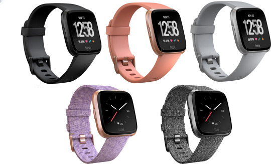
And instead of being big, homely, angular and wrapping halfway around your wrist, the Versa is small, sweet and unbelievably light, even though it’s made of metal (aluminum).

The 1.34-inch screen is square; the body is rounded.
The Versa is smaller and thinner than the Apple Watch. It’s slightly wider, but that’s fine — it makes much more sense to expand along the direction that your arm goes, rather than trying to be a flat object on your curved wrist.
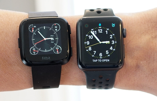
The Versa (left) is slightly wider, but shorter, than the 42mm Apple Watch.
Small is huge. Small means less obtrusive. Small means better suited for many women.
And small means stylish. You can get the Versa in black, silver, or peach aluminum; a “special edition” costs $30 more and comes in dark gray or rose gold. All of them look great, and you can make them look even greater by replacing the included silicone band with a leather, cloth, metal- mesh, or metal-links band.
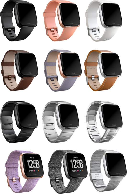
Here’s a sampling of some of the silicone, leather, cloth, and metal bands available.
You can swap bands without tools, although it takes practice. Even after 20 minutes, I never could get the leather band to go on.

Swapping bands involves fiddling with the spring-loaded release lever.
And here’s the truly great part: Fitibt says it goes “four-plus days” on a charge, but it always under advertises battery life. My review unit is happily ticking away on Day Six. Take that, Apple Watch, which you have to charge every single night (and therefore can’t use to track your sleep)!

You charge the Versa by snapping it into a new, spring-loaded stand.
You do, however, sacrifice something for the cheaper price and smaller size: built-in GPS. The Ionic has it, the Versa doesn’t. If you want to map your runs or rides, you have to take your phone with you; the Versa’s software grabs its GPS information from the phone itself.
On the U.S. base model, you also lose Fitbit Pay, which lets you pay for things with your wrist at wireless terminals. Alas, the list of recognizable participating banks are still limited — American Express, Bank of America, Capital One, Wells Fargo, and U.S. Bank. Chase is coming soon. If your credit card comes from one of those banks, and you care about this feature, it’s available for an additional $30 on the Special Edition.
The Fitbit Versa (right) lacks the Apple Watch’s weird bulge on the bottom.
The features
The Versa’s features are mostly identical to the Ionic watch’s, although the new operating system (coming to the Ionic later this year) greatly simplifies navigation.
The Versa has water resistance down to 50 meters, swim tracking and lap counting, 2.5 gigabytes for storing music to play (over wireless earbuds), and auto-recognition of 20 different exercises. It offers guided breathing sessions when you need to relax, and optional hourly reminders to get up and move around.
When it comes to tracking your health, the Versa is a champ. It tallies your steps, calories, and distance; flights of stairs you’ve taken; minutes of exertion; continuous heart rate; and your stages of sleep, which is remarkably accurate and informative.

The touchscreen is square and colorful and very bright.
Underneath, the heart-rate sensor has a third LED light, capable of detecting how much blood oxygen you’ve got (your relative SPO2). Someday, that statistic could provide early detection for conditions like atrial fibrillation or sleep apnea, which would be a huge deal for millions of people.
(Personal sob story: My favorite Fitbit is the incredibly slim, small Fitbit Alta. It does a great job of tracking my stats, including heart rate, during the day and night. But when a foot injury drove me to switch from jogging to stationary biking, I discovered, like many others, that the Alta wouldn’t record my heart rate during exercise! It either dramatically under-reported my pulse rate, or didn’t pick up a pulse at all.
Online, many people with that problem solved it by switching to the fatter Fitbit Charge 2 band. For me, that band did much better — but still sometimes underreported compared to a Polar chest strap. I’m happy to report that the Versa’s heart-rate monitor is dead on during exercise —within a beat or two of the chest-strap’s measurement. Every time.)
You can pay $40 a year to use Fitbit Coach: guided video workouts that play on the Fitbit website or on your smartphone. (They don’t play on the watch itself, although audio-only guidance is available.) There’s a huge variety of duration and intensity, no equipment is required, and Fitbit says that the workouts adjust their intensity based on your own feedback.
Versa the smartwatch
Is the Versa, in fact, a smartwatch at all? I guess it depends on how you define that term. Smartwatches from companies like Apple and Samsung usually offer features like these:
Choice of watch faces. Maybe you like digital, or analog, or elegant, or complicated. The Versa’s app store now offers dozens of faces. Unfortunately, you have to choose them from the phone app (not on the watch) — and making a new selection involves a very slow Bluetooth transfer.

Plenty of watch faces await.
Notifications. Smartwatches can notify you on your wrist whenever one of your phone apps is trying to get your attention (you choose which apps). That’s especially useful when incoming calls and texts arrive. On the Versa, you can’t freely reply or take a call, as you can on the Apple Watch. In May, you’ll be able to respond with canned shortcut responses, but only on Android phones (not iPhones).
Music. You can load about 300 songs onto the Ionic, for playback through Bluetooth wireless earbuds when you’re working out. But you must load them from your computer using a crude Mac or Windows app called Fitbit Connect; it shows only playlists, not songs or albums. There are also Pandora and Deezer apps, but they require a paid subscription. There’s no Spotify.
Voice assistants. On real smartwatches, you can speak to Siri or the Google Assistant, and hear spoken replies. The Ionic has no speaker or microphone, so it can’t do any of that.
An app store. Fitbit’s smartwatch app store has finally begun to pick up steam. There are now about 500 apps available to install on your Versa, including Starbucks, Strava, New York Times, Weather, and so on. They’re all fairly slow and very simple.
Still to come
Fitbit is working hard to make the Versa attractive to women. Starting in May, you’ll be able to record every detail of your menstrual cycle in the Fitbit app — intensity, symptoms, and, of course, dates. Thereafter, it will display a calendar depicting your predicted period week in pink, and fertility window in blue.
Plenty of phone apps do exactly this, but having it part of the Fitbit app makes a lot of sense, because it’s tied in to all your other health stats. Eventually, the company plans to incorporate this other data (heart rate, for example) into its calculations, for even better accuracy.
A semi-smartwatch
To be clear, the Versa is not a smartwatch in the Apple Watch or Samsung Gear sense. It’s not a premium piece of jewelry that runs incredibly fast, runs thousands of apps, has a voice assistant, lets you respond to calls and texts, offers magnetic charging, have its own cellular connection, and so on.
But the Versa’s specs — five-day battery life, a $200 price tag, and small, sweet looks — define a worthy category unto itself. You’ll really like this thing.
David Pogue, tech columnist for Yahoo Finance, welcomes non-toxic comments in the Comments below. On the Web, he’s davidpogue.com. On Twitter, he’s @pogue. On email, he’s [email protected]. You can sign up to get his stuff by email, here.
Read more
Exclusive: What Fitbit’s 6 billion nights of sleep data reveals about us
Google Clips uses AI to snap pictures of your kids and pets — sort of
Why I bought Honda’s plug-in hybrid mystery car
Look up! A dozen ‘air taxi’ flying cars are readying for takeoff
#smartwatch#tech#Pogue#_lmsid:a077000000BAh3wAAD#_revsp:yahoofinance.com#$AAPL#_uuid:a82cc47d-a86f-315a-a849-b66b7b470af8#$FIT#Fitbit#_author:David Pogue
5 notes
·
View notes
Text
Review of this week's No. 1 app: Human Anatomy Atlas 2018
yahoo
Welcome to Pogue’s Rated:App series. Each week, I’ll install whatever is the No. 1 bestselling app on the iOS or Android store and review it, to save you the effort in case it’s a turkey!
This week, the No. 1 bestselling app on the iPhone app store, and the No. 2 app on the Google Play store, is Human Anatomy Atlas 2018.
Like most apps that hit No. 1, HAA is all about visuals; it gives you an interactive, incredibly detailed, medically accurate jaw-dropping 3-D view of the human body.
But unlike most apps that hit No. 1, I know why this app (which has been around for years) suddenly zoomed to the top of the list: It’s usual price is $25, but it went on “super sale” this week for $1. (They haven’t decided when the sale will end.)
Human Anatomy Atlas 2018 is a gigantic, pretty complex app. It’ll eat up 1 gigabyte of space on your phone, and take you some time to learn. Neither of those points would be an obstacle to the app’s target audience: med students and health care pros.
But at $1, this app is suddenly attractive to a much broader range of people. It’s pretty stunning.

Human Anatomy Atlas 2018 puts a colorful, non-smelly digital cadaver on your phone.
What it does
There are, as you may be aware, a number of different parts of the human body, so HAA 2018 offers several tabs that let you control how to begin your exploration:
Regions. Head/neck, abdomen, pelvis, knee, etc.
Systems. Skeleton, circulatory, nervous, respiratory, muscular, digestive, reproductive, etc.
Gross Anatomy Lab. By “gross,” they don’t mean “disgusting” here; they mean “general,” as in “general anatomy.” Here, the app presents a digital corpse lying before you; you can turn it, flip it, or zoom into it.
Cross sections. Here, you get slices (they look like MRI scans) — of the head, thorax, abdomen, or pelvis, from various angles.
Microanatomy. This tab offers close-up views of individual structures like the eyeball, tongue, and hair follicles.
Augmented reality. Here’s the best part, newly added to the Android version of the app (and already part of the iOS version): You can place your virtual corpse onto an actual table (or floor, or desk, or bed) in front of you, and walk around it, using your phone as a viewer. You can even push the phone inside the body, flying through it. It’s freaky and beautifully done and absolutely astonishing — and unbelievably useful, I’d think, to med students.

You really have to see the augmented-reality feature (in the video above, for example) to believe it.
In all of these views, you can tap a body part to dissect it, peeling away layers to see what’s underneath. It’s the cleanest, clearest, least stinky way to take apart a cadaver.
You can also tap a body part to read all about it, or hear its name pronounced.

Tap any structure to read about it, hear its name pronounced, or designate it a favorite part of the body.
There are also 128 quizzes, a testament to the app’s academic purposes. For example, you’re shown an illustration of the leg and asked to tap “the fifth metatarsal.”
Also on tap: Short videos (showing how muscles, joints, cells, organs, systems, and diseases work). Note, though, that you get only one or two examples in each of these video categories; you’re supposed to pay $20 to unlock the rest.

The videos are short, clear, and narrated.
You can also create 3D fly-through tours of your favorite body parts, or create a library of favorite bits, or annotate certain views by drawing on them (with a fairly feeble pen tool — no choice of thickness or color) or typing notes. You can also search for a certain anatomical feature, get help, or choose a different language (seven are available).
We’re talking ridiculously complete.
Get it?
The company behind this app, Visible Body, has been toiling away in Boston for 15 years, refining and refining its medically accurate illustrations of the human body. You may run across their stuff as part of free online classes, in special corporate software for companies like Johnson & Johnson or Medtronic, in textbooks from Pearson or McGraw Hill, and so on.

In Dissect mode, each time you tap a layer, it disappears.
If the app were still $25, I’d tell you that Human Anatomy Atlas is a great learning tool — if anatomy is part of your career.
But at $1, there’s enough magic in this app to recommend it to anyone. Like the human body itself, it’s sometimes icky, often mind-blowing, and always amazing in that it works so well.
David Pogue, tech columnist for Yahoo Finance, welcomes non-toxic comments in the Comments below. On the Web, he’s davidpogue.com. On Twitter, he’s @pogue. On email, he’s [email protected]. You can sign up to get his stuff by email, here.
Read more
Pogue reviews this week’s No. 1 most downloaded app: Sky Guide AR
The controversial Vero is this week’s David Pogue’s Rated:App
Bitmoji is this week’s David Pogue’s Rated:App
This week’s David Pogue’s Rated:App is on Facetune
#tech#_lmsid:a077000000BAh3wAAD#pogue#_revsp:yahoofinance.com#video#Rated:App#_author:David Pogue#_uuid:57009f53-e429-3ff1-8586-f8e011fc74a4
5 notes
·
View notes
Text
Google and Levi's created a digital jean jacket. Here's what I think of it
yahoo
Google has been designing physical goods for years now. But once you’ve come out with your own lines of phones, laptops, speakers, VR goggles, earbuds, and cameras, what’s left?
Clothing.
Yes, Google has teamed up with Levi’s to create the ultimate wearable technology: A great-looking, nosebleed-priced jean jacket ($350). It bears the nearly infinite name, “Commuter Trucker Jacket with Jacquard by Google.”
The CTJWJBG is targeted at a super niche audience: bike riders whose hands are on the handlebars and not their phones.

Google and Levi’s have teamed up to create a digitally enhanced jean jacket.
The handsome blue denim CTJWJBG looks like Levi’s traditional trucker jean jackets, with a few important differences:
Extra pockets in convenient places for your phone, sunglasses, whatever. In addition to the two snap-closed breast pockets and the two regular hip-mounted slash pockets, there’s also a zippered one on the outside left upper arm, as well as a zippered inside breast pocket.

Bonus pockets accommodate the active gadget lugger.
Reflective details on the back, to help you stand out when you’re on the road at night.
Extra back panel to cover your waistband when you’re leaning forward on your bike, to avoid presenting the world with Biker’s Butt.

The back features reflective strips and extra fabric.
A little slit to hold the snap tag. More on this in a moment.
The biggest difference, though, is hidden. On the top surface of the left cuff, Levi’s has woven a grid of conductive, touch-sensitive thread, developed by Google just for this purpose. In essence, it turns your left cuff into a trackpad for simple taps and gestures — yet the jacket remains flexible and, more important, washable. (Levi’s says that the CTJWJBG is the first washable wearable in history.)

Conductive, touch-sensitive threads are woven through the left cuff.
Clearly, a trackcuff (cuffpad?) is going to need power and circuitry. So Google has also developed an impressively thin, flexible, five-inch rubberized strap that it calls the snap tag. It contains the battery, Bluetooth, vibration module, LED light, and all the silicon. When you need to charge the tag (or wash the jacket), you just yank it off. One end fits into any computer’s USB jack for charging, and a charge easily lasts two weeks. You can put the snap tag back onto the jacket with one hand: One end slips into a little slit in the cuff; the other end snaps easily to the cuff.

To charge the snap tag, you pull it out of the jacket and plug it into a USB jack.
The functions
Once you’ve downloaded the Jacquard app for Android or iPhone, and paired the snap tag with your phone, the fun begins.
By reaching across with your right hand, you can make any of four gestures on the trackcuff: Double-tap, swipe upward (away from your hand), swipe downward, or cover the cuff completely.
Using the app, you define what each of those gestures means (well, the swipes and taps, anyway; covering the cuff always means “silence all”). Here are your options:
Play/pause music. This trick, like most of the jacket’s stunts, assumes that you’re wearing earbuds and they’re connected to your phone.
Next track/previous track.
Identify this song. You hear the song name and artist spoken in your earbuds.
Next GPS instruction. For example, “Turn right on Maple Street in two miles.”
“You will arrive in 20 minutes.”
Speak the time.
Speak the incoming text message.
Find Your Phone. Makes your phone start ringing with a special chime, as long as it’s within about 30 feet of the jacket.
Count. Weird but neat: every time you make this gesture, the jacket increments a running tally. You can use it to count patrons coming into the bar, or number of F-bombs in a comedian’s speech, or birds you’re spotting—anything you like.
Illuminate. Lights up the LED on the left cuff button.
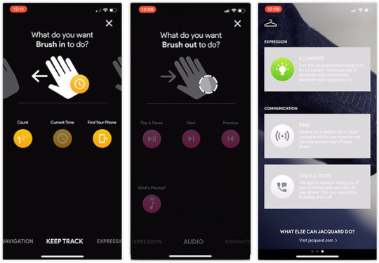
It’s easy to program the three cuff gestures.
In addition to these customized gestures, double-tapping always means “answer this call” (or “hang up this call”). When you’re pedaling along and a call comes in, your wrist buzzes, the left snap lights up, and, when you double-tap your left wrist, you can take the call.
And covering up the entire cuff always means, “Hold everything.” Music pauses, phone calls are quiet.
All of these gestures work flawlessly. I mean, the jacket and phone respond instantaneously and effortlessly, every single time. That part, Google and Levi’s have truly nailed.
But remember: You get to choose only three of those gestures! If you’ve set up the swiping to mean next track/previous track, and double-tapping to mean play/pause, then you can’t use any of the GPS, Find Phone, Count, or Illuminate functions (at least, not without firing up the app and changing the settings).
That limitation means that the CTJWJBG is one very expensive three-trick pony.
It’s not even the only pony on the block. You can already control your music playback with the switch on your earbuds cord — no jacket needed. And if you have speech-enabled wireless earbuds, like Apple’s Airpods or Google’s Pixel Buds (half the price of the jacket), you can do all of that stuff by voice. In that regard, the jacket feels like a juicy, but somewhat redundant, luxury.
The future
Google and Levi’s are well aware of the success/failure they’ve got on their hands. “This is a pilot product, not the final realization” of the idea, a product manager told me.
Already, since the jacket’s introduction last fall, Google has added new features to the app, and Levi’s, for its part, says it’s very interested in pursuing this concept. “Right now, we have a touch sensor, but we could add more sensors: temperature sensor, heating plates, motion sensors —everything is possible. This jacket is a first step,” says the Levi’s rep.
He also pointed out, by the way, that, “for the first time in the history of apparel, we have an insight on how it’s being used. We’re getting an indication of which gestures, which features people use the most.”
Yes, that’s right: This jacket collects data about you. What did you expect from a Google product?
(The companies stress that this data is aggregated and anonymized — they’re not tracking you, only all jacket buyers as a group.)
A non-digital Levi’s Trucker Jacket usually costs $90 (in fact, they’re $70 at the moment). So adding the Google part more than triples the price.
Clearly, at that price, not many people will buy this jacket, and they shouldn’t. But that’s fine with Google and Levi’s. Their goal wasn’t to crank out a bestseller; it was to develop a trial balloon, to take a first step into our digital-clothing future. And in that regard, it’s safe to say that the CTJWJBG experiment is a beautifully designed, flawlessly operating success.
David Pogue, tech columnist for Yahoo Finance, welcomes non-toxic comments in the Comments below. On the Web, he’s davidpogue.com. On Twitter, he’s @pogue. On email, he’s [email protected]. You can sign up to get his stuff by email, here.
Read more
Google Clips uses AI to snap pictures of your kids and pets — sort of
Why I bought Honda’s plug-in hybrid mystery car
Look up! A dozen ‘air taxi’ flying cars are readying for takeoff
#_uuid:ad538740-e650-35ce-874d-92abfbd58b3a#_lmsid:a077000000BAh3wAAD#$GOOGL#_revsp:yahoofinance.com#$GOOG#_author:David Pogue
1 note
·
View note
Text
Pogue reviews this week's No. 1 most downloaded app: Sky Guide AR
yahoo
Welcome to David Pogue’s Rated:App series. Each week, I’ll install whatever is the No. 1 bestselling app on the iOS or Android store and review it, to save you the effort in case it’s a turkey.
This week, the No. 1 bestselling app on the iPhone app store is an augmented-reality stargazing app called Sky Guide AR ($2.99). It’s a dazzling piece of software, with an amazing 4.8 rating on the app store.
As usual, I have no clue why this app suddenly popped up to the top of the list. It’s been around for years, and it’s very similar to other, even older apps, like StarWalk. But since Sky Guide AR did land at No. 1, it’s fair game to be this week’s Rated:App!

Sky Guide AR identifies the stars, planets, and constellations as you move your phone.
What it does
The moment you open this app, you understand it: Your phone is now a viewer for the sky above you. It depicts all the stars, planets, and even satellites that you’re pointing the phone at, and labels them, and draws the appropriate pictures for the constellations. You know — fish for Pisces, a scorpion for Scorpio, and so on.

Sky Guide is like a window onto the sky above you.
You match up what you’re seeing with what’s on the screen: that’s Andromeda, that’s Venus, that’s the International Space Station, and so on. It sure beats someone next to you pointing vaguely and going, “OK, it’s just to the right of those two little dots there below the big dot… do you see it?”
As you move the phone around in any direction, the app shifts what it’s showing you, smoothly and beautifully. A shimmery, pulsating musical soundtrack plays as you go (you can mute it if you like) —hotter stars make higher notes, and brighter ones make louder notes. You can zoom in with the usual two-finger pinch/spread gestures, and you can adjust the brightness by dragging two fingers up or down, to better match the actual color of the sky.
If you tap an object, a pop-up panel appears to describe it for you: Its distance, size, color, and so on.

Tap a celestial body to read more about it.
Of course, there’s nothing to stop you from using the app during the day, or even indoors; it still shows you what celestial bodies are in front of you or above you. In fact, one of the coolest things to do is to aim it downward; the app shows you what’s below the horizon. After the sun’s gone down, for example, you can see exactly where the sun is.
Also fun: At the top of the screen, there are VCR-type controls that let you speed up or rewind the movement of the stars overhead; you can also tap in a specific date. That’s cool if you want to see how the stars were aligned the day you were born, for example, or how a constellation’s path will shift over the seasons of the year.

You can fast-forward or rewind the sky.
You can install a Sky Guide widget on the iOS 11 Today screen (which hangs out to the left of your home screen) that shows you what cool astronomical events or satellite fly-bys are happening today.

At your option, Sky Guide can add a widget to your iOS “Today” screen.
Get it?
You really have to watch the video above to appreciate how lovely and magical this app is.
If you’re curious, scientific, or fascinated by the stars, $2.99 is well worth it; Sky Guide AR is either the best augmented reality stargazing app or among the best. If you’re only casually interested, on the other hand, you may find that the novelty wears off fairly quickly.

Sky Guide is perfect for space-station fly-by spotting.
But that’s quibbling only with the concept. The execution of this app is flawless, and it’s a spectacular example of augmented reality’s promise.
David Pogue, tech columnist for Yahoo Finance, welcomes non-toxic comments in the Comments below. On the Web, he’s davidpogue.com. On Twitter, he’s @pogue. On email, he’s [email protected]. You can sign up to get his stuff by email, here.
Read more
The controversial Vero is this week’s David Pogue’s Rated:App
Bitmoji is this week’s David Pogue’s Rated:App
This week’s David Pogue’s Rated:App is on Facetune
#tech#_lmsid:a077000000BAh3wAAD#pogue#_revsp:yahoofinance.com#_uuid:7ca3a176-bf87-3e8c-9c44-b4e9c0fd96a2#Rated:App#_author:David Pogue
4 notes
·
View notes
Text
The controversial Vero is this week's David Pogue's Rated:App
yahoo
Welcome to David Pogue’s Rated:App series. Each week, I’ll install whatever is the No. 1 bestselling app on the iOS or Android store and review it, to save you the effort in case it’s a turkey. If you’re viewing this on your phone, in an app or Facebook or Twitter, the video plays vertically — it fits your screen exactly, so you can see what it’d look like if you were running the app yourself!
When I started this series, I was sort of worried. What if the No. 1 app every week was the same? What if it’s the Facebook or Instagram app, week after week?
So far, that hasn’t happened. In fact, the app that popped up at the top spot this week — briefly — is a total shock. It’s been around since 2015, it’s got only a 2.2 rating out of 5 on the app stores, and it wasn’t even in the top 100 last week. What’s going on!?
The app is Vero (rhymes with “arrow”). It’s a social network, modeled on Instagram. And its sudden arrival in the top spot has to do with an announcement the company made: That the first million people who signed up would get to use Vero free forever. After that, the company said that it would charge money to use the service. (It hasn’t said how much.)
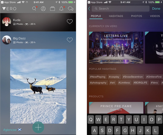
Vero, a “new” social network, seems a lot like Instagram.
In other words, the app’s sudden surge is based on FOMO, the fear of missing out. People rushed to grab Vero, just in case it someday becomes a thing.
It won’t.
Instagram Plus
Vero is basically Instagram — a scrolling infini-list of photos posted by your friends, with the option to leave comments or “like” them — with a few enhancements:
It has a dark design — black background.
The “newsfeed” posts appear chronologically. On Instagram, by contrast, mysterious algorithms determine which posts you see, and in which order — a setup that a lot of people despise.
There’s no advertising. That’s why the company plans to charge people to use Vero.
The company says that it won’t collect any data on how you use the service.
What you can post is more flexible than what Instagram permits. Photos can be any shape, and you can also post links to books, movies, TV shows, or places.
Each time you post, you can specify which of your social circles gets to see it: Friends, Close Friends, Acquaintances, or Followers. (Yes, this means that every time you add a friend, you must specify which category that person falls in.) Shades of Google+.
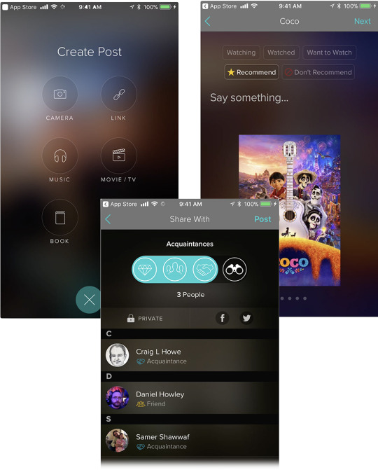
Your Vero posts can include more than photos (top), and you can specify which social circle gets to see them (bottom).
Some of those are noble and welcome changes. But before you dive in…
What’s wrong with Vero
Vero enjoyed a 48-hour moment of No. 1 glory earlier this week, but then came a backlash the size of Jupiter.
The biggest gripe is that Vero is slow and glitchy — and it was. The service was overwhelmed by all of those fear-of-missing-out new members, so network errors and “server could not be reached” messages were constant. Vero even extended the “free forever” deal beyond the first million people, as a way of saying it’s sorry.
Those errors are less frequent now, although it still takes a long time to post a photo — close to 10 seconds.
The other elements of the backlash include some worthy complaints, and some that are more “truthy” than realistic:
Ayman Hariri. Vero’s billionaire CEO is the son of Lebanon’s former prime minister, and, for a while, deputy CEO of his family’s construction company, Saudi Oger. When that company shut down, over 31,000 workers sued for unpaid wages. But Vero notes that “Ayman has had no operational, management or board oversight of Saudi Oger since 2013… His full attention since that time has been on bringing Vero to its community of users.”
It’s hard to cancel. You can’t cancel your own account. Instead, on your account page, you tap the ? button, then “Choose a department, then “Delete my account.” But here’s the fishy part: Now you have to wait for a Vero representative to reply “as soon as possible.”
Russians wrote it. This may not be the time to ask Americans to trust a new social-media app that was coded by a largely Russian team. (“At the end of the day, where people are from is really not how anybody should judge anyone,” Hariri told Time.)
You surrender all your photos and videos. When you sign up, you must OK an agreement that gives Vero the right to “use, reproduce, modify… your user content.” Of course, that’s standard software legalese, stuck in there by the legal department; other social networks have similar terms. But it’s really foolish.
There’s nobody on it. A social network feels pretty empty until you’ve got some connections set up to your friends. And with just over 1 million members, Vero is no Facebook (2 billion) or Instagram (800 million); I had a hard time finding people to connect with, and I’m getting tired of Zack Snyder and British GQ (two of the handful of accounts you’re encouraged to follow). And without members, a social network won’t thrive; just ask Ello, Peach, Yo, or Mastodon.

Just how many Kardashians does a social network need?
The biggest knock against Vero, though, is that it’s just unnecessary. The world doesn’t really need another social network, especially one that’s mostly just like Instagram, especially one that charges people to belong.
Vero’s policies against data collection and algorithmic newsfeeds are attractive. But at this point, it’s facing a substantial reputational backlash, it doesn’t work very well, and its surge of membership was based on a FOMO offer that it won’t be able to repeat.
David Pogue, tech columnist for Yahoo Finance, welcomes non-toxic comments in the Comments below. On the Web, he’s davidpogue.com. On Twitter, he’s @pogue. On email, he’s [email protected]. You can sign up to get his stuff by email, here.
Read more
Bitmoji is this week’s David Pogue’s Rated:App
This week’s David Pogue’s Rated:App is on Facetune
#_lmsid:a077000000BAh3wAAD#_revsp:yahoofinance.com#_uuid:cb946d3a-ddf8-3bbc-83e5-b47cf1ba8dbc#_author:David Pogue
3 notes
·
View notes
Text
Google Clips uses AI to snap pictures of your kids and pets — sort of
yahoo
In its day, Google has produced some truly bizarre hardware products. (Remember the Nexus Q, Google’s “set-top sphere”? Me neither.)
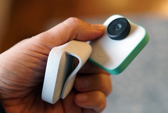
Well, don’t look now, but here comes the company’s weirdest hardware yet: Google Clips ($250).
It’s a tiny, thin camera, about the size of two stacked Triscuits, that combines elements of a spy camera, GoPro camera, and cellphone camera.

Google’s latest hardware product is a strange little AI camera.
The Clips is designed for parents (of children or pets). Of course, we all have perfectly good cameras in our phones — actually, better cameras. But using only our phones presents a few problems:
You’re never in the pictures with your your kid or pet.
Babies and toddlers often stop whatever cute thing they’re doing when they see your phone come out, because it’s kind of big and intrusive.
You can’t predict when your subject is going to do something adorable; odds are pretty good that you’ll miss it.
If you film or shoot enough that you always capture the good stuff, then you’ve got endless quantities of stuff to edit.
All your photos and videos of your kid are taken from the same angle: Your height.
The Clips is just thick enough that it can balance on its edge. It also comes with a rubbery holder/case, which can act either as a kickstand or a clothespin, so you can clip it to things to get cool angles. (The name “Clips” is a pun, involving both the rubbery clip and the short videos that the camera captures. More on that in a moment.)
The Clips comes with a silicone clip case.
When something adorable starts happening, you pull out the Clips; rotate its black lens to turn it on; and set it down (or clip it) between three feet and eight feet from the action.
At this point, of course, there’s nobody pressing the shutter, and there’s no self-timer. Instead — this is the Clips’s headline feature — the camera uses artificial intelligence to decide what and when to capture. Whatever it grabs shows up on your phone, in the Clips app (iPhone or Android).
The camera supposedly learns, over time, who’s in your family, by seeing which faces appear most often. (The camera’s ability to recognize people, dogs, and cats is brought to you buy the AI built into Google Photos. In fact, if you’ve used Google Photos to tag faces with names, the Clips treats those people as familiar faces, and favors them in its photography.)
There’s one button on the camera, too, which you can use to snap portraits manually, as a way of telling it, “This is one of the people I care about.”
Clips and privacy
Once you’ve turned the lens to turn on the Clips, it watches the room for three hours on a charge. An LED indicator gently blinks to tell you that the camera is watching, but you get no indication when it’s actually capturing.
Clearly, there’s a creep factor to a camera that decides on its own what to shoot and doesn’t tell you when it’s rolling. For that reason, Google has gone to extremes in trying to reassure you about privacy:
This camera isn’t connected to the internet — can’t be connected. All of the AI and learning is done right on the camera, not on some cloud servers. (Google says that that feature, building machine learning AI into something this tiny, is a big accomplishment. A camera like this could not have existed a couple of years ago — that much computing power would have eaten up the battery charge in a heartbeat.) The only connection is to your phone.
The photos are encrypted on the camera. If someone steals it, they’ll have no access to what you’ve shot.
The camera doesn’t record sound with its videos.
Man, that one hurts. No sound? So what does it record? Like so much about the Clips, this part requires some explanation.
The app
The Clips snaps bursts of 105 photos, which it insta-stitches together into what Google calls a Motion Photo — basically, a seven-second silent video clip. One that plays a not-very-smooth 15 frames a second. (TV, for comparison, shows you 30 frames a second.)
Weird, right?
What’s impressive is how fast the camera sends fresh recordings to the corresponding Clips app on your phone (it uses a private Wi-Fi Direct connection).
Here’s what else you can do in the app:
See a live preview of the camera’s view, since the camera itself has no screen.
Manually trigger a capture.
Quickly and efficiently scroll through the captures: swipe left to discard one, swipe right to save it to your phone’s camera roll. On the iPhone, it becomes what Apple calls a Live Photo — a still photo that, when hard-pressed with your finger, plays a three-second video clip. (In this case, the Live Photo has a seven–second video clip, which represents some sneaky engineering by Google.) On Android, it remains a Motion Photo.
Shorten or crop a video.
Pull out one frame of the video as a still image, although it’s common to get motion blur in these.

Stills you pull out of the Clips’s videos are often motion-blurry.
Use the app’s own AI to choose a subset of the captures — the “winners” — automatically.
Adjust settings so that the camera captures shots with greater or lower frequency.
The app is really well done. The actual photos are another story.
What you get
Despite the cool idea of an AI camera, the results are disappointing.
The photos don’t look as good as your phone’s. In low light, they’re grainy; indoors, there’s often motion blur.
The camera has a fixed-focus, very wide-angle (130-degrees) lens. As a result, anything closer than three feet is out of focus, and anything farther than eight feet looks really tiny. And anything near the edge of the frame gets bizarrely stretched and distorted.

Note to craniofacial surgeons: There’s nothing wrong with Cody’s head. That’s just something the Clips camera does.
But the bigger issue is that the AI doesn’t work especially well. It captures things, all right, but I’m not sure that its artificial intelligence is any match for your intelligence.
I spent a morning with my adorable five-month-old friend Cody and his mom Lauren. The Clips caught plenty of cute clips — but not always the great ones. At one point, Cody managed to flip himself from back to front. “Good job!” his mom exclaimed. “Did it record that?” she asked me.
No, it did not.
At my own house, I love tossing cat treats for Wilbur the Wonder Cat. He bounds across the slippery floors, chasing it like a cat out of hell, and then pounces on the treat, skidding hilariously three or four feet. I set up the Clips at the right spot for the landing and tossed the treat on target over and over again. The Clips couldn’t get the Wilburdive.
Then there’s also the central concept of trusting the capture. Yes, it’s AI, but what does that mean?
Google says that the camera is waiting for the right combination of lighting, composition, and smiling faces. But do you want photos (or silent video clips) only of the happy moments in your life? Is it possible that you might sometimes want to capture an unhappy moment — say, the tragicomic moment when your 4-year-old’s ice-cream scoop falls off its cone? Google’s AI won’t capture that. (The company says that it plans to offer preference settings for emotional tone in a future update.)
I love the idea of a camera that uses AI to capture the good stuff all by itself. And I do love the freshness of the angles and positions that the Clips’s clip permits.

You can pop the Clips camera into places and angles where your phone would never work.
I just don’t think that much of the Clips’s clips.
You’re paying $250 for a camera that can’t directly take stills and can’t capture video with sound. It doesn’t work as an “ambient camera,” like a security camera that’s rolling all the time. It doesn’t work as a GoPro-type camera, either; its super wide angle means that if it’s clipped to, for example, your body, the video is unwatchably jerky. And its AI-only sort of works.
I’m glad that Google did the Clips experiment, because there are some really good ideas here, and real-world problems to be solved. I just don’t think you should buy it.
David Pogue, tech columnist for Yahoo Finance, welcomes non-toxic comments in the Comments below. On the Web, he’s davidpogue.com. On Twitter, he’s @pogue. On email, he’s [email protected]. You can sign up to get his stuff by email, here.
Read more
Why I bought Honda’s plug-in hybrid mystery car
Apple’s HomePod speaker: Either way late or way early
The tiny, 4K Mavic Air crushes other DJI drones
#_uuid:b22051ee-f9ba-3477-bef6-32ecd67d58c1#Google#Pogue#_lmsid:a077000000BAh3wAAD#$GOOGL#_revsp:yahoofinance.com#$GOOG#video#Google Clips#_author:David Pogue
1 note
·
View note
Text
Microsoft CEO talks about immigration, empathy, and cricket
yahoo
This past Sunday, “CBS Sunday Morning” aired my profile of Satya Nadella, who’d worked at Microsoft for 25 years before being chosen to become the third CEO in Microsoft’s history. (You can watch the CBS story here.)
Nadella’s thoughtful, gentle personal style could not be more different from the brash, aggressive approaches of Bill Gates and Steve Ballmer. So far, his style seems to be working: Microsoft’s (MSFT) stock has more than doubled in the three years he’s been at the helm.
I spent an entire day with Nadella, including some time in his home with his wife Anu and son Zain. As always, we had time for only pieces of the interview on TV — so here’s a more complete edited transcript.

Satya Nadella sat down for an interview for “CBS Sunday Morning.”
Pogue: In your book, “Hit Refresh,” you talk a lot about empathy and compassion. Bill Gates and Steve Ballmer, during their tenures here, had terrific strengths, but I’m not sure compassion would be the word that jumps out.
Nadella: In their own way, I feel that they have a lot of that, very deep. But when I think about empathy or compassion, pick your word, I just don’t think that this is a soft skill that’s nice. I think it’s a business essential.
And I’ll tell you why. We are in the business of meeting unmet, unarticulated needs of customers all over the world, long before even they can articulate it. If we can do that, then we will be successful. If we can’t, we won’t. It’s an essential skill, an essential attribute, for product creation.
Pogue: And yet at this time in America, compassion seems harder to come by than in other times.
Nadella: I’m a product of two amazingly unique American things. One is American technology reaching me where I was growing up, and making it possible for me to dream; the other is the enlightened American immigration policy, allowing me to come and live that dream.
When I sit here, as unlikely CEO of Microsoft, both of those come to mind. So I’m long-term optimistic. I always will say that in the U.S., the real currency is that ability to take differences and bring people together to make our society a stronger society.
Pogue: What is your relationship with the president?
Nadella: I’ve had a chance to meet him a couple times. Once before he was inaugurated, in Trump Tower, and once after, when he called all the tech leaders to meetings in the White House. Good conversations.
I mean, one of the core goals that the administration has is to modernize the government, the technology. And we obviously have longstanding relationships with all the government agencies, and it’s much needed.
Pogue: But what about this initiative, the DACA repeal? Sending home children of undocumented immigrants in this country? A number of them work here at Microsoft. You’ve publicly disagreed with that.
Nadella: Absolutely. Wherever there is any public policy that is not sympathetic to diversity and inclusion, foundational human values that we care deeply about, our employees care deeply about, we’re gonna be very principled in our opposition to it.
Pogue: And you have offered to do something for the employees of Microsoft who will be affected by this DACA repeal…
Nadella: We’ll fight on their behalf, in the courts. We will intervene wherever and however possible. Like we are in other areas, like privacy.
Pogue: Having read the book, you strike me as a kinder, gentler CEO. It seems you want people to get along. For example, you express frustration at the fiefdoms and bickering you inherited among Microsoft employees. You inherited lawsuits that had been dragging on in court, with Samsung and others, and you said, “Guys, guys, guys. Can’t we work it out?” And you raised a lot of eyebrows when you started writing Microsoft Office products for your direct competitors, like iPhones.
Is that a good characterization of your style?
Nadella: Yeah. It is. It’s not about viewing this as zero sum. It’s being able to face up to the realities. I like to describe this as courage in the face of reality.
But at the same time, looking back at our history has been helpful. The number of billion-dollar franchises that were built on Windows is far greater than any other platform. So I said, “Okay. Let’s start viewing today’s world with what made us good in the first place.” So when it comes down to, “hey, there are a billion smartphones!”, it only makes business sense for us to make sure our customers can use our applications and our cloud services on them.
Pogue: Your new strategy is “Cloud first, mobile first.”
Nadella: Actually, we’ve updated that.
There is more technology in our life, not less, with each passing day. We started with mainframes, and then to PCs, which we had on our desks. Now we have smartphones in our pockets. Now we have sensors that go beyond the pocket — on your wrist, or holographic or mixed reality computing, where what you see is a mix of the analog and the digital world.

Microsoft’s Alex Kipman shows me his team’s Hololens, an augmented-reality visor.
So we are in the secular march to more and more computing in our lives. So what technological paradigm makes all this possible? That’s what we describe as the intelligent cloud and the intelligent edge. We’re evolving to more of an intelligent cloud and an intelligent edge, which means that you’re going to have many, many devices.
Pogue: So the cloud is, in super simple terms, the control center that’s on the internet; what’s the “edge”?
Nadella: All the devices, and the application experiences that span all the devices.
Pogue: That’s where the edge of the cloud meets the real world?
Nadella: That’s correct. That’s a great way to describe it.
You will go from device to device, whether it’s in a conference room, your work, or in your home. You’re gonna have thermostats, TVs, speakers, PCs, phones, and your app is going to be spread across all of it. The experience is going to be spread across all of it. It’s enabling you to be mobile, as opposed to the device being mobile — that’s the architecture that we’re moving towards.
Pogue: Microsoft famously missed the boat on smartphones. I actually liked Windows 10 on the phone a lot — why did it fail?
Nadella: Sometimes these digital ecosystems have real “network effects.” The first one to the market shapes it, and then there’s always room for the second one. But whenever it comes down to third or fourth ecosystems, they’re hard.
The lesson I learned from our own obsession of PC being “the hub for all things, for all time to come,” is that there’s no such thing as one device that’s going to be the hub for all things for all time to come! Everybody thinks that the current devices is the last device you’ll ever need — until it’s not.
And so the question is then, what is the constant here? The constant is the person. And so if you start building useful services to them, that span all their devices… Whether it’s a phone, a PC, a large screen in my office, a speaker — all of them are Office 365 devices.
Pogue: Cloud services has been a big push of yours, right? Where you provide other companies with these gigantic data farms that are too expensive and technical to run themselves?
Nadella: Absolutely. This is a push that actually Steve got started, and while working for Steve, I started some of our infrastructure side.
These are fast-growth businesses. We now have in excess of $20 billion run rate — and growing at a very, very fast clip. And so it requires both a significant amount of capital investment, and great innovation in software. And we’re excited about the future. For example, one of the big, new things that we are doing is, how do we infuse into all of our cloud services artificial intelligence?
You can now use PowerPoint, and while you’re presenting, automatically translate what you are saying into 60-plus languages simultaneously. That’s AI in action. But every app developer on Azure [Microsoft’s suite of cloud services] has access to that same capability, and that’s really what’s on our agenda.
Pogue: You’re really doubling down on Microsoft’s investments in AI. But some experts, Elon Musk and Stephen Hawking, are deeply concerned about our rush into artificial intelligence. They’re saying, “Slam on the brakes,” not slam on the accelerator.
Nadella: The way I come at it is perhaps a little more pragmatic.
The rate of progress in AI is stunning, there’s no question. But anything like AGI, or Artificial General Intelligence, we are some ways away. That’s where the machine is as good as a human being in everything.
Think about humans. We can be put in a new environment. We’ll learn. We’ll adapt. But the roadmap to achieving something like that in AI is a long ways away. We are very, very early on.
But to your point, we as creators of AI have a real responsibility to make some design decisions. We should build AI that we can be accountable. I don’t want us to abdicate. “Oh, we created some program that learns. We don’t know how it learns.” That’s just not a way for us to proceed.
Pogue: In your book, you write movingly about the birth of your son, Zain, who’s quadriplegic; there’s an implication that that event changed you.
Nadella: Yeah. There have been a few moments where, in my personal life, there were really these “hit refresh” moments, and Zain’s birth clearly was one such. A few hours before Zain was born, if somebody had asked me, “What are the things that you are thinking about?”, I would have been mostly thinking about, “How will our weekends change?” And childcare, and what have you.
Obviously, after he was born, our life drastically changed. My wife Anu had to drop out of the workforce to take care of him fulltime. To be able to see the world through his eyes, and then recognize my responsibility towards him, has shaped a lot of who I am today, and shaped even how I show up in other places, whether it’s at work or with my other children.

Satya and Anu Nadella met in India when they were in elementary school.
Pogue: So that empathy has even changed how you lead?
Nadella: When you lead, there’s no way you can motivate anyone if you can’t see the world through their eyes.
There’s no way you can get people to bring their A game if you can’t create an environment in which they can contribute. But creating that environment requires you to be in touch with, what are they seeking? What motivates them? What drives them? What are their needs?
And, of course, the fact that you practice empathy at work will only make you a better parent, a better partner, and a better person all around.
Pogue: Well, I know one thing you probably miss, having moved to America. You have no one to talk to about cricket.
Nadella: Well, I mean, it’s no longer true! Because in this connected world of ours — one of my subscriptions is for a TV channel. And so I’m watching cricket all the time.
Pogue: All right, we have about 10 seconds left. Explain to me the rules of cricket.
Nadella: No. (laughs)
David Pogue, tech columnist for Yahoo Finance, welcomes non-toxic comments in the Comments below. On the Web, he’s davidpogue.com. On Twitter, he’s @pogue. On email, he’s [email protected]. You can sign up to get his stuff by email, here.
#_uuid:74d0da62-8d25-3fb5-90f2-241e105bd82a#_lmsid:a077000000BAh3wAAD#_revsp:yahoofinance.com#$MSFT#_author:David Pogue
2 notes
·
View notes
Text
Why I bought Honda's plug-in hybrid mystery car
yahoo
At Christmastime, in the noble tradition of proud parents everywhere, I unloaded — I mean, generously donated — my 2009 Honda Fit to my college-student son.
That gesture wasn’t pure, heart-warming nobility; I wanted a new car. Specifically, an electric car.
I don’t know if you’re aware of how juicy the deals are on these things. Obviously, the main reason you’d get one is because they’re much better for the environment. (Yes, they run on electricity, which still requires burning some fossil fuels to generate — but the impact of electric cars is drastically lower than gas cars.)
But even if you don’t care about being green, an EV (electric vehicle) still get you all of this:
A tax credit from the Federal government. That’s not a tax deduction, which lowers your income before you calculate the tax. It’s a tax credit, which is money in your pocket after taxes. Depending on the car’s electric range, it’s up to $7,500.
Money back from the state. Forty-five states currently offer juicy EV incentives, usually cash. I live in Connecticut, where it’s $2,000. Nothing to do with taxes — it’s just a check they send you.
You save tons of gas money. Electric-car owners never, ever pay for gas.
Special parking places. My Connecticut town is more progressive than most, but it’s got dedicated electric-car parking spaces at the grocery, library, train stations, town hall, and so on. They’re right next to the handicap spaces, and each one has a charging station. Free electricity while you’re shopping!
Drive alone in the carpool lane. Many states welcome EVs to the carpool (HOV) lane.
The brakes last, like, forever. When you brake, magnets capture your momentum and use it to recharge the battery, saving the brake pads.
They ZOOM! An electric car has incredible torque (translation: instant acceleration). They are fun!
They’re silent. There’s no engine noise, obviously. You hear only a faint hum/whine when you put the pedal down. Your music sounds that much better.
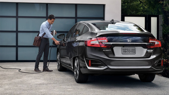
Owning a plug-in means remembering to plug in.
Of course, we all know why more people aren’t buying electric cars: range anxiety. Unless you’ve got something like a Tesla or a Chevy Volt (over 200 miles on a charge), you’re limited in the drives you can take. And it’s not like you can pull into a station and refuel in five minutes. You have to plan your life around charging stops: lunch, overnight stays. It’s a hassle.
But here’s the point of this article: There is a way to get all the advantages of electric without the range anxiety: plug-in hybrids. (Geeks call them PHEVs, for plug-in hybrid electric vehicles. Man, they really need a catchier name.)
A plug-in hybrid is electric with a gas-engine backup. Once the big battery’s dead, the car becomes a regular hybrid, like a Prius or whatever. Amazingly, the gods of legislation have determined that these cars are entitled to all the same goodies that pure electrics are.
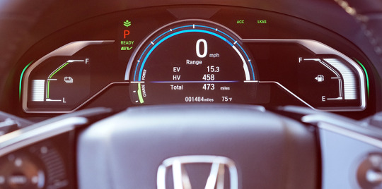
In a plug-in hybrid, you have two “fuel gauges” one each for battery charge (left) and gas level (right).
You can plug in one of these cars into a standard power outlet in your garage, as you would a lamp or something; it charges overnight. Or you can install a 240-volt outlet, like the one for a refrigerator; the car charges in a couple of hours. (Handily enough, public charging stations are 240V, too.)
There are lots of plug-in hybrid models. As a handy benefit, most of them are loaded with the latest autonomous safety features:
Lane keeping. If you start to drift out of the lane without your blinker on, the car warns you and guides you back into the lane.
Collision avoidance. If you’re coming too fast toward a slowing car ahead, the car warns you and actually brakes for you to avoid a collision.
Adaptive cruise control. You set a speed you want to maintain — let’s say 65 mph. At that point, the car speeds up and slows down (even stopping, if necessary) as necessary to avoid hitting the car in front of you. A button on the wheel controls how many car lengths you want your car to hang back.
Self-parking. Well, sort of: The car turns the wheel for you, but you still have to manage the shift lever and gas/brake pedals.
Here’s the journal of my quest to buy the perfect plug-in hybrid family car — and why we wound up buying an obscure, no-name Honda in the end.
Prius Prime
My wife and I started with a test drive at the local Toyota dealership. Our other car is a Prius, which we’ve always loved. (If the Tesla 3 I ordered two years ago ever shows up, we’ll sell the Prius.)
Anyway, we liked the looks of the Prius Prime, a plug-in hybrid. OK, we didn’t actually like the looks, but — you know.
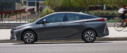
The Prius Prime has a distinctive, polarizing look.
Here’s what we loved about this car:
The price. The base model is $27,100. The Federal tax credit is $4,500 for this model. With the Connecticut kick-in, my final price would be $20,600.
The hybrid MPG. You go 25 miles on pure electric; after that, the hybrid (gas-and-electric) mode gets an amazing 55 miles a gallon. Total range is 640 miles on one gas tank, which is extraordinary.
The wireless phone charger. If you have a recent iPhone or Samsung Galaxy, for example, you can just set it down in the center console — it instantly starts to charge, magnetically.
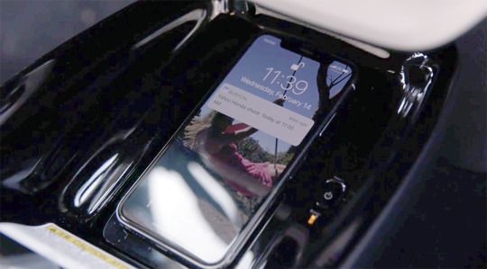
Why don’t all cars have Qi wireless phone charging pads built-in?
Cool smart stuff. Lane-departure warning, front-collision braking, and automatic high beams are all included in the base model.
The heads-up display. Just as on a fighter jet, the Prime can project important stats in space in front of the driver — your charge status, speed, current speed limit. It seems to hover a few feet in front of the windshield.
Here’s what we didn’t love:
It’s a four-seater. My wife and I have a blended family with, on and off, five kids. We’d really miss a fifth seat.
The trunk is the size of a subatomic particle. The batteries in this baby take up most of what would have been the trunk. We sometimes have to drive to our kids’ colleges in Massachusetts and Vermont, loaded up with stuff. That wasn’t gonna work.
25-mile electric range. That’s really not a lot. Would 25 miles cover your commute both ways? Remember that cold weather can cut your battery capacity in half.
All touchscreen. No volume knob at all. Auuugh! And no Apple CarPlay or Android Auto.
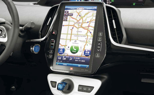
As on a Tesla, most of the Prius Prime’s controls have been moved to a touchscreen, meaning you have to take your eyes off the road to use them.
The ride. Man, this car hates rough pavement. It’s a bumpy ride. Also, as Car & Driver puts it, this is no sports car. “You buy this car to pass gas stations, not other vehicles.”
The good stuff costs. The heads-up display, phone charger, self-parking, and blind-spot monitor stuff are available only on the higher-end models, which erase a lot of the price advantage.
Chevy Volt
Man, if you want electric range (and you do), it’s hard to beat the Chevy Volt. This baby goes 53 miles on pure electric, more than any other PHEV. For a lot of people, especially commuters, that should cover it most of the time. (It’s easy to confuse this car with the Chevy Bolt, which is all electric — 238 miles of range, no gas hybrid mode.)
We took a test drive, and concluded that we loved these things about the 2018 Volt:
53-mile pure electric range. Of course, that also means it takes longer to charge fully: 13 hours on 120V, and 4.5 on 240V.
Super fun to drive. It’s a great ride.
It looks amazing. It’s a great-looking car.

The Chevy Volt looks awesome, even in a dealership parking lot in winter.
There’s also, unfortunately, quite a bit not to like:
It’s another four-seater. Chevy says it seats five, but that’s hilarious. You’d fit in the back middle seat only if you were a Barbie doll. Even the two actual rear seats are super-cramped; at 6 feet 2 inches, my head was mashed firmly against the roof.

The Chevy Volt’s back seat isn’t made for tall people.
It’s claustrophobic. Visibility is not good from the driver’s position.
It’s pricey. The base price is $34,100 — that’s $7,000 more than the Prius Prime. If you want the self-driving stuff (lane keeping, forward collision avoidance, self parking), the grand total is $40,000! Yeah, the tax credits and refunds will help, but… wow. This is a subcompact car.
The marketplace
We sat down that night to look at our other options. There’s a huge range of plug-in hybrids available; here’s a sample, showing base price and electric range. Notice anything in common with their all-electric ranges?
Audi A3 eTron: $37,900, 16 miles
BMW 330e: $44,100, 14 miles
Chrysler Pacifica (minivan!!): $42,000, 33 miles
Ford C-Max Energi SE: $27,120, 20 miles
Ford Fusion Energi: $31,100, 22 miles
Hyundai Sonata PHEV: $34,600, 27 miles
Hyundai Ioniq PHEV: $25,000, 29 miles
Kia Optima PHEV: $35,210, 29 miles
MiniCooper S E Countryman: $36,800, 18 miles
Volvo XC90 (SUV): $67,800, 14 miles
Those are puny ranges! What’s the point of a plug-in when you can drive only 9 miles in cold weather?
The Honda Clarity
In late December, we were just about to pull the trigger on the Chevy Volt when my wife suggested one final Google search. And incredibly, something popped up that I hadn’t seen before: Something called the Honda Clarity.
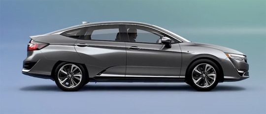
The Honda Clarity’s front half looks better than the back half.
It seemed to have everything we wanted: Room for five adults, full-sized trunk, all the cool autonomous features included in the base model, and 47 miles of electric range! That would make it the No. 2 longest-range plug-in hybrid on the market — and the only midsize, five-adult car with that kind of range.
I found that bizarre, and I still do. Why does the industry think nobody wants a family car with great electric range?
The weird thing is that this car was a total mystery. There was nothing about it online. No reviews —only a few blogger descriptions of a test-driving event Honda staged last fall. The local dealers didn’t know anything about it. There were no ads or marketing of any kind.
(Part of the confusion, no doubt, is that there are two other Honda Clarities: One’s pure electric, and one runs on hydrogen!)
We found a dealer an hour away with one Clarity in stock, and took it for a test drive. The car was an utter mystery to our salesman. He told us, for example, that the car is three feet longer than the Chevy Volt (it’s actually one foot longer), and that it takes 19 hours to charge (it actually takes 12, or 2.5 hours with a 240V outlet). He had no idea how to turn on the autonomous features. And the car hadn’t been charged, so we had to take our test drive on gas (42 mpg).
Here’s what we loved:
The ride. Maybe it’s because this is a midsize, and most of the others are compacts — but man, what a glorious ride. It floats like a magic carpet, except that you still have a great feeling of the road. And it’s so quiet on electric! Combine that with the zoomy acceleration from a stop (232 foot-pounds of torque, if you’re scoring at home), and you’ve got a really fun car to drive.
The space. Our kids have never known anything but compact cars. They could not believe the headroom and legroom when they climbed in.

Nobody will complain of being crowded in the Honda’s back seat.
The trunk. It’s really big. But it’s weirdly shaped. It has a secondary sub-trunk, accessed with a trapdoor, and when the seats are folded down, the pass-through hole to the front is bizarrely shaped. But yeah — plenty of suitcases.

The Honda’s trunk is vast and deep, if weirdly shaped.
Adaptive cruise control. Unlike most cars with this feature, the Clarity’s adaptive cruise works even at low speeds, like in stop-and-go suburban traffic. It works really well. I use it a lot.
Blind-spot screen. When you turn on the right turn signal, the dashboard screen becomes a closed-circuit TV, showing you your right-side rear view. No more blind spot! (There’s nothing equivalent when you turn left, alas.)
Cup-holder cup holders. Each cup holder has two flip-out tabs to accommodate taller or narrower cups and bottles. A clever touch.

The Honda’s cup holders have flip-out tabs.
Auto-lock and unlock. The car unlocks itself as you approach (with the key fob on you), and can also auto-lock once you’re 15 feet away.
Phone pockets in the back. Such a little thing, but so great: A place to hold the back-seaters’ phones to get them out of the way.

A place to hold your phone while it’s charging.
Smart fob. You get two key fobs with the car, labeled Driver 1 and Driver 2. As you approach the car, it unlocks automatically, of course — but it also moves the driver’s seat into your preferred position and angle automatically, as memorized by your fob. (The fob should also adjust the rear-view and side mirrors, temperature, and radio stations for each driver, too. Well, someday.)
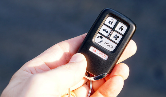
That wide button pops open the electric charging socket; the fan button warms up (or cools down) the car before you get in it.
Bio–plastics. The fabric surfaces inside are made of plants, not petroleum; on the high-end model, the dash is covered by suede, which looks and feels cool and is made of recycled material.
LED lights. All the lights — front, rear, turn signals — are LEDs, and they look awesome.

All the lights are LED and cool-looking.
All the goodies. So much stuff is included in the base model ($33,400)! Lane-keeping, front-collision auto-braking, adaptive cruise control. Apple CarPlay and Android Auto. An 8-inch touchscreen that’s not horrible. (There’s no volume knob, but a physical volume control is on the steering wheel.) Automatic high-beam dimming. Automatic rear-view-mirror dimming at night. Side-mirror heating, front-seat heating.

The Clarity’s drive shifter is electronic—buttons, not a shift stalk—which makes it clearer when you’re putting it in reverse.
The price. At $33,400, the Clarity is pricier than the Prius Prime ($27,100), but it definitely beats the much smaller Chevy Volt, comparably equipped ($40,000). The Clarity also earns the full $7,500 back from the government, plus, in my case, $2,000 back from the state of Connecticut. My final price would be $23,900.
The Touring model ($36,600) adds eight-way power-adjustable driver’s seat, leather seats, a built-in navigation system, and remote-control heating/cooling (you hit a button on the fob while you’re finishing breakfast).
We quickly found a few things we didn’t like, too:
It’s kind of ugly in back. The car looks great from the front, but the back end strikes us as weird/ugly. Some of that comes from aerodynamics: The back wheels are partly covered, for example; the bottom of the car is completely enclosed and flat; and funny little wind intake holes are tucked in the grille and in front of the rear wheel.
Lane assistance barely works. When the Clarity starts to creep out of the lane, it’s supposed to alert you (by vibrating the wheel and flashing a warning) and auto-steer gently back into the lane. It works amazingly well — when it works. But it doesn’t kick in until you’re going over 45 mph, and even then, it doesn’t seem to notice when it’s creeping over a yellow center line.
Occasional engine noise. When the gas has to kick in, it can be loud, and out of proportion to the accelerator position.
The paddles. Behind either side of the steering wheel, your fingers easily reach two paddles. They govern regenerative coasting, in four levels. That is, tug the left paddle four times, and your car really slows down during coasting (to recharge the battery more); tug the right one to lighten up. That setting resets to 0 when you next use the accelerator, though. Honda told me that “this feature can be especially useful as you drive downhill,” but using the brake also recharges the battery, so… why?
No self parking. Oh well.
No USB in back. There’s a cigarette-lighter charger in the back for the kids’ phones — but why on earth no USB jacks?
The name Clarity. My wife thinks it sounds like an antihistamine.
The biggest adjustment we had to make was accepting that the Clarity is a midsize car. Obviously, that’s why we get such great interior space, but it also means a wider turning radius and tighter parking. Mainly, my wife and I both grew up thinking that bigger cars equals worse bad fuel economy. It’s a mind-fuddler to realize that this is our green car!
So guess what? We bought it.

My first time parking the Clarity at an “EV CARS ONLY” spot!
Two months in
All of that happened the first week of January. I’m happy to report that some reviews for the Clarity are finally starting to appear online (spoiler: they like it too), and Honda Inc. is starting to do some marketing and dealer training, too. I guess we were just geniuses, buying this car before the world knew it was great.
The good news is that owning a plug-in hybrid is exactly what it’s cracked up to be: Super fun to drive, instant acceleration, and NO GAS STATIONS. We come home, we plug in the cable, we never use gas. We drive it every day, and we’ve refilled the gas tank once in two months (I had to drive to JFK airport in freezing weather).

We charge the car from an ordinary 3-prong wall outlet on the garage.
The dealers I interviewed for the video above all say that consumers aren’t jumping on PHEVs the way you’d expect. It’s because people don’t know about plug-in hybrids, or don’t understand them, or don’t like change.
Well, if that’s you, change your mind; you’re crazy not to look into this category. Who doesn’t like saving money and getting a zippier car?
All three dealers also said I should have leased the car instead of buying it, because technology is moving along so quickly, this car will seem out of date in a few years. Of course, that’s what a dealer would say, right? But it’s something to consider.
Then again, if it gets to the point where I can’t stand having an ancient 2018 car, I won’t be stuck with it. I’ve got three more kids who will one day head off to college.
David Pogue, tech columnist for Yahoo Finance, welcomes non-toxic comments in the Comments below. On the Web, he’s davidpogue.com. On Twitter, he’s @pogue. On email, he’s [email protected]. You can sign up to get his stuff by email, here.
#_lmsid:a077000000BAh3wAAD#_revsp:yahoofinance.com#_uuid:96beb0ab-4bd5-3b5c-9374-6860cbc7d45b#_author:David Pogue
6 notes
·
View notes
Text
Bitmoji is this week's David Pogue's Rated:App
yahoo
Welcome to David Pogue’s Rated:App, a new video series. Each week, I’ll install whatever the No. 1 bestselling app is (on the iOS or Android store) and review it, to save you the effort in case it’s a turkey. If you’re viewing this on your phone, in an app or Facebook or Twitter, the video plays vertically — it fits your screen exactly, so you can see what it’d look like if you were running the app yourself!
This week, the No. 1 bestselling app — on both the Apple and Google Play app stores — is Bitmoji. It’s a free app, bought by Snapchat last year for $100 million, that’s intended to jazz up your texting life. Instead of sending the same generic, tiny pictures that everybody else sends, you can send giant ones, featuring a cuter, cartoon version of you.

Bitmoji lets you create a cartoon version of yourself, for use in texting. (Photo from Snap Inc.)
When you first open the app, it guides you through the process of designing your own avatar. It auto-draws a basic cartoon of you based on a photo you take; from there, you can fine tune every conceivable aspect of yourself: hairstyle, hair color, eye color, eye shape, glasses, eyebrows, nose, ears, jawline, forehead/undereye wrinkles, clothing, body type, and so on. (It’s a lot like building your Mii on the Nintendo Wii, if you remember that.)
You walk through about 20 screens, fine-tuning your avatar.
You walk through about 20 screens, tweaking your avatar.
What you wind up with doesn’t look exactly like you, but it’s close enough that your texting friends will get the point.
Later, when you’re in mid-chat, you tap the Apps icon (iOS 11) and then the Bitmoji icon — or, on Android, you use the keyboard switcher to choose the Bitmoji keyboard.
What you see now is a universe of little drawings, representing thousands of typical texted comments and sentiments: “I’m sorry,” “See you soon!”, “Thank you,” “I miss you,” “What up?”, and so on. You’ll find internet memes in there, compliments and reactions. Each one features you in a charming or goofy pose, delivering that message.
You can browse them by scrolling, or you can do a search for keywords. Tap the cartoon you want, and boom — it’s in the texting box, ready to send.
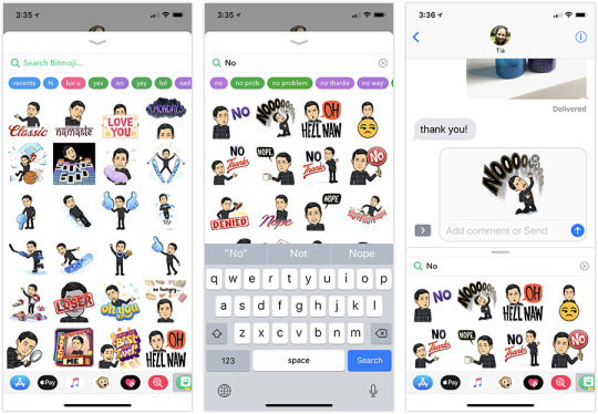
Bitmoji offers thousands of ready-to-use cartoons (left). Type a keyword (center), and then tap one to text it (right).
The business model
Bitmoji is free, which is a little amazing. So how did the company make money (before Snapchat bought them)? Well, as you play with it, you’ll sometimes see what are obviously sponsored cartoons— as you choose your clothing, for example, you’ll find options from Nike and Adidas. And you’ll sometimes see cartoons that have tie-ins to current movies.

Here’s the business model: Let brands sponsor certain outfits or cartoons.
Man, if that’s what it takes to make this software free, I say hooray. Who cares? If you don’t want to be a cog in the great consumer-marketing machine, you don’t have to use them.
What’s not to like
I have no complaints about the software itself. None. It’s super well-designed, and adds something truly novel to the communications process.
The primary objection you might have is the very concept: sending adorable little cartoons of yourself. You might find that idea cloying, or vain, or cutesy. You might not want to do what everyone else is doing, as a big millennial herd, on principle.
And you might think that bitmojis make lazy people even lazier, because they let you send canned sentiments instead of composing them yourself. (Please, please do not send a Bitmoji “I’m sorry” when someone has died.)
When used judiciously and creatively, though, Bitmoji can be delightful. Whenever someone sends me one that I haven’t seen before, a witty drawing that perfectly captures some offbeat conversational situation, it’s good for a grin.

Hey! You’re a cartoon!
David Pogue, tech columnist for Yahoo Finance, welcomes non-toxic comments in the Comments below. On the Web, he’s davidpogue.com. On Twitter, he’s @pogue. On email, he’s [email protected]. You can sign up to get his stuff by email, here.
Read related:
This week’s David Pogue’s Rated:App is on Facetune
#tech#Bitmoji#app#_lmsid:a077000000BAh3wAAD#pogue#_revsp:yahoofinance.com#_uuid:90da9545-2725-38ee-a2bc-553014c44e06#_author:David Pogue#Snapchat
3 notes
·
View notes
Text
Readers weigh in on Pogue's Apple HomePod listening test

An Apple Store staff member demonstrates how the Apple HomePod, home sound system, works at the Apple store in Manhattan, New York, U.S., February 9, 2018. REUTERS/Shannon Stapleton
Here are three great ways to rile up Twitter users: Comment on the president. Say something about immigration. Review speakers.
That’s what I discovered when I posted the results of a blind listening test I conducted last week, in which five panelists were asked to rank the sound quality of an Apple HomePod, Sonos One, Google Home Max, and Amazon Echo Plus. (Go ahead and read it; I’ll wait right here.)
Nobody ranked the HomePod as No. 1 on most songs. For three panelists, the Sonos One was the overall winner; for the other two, the Google Home Max.
I was surprised, because most tech critics ranked the HomePod as the best. So did I, when Apple set up the blind listening test. (Here’s my full review of the HomePod.)
Soon enough, my little test started bouncing around the Twitterverse; here are some of the most popular theories and critiques of the test.
The curtain blocked the sound
The most common complaint about my test setup is about the curtain, which I used to hide the speakers from the panelists’ view. “I would think the curtain will block the highs, which is what HomePod excels at,” tweeted @toxicpath and others.
I don’t think that’s it. First, the cloth I used is extremely sheer — you can see right through it. It’s a single ply of very thin fabric.

The “curtain” was a piece of very sheer fabric.
Second, if the cloth affected the sound of the HomePod, wouldn’t it have affected the sound of its rivals in the same way?
Third, I used the same cloth the night before, during the dress rehearsal, when both panelists ranked the HomePod as the winner.
Some readers suggested repeating the test with the panelists’ backs turned to the speakers. That setup wouldn’t pass muster, either — our ears are naturally scooped to collect sound from the front.
Other readers proposed blindfolding the panelists. Well, OK, but how would they take their notes and record their rankings during the five musical tests of four speakers?
The curtain prevented the HomePod from adapting
The HomePod contains six microphones. They’re supposed to sample the proximity of the walls and ceilings around it, and reconfigure what’s coming out of it so that the important stuff is blasted “forward,” seven tweeters noted
“Since the HomePod adjusts its sound to the acoustics of the room, you should not have used a piece of fabric to hide the speakers,” wrote @markbooth and others. “The fabric may have affected the HomePod’s sound.”
Well, no. The HomePod re-samples its listening position after each time it’s moved, during the first few seconds of music playback. We let the HomePod do its room listening before hanging the curtain, so it had already had the chance to adjust its sound.
The listener positions affected their perceptions
One of the most interesting observations came from people like @JazzStevo. He noticed that the five listeners sat in a row, with the speakers in a parallel row. And when the results were tallied, the listeners closest to the Sonos One end all preferred the Sonos One!
Similarly, the listeners closest to the Google Home Max end both preferred the Google Home Max! (He made this cool diagram to make the point.)

@JazzStevo made this diagram, to show the positions of the four smart speakers (top) and the top-rated speaker choices of the five listeners (bottom).
It’s well established that loudness affects our perception of speakers. Before the test, we did volume-match the four speakers using a meter — but if you’re at the same end of the row as a certain speaker, of course it’s closer to you, and therefore louder!
There’s one huge problem with this theory, though: Why wouldn’t the center speaker, the Apple HomePod (B in the diagram), therefore sound best to the center listeners directly in front of it?
It doesn’t make sense that the center panelist would perceive speaker D as being the loudest.
Spotify over AirPlay has lower quality
One of the most compelling theories came from people like @osaddict: “I wonder if you would have gotten different results had the HomePod streamed directly from Apple Music. I have noticed some difference vs AirPlay.”
“Spotify over AirPlay is very underdriven,” adds @jaydisc. “AirPlay Spotify sounds shockingly worse than Apple Music streaming,” says @ErikVeland. “There’s definitely magic EQ sauce being applied to Apple Music that’s not in AirPlay.”
In other words, they’re saying, streaming Spotify over AirPlay (Apple’s Wi-Fi-based wireless streaming protocol) may not sound as good as streaming Apple Music to the HomePod. (To keep everything equal, my testing involved streaming the same songs from the same Spotify playlist to all four speakers.)
If true, that would easily explain why the HomePod won Apple’s listening test, and lost mine.
I checked with Apple; the reply was that there should be no such degradation as long as the Wi-Fi network is strong.
I did some testing of my own, playing the same song directly from Apple Music and then streaming from AirPlay and Spotify. @jaydisc is quite correct: In general, the songs from Apple Music come in at a higher volume than they do from Spotify. To make the songs sound identical, you have to boost the Spotify volume by a couple of notches.
Once you do that, though, there’s really no perceptible difference in the sound quality. I spent a whole morning doing comparisons — 30 different songs in different genres, “A/B”-ing them between Apple Music and volume-adjusted Spotify, over and over again, at different volume levels and listening positions. I made myself crazy trying to hear a difference.
If there is one, I swear that it’s too small to identify in regular use. It couldn’t have made a difference to my listening panel.
In any case, it would be impossible to control for this variable in a speaker comparison test, since none of the other speakers can stream from Apple Music.
Consumer Reports
In the meantime, I’m not the only one who’s been doing HomePod listening tests.
Consumer Reports finished up their testing of the HomePod, and concluded that “it’s not the best-sounding wireless speaker in our ratings — or even the best-sounding smart speaker.”
Maria Rerecich, the magazine’s director of electronics testing, was kind enough to share the details of her team’s testing process.
“It’s not a bad test, what you did,” she told me. “Having people come in and listen to it is a good thing to do.”
But her team’s goal was different. “We’re looking for fidelity and accuracy to the original tracks, more than somebody saying ‘Hey, that sounds good,’” she explained. Because, for example, “some people like bassy music, some don’t.”
So her team plays various kinds of tracks. Some are instrumental (“Are the instruments clear? Are they located in space properly? Are you getting a sense of the room they were in?”), vocals (“Are the treble, midrange, and bass clear? Is anything out of balance? Is the midrange muddy? Is anything oddly sizzly or peaky? Are there good dynamics?”), and so on. “We use the same tracks all the time,” Rerecich says, “so we know what they sound like.”
They compared the HomePod and other smart speakers against high-end reference speakers, which the magazine has all rated Excellent. “We can flip back and forth from the reference speakers to the test speakers; everything’s synced to the same track,” she says.
The bottom line? “Overall, the sound of the HomePod was a bit muddy compared with what the Sonos One and Google Home Max delivered,” says the resulting article.
Metered tests of static
FastCompany.com did some tests, too — not by listening, but by having the HomePod play white noise (static) and measuring its acoustical properties.
They enlisted NTi Audio AG, a manufacturer of acoustics testing equipment. “The company was kind enough to loan us a testing device, software, and a special microphone so that we could test the HomePod in a real-life natural habitat–my living room,” writes Mark Sullivan. “The company’s Brian MacMillan coached me on how to do the tests, then he and some other NTi people analyzed (and helped me understand) the results.”
The results? “’The developers have done an excellent job of having the HomePod adjust to the room; (it has) Impressive consistency in overall level and frequency response,’ said NTi’s MacMillan.”
On Reddit, an audio fan, WinterCharm, spent 8.5 hours testing the HomePod, using audiophile equipment: a calibrated microphone, Room EQ Wizard software, and a lot of technical knowledge. He measured the frequency response — again, not of music, but of a sine wave.
“What apple has achieved here is incredibly impressive — such tight control on bass from within a speaker is unheard of in the audio industry,” he writes. “What Apple has managed to do here is so crazy, that If you told me they had chalk, candles, and a pentagram on the floor of their Anechoic chambers, I would believe you. This is witchcraft. I have no other word for it.”
But he, too, then got enough methodology pushback from readers — over 1,400 comments, including this reply from Redditor edechamps, which calls his analysis “hilarious” and “garbage” — that he wound up backing off from his original conclusions.
Recipe for the perfect test
Many readers found fault with my testing protocol, and had suggestions to improve it. “I would suggest someone other than Grandpaw Pogue devise the test,” wrote @Dayv. “Pogue is bad at this and he should feel bad.”
@Dayv, and others, offered a simple prescription for a better test:
“Repeat the test with the speaker samples in a more randomized order,” he says. “Doing A, B, C, D or D, C, B, A gives undue weight to D and A. Need truly randomized ordering, and a lot more tests.” (My test was fairly random. I sometimes started with speaker A, and sometimes with speaker D. I also offered panelists the opportunity to hear any speakers again in any combination or order, which they often requested.)
“Blindfold them and have them take voice notes on an app, so that they can speak freely without influencing the other panelists,” adds @jocrz. “This would require the test to be given to one person at a time.”
“The people are sitting really close to all of the speakers — these are room devices, not desk speakers,” @Dayv goes on.
“I would sit each speaker alone on a table, blindfold listeners, and seat them around it,” suggests @jdmuccigrosso.
“You need an anechoic chamber if you want good measurement accuracy,” writes Redditor Edechamps. “It is impossible to accurately measure a speaker in a normal room.”
@cribasoft proposes “an all black media room. “I promise if you put the speakers on a table at the front, and only provided directional lighting where testers are sitting, they could see their paper but not any of the speakers.”
“Need a lot more opinions. Test people separately in the same seat,” says @Dayv.
And, of course, I’d have to persuade Google, Amazon, and Sonos to add Apple Music to their speakers, so that they’re all streaming from the identical servers.
Wow. That would be quite a test.
But you know what? If you need that much effort to hear that one speaker is obviously superior… well, then it probably isn’t.
I suspect, in the end, that my original conclusions are correct: That different pieces of music are different, and the people listening to it are different. There is no right answer.
David Pogue, tech columnist for Yahoo Finance, welcomes non-toxic comments in the Comments below. On the Web, he’s davidpogue.com. On Twitter, he’s @pogue. On email, he’s [email protected]. You can sign up to get his stuff by email, here.
Related:
Head to head, does the Apple HomePod really sound the best?
Apple’s HomePod speaker: Either way late or way early
David Pogue’s sneak preview of the Apple HomePod
#Apple#_lmsid:a077000000BAh3wAAD#_revsp:yahoofinance.com#$AAPL#_author:David Pogue#_uuid:6b44a1ce-f178-3617-839d-2280656dbb09#HomePod
2 notes
·
View notes
Text
Look up! A dozen 'air taxi' flying cars are readying for takeoff
yahoo
Well, it may have been 56 years since “The Jetsons” was first on TV, but flying cars are finally about to become real.
The last few months have been filled with news of companies that unveiled, demonstrated, or released videos of their “air taxis,” as they’re often called. They’re basically giant-sized versions of drones — giant enough to carry a person, or two, or five.
Why now? Because all the necessary ingredients have aligned: Batteries with high enough energy density to carry these copters into the air; composite materials like carbon fiber light enough to work; avionics (aircraft software and electronics, developed for regular drones) cheap and reliable enough to adapt; and collision-avoidance systems advanced enough to keep these things from crashing.
The beauty of these personal copters is that since they’re all electric, they’re really quiet. They could fly at low altitude without becoming a nuisance to people on the ground. And, of course, they’re pollution-free: zero emissions.
All of these models can be autonomous. You plug in your destination, and the thing flies you there. Some have a joystick so that you can seize control of it if you want, and most can also be remote controlled.
These air taxis are built with redundancies of the major elements, so even if something goes wrong, you won’t drop out of the air. Many have low-altitude parachutes, too.
Now, don’t get all excited. You can’t buy a passenger drone yet — that moment will probably come in 2020 at the earliest, and they’ll cost hundreds of thousands apiece. Even then, nothing will happen in the U.S. until the Federal Aviation Administration comes up with rules to govern how these things use the airspace.
Oh, and by the way: Even with all the advances in batteries and materials, these things are still super limited in flight time. You’re lucky to get 20 minutes in the air.
But the trend is unmistakable: A lot of companies have working prototypes that are taking real people on real flights.
Who’s taking off first?
Here are some of the flying machines that have surfaced recently:
eHang 184
This Chinese drone maker has been working on the eHang air taxi for four years, and it’s fairly far along. Since the capsule holds only one person, it’s small — about the size of a car. The prototype has made over 1,000 tests in China, sometimes in high winds and at even at night.
youtube
Here are the specs:
10-mile range
80 mph top speed
Partnered with the Dubai government, who wants to develop air taxis to service its cities
Lands automatically in case of a malfunction
A two-passenger model is on the drawing board.
Volocopter
One of the highlights of CES 2018 was watching this gigantic, 18-rotor craft land on the stage during Intel’s keynote presentation. (Also at CES: The Volocopter’s first passenger was Intel’s CEO, Brian Krzanich.)
youtube
The details:
Designed and built in Germany, where it has approval to fly
Autonomous, joystick-operated, or remote controlled
Carries two passengers
18 rotors, parachute
70mph cruising, 17-mile range
Conducting test flights in Dubai
Estimated price $300,000
Passenger Drone
Weirdly enough, this California passenger-drone company is called Passenger Drone, and so is its product — the Passenger Drone. It carried its first passenger in November.
youtube
16 rotors on 8 spindles
Autonomous, joystick-operated, or remote controlled
Carries two passengers
Top speed: 45 mph
25 minutes per charge
20-minute flight time
Joby
This copter is the brainchild of JoeBen Bevirt, who made his fortune from selling — I kid you not —flexible-arm GorillaPod camera tripods. Now, with the help of $100 million in investments from Toyota, JetBlue Technology Ventures, and Intel, it’s preparing a sleek VTOL (vertical takeoff and landing) copter that can carry four passengers and a pilot for 150 miles. (Full disclosure: My wife does PR work for JetBlue Tech Ventures.)
A couple of weeks ago, Joby invited a pair of Bloomberg reporters to witness an unmanned flight. They weren’t allowed to take pictures or even describe the thing, which is a bummer. But they watched it fly, remote controlled, for a 15-minute flight. “Bevirt says thousands of these sky cabs will one day shuttle people around cities, soaring above the conventional traffic below,” goes the article.
Vahana
This prototype, developed by European plane maker AirBus, has propellers that point upward for takeoff, like a helicopter’s, and then rotate forward, like a plane’s. The company flew it, unmanned, for the first time last month.
youtube
Details are sketchy — they don’t even have a website (only a blog) — but here’s what we know:
Single-passenger
“Productzable prototype” in 2020
Parachute
Illium
Unlike most air taxis, which are propeller planes, this one is an electric jet with a 180-mile range.
Here’s the video of its maiden (unmanned) flight:
youtube
The bullet points:
Holds two people
180-mile range
275 mph
Vertical take-off and landing
First manned flight planned for 2019; on-demand flights by 2025
Based in Germany
And the rest
Just about any deep-pocketed company who’s anyone is diving in. For example:
Uber Elevate, its self-driving air taxis, are nothing more than a white paper and a killer CGI video at this point. But clearly, they’re all in on the concept; they expect to launch the air-taxi service within a decade.
youtube
Boeing bought Aurora Flight Services, maker of VTOL planes, in hopes of exploring the air-taxi concept.
Larry Page, CEO of Alphabet, has spent $100 million to fund two electric-craft companies. There’s Zee.Aero, which has prototypes for two VTOL electric passenger planes, and Kitty Hawk, which is making a no-license-required personal hovercraft for use over water.
youtube
Zunum Aero is working on electric versions of traditional passenger jets (700-mile range).

The Zunum Aero will be an all-electric jet.
We know this much about technology and disruptive change: Everything takes longer than we think, everything has unintended consequences, and everything’s subject to government regulation.
But with this much money and so many companies all chasing this dream, it seems likely that air taxis really will take off — at some point.
David Pogue, tech columnist for Yahoo Finance, welcomes non-toxic comments in the Comments below. On the Web, he’s davidpogue.com. On Twitter, he’s @pogue. On email, he’s [email protected]. You can sign up to get his stuff by email, here.
#_uuid:8b90750a-d22e-3602-8656-310bd90e2141#_lmsid:a077000000BAh3wAAD#_revsp:yahoofinance.com#_author:David Pogue
1 note
·
View note
Text
Head to head, does the Apple HomePod really sound the best?
yahoo
To convince journalists about the audio quality of its new HomePod smart speaker (here’s my review), Apple did something smart: Before we were given our review units, we were required to attend a listening session. Mine was held in Apple’s New York City public-relations loft, a mockup of an apartment.
Four speakers were on a counter against a wall: Sonos One ($200), Google Home Max ($400), the HomePod ($350), and the Amazon Echo Plus ($150).
The PR person could switch playback from one speaker to the other without missing a beat. They even had a halo light rigged to turn on behind whichever speaker was playing, so you’d know which was which.
There was not a shred of doubt: In this side-by-side comparison, the HomePod sounded better than its competitors.
Most of the reviews, including mine, said the same thing: that the HomePod isn’t as smart as the other smart speakers (among other problems, its voice control is limited to iTunes and Apple Music — no Spotify), but that it sounds amazing.
What Hi-Fi (a British audiophile site): “The HomePod is the best-sounding smart speaker available—and by quite a margin.”
Pocket-Lint (tech site): “The best sounding speaker of its type.”
The Verge: “It sounds far better than any other speaker in its price range.”
Tech Crunch: “HomePod is easily the best sounding mainstream smart speaker ever. It’s got better separation and bass response than anything else in its size.”
Still, when I tweeted about the test, a couple of people were suspicious of the setup, which of course was entirely controlled by Apple. What was the source material? What was the wireless setup?
An Apple rep told me that the test songs were streaming from a server in the next room (a Mac). But each speaker was connected to it differently: by Bluetooth (Amazon Echo), Ethernet (Sonos), input miniplug (Google Home), and AirPlay (HomePod), which is Apple’s Wi-Fi-based transmission system.
Since the setup wasn’t identical, I wondered if it was a perfectly fair test. (Bluetooth, for example, may degrade (compress) the music it’s transmitting, depending on the source and the equipment.)
So I decided to set up my own test at home.
The setup
I hid the four speakers behind a curtain — a sheet of thin, sheer fabric that wouldn’t affect the sound. It took me a Sunday to figure out how to get the A/B/C/D switching to work seamlessly, but I finally managed it: All four speakers would be streaming from Spotify, all four over Wi-Fi. I’d use the Spotify app’s device switcher to hop among speakers without missing a beat.

The speakers hidden.
I chose five songs, each with different styles, instrumentation, and sonic demands:
“Star Wars: Imperial March.” Full orchestra, full volume, full of brass.
“Havana” (Camila Cabello). Current pop hit. Distinct bass, drums, piano, and voice. Lots of rhythm.
Brandenburg Concerto No. 3 in G Major. All strings, full range of pitches and dynamics.
“Hallelujah” (Pentatonix). A cappella ballad, five voices, very exposed and close to the mikes.
“Helpless” (from “Hamilton”). Broadway pit band, pop sound, female harmonies.
In these kinds of tests, volume matching is incredibly important, for a couple of reasons. As Tom’s Hardware puts it: “First, if sources are at different levels, they’re easy to tell apart. From there, the test is no longer blind. Second, us humans tend to prefer (all other factors being equal) louder sources.”
For my dress rehearsal the night before, I volume matched them as best I could by ear.
The panelists at the dress rehearsal were my wife Nicki and my friend Mike, a professional guitarist who spent years as an audio technician for big-name touring bands.
I gave each panelist a score sheet, with room for notes, and asked them to rank the four speakers, 1 through 4, after each listening test. I sat at the laptop to control the tests; I played the same section of each song for about 20 seconds on each speaker. Panelists were free to ask for re-plays, or to hear any speaker again, or to hear two speakers in a different succession.
At the end of the rehearsal, I asked the listeners to choose a winner, based on how many first-place finishes they’d marked down. Both Nicki and Mike declared the HomePod to have the best sound, hands down.
The test
The next day, the Yahoo film crew arrived. Our sound recordist, Dave, used level meters to help me volume-match the speakers more precisely.
My five panelists included Darwin, a professional violinist who spends a lot of time listening to recordings on nice gear; Julie, an entrepreneur and homeowner who is precisely the target market for these speakers; Dana and Tori, high-schoolers who haven’t yet begun to lose their ability to hear high frequencies; and Rob, a sound technician for Yahoo.
I didn’t tell them which speakers would be involved. I said only that there were four of them behind the curtain, and I’d refer to them as speakers A through D.
I handed out their score sheets and began the test. Five songs, 20 seconds each, free replays when requested. For each song, I played the speakers in a different order (A to D sometimes, D to A sometimes).
The results
Of course, I knew what the results would be. I’d heard them myself in the Apple demo; I’d read the other reviews; and I’d done the dress rehearsal the night before. Every time, the HomePod won the match easily.
At the end of my own listening test, then, I handed out signs that said “A,” “B,” “C,” and “D,” and asked the panelists to hold up their winners’ signs on the count of three. I knew what they would say: “B,” “B,” “B,” “B,” and “B” (that was the HomePod’s letter).
That’s not what happened.
They held up their signs. Two of them ranked the Google Home Max (“D”) as the best. Three of them ranked the Sonos One (“A”) the best.
Nobody ranked the HomePod the best.
The speakers revealed.
The explanation
I actually have no great explanation for this outcome. Most of the panelists had ranked the HomePod (“B”) as first on some of the songs — just not most of the songs.
Rob: “For me, A, the Sonos, consistently had the most robust sound of all of them.”
Tori: “The Sonos won two of them for me. ‘B’ [HomePod] won the ‘Star Wars.’”
Dana: “’B’ [HomePod] won one of mine. I felt like ‘A’ [Sonos], a lot of times, sounded a lot more sharp.”
Julie: “I picked between B and D [HomePod and Google Home Max] as being the two best. B and D were pretty clear. And C [the Amazon Echo] came in consistently last for me.”
Darwin: “I actually found A [the Sonos] to be the one that I hated the most. B [HomePod] did win one for me. It won ‘Havana,’ because it had a better low end. But I generally picked D [Google Home Max], because it had a clearer, nicer range. As a classical person, I definitely would go with D. But if I were listening to more pop stuff, I could see where ‘A’ [Sonos] could win.”
So what are we to make of this? Why did none of my panelists rank HomePod a solid No. 1, when most critics all do (and so do I)?
Was something wrong with my setup? Well, no, because the night before, using the same setup, Nicki and Mike both ranked the HomePod No. 1.
Here are my theories:
Different music is different. My panelists all conceded that there was some variation depending on the material. “Honestly, they were pretty on par,” Rob said. “I don’t know that one stood out that much more than the other.” “It was much different with different music,” Darwin added. “It varied a lot for me, depending on the song,” Tori agreed.
Different people are different. I said that most professional critics ranked HomePod as No. 1, but not all of them. Buzzfeed’s young critic, for example, concluded: “Ultimately, none of this is a hard science, and audio preferences are highly subjective. Reactions to its audio quality from the four people who listened to it for this review.. were mixed. The HomePod outperformed other speakers in some situations and not others.” And the Wall Street Journal’s Joanna Stern wrote, “The HomePod’s bass is impressive for the size of the speaker, but in many songs, it’s far too front-and-center in the mix.”
Nobody else did blind tests. As far as I can tell, none of the other critics who declared HomePod No. 1 actually set up their own blind A/B/C/D tests. Maybe their conclusions wouldn’t have been so emphatic if they had.
Apple’s setup was different. Remember, Apple’s four speakers were each connected to the source material differently: Two wired, one over Wi-Fi, one over Bluetooth. Maybe that wasn’t an even playing field — and for sure, it wasn’t a real-world playing field. Most people, most of the time, just connect these speakers to their Wi-Fi networks and stream music from an online service.
What I can say for sure is this:
The Apple HomePod generally sounds better than any other smart speaker—but only somewhat, and only in direct A/B/C/D tests. If you listened to the HomePod, Sonos, and Google Home an hour apart, you’d never be able to declare one a clear winner. (Everyone agrees that the Amazon Echo Plus is the loser in this roundup, but then again, it’s $150 and the size of a Pringle’s can; it’s not a fair fight.)
You can get two Sonos Ones for the price of a single Apple HomePod. You can use them as a stereo pair, or put them in different rooms and control them by voice. And you can have your choice of 42 music services (Spotify, Pandora, TuneIn, etc.) — not just Apple Music. And you can use all of Amazon’s Alexa voice commands (and, soon, Google’s commands and even Siri’s commands!), meaning you can control a vastly larger range of smart-home devices than the HomePod can.
Everybody’s different.
Music gear (and listening tests) are famously contentious; they’re probably responsible for triggering more flame wars online than abortion and gun control put together. I’d love to hear your thoughts on Apple’s test and mine in the Comments!
David Pogue, tech columnist for Yahoo Finance, welcomes non-toxic comments in the Comments below. On the Web, he’s davidpogue.com. On Twitter, he’s @pogue. On email, he’s [email protected]. You can sign up to get his stuff by email, here.
Read related
Apple’s HomePod speaker: Either way late or way early
David Pogue’s sneak preview of the Apple HomePod
The $50 Google Home Mini vs. the $50 Amazon Echo Dot—who wins?
#_lmsid:a077000000BAh3wAAD#_revsp:yahoofinance.com#_uuid:1034dc4d-6bfd-323c-9f14-c46ea4470eac#_author:David Pogue
27 notes
·
View notes
Text
This week's David Pogue Rated:App is on Facetune
yahoo
Welcome to David Pogue’s Rated:App! series. Each week, I’ll buy whatever the No. 1 bestselling app is (on the iOS or Android store) and review it. Maybe I’ll wind up saving you from a few wasted bucks. If you’re viewing this video on your phone, the video plays vertically to fit your screen exactly, so you can see what it’d look like if you were running the app yourself.
Last week’s No. 1 bestselling app on the Apple app store was Facetune. If you’re an Instagram nut, that’s no big news; you’re already well aware of apps like this. In fact, Facetune has been around since 2013.
So why did it spike to No. 1 the week of Jan. 28? Even Lightricks, the company in Israel that makes it, doesn’t know. “We haven’t made any change recently,” a rep wrote me. “Perhaps we received some press and that boosted our sales.”
Anyway, Facetune is a selfie-retouching app — incredibly easy to use, with incredibly professional-looking results. With a few swipes of your finger, you can make your teeth whiter, your skin smoother, your eyes bigger, and your nose smaller. You can tap a zit into nonexistence, or make your waist a little thinner. It’s like Photoshop without the complexity (Facetune’s built-in, animated help screens show you exactly how to use each tool). It’s a must-have for anyone who lives and breathes Instagram.

Facetune has smoothed the skin and whitened the teeth of millions on Instagram.
At any time, you can tap the button in the lower-right for a before/after comparison with your original shot. And you can tap the button in upper right to post the photo to Instagram, send it to another app, send it by email, or save it to your camera roll.
The cost for all this magic is $4 for iOS, and $6 for Android.
The app is not only well done and practically idiotproof; it also appeals to our universal vanity. No wonder it’s become a mega-hit.
The danger zone
You do have to be careful when you use Facetune, though. Instagram is full of people who’ve dragged their finger too much, resulting in teeth that are creepily nuclear white, or skin that looks like some kind of plastic mask. It’s freaky and unnatural. It makes you look like you’re inflatable.
Welcome to the age of FaceTune, where everybody’s skin looks like vinyl.
But that doesn’t stop many of the citizens of Instagram (and Tinder, and Match…) from Facetuning themselves. After all, that’s how the stars of Instagram look! Why shouldn’t we all look airbrushed into plastic?

The stars all have freaky-smeared skin—why shouldn’t you?
Heck, once you learn to recognize that freakishly smeared skin tone, you realize that even Instagram’s stars probably use Facetune, too. Khloe Kardashian even admits it. (“It’s life changing,” she told Chelsea Handler. “It’s the only way to live.”)
There’s another danger, of course: That people will start to feel ugly and ashamed if they don’t look like they’ve been airbrushed. That Facetuned photos create an unrealistic expectation of beauty. That somebody will meet you in real life and be appalled. (There is, in fact, a #NoFacetune hashtag making the rounds, a sort of “What I Actually Look Like” seal of authenticity.)
Actually, there’s a third danger: That you’re not going to read Lightrick’s legalese. It includes this alarming line: “You grant…to Lightricks a worldwide, non-exlusive, royalty-free… license.. to use, reproduce,…make available to the public… [and] broadcast… that Content [your photos].” Ummmm, what?
I’m sure that this is just standard lawyer boilerplate stuff (Facebook and other companies have gotten burned by this kind of language coming to light), and that Lightricks would, in fact, not try to steal your photos for marketing purposes. But you know… now you know.
Facetune 2
Actually, there’s a final danger — that you’ll get confused over the version of FaceTune you’re getting.
The old one, called just Facetune, is the one that spiked last week; it costs $4 or $6.
The new one, called Facetune 2, includes many of those same features for free:
Whiten your teeth, smooth your skin, remove skin shine, bring out eye detail
Make any body part bigger or smaller
Make your smile bigger, your jaw bigger or smaller, your face wider or narrower
Apply filters, superimpose colorful lens flares, paint new skin tones onto your face
Crop, vignette, adjust contrast and brightness, sharpen
Defocus the background
In fact, Facetune 2 lets you apply many of those features before you take the photo — in the live preview — or even in a video that you record in the app. That’s some hard-core face recognition. (You can see it at work in my video, above.)
Facetune 2 also offers a bunch of premium features, which you can unlock by paying through the (slimmed-down) nose. You can pay either a one-time $70, or you can pay $6 a month (or $36 a year). Man, you gotta be a hard-core Instagrammer to pay that much for selfie touchups.
What do those “VIP” features get you? Some pretty amazing stuff.
Paint in a totally new backdrop behind you
“Relight” the shot, changing how the light falls on your face (incredible)
Change the height, width, angle, or spacing of your eyes, and make similar adjustments to your nose
Go full-on Photoshop with vibrance, saturation, color-temperature controls; bring detail out of shadows or highlights
Auto-darken eyebrows, auto-reduce eye bags
“Patch” blemishes and moles (that’s free in the old FaceTune version)
In Facetune 2 (the paid version), you can move the “light” around your face.
So here’s my advice: Save yourself even the four bucks you’d spend on the old version. Get the free Facetune 2, even though that’s not the No. 1 app, and just plan to ignore all those “VIP” banners across the advanced, paid-only tools.
Unless, of course, your vanity gets the better of you.
David Pogue, tech columnist for Yahoo Finance, welcomes non-toxic comments in the Comments below. On the Web, he’s davidpogue.com. On Twitter, he’s @pogue. On email, he’s [email protected]. You can sign up to get his stuff by email, here.
#tech#FaceTune#app#_lmsid:a077000000BAh3wAAD#_revsp:yahoofinance.com#_uuid:81fe9fe7-2b7d-3a44-8590-8b1460b59368#_author:David Pogue
3 notes
·
View notes
Text
Apple's HomePod speaker: Either way late or way early
Apple (AAPL) has never been ashamed to be late to the party. The iPod wasn’t the first pocket music player; the iPhone wasn’t the first cellphone; the Apple Watch wasn’t the first smartwatch. But in each case, Apple won the category by making its product better.
On Friday, you’ll be able to buy the HomePod, Apple’s answer to the smart speakers from companies like Amazon, Google, and Sonos. It is indeed way late to the party, even by Apple’s definition — last June, Apple said that it would ship the HomePod in time for the holidays.
But the HomePod is better only in the “speaker” sense. Despite all of those delays, despite the chance Apple has had to study its rivals, despite the fact that Apple says it’s been working on the HomePod for six years, the “smart” part of this speaker is way behind.
Which is so weird. Apple’s voice assistant, Siri, was born before Alexa, “OK Google,” and Cortana. It had a huge head start. It has no excuse now for being the dumbest smart assistant on the market.
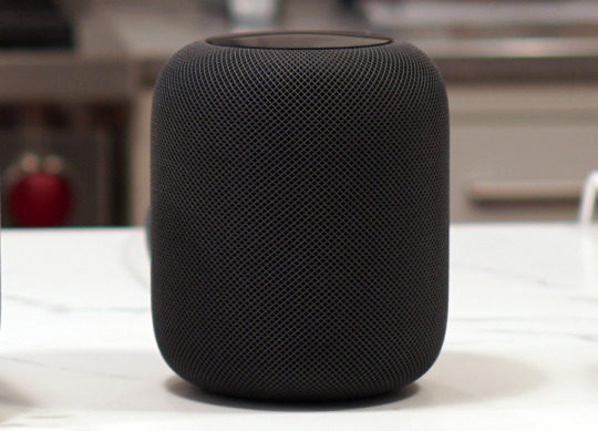
The Apple HomePod is here at last: get a black or white pod in your home.
Music first
You hear people shrieking about the HomePod’s price, which is $350. “I could get an Amazon Echo Dot for $40!”
Well, yeah. And instead of buying a Tesla, you could buy a bike off of Craigslist. It’s just not the same thing.
This thing is built. It’s a heavy, squat cylinder (6.8 inches by 5.6 inches), available in black or white. Rubber on the bottom, cloth mesh around the sides, touch-sensitive screen on the top. Even the power cord is dressed up.

The HomePod’s cord is wrapped in fabric, too.
The touchscreen on the top never displays words or recognizable pictures; it exists solely to offer a cool, colorful swirling LED light whenever HomePod is speaking or listening. Then it goes black.

Apple says that your music habits are encrypted and anonymized before anything’s transmitted to its servers.
Setting up the HomePod is incredibly easy: You just bring your iPhone near it and tap Set Up.

Things get off to a very easy start.
After a few setup screens (including, inevitably, an Apple menu ad), your Apple account password and home Wi-Fi password get transmitted automatically, and then you’re good to listen.
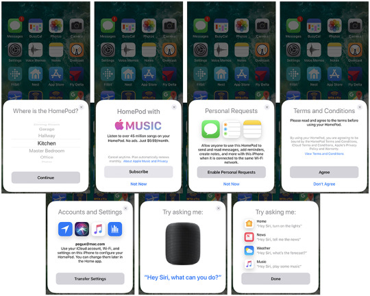
The iPhone walks you through the HomePod setup. No iPhone? No HomePod for you!
Assuming you’re among the 40 million subscribers of the Apple Music service ($10 a month), you’re in for a glorious ride. You can ask it to start playing music by genre, band, song name, album name, whatever. “Hey Siri — play Coldplay.” “Hey Siri — play me some 80’s dance tunes.” “Hey Siri — play ‘The Wall.’” “Hey Siri, next track.” “Hey Siri, volume up.” “Hey Siri, stop.”
You tap the top to pause playback, or tap + and – to adjust the volume. You can also double-tap for “next track,” or triple-tap for “previous track.”
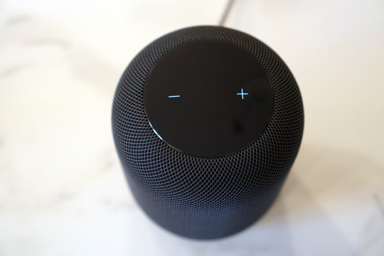
You can tap these buttons for volume adjustment—or just speak your volume requests.
The audio quality will floor you. Let’s just get one thing straight: The HomePod sounds better than the Google Home Max ($400), the Sonos One ($200), or the Amazon Echo Plus ($150), let alone all the smaller Echos and Google Homes. This isn’t a matter of opinion; it’s a universal reaction, based on a blind side-by-side blind listening tests I’ve conducted with listeners from all walks of demographics. (I’ll post the video here on Friday.) The HomePod has the most balanced midrange, the crispest highs, and a crisp, musical bass the other little guys can’t touch.

From left: The Amazon Echo Plus ($150), Google Home Max ($400), Apple HomePod ($350), Sonos One ($200). The HomePod sounds best.
Maybe that’s because the HomePod contains seven tweeters, arrayed in a circle, and a gigantic, 4-inch woofer, capable of moving 0.8 inches, pointing out the top. Or, as Apple describes it, “array of seven beam-forming tweeters, each with its own amplifier and transducer. And each custom designed with a precision acoustic horn that focuses sound for tremendous directional control.” But you knew that.
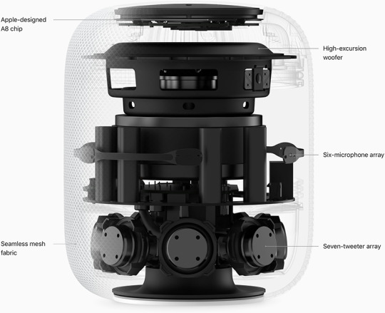
Here’s what the HomePod looks like naked.
At top volume, the HomePod is powerful enough to fill your entire downstairs, or your entire yard. It gets really loud — so loud that Siri asks if you’re sure you want to crank it that loud before doing so. And guess what? It doesn’t distort at 100%, like the Google Home Max does.
The HomePod also contains six microphones. They’re designed to pick up your voice commands even when you’re across the room, even when it’s blasting music. (My 13-year-old is fond of subjecting his parents to the following prank. He tells our Amazon Echo: “Alexa, play ‘Who Let the Dogs Out’ at 100% volume.” The Echo complies — but at that point, it’s impossible for it to hear any further commands! There’s no way to stop it except to get off the couch, march over, and tap it. The HomePod, on the other hand, can always hear you. You can say: “Hey Siri — tell me about this album.” “Hey Siri — who’s this singer?” “Hey Siri — play more like this.” And so on.)
But Apple says that the six microphones also serve to sample the proximity of the walls and ceilings around it. It instantly reconfigures what’s coming out of those seven tweeters so that the important stuff, like the band and the singers, come out toward the room, and the ones on the sides handle reverb, applause, and the like.
I don’t know about all that — there’s really no way to tell if all that’s happening. But never mind. The HomePod sounds really, really great.
Siri second
If you’re among the 39 million Americans who own an Amazon Echo or Google Home, you already have certain expectations of the things it can do for you. You can ask about sports, weather, news, measurements, facts, timers, reminders, and so on.
And you can voice-control your home, to the extent that you’ve bought Apple HomeKit-compatible thermostats, lights, and so on. Unfortunately, Google and, especially, Amazon are way, way ahead on smart-home compatibility. Siri can’t even control anything from Nest, which is probably the most popular brand.
But the sad, stunning fact is that the HomePod can’t do a lot of the things that the other speakers can— or even things Siri on your iPhone can. It can’t call you an Uber. It can’t tell you what’s on your calendar. It can’t set up more than one timer at a time (sorry, kitchen chefs). It can’t check your email.
It also can’t make free speakerphone calls to any number without needing a phone, the way the Amazon Echo and Google Home can. You can use the HomePod for dictating texts and reading incoming ones, if your iPhone is within range; and the HomePod can be a speakerphone for the iPhone.
But the HomePod can’t tell apart different voices in your family, the way the Google and Amazon speakers can. So if the texting feature is on, there’s nothing to stop other people from sending texts “from you” while you’re in the shower, or listening to your incoming texts when you’re upstairs. For a company that touts its dedication to personal privacy, Apple dropped the ball on this one.
Oh, and while we’re categorizing our disappointments: You can’t set up two HomePods as a stereo pair, as you can with Google or Sonos smart speakers. Nor is the HomePod multi-room; you can’t say “Play Barry White in the bedroom,” as you can with its rivals. Apple says that both of those features will come later in the year. (What exactly were you doing during those six years, Apple?)
Velvet handcuffs
The most astonishing limitation of the HomePod is that you must own an iPhone to set it up, and you must be an Apple Music subscriber to voice-control music. Unless you’re all-in on Apple, you can’t even use this thing.
That’s right. Apple’s $350 smart speaker has never heard of Spotify, the music service that’s twice as popular as Apple Music (70 million subscribers). No Spotify, no Pandora, no Google Play, no iHeart Radio.
Now, you can start up these services on their various iPhone apps and send the playback through the HomePod. But you can’t command them by voice, which is the whole point.
“Totally understandable,” you might say. “Apple runs a music service — they want to drive customers to that.” Well, sure, but so do Google and Amazon. Yet their speakers let you control Spotify and other services by voice. And they don’t require one phone brand or another.
For most people looking for a smart speaker, I’d recommend the Sonos One. Its audio quality is just shy of the HomePod’s (you’d notice a difference only in a direct A/B comparison test). It contains Amazon Alexa and “OK Google.” It’s multi-room, it’s stereo-pairable, and — here’s the kicker — you can buy two for the price of a single HomePod.
Bringing HomePod
Being late to the party is an Apple hallmark — but so is starting out with a lame 1.0 version. The first iPod worked only with Macs, not Windows. The first MacBook Air was painfully slow. The first Apple Music app was a hot, confusing mess. And how about the Apple Watch 1.0? Yeah — nobody touched it.
Maybe that’s the master plan for the HomePod, too.
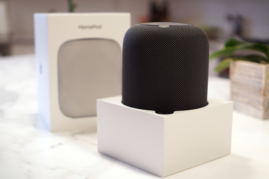
It’s a 1.0 product, for sure.
We already know that Apple is working on letting you use two in a stereo pair, and developing multi-room features (“Hey Siri, play Taylor Swift in the playroom”). So maybe Apple’s also assembling a team of voice engineers to bring Siri out of its 2011 rut. Maybe a software update will bring speaker-independent voice recognition, so each family member can ask about their own calendars, texts, and playlists. And maybe Apple’s lawyers are furiously hammering out the deals with Spotify and Pandora even as we speak.
Until then, the HomePod sounds amazing only in the literal sense. Otherwise, it’s best suited only to a core audience of true-blue Appleheads: people who use the iPhone, signed up for Apple Music, and, preferably, live alone.
In other words, maybe the HomePod isn’t late to the party. Maybe it’s just really, really early.
David Pogue, tech columnist for Yahoo Finance, welcomes non-toxic comments in the Comments below. On the Web, he’s davidpogue.com. On Twitter, he’s @pogue. On email, he’s [email protected]. You can sign up to get his stuff by email, here.
Read more:
David Pogue’s sneak preview of the Apple HomePod
Pogue’s Apple TV 4K live unboxing
Reviewers discover that the Apple Watch Series 3 can’t get online
iPhone 8 reviewed: Nice, but nothing to buzz about
#Apple#Pogue#_lmsid:a077000000BAh3wAAD#_revsp:yahoofinance.com#$AAPL#_author:David Pogue#_uuid:dbf53a2a-e8e0-3736-83d5-b9704a21a2ca#HomePod
4 notes
·
View notes
Text
Algorithmic trading caused the flash crash: An explainer
yahoo
On Monday, the stock market did something weird. Sure, it was sinking through the day — but then, at about 3 p.m. ET, it plummeted. Nobody could figure out why. There was no big headline, no sudden announcement.
“The drop in the morning was caused by humans, but the free-fall in the afternoon was caused by the machines,” wealth manager Walter “Bucky” Hellwig told Bloomberg.
Hup — there it is. Algorithmic trading caused the flash crash.
My “Midday Movers” producer asked me to offer an explainer for “algo trading,” as it’s nicknamed —but really, it’s not hard to grasp. Algo is when you program software to buy or sell stocks automatically, based on timing, price, quantity, or some mathematical model.
Algorithmic trading has a number of benefits: It rules out human emotion; it places trades instantly and precisely, locking in at the values you want; and lets institutional investors (like mutual funds and insurance companies) buy or sell huge quantities of stock in many smaller blocks, so as not to affect the stock price in the process.
Algo trading also, however, tends to magnify upward or downward trends, as we saw yesterday. Fortunately, the market largely recovered after the algo-driven selloff — maybe because humans came back to their desks.
David Pogue, tech columnist for Yahoo Finance, welcomes non-toxic comments in the Comments below. On the Web, he’s davidpogue.com. On Twitter, he’s @pogue. On email, he’s [email protected]. You can sign up to get his stuff by email, here.
#_uuid:e256710f-52cf-3b03-9457-a82275caa671#_lmsid:a077000000BAh3wAAD#_revsp:yahoofinance.com#_author:David Pogue
1 note
·
View note
Text
The tiny, 4K Mavic Air crushes other DJI drones
yahoo
Every consumer product goes through three stages of life. It’s invented; it’s improved and adjusted; and, finally, it becomes a commodity. There’s not a lot of innovation anymore in microwave ovens, ceiling fans, or toilets — they’ve pretty much stopped morphing. They’ve reached the third stage, their ultimate incarnations.
Drones, love ‘em or hate ‘em, are still in the second stage: They’re rapidly changing direction, gaining features, finding out what they want to be. It’s an exciting period in this category’s life, because new models come out fast, each better and more interesting than the last.
For proof, just look at the Chinese company DJI, the 800-pound gorilla of drones. It releases a new drone or two every single year.
They’ve just introduced a drone called the Mavic Air ($800). It’s so small and smart, it makes you wonder why anyone would buy the 2016 Mavic Pro, which costs $200 more — but it’s not what you’d call perfect.
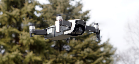
The new Mavic Pro is incredibly tiny, stable, and lightweight.
Meet the Air
The 15-ounce Mavic Air is small — and that’s huge. It folds up for travel: its four arms collapse against the body to make the whole thing small enough to fit into a coat pocket, about 6.5 inches by 3.5 inches by 2 inches. (The top two arms swing horizontally, as you’d expect. The bottom two, though, are hinged in two dimensions: They fold downward and inward, and you have to remember to do those before you do the upper arms. You’ll figure it out.)
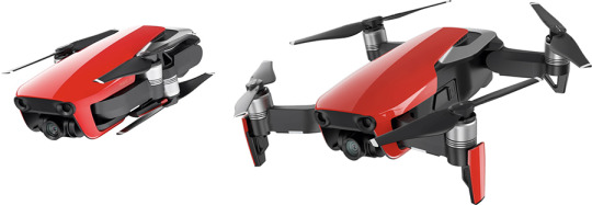
The Mavic Air’s arms fold up.
Of course, there are plenty of small drones — but not in this league. The Mavic Air, for example, can capture gorgeous 4K video. And its camera is on a three-axis gimbal for stabilization; the video looks like it was shot from a tripod even when the drone was being buffeted by 20 mph winds, as you can see in the video above.
The box includes the drone, a remote control (it uses your smartphone as its screen), a battery, a charger, a set of propeller guards for indoor flying, and a spare set of propellers (in crashes, they’re the first to go).
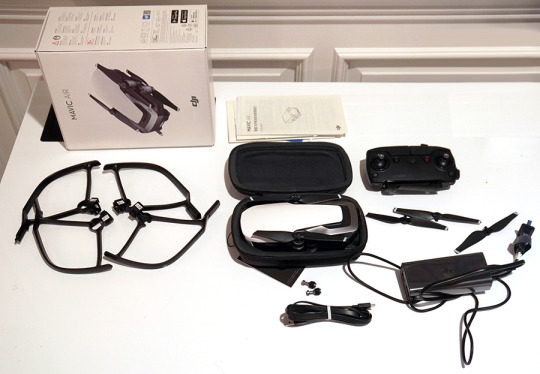
The Mavic Air comes with four propeller guards for indoor flight, 1 battery, a case, spare propellers and a charger.
The Mavic Air is also smarter than any sub-$1,000 drone DJI has ever made. It has depth-sensing cameras on three sides — forward, down, and backward (that’s new) — so that it can avoid collisions automatically in those directions.
Like most drones, this one has an automatic Return to Home feature that kicks in whenever the battery is getting low or if it loses the signal with the remote control. (You can also call it home with one button press whenever you’re just feeling anxious.) Thanks to the cameras underneath, this thing lands exactly where it took off — within a few inches.
The competitive landscape
The Mavic Air’s primary competition comes from two other DJI drones. Here’s the rundown:
Mavic Pro (2016 model, $1,000). Twice the size of the Air. Folding arms. 4K video. “27 minutes” of flight per charge (in the real world, 22 minutes). Front and bottom collision avoidance. Remote control included with built-in screen (no phone necessary). Very few palm control gestures (see below).
Mavic Air (2018 model, $800 — the new one). Folds up. 4K video. “21 minutes” per charge (more like 18). Front, bottom, and back collision avoidance. Remote control folds up tiny — even the joysticks unscrew and store inside the body, for even smaller packing. Has the most palm gestures of the three drones — and the most reliable palm gestures. 8 GB of internal storage for video and stills, so you can still record if you don’t have a micro SD card on you. Another $200 buys you a “Fly More” kit that includes two extra batteries, an ingenious folding four-battery charger, and even more spare props.
Spark (2017 model, $400). The smallest body of all, but its arms don’t fold, so it winds up being bigger for travel. 1080p video. “18 minutes” per charge (more like 11). Front and bottom collision avoidance. Remote control is an extra purchase ($120); uses your phone as a screen. Responds to hand gestures, but not reliably.
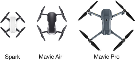
The Spark may look smaller than the Mavic Air, but remember that it doesn’t fold up.
True, the Mavic Pro gets a little more flight per battery. And there’s an even more expensive model, the $1,100 Mavic Pro Platinum, that gets “30” minutes per charge.
(Do those seem like incredibly short flights? Yup. But that’s drones for you. As it is, a modern drone is basically a flying frame designed to haul its own battery around.)
But in my book, the Air’s tiny size is far more important than the marginally greater battery life. As the old saying doesn’t go, “The best drone is the drone you have with you.”
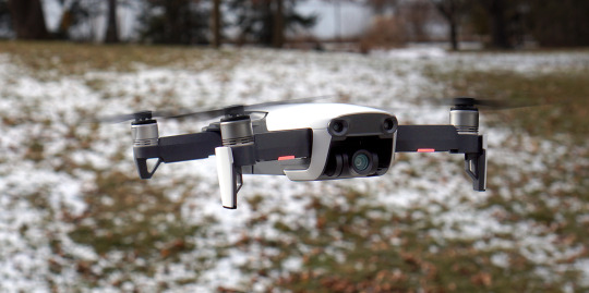
Only the front “arms” have landing gear (the white thing), which fold up for travel.
In-flight entertainment
You can fly the Mavic Air in three ways.
First, you can use the included remote control. If you insert your smartphone into its grippers and connect the little cord, you get a number of perks — like actual joysticks, which make the drone much easier to fly than using the phone alone. The remote also has a dial at the outer corner for adjusting the camera’s tilt in flight, as well as a switch for Sport mode, which unlocks the drone’s top speed of 42 mph (by turning off the obstacle-avoidance features).
The remote also gives the drone a much greater range. It uses a Wi-Fi connection to the drone, instead of the proprietary radio connection of the Mavic Pro. DJI says that still gives you 2.4 miles of range, but I say baloney; even in the middle of the Texas desert, you’ll be lucky to get half that distance. It doesn’t really matter, though, since Federal Aviation Administration rules say you can’t fly a drone out of sight. (Speaking of the FAA: You don’t need a license to fly the Mavic Air as a hobby, but you do need to register the drone itself. And if you intend to fly it professionally — this means you, wedding videographers, filmmakers, construction firms, realtors, police, and farmers — you have to get permission from the FAA.)
The second way to fly the drone is using your smartphone. It works, but you get a much shorter range (about 250 feet), and it’s harder; DJI’s app has become one super-crowded, complex piece of software.
The third way: using hand gestures. The drone must be facing you at all times, and it has to remain pretty close to you, so this trick is primarily useful for positioning it for “dronies” (selfies from the air). Keep in mind that you also need the phone app with you, though, to turn on the palm-control mode.
You stand with your arm out, palm forward, in a “Stop! In the name of love!” pose. Now, you can “drag” your hand up, down, or around you; the drone follows as though connected to your palm by a magnet. It’s the next best thing to The Force.
New, two-handed gestures let you push the drone farther away or pull it closer to you. And you can now make the drone land by pointing your palm toward the ground and waiting.
In the previous model, the Spark, those palm gestures were super iffy; sometimes they worked, sometimes not. The Mavic Air makes them far more reliable, although I never got the new “take off from the ground” gesture working.
As in other DJI drones, the Mavic Air can follow you as you ski, bike, drive, or run (it tracks you optically — you don’t have to have the remote control on you). Unlike earlier ones, this one doesn’t just hover when it encounters an obstacle; it actually attempts to fly around the obstacle and keep going.
How’s it look?
“4K” may be a buzzword, but it doesn’t automatically mean “great picture”; it could refer to 4,000 pixels’ worth of ugly blotch.
The Mavic Air contains the same tiny camera sensor as the Spark and the Mavic Pro. The footage and stills generally look terrific — anything shot from the air is automatically kind of stunning, and the Air uses more data (100 Mbps) to record data than the Pro does.
Unfortunately, this sensor is still fairly disastrous when it comes to dynamic range. That is, it tends to “blow out” bright areas and “muddy up” dark areas. Alas, those are things you get a lot of when you’re shooting from the sky.

The Mavic Air’s footage is often marred by blown-out highlights (sun, left) and goopy, murky shadows (people, right).
The Air can also do half-speed slow motion (in 1080p, not 4K), and take high-dynamic range photos (not videos).
All of these drones offer preprogrammed flight patterns, called QuickShots, that make great 10-second videos, incorporating flight maneuvers and camera operations that would be incredibly difficult to do yourself.
For example, the one called Circle makes the drone fly around you, keeping the camera pointed toward you the whole time; Helix makes the drone spiral out and away from you; and so on. There are two new ones: Boomerang flies a grand oval around you, up/out and back. Asteroid combines a flight up and away, with a spherical panorama. On playback, the video is reversed, so that it seems to start with a whole planet earth viewed from space, as the camera rushes down toward you. Here, have a look.
But it’s small
Like all drones in this price range, the Mavic Air is complicated and sometimes frustrating. It does a lot of beeping at you, it’s still full of options that are “not available now” for one reason or another, and it still doesn’t come with a printed instruction manual.
And yeah, someday, we’ll look back and laugh at an $800 drone that flies for only 18 minutes.
But you can’t buy a dream drone that doesn’t exist. And among the ones that do, the Mavic Air is ingeniously designed, impressively rugged, and incredibly small. Its features beat the cheaper DJI Spark in every category — and even the more expensive Mavic Pro in almost every category.
In other words, if you’re the kind of person considering a drone, the Mavic Air strikes a new sweet spot on the great spectrum of drones, somewhere between beginner and pro, between tiny and luggage-sized, between cheap and pricey. Invest as much time learning it as you’ve invested in buying it, and you’ll be flying high.
David Pogue, tech columnist for Yahoo Finance, welcomes non-toxic comments in the Comments below. On the Web, he’s davidpogue.com. On Twitter, he’s @pogue. On email, he’s [email protected]. You can sign up to get his stuff by email, here.
Read more:
Exclusive: What Fitbit’s 6 billion nights of sleep data reveals about us
Tech that can help you keep your New Year’s resolutions
Pogue’s holiday picks: 8 cool, surprising tech gifts
Google’s Pixel Buds: Wireless earbuds for the extremely tolerant
Study finds you tend to break your old iPhone when a new one comes out
Rejoice: Sonos Speakers are finally voice-controllable
Follow Yahoo Finance on Facebook, Twitter, Instagram, and LinkedIn
#Mavic Air#DJI#_lmsid:a077000000BAh3wAAD#_revsp:yahoofinance.com#_uuid:f3024972-b485-347a-ac1a-13f792608cec#_author:David Pogue#drone
2 notes
·
View notes