#(both lineart and watercolor wise)
Text
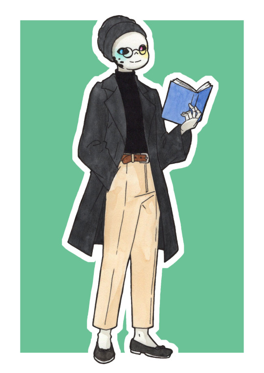
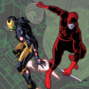
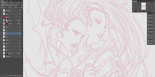
Inktobertale day 11: library
Yes of course it's a sleeveless black turtleneck underneath that coat/jacket/thing. Who do you think I am?
#Cognito art#Ink#Inktobertale2023#Ink!Sans#he can be cute#he can be handsome#he can be all at once#I like a little feminine touch when I draw him in more masculine clothes#here it's the shoes#I think it really adds a little softness#and a little queerness#and a little they/themness to Ink#(I'm actually really happy with how to pants turned out)#(both lineart and watercolor wise)
17 notes
·
View notes
Text
Hi! @velvetcloak asked me to do some kind of lineart tutorial/step-by-step, I'm by no means an expert so don't hesitate to ask if you need some things clarified! Always glad to help.
I use three different methods that are pretty much trial and error, depending on what works best for the artwork but I'll do my best to explain with screenshots - these were taken on photoshop, I draw with procreate, but I'm guessing the layer modes are similar on other softwares. (Also mine are set in french, sorry in advance for the confusion.)
If you're already familiar with digital lineart and softwares, this probably won't be of much use, it's very basic stuff.
Otherwise, more below the cut! (It got a bit long.)
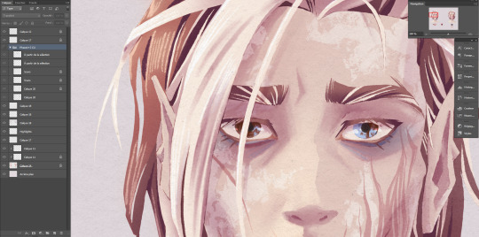
I. Solid black lineart, with this illustration used as reference.
I used the basic gesinski ink brush in procreate, 100% opacity in normal mode to get pure black. Very basic, it's set on top of the colour layers, everything above that is just additional effects and filters + textures. Note that I always draw separate elements on different layers and fuse them later, it's easier to deal with details this way.
The isolated layer looks like this (I changed the colour of a disappearing hair lock, more on this later):
And the colours without it, like this (my style relies heavily on lineart, lol):

Both:
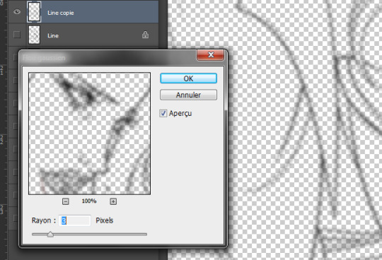
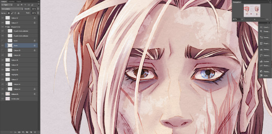
Good! It's a bit harsh though, I like to add a second layer to soften things up, set in 45% opacity multiply mode right under that. I duplicate the main lineart, and add a gaussian blur to the copied layer (between 3 and 5px, values vary from one artwork to another, same with the layer modes.)
Not done yet! I use the blured lineart as a colour filter by locking it to pixels only and filling it with the tone I want. In this case, red. Isolated layer:
And the end result:
The second method, I tend to use more on sketches and loose drawings to get a better blend of lineart and colours:
II. Semi-transparent lineart, with one of these sketches.
Basic 6B brush in procreate (my fav), quite thin here but you can get great results with a larger brush. It's not really obvious looking at this scale, so here's a comparison between a black solid lineart (1 layer, normal 100% - the scars are on a separate layer because of the colour, otherwise it's the same setting) and a semi-transparent one (2 layers), especially visible in lighter areas, note how the second one lets hues show through. I find this to look a bit less stiff.
Now for the method! Since this relies on the layers underneath, you want your colours to a bit more precise than the previous example. Without lineart:
TBH it's also a two layers solution, super easy. Once you're statisfied with your basic lineart, set the layer to overlay 100%. You'll get something like this:
Then duplicate this layer, put the copied layer above the overlay one and set it to normal 70% (or whatever looks best, this is 67%) and you'll get the final result as previously shown! In this particuliar case, I erased the black circle around the iris in the normal mode layer to keep the blue of the overlay one. You could also skip step two depending on the desired rendering.
The third method is a blend of the other two result-wise:
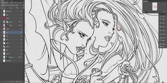
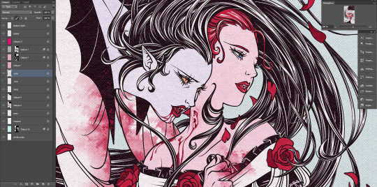
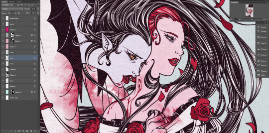
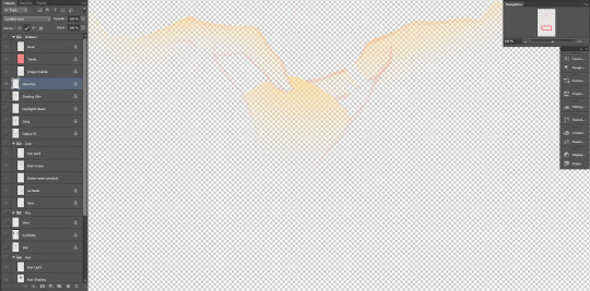
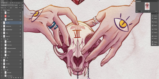
III. Coloured lineart, with this illustration. (tw: a bit of gore and blood in the full artwork, I'll crop it out of the screenshots. Poor guy can't get a break. It's the only file in this style with a semblant of organization, don't be like me, rename your layers and use folders.)
Fountain pen toothy brush, from the MaxPack watercolor set. It has a bit of a texture to it, and isn't entirely opaque so it blends nicely with the layers below. The lineart is set to normal 100%, for this method it's preferable to have separate layers for each elements, since you'll be recolouring them individually. Here, the hands, skull and additional details are all on individual layers.
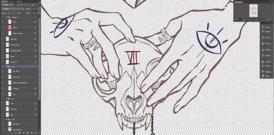
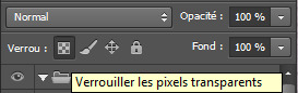
Just like the blurred layer in the first method, you need to lock your pixels (the little grid to the left on photoshop):
And either fill you layer with colour, or paint on it with an opaque round brush/a soft one depending on the desired outcome. (Some zones might need a gradient, or various colours.) You can also use another normal layer on top of a black lineart and set it as a clipping mask, same result, different method. But I prefer to keep the layers count to a minimum when possible.
With the layers below, it will look like this:
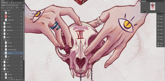
You can notice a bit of lineart transparency over the skull colour layer, cool stuff. (The shading of the skin is set on top for some reason, I don't remember why but surely there was a reason.)
However! In this illustration, I need a yellow glow for the fire so let's create yet another layer, shall we? This affects the whole rendering. I painted a diffuse light source using a soft gradient brush, and set the layer to hard light. Isolated layer:
End result:
All done!
Now go create!
8 notes
·
View notes
Text

Btw here’s a little bit of original art. This is me experimenting with my tablet and brush settings to try and reproduce the coloring style I made on my iPad. I’m not particularly happy with the process although the end product does resemble my current stuff.
Honestly, it’s kinda weird seeing my OCs in a style I’ve only used in fanart so far. It’s a really weird feeling. My original stories have always had their own individual style aesthetics, so it’s kinda… strange. Heroism is the closest aesthetic-wise to the one I developed for the DSMP, but it’s still weird. Both DSMP and Heroism is very colorful and highly saturated against a very dark background. However, the difference in how I perceive them in through their line quality. Heroism is wispy, like grainy watercolor with the thinnest lineart I’m comfortable with doing. Whereas DSMP is bolder and highlighted, with water-stained pigments. It’s just weird seeing Heroism in my DSMP style. I’m never doing this again.
Anyway, the whole point of this was to see if I could finish my WIP to a satisfactory degree on my computer, and the answer is No. There’s a reason I preferred lineless art for the longest fucking time, and it’s because I Fucking Hate Lineart. My Apple Pencil and iPad is the only time I’ve remotely enjoyed lineart, and it really showed.
I’ll probably be doing more original art until I get my replacement pencil next week. I haven’t posted my original art much here, and I might keep it like that.
#personal#dreamlessart#heroism#I started tumblr as a blog#and I continue to treat tumblr as a blog#I am here to post my bullshit and move on
1 note
·
View note
Note
What do you use to draw? I'm pretty sure you use a drawing tablet, but what brand? Any reccomendations?
I have two Gaomon tablets! One which I use for my laptop and one that I use for my desktop.
The one I use for my desktop is a Gaomon PD2200. It's a rather large tablet that comes with a stand. It's really neat, and the screen itself is this sort of matte cover that makes it feel a little more like paper. The main downside is that the 'buttons' aren't 'buttons' so much as they are 'touch buttons'. As a result, you can't really feel when you're pressing on the buttons, so if you try to use them without looking at them, you could press the wrong thing. I ended up not using them and keeping them on, and eventually had to turn that whole function off because it kept picking up inputs that I wasn't giving it and making me think that my computer was messing up.
The one I use for my laptop is a much smaller one that plugs directly into it. It's a PD1161. It has a much smaller screen, but the upside is that it's a display tablet (like the PD2200) and it acts as a second monitor, so I can look at what I'm drawing while I'm watching a YouTube channel and being online. This one has unmarked buttons (that I could mark with a silver sharpie or something), but they're actual buttons, so I already consider that to be a plus.
I like Gaomon! It's a rather fair brand for the price, I feel. The only things I don't really like about them that I've consistently noticed in between both of the products that I have is that:
The colors look different from how they are on the other screen and it's difficult to try to figure out how to adjust them to the same values
The biggest issue I have is that there's often a drift from where the pen is and where the tablet detects it as being. It varies all around the board, and calibrating the screen doesn't seem to do much to fix it. Checking on my drawing tablet right now, it looks to be less accurate towards the center and more accurate around the edges of the screen for some reason. You can work around it, but it's a little frustrating at times that you have to focus on the actual cursor on the screen.
The PD2200 and its touch buttons are difficult to use, and even when I wasn't using them, they still eventually ended up detecting false inputs that made me dread trying to draw on it and frustrated me to no end. I eventually figured out what the issue was, but it took a good couple of months before it finally clicked in my brain after getting a whole other keyboard and noticing that the issues were still continuing.
Aside from drawing tablets, my traditional mediums tend to vary! I like to experiment from time to time with different mediums, and this includes ballpoint pens, sketching pencils, India inks, calligraphy ink, watercolors, alcohol markers, colored pencils... it helps me feel less like I'm sitting in the same rut all the time, being able to swap in between different mediums and experiment. Sometimes what you need to get out of art block is a bit of rest. Sometimes what you need is trying something different!
Traditional-wise, what I really want to do is get a bundle of colored calligraphy inks so I can do some colored lineart, but all that Amazon's really showing me is India inks and glass pen inks. Which are all water-based and not made for calligraphy pens.
As an aside, as a touch of experimentation, I figured out that India inks and glass pen inks work very well on watercolor paper, and it doesn't blot or bleed as much as it does on sketch paper! Sort of makes me wish I did that Pure Vanilla drawing on watercolor paper instead of a sketchbook, but then again I also wish I used a different color for the lineart anyway, so. You win some, you lose some.
Experimenting is,, fun. I think people deserve to experiment.
3 notes
·
View notes
Note
1-30
This is long
1) Do you prefer traditional drawing, or digital?
Uhh recently I’ve preferred traditional as for recent style updates/changes but I do most my work digitally.
2) How long have you been drawing?
I’ve been drawing all my life really but I started taking actual art classes when I was around 7?
3) How many classes have you taken?
(I’m assuming art classes here.) Well I’ve taken after school art classes during middle school and I’m currently in an art school! The classes I’ve taken for art are: 2D (painting, drawing, etc.), 3D (wood, metal, wax, etc.), ceramics, photography (film, digital, photo editing in photoshop & dark room settings), computer (digital art classes based in photoshop), printmaking (screenprints, copper etchings, woodcarving, etc.). While I’m still in high school, I go to my art school half-day (all these courses are college level btw kjrgnweklv).
4) Do you have a DeviantArt, personal website, or art blog?
I have a DA, Instagram, Art Amino, Paigee World, and this blog. I’m more active on here and Instagram however.
5) What’s your favorite thing to draw?
I love drawing arms and legs kejglvebtlkhnj I like the curves the body tends to have bc I just tend to like drawing round shapes?? But sketching a person is just generally fun to do.
6) What’s your least favorite thing to draw?
I dislike drawing still lives so much like, you don’t understand. While it’s great for basics and learning how to properly space things out, I find it completely tedious now.
7) How often do you use references?
Most of the time. Always use references. I use them for hands, shoulder placement, scenery, etc. I suggest not copying it directly, but looking up a stock photo can really help with learning how the body works for anything.
8) Do you draw professionally, or just for fun?
Both. I draw professionally at my art school and have sold work through them, but I also draw for fun so I can draw better professionally?
9) How much time do you spend drawing on an average day?
Almost everyday I spend about 1-4 hours drawing? My job qualifies I help little kids draw so that’s also added in but this also helps my drawing abilities.
10) Are you confident about your art?
Ha.
11) How many art-related blogs do you follow?
I follow a lot on Instagram but maybe 5-8 on Tumblr.
12) Is it okay for people to ask you about your process?
Yeah! If it helps someone perfect their process sure!
13) Do you prefer to keep your art personal, or do you like drawing things for other people?
I like doing both but I guess it depends on what the subject matter is?
14) Do you ever collaborate with others?
Not often but I have in the past. I would like to collaborate more with others so if anyone is interested let me knoow!!
15) How long does an average piece take you to complete?
A digital work takes me about 1-3 hours to complete depending on how complex I make it. A traditional work (ex. my paper star project from forever ago with the hands on the jar) takes anywhere between 5-10 hours.
16) Do you draw more today than you did in the past, or do you draw less?
I draw so much more given my IB Art workload and art school workload and then my job. I think it has helped me improve a lot quicker than I would’ve if I were going slower.
17) Do you think you’re justified in giving other people art advice?
Yeah credential wise. I mean I go to and art school (for almost 3 years now) and have been in critique class settings so I mean?
18) What are you currently trying to improve on?
Being more racially/body type inclusive in my art style. I find a lot of my characters are white and thin and it’s something I want to fix, along with making the different body types appear successful in my style.
19) What is the most difficult thing for you to draw?
Animals of any kind along with feet.
20) What is the easiest thing for you to draw?
Hands and legs and eyes.
21) Do you like to challenge yourself?
Yes. Challenging myself is a way to get better and I’d prefer improve a lot more rapidly by always challenging myself.
22) Are you confident that you’re improving steadily?
Yeaah, if you were to see my personal sketchbook you could see a definite improvement from February to now.
23) Do you draw more fanart, or more original art?
I do a good mix of both?
24) Do you feel jealous when you see other people’s art, or inspired? (Be honest!)
Sometimes I get pretty envious but mostly I chose to take that envy and turn it into determination to get better at my own thing? So yeah I suppose I do get inspired lmao
25) Do you like to draw in silence, or with music?
I prefer music because I like taking frequent breaks to just, jam out?
26) For digital artists: what program(s) do you use?
I mostly use Medibang Paint Pro and sometimes Photoshop CS6.
27) For digital artists: how many layers does a typical piece require?
Over 20. I separate all the colors of a piece on multiple layers and add a clip layer if I want to change a color quickly, then lineart and the initial sketch both have different layers, then overlay and background. It’s a big mess.
28) For traditional artists: what medium do you like most? (Pencil, charcoals, etc)
I mostly sketch with a blue color pencil (as I find a regular pencil transfers the graphite too much for my liking) but I love working in watercolors and oil paints.
29) For traditional artists: How do you usually start on a big piece? (Light sketch, colored lead, sketchpaper, etc)
For something around 18 inch x 24 inch it all depends on the media I’ll be using. For a painting I start with a pencil sketch, then go to an acrylic wash (to block in the shadows), then do the actual painting.
30) What inspires you to not just make art, but to be a better artist?
I want to get better, not the best, but better. I want to be able to be someone’s inspiration to get better and want to overpass my technical skills.
2 notes
·
View notes
Last Seen Blogs