Last Seen Blogs
thedynamiteduo
Dick & Babs

somnicollective
Sleeping Still
carita-enojada
Solo mira las estrellas.

crysdoll
Crysdoll

jb-shadowninja
Well, That Was Awkward!
Text
4/27 Class Sketch

In today’s class time, I decided to sketch a turtle menacingly going towards a city and some elements/principles of design I used were scale, visual texture and linear perspective.
1 note
·
View note
Text
Scale and Proportion

Scale and proportions can help make the image realistic but can also help create a unique style by emphasizing certain elements. This painting, Woman with Head of Roses, by Spanish artist Salvador Dali showcases just that. There is human scale within this piece but it also pushes the boundaries of normal “human” proportions as the two main figures’ legs are extremely long which gives it this exaggerated feel; however, it is important to note that it is not too exaggerated or else it would lose the realistic aspect. This is further done by hierarchy. The flower head figure is the biggest element which demonstrates that it is the most important and/or most powerful. While the ratio between it and the small white figure in the background reemphasizes that, it also draws the eye to the isolated figure and makes it more mysterious. This technique of exaggeration takes the artwork to another level and is essential to what made Dali’s work so special.
Overall, the use of scale and proportion allows a piece to appear realistic but manipulating them in different ways allows for the cultivation of distinct styles.
Glossary
Scale: The size of one object in relation to other objects in a design.
— a certain relative or proportionate size or extent (A human is 7.5 heads tall.)
— a standard of measurement or estimation (The UFO was as big as a football field.)
— point of reference by which to gauge or rate (My puppy is twice as big as your chihuahua.)
Aspect Ratio: This refers to the proportions of the height and width of an image. It defines its overall shape, and it is usually shown as W:H (W is the width and H is the height).
Geometry: Spheres, cubes, cylinders can be used to build more complex objects
Hierarchy: Arranged according to importance or power. What’s bigger or taller is often more important or harder to kill.
Human scale: This sets the stage for the story happening to human-sized characters
Proportions: The size of the parts compared to the whole. Relativity.
Ratio: A ratio tells us what proportions mean to each other. Measuring one thing in terms of another. That monster is twice the size of the human. Their ratio is 2 to 1.
Relative: How objects appear in context with each other
0 notes
Text
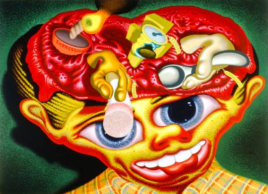
Emphasis

Emphasis draws the viewer’s eye to a certain aspect of the piece. This can be seen in Polish artist Zszislaw Beksinski’s painting “Untitled”. The placement of the head allows it to become the focal point as it is closer and emphasizes that this is the most important part within the artwork. Also, the creatures going into the mouth, moving left to right, leads the viewer’s eye right to the head. This is further stressed with subordination as there is greater detail in the focal point than the buildings in the background which causes it to stand out. Without emphasis, this piece would not have the same visual power or effect as it does.
Glossary
Emphasis: Pow! Something in a scene dominates. In other words, the designer gives visual priority to part of a scene in order to draw the eye there first.
Contrast: Contrast in size, color, texture can make one thing stand out from the many things around it.
Focal Point: The focal point demands attention, it is accentuated, contrasted -- the star or the most prominent component of a scene.
Isolation: Feature a single element alone, away from other elements to create emphasis.
One Element: Eliminate everything else in the composition and the thing that’s left will grab the attention such as a bold title or symbol.
Placement: Position your most important design component in a place to grab attention, such as the center of a poster.
Subordination: The focal point has the visual power while other elements of the scene are subordinate.
Whole over Parts: Sometimes we don’t want the eye to go somewhere specifically such as in an establishing shot at the beginning of a story. We want to show an overview of the environment before we jump into the story. We might look at a map with lots of details. The whole map is the important thing. When we select a place on the map to visit, then that spot becomes the focal point and the Emphasis shifts from the whole to the specific. Another example is that the whole game is more important than its levels.
0 notes
Text
Contrast
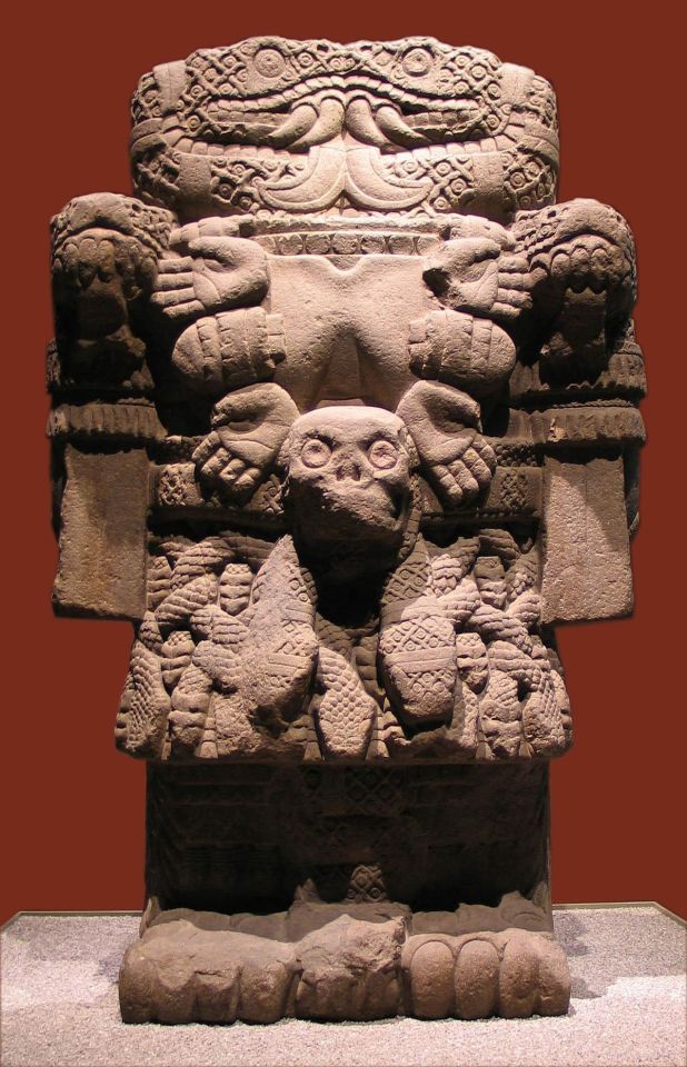
Contrast adds variety and unifies the whole piece. This statue of Aztec deity Coatlicue is a great example of this. While it has low contrast due to piece being old and textures worn down, there is also a lot of high contrast. Due to it being made out of stone, it has to be carved into at all different depths in order to make textures or forms which ends up creating variety on the surface. The overhead lighting further shows this as shadows cast over areas that have been further carved into such as the legs and arms. This statue also has symmetrical balance. Imaging a straight line through the middle of the piece shows that each side is a mirrored image of the other and that this balance makes it cohesive.
Overall, contrast really brings the piece together and makes it stronger.
Glossary
Contrast: Refers to the arrangement of opposite elements (light vs. dark colors, rough vs. smooth textures, large vs. small shapes, etc.) in a composition so as to create visual interest, excitement and drama. Contrast creates variety within a unit, draws the eye to a focal point, creates a sense of adventure or mystery. Contrast is a unifier. Value contrast is when a character or object has a strong darks and lights compared to the scene around it. Size contrast is a gigantic space cruiser compared to much smaller fighters.
Asymmetrical balance: A dynamic compositional strategy in which each side of the axis are distinctly different yet belong to the same story.
High Contrast: A strong dissimilarity such as black letters on a white background. The high contrast setting is an accessibility feature built into interfaces to assist people with vision impairment. In visual perception of the real world, contrast is determined by the difference in the color and brightness of the object and other objects within the same field of view. Because the human visual system is more sensitive to contrast than absolute luminance, we can perceive the world similarly regardless of the huge changes in illumination over the day or from place to place.
Low Contrast: It means a minimum of contrast between light and dark, so that the image is either predominantly dark or predominantly light. The sun sets, dusk sets in and in the gloom there is low contrast in the landscape.
Symmetrical: A form of balance in which both sides of the axis are the same, a mirror image of each other, creating stability and formality. In visual storytelling the symmetrical formal balance is often contrasted with the dynamic action of asymmetrical configurations. For example, the formal balance and discipline on the Death Star in Star Wars is contrasted with the diversity of the different rebel cells and militias from across the galaxy. The dynamic contrasting rhythms and visuals of the dark side contrasted with the Jedi and rebel alliance has kept the franchise going for decades.
Contrasting camera angles: Part of your story is how you show as well as how you tell. The camera is your audience’s view of your story and should be well planned to reveal the story in the most effective way possible
1 note
·
View note
Text
Rhythm
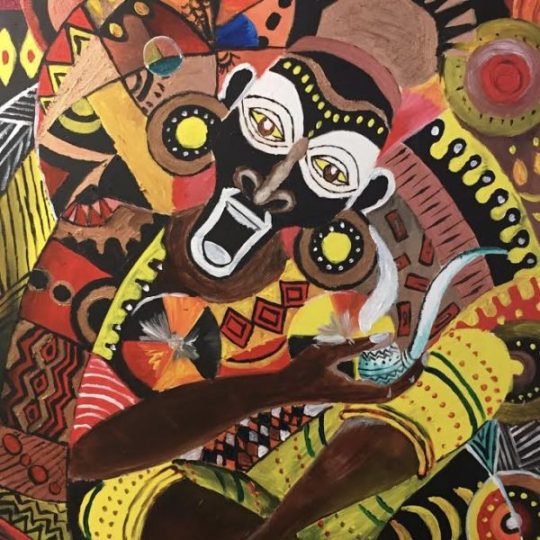
Rhythm can help bring variety and movement to a painting. Kenyan artist Waruguru Waithira perfectly demonstrates this in her painting that’s shown above. There is visual rhythm in almost every aspect of this piece. In the background, a majority of it consists of alternating rhythms such as the red and black zig zags on the left side and the black hills with white dots on the right side. There is also contrasting rhythms throughout the whole piece such as the zig zag, dots and straight lines on the pipe.
Overall, the variety of rhythms that the artist uses allows a static image to come alive and makes the painting more interesting.
Glossary
Rhythm: Caused by patterns in movement. What are those footsteps in the dark room? Are they slow or fast? Running or sneaking up on you? Rhythm controls the pace of action in your story. Rhythm can be repeated character types, weapons, or color strategies. We see and hear rhythm throughout nature as well as in our digital environment. Rhythm organizes units into patterns. Rhythm is created through repetition, alternation, and progression.
Alternating Rhythm: Alternating rhythm is a form of repetition and is predictable. We switch back and forth from one thing to another like a tennis match. Alternating rhythm can create tension, such as switching close up head shots of one character arguing with another.
Audio Rhythm: sounds that create patterns such breathing or shooting rounds of ammo.
Conceptual Rhythm: Intensifies, moves along, or calms the story. Conceptual rhythm coordinates visual and audio rhythm with the pace of your story.
Contrasting Rhythms: These are two or more sounds or motions at obviously different tempos. Legatomeans music in a smooth flowing manner, without breaks between notes or a smooth flowing motion.
Polyrhythmic patterns: The use of simultaneous contrasting rhythms. A battle scene has many(poly) rhythms such as big guns, small guns, shouts, rumbles, footsteps, and explosions.
Progressive rhythm: A pattern that changes over time to more or less intensity. Progressive rhythm makes us feel that something is in an evolving state of change. We can tell when the battle is heating up by the rhythm of the sounds and the actions of the characters running toward or away from the fighting.
Repeating: The same thing again and again gives us a feeling of predictability
Rhythm and motion: When a motion repeats, speeds up, slows down it creates a rhythm. The rhythm of tai chi is slow. The rhythm of Kung Fu is fast.
Staccato: It derives from the Italian verb staccare, meaning "to detach," and can now describe anything - not just sounds - made, done, or happening in an abrupt or disjointed way.
Visual Rhythm: When motifs such as lines or shapes repeat visual rhythm forms.
2 notes
·
View notes
Text
Unity
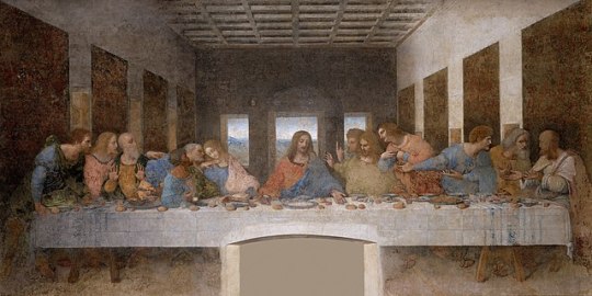
Unity can help bring together multiple elements together and further the idea that the art is depicting. An example of this is The Last Supper by Italian artist Leonardo Da Vinci. This painting shows the moment Jesus tells his apostles that one of them will betray him. From their various reactions to the food to the table, these elements help create conceptual unity as each element unify around the overall concept of Jesus’ last dinner. The proximity of the apostles to one another create a sense of intimacy and helps emphasize how delicate this movement really is. There is also visual unity in the way that each person is aligned with each other and helps display balance among each other. Unity is an essential element in this painting and it helps capture the moment they are all unified in reacting to Jesus’ news.
Glossary
Unity: An entity that is a systematic whole. A fusion or union of parts in harmony to create a oneness. A game is a unity based on a fusion of levels.
Alignment: A common axis creates relationship, the line up creates meaning. Alignment in games can help you find your way on the map or aim true with your weapon. Alignment of troops or vessels indicates organizational strength. Maps are visually aligned with the edge of the frame. Your stats are aligned in a table.
Beat Boards: These are used to illustrate major story points before the rest of the storyboard is completed. Beat boards are a series of single drawings that depict key focal points in a scene. Beat Boards can be compared to a children's book illustration because an individual picture shows a complex story. Beat boards can serve in art direction to indicate how the shot is staged and show color strategies, using shapes and colors, but are not detailed sketches. Making sure the beat boards relate to each other creates unity.
Composition: The arrangement of visual elements within a shot. The three basic shot compositions in filmmaking are long-shot, medium-shot, and close-up.
Conceptual unity: A palm tree, an ocean beach, and a beer unify around the concept of 'vacation' Contrast – creates variety within a unit, draws the eye to a focal point, creates drama.
Contrast: A unifier. Contrast is when a character or object has a strong darks and lights compared to the scene around it. Size contrast is a gigantic space cruiser compared to much smaller fighters.
Proximity: Closer distances connect elements and far apart elements create separation and sometimes magnetism.
Repetition: Things that look alike relate to each other. Shapes or colors that recur in the image create rhythm and recognizable situations.
Unifying Strategies: Designers manipulate contrast, repetition, alignment and proximity to create visual unity and to pull a story along.
Visual unity: A group of repeating or similar elements that create balance or form a structure.
1 note
·
View note
Text
Point
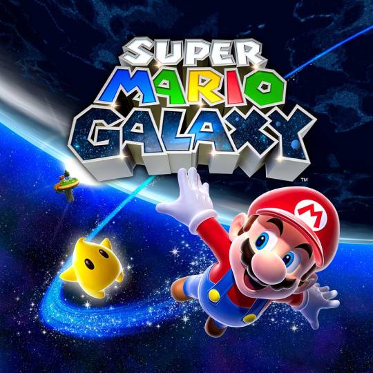
Point can be the most essential part to a design. This reigns true for the Nintendo video game Super Mario Galaxy. The point of this game is Mario is traveling throughout the universe to save Princess Peach and the universe itself from Bowser. The focal point of the design is the title and Mario which helps the audience understanding what this game is about. While video games inherently contain pixels, the designers further emphasize the idea of a space quest as they include “star dust” in Mario’s space trails and around the Luma (yellow star) as well as in the title.
Overall, this design utilizes point in a great way and it reinforces the game’s aesthetic.
Glossary
Point: It is the smallest visual component.
Pixel: It is a recently invented groovy word. The word "pixel" was first published in 1965 by Frederic C. Billingsley of Jet Propulsion Laboratory to describe the picture elements of video images from space probes to the Moon and Mars. A pixel is the basic unit of programmable color on a computer display. Think of it as a logical - rather than a physical - unit. The physical size of a pixel depends on how you've set the resolution for the display screen. Each visual composition on your screen is made of thousands of illuminated points of hue and value.
Focal point: It is the feature of adesign or work of art that is the most interesting or important or the most strongly emphasized.
The Point: It is what a player will tell a friend about the game if they like it.
The point: It is the mission or a moving target.
The point of no return (PNR or PONR): It is the point beyond which one must continue on one's current course of action because turning back is dangerous, physically impossible or difficult, or prohibitively expensive. The point of no return can be a calculated point during a continuous action (such as in aviation). A particular irreversible action (such as setting off an explosion or signing a contract) can be a point of no return.
0 notes
Text
Pattern & Texture

Patterns and textures can help distinguish different layers from one another and add variety. In this final photoshoot before his tragic death, Kurt Cobain, the front man of 90s Grunge band Nirvana, wears examples of progressive patterns such as the cheetah print. Also, while small, there is a radial balanced pattern in the photoshoot lights that are being reflected in his sunglasses. There are also many different tactile textures such as the velvet jacket, fur hat and choppy hair.
This photo demonstrates cohesion of many patterns and textures and shows why he is a fashion icon.
Glossary
Pattern:
Pattern: It is an arrangement, configuration, array, formation, guide, matrix of repeated forms. Patterns create rhythm and can be used to predict and organize design elements such as using a grid. In Software development patterns are conventions for describing and documenting recurring design decisions within a given context.
Alternating pattern: This means to occur in succession, such as day alternating with night. To pass back and forth from one state, action, or place to another such as alternate between happiness.
Chiaroscuro: This is a technique of painting or drawing using a predictable sequence of light and shade to achieve a three-dimensional quality. From the wayback machine: [1680–90; < Italian, =chiaro bright (< Latin clārus) + oscuro dark (< Latin obscūrus)]. Chiaroscuro has been digitized to give depth and dimension in every 3-D video game or animation object.
Collage: This is a technique of an art production, primarily used in the visual arts, where the artwork is made from an assemblage of different forms, thus creating a new whole. Collage is a prototyping process used to assemble colors, textures, silhouettes and other assets to test ideas, colors, size relationships.
Gradient: It is continuous change, darkening, lightening, increasing or decreasing color saturation. A gradient is created when two or more different colors are layered to paint one element while gradually fading between the hues or values.
Grid: This means a rectangular system of coordinates used in locating the principal elements of a plan and depression.
Progressive patterns: These create active change, momentum by shifting in a direction, increasing, escalating, or accelerating.
Radial balanced patterns: These are based on a circle with its design extending from its center. A few examples of radial balance are; a star, the iris in one's eyes, and a wheel with spokes.
Texture:
Texture: Texture of something is the way that it feels when you touch it, how smooth or rough it is. The texture of an object depends on the unique structure of its molecules. Fur may feel soft or coarse, metal may be oiled and shiny or rusted and rough.
Tactile: Tactile textures are physical, touchable textures that you can actually feel on your skin in the real world, like when you pet a cat or dog.
Texture mapping: Texture mapping is a process in which a two-dimensional surface, a texture map, is wrapped around a three-dimensional object. When wrapped, the 3-D object acquires a visual surface texture. Texture maps create high frequency detail, surface texture, or color information on a computer-generated graphic or 3D model.
Visual texture: This is an illusion of texture. Pixels or traditional drawing and painting media can be manipulated to give the impression of texture, while the surface actually remains smooth and flat. The texture on an ancient wall, a vehicle, or a creature's scaly or slimy skin increases the immersiveness of a game. Texture artist is a career path. Texture artists are close observers as they collect, organize, and use textures to create believable surfaces.
2 notes
·
View notes
Text
Motion

Motion can be a vital tool in showcasing intense moments. This movie poster from the 2013 film Gravity utilizes anticipated action by capturing the exact moment the astronaut starts to float away and leaves the viewer with a sense of “oh no”. This is further done by the use of motion blur as it gives the indication that the spaceship is moving away and is leaving the astronaut stranded. In addition, the stillness of the astronaut in this shot drives the idea of complete isolation home.
Overall the use of motion in this shot leaves the viewer on edge and makes want to watch the film.
Glossary
Motion: It is action, reaction, energy, what’s happening, gestures, dynamics, mobility, exertion, labor, and progress through space. Motion varies with your story. Motion indicators In storyboards are arrows, blurred lines, smears, zooms in and out. Your character is dramatized and embodied as a personality through gestural actions.
180-Degree Rule: In filmmaking, the 180-degree rule is a basic guideline regarding the on-screen spatial relationship between a character and another character or object within a scene. By keeping the camera on one side of an imaginary axis between two characters, the first character is always framed right of the second character. Moving the camera over the axis is called jumping the line or crossing the line; breaking the 180-degree rule by shooting on all sides is known as shooting in the round.
Anticipated Action: A dramatic action frozen in time, the tension mounts, we feel anticipation. We expect the sword to swing or the finger to pull the trigger or the couple to kiss.
Camera Motion: Arrows are standard cues, a simple and recognizable way to show motion or progression in a storyboard.
Kinesthetic Empathy: A player’s actual movement when responding to action in a game. Leaning into a curve in a driving game is kinesthetic empathy.
Line of Action: Line of action is an artistic concept, an invisible line that captures the thrust and vitality of the movement. The line of action can be drawn by artists as the first element to capture or exaggerate the pose. Tip: Create the line of action as layer 1 so that you don’t downplay the pose. When you have the full energy of the drawing delete the action line layer.
Motion Blur: When your eyes or objects are in motion, the image will suffer from motion blur, resulting in an inability to resolve details. To cope with this, humans generally alternate between saccades (quick eye movements) and fixation (focusing on a single point).
Optical Movement: Optical movement is an optical illusion. Although the image is not moving, it appears to move. To see examples search “Op Art”.
Stillness: Stillness is calm, quiet, inaction, and peace. Stillness is the opposite of motion. It can be used to contrast with motion.
0 notes
Text
Space
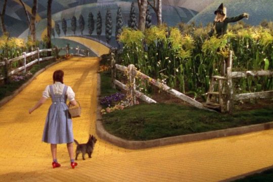
Space is essential in the creation of a realistic setting, especially in old filmmaking where the background was a painted backdrop. A perfect example of this is in the 1939 film The Wizard of Oz. The yellow brick road is a winding path that creates the illusion of the hills being far away and the road leading to somewhere in the distance. This illusion is also fueled by the size relationship between the trees themselves and Dorothy. As the trees go further into the background, they become smaller and they are smaller than Dorothy who is in the foreground which shows the space between them.
Overall, this movie utilizes space in such a clever way and it makes this film visually stunning.
Glossary
Space: It is an area, expanse, territory, distance or range. Variable spaces expand or contract as our stories unfold. A closeup has a short range. A wide shot covers a lot of territory.
Atmospheric Perspective: Value contrast and color saturation decrease with distance. Brightness increases as objects fade further into the background. In addition, objects such as mountains may appear more blue.
Diagonal Shapes: Diagonal shapes pull the eye in a direction to create the illusion of depth. If the diagonal is going back like a railroad track or fence-line the eye will follow it into the perceived distance.
Elliptical Perspective: An ellipse is an oval shape. Elliptical perspective provides visual clues to the location of curved surfaces in space. Look straight down on a glass of water. The rim of the glass is a circle. Move the glass to the side, the rim now appears as an ellipse. Line up the rim at your exact eye level, the ellipse now appears as a straight line.
Foreground, Middleground, & Background: The 3 treatments of objects in space support design to achieve depth. This template for placing and sizing objects in the picture plane shows variations on the foreground, middleground, background configurations.
Foreshortening: Foreshortening is when an object's dimensions appear shorter when angled toward the viewer. At the same time the part coming toward the viewer is enlarged.
Linear Perspective: Linear Perspective is a system used by artists in which the relative size, shape, and position of objects are determined by drawn or imagined lines converging at a point on the horizon.
Overlapping: Overlap is when part of one object is obscured by another object. The obscuring object appears to be in front.
S-Curve or Winding Path: In an image of a landscape, S-curve or winding path will draw the eye of the viewer into a perceived distance.
Size relationships: Objects appear smaller as their distance from the observer increases.
Transparency or Opacity: Transparency or opacity is when we feel like we can see objects through a glassy, gauzy, smoky, or dusty layer. The transparent/opacity adjustment affects the saturation and color of objects to give a feel of depth.
Vertical Position: Vertical position places objects higher up in the composition to appear further away.
Volume: Volume is the amount, expanse, extent, magnitude, size, aggregate, bulk, dimensions, or mass of an object. The volume variable indicates the amount of territory needed for each object in a scene.
1 note
·
View note
Text
Shape
Shapes can be utilized as a tool to distort objects within an image and overall make it more interesting to look at. The painting above, Self, is by Peter Saul, the same artist who painted the photo in my header, and he uses biomorphic shapes to create the hands and face of this painting. Also, all the objects that he painted are representational but he uses distorts them enough to the point where it starts to lean towards abstraction. Saul’s distorted shapes help separate his work from others and is essential to creating his distinct style.
Glossary
Shape: It is the external form or appearance characteristic of someone or something; the outline of an area or figure. As a verb, to shape is to give a particular form. As artists, we shape our characters outward appearance by using shapes.
Abstract Shapes and Abstraction (see Non-objective Shapes): Abstract means no recognizable objects. Abstraction is a sliding scale from realism to completely non representational. Abstract shapes can be used in backgrounds and textures.
Biomorphic: Biomorphic is a free-form pattern or design with a shape suggestive of a living organism, especially an amoeba or protozoan.
Curvilinear Shapes: Curvilinear shapes are s-curves. Curvilinear shapes inform Jessica Rabbit’s character design and can represent a winding river vanishing into the distance.
Distortion: Distortion is exaggeration, contortion, reform, slant, twist, or warp in ways that depart from reality.
Idealism: Idealism asserts that the physical world is less important than the mind or the spirit which shapes and animates it. Idealists choose the soul, the mind, or the psyche over the body, the material, and the historical. When ideals (of appearance, or proportion for example) regulate the way an artist represents the world, her work can be described as Idealistic. The leading artists of the High Renaissance - Leonardo, Raphael and Michelangelo - are all associated with varying forms of Idealism, as were ancient Greek sculptors.
Non-objective Shapes (see Abstract Shapes): Non-objective shapes have no object as a reference and no recognizable subject matter. Non-objective shapes are often used to simplify design shapes. Geometric shapes such as a triangle, square, and circle are abstract until you put them together to represent a house or a smiley face.
Positive and Negative Shapes: Positive space is the subject, focal point, or areas of high interest in any composition. Negative space is the area around the areas of interest. All compositions balance positive and negative space. Yes, stuff in the negative space can point to the focal point to make it most obvious. Positive and negative create a whole. Every composition is a combination of positive and negative space. Wield the positive and negative spaces with control and story-telling magic to become a design master.
Realism or Naturalism: Realism, or naturalism, attempts to represent subject matter truthfully, without artificiality or exotic or supernatural elements. In the visual arts, illusionistic realism strives for the accurate depiction of lifeforms, perspective, and the details of light and color.
Rectilinear Shapes: Rectilinear is a boxy shape made with straight lines. For example, the screen you are looking at is a rectilinear shape filled with little square pixels, and pixels are also rectilinear. A storyboard is a series of drawings in a linear set of rectilinear frames.
Representational: Representational means objects that players can name. The object represents something from the real world, or something that has the verisimilitude of realism. A cartoon bunny can represent a rabbit without being realistic. Representational is a sliding scale from realism to almost abstract. 2 dots and a curve can be arranged into an abstract pattern or they can be arranged into an emoji that represents a smiley face.
Silhouette: Silhouette is a profile or shape that is easy to identify.
Squash and Stretch: Squash and stretch are shapes profiles that emphasize motion. The stretched position shows the form in an extended condition. When you do a sit up your belly squashes and your back stretches.
1 note
·
View note
Text
Value
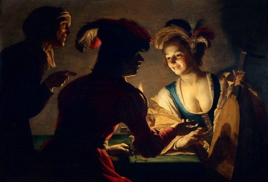
This painting, The Matchmaker by Gerard van Honthorst, is a perfect example of Chiaroscuro and the light source from the candle uses value as emphasis as it directs the viewer’s attention to the woman on the right. The candle also creates value and space as it makes a shadow behind the woman and shows how close or far she is from the wall behind her adding volume to the painting.
Overall, the way the way that the artist utilizes lights and darks adds so much depth to the painting.
Glossary
Value in design: It is lightness or darkness on a scale of white to black (with white being the highest value and black being the lowest value). Value is widely considered to be one of the most important variables to the success of a design.
Chiaroscuro (English: kee-AR-ə-SKOOR-oh, -SKEWR-, Italian:; Italian for “light-dark”): It is the use of strong contrasts between light and dark with bold contrasts affecting a whole composition. Chiaroscuro is a technical term for the use of contrasts of light to achieve a sense of volume in modelling three-dimensional objects and figures.
Light and dark: Every element in your design has a value from 1% black (almost white) to 100% black. Value is relative to everything in the composition. Every color has an underlying value somewhere between white and black.
Value as emphasis: This happens when a strong contrast in value draws attention to itself.
Value and space: Designers use dark and light values to create the illusion of light as it falls on objects. Value is used to create the illusion of highlights and shadows. Highlights and shadows combine to create the illusion of a light source. The pattern of light and dark can create dimension, volume, and mass.
Value patterns: They appear regularly in the world, in human-made design, and even in abstract ideas such as stories. The elements of a pattern repeat in a predictable manner. Night and day is a value pattern common in stories.
6 notes
·
View notes
Text
Line

In the 1920 German Expressionist film Das Cabinet des Dr. Caligari, lines are used to create a bizarre, contorted world. While diagonal lines commonly go towards vanishing points, the majority of diagonal lines in this film are used as a tool to warp normal objects such as windows in order to convey the idea that the world that the audience is seeing is truly twisted. In addition, the use of crisp explicit lines form unusual, jagged shapes that overlap each other and create a sense of anxiety. Lastly, the contour lines of actors’ silhouettes add to the idea of an unhinged world as it creates a divide between the set and characters. It makes you feel like you are looking at the world through the eyes of a madman; the people are real but how the world around them is being viewed is distorted.
This movie is visually stunning and I recommend everyone, especially designers, to watch it.
Glossary
Lines: They have both a direction and a length. Line means a mark, streak, stroke, slash, path, stripe, border, contour, striation, course, route, and track. Curved, bent, thick, wide, broken, vertical, horizontal, burred, or freehand, lines delineate shapes, forms, and spaces, volumes, edges, movement and patterns. Not only that – lines create both 2D and 3D objects and figures. Lines are awesome and powerful.
Contour lines: They indicate the edge around an object or the changes in volume within an object. Contour lines dramatize changes of plane within the form. The curve of a belt around the waist is a contour line.
Diagonal lines: They are useful to draw the eye into a composition such as toward the vanishing points. Three common types of diagonals are 1) actual diagonal lines 2) objects placed diagonally in a scene 3) a diagonal line created by the viewpoint such as the Dutch tilt.
Dutch Tilt (known as a Dutch angle, canted angle, or oblique angle): It is a type of camera shot that has a noticeable tilt on the camera’s “x-axis.” The Dutch tilt camera technique was introduced by German Expressionists in the 1920s — so it’s not actually Dutch. Directors often use a Dutch angle to signal to the viewer that something is wrong, disorienting, or unsettling.
Explicit: It means clear, direct, and obvious. If a drawing is easy to read it may be that the lines are explicit, clean, with efficient use of variety. There are explicit lines around the frame of the Dutch Tilt illustration.
Gesture lines: They capture motion, such as in an action pose when gesture drawings are used in storyboards.
Implied lines: In 3-D scenes, it is a line in a scene that is not physically there but is suggested by points in the art. Implied lines suggest the edges of an object or planes within an object. The line may be broken such as a dotted line, it may be defined by value, color, or texture, or it may not be visible at all. With implied lines, our brain interprets that a line exists.
Line As Value has a long history. Artists have used line drawings to create value, or shading, and to achieve the impression of volume.
Line of action: It is an imaginary line that extends through the main action of the figure. When you draw an action figure you can capture the line of action on one layer then draw the figure drawing on another layer.
Line quality: It is the expressive essence of lines. Varying the line quality makes objects appear more 3-dimensional and exciting. Range in line quality heightens descriptive and suggestive potential. A single line can change in darkness and width, can vanish altogether to mentally reconnect later on an edge.
Line weight: This refers to the thickness or thinness of a line.
Lost and Found Lines: We don’t really need a strong contour line around every part of an object because our brain will fill in the blank where the edge disappears. When a line fades out and then restarts further along the edge it is called a lost and found line.
Psychic lines: These are invisible. Psychic lines form between characters or between a gun and a target, or a hand pointing in a direction. There is no real line yet we feel a line. Eyes looking in a direction, especially characters looking at each other create a psychic line.
2 notes
·
View notes
Text
Color
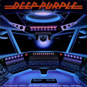
Color is an essential tool in conveying moods and tones in art. A perfect example of this is the Deep Purple 1978 compilation album When We Rock, We Rock and When We Roll, We Roll. The various shades of blues and purples create an analogous color strategy and while there is red and pink in this design, the cool colors perfectly create a ominous, futuristic tone as this “rocket ship” is into the vast, unknown, territory of space. This tone is further conveyed with the brightness of the lights on the front and ceiling of the rocket ship as it conveys an alien-like feel.
I absolutely love this album cover and I think it does a good job in demonstrating the mood that Deep Purple has as a band, especially in their song Burn which can be found in this album.
Glossary
Visible light spectrum: The segment of the electromagnetic spectrum that the human eye can view. This range of wavelengths is called visible light. Typically, the human eye can detect wavelengths from 380 to 700 nanometers.
Color psychology: The study of the effect that colors have on emotions, behavior and feelings of people.
Color systems: Classify color and analyze their effects.
Additive color system: It is used for colors of light such as light emitted from computers, phone screens, and projectors. Red, green, and blue are the primary colors.
Subtractive color system: It is used for pigments such as ink, dye, and paint. Cyan, magenta, and yellow are the primary colors.
Change in Color: To use color to separate the foreground, midground, and background planes to create the illusion of depth and is commonly used in animation.
The color wheel (color circle): Arranges a pattern of hues around a circle. There are several versions of the color wheel or color circle. The circle connects relationships between hues to illustrate color strategies.
Local color: It is the natural color of an object unmodified by adding unrealistic light and shadow or any other distortion. The color that the eye observes is altered by lighting conditions such as time of day or the surrounding environment. The local color of a lemon is yellow.
Palette: It is the range of colors used in a particular composition or by any person who uses color such as an artist, house painter or interior decorator. An example of a palette is Vincent Van Gogh’s limited palette of hues in his Starry Night painting. Starry Night’s palette is a variety of blues, greens and yellows.
Properties of color: are hue, saturation, and brightness.
Hue: The named color around the color circle such as red, orange, green, yellow, violet, and blue.
Saturation: The intensity or purity of a hue. Fire engine red is more highly saturated than brick red or the color of red wine.
Brightness: The perceived intensity of light coming from a source such as a screen. On a color screen, brightness is the average of the red, green and blue pixels on the screen. Brightness is important to both color perception and battery life on mobile devices. Brightness of a screen can be adjusted.
Symbolism of color: In art and anthropology, it refers to the use of color as a symbol in various cultures. There is great diversity in the use of colors and their associations. Diversity in color symbolism occurs because color meanings and symbolism occur on an individual, cultural and universal basis. Color symbolism is also context-dependent and changes over time.
12 Color Strategies:
1. Monochromatic: This means variations of a single hue such as a light blue and a dark blue or a greenish aqua blue and a lavender blue.
2. Achromatic color strategy: It integrates variations of black, white, gray, and a full range of neutrals.
3. Full Spectrum Strategy: It represents the full circle of spectral colors by incorporating at least five of the base hues.
4. Achromatic/Chromatic Mix strategy: Achromatic colors dominate the composition with a chromatic hue accent.
5. Warm/Cool: Contrasting ‘temperatures’ of warm & cool. Cool colors appear on the green/blue/violet side of the color wheel. The colors on the red/orange/yellow side of the color wheel are called warm. Emphasis is on the contrast between warm and cool achromatics: brown - gold (warm), grays - silver (cool).
6. Saturation Similarities: Hues may vary in this strategy, but all colors must have the same or very similar saturations. Saturation Contrast: Hues may vary but all colors must have significant contrast of saturation.
7. Value Similarities: Hues may vary in this strategy, but all colors have the same or very close values. Value Contrast: Black (or dark desaturated hues) contrast with white (or very desaturated tints of hues). The Value Contrast strategy demonstrates strong distinction of value with the strongest example being between black and white.
8. Complementary Dyad: It creates a strong hue contrast. Complementary hues are located directly opposite each other on the color circle.
9. Split Complementary strategies: They are based on two complements. To create a split complementary color strategy select one hue and contrast it with the hues on either side of its complement, such as Red & Yellow-Green/Blue-Green.
10. Tetrad strategy: It uses four equilateral hues from the color circle, such as Red, Orange, Green, Blue.
11. Triad strategy: It uses three equilaterally balanced hues from the color circle, such as primary, secondary, or tertiary.
12. Analogous strategies: To collect 2 or 3 neighboring hues on the color circle.
0 notes
Text
Welcome
This blog explores the Variables/Elements and Aesthetics/Principles of design and is illustrated with my choice of examples.
1 note
·
View note