
Last Seen Blogs

pdfly24
Life

fadcheats
Faad

faggotstump
I'm comin' apart at the seams....

sadgi
momma's serving some serious macaroni
Text
Satisfactory & Sufficient
There is an issue in teaching communication design students. The issue is one of targets and how high the students should aim in solving the briefs they are working on. While there is substantial research in graphic and associated communication design disciplines about writing briefs and defining problems, it would be useful for students to have some form of metric available to them that allows them to assess the scale and values of their solution. In short, how good does good enough needs to be in order to be good?
Anyone that has taught design students will be familiar with the issue and the two faces the problem presents:
A student who aims too low in their planning, for any number of reasons - frequently nerves, and who can't identify how high they should aim in the first place.
A student who aims too high in their planning and can't identify that not only is this ambition likely to be unfulfilled, but it is likely to put too high an overhead on the available resource - which includes the student, their skills and the technical means they have access to.
After a good decade and half of thinking about this (no one said I was a quick thinker) the answer emerged from my research into communication design* as a complex adaptive system (link). it is accepted in epistemology that there are small scale, local and contingent truths that, while not being universal, are pretty useful for working in the world we live in.
A visually impaired British person knows that a fast beeping at a pedestrian crossing means that they can safely cross. This is knowledge by most definitions of knowledge without being universal (German crossings click and Japanese ones make bird sound) - it is a good enough truth.
By the same token there are a world of sub-optimal design solutions that work just fine in the right context. People tell me that the wayfinding on the New York MTA works for most New Yorkers - though for the life of me I can't see why.
The Nobel laureate Herbert Simon worked in economics and observed that many social systems (including economics) do not aim for perfection, but they do have very good notions of what good enough looks like in their part of the world.
'Accomplishment a Matter of Degree. Defining objectives does not exhaust the vale element in an administrative decision. It is necessary to determine, in addition, the degree to which the objective is to be attained. A city charter or ordinance may define the function of the fire department as "protecting the city from damage due to fire"; but this does not imply that that the city will wish to expand the fire-fighting facilities to the point where the fire damage is entirely eliminated--an obviously impossible task. Moreover, it begs the question to say that the fire department should reduce losses "as far as possible," for how far iti is possible to reduce losses depends on the amount of money available for fire protection and fire prevention services.'
Simon, H. A., Administrative Behavior, second edition (1957), p.177.
He later called this evaluation of good enough Satisficing, a portmanteau neologism of: satisfactory and sufficient. For a satisficed job to be considered good enough there will have to be an accepted level of good enough in that world. Anything meeting that level or above is considered to be a success. The job doesn't necessarily need to be wonderful to be a success, just good enough.
Any number of global fast food products are sad reflections of the original cuisines: a B** M** is a pretty feeble burger but it sells in vast numbers every day. A K** is not a patch on actual US buttermilk chicken (can you tell how I hungry I am as I write?) but it is a global standby for hungry stoners everywhere. The standard at play is good enough, not perfection.
The consideration of the difference between good enough and perfect is a usefully teachable moment for a design student developing their work. And this is where my diagram builds on Simon's work by visualizing this tension.
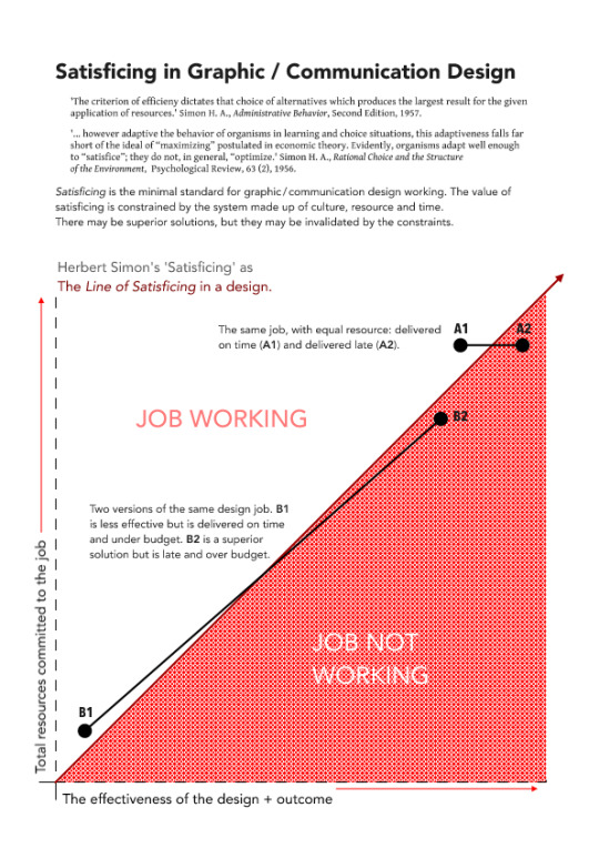
This is not suggesting that students aim low but it is suggesting that walking through the process defining what the acceptable lower limits in any particular cultural system is, with due regard for the available time and resource, a useful filter mechanism for a design student.
As we see on the graphic it is possible to put in high levels of time and resource and end up with a failing job (one that was delivered too late or required too many resources to work). It is equally possible to have two different solutions to problem, with the weaker solution winning out because it can be achieved on time and to budget.
* Graphic Design is the common term for it, but the historical overheads that come with it deny the modern practice a designer will face. However, Communication Design as a term addresses the complexity of the modern role. We design the flow of the user's attention across multiple media platforms.
0 notes
Text
The Poster is incoming…
The next issue of The Poster (3.2) is in the final stages of production. The editorial is as finished as those attention grabbing and attention deficit madmen in power will allow me to get. The editorial is currently in version 3, as every time I got it complete President Trump, or another troll sporting a mask of human skin, would do something so monumentally damaged that I’d have to write it all over again.
0 notes
Text
Naming Parts
This is a blog that is mostly about where visual culture comes from and what communication designers can do with that knowledge. Not because culture is the thing; the object of study, the dog’s bits, the glimpse of heaven itself; but because culture is the basic material that Communication Designers of the world use to make work. Where a sculptor works in metal and stone and a painter in paint, communicators work in the stuff of culture.
Communication Designers hammer, screw, bolt and glue the ideas and dreams of other people’s culture into something that makes sense to those users: an advert that doesn’t come across as true to the intended audience is a bad advert,* a piece of medical packaging that doesn’t makes sense to a sick person in the community it serves is dangerous,** a road sign that warns a driver of a hazard too late time to take action is criminal: but all of these are real designs, real designs that haunt the world and by haunting the world make it weaker, confused, divisive and fundamentally a bit crap.
Let me tell you a story. Once, while driving in the Italian Alps, I drove two kilometres the wrong way down a one-way road. The good news is that I didn’t die, neither did anyone else, and no one was hurt - it was just bloody terrifying. While backing up two kilometres on the same road I eventually found the No-Entry sign. A hand painted sign. A sign playfully adapted by a local painter with joy in their heart but no eye for detail or basic talent from the international standard. So we have a sign that didn’t meet my eye as either an instruction or guide. Put simply the sign didn’t match my existing understanding of either Italian or international road signage. Which meant that although the sign had crossed my eye it didn’t meet my internal standard for sign and so I hadn’t registered it a something worth knowing. And no, I didn’t stop and take a photo of the sign. I was frankly too shaken to by the whole experience to do anything about it.
This blog is about how we build models of culture, as designers and in the user’s heads.

0 notes