
pharanbrush-log
Pharan Brush Log
Small notes and thoughts on brushes and tools. Brushes for CLIP STUDIO PAINT.
Main blog and shop: @pharanbrush
26 posts
Don't wanna be here? Send us removal request.
Last Seen Blogs

skinnylittlepunk-blog
all I am is a blond rebellion.

ourclearstudentcandyfan-blog
Untitled

vowicixelap
Untitled

theavenuedentalgroup-blog
Avenue
Dental Care

thehereandtherecrowd-blog
Here and There
Text
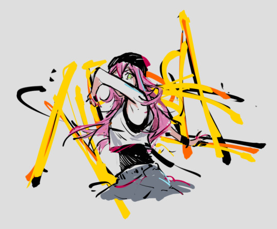
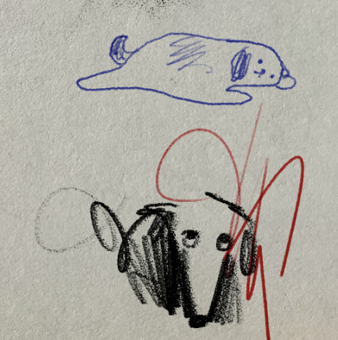
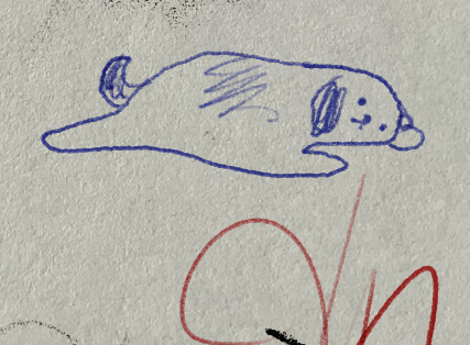
(oc Nera belongs to @/erojiji3)
I've been studying limited-tone colors and shadows and figured Leif was a good tool to use. But it wasn't doing what I needed it to do, or even what I imagined I originally wanted it to do, so I decided to make a few new brushes, as the new Leif set. (retiring most of the original ones in the process)
Currently just calling the new set Leif 2.
The new brushes, named "Leif Paint" (with variations on its shape) have been coming along nicely.
Yesterday, I drew this thing and was enjoying how the brushes were working for it.
Its primary purpose, making dabs of paint look leafy and generically brushy and nice, is definitely already there.

As a paint-sketch and finalized painting tool, especially for shaping shadows, I think I still need to test some more but results have been promising so far.
I also made a separate drawing version of Leif Paint that may just end up in the EnpitsuP set. I guess it should just be included in the main Leif set too.
6 notes
·
View notes
Text

just messing around with Bichael BorupenP
I haven't used it in weeks and I forgot how fun it is to use.
3 notes
·
View notes
Text
EnpitsuP Jumbo WIP
Currently testing a blunted jumbo pencil.
Tentative name: EnpitsuP Jumbo
I'm trying to incorporate some of the useful aspects of a jumbo Staedler pencil I recently got.
Surprisingly, the bigger pencils have a super noticeable taper to them but I'm not sure how/if I want to add it in digital form. (ie, what combination of pressure and tilt I want it to respond against and what the curves are)
17 notes
·
View notes
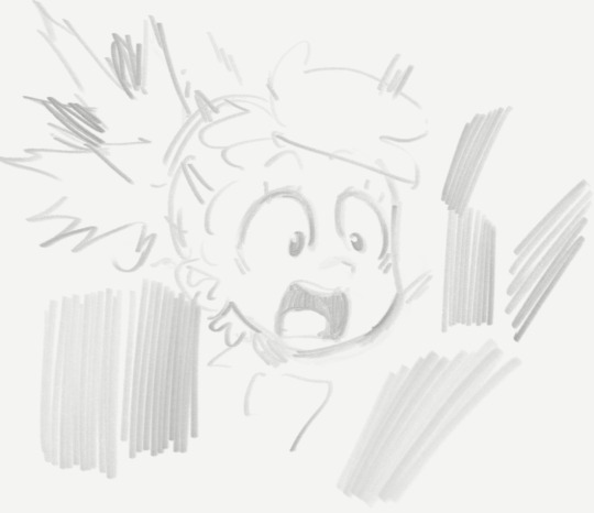
Text

I was testing a new paper texture I recently scanned.
The image isn't indicative of what an actual brush would look like. I was just testing it to see if the tiling looked ok after I cleaned it up.
After cleaning up the texture, I need to adjust the levels and add a bit of gradation to the "depth" of the pattern. This is so an actual brush that uses it would behave correctly with pressure. That step hasn't been done yet here, and it's something that potentially, but not always, needs to be done for each type of application of the texture (eg, a marker wouldn't interact with the paper texture in the same way a pencil would).
But it already feels like versions of this can make its way into all 3 of my brush sets.
1 note
·
View note
Text
I wanted to have a post to link to that visually demonstrates why, even you don't plan to use any of the other rulers and features, Lazy Nezumi Pro's smoothing alone is reason enough to get it for Photoshop.
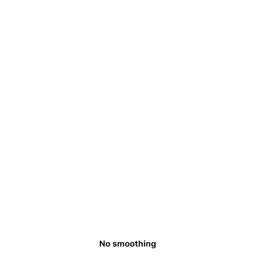
Here's our baseline. Photoshop without smoothing.
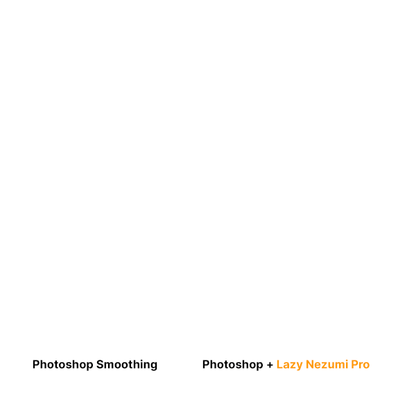
Now here's a comparison between the smoothing options.
This isn't a paid ad. I just think...
well, LOOK AT IT. "Smoothing". C'mon!
(I want to make a separate post for CSP. CSP's stabilizer is an order of magnitude more sane, but it has some huge weaknesses as you crank the stabilizer higher that requires a few more gifs to really show)
Here's affiliate link: https://lazynezumi.com/?ai=pharan
I *DON'T* get a kickback from the link, but if a lot of you use it, it does help me justify being annoying to them. :p
Lazy Nezumi Pro is an amazing feat of engineering/one-time purchase pen smoothing and rulers plugin application for Windows. It works with all sorts of digital art programs (there's a compatibility list on their site). You get free updates for one year.
#drawing#photoshop plugin#photoshop smoothing#photoshop stabilizer#lazy nezumi pro#lnp#digital art tools#photoshop shoelacing#stabilizer for photoshop
79 notes
·
View notes
Text
I was working on GIF Enjoyer, and I was finishing up the last of the features I wanted to add for the year.
It occurred to me that I had been using base zero for frame numbers the whole time. It didn't feel right to make it base 1, but I added the code to make it possible in the future.
(It was just a 0 or 1 value the widgets could reach for, and it would just add the number to any frame number it displayed, without touching the actual underlying frame number values.)
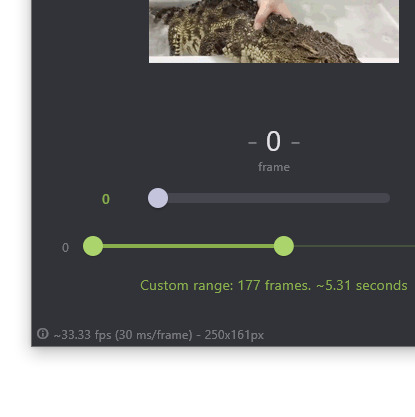
I was reminded that, yeah, this is partly an easy-to-use GIF scrubbing app. But it's also sort of an informative look into more of the inner workings of GIFs. I recall a time when even if I was into programming, I had no idea how exactly GIFs stored their frame intervals apart from the fact that one was stored for each frame. (You can see this clearly when you open a GIF in Photoshop)
This was the spirit behind this tooltip that appears when the framerate doesn't add up to a whole number:

In the same vein, I think users can tolerate base zero, as a statement that "hey, this is how GIFs work. This is how programs deal with GIF frames".
On the other hand, if the animator were trying to match the animation frame-for-frame, having GIF Enjoyer be base zero and their animation app be base one, will make their process more error prone.

You know what though? Screw it. That's a good enough reason. I'll just add it.

9 notes
·
View notes
Text
Lazy Nezumi Cheap Ballpoint Script

There are some things that real ballpoints do that typical art programs these days don't give you the option to simulate.
Things like:
the wobble of the line you get from drawing on a thin sheet of paper over a wooden table or other hard textured surface.
The chance to create a blob at the start or middle of the stroke.
Each stroke having a different amount of ink at the start so you get a random thickness or darkness.
How you can scrape the ball point by just skirting at the edge where it sits, letting you draw lighter but having a skippy mark.
There's more but the first three are ones I managed to somewhat capture in a Lazy Nezumi script some time ago. You can find the script here if you're curious:
But if you're not a power user of LNP already, it might be a bit complicated to set up. The steps are supposed to be in the documentation but I'll try to explain in simpler terms in a future post.
To make sure the wobble actually applies its intended effect, you have to set the CSP stabilization to 1 or 0.
It really sells it when you draw over a paper image.
Brushes used above are part of my EnpitsuP brush pack for Clip Studio Paint.
If you're a digital artist on Windows and haven't tried Lazy Nezumi Pro yet, go check it out!
Use my affiliate link: https://lazynezumi.com/?ai=pharan
(I don't get a kickback but it lets them know I sent you. And I can pester them about it.🤫)
451 notes
·
View notes
Text
I need to release these and a few other brushes this month (graduating them from supporter early access), but I've been kinda feeling all over the place the past couple of months .
More neutral/tonal versions of some side-pencils I released earlier this year. Those original ones were kinda too streaky for covering large areas so I took the edge off of the brush stamp.

I guess the eventual sample should compare the side ones from the unlabeled ones.
6 notes
·
View notes
Text
Testing the more neutral version of BeakwellP.
I've been kinda busy the past few months with other things, I haven't been able to update the main set but I think this will be released soon.
I kinda just want to get this out so I can finally update my main CSP to 2.0. But I'm half-worried I'll be one of the people who are running into 2.0-specific problems.
9 notes
·
View notes
Text
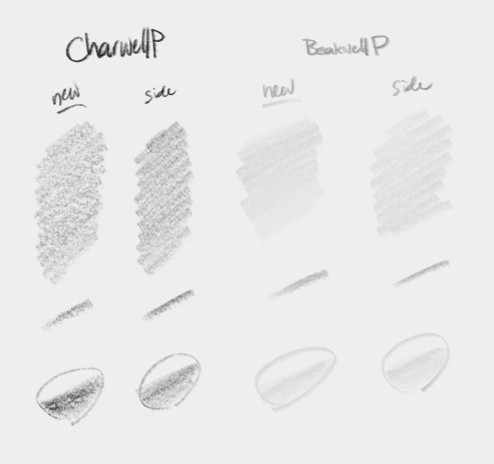
I was updating CharwellP and BeakwellP, and considering keeping the Side version and just naming the new ones CharwellP and BeakwellP WITHOUT the "side" suffix.
The motivation behind the update is that the side versions that are currently out
1. tend to generate a lot of streaky noise when you fill an area. and
2. draw shadow edge that's too sharp for a quick and convenient terminator suggestion.
The solution seemed to be that Proko video showing how to sharpen a pencil. The problems above are precisely mentioned in the video: an aspect of it is that if it's fully almost fully on the side, a sharp tip causes a sharp and dark edge. It gives the pencil more flexibility if you have the tip curved away from that angle so it doesn't make that sharp edge.
The aspect of flexibility isn't fully captured by CSP though, as tilting the real pencil uses different parts of the lead tip. But tilting in CSP will always use the same brush stamp/shape.
Changing the size will be a decent approximation for most uses though.
As is usually the case in CSP, the aspect of flexibility isn't fully captured the program, since tilting the real pencil uses different parts of the lead tip. But tilting in CSP will always use the same brush stamp/shape.
Changing the size will be a decent approximation for most uses though.
I might take these pencils for a spin a few more times to see if the "tip" feels rounded out enough. And make some more adjustments as needed. Feels like it's already pretty close though, after all the work I already did on it.
5 notes
·
View notes
Text
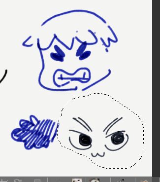
Bichael BōrupenP
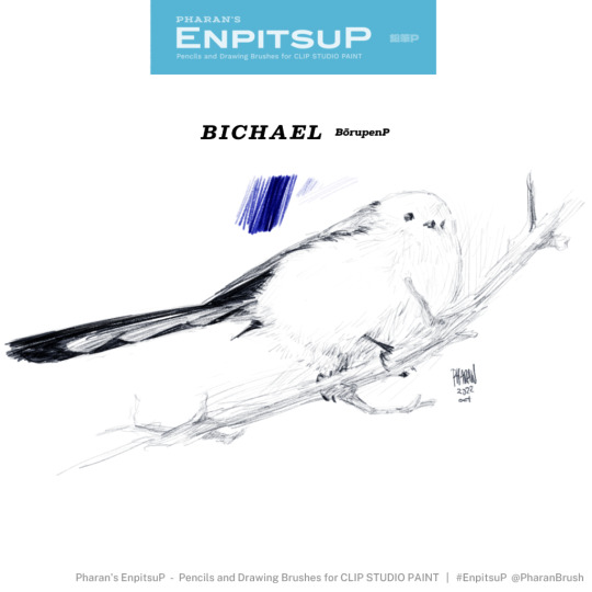
I got the idea for Bichael BōrupenP from artists who really know how to work some ballpoint inks to mark lightly and achieve rendering that's more subtle but with a style still characteristic to ballpoints. I designed it to allow that amount of control.
There were some older attempts at a brush like this before Bichael, but those older attempts (Art BōrupenP) retained the older, slightly blotchy texture.
By contrast, this Bichael was inspired by the mostly clean marks made by a cheap BIC ballpoint on a Moleskine notebook.
When I first learned about it, I was surprised how light these real life ballpoints can go, and how effectively they're used to render. I always grew up thinking ballpoints were a binary writing tool and pencils were the ones with gradation. Actually, come to think of it. I guess I also didn't like it because it took too much hand pressure to actually get the ones I had to mark a reliably solid line.
While researching for this brush, I learned a lot of weird things about the physical properties of ballpoints— stuff like how you kind of make it even lighter by making the ball skid by drawing at a really low angle, and how part of the look is the wobble of the line it seems to roll a chance to cause ink blobs at the start of some of your strokes.
Some of it is unfortunately not something I can simulate with CSP alone. I actually managed to simulate some of these effects using a Lazy Nezumi Pro script. But that's another post for another time.
17 notes
·
View notes
Text
EnpitsuP Sidesketch 01
I saw this pencil brush that I wanted to replicate and I went at it for a good few days til I reached 3 variants of it.
CharwellP Sidesketch most closely resembles what I was trying to imitate, which is sort of an opacity/density-responsive rough sketching brush. Using it for a few things, it feels like the kind of brush I'd put as the default pencil brush for a tablet app. If you had nothing else, this is at least sort of a least-common-denominator brush. Not too focused on a natural look. Not too digital.
IroEnpitsuP Sidesketch is a less dense version of it, which is a bit annoying if you want an opaque pencil, but it ended up looking like a nice colored pencil brush so I decided to keep it as a separate version.
QuackwellP Sidesketch uses the same brush tip but acts more like what Quackwell was supposed to be: a rough drawing pencil.
I'm somehow vacillating between being really happy with this brush and second-guessing its usability. I'll have to make a few more things with it so, at the very least, I have stuff to point to to say "it works for these things".
It's nothing like a mechanical pencil which I tend to prefer, and I know some people do too.
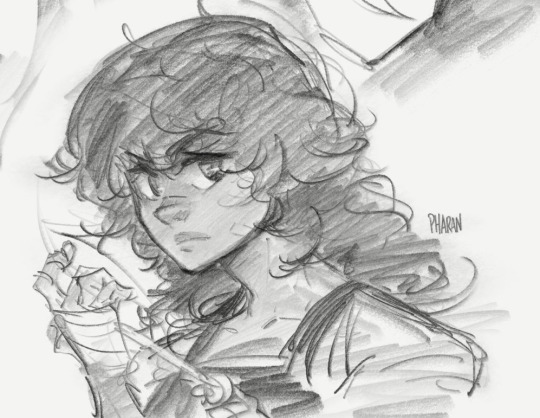
^^ OC Kayden belongs to @wonder-kya
(Log above was from July 2022)
These new pencils have been added to EnpitsuP as
AshwellP Side, CharwellP Side and BeakwellP Side.
QuackwellP Side is under reconsideration.
40 notes
·
View notes
Text
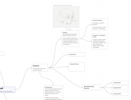
I'm trying to make a map of the brushes. I'm starting with EnpitsuP.
Half-expecting it will be useful to reorganize EnpitsuP more intuitively too. But at minimum, I hope I'll have something to share to people.
I'll add brush samples
10 notes
·
View notes
Text

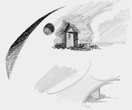
making some adjustments to CharwellP
I did a couple of studies before this but it didn't seem to respond well. I'm gonna do a few more with the new settings to see if it's really working better.
1 note
·
View note
Text
I was thinking I wanted to use PGel (from the BorupenP set) for drawing and I realized I liked the Settei set's response a bit better for dumb doodles.
So I'm making PGel Settei.
The difference was with the brush size and density curves on the lower end. The challenge with Settei is always to make it feel inbetween a harsh binary pen and a responsive physical ink pen.
The on-or-off binary pen response makes me feel too much like it's detached from what my hand is doing so I'd rather not make brushes like that. Those are easy to make though since you can just turn off all the curves.
Not sure when this is coming out yet but I'll likely include it in early access soon just so I can check it with people.
1 note
·
View note
Photo


DryTzu SP Hagrid
I realized if you criss-cross the strokes just right, DryTzu Hagrid makes kind of a nice bark-y effect.
2 notes
·
View notes
Text
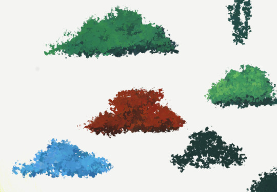
Made a version of Pipton Far Bush that's made up of smaller bits.
Probably calling it Pipton Far Bush Bits
(It's working well.)
coming soon to Pipton.
2 notes
·
View notes