
periwinkle-pencils
The Tiny Little Art Blog
just a little art blog floating through space
2 posts
Don't wanna be here? Send us removal request.
Last Seen Blogs


Text
How to Pick and Use Colour in Your Art

rainbow
We all know the feeling of dread that kicks in when you finish your line art. You’ve spent hours meticulously sketching your art out, then cleaning the sketch up and getting it perfect, only to hit a blank when you have to add colour. There are hundreds of colours to choose from, each of them with varying saturations and intensities that could totally change the mood of your art. You add the wrong shade of red to your art and it totally changes the feel of the piece and you have to start over. Colours are difficult to pick, and difficult to make look good. I personally struggle with colour palettes, but I’ve found a few tricks that make it a lot easier. Those tips are what I’d like to share with you today in this blog, so keep reading to check them out!
Take from nature
Nature has some beautiful colours, so why not use them? Take some pictures of the fall trees, the flower fields, the setting sun, whatever looks nice! Make sure to be careful though, as sometimes even natural colour palettes can look cluttered. Avoid using things like rainbows as colour palettes, and try not to use pictures off the internet, as the colours might be altered and it might not look as good. Once you have your picture, take the colour that shows up most and make that your main colour. Then find commonly reoccurring colours and use those as your secondary and tertiary colours. Then, BOOM! You have a colour palette!
Lower the Saturation
Having bright and vibrant colour palettes can be great and super fun, but you can’t make them too bright. Make sure you don’t over-saturate your colours, or you’ll end up hurting your eyes. You can desaturate your colours by adding a little black or white to them. This will make the colour less intense, and spare your eyes from agony. If you want a vibrant colour palette, don’t use super bright colours. Use complementary colours like pink and light green. Put them near each other, and they’ll pop out and look more vibrant. If you’re confused, there’s more about colour theory in the next section.
Colour theory
Having good colours is important, but knowing how and where to use those colours is just as crucial. That’s where colour theory comes in. Remember back in fourth grade art class when the teachers would talk about warm and cool colours and complementary colours? Yeah, that’s colour theory. Well, kind of. To sum it up, warm colours are red yellow and orange, and cool colours are blue green and purple. Greys can be cool or warm too. If a grey has a red undertone it's a warm grey, and the opposite for blue. Warm colours are better if you want to have a warm environment, like a fireplace or a summer’s day. Cool colours are good for cold environments like snowy tundra. If you want to show a warm place near a cold spot, like a log cabin in winter, you can use warm colours for the inside of the cabin and cool colours for the outside. This will make the inside feel warm, and the outside feel cold and treacherous. The contrast between the two colours will further emphasise this, and make it feel more alive and interesting.

Colour wheel
In colour theory, there are also contrasting and complimentary colours. Take a look at a colour wheel. Draw a straight line from one colour to another. Those colours are complementary. For instance, blue and orange are complementary. Complimentary colours next to each other look very vibrant, and will pop out. If you use them too much though, it will hurt your eyes. Make sure to use them sparingly or turn down the saturation if you use them unless you want to hurt your eyes. You can use complimentary colours to bring focus to something. For instance, if you want the focus to be on a character’s eyes, you can use purple as a base colour and add yellow highlights to make it stand out. This will bring the focus to the eyes of the character.
This video does a really good job at explaining colour theory!
Just ditch the colour entirely!
If you’re having a lot of trouble with colour, and it's getting to the point where it isn’t fun anymore, just go monotone! Monotone colour palettes take a lot more skill to convey emotion, but they can be very pleasing to look at. The key is adding just the right amount of grey scale. Don’t totally go black and white, use some greys and browns too. Warm browns can add just the right amount of colour to your piece. You can also add some warmth to your blacks and whites by using a very dark, or almost black, red or an off white. This will save you the trouble of a colour palette without causing hindrance to your piece. In fact, it could make your piece feel old or graceful, like an ink written letter from the 1800’s! If colour isn’t your strong suit, then improvise and find something that works better and is easier for you! Here’s a monotone colour palette that looks really nice!
Colour is really fun, and can add a lot to an artwork, but it can be really tough to find a good palette. Hopefully my tips have helped out, even a little bit. If they haven’t, please tell me what you struggle with in the comments, I’d love to help! If I did help at all, please feel free to leave a like or tell me what you liked about my tips. I’d love to hear how it helped!
#colour pallette#How to pick a colour palette#colour#colours#how to pick colours#art#arts#artsy#creative#colour schemes#colourtheory#picking colours#how to#tips#tips and tricks
7 notes
·
View notes
Text
Overcoming Art Block
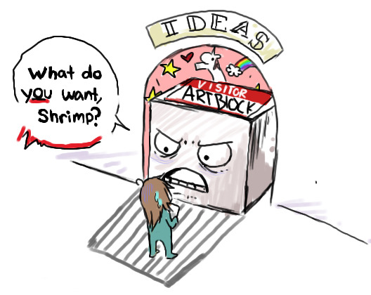
image by ResoluteAssassin on Deviantart
Art block. Anyone who enjoys drawing shudders at the mention of it. The big bad invisible wall between you and your artwork that prohibits even the slightest thought of creativity. Art block sucks. It's super annoying to deal with, and it can leave you feeling frustrated at your lack of progress. Luckily, there are some ways to shake this seemingly unbreakable barrier and continue drawing. It’s tricky to do, but not impossible, and I’ll be sharing some tips on how to overcome it in this blog.
Just get started
When I get art block, starting a piece can feel like running a marathon. The blank paper or screen just stares back at me mockingly, and the complete and total silence of my creativity echoes out through my head. The paper or screen is just so empty, and I can’t seem to fill it no matter what I do. One of the best things to do when you don’t know how to start your drawing is to just start. Don’t think too much about it, just start the piece. Make a few light scribbles on the paper, draw a few lines on the screen, make a few shapes out of paint on the canvas, whatever you need to do! Once you have your start, try and find some familiar shapes in the mess. Does that squiggle look like a face? Detail it! Does that line look like a snake? Detail it! Do those blobs look like rocks? Detail them! Once you’ve found those points, keep on drawing them until they’re finished. Then suddenly, voila! You have your art, and no more art block!
Practice practice practice
This might seem strange, but art block is great for practising things you struggle with. I have trouble with anatomy, and often struggle with drawing hands and poses. When I get art block, sometimes one of the best things for me to do is practice anatomy. I pull up a billion reference photos of what I want to draw, and get to practising it. Art block makes drawing interesting and creative things especially difficult, so doing something like anatomy studies is a little easier and helps you improve. This won’t make the art block go away, but it helps you work through it and improve. It’s also a lot easier than something more creative because you’re drawing from reference. You know exactly what you’re drawing, and there’s nothing your brain has to do on it’s own. It’s not always fun, but it works.
Good ol’ prompts
Prompts are a lifesaver with art block. I have a list of drawing ideas, poses, colour pallets, and characters ready and on hand just in case I get art block. Why spend all that time and effort moping over ideas that you can’t come up with when you can have a million ideas in a list to choose from? Keeping a list of prompts on your phone can be really helpful for ideas, and can be just the thing to get you going when art block is giving you a rough time. Or, alternatively, you can just look up some prompts online. There are millions of drawing prompts on the internet to choose from! If there are too many choices for you to decide on one, just use a randomizer wheel. Pick six prompts randomly, and put them in the wheel. Then spin it and BOOM! That’s what you draw. Crisis averted.
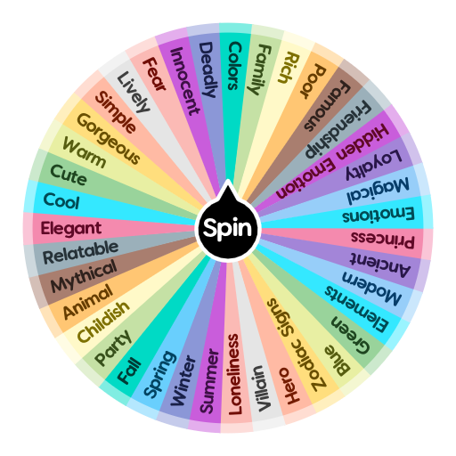
example of some prompts
So, next time art block hits you, why not try some of these tips? Please let me know if any of these helped you. Feel free to share some advice or tips of your own in the comments, I’d love to hear them!
#art#small artist#art tips#art block#art blog#art block tips#tips and tricks#art block sucks#how to overcome art block#how to stop art block#no more art block#drawing tips#drawing#artsy#arts#art tip#creative#how to#helpful
162 notes
·
View notes