paulasees
ojo
ojo is one of my favourite Spanish words. It means 'eye' and considering its meaning I love how visual it is with the two Os look like actual eyes and the J in the middle like a nose.
16 posts
Don't wanna be here? Send us removal request.
Last Seen Blogs

globalrepublic
Globalrepublic


martiegreen
oh boi
crispyjenkins
i keep it around for luck

kxgehinx
ship of haikyuu!!
Text
My own COVID19 visual diary
As everybody, I’ve spent the last few months in a very reduced geographic radius. With most of my photography jobs cancelled, my motivation has been very low, so I’ve forced myself to keep using my camera to keep my own mental health, and my technique and inspiration stimulated. Knowing that I was learning new skills has also been therapeutical.
My last post of this tumblr (for now) is a collection of my 10 most important recent photos for different reasons, personally and professionally.
I managed to get back home. Spain isn’t always as sunny as we expect. (January 2021)
Wild-camping in Ireland can have interesting alarm clocks. (September 2020)
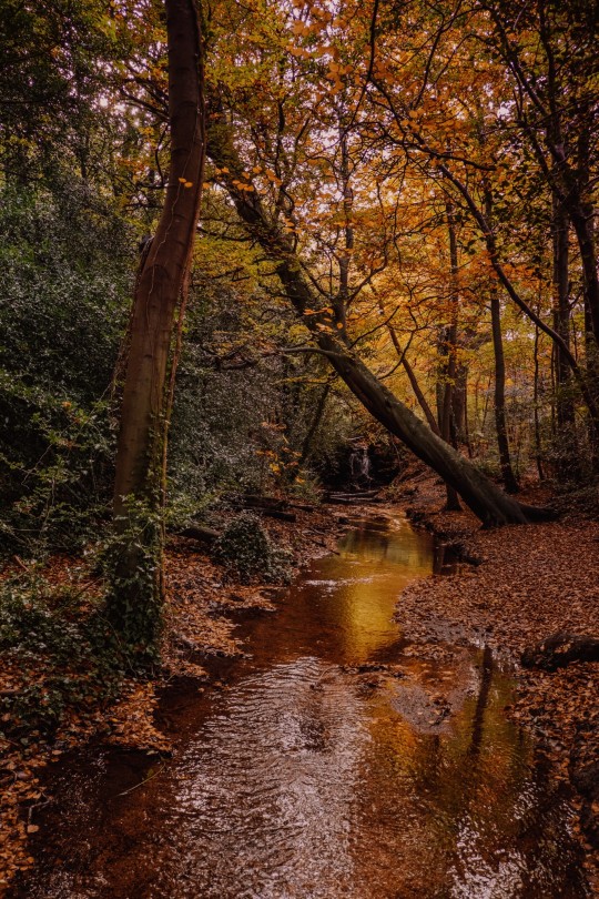
Refreshing walks in the Botanical Gardens (June 2020)

Photoshoot for Thermakota coat company (May 2020)
The last sunset of 2020 wasn’t as bad as the year itself
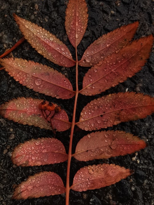
I can’t remember which lockdown it was. I still managed to get some Autumn colours in my retinae (November 2020)
1 note
·
View note
Text
A pixel, according to Wikipedia, “the smallest controllable element of a picture represented on the screen”. These images by @16pxl are not made of pixels but with pixels.
and the principle of its technique reminds me of an updated version of Seurat and Signac’s Pointillism:
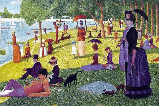
A Sunday Afternoon on the Island of La Grande Jatte - Seurat
When the structural framework of an image can be seen , its craft becomes more obvious and this reminds me of an invention that really got my attention a few years ago: an descriptive camera that captures an image made of words. My explanation isn’t very clear and since this is a visual communication, I shall stick to the saying “an image is worth more than a thousand words” to show the way it works:
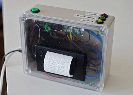
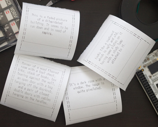

“The technology behind it is not really as cutting edge as PhotoSketch, although the concept certainly is. When an image is taken using the Descriptive Camera, it sends the digital photo to a person, who will then describe what’s in the photo. Richardson uses Amazon’s Mechanical Turk service to find people who will describe the photo. Finally, the camera’s built-in thermal printer will print out the description.” (source: https://technabob.com/blog/2012/04/26/descriptive-camera-prints-words/)
2 notes
·
View notes
Text
Renew or die
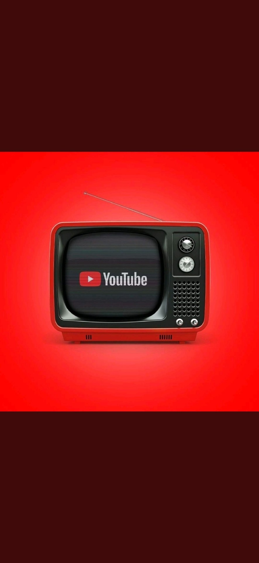
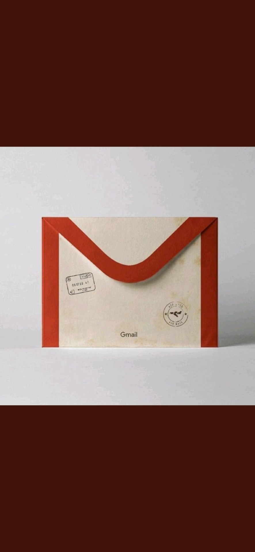
An idea that has been explored in the Visual Communication module and that I have special attention is how do we decode different cultural elements according to our background. I’ve written about the intercultural dissimilarities but these interpretations of some of the most famous digital platforms of nowadays has made me think of the chronological variations when decoding a visual message, realising that some adults might not be able to understand them.
0 notes
Text
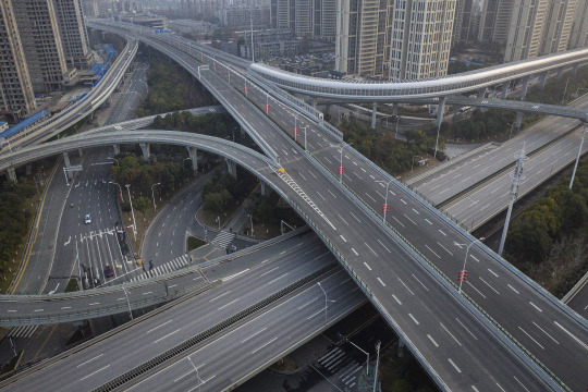
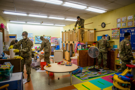
2020, reality and fiction
As 2020 is (finally!) coming to an end, this year’s last post in my visual diary is going to be a compilation of photographs I have found shocking. The whole year has been impressive itself, with scenarios that we would have been
inconceivable before. If we would had been shown any of this images in New Year’s Eve, we would have thought they were fiction and now all understand and assume as normal, or as the new normal.
In terms of semiotics, I think the visual production (movies, photography, videogames) will be affected since the images we have witnessed in the last few months go beyond fiction.
Getty Images
Andrew Seng
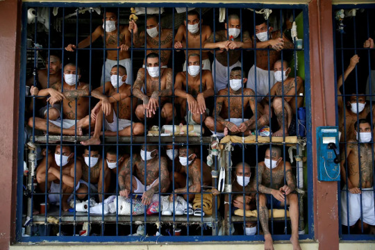
José Cabezas
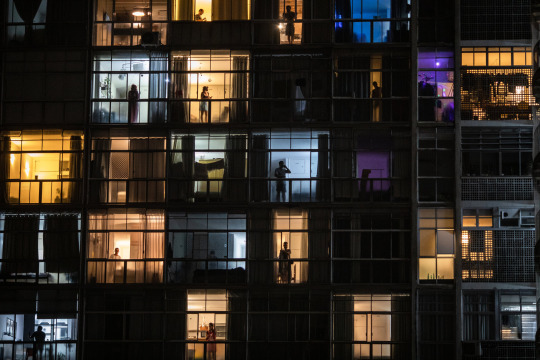
Víctor Moriyama
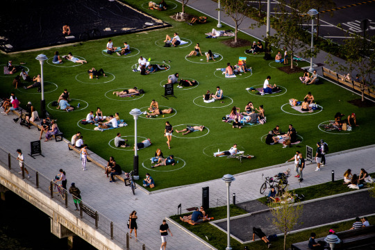
Hilary Swift

Ash Adams
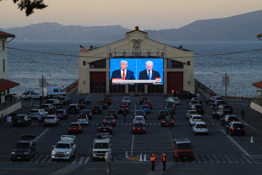
Jim Wilson
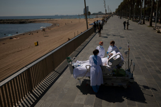
Emilio Morenatti
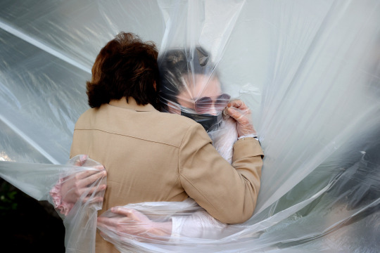
Al Bello
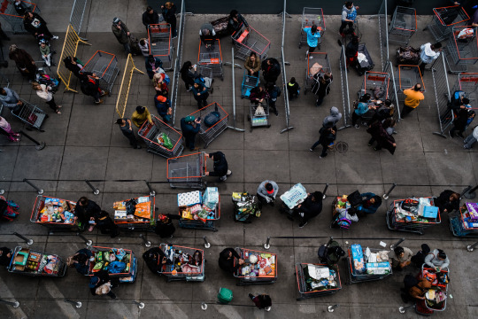
Gabriela Bashkar
2 notes
·
View notes
Text
Cultures and colours
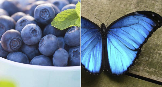
This week I’m going to talk about cultural conventions and visual elements, a topic that was briefly mentioned in our class on visual rhetoric, and I’m going to focus on the colour blue.
For years, my Irish boyfriend and I have had some disagreements, like any other couple. A recurring one was naming this colour:

For me it’s clearly green and for him it’s clearly blue.
I used to think it was one of those perception issues like that famous dress that went viral
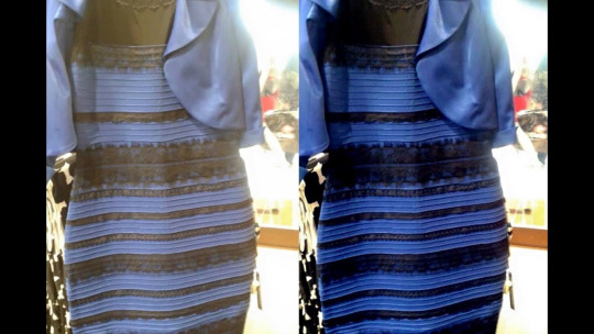
But this week I came across an interesting Twitter thread that explained how different languages categorise colours differently.
Apparently, ancient Greek language lack a word to designate it. A surprising fact if we look at the country’s current flag and consider that it’s composed of a peninsula and islands, surrounded by the sea.
In ancient’s Greek’ literature masterpiece, The Oddisey, Homers refers to blue objects with the expression “dark wine”.
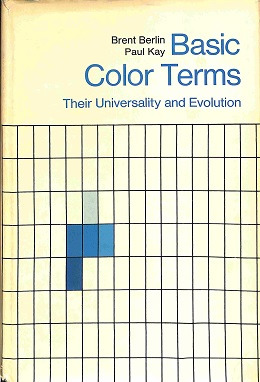
This phenomenon isn’t exclusive to ancient Greece but as Brent Berlin (anthropologist) y Paul Kay (linguist) explained “Basic Color Terms: Their Universality and Evolution (1969)”, ancient civilisations (Vedas, ancient China) didn’t have a word for it. It also doesn’t appear in the Bible.
All the cultures have words for both “black and white” since they allow to distinguish between darkness and light. The next one that appears is red because of it communicates basic and innate body reactions, as it’s the colour of our blood.
Afterwards, the yellow and green follow as they help us distinguish edible and not edible fruits in nature.

However, there aren’t many blue elements in nature so the need to name it isn’t that urgent, so for thousands of years civilisations didn’t have a word for it, except for ancient Egypt.
This doesn’t mean that people of those civilisations weren’t able to see that colour, it just failed under a different category linguistically.
Nevertheless, this categorisation affects our perceptions in different languages and societies.
For example, the following images show the samples for “rosa” (Spanish for pink) and “pink” that Wikipedia offers:
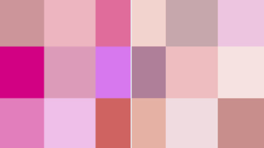
This is just a small sample that illustrates the diversity of conceptions and codifications of the world.
Intercultural visual rhetorics is something that we need to keep in mind in our future work as digital practitioners, especially if we execute jobs for a global market.
Note: related to this topic, this article on how different people see colours differently is also relevant: https://artsandculture.google.com/story/NAURhPrNHkoVMQ
1 note
·
View note
Text
Of travelling and photographing
Two things I love doing and I love reflecting and seeing projects on. Today I am going to present two views where these two popular activities are intertwined and ironically reviewed, revealing their paradox and stimulating a reflection on the original purpose of photography to document and fix reality:
1 . Graphic designer and student Zilla van den Born, 25, faked a five-week vacation in Southeast Asia.
As a University project, she staged and manipulated photos, videos and videocalls to pretend she was travelling while she never left her home in Amsterdam, where she kept herself busy crafting that trip. The purpose of her project was “to prove how common and easy it is to distort reality.”
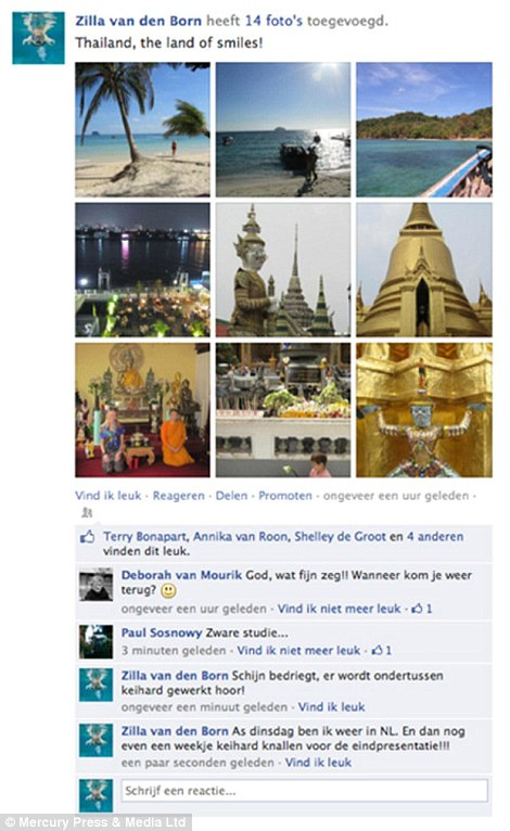
Below there are some videos of the edition processes she did:
vimeo
vimeo
_______________________________________________________________________
2. Switzerland-based artist Corinne Vionnet.
Another project on travelling photography I really enjoyed is Switzerland-based artist Corinne Vionnet. Although her technique first strikes like watercolour or oil in canvas, her means is only digital photography and she does not even use her camera to create her works!
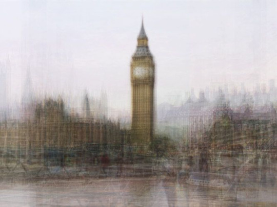
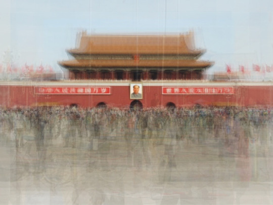
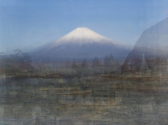
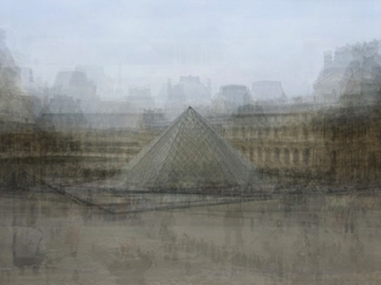
All she does is collecting hundreds of existing images that she finds online and digitally superposing and merging them into one, generating a dreamy effect similar to a painting.
Not only the result is aesthetically interesting but the underlying meaning of the communal spaces many people seek to photograph and how the initial purpose of the transcendence once associated to photography fades in thousands of repetitive files. The ghosty human figures also evoke the passing of time and the lack of permanence.
1 note
·
View note
Video
youtube
The Simpsons - Homer's Web Page
This video is being a recurring evocation in the process of design my music poster for our module’s second assignment.
I mentioned before in this diary that this is the first time I open Photoshop with a blank canvas and start to design from scratch. Having used that software for many years now (and I have to admit that my first copy was pirated, though the misdemeanour has probably prescribed after 22 years!).
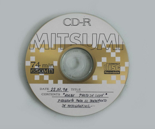
My first foray to photo editing with “Adobe Photo Deluxe”, 1998
Completely self-taught in photo editing since I was an early teenager, It has taken me this long then to start designing (sorry, I have been busy!) and my biggest fear while doing it is ending up with something like Homer’s website. I’m terrified of randomly populating my rectangle of white pixels with a juxtaposition of disjointed elements that do not function well as a whole together.
I hide some of my layers often to check if my design still work and remind myself that “less is more” in order to fight my first instinct of adding new elements “because I can”, because I have just learned to use a certain tool, because it is an assignment and, therefore, I want to proof that I can carry out the required actions: applying gradients, textures, effects...
I am now realising that this is not just an exercise of coming up with a poster but a practice of conscious observation and although I am confused with my design, I think I am on the right path when I find myself analysing the design and typographies of my shampoo packages when in the shower, but I still have a lot to learn...
0 notes
Text
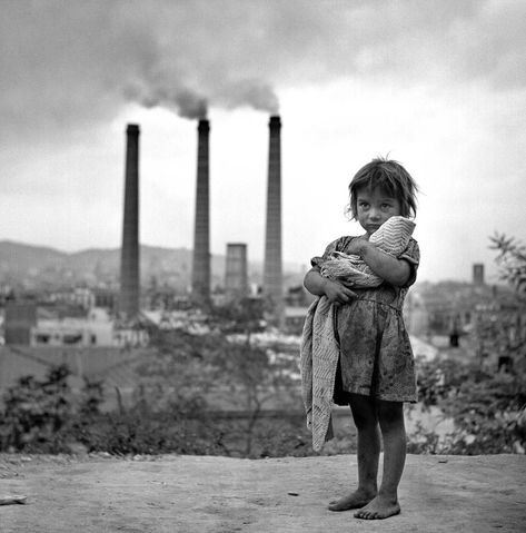
Last week, The Guardian published the online photo essay: Capturing Madrid's history, a collection of of historical photographs of Madrid, most of them from the 20th century. I’m Spanish and I work as a photographer and as a Spanish language and culture teacher, so it goes without saying that this really got my attention: I’m always very curious to see how my country is depicted abroad, but I’m especially interested when the means is photography.
I really enjoyed scrolling through the selection and recognised some of the photos and the photographers’ names. I used these photographs in a module I teach on contemporary society since I think visual content is quite appealing to students.
By pure coincidence, that very week, we had our “Visual Rethorics” class and the parallelism was quite clear. In our Visual Communication class we examined how our cultural background, helps us decode the visual content we come across, loading the figures we see in the paper or screen with our own meanings, some more arbitrary, some more rational. Semiotics are key when processing visual information and after a fruitful discussion with my students it was very clear that what I, with my experience in the country, see in these photographs, differs from what my students interpreted, so for this week’s post I decided to make a small selection of my most meaningful historic photographs of 20th century Spain, not just Madrid:
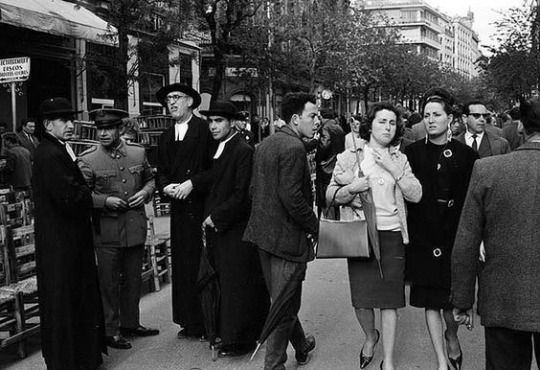
"Piropo", by Francesc Catala Roca
The name of this photo is “catcall” and by looking at it, one can almost hear the man’s voice telling something to the two women that walk together in the street surrounded by man. On the left of the picture, the uniforms of the four man reveal the most powerful sector of the society of the time: the Church and the military forces.
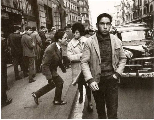
The spontaneity of catcalls are recurring in street photography and here we have another example by Xavier Miserachs in Via Laietana. A lot has changed and luckily these actions are less frequent in contemporary Spanish, so this is something that the viewer needs to know in order to understand what is going on in the photograph.
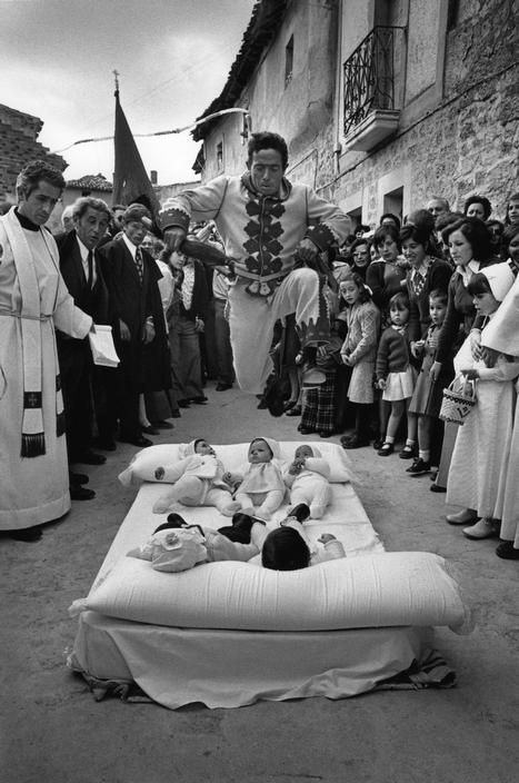
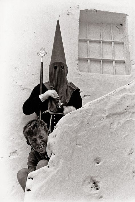
This shocking photo by Cristina García Rodero, the first Spanish woman to be part of the Magnum agency, must be very difficult to interpret to anyone that isn’t familiar with this strange Spanish tradition: in a village, all the newborn babies of the year are placed on the floor so a creature, El Colacho, jumps over them to give them a particular unorthodox type of baptism on the day after Corpus Christi.
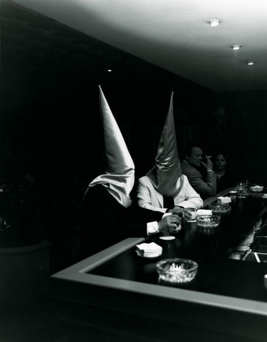
Cristina Rodero has spent most of her life documenting traditions and one of her main leit-motives has been Easter, a very strong tradition in many parts of Spain with penitents wearing habits that people without the relevant knowledge can think it’s KKK’s, whereas it’s just a mere religious costume.
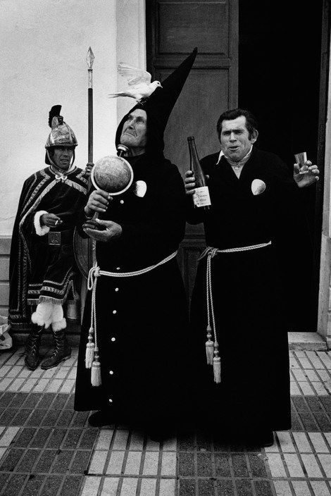
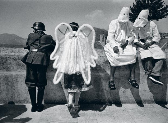
Spain suffered a Civil War followed by a Dictatorship between 1936-1977. The Dictatorship meant censorship, so Spain was quite behind the rest of its neighbour countries for many years. However, it opened up for the tourism, since that was a source of wealth. The emergency of tourism caused and its consequential cultural exchanges revolutionised Spanish morals, urbanism and conceptions of the world. Xavier Miserarch portrayed this in a lot of work:
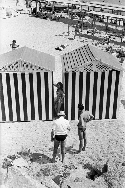
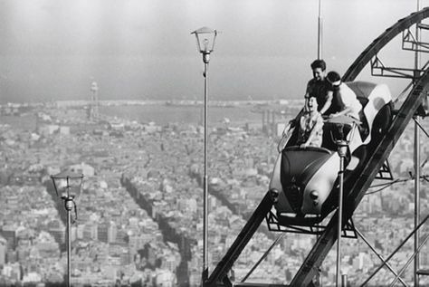
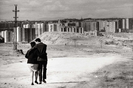
The bonanza tourism brought to the Spanish economy contrasts with the poverty of a post-war society, as it can be seen in this famous photo taken in Barcelona:
1 note
·
View note
Text
0 notes
Text
Week 6
In this week of US general elections, my weekly post is related to graphics that have caught my attention. The first one is a vintage gem: BBC coverage for 1979 elections. I find these graphics, combined with the epic music, very effective. Forty years ago, the resources available to create video were way more limited to nowadays'. However, the designers in charge of these credits managed to come up with a clever and powerful product. Starting with the creation of the main candidates' headshot with just "x" characters and solid colours as a background, a digital, computeresque scenario is depicted. This is followed with sequences of repeated nouns: "analysis, trends, comment, gains, losses, polls", written in capital letters with an outline filled with footage and a representation of the house of the parliament building and, again, the candidates' faces in neon-like drawings framed by imperial-looking circles. The video is closed with the text: "decision 79", in the colours red and blue, recurrently used in politics with a proper 70s typography: all the letters except the "i" in the word are divided in two and the big number "79" is probably designed ad hoc, since the 9 takes the space of the retraction of the number 7.
The second video is from the news website "High Snobiety". This page has a focus on design, visuals and fashion and in the days prior to the election, chose to cover all their photographic with a very impacting repeated message: "don't click this". Written in black, bold capital letters on a red background, made the navigation experience quite unique, giving the visitor a confusing experience, specially considering that usually websites are trying to persuade users to click on their links. However, the website wanted to emphasise the importance of the context of the US presidential election and persuade their users to vote. I found this campaign quite interesting, unique and effective.
0 notes
Text
0 notes
Photo
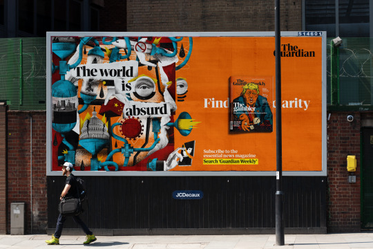
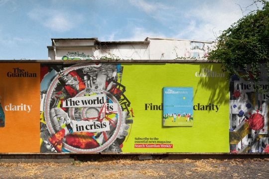
Photo source: https://www.creativeboom.com/inspiration/guardian-weekly-find-clarity/
Illustration by Rafael Alejandro
Campaign by creative agency Oliver, and in partnership with Omnicom Media Group’s PHD, and Kinetic
1 note
·
View note
Photo
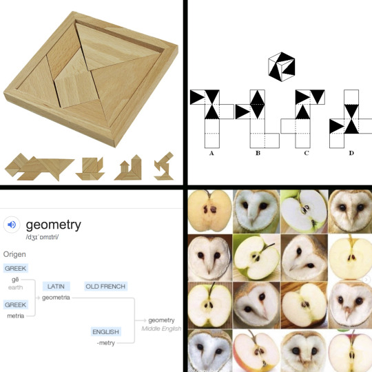
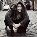
Since the goal of this visual diary is to reflect on how our perception is changing and evolving, I find this week’s entry is quite suitable. I don’t consider myself a particularly analytical person. I’m observant and creative but I don’t categorise much. My spatial awareness isn’t very good and I’ve always been terrible bad at games like tangram (image 1) or spatial ability tests (image 2).
After years using Photoshop with photo edit and retouch purposes, last week I opened a file to create from scratch for the first time during our Visual Communication class and that was a completely new way of using this software for me and despite being familiar with Photoshop’s tools, I was completely lost and didn’t know how to start. Our teacher introduced us the Polygon tool and I was still very confused: “how are we supposed to create with just ellipses, triangles, rectangles, lines and polygons?” Then I remembered concepts of Geometry from Primary school and started to purposefully look around during my daily walks looking for those shapes to discover they are everywhere and everything is made of them. This has been my week revelation: a new way of looking, a code in which reality is formed, not in vain the etymology of the word “Geometry” is “the measurement of the Earth” (image 3).
And then I saw image 4, a compilation of photos of apples and owls to show the resemblance between both and realised how magical it is the fact that out of such limited ingredients we can have endless possibilities of combinations. This also led me to think about AI training engines but I guess that can fill a different post of this diary.
1 note
·
View note
Photo
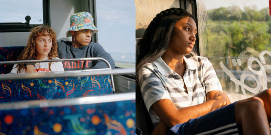
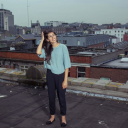
Week 1
Left, photo by Darragh Soden. Right, frame for series “We are who we are”, directed by Luca Guadagnino.
When I was watching the series, this image of the main character Caitlin, looking out the window of the bus with a characteristic teenage rictus that oscillates between deep sadness, melancholy and daydream, reminded me of the well- known photo by the Irish photographer Darragh Soden. Both photos’ colour palette have analogue reminiscences, which I think enhances the feeling of melancholy for the viewer.
I enjoy how in this juxtaposition of images the cold tones of Darragh Soden’s photo, with the characteristic pattern of Dublin bus’ upholstery, contrasts with the summery and warm tones of the frame of Guadagnino’s series, set in Italy.
2 notes
·
View notes