olivia-erskine-grad702
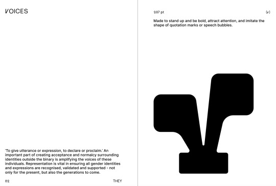
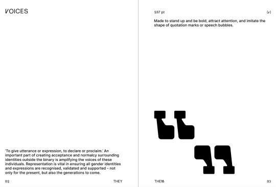
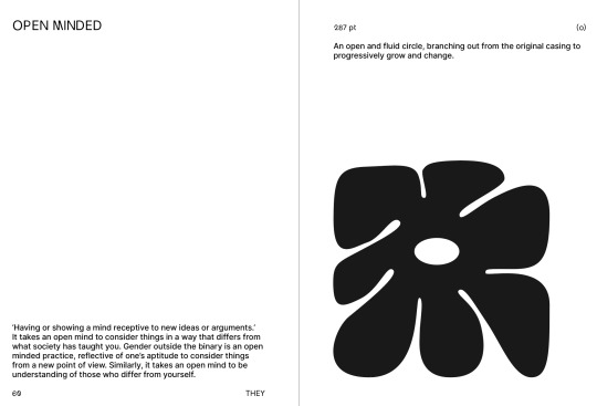
THEY THEM
THEY THEM - A Nonbinary Typeface
124 posts
Don't wanna be here? Send us removal request.
Last Seen Blogs
mtngh0ul
* MOUNTAIN GHOUL.
hiisilija
Not dead yet
successful-revolution-blog
one day more

aelois
Aleois
freckles-the-fugitive
You expect me to work in this dress?
Text
And here it is, the final outcome.
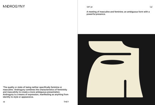
Overall, this project has been a semester long journey of self discovery. I have come to gain a deeper understanding of gender identity, societal constructs, self expression and the art of typography. I have been pushed out of my comfort zone in my way of making as well as my way of thinking. I challenged myself to explore how I could communicate abstract ideas in a tangible way. I shared myself and my ideas through my project to an extent that I never have before. Although there are things I would change and time i would have liked to allocate better, I know that if I had altered any part of the process I wouldn’t have come to this exact outcome. I think I have explored and responded to the question, “how can typography be used to express nonbinary gender identity” to the best of my abilities. ‘They Them’ is a complete reflection and encompassment of how i perceive gender identity. It is a real marker of self growth as I reflect on it in comparison to my previous projects over the years. It is a positive and conclusive way to end my degree, and a piece of work I will always have an affinity for.
0 notes
Text
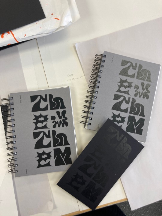
I managed to get the books spiral bound today but it proved to be quite the challenge. I missed pink limes opening hours yesterday because the trimming took longer than I expected. I then went to ask whether I could get it done on the north shore campus, but i was told they weren’t sure if they would have the right size. I then went to warehouse stationery, who didn’t have coils big enough, and then this morning Fuzed, who originally said they could do it and then said they couldn’t. I didn’t realise that since changing the layout of the book it added heaps more pages, making it around 130 pages and 2cm thick. I just assumed this would be a standard wire binding size but apparently it’s not. I managed thankfully to go out to pink lime on the north shore and they were able to do it. They had to use a slightly bigger coil because it was the only option, but I actually love how it turned out, it makes it into more of a feature. However, this did mean the measurements were off and some of the pages are cut really close to the holes. Overall though, very happy with it and thankful I was able to get it bound in the end. I came into uni and started on the cover. This idea was actually a genius one of Tatiana’s I was saying how I wanted too stuck board on to the cover (because I couldn’t get thick board spiral bound) and she suggested I make it like a panel on the side of the cover that leaves room for the info on the left. Once I spray glued the printed paper to the card and trimmed it down I started to get apprehensive about whether I wanted a board cover at all, but in the end I decided to go ahead and I think it was definitely the right decision.
0 notes
Text
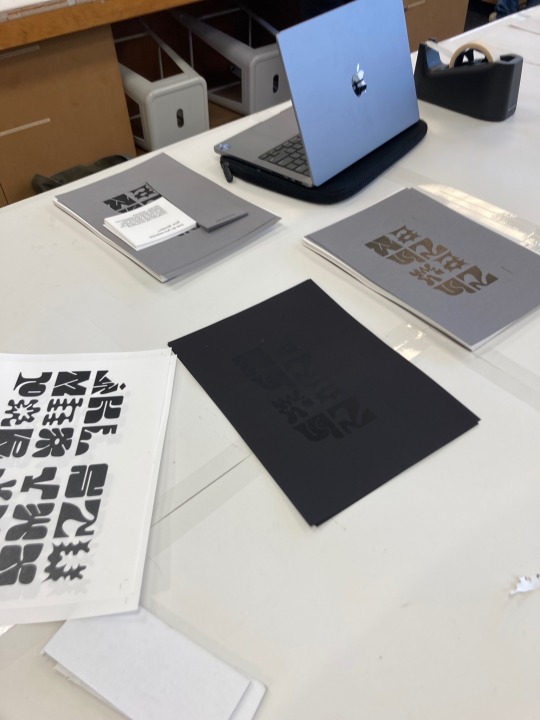
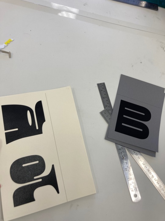
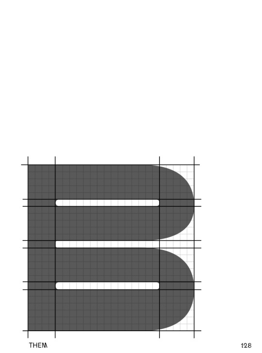
Finally after three full days I have two copies of my book printed and trimmed. I absolutely should have left myself more time for this - not allocating myself enough time for tasks is a symptom of my adhd that I have not yet learnt to counteract. I was confident I could get everything printed bound and trimmed in one day, but at least I left myself enough time for error. I printed the letters onto a mix of blue, green, grey and cream paper depending on what intuitively felt right to me in regards to the nature of the form. It all went entirely smoothly aside from one issue - the trimming/placement of the letter B is wrong on both copies. It was too late in the day for me to reprint and trim so I’ve just had to leave it. Overall though I love how everything turned out. Some of the patterns could’ve done with some adjustment but it wasn’t a priority in getting the project completed.
0 notes
Text
I went into uni today with the intention of printing my book pages. Instead I spent about 8 hours trying to figure out how to make the layout work. Because it’s the weekend there was no one around that I could ask for help and it seems there’s not much information online about printing for spiral binding. I have no clue what I was doing wrong or need to change but if I can’t figure it out I’ll have to wait till Tuesday and ask fleur/Greg/Tatiana for help. On the plus side, this gives me more time to continue refining the book, but on the downside i was intending to get it bound at pink lime on Tuesday so this will be cutting it fine
0 notes
Photo
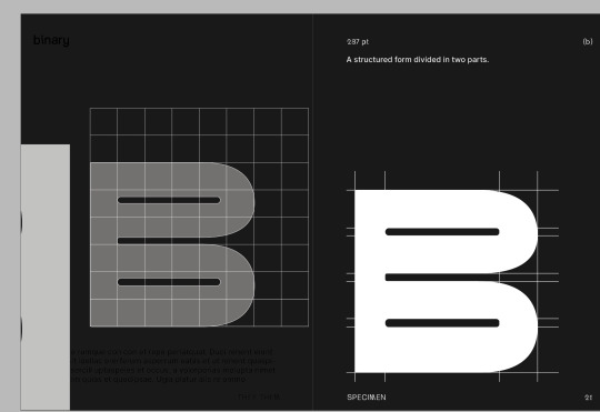
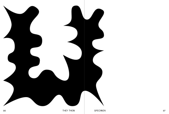
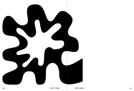
After a number of very long days and late nights I have finally finished designing the spreads. Changing the layout so soon to the deadline didn't feel like a risky decision at the time, but it definitely set me back much more than I thought it would. However, even though I'm cutting it quite fine I'm so happy with how the spreads have turned out. the structure of the book really makes it feel like a visual diary and taking the viewer through my journey. At the end, I have a three page spread in which one page folds out to show the alphabet. Pictured above is the final variation and refinement of my typeface. I like how the book travels through the alphabet one letter at a time, and then at the end brings it all together to display them as one. Im glad I decided to disregard the typical contents of a type specimen book and instead make something that matches the explorative nature of the typeface itself. Once it is all printed on nice paper stock and the colours pages added I'm hoping it'll have a really strong visual presence.
0 notes
Photo
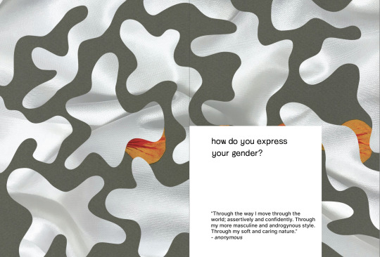
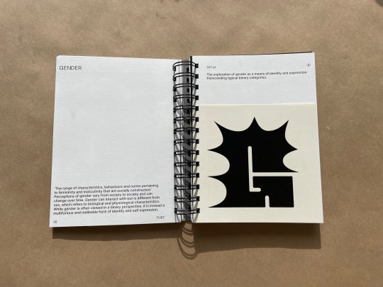
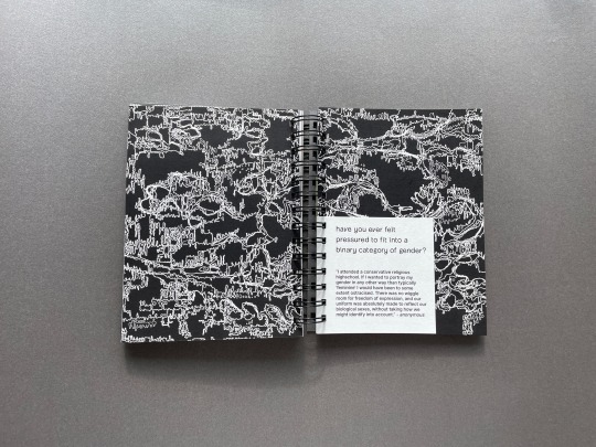
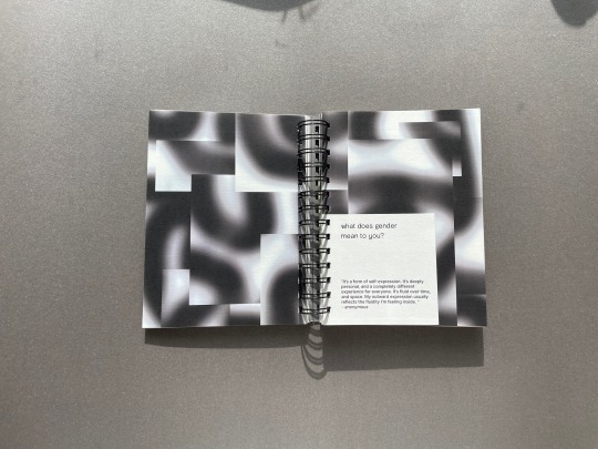
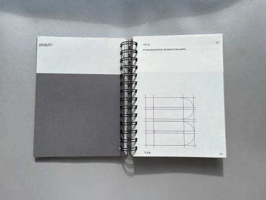
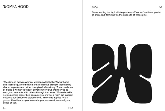
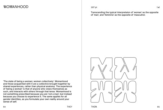
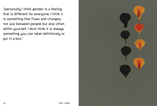
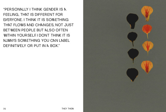
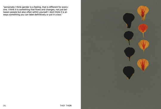
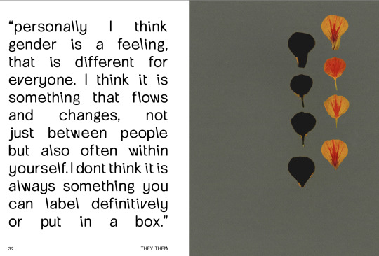
The revised structure of the book is working out really well. I haven't updated Tumblr in a while just because Ive been working so intensely to get these spreads completed. Each page has its own little depiction of some background context to the letter, as well as a definition and brief caption of the ideas applied in the letter. I decided that I did want to keep some of the patterns - again, they do add a depth to the book beyond just paper and letters. I finally figured out a way to incorporate the quotes from. the survey too. I decided to place them within a spread of a pattern that communicates what the quote is about. I was considering different ways of doing so, but decided that keeping the system of the smaller cut outs made sense as it is a reference back to ‘the space between two halves’, or the space between the binaries, as symbolised by the two pages. It also made sense for the letters and the quotes to be presented in the same format, considering they are both discussing the same concepts. I made the size smaller than the letters - the same as the anatomy areas - to kind of communicate that these quotes were a part of creating the letters too. I scattered a few words in the text throughout to show how it look in use. Overall, this layout is almost a bit more pieced together, which in this context I like because this book has transformed away from a typical ‘type specimen’ book and into more of a process workbook or visual reflection of the research project and the exploration/experimentation that took place.
0 notes
Photo
I’ve been designing the little sections of anatomy/influence/process to go not the new page layouts. In typical me fashion, I was adamant that this would only take me a day or two, but I’ve now spent the better part of a week redesigning the book. Luckily, I do think its worth it. this structure feels so much more like its taking the viewer on a journey through the alphabet, and through my exploration of this type design. It also eliminates the need to have a specimen section at the end, fixing the issue I had with that section not fitting in.
0 notes
Photo
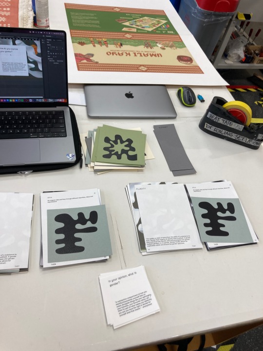
In the process of restructuring my book ive also been experimenting with ways I can include the survey answers within the pages. Again, these played such a vital role in the creation of the typeface and the direction of the whole project, it would be a shame not to include them and give them recognition. it also is a way of explaining my motivation behind the project without having to literally express it. I am however still having the same issue of heirarchy. I really like how th feature text looks set in a large size and covering the page but I feel like it overpowers the letters. Especially because the text on the alphabet pages is so small in order to create the negative space that makes the letters feel prominent and larger scale than they actually are. This is something to continue experimenting with anyways.
0 notes
Photo
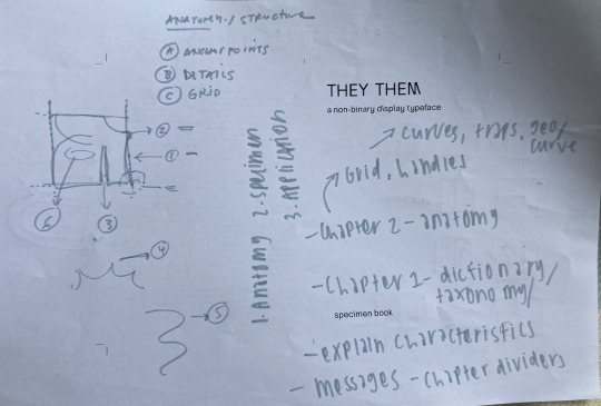
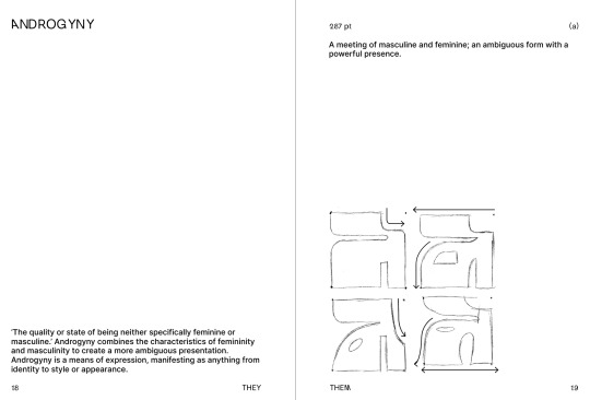
Today I discussed my uncertainty about the type specimen element of the book with Tatiana. She kind of implied that maybe the pattens were too dominant on each page, as well as that some of them weren't working so well. I discussed the layout with her and in the end, we came to the conclusion that the separation between the sections of the book didn't make sense. She suggested instead that I keep the taxonomy/alphabet section, but then rather than go into ‘type specimen’ discuss type anatomy (anchor points, details, grid), then application of the typeface in the third section, with a spread of the alphabet either before or after these. She explained that because there is so much contextual knowledge and ideas behind each letter, this should be discussed somewhere within the book as it informs the viewer.
I came home and attempted to create these sections of the book. Dividing the book by chapters definitely helped a lot with the structure, but I'm still struggling with how to integrate these discussions of anatomy within the design system.
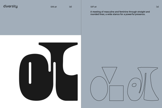
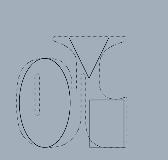
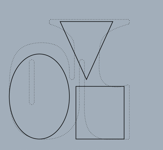
Furthermore, I’ve kind of gone off the idea of the patterns on each page. I still like how it looks visually, but it does take up so much of the book for something that kind of just compliments instead of contextualises the typeface. I think that instead, I'm going to try having each spread laid out with the key word at top left, a definition bottom left, then the point size and letter/word at the top of the right page, a short caption on how the ideas are communicated in the letter, and then underneath the cut out with the letter on the right page, an element of the letters anatomy/ideas/concept/process and other aspects that I was intending to include in the type specimen. If it looks ok visually I think this is a much more concise and logical way to structure the book, as well as keeping the viewer engaged and informed. I figure that ive put so much consideration into the meaning of the letterforms I may as well share this.
0 notes
Photo
I did a full test print of the spreads thus far in order to check whether i liked all of the patterns and colours on the paper stock and colour I'm using. There were a few that definitely need to cut just because the hues were off or I don't like how they look on paper. I still like the size of the book - its very petite but I think its right for displaying the letters. I'm slightly worried that the book his going to be too busy and overwhelming, especially that the patterns will overpower the letters. I'm also still unsure about the type specimen aspect, but overall I really like the direction its heading in.
0 notes
Photo
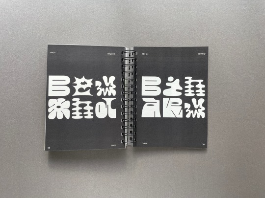
For the ‘type specimen’ half of the book, I’ve been exploring the different interesting ways I could present the letters on the pages, as well as make words with the text. Although I really like how these all look visually, I’m struggling to work out how to integrate this part of the book with the rest. I think that putting letters on pages in a really large scale would throw off the hierarchy I’ve created in the first half that has the letters as the most dominant element. I also don’t know how to keep the design system going in order to display things like the anchor paths or process sketches.
0 notes
Photo
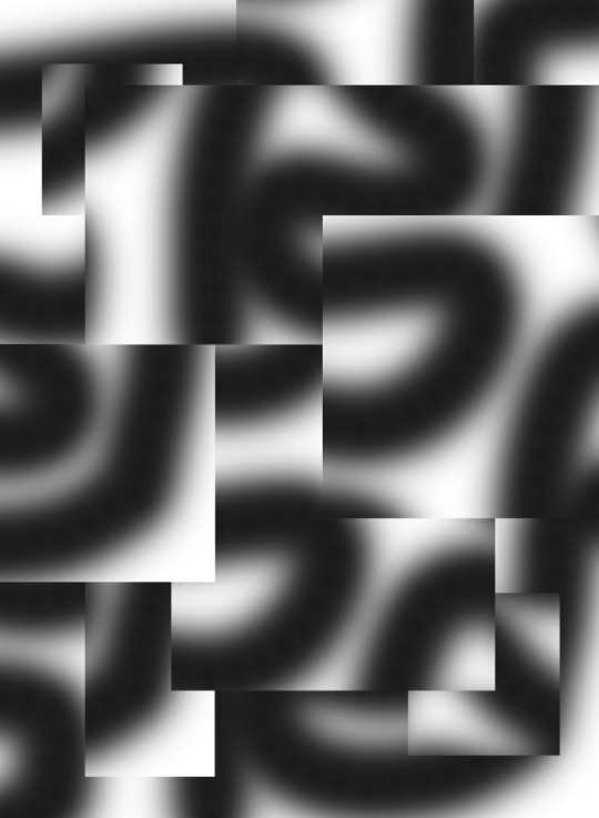
I’ve made a piece of imagery for almost every letter of the alphabet now and started applying them in the spreads. I think it’ll make for a really interesting narrative and creative exploration throughout the pages of the book. I feel like it just adds another element that isn’t just paper and letters. The intention is that the squares the letters are on will be separate shorter pieces of paper, probably in coloured card, that you can turn over to look at the pattern underneath.
0 notes
Photo
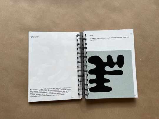
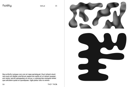
Further imagery exploration, largely focusing on the idea of fluidity, and expressing this through organic and rounded forms, as well as colour spectrum to reflect the spectrum of gender identities,
0 notes
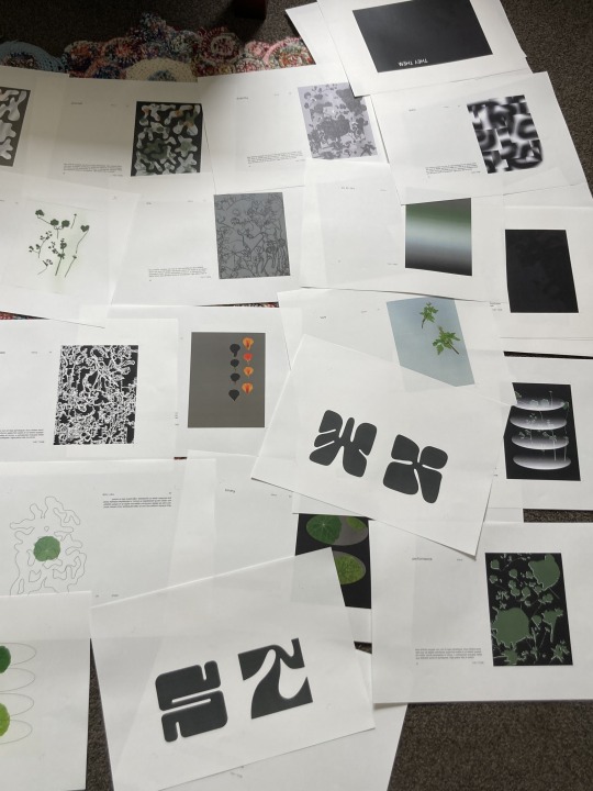
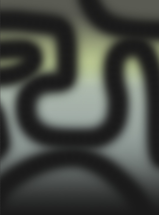
Photo
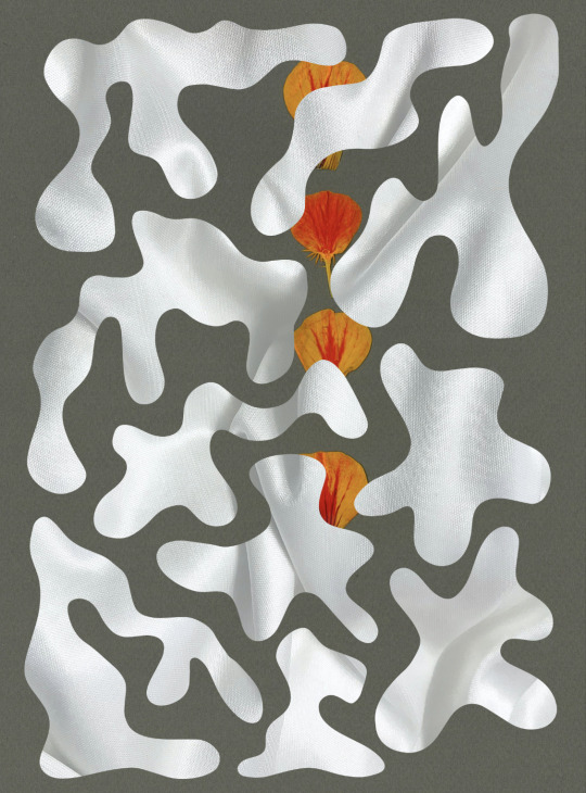
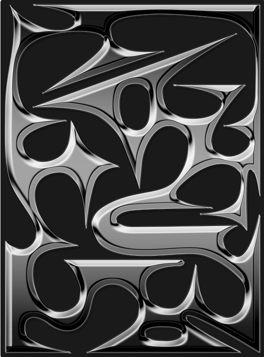
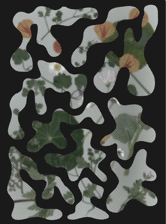
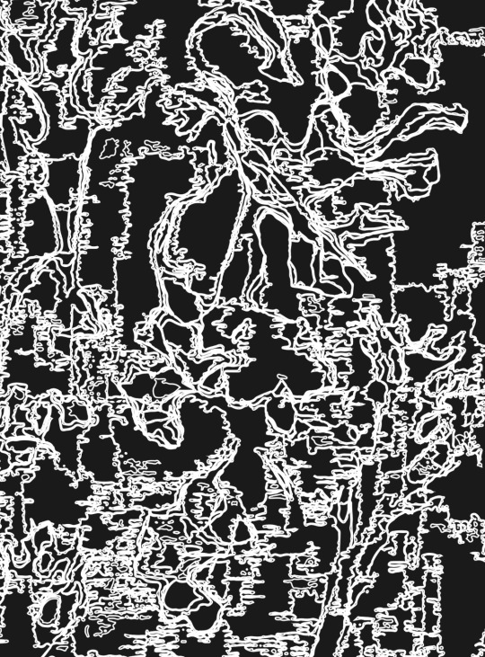
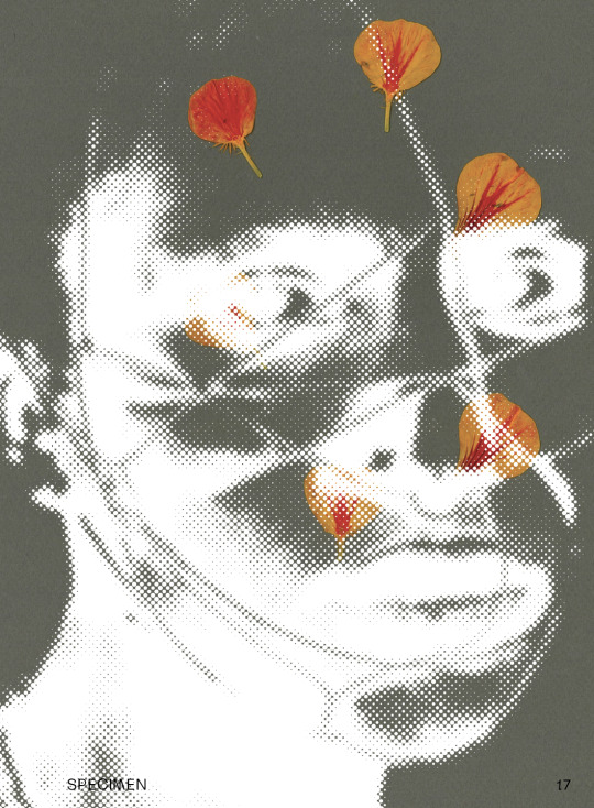
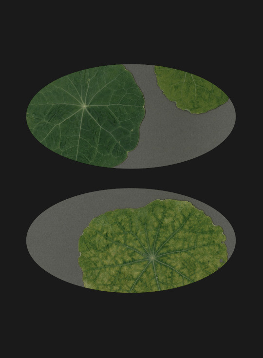
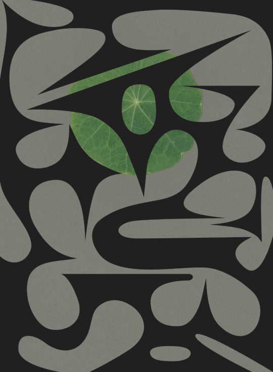
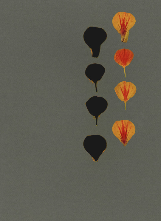
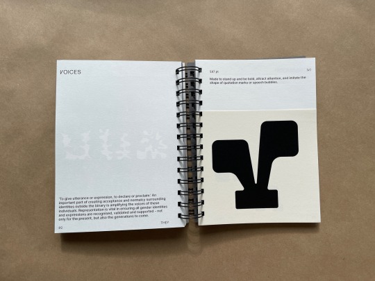
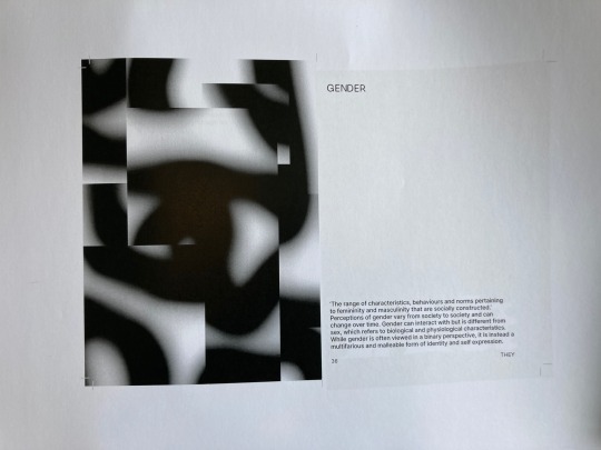
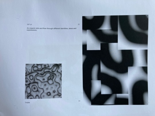
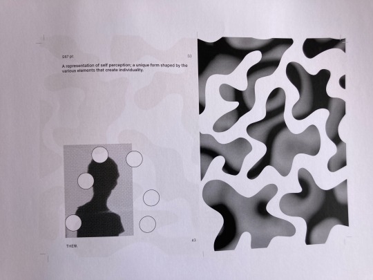
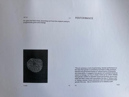
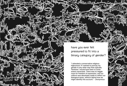
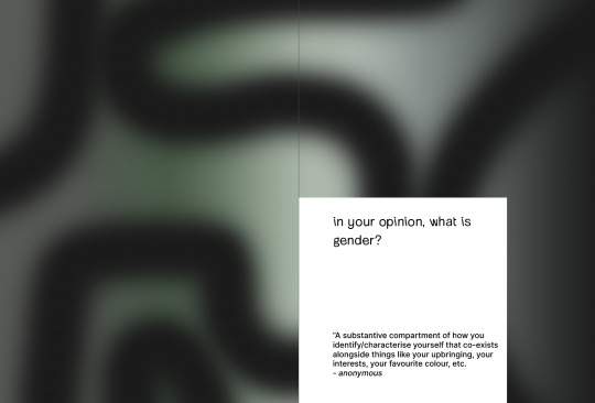
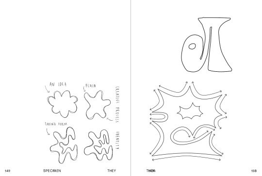
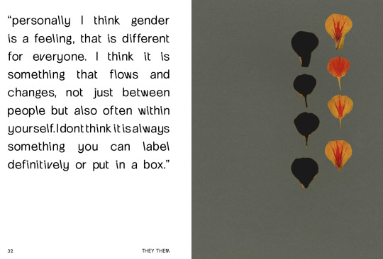
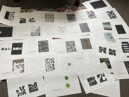
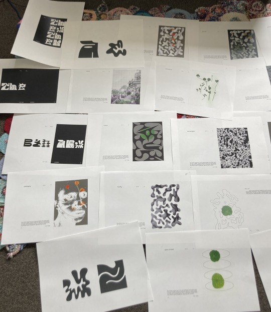
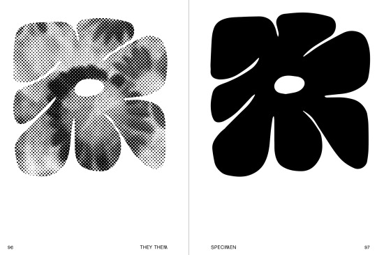
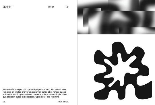
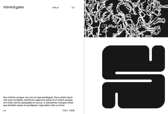
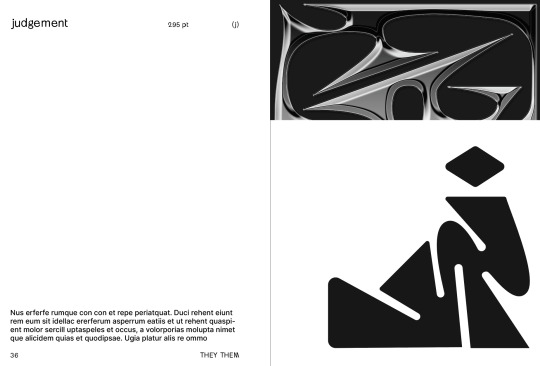
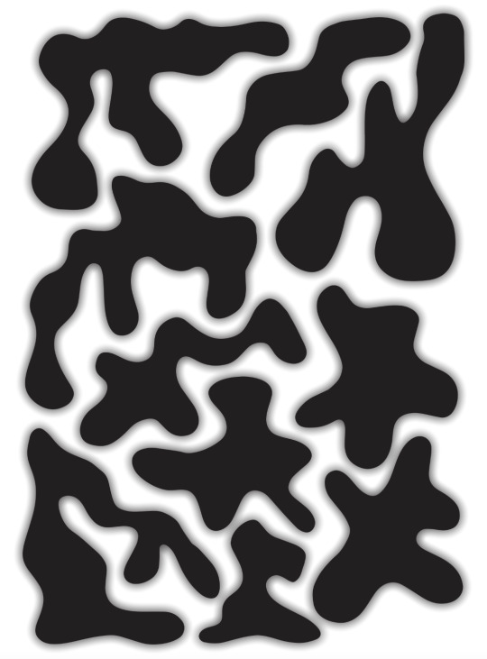
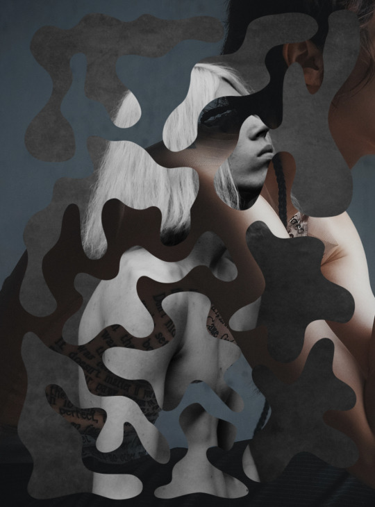
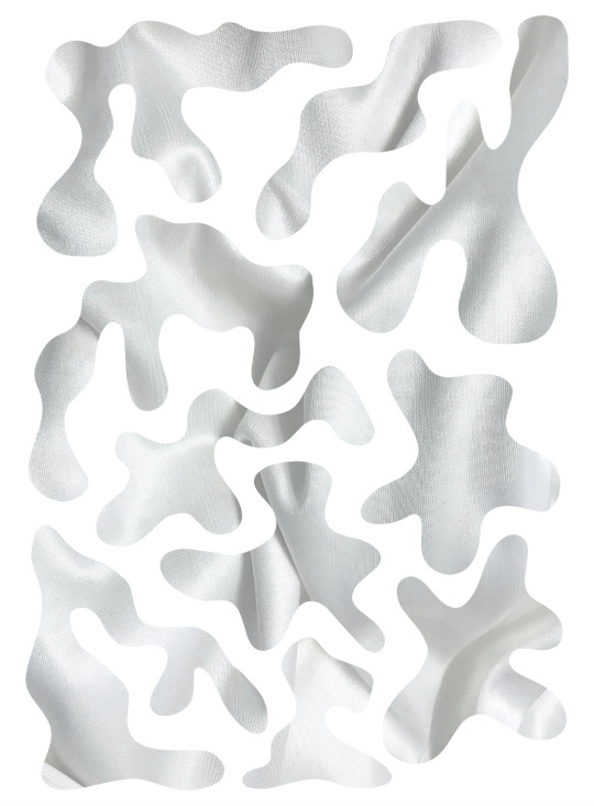
Following on from the idea of creating images/patterns/textures/visual representations, I’ve spent the last few days creating images like the ones above to go one each spread of the book. I kind of just applied my intuitive understanding of each and depicted it the way I perceive it in my mind. In example, the busy black and white pattern reflects stereotypes, almost like lots of little voices telling you who you should be and what you must do. The jagged patterns reflect judgement, again depicting its harsh and harmful nature. The black with two circle reflects a binary - two groups posed against eachother. The white ovals with the plants reflect Nonbinary - transcending and existing outside of given categories. The black with fluid shapes and flower texture reflect queerness - a fluid and flourishing identity and experience. The flower petals that have been cut out and moved reflect transgender - a growth from one space or category to a new, more expressive and colourful one.
This continues to push me outside of my comfort zone, but at the same time feels like a very intuitive and natural creative process. It has also made me think deeper about the forms depicted in my letters and how others may make connotations with them.
0 notes
Photo
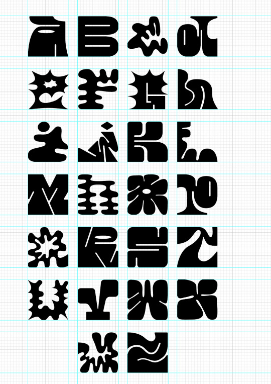

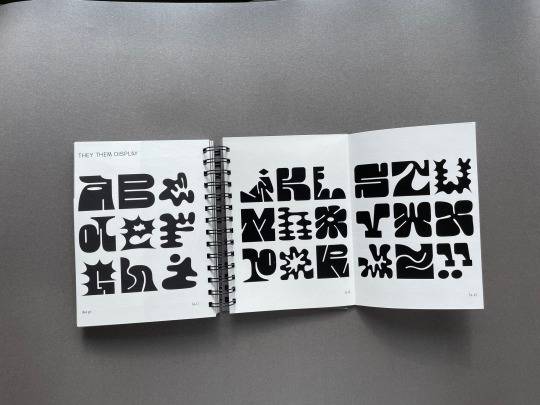
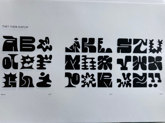
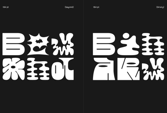
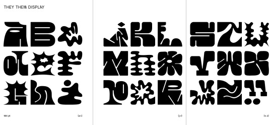
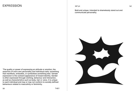
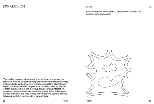
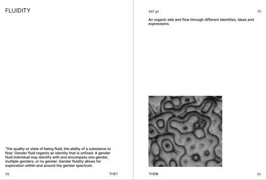
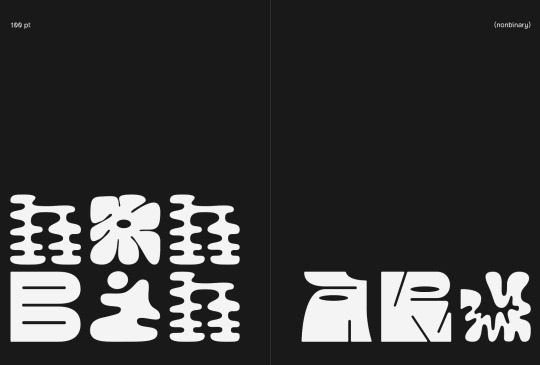
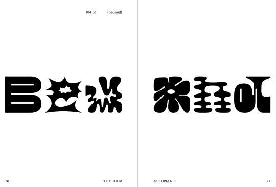
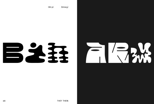
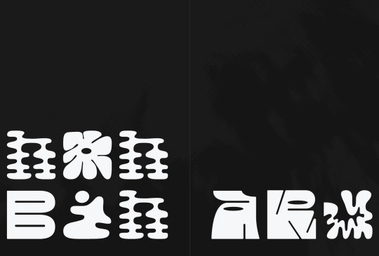
My (somewhat) finalised typeface. This is all of the letters refined and collated into a grid. The main feedback I received on this in class is to move the tail of the ‘y’ lower down, as well as make the base of the ‘v’ a bit narrower. I’ll definitely make these changes because I can see how they'd increase the legibility. Overall, I think the typeface is successful in being bold and ‘taking up space’, as well as being expressive, unique, and communicating Nonbinary gender identity through its personality and the meaning of each letter brought together.
0 notes
Photo
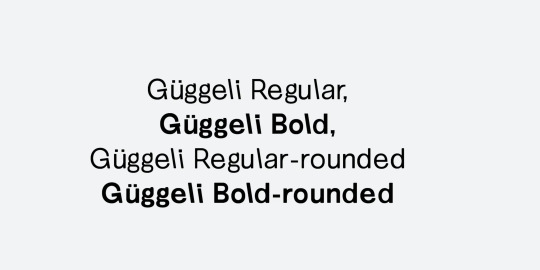
Over the last week or two I’ve been considering my typographic choices for heading and minor text in the book. I originally looked at the fonts used in the book ‘Extra Bold’, as the book addresses the presence of typographic binaries and is generally inclusive of different gender identities. I determined that I didn’t want to use my typeface for headings, other than the cover, as I want use it kind of sparingly as not to commodify it too much. After looking through pangram, adobe fonts, google fonts, sharp type, grille type, and many many other sites, the only font that stuck with me was Guggeli. The way that some of the letters are slanted and the slight offset of it all perfectly intertwines the concept of removing binary structures from typography. It has a rounded version that also fits perfectly, as my typeface only has rounded edges too.
0 notes
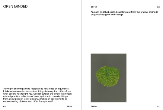
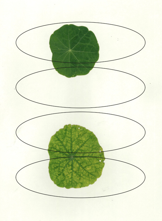
Photo
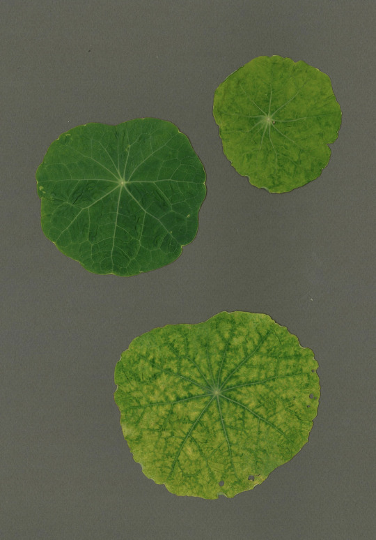
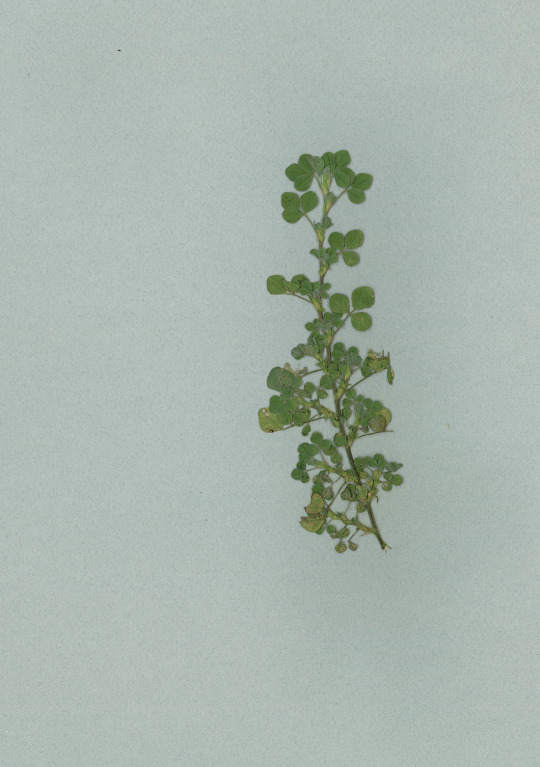
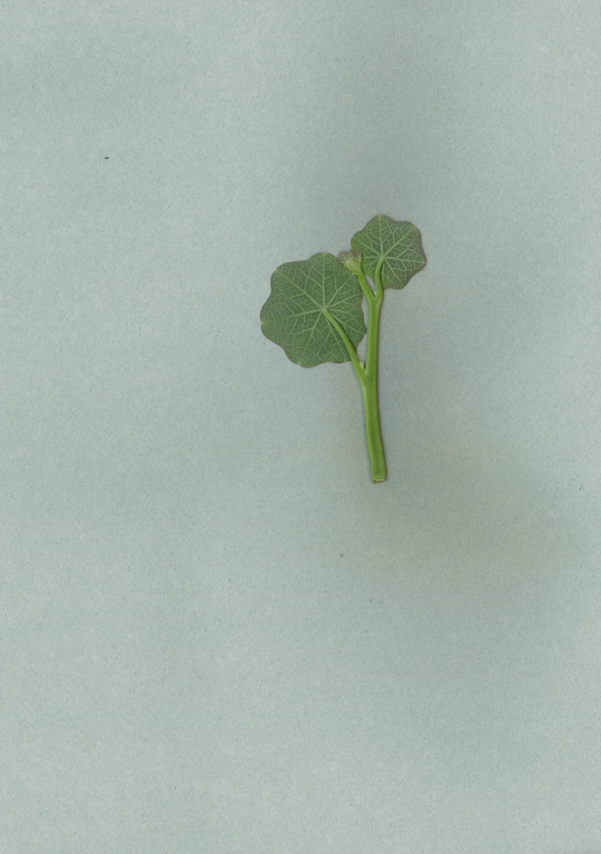
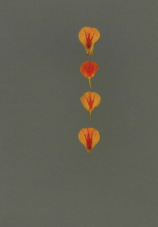
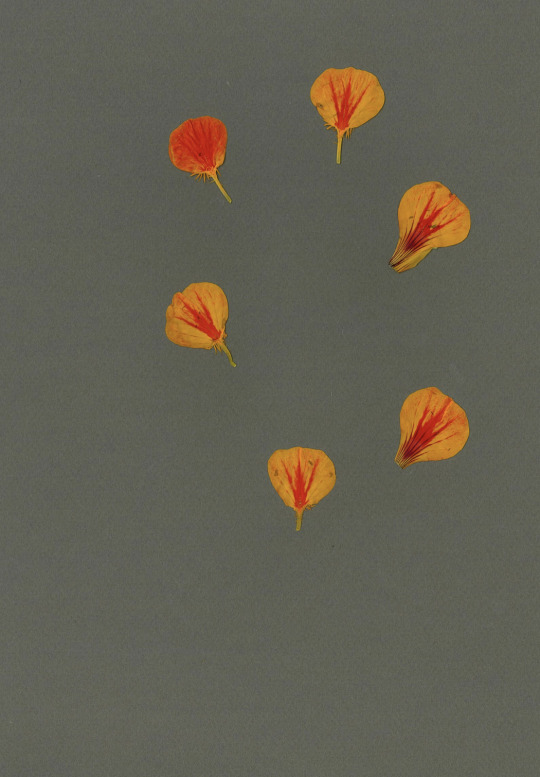
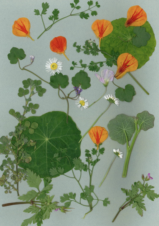
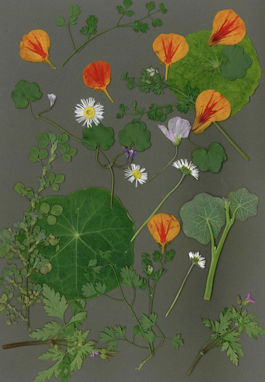
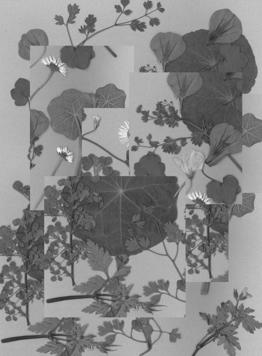
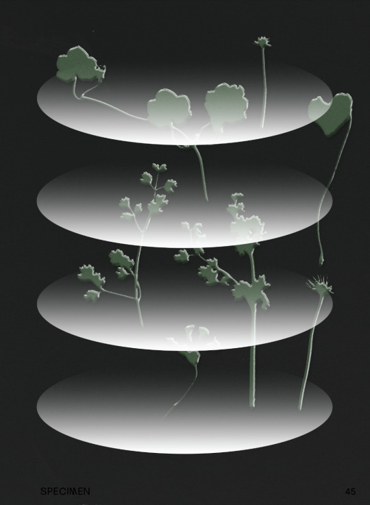
These are some of the pressed foliage scans. I love how these turned out. I think it could be a really nice way to incorporate more analog and organic matter into the book, especially considering they are almost a metaphor for gender identity, based off the survey responses.
0 notes