
Last Seen Blogs

lorvdz
Hithering And Thithering
Adler’s Cutie Patootie:3
rollxtblan-blog
mère ours.

ivilvl-blog
공모전 대외활동

jcparana
Sem Destino

maryvolentir
Gîndirea vine din gîndire.


Text
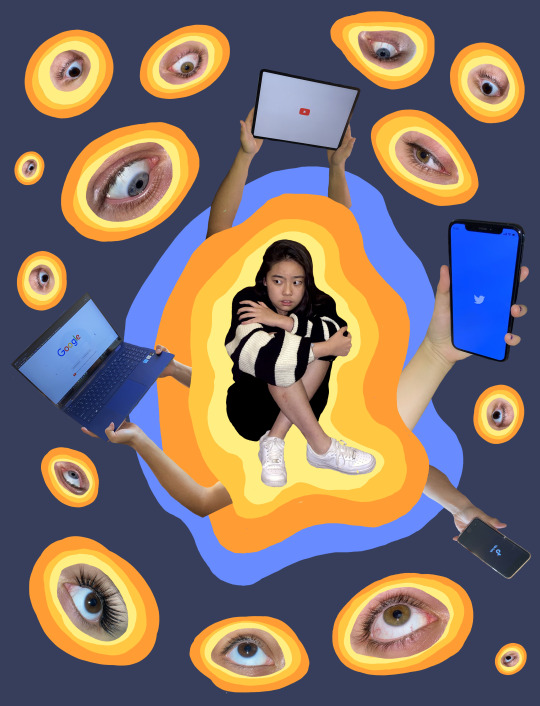
PROJECT 6: WILD CARD PROJECT
Through creating a series of digital artworks with Adobe Photoshop and Illustrator, I strive to explore my self-identity as a adolescent girl in the influential age of social media. My pieces are examined through the lens of our current systems of living, communication, and interaction. I explore the perception of others and self through the media’s POV, the disconnect through media, and the dissemination of values and information by icons by the media. This journey begins through self exploration both physically and mentally (image 1-4). I asked myself, “Who am I, and what is my identity?” These thoughts then moved from my reflection as an individual, to how my identity is viewed by others. However, once we begin to move away from our primary thoughts, we begin to compare our lives with those around us. That is when the pressures of society begin to create a rhetoric of comparison, and in turn, cause us to feel a “lack” and inadequacy. Society often dictates what is considered beautiful, and if you don’t associate with such thoughts, you can often times feel unworthy. Each object, figure or icon in each individual illustration can be interpreted as a single item, or in relation to the surrounding objects (images 5-7). Also, each illustration can be viewed in isolation or in relation to the set, in any order. The icons, objects and figures often have personal meaning that can be unique to the viewer. I also utilized colors as a representational tool. Red is symbolic for anger, lust, and sex-appeal (image 1), blue represents depression and disconnection (image 4,6), while green symbolizes addiction, falsity, and secrecy (image 5,7). The line weight of the illustrations are deliberate to mimic an abstract “cartoon” world, to symbolize the digital world that the media lives within. However, in my pieces with this series, such a world isn’t tangible and can only live on cellphone screens or computers. However, the message I’m trying to relate, can manifest as real feelings in one’s own life.
0 notes


Photo
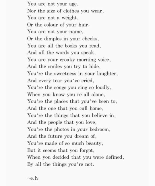
PROJECT 5: THE TEXT (and how it affects everything in my film)
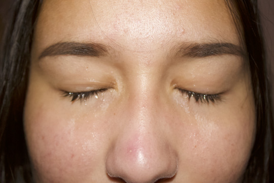
This is a poem I found online on google images. The title of the poem is unknown and the only indication of the author of this poem has initials called e.h.
I chose this poem because of 2 main reasons:
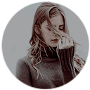
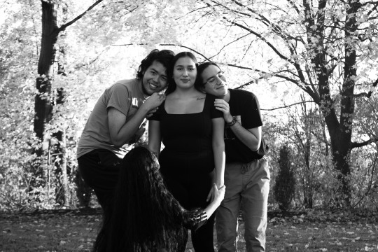
1. When I read it, it felt personal. I felt like I related and connected to it very deeply as I used to have self insecurities and body dysmorphia. I used to be paranoid of how people view me and I felt so little than what I am truly worth. Therefore, my goal for this film is for others to feel even just a sense of what it is like for someone to feel that way, because in my opinion that is exactly what films and art should do. If they didn’t make us feel, they’d be worth nothing. However, you must be thinking that because this is quite personal, that I will be using myself as the subject. This is wrong, I will be using a friend of mine, the reason for this is because I have a vision and ideas especially with all the stylistic approaches and techniques that I have mentioned in the La Jetée inspiration section.
2. The fact that it is a challenge. The reason for this is because the text doesn’t 100% match the vibe given off by the La Jetée inspired aesthetic photographs. I want to portray this eery deep darkness that arrises in this problem and perhaps create a twisted ending. You see from the beginning to “You’re made of so much beauty.” it seems almost encouraging and self approving and self appreciating. However, everything after that basically says the complete opposite. After this and extra heavy review of the poem, I wanted to maintain the creepy B&W film photography from beginning to end in order to foreshadow the unfortunate events that is to come in the end of the poem, which I will not spoil, but it will be a very very extreme and arguably the worst case scenario to happen. I thought of this as I thought of all the films and movies I’ve watched. Every film needs its climax or at least a twist in the plot or some sudden shocking revelation that changes everything to make it interesting and to keep you at the edge of your seat. This relates also to the reason I made first where I mentioned how art and films are meant to provoke feelings and emotions which would successfully do that.
0 notes
Text
Project 5 Inspiration: Example Videos on Vimeo
Somewhere in the Middle by Seung Hwan Daniel Lee
The “breaks” in between each photo played in the video had a black background every time. I was really interested in this because of the way this effect made me feel, which was almost as if I was blinking myself and I felt as if I was there in the scene as if I was the person narrating. Amazed by this, I’ve decided to get inspiration from this idea and develop it into my own tastes and vision. I think incorporating sound effects such as perhaps film rolling sound effects, or camera shutter sound effects. The reason for this is because it links well with my photographs which are to supposedly meant to appear looking like photographs taken through a black and white film camera but through editing. However, I also realized that Lee’s use of these “breaks” had two parts which, to me, was not compelling and that I would avoid in my video. These “parts” were the fact that the “breaks” background wasn’t just black all the time, it was sometimes grey, therefore for my film, I am striving to only use black “breaks” backgrounds to make sure it isn’t confusing as that is what it did for me and having this maintained, in my opinion, produces a stronger aesthetic purpose and complements my idea of camera shuttering or film rolling.
The City by Nadia Holcomb
Holcomb chose a narrator with a deep soft voice, which I was very captivated the entire time listening to. He had this soft and very slightly raspy voice that felt like it transcended through my soul. However, in my opinion, there were some issues I found in the narration that I will definitely avoid in mine. The problems were that I would slow down the talking as it would match the voice so much better because especially once we get through more of the video it seems more rushed. Also, there were many parts where it was obvious that he was out of breathe however it didn’t make sense with the reading because the reading didn’t mention anything that could link to this out of breathe sound effect. For my project, I am already planning on using my voice unlike Nadia just because I know the text I’m reading the best because I had to read it so many times in order to prepare for my photos and create my film. Therefore, I will be reading it as well as I could with a soft raspy voice that I already do naturally have, but I going to literally try to hone it to the point where it becomes more extreme than when I normally talk. I will also try to link words and avoid getting out of breath and if I do, I will edit/cut it out therefore it doesn’t sound choppy.
0 notes
Photo
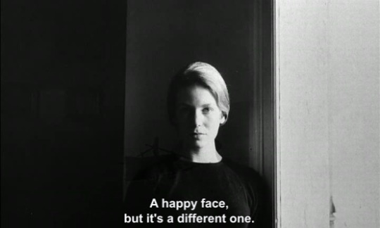


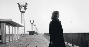


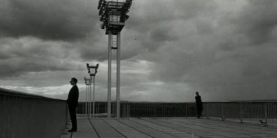


Project 5 Inspiration: La Jetée
La Jetée plays a huge inspiration factor in my film. When I watched La Jetée, I was deeply entranced by the photography in the film. They weren’t just plain black and white film photography, Chris Marker included many different and strong photographic stylistic approaches and techniques into the photos. I included some photographs of scenes from La Jetée that I really enjoyed and played a huge role in the photographs I took in my film. These photographs included are showcase exactly the approaches and techniques I admire in La Jetée which I am going to explain below:
Lighting:
Direct Lighting & Indirect Lighting:
With direct lighting especially on his human subjects’ face’s creates this creepy intense appearance onto both the subject and the mood and setting of the image. Marker also seems to have played around with the camera’s direction, angle, and distance from the subject which I thought was interesting for me to try out too. My main goal is to portray this eery deepness look in my photographs.
Choice and Use of Subject:
I enjoyed his use of subjects when he placed a person staring right into the camera. This is unordinary especially in most films. It is normally very awkward. But with the incorporation of the lighting shone onto them and incorporated with sometimes an intense stare, it creates a connection with the audience and the subject person in the film because it almost seems as if he/she is staring right into our souls.
Facial expressions: I preferred the images where the facial expression is emotionless and just staring straight into camera. I strive to convey this in my photographs unless the text I have chosen indicates
His use of subjects is not limited to only people but also to landscapes and people in landscapes or some type of setting. I like the use of the altering between these shots, it provides a new look every time and gives that element of surprise of what is to come in the film.
In very rare cases in the film, when you see people standing up still and straight especially with their legs closed together portraying this eeriness because it isn’t normal there is no sign of slouching, it is too perfect that it doesn’t make sense and makes the scene almost a little uncomfortable to look at.
Sometimes these human figures were portrayed as silhouettes which was pretty interesting to see.
Choice of Background:
Sometimes the background is very obvious when it is intended to be whether it is at a landscape like the airport for example in La Jetée or it is just consumed with darkness, sometimes we can see the setting and objects in the darkness background, sometimes we can see weird forms caused by some light shone in the darkness and sometimes the background is completely consumed by the darkness, and sometimes the background’s darkness is so dark that it literally consumes parts of the subject’s face which creates an almost terrifying look onto them. This applies mostly towards photographs with people as the subject. However, what I noticed when the photographs portray the subject as the landscape is that they do the same thing however instead of darkness it is light or even to extremes it is literally white especially the sky. I like all the use of choices Marker used here which is why I consider doing pursuing these in my work.
The Camera:
The photographs taken were obviously black and white however it was also very grainy which could indicate that it was taken with a film camera. Initially I was planning on using a film camera however I reached out to the places in Ithaca that develops film photographs and it takes around 2-3 weeks for it to develop which is time I do not have. Therefore I will be taking these pictures with my DSLR camera and editing them to black and white and altering the contrast and highlights and graininess and other editing tools in order to achieve the stylistic effect Marker manages to.
1 note
·
View note
Text
Spirited Away by Miyazaki
Hayao Miyazaki, born in 1941 in Tokyo, is one of Japan’s greatest animation directors as well as the co founder of Studio Ghilbli, which is a film and animation studio founded in 1985. Miyazaki is most known for his animation movies: Spirited Away (2001), My Neighbor Totoro (1988), Howl’s Moving Castle (2004), and Princess Mononoke (1997).
Spirited Away is a Japanese animation film created in 2001 and it is both written and directed by Hayao Miyazaki. It was so successful that it became the highest grossing film in Japanese history, it won the Academy Award for Best Animated Feature and many other renowned awards and recognition. Spirited Away is about a young 10 year old girl protagonist called Chihiro Ogino who is moving to a new neighborhood enters a world of Kami which were Japanese Shinto Folklore spirits. A witch called Yubaba turned her parents into pigs therefore Chihiro worked in Yubaba’s bathhouse in order to free her and her parents and go back to the human world. Miyazaki presents a variety of interesting yet crucial themes in the film such as supernaturalism, the blurred line between good and evil, fantasy, becoming an adult, traditional Japanese, environmentalism, culture and western consumerism, the power of words and names, etc. When watching the film, it reminded me a lot of Alice in Wonderland and The Wizard of Oz because their plot is quite similar. Chihiro, Alice and Dorothy all get lost in this supernatural world and meet strange fanatical characters who help them pave their paths. One of the things that struck out most to me in the film is the use of sound especially in all the flying scenes. In my opinion, the music in the flying scenes is very clever and fits well those scenes, the music used is very soft yet uplifting and gives this feeling of hope as well as evokes feelings of great determination in the protagonist when she is in the flying scenes. I also think the sound effects like swooches complements very well with the flying visuals.
0 notes
Text
Making Comics: Storytelling Secrets of Comics, Manga, and Graphic Novels by Scott McCloud
I used to love reading comics when growing up. I still recall my favorites: The Archie Comics, Adventure Time, Peanuts, Asterix, The Adventures of Tintin, The Smurfs, etc. Occasionally I still flip through these comics to remind myself of simpler times and reading them always makes you feel great inside and out. Although you must think because I’ve had such a rich exposure to comics, that I should know so much about making. However, that has been proven false when I started reading Scott McCloud’s “Making Comics”. There were so many concepts and ideas that has never occurred to me, obvious or not, and although I don’t plan on creating comics, I will definitely apply some of these concepts in my art making and film making processes. I would like to just say that the organized structure of the book and the clarity in McCloud’s explanations were so successful in the comprehension of making comic concepts. What I enjoyed about the book and in my opinion was also very clever and amusing, was the fact that McCloud made the structure into a comic itself. It is basically a comic about comics! I was very interested when reading Chapter 1: Writing with Pictures. In it, McCloud suggests that there are 5 crucial parts to writings with pictures: choice of frame, choice of image, choice of moment, choice of flow, and choice of word. Choice of moment reminded me of Murch’s In the Blink of an Eye. Choice of moment is where you decide which moments to put into the comic and which ones to leaves out of it. Just like In the Blink of an Eye, Murch really put emphasis on deciding what to cut out and what to keep into a film. Choice of frame was really interesting as it reminded me of my photo taking mannerisms. You really have to find the right angle and distance from the subject you are taking a picture of just like how you comics you need to find the perfect distance and angle to view these moments. And cropping is necessary in both photo framing / editing and comic framing. This was interesting as it brought out these similarities and it made me realize that sometimes when we learn a technique or advice from one thing, we are able to apply them in other scenarios which would vastly improve the thing whether it is comics, or films, or photographs, or anything we are trying to make.
0 notes
Text
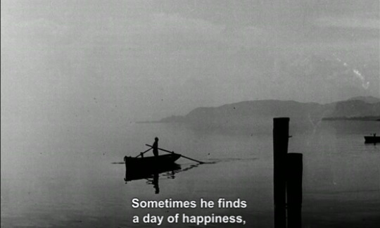
La Jetée
La Jetée is a French science fiction short film directed by Chris Marker in 1962. This film was construction entirely from still black and white film images and narrated in French by a male voice that tells the story of a post-nuclear war experiment in time travel.
Through the use of the combination of the sound, visuals and editing, Marker manages to successfully portray a concept of the illusion of time and movement. We see this concept portrayed repeatedly throughout the film through the use of dissolves, fade-ins, and fade-outs with differing transition durations. The sound use in La Jetée is remarkable and it is, in my opinion, the most important and successful part of the film. These sounds include voice over narration, music, and sound effects. What I have come to realize is a pattern where Marker combines the dissolving transition with sound use. The sound effects usually portray familiar noises such as airport noises or footsteps. Dramatic intense music which gradually gets louder by the second successfully dramatizes the image being portrayed and creates this sense of urgency and an expectation of something dark. What also stood out to me was because we are so used to the voice of the French man, hearing other voices such as the female voice over in the airport is not only pleasingly unexpected therefore making it even more compelling. I would like to comment the narration because I understand French. The mannerism in which the french male narrator speaks is quite special, his voice is not only quite deep and although he is talking quite clearly, his voice takes that away slightly due to its raspiness. Although, it could sound like he is speaking slower. He is not exactly doing so. If you really focus on his voice, you could tell he is talking at a normal French speaking pace which is usually fairly fast. However when French people normally speak, there are quite a lot of changes in the speed of phrases spoken due to context of the conversation, the tone, the mood. However, with this narrator, when he is talking, each phrase is strictly spoken and maintained at the same speed and pace. The only times this changes is when he whispers. Therefore, the reason it almost feels as if he is speaking slower than usual is because he is utilizing the pauses between these phrases. The whispers included feel almost cold and secrecy like and it is harder to be able to hear what he is pronouncing and trying to say. The images used are although all black and white film photography, but each photo used however some very similar to each other can be drastically different. I believe that the use of the subjects especially their stare and their position, the lighting shone onto the subjects, depth of field, difference in photo resolution, composition, angle of shot, the camera’s position (especially the extreme close up shots), etc. are extremely strong and successfully manages to change the atmosphere or mood, tell the story, showcase the idea being suggested and the moving of the story along gradually.
0 notes
Text
In the Blink of an Eye
In the Blink of an Eye by Walter Murch is a book about the art and craft of editing in filmmaking and suggesting that film editors should prioritize emotion over the technicalities of editing. It is also a revised transcript of a lecture given by Murch on film editing.
I would like to share my personal reflection, response, thoughts and opinions through the chapters I found the most intriguing.
“Cut Out the Bad Bits”
“Oh editing…that’s where you cut out the bad bits.” This is a phrase Murch used to hate however has come to appreciate it. Murch suggests that we should identify the bad parts to our film however it could still be of good use in another film just not in this one. However, because of this cut, it shouldn’t disrupt the structure of the good parts of the film. Murch used an example of comparing humans to chimpanzees. This then is pushed towards how the information in DNA is compared to an uncut film and a chimpanzee and human are compared to being the different films from the same footage. It is the method in which you put the film together that creates completely different species that works out to its own environment. Murch suggests that we should not make a chimpanzee film then change it into a human instead.
Most with the Least
Just like the title, it is exactly what Murch suggests editors to do. Only portray what is essential in engaging the audience’s imagination. We need to suggest things rather that expose them which allows the audience to be spectators instead of the participants. Murch introduces another example where he compares the film editor to a tour guide, where the tour guide shouldn’t overly point things out and instead allow the tourists to let them take the places in and allow them to see what they see instead of what the tour guide sees. He also mentions that it takes a lot of work and many decisions to decide areas that are not to be cut. This chapter has definitely resonated with me a lot and has made me realize that Murch makes an incredible point. I can even make a real life comparison of my own: during digital media art critiques and even in many other art class critiques I have had, my classmates are the ones who share their ideas about what my art suggests or mean. This is interesting because it allows you to realize things in your own work that you have not seen before even though you intended something else or different in your work or had another certain interpretation.
A Galaxy of Winking Dots
At first I was really confused by what Murch was trying to suggest with him introducing an scenario about shining infrared light into the eyes of the audience and how if the film is working they would blink in unison and if the blinks weren’t in unison it would suggest that the film isn’t working. He relates this to an example of a recording of pianist Sviatoslav Richter who played Mussorgsky’s Pictures at an Exhibition during a flu epidemic in Bulgaria. What happened was when he was playing certain passages, not one person coughed because he was able to halt the coughing impulse of every one of the sick people there. Although this is apparently a famous live video, I have personally never heard of something like this myself and I found this example comparison very cleverly strategic.
0 notes
Photo
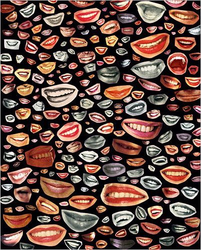
Untitled by Unknown
I came across this collage on Pinterest and I immediately was captivated by it. I was really interested the use of cropping of the image of the mouths where the area around the mouths were kept which produces this stuck on badge looking aesthetic too the images. I definitely think that this collage does look so much better than how it would be if the artist has gotten rid of the space around the mouths. I enjoy the layout and placement of the mouths where there isn’t overlapping, all the mouths have gaps and spaces between each other, which prevents it from looking overwhelmingly messy and probably hard to distinguish, which I found as a clever use and I will make use of this in my work.
0 notes
Photo
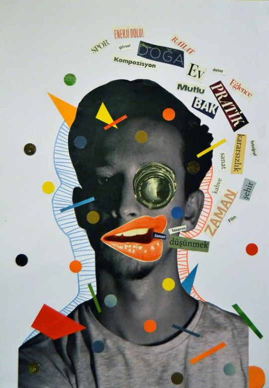

Untitled by Ilkay Kocahalilogullari & Instagram Filter: GoodVibes by danmollervfx
I ran into this collage on Pinterest where the layout really interested me. I was really inspired by the layout and composition of the subject and how it is being surrounded by some of the shapes, sketches, drawings, texts, etc. Although there are a lot of these things placed over on top of the subject, I don’t think I’m too interested in this effect, I’m only into the surrounding look. I think incorporating this to this filter I have come across on instagram and love to use all the time would be really unique and hopefully what I envision of it would produce something quite compelling, special and aesthetically pleasing.
0 notes