
Last Seen Blogs

elksboss
Untitled

how-now-brown-wow
Ejaz-Is-Dumb.edu

ithinkilikeit-reactions
K-POP writings/Gifs

dannalikestoread
Danna

ym7da
7's
Text
Final Reflection

The main project goal for this project was to do a live brief for a client to gain valuable experience. The brief I chose was to create a virtual tour for Barclays Eagle Labs, due to the COVID-19 pandemic. Barclays Eagle Labs is a place to connect, learn and grow. My personal goal was to create the user interface, whilst my teammates created the 3D elements and of the virtual environment. The project plan was to create an initial idea, present it, and then develop it throughout the project after gaining feedback from the client.
I learned how to design interfaces for virtual reality. I have always enjoyed designing user interfaces, however I have limited myself with mostly smartphone apps, so I wanted to test myself and see what I could achieve and learn creating something different. I learned that to create a successful VR interface, it is vital to stick to the same principles as smartphone application design, minimal features, and enough space between buttons and text.
I created my user interface with the intention of putting the user first, rather than focussing on solely the look of it. I enjoyed designing it; I think the challenging thing for me was working with a client directly, as I have only worked for someone who is passing down work from clients to me, rather than me dealing with the clients myself. I am pleased with how my work turned out; however, I wish that as a team we had more cohesion and brainstormed and had all of our ideas on the table at all times.
As a group we did communicate at the beginning with informal voice chats over Discord, however a disagreement in the midst of the project brought a halt to it, which made it tricky to navigate through the project. I am proud of the team though, as we stayed professional throughout the project and carried on working, albeit more independently apart from when we gathered for client meetings. I certainly didn’t want to give up this opportunity of working with such a prestigious client in Barclays, and also the great minds that were on my team. I am not a person to hold grudges, as I am mature enough to realise that unfortunately life is like that; it is about how we deal with these tough moments in life that defines us, and ultimately it defined our project in a positive light that we carried on and pushed through.
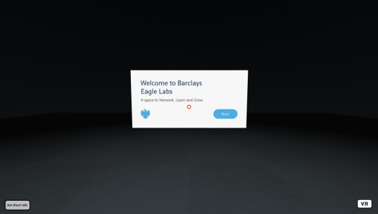
The outcome was a user interface that first of all enabled the user to learn how to use the virtual reality experience through tutorials. The interface includes a welcome screen, tutorials, 3D prototyping, interactive hotspots and a motion sickness warning. All of these screens are useful to the client, as they help them to connect, learn, and grow with Barclays Eagle Labs. Hopefully the interface will enable the user to be able to experience the tour in a positive way. The success of my work is that it is a working prototype of the interface, however the failure of it is that I didn’t manage to create a working virtual reality prototype in Unity.
I think in this project, certainly my user interface skills were highlighted. However in contrast to that, my lack of development skills were highlighted too, which made me feel slightly uncomfortable in some meetings, as I felt slightly inadequate. I have certainly learned from this project that I need to attempt to break that barrier between using software such as Unity, rather than worry about finishing the work on time and getting a good grade. Thus, I definitely need to develop my development skills, and I will certainly try to accomplish this either next semester or in my professional or personal time after university. It is certainly something that I will not ignore. I also have regret at not speaking up more in meetings and asking more questions. I was nervous when speaking with the clients, however I wish I had been more confident in myself and my abilities. This has clearly highlighted that I have a problem in communicating confidently.
I have a big regret at not teaching myself how to use Unity or asking the tutor for help on how to use the software. This was due to a fear of failing and worrying about timeframes to get work designed and presented for the client on time for meetings. I would also like to ask for more help from the tutor in future, rather than trying to work alone most of the time. I want to develop myself, and I certainly needed help with Unity to do that.
Because I have a job in Graphic Design, I am fully aware of how little time you have when designing a product as I have done it many times before, sometimes even on the same day. Being aware of this, and how prestigious the client was, I focused more on the visuals than maybe I should have. I should have taken more consideration into the fact that this project was an academic one at university, rather than a project in the workplace. If I were to do the project again, I would certainly take more time to create more ideas, and to carry out usability testing to test my ideas in order to develop the idea more. Because I am aware that in the workplace, a client usually asks for a design and you usually create it due to the limited time you have, rather than spend a lot of time on research and testing which is beneficial from an academic standpoint.
0 notes
Text
Finalising the Project
Final Meeting with the tutor
Finally, I had the final meeting with the tutor. It was a positive meeting, and we discussed what needed to be done for submission. Now, my focus was to get my assets ready for submission.
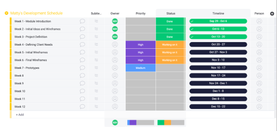
I also decided to review the Monday.com timeline to see if I had met the and targets. The only target that I didn’t achieve, was the Unity integration. However, I plan to learn Unity next semester at some point to gain my skillset, as it is a new software that I don’t feel comfortable using at this moment in time.
New Branding
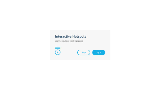
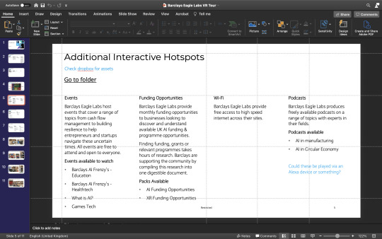
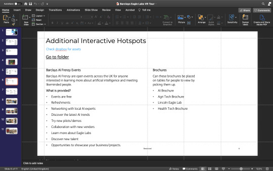
The next task was to apply the new branding to the interface. After speaking with the tutor, we agreed to apply the new branding to one section of the interface to visualise it and focus on getting my work ready for submission. I chose the interactive hotspots, and I placed the text that the client supplied to me onto the interface.
Final User Interface


0 notes
Text
Final Meeting Notes
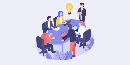
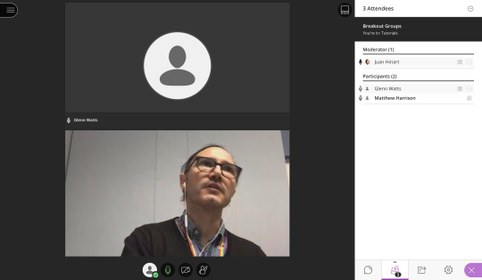
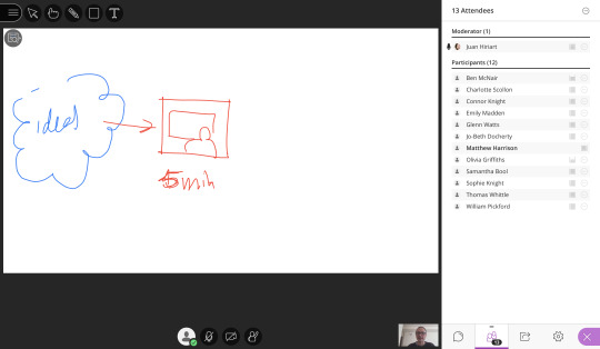
Today was our final meeting on Microsoft Teams with the Barclays team. I would like to thank them for their help and corporation during this project; it has been an enjoyable and daunting experience all at the same time, and it has given me some client experience which I can take into the real world in job situations in the future.

We discussed the fact that as a team we needed some assets, such as text for the interactive hotspots. We discussed what was needed in the general eagle space, which is in the hands of my teammates Glenn and Tom.
My task is to add the text provided by the client into the user interface for the interactive hotspots.
0 notes
Video
youtube
https://youtu.be/IqDazXlsJp0
This week for the presentation, I included just the relevant information that the client hadn’t seen before. This was to ensure that the presentation was quicker and to avoid going over past discussions once again which had already happened. This time, I included the three new features in the presentation.
0 notes
Text
Development of New Ideas
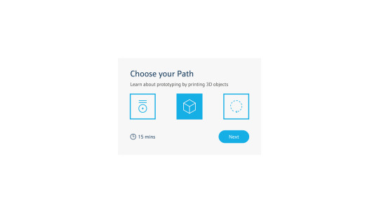
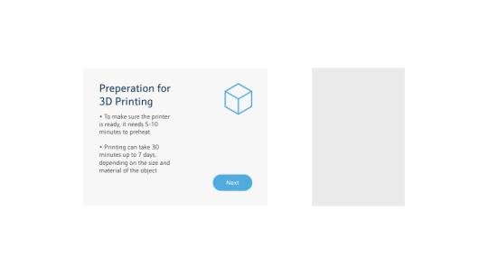
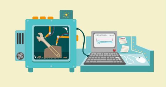
To ensure I knew what path to take the user down, I decided to look at how metal and wood are printed in 3D. This will hopefully help me decide whether it is taught through explanation or it is a choice for the user.
My first thoughts are that explanation may be the way to go with this one, due to the fact that it is a tour and users need to be sold on the idea of using Eagle Labs.
3D Printing Metal
youtube
https://youtu.be/da5IsmZZ-tw
3D Printing Wood
youtube
https://youtu.be/dFUxMkgl1Iw
I noticed that both materials go through the same process as plastic. Therefore, I will ensure that the user can print each one of the materials, and to find out what benefits each material has.
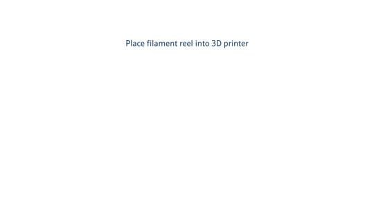
I have now realised the importance of a filament reel, which I will include a description of in the printing process. There is the potential also for the user to place a filament reel into the printer, to ensure a realistic experience.
Benefits of Printing Metal
Reduction in lead times
Cost advantages through the reduction of material waste
New approach to design
Can shape the most complex parts
It makes efficient products
Benefits of Printing Wood
Greater flexibility which is good for complicated models
Looks and feels just like carved wood
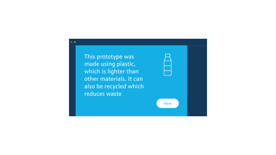
Benefits of Printing Plastic
Lighter than other materials
Can be recycled which reduces waste
Perfect for prototyping
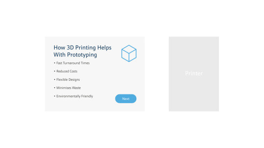
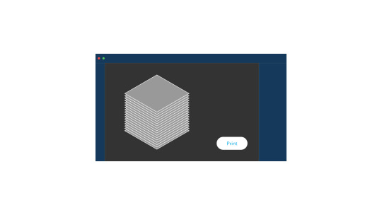
To ensure consistency and an immersive experience, I will include the new screens on the computer whilst in the 3D software.
Here are the new screens that I created, with a logo to represent each material.
Materials


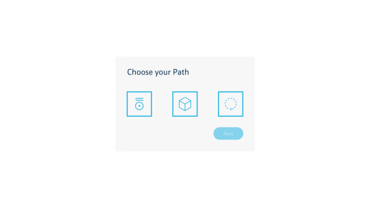
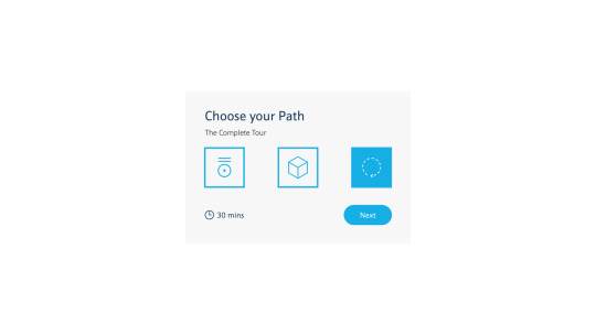
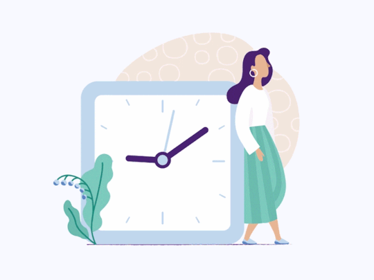
Choose your Path and time feature
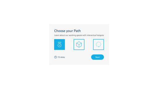
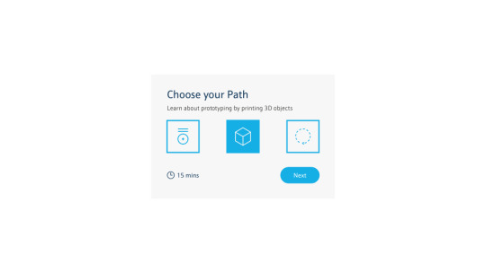
Another law that I have observed in my book called ‘Laws of UX by Jon Yablonski’ is called Fitts’s law. Key takeaways from this law are that touch targets should be large enough for users to accurately select them, and to have enough space between them to allow this to happen.

With this in mind, I designed the new ‘Choose your Path’ interface to ensure enough space between the buttons that are sufficiently sized for the user.

Once clicked, the user will see the timestamp on the bottom right corner, helped by a small time icon to quickly understand what it means. The square will fill once clicked, so the user can read what they are getting into before they choose what to do.

References
https://www.beamler.com/what-are-the-advantages-of-metal-3d-printing/
https://all3dp.com/2/wood-3d-printer-all-you-need-to-know-about-wood-3d-printing-2/
https://www.sculpteo.com/blog/2018/06/20/3d-printing-materials-the-7-benefits-of-plastic-3d-printing/
0 notes
Text
Meeting with the Client
This morning at 10am we had another meeting with Barclays, and we were joined by more members of the Barclays XR team.
The purpose of the meeting was to update Barclays on what we have been working on this past week.
To give them a better visual understanding of the user journey, I created a user flow to guide them through it:
https://youtu.be/dmiOzzYHUFU
youtube
The new 3D prototyping story was included, and they were impressed with the idea. We all agreed that the experience was more interactive and helped the user understand the process and what Barclays Eagle Labs can offer them.
Here is the feedback that we were given, which we will work on:
1. Potential to add different materials to the 3D printing process, either through explanation or the choice to see how each material is printed, such as wood and metal etc.
2. Adding a time feature, for example letting the user know beforehand how long the experience will take (I thought this was a brilliant idea personally and I’m surprised I didn’t realise to include it myself earlier in the project - this is the advantage of having a pair of fresh eyes observe your work)
3. Maybe adding a feature where the user can choose what path they would like to go down, just to see the 3D printer or the interactive hotspots? Instead of seeing everything?
We have another meeting on 2nd December to update the client on our progress. By then, we hope to have integrated our work into a shared Unity document so the full experience can be seen by the audience.
0 notes
Text
Week 8 - Progress Review
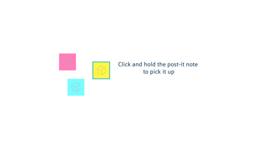
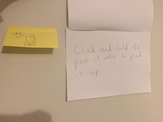
To prepare for the meeting with Barclays, we had a progress review as a team. We discussed what we needed to prepare for the meeting, and we agreed that presenting the user flow to the client would be a good way of visualising the interface to them so they understand the user journey more. I also mentioned the new prototyping immersive experience with the post-it-notes, and the team were happy to move forward with this idea.
0 notes
Text
Client Meeting Feedback Development
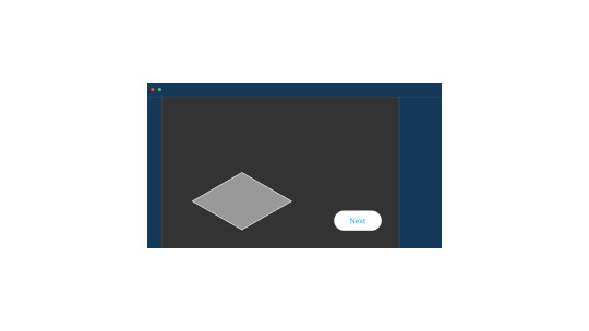
After finalising the sketches of the final idea, I brought them into Adobe XD and developed them. Here are the results. I wanted to try and make a user interface that looked similar a typical software that is used to create the 3D prototypes, in order to create a realistic experience.


0 notes
Text
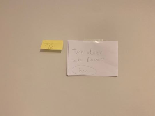
Client Meeting Feedback
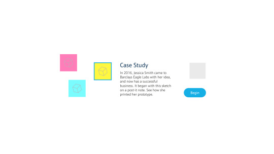
The meeting with the client went well, and it was a valuable experience (it was my first client meeting). Our task now is to bring our ideas together and tweak the prototyping section, narrowing down to just the 3D Printer instead of having all 3.
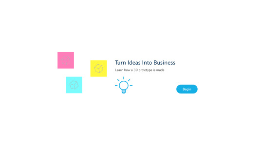
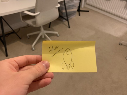
The team at Barclays would like to showcase how an idea on an idea on a post-it note can be elevated to a successful business right there at Barclays Eagle Labs using a 3D Printer.
This makes perfect sense; it is extremely helpful to get constructive feedback.
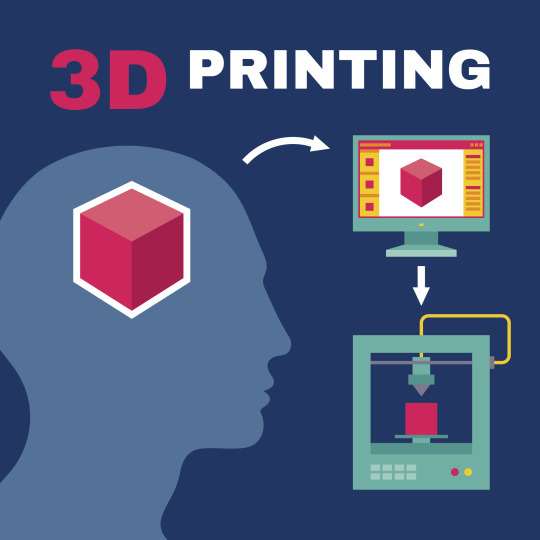
To ensure I get to grips with the full story of how an idea is printed as a 3D object, I found a YouTube video which explains the journey of a 3D Printed Object.
undefined
youtube
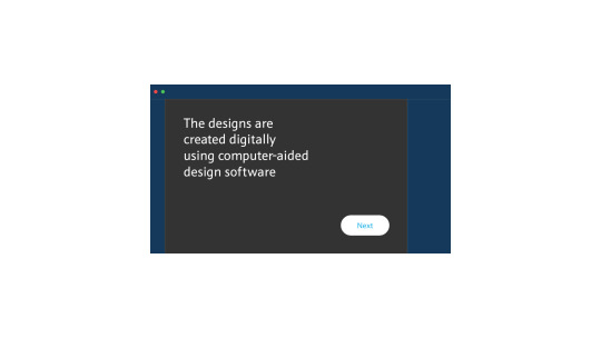
The 3 basic steps are:
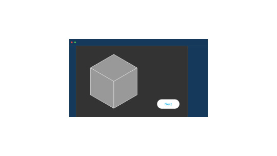
1. Create a virtual design on CAD software
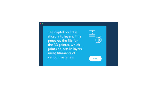
2. The 3D design is broken down into layers in a process called ‘Slicing’
3. All of these layers are sent to the 3D printer to print
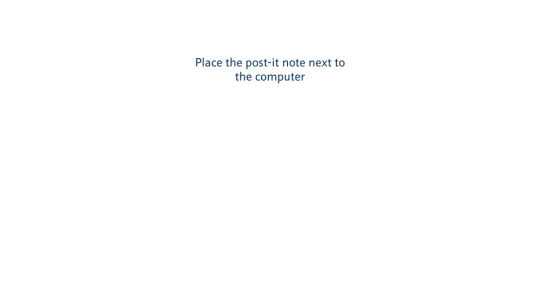
The steps my VR experience needs to take:
1. Sketch idea onto post-it note or whiteboard
2. Create a virtual design of the sketch on CAD software
3. The 3D design is broken down into layers in a process called ‘Slicing’
4. All of these layers are sent to the 3D printer to print
How can immersive stories be told in VR?
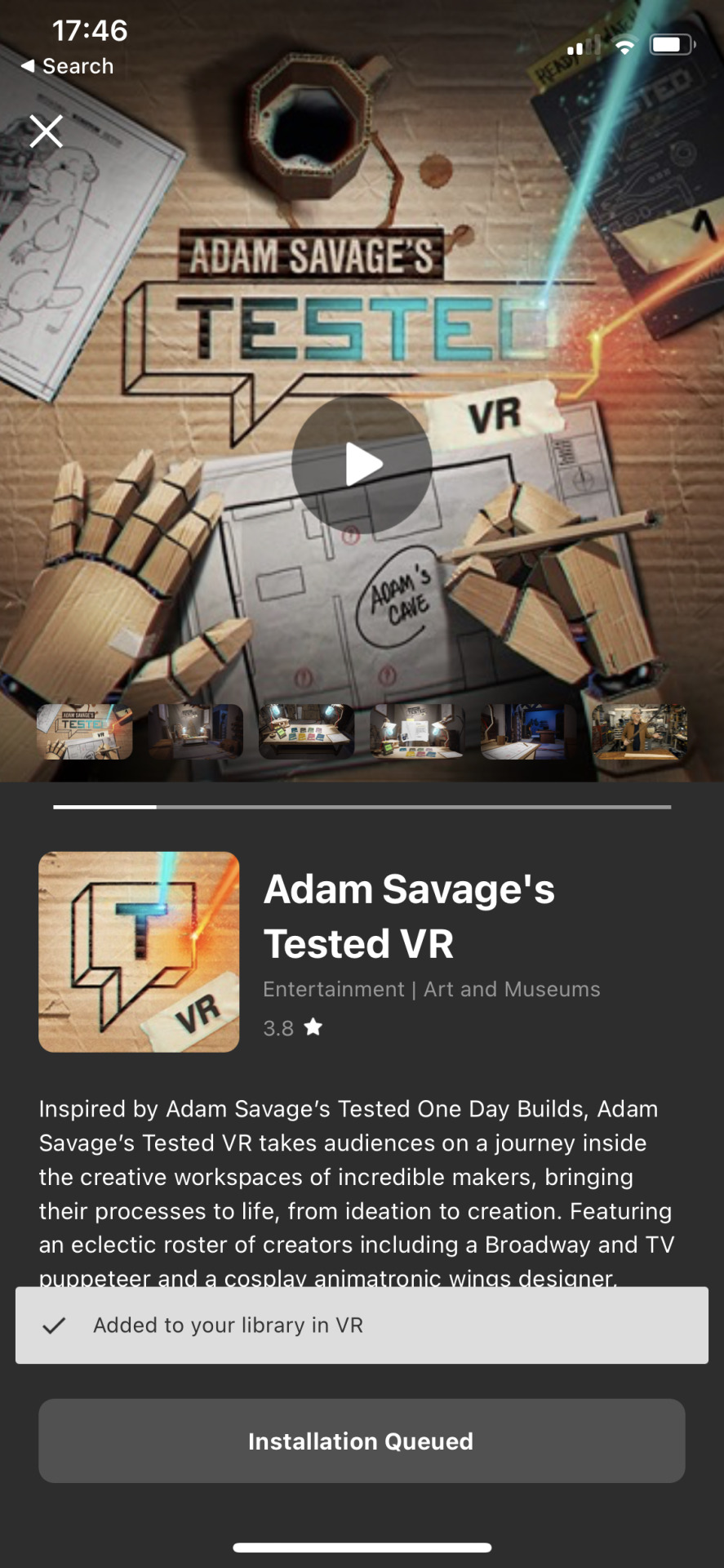
To find out, I went to the Oculus Quest store to have a look for myself on my Oculus Quest. An immersive story would benefit the service that we are providing as it would hopefully inspire a visiting user who is an aspiring entrepreneur to create an idea of their own.
To begin, I went on the Oculus Quest store on my smartphone. I found two examples to try out:
Adam Savage’s Tested VR
undefined
youtube
I thought that this experience was really positive, due to the fact that it was so interactive and it really felt as if you were in the space handling the pieces of paper on the desk.
The interactivity made for a more rewarding experience, and I felt that the information I was receiving was more memorable than if I were to read it on a blank interface in front of me. The interactivity helps to break that barrier between the real world and the virtual world.
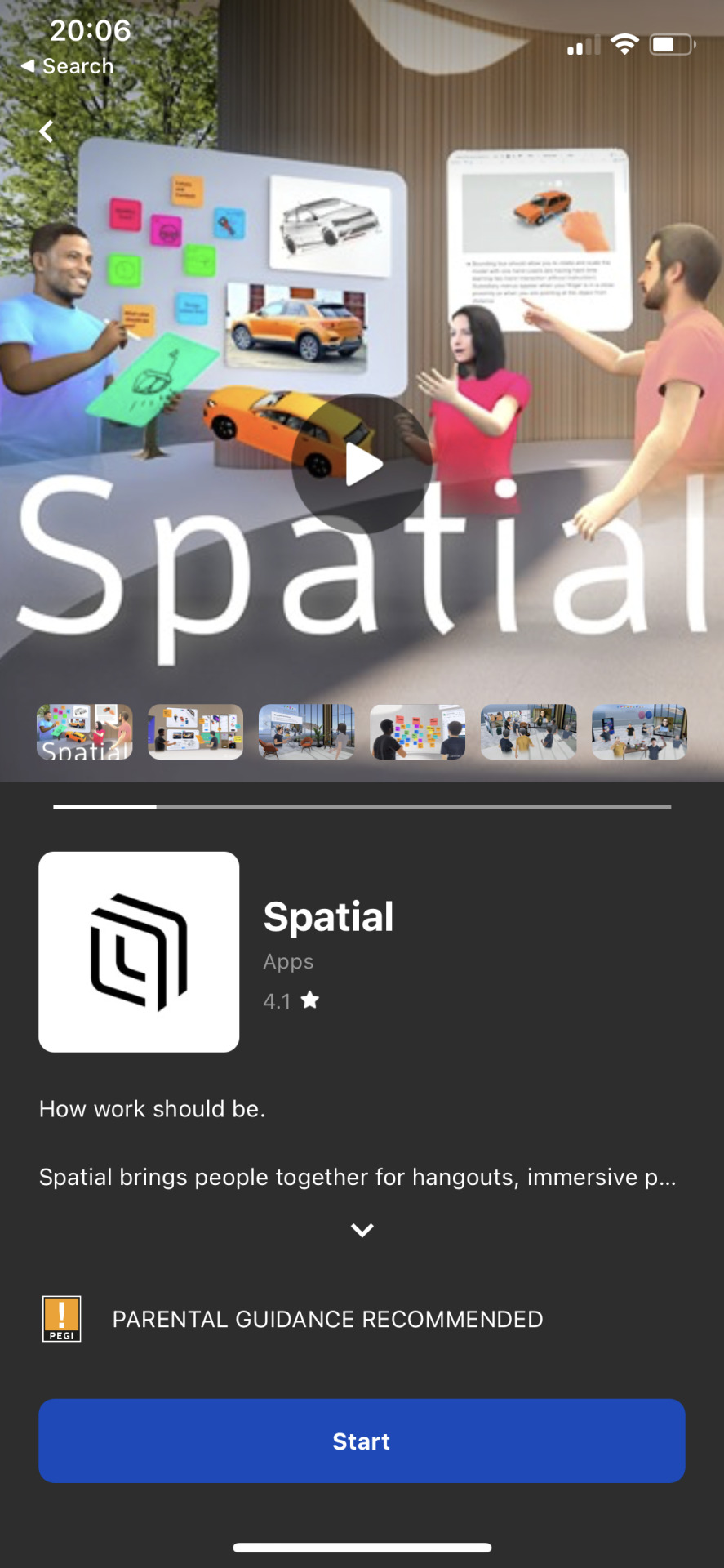
Spatial
Spatial is another example of a VR experience that I thoroughly enjoyed. I was really impressed with the tutorials such as learning how to move around, which made me glad that I had included this feature in my own work. Using the post-it-note was enjoyable; I was asked whether I preferred dogs to cats on one of them, and then drew on another post-it-note. Being inmersed in the story I feel is absolutely vital to gathering vital information such as how to prototype in an eagle lab. These two VR experiences certainly stuck with me so I will ensure that my users will get an immersive experience for the Barclays eagle labs virtual tour in the prototyping room.
undefined
youtube
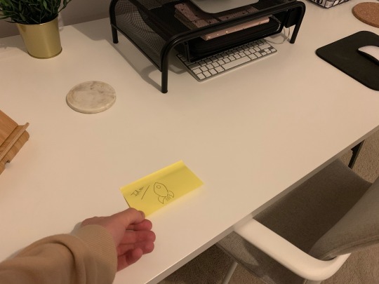
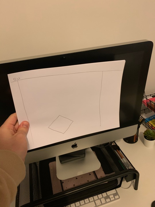
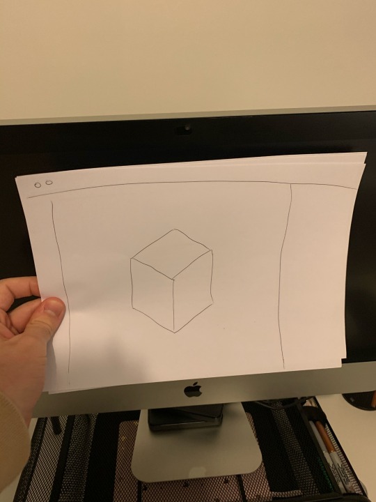
Once I had the specific steps and I had delved into how immersive stories can be told in VR, I needed to sketch the ideas. Once I had sketched the ideas, I mocked the experience up in my home office, to try and see what the experience would be like to the user. I sellotaped the screens to the wall and the computer screen to add realism to the experience.
0 notes
Text
Week 7 - Interim Review
youtube
https://youtu.be/1EcHjeZz_UA
0 notes
Text
Development of Project
To make sure the branding was consistent, I used the colours from the website to make my user interface. This is to make sure that the user has a similar experience to that of the one on the website at a computer or on their smartphone.
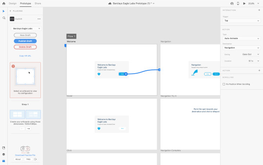
Here is the initial prototype on my XD document.
I connected the screens in prototype mode, and tested it out afterwards to ensure it was working smoothly.
After discussing with the team, I decided to add a new menu to the user interface to visualise the experience and help the user to complete the tour.
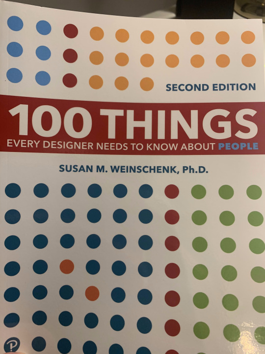
I wanted to have a look into what motivates people to do something, and I stumbled upon a page in one of my design books, called ‘100 Things Every Designer Needs to Know About People - Second Edition’ by Susan M. Weinschenk.
She mentions on page 118 that people are more motivated as they get closer to a goal. The effect is called the goal-gradient effect, which was studied in 1934 by Clark Hull using rats. He found that rats were running a maze to get food at the end would run faster as they got to the end of the maze. The goal gradient effect says that you will be more attentive and work harder the closer you get to a goal.
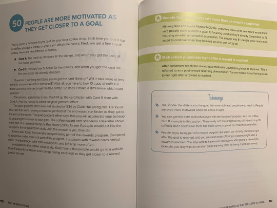
This is something that I am aware of, for example on a game that I have played on before called FIFA Ultimate Team. The idea is that the more games you play the more points you earn, and points give the user rewards. The concept is ‘seasons’, so you have a certain amount of days to accomplish the rewards until they are refreshed, which causes a constant cycle of goals, keeping the user entertained and hungry to play the game.
I certainly feel that having an objective in the experience would be a benefit to the user; it would encourage them to interact with every single part of the experience, thus helping both Barclays and the user.
Here are the sketches of my idea, which I will now put into Adobe XD.

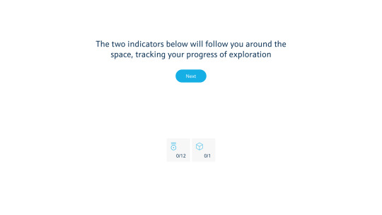
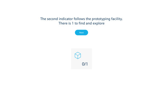
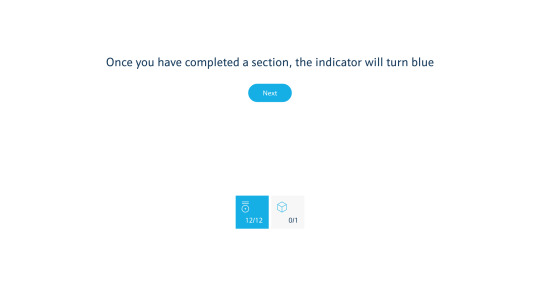
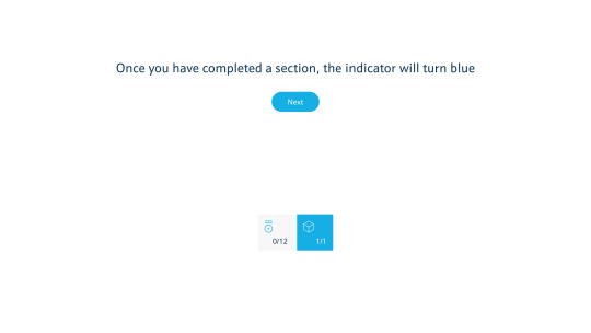
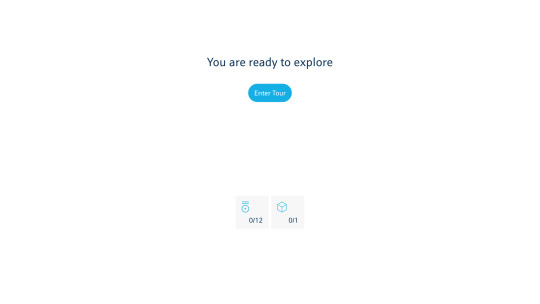
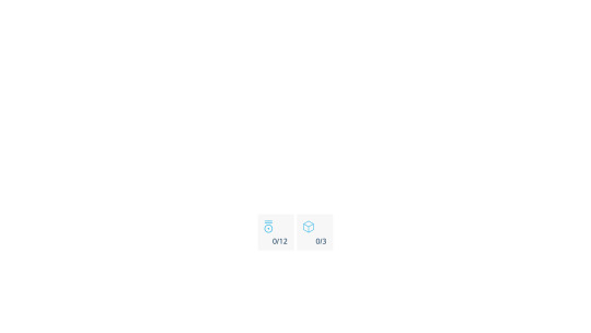
I wanted to have a menu that was always there for the user to see, however at the same time to also not be in their line of vision so they can still see most of what is in front of them without confusion. To do this, I needed the menu to be as small as possible. To be as small as possible, it needed to be as simple as possible. How could I do this? I used icons and numbers, to visualise what the goal is, and the user progress.
To make sure the user was aware of the feature, I included a brief description that should help them understand the purpose of the menu.


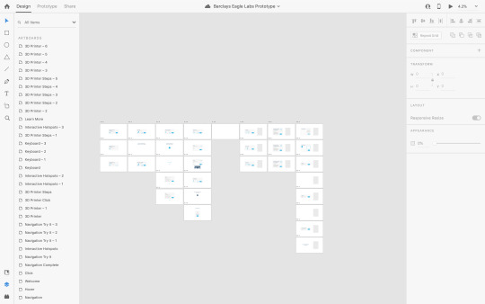
Once I had completed the new screens, I added them to my XD document and connected them with the relevant screens.
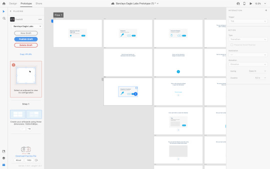
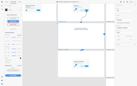
Here are all of the actions that the user can take between each screen.

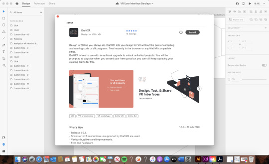
To add realism to the prototype, I found a plugin that enables me to view my prototypes in Virtual Reality. The plugin is called DraftXR.
0 notes
Text
Week 5 - Group Tutorial
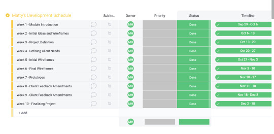
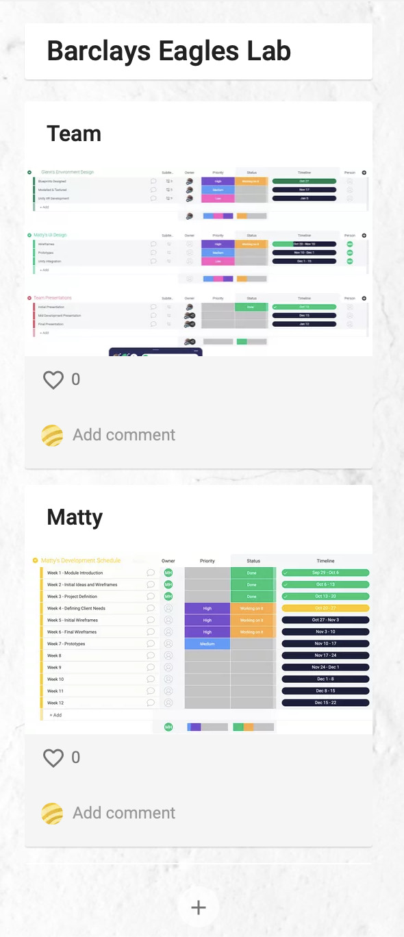
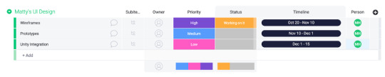
This week, we created a Negotiated Brief Development Wall, to enable communication between the tutor, and the students in the group to see what we are working on. As a team, we uploaded our Monday.com targets to visualise our goals for the project and the timescale.
0 notes
Text
Project Launch
Collaborate Session
In this weeks session, we recapped what stages we have done so far, and where we should be at the moment.
Agile Foundations
Once the collaborate session had ended, the individual/group tutorials began. I gave myself a window of time to do some more research, looking into Agile Foundations, from the instructor Doug Rose.
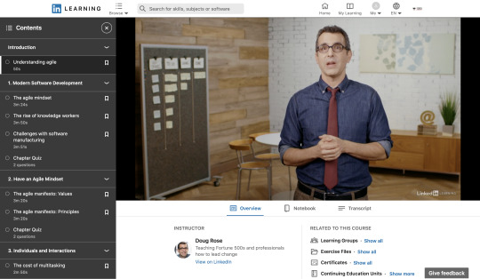
In section 1 looking at the agile mindset, he mentions an old joke where two fish are swimming in the ocean.
“One looks at the other and says, "The water looks cloudy today." The other fish looks back and says, "Yeah, what's water?"
This joke demonstrates that the way people do things usually becomes part of our own reality. The fish are floating in the water without thinking what it is.
We don't question the way we work, instead we think that the way we work is the only way that makes sense.
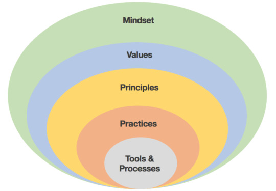
It is important to remember that it isn’t just focussing on a different way to work, it is focussing on a different way to think about working.
A team that I agile enough should be able to ask themselves honest questions about the way they work and move forward with continuous improvement.
Being agile will ensure higher productivity, and especially as we are working for a huge client in Barclays, it is crucial to ensure our group is focussed on thinking like an agile team.
It is important that our agile mindset is a reaction to the challenges we will face during the project.
An agile team focuses on having collective decision making, instead of having one leader who instructs the whole group. For example, a database engineer might know a little bit about software development but not enough to manage a team of developers.
0 notes
Text
Project Proposal
Project Proposal: Barclays Eagle Labs – Tour Experience
Team Roles
• Matthew Harrison: Lead UI Designer
• Glenn Watts: Lead 3D Artist & Unity Developer
• Thomas Whittle: 3D Artist & UX
Description
The COVID-19 pandemic has changed the lives of people around the world. Because of how the virus behaves, people have had to drastically alter their lives; social distancing has become the temporary reality due to lockdowns and restrictions which help to stop further transmission of the virus.
Inevitably, this has affected society and the global economy. Thus, people and businesses have moved online where possible, with many employees and students working from home for the foreseeable future. There are many obstacles that have been overcome with the use of technology, such as carrying out meetings using online video chat services, as well as communicating with loved ones whilst adhering to the current guidelines and staying apart physically.
One of the technologies that has the tools to help in this situation is virtual reality. It enables a user to experience and interact with a virtual world. The possibilities with virtual reality give users the chance to interact with real world environments and to socialise with other users in the same way as they would in real life.
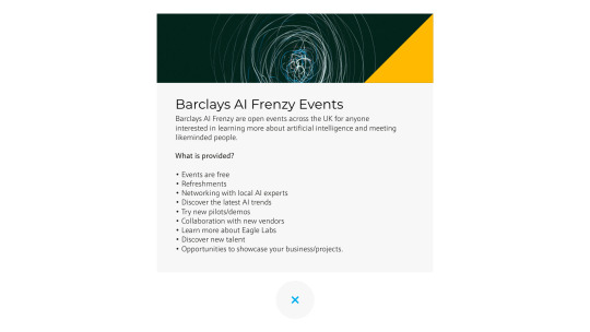
Barclays Eagle Labs are places to network, learn and grow. They enable people to connect with anyone such as entrepreneurs, industry-leading corporates, and investors. Because of the situation, Barclays want to recreate the Barclays Eagle Labs in realistic immersive detail, to enable people to experience what they are like without leaving their homes.
Design Outcomes
Our final outcome will be a proof of concept virtual reality experience that resembles the existing eagle labs, incorporating other characters with animations and sounds to ensure there is a lifelike experience for the user. We would also like to include other users if possible so they can interact and network with each other. My role will be focussed on the user interfaces, and I will adjust my wireframes until the client is happy with them.
Once the wireframes are complete, I will create working prototypes, and transfer them over to unity to integrate them with the virtual reality experience. To integrate them into unity, I will work with Tom and Glenn to use their expertise.
I will be developing interfaces for:
• How users navigate the environment
• 3D Printer, Laser Cutter and Vinyl Cutter demonstration
• Interactive Hotspots
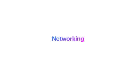
• Networking
• More features that the client requires
When designing my interfaces/experiences, I need to consider:
· Don't expect the user to know what to do or where to go. Understand who will be using the service and why
· Don't overwhelm the user with a wide array of features on an interface that is confusing
· Create a minimalist environment
· Focus on the user experience and the interface will work around that
· User research
· Wireframes and digital prototypes
· Canvas size
· Text readability and optimal distance
· Ergonomics
· Posture
· Motion sickness
· Button placement
Project Organisation
As a team, we will be using Monday.com to organise our project workflow. Because we haven’t spoken with the client, we haven’t got any meeting dates with them thus far.
Nevertheless, we are in regular contact as a team, and we have so far had one team meeting per week and will continue with this. Once we have talked to the client, we will all have a clearer view of what we need to work on.
0 notes
Text
Week 3 - Presentation of Brief Proposal

Here is my presentation of my brief proposal. Because I am so eager to get going with this project, I have started my designs already as I am aware of how quickly clients need work; hopefully I will be able to speak to them soon and gain some much needed feedback to help our team progress.
I will be working on the user experience and interface design for the Barclays Eagle Labs virtual reality brief in a group with Tom and Glenn.
To begin, I looked at things to Consider when designing for VR.

Don’t expect the user to know what to do or where to go.

Create a minimalist environment and don't overwhelm the user with a confusing interface.
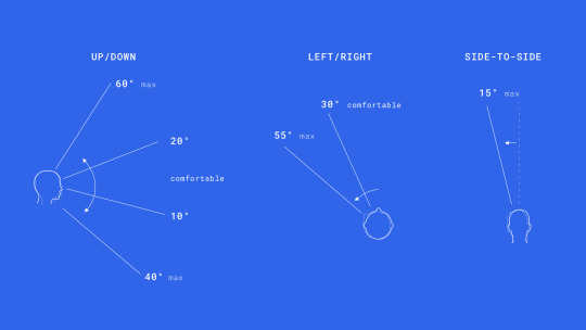
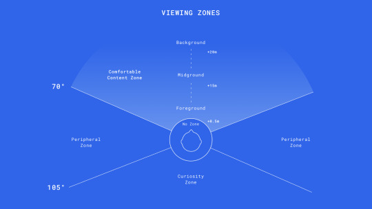
Ergonomics need to be considered. The experience needs to be comfortable as possible for the user, so we have to take into consideration the viewing angles.
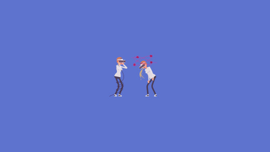
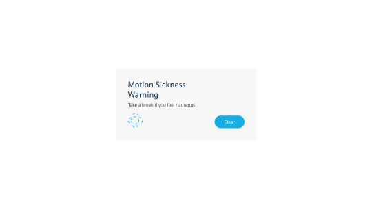
Motion sickness is common amongst virtual reality users. Tackling this issue is very important and could be done through popups once the user has been using the service for a certain period of time.
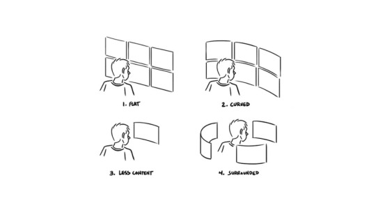
When designing user interfaces for Virtual Reality, there are four avenues we can go down:
Flat, curved, less content, or being surrounded.
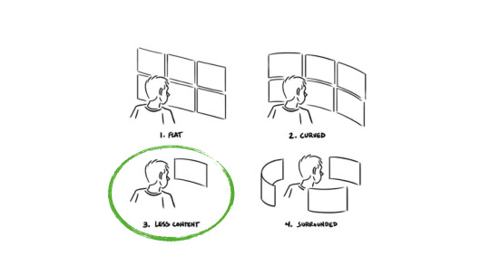
Although there will be a lot of space to play with, it is imperative to keep the content minimal to keep the focus on the space and experience itself, rather than a user interface that takes up a lot of time to be navigated around.
We are all familiar with flat interfaces on our smartphones and laptops, so it is essential to continue with a flat interface.
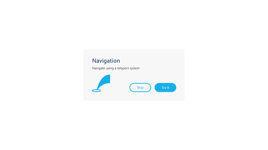
A look at how the user will navigate around the experience.
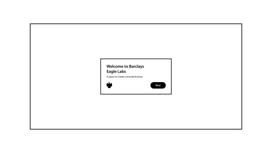
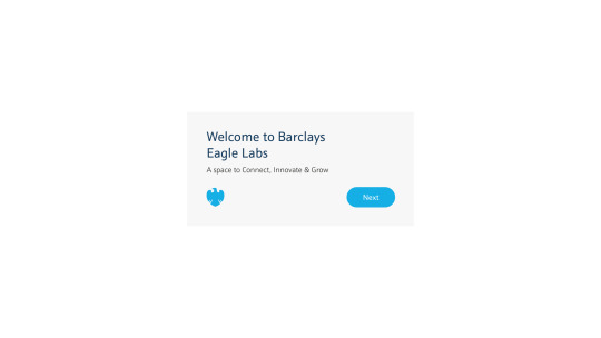
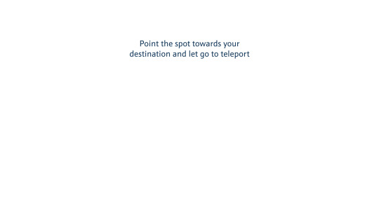
To begin with, the user will be presented with a welcome screen. The buttons can be clicked using a visual reticle, either from their direction of vision or their hands, depending on what device they are using.
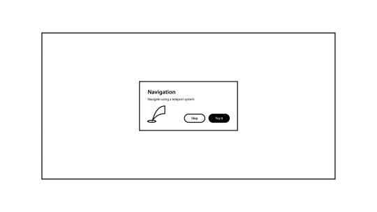
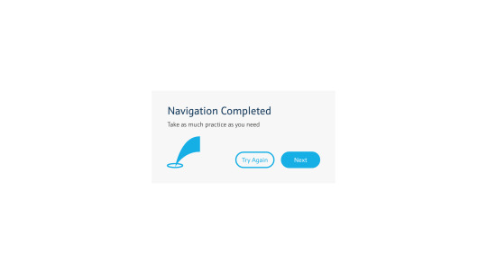
It is crucial to give the user a tutorial on how they will navigate around the area. If any users are familiar with how to navigate in Virtual Reality, they have the option to skip this step.
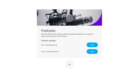
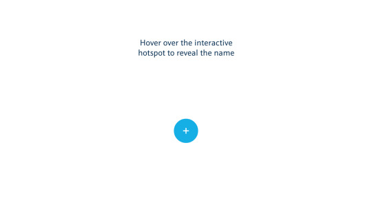
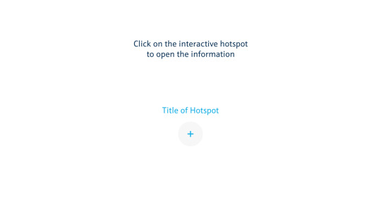
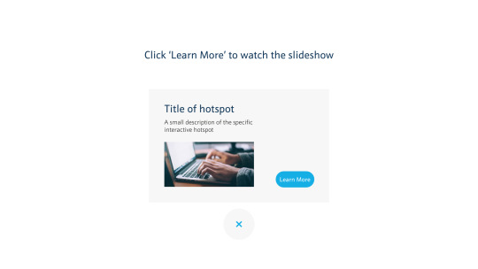
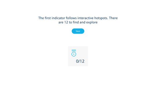
The client want to include interactive hotspots, which teach the user about the working spaces and what benefits they bring.
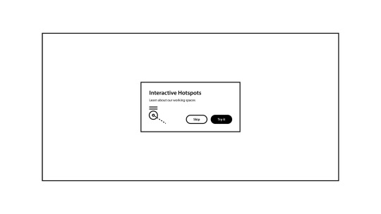
Again to make sure the user isn’t confused, there will be another tutorial on how to use the interactive hotspots that the client would like in their experience.
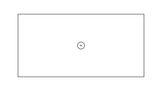
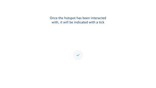
The interactive hotspots will appear as circles.
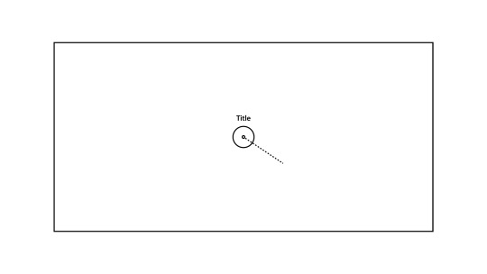
When the user hovers over one, the title of the hotspot will appear.
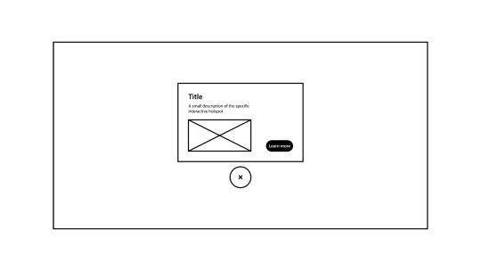
When the user clicks on the hotspot, a description and image or video will appear.
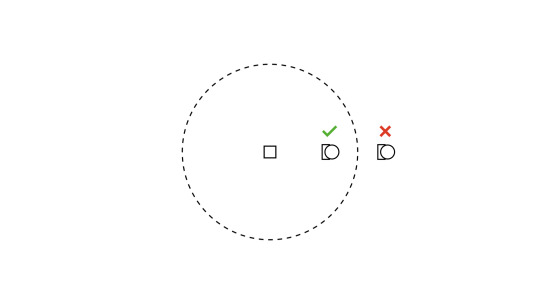
To focus on the space itself, the items and information can only be seen and interacted with once the user enters its vicinity.
This will encourage the user to navigate around the space instead of using a central menu which would create static users. The distance of the vicinity will need to be discussed and tested before being implemented.
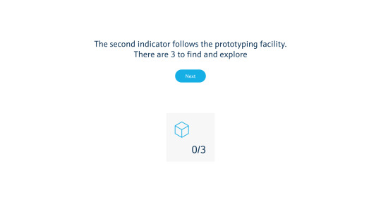
Another area the client would like to look at is prototyping 3D objects, so users are aware that they can create business ideas at Barclays Eagle Labs.
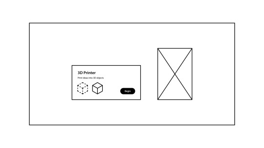
When a user wants to create a 3D object, once they reach the vicinity of the printer, a user interface will appear which enables them to begin.
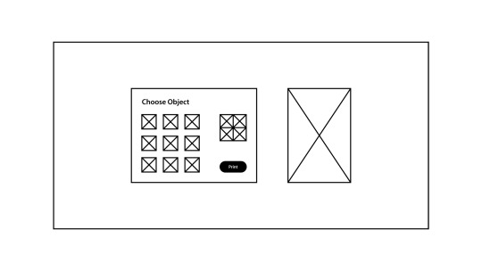
The user will then be presented with categorised objects to choose from.
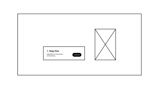
Once the user has chosen their object, they will be presented with an animation of the printer working.
The animation will pause at each step to make sure the user is aware of what is happening. To continue the animation, the user will need to click the ‘continue’ button.
In between each step, the user interface will disappear to put full focus on the animation.
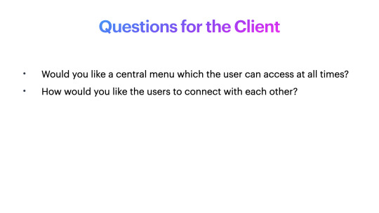
I’m not sure if the client needs this, however I would like to put forward an idea for users to network virtually if this is required in the future.
To ensure a smooth networking experience, the user will be able to talk freely to a person like they would in real life.
Again, to ensure the experience is the same as real life, the user will need a users permission to add them.
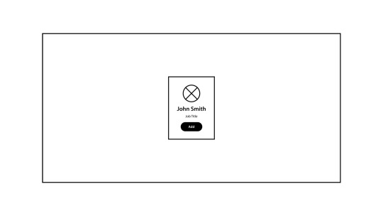
The user will be presented with the user interface of their social profile.
I will discuss with the client if social media integration is possible, such as LinkedIn or Facebook.
What software will I be using in this project?
I will be developing the prototypes in Adobe XD, which is a program I am familiar with. I will then work with Tom and Glenn to transfer the working prototypes over to the virtual reality experience.
I have tried to focus on the space itself, and I feel that menus that are accessed within vicinities encourages the user to navigate the space around them, rather than to have a central menu.
0 notes
Text
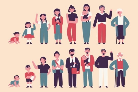
Personas, Scenarios and Sketches
Personas
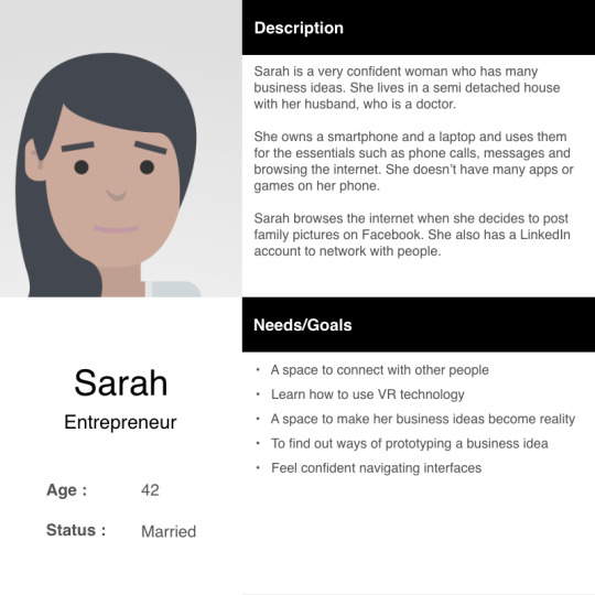
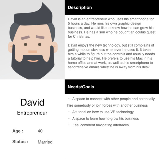
Here are my two personas for the Barclays Eagle Labs virtual tour:
Sarah: Entrepreneur, 42
David: Entrepreneur, 40
Scenarios
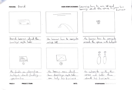
David
Learning how to use VR and learning about the space to grow his business.
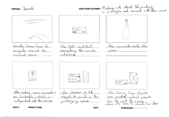
Sarah
Finding out about 3d printing a prototype and connects with other users.
Wireframe sketches
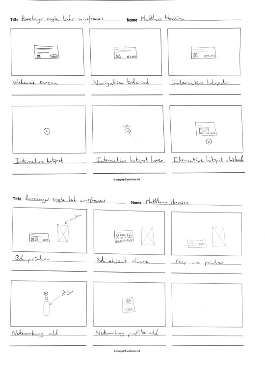
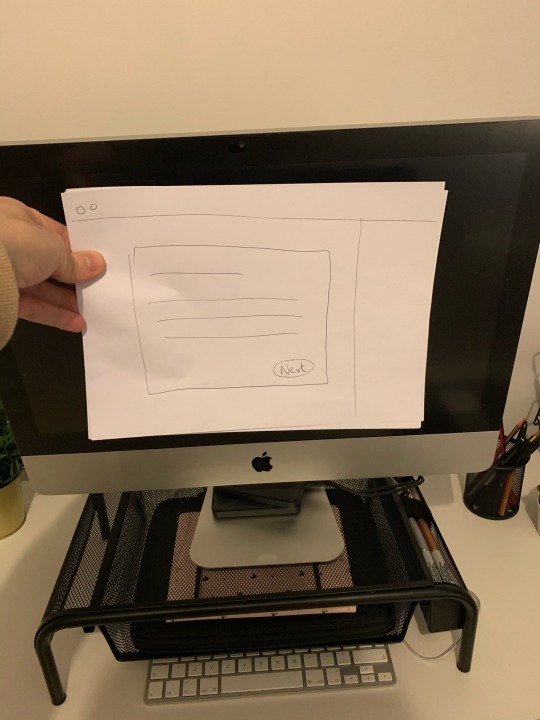
After completing the sketches, I created digital wireframes that I will include in my initial presentation.
0 notes
Video
youtube
To begin, I wanted to see how UI components are designed for VR.
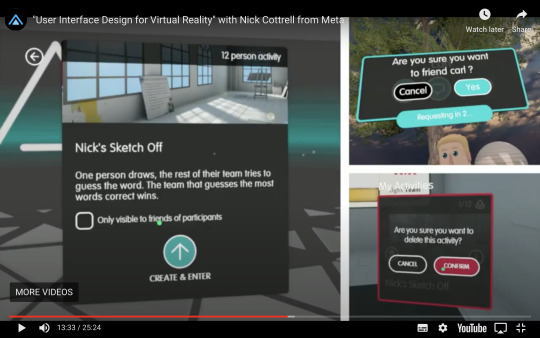
I found this talk from a man named Nick Cottrell who designs User Interfaces for VR. He sees design as stitching elements together; he says to keep what works and get rid of what doesn't and create new experiences. His background is in print and web at different agencies.
He got the opportunity to work on a VR game called AltSpaceVR, which is a social network for VR users. He now works at a company called Meta, which is a company that is finding new ways to interact with computers that designs mixed reality.
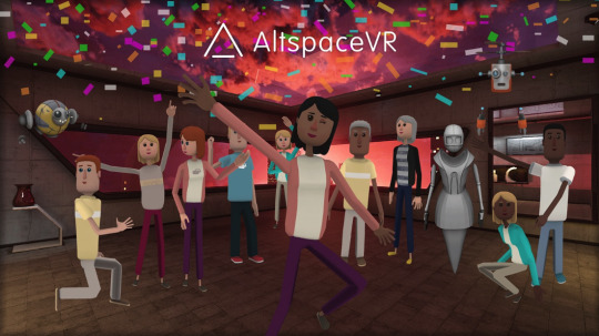
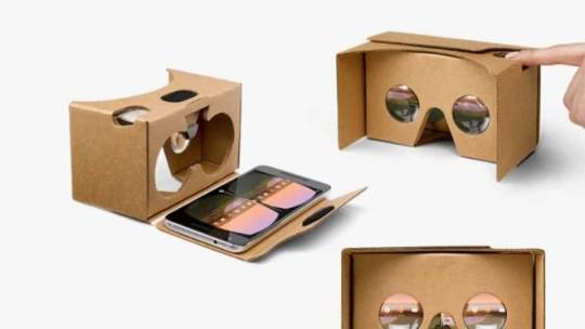
Microsoft bought AltSpaceVR due to its success, which brought it to a larger audience. It also has a smartphone app, which enables smartphone users to connect to the service on their phone, which bridges the gap with the expensive prices of devices such as the Oculus Quest. This means that the service can be accessed by people by placing their phone into a cheap headset like a Google Cardboard, which costs a fraction of the price at around £10-15.
Nick mentions that even though VR is a futuristic and new to us all, the basic principles in design still hold true.
However, things differ in context, control and comfort.
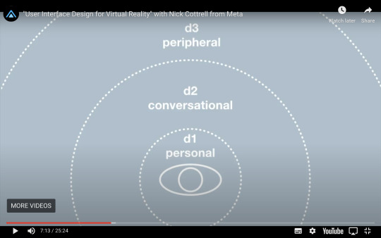
Context
The distance the user is to an object can show meaning, so the interface may change depending on how far away you are from it. So for example, if the user is close enough to an object, the designer should then highlight this. If the user is too far away, they won’t be able to interact with it. Instead, the designer could make some text to go above the object, which indicates to the user that they need to come closer to interact with it.
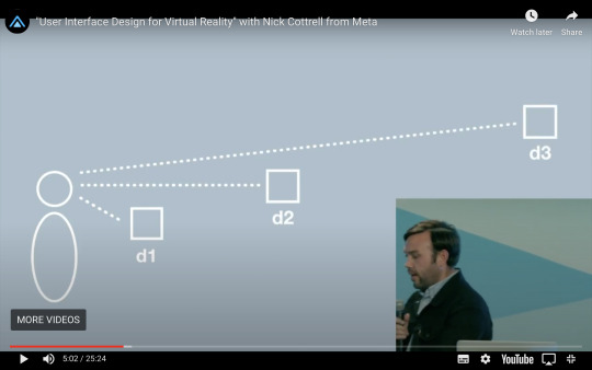
Nick says that it is helpful to set up breakpoints based on distance.
For example, on AltSpaceVR you can only interact with people close enough to you, which encourages movement between the space.
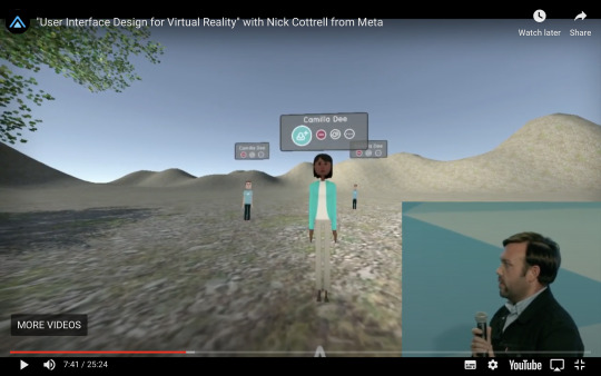
Control
It is very important to show people what to do. This is common sense, as if a user is new to a technology then it is vital for them to know how to use the interface. The control system uses cursors and hands, rather than cursors and touch which is what we are used to with smartphones and tablets/computers.
For example, to move around, you will click or push a button to move around the space, rather than to physically move around it. This means that there needs to be a visual cue to show the user where to move, for example below with the yellow arrow.
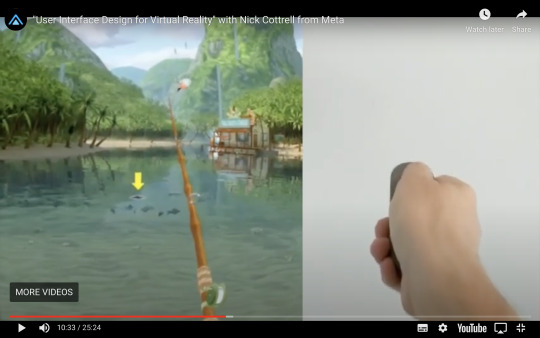
Point-and-click is still the lowest common denominator across platforms. So for example, if a user was to hover over the interface, the colour of it may change to indicate that it can be clicked. Letting the user know what is next is very important. It is also important to make sure buttons like this below are easy to select, and not really small that makes it hard to aim at.
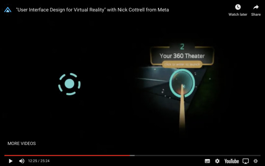
Also, he says that round objects are easier to select, such as the circular buttons on the right of the image below. Also, it depends on what virtual reality device you are using, as pointing with the head on a mobile device would be harder than using your hands on an oculus quest.
To group things together, menus that switch into other menus are important, to ensure confusion is minimal.
Comfort
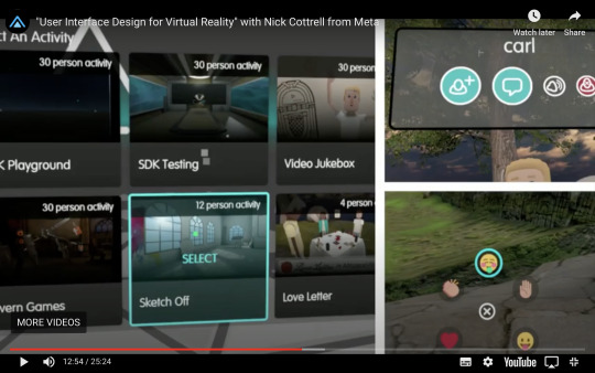
It is important to make sure the experience is as comfortable as possible. Having a lot of space in a 360 environment does not mean that you can have more content.
For example, if you were to have a huge screen that curved in front of the user it would consume them and the user would be constantly moving their head.
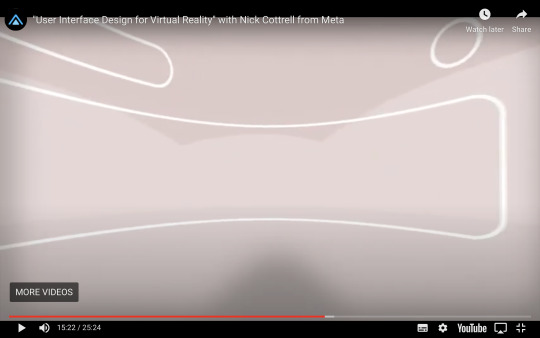
It is much more comfortable to put as much content on there as if it were a smartphone device, with flat screens with minimal buttons and content, to ensure the space around them is still in view.
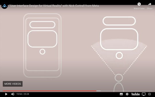
This screen below would be the ideal size and design for a virtual reality user interface.
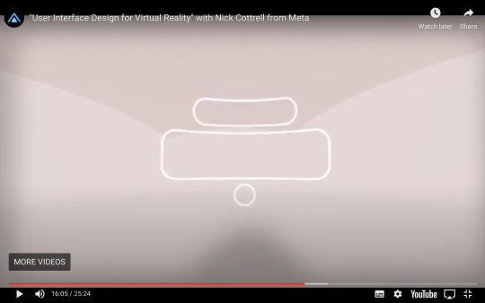
It is critical to understand that if it is too much for a smartphone screen, then it is too much for a virtual reality environment.
Developing the User Persona
To make sure I was designing for the right people, I researched what the average age of an entrepreneur in the UK is, which is 40.
https://www.enterprisenation.com/learn-something/britains-average-entrepreneur-is-40-years-old-and-most-likely-to-be-called-david/
They are also most likely to be called David, so I will make sure one of my two personas is called David.
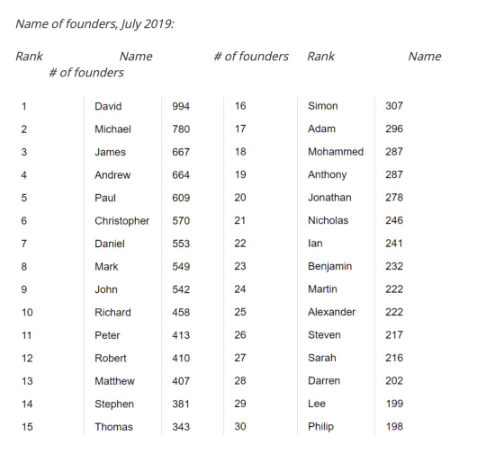
I noticed that the most popular female name among entrepreneurs is Sarah, so I will call my second persona Sarah.
I also found that almost all people from the ages of 16 to 44 years in the UK were recent internet users (99%) in 2019, compared with 47% of people aged 75 years and over.
https://www.ons.gov.uk/businessindustryandtrade/itandinternetindustry/bulletins/internetusers/2019
Another startling statistic that I found was that 95% of 35-54 year olds in 2020 own a smartphone, which means that the probability of my personas owning one is very high.
https://www.statista.com/statistics/271851/smartphone-owners-in-the-united-kingdom-uk-by-age/
The internet was accessed every day, or almost every day, by 78% of adults (39.3 million) in the UK in 2015, compared with 35% (16.2 million) in 2006.
https://www.ons.gov.uk/peoplepopulationandcommunity/householdcharacteristics/homeinternetandsocialmediausage/bulletins/internetaccesshouseholdsandindividuals/2015-08-06
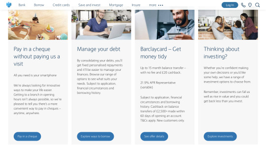
These statistics show that we are users of flat screens. This confirms that it is absolutely essential that my user interface is flat. I want to make it similar to the Barclays website to ensure brand consistency and also familiarity.
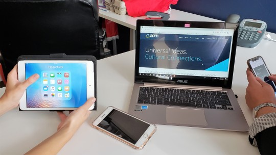
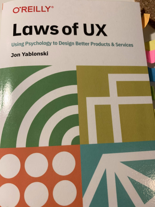
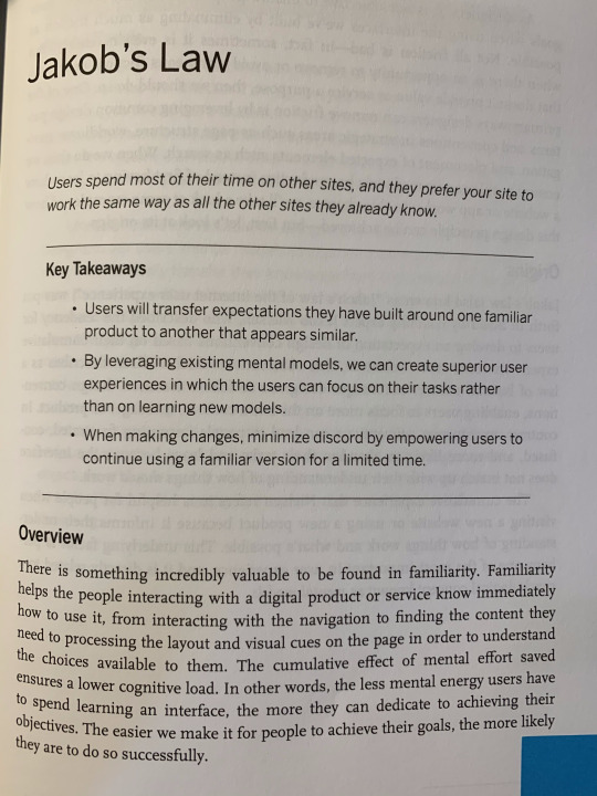
In a book that I own called ‘Laws of UX by Jon Yablonski’, I found a law called Jakob’s Law, which is to make sure that your site is similar to others, due to the fact that users spend a lot of time on many sites, not just one. Virtual Reality is a new technology to people so there needs to be familiarity with the design of it.
I went to the Barclays website to see what the experience was like on there, so I could transfer some of the existing features to my virtual interface.

To ensure it was similar on a smartphone experience, I had a look at the website on my phone.
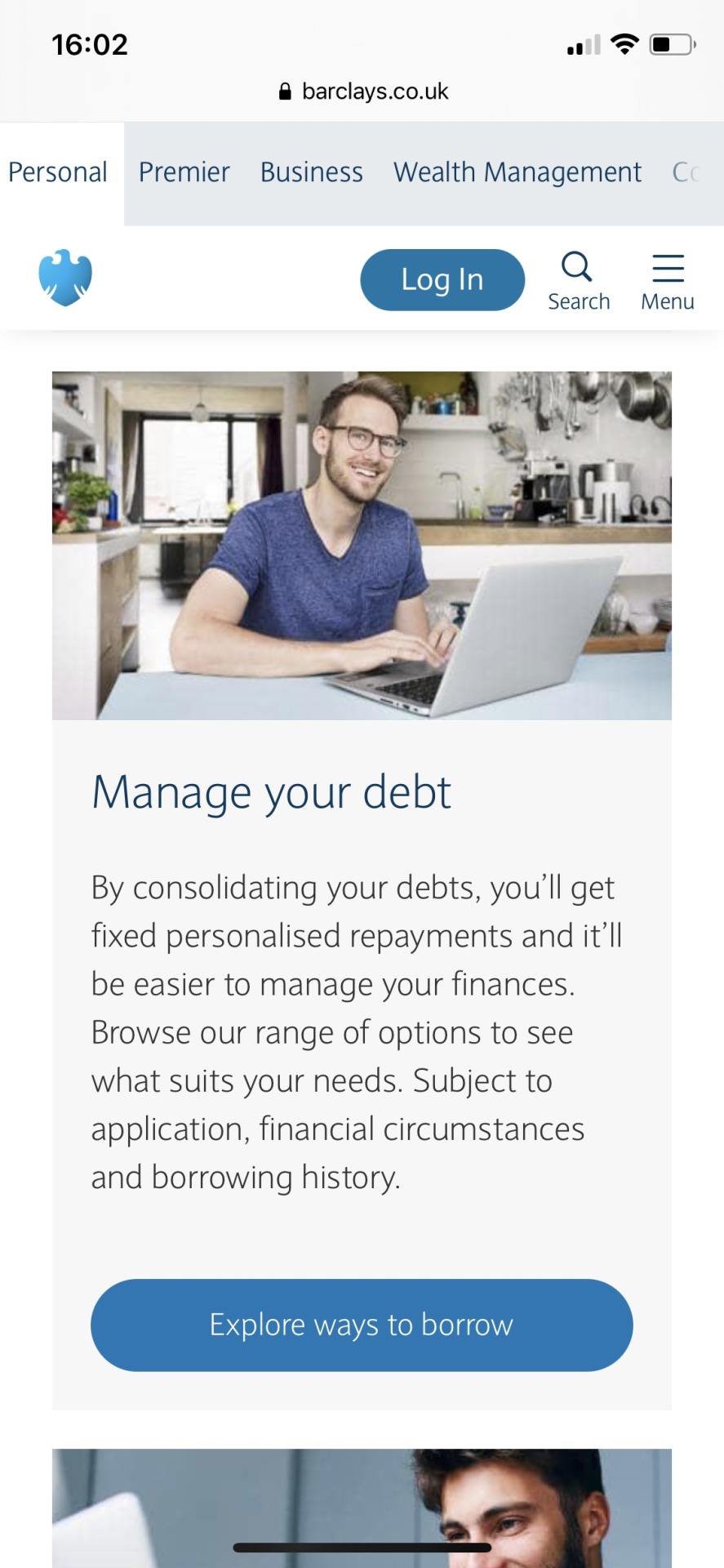
The experience was the same, which was really pleasing for me going forward, as I plan to integrate a similar design.
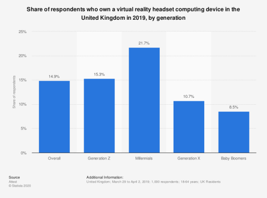
VR usage statistics in the UK
Lastly, I wanted to have a look at how many people are using VR in the UK, to give me more of an idea. These statistics confirmed my thoughts that virtual reality is new to not only my age group, but overall with just 14.9% of the respondents saying that they own a virtual reality headset.
https://www.statista.com/statistics/1044070/uk-virtual-reality-headset-ownership/
0 notes