masonmaye
Ella Mason
Third year AUB student studying Visual Communication.
642 posts
Don't wanna be here? Send us removal request.
Last Seen Blogs

softspeakmeanstreaks
worth the whole damn bunch

freshtyphoonsheep
題名未設定


waterwitch4u
Water Witch

sydneyeyelashextensions
Untitled
Photo


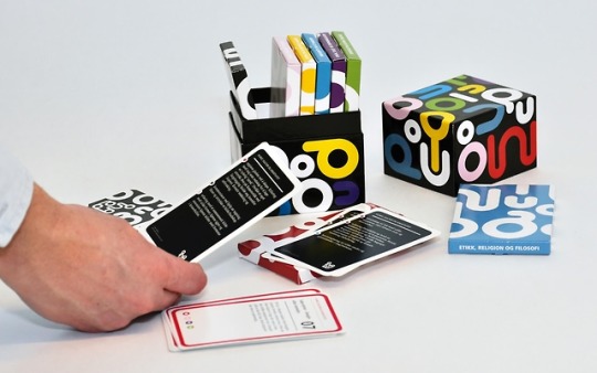


Some card design that I am liking recently.
1. Workplace - BOK : 52 Ways to help clients create better workplaces
2. Persuasive Patterns - Anders Toxboe : With a focus on human behavior, each card describes one psychological insight and suggests ways in which you can apply it to your product.
3. Questions & Empathy - Michael Ventura : Seeking clearer understanding or deeper connections? Let these cards guide your conversation and exploration. Questions & Empathy has inspired empathic exchanges for top creatives and businesspeople alike.
4. The Cat In The Sack - Alice Kolb : Behind each illustration lies an expression that gives you a clue as to what the drawing might be about. An idiom, if you will.
5. inPed - Montaag : inPed creates tools for daycare personnel aiming to provide children with a meaningful upbringing
6. Combined Shapes - Brynjar Siguroarson : Combined Shapes is an ingenious and simple card game that consists in finding the nine different partners and fitting them together to discover the resulting shape.
7. 54 Cities - Matheson Marcault : 54 Cities is a deck of cards. It’s also a walking puzzle about Kensington and Chelsea: their history, their forgotten possibilities, the ground beneath them and the air above. There are four walking routes, one for each suit on the deck of cards.
8. Art & Machine - Ryan Hewlett : Deck of playing cards about the history of Modern art, design, and machine technology.
8 notes
·
View notes
Link
In-bed, 2009
From "24 outdoor contexts"
Video, black and white, sound
"24 outdoor contexts" re-presents the MoMA Project “(Untitled) 1991” by Felix Gonzalez-Torres, displayed in New York during the summer of 1992. Executing the project in 2009, I used an exhibition catalog as reference to photograph the original locations where Gonzalez-Torres displayed 24 billboards of an empty bed 17 years ago. The new images not only depict a city transformed but also reveal the disappearance of an artwork.
Together with black and white prints of the locations, I created a video of an in-bed conversation between Peter Muscato—the photographer who documented the billboards in 1992—and Gonzalez-Torres’s only gallerist in his lifetime, Andrea Rosen. I utilized two male actors in this piece to interpret an imagined conversation, while exploring a realm of mediated production and reception. The video showed here, develops an ontological discussion relating to photography, art influences and the politics of representation.
1 note
·
View note
Text
Target Audience & Context
My final pieces for ISTD turned out to be more conceptual and ornamental than I had first planned. The pieces, applied in the right context, perhaps displayed alongside the crown jewels or in a museum, would visually inspire remembrance for the Queen for when she passes away or abdicates.
My target audience would be those old enough to have witnessed the Queen's reign (5-70 years of age) but also those young enough to experience life without the Queen. The project is one that can appeal to all ages as it’s a neutral symbol of respect for Queen’s reign that doesn’t push any agenda of anti or pro royalty.
2 notes
·
View notes
Link
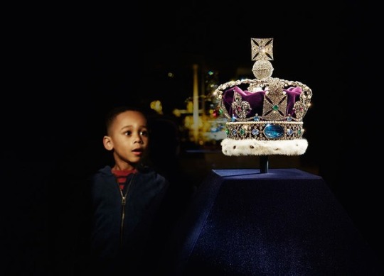
The crown I have based one of my final objects off of. I chose St Edwards Crown over the other crowns that the Queen has worn, as it is the most recognisable and has a really strong visual style.
0 notes
Photo


Displaying royal objects
Thinking about how to display my final artifacts, and how important presentation will be for them. A lot of the royal jewels are contained in glass boxes, but a lot of them are displayed either on cushions or plinths.
I could easily create a shaped plinth for my objects, in a red or a royal purple that will really pull the objects together and give them a visual connection and a sense of royalty.
1 note
·
View note
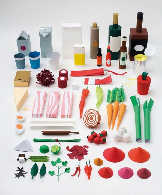
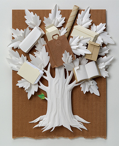
Photo
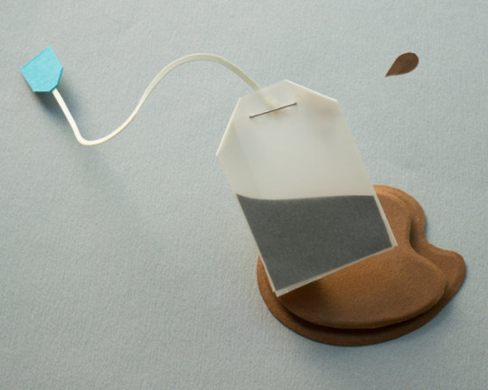
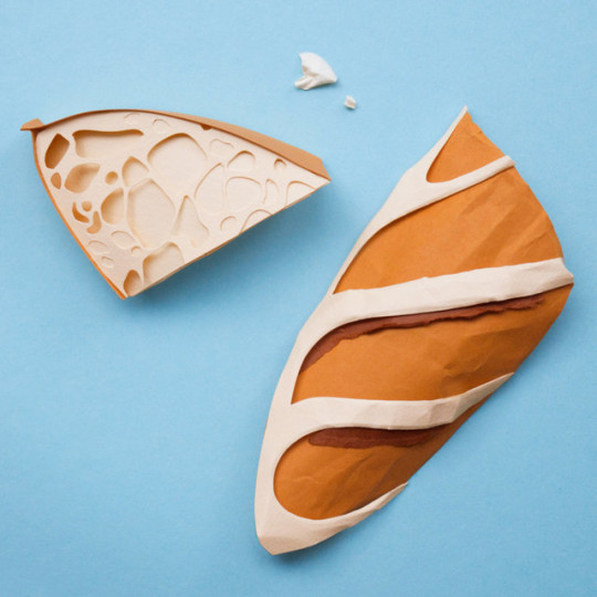

Reina Takahashi
A French papercrafter recommended to me. I’ve been exploring a lot of 3D crafters as of late, but it’s easy to forget that a lot of 2D work doesn’t have to be flat images and can include a degree of 3D manipulation to make the piece come to life. I really love the almost rustic style of the objects and subtle use of colour.
The photography of this work is really inspiring, as these objects could look so much more simple if they were not photographed in a dynamic way. Photographing papercraft can make or break a project, and I need to remember this when photographing my final pieces.
1 note
·
View note
Link
Thinking of objects that are easily associated with the Queen, two obvious ones are the orb and the sceptre, two objects that the Queen has only held once in her life yet are so significant to her image.
0 notes
Photo
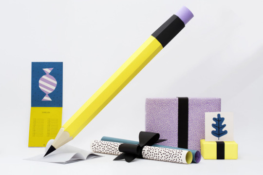


Paper Inspiration
Jonathan Milne
Sally Vitsky
Fideli Sundquist
Snask
Lobulo
Carlo Giovani
After a tutorial with Sally, I’ve decided to wholeheartedly approach the world of 3D papercraft for my final piece for my project. I know extensively of 2D papercrafters, but I don’t know much about the 3D world. Getting inspiration helps my process, and helps me figure out how pieces are crafted and photographed.
0 notes
Link
This link was shared to the course, and I found it really grabbing, as I have both an interest in theatre and an interest in the logo that was created for the Globe.

A 12-sided ring that represents the shape of the theatre, using the imagery from one of the many trees cut to form the theatre. The strong, simple logo is used everywhere and it made me think about my own logo concepts for ISTD and my royal event. Being confident about a concept and applying it in different ways is motivational for me, and I really like the execution of this logo for this brand.
0 notes
Link
A project around the Queen’s 60th jubilee by Pantone and Leo Burnett London, presenting her 60 years in 60 Pantone shades which is brilliant.
“The guide is numbered featuring PANTONE Colour references citing the date and location that defines the queen's choice. So, next time you are selecting the swatches to a stationery system or defining the palette of your next poster, let her Royal Highness, the Queen assist you in the matter.”
This project is really fun, it captures the humor of the queen is such an icon in the UK, yet the project is also careful with the content of colour shades pertaining to outfits. This sort of item would be lovely in a party pack, but I’m not sure if my concept is humorous enough to contain something like this.
0 notes
Photo
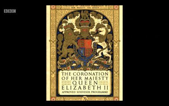
The coronation souvenir programme booklet. Great resource to base content off of.
0 notes
Link
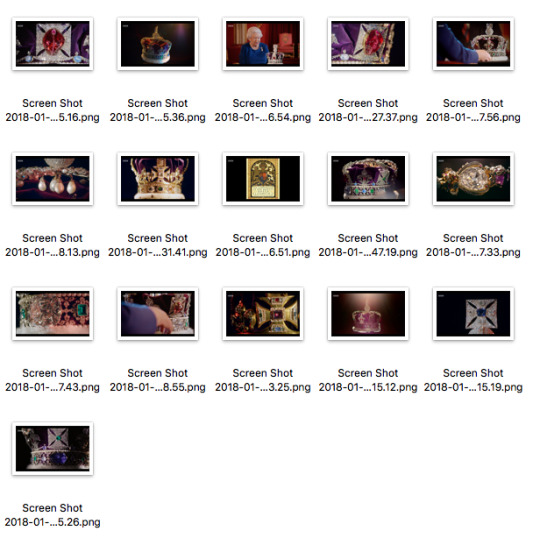
On BBC last night, an hour-length programme that covers the Queen’s coronation 65 years ago and her comments on it, never before been documented.
The programme was intensely fascinating, especially as they discussed the ballet-like organisation of the event and the history of the event.
The programme covered the crown jewels, items that were very significant to the coronation, so I took a lot of screengrabs to get some colour matches which I could apply to my concept identity, and shapes for other visuals.
1 note
·
View note
Link
An incredibly interesting article about Charles Petillon and his mass of balloons.
0 notes