lucymayviscom-blog
LUCY MAY VERNON
Visual Communication Student
673 posts
Don't wanna be here? Send us removal request.
Last Seen Blogs

harvzilla
Harvzilla

sparklycolorblaze
Untitled

pipunculidae
and stop starin' at me with them big ole eyes
anonsables
Randki meżczyzny z Kobietami
Text
FMP Evaluation
At the beginning of this project, I was fixated on the idea that my final major project should be aimed at affecting change and challenging current social or environmental issues. I was looking into big campaigns and it just lead me to go around in circles and become more and more stuck! I decided to change my way of thinking from what is wrong and what needs changing to what is great and should be celebrated or encouraged?
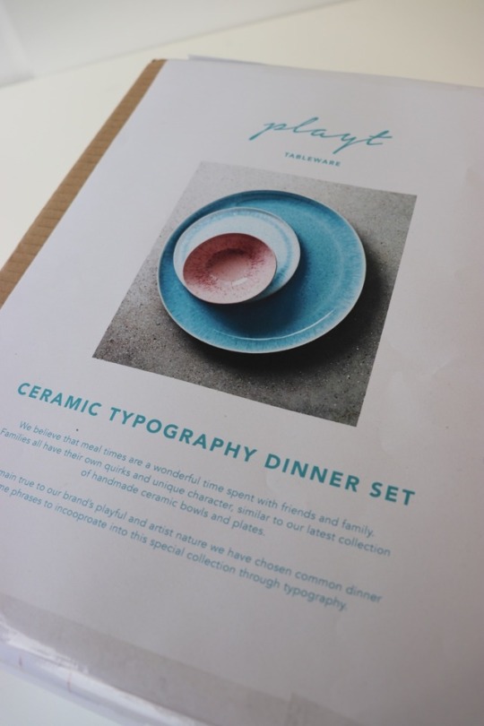
This thinking method was a lot more successful and it lead me to the area of focus for my project. I decided that I wanted to look at families as my project topic. Specifically, I wanted to explore the different dynamics of different families and how the image of an ‘everyday family has changed over time. As I began my research into this topic, I began to closely examine how families were sharing their meal times together. This was an occasion that most families can relate to but all do differently. I found this topic really interesting and began to look into the importance of sharing dinner time together through research and interviews. It turned out that there are many benefits to the mental and physical well being of individuals through sharing dinner time with their family. I felt that this is something we should be encouraging in a world where meal times have become a more casual occasion.
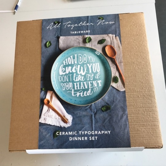
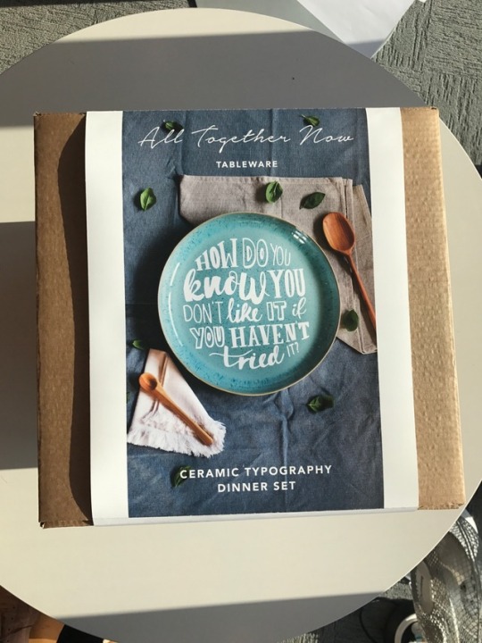
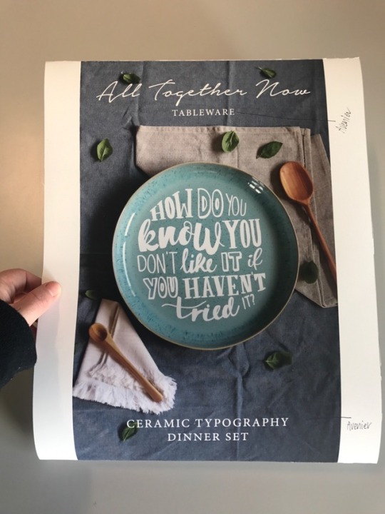
This lead me to examine my research from different families sharing dinner time together and think how can I find a common ground between all of these unique families that I can use to encourage the same thing? After a while, the answer appeared...plates. While all families that I interviewed and photographed had different ways of doing their meal time, they all used tableware!
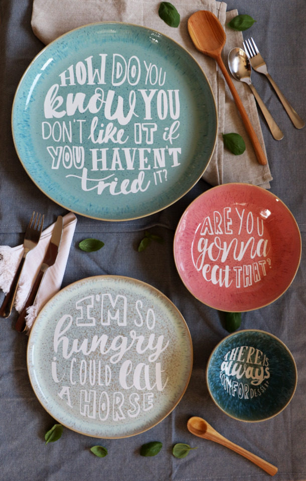
My project focus became all about tableware and how I can create a dinner set that families would want to buy and use, therefore encouraging more dinner times at the table together. I began by writing the interview responses on the plates however I realised that as a product this wouldn’t work because the consumer wouldn’t understand the context enough at first glance in a shopping aisle. I needed something more simple and something that someone would look at in a shop and be drawn to. Sally suggested to me that I looked at common dinner time phrases that families can relate to. I really liked this idea and realised it was a good way of drawing in the consumer as they will read the phrase on the plate and hopefully draw upon their own experience which will gain a positive response.
I collected common dinner time phrases and began to draw them onto plates. I soon realised that typography was the best means of getting across my message and spent days upon days upon days designing the type for my plates. I was then introduced to the idea of using vinyl cutting so that the words would stay on the plates, and while this meant that my product for hand in wouldn’t be functional, it got across the idea very well and would look as professional as I could get it without spending a load of money!!
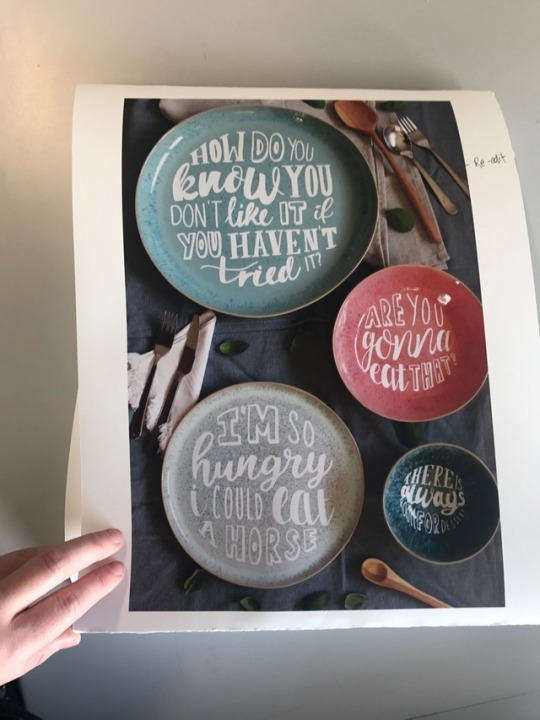
I really enjoyed this process! I made a number of experiments using different coloured vinyl, different coloured plates, plates collected from people I interviewed, and eventually I found the final set. I wanted my plates to reflect the diversity of these families. Because even though I wanted them to relate to the phrases, I still wanted to celebrate their quirks and different characteristics. I did this through my choice of dinner set. The plates and bowls I chose were all different colours and all had quirky patterns on making the set a really beautiful mix and match.
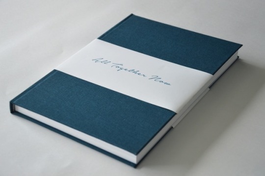
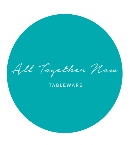
Seeing as I was creating a product I also needed to look at the branding and packaging of that product. This was really rewarding for me as it is an area I particularly enjoy. I chose the name ‘All Together Now’ after receiving feedback from peers and tutors and I felt that this name represented what I wanted from my product, for people, families, to come together.
Overall this project has challenged, excited and motivated me. I feel that I have responded well to my research and design development through my final outcome. If I were to develop this project further I would love to include more implements of tableware such as cutlery, napkins, tablecloths etc.
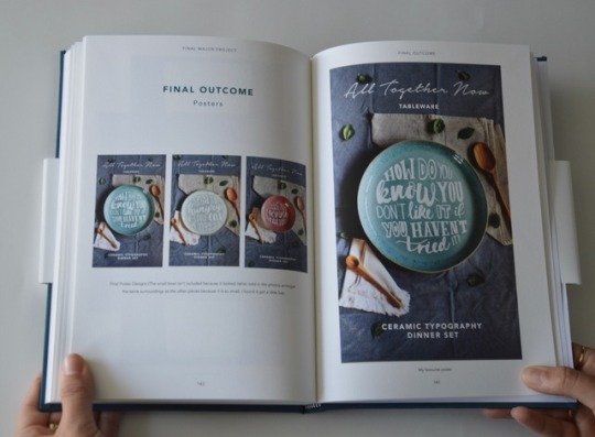
My final outcomes consist of:
A Typographic Dinner Set
Poster Designs
Package Design
0 notes


Photo


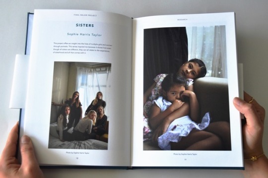
PROCESS BOOK First-Ever Case Bind
I decided that I wanted my final process book to be special and I wanted it to work as a great portfolio piece. So I decided to give case binding a go! This was very simple to make and I was so pleased with the result! I think that it gives the book an extra feeling of presence and importance when you are holding it!
0 notes
Photo

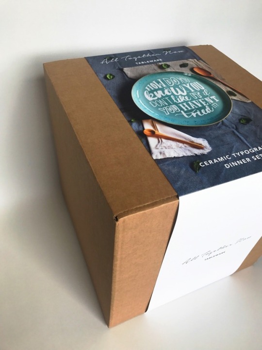

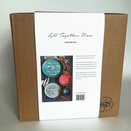
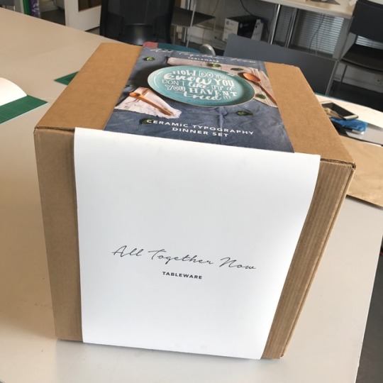
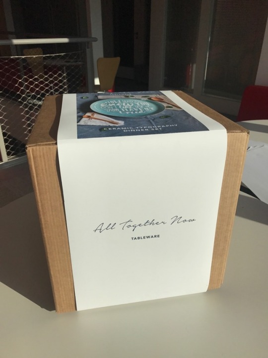
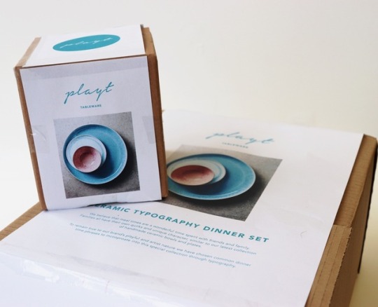
PACKAGE DESIGN Final
In the end, I decided to re-design the packaging so that the width of the belly band was the same all the way around the box and without any white borders! I was much happier with this outcome!
0 notes
Photo

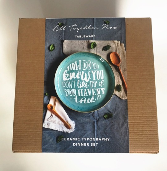
PACKAGE DESIGN Development
I decided to simply trim off the white border on the top to see how it looked, however, I felt that it then looked inconsistent.
0 notes
Photo


PACKAGE DESIGN Development
After printing and wrapping my package design around my box, it was pointed out to me that something looked a little odd. I had designed the top of the box to have a white border around the photo, however, where it is sandwiched between the front and back which both have a white background, it looks like it hasn’t been cropped properly and as if the border is not meant to be there!
It also looks very busy when I add the border! So I decided to try a few alternative options.
0 notes
Photo

PACKAGE DESIGN Development
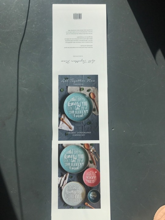
I printed off the first mock-up of my package design. I was happy with the majority of it but there were a few things that I felt needed adjusting!
I decided to change the font for ‘TableWare’ and my other text to ‘Avenier’ instead of ‘Minion Pro’ so that it matched the branding.
I also decided that I should colour match my text to the ‘All Together Now’ logo which was an off grey.
0 notes
Link
0 notes
Link
0 notes


Photo

Branding - MAKESHIFT STUDIO
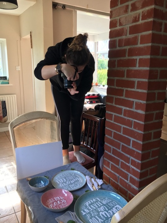
I wanted to take some photos of my product in context for the package design. So I set up a makeshift dinner table with cutlery and a few little extras!
0 notes
Photo


Branding - Package Design Experiment No.3
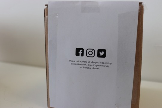
I tried a printed experiment using my simple ‘playt’ logo on the boxes. I wanted to keep it quite simple and to include the logo around the sides and the main information on the top of the box. I also included a social media aspect on the side of the box, encouraging people to take a photo of who their sharing dinner time with or even just using the plates, to be shared onto the brand’s Instagram, twitter and facebook page. I now think that I will just create an Instagram page as that is the most appropriate platform as it is more photo-led. I used this photo of the plates just because I hadn’t yet taken my own photos!!! (So I would not use this photo!) I think that for the next experiment I will make the photo much bigger as the product is the most important aspect.
0 notes
Photo


Branding - Logo Experimentation
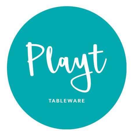
I played around with some fonts and compositions for the word ‘playt’. It was hard to compose the ‘Tableware’ because of the ‘y’ in playt dropped down quite low. I chose this colour blue because blue symbolizes trust, loyalty, faith and confidence, all qualities that should be shared amongst friends and family members.
0 notes
Photo
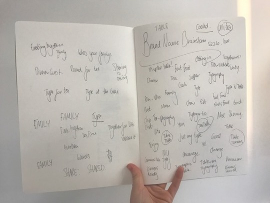
Branding - Name!
Trying to figure out a name for my brand was quite challenging. I wanted to have a name that let people know what the product was but also something to do with being together but also something playful! I braindstormed for a while then settled on the name ‘Playt’ as a twist on ‘Plates’ and ‘Play’. I felt that this name was suitable in sense that it let people know what the product was but I was disappointed that it didn’t involve anything about people coming together.
0 notes