joshpatmore-blog
josh patmore
Level one graphic designer studying at UWE bristol
26 posts
Don't wanna be here? Send us removal request.
Last Seen Blogs
healingrevival
LIFE&LOVE
dobomiyeon
Just Me.

uniquephilosopher4343
My Desires

allyadvisory
Ally Advisory
aragarna
Aragarna
Photo


Infographic documenting every social interaction I had over the course of a week...some interesting figures
1 note
·
View note
Photo

I was approached by the creators of 'Ham & Onions' to create a poster to advertise their sitcom pilot at various film festivals. This is the first design of many planned.
1 note
·
View note
Photo


Latest Relay, Cameron's piece on the left was inspired by the song Time by Pink Floyd, so i made a typographic piece using his colour scheme and the opening line of the song.
1 note
·
View note
Video
youtube
Words in Motion. Film about Ian McMillans Connected, final version. I worked with Kazeem Shomade to make this.
0 notes
Video
youtube
New Experience brief. I decided to drive to cardiff with some people and a camera. This is what became of it.
0 notes
Video
Final moving image piece for Every Object Tells A Story. The exploration of a hip flask.
1 note
·
View note
Photo
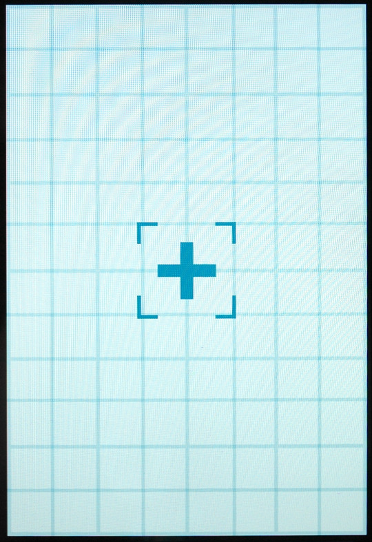
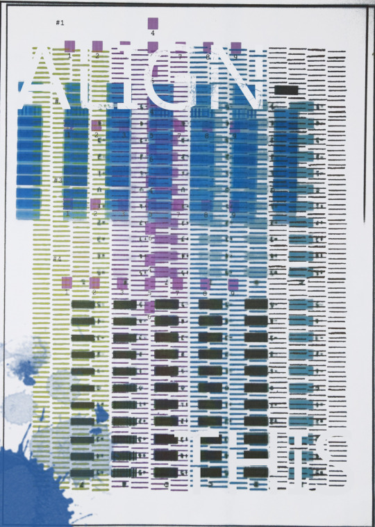
Cameron's idea (bottom) of using various printers to print the alignment tests was clever, so i wanted to do something of this kind of idea to achieve a different look. I stuck with the theme of align and drew a pin point icon, but i thought it was too plain (top right).
I decided to display it on my computer and take a picture of it so that the scan lines were prominent to achieve a "computer" style (top left).
6 notes
·
View notes


Photo
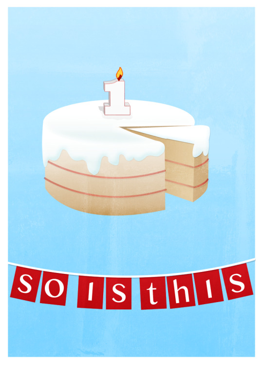
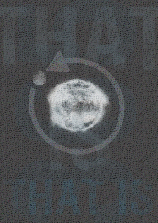
This weeks Relay response focuses on the duration of a year and what happens in that time. Cameron's piece features the earths orbit (Bottom) around the sun which got me thinking of other events that happen in a year. After thinking about it for a while i decided to focus on Birthdays and this is what came of it (Top).
0 notes
Photo
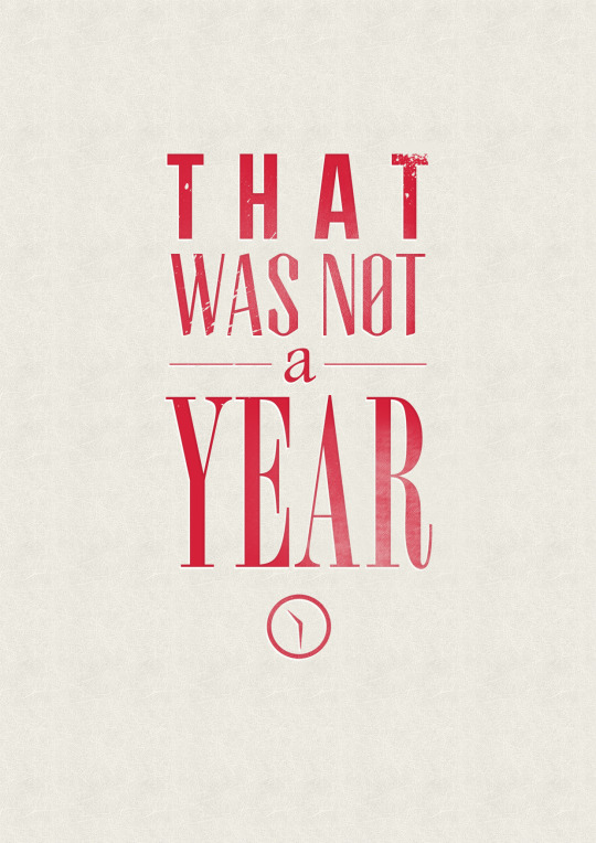
Response to Cameron's latest relay piece. He made a time lapse of the sky ending with the text 'One Year Later'. I decided this week to take a different approach to my response and make it more of a conversation.
Although a time lapse of a whole year is obviously unrealistic for this project, the one Cameron created spanned a couple of hours, therefore the tag line 'One Year Later' is misleading. That is how i came up with this piece.
3 notes
·
View notes
Video
First test for the final scene of an upcoming moving image piece.
2 notes
·
View notes
Photo
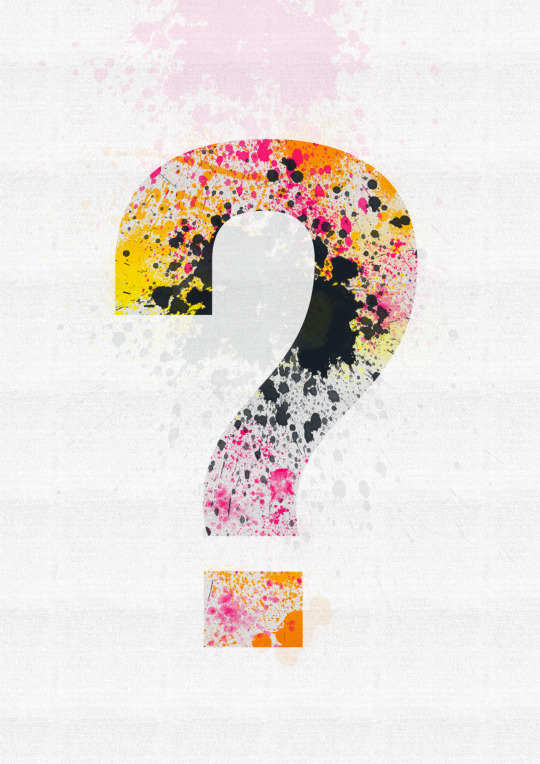


As part of my next Relay, i am trying to take the focus away from the original theme. Cameron's latest piece is a really nice image and is quite abstract. It looks as though it is a hand rendered painting of an american footballer and has a really nice splattered look. I chose to focus on this and make a poster focusing on the paint splatter technique.
It took me a while to figure out what the image was of, which i think is really effective as it makes you ask questions, and this lead me to use a question mark as the main icon and try to make a strong design using paint splatters.
I look forward to seeing what cameron makes of this response, as i think it is very open to interpretation.
I originally used a burst of colour on the image as Cameron's is quite nicely coloured, but i think i prefer the strong black and white version and think it would make a nice screen print.
2 notes
·
View notes
Photo
Mine and Sophie's somewhat rushed poster.

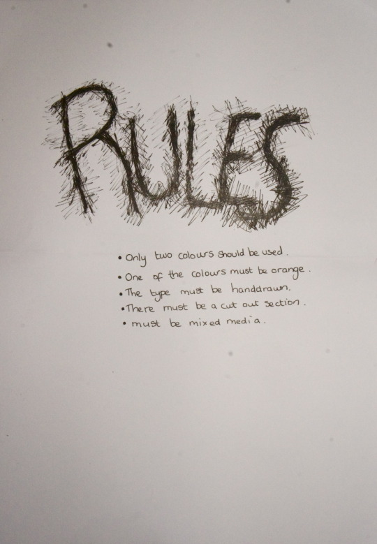
To design a poster advertising a designers talk at spike island, using rules.
1 note
·
View note
Video
A very simple stop motion animation exploring the uses of my hip flask.
51 notes
·
View notes