
joeweisbloom
Joe Weisbloom
Visual Communication Level 6
228 posts
Don't wanna be here? Send us removal request.
Last Seen Blogs

worlize
Worlize Wonderland

hometoursandotherstuff
Home Tours & Other Stuff

teamagnes
Agnes Bruckner

skittleberryxd
𝚂𝙺𝙸𝚃𝚃𝙻𝙴-𝙱𝙴𝚁𝚁𝚈-𝚇𝙳
Text
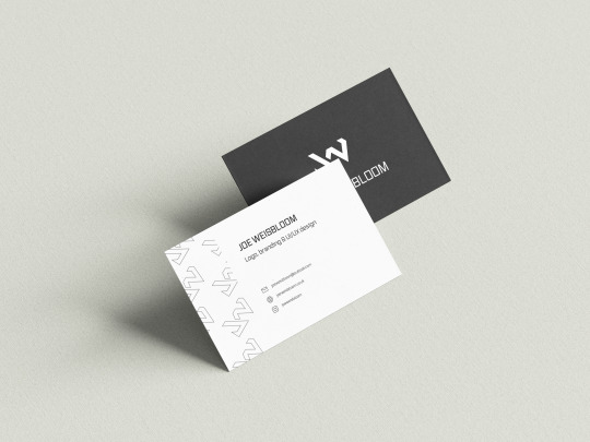
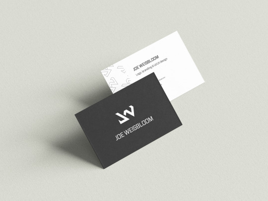
I finished up my mockup up some business card ideas. I kept these clean and simple, only containing essential information.
Overall, I felt that my personal portfolio and branding assets accurately represented me as a designer, and assist in displaying my design skills. I will however continue updating/changing these assets in the future.
0 notes
Text

I also appropriately amended my 'About & Contact' page, to ensure it was up to date.
0 notes
Text
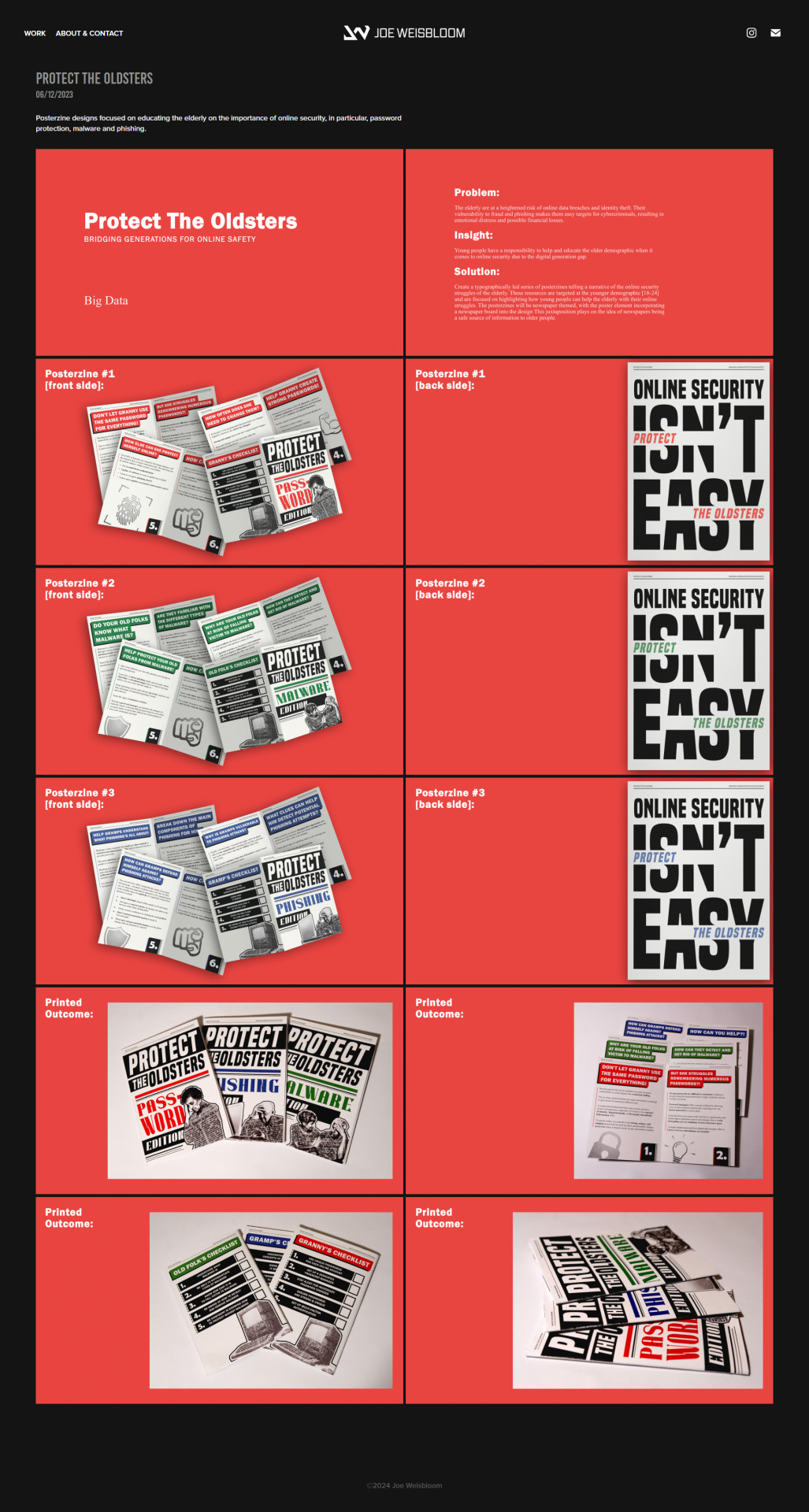
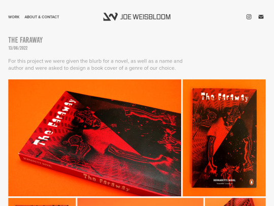
Whilst my 'Protect The Oldsters' project didn't necessarily align with my specialism areas, I felt that it was a good representation of my typography work, and poster/marketing design skills.
0 notes
Text
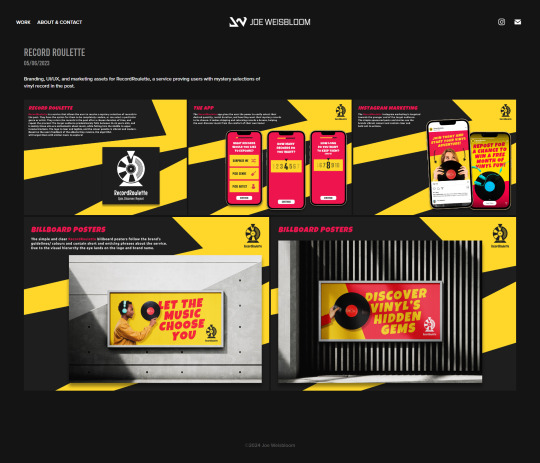
Next, I decided to add my RecordRoulette project as it also focused on branding, UI/UX and marketing.
0 notes
Text
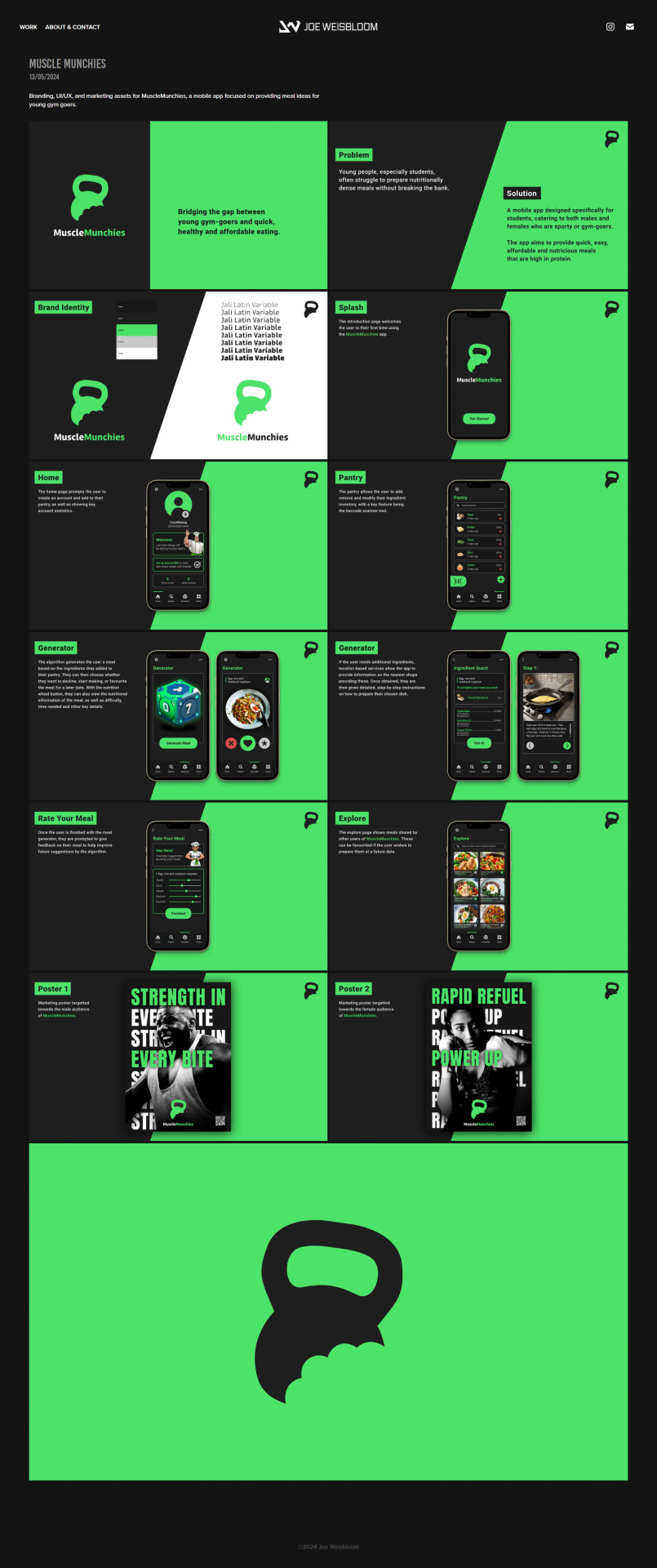
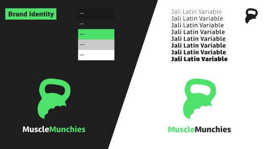
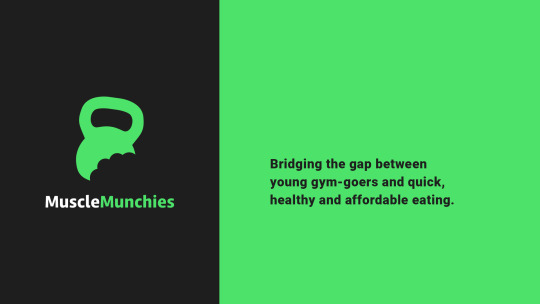
I added 3 new projects to my portfolio. The first of these being my most recent project, MuscleMunchies. This project was relevant as it aligned with my design specialism areas.
I also subtly changed the title, date and description format on all portfolio pages.
0 notes
Text

Leading on from my updated colour palette, I decided to inverse the colours on my portfolio. I was pleased with the dark theme as I felt it had refreshed my old theme without straying too far away from my visual identity. I also updated the footer to the current date.
0 notes
Text
I started by making a subtle change to my personal branding colour palette. I changed the dark grey to a slightly darker shade, I felt that for the website this make my logo and name clearer due to the increased contrast.
0 notes
Text
I was happy with the existing personal identity I had built in second year, as I felt it still accurately represented me as a designer.
I decided I was going to further develop my branding and website.
0 notes

Text

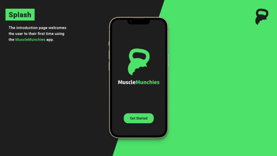
Display sheets containing my final outcomes.
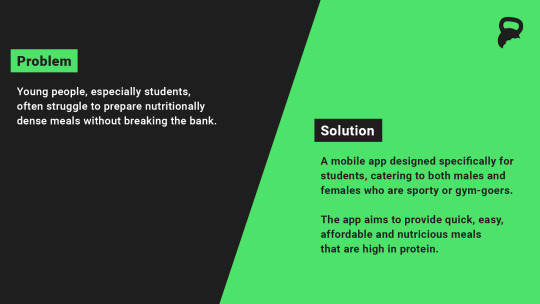
I really enjoyed this project as it allowed me to explore UI/UX design in great depth. I learned lots of new skills and completed a project that I will be pleased to include in my portfolio. My designs changed and developed massively throughout the course of the project, and I found the feedback from tutorials and presentations very helpful. I felt my outcomes accurately portrayed the intentions/purposes of the brand, as well as successfully connecting with my target audience.
0 notes
Text
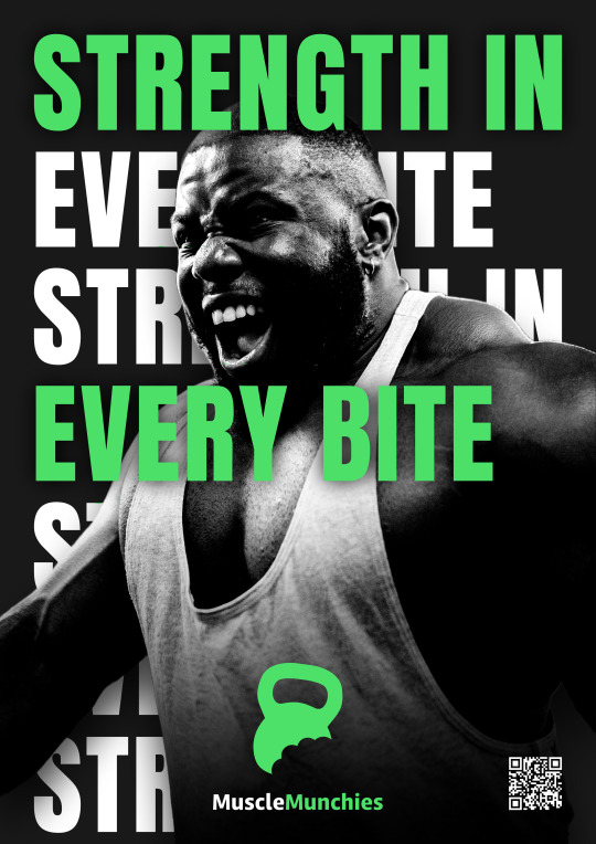
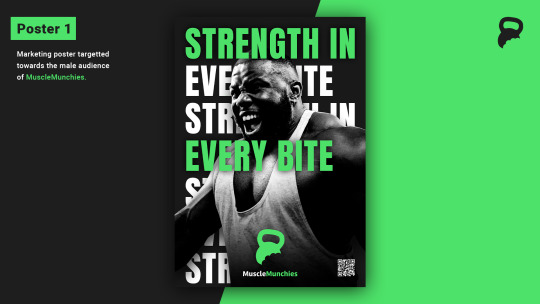
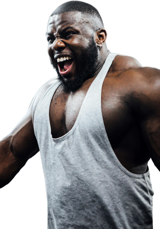
My design for the male audience, consistent with the MuscleMunchie’s branding, clear and bold catchphrases, as well as a QR code link to the app.
0 notes
Text
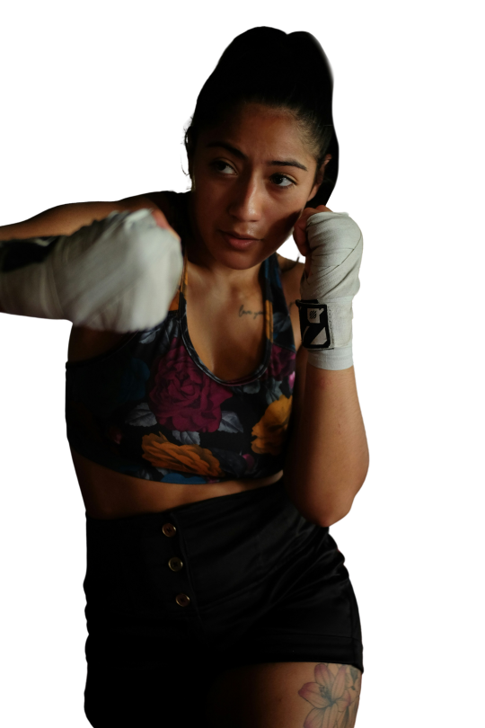
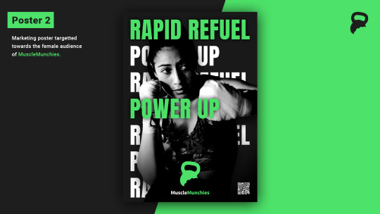
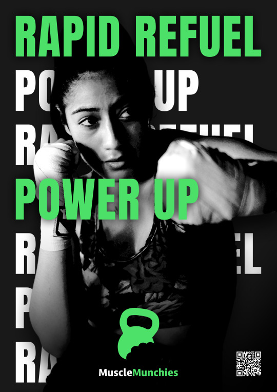
I found appropriate images on Unsplash, ensuring they appealed to both male and female audiences.
0 notes
Text
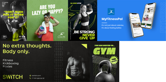
I researched existing marketing posters with similar purposes and color palettes to create a moodboard.
0 notes
Text
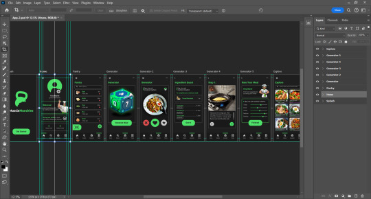
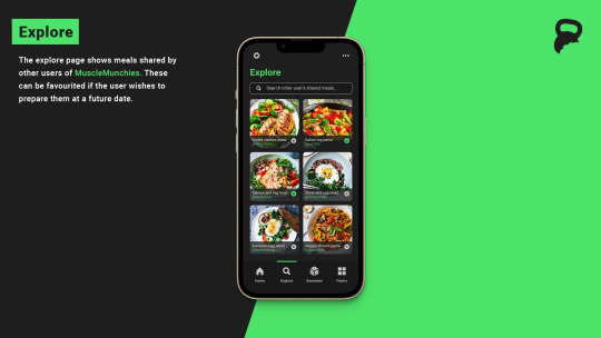
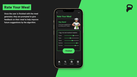
With all changes from my feedback made, I was pleased with the outcome of my app design. I developed features such as allowing users to share and favorite meals on the explore page, this relates to speculation and new and effective approaches (LO2), as these aren’t features I’ve seen incorporated into any other apps/services.
0 notes
Text
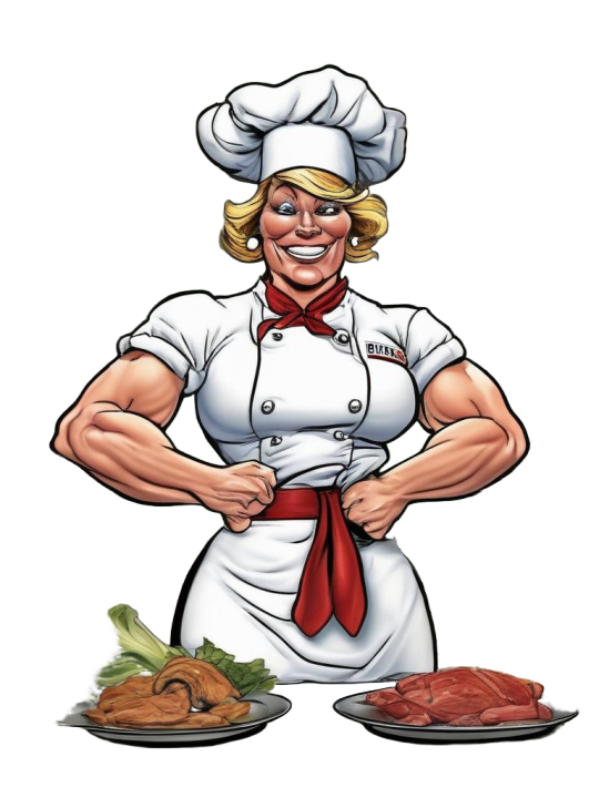
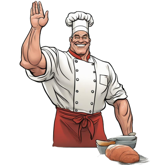


As well as changing the accent color of my AI designed male chef, I also generated a female chef to increase the diversity of the app. I also added the MuscleMunchies branding. LO3 is relevant here due to making significant changes based on lecturer feedback, as well as incorporating independent changes.
0 notes
Text
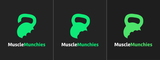
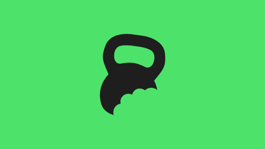
I changed the bite mark to achieve a more realistic design. This is a perfect example of sustained and effective development throughout my project (LO2).
0 notes