
grad603-jackloftus
GRAD603 - Folded Publication
21 posts
Don't wanna be here? Send us removal request.
Last Seen Blogs

danyade
danya de
bangtanturkishtrans
Bangtan Turkish Trans

drguptasclinic1
Dr. Gupta's Clinic

fa1ryfru1t
cashton
glazsirok
GlazSirok


Photo

rather than using photo’s for the brochure I’ve decided to use simplified portraits of the designers as i feel it fits the style of my brochure better.
0 notes
Photo

I’ve decided against using paragraph styles for the heading of each keynote speakers name as there are slight variations in the size of certain letters in trying to create a bit of balance.
0 notes
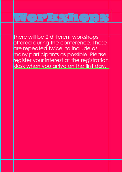
Photo

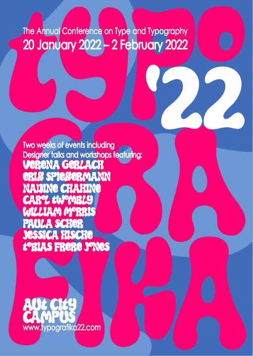
All the keynote speaker pages are on a pink background with blue title text. All the body text sits 36.6mm from the top of each page maintaining a 10mm gap from the bottom of the title text (designer names) keeping a cohesive structure.
0 notes
Photo
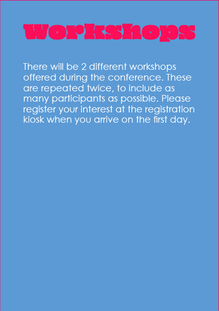
for the pages that use the heading text which use the typeface “Oi” i decided on using the same blue background as the poster side background as i felt it was nicer visually as well as linking to the poster side.
I am also maintaining a 9.6mm gap between the header text and body text when i use the “Oi” typeface as the header; just so the brochure can remain visually cohesive.
0 notes
Photo

working layout for brochure. continuing “bubblegum” colour scheme
0 notes
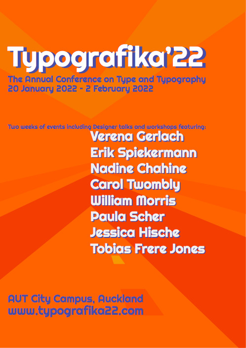
Photo
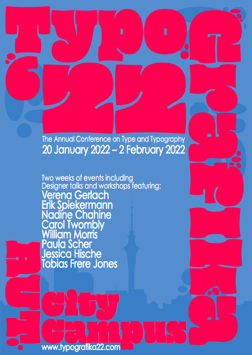
final variation of the poster side. I prefer this colour scheme and i got some friends and family to look at some versions for critique and this was eventually what people gravitated towards more often as the colour contrast is “nicer on the eyes” according to one person.
I also feel like the blue and pink is an easier colour combination to work with for the brochure side.
0 notes
Photo
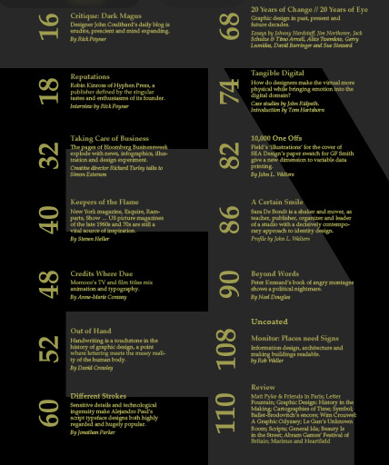


some initial research into how i could layout the table at the end of the brochure. I want to try something a bit different but maintain a simplicity that makes it easy for the viewer to read.
I particularly like the circular layouts as I feel I could have a similar approach on my brochure that could create a visual cohesiveness with the poster side of my brochure.
0 notes
Photo


Refined development for poster side. i looked at using fat typefaces as i liked the way they filled out space with the way bright colours can create contrast on the images. layering the type was also something I explored.
0 notes
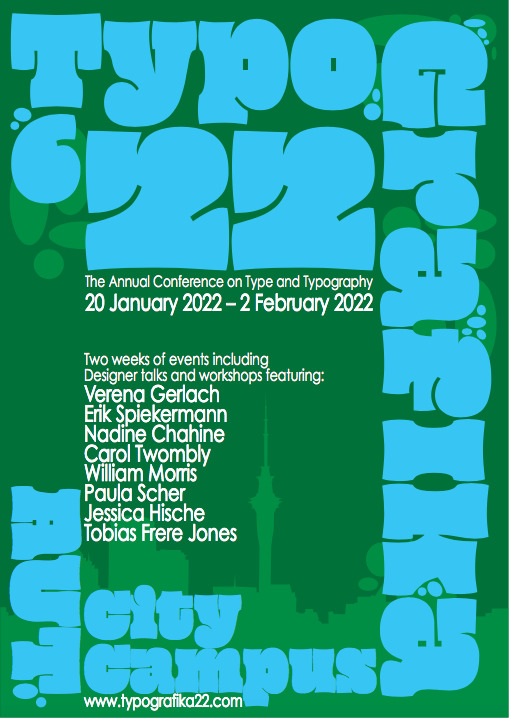
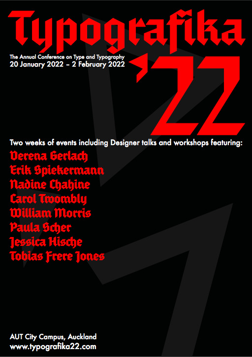
Photo

contrasting colour schemes I will experiment with. Green + Blue, Blue + Red, Pink + Blue, and Red + Black are combinations i think could work best.
0 notes
Photo


Poster side development. All made on illustrator as I’m strongest on that software. I can also transfer the poster to inDesign and only use 1 layer to help with organisation on the file.
0 notes
Photo
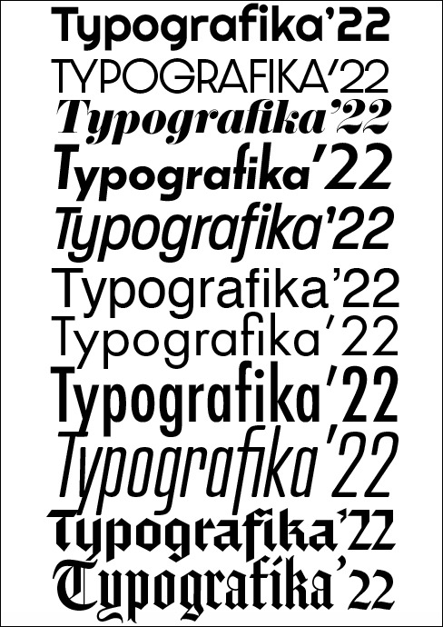
Typeface research. I want to experiment with a big range of Typefaces and possibly include different types in the same poster to capture the variations in form and shape that is common in type.
0 notes
Photo

More typographic research that will help influence my development. mainly inspiration for the poster side but will continue conventions to the brochure side.
0 notes
Photo

first experiment with contrast in colour between poster and brochure.
0 notes
Photo
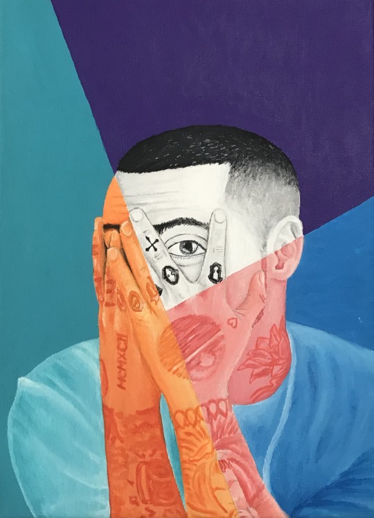
Old painting of mine that inspires some different contrasting colour combinations for the brief.
0 notes
Photo
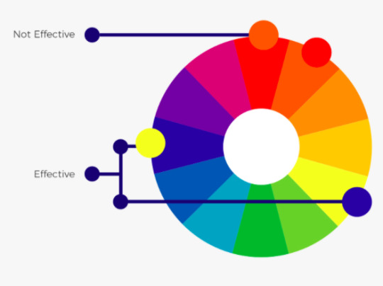

Colour wheel research looking to create complementary and contrasting colour combinations for the poster and brochure.
0 notes