gracemlarivee-blog
Grace Larivee
design journal
21 posts
Don't wanna be here? Send us removal request.
Last Seen Blogs

wolfsguillotine
i still feel high
cxndycl0wn
cxndycl0wn

adriano-ferreira
Direito, Poesia e Política

relevant-url-incoming
more time travel. always more time travel.

chadpopulisphotography
Untitled
Text

Photography
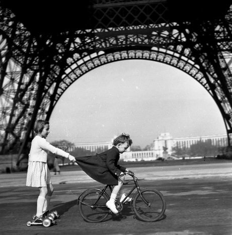
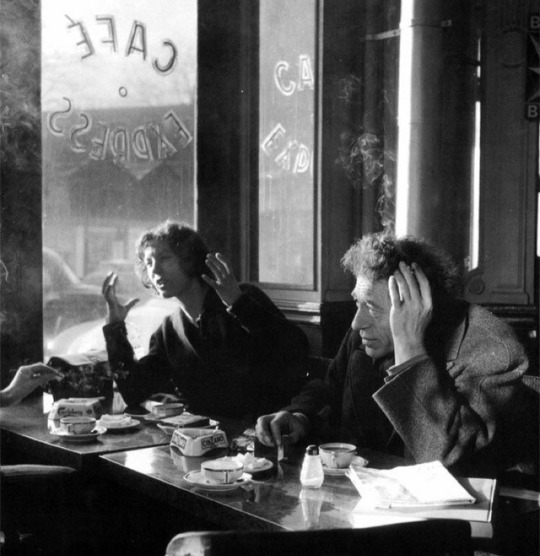
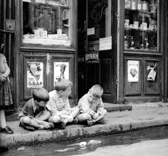
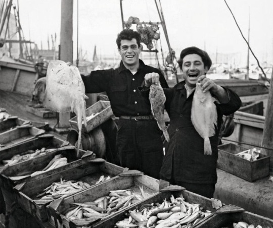
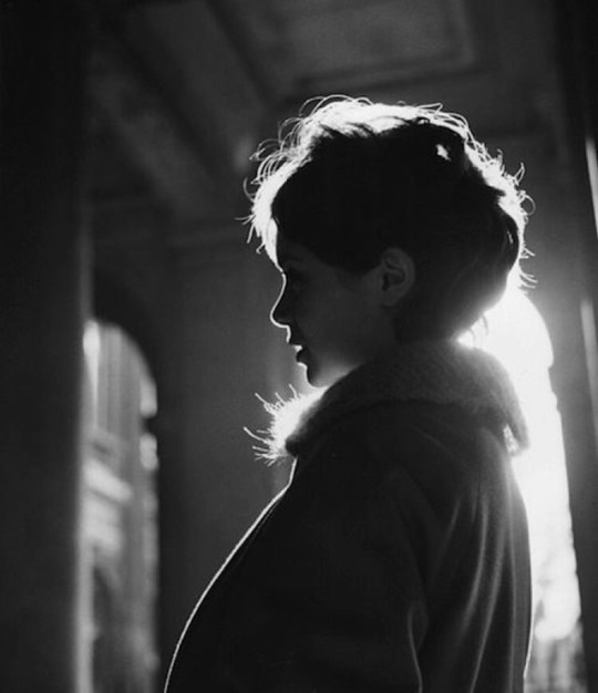
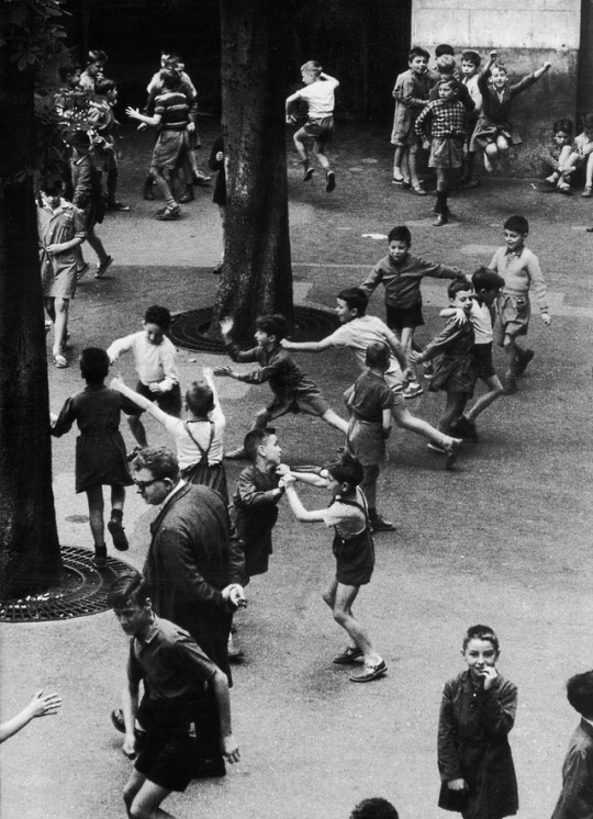
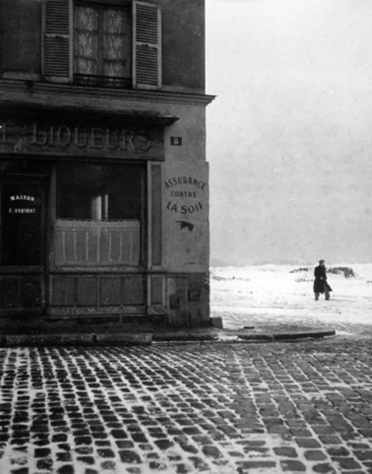
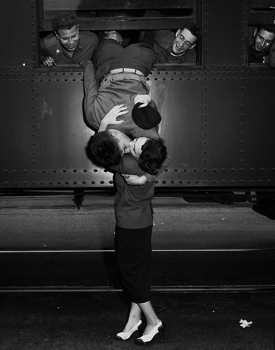
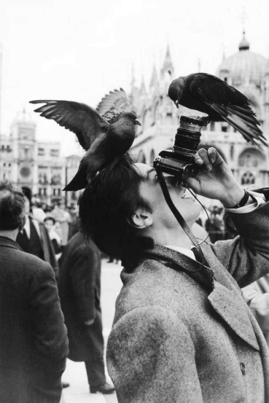
Photographer, Robert Doisneau, finds inspiration in simple moments. I was drawn to these photographs because they capture moments we sometimes miss in life. The little things about these photos stand out. Many of these photographs capture life in France in the 1930s. These photos stood out to me because the message of the photographer is clear throughout.
I love these black and white photographs because they are clean and simple. Though very simple, these photos convey a message to the viewer. Doisneau photographed moments that the viewer could relate to.
0 notes
Photo
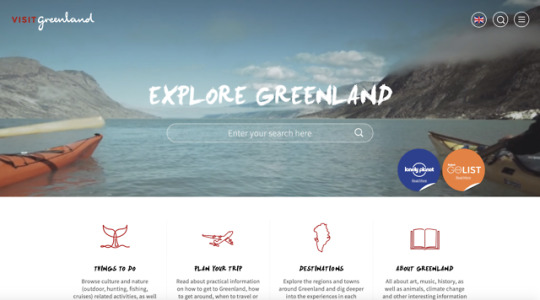

Destination Websites
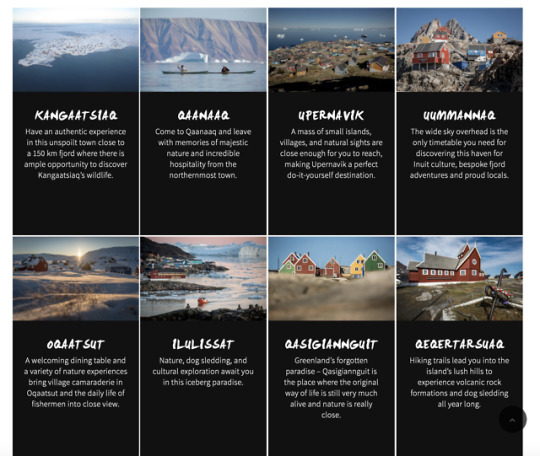
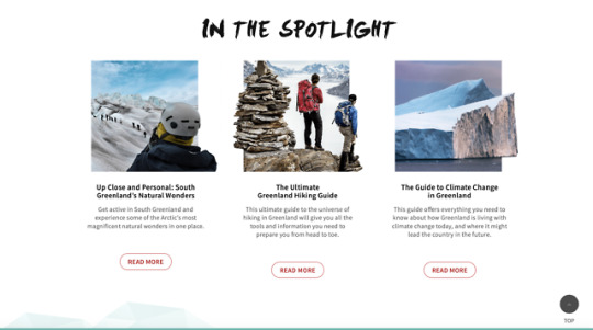
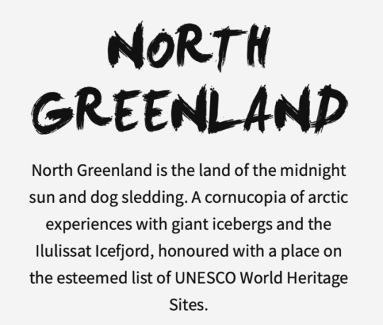
After browsing a few destination websites, I found that the site for Greenland was very appealing. When the site first launches, the viewer is greeted with a video of various activities and adventures one could pursue on a trip to Greenland. The choice in font is very fitting for the images and color scheme of the site. It is evident the designer put a great deal of thought into the color palette on this website.
There are many interesting tabs that allow a potential traveler to find and create the perfect vacation. The small graphics and illustrations on the website are perfect for the minimalist vibe. I find this website is very simple and elegant in its design, which makes it very impressive.
visitgreenland.com
1 note
·
View note
Photo
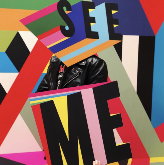

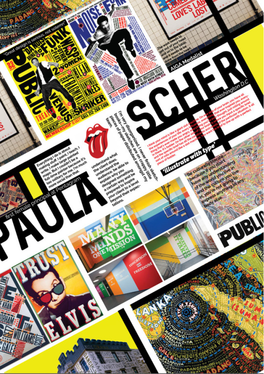
The first design firm I found was Sagmeister & Walsh. Sagmeister & Walsh is a creative agency based in New York City. They are a full-service studio creating strategy, design & production across all platforms. We specialize in brand identities, campaigns, social strategy & content creation, commercials, websites, apps, books, environments, and more. After exploring their website, I pulled images of my favorite projects they’ve done. Additionally, the design of their website was so unique and I spent more than twenty minutes just looking through the pages. This firm was begun by Stefan Sagmeister and Jessica Walsh. Stefan is a designer and art director from Austria who currently lives and works in New York City. He has worked for the Rolling Stones, The Talking Heads, Lou Reed, and The Guggenheim Museum, among many others. And Jessica is a designer and art director living in NYC working for clients such as Jay-Z, Barneys, The New York Times, Levi's, and The Museum of Modern Art, among many others. The work that is featured on their website definitely reflects their design and their clientele.
The second design firm I found was a more established designer named Morag Myerscough. She is considered one of the UK’s most prolific designers. Her style is easily identified by incredibly bold colors and shapes. Her clients range from Zynga in San Francisco to the British Council in Burma. “It’s about mindset and trying to create something for people to feel they are part of.” She is known for many oversized works and beginning her works by hand. Her works are usually featured in public settings and catch a viewer’s eye immediately. These two studios are very different in the techniques and styles.
2 notes
·
View notes
Photo
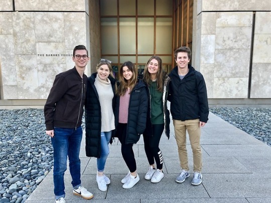
The Barnes Foundation
When I decided to pursue Graphic Design in college, I was unaware of how many different facets there truly are. This trip to the Barnes opened my eyes to the life of an In House Designer. I was blown away by the amount of work the designers put into what appears to be a simple invitation. It never crossed my mind that one day I will need to consider what type of paper I want my designs printed on.
The examples they showed us all displayed very consistent design, which is to be expected when there are only two designers working on a project. I was surprised to hear that they are limited in what they can do with paintings in their advertisements; moreover, that they were limited to some “creative cropping.” I throughly enjoyed this trip and all the fantastic examples of design that were shown. This type of design is something that interests me and I will keep in mind for the future.
3 notes
·
View notes
Photo
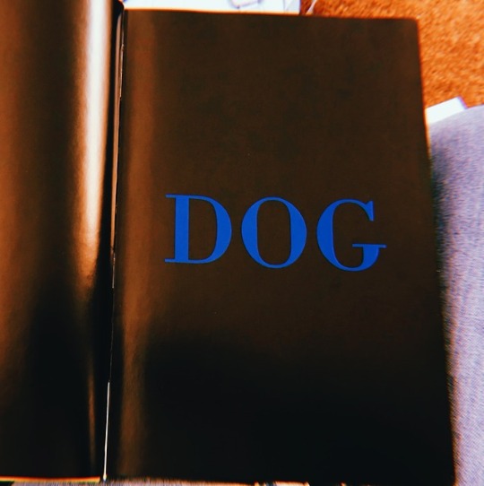
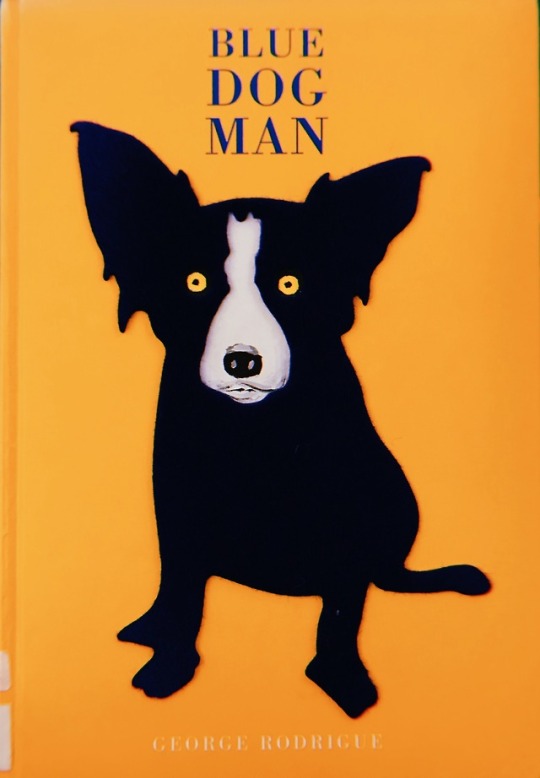
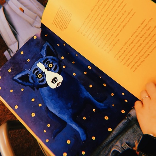
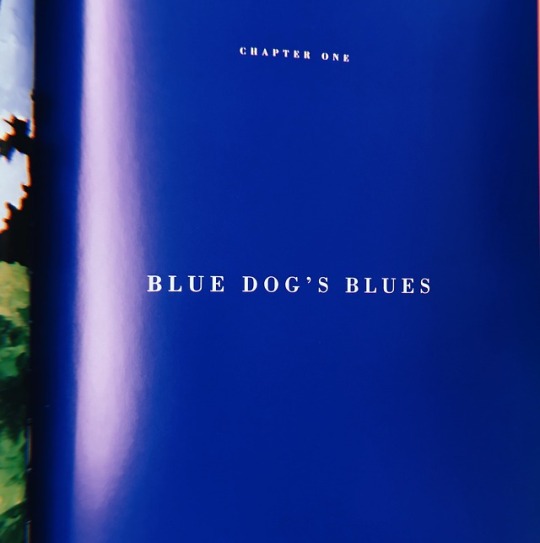
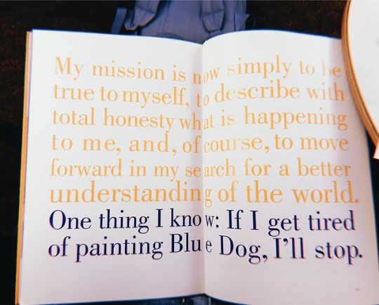
Book Design
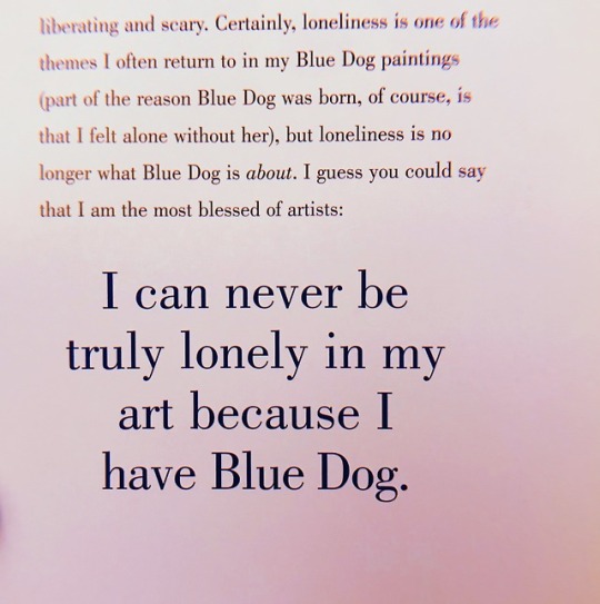
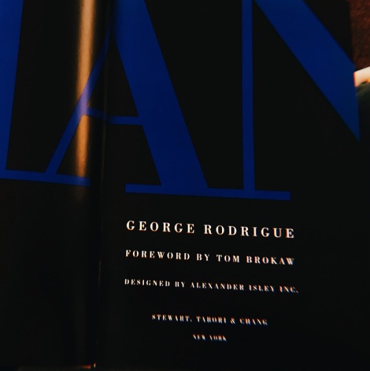
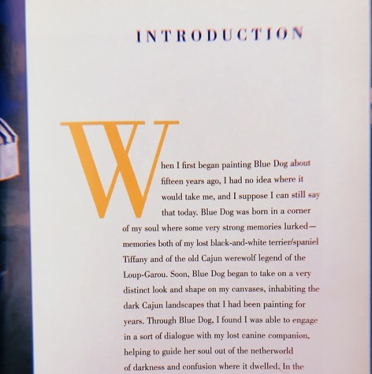
I was immediately attracted to this book, Blue Dog Man. This book is a compilation of paintings by George Rodrigue that feature his infamous blue dog. I think I was immediately drawn to this book because of the color scheme, the sharp contrast between the blue and yellow caught my eye. I also find that the type face compliments the colors very nicely. It is interesting to see how the designer incorporated the color scheme into the paragraphs and quotes. There are roughly 100 paintings in this book that feature this blue dog in a variety of settings. The concept of this book is very interesting, this artist is so drawn to this dog that he paints it in a variety of settings. It is evident that Rodrigue is very invested in his art and this blue dog.
2 notes
·
View notes
Photo
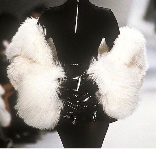
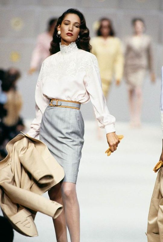
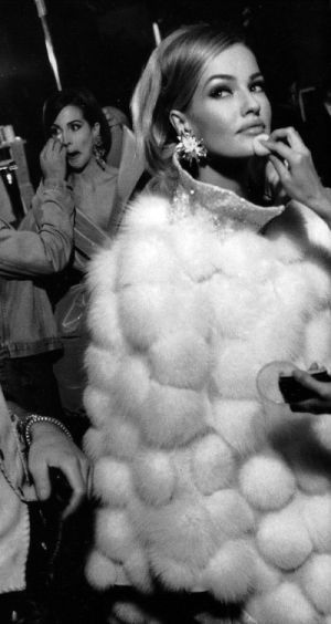
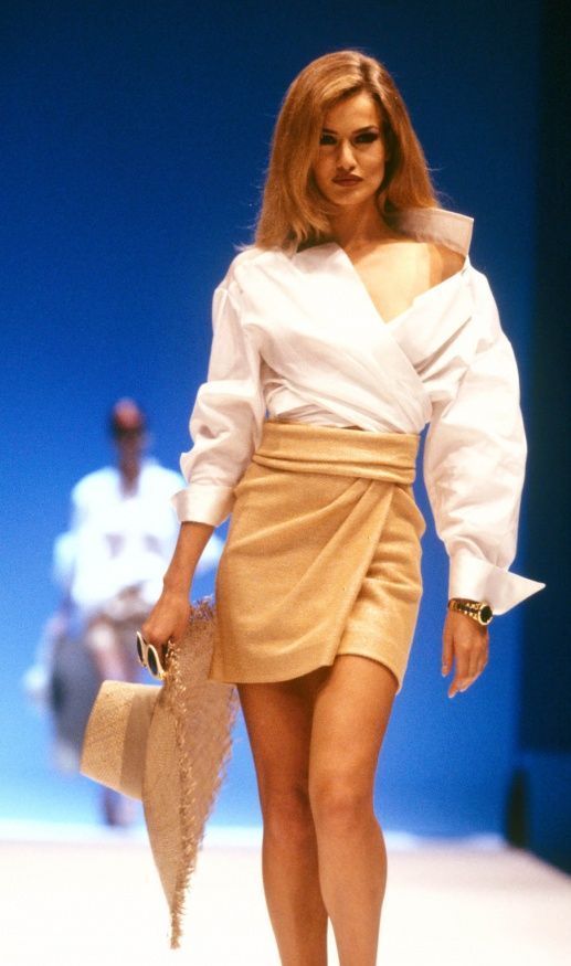
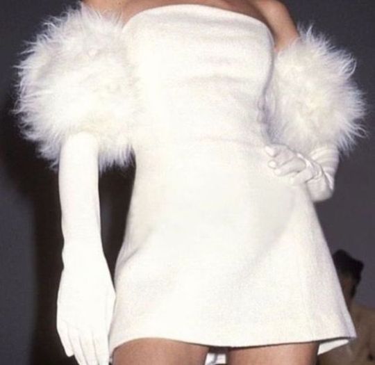
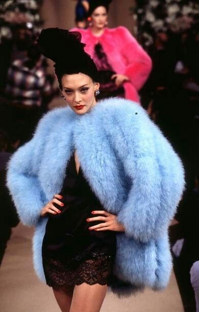
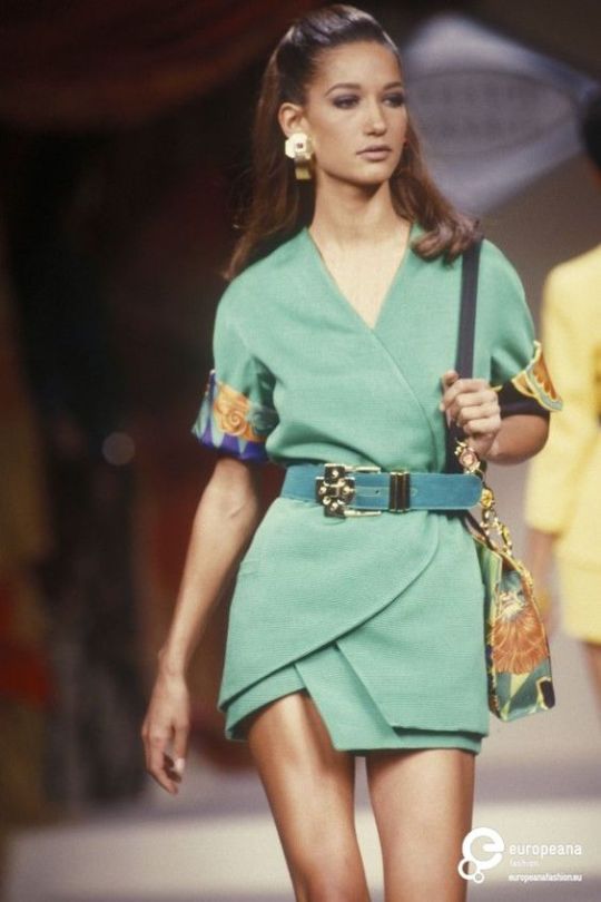
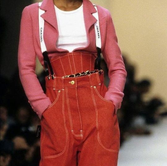
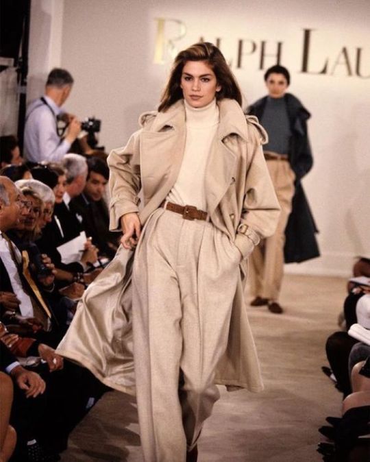
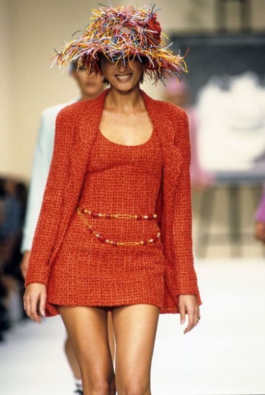
Fashion Design
Fashion Design is something that plays a role in our lives everyday. I was really drawn to these pieces because they are all so unique. Each is brightly colored and immediately catches the eye. I find that I am drawn to the fashion of the 70s-80s because designers were taking advantage of bright colors and interesting textures. My favorite of the images above is the white wrap shirt paired with the draped beige skirt, this is something I could image seeing now on social media. All of these looks are so different yet have a similar vibe, which is something I really admire. I wish designers were still producing pieces like this because they are timeless.
1 note
·
View note
Photo

DESIGN & EXPLORE.
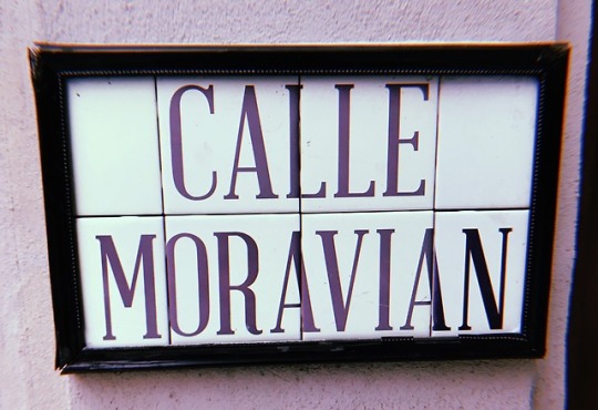
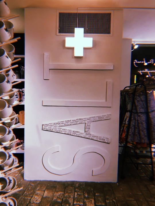
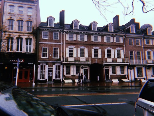
My group traveled to Rittenhouse Square for this assignment. I was really looking forward to this trip as Rittenhouse is filled with interesting design. We hopped on the subway at 34th and began this adventure. After roaming around for a little bit, we headed to Continental Midtown for a late lunch. Chatting about design and sharing some apps, we had a great time! Afterwards, we went into Di Bruno Brothers to find some unique package design. I noticed that most of the packages featured some sort of minimal illustration and a simple type face. Maybe 2019 is the year of minimal design? Overall, this trip was very fun and I would recommend it any one thats looking for a fun afternoon of food and design!
2 notes
·
View notes
Text
Time Management
All of my life I have struggled with time management. Sometimes, I am really on top of my work and find that I have so much extra time for other things. When I plan my weeks ahead in my agenda book, I am very organized all week. When I don’t, my week is a mess. I blame my poor time management skills on the fact that I struggle to get into a rhythm. Though, I do have some things I consistently do to make my days a little easier. I always write my assignments on my laptop right when I get them so that each time I open it I am reminded of the work I have. I also always assure that my dorm is neat, this is such a simple thing that gets me in the mindset to get my work done. Overall, I think that if I really wanted to get into a routine with my work I could, I would just need to dedicate a lot of time to insuring my success.
1 note
·
View note
Photo
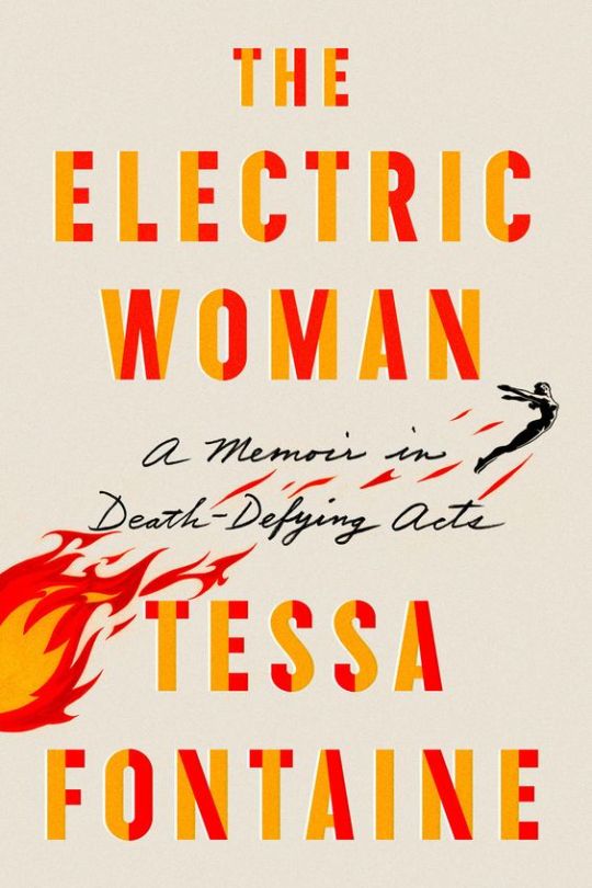


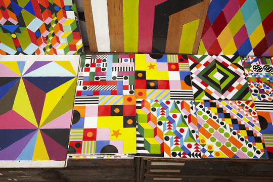
Best of 2018
From movie posters to album covers, each year we are greeted with new designs and new art. 2018 was home to a variety of new design. My personal favorite in this collection of images is the book cover for Tessa Fontaine’s “The Electric Woman.” Immediately, my eyes are drawn to the bright and dynamic colors. They capture me as a viewer and leave me with a sense of excitement. I also really enjoy to illustration featured in this cover, it is so simple yet very powerful and on theme. If I were to pass this book in the store, it would peak my interest and I would be curious to know what it was about. Overall, I always find myself drawn to minimal design that really catches my attention immediately.
1 note
·
View note
Photo
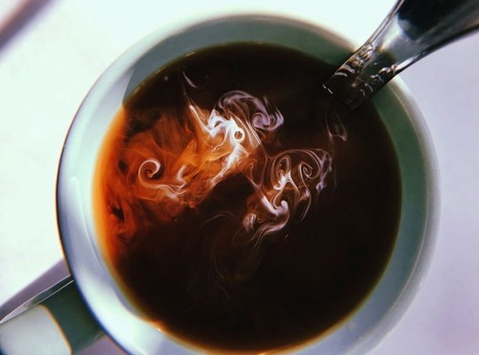
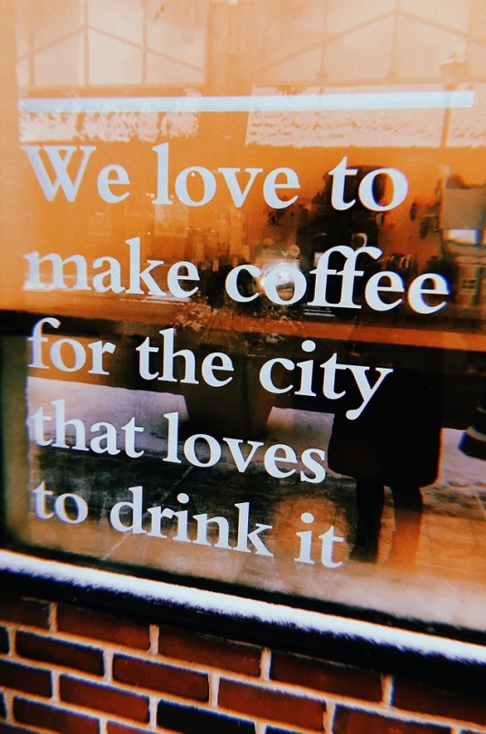
But first, coffee... || Interests in Philly
I would say one of my greatest passions is coffee. Whether it’s from the pot or from the local shop, I’m there. Not only is it a necessity to start my day, but it’s something that brings people together. It gives you the ability to sit down and take a moment from your day. The Penn Coffee Club is a group of students who take time from their studies to enjoy a cup of coffee. They see coffee as a social medium that brings people together and takes their mind off of their studies for just a moment. They meet in locations such as Philomathean Society and the Institute of Contemporary Art for their “cupping classes.” I find this club to have a strong message and something that peaked my interests. They have a variety of partners on their website who send them coffee for their classes, and many members have been featured on online magazines to discuss the club.
Check out some more about the student, coffee connoisseurs of Philadelphia!
http://www.penncoffeeclub.com
1 note
·
View note
Photo
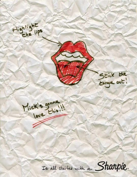
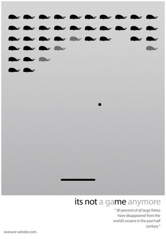
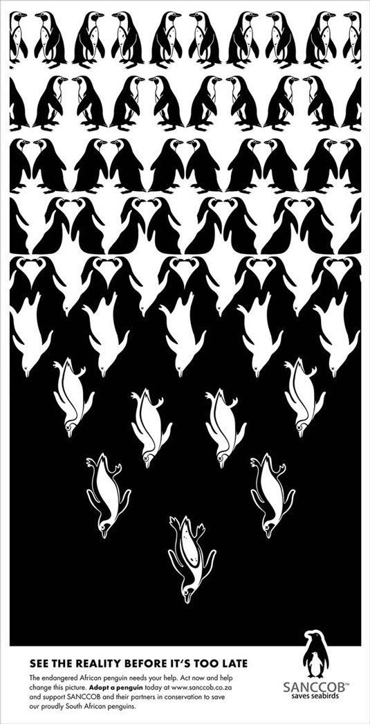

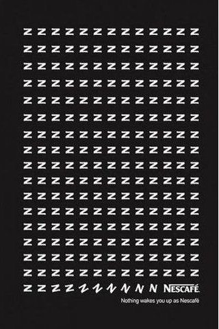
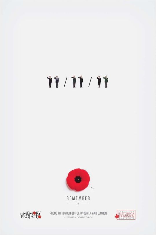
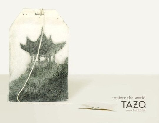
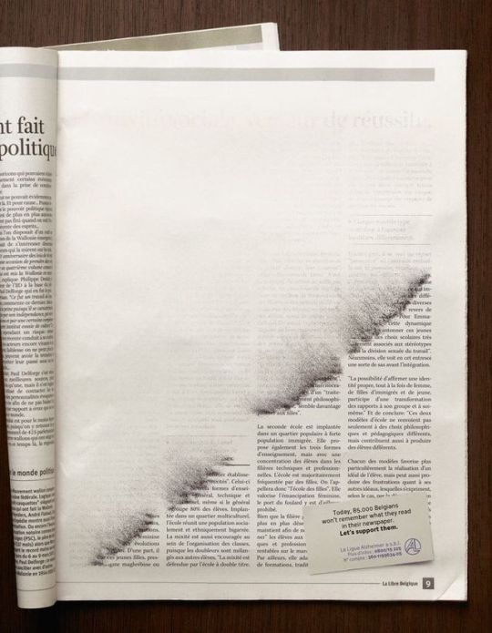
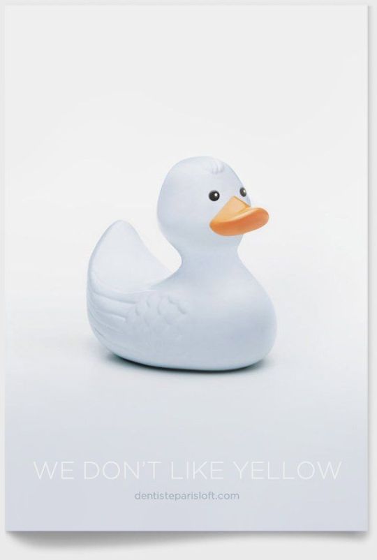
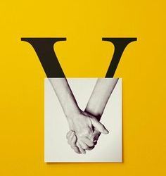
Advertisements
These advertisements stuck out to me because they all feature hidden meanings in their design. The designers achieved this by using certain elements to convey the hidden messages. They made these ads minimal compositions, and there is great power behind it.
I personally found myself attracted to the ads that were for more serious matters. I have a feeling these designers wanted to make their audience think so they made the ads subtle. They draw the viewer in and make them think. These ads don’t make the viewer immediately sad or upset, just makes them contemplate the meaning. I find these ads so compelling because of their minimalistic qualities, its rare to see something so compelling with such little elements to it.
1 note
·
View note
Photo
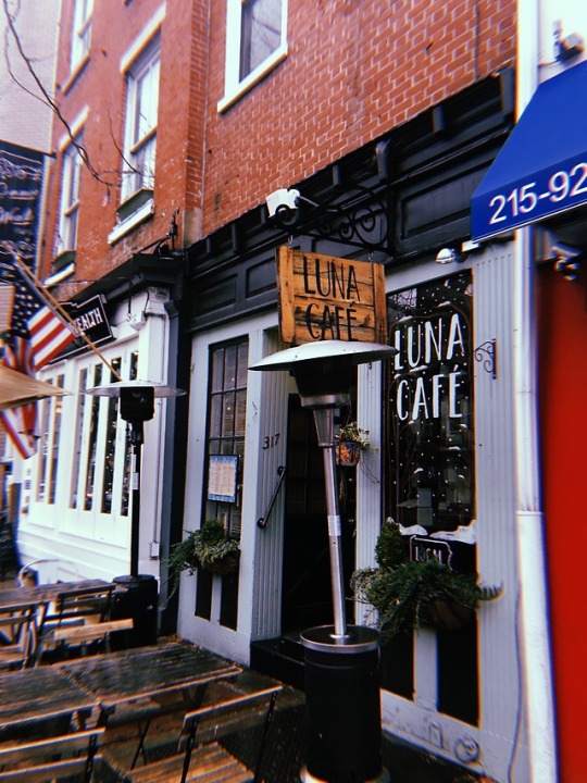
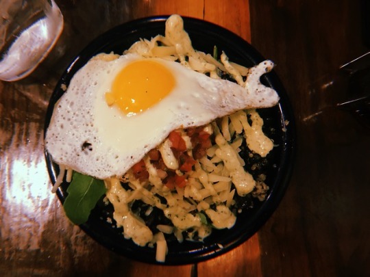
Eat & Explore
On Sunday, we headed to Old City for a nice breakfast. We went to a small cafe on 3rd and Market called Luna Cafe. it featured many unique breakfast choices and had a very cozy feeling. I admire Old City and the restaurants that find their homes in it. Many of these places, Luna Cafe especially, fit right in with the quaint feeling Old City emits. We admired Independence Hall, and the amazing history. Afterwards, we hopped in an Uber and headed back to campus.
3 notes
·
View notes
Photo
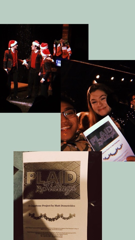
Westphal Event Assignment
For this assignment, I chose to go see the show “Plaid Tidings.” This show was the senior project of Matt Demetrides, it was the sequel to another student written show “Forever Plaid.” This production included a variety of acapella songs but especially featuring Christmas tunes. This show told the story of a semi famous singing group who tragically lost their lives in a car accident but are able to come back to earth to perform once more. The audience filled the Black Box and waited in anticipation for the show to begin. I found that many of the students around me knew someone who helped with the show and wanted to see their friend’s work in action. There were also many family members who came from far and wide to see their son perform in this Christmas show. It is also important to note that it was not necessary to see the first version of the show to understand this one. They did a song that recapped the audience on the first show which made it much easier to follow.
As someone who did theatre for most of their life, I know how much work and preparation goes into a production of this caliber. The four actors performed the entire show without leaving the stage for breaks (besides intermission). I connect multiple elements to my understanding of design. First, the obvious, would be the set design. The set was purposefully arranged to allow the actors to move freely about while still interacting with their surroundings. The props needed for the numbers were strategically hidden for the actors to fetch when needed. In addition, I related the hard work coming together to produce a great end result to my design work. It is so interesting to think about the work that went into creating something, it may not always be evident how much time was spent but we all know that some sort of work had to go into this production. All of the actors, directors, musicians, set designers, and stage directors came together to create one cohesive piece of art that is meant to be enjoyed by any sort of audience. This is similar to the work we do in design, we need to collaborate to create something that will be cohesive and impressive. I really enjoyed this production because it was evident the performers were genuinely enjoying what they were doing.
1 note
·
View note


Photo
Paula Scher
Paula Scher is a graphic designer who has played a vital role in the growth of this art form. She discusses her career and the many things she overcame on her path to success. As a young designer, I took many pieces of advice from this documentary. Many things she said resonated with me and I felt a inspired by what she was saying. At one point she says “You have to be in a state of play to design. If you’re not in a state of play, you can’t make anything.” This was a great reminder that I should be having fun with what I’m doing, that if I am consumed by my work I’m not doing it right. An artist is not able to create unless their thoughts and ideas are able to change and grow to become better.
She talks about her hunger to create and questioning what she will make next. It is the excitement of creating something powerful that drives her work, and I found that to be very interesting. The drive to create new things is something all designers should feel, if you aren’t excited about what comes next then you need to do things that excite you. As a young designer, it is really comforting to see someone who has found such great success in her career and still loves the work she is doing everyday.
1 note
·
View note
Photo
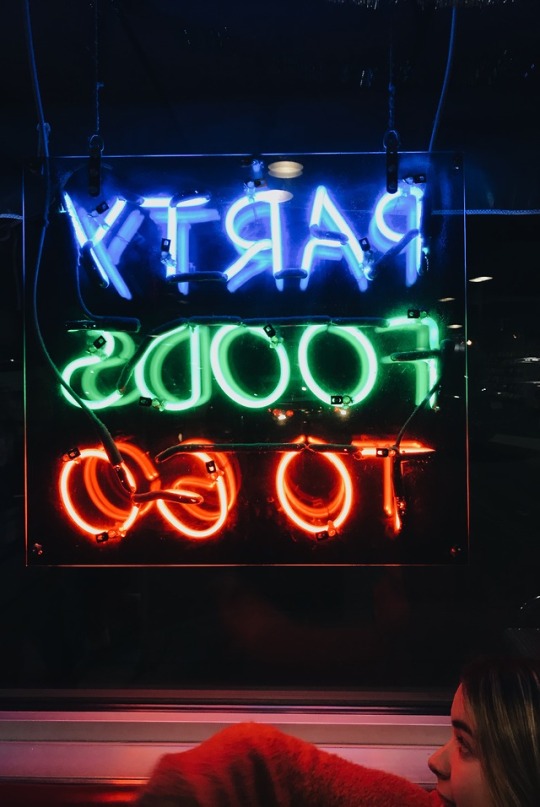

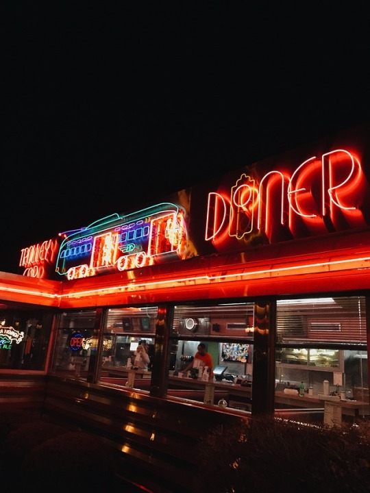
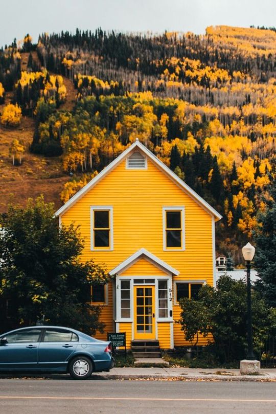
Color Combinations
When looking for images for this assignment I found that many of the photos in my camera roll feature two colors exclusively: red and blue. When I thought about it I realized many of the things in my life are these colors; from my bedroom at home to the stickers that adorn my laptop, these colors have always been very prominent in my life. My favorite image of the ones I chose was one taken at a diner outside of Philly. I really like the way the neon lights glow and have a strong colored halo. These colors are often seen together (RGB) and work together with each other. They each have their own tones but still are able to play off of each other. The warmth of the red compared to the coolness of the green and blue allows for this combination to work. The contrast makes each color pop in its own way.
1 note
·
View note