dailyresources
Daily Resources
Welcome to Daily Resources! This is a blog dedicated of resources related to Photoshop & Tumblr. You will find tutorials, themes, psds and more! Feel free to tag us in your resources, tracking #dailyresources
— If your post doesn't show up in the tag, feel free to send us a message/ask with the link of the post, and we'll take a look.
— Answers will be slower than usual, we are sorry.
5255 posts
Don't wanna be here? Send us removal request.
Last Seen Blogs
freendox-blr-blog
senza titolo
amabile-lucya
Amabilidade
rwby-confess
RWBY CONFESSIONAL

chivebottom4
The Journey of Gunter 084
Note
Hello!
Is it okay if I request some casino/las vegas related dividers? (Like cards, casino chips, anything gambling)
Hi! Absolutely! ♠️♥️♣️♦️ hope you like them! 💖


[Free] Masterlist Headers & Dividers!
Please consider liking or reblogging if you use 💕
164 notes
·
View notes
Text
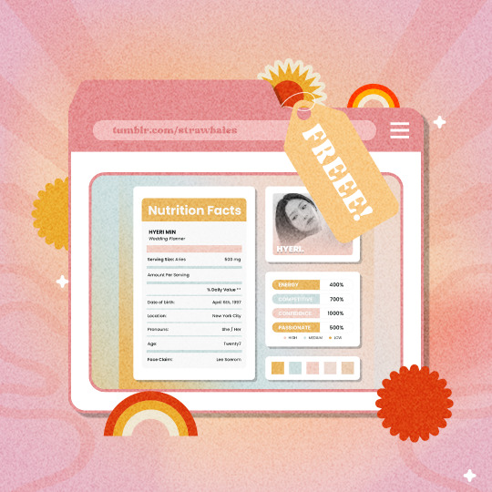

✿ nutrition facts ⸺ psd template !
this is a free / pay what you want template. this psd template requires basic photoshop skills such as clipping mask & changing colors / texts . if you have any questions about the template , please don't hesitate to send an ask . please read my rules to learn what you can / can't do with my resources . click the source link to download the template .
this is nutrition facts inspired graphic template .
the template is free . but if you wish to buy it or tip me , feel free to do so . i'll highly appreciate it !
credit isn’t mandatory but i would appreciate it that too .
please do not claim the template as your own & redistribute them.
font used: poppins.
109 notes
·
View notes
Text
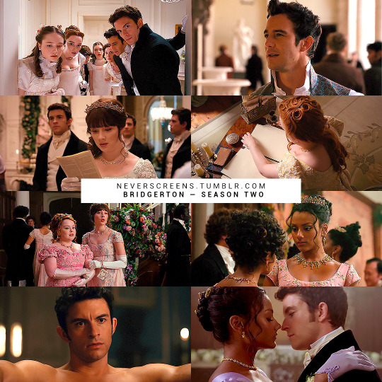
— BRIDGERTON, SEASON TWO.
Capital R Rake, Part One, Part Two, Part Three.
Off to the Races, Part One, Part Two.
A Bee in Your Bonnet, Part One, Part Two.
Victory, Part One, Part Two.
An Unthinkable Fate, Part One, Part Two.
The Choice, Part One, Part Two.
Harmony, Part One, Part Two.
The Viscount Who Loved Me, Part One, Part Two, Part Three.
Download (14,2GB). Like or reblog if it was useful, every interaction shows us that we should keep making screencaps for y'all ♡
42 notes
·
View notes
Text
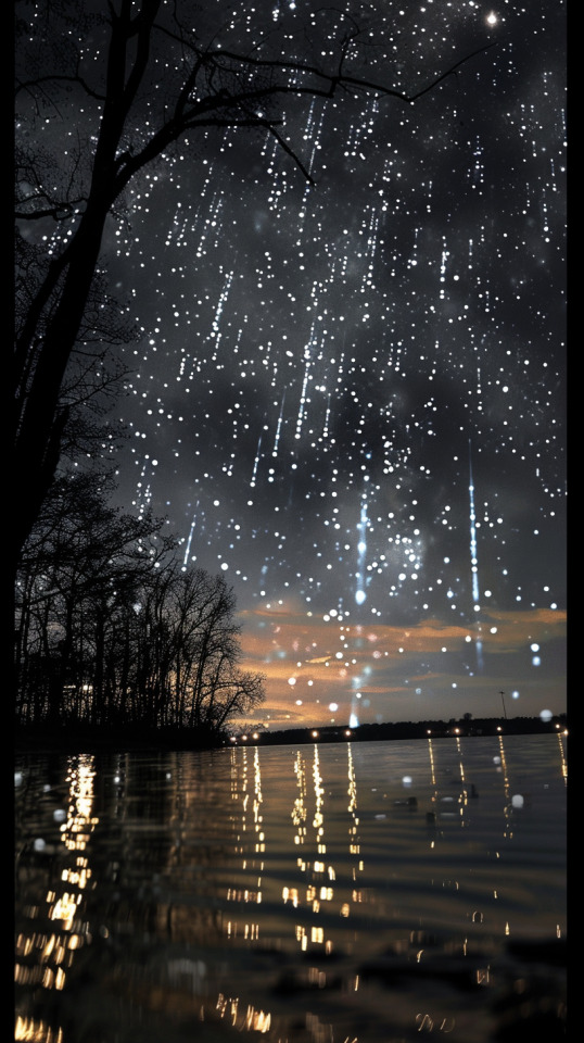
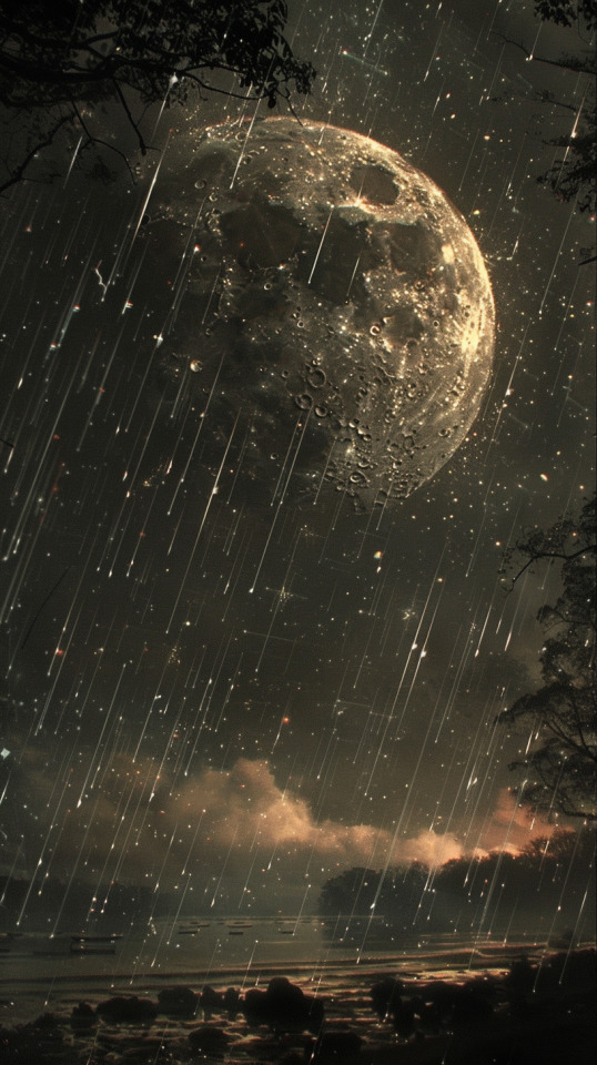

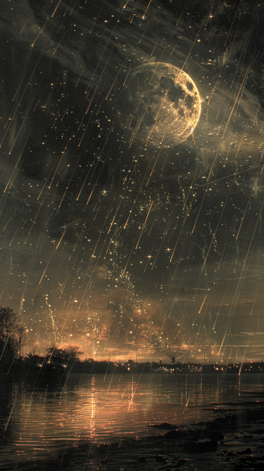
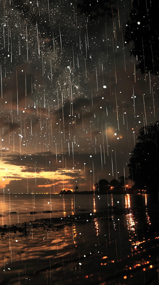
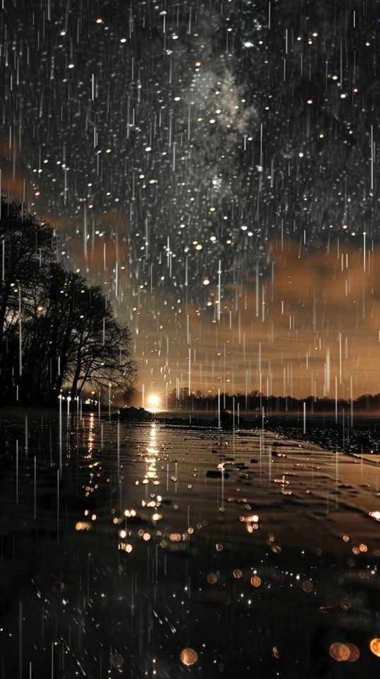
more wallpapers since you guys seemed to like the last set xx
enjoy
13K notes
·
View notes
Photo
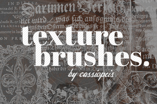
TEXTURE BRUSHES ✨
those are ancient book text & art textures – there are 12 of them.
please like or reblog if using !
do not repost, redistribute or claim as your own !
this resource is free, but if you chose to buy it, i thank you from the bottom of my heart for supporting me ♡♡♡
you can download it here!
517 notes
·
View notes
Photo

𝘀𝗮𝗲𝗿𝗼𝘆𝗶 a template by hesperides .
a simple and easy to navigate psd template . optional uses include rp promos , skeleton / bio graphics , and general character edits . fonts used are hello branch and helvetica neue . colouring psd not included but can be downloaded at divinecomedys .
○ download in source
○ don’t repost behind a paywall
○ like , reblog , credit if you want
224 notes
·
View notes
Note
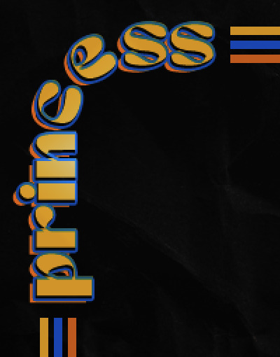
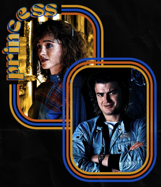
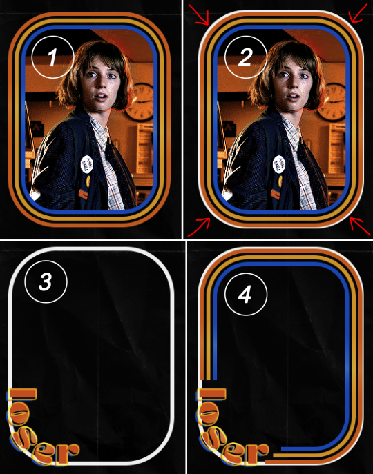
hello! I love your edits and I wanted to know, for the "Steve Robin and Nancy" Gif you posted.. How would I go about doing something like that? More specificly, the bottom two where it says "Height Difference" and where it labels them as "Princess, Jock and Loser"
Thank you! Sorry this took a while to answer. I finally had time to sit down and write this. Link to original post.
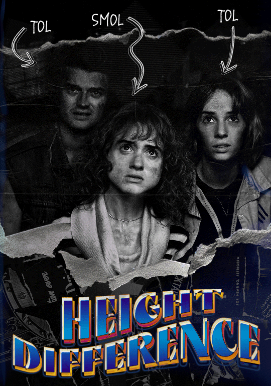

Quick notes:
I'm using Photoshop 2021 on Mac and working in video timeline. Must have basic gifmaking skills and know how to use layer masks. This is primarily a gif layout and text tutorial.
Fonts used in first gif:
Pea Wolfe Tracks — link here
King & Queen — link here
Fonts used in second gif:
Kiera — link here
Post — link here
Ellianarelle's Path — link here
Heina's hurry — link here
I used a light leaks/film texture, ripped paper textures, folded paper textures, and transparent pngs (arrows + post-it notes + smiley face).
We'll start with this gif.
Make your gif! The gif here is 540x600px. I color and sharpen it to my liking. Go to image > canvas size > change height from 600 to 770px. I left the anchor in the middle, though it doesn't really matter.
I drag and drop my folded paper texture and change the layer order so it's under my gif. Then I change the blending mode on my gif to Screen so the texture shows through the gif, but I keep the texture at 100% Opacity and Fill.
Now I move my gif around and add my ripped paper textures. I wanted to give it a sort of poster-like feel to it, so I made more room on the bottom for my main text and ended up with something like this. Blending mode is set to Lighten for the ripped paper textures.
I then use layer masks to hide what I don't want shown and add my light leaks/film texture. Blending mode on light leaks/film texture set to Pin Light, Opacity: 50%, Fill: 70%.
I use Levels and Brightness/Contrast adjustment layers to darken the gif up a bit more, then I add a patterned paper texture. Blending mode for patterned paper texture set to Lighten, Opacity: 100%, Fill: 75%. Result:
Now on to the text!
I'm going to be honest here, a lot of this was clicking around until I settled on something I liked. There's three layers to create this text effect. The font used here is King & Queen.
For the first text layer, the font color is set to black (#000000), font size: 87 pt, leading: 80 pt, tracking: 25.
Layer styles used here are stroke and drop shadow.
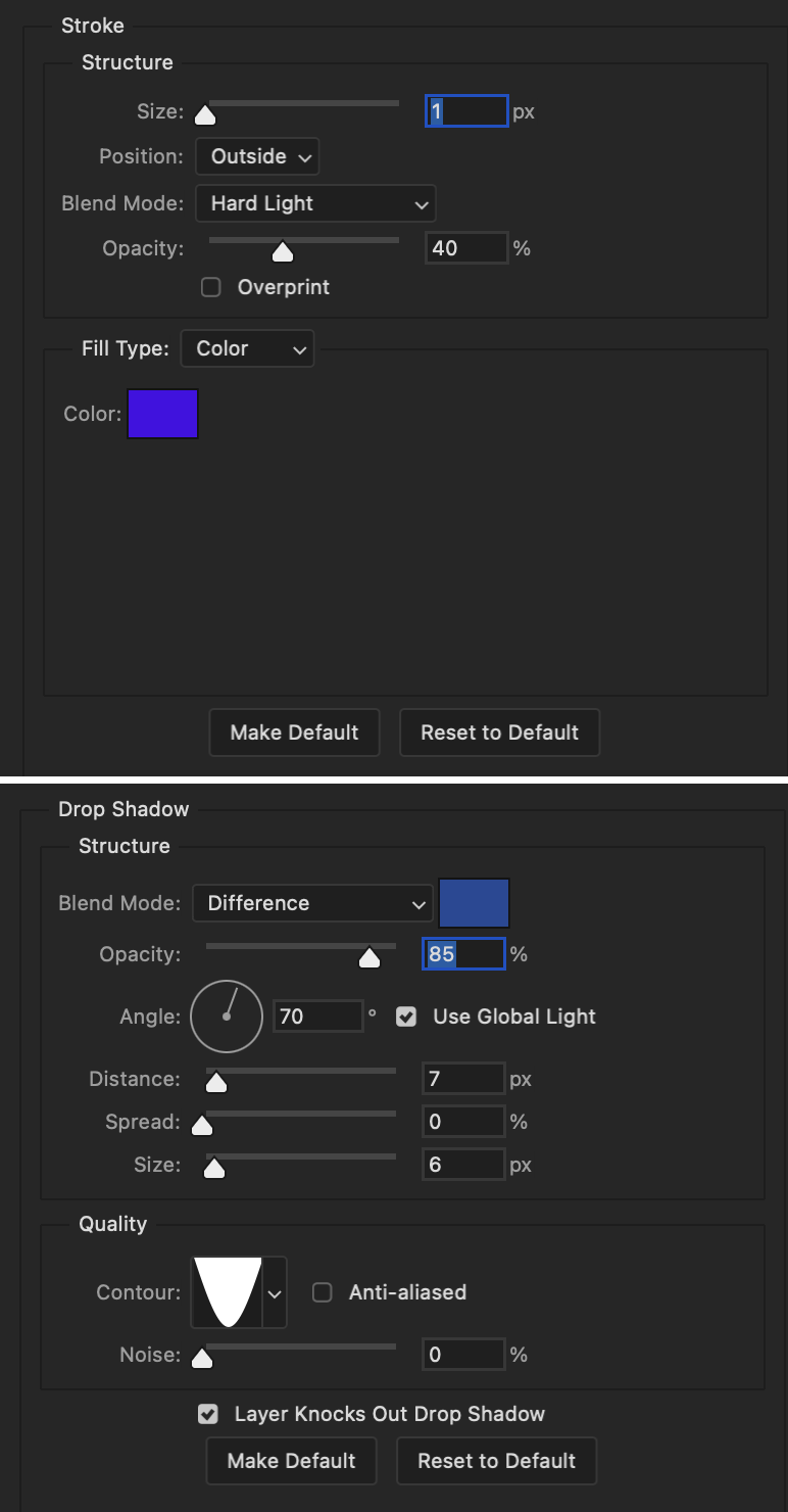
Text Layer 1
Stroke settings:
Size: 1px
Position: Outside
Blend Mode: Hard Light
Opacity: 40%
Overprint: unchecked
Fill Type: Color
Color: #5911ed
Drop Shadow settings:
Blend Mode: Difference
Color: #2d5ba8
Opacity: 85%
Angle: 70°
Use Global Light: checked
Distance: 7px
Spread: 0%
Size: 6px
Contour: Cone - Inverted
Anti-aliased: unchecked
Noise: 0%
Layer Knocks Out Drop Shadow: checked
Blending mode for text layer set to Overlay, Opacity: 100%, Fill: 85%.
Warp text settings:
Style: Wave
Horizontal: checked
Bend: +60%
Horizontal Distortion: +10%
Vertical Distortion: 0%
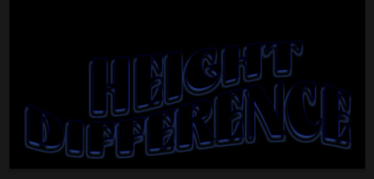
With all those settings applied, the first text layer looks like this:
Duplicate the layer, clear all layer styles, and change the color for the second text layer to white (#ffffff). All other text settings (including warp settings) should stay the same. The only layer style then applied to this text layer is stroke.
Text Layer 2
Stroke settings:
Size: 1px
Position: Outside
Blend Mode: Difference
Opacity: 100%
Overprint: unchecked
Fill Type: Color
Color: #d48f16

Blending mode for the second text layer is set to Difference, Opacity: 90%, Fill: 100%. Nudge the second text layer a bit so the first text layer is a little more visible or move to your liking.
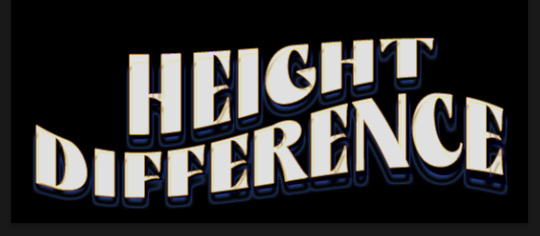
With both those layers active, it looks like this:
Duplicate the second text layer, clear layer styles, and change the color of this third text layer to a dark grey (#1a1919). Again, all other text (and warp) settings should stay the same.
Layer styles applied to this layer are stroke and gradient overlay.
Text Layer 3
Stroke settings:
Size: 1px
Position: Outside
Blend Mode: Difference
Opacity: 100%
Overprint: unchecked
Fill Type: Color
Color: #d48f16
Gradient Overlay settings:
Blend Mode: Difference
Dither: unchecked
Opacity: 100%
Gradient: #cd3f00 > #ffdb5d
Reverse: unchecked
Style: Reflected
Align with Layer: checked
Angle: 90°
Scale: 100%

Blending mode for the third text layer set to Exclusion, Opacity: 100%, Fill: 100%. I also moved the third text layer around, down and to the right a few pixels to give it that 3-D Word Art effect.
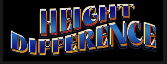
With all three text layers active:
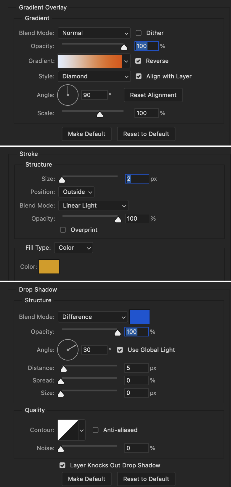
Next are the arrows.
Take your transparent pngs and place them to your liking. Blending mode for these is set to Difference, Opacity: 100%, Fill: 100%.
Command + click on an arrow thumbnail to select all the pixels in that layer. This is why the image must be transparent!
With that selection made and on a new blank layer, right click the selection and click on stroke. Settings for that are width: 2px, color: white, location: center. Move that a couple of pixels over.
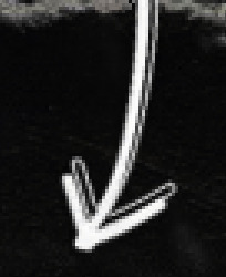
Do this for all arrows for a total of 6 layers for arrows. I group them together to keep my workspace clean, then I duplicate my arrows group with no further changes made to the second group to get what you see in the final gif.
Next is the smaller text. It's three separate text layers for each word, so I can move each of them around to my liking.
Font used is Pea Wolfe Tracks, font color: white (#ffffff), font size: 24 pt, leading: 6 pt, tracking: 25. Bold and italic options checked. I set the blending mode to Difference, Opacity: 100%, Fill: 100%.
And that's it! That concludes the tutorial for this gif!
Now on to this gif.
We'll start with the background gif. There are three separate gifs. You could make them one gif, but I wanted the option to order them differently if I needed to.
All gifs in the background are the size of the canvas: 540x770px. Color and sharpen to your liking, but keep them all black and white. To get the blurry effect go to filter > blur > guassian blur. Set radius to 7.0 pixels. Add this to all three gifs.
Then I add two folded paper textures. Blending mode for one set to Lighten, Opacity: 60%, Fill: 100%. The other set to Screen, Opacity: 70%, Fill: 90%.
I found this tutorial a while back for a halftone effect. They include links to the halftone pattern used here as well as textures and gradient maps not used here.
I'm only using the halftone pattern here.
Pattern fill settings:
Angle: 66°
Scale: 8%
Link with Layer: checked
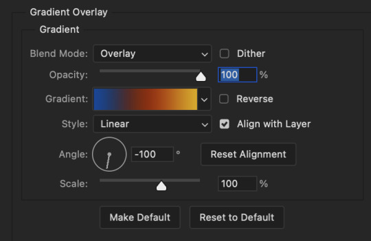
I also added a gradient overlay layer style to the halftone pattern which gives the gifs the color you see above.
Gradient Overlay settings:
Blend Mode: Overlay
Dither: unchecked
Opacity: 100%
Gradient: #0059ac > #a33600 > #e6b801
Reverse: unchecked
Style: Linear
Align with Layer: checked
Angle: -100°
Scale: 100%
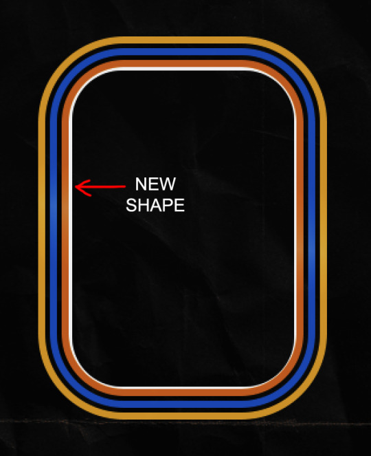
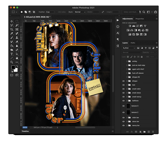
Now on to the square shapes with rounded corners. In the interest of keeping this tutorial short(er), I found this tutorial on youtube that explains how to make squares with rounded corners.
I set my stroke size to 6px, stroke color to white (#ffffff), and fill to no color. I don't use the stroke layer style to make the borders of the shape like in the video! I'm only linking the video to show how to curve corners with square shapes.
Note: Be sure you know how big or small you want these to be and how they're going to fit on your canvas in order to make all the shapes and edit them. It can be tedious to change the settings.
Duplicate and resize to your liking.
In this instance, I wanted to make three squares total, so I had to duplicate twice and resize until I had something I liked.
Settings for the shapes used here are:
Innermost shape: W: 200px, H: 280px, corners: 50px
Middle shape: W: 220px, H: 300px, corners: 60px
Outer shape: W: 240px, H: 320px, corners: 70px
Once I have the size I want for all three shapes, I group them together to make a set and duplicate that group twice, then adjust each set on the canvas for my layout.
What the sets look like all together:
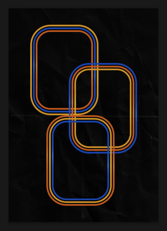
Colors used: orange #e47100, blue #0062d1, yellow #ecac00
To add color to the shapes, either change the color of the shape itself or use layer styles. I used layer styles.
Note: I didn't add the colors until the end after I knew what gifs went where and what color scheme I wanted, but I don't want to add more images than I need to here.
To keep this short, I found this tutorial on youtube that explains how to wrap text around a shape. However, I wanted the text to align on the outside where the white line is and not the green line (left image):
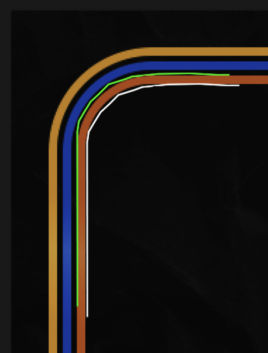
So I created another shape just inside the innermost square and used that as a path for my text (right image). Adjust the text to your liking until you have your text where you want it. Refer to the video tutorial if you need help moving the text along the path!
You don't need the shape path once you have your text where you want it, so use the layer visibility tool to hide it. You can hide your other shapes too so you can work with your text.
Do not delete your shape path!
I duplicate it once I start working with my "jock" text since all the sets are the same size. The "loser" text has to be worked a little differently, but we'll get to that later.
For the princess, jock, and loser text, there are two text layers to create the overall effect. For both layers, font used is Kiera, font color set to white (#ffffff), font size: 60 pt, blending mode set to Normal.
I added a gradient overlay layer style to the first text layer which I'll call the base layer. Opacity for this layer is 100%, Fill: 100%.
Base Layer
Gradient Overlay settings:
Blend Mode: Normal
Dither: unchecked
Opacity: 100%
Gradient: #f0b002 > #e7f0fd
Reverse: checked
Style: Diamond
Align with Layer: checked
Angle: 90°
Scale: 100%
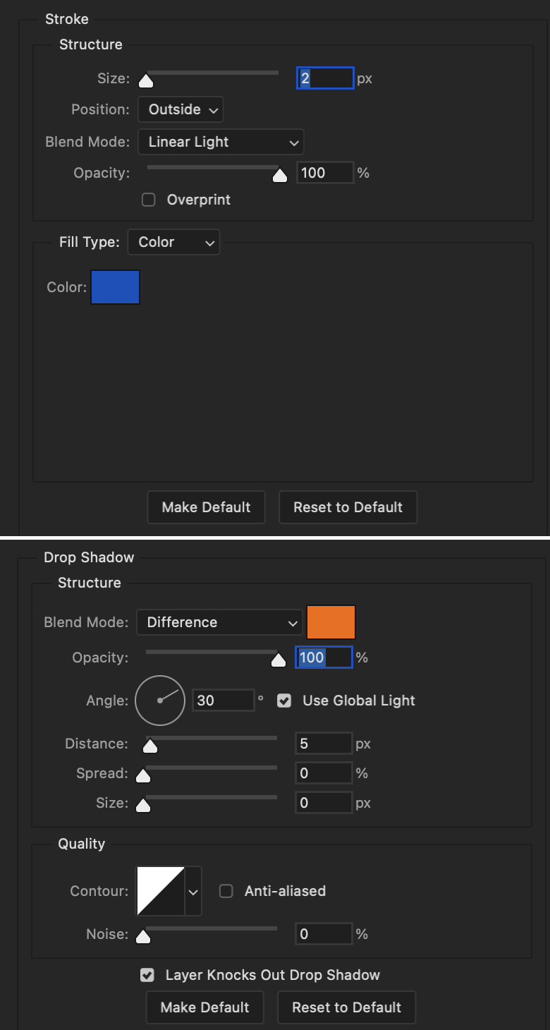
The second text layer is your stroke and drop shadow layer. For this layer, opacity is set to 100%, Fill: 0%.
Stroke and Drop Shadow Layer
Stroke settings:
Size: 2px
Position: Outside
Blend Mode: Linear Light
Opacity: 100%
Overprint: unchecked
Fill Type: Color
Color: #0064cb
Drop Shadow settings:
Blend Mode: Difference
Color: #fb7c00
Opacity: 100%
Angle: 30°
Use Global Light: checked
Distance: 5px
Spread: 0%
Size: 0px
Contour: Linear
Anti-aliased: unchecked
Noise: 0%
Layer Knocks Out Drop Shadow: checked
End result looks like this:

When I make my shapes visible again (minus the one I used as a path), I get this:
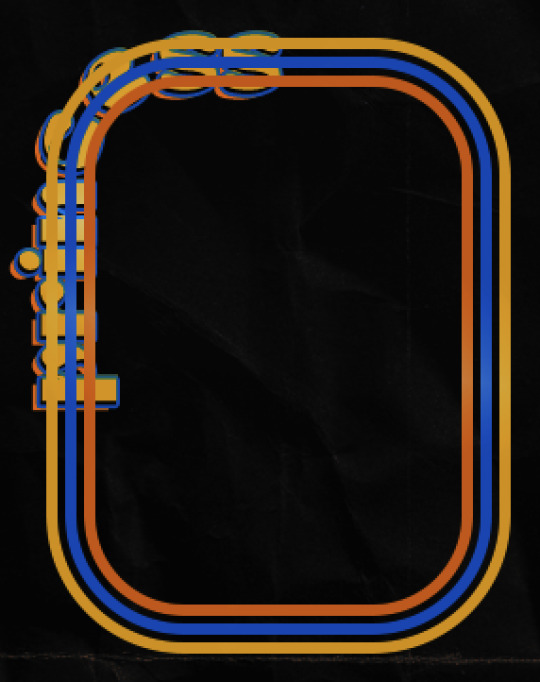
The shapes are clearly in the way of the text, whether they're above my shapes layer or under it. I use layer masks to hide what I want, so the text is legible. It looks cleaner this way and I wanted the text to be a part of the shape itself. I do that for each rounded square.
Now on to my smaller gifs. I like to crop, resize, sharpen, and color separately because my laptop and Photoshop would kill me if I tried to do it all on one canvas. I use the size of the middle shape for my gifs (220x300px), so I can have a little wiggle room when adjusting. I then use a layer mask to hide the parts of the gif that are outside of the shape.
A quick way to do this is to command + click on the thumbnail of the innermost square. With that selection made, I got to my gif layer and add a layer mask. Sometimes you need to invert it. Use command + i with the layer mask selected (not the gif) to invert the layer mask.
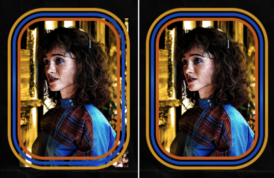
I repeat this process with my Steve and Robin gifs. I have to go back and forth with all the layer masks to hide parts of the gif/shapes I don't want for each set. It's kind of a long process, but not all that difficult. I label and group my layers together as I work to keep things clean and it helps me keep track of what I edited and what needs to be edited when it comes to things like this.
The picture below shows where I hid the bottom right corner of Nancy as well as the shapes that make up her set using layer masks. I also did this with the Steve and Robin sets, hiding the bottom left corner of Steve.

Similar text settings used for jock. The gradient overlay layer style for this base layer is different than that of princess because of the positioning of the text. Again, same as princess, two text layers are used here. Blending mode, opacity, and fill for both are the same as the princess text layers as mentioned before.
Base Layer
Gradient Overlay settings:
Blend Mode: Normal
Dither: unchecked
Opacity: 100%
Gradient: #007aec > move bottom middle dot to 80% > #e7f0fd
Reverse: checked
Style: Diamond
Align with Layer: checked
Angle: -140°
Scale: 100%
Stroke and Drop Shadow Layer
Stroke settings:
Size: 2px
Position: Outside
Blend Mode: Linear Light
Opacity: 100%
Overprint: unchecked
Fill Type: Color
Color: #a05700
Drop Shadow settings:
Blend Mode: Difference
Color: #ffba00
Opacity: 100%
Angle: 30°
Use Global Light: checked
Distance: 5px
Spread: 0%
Size: 0px
Contour: Linear
Anti-aliased: unchecked
Noise: 0%
Layer Knocks Out Drop Shadow: checked
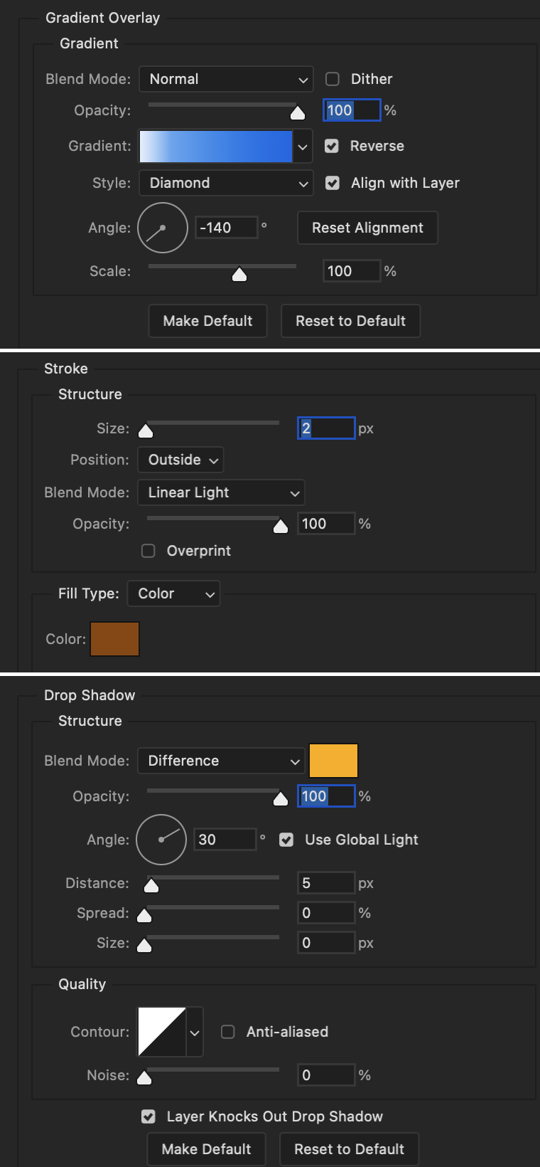
Image 1: We start with Robin.
Image 2: To make the loser text, I had to create a new path.
Image 3: I make it so the text is on the inside of the path instead of the outside. (Hint: Refer to video tutorial if you don't know how to do that.) I then adjusted the tracking between the letters in the word "loser" so they didn't look so squished together.
Image 4: Then I use layer masks to hide the parts of the shape I don't want shown.
You can then hide the path or delete it. You only need it if you want to adjust the placement of the text. I keep it (hidden) just in case.
Text settings for loser are just like those for princess. Blending mode, opacity, and fill are also the same.
Base Layer
Gradient Overlay settings:
Blend Mode: Normal
Dither: unchecked
Opacity: 100%
Gradient: #eb6400 > #e7f0fd
Reverse: checked
Style: Diamond
Align with Layer: checked
Angle: 90°
Scale: 100%
Stroke and Drop Shadow Layer
Stroke settings:
Size: 2px
Position: Outside
Blend Mode: Linear Light
Opacity: 100%
Overprint: unchecked
Fill Type: Color
Color: #e1a900
Drop Shadow settings:
Blend Mode: Difference
Color: #0068de
Opacity: 100%
Angle: 30°
Use Global Light: checked
Distance: 5px
Spread: 0%
Size: 0px
Contour: Linear
Anti-aliased: unchecked
Noise: 0%
Layer Knocks Out Drop Shadow: checked
Next are the post-it notes! This is probably the easiest part of making this gif. You just have to repeat this process for however many post-it notes you're making.
Image 1: To start, place your transparent post-it note where you want it. You can also rotate it if you'd like.
Image 2: Then create a text layer and write what you want. Font used here is Post. I wanted this text underlined to give emphasis, so I click on the underline option. I also adjusted the leading because I wanted more space between the word and the line. Rotate the text so it looks like it's written on the post-it note.
Note: It looks better if you choose a font that looks handwritten.
Image 3: I wanted another line to give emphasis to the "Dingus!!" text and make it seem more handwritten. I use the line tool to create another line.
Image 4: Then I adjust that line to my liking.

Fonts used for notes: Post, Ellianarelle's Path, and Heina's hurry
Repeat this process for all post-it notes!
That finishes the tutorial! (And I hit the 30 image limit lol.) I hope this helps. If you have any further questions, feel free to send an ask or IM and I'll try to answer to the best of my ability.
Happy photoshopping!
139 notes
·
View notes
Text
GIFMAKERRESOURCE/TORTUREDPOETS FONT PACK #20
I do not own these fonts, so there is no need to credit me, but please like or reblog if you found this helpful!
DOWNLOAD HERE
58 notes
·
View notes
Text

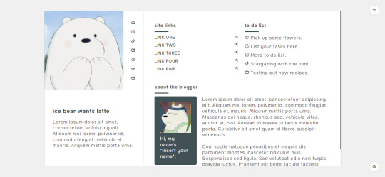

Theme — Latte by tanaka-drew
Preview/Download
Features:
280x280px sidebar
custom blog title
five custom links
tasks section**
about section with 110x110px about image**
muses section with 70x70px muse image**
option for 450/500*/540px blog posts
option for multiple font families for heading and body
option for 1/0.9*/0.8rem body font size
option for 0.9/0.8*rem uppercase font size
option for hide tags*
option for show tags
Notes:
* denotes default features.
** denotes default features that you have to edit directly into the code.
Sidebar is on position “sticky”. This means that it will stick to top and the succeeding elements are cut if you go beyond your screen but will scroll up when you reach the bottom.
This theme is NPF posts friendly. :D
Neither ask or submit links would show if you don’t allow people to ask you questions or allow people to submit things to you.
I don’t claim any of the fonts, scripts and/or tutorials I used unless stated otherwise. See full credits here.
Support me on Ko-Fi.
146 notes
·
View notes
Note
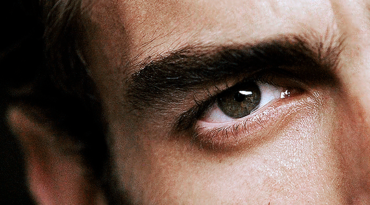
how do you sharpen your gifs???? they're insanely high quality!
Hello, Anon dearest, and thank you so much! ✨ To answer your question properly, I would first have to know which gifset(s) of mine you're referring to because I've made a lot over the years and I often change my sharpening settings, too. It totally depends on what I'm working with at the moment, to be honest. 😅
But, as for the last few sets of mine (this, this, and this in particular), I used these settings:
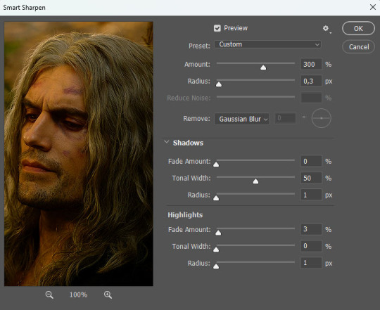
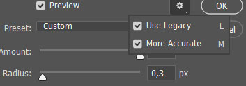
After converting my frames/layers into a smart object, I applied the settings above. Remember to click on the gear icon in the upper right corner and check both 'Use Legacy' and 'More Accurate' as well. This will make your sharpening look more 'natural' and less cakey imo.
Below is a comparison of before and after:
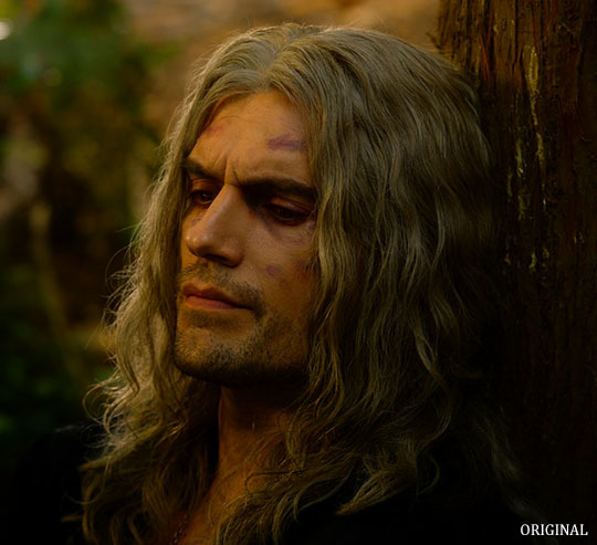
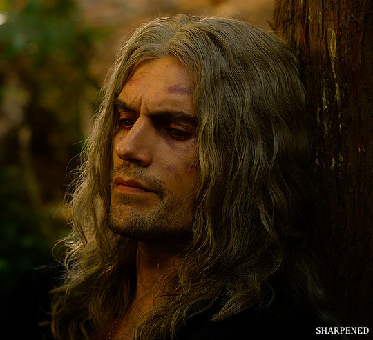
Note: This Geralt screenshot was taken from a 4K (2160p) video. Most videos I work with are at least 1080p or 720p because quality matters.

And here's the final result: colored, brightened, and sharpened.
—
I hope this answers your question. If not, feel free to send me more questions about this kind of stuff. I'm always happy to help out :)
139 notes
·
View notes
Text

COLORING + SHARPENING TUTORIAL
someone asked for a coloring tutorial and my sharpening settings, so here it is! there are also a few tips to achieve more HQ gifs. :)
tutorial under the cut!
FOR HIGH-QUALITY GIFS
FILE SIZES
it doesn’t matter what your sharpening settings are if the file you’re using to gif is too low quality, so i tend to look for the best that i can get when downloading stuff.
usually, movies (+2h) look better if they’re 5GB or more, while an episode (40 min/1h) can look good with even 1GB. the minimum definition i try to find is 1080p, but i gif with 2160p (4k) when available. unfortunately, not every computer can handle 4k, but don’t worry, you can gif with 1080p files just fine if they are big enough. contrary to popular belief, size does matter! which means sometimes a bigger 1080p file is better than a smaller 2160p one, for example.
SCREENCAPPING METHOD
this can too influence the quality of your gifs. as a gifmaker, i’ve tried it all: video frames to layers, directly opening video clips, loading files into stack, and i’ve finally settled down with opening screencaps as an image sequence. with bigger files, it doesn’t matter much what technique you use, but i’ve noticed with smaller files you can do wonders if you screencap (either by loading files into stack or opening as an image sequence) instead of using video clips. for example, this gif’s original video file was only 4GB (so smaller than i’ve usually go for), if you can believe it!
here’s a tutorial for setting up and screencapping with MPV, the media player i use to screencap. again, you can keep using video clips for bigger files, but you’ll find this useful when dealing with dire causes. i don't file loads into stack, though, like the video does. i open as an image sequence (open > screencap folder > select any image > click the image sequence button). just select OK for the speed. this will open your screencaps as a video clip (blue bar) in timeline mode (i'm a timeline gifmaker, i don't know about you). you will need this action pack to convert the clip into frames if you're a frames gifmaker. i suggest you convert them into frames even if you're a timeline gifmaker, just convert them into a timeline again at the end. that way you can delete the screencaps right away, otherwise you will delete the screencaps and get a static image as a "gif".
ATTENTION if you’re a Mac Sonoma user, MPV won’t be an option for you unless you downgrade your system. that is, if you have an Intel chip. if you have M1 Max chip (or even a better one), here’s a fix for MPV you can try while keeping that MacOS, because nowadays MPV is skipping frames in its latest build. or you can use MPlayer instead for less hassle. here are two tutorials for setting and using MPlayer. Windows users are fine, you can use MPV without trouble.
FOR EVEN MORE QUALITY
ADD NOISE
here’s a tutorial for adding noise as a way to achieve more HQ gifs if your original material is too low quality.
REDUCE NOISE WITH CAMERA RAW
instead of adding noise, you can reduce it, especially if your gif is very noisy as it is.
the path is filter > camera raw > detail > nose reduction. i do this before sharpening, but only my video file isn't great to begin with. because it’s a smart filter, you can reduce or increase its opacity by clicking the bars next to its name in the layers panel.
TOPAZ AI
i use Topaz Photo AI to increase the quality of my screencaps when i need to. it’s paid software, but there are… ways to find it for free, usually on t0rrent websites. if someone’s interested, i can make a tutorial solely about it in the future.
SHARPENING SETTINGS
here are my sharpening settings (filter > sharpen > smart sharpen). i sharpen things twice: 500% 0.4px + 10% 10px. here's an action for it, for more convenience. here's a tutorial on how to use Photoshop actions. for animated stuff, i use this action pack.

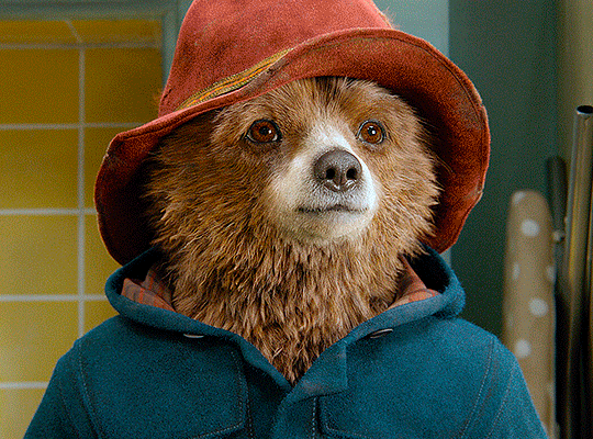
COLORING
here’s the gif i'm gonna use as a base. it’s already sharpened like the way i always do it.

LIGHTNING THE SHOTS
half of the secret of a good coloring is good lightning. i always useCurves (layers > new adjustment layer > curves) and Brightness & Contrast (layers > new adjustment layer > brightness & contrast). the settings depend on the scene you’re giffing, but i always try make my gifs bright and with high contrast to make the colors pop.
CURVES
besides lighting your scene, the Curves adjustment layer has four automatic options that will color-correct it for you. it’s not always perfect and it doesn’t mean you won’t need to do further coloring, but it’s a great start. it’s a lifesaver for most ridiculously yellow scenes. look at the difference! this gif uses the 3rd automatic option (the screenshot below isn't mine btw so that's why the fourth option is the chosen one), from top to bottom. what automatic option you need to choose depends on the gif.

sometimes i like to tweak my Curves layer. not everybody does that, it’s not that necessary and if you’re not careful, it can screw your gif up. to modify your layer by hand, you will need to click and drag points of that straight line in the position you desire. this is the concept behind it:

basically, the lower part of the line handles the shadows, while the upper part handles the highlights of the image. if you pull a highlight point up, the image’s highlights will be brighter. if you pull it down, it will make them darker. same thing for the shadow points. you should play with it to get a grasp of it, that’s what i did when i first started giffing.
BRIGHTNESS & CONTRAST
then i added a bit of brightness and contrast.

CHANNEL MIXER
the scene looked a bit too yellow, so i used the Channel Mixer (layer > new adjustment layer > channel mixer) adjustment layer. here’s a tutorial of how it works. not every scene needs the Channel Mixer layer though, i mostly use it to remove heavy overall tints. in this particular case, the Curves layer got rid of most of the yellow, but i wanted the gif to be just a bit more blue so the Channel Mixer tweaks are very minimal.

SELECTIVE COLOR
now, this adjustment layer i always use: Selective Color (layer > new adjustment layer > selective color). this is THE adjustment layer to me, alongside the Curves one. this is how it works:

ie, you can separately edit a color this way, giving it tints. for this gif, i wanted to make the colors more vibrant. to achieve that, i edited the selected colors this way:
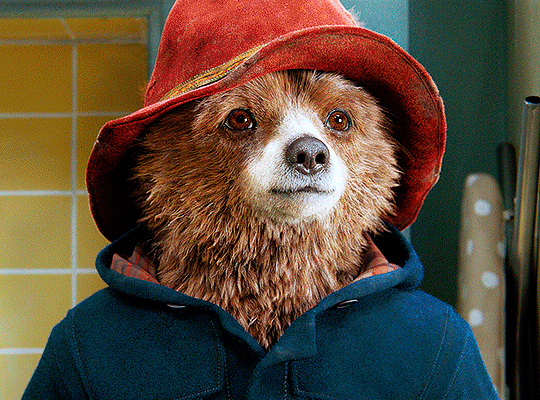
for the reds, i added even more red in them by moving the first slider to the right, making the color more vibrant. for his hat to have a more warm tint, i added yellow to the reds (third slider, moving it to the right). finally, to make the reds stronger, i moved the last slider to the right (more black).
for the yellows, i made them brighter by adding white to them, thus making the tile wall and Paddington more bright as well.
for the cyans and the blues, i just added the maximum (+100) of black that i could.
i wanted for Paddington's nose to be brighter, so i added more white to the whites.
lastly, i added depth to the blacks by increasing their own blackness.
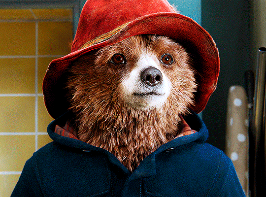
you should always play with the Selective Colors sliders for a bit, before deciding what you want or need. with time, you will automatically know what to change to correct the color grading. it all takes practice!
HUE/SATURATION
i don’t know if you noticed, but there are some green spots on the blue wall behind Paddington. to correct that, i added a Hue/Saturation adjustment layer (layer > new adjustment layer > hue/saturation) and made the saturation of the greens 0%, making that unwanted green disappear from the background.

while the green spots on the wall are specific for this gif, i use hue/saturation a lot to tweak, well, hue and saturation. sometimes someone’s skin is too yellow, i made it redder by tweaking the reds and the yellows, or vice-versa. the hue bar follows the rainbow bar, so the maximum settings (+100 and -100) give the selected color to change its hue to something more red or pink (the rainbow extremities). changing hue can give pretty whacky results, like turning someone’s skin tone to green, so you will need to play with it to get the hang of it. you can also tweak the opacity of your hue/saturation layer to further improve your gif’s coloring. i didn’t do it in this case, the opacity is still 100%. the reds and the blues had their saturation increased to make them pop just a bit more, without affecting the other colors.
COLOR BALANCE
the highlights of the gif still had a green tint to it due to the automatic correction of the Curves layer, so i used Color Balance. this is how it works: instead of giving specific colors some tints, you can give them to the shadows, highlights, and mid-tones. if your shadows are too blue, you counterbalance them with the opposite color, yellow. same thing with the cyan-red and magenta-green pairings. in my case, i added a bit of magenta.


B&W GRADIENT MAP
now, if this gif was a dish, it’s time for the salt and pepper. i always add a Gradient Map (layer > new adjustment layer > gradient map) (black to white gradient) with the Soft Light blending mode, thus giving my shadows more depth without messing with the mid-tones and highlights. it also doesn’t “deep fry” (you know those memes?) the gif too much by adding even more contrast. usually, the opacity of the layer is between 30% to 70%, it all depends on the gif. it always does wonders, though!
COLOR FILTER
finally, i like to add Color Filters (layer > new adjustment layer > color filter) to my gifs. it’s very handy when giving different scenes for the same minimalistic set because it makes them kind of match despite having completely different colors. in this gif’s case, i added a “deep blue” filter, opacity 50% density 25. you can change the density and the opacity of the layer for further editing, again, it all depends on the gif.

VIBRANCE
if i feel like it, i add a vibrance layer (layer > new adjustment layer > vibrance) to make the colors pop. this can ruin your coloring sometimes, especially when regarding skin color, so be careful. i didn't do it in this gif because i felt i didn't need it.
TA-DA! 🥳
AN OTHER EXAMPLE
the color grading of the original scene it’s pretty good as it is, to be honest. let’s see a worse scenario, a VERY yellow one:
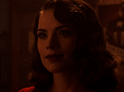
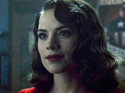
no channel mixer this time because the automatic curves option dealt with the yellowness, but you can see it made the gif too green. i needed to correct that with the following adjustment layers:
curves (automatic option) (gif 2) >> same curves layer (tweaks) (gif 3) >> brightness & contrast (gif 4) >> hue/saturation (tweaked cyan+blue+green) >> selective color >> color balance (gif 5) >> b&w gradient map >> (sepia) filter >> vibrance (gif 6)
i added a hue/saturation layer to remove the blues & greens before my selective color layer because i thought that was more urgent than tweaking the tint of all colors. color balance (gif 4) was the real hero here, though, by removing the green tint. the selective color layer was meant to make the red pop more than anything else, because the rest looked pretty good, especially her skin tone (despite the green tint). you can notice that tweaking the curves layer (small gif 3) also helped A LOT with the green problem.
tl;dr 😵💫😵💫😵💫
here's a list of my go-to's while coloring and lightning gifs. it's not a rule, just a guide. there are gifs in which i don't use all these adjustment layers, or use them in a different order. it all depends!
1. curves (automatic option + tweaks)
2. brightness & contrast
3. channel mixer
4. selective color
5. hue/saturation
6. color balance
7. b&w gradient map
8. color filter
9. vibrance
i'll suggest that you study each adjustment layer listed for more info, either with other Tumblr tutorials or YouTube ones. the YouTube ones focus on images, but you can translate what they teach to gif making very easily. you can ask me to further explain any adjustment layer, too! i was brief to keep this short (which i kinda failed lol).
feel free to ask me for clarification or something else about gifmaking wise, i always like to help. ❤️
315 notes
·
View notes
Text
BLACK SAILS ICONS link here
35 icons. like if you save. reblogs are appreciated.
commission · tips
17 notes
·
View notes
Text

One last gift for my 4k celebration -- Here are 7 PSDs for download. I've also put together a gallery with the image previews.
Please like/reblog if using. You can make any changes you want, use as a base, etc. but Do not repost or claim as your own!
Download: [MEGA]
Gallery for preview images: [PostImage]
Also check out my previous set of PSDs and gif textures!
Under the cut is additional links to my posted gifs/edits made using these PSDs.
Horizon + Dawn PSDs: (x)
Fe PSD: (x)
Noir PSD set: (x)(x)
Summit: (x)
30 notes
·
View notes
Text


theme thirty-four ♡ by userbru
live preview | code | support me on ko-fi?
540px posts
300px sidebar image (optional) /*if you don't want a sidebar image, just don't upload one
50px desktop icon (top menu)
5 sidebar links
custom desktop title & description
very minimal customization needed ♡
credits on code
recommend doing a theme reset before installing this theme
how to change sidebar link icons
i accept theme commissions ♡ for more information, dm me on my main @fadeintoyou1993
here's a masterlist of all of my themes w/ the npf fix (updated 09/april)
176 notes
·
View notes
Note
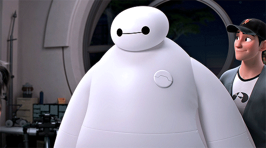
hello! im a newby gimaker and i want to follow your tutorial on sharpening but i dont know how you got to the photoshop page you started from where it looks like a video timeline. can you tell me how you got there? <3
Hey!!
Welcome to the wonderful world of gifmaking <3 yes i can lead you through to that point. I have a mac so this might look different for you, but all the steps stay the same - I just shifted from windows to mac so i know this xD
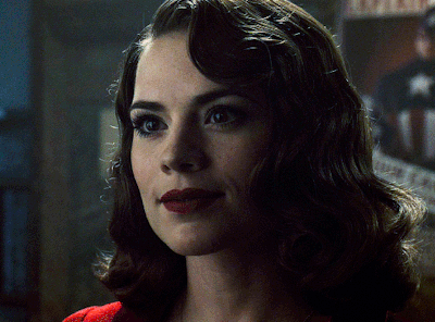
I'm going to show you how to do this on this gif:
I prefer to use screenshots for my gifs (I also don't know how else to make them), so I use Mplayer for that. I used to use MPV player but that stopped working with my new computer system.
First, you want to make sure that you're using a high-quality file. If 1080p is available to you, use 1080p at the very least. This will make sure your gifs are crisp and sharp.
Open your file with Mplayer. Then find the bit that you want to gif. I sometimes search forward by frame by using the ">" key. Once you're at the start point of your desired gif, pause the video. Then, Cmd/Ctrl + Shift + S to start screenshotting. The video will start to play slowly as the screenshots are captured. (They go to the desktop automatically but you can change that in interface settings).
The rest of the tutorial is under a cut:
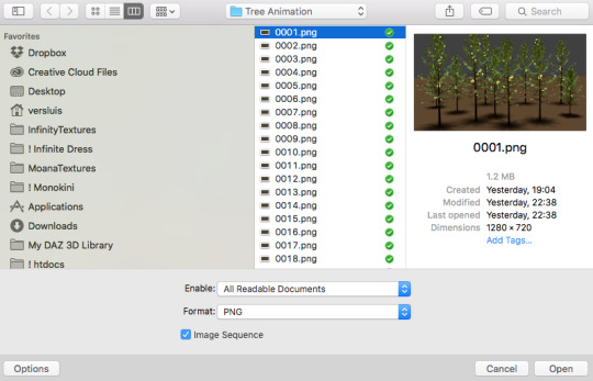
Once you get your screenshots, you're going to go Photoshop. File > Scripts > Load Files Into Stack.

You're going to get a dialogue box. Click Browse and load the screenshots that you want. This is what that looks like when you finish:
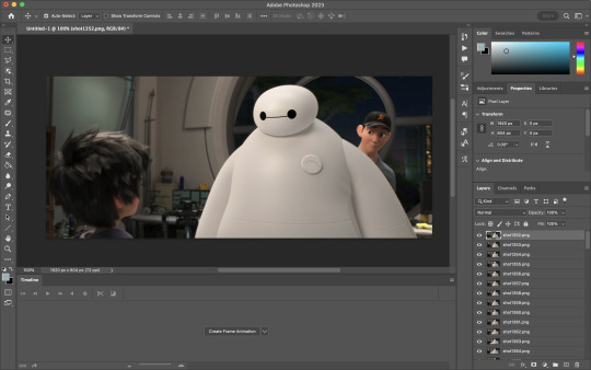
Next, you're going to crop your gif, using the crop tool. You can press C on your keyboard for this or use the tool with this icon in the sidebar.

For this, I'm using an aspect ratio of 540 x 400:

Click that checkmark to crop. Once you do, we're going to resize the image. Use the Cmd/Ctrl + I function to bring up this box. For tumblr gifs, you want to change the width. The height doesn't really matter but if the width doesn't match up, Tumblr is going to fix it for you and it'll look funky. Per row:
1 gif , we use 540px
2 gifs, 268px each
3 gifs, 177, 178, 177 px
We're just doing one, so I'm using 540px.

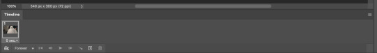
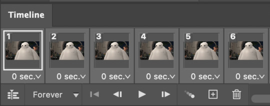
Now, you want to make sure you can add the timeline. In the top bar, go to Window > Timeline
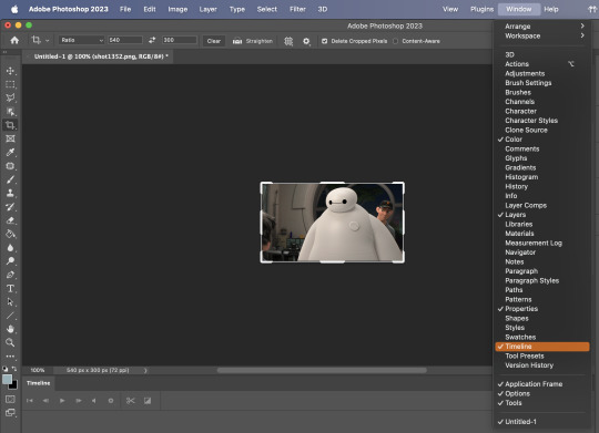
This will bring up the timeline.

From there, click "Create Frame Animation" (you might have to press the arrow in the timeline bar first.)
It's going to look like this:
We're going to use those three lines in the corner of the picture above. The first option we'll select is "Make Frames From Layers"
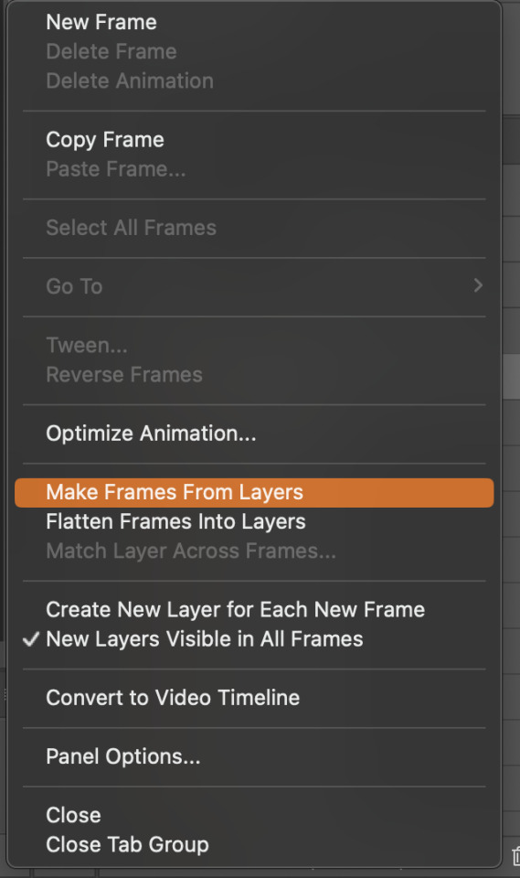
That looks like this:
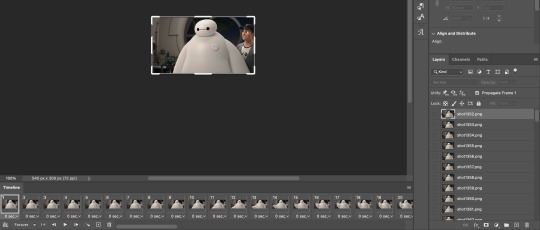
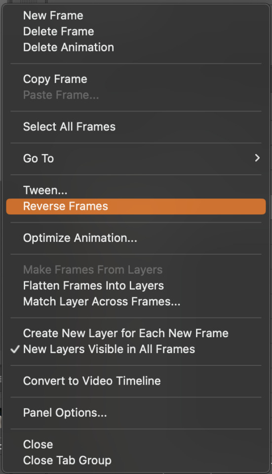
Now, when these load in, you may notice that they're all in reverse. To make them go back in order, we're going to go back to that menu and click "Reverse Frames."
Then, in that same menu, click "Select all Frames." We're going to change the animation speed. You want to make sure you have the first frame selected. We're going to click the arrow next to the "0 sec"
When you click that, it will give you a menu. Click, "other..." You should get a dialogue box that says "Set Frame Delay", just like the one below.
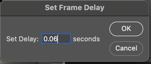
You want to use anywhere between 0.05-0.1 seconds. I find that anymore more is just too slow, so I prefer 0.06. This is fully changeable at the end of my sharpening tutorial, and you can use what you want, but that's what I prefer.
When you do that, it'll change the frame speed of all the gifs.
Now, go back into that little menu, and click, "Convert to Video Timeline."
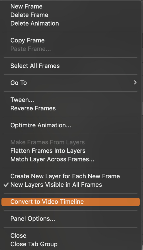
This is what it'll look like:

Now we're going to select all the layers in the right-hand pane. Once we do that, right-click and select, "Convert to Smart Object."
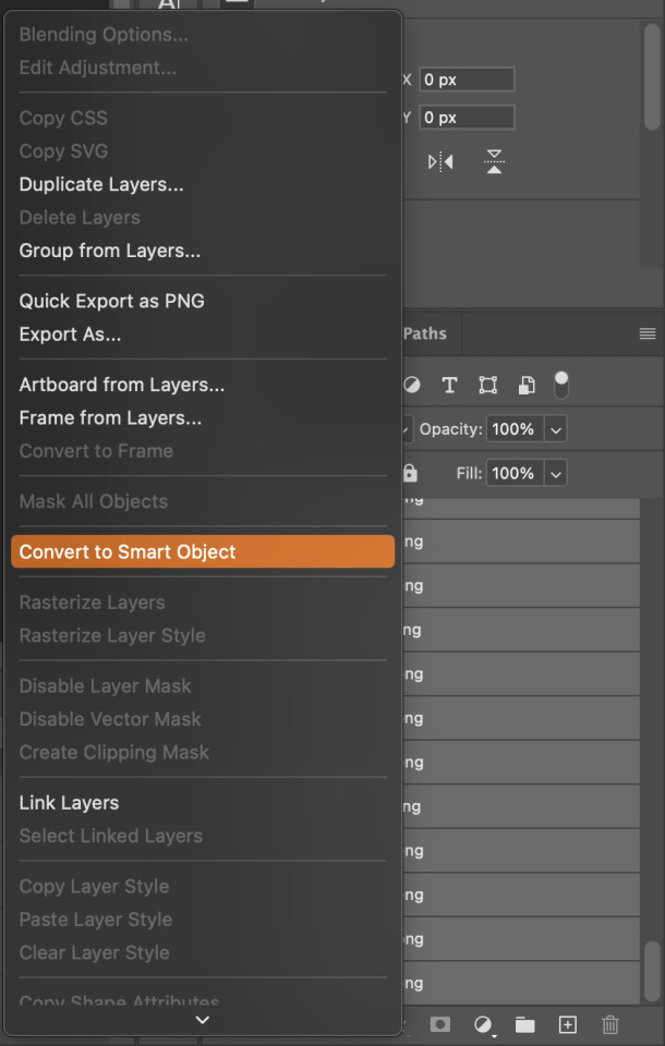
And you're there! Now you can use the sharpening tutorial to your liking.
Pro tip: Make an action with all these steps so you don't have to do them by hand with every single gif you make.
Hope this helps and it wasn't super long winded. Let me know if you have any questions <3 Happy giffing!
20 notes
·
View notes
Text

MILLY ALCOCK RHAENYRA BTS ICONS link here
like if you save. reblogs are appreciated.
commission · tips
41 notes
·
View notes
Text
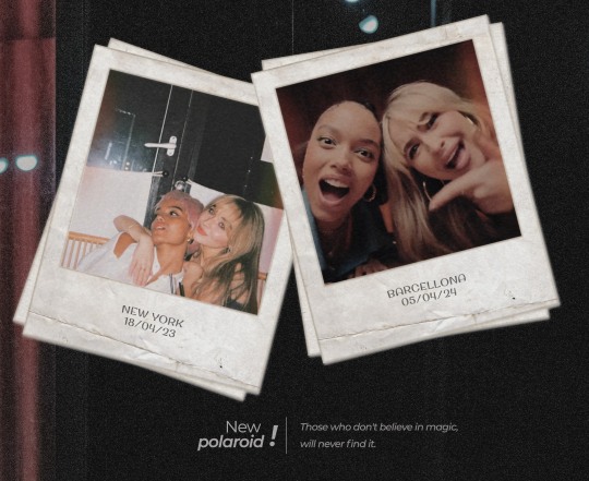
New polaroid template 01 !
Paid content: This template has a symbolic cost of €1, you can purchase it here.
Font used: Origicide; Berkshire Swash; Montserrat
Like or reblog if you like/use it
Credits would be nice!
Don’t claim as yours.
If you enjoy my work, please consider buying me a coffee! You can support me on ko-fi
Have a good day!
16 notes
·
View notes