
Last Seen Blogs

yazziescribbles
Yazzie's Doodles and Sketches
encntada
💓

woodfont8
SocialCali SEO Agency
cimoris
Angst Dump
zeomits
ジオミッツ社
Text
Applied Project
“As a designer/creative thinker/problem solver/creative, you are empowered with the ability to contribute to the betterment of society (business/commerce as well) specifically the local community, your country, the world.... What do you want to do? How are you going to do it?”
https://www.figma.com/file/UYdOmTpg92tCiP4IQOJYHh/NO-MORE-WASTE?node-id=0%3A1
Figma was a really easy platform to use and my final product was really fun to create. I learned so much in these last three weeks and I feel a lot more comfortable designing UX/UI platforms. It’s a skill that I think will be very important in future. As for design, I think the logo is really working and the colour scheme feels very neutral. I don’t want it to be “pushy” towards not wasting food but inviting so people want to help those around them. I also like that there is no talk about money as I want it to be against our policy for people to have to pay. There are a few pages that I love and some that I hate. The chat page and setting pages are really working but when people are trying to offer or ask for food the end page is just not working for me. I would love to develop this further so I might keep working on this as a side project in the future.
0 notes
Text
Visual Presents
“Research and find a creative place/hub/company that you would LOVE to work with or for. Create an information package about them that communicates what they are all about (see more info below)—the final outcome could be a website, a poster, a product, a package, a book, a zine, an app, a digital document etc, be creative).”
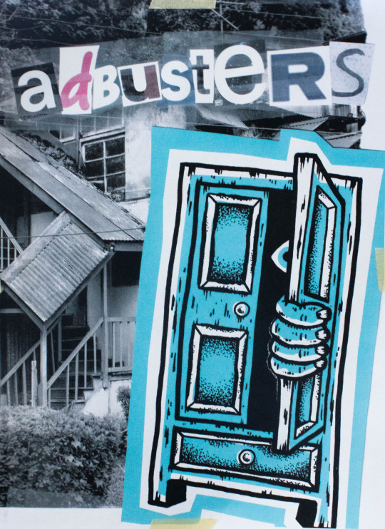
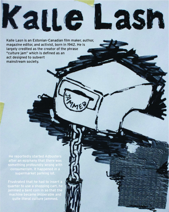
My dream job would be at the company Adbusters. I found them for the first time in 2017 after I picked up their #132 issue called “GOD, I’M LONELY” and my life was forever changed. I was looking at the different aspects of my life while I was about to graduate and found so many things wrong with the world. Their magazine helped me put all the feelings I had into words. I would love to spend my days making things that really impact people and the world like they do.
CREATIVE BRIEF - Feb 9th - Feb 14th


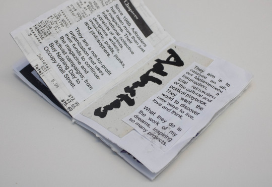

I took the creative brief as a trial run for my final project. I knew I wanted to try making a zine which is a short magazine made of usually one piece of paper that is self-published and photo copied as a way to distribute it. I haven’t made a lot of before but they seem like the perfect solution to this project.
I looked through magazines and found some interesting element to create the initial compositions and this was very fun on the small scale. It felt free and very inspiring. I then added the typographic elements in a mixture of handwritten and printed which is a common theme in Adbusters. I used just a normal 8.5 x 11 piece of paper to make it but I know I need to make my final solution bigger to make an impact.
MOODBOARDS


I have a lot of Adbusters inspired moodboards as they have been inspiring a lot of my work lately.
RESEARCH - Feb 14th - Feb 21st
“Since 1989, our international collective of artists, designers, writers, musicians, poets, punks, philosophers and wild hearts has been smashing ads, fighting corruption and speaking truth to power.”
I have never really looked into Adbusters history but they have done some cool things. They seem extremely motivated and are always looking for new ways to change the way people think. With capitalism being their enemy number one, I can really relate to everything they write or make.
EXPLORATION - Feb 21st - 28th


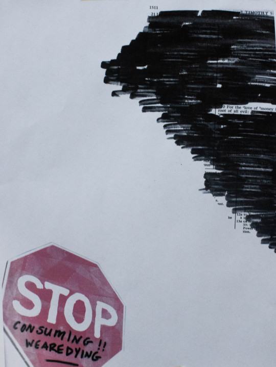
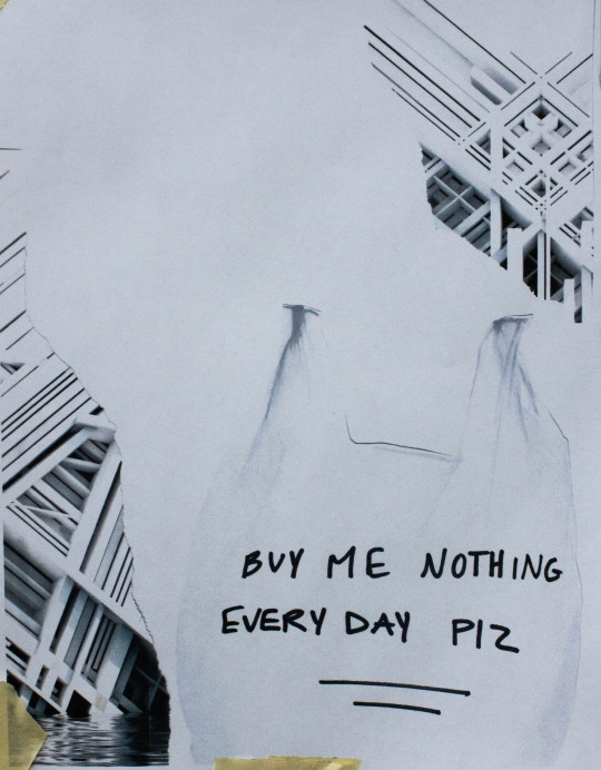
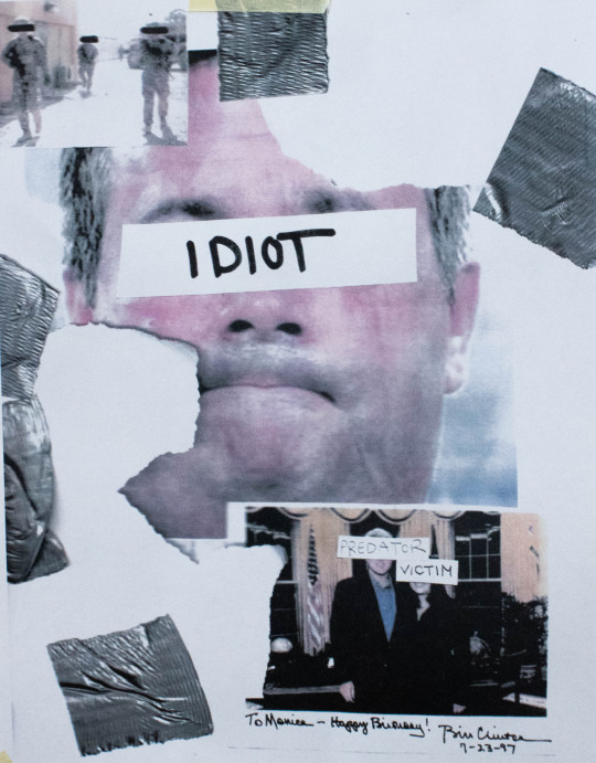
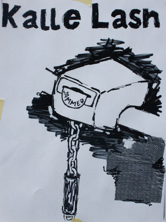


After reading the story about Kalle Last jamming the shopping chart, I have not been able to stop thinking about using that for the zine. I sketched out something fun and quick, I wanted to keep it grungy and sketchy, using only sharpies . I have been playing around with different tape textures during my grad project and I have found that was duct tape is photocopied, It creates this really interesting texture so I wanted to use a lot of that. Exploring like this in such a raw way has been very therapeutic.
In the readings, It talks about the issue designs have with programs like InDesign is that they aren’t able to see how the spreads will look all together as the reader flips through them so they often print them out and lay them out horizontally. This idea was so helpful when I was trying to figure out the order and how the spreads will look all together. I also had to remember that the compositions of the individual pages aren't the only thing that matters but the compositions of the whole spread. Seeing them up on the wall made that a lot easier and I could see how the text would help the final composition.
FINALIZE - Feb 28th - March 6th


I uploaded pictures of the scanned compositions into an illustrator file and I added all the information and rearranged how I wanted to. I used Interstate as the font because it is famous for its relation to interstate signage and its interesting style. It makes it easy to read when it is small which it will have to be because of the size of the zine. I also used a mixture of centre aligned and left aligned as that is the norm for Adbusters type. I used used both black and white coloured type as another form of hierarchy within the type. I really enjoy how this works out and I’m going to make an initial copy to show people to get feedback before I make the final version.
FINAL TOUCHES - March 7TH - 9TH
Meeting with Ian is always so helpful; We were talking about the style, the back being blank and how the inner pages stick out a bit. With the way the zine works it is kind of enviable that the inner pages stick out a bit but I’m just going to try and trim what I can, but I like the way it reads and I think the paper works well. Its shiny like the normal magazine paper but is the same dimensions as the original style of the magazine.
Ian brought up the blank back and if I was going to keep it blank then I'm going to have to glue it down so people don’t try to unfold it but then I thought about maybe using it as a poster space for some promotion about my own work. This whole project is about creating something to try and promote ourselves to these companies so why not throw in a little promotion about my grad project which is also heavily inspired by Adbusters.
FINALS

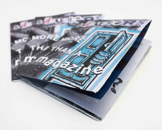
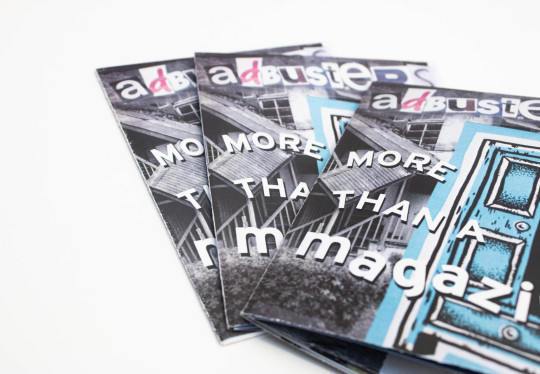
I think the end product is very interesting and a fun play on what Adbusters is known for. I like the spreads a lot and I think as a whole piece it’s very cohesive. It feels like one whole magazine. I also think using the back page as some kind of poster is really fun. I like the presents it has when it folds out. I'm nervous but I think I might actually send this to them. I think if I was to rework it, It might be the first page as I think the block of text doesn’t flow as nice I wanted it. I think it might be the way it wraps around the stop sign. I forgot that I wanted to add a barcode on the black of the magazine as a reference to real magazines. I also would like to maybe make a version that has a few more spreads. The nice thing about Adbusters is that they really know how to let the work breath inbetween articles so by being able to double the spread count, I think I would have been able to fix some of the breathing and pacing issues. Over all I really liked this whole project, I enjoy making book style works and this is definitely the work I want to be doing in the future. I actually think this the beginning of a new hobby and fun passion project.
6 notes
·
View notes
Text
Package Design
“Using predominantly paper and or cardboard, design and create a package/container (with new applied brand/concept) for an object of *daily use.”
CREATIVE BRIEF IDEA
I want my creative brief to create a second life for something already made and also utilize the cardboard theme right off the bat. My family goes through wheat thins like they are going out of fashion so I think I will use that. I want to handwrite it because using a printer is just creating another level of waste
CREATIVE BRIEF FINAL
I like the look and the physical aspect that re-folding it into a box creates. In my idea stage I had commented how it would turn it into a display piece and I do think I have achieved that. I am keeping it on my desk to remind me of the expectations and objectives.

During this last semester, I want to stay in the physical art realm when working on initial ideas and process so I created a physical moodboard. It really helped me ignite the process of initial ideas and helped me stay away from the endless scroll. I like keeping the cardboard aesthetic and the brown/neutral colour scheme into the final design concept. By hand writing the design “values” out and applying them to the moodboard kept my head in the right direction also. Being able to have this as something to look back on, like the physical creative brief, I think will really help me stay creative during the whole process.
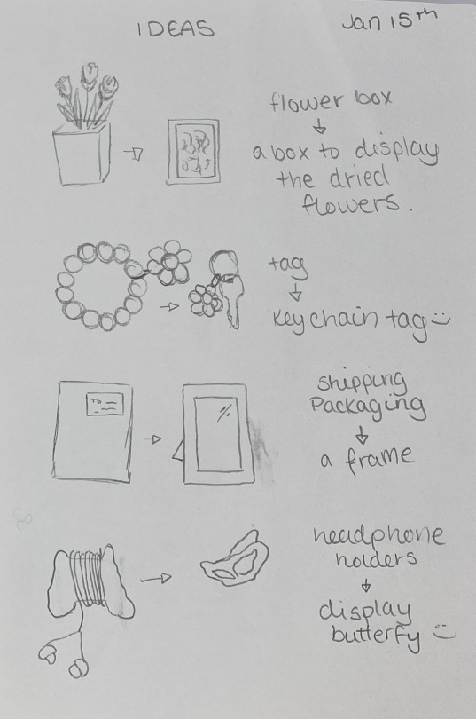
After being inspired by the moodboard, I started to just write down different concepts and sketch them out. Not all of my ideas have been written down, but keeping it off the computer gave me more time to really conceive how each one would work and if it was worth exploring. I definitely think I'm going to create a new brand and packaging instead of inventing an existing one. I like the freedom to be really creative and design something brand new.
FRAME
I think I have decided to go with the shipping package into a frame idea. After looking around on the internet, I can’t find anything similar so I’m excited to try and design something new, and be able to explore the different hurdles and road bumps. After some initial testing, I have confirmed the idea does work but definitely needs to fine tuning.

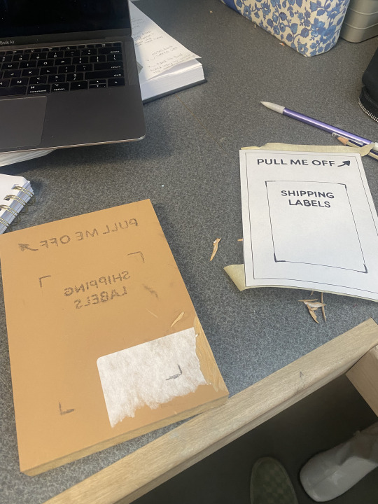
I did another trial run on a small scale just to fix some road bumps and make sure the new tool I bought works right. It cuts the perforated line that makes the certain elements tear off, It very handy and definitely worth the money. Adding a tiny piece of art inside made it seem very real and tangible which was rewarding. Next, I need to explore it at real life scale and see if it still works and what other issues I need to fix.


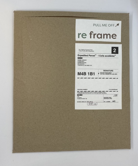
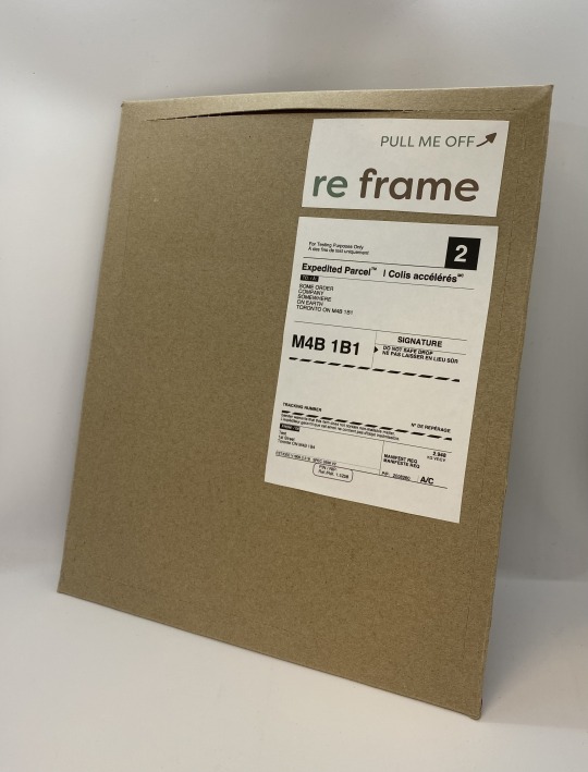
RE FRAME
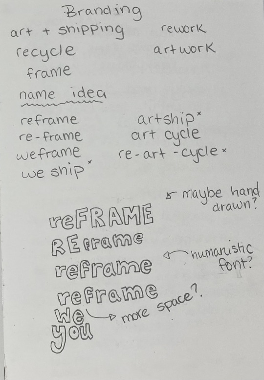
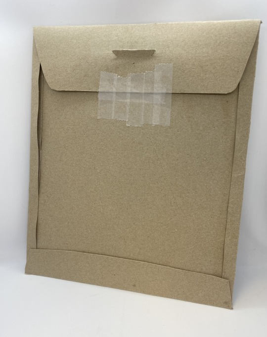
On top of the product design, I need to start thinking of the brand/logo/outside packaging. I want to use recycled cardboard as the packaging and then create some kind of stamp to add any outside information like “pull here” or the brand name, etc. I also need to be specific with where to put the shipping labels as to not affect the functions or aesthetic of the product.
I think the idea of going with “re frame” or “we frame” as the brand name to connect with the main frame aspect of the product and connected that we are reusing and recycling. It should be a humanistic font, maybe even hand drawn to connect with the hand made design principle. That something I need to keep working on.
JUST CHECKIN’ IN
After talking with Ian, he pointed out turning the little front flap into something. It would be another design functions or creating another life for it if it is removed. I hadn't thought about it much but I am thinking about what if It turned into a business card for the artist whose work is inside? Or even a little than you note or something from them? Then it would have a second life that is creating a opportunity for the artist to make more connections through their art. The only hurdle would be deciding how to do that. Like should I print in on the inside of the box? If so, how to a get around the preprinted design of the recycled cardboard? Does the artist write a hand written note themselves around the preprinted art work? Does that mean they get the precut packaging and then need to assemble themselves when they are ready to ship? I’m thinking I should do some interview with people to see what they would like as an artist.
I am always up for trying new things but trying a new skill is always hard, and craving this thing is a lot harder then I was told. I have cut myself so many times that I don’t have any feeling in my hand anymore. My blood is now fused with the Lino stamp and I really hope it works. The small letters were the hardest part and I think some aren’t going to work completely. But even as a first step, I think this is an interesting way to go. Keeps the waste to a minimum and make it feel more handcrafted.
STAMP TRIAL
So, I think the stamp is a no go. I tried do a couple of trial runs but the press wasn’t calibrated right and then when I tried to hand press the package kept moving. This process doesn’t really work on a commercial scale anyways. If we were to cut and print hundreds of packages the hand pressing stamp just isn’t worth it. I also had been planning to use stickers on the inside of the packages for the artists “business cards”. This way they can design them themselves and curate the packing more. If I am planning to use stickers on one side then is it really worth create the stamp for the outside? I think maybe I should drop the stamp for this reason.
I have been working at 5″x 7″ but I don’t think that is going to work for the end result. Shipping labels are 6″x 4″ so to allow for enough space for the edge of the frame and branding we are going to bump it up the the next art size of 8″x 10”. I also design the stickers to fit within the 4″x 6″ frame so that the shipping company can print it all off of the same label printer. Then the shipping company &/or artist could buy the pre-cut packing and assemble them in the warehouse, ready to ship whenever.
DESIGN RATIONAL
Overall, I really liked this project and the process. Exploring the way packaging effects other people and how people will different life experiences interact with it was really eye opening. I don’t think about accessible packaging as much as I should. I think my end result is an interesting start of something really important. Creating second life packaging is definitely part of our future and “kits” are becoming more and more popular. People really don’t want to have to buy a second item for purchases so limiting the frame to the package is definitely the way to go. Not to mention, frames are not very accessible to anyone old or young, able bodied or not. Reusing old cardboard was a good idea as it already has the plastic coating to create something waterproof but isn’t creating more waste. The thick cardboard is the best for keeping things safe and allowing the cardboard to only break when the consumer wants it too. I’m very happy Ian brought up creating a second life to the piece that the consumer rips off because I think its the best solution for the whole packaging. Creating something that the artist can personalize and use to promote themselves easily is the best solution for the outcome. I wish I had a more commercial way of cut and assembling the finished product because it just doesn’t look professional at all. It’s disappointing because I think the final idea is something really innovative. I might keep working on it and explore it more.
0 notes
Text
BRAND IDENTITY
“The success of a brand relies not only on good creative design, it also needs to ‘mean’ something. In our graphic toolbox we have the use of typography, colour, image and style, and our choices for these will be determined by the message we wish to communicate.”
—Catherine Slade-Brooking
“Create a unique brand identity that can be extended into a potential business application (*design/art/photography/web/illustration/video/gallery etc.). *The choice is yours regarding the direction that you want to go; you may already be getting/thinking about client work so further development/refinement of a creative identity should prove invaluable for a personal creative business.”
Monday, November 1st - Ideation
I have lots of ideas after this class. I have always thought of creating an artist living space. One where there are apartments, maybe even communal living areas and of course workspaces. Having the school workspace for this year has been a dream and being able to keep school at school and not squished in my bedroom has helped me a lot. Also being able to collaborate with my fellow classmates so freely, has really helped me explore an office-style creative process more. So by creating a space that doesn’t have time limits or distance from home issues has always been exciting to me.
Over the last summer, I have been exploring the art of stick n’ poke more. I am being clean and safe, might I add. Using tattoo shop grade equipment, I have been covering myself and other in some okay-ish art. I really like the machine-free style of little goofy hand drawn tattoos. They can be so tiny and simple but have a lot more story behind them. “Handpoke” as its called more modernly is really coming into style, and building a shop full of machine-free artists would be a really fun, creative opportunity.
Wednesday, November 3rd - Moodboard/Creative Brief
I want my creative brief to really focus on the creative part. I have decided to choose the Stick N Poke shop for my brand so I need my moodboard and creative brief to also communicate this.
First thought process was to try to create a tattoo stencil with the creative brief so I found tattoo stencil paper and found a couple articles on how to print using a regular printer. I really tried but it was a fail. I then tried to hand draw the brief onto the paper but it was just not working. I think the paper was just bad quality and old.
I left the tattoo stencil idea so I thought what if I just edit a tattoo release form to hold the creative brief information. I found just a basic release form and added my own information.

Next I moved to the moodboard. I wanted to creative something that explained the tattoo idea and used more black and white, and neutral colours because that is what I am thinking for brand colours.

Monday, November 8th - Research
The hand-poke process has originated from traditional forms of non-electric tattooing. The process of a single needle and ink process dates back as far as ancient Egypt.
The kind of traditional tattooing that we understand surrounded the idea that it was illegal so artists didn’t have physical locations. They would set up in popular places like bars and barber shops. Their set ups had to be able to be portable as they had to be able to be quickly packed up incase of emergency.
They would have their designs in books called “flash sheets” that the client would pick from instead of the artist creating personal designs. The artists didn't have the time to create personal designs so having large landscape style books full of designs they have done before means they could be fast and try to do as many as possible before they were found out.
Wednesday, November 10th - More Research
The tattoo community has a hard time with inclusion. It is not very well known but black clients often have a hard time finding tattoo artists who are willing to tattoo them. Dark skin is harder to tattoo because of how the pigments sit in the skin and contrast with the skin around it. Black ink usually is the best option for visibility and because of this many artist will not even offer colour tattoos for black people. There are many ways to be able to tattoo dark skin with every colour, the artist just needs to learn the techniques.
There are so many areas of life that racism is strong that we don’t even realize. I believe that everyone should be able to experience art and the colour of your skin shouldn’t stop this. Any brand that I would create or be involved in should also believe in this. Therefore, my shop would have artists that can tattoo all types of skins.
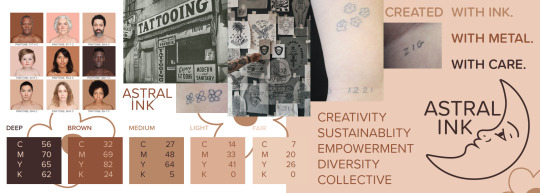
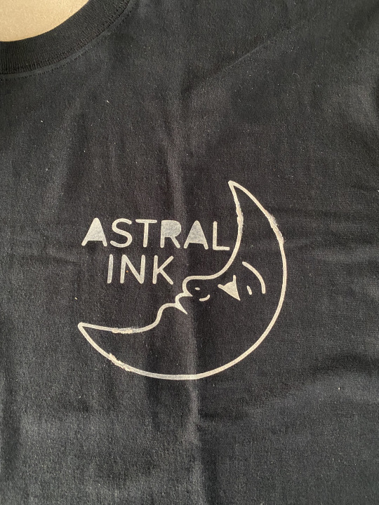
Space has always been one of my passions. I love NASA and any space exploration. The stars and the universe has a power that humans might not ever understand fully. I also have a real interest in astrology. I know lots of people make fun of it and there isn't really any science behind it but it’s fun for me. I also think it is as real as the stock market so if men can sit around a computer and look at made up numbers then I can say how much of a taurus I am.
I want the logo and brand to reflect this interest so I have decided that ASTRAL INK is the perfect name. Astral is defined as relating to or resembling the stars and Ink relates to the ink I use to tattoo.
Monday, November 15th - Design
I want to have a fun but simple logo because that would be the type of tattoos I do. After deciding on the name being ASTRAL INK I have been exploring with some ideas.
I have a moon tattoo that I did last summer as I have always felt really connected to the moon and I thought wouldn’t this be a perfect place to start on ideas? A personal tattoo that I both designed and tattooed seems like a good representation of my company.
I also want to use my own handwriting in the logo font because most type based tattoo that I have done are using my own handwriting.

I definitely feel like I’m getting somewhere.
Wednesday, November 17th - Design
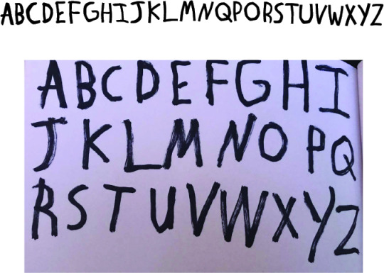
After working on the logo and using my own handwriting as the type, I think I want to create my own font to use for my style guide. I have started to make some quick mock ups for the alphabet and symbols. I like how It looks right now and I think it does feel like it fits within the brand.
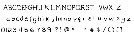
Okay, I hate it. It looks childish and lazy. I think if I had more time to really work on it and make it more finalized and uniform then It would work but right now it is not a good direction. I can’t waste any more time on it.
Looking at different fonts, Proxima Soft is standing out to me. It fits in with the moon style of the logo. I’m gonna play around with it more.
Friday, November 19th - Design

I think the font really works and then makes it so the other brand communications will seem a lot more uniform.
Proxima Soft is a rounded version of Proxima Nova designed by Mark Simonson and should be the main typeface used for all Astral Ink business communications.
It is warm, playful, and a reference to the hand drawn font used for most text based tattoos at Astral Ink.
Monday, November 22nd to November 29th - StyleScape & Guide
For the Stylescape, I wanted to use my moodboard plus my new logo and colour scheme to communicate my business.
I have decided on a layout and grid structure. The landscape style of the guide is a reference to the traditional style of flash sheets. The grid also allows me to be a bit more creative with my layout styles.

I started with the colour styles just because that will affect the rest of the style guides. The Skin tone colour palette is a connection towards the inclusion issue the tattoo arena deals with. I also went and picked seven rainbow colours that can be used when needed.


I then went onto the type and logo breakdown.
Using the layouts from the other pages I went onto the other ones.
Wednesday, December 1st - Contract
I started on the contract. My contract is going to look a little different than the graphic designer example contract just because of the business. I took the sub sections as inspiration. I wanted to create something that could be actually used so it talked about the sessions, prices, and the expectations. It has an area for the artist’s biography and all of the legal stuff. It creates a perfect starting point for a good tattoo sessions for all.
I wanted It be able to be printed by anyone whenever so I used a normal A4 size artboard. Then individual artists can add their bio and have a bunch of copies at their station.
Issuu Link - https://issuu.com/vtenneille/docs/contract
Friday, December 3rd - December 5th - Branded Items
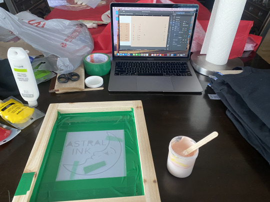
I made some mock ups of the store font and layout but I wanted to make a more handmade branded product.
Because I am pushing such a machine free store idea but I think the branded items should also be as machine free as possible. T-shirts are often a common item stole at tattoo stores so I thought that was a good idea.
I used my moms Cricut to cut out a stencil and my screen printing skills to make my t-shirts. They came out surprisingly good but not perfect. I would definitely use a photo stencil during the next run of t-shirts. The shirts are just plain black t-shirts but I tried to get as close to the colour FAIR from my colour scheme.

Monday, December 6th - Finalized
The final design is looking good, I am worried about sending for print. Sometimes I can be a little bit of a control freak and not being able to watch them printed it stresses me out. I was going to hand print and assemble myself to go along with the machine-free theme but I messed up my initial file and made it too big to be able to print full bleed on a tabloid piece of paper. It was a rookie mistake so to be able to keep my grid structure and formatting correct then I needed to send it to a commercial printer. If I would have notice sooner I could have corrected it but I just couldn’t risk it this close to the end.
Issuu Link - https://issuu.com/vtenneille/docs/newfile
Time Spent - 48 hrs
Branded items - Around $50
Printed Booklet & Contract -
$$ Spent Total -
DESIGN RATIONALE
For my brand identity I really wanted to work on something that I was passionate about and really saw as something I could make a reality. Tattooing is a competitive business but I think I am a competitive person who could make a difference. I really do think the logo, colour scheme and type communicate the values I decided for my company.
Handmaking the t-shirts was just such a fun learning experience that made the whole thing feel very real and exciting. I do wish I had handprinted the style guide because I think it would have added another level to the hand created energy I want for my company. Within the style guide there are certain pages I love and certain ones I don’t. The logo breakdown layout just isn’t doing it for me. I spent a long time trying to get it to work but I still don’t think I got it right. Whereas pages like the social media and the colour breakdown feel really well designed and well balanced.
I am glad I got both the contract and style guide physically printed because within the tattoo shop you're gonna need to have physical copies ready at all times.
I have been trying really hard at staying off the internet to get initial ideas and I felt really in my element of creativity creating this project. It’s definitely something I want to keep practicing at and I think this is a perfect portfolio piece for myself.
Ps. Ian, you are a wonderful instructor. I hope you know just how much you help and push us every single class. You have given me so much confidence in my design abilities and in always trying something new. You truly are a wonderful designer and you personally have made my experience in the art & design program an amazing one.
0 notes
Text
Period Poverty
“Create a ad campaign to promote the donate drive for period products in Medicine Hat. Be sure to show a number of variations of the idea presented: different typefaces, colours, arrangements. *Keep in mind, that further and potentially updated directions may be given by client during briefing or during presentation feedback. This project will be done in groups and presented as a team. Try to utilize the strengths that you have within your group, focus on clear communication and pulling your own weight. Obviously this is an opportunity for you to take charge and develop leadership roles and an opportunity to step outside of your comfort zones in order to learn/try something new.”
During this assignment, I definitely took on the leadership role. I directed concepts, jobs, and meetings. It was interesting to almost act like a creative director with my groups as initial ideas and directions were mine, but I felt like I was able to use everyone’s skills to utilize the whole team well to create the complete campaign.
Step 1 - RESEARCH - SEPT 29TH - OCT 6TH
Period poverty is something that affects people worldwide so it was very important to make sure we understood the struggle that occurs from this global tragedy. People everywhere are made to choose between shelter, food, and period products. People spend upwards of six years menstruating over the course of their lifetime, while spending an average of $6000 on products with rural people paying double.
This yearly donation campaign usually fills the food banks yearly quota for products so that highlights how important the campaign reaches as many as possible.
I created a quick creative brief and moodboard to initially connect with the client.

Step 2 - PROFILE - OCT 7TH - 13TH
Around our second meeting we created to profiles for our initial and secondary customer based. Sam ended up illustrating some sketch of these two which were very cute!
Our first target audience was middle women as they would be more likely to remember the campaign and pick up extra products during their grocery trips. We came up with Carol, she is a 42 year old married woman with 2 daughters and a son. She graduated high school and went on to get a diploma and has worked at the same company for 20 years. She loves her office job and has a great yearly salary of $80,000 a year. Her husband works so they have a double income household but are still budget oriented. She is an extreme couponer and likes to do one large Costco shop a month with all 5 family members and two cars. She is very invested in her community and tends to volunteer on a regular basis around town. She is very into her social medias, like Facebook, etc.
Our second target was older men so we created Steven. Steven is a 47 year old widower with two teenage daughters. He has a full time job but still very involved with his kids. He went to trade school after high school and spent his years working his way up a construction company. He has a nice $75,000 year salary but that isn’t including any Christmas bonus’ which he loves to spend on fixing up his house and taking his girls on road trips. Steven grew up very poor and worked hard to make sure his girls didn’t live the same life he did. He also had a 5 sisters so is very comfortable around period conversations. He isn’t very techy but his girls help him and they usually do weekly superstore grocery trips together.
Step 3 - CONCEPT - OCT 14TH - 19TH

My initial idea was they way older generations use to pass notes. That was the way that they communicated things that were too uncomfortable to talk about in person. Periods have such a stigma surround the way we talk and ask for help during this very normal human experience.
I decided to keep the colour scheme as the common pink and red “menstruation” colours but include a muted yellow tone to create a more gender neutral over feeling. Katrina really helped on find the perfect tones of each colour that worked well together.

Next I wanted to focus on using a female designed font. I know the average person wouldn’t notice but I felt it was important to be mindful of every part of the design process. I found four that I thought worked well and the team helped me narrow it down.
Step 4 - FEEDBACK - OCT 20TH
When out client initially saw our Stylescape, she commented on how she liked the colour scheme and agreed that adding the yellow moved it on towards a gender neutral colour scheme.
But she also commented on how it felt like we were focusing on how too much on the stigma and not enough on what happens if people don't donate and the struggle that people have without period products readily available.
So we pivoted by keeping an emphasis on the conversation but more of the negative side of that conversation. Moving towards a more graphic image of blood but remembering to keep it gender neutral.
Step 5 - PHOTOSHOOT - OCT 22ND


We had a lot of fun with this one and felt like a really collective experience with everyone being involved and collaborating on the ideas! You can see how that made them even better this time around and it made it so much easier working out the layout.
Step 6 - LAYOUT - OCT 25TH

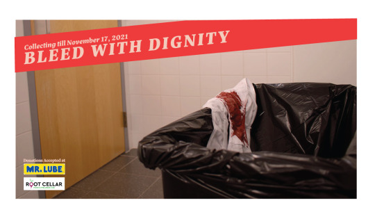
I wanted to keep the layouts cohesive but slightly different for the Facebook ads and the poster designs. The diagonal movement creates a dynamic element in the designs and opens the conversation about the graphic images.
Thankfully, the client really highlighted how much she appreciated that we listened and took her criticism on board. That was the reason she choose our group to take over the final designs. Talking to her and exploring this kind of assignment was so helping and exciting.
I was having a real crisis about school, questioning my ability, and feeling like I don’t really belong in the program and this really made me feel more confident in myself and my ideas. I really tried to think of this like a real life work setting and worked on being as professional as possible. I think I definitely accomplished that.
Step 7 - FINAL DESIGNS - OCT 27TH - 30TH
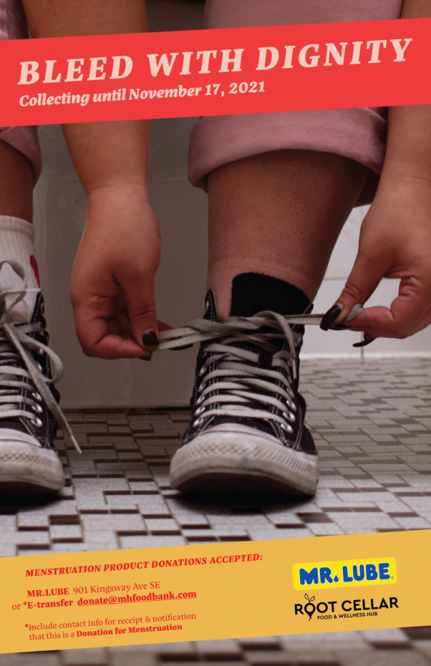
The client had said that although she loved the content, we will need to make it PG for the local clientele. She thought that it isn’t going to be shareable for the Facebook campaign which is completely understandable. So again, we pivoted and tried making it more PG by highlighting the things people do when they aren’t able to have the conversation.

These turned out perfect! The look and feel expresses exactly what both us and the client was looking for. With some help with Ian, the type was also improved on this next ideation. This end result felt like it came very natural and easy.

DESIGN RATIONAL - NOVEMBER 1ST
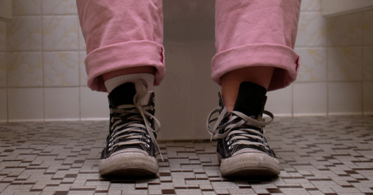
Simplifying the concept of the conversation of asking for menstruation products to just a picture of a sock less foot really elevated the campaign to a new height. I pride myself on finding the details in everything and I think that is shown here. From the colour scheme being reflected in the pink pants to the female designed type really highlights the menstruation aspect of the project. I feel like I learnt so much during this project, with one being able to trust my design instincts. I spent around 42.4 hrs on this project from start to finish. I also spent around $25 on supplies for the multiple photoshoots we had. The posters cost $$ to print which I didn’t pay for but sending them to print was great practice for the real world.
0 notes
Text
A Sign Meant...
“Determine a place / thing / situation where you feel a sign could be of use and or be of help. Design a sign (or multiple signs) but they must just be temporary (make sure at the end, you pick up your sign as we do not want to litter). The sign must be designed for use somewhere in the public realm.”
I had many different ideas when first hearing the assignment. Some initial ideas surrounding signs was parking, idling car, moods, and germs. I felt that germs was the most vague topic which allow me to really investigate the idea of signs and semiotics surrounding sign design.
STEP 1 - RESEARCH - SEPT 8-10TH
I started with a very basic moodboard just to express the colour palette and design styles I had in mind.

Something that had stuck with me during the past year of this pandemic fiasco has been the amount of misinformation and home-taught genius’ around me. I wanted my sign to help re-information people instead of focusing on negative. Personally, I don’t think those people need anymore attention these days.
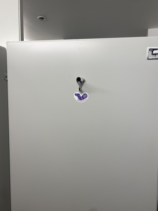
Sanitizing when entering anywhere has been common practice and every bathroom has a diagram on how to proper wash your hands, but there has been no signage to remind people that the germs don’t just leave on your hands. They aren’t exclusively allowed up until your wrist and then need to apply for a vista to move further up your arm. (It feels very 5 second rule to me.) There are many different items that people carry around with them that probably wouldn’t follow the black light test. I wanted my sign to express this concept but I wanted it to be mainly focused towards children as more of a learning tool. Children are the adults of the future and empowering them to understand their role within the current climate is extremely important. Also buy designing for children you also are automatically including most people under the blanket of understanding. I found that clothes, hand towels, cellphones/keys, shoelaces, and debit/credit cards can have more germs than your hands if not sanitized regular and properly.
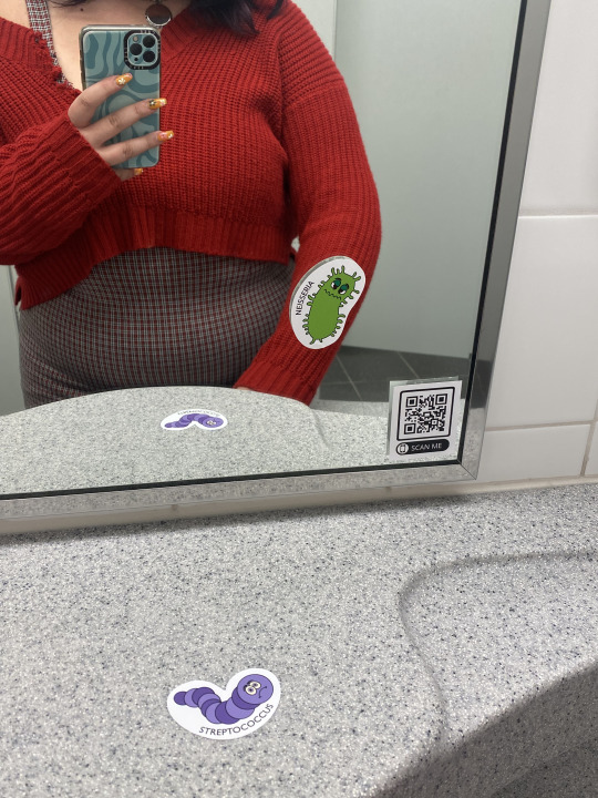
Now although I want the sign to be almost universal and really be able to be placed anywhere, because again germs are everywhere, I wanted to focus my attention specifically on bathrooms. This meant they needed to be waterproof and durable, but the assignment was specific about needing to be able to remove them. My solution was stickers and I found semi-permanent stickers that you are able to remove on most hard surfaced.
STEP 2 - DESIGN PROCESS - SEPT 15-27TH
My initial idea was to illustrate different objects covered in germs that would be in bathrooms that are forgotten about in the germ conversation. Then printing them as stickers to be placed inside bathrooms. Like keys where someone might place their keys in the stall or a phone on the counter by the sink or a germ covered hand print on the door. Now while I like this idea, I wanted it to be simpler and more creative so I thought about what if I used the mirror to help communicate the message in an interesting way.

Everyone looks at themselves when pulling up to the mirror in the bathroom so that might be a way to make sure the message is at least noticed. It also add a level of interactive fun to the sign. I continued to think on using germ covered objects within the mirror but I thought it should be simpler to help communicate with as little obstacles as possible. I scaled down to just have little germs to stick on the mirror to express where the germs might be.
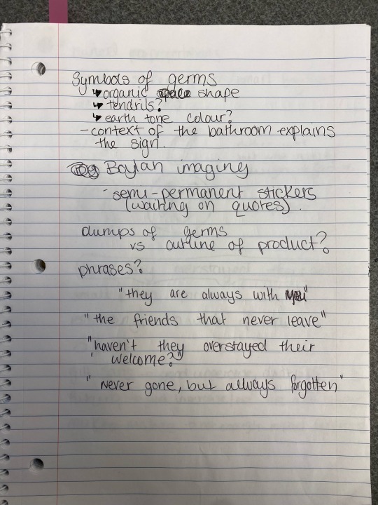
I researched common germs and their official shape to keep it as organic and truthful as possible. There was a lot of common traits such as its organic shape, the tendrils, extreme colours of contrast on the images. I understand the picture we have of them are dyed to exaggerate the contrast to be able to see them microscopically so I felt like it would be interesting to continue the theme of colour contrast into the sign design as a way to highlight us “seeing” them with our naked eye.
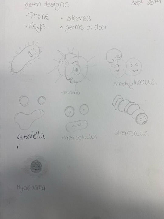
My initial drawings were just fast, cartoony ideas based on the scientific pictures. I like them and felt confident to bring them to the computer.

Then I worked on the digital copies and really felt like it started coming together. The colour was something I wanted to make sure I got it right so I did many different colour variations. I like a large majority of them so It would be interesting to sell them in packs of multiple colour version of all the bacteria so people can pick and choose their customization.

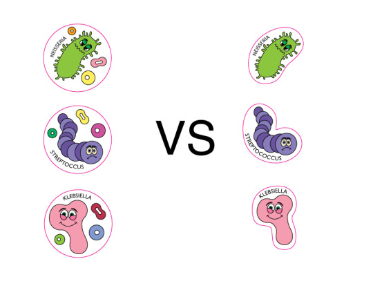
I went and pick one version of each to get printed for this assignment, but then I had to decide if I wanted them to be custom cut or circle stickers with extra little decorations on them. I felt that the custom cut stickers would be better for customization of placement for the user. Next, I wanted to add the name of each bacteria around the shape. This would be to strengthen the education factor to the sign. But I needed to decide on a font.

I found that three different fonts that have been provide to work the best within the teaching field. Gill Sans, Futura, Mukta Mahee were my options. They all are slightly different and I looked at them in lower and uppercase to make my decision. I went with Gill Sans because although I liked Futura lowercase the best, I knew I wanted to the type to be in uppercase for hierarchy reasons. Gill Sans uppercase felt the most universally clear and also Gill Sans Nova is one of the best multilingual type faces which is important to me and the sign.
Now with the stickers done, I moved on to the side dishes. During a progress conversation, it was brought up if I was going to add any extra information about my bacteria for the viewer. I thought creating a space for information about each bacteria and the message behind the sign might actually be important considering my educational emphasis. My solution was a QR code that linked to a google doc with information on the bacteria and also links to cleaning and sanitization practices. It is pretty simple but it would be nice to be able to expand on this tool, possibly with educators, to create a more in depth tool for them to use in junction with the sign.
STEP 3 - THE SIGN ITSELF - SEPT 29-4TH


STEP 4 - REFLECTION - SEPT 6TH
I really like how everything turned out, but here is a few things I would change.
The design of the bacteria and colours work well with the educational children aspect of the piece. It’s bright, it’s fun, and it’s engaging. I am not sure the mirror is really playing into the sign as much as I had initially hoped. I really wanted this sense of interaction but I’m just not feeling it. I think the bacteria needs to be smaller and have more of them. They are the perfect size for the extra ones on the door and around the sink, but the ones that should look like they are on your sleeve or on the door through the reflection of the mirror are just too bulky to get the illusion right. I think I am onto something but just not quite there yet. If I would have gotten them printed maybe a week early I could have noticed that and changed the end result.
Overall, I spent 34hr and 23 mins on this project and $100 for printing the stickers. I’ve been tracking the QR code for scans and there has been around 11 unique scans since I installed them. I’m going to see how long I can keep them up before someone says anything I think and continue to track the scans and comments from people.
0 notes
Text
The Political Type
“Produce a final outcome that engages your target audience on an issue of your choosing. Your research should include aninvestigation into campaigns related to socio-political graphics (and also related to the topic (issue) that you plan to communicate, *of course). Your typography needs to both engage and inform the viewer through a carefully considered information hierarchy.”
WEALTH DISTRIBUTION
Oxfam reports that from March 18th, 2020 to the end of 2020, global billionaire wealth increased by $3.9 trillion. By contrast, global workers’ combined earnings fell by $3.7 trillion, according to the International Labour Organization, as millions lost their jobs around the world. (https://inequality.org/facts/global-inequality/)
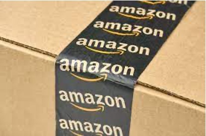
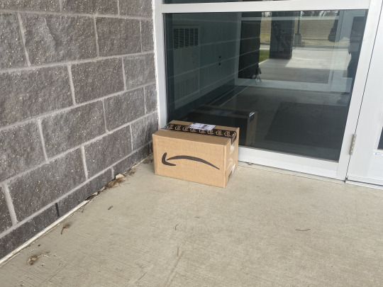
When I first read this project I knew immediately that I wanted to connect it to Amazon and Jeff Bezos. The global wealth distribution blows my mind and frustrates me to no end. Even in a pandemic, where thousands of people are dying everyday, a couple of people are gaining billions of dollars in minutes. A common phrase currently is that there is no ethical way to earn a billion dollars and I believe in that 100%. Capitalism has developed a society where it is impossible to ethically consume. Someone, somewhere is being shorted to be able to have the profit margins that the wealthy current obtain and I pride myself on my humour and ability to create quite witty ideas based on these facts. Therefore, I decided to recreate an amazon package but put my own clever spin on things.
Step One - RESEARCH
Jeff Bezos Net Worth - $180.6 Billion as of 3/21/21
Jeff Bezos is now so rich he could never spend the money he earned in a single day this week (https://www.independent.co.uk/voices/jeff-bezos-amazon-share-price-net-worth-super-rich-billionaires-a9633716.html)
There is even website where you can spend his fortune but they only have it at $124700000000. (https://3pic.github.io/money)
Package Tape
Shipping Label

Packing Slip
Amazon has created their own font called Amazon Ember which is the master brand font for all Amazon products and services. It was designed by Dalton Maag in 2015 and has so many different styles with in the family. It was pretty easy to find for download which made this process so much easier.
Step Two - DESIGN
I really wanted this box to look almost legit from further away but at closer inspection makes you think a little harder. Like if it was on your porch you wouldn’t question it until you brought it inside and really looked. I wanted it to be very interactive and fun for the viewer even with the heavy subject matter.

I wanted to be able to use this new design to create a new version of the tape that is used on the box.

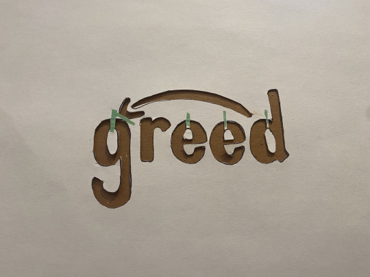
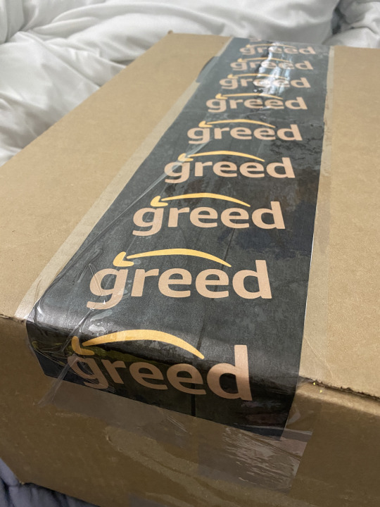
I wanted to redesign the logo which is used all over the package. I started by sketching out the original logo to get this feel of the typeface and then reworked the letters. I decided with the name “greed” to make my opinion on the company pretty obvious. The original logo uses the arrow to show “A to Z” but I wanted to flip the arrow to comment on how we are moving backward. My thought process was from good “deed” to “greed”.
I tried to create a stencil to hand drawn the tape onto the box.

I didn't like how it turned out when I practised it because It looked too messy and human. It really didn’t give off the same look as the original which defeated the ending message of the piece. Therefore, I decided to just digitally design the tape.

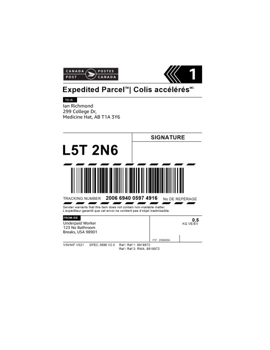
I decided to drop it off to my instructor for him to really experience the full effect of the piece so I wanted to fix up a shipping label to add to the final experience. I put the to address as my college but I wanted to add my humour to the return address. I came up with - Underpaid Worker, 123 No Bathroom Breaks, USA 98901.
The final piece was what was going to be inside when they open the package. I wanted to comment on the just insane amount of money even just One Billion dollars really is. I think because we use a word to symbolize it that it takes away from really understanding the value of it.
I decided on recreating a packing list that usually show the ideas you bought and explains how to return, etc. but instead shows the amount of stuff that you can buy with Jeff’s fortune. This part took an interesting turn because I really didn't even understand how much you could buy with this amount of money.
I started with the basics - you know, solving world hunger and homelessness which supposedly could be ended with about 50 billion dollar per year.
Next I wanted to buy everything on amazon which the would cost about 12.8 billion dollar. (https://3pic.github.io/money)
Then I added just some things that would be considered almost an investment like a nuclear power plant (8 billion), a Coal power plant (2 billion), and a Skycraper (3.8. billion).
After that I spent around 73.6 billion dollars so I added some fun stuff like a private jet (1.2 million), a Flacon 9 Rocket (57 million), and a cruise ship (600 million). This is where it took that weird turn because I realized buying just 1 of those three things only cost 0.6582 billion dollar.
I soon realized I was going to have to up some numbers here. I decided to actually buy Everything on Amazon 3 times and decided I guess I’ll just keep the extras for some family Christmas presents this year or something. Next, I changed my mind and brought 7 Nuclear Power plants, 2 Skyscrapers, and 3 Coal Power Plants. Then I bought 10 Private Jets for all my family members, 7 Cruise Ships, and 3 Falcon 9 Rockets, you know incase one breaks.
I still had an insane amount of money left so I decided to open 20 different Mcdonald’s Franchise (1.5 million) because the world can never have enough McDonald. And after ending world hunger and homelessness, I thought I’d do some more good deeds (Wink wink) and pay for 20,000 kids college education ($100,000 each.) Of course each of those kids need luxury cars ($200,000) to drive to school or sell if they need more money when they can’t find a job after college.
Lastly, I thought to really fit the billionaire mindset that I can’t be too kind - zoos are very controversial like myself, and being ethical isn’t really my style so I thought I’d restock the zoos on some tigers. There is around 10,000 zoos in the world and I thought I buy them each 6 tigers ($10,000) because you can never have enough tigers laying around, hating their life.
I was going to add a mansion or some kind of luxury house for Jeff but Bezos is already one of the country's biggest landowners, and he and his family own at least five homes across the US so I thought he was good for homes.
I ended up only spending 170.143 Billion dollars because I wanted to give him a little safety net of money incase something went wrong, etc. But It really showed how much a billion dollar can really get you and how I will never be able to gain that amount of money by just “working hard” like capitalism teaches you.
Again, I wanted to add some humour to the return section of their packing list so I added some facts that I found during my research and wanted to add Jeff Bezos Net Worth but then another interesting thing happened.
When I started my research (March 21st, 2021) Jeff’s net worth was set at $180.6 billion on Forbes but I thought I’d check again just to make sure my info was up to date. As of April 8th, 2021 his net worth was up to $193.3 Billion. That’s nearly $13 billion in under 3 weeks. Then, I checked again this morning (April 9th, 2021 around 9am) and it had hit $193.6 billion. Then, I just refreshed the page at 11am and it's up to $195.4 billion so that's 2.1 billion in 24 hrs.
This whole process really fuelled by hatred for billionaires and I really hope it has for other people.

Step Three - FINAL PIECE
Unlike the original company, I wanted to be thoughtful on my waste and packaging so I reused a box from my work and removed all the old tape and stickers. I wanted to hand drawn the logo on the side to be able to flip it upside down and make it feel more human. Definitely from a distance you cannot tell it’s hand drawn.

The tape was the next element and I think it turned out really interesting. I definitely blends in as an Amazon dupe and I think the brown colouring of the type matches the box well which helps.

Next, I had thought about printing my packing list to be really long with all the items individually and printed on multiple pieces of paper that fill the box to emphasis the amount of stuff you can buy. But I didn't really want to be that wasteful which is what Amazon usually would do. They tend to not care at all about their paper waste and sometimes end up sending a different packing list for each different item or even a whole new box for each item. I know they do it to be able to ship certain items faster but they have a tendency to show up at the same time or even just a day later anyways so its useless. To counteract that mindset I wanted to print it all on just piece of paper but I found it would be really loose in the box and I thought It would take away from the impact of the piece. Considering this was the most important part of the whole work, I thought about adding some kind of filling to the box.
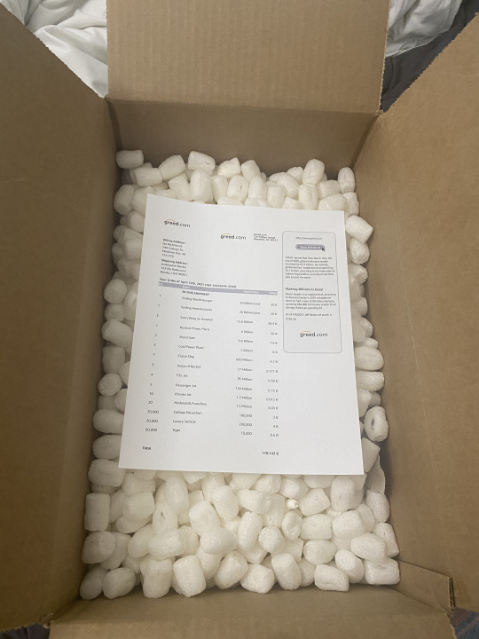
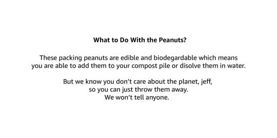
Now, package filling is another element that can be extremely wasteful but fortunately other companies have started to come up with ethical alternatives. I thankfully had these biodegradable packing peanuts leftover from some Lush packages I ordered on hand already. These packing peanuts actually starch-based packing peanuts that are edible and able biodegradable in both water and soil. Lush recommend adding them to your compost bin or just add them to your bathwater after your bath and watching them just dissolve. Using package filling that was both biodegradable and reused made me feel a lot better about the whole piece and adds to the impact of the political commentary and Ian brought up a good point of explaining the packing peanuts within the piece. I quickly whipped up this note to add inside the box and wanted to personalize it for Mr. Bezos.
I wanted to be able to use my at home printer instead of sending it to a professional printer to be able to save time, energy, and resources. The energy it takes to send the files, print off the 6 pieces of paper while professionally cutting them, and then me driving to go pick them up is insane compared to just printing them at home. On top of that, I wanted this project to be able to be accessible to anyone; like the idea of other people are able to get these files or even redesign them themselves and recreate the project all of the world is my vision and would be able to make a lot more of an impact that another commercial, machine made statement.
Step Four - REFLECTION
I am so proud of this project. It isn’t perfect and I definitely want to make it again and try to iron out the final details but I think it really says what I was trying to say.
The design of all the piece work really well. Being able to use the real amazon fonts and basing them off real amazon structures helps make the artwork seem cohesive and readable. I think the only part that is lacking is the tape. Having to use my home print made me unable to get one consistent line of tape like the real amazon tape so I would love the fix that and retry that element.
Being mindful of all the elements that I chose really helped my vision come to life and I felt so consistently creative and excited about this project. I also documented a lot more of my progress that I usually do and feel like that helped me keep my final piece in mind when making decisions for all the elements.
I want the final project to have a very human, handmade feel instead of just falling into the same machine made, consistent, consumer garbage that Amazon represents. It is based on something that I am so passionate about and it remind me why I make art. It has definitely sparked a drive to make more art like this. Using typography in conclusion with physical objects to really make an impact and a statement is what I want to spend my time doing. Even building off this project, I imagine designing a whole interactive art piece where you set up a whole “greed” warehouse where there are actors filling orders and shipping off packages of basic necessities but they all cost billions of dollars and its all going to the same 9 addresses of the wealth elite. All the actors have to experience the real amazon work experience with timers to make sure they are working hard enough and if they have to pee, they have to use bottles beside their desk. And there would be actors outside the show asking for money with the audience completely unaware that they are part of the show and all the donations would go towards homeless charities and just local people that need it.
0 notes
Text
Reflection
This project was very intriguing to me. I felt a little overwhelmed at the beginning with just not knowing where to start or how to tackle such an intense project.
I knew I wanted something that was fun, playful and personal. I didn’t want to the font to look like everything else and I didn’t want it to be something you would see on your advantage joe’s document. I wanted it to be something that the right person would find, love and automatically know the perfect project for it.
Taking the font in a more personal approach really helped me stay focused and motivated through the whole process. I think that shows in the end result.
It definitely isn’t finished but has opened up a wonderful starting point to create something really powerful. I’m glad I created the both upper and lower styles separately as it has allowed to think about how the font will work as a family instead of just a single style. I am excited to be able to expand both of them later on a make a full set of the Regular and Bold styles.
Font labs was a big help in making the project run smoothly as they allow you customize everything and it really make getting the letters to flow in an organic way easy.
The font specimen was where I had the most trouble. I wanted it to be able to express the typeface and the direction I see it kind of going it but I’m not 100% certain I got that. I wanted the colour scheme and the layout to communicate the vibe I got form the font correctly. I know I have a hard time with the size of my fonts. I always want it to be big and in your face and I have heard the critique of sizing down my type in a couple different classes. I’m trying to keep myself in the line and push my boundaries so the font size on my poster decreased consistently throughout the process which I am happy about! You can definitely see the different between my initial colour scheme mock ups and my final poster. (Ian, I promise I will keep working on it lol)
0 notes
Text
Type Specimen Poster

I feel like this last version really expresses the the feeling and vibe I was trying to create with this font. The layout feels a lot more organic and flows a lot more naturally.
0 notes
Photo


While working on my Type Specimen poster, I tried a couple different colour ways to try and express my thought process for how I think this font might be used. I enjoy the colour scheme of the black and the creamy skin tones. But I still felt like the hierarchy and layout could be worked a lot more to make it communicate better. It is just “a lot” as they say.
0 notes
Text
NEFF - BOLD

The Final Font. I decided on the font family name of NEFF. With the way both is Bold version and the Regular version ended up, I feel like I have a lot of room to add in other styles within the font family and dig in a little deeper as time goes on. I fixed up a couple of the letters and made everything a little more cohesive. I enjoy the way the letters look together and I'm excited to expand it with a lowercase in the future.
0 notes
Text
Inspiration - Someone Special
When trying to find inspiration for my font I knew I didn’t want to do something simple that would you see in everyday life. I didn’t want to make a universe font like Helvetica or Avenir - I wanted something that would stand out and something that wasn’t for the faint hearted.
I was gifted a lovely note from someone special and had the idea of creating them a font.

I started with just creating a lowercase font that used the expressiveness of their handwriting to really add to the vibe.
Next I wanted to try and make an uppercase version. It is definitely a different vibe then the lowercase and I wouldn’t say they are the same font but maybe the same family. I enjoy them both and definitely want to try expanding both them into full Upper and lower case fonts.
I am still deciding which one I like better and I’m going to try exploring type specimens for both to see which one works better.
0 notes
Photo


CAPTURING LETTERFORMS
“Using paper (tracing paper is preferred if you have any) and go around
your neighbourhood/city and trace random letters/words found in the local environment.”
Exploring the typefaces around Medicine Hat was very interesting and surprising how many different letterforms you can find by just looking around.
0 notes
Text
Local Type Specimen
“Designing your own letterforms is a wonderful opportunity to inject depth, insight, intricacy and additional meaning to whatever it is that you are working on.”
There will never be enough typefaces as long as there is art and creativity and the idea of creating a typeface that adds to the your message is very interesting to me.
0 notes
Text
Final Product - Visual Pollution
I found this project really inspiring and interesting. The concept came very easily to me and I really enjoy how the photos that I took came out. I think they are the part I am most proud of. They are dynamic and work very well with the subject matter of the type. The type is also an element I enjoy - I tried to keep with a consistent justified standard because I had never used it before and many of my photos also kept to a square format. I wanted the type that is over the pictures to be a little too big as it can be distracting thus highlighting the narrative.
I like how the narrative isn’t always linear – I wanted it to feel a little more like a natural internal monology.
The grid was something that I had some practice in, but I usually find that I’m not super mindful of it unlike during this project. I consistently was using it to align my text, pictures, and extra items. I think it helped me actually stick to a structure while still being able to be creative.
I wish I had maybe worked with the pictures taking up a whole page, but I wanted to make sure I kept my resolutions at a printing standard in case I did end up printing. Also, maybe some more interesting crops of my photos – they tend to stick to the square structure which is okay but I found a little repetitive at times.
I think maybe next time I would try being not so simple – I kind of forgot about any graphic design or illustration within my project and I feel like that would have made it feel a little more “Tenneille” and interesting. I forget that we can bring in other elements of different classes sometimes.
Overall, I think certain spreads like 1-2, 17-18, and 25-26 work really well where as spreads like 2-3, 13-14, etc need a little bit more work.
https://issuu.com/vtenneille/docs/visual_pollution
0 notes
Text
Week 3 - Research
A lot of my text in my photo essay is what my mother would call “word vomit”. I took a lot from the heart as I was thinking about how visual pollution has affected the world while small quotes and facts I had come across from different websites.
https://digitalcommons.unf.edu/cgi/viewcontent.cgi?article=1003&context=jcci
http://oaji.net/articles/2017/1174-1495532697.pdf
https://content.sciendo.com/view/journals/quageo/38/4/article-p133.xml?language=en
http://brandalism.ch/issues/visual-pollution/
0 notes
Photo

Week 3 - The grid
I spent time mapping out my grid and figuring out where I wanted my running headers and page numbers.
The running headers stay but my page numbers to jump around to fit in with my pictures/text. I like the size and the font choice just so it isn’t distracting but still adds to the composition.
0 notes