
Last Seen Blogs

meg-noel-art
Error Loading...
shisui-uchiha-rp
Shisui Uchiha
heavenly-carnival
the heavenly carnival

majoramospon
〽️ajo

distance-does-not-matter
study the stars
Text
Final Moving Image and Reflection
Above is my final Moving Image.
Overall I really enjoyed this project, learning a new software and exploring a media I am unfamiliar with. Learning after effects was both a challenge and a joy, being able to make mistakes and learn from said mistakes. I also enjoyed finding my own ways to express my ideas through after effects, being able to freely explore videography techniques such as Timelapse for the first time.
I feel that my work from this half of the semester fits perfectly with my work from the previous half. Meant to embody both my place and the people of that place, all while using type as hero. With my chosen typeface and colour palette remaining the same.
The first part of the Moving image, shows the type as the Waitakere Ranges. Then moving into showing the diversity of people through the stretching of text.
Overall I am very proud of my work and am happy with how it uses type to show my place.
0 notes
Text
Sound and Roll the Credits!
I spent some time putting the video together and making sure everything fit together. What I noticed was the video was missing something, but not physically just in terms of audio.
At first I thought of adding individual sound effects to help reinforce what was happening in the moving image. However after browsing the iMovie sound gallery for a while I decided that it would be better to lean into the nature aspect of my work. I went through my videos that I had taken for this project and used a audio clip of birds and the forest in the background. I thought this fit quite well, and I started the moving image by fading it in and then fading it out during the credit that I made.
Credits is another thing that I created during this session. Using the same clip I used during the starting transition I created some basic credits. Using a luma matte filter with a basic shape over the video, I created a similar tint to the initial video clip. I then faded in both my name and class along with what I had done. With that I was pretty much done, and just went back and resolved some simple things such as pacing and such.

0 notes
Text
Rationale Reposted
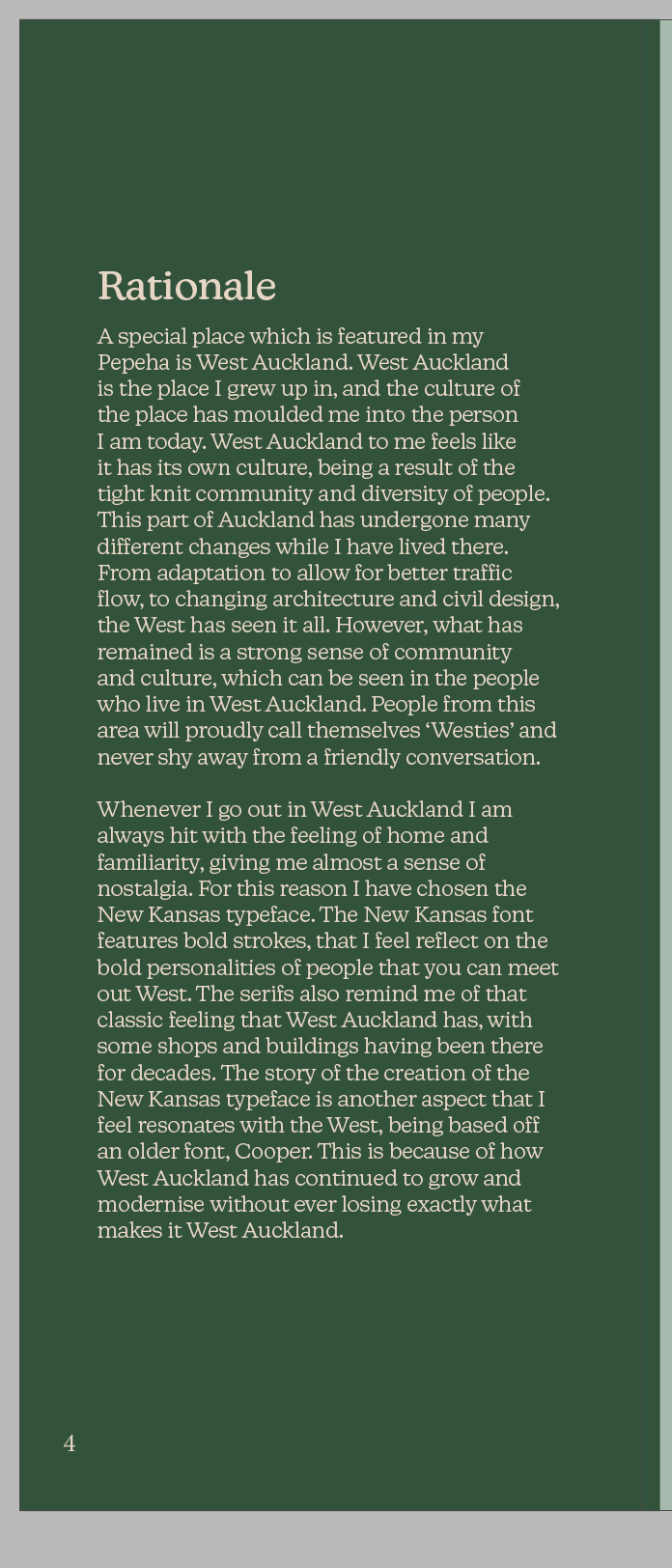
A special place which is featured in my Pepeha is West Auckland. West Auckland is the place I grew up in, and the culture of the place has moulded me into the person I am today. West Auckland to me feels like it has its own culture, being a result of the tight knit community and diversity of people. This part of Auckland has undergone many different changes while I have lived there. From adaptation to allow for better traffic flow, to changing architecture and civil design, the West has seen it all. However, what has remained is a strong sense of community and culture, which can be seen in the people who live in West Auckland. People from this area will proudly call themselves ‘Westies’ and never shy away from a friendly conversation.
Whenever I go out in West Auckland I am always hit with the feeling of home and familiarity, giving me almost a sense of nostalgia. For this reason I have chosen the New Kansas typeface. The New Kansas font features bold strokes, that I feel reflect on the bold personalities of people that you can meet out West. The serifs also remind me of that classic feeling that West Auckland has, with some shops and buildings having been there for decades. The story of the creation of the New Kansas typeface is another aspect that I feel resonates with the West, being based off an older font, Cooper. This is because of how West Auckland has continued to grow and modernise without ever losing exactly what makes it West Auckland.
1 note
·
View note
Text
Crunch time! more text!
From the last post I resolved the transition to the next set of text. I decided to pivot and keep the West a larger size, rather then sticking to my plan of reducing the W back to its initial size. I did this because making the W bigger and then smaller for no reason would be literally redundant, as it wouldn’t add much. I am happy that I picked this up as this is something I learnt during the first part of the semester, designing with intention.
I moved the stretching W’s end position closer to the left so when it transitions fully to west it is centred. I then had the ‘ko Toku Wahi’ drop down subtly, as the emphasis should be on how West is my place.

0 notes
Text
Transition to next part!
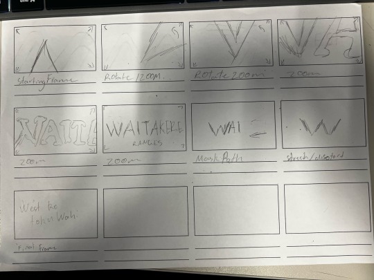
After completing the previous transition I wanted to create another transition that focused on my place. For this one I referred back to my rationale, and how I talked about the people of west Auckland being diverse. So for this transition I used the scale and position effect to distort and stretch the letter W, this was meant to portray the diversity and variety of people that come from the west (Westies). The W then rolls out letters to make the word West. I haven’t fully yet resolved this transition as I don’t know how to move to my next set of text which is ‘West ko Toku Wahi’.
This transition is meant to tie in with the first initial transition of the moving image. Tying place, the ranges and nature, with the people of west Auckland.
0 notes
Text
Week 12 class
In week 12 most of the class was spent doing our own work and doing some one on one feedback sessions with the lecturers. While the lecturers were with other students I did some work on my project.
As suggested earlier on by Emil, the text of my work could use some some kerning to help ease the spacing between the letters. This is a small change that helped to give my work a more polished look.
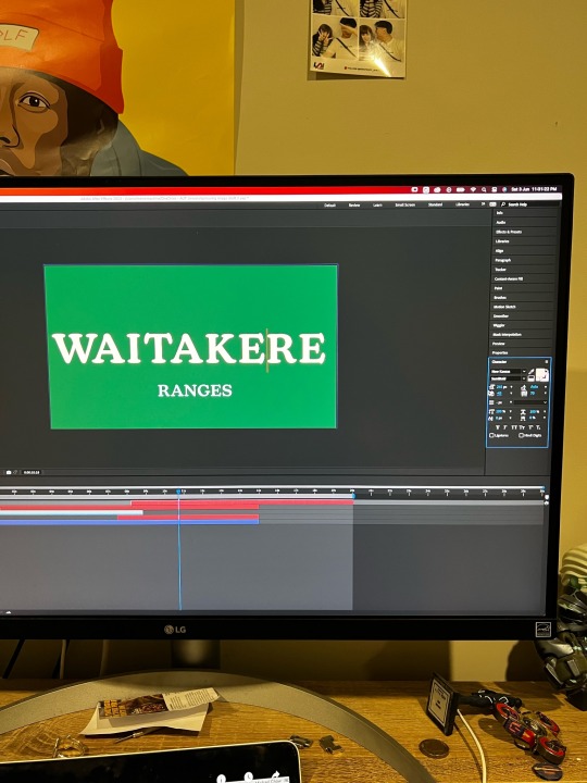
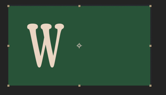
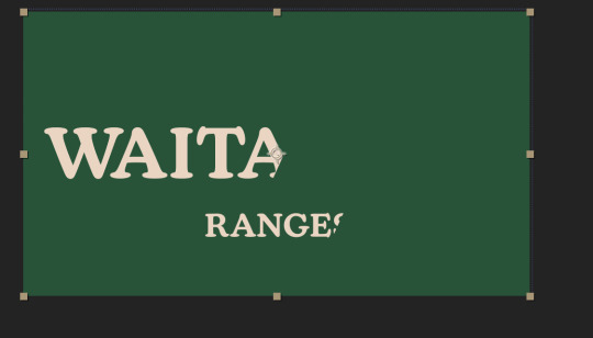
After kerning I also took another piece of Emil’s advice and simplified my colour palette down a bit. I did this by making the colour of Ranges the same colour as Waitakere. This was bring more emphasis on the text it self rather then the colours.
I knew that I wanted to bring the emphasis of the piece back to the W for the next transition. I experimented with using the Mask path effect on my text as an outline. But the issue was that using this effect was not optimal as it could only be used at a straight vertical angle. Meaning that when the mask was made it would cut off a bit of the W or A of Waitakere. Instead I used the pen tool to draw a shape and then used the position effect to move it into place like a mask. I then repeated and synced this effect the Ranges part of the image.
1 note
·
View note
Text
Editing Type Specimen Booklet
This week in class I left my laptop at home and have been working on my blog and editing my Type specimen Booklet. I had already looked at my feedback and had a plan of attack ready to improve my booklet. Firstly I came up with a new Title, that being Place in Type. This meant to show how place and be represented in type. I got this by looking at the two largest aspects of my Booklet type and place. I was originally going to settle for the much more literal title of "New Kansas, Exploration of Type & place".
Another change that was featured in my feedback was the colour blocking on page 7, as it didn't really add much. This links back the idea of design with intention which was something that I worked on when initially starting this project. After removing the blocks of colour I decided to leave the page blank with just the image. I thought about what I could add here but I settled on not adding anything at all to place greater emphasis on the image and place.
I also fixed minor errors, such as page 4 a miscoloured page, and hyphenation on page 15.

0 notes
Text
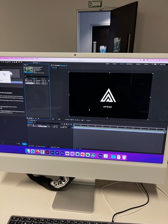
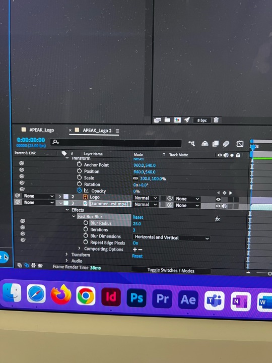
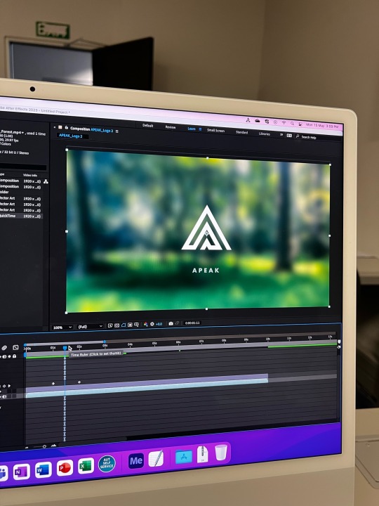
implementation of video
I replaced the video in my moving image with the one I had shot in the Waitakere Ranges. This helped to tie my place into my moving image. I started my moving image with it zoom in on the Peak of the W, this shows the correlation between my place and the typeface.
I also edited the pacing of when the 'Ranges' pops out and joins the 'Waitakere'.
0 notes
Text
Video Results and New Plan
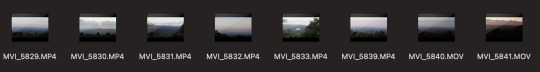
The video results were good, I spent a little bit of time looking over them and have an idea of what clip I would like to use. I am using one of the Timelapses that I took, as the clip shows the progress of time and would fit well in my kinetic type.
I also spent part of the evening drawing a brief new story board to base my next phase of work on. I would like to use the mask path effect to emphasise the w of Waitakere and then transition it to the work west. My general idea would be to stretch and distort the W and then reveal the word west Auckland. I think the stretching and distorting of the W would help to show the general diversity of West Auckland.
Am still deciding if I go with 'West Ko toku Wahi' or 'West Auckland Ko tohu Wahi"
0 notes
Text
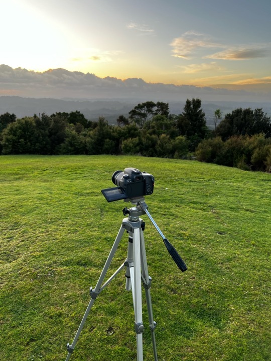
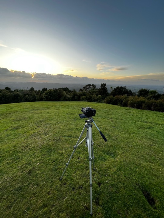
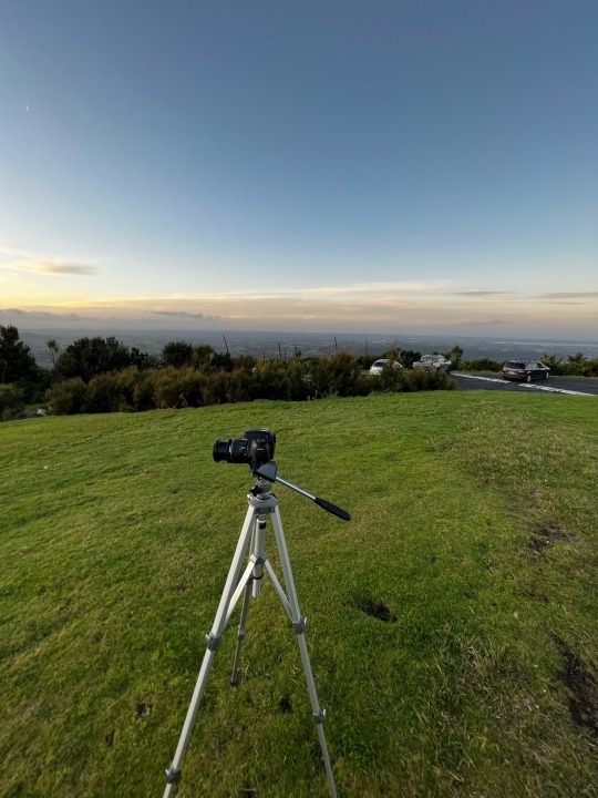
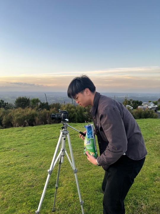
I Went Up a Mountain.
On Wednesday after I finished at work I went up to Pukematekeo lookup out. This is a part of the Waitakere ranges and is the northernmost hill in the ranges. With the Waitakere ranges being a part of my Pepeha and Type specimen book, I thought this was a good place to look for footage. Pukematekeo also helps to feed into the Waikumete, another place featured in my Pepeha.
I drove up at around 4:50pm to prepare before sunset, I brought my tripod and camera. I first filmed several still clips looking out on west Auckland, and then later a couple Timelapses.
I think this was very refreshing to see the beauty of West Auckland and helped me to strength my resolve in this project.
0 notes
Text
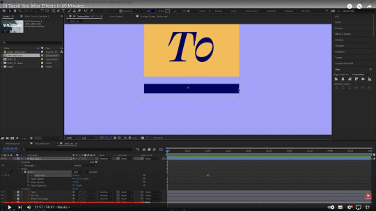
Youtube tutorials
After class on Monday I spend a couple hours going through after effects tutorials. Youtube was very handy for this as it has a wealth of knowledge that is easily accessible. One of the best content creators for this was Ben Marriott, who specialises in motion graphics and after effects.
I first watched his After effects in 10 minutes, and then his After effects in 60 minutes. This videos helped me to familiarise myself with the programme a bit more and helped to inform me of some effects that I can use in my kinetic type. One take away I got from his videos was the Mask path effect that I think will help me transition between text in my work.
Other videos I watched were lists of useful effects to use and videos on the fundamental basics of animation and motion graphics.
0 notes
Text
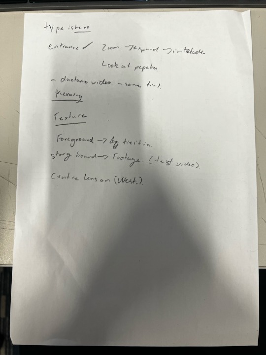
Week 11 - Feedback and Improvement
Today in class we looked into exporting our clips and how we can compress our video files using handbrake. David also talked about how we can use different presets to export the video for different formats.
The lecture aspect of the class was short but I then talked to Emil about my work so far. He mentioned how I need to remember that type is hero. and that should be the emphasis of my work. He confirmed my thought that concept one had more room to develop and is a stronger idea. Emil and I talked about how I can use video as texture and I can tie it into my older work using a tint or duotone effect. We also touched on shooting video and how I need to ensure that I focus on west Auckland.
I also briefly spoke to David, he had similar feedback to Emil. They both mentioned how I should change my text to some thing that makes a bit more sense. Emil in particular mentioned how I have 30 seconds and should explore using more pieces of type.
By the end of the class I had an improved draft, which was an improvement of concept 1. I altered my original concept to show the text rotating into place, with the first frame being a nod to the Waitakere Ranges. I also spoke to David about using a track matte to show video footage of west Auckland. For the time being I used stock footage as a stand in.
0 notes
Text
Adobe tutorials
For the remainder of class I took advantage of the Macs in class and did some adobe tutorials for After Effects. I used the in app tutorials that give helpful step by step guides. This was very helpful in teaching me how to import and use illustrator files in After effects. It also went over some of the effects that we had already learnt such as position and opacity. It also showed me how to use blur and mirror effects. This just helped me get familiar with After Effects.
0 notes
Text
Week 10
Today in class we continued to expand our skills in Premier Pro by looking into Timelapse. We looked at how we use Premier Pro to create Timelapses. We looked to inserting organised photos and placing them in the programme turning them into video. We also looked at using the power of the programme to interpret the Timelapse to smooth out the frame rate.
We also did this for a claymation exemplar, Which I will show in another post.
I also showed my concepts to David, and I received some feedback from him in turns of my work. He mentioned how I can use video in my work to link to my pepeha. He also touched on how I could change the text of my work to be more relevant to myself and place.
0 notes
Text
Concept two
This is another concept that I created using my storyboards. This one shows off how the west features an array of people from different backgrounds and communities. I did this by showing how the letters come in from different areas.
I like this one but I feel that it may be a little bit boring. I think I will continue to develop my first concept. However, I still think it was good to digitise both of my ideas.
0 notes
Text
Concept One
This is my first concept that I created from my story boards. Featuring the zoom into the West title screen, this was to show the grandeur of West Auckland and its significance to me. I reinforced this with the bounce that I added to the end of the zoom out that shows the weight of the word in the composition.
I feel that the timing of the piece could be improved, and it could use some more dynamism.
0 notes