
Last Seen Blogs


Text
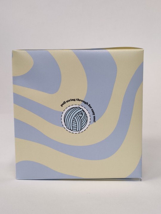
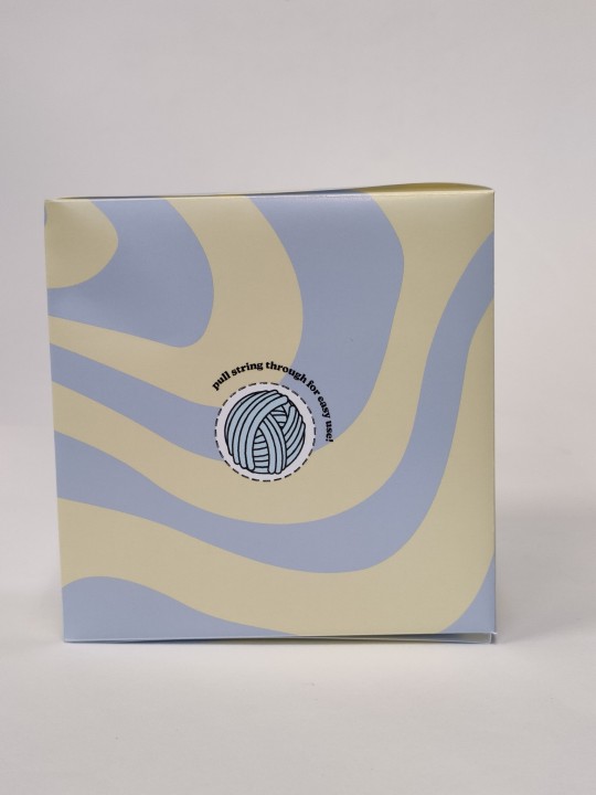
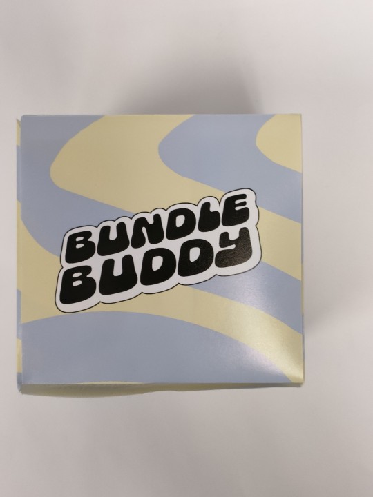
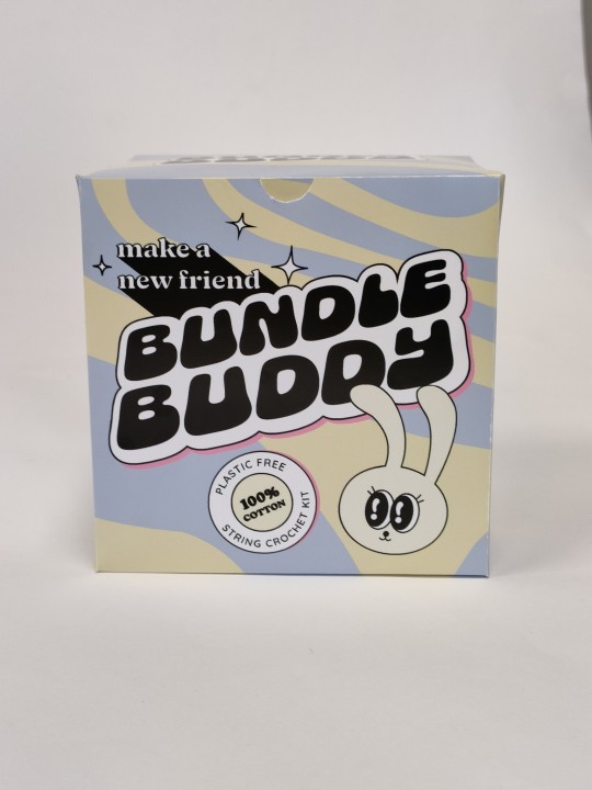
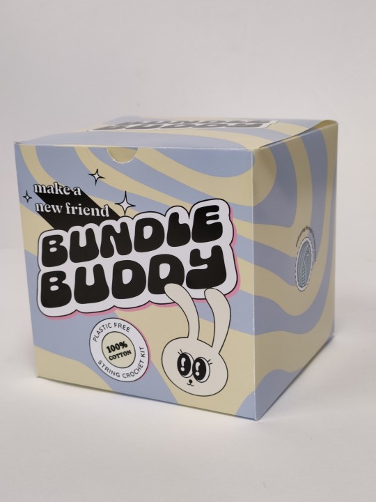
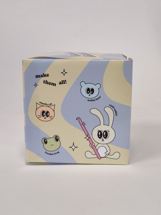
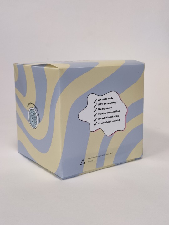
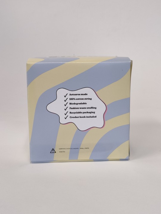
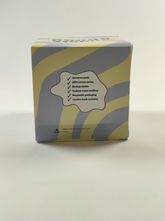
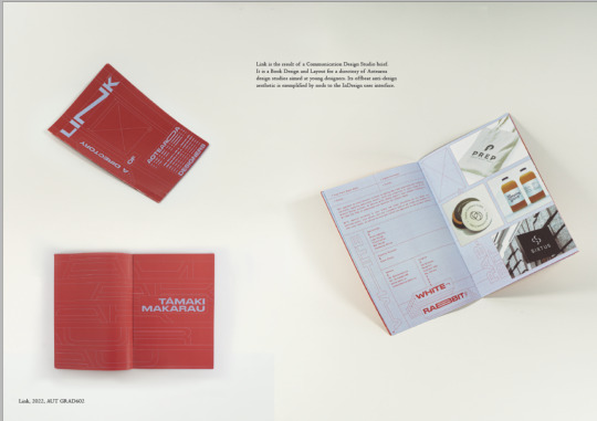
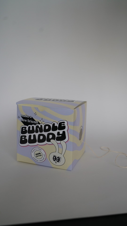
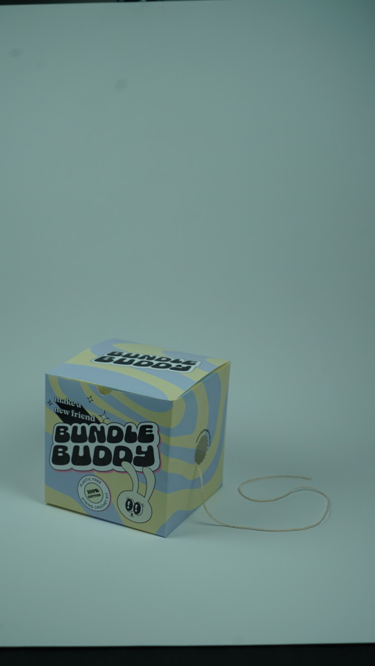
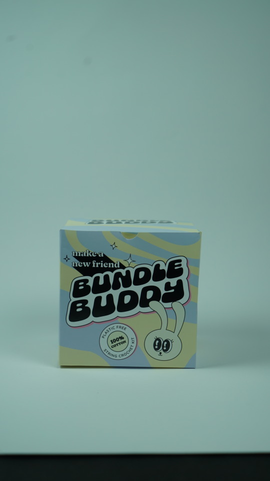
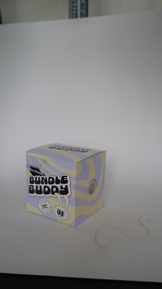
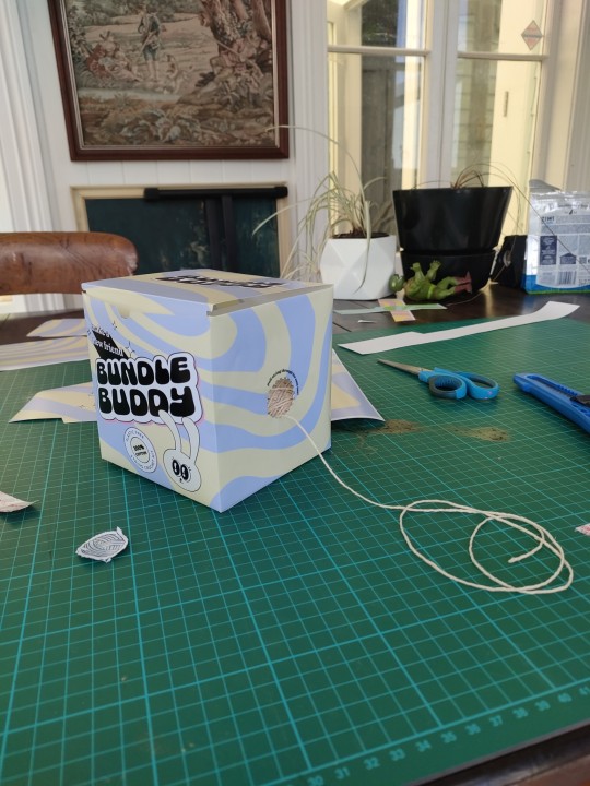
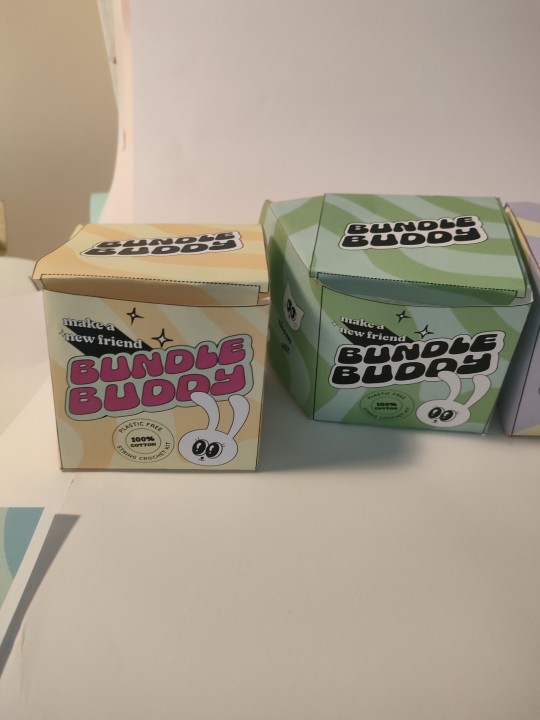
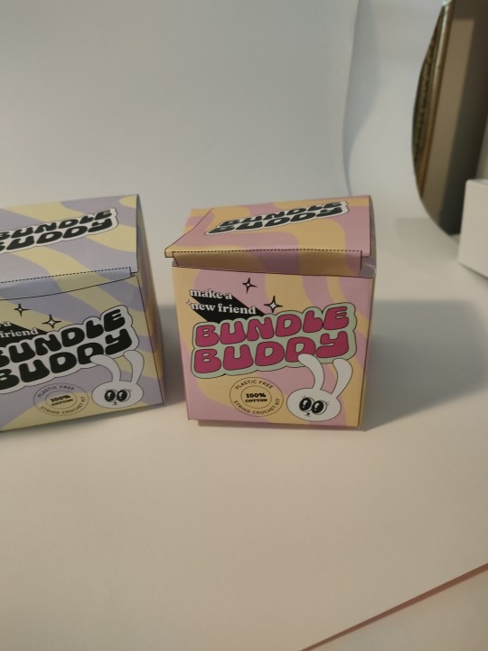
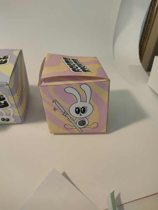
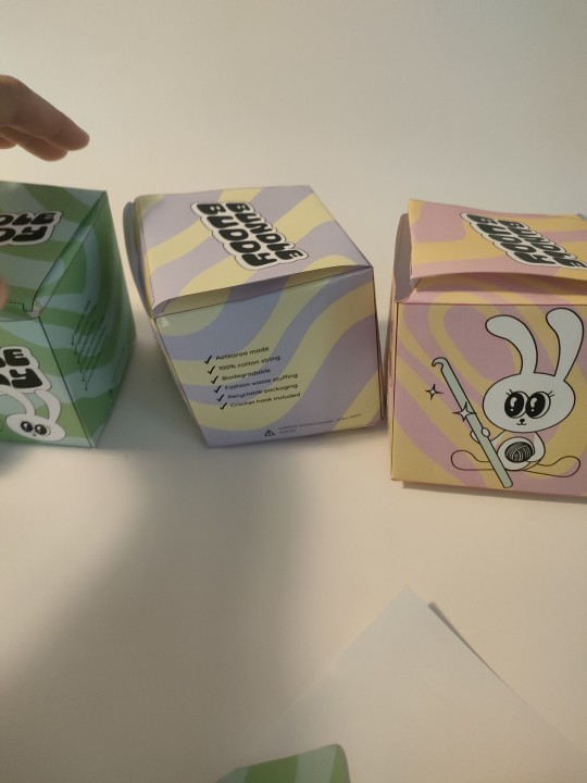
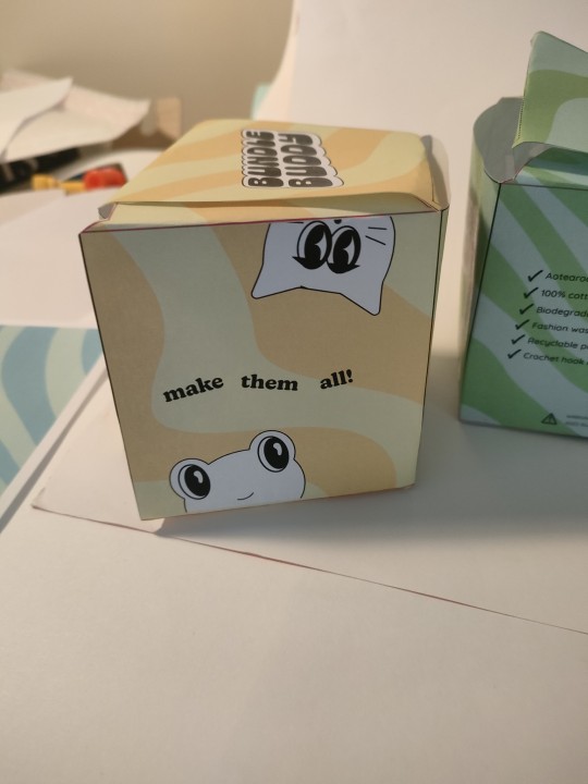
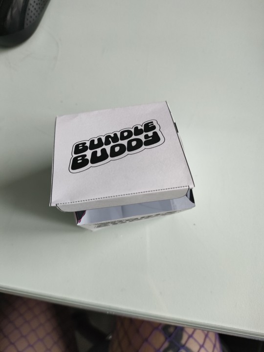
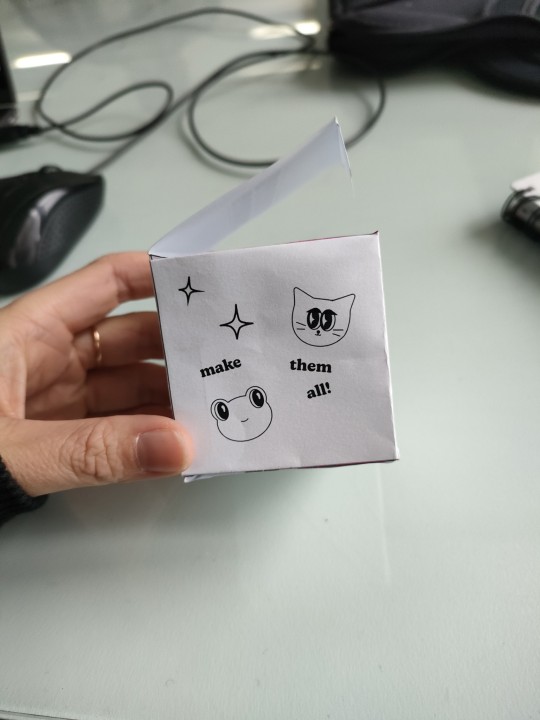
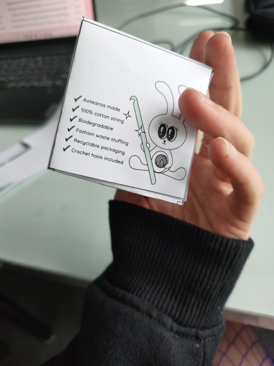
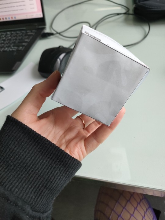
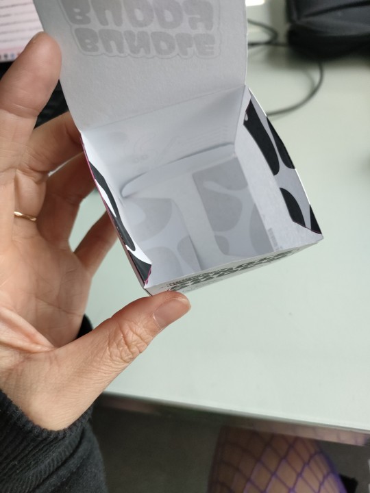
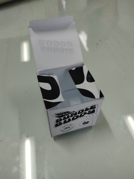
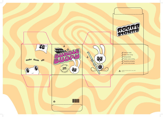
My final package design. I think it works apart from a few construction issues I had right at the end. I think if it was a thicker stock it would also be more effective. Also I'm slightly disappointed with the blue/purple tone of the pattern I'm not sure it quite came out right on this printer...oh well!

0 notes
Text
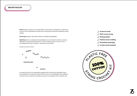
Some key moments from my brand book. I was reasonably happy with how this turned out although I did feel a bt rushed. I think I could definitely have refined a bit more to make it look slicker and more put together. As it is it is consistent with the brand and the packaging.


0 notes
Text
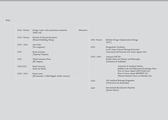
I added this very subtle lines to add a bit of interest and to support the information design aspect of my CV page.
I’m reasonably happy with this, there a certain things I would change and will probably when I go to apply for internships. I think I would retake some of my photos in a bigger space so that I didn’t have to rely on photoshop to extend some of the backgrounds. I think I would also adjust the greys and make sure everything was in the same colour story. I’m also concerned that although I understand the importance of having the work speak for itself and keeping the design system simple, I do worry that it doesn’t really feel very ‘me’ when I guess the point of a portfolio is to demonstrate you and your style etc. I think I come across as a bit reserved or demure which I don’t think I am both personally and design wise.


0 notes
Text
CV page iteration. This was tricky information design...
0 notes
Text
Another example of student work I see all the time that’s clearly influenced me subliminally! This is up by the risograph printer and I do think that my design for Bundle Buddy would have worked really nicely with riso but again i just didn’t have time!
0 notes
Text
Portfolio
I am going to go for a super simplistic minimalist (eek! not really me!) design system for my portfolio.

I’m reasonably happy with these although if i had a bit more time I would make some adjustments so that all the greys were the same tone. This was tricky as I mostly used real photographs in combination with some stock mockups so everyhthing was a bit differnet in terms of lighting.
0 notes

Text
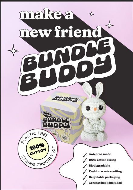
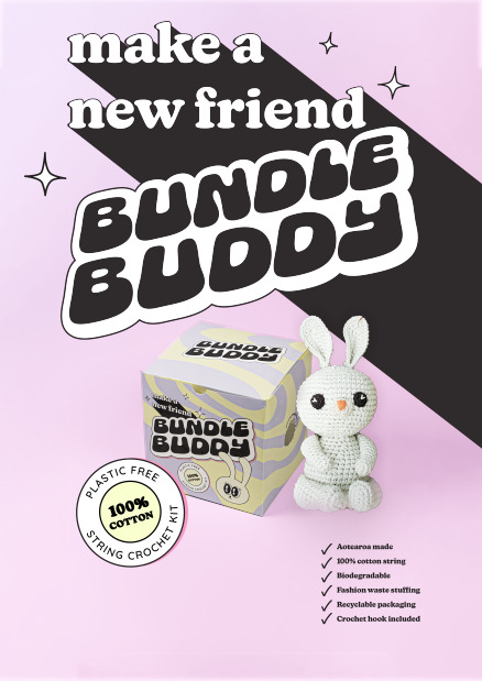
Ad iteration.
I wanted this to be a very simple ad, essentially emphasising what the product is, highlighting the key brand vlaues of sustainability and getting the tagline in peoples’ heads.
0 notes
Text
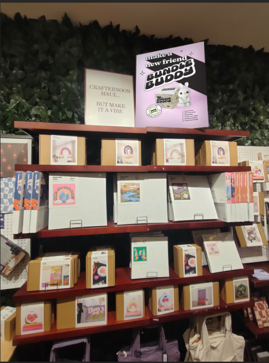
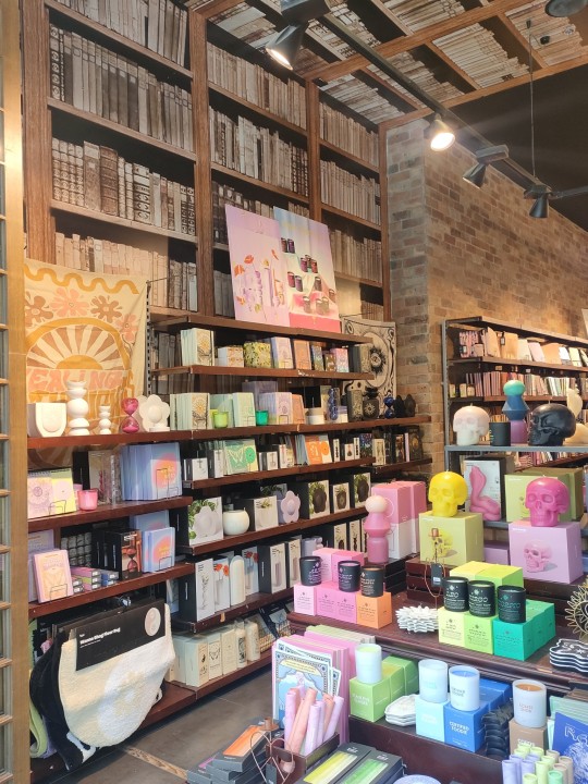
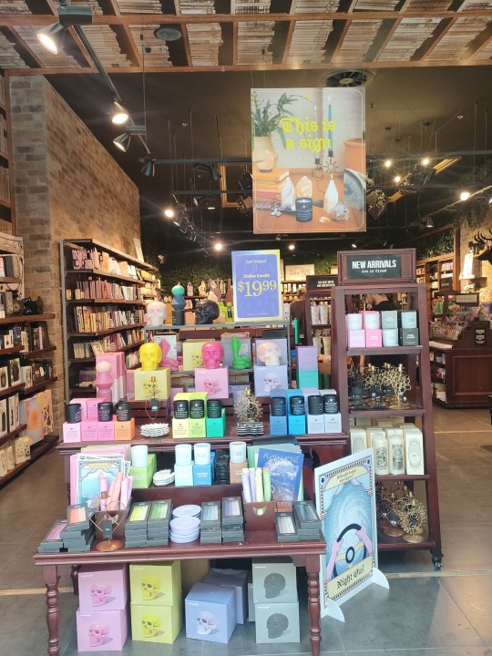
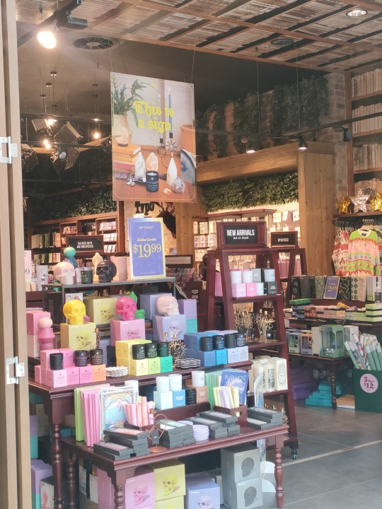
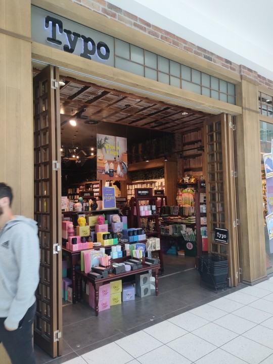
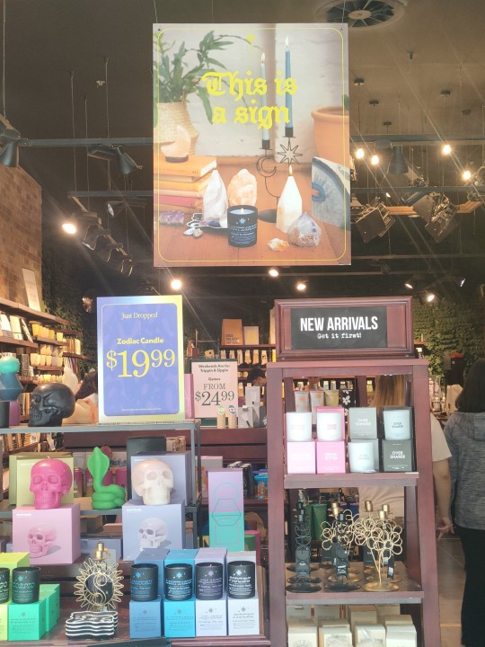
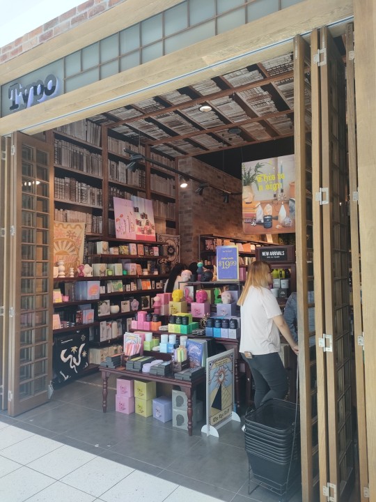
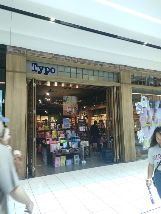
I got some more photos of typo and looked for point of sale areas which I could use for my ad mockup

0 notes
Text
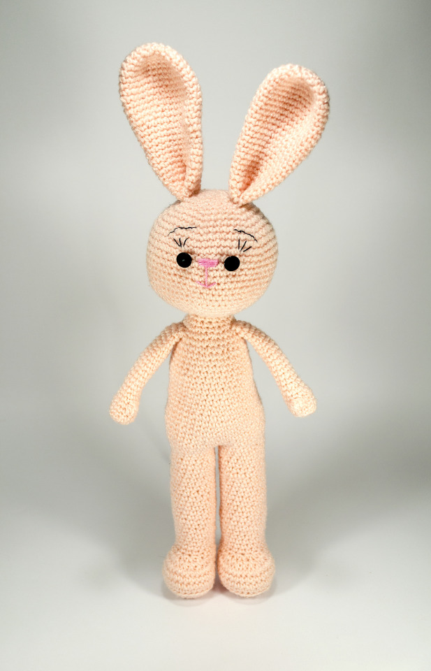
For my ad I want to use a photo of a crochet bunny to give the impression of the finished product, enticing consumers to buy it. I tried to look for one to buy so I could photograph it in a real space with the package but this proved more difficult than expected. Instead I found a couple of stock photos on shutterstock which i have a subscription to so hopefully I can make these fit my vision.


0 notes
Text
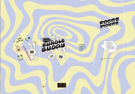
First to scale mockup. It’s looking pretty good but I mucked up the cutt and ended up cutting off a tab. Also I need to work on the perforated edge as it was impossible to poke a hole through without ripping a big chunk off. I think this is a lot to do with the paper stock which is a lot thinner than what would have in the ‘real world’ which would be CRB. This is satin 200gsm which was the only avilable at large format everywhere I tried. Given the size requirements of the package it needed to be printed on A2 so i was a bit limited in terms of stock. If I had a thicker card I think the perforation would be more effective as there’d be some surface tension you could push against to pop the hole out.
0 notes
Text
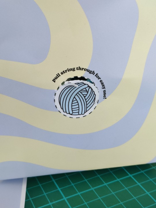
Placing on the net for first text print. I gave away the idea of the bunny holding the ball of string as I couldn’t make it work and it just looked to busy. Instead I moved that on its on to the side and i’m going to give this a perforated outline so that you can pop the hole out and pull the string though. I’m also not sure about the face with the haracters on just yet. I think maybe its a bit crowded. I’ll have to see when I movk it up. I think because of the pattern I like the idea of a decent amount of negative space around elements, althugh of course it’s not really engative space because it has this crazy psychedelic pattern to it.
0 notes
Text
starting to get somewhere with this! I like where the colours are at mostly. I think the struggle with this background is that it makes the info on the back quite tricky to read. I’m trying this different white graphic elements to give somewhere for the text to sit.


0 notes
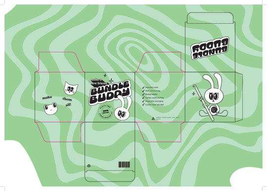
Text
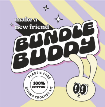
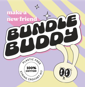
Lots of iteration with colour combinations. In theory I like the idea of moving away from the black and white in the logo but in practiice its not working, or at least I’m not finding anything that’s better than the black and white. I’m trying to push myself as I tend to hide in the safety of black and white or minimal colour in my work.

0 notes
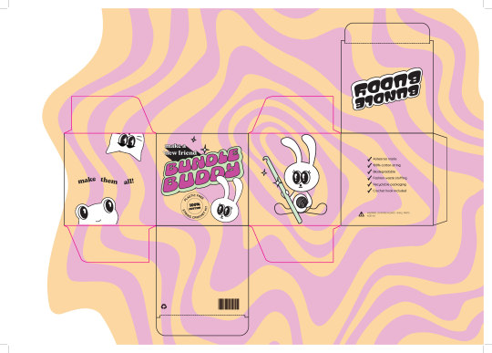
Text
Some colour combinations mockups.
I'm a bit torn at this stage with the colours. I think what I'm liking is the contrast of the black and white with the colourful background. But I think the black and white parts still need maybe a touch of colour to offset the homogeneity of those sections and maybe bring it into the visual world of the background a little. What could be a good approach would be to have these different colour combinations as different versions of the products in the same line i.e. the different animal characters you make correspond to the different colour patterns


0 notes


Text
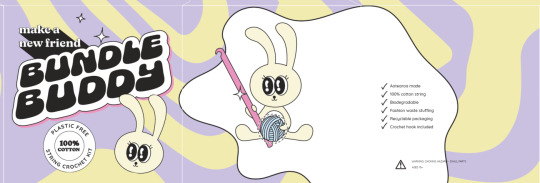
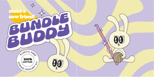
Colour was the big hurdle (and still is!) I know I needed to inject a lot of colour, especially after talking in class with everyone during the packaging workshop but I was struggling to find a way to do it, especially as I really like the boldness of the black and white of the logo. I came up with this kind of psychdelic pattern which lives in the same visual world as the logo and also I think reflects the shape and movement of string.
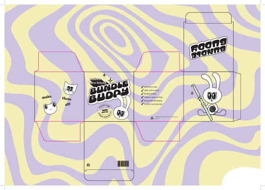
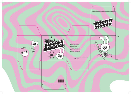

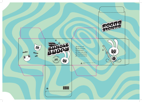
I tried a bunch of different colours and I’m having trouble deciding. Next step is to print them out and mockup them up and see what they look like in the real world.
0 notes