
wongwoanxiu
AY23.24 World of Ideas & Imagination
6 posts
Don't wanna be here? Send us removal request.
Last Seen Blogs

platinumsubzero
Platinum Sub Zero Repair
bokunogentoo
Boku no Gentoo
bodrumgaysohbet
Bodrum gay sohbet

ultra-fanboy-boy
What does it need a title for?
Text
WOII - Phenomenology
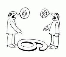
To me, Phenomenology is about perceiving artworks in different ways. One example would be, the picture of the duck and rabbit. Some people sees it as the duck whereas others sees it as the rabbit. To me, this means that everyone perceives things differently, hence as a designer I should be able to perceive things differently in many ways possible to understand our audiences deeply to create a design that benefits all. It offers a framework for understanding and designing for human experiences which fosters empathy, authenticity and meaning in the art. For example, the ‘6 & 9’ joke, in our perspective, we could understand why both of them were arguing that the number is 6/9, however they cannot. This is when we should come in to come up with a solution that benefits all. One takeaway this lesson has taught me that helped me in my studio work is to learning how to evaluate my work in different ways. While I understand that everyone has styles of their own and have different types of artwork that they may like, it helped me decide what works the best for my design. It has also helped me keep my options open when choosing my materials/medium, I would reconsider my choices and that has helped me learn much more new things and be authentic.
0 notes
Text
WOII - Reflections
Initially, when I first started taking World of Imagination & Ideas lessons, I found it hard to understand and thought it did not relate to what I was learning in school. Overtime, I felt like it has helped me broaden my design knowledge, getting to know more techniques, artists, art styles, philosophies to research on that could help give my work more variations instead of always sticking to one style. Learning how to analyse artworks helped me breakdown works structurally that could deepen my understanding on the Artist’s motive, the steps taken, and the materials used for the work that may be related to the motive behind it. It deepens my understanding of graphic design which I now feel is so much more than just communicating through elements and words. World of Imagination & Ideas has taught me to enlarge my ideas and think differently where I could get inspired by things easier. I keep myself open to new ideas even if I think it does not relate to what I am doing because I know that it can help me learn one thing or another that I can apply in my work.
0 notes
Text
WOII - Semiotics
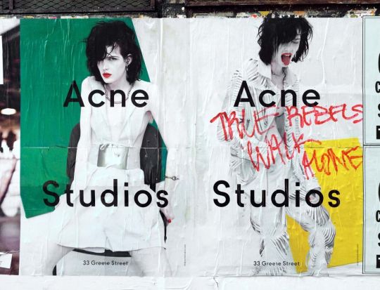
I learnt about pictorial representation and how it appears in our daily lives. Three types of signifiers would be ‘icon, index, symbol’ whereby icons are straightforward representations, index are icons that people would easily relate to a certain word, eg skull - danger. Symbols are this universal icon that all of us will learn since young, an example would be numbers. Some important elements that plays a part to pictorial representation, such as: point, line, plane, pattern and texture, space, time & motion, value, colour, balance, rhythm, scale and proportion, emphasis, unity. This lesson has helped me identify more varieties of ways to represent an idea I want to show. For example, in craft visual narratives workshop, I wanted to represent eeriness and the rat race culture. I used a caution tape to paste across the HDB flat to represent ‘danger’ and desertedness of the place. Using a dying heart rate to represent emptiness in humans. I chose this poster from Acne Studios to analyse on. Acne Studios promotes themselves as a ‘mystical world’, with poisonous vines and roots. The crumpled texture on the paper represented veiny branches. The scribbled red letters gives it a grunge look, and acts as a ‘warning’ and rebellious. The monochromatic clothes on the model have a contrasting look against the vibrant green/yellow on the background. The elements complement each other that gave it a chaotic and wild vibe that represented their clothes.
0 notes
Text
WOII - Post Modernism
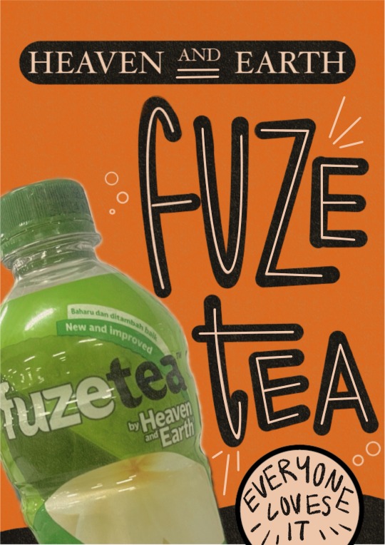
What I like about Postmodernism is that it encourages us to be bold and playful in our art. It makes us think out of the box, experiment new styles and break design traditions. Some takeaways are, adding pluralism to my work, multiplying the object or learning to group objects of the same style to make the poster loud. Secondly, combinations of 2 different styles together and using of historical references. Postmodernism has integrated into my school works in ways such as using embroidering chinese characters on my work, combining with modern art. It taught me to always explore in various ways, like using different methods (burning, cutting, crumpling, sewing) or different styles like grunch + swiss. If we had more time, the things that I would improve on for the poster I made with Joyce would be making the combination of 2 different styles more obvious. We were going for a retro poster so we could have added in some elements of futuristic, adding in more variations of colours, making it 'conceptually weird' by playing with the concept of 'heaven & earth'. We could have added in exaggerated photos of heavens or the earth, fragmenting the photos then putting them together. How Postmodernism was effective in the poster on the right was that there was some balance in the messiness of the poster, and that the design created this warp effect that felt out of place which drew me in to read more about the poster.
0 notes
Text


WOII - Analysing Artworks
Today’s lesson about analysing artworks could be broken down into 5 parts: processes & purposes, subject matter & meanings, choice of medium, aspect of form, lastly context of piece. Some main takeaway of today’s class would be analysing works through their texture, how the texture plays a part to the function of the work. What was interesting about what was taught was being introduced to the different textures people creatively thought of. Eg. batik, crochet, tarps (freitag), and from plants (ratten and bamboos). There is this aesthetic about a work that the texture of it can help further group it and helps us to analyse. During the group discussion, we were able to group different items into different categories we made up of, eg; materials, daily life, time, vintage. Today’s lesson helped me deepen my understand with narrative visuals craft workshop whereby I understand what different textures communicate, and being able to group subjects together that communicates a clearer idea. Some interesting works I saw at the museum helped me practice analysing artworks. Eg. upcycled keychains, combs, earrings. From the texture and the fact that each item has a completely different swirl and mix of colours, I could tell that these were made from upcycled plastics. Also note that these are daily items that we are able to use daily, which then could be a daily reminder to ‘reduce plastic waste’. Another example; stilt house.
There is 2 textures communicated in this artwork; wood and paper. I think the choice medium really reflects an accurate 3D representation of stilt houses in real house which helps to to touch on the purpose and context of the piece, communicating this rundown and authentic vibe to it. The aspect of form communicates this realistic layering of the houses, and the background, both of different medium that helps us imagine being at a place with stilt houses and to understand the culture deeply.
0 notes
Text

WOII - Aesthetics
Some key takeaways from today’s lesson would be ‘form’ and function’. We were to digest the 'crystal goblet' paragraph and understand what the content is about. The essay speaks about this metaphor comparing typography and a crystal goblet, whereby type should be simple for the readers to focus on it easier. One of the few slides showed the essay with serif typeface, another with san serif type, and another with this permanent marker texture font. All fonts are definitely readable, but this is when form and function comes in. Comparing the font and the context of the essay, the permanent marker font definitely does not align with the aesthetics of the essay, as this type of fonts are normally comedic. As for the san serif font, it is readable but it does not bring out the classy and elegance of the essay, which means the last serif font would suit this essay the best. I think this lesson helped me with choosing a font for my studio work for the trading card, helping me narrow down my choices to ensure that both the form and function are working together to communicate the idea I want to portray. We went around Sim Lim Sq to look for logos to discuss further about form and function; here is one example:
Dalgona coffee: This is a coffee candy and I could tell that the designer was going for a cute illustration style to communicate the product. I think that the form and function worked together well as it attracts the correct target audience, and the image sells the product, I feel is very straight forward that it is a coffee flavoured candy.
0 notes