
Last Seen Blogs

saturatedwords
Saturated Words

raevens-world
Untitled

baddiebbrbtingz
certified angel of brahma propagandist and dumbass

sansharafova
SansharaFova
lulycj
Luly
Text
Final Evaluation
Describe the stages of the project
- Had to create a mind-map for what time-based work is?
- Conducted research on different examples of time-based work?
- Conducted research into artists and designers on the internet and at Nottingham Contemporary.
- Experimented with stop frame animations.
- Conducted research into what a ‘Ident’ is, and the types of ‘Idents’.
And much more...
What went well/not so well and why?
The things that went well was producing experiments of the Channel ‘Z’, research into artists and designers, and producing stop motion animations. The typography really connected with the ident, strong detail in research, and I was getting confident in using stop motion by understanding the frames. The things that didn’t go well were my audios, and GIFs, there was an issue when it came to uploading it onto Tumblr.
What did I enjoy most/least?
I enjoyed producing variations of Channel ‘Z’ the most, as I confident in trying out my skills in using the tools, which helped me to produce effective idents.
Have I progressed as well as I could? Why?
Yes I believe that I have because my Photoshop skills are getting stronger, as I’ve been using the software in projects, and I’m learning to be more experimental in art.
What have I learnt from this project?
I have learnt that Time-Based work is art work that has a duration, like audio, photography, installation, poems etc.
What would I do differently in my next project?
Although this will be difficult for me, I will try and be concise with my theoretical work, giving more time to produce practical work.
2 notes
·
View notes
Photo

Time Frame Animation Experiment 2 (Developmental)
Formal elements & Evaluation
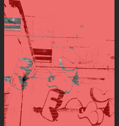
Although this is meant to be a sequential animation, I find this very interesting, as colour, repetition, pattern, and composition creates a pop art style because it uses the idea of Ben Day dots, and makes me think of Roy Lichtenstein's style of work. The colours fill the artwork with joyful energy.
Done well in being experimental with layering, composition, and colour by using my Photoshop skills. Could improve by gaining knowledge in GIFs, and creating an animation in Photoshop.
0 notes
Text
Developmental Process for Time Frame Animation Experiment 2 + Evaluation

1. Firstly, I set up my timeline, opened up a image, and went on Image - Adjustments - Threshold
2. Then, I duplicated layer to add another effect onto it.
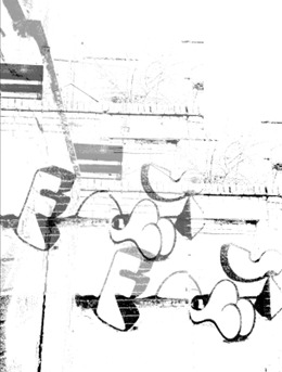
3. Afterwards, I overlayed the duplicated layer over the previous one,by playing with the opacity.

4. Finally, I clicked on the Paint Bucket Tool, and selected the colour red for the for the imagery.
I believe that the process went well, as I was confident in being developmental with Photoshop, and playing around with different tools to create another resolution. However, getting the animation to work didn’t go well because that issue with no movement of GIF was faced in this experiment.
0 notes
Photo


Influence for my work

Although the animation didn’t come out the way it did, I got inspired my Keith’s repetitive imagery drastically changing in a narrative sequence, which gave me the idea of repeating my photographs, but changing the sequence as I go along. But there’s a difference between our photography. My work is presented using thumbnails. Whereas, his work shows more of a narrative.
0 notes
Text
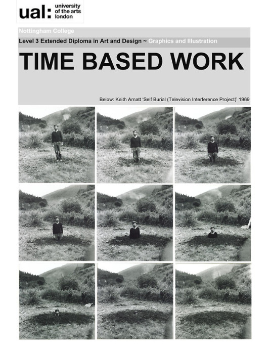
Keith Arnatt - ‘Self Burial Television’
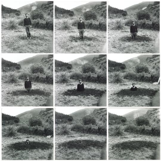
http://www.tate.org.uk/art/artworks/arnatt-self-burial-television-interference-project-t01747
Formal elements & Evaluation
I find this photography very interesting, as colour, repetition, composition add a calm and quite sad emotion - in other words, it almost looks like death, which I don’t want to think about as it can be a disturbing subject. I believe that the balance of light and dark in the photographs, is meant to reflect the calm atmosphere. It reminds me of my time frame animation on Photoshop.
I believe that the artist has done well in using a balance of light and dark, composition, tone, and repetition because they reveal every detail outside (scenery and the man). I don’t feel that an improvement is needed because the artist shows everything he wants you to see in his photographs.
0 notes
Photo

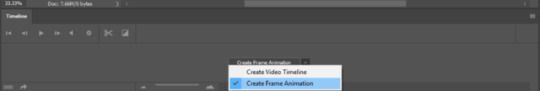
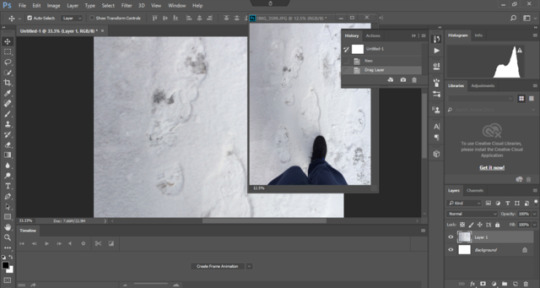
Alistair’s Session - Photoshop Time Frame Animation Process
Process & Evaluation
1. Firstly, I went on on Window - Workspace - Motion, creating a timeline for animation.
2. Once that was done, I went on the timeline and changed the setting to Create Frame Animation.
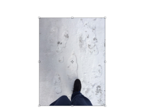
3. Then, I dragged my chosen photo to the Photoshop page, and clicked on Ctrl + T to transform by reducing down the image.
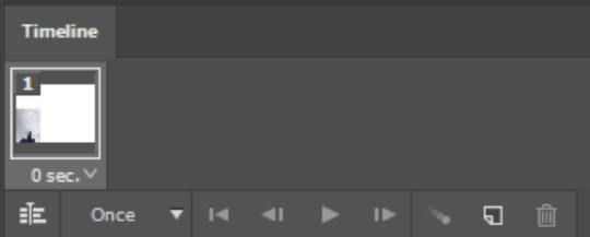
4. Finally, I dragged the image to the Timeline, and duplicated the layers. I repeated this step until a series of images was created.
I believe that I’ve been confident and committed in trying to apply my knowledge of photoshop to an animation. However, getting the animation to move didn’t work well, so I had illustrate my animation using a series of images.
0 notes
Link
Notes
- People were animated.
- Celia Chapman was one of the main people working in design for BBC.
- She worked with another designer, re-promoting the BBC.
- Produced a 3D model out of cardboard for the ‘2′.
- They would select which variation, relating programme.
- Wanted the ‘2′ to be stay as it is.
- BBC 2 had a problem with programming.
- The brief was to change people’s perception of channel.
Formal elements & Evaluation
I find this video interesting, as the colour, typography, composition, line, shape, and repetition makes the design of BBC persuasive, making me want to watch the programmes of the channel, as the typography forces you to notice the ident. The colour red, I feel, is meant to link to entertainment, and the reactions towards the ident. It reminds me of when I created a brand for tea.
I believe that the designer done well in creating different variations of BBC, as you can see the materials & techniques that have been used. In other words, it’s clear how the BBC was modernised over time. I’m not sure on how it could be improved, as the design functioned very well due to the channel having its popularity.
youtube
Notes
- The 4 is made up of different angles & shapes.
- The layering of the ‘4′ has been experimented with.
Formal elements & Evaluation
I find this video interesting, as composition, line, shape, colour, and repetition makes me think of the Dada movement, as the ‘4′ seems fragmented which links to the technique photomontage - which was often fragmented representng fragmentations of society. I believe that form plays a vital role in the ident, as there’s lots of movement expressed.
I believe that the design has been done well, as there’s lot of nice colour and the the imagery as this exotic feel. Could improve by showing a variation of scale in the design of the ‘4′.
0 notes
Video
Formal elements & Evaluation
I find your work very interesting, as I like how the typography is all apart and constructed together forming an ident. It reminds of the channel 4 video when the ‘4′ kept reconstructing itself, showing lots of energetic movement. There’s a fast flowing movement.
Done well in composition, and by keeping the camera stable, which is a weakness that I’ve had in my GIFs. Could improve by varying your letters - showing a mixture of capitals and lowercase. Rather than just sticking to capitals.
First try at coming up with a ident for the Chanel Z work. I like how it has started off but I need to add more frames as in my opinion the video isn’t long enough and requires more.
9 notes
·
View notes
Video
youtube
Formal elements & Evaluation
I find his work interesting, as the way he uses colour in the splash of water and people being slashed in slow motion is very mysterious due to the action being sequenced. I believe that through his artwork, he wants to see how his life developed into artwork, as the story he shares is quite personal. In other words, he was living in a surrealistic world.
Done well in confidently showing how his life turned into art, by sharing the story of his life, and dreamlike work because when I looked his work called ‘The Raft’, it was very dream-like, as realistically that wouldn’t happen without any cause. Not sure about improvement.
2 notes
·
View notes
Photo
Formal elements & Evaluation
There’s an interesting use of tone, composition, and colour, which adds a strong balance of light and dark. From the imagery, I can imagine them moving, even though they’re stable. The composition of the imagery is contradictory from the repetitive imagery on the outside and inside of Zoetrope.
Done well on the balance of light and dark because there’s an equal balance, showing consistency. Could improve by choosing a professional area for photography.
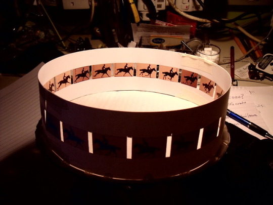
Zoetrope Animation
This is a picture of a zoetrope it is one of several animation devices that produce the illusion of motion by displaying a sequence of images or drawings showing progressive phases of that motion.
3 notes
·
View notes
Link
This video interests me because it’s very poetic and Kate add emotion to what she’s saying, and she puts her energy into her microphone by strongly expressing her thoughts. And I believe that her speech had a element of performance art, as the words that she used was subtly creating a song.
I believe that she done well in strongly expressing her thought and emotion clearly, through her expression on her face. Not sure on improvement, as her speech was coming out fast - it was hard to catch what she was saying.
8 notes
·
View notes
Link
Formal elements & Evaluation
I find this artwork interesting, as the number of typography forces you to read the headings, through the black upon white being catchy and the politics being persuasive by getting people to notice what’s going on in society. I feel that’s the point of the artwork being title ‘Vacuum Days’, as a vacuum has suction like politics does.
I believe that the artist has done well in the composition and presentation of typographic language because it makes me want to read the information and find out more. Could improve on the scale of typography, as some information isn’t legible from a far distance.
7 notes
·
View notes
Link
Formal elements & Evaluation
I find this video interesting, as colour, composition, and sound create a calm atmosphere. The shining light and the calm atmosphere makes me think of fire flies flying around the sea at night. The sound was quite unusual, as the singer was creating it by tapping gently on the microphone, and her voice through the microphone was robotic.
I believe that the artist has done well in being mysterious in the way she delivered sound through the microphone, and the rhythm she created because the sound sticks in my head. Could improve by varying the sound, and the pitch of the microphone.
5 notes
·
View notes
Photo
Project Brief for Time-Based Work.
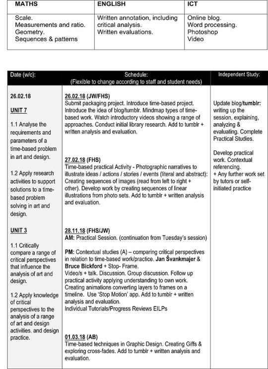

Project Brief - Time Based Work
Unit 3 on page 2 should read ‘introduction to critical and contextual awareness in art and design’
& should read on the schedule 28.03.17 and not 28.11.17
16 notes
·
View notes
Photo
They are very good photos. I like how you’ve taken photos in two different colours, and placed them next each other. There’s a strong balance, created by the contradictory photography. It reminds me of Duane Michals work, as he varies his composition like you’ve shown a close up of the lamp and the lamp from a far distance. Done well in thinking about one-point perspective. I don’t feel that it needs to be improved, as you’ve shown a strong understanding of tone and colour.
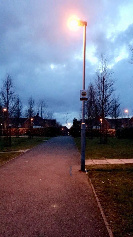
These are photos I took one in back and white and one in colour showing the same picture but one In back and white and in colour I edited these photo’s and changed the brightness and saturation and effects.
2 notes
·
View notes
Photo


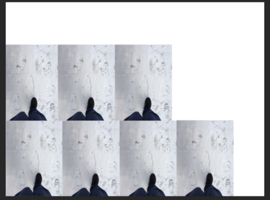
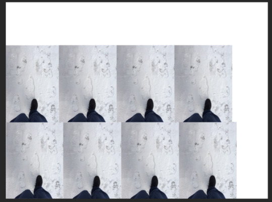
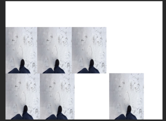
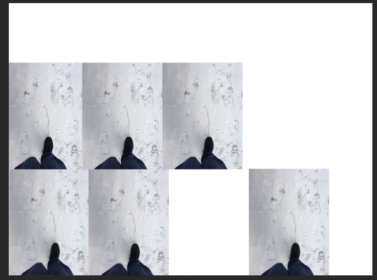
Alistair’s Session - Photoshop Timeline Animation Experiment
Note: This is meant to be an GIF animation I produced on Photoshop, but it didn’t seem to be moving when I opened it up as a JPEG. file, so I had to show the PSD. file to illustrate my experimental animation
Formal elements & Evaluation
Although the following issue took place, I find it interesting, as repetition, shape, tone, and composition have formed a repeat pattern, which creates a strong rhythm. I can imagine hearing the crunch sound of my feet walking on the snow. The tone employed in the photos, reflect that cold air and overcast on the day, bringing snow. The sequence of photographs reminds me of Duane Michal’s photograph sequence.
I believe that I done well in making a contextual connection with Duane Michal’s idea of displaying his photography in a sequence because there’s a similarity between my work and his. They both feature tone created by the balance of light and dark light from the camera. However, I could improve on making changes to the photographs, by manipulating them on photoshop, as the sequence goes along.
2 notes
·
View notes
Text
Continuation of Research
youtube
Notes
- Apartment buildings caught his attention- geometry.
- He would draw his photos.
- He had a strong interest for comics.
- Tweaked typographic language.
Formal elements & Evaluation
I find this video interesting, as colour, shape, and typography make his artwork very comical. As when I think of comics, I think of lots of vivid colours like reds and blues. I believe the idea behind his work was to show how he sees the world around him, as he transformed his photos into drawings, and to express his strong like for comics. In other words, I think he wanted people to be entertained by his work, as he would transform his photos into comics.
I believe that he did well in his experimentation of photographic work, and in transforming that work into observational work (drawings) because he’s essentially showing his different approaches in symbolising what he sees around him in his environment. I’m not sure on improvement, as I felt that he was very innovative with his work. He didn’t just draw from his imagery but created comics.
youtube
Notes
- Had a fascination with photographing.
- Her photos would be out of focus.
- She chose people by chance and got into it by photographing them.
- She would down a street and photograph one person.
Formal elements & Evaluation
I find her work interesting, as she doesn’t seem to feel any guilt from controversially photographing people without their knowledge, but confidently turns that idea into artwork. There’s strong use of tone and composition, created by her ‘out-of-focus’ photos. I believe that she wanted people to notice her innovation in photography by confidently using secret photography.
I believe that she did well in confidently using secret photography, as she was showing her photography and was comfortable in expressing her style of photography. However, she could improve by finding another approach to photography, as her artwork is likely to cause public disagreement.
2 notes
·
View notes