victvideo
vicTVideo
A stressed out enby sharing their love for classic films, video games and comic books.
13 posts
Don't wanna be here? Send us removal request.
Last Seen Blogs

lunar-witches
M O O N B E A M

bigprincess-energy
Daddy Issues™️
hand-of-devotion
voice of hope

noura-zj
Siew Hui Low

99percentprocrastination
don't throw it away
Text

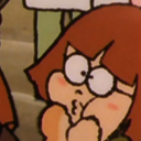
Lillian Gish photographed by Abbe as seen in the October 1923 issue of Picture Play Magazine
Caption: This glimpse of one of the early scenes in "The White Sister," Lillian Gish's first picture for the Inspiration company, holds rare promise of beauty, for it seems to have caught in its very backgrounds her ephemeral charm.
56 notes
·
View notes
Text
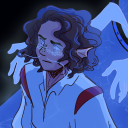
Ali: Fear Eats the Soul
Angst essen Seele auf (1974)
Dir. by Rainer Werner Fassbinder
Cinematography by Jürgen Jürges
Starring: Brigitte Mira and El Hedi ben Salem
Image Description:
Ali (El Hedi ben Salem) sits sullenly on the bed. The camera is positioned in the hallway, on the outer edges we see the doorframe whilst Ali is centred in the frame, facing us.
#rainer werner fassbinder#ali: fear eats the soul#Neuer Deutscher Film#Junger Deutscher Film#el hedi ben salem
1 note
·
View note
Text


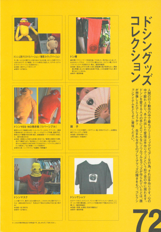


Scanned the Doshin the Giant Official Fan Book from 1999 in 600dpi for everyone's reading and viewing pleasure. Gorgeous book containing both neat pictures and amazing development facts. Would love to see some of those interviews translated.
Learned a ton just from some quick machine translations in this, been meaning to make a Doshin the Giant video for years, but now I feel extra inspired.
https://archive.org/details/doshinfanbook
34 notes
·
View notes
Text
Michel Vaillant: Le Fantôme des 24 Hours
Written & Drawn by Jean Graton

Panel from page 30 of the Dutch edition of Le Journal de Tintin Year 23 #24 (Weekblad Kuifje 23ste jaargang #24) published by Le Lombard on the 11th of June 1968.
Image Description:
A silhouetted figure is standing on an empty race track in the dead of night. The moon is shining bright and causing some light to be reflected on the edges of the silhouetted man.
#michel vaillant#jean graton#classic comics#bande desinee#franco belgian comics#le journal de tintin
4 notes
·
View notes
Text
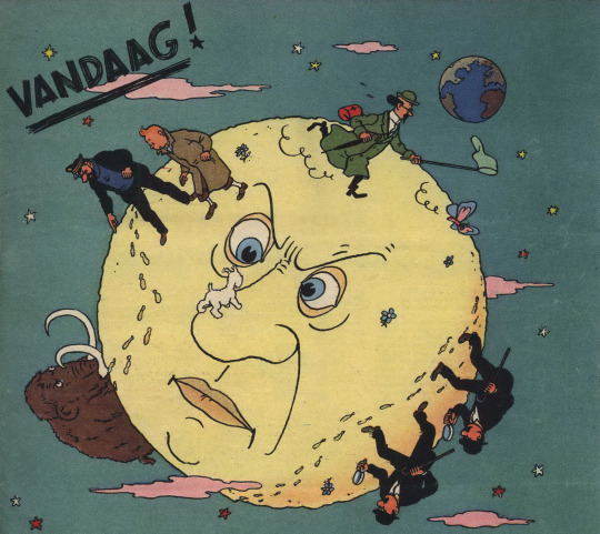
Tintin Destination Moon Paint gag Comparison
Objectif Lune (Originally serialized as On a Marché sur la Lune)
Written by Hergé
Drawn by Studios Hergé (Hergé, Bob de Moor et al.)
In this blog I attempt to show the key differences between this gag in the original serialized version and the later collected edition. I originally wanted this to be a short and simple post but when analysing the strips more closely I started to notice many other differences between the two versions, and I started to write those down as well. Obviously, the colouring is very different between the two versions something which is to be expected and I won’t really comment on.
The original serialized version of the story has only ever been rereleased in French in Hergé, le feuilleton intégral tome 11 and Tintin Les premiers pas sur la Lune both of which can be purchased on the official Tintin store. Unfortunately, the Dutch translation of the original version was never rereleased, and it has never seen a release in English at all. The images I use for this blog are scans of the Dutch language versions of these stories.
On a marché sur la Lune, Le Journal de Tintin Year 5 #27/Mannen op de Maan, Weekblad Kuifje Jaargang 5 #27 was originally published by Le Lombard on the 6th of July 1950.

Objectif Lune/Raket naar de Maan/Destination Moon originally published in Dutch and French by Casterman in 1953 (This Dutch edition is from 1981).
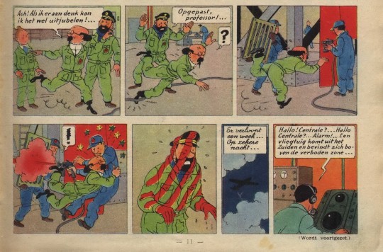
I will be going over these pages panel by panel, describing what’s different and sometimes explaining why. The first panel has been completely redrawn, so all the characters fit in the now slightly shorter panel. Tintin’s position is unchanged, but Haddock and Calculus were moved more to the left. The pockets and folds in their clothing is slightly changed, Tintin’s eyebrows are more pronounced in the redrawn version. The biggest change in this panel is Haddock’s positioning, his head is now turned more to the left (our left). At first glance panel 2 seems to have only been shortened, cutting out Calculus’ question mark balloon, Haddock’s dialogues is shortened to “Watch out!...” dropping the word “Professor”. But on closer inspection we can see that Haddock’s head is drawn differently, Calculus’ pupils are also in a different position. The third panel is now longer and a Haddock chasing after Calculus was added. The man holding the grate has been completely removed from the comic, instead we now see a signpost with a sign saying “Watch out! Freshly painted!”. But these are not the only differences in this panel, when looking closer one can see the painter has also been redrawn slightly. His overall has more folds and is a bit more detailed, his neck has also gotten an extra line and his overall also doesn’t cover his shoes as much as it used to. When looking closely at his head we can also notice that he has a new cap in the redraw which is more spherical. The last difference surrounds the man walking in the background, his original position is now covered up by the sign, so he was moved to the left and is now walking the opposite direction.
Panel 4 was also changed significantly. Obviously, the man holding the grate was removed again his exclamation mark balloon was also removed and instead the painter now gets a question mark balloon. The panel is also wider now, so we actually see Haddock getting hit by the paint. Calculus falling into the painter now also has the added side effect of knocking over the signpost, causing the sign to leap through the air. The painter was redrawn again for this version, his face was redrawn in a style much closer to Bob de Moor’s personal art style and his cap now has 129 on it instead of the double-digit number it had before. Panel 5 is also quite different, in the redrawn version Haddock no longer has the striped pattern because the man with the grate was removed and is instead completely read from the shoulders and above. The original panel shows us a medium shot of Haddock which the redrawn version changes to full shot. In the redrawn version the paint blast has also knocked over Haddock’s captain’s hat which can be seen (painted red) on the floor in the bottom left corner. The sign has also landed on Haddock for added comedic effect, the knocked over signpost can still be seen in the bottom right corner. Panel 6 was completely removed from the collected edition, its text now having been added to panel 7. The seventh panel is the only one not to have been redrawn, the only changes were the added caption from panel 6 and that the text balloon was moved down to make room for this.
The main differences between the two versions are that the grate was removed from the joke and Haddock was more present in the drawings as extra set up. This last bit caused some panels to be widened which in turn caused others to be shrunk. Although Bob de Moor worked on both versions, it’s obvious judging by the style that he redrew the pages largely on his own.
Destination Moon and its companion book Explorers on the Moon have many differences from their original serialized version. Certain pages were added, others were scrapped, certain panels were redrawn, reordered, or slightly enlarged. Most of this was done because the original 118 page* story had to be divided over two collected editions each holding 62 pages of comic strips. Most of the new pages were added to Destination whilst about 2,5 pages were cut for Explorers. The reason I decided to focus on this paint gag specifically was because it looks very different from the original yet there seems to be no obvious reason for the change. Both versions take up the exact same amount of space on the page. Perhaps Hergé wasn’t happy with the original gag, the grate does make it a bit more contrived or perhaps he wanted Haddock to be more present in it. But this is pure speculation, in any case I’m happy it got redrawn. I personally find the version in the collected edition much funnier because there’s a bit more anticipation in this version; we see Haddock chasing after Calculus and then we actually see him get hit by the spray paint. That said I really like the original drawing on panel 5, I like Haddock’s expression and figure more in that one. The paint dripping off his fingers is a nice touch too.
I hope you enjoyed my comparison of this short gag from Destination Moon, as mentioned before the story has many differences which I might delve into in the future!
*The exact number of pages depends on whether or not you count the cover pages especially made for the story and the summary page, I excluded these from my count (none of these made it into the collected editions anyway) including them the total would be 125 pages.
#tintin#captain haddock#hergé#bob de moor#bande desinee#comics#franco belgian comics#adventures of tintin#professor calculus#moon#comparison#le journal de tintin
6 notes
·
View notes
Text
Shanghai Express (1932)
Directed by Josef von Sternberg
Cinematography by Lee Garmes
Starring Marlene Dietrich, Anna May Wong, Clive Brook
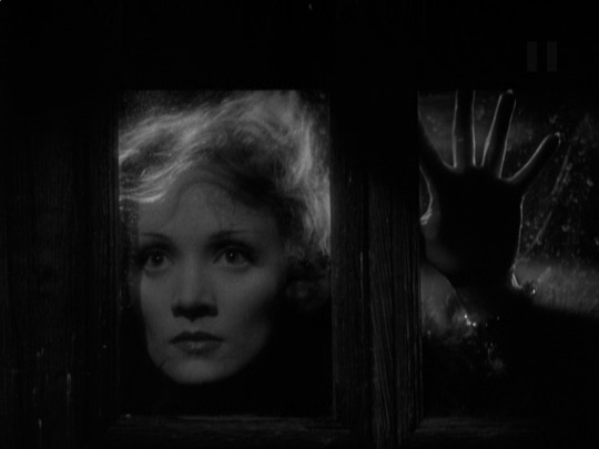
Image description: Shanghai Lily (Marlene Dietrich) looks inside through a window, with her face visible and her left hand touches the glass.
3 notes
·
View notes
Text
Carol (2015)
Directed by Todd Haynes
Cinematography by Edward Lachman
Starring: Rooney Mara and Cate Blanchett

Image description: Therese (Rooney Mara) looks out a foggy car window as red light from a stoplight reflects on her.
0 notes
Text
Metroid II: Return of Samus
Released on the Gameboy in 1991.
Developed by Nintendo R&D 1.
Published by Nintendo.

Image description: 8-bit gameplay render of bountyhunter Samuss Aran standing on an alien landscape with her baby Metroid companion.
2 notes
·
View notes
Text
Fallen Angels (1995)
墮落天使 (1995)
Dir. by Wong Kar-wai
Cinematography by Christopher Doyle
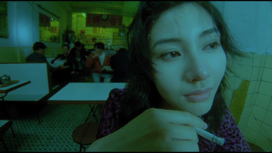
This is screenshot is from an older restoration of the film, before they ruined it by completely destroying the film's colour scheme and changing the aspect ratio.
Image description: Michelle Reis' character is smoking a cigarette whilst looking away from the camera.
2 notes
·
View notes
Text
Charade (1963)
Dir. by Stanley Donen
Cinematography by Charles Lang
Starring Audrey Hepburn and Cary Grant

Image description: Exchange between a concerned Peter Joshua (Cary Grant) and a distraught Regina Lampert (Audrey Hepburn) who is in a phone booth.
Grant: "What are you doing in here?"
Hepburn: "I'm having a nervous breakdown."
19 notes
·
View notes
Text
Diary of a Lost Girl (1928)
Tagebuch einer Verlorenen (1928)
Dir. by G.W. Pabst
Starring Louise Brooks

Image description:
Medium close-up of a saddened Thymian (Louise Brooks) looking directionless out the window. Rain is trickling down the glass pane.
0 notes


Text
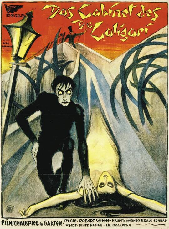
A Century of Glamour Ghouls: 1920s
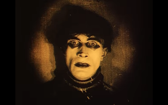
Cesare in The Cabinet of Dr. Caligari (1920)

The Movie
So, so much has been said and written about The Cabinet of Dr. Caligari (1920). From its Expressionist design to its reflection of the German psyche in the interwar period, there is little ground uncovered. And of course just about every thesis put forth has been countered. It’s a divisive film, but and undoubtedly influential one.
The Cabinet of Dr. Caligari begins with a young man, Francis, telling a story of the troubles he and his fiancee, Jane, have endured at the hands of the nefarious Dr. Caligari. In the flashback, a fair has come to the town of Holstenwall and a rash of strange murders breaks out. One of the victims is Alan, Francis’ friend, and a good-natured rival for Jane’s affection. Francis (and the authorities) begin to suspect that it’s no coincidence that the murders began when the mysterious sideshow barker and hypnotist, Caligari, came to town with Cesare (Conrad Veidt), a hypnotically controlled sleepwalker. As they close in on Caligari, Cesare is on his way to claim their next victim, Jane. But who is this Caligari really? How much free will could a somnambulist really have?
The plot is, at its heart, a simple detective story, complicated by the film’s Expressionist style. It’s not uncommon for storytellers to pair simple or familiar elements with more experimental ones to make it easier for their audience to concentrate on the newer, more adventurous elements. You’ll find this strategy in many of the films considered part of the German Expressionist movement. In more recent filmmaking, Tim Burton attempts this with his films often (with varying success). Edward Scissorhands (1990) in particular comes to mind.
German Expressionism was a popular art style and it spanned many art forms, though its shining moment was on film. Following WWI, the use of Expressionist styling set apart German films from their competitors, primarily American films at the time. Expressionism sought out extreme subjectivity, materializing emotions and moods into physical space.

The Cabinet of Dr. Caligari uses this approach to articulate Francis’ unreliable narration of the happenings at Holstenwall. Unnatural angles and impossible shadows evoke delusions desperately struggling to become reality. Hermann Warm, Walter Reimann, and Walter Röhrig designed and painted sets and costumes that stretched reality. It would only be two characters, Caligari and Cesare, that would get the full Expressionist treatment.
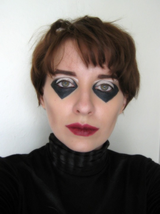
The Look
Conrad Veidt’s Cesare is a lean, shadowy figure. Cesare is often photographed such that it seems as if he’s forcing himself out from the walls, fighting against incongruous gravity.

The Clothes
Cesare only has one costume through the whole film. He wears a dark turtleneck knit sweater with the texture of the sweater embellished with stripes at the neck and wrists. On the front of the sweater is a loosely drawn X that suggests an accumulation of dust. Cesare’s pants are fitted and the same shade as his sweater. His shoes are matte with no decoration or detail.
For my daywalker look, I tried to avoid looking costumey by varying the colors, but staying muted. I chose a v-neck sweater over a mock-turtleneck top to keep the silhouette and and to mimic the top of the X on Cesare’s costume with the V of the sweater. I don’t own any black skinny jeans, but those would have been a better choice for the pants tbh.
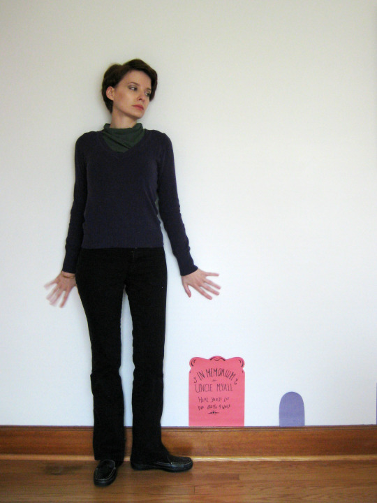
I also don’t own a dark knit turtleneck so I embellished a plain black turtleneck with baby powder and a small paintbrush on the neck, wrists, and loosely drew the X. I paired it with black leggings, but any fitted pair of dark pants would work. To achieve the effect of his pants and shoes blending into one another, I put on some black ballet flats and put an old pair of black socks over them. (I do not recommend doing this if you’re planning on wearing this someplace with a lot of hardwood floors! Just get some all-black fabric sneakers.)

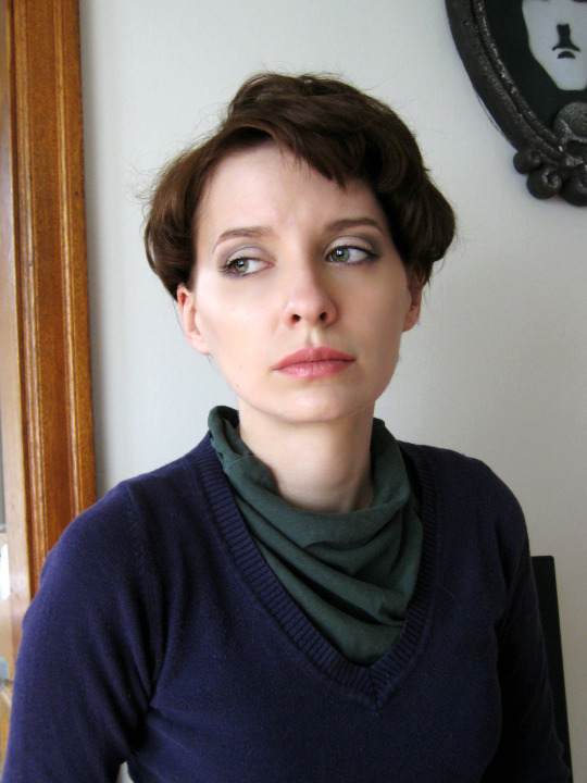
The Makeup
Cesare’s makeup is the most graphic makeup design in the film. The deep, dark, and geometric makeup emphasizes the sunkenness of his eyes and cheeks. The shapes drawn around his eyes, when seen at a distance, can make them seem open or closed; the makeup mirroring the nature of his somnambulism.
For the daytime look, after applying an even layer of foundation, I concentrated on the eyes. Starting with a neutral shadow, I laid down a base layer of powder to ease blending later. Moving to a dark gray eyeshadow, (1.) I laid down a smudgy line on the outer half of my lower lid. I brought the line out past the end of my eye and blended it directly upward above my crease. (My eyes are very round, so I didn’t want to bring the shadow all across my bottom lid because I find that makes them look even rounder–not quite right for this look.) (2.) I then went in with a taupe shadow on the same brush to build up the chevron shape on my outer eye. Using a clean brush, I covered my moveable lid with white shadow. (3.) To finish up the eyes, I applied a coat of black mascara and went into the waterline softly with black liner. If you think you’re eyes will look too small (or you just don’t like getting up in your waterline) a few extra coats of volumizing mascara would do the trick.

For the eyebrows, I went for a thick, straight shape with a brown pencil and softened it out with brown powder. I also went in with a little bit of contour just under my cheekbones and dusted the tops of my cheekbones with a matte highlighter.

For the lips, I chose a pink nude since the eyes are the real focus. I used a liner to straighten the lines of my lips a little.
On to the full makeup! Since I’m working over the daywalker look, there are a few steps I will have “skipped” in the photos, but I’ll include them in the written instructions.
For a base, I powdered down my foundation with white powder to get that deathly cast. Using a dark taupe powder, I contoured my cheekbones. To the left is the initial shape and to the right is after I blended it out (but only back and down, since this is meant to be a sharp, stark look.)

(1.) I used a very soft black liner to map out the under eye shape. Be sure to use a very soft product for this so you don’t tug at this skin too much. It’s sensitive! (2.) Fill those shapes in! You might notice that I didn’t extend the shape very much on the inner corners of my eyes. (3.) My nose protrudes at a pretty sharp angle fairly close to my eyes so the shape would be distorted if I extended it further. If you have more real estate there, go for it! It’s okay if the lines are a little messy, we can clean them up later.

From the points at each end of the eye, (1.) draw a rough triangle upwards to the area above your crease. (If you have hooded lids or a monolid, this might be a great opportunity to try a cut crease!) (2.) I then went in with a fine brush and black powder to tidy the lines and get sharper points. (3.) Using white face paint and an angled brush, I covered my moveable lid and drew an arcing line just below my eyebrows. I also went in with the soft black liner to darken my lower waterline. Now’s not a bad time to apply a coat or two of black mascara. To finish up the eye area, (4.) I blocked out the head of my brow and darkened the straight shape that I created with the daytime look with a brown eyebrow pencil. I also added a little flick at the arch, but that’s optional.

I went with a vampy wine color for the lips, staring with a liner to make the shape of my lips more angular. I exaggerated the cupid’s bow and made a straight line from the top of my cupid’s bow to the ends of my mouth. My bottom lip is already fairly straight in the middle so I only straightened out the sides with a little overlining. After I filled in my lips with burgundy lipstick, I pursed my lips to blot to emphasize the uneven texture.

The 1910s | The 1930s | The 1940s | The 1950s | The 1960s | The 1970s | The 1980s | The 1990s | The 2000s
339 notes
·
View notes