
Last Seen Blogs

medinanieves81
The Blogging of Stiles 275

f8-javier
P∆CØ
gouachevalier
GOUACHEVALIER

aestheticcrystalsblog
aesthetic Crystal

davemcnally87-blog
Naively Genius
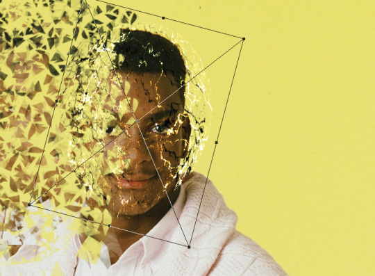
Text
Evaluation
How did the lesson go?
The lesson started by me introducing the powerpoint to the class then they downloaded it from interact and followed the steps on the powerpoint and videos.
what went well?
Adding some certain lines to the powerpoint such as “if the align settings aren’t there go to window then align” went well since I saw some people having the issues that I predicted and were able to solve it by reading lines I incorporated similar to this. To say that the lesson carried out could be considered a bit “complex” with a somewhat long tutorial the fact that people were able to complete it showed that it was still understandable and consistent in teaching throughout the whole lesson.
What didn’t go so well/didn’t go to plan?
I think the lesson lasted longer than it should have and went over the 10-minute mark, another issue was that in some cases After Effects crashed which I should have been more aware of and made the task less straining of the computers. The computers being generally slow and taking time to load up certain features and effects also prevented people from getting the task complete on time.
Why do you think that was?
I think it went over the ten minute mark due to the tutorial explaining a long process, I did however predict that people might not get all of it done in time so I gave the option on the powerpoint to just save after the first part of the tutorial and not carry out the bonus explosion effect.

As for the computers working slow, I didn’t think about this as I carried out the process on my own computer at home which didn’t take as long and never crashed.
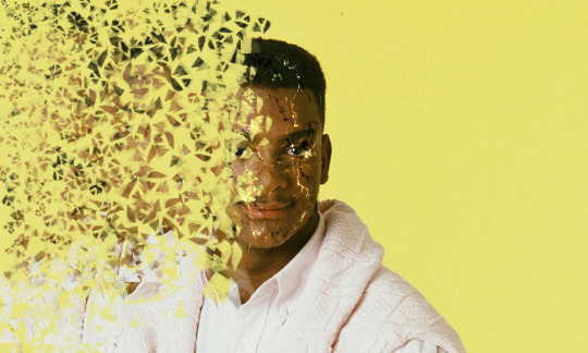
Successful?
Looking at some of the final results it turned out successful, the majority of the class were able to complete the task with the explosion effect with a few that didn’t finish on time or that got stuck in some parts possibly due to their After Effects crashing or just not loading up features correctly.
What would I do differently next time?
Next time if I were to carry out this task again of teaching a lesson I would probably focus the lesson on something that might appeal to more people rather than just the part of the class that like using After Effects. I could have also recommended the playlist verbally since I saw people who were stuck still not trying to learn through the videos which wasted time and lead to them not having the task complete on time.
0 notes
Text
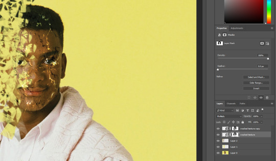
Teach to class powerpoint and links

Final glitch effect - https://www.youtube.com/watch?v=d5mnT_OQwC4
Recommended playlist if stuck - https://www.youtube.com/watch?v=6-JM8Bm65Kc&list=PLzsVYkTxqctV0C0y7iBVvvfaQroN0gQ2L
Examples of the glitch effect - https://www.youtube.com/watch?v=ZKB7yeaky_c&list=PLzsVYkTxqctVhZbXBop4cgffP7FcsmihY


Video one -
youtube
Video two -
youtube
Video three -
youtube
Video four -
youtube
Video five -
youtube
Tumblr not letting me embed more videos so links will be used...
Video six -
https://www.youtube.com/watch?v=4JwAvTxv8ZA&index=6&list
Video seven -
https://www.youtube.com/watch?v=_ZgoEDMaT-A&index=7&list
Video eight -
https://www.youtube.com/watch?v=9UHTherdLNA&list
Video nine -
https://www.youtube.com/watch?v=mZrkfmUOBYQ&index=9&list
Video ten -
https://www.youtube.com/watch?v=oRb9Uow95ug&index=10&list
Link to whole playlist -
https://www.youtube.com/watch?v=6-JM8Bm65Kc&list=PLzsVYkTxqctV0C0y7iBVvvfaQroN0gQ2L&index=1
0 notes
Text
Lesson to class
Scans of sketches of chess idea -
How much each piece is worth idea sketch -
How pieces move idea sketch -
Being more specific so lesson is easier to understand and fit into 10 minutes by only doing the three “special” moves of chess -
What I’m going to teach -
The three special moves of Chess
Castling
Pawn Promotion
En Passant
Creating assets in Illustrator using the pen tool and then animating them in After Effects
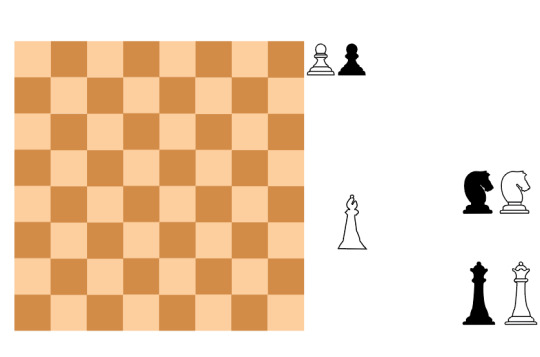
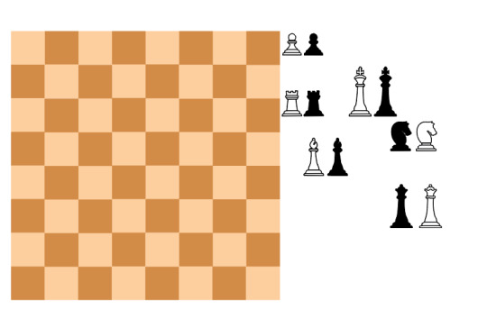
Changing idea to teach class, I decided to change what to teach since only half the class knew how to play chess anyway so this would probably be boring and confusing to the other 50%. I also didn’t know very well how I could have the class engage with this. Teaching just this also wouldn’t make it close to 10 minutes unless it was stretched out which would become uninteresting and not well structured.
I decided instead to do something using After Effects since I didn’t think anyone else in the class was thinking of teaching something involving this program so it would help the knowledge learnt through the lesson be different and interactive. Due to the course being digital design and animation I knew that at least some of the class would be interested therefore them being more willing to complete the task as compared to the chess idea where I didn’t even know if the class liked to play the game or not.
Notes and methods wrote down and used before creating the powerpoint and videos for the lesson -
How to make explosion glitch effect in after effects
1. open up after effect
2. change the width to 1280 pixels and the height to 720 pixels
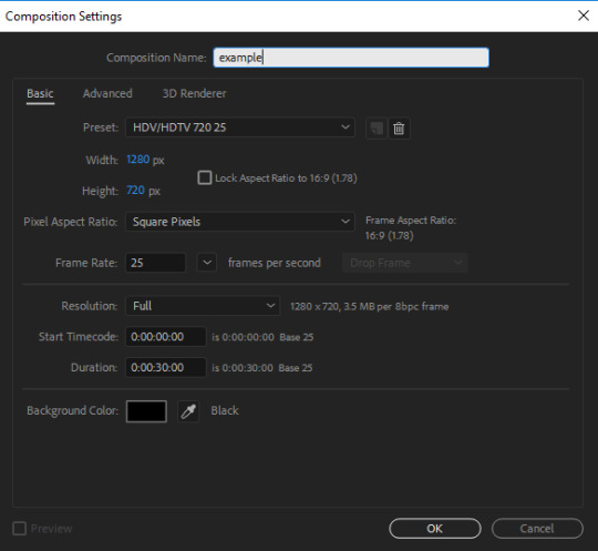
3. Add solid
4. Select the text icon and write any word with any font and colour (works much better with a white font on a black solid. Any stroke colour is fine set to 1
5. Centre the anchor point of the text (if you change your font or size of the text later on you might have to centre the anchor point again.
6. Align vertically and horizontally with the composition
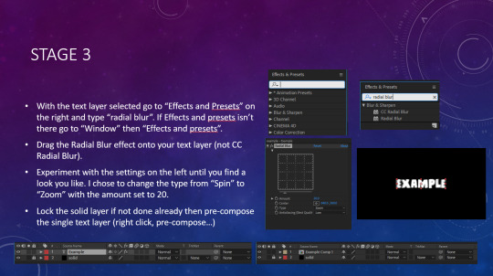
7. Add radial blur effect to the text in effects and presets, type “radial blur” in then drag it onto your text layer. Not “cc radial blur”
8. play with the blur settings until you find a look you like, I like the type on “zoom” and amount on “20″
9. pre-compose the layer
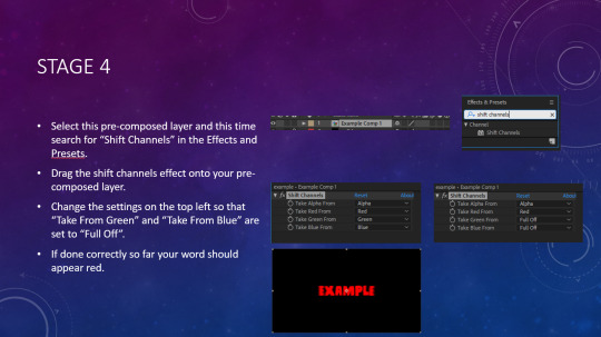
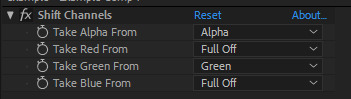
10. Type “shift channels” effect in effects and presets and drag this onto your layer.
11. change the settings so that “take from green” and “take from blue” are set to “full off”
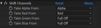
12. Duplicate the layer by holding “ctrl c” then “ctrl v”
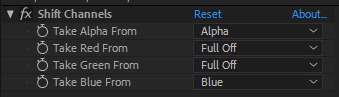
13. Change shift channels settings of this duplicated layer which should be on top, change the “take from red” option to full off and put the “take from green” option to green.
14. Duplicate this layer and change the settings a final time by changing the “take from green” option to off and changing the “take from blue” option to blue.
So now each text pre-composed layer has a different take from colour
15. Select both of the top two layers go to “blending modes” then change it from “normal” to “screen”. If done correctly the word should now appear white.
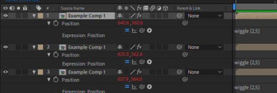
16. select the top pre-composed text layer open up position (p) and hold “alt” on the stopwatch.
17. type “Wiggle (2,5)” without the quotations.
18. Do this for the other pre-composed text layers
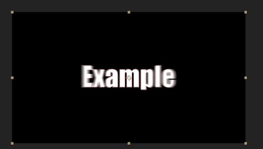
Should look something like this so far
youtube
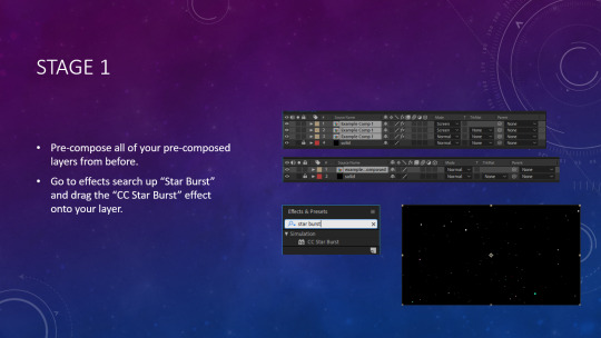
19. To add the burst effect, first pre-compose all 3 of your pre-composed text layers.
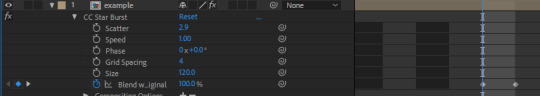
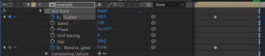
20. Go to effects and presets again but this time search up “Star Burst” drag the “CC Star Burst” effect onto the pre-composed layer
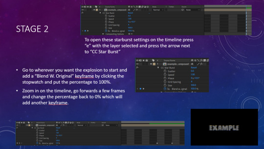
21. press “e” with your layer selected and open star burst.
should like this for now
22. Go around 1 to 2 seconds into the animation and add a “blend with orignal” keyframe at the bottom by selecting the timeline, change the value of this keyframe from 0% to 100%.
23. Zoom into the timeline, go forwards 1 or 2 frames and add another keyframe with the “blend with original” opacity now set to 0%
24. Zoom out of the timeline again and place a “scatter” keyframe by clicking a stopwatch and put the value to “0″ in line with the first “blend with original” keyframe.
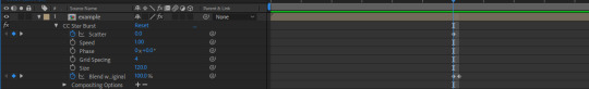
25. Go to around 5 seconds in and change the scatter value to 100.
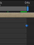
26. to shorten the animation length, drag the “work area end” icon to wherever you want on the timeline.
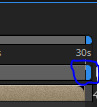
I dragged mine to 4 seconds as this is where I placed my last scatter keyframe
Finished product -
youtube
Other examples -
youtube
youtube
youtube
What will be the best way to teach?
Teaching class through powerpoint
The way I taught included a powerpoint with many images of snips from the process I did as well as a link to a playlist which contained ten short videos I created using OBS to record my screen then split the whole recording up into sections as it’s own video each for one of the stages if someone was stuck by just using the powerpoint. As well as this the powerpoint included text to actually tell the process and was set out as bullet points so that it was even easier to follow. I will also to make sure to have a duplicated version of the powerpoint with an added slide to show people which powerpoint on interact is the one to be used during my lesson as I’m assuming other people will have their own powerpoints on interact.
Image from my powerpoint showing people which one to download (slide made after placing interact powerpoint) -

Issues I had when creating the powerpoint -
The file of the powerpoint was far too large due to the imported videos as well as all the images so to fix this I uploaded the videos to youtube and pasted the links in the powerpoint.
How will people learn? Refer to learning theory.
People will learn by carrying out the process themselves with software they’re already slightly familiar with. So this lesson would require skills they have already required (if not there will be hints throughout the powerpoint and images) but also some new features and effects that will be easy to implement and adjust.
How will I assess that people learned?
After the lesson is finished the class will put up their final animation on a loop where I will go around the class and look at what their final animation of the effect looks like. This would also tell me how accurately people followed the tutorial as each completed animation will look different in terms of fluency and timing.
what resources will be needed?
The first and most important thing that would need to be created for people to use and learn from is firstly the powerpoint with screenshots of the process, links to a playlist with videos and finally examples of what I have created to see if there’s look how it’s supposed to so that they can compare their work and evaluate it themselves.
0 notes
Text
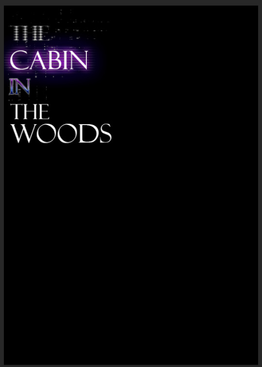
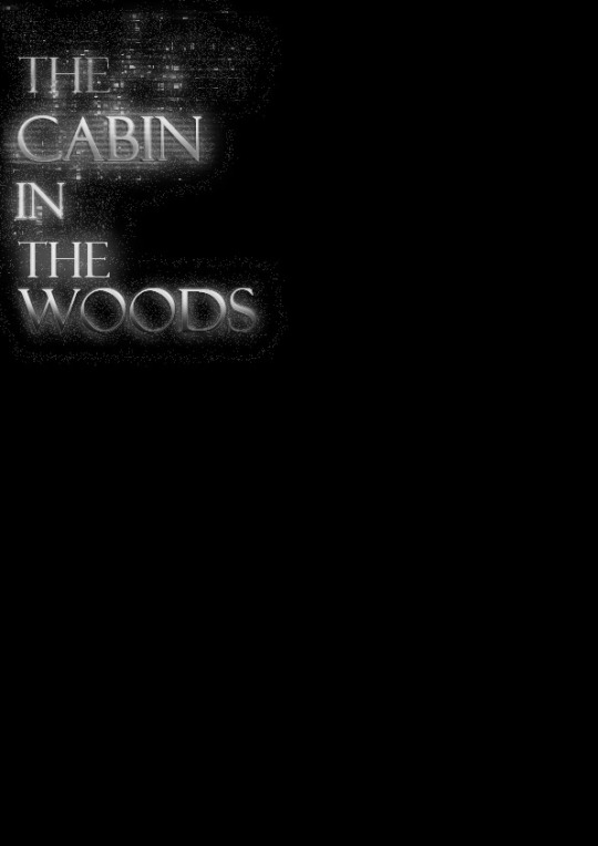
Book cover
How was this done?
To start Photoshop was used to create an A4 portrait canvas where I added a solid fill colour. The text tool was then used to write out the title of the book making sure that each word was on its own layer so that they could be altered individually.

I then chose an image which I thought related to the title and placed it onto the image on its own layer.
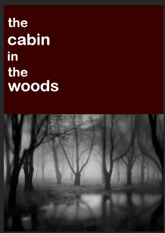
I put all of the text of the title into a group then duplicated it.
To have the image of the woods only be shown on the text I placed the image in front of the text held “alt” on the layer and then selected the text group folder.
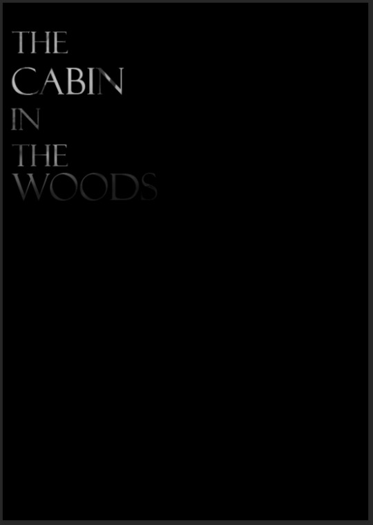
For the first word being “the” I selected the layer from the first group went to filter, filter gallery and added a halftone pattern with the pattern type changed to line.

I then went to filter again but this time selected blur then motion blur where I changed the distance until the word looked semi-readable but effective.

Next, I duplicated this layer went to filter, distort and added a wave effect.

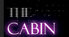
For the next word being “cabin” I added a blue outer glow in the blending options duplicated the layer and changed the outer glow to purple, the blending modes were changed to “exclusion” so that both colours could be seen more clearly.

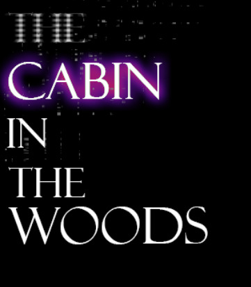
I added a motion blur and distort wave effect to lower cabin layer also.
For the word “in” I held “ctrl” and selected the image on the layer in the higher group of words to only select the word.

Then I used the brush tool with the hardness on 0% to colour in the lower half of the word blue, the top half of the word was coloured in purple. Next, I went to the blending options where I added a bevel and emboss effect making sure that it had a high depth and size.
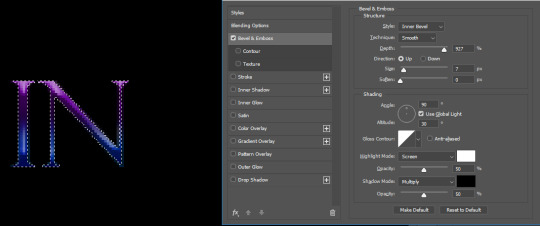
To add a white glow I went to the “in” word in the lower group and added a white outer glow.

I experimented with these techniques more along with duplicating layers until I found a design which looked somewhat effective. I also added a dissolving white drop shadow since I think it fitted well with the rest of the effects used.
Successful?
I think that this was carried out semi-successfully since I think the final design’s colours being white, grey and black suit the context of the writing well adding a certain eerie atmosphere. Making the size of the main words being “cabin” and ”woods” larger helps draw attention to the main focus of the text also. Finally, I think the chosen capitalised font compliments and helps exaggerate certain added effects such as the distorted wave used on the word “cabin”.
However, I think the location of the words could have been placed more effectively to have less negative space as well as there being more consistency throughout the appearance of the text, for example, having the two “the” words look more similar to each other.
What went well?
Using the brush tool with the bevel and emboss went well since I think it added depth and allowed me to be more specific with how I wanted the colours to be shown on the words, it was also quick and simple to carry out allowing me to alter the appearance easily.
What didn’t go so well?
I think using the wave distortion effect and the halftone pattern didn’t go well at the start for the first word since it wasn’t that readable, however, once I had experimented with these effects more I think that the final use of them looks effective and works specifically well with the dissolving white drop shadow.
What I would do differently next time
Next time I would try and think about the spacing of the words more before adding effects and duplicating layers. I also would try and incorporate the original image I placed onto the words more since in this task it was lost under all the added effects.
0 notes
Text
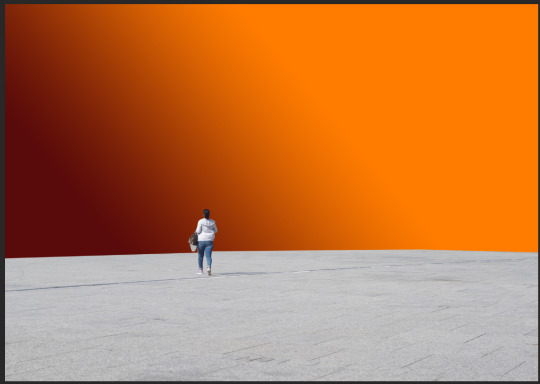
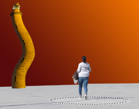
Surreal landscape
How was this done?

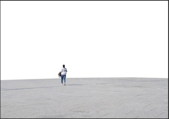
To start I first made all the layers invisible apart from the layer with the woman walking. I then resized this image holding “shift” to not lose its proportions and made the image fit the canvas.
To add a sky colour I went to adjustments and added a gradient fill where I chose the colours and angles I wanted.
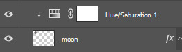
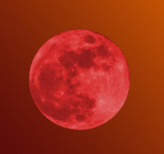
To change the colour of the moon I went to the adjustments section again but this time selected hue and saturation, I placed this new adjustments layer just above my moon layer held “alt” and selected my moon layer so that the hue and saturation would only apply to the moon.
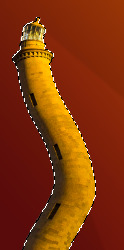
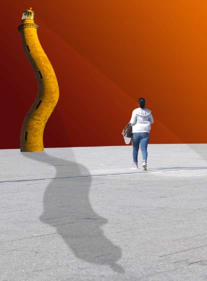
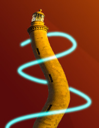
I next changed the changed the location of the lighthouse to appear on the ground of the image. Then with the lighthouse still selected going to “edit” then "puppet warp” where I placed one pin at the top, one at the bottom and three in the middle. I then warped the lighthouse to look curvy.

To get the light on the ground from the lighthouse I used the ellipse tool and selected an area of the ground in front of the lighthouse.
Whilst this area was selected I clicked this add to selection icon at the top.

And then selected the polygon lasso tool where I selected the area of how the light would be travelling to the ground whilst holding “shift”.
With this area selected I added a curves adjustments layers and made the area lighter.
To get the light to look more realistic I went to “filter” “blur” and then “gaussian blur” where I made the radius slightly higher.

Next, I added the shadow to the lighthouse which was first done by hold “ctrl” and selecting the image of the lighthouse on the layers panel which selected the whole area of the lighthouse since it was a png image.
I then went to curves again but this time made the selection appear darker which created a new layer of the darkened part of the lighthouse.

I selected this new layer right clicked and selected “flip vertically” then “flip horizontally”, then pressed “ctrl” + “t” to transform. Whilst being able to transform I held “ctrl” to drag the points so that the shadow appear larger as it got further away from the actual lighthouse.
A gaussian blur was also put on this shadow.
For the light travelling around the lighthouse, the curvature pen tool was used to create a path over the lighthouse, a new layer was then added so that the light would go on its own layer.
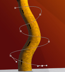
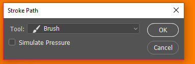
Making sure that the brush thickness was set to 15 pixels and the colour white I right clicked and added a stroke path where I selected the brush option.


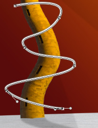
I then added a layer mask to this light going the lighthouse layer and used the black brush to remove some of its visibility to give the impression that the invisible areas were behind the lighthouse.
I then added a blue outer glow in the blending options.

I experimented with the techniques even more by altering the points of the orca and adding a shadow, a light beam was also added like with the lighthouse but instead making the outer glow pink.
A red drop shadow was also added to the moon.

Successful?
I would say that this was carried out successfully since I think that the image looks interesting with accurate looking shadows for the orca and lighthouse along with believable light coming from the lighthouse, I also think that the colour of the moon’s drop shadow and the moon itself fit well with the background gradient colour and doesn’t look out of place.
What went well?
Specifically, I would say that using the puppet warp tool went well since I think it allowed me to manipulate the lighthouse accurately. Selecting multiple areas at once with the ellipse tool and the polygon lasso tool went well also since I think it was easy to do and allowed me to be more specific when selecting areas.
What didn’t go so well?
I could have used the curvature pen tool better to get more convincing light beam directions around the orca and lighthouse.
What I would do differently next time
Next time I could have added multiple sources of light and more objects in general to make the image have less negative space and create an overall more alluring image.
0 notes
Text
Apocalyptic city
Original image -

How was this done?
To start I first used an image of a mushroom cloud then placed it over the original street layer so that the cloud would be directly behind the clock tower, I added a layer mask to the mushroom cloud layer and used the brush tool with the colour set to black to only have the image appear visible in the sky.

I then added other images which I then edited out using the same layer mask method, some of the blending modes such as the cracks had to be changed from normal to multiply which helped remove the background.

I then added adjustment layers such as multiple exposure and saturation layers to exaggerate the effect, even more, I also used the hue adjustment to give the added objects a more red tone so that they didn’t look out of place in the image.

I finally added a texture over each building and street and used the warp tool so that the texture followed the form of the building, for the texture I also changed the blending option from normal to multiply so that they blended better with the buildings.
For the road texture, I did the same but then duplicated the layer and changed the original texture blending mode to Pin Light with the opacity down to 40%.

Experimenting with the added smoke effect opacity until I found a look I liked.
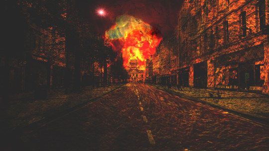
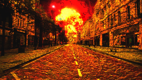
Some of the paths looked stretched so I created multiple textures and applied them separately like how I did with the buildings.
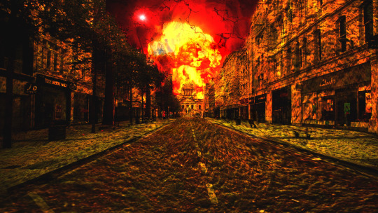
I also thought that the sky looked better without the added cracked effect since I think it looked out of place.

Successful?
I would say that this was carried out semi-successfully since I think the image looks effective but might be too overpowering which could lead to an unlikeable design. I wanted the sky to be the main focus of the image so I could have chosen an image which had a larger amount of sky but since the sky isn’t that large in this image it adds to what makes the design look overpowering and doesn’t have much space to show some blend into less effective colours.
What went well?
Adding the adjustment layers went well since this added a lot to the image and really helped create an atmosphere as well as helping to blend added images.
What didn’t go so well?
I could have used the warp tool better since at the moment some of the texture still looks too clearly stretched and therefore makes the image look less believable.
What I would do differently next time
I could have also added more objects like a run down car or wild animals
0 notes
Text
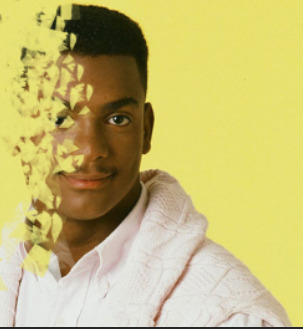
Distortion effect
How was this done?
To start a large image was chosen which had a very plain solid colour background.
Original image -

Then the Polygon Lasso tool was selected where I created a shape around the character whilst holding “shift” so that different shapes could be added to the original one.

A new layer was then added and the clone stamp was selected.
I then changed the brush from a circle to a sampled brush which had been created from the shapes.
I then wanted to change the brush settings so I went to “Window” then “brush settings”.
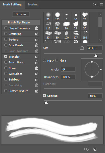
Here I changed the spacing at the bottom from 10% to 90% so that the brush looked more segregated.
I also used the shape dynamics option when using the brush multiple times to make the design look more random and dynamic.

Next, I changed the sample from all layers to current and below.
I then held “Alt” to select the background and add some of it in front of the characters side with the brush.
A new layer was then added, and the previous clone stamped layer was moved under the original image layer and this new one.
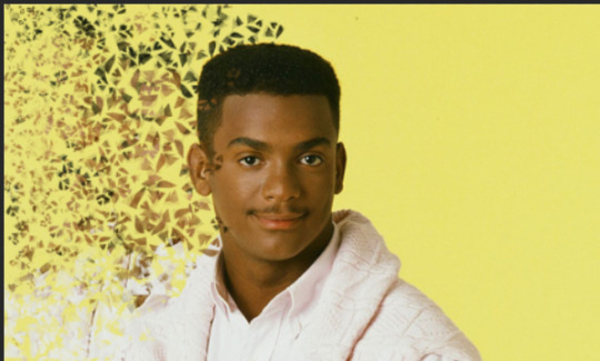
On this new layer, a cracked texture image was added and placed over the face.

To make the texture fit the face more I went to “Edit” “Transform” and then “Warp”.

The blending mode of this layer was then changed to "Multiply”.

This layer was then duplicated and had the blending mode changed to “Divide”.

This new divided layer was then moved slightly to the right and rotated slightly also.
A layer mask was added to both the cracked layers and the brush tool was used with the colour set to black to remove any cracks that appeared outside of the face.
Final image -
Successful?
I would say that this was carried out successfully since I think the final design looks effective with only a few mistakes to say this was my first time creating something to look distorted.
What went well?
Adding the crack effect with the different blending modes went well for me since I think that this added a lot to the image and wasn’t difficult to understand, I also thought this was the most interesting part when creating this design since I liked using the warp tool.
What didn’t go so well?
I think I could have tried to have the distortion of the face follow the form of the original image better like how I did with the shoulder area since at the moment the distorted area of the face seems too straight and makes the design look less believable.
What I would do differently next time
Next time I could make the distortion follow multiple directions instead of it just one since this could have added elements of realism like it was blowing with the wind which isn’t this consistent.
0 notes
Text
Spot heal and clone stamp
Original image -
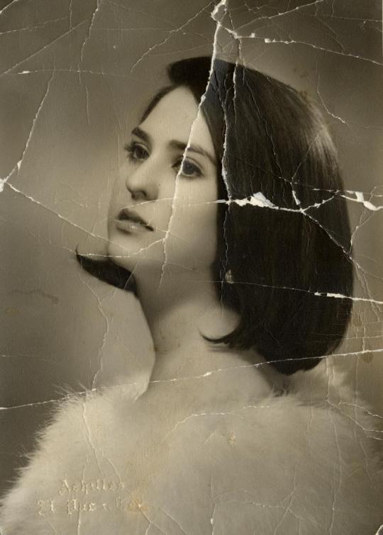
After photoshop -

This final task was to try and remove stains and rips from an old image using the clone stamp tool and the spot heal brush.
successful?
I would say that this was carried out semi-successfully as I think the image looks improved with the marks getting removed effectively, however, some of the detail was lost such as the light reflections in the hair and the texture of the wall, this was lost because I didn’t use a small enough brush to be more accurate, I would have been able to carry this out better if the time limit was extended.
What went well?
Specifically, I would say that moving the marks from around the character’s left eye went really well as the area doesn’t look Photoshopped in my opinion, aswell as this when observing work from the class it appeared as if people struggled with correcting this specific part of the image.


Overall, using the spot heal brush worked better for me than the clone stamp as the image didn’t contain many areas which I thought could have been duplicated somewhere else.
what didn’t go so well?
I found it difficult to remove the marks over the background without changing the texture as the texture was not consistent in terms of brightness and I didn’t blend it to look believable.
0 notes
Text
Spot heal brush
Original image -
Image after spot heal brush and clone stamp -

Successful?
I think that this was successful since I think the final image looks well done and believable with accurate blends.
What went well?
I think most of it went well especially the spot heal brush since it was easy to use and understand, I think this tool was great for removing areas more accurately than the clone stamp, however I think the clone stamp was more useful in some situations for example removing the hair that got in the way and the slight shadow under the chin.
What didn’t go so well?
On some areas such as below the chin and the right shoulder proved difficult to fix due to the colours being quite different compared to the rest of the character, I had to keep switching between the clone stamp and the heal brush until I created something that I thought looked well.
Another example -
0 notes
Text
Clone stamp
Original image -

To start after the image was opened in Photoshop and a new layer was added, the original layer was then selected then the clone stamp tool, I also made sure that the sample was set to “All Layers” to select an area I wanted to duplicate I would hold “Alt” and then select the area, in this case, it was the tree. I then moved to another area of the screen and began to paint in my tree still using the clone stamp tool but just not holding alt, if an area didn’t look correct I could select another area with the tool and paint that part in again.

To remove the trees the same process took place but in this case, the sky was selected and pasted over the tree.

Original image -
The same technique was used here also with pasting the sky over the pylons.
And pasting the grass over the wooden hut in the bottom left.
Successful?
I think that this was successful since I think the images look believable from a distance if the image were to be zoomed in to a mass extent however some inconsistency might be spotted.
What went well?
I think pasting areas over other areas went well since I think this was easy to do and if the blend didn’t look accurate this could be changed quickly and effectively.
What didn’t go so well?
I would say that nothing didn’t go well, there were a few times where the blend didn’t look accurate because I selected an area of the sky which was a different tone than the sky near the area I wanted to paste over but this was fixed quickly.
What I would do differently next time
Next time I would zoom in more so I could be more accurate and overall create a more realistic looking altered image. I could also have created a new layer every time I was either pasting in an object or removing one since this would allow me to alter the image even more easily and specifically such as rotating or reflecting them.
0 notes
Text
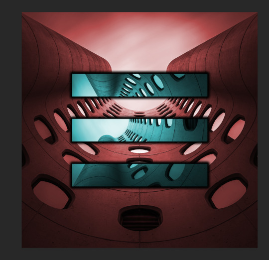
How was this made?
To start after the image was placed, I went to “View” then “New Guide Layout” where I changed the number of columns to six and removed the gutter which split the image into six sections going vertically.
I then used the Marquee tool to select areas of the image, to select multiple areas at a time I would select an area hold “shift” and select another, I selected every other section of the six then placed them onto a new layer.

After they were on their own layer I used the rotate and reflect options to create a more interesting image.
I then used the hue and saturation adjustments layer to change the colour of the original sections.

I also did this for the layer above which had been cut out, I made the colour for this layer a different colour without it affecting the layer below it by holding down “Alt” with the adjustments layers selected then clicking the top cut out layer since this is the one I wanted it applied to.
I then selected the cut out layer again and held shift to resize the image without changing the dimensions, I also aligned this layer vertically and horizontally to the canvas to make the image in a central position.
I then rotated the image 90 degrees by holding “CTRL” and “T” with the image selected then clicking “Rotate 90 Degrees Clockwise”.
I wanted to add a drop shadow to this layer also so I went to the layer clicked right click and went to “Blending Options” which allowed me to add a drop shadow as well as other effects such as an inner glow.

Another example I did -
Successful?
I think that this was carried out successfully since for a simple project and the small amount of time it took to complete I think they look interesting with effective colours and allows me to draw the attention of the viewer's along the image.
What went well?
Adding the certain blending options went well since I have used these options before and understood how to use them effectively, I think these options are simple to use to say how much they can change an image and help make certain objects/areas stand out.
What didn’t go so well?
I would have liked to know how to create different shapes using the Markee tool, the ellipse and rectangular options are in my opinion basic and I didn’t know to know how to use other shapes such as triangles or stars which I think would have enabled me to be even more creative with my design.
What I would do differently next time
Next time I would try to incorporate even more images instead of just one so I could use different aspects and allow me to create a more specific looking design.
Image source - https://unsplash.com/photos/njVzrpbBEOc
Another example -
0 notes
Text
Photoshop tutorials
Liquify tool experimentation -
How was this done?
Background in too much motion
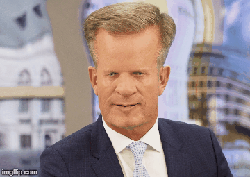
To make this gif a large image of a celebrity was copied and pasted from google into photoshop where the image would be enlarged to fill the canvas, this image would then be saved as a JPEG. Next, the image was selected then went to filter then liquify where I used the forward warp tool to enlarge the head shape, next I used the pucker tool to shrink the eyes then finally the bloat tool to enlarge the nose, mouth and chin. I would then save this image as a JPEG and did the same thing for another celebrity. To make the gif I went to a website called imgflip.com where I would upload the two images before and after liquifying which would generate a gif.

Playing with the liquify settings


Successful?
I would say that this was carried out semi-successfully, I have a much better understanding of how to carry this out now but at the start the backgrounds were in too much motion, the first one is due to that the motion not being a solid colour so that the movement is more visible and the other (with Ellen) being due to me moving the location of the original image after liquifying the duplicate.
What went well?
I think the actual use of the tools under the liquify option went well since I think they were simple to understand and get used to.
What didn’t go so well?
At first, trying to change the face of the character without changing how the background looks like is what didn’t go so well for me.
What I would do differently next time
Next time I would use images where the background is more consistent, as well as this I would experiment with what actual features I am altering.
Face mesh experimentation -
How was this done?

This face swap was created by first selecting two large images and pasting them in different photoshop documents with both tabs open, then I used the pen tool to go around the face of one of the characters making sure there is room to delete the excess skin, with this path made from the pen tool I made a selection and turned the feather to 30 which made a selection of the face with soft edges, I then dragged this section into the other photoshop tab with the other face which created a new top layer.
I then moved and rotated this layer until the facial features matched up with one another at this point the opacity of the lower face layer was turned down so the image could be placed more accurately. I then selected the top layer and selected a layer mask where I then went around the face with the brush tool set to black and the opacity and flow also set lower. I made the brush smaller if I wanted to be more accurate with the hardness set on 0% to have a more smooth looking blend. I also used some adjustment layers to get the correct colour toning such as “hue and saturation” and “curves”.

To improve this I could have made the added on eyes larger to make the image look more believable.
Did some more at home including -
Ellen and Dr Phil with a tan.

Ellen on a streamer called Ninja with Post Malone's moustache.

And Drake on Post Malone.

Successful?
I would say that this was carried out successfully since I think most of the characters look believable even with a few errors which could have been carried out more accurately.
What went well?
I think that cutting out the face and other specific features went well since this was easy to do and didn’t require me to be accurate when cutting out objects, I also thought that using adjustment layers to make the faces blend better went well since I think this was simple to do and could be altered at any time if some colours didn’t look correct.
What didn’t go so well?
The blending could have been carried out better especially on the last image with Drake and Post Malone since the two layers haven't meshed well on the left cheek and is very noticeable once pointed out.
What I would do differently next time
Next time I would think about the images getting chosenI’m wanting to mix more, the tone of the skin wasn’t much of the problem for me but actually how shiny the skin appears was an issue since the colours were too far off and made it difficult to look realistic. I would also think about facial hair and how believable I could make it look on a woman.
0 notes
Text
Slicing head photoshop tutorial

How was this done?
To start the curvature pen tool was used to make a selection around the part of the head face we wanted to slice off making sure that the feather was on 0%, I then coloured the selection in by going to layer then new fill layer and selected a colour, next I held control and selected mask then selected even more around the head and copy and pasted the layer, then using the magic wand tool to select the white then delete it. Next, went over the layer with the black brush and rotated the cropped out section of the head. The dodge tool was then used on the chosen colour to give the appearance of shading with the colour layer rasterised, the dodge exposure was turned down to 20% from 50 and the range was changed from “midtones” to “highlights” to shade because my colour was too bright.
Successful?
I would say that this was carried out unsuccessfully, I think the final image doesn’t look believable or well done in my opinion, the shading of the orange is not realistic and the angle of what the top head is rotated doesn’t work for me, if the design is meant to be unrealistic I should have made the tilt even more drastic.
What went well?
Using the mask options along with the brushes to remove certain areas went well since it allowed me to manipulate the image simply.
What didn’t go so well?
I got confused in some parts as to when I was trying to select an area and move it to the top it wouldn’t work, I didn’t know why it was selecting other areas of the image but I couldn’t figure this out.
What I would do differently next time
Next time I would try to be more accurate with the pen tool and exaggerate aspects depending on how realistic the design is meant to be, I would also use the dodge and burn tools more to intensify the shading.
0 notes
Text
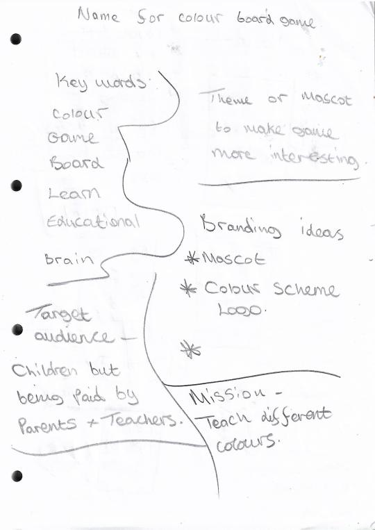
Memory game to help remember colour
For this task in groups, we were asked to find a problem, the problem would be teaching something difficult towards young children such as tying their shoes and coming up with a solution.
After researching different problems my group and I decided that it would be interesting to find a way to teach children different colours.
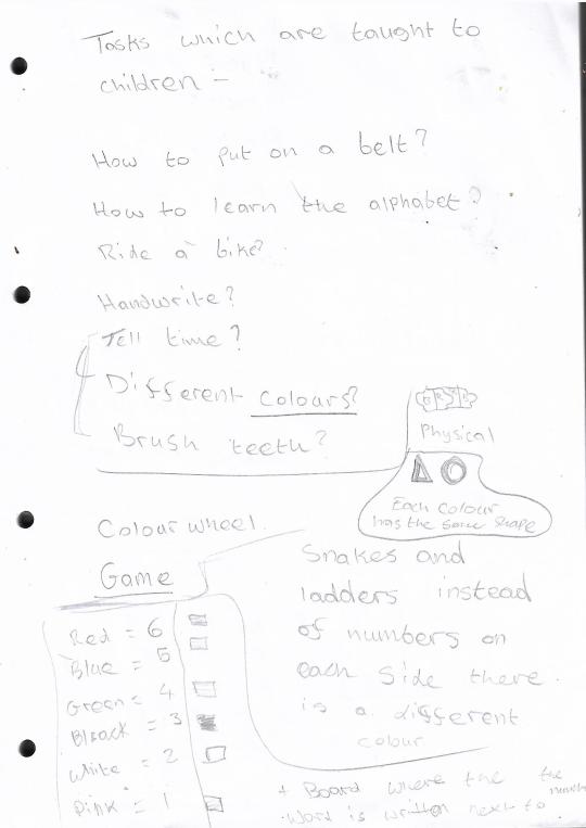
We then decided that the best way would be a game since it would be interactive which is one of the best ways children learn, we didn’t consider the digital side of gaming much and focused more on the physical side of things since when we looked at examples of colour games the majority of them were digital anyway so that this would be a good way to stand out and be different.
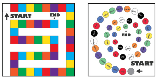
My initial idea was to have a die where each side was coloured differently and each colour would represent a different number, the idea also included a board with separate squares on where when the die was rolled whichever side it landed on the player would move as many times which that colour was worth for example red would be worth six moves, the board also had snakes and ladder aspects to make the game more interesting.
This idea then developed into a board where the actual word was written on the board in its own colour and the player would move to that colour whichever side the die landed on until they completed the course, the snakes and ladder aspects were also removed at this stage.
I decided to make more of a track instead of a grid styled board since this would come across as more interesting and stand out from other games.
The group ended up going with this idea but some changes were made for example making it easier to understand, this would be done by on the board just having the square be the colour and for an older version have the writing on also.
A whole different idea was mentioned by someone in the group that the game would be a puzzle with a different colour on each piece which would then make an animal like in our case a dragon, we didn’t go with this idea since it was too similar to what the idea was based off.

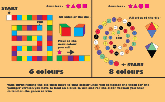
For the younger version, a standard six-sided die would be used and for the older version, an eight-sided die would be used so this would be able to teach them more colours. We also changed the style of the board to be more spirally for the older version.


Four different shaped counters was added for each player so that they could move around the board and not get confused with who was where, A space at the start of the course was also added so that the players knew where to start but also so that the colour at the start wasn't the same colour as one of the sides of the die so they wouldn’t move at all on their first turn which would make the game more slow and boring.
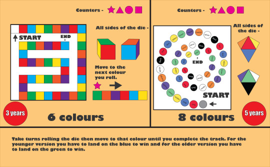
Decided to add recommended ages for each game.

A problem could have been that the boards could break easily so to fix this we decided to have the same design but place it in a square board so it could fold up and be more practical to store.
Final design -
Post presentation
Stage 1 -
What problem have I tried to solve and how have I tried to solve it?
The problem that was tried to be solved was people finding it difficult to teach colours to young children, to solve this issue my group came up with a board game idea which I think does solve the problem but could be improved.
The product linked to the educational theory researched previously. How did it go? Was I properly prepared?
During the research, I learnt that children tend to learn better interactively and with the use of colour so it was interesting to put both of the methods together to make them learn as fast as possible and take in the information easier. I also think that the presentation went well since we included these factors the idea seemed possible with only a few adjustments recommended. I think that I was semi-prepared for the presentation since the board game is quite simple to understand and explain, the main issue was explaining the difference between the board games for the different ages so some bullet points could have been helpful to explain these differences.
What comments and feedback did I get?
After the presentation some comments were given for example possibly changing the age for the different board games making them for younger children since at the moment it seems too basic for the age which we recommended, another thing which was suggested was to have the word of the colour on the space and have it just be one board with the word being optional to read. Another bit of feedback we got would be to think about the players who are semi-colour blind and potentially build a version for them also.
Was the feedback generally good?
I would say that the feedback was in general good with only a few issues mainly being the differences between the two boards and making them into one.
Do I think the suggestions would improve the product?
Most of the suggestions were good comments to improve the product especially adding the actual word to the younger version and having it optional since this was in my original idea just not being optional so this would teach the children to read as well as the different colours, another useful suggestion was to add lights to the board so that when the player landed on a certain space on the board it would light up which would appeal to a younger audience and make them more interested in the game, however, an issue with this could be that it would cost more for the consumer for buying the actual game and batteries, especially if the game is targetted towards children it could break more easily. Some suggestions like adding brail or sound to tell the player what space they are on to the board wouldn’t be that helpful since a blind person wouldn't need to learn colours anyway.
Stage 2 -
Improving the design -
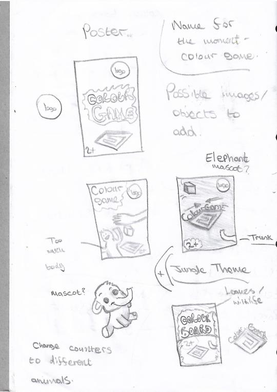

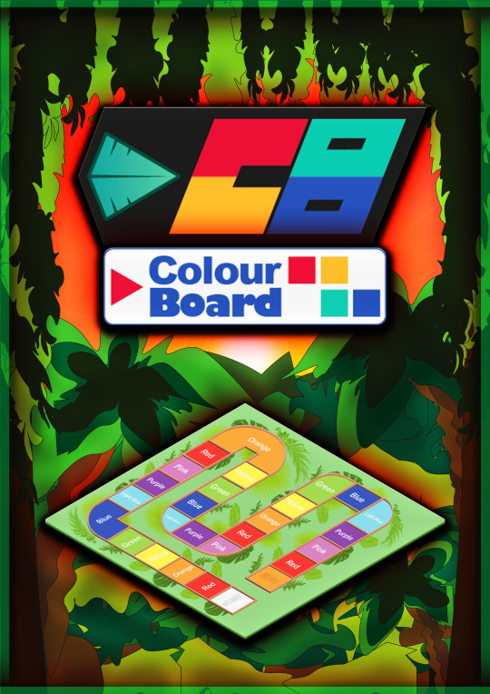
How was the poster created?
The poster was created by first using radical gradients and flairs to resemble a sunrise, next the pen tool was used to create trees, leaves vines and other jungle aspects, after the board, logo and name was received I placed this onto the image into positions which I thought looked effective, I then applied blending options to these added objects with red drop shadows and other aspects such as strokes and outer glows. I then used the dodge and burn tools to add depth to the image and make the poster look more intriguing and 3D. Finally, I used adjustment layers specifically curves and saturation to make the poster look more exciting and fun.
What worked well?
I think that choosing a theme went well since I think it also brings in a colour scheme to the design which makes the product look more interesting and eye-catchy. I think the logo, poster and game board suit each other well and nothing looks too much out of place.
What didn’t go so well?
I think that the poster could have been altered to add more information about the game instead of just being a background for the board and logo to be placed on, it could have included things such as a recommended age since the background itself doesn't give the viewer much information in terms of who the game is recommended for.
Was the team effective and why?
I feel like the team was effective when we were doing our own thing after discussing who would be working on what, the team also was able to create a powerpoint which did go well with the pitch but could have been improved by possible annotations of objects. Since I don't think any of the members including myself would prefer to work in a team over working solo and knew we would work better on our own after a short talk and plan to improve we would each create our own design which would be on the final advertisement. After talking to each other and looking at the feedback we as a group changed how the actual game would work and decide on a theme.
Dean created the new layout of the new board along with added leaves and vines to fit the jungle theme, George created the logo for the game along with the actual name to be put onto the poster. Finally, I created the actual poster background and placed the board, logo and name that George and Dean made onto the poster, I changed the sizes and positions along with adding adjustments to make the game look more appealing which did change the colour of the colour of the name, logo and board but not enough to lose its overall appearance. I also added drop shadows and other certain blending options around these objects to make them stand out more add depth.
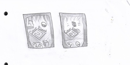
I actually ended up using the incorrect logo George had as his final design by mistake due to when I got given the image it contained previous designs one of which I ended up choosing since I thought it fit the design of the poster better, so either there was lack of communication or I’m just unaware since I didn’t see a line which separated the final design from the experiments.
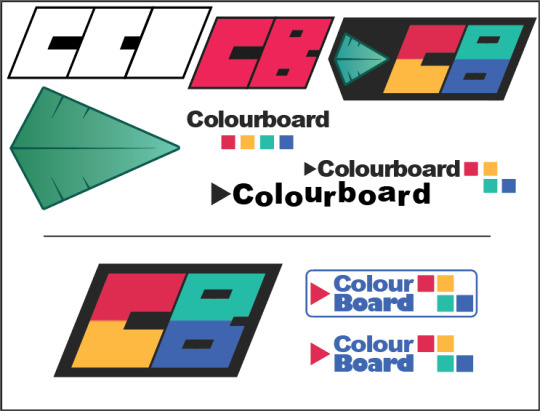
I also thought that the one I chose (top right) was the final design since it contained the most detail.
Who came up with the best ideas?
I would say that we all came up with ideas which helped lead to the final design and actual idea, specifically through Dean was effective in pointing out potential flaws with the product and final advertisement which allowed us to work faster and therefore have a more finalised thought out product. Dean was also good at thinking of the initial problem and how we could solve it such as learning colour through a game. George was good at paying attention to detail surrounding the game which most people wouldn’t recognise until further on in the process such as having a potential mascot and theme to help attract attention. I came up with what the actual game would be about and thought of potential solutions to what possible problems could occur. Also since I was creating the poster I chose how the final advertisement would look along with where what the other members of the team created would be placed and how they would be scaled along with potential effects as mentioned.
Who in the group didn’t contribute enough?
I would say that no one didn’t contribute enough since due to the game being simplistic anyway it would be difficult to adapt or add more possible ideas without making the game look or be too complex for children to understand. When we each decided what steps we were doing no one failed to deliver on time so that we as a team were able to get the whole process complete faster.
Would you approach the process differently if you did them again?
Overall not really, I liked the way the group worked, possibly more communication could have helped along with giving constructive feedback to each other. I also would have tried to include a mascot in the final design since I think it would have added more character to the game and make it more memorable.
Have you improved the product much and do you think it is a good product now?
I think the product has been improved quite a bit especially in terms of adding character to the game and making it stand out, the game itself I think has also been improved quite a bit, for example, having just one game appeal to a wider target audience over having two individual boards for different age groups.
Old board design -
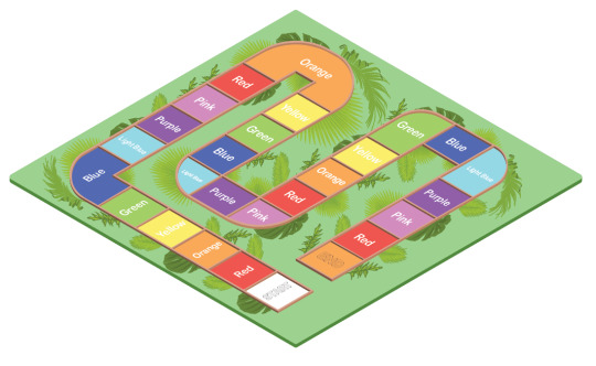
New board design -
Pitch 2
The script
The script was created in powerpoint where Dean would show and explain the old design with what looked wrong with it and how it needed improving. Dean would then also explain his board design with why he made the decisions he made. George would then explain why he created the logo the way he did also explaining the colour scheme of the logo and style of font used for the name. I would then explain the final advertisement design and how it relates to the colour and jungle theme, as well as why I added the effects I did to appeal to the target audience and make the game look exciting and interactive. We would then all answer questions depending on who we thought would be most suitable to answer it, for example, a question about branding I would answer and about the board or game itself Dean would answer. We would also all make mental notes on what the feedback was.
Reflection -
Feedback after second pitch and whether I agree with it -
After the second pitch, more ideas were given to help improve the product one of them is making the counters in the shapes of different animals, I like this suggestion since it would help fit the jungle theme but also make the game appear more interesting to children. Another suggestion was to have the game be electronic and have a space light up if a player were to land on it, I think this idea seems fun and would appeal to children but feel like it could be more breakable and would be more difficult to mass produce due to the cost being much higher.
0 notes
Text
Learning
Task 1
What did we do in the first lesson regarding memory and how we learn?
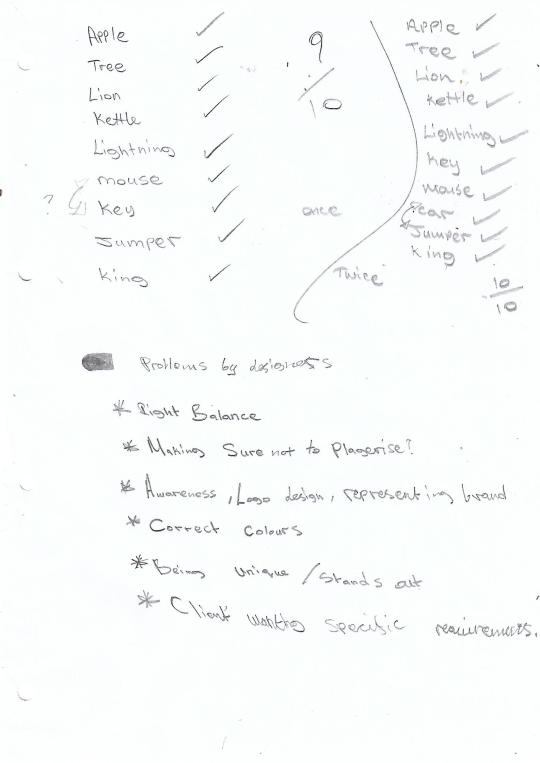
In the first lesson, we discussed as a class the methods of the different ways to learn and memorise things adapting certain opinions, we then did a memory test where we tried to memorise 10 different objects and then further discussed ways how memory could be improved.
What is learning?
Learning is the intake of information and being able to store it in hope that it would be useful later then transforming into an eventual skill.
How do we learn?
There are multiple ways different people learn for example some people are more visual learners where they take in information through their eyes which can be done by diagrams or a tutorial. Some people learn better through audio where volume is used to maybe direct someone through something. Actually doing something yourself and practising is often a common way people learn since it’s more hands-on giving them the ability to work at a more personal speed where they could be more comfortable. The final way people learn is through writing and reading where text is more appealing to them since it might come across as easier to understand.
How can we improve learning?
Learning can be improved for some people by simple repetition so that the information is more likely to stick into their head and that they won't forget it. Taking notes is another method people might use to improve their learning for example if someone is telling them information and they are taking notes they are in a way processing the information twice which relates to repetition.
Asking questions about certain topics also helps people learn since it might be more personalised and specific to them, therefore, making them more engaged with a topic they are learning about.
How can we improve memory?
There are many methods to improve memory, for example in class during the first lesson after trying to remember all 10 objects we discussed how possibly making a story out of the objects would make them easier to remember or imagining them around the room and relating certain emotions to each object to make them more personal.
Task 2
Studies between ages -
A study by Phillip Ko occurred where he got a group of seniors over the age of 65 and a group of younger people with an average age of 23, the test was that two, three or four coloured dots flashed on a screen, then went away where they then were replaced by a single dot, both groups were then asked if the single dot matched the colour of any of the other dots, the younger group performed better but he doesn’t claim that younger people have a better memory than older people but in fact younger people just visually see things in HD unlike older people so that they take in more detail and information in the first place.


However, a study by Dr Jon Simons suggests that older people remember better due to younger people being more likely to use strategies that promote the “formation of memory traces” which can boost memory significantly, therefore when adults are asked to think more deeply about the meaning of information they are learning, which often results in better “recall of that material”.
Studies between genders -
According to CBS, a study by Goldstein (an author of a study found in the journal of The North American Menopause Society) finds that middle-aged women outperform men on all measures of memory, However, the study can also confirm that a lot of women memory declines after they go through menopause. A study where men have an overall better memory than women couldn’t be found.
Do different ages have any factors that affect the way they learn?
According to the California Department Of Education, children tend to learn in many different ways mainly through the senses such as touch, taste and sound since these ways tend to be the most interactive in terms of taking in information, children also are fond of problem-solving due to them tending to like exploring and discovering.
As reported by Kristian Gaetano a former director of education at Learnkit adults are more afraid to fail and have more social filters leaving them to experiment less and learn more independently. Adults also like to have more specific learning opportunities to make them more engaged in ways that it would benefit them, therefore, them being able to take in information more clearly.
Task 3 -
Learning styles and teaching methods -
For the different learning styles, different teaching methods are used for example if someone were to learn visually like a lot of children this could be taught through charts or diagrams to give out information in an easier form for them, it’s also recommended that after they are taught give them time to help visualise what they have just learnt.

For auditory learners, they can be taught more effectively through things such as audiobooks, reading aloud and even associating music with certain ideas and concepts.

For people who learn best by actually carrying out something (physical) they can be taught by using as many physical objects as possible such as flash cards since they can touch and move them around, another teaching method for this type of learner would be to describe things in how they would feel if you were to touch them for example if a story was being told focus on the more physical side of things and how possible objects in the story might feel, since a lot of children learn this way also they are often taught through the use of games since they find this method more interesting and interactive.

And finally for the people who learn best through reading and writing they can be taught by taking notes and reading what they have written down so they take in the information multiple times and have it whenever they need it, textbooks and also glossaries are often more simple for the reading and writing learner to understand since they pay more attention to what the actual text is saying.

sources for the research -
Improving memory - https://www.pickthebrain.com/blog/7-secrets-to-improve-your-ability-to-learn-for-students-of-all-ages/
Philip Ko full study - https://etd.library.vanderbilt.edu/available/etd-04022010-161315/unrestricted/KOPC_dissertation_FINAL.pdf
Philip Ko summary of study - https://www.carbonated.tv/news/why-do-young-people-have-better-memories-its-probably-not-what-you-think
Dr Simons study - https://www.theguardian.com/lifeandstyle/2012/jan/14/memory-that-improves-with-age
The study between men and women - https://www.cbsnews.com/news/who-has-better-memory-men-or-women/
California Department of education -https://www.cde.ca.gov/sp/cd/Re/caqdevelopment.asp
How Adults learn - http://learnkit.com/2016/01/13/adult-learning-needs/
https://study.com/academy/lesson/visual-learning-style-strategies-activities.html
https://happyhomeschoolnest.com/blog/teaching-auditory-learners
https://www.thoughtco.com/auditory-learning-style-p2-31150
https://web.wlu.ca/learning_resources/pdfs/Learning_Styles.pdf
0 notes
Text
Instructions to create food without letters or numbers
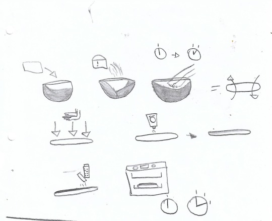

How was this done?
This was done by first thinking of a food that I thought would be interesting to show how it would be created in only 6 frames or less, I chose pizza since I thought it wouldn’t be too complex or too simplistic.
Successful?
I would say that this was carried out most successfully since I think it looks clear in most parts of the image but I think some parts could be improved, I think that the arrows and the clocks really help make the instructions clear along with the colour palette looking interesting and even the background being in the colour of the Italian flag which relates to pizza which I also think is a nice touch.
What went well?
I think how I created the food and other objects went well since this was easy to do but also think they look accurate to what they are supposed to be showing. I also like how the small versions of the pizza from a bird's eye view in the top left of three boxes add a lot to the instructions helps reassure the person following them that they are doing it correctly.
What didn’t go so well?
Since I wasn’t allowed to use numbers or letters in the image I couldn’t think of a way to show what temperature the pizza should be cooking it so I left this step out which makes the instructions more confusing.
I also found it difficult to show how to create all of the pizza, for example, actually making the tomato puree since this would go over the 6 slide limit or adding certain toppings.
What I would do differently next time?
Next time I would try to find a way to represent digits and then add them to the image or pick a more simple food to create where a specific temperature isn’t required.
1 note
·
View note
Text
Communicating with alien
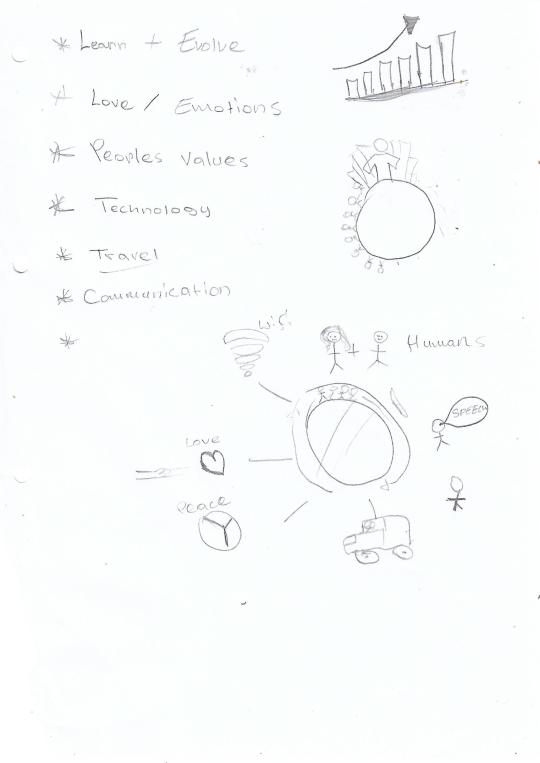

This is what my group presented as a poster to show an alien that the human race is worth living.
How was this done?
This was done by initially thinking of what certain aspects make someone human such as their emotions, we then thought of what advancements the human race has made to show that we are able to adapt and develop.
We came to the conclusion that an image of the Earth would be the main focus since it shows that we have developed our technology enough to be able to understand what the world looks like, we also added buildings to also show development with the people holding hands around the world to show emotion with some different expressions on the people to also represent this.
A wifi symbol was used to also show advancement and also relates to the people holding hands all around the world showing that we are adaptable, have the ability to live in different climates and have explored the whole of the planet.
Successful?
I would say that this was carried out unsuccessfully since I don't think the message is that clear along with having possible confusing aspects like why one human is much larger than all the others additionally with the lack of different genders being shown along with other races.
What went well?
Actually having an image of the world went well since I think it looks accurate helps explain how much humans have developed due to us knowing how our world looks. Another thing which went well was adding different expressions to the character’s faces since this was easy carryout and helped show that humans have emotions.
What didn’t go so well?
I think that adding the heart to help represent emotion didn’t go well since that symbol wouldn’t be known to alien life and wouldn't get the message across. Also, the timing could have been handled better since most of the time was spent discussing potential ideas which didn't make it into the final poster design, this caused the final poster to be unfinished with lack of colour and objects.
What I would do differently next time?
Next time more things would be added such as more symbols which might be more basic and easy to understand, more colour would also have been added to make the poster come across as more persuasive and intriguing.
1 note
·
View note