
Last Seen Blogs

karmagddon
KARMAGDDON

playhappytao
Pagansoul
angrykittenvoid
Hi 💕

bgm05
Merry Christmas!

mcdowellmcpherson9
The Journaling of Erichsen 190
Text
MA Fashion and Textile Practices Major Project Path - 9th September
As I draw my research to a close I feel it is important to look at society as a whole and try to determine who the Future Tribes are.
In the terms of political tribes - who, after all are the people who make up our societies and determine our governments - Europe is currently split into 6 distinct groups. These tribes were determined by means of a poll which was carried out by Chatham House - the home of The Royal Institute of International Affairs and Kantar Public between December 2016 and January 2017, which covered 10 European countries and involved more than 10,000 people. The 10,000 questioned were asked about their views on a range of political and social issues. The data that was collected gave an interesting insight into the minds of the people across the countries involved. The object of the poll was to assess how these people were thinking in regards to the EU because their future actions of could help shape the future of Europe. In the advent of Brexit it seems that the UK may no longer be counted as members of the EU, but it is interesting to see what the answers were and I am sure we can all feel an affiliation to one tribe or another from the list below.

Goodwin, M., Raines, T., & Cutts, D. (2017). Probaility that tribe members agree 'I feel proud to be European'. [Illustration]. Retrieved from https://www.bbc.co.uk/news/uk-politics-42108806.
Some of the main questions were whether the EU should have as much power as it currently holds, whether immigration has had a positive or negative impact on their societies and if some of the wealthier nations should be financially supportive of those nations with strained economies. In size order from largest to smallest are the political tribes which were determined from the poll:
Hesitant Europeans - 36%
This group tends to sit on the fence when it comes to any major issues, although may vote to the centre of to the right if required. They are irresolute about the EU and can waver on political agendas, or can be apathetic. Immigration is a concern and be more concerned about what’s happening on their home turf than in other countries.Their income tends to vary greatly and live in a wide range of European countries.
Contented Europeans - 23%
In this group they feel relatively happy to be part of the EU. They are often younger with positive views on immigration, and vote towards the liberal and left end of the political spectrum. They tend to be based in countries such as Poland and Hungary. They have faith in the EU ideology and tend to prefer to keep the status quo.
EU Rejecters - 14%
This group believes that the EU is undemocratic and wields too much power. They dismiss the idea that being in the EU holds any benefits and feels little camaraderie with other European countries. Many feel negative about immigration and are angered by the politics that comes with being part of the EU. People in this group are rural living and are mainly from Britain and Austria.
Frustrated Pro-Europeans - 9%
These guys are Pro-European. They believe that Europe will become more powerful through progressive values because at the moment they are not feeling the benefit of being part of the EU. They support the idea that a richer state should support a poorer one, but also feel mixed about immigration. they are a range of age groups and live mainly in France, Italy and Belgium.
Austerity Rebels - 9%
This group is dissatisfied with the way politics are conducted within the EU and a more relaxed view with more power being restored to member states. They think like the Pro-Europeans that the richer states should support the poorer ones and believe that each one should receive their fair share of immigrants. The level of unemployment is higher in this group and have experienced economic hardships. Their age tends to be middle aged or older and live in countries with a poor economic track record such as Greece and Italy.
Federalists - 8%
In this group they are committed supporters of EU and believe that the EU has benefited them greatly. They tend to be wealthier, older and disproportionately male who are very positive about immigration. They are the highest educated with a strong social network and most likely live in Southern Europe like Spain and Italy and reside in cities.
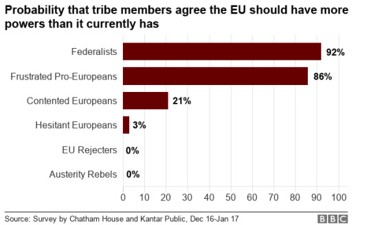
Goodwin, M., Raines, T., & Cutts, D. (2017). Probaility that tribe members agree the EU should have more powers than it currently has. [Illustration]. Retrieved from https://www.bbc.co.uk/news/uk-politics-42108806.
It is really interesting to see what conclusions were drawn from this poll. I can definitely see what political tribe I would be part of, or at least two that I would feel welcome in. The way we see society is really down to our own experiences and environment. We are the children of who have gone before us, and are defined by our experiences. It is then our responsibility to at least try and understand what we need to do to create a society we want to be part of. Unfortunately this was not a world poll where the opinions of the population could be taken into account, but it goes some way in identifying what we are thinking and how we are shaping our societies. Essentially we are all the Future Tribes to some extent, however long we have left on this earth we are shaping and molding it as we continue through life, and when we are gone the next tribes will carry the torch. The use of the T-shirt as a medium in identifying us as tribes, is really using the T-shirt as an extension of ourselves and the need to belong to something - something to make everything feel worthwhile.
Website:
BBC News. (2019). The six tribes that could shape Europe's future. Retrieved from https://www.bbc.co.uk/news/uk-politics-42108806.
Publication:
Talbot, S. (2013). Slogan T-shirts: Cult and Culture. London: Bloomsbury Publishing Plc.
The T-shirt as a reactionary item.
As I discussed in my previous post, the T-shirt seems to be a reactionary item that responds to the wealth of mixed media we see in our society. Glenn Adamson (2013) Head of Research at the V&A would go so far as to describe it as a postmodernist device:
“I think the slogan T-shirt seems to strategically respond to the condition of postmodernity in the sense that it is a personalised version of soundbite culture, and the slogan T-shirt is always both a visual presentation of style and language.”

Working Class Heroes, n.d. (n.d). Deus Ex Machina Sunbleached Postmodern T Shirt Beluga Rose. [Fashion]. Retrieved from https://www.workingclassheroes.co.uk/194238/products/deus-ex-machina-sunbleached-postmodern-t-shirt-beluga-rose.aspx.
Postmodernism was a movement that began around the 1970’s which challenged the purity and idealism of a 20th modernist aesthetic. Postmodernism embraced the mixing of media and art styles which not only effected the way we looked at the our society then, but still continues to do so. In the sense of how postmodernism can be applied to the T-shirt is that, primarily a modernist would look at it and assess its function to that of clothing and nothing more, a postmodernist view would be that form is adaptable regardless of function and can be manipulated to any means necessary.
The advantage of the graphic T-shirt is that it can display whatever we choose without having to say anything, because it does the work for us. Not unlike social media, where we can be the silent commentator. The slogan T-shirt could be the ultimate editor to our current quandaries. The Topshop “Save Your World” T-shirt says in three words what we have been discussing at length, - the slogan T-shirt could represent the ultimate soundbite, reaching far more than your Facebook friends or Twitter followers.
The T-shirt as a sub-cultural medium
Subculture by definition is a group of people within society with attributes which distinguish them from the larger group - so this term is often related to the younger generation who represent themselves differently through music choice, language, and clothing etc. Subcultures often emerge in reaction to political shifts, social changes and events which challenge the status quo. Subcultures have always existed in some form but became more prominent after the major wars, such as with the formation of street gangs in the 20’s and 30’s, and after the second world war in the 50’s and 60’s when the teenager came into their own with a more disposable income within stronger consumer society.
Punk was one of these subcultures as I have discussed in length in previous posts, but it was punk that really enabled us to see what a subculture was capable of. Their aesthetic and attitude is something which has had lasting effect, we often describe something which challenges society and goes against majority thinking as being so ‘punk’. Although it can be argued that the punk aesthetic wasn’t something which emerged organically, particularly in the UK, it could be said it was devised carefully by such Svengali characters as Malcolm McLaren, manipulating others from the background with a fashion savvy Vivienne Westwood as his sidekick. Dr Matthew Worley (2013) Reader in History from the University of Reading said of the punk aesthetic:
“I think to understand punk’s language you have to put the use of slogans into context of the imagery too. The language is very much mixed up into a broader imagery, which was consciously designed to provoke, upset and shock.”
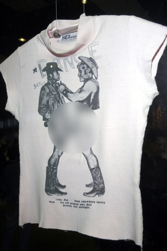
Westwood, V. (1976). Vivienne Westwood’s ‘Cowboys’ hand screen printed t-shirt, 1976. [Fashion]. Retrieved from https://www.marieclaire.co.uk/fashion/a-brief-history-of-punk-fashion-79145.
I can imagine when Vivienne Westwood’s cowboys T-shirt first came out people struggled with the visual imagery of two well-endowed half naked cowboys on the front, until you read the text with it and the whole meaning becomes clear. Of course it’s not only punk which was the defining subculture, but it offers a prime example of societal changes and political discourse defining a group of people to such an extent that was so effecting.
The T-shirt as a symbol of protest
As punk really defined the way we looked at and reacted to what was going on in society, the ethos of punk has continued in various forms ever since. It seems that every reaction we have to what is going on in our world requires a graphic T-shirt to represent and reiterate our voice. The ability of the graphic T-shirt to give us a voice is incredibly powerful, we may feel marginalised by our standing as a women for example, or because we are disabled, or we may feel like we cannot speak for the fear of being ignored. The graphic T-shirt enables us to feel a sense of togetherness with others, offering a silent hand to each other, to recognise a fellow kindred spirit.
Using the T-shirt as a symbol of protest, has of late become more and more evident, we have much to protest about in our world and current events seem to warrant us to become walking placards for our indignance. According to Shehnaz Suterwalla (2013) a journalist and editor:
“The slogan T-shirt spells out on the body a feeling, thought or belief. It can act like a personal manifesto or an expression of desire, including resistance.”


I think the first protest T-shirts I remember seeing were those of Katherine Hamnett. In 1984 the Prime Minister was holding a reception for the designers involved in London Fashion Week and Katherine chose to wear her T-shirt ‘58% Don’t Want Pershing’ – in reference to a European opinion poll regarding the positioning of American cruise and Pershing nuclear missiles. It was a great opportunity for Hamnett to protest her discontent as the image was caught on camera and appeared in newspapers nationwide. A perfect resolution for her because her agenda was all about direct political statements. Since beginning this project I have noticed more and more the use of the T-shirt as a medium for protest. Whilst watching the news one evening, discussion was concerning the wearing of ‘Bollocks to Brexit’ T-shirts by Liberal Democrat MEP’s to the first day of European parliament, and of course the ensuing outrage at such a gesture. The use of the T-shirt as a platform for protest has never been more fitting.
The T-shirt as a lifestyle signifier
In the 80’s the use of branding on T-shirts was a big thing. I remember buying a Tag Heuer T-shirt with their logo emblazoned across the front just because I knew it was an expensive brand, I also purchased a Moschino T-shirt for the same reasons. I could never afford the main clothing line but the T-shirt was the ticket to a way in, you felt like you owned a smaller part of the whole. But this branding wasn’t necessarily about saying anything in particular apart from that you aspired to be someone else or possibly someone better. The lifestyle T-shirt has evolved somewhat over the years since, although it’s significance in today’s society may be in question. Shouldn’t we be more concerned with what’s happening in our world as opposed to flaunting the latest designer brand? Chris Sanderson (2013) co-director of The Future Laboratory and creative director of trend forecasting magazine Viewpoint said as such:
“As we move towards a society that is becoming more polarised, social action and political thought become more important. I believe that we are moving into a period where the frivolous and meaningless are no longer relevant or seen as fun, and I think we will see that clear demarcation of people who want to take a stand and wear something more meaningful.”
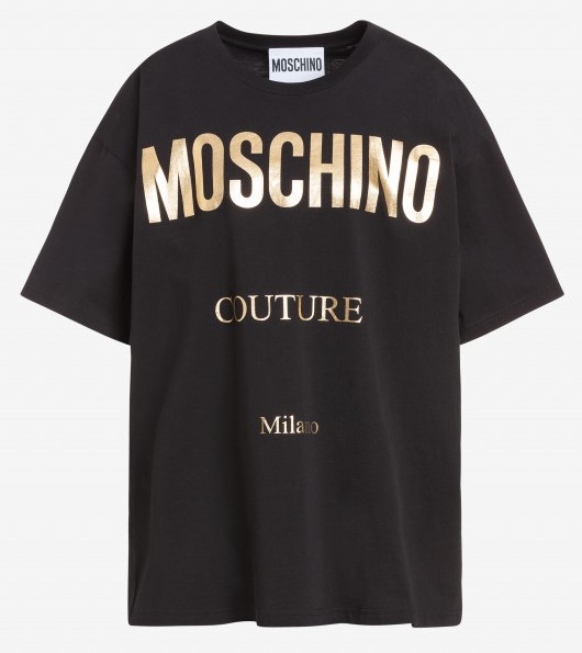
Moschino, n.d. (2019). MOSCHINO COUTURE JERSEY T-SHIRT. [Fashion]. Retrieved from https://www.moschino.com/gb_en/moschino/women/clothing/t-shirts/moschino-couture-jersey-t-shirt-46406.html.
How right he was! There will no doubt always be T-shirts that advocate a brand, but maybe today it’s the brands who need to look at themselves a little closer. If they were willing to risk association with the greater good maybe they would be perceived in a different way, but then that would be a risky strategy as they would be forever linked to that ideology.
The T-shirt as a marketing platform
Whilst studying at Uni we had a trip to the Tate Modern in Liverpool, and as a bit of a gift shop lover I was keen to see what was on offer there. I was struck by the amount of T-shirts that were available to promote the various artists that were exhibiting at the museum at that time, particularly the designs of Bridget Riley whose work was displayed on mugs, postcards and T-shirts. Clearly a marketing ploy by the museum so that the public may take away a piece of the exhibition with them. I shouldn’t have been surprised really as using the T-shirt as marketing ploy has been going on for many years. The term “Been there, done that, got the T-shirt” didn’t come from just anywhere, where it actually came from is a bit of a mystery but it means that no matter where you went there would inevitably be a T-shirt to suit the occasion. We all know that branding is a powerful medium but would we be willing to literally wear it on our chest? Julian Vogel (2013) at Modus PR seems to think we would:
“I suppose if you think of it in terms of Ralph Lauren’s Polo motif or Lacoste’s crocodile then why wouldn’t you have, for instance, your love of Coca-Cola on your chest? Corporate’s are always really excited about collaborations because it’s free advertising…and I still think the T-shirt is the garment to do that.”
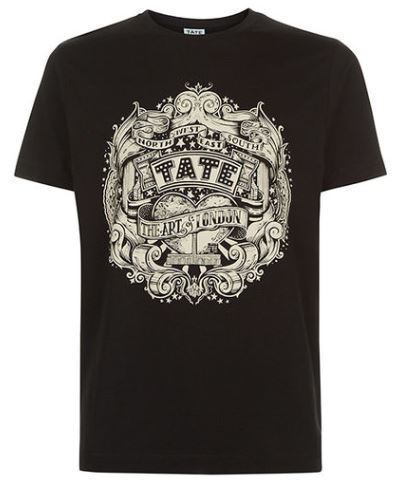
Tate Shop, n.d. (2019). https://shop.tate.org.uk/vic-lee-black-t-shirt/g1020.html?cgid=t-shirts. [Fashion]. Retrieved from https://shop.tate.org.uk/vic-lee-black-t-shirt/g1020.html?cgid=t-shirts.
When we did our group presentation for our brand ‘Hud Pop’ we decided that to be more noticeable we needed to put our brand on a T-shirt. It made sense, we were talking about our brand and so displaying it on a T-shirt somehow strengthened the belief we had in it, as well as projecting a stronger message to our audience. The uniformity of that group collective made us feel more connected to what we were trying to portray.
The T-shirt as a campaigner’s medium
Sometimes a campaign can start by the means of a graphic T-shirt, not unlike the protest T-shirt, the campaigner’s T-shirt has been a powerful medium for many. Parallel’s can be drawn to the protest T-shirt however unlike the protest T-shirt - which tends to be concerning a particular point in time - the campaign T-shirt has longevity within the aim of the campaign itself. Not only does the wearer display their support and belief in the campaign but the proceeds from the sales of such go to the very cause it was created for, it’s a win win situation for all involved. Larissa Clark (2013) marketing director for the Environmental Justice Foundation says that the use of graphic T-shirts with campaigns helps push the campaign message:
“Campaigns don’t get dropped, the reality is that it is really hard to maintain the message in the media for a long period of time because the attention is all about ‘the latest’; everything has a shelf life, and so although issues are still urgent you have to reinvigorate the message and develop it and hopefully it becomes sufficiently retro that you can bring it back.”
TK Maxx, n.d. (2015). TK MAXX RED NOSE DAY 2015. [Fashion]. Retrieved from https://www.thestylerawr.com/2015/02/tk-maxx-red-nose-day-2015.html.
A little collaboration with an established designer can also go a long way in delivering a campaign message to a wider audience, such as Vivienne Westwood’s eagerness to support the charities she believes in by donating her graphic artwork to them as a means to cement the message further. Campaigns such as the yearly Red Nose day for Comic Relief employ the use of different designer collaborations each year as a marketing tool to garner interest, which they sell through high street outlets T K Maxx, Sainsbury’s and Asda. Past collaborations have included Karl Lagerfeld, Victoria Beckham, Matthew Williamson, Vivienne Westwood and more, as well as roping in the help of various Hollywood actors and homegrown stars. This collaborative strategy helps maintain the interest of the people and ensures the campaigns remains within the public’s psyche.
The T-shirt as a political platform
The rise of the political T-shirt has come from the need to facilitate our frustrations about the political climate, which has seen a lot of discourse of late. Although the use of a slogan T-shirt is not a new way of projecting our political opinions by any means, but I think since the election of President Trump in 2016 and the UK’s own farcical political endeavors have done much to aid the need to display our concerns on our chests. It is likely that our political concerns may not be heard or we may be ignored, but wearing a T-shirt which displays them surely doubles the sentiments we wish to share more than a mere placard alone. Shumon Basar (2013) art critic and editor at Tank Magazine says the slogan T-shirt can add weight to expressing our frustrations:
“I think there is something very interesting about the parallels in which capitalism proliferates through our lives throughout the world as a modern form of terrorism and for me the slogan T-shirt is the obligation to express your concerns, even is ultimately your expression is impotent. But what can you do? One of the only options is to manifest dissatisfaction and frustration and maybe for some that is through wearing the slogan T-shirt.”

Associated Press, n.d. (2018). Supporters of US President Donald Trump shouting to passing motorists as they held a ‘Make California Great Again’ rally on Saturday to support Los Angeles County Republican candidates in the California primary election. [Photograph]. Retrieved from https://www.scmp.com/news/world/united-states-canada/article/2149612/donald-trump-invokes-red-wave-us-midterm-elections.
Trumps political campaign tagline was “Make America Great Again”. For many America has always been great but he made the nation believe that there was something fundamentally wrong, and he was the only one to solve it. Of course much merchandise ensued - mainly in the form of caps and T-shirts. Through his faux pas in regards to comments on race and equality this merchandise has been adopted by far right supporters almost as battle gear for their insalubrious agendas. The political T-shirt is a great tactical item for passing on the agenda to others in a quick way. Many T-shirts are handed out at political rallies and then inevitably the T-shirt is worn back home, which then leads to more discourse - they become a voice in their own right.
0 notes
Text
MA Fashion and Textile Practices Major Project Path - 8th September
I had previously popped into Primark on the way back from Uni one day. This was my first port of call because I knew Primark stocked a huge range of T-Shirts and that they would reflect what was going on right now. The beauty of the T-Shirt is that it can change very quickly to reflect the sentiments of the time and change on a whim to attract potential customers. Primark is a renowned fast fashion outlet so their T-Shirts would no doubt be very ‘of the moment’.

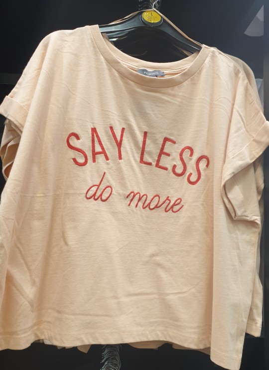


Initially I was quite surprised by the offering that Primark had. Oddly, looking at the women’s and the men’s offering the difference was huge in the sense of sentiments expressed. I didn’t take any pictures of the men’s T-Shirts as the majority of the men’s were focused on video games, sports or places of the world. Anybody would think that the Primark man didn’t have anything to say, or would want to say anything in particular on their T-Shirts in fear of what, appearing to care? Maybe the psychology of the T-Shirt went deeper than I thought!
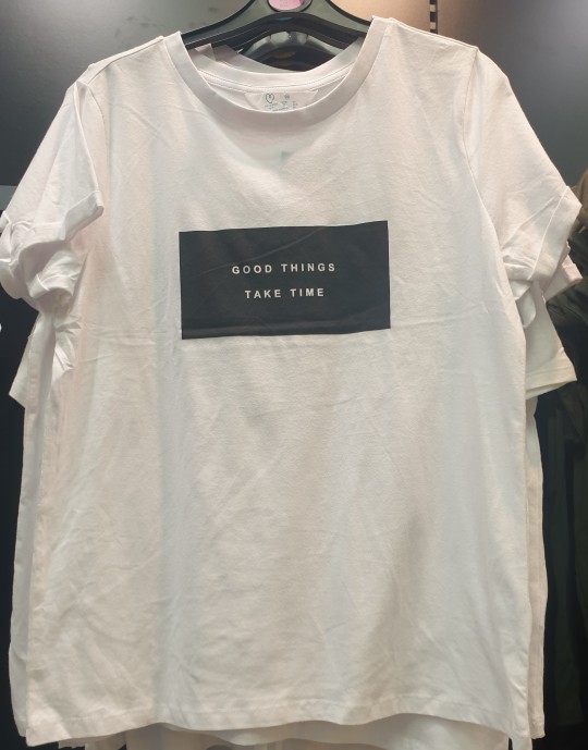
If the women’s were anything to go by it was almost like reading a wearable self help book. With sentences like “You are enough” and “I’m doing this for me” felt like they had been lifted straight from the aforementioned literature. Maybe the future tribes need reassurance in this world. The state of the world of late has been much in question, what with climate change, animal welfare, wars, and the intense political discourse which has been dominating our media for years can effect us all intensely. Whether we are interested in the state of the world or not it is hard to escape what is happening right now, and a few reassuring words can be all it takes to make a difference.
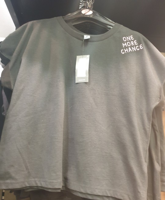
Whereas “Say less, do more” and “One more chance” seemed to offer a positive message to the wearer and the observer. Were they referring to the state of our world? We really do only have limited chances to reconcile ourselves with our planet, and maybe say less and do more like Greta Thunberg, sitting in quiet solidarity until she was noticed can possibly say more than all the shouting and protesting we have done so far, it’s a hard one to figure.
I wouldn’t get chance to go to the shops for some time so I decided to take a look at what was on high street websites such as H&M and Topshop to see what they were offering in the way of the graphic T-Shirt. H&M have always supplied a good selection of T-Shirts online but are somewhat hidden away in store. So online was my best option in this case, and from this large offering there were a few which stood out.

H&M, n.d. (2019). Printed jersey top. [Fashion]. Retrieved from https://www2.hm.com/en_gb/productpage.0761350007.html.

H&M, n.d. (2019). Printed T-shirt. [Fashion]. Retrieved from https://www2.hm.com/en_gb/productpage.0805510007.html.

H&M, n.d. (2019). T-shirt with a motif. [Fashion]. Retrieved from https://www2.hm.com/en_gb/productpage.0779852006.html.

H&M, n.d. (2019). Viscose T-shirt. [Fashion]. Retrieved from https://www2.hm.com/en_gb/productpage.0698273007.html.

H&M, n.d. (2019). Short Pride T-shirt. [Fashion]. Retrieved from https://www2.hm.com/en_gb/productpage.0768556001.html.
H&M, n.d. (2019). Printed T-shirt. [Fashion]. Retrieved from https://www2.hm.com/en_gb/productpage.0805510002.html.
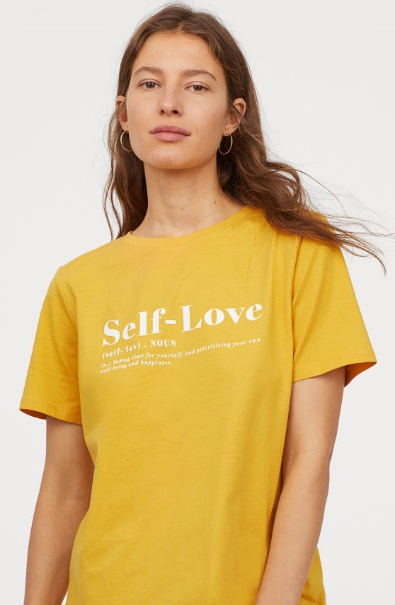
H&M seemed to deliver a couple of strong messages in their T-Shirts collection. The “Self-Love” message echoed the opinions of Primark, reassuring us to love and look after ourselves, like a silent hug. Is this saying we should be more selfish? Being selfish has got us into a lot of trouble in the past, we need to be thinking of the bigger future. Although loving yourself has always been the mantra to a happier life and that means happier society in general, like Rupaul always says “If you can’t love yourself, how in the hell you gonna love somebody else?” and Rupaul is never wrong. I think the secret is finding the balance between the two, love yourself and be happy but don’t do it at the expense of others.
On the theme of love, there were many T-Shirts out there this season in regards to anybody being free to love whoever they choose. 2019 marked the 50th year since the Stonewall Riots, and London Pride ended their festivities in tribute to all that fought to have the fundamental rights as human beings to love without barriers. The Stonewall Riots refers to a riot which took place at the Stonewall gay bar in Greenwich Village, New York in the June of 1969 in which members of the LGBTQ+ community fought back against the constant police raids the bar and its customers had endured throughout it lifespan. The raid would prove to be a turning point in the fight for the rights of LGBTQ+ communities all over the world as more and more people came out to protest in support. Michael-Antony Nozzi (2019) was involved in the riot that night:
“It was the perfect storm, a hot summer night. A bar that normally holds 20 to 30 people, now all of a sudden with 300. The cops stupidly deciding, ‘that’s the bar we’re going to raid’ and Judy [Garland] dying the week before. Our attitude was: ‘No you’re not going to do that to us. Not tonight.”
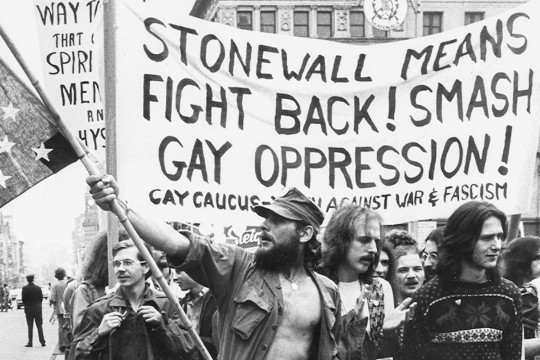
Walsh, C. (2019). Protesters took to the streets in the aftermath of the Stonewall riots in lower Manhattan in the summer of 1969. [Photograph]. Retrieved from https://news.harvard.edu/gazette/story/2019/06/harvard-scholars-reflect-on-the-history-and-legacy-of-the-stonewall-riots/.
The other theme which H&M featured within their collection was that of the strong female. Since the #MeToo movement began back in 2006 the movement has continued its crusade to stand up to sexual harassment and sexual assault within many industries worldwide. I discussed the movement back on one of my previous posts, and thankfully we have seen the movement continue to be successful in drawing attention to this abuse to both men and women. The rise of the graphic T-Shirt in support of a strong female identity and feminist agendas is proving to be ongoing. Because of this movement more women, and men are feeling safer within their work environments as they should do. Quotes like “Femme & Fierce”, “Sisterhood is powerful” and “ Les femmes s'unissent” -which means “Women unite” are pushing the message further and wearing such lets others know we are strong if we stand together as a united front.
I thought Topshop would probably be one of the best places to look when it came to current graphic T-Shirts, they are the brand who keeps their fingers on the pulse when it comes to current fashion.
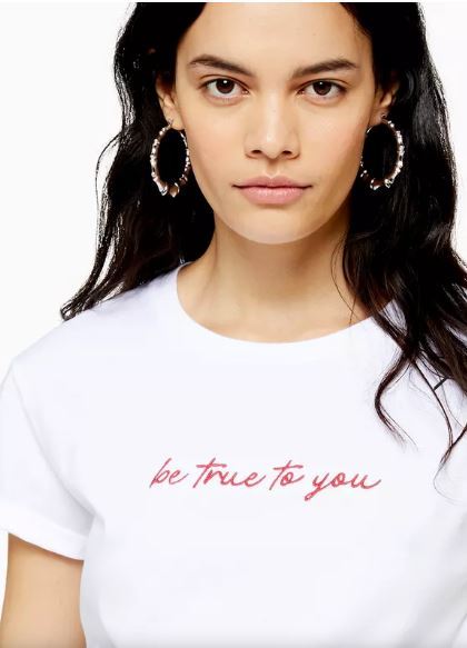
Topshop, n.d. (2019). True To You T-Shirt. [Fashion]. Retrieved from https://www.topshop.com/en/tsuk/product/clothing-427/t-shirts-6864659/true-to-you-t-shirt-9064873.

Topshop, n.d. (2019). See The Good T-Shirt. [Fashion]. Retrieved from https://www.topshop.com/en/tsuk/product/clothing-427/t-shirts-6864659/see-the-good-t-shirt-9041736.

Topshop, n.d. (2019). Make It Happen Slogan T-Shirt. [Fashion]. Retrieved from https://www.topshop.com/en/tsuk/product/clothing-427/t-shirts-6864659/make-it-happen-slogan-t-shirt-9072865.
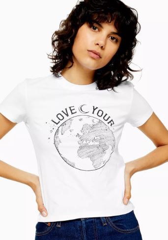
Topshop, n.d. (2019). 100% Organic Cotton Love Your World Top. [Fashion]. Retrieved from https://www.topshop.com/en/tsuk/product/clothing-427/t-shirts-6864659/100-organic-cotton-love-your-world-top-9035469.

Topshop, n.d. (2019). 100% Organic Cotton Save The Sea Top. [Fashion]. Retrieved from https://www.topshop.com/en/tsuk/product/clothing-427/t-shirts-6864659/100-organic-cotton-save-the-sea-top-9035485.
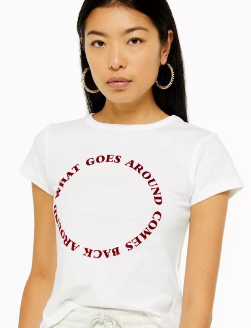
Topshop, n.d. (2019). What Goes Around T-Shirt. [Fashion]. Retrieved from https://www.topshop.com/en/tsuk/product/clothing-427/t-shirts-6864659/what-goes-around-t-shirt-9039864.
There seemed to be two distinct themes at Topshop. The first was again life assuring messages like “Make it happen”, “Be true to you”, and “See the good” all in a handwritten font which appears more personal somehow, like you’ve written it as a reminder to yourself, or you’ve read it in a note from a friend or loved one. It really seems like we’re teetering on the edge of something and these messages are like giving ourselves a gentle reminder to just keep on going, to keep away from the edge!
The second theme is based on global awareness, which is vital to our future existence. The “Love your world” and “Save the sea” T-Shirts are made from 100% organic cotton, which of course is a good thing, but it seems not many retailers are producing garments in more sustainable fibres as yet. Of course it is a good gesture towards dealing with the problem of sustainability but I think they could be doing more. H&M have been producing clothing for the last few years under their ‘Conscious’ label which ensures the products with that label are made with at least 50% recycled materials. In fact many contain 100% and the most recycled cotton they use is at 20%, but they are looking to increase this in the coming years. Their range is cheap too, well certainly affordable to the average person, dispelling the myth that sustainable means having to pay more.
I’ve recently discovered another cheap retailer called Monki who produce really affordable clothing, and from this Autumn all their cotton will be 100% sustainably sourced, forever. By 2030 they intend to use recycled or other sustainably sourced materials only, and all their stores currently offer textile recycling facilities. Their stores are also powered by renewable energy sources, aiming to be climate positive by 2040, very impressive.

Monki, n.d. (2019). Button-up shirt dress. [Fashion]. Retrieved from https://www.monki.com/en_gbp/clothing/dresses/product.button-up-shirt-dress-black-with-face-doodles.0632640018.html.
I think the conclusion I have come to regarding high street graphic T-Shirts is that they are very reactive to our current situation. They tend to reflect our sentiments regarding our social situations and our culture. Many of the trends are translated straight from what were are seeing on social media, the news or documentaries, we are keen to let the world know that we care, or how we feel. Maybe the sentiment of what’s being said becomes stronger if we decide to commit it to a tangible product, and not as forgettable as a tweet or share. Even if our sentiments change over time, the T-Shirt remains as a physical reminder of who we once were, they tell a story, a story of us.
Websites:
Bekhrad, J. (2018). The T-Shirt: A rebel with a cause. Retrieved from http://www.bbc.com/culture/story/20180202-t-shirts-the-worlds-most-expressive-garment.
Bass-Krueger, M. (2019). Everything to know about the history of the T-shirt. Retrieved from https://www.vogue.com.au/fashion/trends/everything-to-know-about-the-history-of-the-tshirt/image-gallery/65641e7e0e07560fceb738db1e973e7a?pos=1.
Victoria & Albert Museum. (n.d). The Rolling Stones tongue and lips logo. Retrieved from https://www.vam.ac.uk/articles/rolling-stones-lips-and-tongue-logo-by-jon-pasche-1970?gclid=CjwKCAjwzdLrBRBiEiwAEHrAYj9A-Xj7_mPaANxAvVaaWklRWfNlbqnj5QXjdM0CrZAcdrM7aZlzpxoCG6cQAvD_BwE.
Radio X. (2018). Why This Logo Was Named The Most Iconic T-Shirt Of All Time. Retrieved from https://www.radiox.co.uk/artists/rolling-stones/rolling-stones-logo-tshirt-meaning-design/.
Hemingway Design. (n.d). Red Or Dead. Retrieved from https://www.hemingwaydesign.co.uk/about/red-or-dead/.
Paskett, Z. (2019). What happened at the 1969 Stonewall Riots: 'You’re not going to do that to us — not tonight. Retrieved from https://www.standard.co.uk/go/london/lgbtq/what-were-stonewall-riots-lgbtq-lesbian-gay-bisexual-trans-pride-a4177926.html.
Publication:
Brunel, C. & Collin, B. (2002). The T-shirt Book. New York: Assouline Publishing, Inc.
0 notes
Text
MA Fashion and Textile Practices Major Project Path - 6th September
The T-Shirt
The the 1970′s, according to Brunel (2002), Elle magazine announced that:
“The T-shirt will become a basic item of clothing that will never go out of fashion because it’s already beyond fashion.”
It is a statement that has never been more correct, the T-Shirt IS beyond fashion, and yet remains steadfastly within the collections of high profile designers but then is equally at home on the rails in a low budget store. The T-Shirt is an oxymoron, it’s that blank piece of paper waiting to be filled.
The origins of a ‘T’ shaped garment goes as far back as the middle ages, where an undergarment with a round neck and sleeves would be worn as an extra layer between the skin and the upper layer of clothing.This garment could be washed separately and replaced without the need to wash the other clothes. This was a long rectangular piece of woven linen or cotton with longer ‘tails’ which could be tucked between the legs. Over the centuries this garment changed little apart from losing its ‘tails’ and slimming down to fit the body more closely.
Ironically, this is how my boyfriend likes to operate, wearing the same clothes all week - he works from home - and then changing his T-Shirt and underwear daily. Thankfully the string vest has yet to emerge. I’m sure he wouldn’t be impressed with me writing this!
By the time it reached the 19th century this garment was certainly more advanced than its predecessors. With the invention of knitting processes, the structure was made more form fitting and used alternative materials such as wool and jersey. The sleeveless knitted vest was worn as early as the 1910′s but had yet to adopt the classic ‘T’ shape. The Union Suit on the other hand was an American invention, first patented in 1868 as part of the countries clothing reform effort - where clothing was created to be less restrictive than the Victorian clothing of the time - it comprised of an all-in-one body suit which quickly caught on with men because it buttoned down the front and had a flap at the back for, lets say, ease of toilet use. The style remained popular until the early 20th century, primarily used for work wear, but then was separated into two garments to ease movement further - full length trousers known as ‘long johns’ and T-Shirt style top. This is when the T-Shirt is thought to have become an actual piece in its own right.
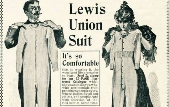
Real Men Real Style, n.d. (n.d). The union suit dominated as a men's undergarment throughout the late 19th and early 20th century.. [Illustration]. Retrieved from https://www.realmenrealstyle.com/history-origins-mens-underwear/.

Joysmith, E. (1943). Utility Underwear- Clothing Restrictions on the British Home Front, 1943. [Photograph]. Retrieved from https://commons.wikimedia.org/wiki/File:Utility_Underwear-_Clothing_Restrictions_on_the_British_Home_Front,_1943_D13079.jpg.
Although another theory is that the U.S Navy first adopted a very basic form of the T-Shirt as underwear in the First World War but by Second World War the U.S Army had made it part of their official underwear. It was apparently used as a good way of safeguarding the uniform, the uniform was hung safely away whilst manual labour ensued and then could be easily cast aside when inspection was due. In the below photograph, actor Carlo Aldini can be clearly seen wearing a T-Shirt on the set of his 1930 film Kampf gegen die Unterwelt ( Fighting the Underworld)
Aldini, C. (1930). Scene with Carlo Aldini and Siegfried Arno.. [Film Still]. Retrieved from https://www.akg-images.de/archive/-2UMDHUH9GG88.html.
Theories aside, it was the underwear boom that ensued that was to cement the T-Shirt as a necessary item of clothing. That and the association the T-Shirt had with the U.S forces, it was hero attire, of course war time advertising all fueled this link. Sears Roebuck, the large chain of American stores had many ad’s promoting the use of the T-Shirt as an everyday item, not just for underwear but for casual use outerwear too. The term “Gob” referred to a slang word for a sailor.

Sears, n.d. (1938). 1938 Sears Summer Catalogue. [Advertisement]. Retrieved from https://www.vam.ac.uk/blog/news/t-shirts-101-part-2.
It wasn’t long before this previous underwear garment became acceptable as casual outwear, and not soon after the graphic printed T-Shirt arrived. The first graphics to be seen on a T-Shirt were in the film The Wizard of Oz. In the scene Dorothy, the Cowardly Lion, the Tin Man and the Scarecrow arrive at the the Emerald City looking a little worse for wear, so they are guided to the cities beauty parlour where they are pampered from head to toe. Some of the beauty parlour’s assistants can be clearly seen wearing green T-Shirts with the word ‘OZ’ in white emblazoned across the front. The T-Shirts were also distributed amongst the cast and crew, as well as sold to the general public in anticipation of the film. They were the first promotional T-Shirts.

Fleming, V. (1939). Workers in The Wizard of Oz wear Graphic T-shirts in 1939. [Film Still]. Retrieved from https://www.shopcommonthreads.com/blog/tag/T+shirts.
As the U.S entered the Second World War it was important to reassure the public that their forces were committed and ready for what lay ahead, so Life Magazine’s documentary photographer and photojournalist Eliot Elisofon was given the task of taking a photograph to be shared with the nation that reiterated this sentiment. Corporal Alexander Legerda from the 94th Bomb Group in the U.S air corps was chosen for the task and made the cover of Life Magazine in July 1942 holding a 30 cal. machine gun and wearing a graphic T-Shirt advertising the Las Vegas Gunnery School, Nevada. The T-Shirt was made by the American Athletic Co. in Los Angeles, CA. Legerda was the first person to wear a custom printed T-Shirt on the front cover of a publication. After the war the T-Shirt symbolised a victorious nation, although still not totally accepted as the everyday attire it came to be, it remained for work wear and home wear only - that is until Hollywood told us differently.

Elisofon, E. (1942). Corporal Alexander Legerda in his 1942 LIFE Appearance. [Editorial]. Retrieved from https://www.vam.ac.uk/blog/wp-content/uploads/2014/10/LIfe-Magazine-Cover-1942-first-words-on-a-tee1_d84c37654899a36737bb1d059257ec6b.jpg.
By the 1950′s Hollywood had cottoned on (excuse the pun!) to the appeal of the T-Shirt, well at least to how sexy it could be. Marlon Brando was the first Hollywood actor to be seen flaunting the T-Shirt in the film ‘A Streetcar Named Desire’ - a film based on the famous play by Tennessee Williams. In the film Brando is often seen in various states of undress, in form fitting sweat stained T-Shirts, tight grease covered vests, or bare chested - which could only have added to the films appeal. His character is a somewhat violent factory worker whose relationship with his wife’s sister is twisted and tumultuous, a scandalous subject for the 1950′s. So the T-Shirts association with sex and scandal confirmed the piece as attire for the working class reprobate. Curator of the exhibition Cult - Culture - Subversion Dennis Nothdruft (2018) said of the T-Shirts impact at the time:
“It’s just a white T-shirt, but it already has that kind of disruptive potential, It was rebellious, because [T-shirts] were actually undergarments … It was a tough political statement.”

Kazan, E. (1951). A Streetcar Named Desire (1951 film). [Film Still]. Retrieved from https://variety.com/2017/vintage/features/streetcar-named-desire-anniversary-1202626588/.
What really launched the T-Shirt to cult status proportions however was James Dean’s portrayal as Jim Stark, an unruly teen in the 1956 film ‘A Rebel Without A Cause’. The film was probably the first of its kind to look at the differences between parents and their children and the conflicts which arose. It was to examine the inner working of dysfunctional family life in America - until then the American family had been portrayed as pinnacles of society, no matter what was bubbling underneath. In 1990 the film was added the the Library of Congress’s National Film Registry as being a culturally, historically, and aesthetically significant slice of 1950′s America. Aesthetically significant because Dean was displaying an authentic vision of what the average teenager wanted to wear in 1956, or what the more rebellious were wearing.

Ray, N. (1956). A Rebel Without A Cause. [Film Still]. Retrieved from https://www.britannica.com/topic/Rebel-Without-a-Cause.
Now that the T-Shirt was firmly planted in the people’s psyche, it took Marlon Brando again to show it worked well in a rebellious ‘three piece’ teamed with the biker jacket and jeans in the film ‘The Wild Ones’, and the male cast of ‘West Side Story’ to wear the T-Shirt as the favoured accessory of gang culture. The T-Shirt was now so well known for clothing movie’s misfits, when was it to become the clothing of the many?
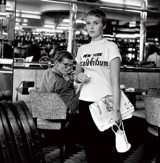
It wasn’t until the 1960′s that the T-Shirt was to become a uni-sex item of clothing. Many may remember the French film ‘Babette Goes To War' with the beautiful and sensual Brigitte Bardot, in which she is seen laying in the grass in her slim fitting white T-Shirt with its sleeves casually rolled up. The first graphic printed T-Shirt worn by a woman on film was in the 1960 French New Wave (experimental film making using unusual editing and exploratory narrative) film ‘À bout de souffle' (Breathless) in which another petty criminal embroils his aspiring journalist girlfriend - played Jean Seberg - into a life of crime. The film shows Seberg on the Champs-Élysées in a T-Shirt advertising the Herald Tribune, her place of work. Teamed with her short gamine hairstyle and slim, androgynous figure she would be easily mistaken for a stylish teen of today.
Godard, J.L. (1960). À bout de souffle (Breathless). [Film Still]. Retrieved from https://www.vanityfair.com/hollywood/2015/06/raymond-cauchetier-set-photographs-breathless-new-wave.
The T-Shirt was now officially outerwear, and by the late 60′s and 70′s experimentation in the use of the T-Shirt became more evident. In the UK the T-Shirt was a little later to catch on, but the foresight of Barbara Hulanicki’s Biba saw that it became a staple item for the new generation. This time around the T-Shirt also became a medium for political sentiment, used for presidential campaigns to advertising ‘free love’, the T-Shirt became a blank canvas for the sentiments of the many. As Brunel (2002) states:
“Its fundamental simplicity makes it the perfect personal sandwich board capable of getting across its ‘message of the day’. the world over - whether involved in protecting the environment, human rights, saving the whales, you name it - T-Shirts are an excellent means of identifying kindred spirits.”
The T-Shirt now was a revolutionary item, it was a political soundboard, it was a means of expressing our musical affiliations and a way of identifying those who felt the way we did. A great example of this is the Rolling Stones logo t-shirt. The logo was originally designed by Royal College of Art student John Pasche and was commissioned by Mick Jagger to come up with a logo for the bands new company Rolling Stones Records. Jagger had liked the young artists work after seeing it at the degree show in 1970. Mick had seen an image of the Hindu goddess Khali and was inspired by her open mouth with tongue hanging down. Often thought to be a symbol of Jagger’s pronounced mouth, Pasche (2018) said it was possibly an unconscious thing:
“A lot of people ask me if it was based on Mick Jagger’s lips - and I have to say it wasn’t, initially. But it might have been something that was unconscious and also really dovetailed into the basic idea of the design. It was a number of things. It’s universal statement, I mean sticking out your tongue at something is very anti-authority, a protest really… various generations have picked that up.”

Pasche, J. (1970). Rolling Stones Logo. [Illustration]. Retrieved from https://www.creativereview.co.uk/rolling-stones-logo-john-pasche/.
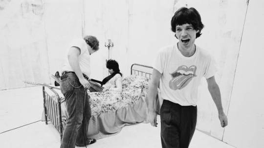
Putland, M. (1978). Keith Richards lies on a prop bed as Mick Jagger laughs during the production of the music video for Rolling Stones' 'Respectable' in New York, 1978. [Photograph]. Retrieved from https://www.creativereview.co.uk/rolling-stones-logo-john-pasche/.
The T-Shirt had become a place to display political agendas and to project our messages of protest. We all recognise the Cuban revolutionary Ernesto Guevara’s face - aka Che Guevara, not necessarily because of his political standing, but because of the simplified image of his face displayed on a T-Shirt - taken from the iconic photograph by Alberto Korda in 1960. Media and television have also become major players in the way the protest T-Shirt has become a way of pushing our agendas. With photographed and televised protests become the norm, a well worded placard along with the T-Shirt is a way of free advertising for whatever cause you are backing.
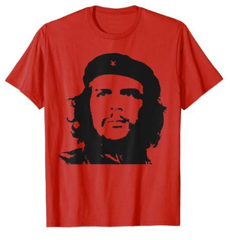
Amazon, n.d. (n.d). Che Guevara Revolution T Shirt. [Fashion]. Retrieved from https://www.amazon.com/Che-Guevara-Revolution-T-Shirt/dp/B079MRM3FF?customId=B075382QRP&th=1.
It could be said that the T-Shirt as a fashion item only became so around this time, but it had been championed as far back as the late 1930′s by none other than Coco Chanel herself. A photograph taken as she posed at her villa on the French Riviera clearly shows her love of the T-Shirt back then. The classic striped sailor’s top - the Breton shirt - was a essential piece of naval work wear but Coco was to propel this humble item to the mainstream when she included a similar style in her nautical themed sportswear collection in 1917. Teaming it with wide leg trousers and flat brogues it oozed simple elegance, and has since become synonymous with classic French fashion. In the 50′s and 60′s it was adopted by the creatives such as Pablo Picasso and Jean Paul Sartre, and later by French fashion designer Jean Paul Gaultier who has made the shirt edgy when teamed with his more adventurous creations, or tartan kilts!

Look for the Woman, n.d. (2015). Coco Chanel. [Photograph]. Retrieved from http://lookforthewoman.com/picasso-french-style-icon/.

Marcy, M. (n.d). Jean Paul Gaultier. [Photograph]. Retrieved from https://www.pinterest.co.uk/pin/570057265318472259/.
It wasn’t long before the T-Shirt became the staple piece included in every designers collections. In later years other fibres were added to the cotton mix, such as Lycra in the 80′s which revolutionised the sportswear industry and created clothing for casual wear as well as exercise. The 90′s saw a change in direction where the T-Shirt was disheveled and deconstructed as part of a grunge aesthetic, or emblazoned with bands graphics. One I particularly remember was the band James’s ‘Sit Down’ T-Shirts to promote their song of the same name. I saw guys walking around Leeds with these long baggy T-Shirts with ‘Sit Down’ printed in large text across the back of them, and wondered what they were all about. It was a good tactic as I eventually found out what they were referring to but without a certain amount of digging. James were part of the ‘Madchester’ scene in the early 90′s which saw a glut of Northern Bands, particularly from Manchester storm the music charts.

Worth Point, n.d. (n.d). JAMES T-SHIRT! SIT DOWN TIM BOOTH. [Fashion]. Retrieved from https://www.worthpoint.com/worthopedia/james-shirt-sit-down-tim-booth-245105457.
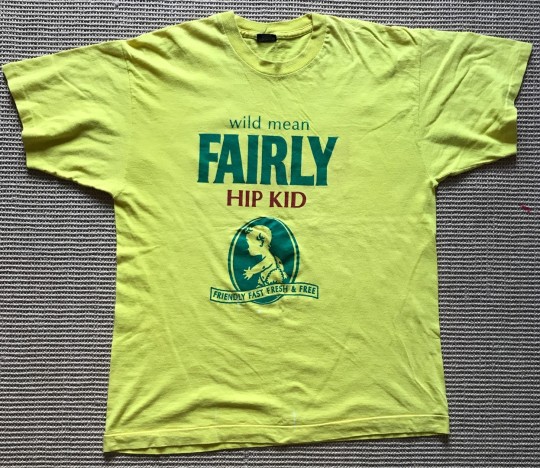
I was part of the rave scene at the end of the late 80′s and into the mid 90′s. Quirky T-Shirts were the standard dress code for the ‘raver’ and became more and more of an aesthetic pastiche to the advertising campaigns and big brands of the day. My love of Read or Dead came from - apart from my ‘Space Baby’ T-Shirt - the wearing of their T-Shirts which played heavily on brands such as Lego, Hoover and Shell, it was a two finger salute to the large corporations. Wayne Hemingway - Read or Dead’s founder did get into a little bit of bother for bastardising their branding but he was never one to take much notice. Another one I remember was the take on the Fairy Liquid logo and catch phrase ‘Mild, green Fairy liquid’ only to say ‘Wild, mean fairly hip kid’. T-Shirts were very much graphics based at that time, and more and more designers saw the power of this affordable clothing item as a way to garner more customers.

Hemingway, W. (n.d). Hell and Groover. [Fashion]. Retrieved from https://www.hemingwaydesign.co.uk/about/red-or-dead/.
Lewis, J. (2018). Vintage 90s T from rave era. [Fashion]. Retrieved from https://www.depop.com/products/jonnylewis-vintage-90s-t-from-rave/.
Designers such as Sonia Rykiel as early as the 1970′s had been using text on her T-Shirts, then there was Moschino with huge brand fonts adorning his oversized shirts. Dolce & Gabbana and Versace all saw the importance of the designer ‘T’. It was another way of advertising your brand to every level, rich or poor you could wear the logo and feel part of the ‘in’ crowd. The T-Shirt doesn’t care about your socio-economic standing. Christian Lacroix (2002) once said of the T-Shirt:
“Today’s T-Shirt is a banner and a manifesto, a subtitle and a visiting card - almost an ID card. It proclaims loud and clear what people are thinking deep down. It’s like an extremely private skin; it is cut and scratched, tattooed and painted, all to become cutomised. Whatever else they may do, people never put on a T-Shirt just like that - thoughtlessly.”
Although, however true that statement may be, some people simply wear a T-Shirt as a basic commodity. That is the beauty of the T-Shirt, you can make a statement if you so wish, but you can also remain none committal and ambiguous. So how is the T-Shirt defining our tribes today? I thought I would go out and have a look at what was happening in our high street.
0 notes
Text
MA Fashion and Textile Practices Major Project Path - 5th September
Punk and Vivienne Westwood
The punk scene in both the UK and America was of course to continue long after the demise of the Sex Pistols, they were just the catalyst to project the punk sound into the mainstream. In the US bands such as; The Stimulators, Bad Brains - significant for being the first all black punk band, Black Flag - my brothers favourite band, Dead Kennedy’s, Agnostic Front, Minor Threat and more had all drawn inspiration from the like of Iggy Pop and The Stooges, the Ramones and the Sex Pistols and carried punk forward into the future. Bands like Nirvana, Rage Against the Machine and Green Day are bands we know today because they were inspired by those earlier punk pioneers. Billy Joe Armstrong (2010), lead singer of Green Day spoke to Rolling Stone magazine about the Sex Pistols impact on him as a writer:
“The Sex Pistols released just one album … but it punched a huge hole in everything that was bulls*** about rock music, and everything that was going wrong with the world, too, no one else has had that kind of impact with one album. Never Mind the Bollocks is the root of everything that goes on at modern-rock radio. It’s just an amazing thing that no one’s been able to live up to.”
In the UK The Clash and The Damned continued with chart success’s and other bands grew from punks influence such as; Joy Division, Siouxsie and the Banshees - who had been around for some years but were now getting noticed, The Cure, The Fall, Caberet Voltaire and many more. The sound was categorised as alternative and independent music. Johnny Rotten himself was soon to fall foul of Malcolm McLaren who left him stranded in San Francisco without money or a flight home, McLaren was off to forge his own career in pop and to manage other bands such as Adam and the Ants and Bow Wow Wow - both of which were dressed by Vivienne Westwood. Eventually finding his way home to London, Rotten formed his own band called Public Image Ltd, a sarcastic reference to the media machine that McLaren had so desperately pushed the Sex Pistols towards.
youtube
Public Image Ltd [PiL Official, Public Image Ltd]. (2013, Oct 10). Public Image Limited - This Is Not A Love Song (Official Video) [Video file]. Retrieved from https://www.youtube.com/watch?v=Az_GCJnXAI0
Malcolm was to go on and achieve relative chart success with songs such as ‘Buffalo Gals’, ‘Double Dutch’ and ‘Madame Butterfly’ which is one of my favourite songs. Growing up in the 80′s I had no idea who Malcolm McLaren was but I liked the songs he produced. His sound had taken influences from hip hop culture and electronic sounds and mixed them together, much like his attitude towards collaboration amongst bands in his punk days. I get the impression from my research that he wasn’t well liked on the punk scene, The Damned lead vocalist Dave Vanian (2019) once described him as “a Fagin type character”, and we all know how Johnny Rotten felt about him before and after the end of the Sex Pistols. He doesn’t come across as overly likable, but you cannot deny his ability to see the potential in people and the way he utilised his instinct for business.
youtube
Malcolm McLaren [Sherry Wallace]. (2012, Dec 22). "madam butterfly" malcolm mclaren [Video file]. Retrieved from https://www.youtube.com/watch?v=3JN8o8-ZK5s
After the breakup of the Sex Pistols in 1978, Vivienne Westwood had already renamed her and McLaren’s shop SEX on The Kings Road to Seditionaires, and had been selling clothing inspired by fetish and bondage clothing into wearable fashion, utilising zips, pins and straps within her designs. This of course was a huge hit with the punk youth and bands McLaren adorned. In 1980 Vivienne was left disenchanted with the collapse of punk in the UK and renamed the shop Worlds End, as that’s how it must have appeared to be. This name was to be the last incarnation of the shop and is still called Worlds End today.
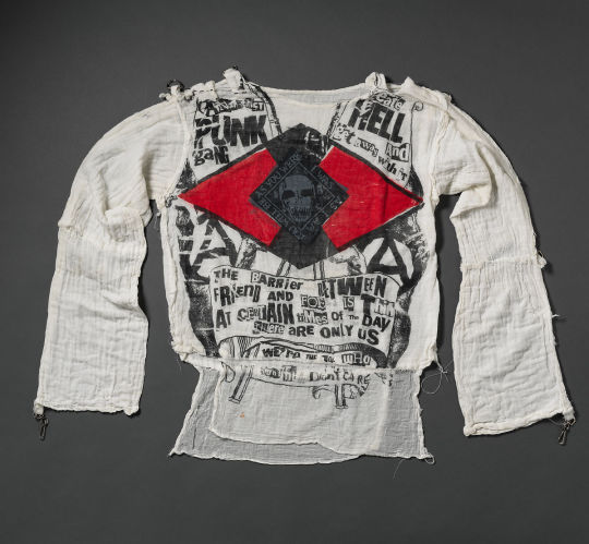
Westwood, V. (1977). Anarchist Punk Gang – The 1% ers shirt from Seditionaries,1977. [Clothing]. Retrieved from https://www.metmuseum.org/art/collection/search/185218.
In 1981 Westwood and McLaren showed their work for the first time on the major catwalks, this was The Pirate Collection based on a romanticised vision of the pirate. This look was to be seminal in the New Romantic aesthetic, showcased especially by bands such as Visage and Adam and the Ants. Vivienne pioneered her own cutting techniques based on rectangles and taking inspiration from historical cuts. She would make a toile of the garment in smaller scale on a reduced sized dummy, once the fit was correct it was then scaled it up to actual size. Throughout the 80′s Westwood continued to be inspired by different cultures and times, her collection in SS'82 was Buffalo Girls, in AW that year it was Peruvian women, SS’83 was Blade Runner and so on. It was to be what she called her Pagan years. By 1984 her collaboration with Malcolm McLaren had ceased.
Westwood had been with McLaren since her break up from her first husband Derek in 1965. She already had son Ben, whom she’d had with Derek when they moved into a flat in Clapham. They then went on to have son Joseph together in 1967. Prior to meeting Derek she had been a primary school teacher and had made her own jewellery, which she sold on a stall on Portobello Road. Westwood has said that although he was a driving force behind her, she felt he was controlling. Westwood (2014) said of their meeting;
“Malcolm chased me, I didn’t want him for my boyfriend. He didn’t look after himself. And I started trying to cook for him a bit and stuff like that. And, well, that’s how it started. The point is, I didn’t want Malcolm at first, but I did, in fact, end up getting pregnant by him, even then, I didn’t really want him."

Westwood, V. (1977). The Pirate Collection. [Clothing]. Retrieved from https://blog.viviennewestwood.com/the-story-so-far/.
In the late 80′s Westwood’s style changed again, this time her girls were seen sporting fashion which parodied the upper classes. Westwood’s 1987 Harris Tweed collection was inspired by a young ballet dancer she had spotted on the tube wearing her hair up in a plaited bun, ballet shoes in bag and wearing a Harris Tweed jacket. For this collection she used fine wool tweeds and velvet’s - fabrics that the aristocracy would have used. This air of luxury continued to be a feature throughout most of her collections in the 80′s, her signature corsets becoming pieces to aspire to. Her model muse at the time was Sara Stockbridge who had the perfect look to carry Vivienne’s signature aesthetic. I always remember the cover of I-D magazine Sara was on, she was just so quirky and different compared to other models at the time.
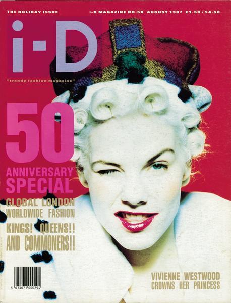
I-D Magazine, n.d. (1987). Sara Stockbridge 50th Anniversary Issue. [Editorial]. Retrieved from https://www.brennan-and-burch.co.uk/blogs/b-and-b-blog/45795267-sara-stockbridge-iconic-muse-of-an-era.
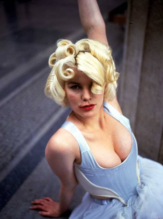
Ryan, D. (1987). Harris Tweed Collection. [Photograph]. Retrieved from http://worldsendshop.co.uk/lips-print/.
The 90′s decade sees her Anglomania years, Westwood’s take on the connection in fashion between the UK and France. She said (1993) of the collection:
“On the English side we have tailoring and an easy charm, on the French side that solidity of design and proportion that comes from never being satisfied because something can always be done to make it better, more refined.”
She took inspiration from Gainsborough’s paintings, country charm and France’s obsession with English tailoring. And in the winter of that year she went all out for tartan - a look we probably most associate with Westwood’s post punk collections. The collection was created in conjunction with her new husband Andreas Kronthaler. They had met previously in 1988 when Westwood was teaching for Fashion Design at the Vienna School of Applied Art. He moved to London to work for her company in 1989, and their first joint collection was the Cut and Slash collection in SS’1991. They married in 1993 and have been married ever since. Whilst he is essentially a silent partner in her business she has since acknowledged him as a major contributor to her Gold Collection for the last 25 years.

Westwood, V. (1993). Andreas Kronthaler for Vivienne Westwood. [Photograph]. Retrieved from https://www.vogue.com/fashion-shows/fall-1993-ready-to-wear/andreas-kronthaler-for-vivienne-westwood.
From 2000 to present Westwood has concentrated on what she calls her Exploration years. She has been fascinated by the properties of different fabrics and what they can bring to her designs, one has fed the other, she has been treating fabric like a living entity. Since her early days on The Kings Road she has been incredibly successful as a designer. She has 12 Vivienne Westwood stores in the UK and another 63 outlets worldwide, as well as a comprehensive e commerce website.
Of late Vivienne has become concerned about the sustainability of her fashion business and ‘fast fashion’ within the fashion industry as a whole. Her new mantra is ‘quality not quantity’ and has no qualms about using her name as leverage to get ethical fashion into the mainstream. In 2014 she put a halt on expanding her business further - despite her business in China doing so well - to concentrate on seeing how her own business was effecting the environment and to work hard to ensure that her own standards of sustainability were met. Westwood (2014) said of this decision:
“Do I feel guilty about all the consumption that the fashion world promotes? Well, I can answer that by saying that I am now trying to make my own business more efficient and self-sustaining. This also means trying to make everybody who works in it happy, if I can."
That same year she launched her ‘Save The Arctic Campaign’ which featured no less than 60 celebrities sporting a specially designed T-Shirt with all proceeds of the sale going towards the charity and climate activists Greenpeace. The campaign featured celebrities such as George Clooney, Chris Martin, Grayson Perry, Kate Moss to name but a few, who were photographed by award-winning celebrity photographer Andy Gotts. Vivienne, along with some of the celebrities traveled the London underground to promote the campaign, and were pictured on the long escalators - lined with the remaining celebrity photographs - which lead up to the main head quarters of Shell Oil.
Gotts, A. (2014). Paloma Faith Save The Arctic. [Photograph]. Retrieved from https://www.viviennewestwood.com/en/westwood-world/save-the-artic-campaign/.

Zimbio, n.d. (2015). Vivienne Westwood, Sadie Frost, Leebo Freeman and Andy Gotts attend the Save The Arctic Collection launch at Waterloo Station on July 13, 2015 in London, England.. [Photograph]. Retrieved from http://www.zimbio.com/photos/Vivienne+Westwood/Andy+Gotts/Save+Arctic+Collection+Launch+Photocall/57Ugwti3R73.
The T-Shirt design featured a heart shaped globe with a flag marking the Arctic region. Vivienne (2014) felt the help of celebrities was beneficial to the campaign:
“Andy is popular with celebrities because he makes it all a pleasant experience. I also really relied on the help of Jerry Hall and Georgia May to do this. Celebrities are often the key to getting a message across, public opinion is very responsive to celebrity.”
The logo for Save The Arctic was also used to launch her SS’14 Gold Label collection show. The campaign has gone part way in ending Shell Oil’s interest on the area. After three years of constant campaigning by Greenpeace and with the support of over 7 million people, Shell Oil have quit drilling in the Arctic. There is still has a long way to go before the pressure is off this magnificent region, which supports human life and animal life not found anywhere else on Earth.
Westwood wasn’t content to leave campaign there however, and in 2019 at London fashion week John Sauven, executive director of Greenpeace UK, along with Vivienne herself took to the catwalk to conduct a climate protest catwalk spectacular. London fashion week was the ideal platform for Westwood, already a seasoned fashion aficionado and Greenpeace to push the need for large fashion brands to start taking sustainability and climate change into consideration, before it’s too late. John Sauven referenced Greta Thunberg - the school girl who made a stand against climate change by sitting outside the parliament building in Sweden, but then had the incredible support of 1.5 million school children around the world when on the 15th March came out of their schools in support of her. Sauven (2019) said of her actions:
"Greta is that shy girl sitting at the back of the classroom, she’s not a leader, she doesn’t see herself in that way. She sees herself as a very shy, quiet girl who doesn’t usually say very much. And you think, wow, that’s immense power, and it gives you immense hope. You need all these different types of people to create change. The people that shout the loudest, they maybe aren’t the people you’re going to see coming forward in the next generation.”
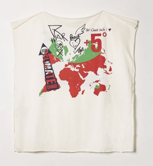
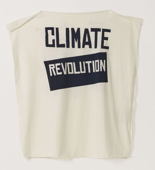
In the last few years Vivienne Westwood has concentrated more on using her fashion and status for campaigning and activism. She has gone on to look at how businesses can reform their policies, looking at climate ecology, looking at the effect of fracking and supporting to anti-fracking campaigns, and giving support to Cool Earth - a charity which helps indigenous communities to halt deforestation. She has her own Climate Revolution website which she fills with information on her campaigning and current fashion related items. She often designs T-Shirt graphics and donates the designs to be used by charities, her latest T-Shirt is for the charity magazine Big Issue. Here Vivienne (2019) explains her reasoning why her new Tao T-Shirt is priced at £120:
youtube
Vivienne Westwood [Vivienne Westwood]. (2019, Aug 19). IoU - Cotton and the Fashion Industry [Video file]. Retrieved from https://www.youtube.com/watch?v=evSoIaootlE
I totally support Vivienne’s attitude on why we should be paying more for our fashion - paying more and buying less. I had to think about the last time I actually bought something new, most of my purchases are from eBay or charity shops, being poor certainly helps you budget for fashion! I also love her mantra of ‘Buy well, choose well and make it last’, which applies to us as the consumer and also to fashion industry brands who need to look at the materials they are using and the way they are manufacturing their products. £120 is a lot for a T-Shirt but I can see the reasoning behind the price tag, you are paying for a more sustainable product which should have the longevity to be worn for many years, and the skilled workers who are paid fair wages to make it. As well as the proceeds going towards the Big Issue - a charity which has helped homeless people in the UK for many years.

The Big Issue, n.d. (2019). Vivienne Westwood's exclusive design just for The Big Issue is available from her store for £120 with all proceeds going to The Big Issue. [Fashion]. Retrieved from https://www.bigissue.com/latest/why-vivienne-westwood-collaborated-with-the-big-issue-on-a-limited-edition-t-shirt/.
The T-Shirt is really nice actually, it’s a call to the younger generation to build their characters, because it’s their characters which shape them as human beings, they are the ones who are going to create the future. I based my practice work on Vivienne’s Climate Revolution T-Shirt because I liked the simple sleeveless shape and raw edges, clearly based around the use of the rectangle that she has used in many of her collections.
Vivienne Westwood has always used the T-Shirt as the affordable and accessible way of buying her fashion, as with many high fashion designers, it is the one product which enables the consumer to purchase a piece of them. It’s the one product which is wearable by so many, it’s a unisex item which appeals to a broad range of people - and the more the merrier if it’s promoting a good cause.
https://www.viviennewestwood.com/en/women/clothing/t-shirts/square-t-shirt-climate-revolution-white-nat-white-CLA305AW550168.html?cgid=women-clothing-tshirts#page=1&start=5
Vivienne Westwood became a Dame in 1992 when she received her OBE from Queen Elizabeth II. Always the one to make a statement, she went commando to the awards ceremony and apparently forgot her lack of underwear when twirling in her skirt for the photographers! Making a statement has been a way of life for Vivienne Westwood, from her early designs in her shop Let It Rock and then SEX to showing her support for numerous campaigns as a charity activist - she is the ultimate fashion queen of punk and long may she reign!

The Big Issue, n.d. (2019). Vivienne Westwood is making a fashion statement with the Big Issue. [Editorial]. Retrieved from http://climaterevolution.co.uk/wp/hero-post/vivienne-westwood-is-making-a-fashion-statement-with-the-big-issue/.
Websites:
Pavarini, M.C. (2014). Vivienne Westwood designs logo for Greenpeace. Retrieved from https://www.sportswear-international.com/news/stories/Vivienne-Westwood-designs-logo-for-Greenpeace-7945.
Thorpe, V. (2014). Vivienne Westwood: climate change, not fashion, is now my priority. Retrieved from https://www.theguardian.com/lifeandstyle/2014/feb/08/vivienne-westwood-arctic-campaign.
Alexander, E. (2014). Vivienne Westwood 'didn’t want' to have a relationship with Malcolm McLaren: 'I thought that maybe he’d got the wrong idea and it was my fault. Retrieved from https://www.independent.co.uk/news/people/vivienne-westwood-didn-t-want-to-have-a-relationship-with-malcolm-mclaren-i-thought-that-maybe-he-d-9746980.html.
Westwood, V. (n.d). The story so far. Retrieved from https://blog.viviennewestwood.com/the-story-so-far/.
Westwood, V. (n.d). Climate Revolution. Retrieved from http://climaterevolution.co.uk/wp/hero-post/vivienne-westwood-is-making-a-fashion-statement-with-the-big-issue/.
Hall, H. (2014). Vivienne Westwood launches star-studded Save the Arctic Campaign. Retrieved from https://www.stylist.co.uk/life/vivienne-westwood-launches-star-studded-save-the-arctic-campaign-featuring-kate-moss-naomi-campbell-and-david-gandy/60901.
Whitehouse, M. (2019). vivienne westwood and greenpeace talk staying angry and finding hope. Retrieved from https://i-d.vice.com/en_uk/article/ywy4gg/vivienne-westwood-greenpeace-john-sauven-climate-crisis.
Whitmore, G. (2013). Vivienne Westwood: Her life and career so far - in pictures. Retrieved from Whitmore, G. (2013). Vivienne Westwood: Her life and career so far - in pictures. Retrieved from https://www.theguardian.com/lifeandstyle/gallery/2013/nov/30/vivienne-westwood-sexpistols.
Petrusich, A. (2016). Where Punk Rock Begins. Retrieved from https://www.newyorker.com/culture/cultural-comment/where-punk-rock-begins.
Chick, S. (2017). MC5 – 10 of the best. Retrieved from https://www.theguardian.com/music/2017/aug/17/mc5-10-of-the-best.
Uhelszki, J. (2018). MC5 on ‘Kick Out The Jams’: “We weren’t on a meth power trip… just a power trip”. Retrieved from https://www.uncut.co.uk/features/the-making-of-mc5-s-kick-out-the-jams-33061.
Gibson, C. (2016). What happened in Chicago in 1968, and why is everyone talking about it now?. Retrieved from https://www.washingtonpost.com/news/arts-and-entertainment/wp/2016/07/18/what-happened-in-chicago-in-1968-and-why-is-everyone-talking-about-it-now/?noredirect=on.
BBC News. (2018). 1968 Democratic National Convention: A 'week of hate'. Retrieved from https://www.bbc.co.uk/news/world-us-canada-45226132.
Ramone, M. (n.d). Marky Ramone. Retrieved from http://www.markyramone.com/biography/.
Rowley, S. (2017). The Damned: an epic tale of fast living and faster music. Retrieved from https://www.loudersound.com/features/the-damned-an-epic-tale-of-fast-living-and-faster-music.
Phillips, S. (2013). Robert Golden's best photograph: the 1976 Notting Hill carnival riots. Retrieved from https://www.theguardian.com/artanddesign/2013/mar/13/robert-golden-best-photograph.
Song Facts. (n.d). White Riot by The Clash. Retrieved from https://www.songfacts.com/facts/the-clash/white-riot.
Ward, O. (2019). British politics is (Johnny) rotten—no wonder punk music is making a comeback. Retrieved from https://www.prospectmagazine.co.uk/arts-and-books/british-politics-is-johnny-rotten-no-wonder-punk-music-is-making-a-comeback.
Lauderdale, B. (2015). A Brief Political History Of The United Kingdom. Retrieved from https://fivethirtyeight.com/features/a-brief-political-history-of-the-united-kingdom/.
BBC News. (2011). Smashed Hits: Is London Calling the best anthem for a city?. Retrieved from https://www.bbc.co.uk/news/magazine-14324385.
Welch, J. (2016). Sex Pistols: Anarchy in the UK and the tour they tried to ban. Retrieved from https://www.bbc.co.uk/news/uk-england-norfolk-38165091.
Serena, K. (2018). The Short, Tragic Romance Of Sid Vicious And Nancy Spungen. Retrieved from https://allthatsinteresting.com/nancy-spungen.
Alt Press. (2018). WAS THE SEX PISTOLS’ FIRST US TOUR AS DESTRUCTIVE AS REPORTS SAY?. Retrieved from https://www.altpress.com/features/sex_pistols_first_u-s-_tour_destructive_1978/.
Wawzenek, B. (2017). Influence and Infamy: How the Sex Pistols Impacted the Future of Music. Retrieved from https://diffuser.fm/sex-pistols-influence/.
Perry, A. (2018). The end of the Sex Pistols: how punk died 40 years ago today, and John Lydon rose from its ashes. Retrieved from https://www.telegraph.co.uk/music/what-to-listen-to/end-sex-pistols-punk-died-40-years-ago-today-john-lydon-rose/.
Documentaries:
Miller, J.J. , MacDonald, E. , Barbisan, J. , Tabata, S. (Writers) & Miller, J.J. (Director). (2019). Punk: Part 1 [Television series episode]. In D. Murray (Producer), Punk. Canada, North America: Sky Arts.
Miller, J.J. , MacDonald, E. , Barbisan, J. , Tabata, S. (Writers) & Miller, J.J. (Director). (2019). Punk: Part 2 [Television series episode]. In D. Murray (Producer), Punk. Canada, North America: Sky Arts.
Miller, J.J. , MacDonald, E. , Barbisan, J. , Tabata, S. (Writers) & Miller, J.J. (Director). (2019). Punk: Part 3 [Television series episode]. In D. Murray (Producer), Punk. Canada, North America: Sky Arts.
Miller, J.J. , MacDonald, E. , Barbisan, J. , Tabata, S. (Writers) & Miller, J.J. (Director). (2019). Punk: Part 4 [Television series episode]. In D. Murray (Producer), Punk. Canada, North America: Sky Arts.
0 notes
Text
MA Fashion and Textile Practices Major Project Path - 4th September
Punk and Vivienne Westwood cont.
The Clash’s breakthrough single was unarguably ‘London’s Calling’.The song refers in part to a narrowly missed nuclear disaster on the Three Mile Island Nuclear Generating Station in Dauphin County, Pennsylvania in 1979. The accident involved the partial melt down of one of the nuclear reactors, and was considered to be the most serious nuclear incident in US history. ‘London Calling’ is a nod to old BBC wartime radio broadcasts declaring London had something to say, so The Clash were declaring that nuclear war had begun and it was a calling out to post-apocalyptic survivors. There are also nods to their feeling’s towards the elite who live along London’s Thames, as well as to the glorification of London in the swinging sixties and ‘phony Beatlemania’ - in the 70′s London was a bleaker place.
youtube
The Clash [The Clash]. (2009, Oct 3). The Clash - London Calling (Official Video) [Video file]. Retrieved from https://www.youtube.com/watch?v=EfK-WX2pa8c
In the early days The Clash gigged with other bands and were the main support band for the Sex Pistols. A crossover was happening at that time, many of the American bands were coming over to observe the UK punk scene for themselves and taking the aesthetic back with them. Bands such as The Runaways - lead by charismatic lead singer Joan Jett - went from rock attitude to punk attitude almost overnight.
The Slits were another female band who were inspired by the Sex Pistols and their devil may care attitude. None of them really knew how to play or what they were doing, they made it up as they went along. The Slits would eventually hold their own with many of the male bands on the scene, although being an all female group did provoke some audience members to violence, they were often attacked for daring to be forthright females who had a voice. Drummer Palmolive (2019) said of the attitude some had towards them:
“We were very provocative but we felt we had a right to be provocative, but that didn’t give someone the right to punch you or cut a slit in your pants with a knife. I feel like in a way The Slits were a revolution with the revolution, we wanted to have the reigns to our destiny.”
youtube
The Slits [Marx Dudek]. (2011, Jun 15). The Slits - Vindictive (Peel Session 1977) [Video file]. Retrieved from https://www.youtube.com/watch?v=wrLMm5d6lqg
Other groups with a strong female presence were trying to make themselves heard and it worked, the scene was becoming more gender balanced. Groups like Siouxsie and the Banshees and Blondie were also paving the way for women in rock. Debbie Harry from Blondie was the only female singer to sing on a Ramones track and was held in high regard by the band.
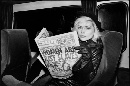
Stein, C. (n.d). Debbie Harry The headline reads "Sex and marriage by the Ayatollah: WOMEN ARE JUST SLAVES.". [Photograph]. Retrieved from https://www.reddit.com/r/HistoryPorn/comments/6yn286/debbie_harry_september_3rd_1973_the_headline/.
When the Ramones eventually played in the UK it was to become a seminal moment in punk rock history. The Ramones were the band that many of the UK punk bands had taken inspiration from, and now they were here in the flesh. The gig took place at The Roundhouse, London on 4th July 1976. Many bands were in the audience; The Buzzcocks, The Vibrators, Generation X, The Damned, Sex Pistols and more.
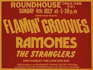
Christie's, n.d. (2008). The Ramones. [Poster]. Retrieved from https://www.christies.com/lotfinder/Lot/the-ramones-5144625-details.aspx.
Well I can avoid it no longer, the Ramones gig was to kick punk into the mainstream but one band were to propel it to stratospheric proportions, and that band were the Sex Pistols. Already an entity managed by Malcolm McLaren and dressed in part by Vivienne Westwood, the Sex Pistols were ripe for punk stardom.
youtube
Sex Pistols [jaroshy]. (2010, May 20). The Sex Pistols - Anarchy In The U.K (official video) [Video file]. Retrieved from https://www.youtube.com/watch?v=cBojbjoMttI
The Sex Pistols first single was ‘Anarchy in the UK’. It was really about the state of the country at the time and the frustrations of the younger generation. They saw that people such as the monarchy lead a life which was unobtainable and unrealistic to the average person, times were hard and they were angry about it. They wanted to create something which was accessible to everyone. Johnny Rotten (2019) didn’t like the term punk but knew the ethos behind it:
“What’s really important to me is what punk turned into, honesty, originality and a genuine feel for my fellow human beings. I think the word is empathy really, and there it is, and then punk took off.”
A few of the bands were set to tour together in order to push the sound across the country. The Sex Pistols, along with The Damned, The Clash, Johnny Thunders and the Heartbreakers and more. The tour was to be ‘The Anarchy Tour’ gigging at Universities across the nation, and initially was meant to start at the University of East Anglia (UEA) in Norwich on 3 December 1976. This first gig was cancelled at the last minute on the grounds of fearing the audience and property would be compromised, possibly due to the Sex Pistols appearing on the Bill Grundy show a few days before and using profanity. Grabbing the headlines of many national newspapers the day after the incident no doubt cast a shadow over the whole proceedings, which then lead to cancellations of many of the booked gigs. The bands continued to travel to each gig in th hope that by chance they would be allowed to play. Only three of the scheduled gigs went ahead, Leeds Polytechnic being the first, then Manchester and with another four added en route. Ian Moss (2016) was in the audience at Manchester’s Electric Circus in Collyhurst:
���It was completely life-changing, the Pistols walked on stage and it was magnetic. I had not seen people who looked liked that. They started playing and it was exciting - the music was really good - but the main thing was the attitude. I had seen David Bowie and Mick Jagger but he (Lydon) had more charisma than either of them."
The Bill Grundy incident was quite damaging for the scene at the time, the Sex Pistols were of course being themselves and some say were goaded by Grundy to swear live on camera. Either way, the media frenzy which followed labeled punk as purely being antagonistic and troublesome which saw a rise in certain elements arriving at gigs purely to cause trouble, attacking the audience and the bands themselves. The Sex Pistols decided to leave the country and head for the US to tour, when they got there no gigs had been lined up. Malcolm McLaren said nobody wanted to deal with them but ironically they finished up touring the South on the typical Country and Western routes, and then on to west coast cities such as San Francisco where they went down a storm! Suddenly America had discovered punk.

Altpress, n.d. (2018). WAS THE SEX PISTOLS’ FIRST US TOUR AS DESTRUCTIVE AS REPORTS SAY?. [Photograph]. Retrieved from https://www.altpress.com/features/sex_pistols_first_u-s-_tour_destructive_1978/.
The tour of course was offensive to a large proportion of the towns they appeared in, many people demonstrated at the gigs and were worried for the safety of its property and townsfolk. McLaren of course loved the controversy and wanted as much of the disruption as possible to be seen by the American and British press, in his eyes any exposure was good exposure. The tour had essentially been a success but Sid Vicious and his American punk girlfriend Nancy Spungen had started taking heroin and things began to change, the drug taking effected the bands creativity and energy greatly. As soon as the American tour finished in 1978, the band returned to New York and promptly broke up, right at the pinnacle of their fame. In the months that followed Sid and Nancy holed themselves up in the Hotel Chelsea and spiraled deeper into their addiction. On October 12th 1978 Sid Vicious called the police to say the body of Nancy Spungen was laying dead in the bathroom of their hotel room with a knife wound to her stomach. Vicious was immediately arrested and charged with second degree murder. Four months later he died of a heroin overdose before his trial began.
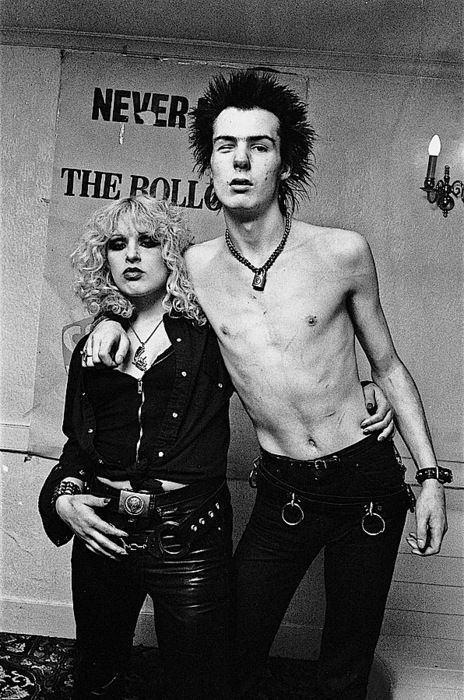
Wizard Varnish, n.d. (n.d). Sid and Nancy. [Photograph]. Retrieved from http://wizardvarnish.com/wv/2017/04/13/180656/.
The events of the months prior to Sid’s death were incredibly unsettling for the ex band members, and his death shook them to the core, Jonny Rotten (2019) especially felt responsible:
“The biggest joke of all was that Sid would have never hooked up with a girl like Nancy unless I introduced her to him, which I did. So I take some really serious sense of responsibility in Sid’s demise because of that. I miss my friends.”
0 notes
Text
MA Fashion and Textile Practices Major Project Path - 4th September
Punk and Vivienne Westwood
Whilst the punk scene was on the slight decline in the US, the UK punk scene was only just emerging. Many new bands such as The Clash and The Damned had been influenced by this American hard rock sound from over the pond, particularly by Iggy Pop and The Stooges, MC5 and The Ramones. Malcolm McLaren, along with The Damned and The Clash’s management realised that something big was brewing within the current music scene - there was something in the air. When you think of the UK punk scene, it is guaranteed that most people will think of the Sex Pistols - but the first UK band to release a punk single was The Damned with ‘New Rose’.
youtube
The Damned [Rafael Lage]. (2016, Jan 1). The Damned - New Rose (Official Video) [Video file]. Retrieved from https://www.youtube.com/watch?v=ThcXEqxI_IQ
The Damned had formed in 1976, four lads from London who had all been in various bands prior to the initial line-up. They were signed to Stiff records the same year and released their debut single ‘New Rose’ from their forthcoming album Damned Damned Damned - released in 1977. The scene at the time was very incestuous, many of the bands socialised with each other and as the US scene, collaboration was key in progressing the scene forward. One place where the bands would meet was The Kings Road, here a mix of alternative fashion and punk music combined to inspire and shock in equal measure. Dave Venian (2019) - lead singer of The Damned said of his cohorts back then:
“It was funny because in those early years you’d meet people of similar interest and they would invariably look different then the normal person on the street.”
Johnny Rotten (2019) of the Sex Pistols said of the punk aesthetic:
“Before the leather jackets and the studs was true punk, which was a miss match of things. Maybe one designer piece, but you’d have to make sure the designer was the right one, and the right one at the time was Vivienne Westwood.”
Vivienne Westwood’s store SEX (previously called Let It Rock) was un-surprisingly on The Kings Road, so a natural haven for this new wave of youth wanting to look different than the ‘normal person on the street’. Johnny Rotten was possibly somewhat biased because Westwood was the girlfriend of the Sex Pistols manager Malcolm McLaren and joint owner of the shop. Viv Albertine (2019) of The Slits was so inspired by Westwood’s attitude and fashion sense that she began to write songs and eventually form her own band:
“Vivienne would take something like a T-shirt, or a batch of T-shirts from India, they didn’t look right, the collars weren’t right, the sleeves weren't right and so she’d cut the collars off, cut off the sleeves, cut the bottom off and couldn’t be bothered to sew them and leave them frayed. She would write something on them that was really powerful, really shocking that’s going to grab attention across the front, and what that taught me is that it doesn’t matter if you sing a bit out of tune or out of time, but what have you got to say?”

Dazed Digital, n.d. (2015). Vivienne Westwood wears the controversial Destroy T-shirt . [Photograph]. Retrieved from https://www.dazeddigital.com/fashion/article/24335/1/vivienne-westwood-s-top-ten-political-moments.
Vivienne apparently had a lot to say. Above is one of her more controversial designs, which featured a large red swastika, an upturned Christ on the cross and a postage stamp of the Queen, above them is the word ‘DESTROY’. The red swastika alone would cause some attention, and she knew it. The T-shirt was meant to make comment in regards to standing up against powerful dictators around the globe who were violating peoples basic human rights. In a broader sense it was saying to the older generation that the younger generation would not tolerate their preset values and attitudes. The T-shirt was sold at her Kings Road store SEX.
Fashion and music have always been intertwined but at this time was even more so. Clothes were making a statement, they reflected the attitude of the youth and of the music they listened to. One band were less about the way they looked and more about the politics of the time - that band was The Clash. The Clash were again four lads from London who formed in the same year as The Damned; 1976. The Clash’s influences were from Heavy Rock to Reggae. Reggae surprisingly made a significant impact on the UK punk scene, and The Clash often used elements of the Reggae sound within their own music. Joe Strummer from The Clash felt that their music really should have something to say about what was going on in the world, as Reggae always had done. He really believed that music could bring about social change. In an interview Joe (1977) said as such:
“I think we can definitely change something. I mean, look at the 60′s, what do you remember from the 60′s? All I can remember is the music, music is what people are turning on to in the last 30, 40 years, not books or art. So we have more chance than anybody to change things.”
youtube
The Clash [The Clash]. (2013, Sept 4). The Clash - White Riot (Official Video) [Video file]. Retrieved from https://www.youtube.com/watch?v=IvG3is7Bm1w
The Clash’s first release was called ‘White Riot’ which was immediately mistaken as a song inciting a race war, where it was in fact about unifying races and standing up to the authorities. The song was actually inspired by the Notting Hill Carnival riot in west London an 1976, which was a peaceful event until the police arrested a pickpocket and violence broke out. Members of The Clash were the carnival at the time and got caught up the rioting between the police and a mixture of black and white carnival goers. Around 60 crowd members were injured and over 100 police officers.

Golden, R. (1976). Robert Golden's photograph from the Notting Hill carnival riots in 1976. [Photograph]. Retrieved from https://www.theguardian.com/artanddesign/2013/mar/13/robert-golden-best-photograph.
The British youth of the 1970′s had a lot of things to get angry about. At the beginning of the 70′s there were high rates of inflation which contributed to frequent striking by coal miners. Their union, along with other public sector unions were fighting for higher wages for their workers, and the strikes caught the attention of the government and public alike. Labour held power in the country between 1974-1979 until Margaret Thatcher was voted into power. She privatised many of the UK’s major industries which led to high unemployment rates and the de-activation of many of the coal mines throughout the country.

Douglass, D. (n.d). 30th anniversary of the great coal strike of 1984/5. [Photograph]. Retrieved from https://www.minersadvice.co.uk/reviews_%2030thanniversaryof84.html.
0 notes
Text
MA Fashion and Textile Practices Major Project Path - 3rd September
Punk and Vivienne Westwood
One of those New York emerging bands was The New York Dolls. They were struggling musicians who also designed and made their own clothes to make extra cash. Founder of the band Sylvain Slyvain and his high school friends Billy Mercier and Giovanni Genzale (aka Johnny Thunders) took inspiration from Marc Bolan, make up from their girlfriends bags and the clothes from their wardrobes to create the unique look of the Dolls. Slyvain would travel to the UK to buy items from Kensington Market and the Kings Road to form their androgynous look.

Proto Punk Apothecary, n.d. (2016). The New York Dolls - Live at the The Boston Armory [Photograph]. Retrieved from https://protopunkapothecary.blogspot.com/2016/12/the-new-york-dolls-live-at-bottom-line.html.
The image was to prove attention seeking in all wrong (right!) ways. The band were asked of the were homosexual or bi-sexual, but insisted they were try-sexual, they’d try anything! They did upset the gay liberation community who called them transvestites, something which was somewhat of an insult at the time. You’ll notice in the video how lead singer David Johansen is clearly influenced by the Rolling Stones lead singer Mick Jagger.
youtube
The New York Dolls [TheNewYorkDollsVEVO]. (2016, Mar 29). New York Dolls - Personality Crisis [Video file]. Retrieved from https://www.youtube.com/watch?v=2aQTGqqXHw4
A similar band at the time were Wayne County & The Electric Chairs, lead singer Wayne (aka Jayne) used to wear almost full drag on stage with a huge plastic dildo which squirted milk at the audience. Wayne was also a DJ at a club in where other aspiring musicians would hang out. One day a certain Marky Ramone (aka Mark Steven Bell) walked in and liked what he heard, some of the Electric Chairs had heard Marky play and recommended him to join the band, they then became Wayne County and The Backstreet Boys.
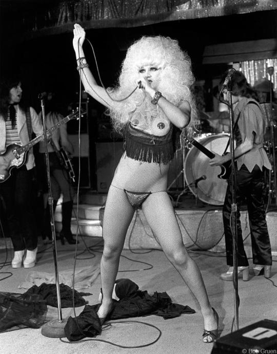
Gruen, B. (1974). Jayne County, NYC, 1974. [Photograph]. Retrieved from https://www.morrisonhotelgallery.com/photographs/1lkaV5/Jayne-County-NYC-1974.
Wayne County & The Electric Chairs had been inspired by The Stooges early on. Iggy didn’t care, he had a devil may care attitude when he performed and they connected with that. Iggy (2019) said of the way he felt back then:
“I sort of started to see things a different way. There was this feeling something had to happen that was more amazing to look at, more aggressive to listen to. It wasn’t some sort of marketing plan or something, it was just what I felt inside, how I wanted to be. Look out, watch this!”
Danny Fields - A&R man at Elektra records, was to become a confidant and ‘babysitter’ for Iggy whilst on tour. Iggy became increasingly more extreme in his performances and Fields felt the need to be at their gigs to keep an eye on him, or the audience for safety’s sake. Iggy would pour hot wax on his body, slash his chest with broken glass, smear peanut butter on himself and jump into the audience, nobody did stage diving back then.

Rolling Stone, n.d. (2016). Iggy Pop, in Cincinatti, the night he whipped peanut butter at the crowd.. [Photograph]. Retrieved from https://www.rollingstone.com/music/music-lists/20-wildest-iggy-pop-moments-72545/first-eyewitness-account-of-iggy-slicing-up-his-torso-may-23-1969-24964/.
Marky Ramone left Wayne County and The Backstreet Boys when he met American singer and songwriter Richard Hell who formed Richard Hell & the Voidoids. After a 1977 UK tour with upcoming bands like The Clash they came back to New York where Marky went to the club CBGB in Manhattan's East Village. Here he met Dee Dee Ramone and was asked if he’d like to join the band. The Ramones were initially inspired by The New York Dolls but gradually formed their own aesthetic, unifying their look with skinny jeans, their own logo t-shirts and black biker jackets. Danny Fields was also the rock and roll columnist for the Soho News the the time and happen to see The Ramones at one of their early gigs. He was impressed and asked to be their manager, they said if you have $3,000 to buy new equipment then the job is yours. Fields clearly thought the band had promise, so asked his mother to lend him the $3,000 to give to the band
youtube
The Ramones [Rhino]. (2018, Sept 12). Ramones - I Wanna Be Sedated (Official Music Video) [Video file]. Retrieved from https://www.youtube.com/watch?v=bm51ihfi1p4
Many locations throughout the city weren’t suitable for the new wave of bands coming through, but one place that was accepting of this new sound was CBGB’s. The Ramones became regulars players at the club, with female lead Blondie as its warm up band. They were the warm up act for The Ramones for more than two years who just got better and better. I have always loved Blondie, my brother being a fan growing up I often heard their music coming from his bedroom. Debbie Harry was, and still is a real style icon, she was one of the few female performers who set the tone for women within the music industry.
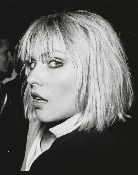
Taylor, T. (2018). Debbie Harry. [Photograph]. Retrieved from https://www.interviewmagazine.com/culture/obvious-history-debbie-harry-near-fatal-brush-ted-bundy.
The music scene at CBGB’s was one of diversity. Not one band sounded like the other, that early New York music scene didn’t have one defining sound, they just had the attitude of experimentation and expression. The sound didn’t become punk until the authors of Punk Magazine used the phrase to describe it. Three young guys from Connecticut - John Holmstrom, Legs McNeil and Ged Dunn wanted to create a magazine based on their two loves, rock & roll music and cartoons. John had seen The New York Dolls play a song called ‘Teenage News’ and wanted the magazine to be called that, the other guys thought it was a little lame so Legs suggested Punk as a joke. He had seen kids called it on films and TV shows, and been called it a few times himself, so thought it fitting.
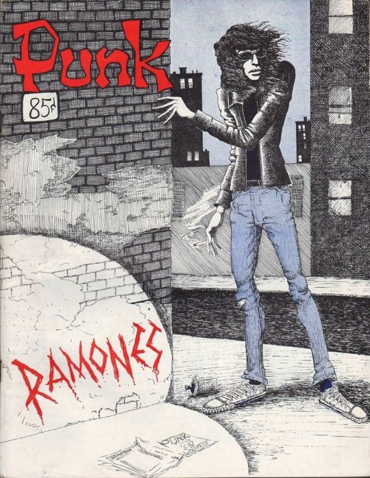
Vogue, n.d. (2016). Punk Magazine. [Illustration]. Retrieved from https://www.vogue.fr/culture/a-voir/diaporama/exposition-the-ramones-punk-new-york-queens-museum-groupe-rock/30884.
The term didn’t go down well with some of the bands at first. The term punk was also use for male prisoners who turned tricks in jail, so the connotations weren’t seen as complimentary. The more the term was used in media and television the more the term punk rock became the phrase used to define the scene, so it inevitably stuck. John Holmstrom (2019) explains what they were trying to do:
“What we were trying to do with Punk Magazine was to redefine Rock & Roll as Punk Rock. The original spirit and rebellion of the 50′s, it wasn’t safe, it wasn’t what your mother listened to, it wasn’t even what your big brother listened to. We wanted to wipe all that out and start over again.”
Drugs had started to become rife on the scene. Not just recreational drugs such as Marijuana and LSD, but hard drugs such as Heroin. President Nixon was very focused on the drugs influx into America’s towns and cities, but less focused on the amount of Vietnam vets coming back from the war addicted to Heroin and the sheer demand for hard drugs across the nation. With the use of hard drugs, creativity began to suffer and the scene began to diminish. One of the major bands to suffer was The New York Dolls, a few of the band were addicts or alcoholics and they had just been dropped my their management. They were on the verge of breaking up when Slyvain Slyvain was to by chance bump into someone who he had met a few years before; Malcolm McLaren.
Slyvain had met McLaren and his girlfriend Vivienne Westwood at an International Boutique Show in 1971 where they had discussed their shop ‘Let It Rock’. McLaren was a big fan of the Dolls and invited Sylvain to hang out with him. Seeing an opportunity McLaren got the band members into rehab and cleaned up long enough to wear his clothes to their next gig. McLaren had chance to see many of the bands perform at CBGB’s and noticed their clothing, which a lot of the bands had put together themselves. He met Richard Hell from the Voidoids and noticed he was wearing a T-shirt which had been ripped apart and then held together with safety pins, and the next thing he and Vivienne were selling clothes with rips and safety pins.
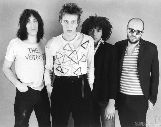
Gruen, B. (1977). The Voidoids, NYC, 1977. [Photograph]. Retrieved from http://www.bobgruen.com/richard-hell/.
Soon the band were kitted out head to toe in red - to fit in with the bands new song ‘Red Patent Leather’ - all designed by McLaren and Westwood. It was intended to be a new chapter for the band, under McLaren’s management he issued a manifesto stating that the band were no longer puppets of their last management and were free to be who they wanted to be, reminiscent of a communist manifesto. This new marketing ploy however was to fall flat, they weren’t taken seriously by the public or other bands, they had become a bit of a joke. Some of the band members resorted to taking drugs once more and the band split soon after. In Detroit Wayne Kramer from MC5 had become embroiled in the criminal underworld, and started selling drugs to support his new venture. He was caught selling cocaine to undercover federal agents and was sentenced to four years in prison.
The general consensus about punk rock was that it was on a slow decline in 1970′s America. Not many bands were being signed, and when new releases came out they were lost in the quagmire of Disco and Stadium Rock records. It was considered a niche sound that didn’t travel well outside its home turf. DJ’s on the usual stations didn’t want to play the records, America wasn’t ready for the type of sound punk was pushing. Danny Fields and Linda Stein - The Ramones then joint managers - suggested they introduce the Ramones sound to a UK audience, and McLaren had already suggested to Slyvain that he should come to England as there was a youth culture there which would possibly appreciate the Dolls sound....
0 notes
Text
MA Fashion and Textile Practices Major Project Path - 2nd September
Punk and Vivienne Westwood
I couldn’t write a blog on the exploration of how graphic design has impacted upon the fashion industry - spotlighting the T-shirt not only as an iconic fashion item, but as a social, cultural and political platform, unless I discussed the social and political events which incited punk culture, as well as the impact of the culture itself. Including Vivienne Westwood along with this research is essential as she is a fashion designer synonymous with the movement and often cited as the designer responsible for creating the UK punk aesthetic as we know it.
Punk was said to have begun in America sometime in the late 60′s. There had already been Acid Rock and Folk Rock and now something new was emerging . Initially was considered to be a phase, just a offshoot of the rock scene and soon would die out. You could say it was all Iggy Pop’s fault - the iconic front man of The Stooges. He grew up in Detroit, Michigan with supportive parents who encouraged him in anything he wanted to do. He started playing the drums at a young age and spending many hours listening to his radio. One song he loved was The Kinks - ‘You Really Got Me’. He loved the way the guitars were grating and words sung in a rather lazy manner.

Childers, L.B. (n.d). Iggy Pop. [Photograph]. Retrieved from https://www.newyorker.com/culture/cultural-comment/where-punk-rock-begins.
youtube
The Kinks [Diablo GAGA]. (2012, Jun 27). The Kinks - You really got me (1965) HD [Video file]. Retrieved from https://www.youtube.com/watch?v=Eq_KQYVPadQ
Iggy was also greatly influenced by heavy rock band MC5 and their manager John Sinclair. By 1967 Iggy had already formed the band The Stooges and were signed by Sinclair at Elektra records, the same label as MC5, and the two bands gigged a lot together. The MC5 had a harder edge to their music which Iggy liked. Wayne Kramer (2019) said of their attitude at the time:
“We were part a generation who rejected grown up ideas about things, and we had to do something because the grown-ups were f*****g us up big time.”
He was of course referring to the newly elected President Nixon and the disgust many had with his contempt for upholding the law, the many millions of American who objected to the Vietnam war and were ignored, and the civil rights marches which were happening all over the country. As a member of a rock band Kramer felt that it was their responsibility to show disdain for what was happening in their world. In 1968 Chicago held a counter festival to the Democratic convention in which bands all over the country were to gather in a huge anti-war concert in support of the Democrats and their anti-war effort. When the band turned up they realised none of the other bands had turned up, they had decided they didn’t want to be jail fodder for the Chicago police force. The atmosphere was already tense and the police began harassing the 10,000 strong crowd. Some small skirmishes broke out but nothing that wasn’t stopped, but then MC5 took to the stage.....
youtube
MC5 [MC5 - Topic]. (2014, Nov 8). Kick Out The Jams (Original Uncensored Version 1968) [Video file]. Retrieved from https://www.youtube.com/watch?v=9fpgQGmHFWE
There had already been a rumour that some of the protesters had put LSD in Chicago’s water system and that they had sent out gangs to seduce the wives and daughters of the Democratic delegates, taking the rumour seriously Mayor Richard Daley had positioned all of the city’s police force - approximately 12,000, along with 6,000 armed National Guardsman, and 1,000 intelligence agents from the FBI, CIA, Army and Navy. Another 6,000 US Army troops were waiting in the wings just in case. With around 25,000 people on stand by it would seem that Mayor Richard Daley was almost expecting something to happen in what was meant to be a peaceful protest. This action itself could be seen as an unwillingness to allow freedom of expression. MC5 finished their set, the police moved in, and all hell broke loose. Haynes Johnson (2013) reporter with Smithsonian Magazine said of the events that day:
“A lacerating event, a distillation of a year of heartbreak, assassinations, riots and a breakdown in law and order that made it seem as if the country were coming apart.”

Gibson, C. (2016). What happened in Chicago in 1968, and why is everyone talking about it now?. [Photograph]. Retrieved from https://www.washingtonpost.com/news/arts-and-entertainment/wp/2016/07/18/what-happened-in-chicago-in-1968-and-why-is-everyone-talking-about-it-now/?noredirect=on
Time Toast, n.d. (n.d). democratic national convention in chicago. [Photograph]. Retrieved from https://www.timetoast.com/timelines/the-vietnam-war-1954-1980-c0d792f9-30f1-494a-a33f-032dfc1f2f3c.
The riot moved from the park into the street, tear gas was released and spread quickly throughout the city. Police sprayed demonstrators with Mace and beat them with batons. The majority of the fighting occurred at the entrance to the Conrad Hilton Hotel where an entire 17 minutes of live footage was captured and watched by all of America. Washington Post columnist Mary McGrory (2006) was coming from the hotel at the time and described what she saw:
“A young man was spread-eagled across the hood of a car while four policemen beat him with their billy-clubs. What made the scene most hair-raising was that the presence of the press — our credentials were plain to see — had not the slightest deterrent effect. The cops wanted us to see them beating an unarmed and defenseless man and felt no need to explain themselves. They were making a statement. In Chicago, in 1968, it was a crime to be young. The streets literally ran with blood. The police pushed a crowd of Democrats through the plate-glass windows of the Hilton Bar.”
The event sparked a week of rioting a violence across the city, and by the end Chicago police had made nearly 600 arrests. Around 100 protesters had been injured and approximately 119 police officers. This event was to tarnish the reputation of the Democratic party for years, the Republican National Convention was in contrast an orderly event and people inevitably compared the two. Protesters believed the public would see the reason behind the demonstration and not the violence and inexcusable police behaviour. Unfortunately Mayor Richard Daley was to receive around 135,000 letters in support of his actions, as opposed to only 5,000 condemning them. It is strange that the opinions which sparked these events seem to parallel the current political opinions we are hearing today, sadly, it seems that not much has changed in just over 50 years.
Gibson, C. (2016). Police lead a demonstrator from Grant Park during demonstrations that disrupted the Democratic National Convention in Chicago in August 1968. [Photograph]. Retrieved from https://www.washingtonpost.com/news/arts-and-entertainment/wp/2016/07/18/what-happened-in-chicago-in-1968-and-why-is-everyone-talking-about-it-now/?noredirect=on.
From that gig MC5 also sparked controversy. ‘Kick Out The Jams’ opening line ‘Kick out the jams Motherf****r!’ did not bode well with their label. Arguments between Sinclair and Elektra’s bosses who wanted the track censored. Music chain Hudson’s refused to sell the record, so in retaliation the band posed for a photograph in a magazine ad stating ‘F**k Hudson’s’, which then incited the chain the ban all records produced by Elektra and consequently led to the band to be kicked off the label. In the long term MC5 weren’t too damaged by their actions, it propelled them to legendary punk status before Punk was a thing.
Iggy had been playing drums in blues bands prior to forming The Stooges, Wayne Kramer recalls hearing him play and apparently offered him a place in MC5, which he has no recollection of - Iggy experimented with acid in the early days and through one particular trip knew his destiny lay elsewhere. The band comprised of Iggy’s school friends brothers Ron and Scott Asheton and Dave Alexander, who conveniently had a bass, amp and car. The school had booked new band The Doors to play at its Homecoming Dance, but Jim Morrison was wasted and the band sounded like they hadn’t practiced. Iggy loved the idea that a band could sound so disjointed, it inspired him to perform how he felt and sing about subjects which meant something to him.
youtube
The Stooges [rockinrollex]. (2011, Dec 3). The Stooges - I Wanna Be Your Dog (HQ Sound) [Video file]. Retrieved from https://www.youtube.com/watch?v=xjDLc-8tW2I
Nobody had heard anything quite like The Stooges, which some thought was a good thing. ‘I Wanna Be Your Dog’ still sounds so incredibly fresh 50 years later and is now considered one of punk’s national anthems. The Stooges moved to a run-down district of New York in 1969. The city in general was in a poor state of disrepair, it had suffered much political and financial heartache throughout the 60′s and with many movements coming to a head such as the rights for women and gay rights, it was a city where the American dream was lost, you had to create your own dreams.
Here a sense of community was built from the mixing of like-minded people such as artists, musicians, poets. All with the mind-set that they wanted to create something new for themselves. Like the Bauhaus before it, collaboration was commonplace, a mixing pot of creative talents coming together not necessarily seeking fame, but to have a sense of togetherness - they created their own tribe.
0 notes
Text
MA Fashion and Textile Practices Major Project Path - 2nd September
Big Biba cont.
Big Biba’s fashion departments were the heart of the brand, it was where they had begun so wanted them to remain similar to the original idea - albeit larger! The first floor was where Biba’s fashion lived. At one end of this floor a huge 85 foot leopard skin swathed platform area with bed resided known as the Sarah Bernhardt area. This was the lingerie department where the products were casually placed in wardrobes and drawers and scattered over the bed. The changing rooms very controversial at Big Biba, they were communal, something which never been done before, but is commonplace today. The menswear and children’s wear departments had also been devised with the same great care and attention.
Kerr, R. (n.d). Twiggy lounges in the art deco inspired Rainbow Room restaurant in the Big Biba shop. [Photograph]. Retrieved from https://www.pinterest.co.uk/pin/36169603232732925/?lp=true.
Children’s wear had been stocked at Biba since their Church Street location but now was the chance to go full-on fairy tale for this department. The idea that Big Biba was a shopping destination for the whole family was one that no other store had done before, they had made shopping a leisure activity. Big Biba had a cafe and creche in the children’s wear department, something very modern for the time. This of course helped parents to linger longer in their respective departments if they knew their children were well catered for. The second floor housed the expectant mum’s department where the furniture had been made purposefully larger to make them feel slimmer in comparison.

Abbey Fabrics, n.d. (n.d). Big Biba - Children's Dept. [Photograph]. Retrieved from https://www.pinterest.co.uk/pin/117234396526198297/?lp=true.
Not unlike the Children’s wear department, the men’s wear area was similar in its methods of distraction. A sports area was installed where darts or indoor bowls could be played. Right in the centre of the floor was the ‘Mistress Room’ here such delights as long satin gloves, edible underwear, sexy negligees and Vargas inspired saucy playing cards could be purchased - clearly today's Agent Provocateur garnered some inspiration from here! On the third floor was the Beauty parlour and hairdressers run by Regis, where they offered natural beauty products and therapies, sun beds and massages, really ahead of its time. Big Biba’s Household departments sold everything - well apart from electrical goods - for the home. Split into 24 room sets - very much like interior destinations today - each one decorated and stocked with Biba products, this area really pushed aspirational living to the max, the tag line read ‘ This is where houses start becoming homes’, almost reminiscent of an IKEA campaign today.

Sweet Jane, n.d. (2018). Biba Kitsch Room-Set. 1973.. [Photograph]. Retrieved from http://sweetjanespopboutique.blogspot.com/2018/06/the-biba-bed-sitting-room-1970.html.
The top remaining floors were given over to leisure and dining. The famous Rainbow Room was preserved from the original room which opened in 1933, called such because of its stunning art deco multi-coloured ceiling. Hulanicki wanted to preserve as much of the original aesthetic as possible, whilst removing some of the later add on’s to bring it back to it’s former glory. This room was host to Big Biba’s restaurant and would prove to be the most costly room in the whole building, this was because modern industrial kitchens had to be fitted as well as the restorations themselves. Offering a take on traditional British cuisine they also had a selection of foreign dishes and a vegetarian counter. The Rainbow Room wasn’t just a restaurant however, it really made a name for itself as a gig destination. The New York Dolls were one of the first bands to perform at The Rainbow Room and thus helped the Punk movement take hold in the UK. Other acts included Bill Haley, Cockney Rebel and The Ronettes, as well as Ian Dury with his first band Kilburn & the High Roads.

Charko, K. (2013). THE RAINBOW ROOM, BIG BIBA.. [Photograph]. Retrieved from https://kasiacharko.wordpress.com/2013/08/03/the-rainbow-room-big-biba/.
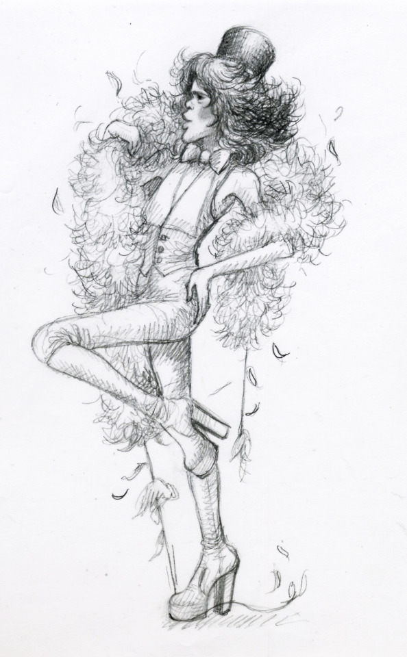
Charko, K. (1973). sketch of David Johansen at Rainbow Room gig, Big Biba 1973. [Illustration]. Retrieved from https://kasiacharko.wordpress.com/2013/07/13/the-new-york-dolls-gig-big-biba-rainbow-room-november-26th-1973/.
The top floor was the The Roof Garden, a beautiful oasis of calm right in the centre of busy London. Derry & Toms had originally opened the roof garden in 1938 and was designed by Ralph Hancock. Hulanicki had again wanted to preserve this green haven and set about restoring what remained of the original design. In May 1974 the roof garden was open to the public and little had changed from the original. The garden was split into separate areas; the Spanish garden, England Woodland Garden and Tudor Garden. The original had included much wildlife including flamingos, so these were added back in abundance along with doves, ducks and even penguins! The Pavilion which sat at amongst the gardens was re-opened as The Roof Garden Restaurant.

Oosterhoff, I. (2015). Barbara Hulanicki in the Roof Garden. [Photograph]. Retrieved from https://www.messynessychic.com/2015/07/07/londons-lost-department-store-of-the-swinging-sixties/.
Sadly, from its opening in 1973 Big Biba was already on a downward slide. Just a month prior it opening, Dorothy Perkins majority share of Biba Ltd became part of a larger subsidiary of the property firm British Land. Then with the subsequent oil crisis, miner’s strikes and the three day week combined this only contributed to the inevitable property slump and the following recession. Relations between Hulanicki and Fitz-Simon began to break down, as well as between Dorothy Perkins and British Land. By July 1974 the founders were told that they would no longer involved in the day to day operations of the store. The store continued for a while afterwards with two of the floors already closed, but the September of 1975 saw the decision that the store would close, bringing an end to Big Biba.
Big Biba really was a massive achievement for a brand, even today only the likes of Nike or Disney could get away with such a huge store dedicated to only one brand. At one point Big Biba came only second to the Tower of London for tourists attractions, followed by Buckingham Palace, boasting over a million customers per week. I really admire Barbara Hulanicki, she was determined from the start to go with her gut and follow her dreams. She was clever in the way she built her business, starting small and gaining a strong following built on the back of savvy pricing, accessible products and a strong aesthetic. Many of today’s small companies could learn a lot from her business acumen. She and Fitz-Simon didn’t give up on their passion for fashion and moved to Brazil where they became exporters for high end brands such as Cacharel. The Biba name was bought by House of Fraser and launched throughout their stores in 2010, with celebrity model Daisy Lowe fronting the campaign. Hulanicki was asked to come back and advise them in a consultative capacity. Long live Biba!

Roohi, Y. (2019). Biba at House of Fraser. [Photograph]. Retrieved from https://yasminroohi.com/dresses-ladies-house-of-fraser.
Reynolds, J. (2010). Biba: expands into homeware. [Illustration]. Retrieved from https://www.campaignlive.co.uk/article/biba-extends-brand-offering-homeware/1031173.
Websites:
Ferrier, M. (2014). Biba founder Barbara Hulanicki: 'I have a lovely life. I intend to outlive you all'. Retrieved from https://www.theguardian.com/theobserver/2014/sep/07/barbara-hulanicki-biba-fashion-interview.
V&A. (n.d). Biba. Retrieved from https://www.vam.ac.uk/articles/biba.
Modlinger, J. (2013). Fashion archive: The seven storeys of Biba. Retrieved from https://www.theguardian.com/theguardian/2013/sep/11/biba-store-kensington-opens-1973.
Charko, K. (2013). Big Biba. Retrieved from https://kasiacharko.wordpress.com/.
Book:
Thomas, S., Turner, A.W., & Hulanicki, B. (2006). Welcome to Big Biba (2nd ed.). Suffolk: The Antique Collector's Club Ltd.
0 notes
Text
MA Fashion and Textile Practices Major Project Path - 1st September
Big Biba
To say that Big Biba was just another department store would be doing the brand a huge disservice. Big Biba was the ultimate destination place that was given the title of ‘The most beautiful store in the world’ and it certainly lived up to its reputation. Derry and Toms was opened in 1933, a robust Art Deco building which must have made an optimistic architectural statement in a post war London gripped by The Great Depression. With seven floors it must have seemed quite revolutionary for the period. Barbara's intention was to retain as much of the art deco decoration as possible and in fact wanted to reflect its aesthetic throughout Biba’s branding and products - as well as utilising inspiration taken from the couple’s travels abroad. The photograph below shows the store swathed in decorations for King George VI’s Coronation in 1937.

House of Fraser, n.d. (n.d). Coronation decorations at Derry and Tom's 1937.. [Photograph]. Retrieved from https://www.housefraserarchive.ac.uk/image/?id=HOFI00262.
Biba’s shops had always been influenced by the buildings they were situated in and Big Biba was no exception. (Thomas et al., 2006) describe the building as such:
“Derry & Toms was reduced to faded glory, Biba’s task was simply to bring it back to its original splendour.”

McKnight Kauffer, E. (1919). WINTER SALE AT DERRY & TOMS. [Poster]. Retrieved from https://www.christies.com/lotfinder/Lot/edward-mcknight-kauffer-1890-1954-winter-sale-at-5944314-details.aspx.
With the aid of designers Steven Thomas and Tim Whitmore, Hulanicki began designing the interiors for Big Biba and each of the fifteen departments that were intended. The interior space was twenty times the size of their previous Biba store, but Barbara was unphased by the task which lay ahead. She felt confident it was just a case of translating and up-scaling their current business. They currently had around a 100,000 people per week footfall in a space which was inadequate, so she saw the size upgrade as a huge (literally!) advantage. What Barbara and her cohorts designed was like a living, working movie set, it was a fantasy place accessible to everyone and they came to see it in their millions.
In the September of 1973 Big Biba opened its doors, each of its seven floors stocked to the gills with Biba’s own label products, Biba was a way of life. each and every item was either designed, commissioned or approved by Hulanicki, not one item was passed without her say so. Some were doubtful that she could pull off this gigantic task and felt that her earlier success couldn’t translate to such a huge scale venture, but once opened Big Biba was to attract more than a million customers per week.
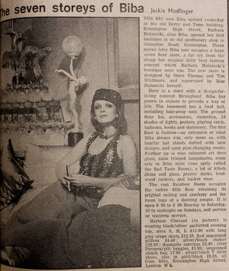
Modlinger, J. (2013). Fashion archive: The seven storeys of Biba. [Editorial]. Retrieved from https://www.theguardian.com/theguardian/2013/sep/11/biba-store-kensington-opens-1973.
Biba had never entertained window displays, Barbara had always wanted to conjure a sense of mystery and wonder and Big Biba was to remain just that. Instead of placing products in the widows she did the opposite and placed sofas and chairs there so that customers could look out at the passing world instead. Once inside the store customers could be forgiven in thinking they had arrived on the set of a movie, and certainly not typical of the slightly cramped, dimly lit Biba’s of old - although Barbara never really lit anything well, it added to the atmosphere. (Thomas et al., 2006) said Vogue had described Big Biba as:
“A palace of of apricot marble, coloured counters and fake leopard-skin walls; seven floors of fantasy.”
That apricot marble covered 26,000 square feet and was made especially in Portugal, so much was required that they exhausted supplies and still wanted more. There were also over 20,000 mirrors used in the store, so no excuse to not see how fabulous you looked living the Biba life. The ground floor was for things you needed if you were in a hurry, exactly like supermarkets today which supply areas with items ‘to go’, or shops that supply point of sale (POS) items near the till that you can pick up on the go. Hulanicki really did create shopping experiences that we consider as standard today.
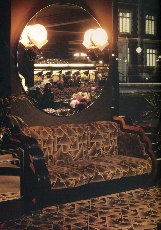
Charko, K. (2013). window sofa. [Photograph]. Retrieved from https://kasiacharko.wordpress.com/2013/06/28/big-biba-opens-september-10th-1973/.
The ground floor contained products such as leather goods, boots and shoes, jewellery, knitwear, magazines and records, stationary and more. They also had a book shop supplying tomes in art and design, something new to Biba. A tights counter was standard at Biba but this space was elevated with extra space and range size. Hulanicki was careful to keep items that the customers would recognise from previous stores, such as the hat department which previously utilised flea market hat stands, but now the hat department contained over 200 and were specially made in Czechoslovakia.
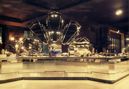
Charko, K. (2013). Biba makeup counter. [Photograph]. Retrieved from https://kasiacharko.wordpress.com/2013/06/28/big-biba-opens-september-10th-1973/.
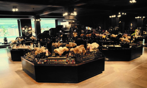
Gosling, E. (2012). Biba makeup counter. [Photograph]. Retrieved from https://www.designweek.co.uk/issues/may-2012/biba-founder-barbara-hulanicki-chats-to-design-week/.
Biba’s cosmetics line was one of the brands most successful ventures. The colours were synonymous with fashion, using colours which had never been used for cosmetics before such as dark brown mulberry, plum and black. Celebrities and pop stars were often seen casting their eyes over the vast range of lipsticks, nail polishes and eyeshadows. (Thomas et al., 2006) said that Siouxsie Sioux of the punk/goth band Siouxsie and the Banshees once said:
“Once I had started going to Biba on my own, and discovered rust colours for the eyes, I really got quite heavily into wearing red eye shadow.”
Biba’s T-shirt department was also a sight to see, with over a 1,000 pigeon holes to accommodate their vast selection of styles that were available in 24 colours and three sizes, many of the colours were specially created to Biba’s requirements.
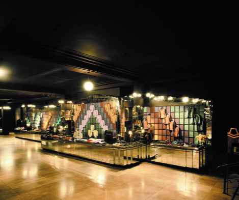
Gosling, E. (2012). Biba t-shirt counter. [Photograph]. Retrieved from https://www.designweek.co.uk/issues/may-2012/biba-founder-barbara-hulanicki-chats-to-design-week/.
Barbara and Fitz-Simon’s vision for Biba had always been about building a strong brand aesthetic. Biba was one of the first stores to recognise the power of the logo and utilised it to the nth degree. Going back to 1966 they sold a Biba branded diary and calendar, so Big Biba presented them with a great opportunity to capitalise on this idea in the Logo Shop. The shop sold posters, greetings cards, balloons, chocolates, matches and so much more, it was the most affordable way for customers to buy into the Biba lifestyle. Biba was all about affordability, but even if you had spent the majority of your budget travelling to London then you could still buy a Biba item to take away as a memento of the trip. I adore Biba’s branding and logo designs, of which there are so many connotations. Big Biba was about delivering a coherent brand message which continued through onto all their packaging, labeling, logo shop merchandise, store signage and even their own newspaper! The person mainly responsible for this look was designer Kasia Charko. Kasia was an illustrator who was employed to work with Tim Whitmore and Steve Thomas of Whitmore Thomas Design Associates, as well as Barbara Hulanicki herself to create Biba’s signature look.
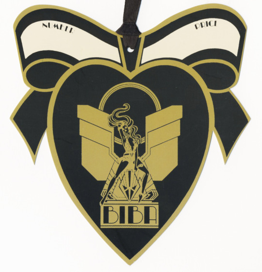
Charko, K. (2013). Mistress room label. [Packaging]. Retrieved from https://kasiacharko.wordpress.com/2013/06/28/big-biba-opens-september-10th-1973/.
Charko, K. (2017). Sam and Alice. [Illustration]. Retrieved from https://www.lambiek.net/artists/c/charko_kasia.htm.
Charko, K. (n.d). Big Biba Logo's . [Illustration]. Retrieved from http://www.jannaludlow.co.uk/Biba/Artwork.html.
It was a vast amount of work Charko was to produce for Big Biba, after all there were fifteen departments over seven floors all requiring branding and graphics. It took two years of hard work to finally finish all the graphics required for Big Biba, as well as a newspaper linked to the store which covered any new events, products and everything else in between. Charko had completed a three year graphic design degree at Leicester College of Art and had been working as a freelance illustrator on various magazines such as Woman and the Radio Times before landing the job for Biba.
The basement of Big Biba was its food hall, it was quite a departure from their usual aesthetic - although still maintaining the overall branding - it celebrated the Pop Art culture of the 1960′s. In the tinned goods and household essentials section, huge ‘tins’ of soup housed a huge array of tinned products. One of these was called ‘Warhol’s Condensed’ which contained Campbell’s Soup tins, this was a play on Warhol’s re imagining of the humble soup tin from his famous Campbell’s Soup art.
Flash in on the 70's, n.d. (2013). The foodhall at Big Biba brought pop art back to its supermarket roots. [Photograph]. Retrieved from https://flashinonthe70s.wordpress.com/2013/11/06/pop-goes-the-easel-and-the-armchair-the-barbicans-new-show-celebrates-the-playful-influence-of-pop-art-on-postwar-design/.
The food hall stocked 350 own brand products ranging from wine and baked beans, through to ice cream and washing powder, all displayed in quirky and unusual ways. Many of Biba’s customers as well as the general public came to Big Biba’s food hall and nowhere else, they could get products there more associated with other high end food halls but at cheaper prices.
1 note
·
View note
Text
MA Fashion and Textile Practices Major Project Path - 1st September
Last week Heal’s released their New Season Autumn Winter’19 brochure. It’s always exciting to see what new products will be coming into store or available to order. Flicking through the brochure I noticed a lot of the new products bucked the Art Deco and 60′s/70′s trend, and the mixing of the two. Many of the new ranges are named after places in London such as Fitzrovia, Bloomsbury and Brompton, places which are renowned for their architectural, literary and fashionable heritage. Cushions and throws reflect this nod to the era by mixing patchwork, quilting and velvet for a luxurious aesthetic.

Heal's, n.d. (2019). Fitzrovia 3 Seater Sofa. [Photograph]. Retrieved from https://www.heals.com/fitzrovia-3-seater-sofa.html.

Heal's, n.d. (2019). Bloomsbury Armchair. [Photograph]. Retrieved from https://www.heals.com/bloomsbury-armchair.html.

Heal's, n.d. (2019). Palermo 3 Seater Sofa. [Photograph]. Retrieved from https://www.heals.com/palermo-3-seater-sofa.html.

Heal's, n.d. (2019). Origami Cushion 40 x 40cm. [Photograph]. Retrieved from https://www.heals.com/origami-cushion-40-x-40cm.html.
All beautiful things, especially the Bloomsbury sofa and chair which I love, unfortunately not in my budget! All these lovely new products using a mix of Art Deco and 60′s/70′s aesthetic got me thinking about designers yet again looking back to past eras for inspiration, and Biba came to mind. Biba were already listed on my research mind map as a brand which became successful through strong graphic strategies, especially culminating in the brands stand alone store Big Biba. Biba’s founder Barbara Hulanicki had borrowed heavily from the Art Deco and Art Nouveau eras whilst creating her brand in the early 60′s giving Biba a distinct aesthetic straight from the start.
Biba
Biba began in 1963, when the daughter of a Polish diplomat - Barbara Hulanicki, and her husband Stephen Fitz-Simon - an advertising executive launched their Biba Postal Boutique selling their affordable clothing in newspapers and magazines. In 1964, Felicity Green, the then fashion journalist at the Daily Mirror, noticed the brand and requested Barbara to design a piece for the papers fashion pages. Barbara designed a short pink gingham dress and matching headscarf inspired by a dress her mother had made her when she was a little girl. The dress was an immediate success, selling 17,000 pieces in a short time.
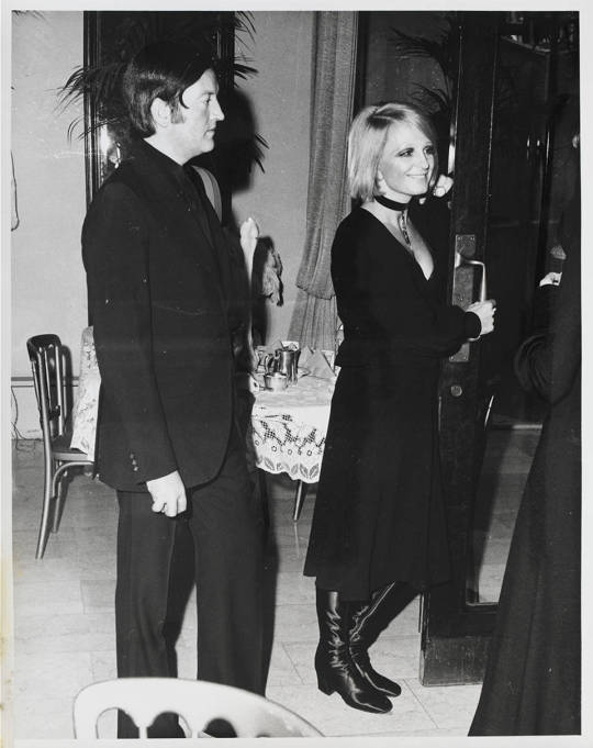
V&A, n.d. (n.d). Barbara Hulanicki and Stephen Fitz-Simon, about 1960, photographer unknown. Biba archive. © Victoria and Albert Museum, London. [Photograph]. Retrieved from https://www.vam.ac.uk/articles/biba.
The sale of this dress was to propel the brand into the mainstream, and resulted in the duo opening their first boutique at 87 Abingdon Road, Kensington - a former chemists. The shop was incredibly popular, attracting a mainly female clientele under the age of 25. They came in their droves to buy Hulanicki’s slimline aesthetic inspired by past decades such as Art Deco and Art Nouveau in muted tones of olive, rust and her favourite colour ‘Bruised Purple’. Biba’s signature look was simple and linear, utilising long straight sleeves and ‘A’ line shift dresses which were popular at drawing attention to the legs. The size range was small, size 8 being the most popular. Hulanicki (2014) said of those small sizes:
“I know that sounds mad but girls in those days, there were no continental foods to get fat on, and no one did exercise, so they weren't muscly. Not like the American girls. We made a few pieces in a size 12 but no one bought them. Of course when the pill came in that changed everything. I remember crossing Kensington Church Street in 1969 and seeing these girls with their thighs and their hips, and thought: uh-oh. Now being thin is a status thing!”
The brands ethos was about delivering stylish yet affordable clothing to the youth of the day. Barbara (n.d) insisted that the clothes remain price conscious:
“I wanted to make clothes for people on the street, and Fritz and I always tried to get prices down to a bare minimum”
Fitz-Simon had worked out that young London females would have a certain amount of disposable weekly income - he’d based his calculations on the average London secretary earnings in 1964 - and kept there prices well inside this figure to maintain a quick turnaround in stock with repeat sales. Their policy at the time was ‘pile it high, sell it cheap’ unlike many other London boutiques who catered to clientele with money and whose stock was minimal.
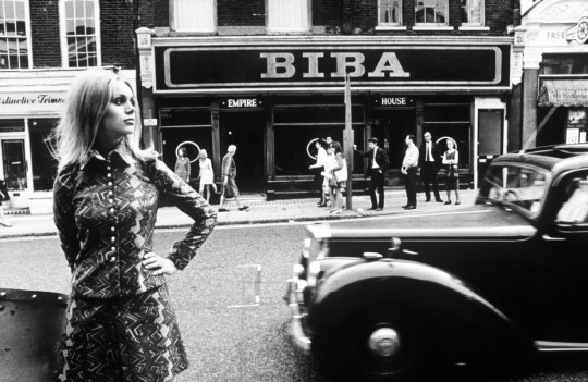
Oosterhoff, I. (2015). Biba Kensington. [Photograph]. Retrieved from https://www.messynessychic.com/2015/07/07/londons-lost-department-store-of-the-swinging-sixties/.

Townsend, P. (1964-1969). Interior of the Biba store, Kensington High Street, 1960s. Photograph by Philip Townsend. [Photograph]. Retrieved from https://www.vam.ac.uk/articles/biba.
These photographs show Biba’s already strong graphic style. The windows of the store sported the brands logo in large scale and not much else, enticingly minimal as to draw the client in from the street to discover what laid beyond. Once inside they were treated to a dramatically dimly lit array of fashionable merchandise, assistants sporting the brands signature pieces and music blasting from the shops sound system. By the mid 1960′s Biba wasn’t only selling to the bargain seeking youth of London but to influential stars of the day such as Twiggy and Cilla Black, they were the first of its kind to create destination shopping. According to Thomas, Turner and Hulanicki (2006) Good Housekeeping once said of the ways fashion shops now operate:
“If you can’t hear yourself shop for the heavy rock music pouring out of walls and ceilings wherever you you are, blame Barbara. If you can’t see whether a dress is black, brown or navy because you’re shopping in semi-darkness, it’s Barbara’s fault.”
By 1965 the brand had become well established, and when the Daily Telegraph named Barbara Hulanicki one of the people who made London swing - as part of an article about ‘Swinging London’ - things were to only get better. In 1966, in a bid to expand Biba moved from Abingdon Road to Kensington’s Church Street. Again they gained further success by launching their first mail-order catalogue in 1968.

Vintagegal, n.d. (2014). Biba Catalogue. [Photograph]. Retrieved from http://vintagegal.co.uk/books-magazines/vintage-1960s-biba-catalogues/.

Vintagegal, n.d. (2014). Biba Catalogue. [Photograph]. Retrieved from http://vintagegal.co.uk/books-magazines/vintage-1960s-biba-catalogues/.
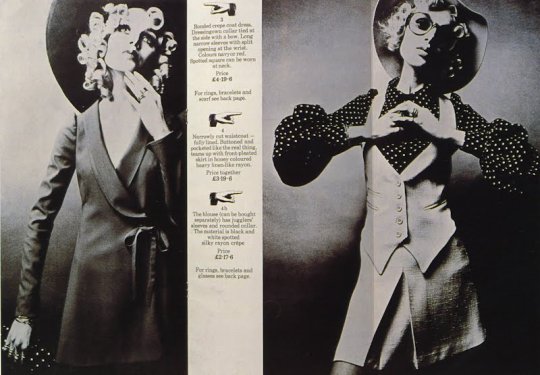
Vintage Vixen, n.d. (2011). Mail-order catalog excerpt with baby doll-inspired fashions.. [Photograph]. Retrieved from http://blog.vintagevixen.com/2011/09/.
A total of five further catalogues were issued until the mail-order department was wound up the same year. In the September of 1969, Biba moved premises again to 124 - 126 Kensington High Street, obviously they had realised staying in Kensington as their main area would continue to prove profitable. The new address was a larger property with scope to add more departments, so here they introduced ladies evening wear, menswear and household, enabling Biba to become a department store. This same year Dorothy Perkins became a major shareholder of the company and by the Spring of 1970 Biba had also launched a cosmetics line.
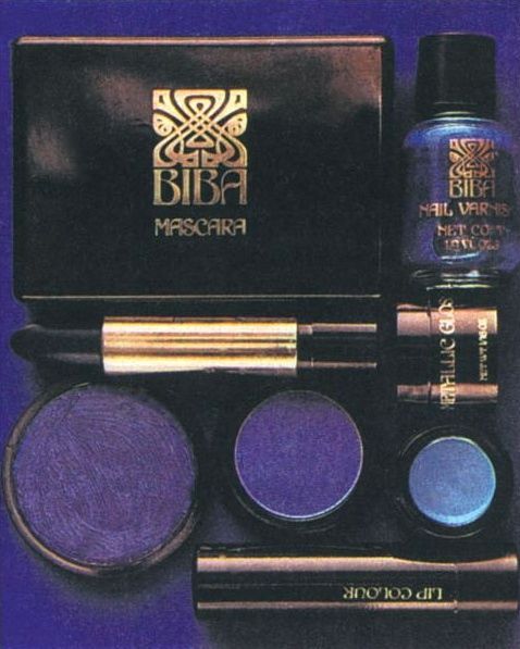
LNCRED, n.d. (2018). Biba Cosmetics. [Photograph]. Retrieved from https://thpix.com/media/836543699512579145.
Not to miss out on a good thing, other stores worldwide began to open Biba concessions, such as within the Bergdorf Goodman store in New York, as well as cosmetics counters in Au Printemps Paris, Fiorucci in Milan and Tekano in Tokyo. Things were to take a serious turn in May 1971 when the Biba store on Kensington High Street was targeted for a bombing attack by the militant far left group The Angry Brigade. The Angry Brigade formed around 1968 incited by anti-Vietnam war demonstrations held in Grosvenor Square and the actions of the European anarchist movement. Between 1970 to 1972 they were responsible for a number of bombings, possibly more than 25, across London and parts of England. They selected a number of establishments for their bombing campaign, ranging from banks and foreign embassy’s to the Ford car company and a BBC broadcasting truck which at the time was covering the Miss World contest. In respect of the Biba attack, their message was very much one of anti-consumerism. They had planted the bomb in Biba’s stock room and when the blast occurred thankfully nobody was injured. 500 members of staff had to be evacuated from the building. Their idea was never to cause harm but to gain publicity and promote anarchy. They printed a piece in the International Times - London’s main underground paper at the time - not long after the attack stating:
“If you’re not busy being born you’re busy buying.”

The Reprobate, n.d. (2018). BIBA AND THE ANGRY BRIGADE. [Photograph]. Retrieved from https://reprobatepress.com/2018/11/21/biba-and-the-angry-brigade/.
After more bombings in an attempt to gain further publicity the group became easier to locate and track down, and in late 1971 their main leader Jake Prescott was arrested and subsequently sentenced to fifteen years in prison. The trial of The Angry Brigade was to become one of the longest trials in English history with a further four convictions with prison sentences of ten years and later four acquittals. The group re-emerged in the 80′s as the The Angry Brigade Resistance Movement and was a faction of the Irish Republication Socialist Movement but soon dwindled and dissolved.
A few months later Biba had recovered and launched its cosmetics line across more than 300 Dorothy Perkins stores nationwide. In the December of that same year Biba announced it was to move again to a larger building on the other side of Kensington High Street, which was currently the site of the Derry & Toms department store. Derry & Toms closed its doors in the January of 1973 and within a few months the site was transformed into what would be Biba’s ultimate flagship store - Big Biba.
0 notes
Text
MA Fashion and Textile Practices Major Project Path - 30th August
Straight after the programme Bauhaus 100 there was another Design Season programme called Bauhaus Rules with Vic Reeves. I love Vic Reeves (Jim Moir) so thought it could be an interesting watch. With 2019 marking the 100th anniversary of Bauhaus, BBC Four took the cameras to London’s Central Saint Martins to see if current students at the art school could live by the rules of Bauhaus for a week. Accompanying them was the shows presenter celebrity comedian Vic Reeves. Six graduates of the school were asked to participate in the Bauhaus takeover experiment, whose disciplines ranged from fine art, fashion, graphic design and architecture. Each day they would be presented with a creative brief inspired by the Bauhaus workshops, to see if the power of Bauhaus still holds true today. On the Saturday they would be holding a Bauhaus inspired costume party and were told to ask anybody who was up for it to come along.
Linkedin, n.d. (n.d). Central Saint Martins, University of The Arts London. [Photograph]. Retrieved from https://www.linkedin.com/company/central-saint-martins-college-of-art-and-design-university-of-the-arts-london/.
Setting the briefs for the graduates were keys figures from art and design - the first of which was artist Ian Whittlesea, who had studied the exercise regimen devised by Bauhaus Master Johannes Itten. The graduates were took to the roof of the school and followed a set of exercises delivered by Whittlesea. The graduates could see the point of these mind clearing exercises, one ex student Lisa Darrer (2019) said it made her feel really grounded and aware of her surroundings, another ex student - Lizzy Deacon (2019) said she felt very aware of her body and noticed one of her hands was bigger than the other. The exercises really seemed to make an impact on the students as a whole, making themselves more aware of themselves and their surroundings.
The Art Story, n.d. (n.d). Itten leading his students in physical exercises. [Photograph]. Retrieved from https://www.theartstory.org/artist/itten-johannes/.
They were then taken to the canteen where they were given a meal of bread and a recipe of Itten’s creation - ‘garlic mush’, which some of them enjoyed as they said it was probably healthier and better for them than some of the meals they had been eating as students!
Ian then set the graduates their first creative brief, they were to explore the contrast between basic materials such as rough and smooth, hard and soft,light and dark etc. and to make a piece of art from it - this reminded me of Marcel Duchamp and his found art or ‘Readymade’s’. All the students materials were to come from the ground or from the bins of the school. This exercise in discovering the most basic of materials was part of the preliminary course at Bauhaus and was to help the students see the usefulness and beauty in everyday objects. I remember doing a similar exercise whilst studying for my degree in Graphic Design, except it was to show contrasts between fonts.

Mirkin, M. (1922). Contrast Study with Different Materials (Reconstruction 1967). [Mixed Media]. Retrieved from https://www.pinterest.co.uk/pin/279152876885423902/?lp=true.
The graduates were then asked to blindfold themselves to feel the objects they had found, this was also one of Itten’s ideas, that to create something the students must engage with all their senses and discover their sense of ‘play’. They were then given an hour and a half to produce their pieces. It was a good exercise for the graduates, they said it was like they were relearning and rediscovering materials they would have otherwise ignored.
The next brief was to echo Wassily Kandinsky’s colour theory practice. To set this brief was Scottish artist David Batchelor - whose installations use colour and geometry in a similar way. He gave each of the graduates a piece of paper which showed a line drawing of a circle, triangle and square. They then had to assign the three primary colours given to each of the shapes - red, yellow and blue. He wanted them to consider carefully each shape and colour and try to ‘feel’ which colour went with which shape - under Kandinsky’s rule there is only one correct answer!
Bormann, H.S. (1930). Heinrich-Siegfried Bormann, Illustration of the four primary colours: their planar relation to each other (study from Kandinsky’s course), 1930. [Illustration]. Retrieved from https://www.vmbee.com/blogvmb/2016/3/22/bauh.

Bayer, H. (1968). 50 Jahre Bauhaus. [Poster]. Retrieved from http://www.artnet.com/artists/herbert-bayer/50-jahre-bauhaus-poster-C1hxUHTljHkT8CPbW1MJyg2.
The answer was of course illustrated in the study of the theory by one of Kandinsky’s students Heinrich-Siegfried Bormann and in the above poster by Herbert Bayer. According to Kandinsky’s Basic Colour Theory he determined that the triangle was an interesting shape so it deserved a energetic and lively colour such as yellow. The square was of some interest so would suit a strong colour such as red, and the circle being a ‘dull’ shape required the colour blue which was a peaceful colour. Only Vic Reeves and one other graduate passed the test. They said they felt drawn to use yellow for the triangle as it felt like an unsettling colour, interesting! That is pretty much how Kandinsky would describe the colour. David then set them a task to use only three primary colours and the three basic shapes to create a piece of art, or whatever they wanted. David (2019) made an interesting comment in regards to Kandinsky’s method of using intrinsic methods:
“It all sounds pretty wacky today, but immediately after the first world war - a world which appears to be falling apart - and they’re just trying to stick it back together again in a new way”
It was true that Gropius had set up the Bauhaus school to find a new way of thinking after the horrors of the war. They were grasping at ideas and running with them. It was same as the graduates in the documentary, some of them decided to abandon his method and go with whatever idea they had, not agreeing with the rigidity it set - sometimes it is all about breaking the rules!
Batchelor, D. (2013). Spectotem 6. [Installation]. Retrieved from https://curiator.com/art/david-batchelor/spectotem-6.
The next to offer up a brief was head of design at Habitat Kate Butler. She first discussed Marcel Breuer’s iconic Wassily Chair. Made from tubular steel and inspired by the artists Adler bicycle handlebars, it was the start of what was to become tubular steel furniture. The process for creating tubular steel had only just come onto the market and produced by German steel manufacturer Mannesmann. Breuer took this idea and adapted it to fit his furniture concepts. The designs were revolutionary at the time, using bent tubular steel and materials such as leather had never been done before.
Breuer, M. (1925). Marcel Breuer Wassily Chair. [Furniture]. Retrieved from https://kaiyo.com/knoll-knoll-marcel-breuer-wassily-chair/.
The graduates were taken to the metal workshop and given the task of making an everyday household item using the Bauhaus principles of form follows function, and were split into pairs to collaborate their ideas. At Bauhaus it was commonly believed that women couldn’t think in 3D, which is preposterous but at the time women were still regarded as less creative. The graduates were given one hour to sketch up their preliminary ideas and then it was down to them, with the help of the metal workshop technicians, to come up with a viable item. They actually came up with some great ideas, one was for a portable birdbath - and in their words clearly something every millennial would need! One idea was for a seat for your dog at the table, another for a simple cafetiere. They determined that the collaboration was a great way of sharing ideas, and really enjoyed the experience of bouncing ideas off each other.
The next brief was set by experimental photographer Constanza Isaza Martinez, who asked the graduates to produce a photograph without the aid of a camera.This was taking direct inspiration from artist and Bauhaus Master László Moholy-Nagy who pioneered a technique of producing photographs - or photogram’s as he called them by the means of photo sensitive paper. Constanza asked the graduates to make these photographs using light and shade for inspiration. The had a while to plan their designs and then went to the schools dark room with any materials they wished to use, they had to bear in mind that anything they blocked out from the paper would appear white on their designs.

Moholy-Nagy, L. (1925/1928). Photogram. [Photogram]. Retrieved from http://artsatva.com/moholy-nagy-future-present/ex8059_312_mnf_004-hpr/.
The designs turned out really well for the graduates. They experimented with lots of different materials and the results reflected that. Some were quite playful, which was Moholy-Nagy’s idea, that it was about discovering what materials could do when under certain circumstances. They found the experiment to be beneficial in the way they may now look at the materials they use for their own projects, the beauty that can be found in everyday materials.
The next brief was set by graphic designer Neville Brody, who made his name by designing graphics and layouts for iconic magazine The Face. The task was to design a poster for Saturday’s costume party and the theme was metal - a nod to the iconic metal themed party held by Bauhaus Dessau - but incorporating attention seeking graphics, not mixing upper case and lower case fonts and to include a made up language. The graduates had a certain amount of time to sketch up their ideas and then were taken to the Letterpress workshop to be instructed by specialist technician Helen Ingham. Bauhaus really set the way for advancements in typography and graphic design, they broke the rules in typography and layout in the way it was used, breaking free from a fussy Victorian aesthetic. Herbert Bayer was head of printing and advertising at Bauhaus Dessau and was responsible for creating much of the schools advertising, posters and literature. His method of using fonts sans serif - without any embellishment on the typeface - was to become the contemporary style to take over typography at that point in time. Bauhaus very much set the tone for directional graphic design for the next century and many influences are commonplace today.
Brody, N. (1980). NEVILLE BRODY. The Face. Magazine, inside. 1980s.. [Editorial]. Retrieved from https://www.pinterest.co.uk/pin/461407924312729098/?lp=true.
The students at Bauhaus often used a process called ‘Photomontage’ which took images from various sources and mixed them together in a collage type manner, this was considered very cutting edge. The graduates approached the poster design in a similar manner and combined photocopying, metal objects and letterpress to create their collaborative piece. They were asked to select their three favourite designs and Neville Brody then selected the winner. It was interesting as the brief asked that the design be attention grabbing, and the completed designs were all in black, white and red - as my Anarchist of Love T-shirt and very much in the style of the ‘red topped’ daily newspapers I mentioned previously. Maybe the graduates had subconsciously tapped into that, that the colours and images used were attention grabbing like those daily newspapers were intended to be. Helen Ingham (2019) described the finished design as ‘quite punk’.
The last brief was delivered by fashion designer Holly Fulton who set the graduates the task of designing their own costumes for Saturday’s metal themed costume party as well as decorate the gallery space at Central Saint Martins. They had to be inspired by the costumes of artist and choreographer Oskar Schlemmer, who ran the Bauhaus theatre group. They were encouraged to think big, she wanted to see unique and interesting shapes emerging, Bauhaus was all about uniqueness. She said at the party they would have to pair up and involve themselves in the ‘Bauhaus Dance’ - which involved dancing in pairs without touching, but the wild stamping of feet and leaping in the air were highly encouraged! The graduates some up with a sub theme of ‘opposites attract’ like a magnet would attract, so worked this into their Bauhaus dance by incorporating dance moves which mirrored each other.
Binnmann, R. (1929). Metallisches Fest. [Photograph]. Retrieved from http://www.getty.edu/art/collection/objects/57672/rudolph-binnemann-metallisches-fest-german-about-1929/.
The graduates were given some metal objects to start them off and then quickly realised a trip to the shops was needed to gather more materials. The found hardware stores and the kitchen departments of interiors shops were the best places, and returned with a huge selection of goodies to inspire their designs. Costume parties at Bauhaus were highly competitive, it was all about who was the most avant garde and different. The graduates costumes were a huge success and really portrayed the Bauhaus spirit of experimentation and collaboration. If it wasn’t for the Bauhaus we may never of entertained the collaborative culture in the way we have, and still continue to do.
Vic Reeves had designed himself a metallic cyclops horse costume, which was certainly unique! He surely must have been inspired by the Bauhaus sense of experimentation. His comedy has always erred to the side of the avant garde, and was one of the pioneers of the alternative comedy scene. The Bauhaus parties were special to Walter Gropius, that when he died in in Boston, Massachusetts in 1969 at his request a metal themed ‘Fiesta a la Bauhaus’ party was held with ‘drinking, dancing, laughing and loving’.....very apt.
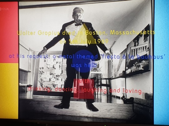
Websites:
Smirnova, E. (n.d). Basic Color Theory by Kandinsky. Retrieved from https://ekaterinasmirnova.wordpress.com/2012/08/06/basic-color-theory-by-kandinsky-44/.
Schneider, S.R. (2011). The Wassily Chair By Marcel Breuer. Retrieved from https://www.gentlemansgazette.com/wassily-chair-model-b3-by-marcel-breuer/.
Bauhaus 100. (n.d). Herbert Bayer. Retrieved from https://www.bauhaus100.com/the-bauhaus/people/masters-and-teachers/herbert-bayer/.
Documentary:
Moir, J. (Presenter) & Lloyd, S. (Director). (2019). Bauhaus Rules with Vic Reeves [Television series documentary]. In Lloyd. S (Producer), Design Season. London, England: BBC Four.
0 notes
Text
MA Fashion and Textile Practices Major Project Path - 29th August
The Bauhaus cont.
After the closure of Bauhaus Weimar, Walter Gropius was determined Bauhaus would continue, so he embarked on a promotional tour. He wanted the Bauhaus ethos to reach far and wide, and enable the general public to gain a better understanding of their ideologies. On this tour he met the woman who was to become his second wife - Ise Frank, or later to be known as ‘Frau Bauhaus’. This promotional tour got the desired effect and Gropius received many bids for a new location. He had been offered a piece of land near the Junker’s Aircraft factory in Dessau which seemed ideal, so decided to design and build the new Bauhaus here. Although Gropius was never an overtly political figure the Dessau government was Communist in its thinking, so he felt his Bauhaus ethos would be better understood this time around.

Bang, M.J. (2017). LUCIA MOHOLY’S PHOTOGRAPH OF A BAUHAUS BUILDING IN DESSAU, 1926. [Photograph]. Retrieved from https://www.theparisreview.org/blog/2017/09/07/five-hundred-glass-negatives/.
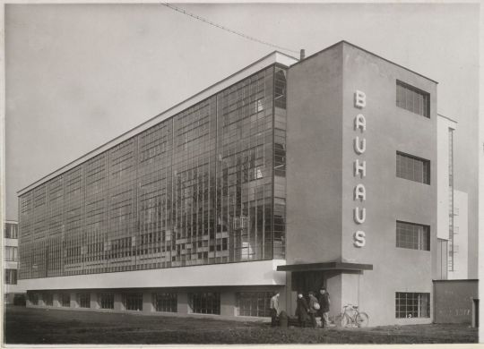
The Charnel-House, n.d. (2014). Unidentified photographer Bauhaus Building, Dessau, 1925-1926- Workshop wing, view from southwest [architect- Walter Gropius], c. 1926. [Photograph]. Retrieved from https://thecharnelhouse.org/2014/04/01/object-lessons-from-the-bauhaus/unidentified-photographer-bauhaus-building-dessau-1925-1926-workshop-wing-view-from-southwest-architect-walter-gropius-c-1926-gelatin-silver-print-mounted-to-cream-wove-paper-image-11-5-x-16/.
The building went well and the new Bauhaus was completed in 1926, with the new school opening in 1927. Bauhaus Masters had separate accommodation away from the main building but were still very much immersed in the school culture. Gropius employed the architect Hannes Meyer as director of the newly established building department. In April 1928 Gropius appointed Meyer the new director of Bauhaus, Dessau. This was a huge surprise for the Masters of the Bauhaus - he was its founding father, although Gropius insisted he was to be present in a consultative capacity. Meyer introduced new workshops on technology, photography, natural science and the humanities as well as dissecting the arts and sciences. In the latter part of 1928 he introduced free painting classes, which enabled the general public to attend the school.
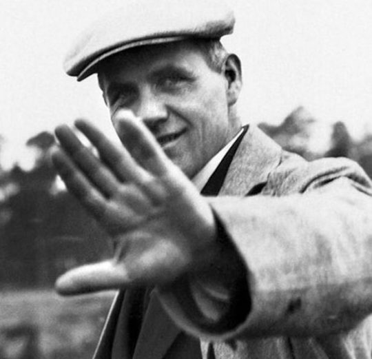
Infiernoseguro, n.d. (2017). Hannes Meyer. [Photograph]. Retrieved from http://infiernoseguro.blogspot.com/2017/11/la-bauhaus.html.
Meyer thought that Bauhaus Weimar had lost its way somewhat, he felt they had become less focused on producing work ‘for the people’ because their products were now beyond the financial reach of the average person. Meyer’s (1928) new slogan was:
“The people’s needs instead of the need for luxury!”
Meyer’s comments became increasingly more critical of the Bauhaus ethos, causing tensions amongst the other Masters as well as Gropius himself. Meyer’s opinions on Bauhaus, along with his strong Marxist views began to filter through to the students, who began to become more political and dissident under his influence. From this his role of director came into question, Gropius, along with the Lord Mayor of Dessau and other Masters such as Wassily Kandinsky felt he should be dismissed, the reasoning being he incited ‘Communist machinations’. Although the local government at Dessau was communist in their political leanings, a director of a major art school should not be so politically biased. In August 1930 - with final say from the government - Meyer was dismissed from his post. With a personal recommendation from Gropius, Bauhaus quickly replaced Meyer with architect Ludwig Mies van der Rohe as its new director.

Rohde, W. (1934). Porträt Ludwig Mies van der Rohe. [Photograph]. Retrieved from https://www.bauhaus100.com/the-bauhaus/people/directors/ludwig-mies-van-der-rohe/.
Ludwig Mies van der Rohe was the third and final director of Bauhaus. Under his direction the school changed again, it became more experimental and the curriculum changed to reflect that. To avoid any political disturbances amongst the students he interviewed each one individually to uncover what politics they favoured. Any communist students - a prior fans of Meyer - were thrown out of the school in a bid to restore harmony. Harmony was only temporarily restored, a newly elected local government with a National Socialist majority began to put pressure on the school, they did not agree with Mies van der Rohes’ experimental educational methods - he was inter-nationalist not national socialist. In an attempt to comply he reluctantly committed to a more conventional curriculum, combined workshops and the preliminary course was stopped altogether. These changes however were not enough and the government stopped funding for the school entirely. In 1932 - with its financial support removed - the school was forced to close. Some of the students were arrested by Nazi forces and it was discussed that the school should be burned to the ground. Sadly, the Nazis took over the building and used it as a communications base.
Ludwig Mies van der Rohe was determined that the Bauhaus should continue as a privately run school. In 1933 he opened the third incarnation of the Bauhaus in a disused telephone factory in Berlin. The Nazis again attempted a closure but was allowed to remain open on the condition they expelled all their Jewish and communist faculty members. This was the final straw for Mies van der Rohe, he decided he would rather close the school than hand over the students and school to the National Socialists. Mies van der Rohe (n.d) said of education:
“True education is concerned not only with practical goals but also with values. Our aims assure us of our material life, our values make possible our spiritual life”.
After the closure of the Bauhaus, many of its students and Masters travelled all over the world, taking with them the fundamental beliefs of the school. The Bauhaus Manifesto still holds true today with many artists, architects and designers following its basic principles, or are influenced by its ‘form follows function’ ideologies. Looking at large multi-national companies like IKEA, with their nesting tables and anglepoise inspired lighting it is hard to imagine a piece which doesn’t take the Bauhaus aesthetic into consideration.

IKEA, n.d. (2019). Forsa Lamp. [Photograph]. Retrieved from https://www.ikea.com/gb/en/p/forsa-work-lamp-nickel-plated-10146766/?cid=gb%7Cps%7Cpla%7C%7C%7C%7C&gclid=Cj0KCQjw753rBRCVARIsANe3o47Ba8qnofLrx8G0wKV-cTIqNwkYw3z0EQkUydK-E4jfbKIxPUBQ0p8aAuy2EALw_wcB&gclsrc=aw.ds.
So many aspects of our lives have been influenced by Bauhaus aesthetic: The ‘less is more’ attitude of fashion design has seen brands such as Cos and Monki keep there designs simple and functional, yet possibly adding clean, geometric Bauhaus inspired prints for focus. Children’s toys saw the likes of Lego and the use of simplified mechanical parts in their construction games. The way we construct our advertising and literature will ever be effected by the invention of sans-serif fonts and the way we consider layout and editorial work. Most Universities have an Art, Design and Architecture department - as we do at the University of Huddersfield, this can be attributed to Walter Gropius and his idea that combining creative disciplines under one roof can only serve as a positive attribute and aid collaboration and inspiration amongst students.
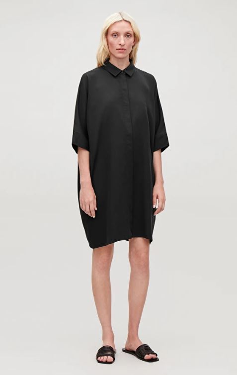
COS, n.d. (2019). DRAPED BOXY SHIRT DRESS. [Photograph]. Retrieved from https://www.cosstores.com/en_gbp/women/dresses/shirt-dresses/product.draped-boxy-shirt-dress-black.0729228004.html.
Ludwig Mies van der Rohe himself moved to the USA where he developed the worlds first skyscrapers. Although Mies van der Rohes’ buildings were intended for urban living they were eventually utilised as corporate structures to promote capitalism, something he was against. It is odd that today’s politics are seemingly following the narrative that eventually saw the closure of Bauhaus. Countries like Italy, USA, Austria, Hungary and Poland are now seeing far right tendencies emerging within their own politics. These places are becoming ever increasingly intolerant of cultural institutions and deeming them less necessary for the future. Currently the UK is not far behind!
Websites:
BBC News. (2018). Feine Sahne Fischfilet: Punk concert at Bauhaus cancelled. Retrieved from https://www.bbc.co.uk/news/world-europe-45990293.
Genius.com. (2018). Zurück in unserer Stadt Feine Sahne Fischfilet. Retrieved from https://genius.com/Feine-sahne-fischfilet-zuruck-in-unserer-stadt-annotated.
Astbury, J. (2018). Walter Gropius: the ideas man who founded the Bauhaus. Retrieved from https://www.dezeen.com/2018/11/02/walter-gropius-bauhaus-100-founder-director-architecture-design/.
Bauhausmanifesto.com. (n.d). Manifesto of the Staatliches Bauhaus Walter Gropius, April 1919. Retrieved from https://bauhausmanifesto.com/.
Herzog, N. (2016). These are the Key Points of the Bauhaus Manifesto. Retrieved from https://www.widewalls.ch/bauhaus-manifesto-key-points/.
Moore, P.E. (n.d). A Mystic Milieu Johannes Itten and Mazdaznan at Bauhaus Weimar. Retrieved from http://www.bauhaus-imaginista.org/articles/2210/a-mystic-milieu?0bbf55ceffc3073699d40c945ada9faf=oeh4kc298o6e3ecjd46mfub8u6.
Bauhaus 100. (n.d). Johannes Itten. Retrieved from https://www.bauhaus100.com/the-bauhaus/people/masters-and-teachers/johannes-itten/.
Bauhaus 100. (n.d). Gertrud Grunow. Retrieved from https://www.bauhaus100.com/the-bauhaus/people/masters-and-teachers/gertrud-grunow/.
Bauhaus 100. (n.d). Josef Albers. Retrieved from https://www.bauhaus100.com/the-bauhaus/people/masters-and-teachers/josef-albers/.
Bauhaus 100. (n.d). László Moholy-Nagy. Retrieved from https://www.bauhaus100.com/the-bauhaus/people/masters-and-teachers/laszlo-moholy-nagy/.
Bauhaus 100. (n.d). Gunta Stölzl. Retrieved from https://www.bauhaus100.com/the-bauhaus/people/masters-and-teachers/gunta-stoelzl/.
Bauhaus 100. (n.d). Marianne Brandt. Retrieved from https://www.bauhaus100.de/das-bauhaus/koepfe/meister-und-lehrende/marianne-brandt/.
Bauhaus 100. (n.d). Hannes Meyer. Retrieved from https://www.bauhaus100.com/the-bauhaus/people/directors/hannes-meyer/.
Bauhaus 100. (n.d). Ludwig Mies van der Rohe. Retrieved from https://www.bauhaus100.com/the-bauhaus/people/directors/ludwig-mies-van-der-rohe/.
Doyle, R.B. (2017). Definitive proof nobody did costume parties like the Bauhaus. Retrieved from https://www.curbed.com/2017/10/25/16547486/bauhaus-design-style-school-costumes-parties.
Wood, N. (n.d). Bauhaus at 100: The school that shaped the way we live. Retrieved from https://www.panmacmillan.com/blogs/literary/influence-of-the-bauhaus-movement-bauhaus-design.
Brainyquote.com. (n.d). Ludwig Mies van der Rohe. Retrieved from https://www.brainyquote.com/quotes/ludwig_mies_van_der_rohe_401123.
Documentary:
Whittaker, J. (Narrator) & Whitecross, M, (Director). (2019). Bauhaus 100 [Television series documentary]. In A. Rhodes (Producer), Design Season. London, England: BBC Four.
0 notes
Text
MA Fashion and Textile Practices Major Project Path - 28th August
The Bauhaus cont.
Weimar was quite a traditional city in 1920′s Germany and began to become less tolerant of the students and teachings of Bauhaus. The students would be quite rowdy and rebellious on their trips into the city, they stood out, they looked and acted differently than the city’s residents. They had radical haircuts and courted androgyny, they openly drank and smoked and generally provoked the status quo. On one trip into the city they vandalised the Goethe–Schiller Monument by throwing paint over it, they were early punks! This behaviour didn’t go down well with the local government, so they requested that Bauhaus prove its worth by organising a exhibition to showcase their work in one years time, or it would consider cutting the schools funding. In 1923 the Bauhaus exhibited its idea for modern living and architecture in a specially built house in Weimar called ‘Haus Am Horn’. This house was built and filled entirely from scratch by students and Masters at Bauhaus. Even the preliminary course was suspended that year in favour of the work for the exhibition. A poster was designed by Bauhaus Master, typographer and designer Joost Schmidt for the occasion.
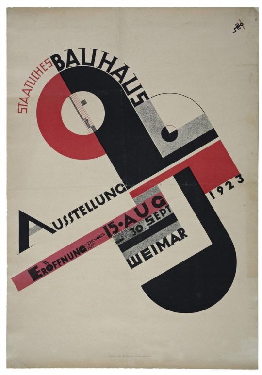
Schmidt, J. (1923). Poster for the 1923 Bauhaus Exhibition in Weimar, author: Joost Schmidt.. [Poster]. Retrieved from https://www.bauhaus100.com/the-bauhaus/works/graphic-printshop/poster-for-the-1923-bauhaus-exhibition-in-weimar/.

Uni-Weimar, n.d. (2017). The Haus Am Horn (photo: Roland Dreßler). [Photograph]. Retrieved from https://www.uni-weimar.de/en/university/profile/unesco-world-heritage-bauhaus/haus-am-horn/.
The building was initially meant to be one of many Bauhaus buildings planned for the site. Plans were developed by Bauhaus Master Georg Muche along with Gropius and Adolf Meyer and was the first building constructed in the Bauhaus aesthetic. The school were incredibly proud of the work they had committed to the exhibition but sadly the local council and public attendees were less than impressed with the work shown. They simply did not understand the ideologies behind it and within the year the schools funding was cut by 50%. Shortly afterwards a new Nationalist government arose and funding was cut entirely, as they did not deem this type of school necessary. Bauhaus Weimar was closed in March 1925.
0 notes
Text
MA Fashion and Textile Practices Major Project Path - 28th August
The Bauhaus cont.
The Bauhaus Manifesto was created in 1919. It was a written text which laid down the guidelines in which Gropius felt the new school should follow. There were to be no distinctions between artist and artisan, they were considered to be of equal measure and students were to return to basics, to analyse their craftsmanship and its original source. An excerpt from Gropius’ (1919) manifesto reads as such:
‘Architects, sculptors, painters—we all must return to craftsmanship! For there is no such thing as “art by profession”. There is no essential difference between the artist and the artisan. The artist is an exalted artisan. Merciful heaven, in rare moments of illumination beyond man’s will, may allow art to blossom from the work of his hand, but the foundations of proficiency are indispensable to every artist. This is the original source of creative design’.

Harvard Art Museums, n.d. (2018). Happy Birthday Bauhaus. [Photograph]. Retrieved from https://twitter.com/harvartmuseums/status/984415850877870081.
Essentially, the manifesto can be broken down into these basic rules:
Art should be building - They determined that the beauty of design should be in the creation of the thing you making, that is the art itself. A profession alone should not be the reason to create art, but that the thing is the end result of the craftsmanship involved.
Functionality dictates form - They wanted the students to consider that the thing they were creating should first and foremost be functional, and that functionality then determines the aesthetic. Economical design was premier, hence the clean and modernist look of the Bauhaus, no part of the designs were without purpose.
Consider space, materials and cost - Think about how the materials you use could be utilsed in the most economic way possible. Waste nothing. How can you complete the task without wasting time and resources? Bauhaus was ahead of its time, they were almost a zero waste enterprise.
Newness in everything - The students were to think about utilising new materials and about how new processes and functionalities could apply to their projects. The emphasis was on projecting forward and thinking of new ways to evolve their craft.
Simplicity and necessity - This links directly with the rule of functionality dictating form. Nothing as to be added that was purely for ornamental purposes, each element of the design had to be relevant. Design had to be organic and that what emerged was what was intended for its function.
It was thought that Gropius had been inspired by the socialist ideologies of William Morris, where he too had been disturbed by the barrier that existed between the arts and sought for a more unified approach.
At Bauhaus Gropius gathered a collection of teaching ‘Masters’ of their craft, which included Wassily Kandinsky, Paul Klee, Marcel Breuer, László Moholy-Nagy, Johannes Itten and Oskar Schlemmer. Who gathered students from every background and political leaning - this was to be a place of collaboration not for political discourse. A six months preliminary (foundation) course was set up - this course covered every discipline at the school as to enable students to determine which specialty they would wish to follow. This course was to set president for all future art schools and a foundation course is still available to take in most art schools today.
The course was devised and run by Bauhaus Master and deputy director Johannes Itten. Itten was a abstract artist and teacher who was employed at Bauhaus in the October of 1919. He was an intimidating and solitary character who many of the students approached only in whispers. He devised an exercise programme for the students to follow each morning - not unlike Tai Chi - which was to enable the body to produce energy and omit light. It was to help clear the mind, body and spirit of negativity prior to work. He shaved his head and was a strict vegetarian, channeling traits of Buddhism but actually under the influence of the Mazdaznan temple community. His Mazdaznan influence was strong within the school, even the canteens’ menu was under his guidance where it served a garlic ‘mush’ concoction of his devising. Many Bauhaus students followed the same beliefs as Itten and shaved their heads and held themselves somewhat above their counterparts.

100 years of Bauhaus, n.d. (2019). Portrait of Johannes Itten, photo: Paula Stockmar.. [Photograph]. Retrieved from https://www.bauhaus100.com/the-bauhaus/people/masters-and-teachers/johannes-itten/.
In those early years of Bauhaus Itten was instrumental in how students were taught at the school. His preliminary course introduced an holistic approach to study, especially in the way they were to approach their practice. He wanted them to see materials and colour in a new way, as Wassily Kandinsky did. That same year he employed musician Gertrud Grunow to teach her course on the relationships she felt existed between colour, sound and movement called the ‘Theory of harmony’. She had developed a synesthetic theory based on this relationship whilst composing music and playing compositions. She taught at the school for four years until she left to continue teaching in Hamburg in 1923.
Itten was also to leave Bauhaus in 1923, the teachings of Mazdaznan had started to become more controversial, having begun to include far right ideologies from the study of Eugenics and Race Evolution. Although never linked directly with these ideologies Itten left the Bauhaus to join the Mazdaznan temple community in Herrliberg on Lake Zurich, and then three years later founded his own school of modern art in Berlin. Although now gone, his legacy would remain, the school continued to teach the students the same core elements of the course he had created.
After the departure of Johannes Itten in 1923 Walter Gropius employed László Moholy-Nagy - a multi-disciplinary creative from Hungary - to direct the preliminary course and head up the metal workshop in Weimar. In the same year student Josef Albers graduated from Itten’s preliminary course and was offered a teaching position by Gropius to work at the very school he had graduated from. Gropius liked to utilise the talents of newly graduated students by employing them back to Bauhaus in a teaching capacity. What better way to continue the Bauhaus ethos than employ the students who had become masters of their craft under its tuition?!
Women at Bauhaus
Although radical in its approach to teaching methods and progressive thinking, the Bauhaus wasn’t as flexible with its attitude to women within the school. 51% of the students in Bauhaus were women and although introduced to many disciplines within the six month preliminary course were invariably discouraged from continuing along any other path apart from textiles. Throughout Bauhaus Gropius had only employed one female Master at the school (later in Dessau), Gunta Stölzl. Gropius had the opinion that having a large amount of female students would result in the school not being taken seriously. Metal sculptor Marianne Brandt was a student at Bauhaus from 1923 and was the only female student that worked in the metal workshop run by László Moholy-Nagy.
Davis, B. (2006). Marianne Brandt Untitled (Self Portrait with Jewelry for the Metal Party) 1929. [Photograph]. Retrieved from http://www.artnet.com/magazineus/reviews/davis/davis8-3-06_detail.asp?picnum=10.
She was apparently given a hard time by the other male students, they would give her monotonous tasks to complete over and over in the event she would give up and leave the course. But eventually she was to prove herself and was appointed head of the department on the departure of László Moholy-Nagy.
Veit, R. (2015). Silver and ebony coffee and tea set (MT 50, MT 51, MT 52, MT 53, MT 54, MT 55a), 1924. The tea set was put back in production by Alessi in 1983, the year Brandt died.. [Photograph]. Retrieved from https://www.core77.com/posts/36776/Marianne-Brandt-Bauhaus-Powerhouse.
Fun at Bauhaus
You would think that a school such as Bauhaus was a studious place, taking themselves very seriously. When it came to work they did, but when it came to play, that was a different thing entirely. Bauhaus Weimar had the most spectacular costume parties! These of course weren’t just like any costume party, they approached the design of the costumes as they would approach any project, but with an unexpected injection of ostentatious elegance. Competition was fierce amongst students and Masters alike, and the challenge was to be as unique and fantastical as possible. Farkas Molnár (1925) - the Hungarian architect - was a student at Bauhaus in the early 1920′s and said of the costumes created:
“Everyone prepares his or her own. Never a one that has been seen before. Inhuman, or humanoid, but always new. You may see monstrously tall shapes stumbling about, colorful mechanical figures that yield not the slightest clue as to where the head is. Sweet girls inside a red cube. Here comes a witch and they are hoisted high up into the air; lights flash and scents are sprayed”.
The parties always had a theme, ‘Mustaches and Glasses’, ‘Beard, Nose, and Heart’ or ‘Metal’, the latter being one of the most well known of the Bauhaus parties where attendees were bedecked in tin foil and kitchen equipment and would enter the party by sliding down a chute into a room filled with silver balls. The theatre workshop was mainly responsible for these avant garde creations, run by painter and choreographer Oskar Schlemmer. He had created his on dance production in 1922 called The Triadic Ballet, a play split into three parts where each part had different colours and moods. Each of the 18 costumes used in The Triadic Ballet were based on the human body, but simplified into basic shapes such as cylinders and circles.
Brown, K. (2019). Costumes by Oskar Schlemmer (Bauhaus) for the Triadic Ballet, at Metropol Theater in Berlin. Photo: Ernst Schneider, 1926. (Apic/Getty Images). [Photograph]. Retrieved from https://news.artnet.com/exhibitions/triadic-ballet-bauhaus-1444630.
0 notes
Text
MA Fashion and Textile Practices Major Project Path - 26th August
The 100th anniversary of Bauhaus celebrates a point in history where creative expression was born from shifts in political agendas and the breaking down of social networks.Taking a look at a few of these historical shifts which I feel are relevant to my research - such as Bauhaus and Punk - will hopefully enable an understanding as why it was so important to express creativity and discontent at those times.
The Bauhaus
It seemed very coincidental but at the time I was about to start my research on Bauhaus there were a couple of programmes on BBC Four - part of their ‘Design Season’ - in regards to the subject. The first one I watched was Bauhaus 100, a documentary of the establishing of the Bauhaus school by Walter Gropius in 1919. I was immediately attracted to the opening music and ‘Shazamed’ it on my mobile phone to get the band and song title. It was a song by left-wing German punk band Feine Sahne Fischfilet and their song ‘Zuruck In Unserer Stadt’.
youtube
Feine Sahne Fischfilet [Audiolith]. (2017, Nov 10). Feine Sahne Fischfilet - Zurück in unserer Stadt (Official Video) [Video file]. Retrieved from https://www.youtube.com/watch?v=4bw86Gj-j2M
The band was supposed to play a gig at Bauhaus, Dessau - now an UNESCO World Heritage site - in November 2018 but was cancelled at the last minute by the arts council as they feared protests from far right extremists would cause conflict and possible damage to the site. The band have been criticised for their extreme political opinions which often feature as narrative for their music, but were upset by the decision taken by the council. The Bauhaus council (2018) said of the cancellation:
“Extreme political positions, whether from the right, left or other" could not be hosted at our concert venue”.
Although the bands guitarist Christoph Sell (2019) said this comment put anti-fascists and right-wing extremists on a level playing field:
“The absolute cheek of it, I don't let myself be compared to people who are homophobic or denying the Holocaust. We want a society without racism, we want a society based on democracy”.
Unperturbed, the band played at another venue in Dessau and donated the profits to a local anti-fascist group Dessau Nazifrei. It is ironic that the Bauhaus - which was once a place for people from all political backgrounds to join together creatively without prejudice - is still being disrupted by the same politics which closed it all those years ago. The exact reason why they chose to use the music at the beginning of the documentary. The song ‘Zurück in unserer Stadt’ (Back in our city) refers to the confliction between youth alienation and suppression paired with the urge to rebel and cause chaos. The German music website Genius.com (2017) discusses the meaning:
“Back in our city" is the soundtrack for a night in which everything seems possible, a self-confident commitment to the explosive connection of friendship and zest for life. It is the articulation of irrepressible anger over social cold, imminent alienation and loneliness, but also the desire for riot and rebellion. This song is about provocation and excess. It tells our stories of the desolate and at the same time exciting streets of the cities where we grew up. In two and a half minutes, a burning cocktail of great and at the same time harsh experiences that we have been doing there since our early youth shape and inspire us again and again , Then, with positive energy, spontaneity and a smile on their faces, roaring through the streets of our city and singing in unison: "We are back in our city”.
It is interesting to read that their past experiences are the instances that have inspired them and shaped them as people. It is these past experiences, whether they are good or bad which shape our future tribes. They talk of ‘social cold’ and alienation, that they have been let down by society, but they also want to be heard and not fade into the background. They are the children of our making, they are the products of what has gone before, but then aren’t we all?

Astbury, J. (2018). Gropius drafted the Bauhaus manifesto in 1919. Photo is by Louis Held, taken in 1919. [Photograph]. Retrieved from https://www.dezeen.com/2018/11/02/walter-gropius-bauhaus-100-founder-director-architecture-design/.
Walter Gropius was born in Berlin in 1883 with architecture already a prominent feature in the family - his uncle Martin had already made a name for himself in the industry. Possibly inspired by his uncle he attended college to study the subject, but dropped out before the end of his degree to work with architect Peter Behrens in 1908. Here Gropius was to meet fellow architect Ludwig Mies van der Rohe who joined Behrens company the same year. Gropius left in 1910 to form his own business with Adolf Meyer where they developed a successful practice. Gropius worked in collaboration with industrialists to design the Fagus factory building in Alfeld - which would prove to be the project that would put his name on the architectural map.
Astbury, J. (2018). Gropius' Fagus Factory in Alfeld made his name. Photo is by Carsten Janssen. [Photograph]. Retrieved from https://www.dezeen.com/2018/11/02/walter-gropius-bauhaus-100-founder-director-architecture-design/.
In 1914 war broke out and Gropius’ business was put on hold as he joined the cavalry as a Leftenant. On return from seeing the horrors of war he was deeply effected and became determined to see that new technology should be used for progression and not aggression. At this time he began to affiliate himself with several groups which shared this same opinion, one of which was the Arbeitsrat fur Kunst (Work Council for Art) After the founder Bruno Taut left in 1918 he took over as chairman and continued to instill the groups sense of innovation. A flyer was produced (1918) which stated his intentions clearly:
“Art and the people must form an entity. Art shall no longer be a luxury of the few but should be enjoyed and experienced by the broad masses. The aim is an alliance of the arts under the wing of great architecture”.
With a new vision for the future he imagined a place where all types of creatives could work in unison with one another, where the applied arts and the fine arts would no longer be seen as two genres which could never mix. In 1919, when he acquired a building in Weimar - a combination of the current Academy of Fine Arts with a disbanded School of Arts and Crafts - and Bauhaus Weimar was born.
0 notes
Text
MA Fashion and Textile Practices Major Project Path - 22nd August
Working at Heal’s - the high-end interiors store at the Redbrick Mill, Batley - has its benefits. This year is the 100th year anniversary of Bauhaus and to mark the occasion we had special literature printed for the customers to take away, and a few new pieces in store inspired by the movement. So I thought this was an opportune time as I was about to discuss Bauhaus as part of my research.


The leaflet is a really nice piece of informative literature, especially for the customer who doesn’t know anything about Bauhaus. It shows the timeline from when the school first opened to Bauhaus’ influence today. Heal’s was one of the first stores in the UK to support and sell the work of Bauhaus, so it discusses the pieces that were sold then and what they still sell today. Unfolded it shows a Heal’s campaign poster from 1933 by English artist and photographer Norman Weaver.
As this new aesthetic took a hold across Europe, Ambrose Heal - great grandson of the founder of Heal��s John Harris Heal, and himself a furniture designer - was the first to spearhead the movement in the UK. Heal’s held a series of exhibitions called ‘Modern Tendencies’ at their Mansard Gallery within Heal’s Tottenham Court Road store, which from 1928 onward would court controversy in the stocking of tubular style furniture. This introduced much of the general public to modernist furniture for the first time - and it wasn’t to everyone’s taste.

Woodman, A. (2013). Modern Tendancies. [Poster]. Retrieved from http://vintageposterblog.com/2013/02/11/modern-tendencies/#.XV7OwuhKiUk.
Nevertheless Heal’s stuck to their guns and continued to exhibit this controversial contemporary furniture. In 1933, The Great Depression was in full swing - it was one of the worst economic downturns the world had seen, starting in the USA and spreading worldwide til around the late 1930′s. With his business at risk Ambrose Heal devised a promotional campaign which focused on affordable home furnishings - his ‘economy furniture’, One of these campaigns was ‘ Economy with a Difference at Heal’s 1933′ which championed the Bauhaus ethos. A catalogue was produced which featured chromium-plated steel furniture including a chair by Ludwig Mies van de Rohe - architect and the last director at Bauhaus.
Heal's, n.d. (2019). Heal’s and 100 Years of Bauhaus. [Photograph]. Retrieved from https://library.hud.ac.uk/pages/referencing-onlineimage/.
By 1936 Bauhaus pieces were commonplace at Heal’s, the store was very much a place to showcase new pieces. An exhibition to feature seven designers was created called ‘Contemporary Furniture by Seven Architects’ one of which was former Bauhaus master Marcel Breuer.

Heal's, n.d. (2019). Heal’s and 100 Years of Bauhaus. [Poster]. Retrieved from https://library.hud.ac.uk/pages/referencing-onlineimage/.
Breuer had come to the UK after the closure of Bauhaus and began working once again with Walter Gropius at the contemporary furniture company Isokon. Heal’s sold many of his pieces along with his now iconic ‘Long Chair’, of which IKEA's ‘Poang’ chair is reminiscent.

Museum of Applied Arts & Sciences, n.d. (n.d). ‘Long Chair’ by Marcel Breuer. [Photograph]. Retrieved from https://collection.maas.museum/object/167934.

IKEA, n.d. (n.d). Poang Armchair. [Photograph]. Retrieved from https://www.ikea.com/us/en/catalog/products/S19240849/.
Heal’s was also one of the first retailers to sell Ludwig Mies van de Rohes’ Barcelona Chair, so called because the Spanish royal couple sat on the chairs at the Barcelona Exhibition in 1929. A numbered, limited edition of the chair has been released to honour this iconic design.

Heal's, n.d. (2019). Heal's have it first. [Photograph]. Retrieved from https://www.heals.com/blog/heals-100-years-of-bauhaus/.
In celebration of the 100th anniversary, Heal’s asked several designers to come up with a selection of pieces inspired by the Bauhaus aesthetic. They came up with some lovely pieces, ranging from textiles to ceramics that really capture the spirit of Bauhaus.

van Rhyn, J. (2019). Bauhaus Cushion. [Photograph]. Retrieved from https://www.heals.com/bauhaus-cushion.html?colour=ink-blue.

Pritchard, E. (2019). Lawn Cushion. [Photograph]. Retrieved from https://www.heals.com/bauhaus-cushion.html?colour=ink-blue.

Design K, n.d. (2019). Design K Teapot. [Photograph]. Retrieved from https://www.heals.com/design-k-teapot.html.
Wiig Hansen for Raawii, N. (2019). Strom Jug Large. [Photograph]. Retrieved from https://www.heals.com/strom-jug-large.html?colour=yellow.
0 notes