talbottocarucci-blog
Photo1
Tisch School of the Arts, NYU
100 posts
Don't wanna be here? Send us removal request.
Last Seen Blogs
fastet
average purple enjoyer™

celtichammerclub
Celtic Hammer Club
okasera
Okasera

fabysaturn
🌈Faby Saturn
gingersnappin-4you
Musings of a Ginger
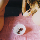
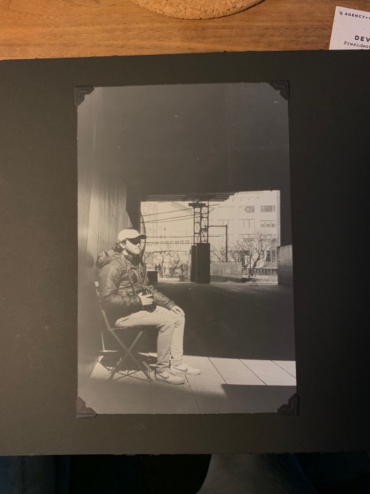
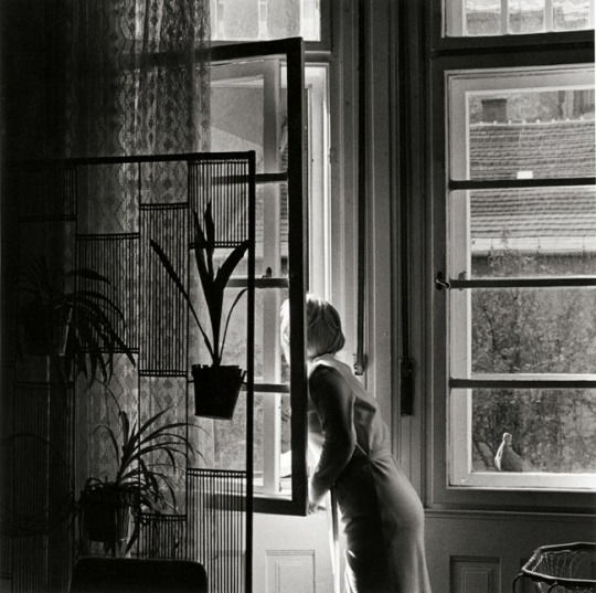
Photo
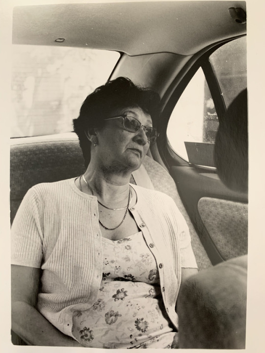
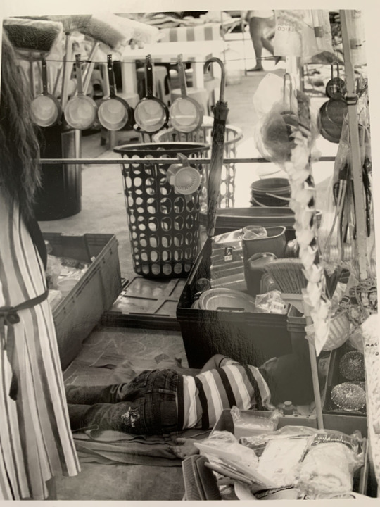
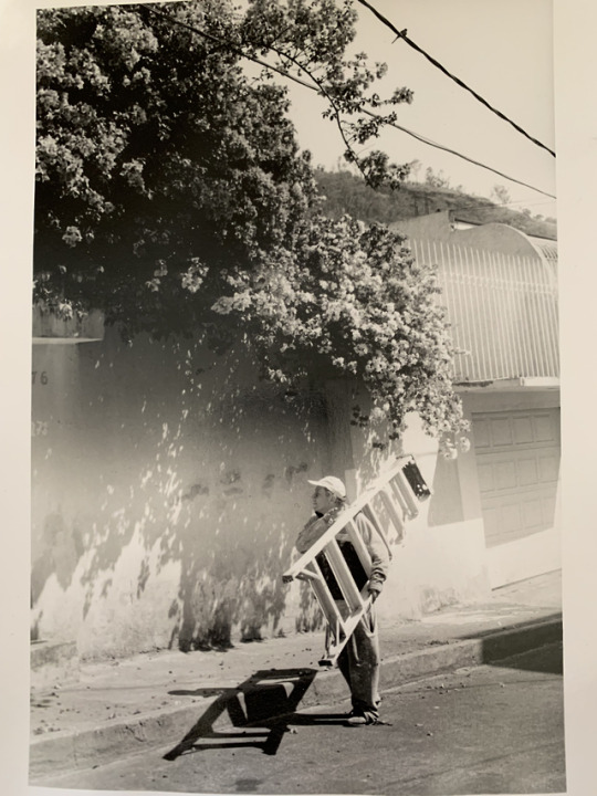
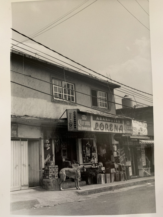
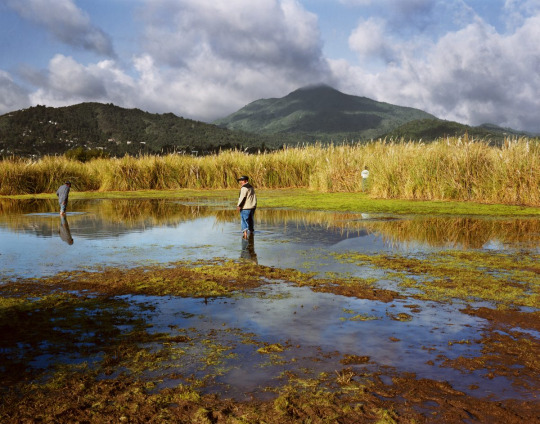
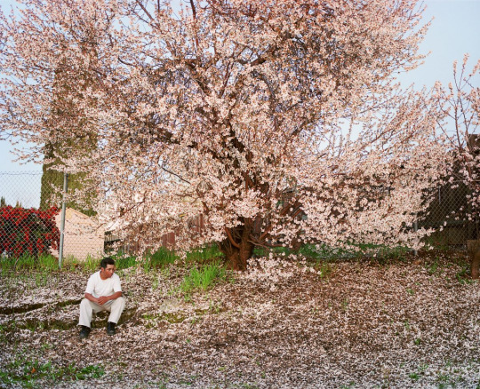
HOME ACROSS THE BORDER
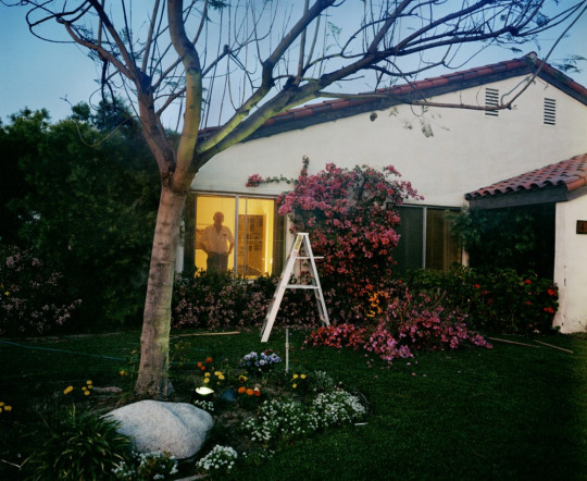
“Home Across the Border” tells two stories: the first of my own sense of home in my mother’s native place of Mexico City, and the second of Mexican and other immigrants making a new home in Spanish Harlem. These two understandings of home contain many similarities, the most prevalent being the subconscious knowledge that this land is not native, not your homeland, yet is a place that you have come to call home anyways.
There was an irony in shooting these pictures for me when I felt more comfortable and familiar in the country I was not born in than in the country I was. But perhaps part of this was being surrounded by family members and seeing places I have seen every summer since I could remember, while I had never traveled to Spanish Harlem previously.
At times the similarities between these two places were striking. Moments walking down the streets of Spanish Harlem I would feel as though I was back in Mexico and a sea of familiarity and love would wash over me. Everything from the stands selling mango with tajin, the little shops containing conchas and tapatio, to the Spanish constantly heard on the street. The only giveaways that it was still New York were the occasional English street and store signs. But even then, English was the language that felt foreign in these few blocks.
I had never taken a film camera to Mexico prior to this project and found that it was a new lens - for some reason the things I had seen a thousand times in my grandparents’ house became framed in a different way. This framing was simultaneously new yet old, beautiful yet incomplete, fleeting yet frozen in time forever.
Humans have the amazing capability to adapt, to nest, to make any place into a home. The home that I have in my mother's land and the home that immigrants have found and made here are homes in the fullest sense of the word. Homes are places of community, love, familiarity, safety. Homes transgress borders. - Liz Pipes
0 notes
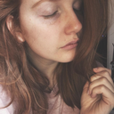
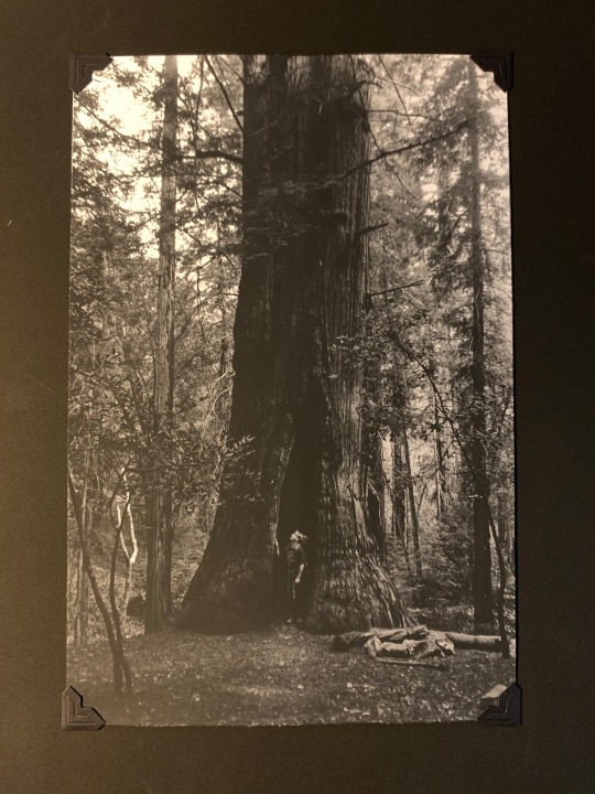
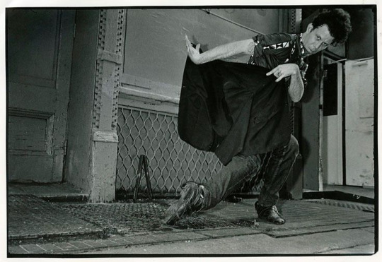
Photo
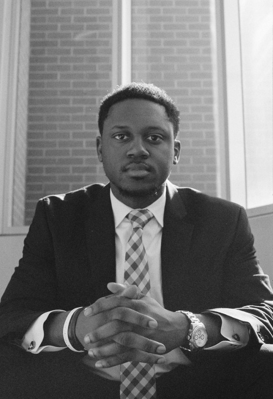
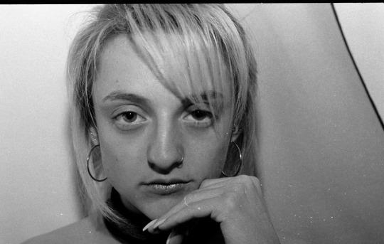
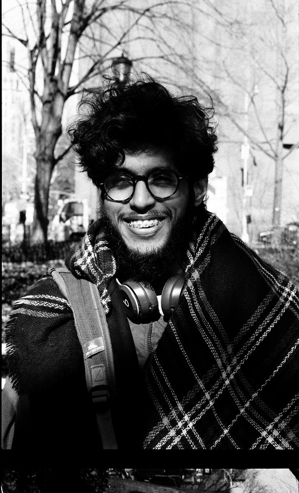
I like photographing people. It helps me understand the deeply multifaceted aspects of ourselves. That we are not stagnant beings. That we have so many layers and ones that have yet to be discovered.
When I look back at these images, I am able to reconcile how I see the person in the photograph now in one image with what I felt as I was taking picture in that exact moment. If I felt a certain wistfulness beaming off a person while I was photographing them, I can still feel it while I look at the image much later. And if I know the person well, I can understand some of the circumstances that contributed to this feeling they gave and continue to give off. I am also able to see different emotions that people reflect. This gives me clarity of the strength of our emotions in different moments and their dependency on circumstances.
As I take these photos of others, I am able to better grasp the idea of impermanence in our emotions and that they change. It’s often easy to attribute a feeling to how I feel about myself globally, that a feeling I felt in a moment can become how I feel and perceive myself as a whole. Taking these images helps me see myself more empathically. That I too am evolving and am deeply human. That contrast is a part of our evolution.
-Tiffany Lee
0 notes
Text
Exhibition Review on Gail Albert Halaban - DQ Kim
DQ Kim
Photography 1
Exhibition Review
Gail Albert Halaban - Italian Views
Currently showcasing at Aperture Foundation in Chelsea, Italian Views by Gail Albert Halaban tells a visual story through the windows. Shot mostly on October 2017 and April 2018 all throughout Italy, the historical architecture and the life of the city-dwellers are engraved in the single frame. What is most fascinating about his photos is that you can imagine yourself being in the scene and experience the culture. Because he used mostly wide-angle lens, the broad view pulls the audience inside. His images are all evenly lit, creating a surreal type of vibe and almost an illusion of the monumental buildings. He mostly uses tungsten light to create warm and homey atmosphere indoor, in contrast to the empty and motionless scene outdoor. Even though his photographs are wide and have a lot of information in a frame, there is always a point of interest that brings our attention. Inside the window, we see daily lives of people like mother and daughter chatting, a baby sitting alone in the kitchen table, and old husband and wife starring outside. It feels like the viewers are sneaking on the window and seeing everything from another perspective. Although his photos were not so appealing to me compared to the other projects at first sight, the unique yet intimate stories of people in each window and the surreal tone of the architecture buildings created an interactive experience for me to learn more about what is happening in the scene. I wish there were more images in the gallery but I look forward to see his future projects.
(The class tumblr was not working when I tried to upload when it was due. Here is the essay. Thank you.)
0 notes
Text
Cracks in the Dark - DQ Kim Final Project
DQ Kim
Project: Cracks in the Dark
Print: Matte Fiber
Dimension: 5 inches x 7 inches
People call New York as “the city that never sleeps.” While they work hard in the morning, they also play hard at night. As a videographer deeply interested in manipulating shadows and lights, I wanted to portray New York as I see from my eyes. Unlike many others, the city was lonely and sometimes discriminating to me. After I came back to school from the military service, my friends and people I loved were gone. Staying awake late at night and observing the empty streets became my daily routine and I wanted to capture those moments. Cracks in the Dark displays a dynamic space with the use of flashlight and lets the audience to interact with the dark environment. By experiencing limited vision and following wherever the light goes, I hope the viewers can also be in my shoes: feeling lost and empty.
(I’m currently away and my photos are not with me. Sorry)
0 notes
Text
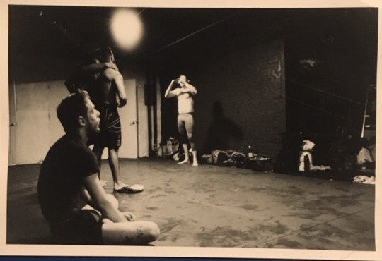
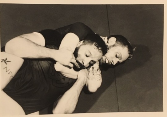
The Basement - 36 Waverly Ave. - Jason Hoon Lee
The Basement – 36 Waverly Ave.
A small place we go to clear our heads. Every night at 36 Waverly Avenue. In the basement of a run-down building in Clinton Hill, you’ll find a small gym. A diverse group of 13 or so ordinary people just trying to cope with living in the big city. Open the door and enter the building. Follow the signs down to the basement. You’ll see a gray door. Walk through that door, depending on the day, you might meet a doctor, a real estate agent, a comedian, a music teacher, a pastry chef, a writer, a banker, a fitness trainer, a construction worker a college student or more. It’s a weird mix of people you won’t find anywhere else. From ages 19 to 36. From Professional fighters to blue collar workers. We have one thing in common that brings us together in a place like this. We like to train. Muay Thai, Submission Grappling to Mixed Martial Arts. We’re fight enthusiasts.
Door opens at 6:00pm. I get there around 6:45. The guys are sitting around the mat and talking before the session starts. I go around and greet everyone in the room. I find a spot and sit down. My mind is still clouded with all the unnecessary stresses from the day. I’m still beating myself up over that small thing that happened at work today. I’m reliving that moment over and over again. I don’t know why I do it, but I do. It’s a problem. After some time of spacing out, it’s 7:00. Everyone gathers around. Matt starts the session.
Ten hard six-minute rounds tonight. My whole body is pulsating. My chest is pounding. I feel so alive. An hour of pure survival. I lay on the mat trying to catch my breath. My back is aching, my lungs are burning. My legs feel like rubber. I’m completely drained, but in a weird way, I feel reenergized. I feel clear. It’s like therapy. It gives me the confidence to face the world. If I can get through this, just a couple times a week. I’ll be okay. This place is my escape. Bancho MMA. The basement of 36 Waverly Ave.
-Jason Hoon Lee
(Most of the photos were given away to the members in the group)
0 notes
Video
Selective Serotonin Reuptake Inhibitors (SSRI’s) increase the brain’s ability to restructure itself, allowing for change. The project Serotonin visually represents my process of reconstruction and change by narrating my recovery from anxiety. The images feature different moments from the past months. They begin distorted and out of focus, representing the way I see the world under the cloud of anxiety. As the images progress, they become sharper and more clear. This progression represents the way SSRI’s have allowed me to interact in the world without the distortions of severe anxiety. In this respect, Serotonin is a visual experiment in the reconstruction of myself.
Marisa Bianco
0 notes
Text
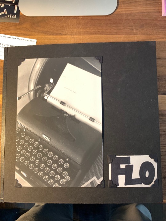
Find Your Flow
“We do not want merely to see beauty, though, God knows, even that is bounty enough. We want something else which can hardly be put into words--to be united with the beauty we see, to pass into it, to receive it into ourselves, to bathe in it, to become part of it.”
– C.S. Lewis.
I am writing my thesis and building a business at the same time. Both are all-consuming and life?-defining. They both have me asking a lot of questions about myself and my place here. Not just in New York, but I mean in the world. One of my biggest questions – Can we evolve away from our anthropocentric systems of economy, society, and spirituality and restore an ecological community of interwoven life? – holds a particular gravity and seems to guide me forward.
But I wonder... Why are we always asking ourselves why? Why this? Why that? Why are we here? Do we need to know? Can’t we enjoy the ride?
Flo is a look into the last few months of my life and is dedicated to a physiological “flow state” – a state of uninterrupted attention, usually defined as the mental state of operation in which a person performing an activity is fully immersed in a feeling of energized focus, full involvement, and enjoyment in the process of the activity. I am trying to find meaning in the chaos of the city, but also as a developing adult, going deeply into life in a distracted world. As I painstakingly search for my “why,” I am struggling to take the time I need without “falling behind.” What does it mean to make progress? Does it just mean productivity or output? Or is there a more intrinsic value to how we spend our time? I am meeting the universe halfway; coming to terms with reality in due time? Sometimes that looks less “productive.” Sometimes that means doing nothing at all. Sometimes that looks like resistance and objection.
Flow usually is an independent, somewhat isolating activity. How do we use our lives and the work we gravitate towards to achieve flow, purpose, and empathy with the whole? I invite you to gaze and ponder here and beyond.
Make your mark. Find your flow.
-Parker Reposa
0 notes
Text
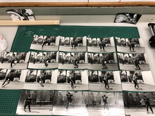
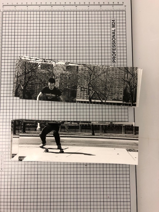
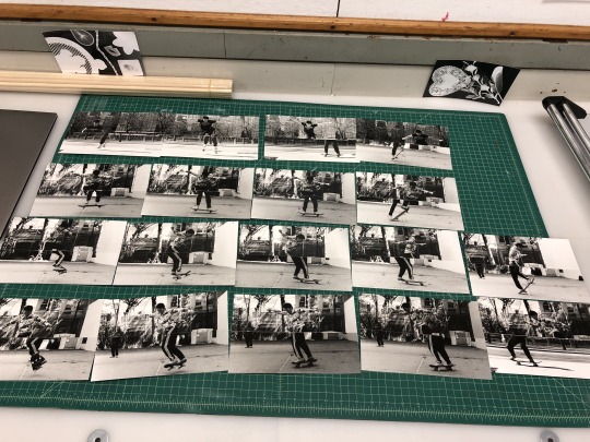
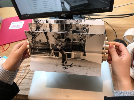
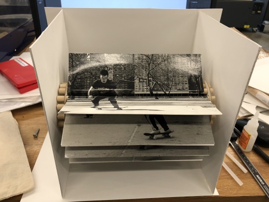
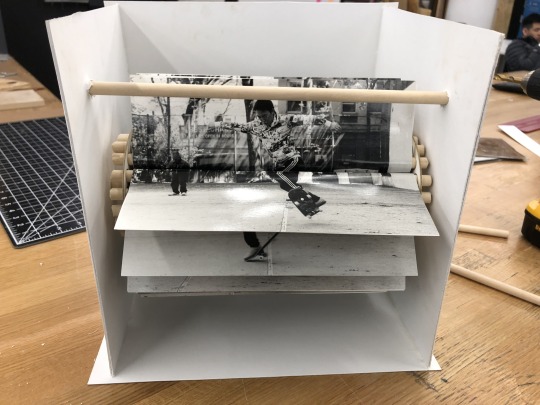
Photography Final Project - Skateboarding
By Jiuxin Zhu
vimeo
Artist Statement:
There are many similarities between skateboarding and analog photography. They are both time-consuming and technically difficult. As a skateboarder for few years, the only trick I could do was Ollie. So, I wanted to challenge myself both physically and technically by training myself to do skateboards tricks and shooting photos of me achieving those tricks.
I went to practice skateboarding at least once a week. After landing a trick for a few times, I started to shoot with camera. The first approach I used to capture the trick was by using the timer on the camera and the timer on the phone. First, I checked the length of the timer on the camera and the length of me skating from a start point to the point to do the trick. Next, I started the timer on the camera and the timer on the phone at the same time. Then, I ran to the start point and waited for the moment to start skating. I would adjust the moment of starting during the shooting process.
After shooting seven rolls of film of three tricks with the first approach, I was dissatisfied with my photos. First, the composition of photos looked similar, which might not interest viewers. Second, the stopped action in photos could not well-demonstrate the trick I was doing and whether I achieved the trick or not. Third, I did not think I could achieve enough tricks to create a decent amount of photos in the remaining time. So, instead of creating one photo per trick, I decided to use a series of photos to animate each trick.
Inspired by The Horse in Motion by Eadweard Muybridge, who used twenty-four cameras triggered by tripwires to capture the motion of a racing horse, I came up with the second approach by using five cameras with shutter release cables triggered by an assistant to capture skateboard tricks. The five cameras were arranged in a row with the same aperture and shutter speed setting. Each camera was connected by a shutter release cable. The assistant held all shutter release cables in one hand and pressed them down in order in a short period of time after the nose of my skateboard reach the point to do the trick.
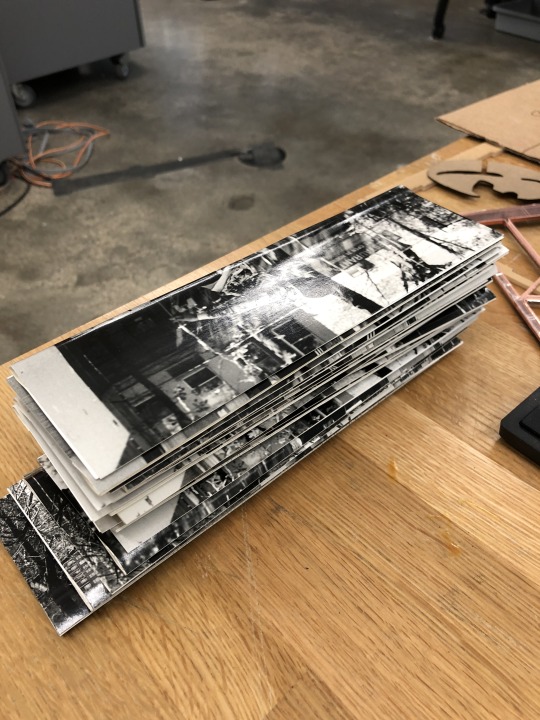
Finally, there are eighteen photos in the final presentation. They can be divided into four groups. Three groups of photos are used to demonstrate three skateboard tricks I achieved - Ollie, Frontside 180 and Backside 180 - shooting with the second approach. The other group is used to demonstrate the result of the first approach, in which each photo is a different practice of the same trick and the continuity is a result of careful selection.
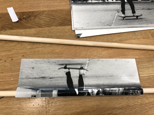
The photos were cut in half, reorganized and installed in a flipbook machine made by mat boards and dowels. The accompanied video demonstrates the process of two shooting approaches.
The First Approach:
vimeo
The Second Approach:
vimeo
The Making Process of Flipbook Machine:
1 note
·
View note
Text
Lily Grigsby-Brown’s Artist Statement
Over the course of this semester, I have built a new relationship with photography. Photography has become my way of self-expression and a way to document important places, things and people in the world. I realized a topic that I have struggled with since moving to NYC almost two years ago is, “where is my home?” Although I grew up in Los Angeles, California, I now live in New York, New York. So which one is really my home? Los Angeles witnessed my childhood and helped me discover my passions, while New York has helped me figure out who I am and the type of person I want to be. Both places are vastly different, and I don’t know if I consider either of them to be my true home.
Throughout the course of completing my project and taking pictures, I realized that the word “home” is not what matters… The word “love” is what does. When taking pictures in New York, Los Angeles, and Washington D.C. I found myself discovering that I feel truly loved in each of these places. My project is definitely a narrative and follows my process of figuring out where my real home is. By the end, I discovered that love is the answer and the word “home” does not actually matter because your home can be wherever you are as long as you have love. I arranged the photos in a specific way and wanted to start with Los Angeles because it is where everything started for me. I ended up adding in other photos from each of the places to emphasize my connection and love to these places.
Sally Mann was my biggest inspiration for this project. Although we have looked at many photographers over the semester I really found myself in love with Mann’s work. I loved the intimacy of her Family Pictures and tried to recreate that within my own project. I also love her Southern Landscapes project and I tried to use her exhibition as a model when taking pictures of the landscapes of California. Her landscapes have a darkness and nostalgic vibe that I really wanted to recreate in my own work. The biggest difference between me and Mann was that in my work, I tried my best to not pose or position anything in a forced manner. When taking pictures of my loved ones, I took the pictures as a spectator, or I told them to pretend as if I was not there. While some of the pictures seem posed, I can say they are really not; the models are instead putting on a show for the camera. While my project is not documentary style because I am not getting every side of the story, it does have some elements of the documentary genre because I tried to be a spectator and let the pictures speak for themselves.
Chris Verene was another photographer that inspired me for this project. His Family pictures on his website made me feel that I wanted to create a documentary style project of my own family, but it proved harder than I could have imagined. I told my family and friends about the project and they all were super eager to help in any way they could. This being said, that made it hard to simply be a spectator and try to tell the stories from each perspective. Most of Verne’s work is unstaged and I tried to implement that into my project the best I could, even if my family/friends really wanted to help and were willing to do whatever I told them to.
Therefore, I decided to make the project more about me and my connection to these places when trying to find where my real home is.
0 notes
Text
Philipp Keel Report by Parker Reposa
About the artist: Philipp Keel is an artist and author as well as the publisher of Diogenes. He studied at Berklee College of Music in Boston and at Hochschule für Film und Fernsehen in Munich, before moving to California and working in various artistic disciplines. His photographs, paintings, drawings, and prints have since been shown in numerous international exhibitions, most recently at Bildhalle Zurich, and are present in leading collections.
Look at me - 1999 (https://www.philippkeel.com/7742464/look-at-me)
Work statement: This wild compilation of images emerges from Keel’s ceaseless curiosity for people and their environment. He is fascinated by the absurdity of life and captures it. The strong and expressive portraits in Look At Me present a clear and highly personal view in an utterly refreshing manner.
"Everybody takes pictures in the belief it is necessary to communicate a message. We look at all of these pictures and often see nothing. Our glance bounces off their surface, and we remain alone. Yet something quite different happens in Philipp Keel’s photographs. His choice of unique moments makes us recognize the miracle of being alive.“ – Doris Dörrie
Look At Me is equal parts mundane and exquisite. There is a normalcy and approachability to these images, but also a sense of perfection as well. The relatability and palpability in this body of work continues to strike me. All black and white and mostly portraits, I am left wondering why Keel selected this multitudinous and diverse grouping of images. Upon my first look through the images in this collection, the photos seem to relate very little to one another. A deep stare into a model’s eyes here, a stack of doughnuts there, the blow up dinosaur, and bull testicles. The photos seem random and scattered. What is he trying to show us? However, the more you look at the body as a whole, there seems to be a provocative quality to all of them together. They somehow fit and work together. Maybe it is the authenticity in each photograph. There is a deep truth in this body of work. An honesty and lack of staging that almost brings your right back to that moment. The guardless expressions and arresting eyes captivate and bring the viewer in so simply. There exists this really intimate connection between Keel and his subjects; something that makes the artist alluring and mysterious. What does this man do? How does he get into so many different people’s lives? Many of the photographs are names after the people in them, which means keel either knows them personally or had to at least get to know them for the purposes of this work. In this compilation of portraits, Keel is exploring “people and their environment” and I think he really does achieve this. He is fascinated by the absurdity of life and captures it with such deep truth here. I really enjoyed this selection of photographs.
COLOR- 2003 (https://www.philippkeel.com/7742457/color)
Work statement: All too often we overlook the absurdity of the ordinary. In Philipp Keel’s Color the beauty of the mundane is made visible. His work invites the viewer to take a fresh look and to be curious. Through the lens of Keel’s camera, the usual becomes unusual, and the familiar appears in an unfamiliar way. His pictures are lively, spontaneous and ironic. The perspectives surprise and the reflections hint at a world in front of and behind what we see, suggesting something more – a story, a secret, a puzzle.
Contrasting harshly from Look at me, Color could not be more different of a project. This body of work pops with vibrant saturation and floods the senses with neon glimpses of the mundane. This body of work compared to Look at me really shows Keel’s diverse artistic gears and displays how much his work changed just in a few years. He photos seem less real, more doctored and wrapped in plastic. Less honest, maybe. They seem to rely so much more on color and less on framing and composition, which personally I like less. While visually sexy and stimulating, I am drawn to these less. They seem like good photos for a refurbished mid century modern hotel holding onto something not yet here. The work is less personal, less intriguing, less about people. I don’t want to spend a lot of time trying to string together the story or the selection of the whole like I do in Look at Me. I miss the eyes and smiles that bring me in. I will admit that the work as a whole makes for a good book that I would certainly put on my coffee table, but the artistic work and expression hidden within is lacking for me. I wish there was a deeper level I could go here. While I do agree with the work statement and see value in looking at our daily lives with more scrutiny and focus, I find this work a bit basic and disinteresting. The work it takes to get into people’s lives, create portraits, and express them accurately attributes a certain level of responsibility in the photographer. In this work, I did not sense that responsibility and felt that really anyone could have made these images.
Overall, I really find Keel’s work fascinating and have followed his career for some time now. His questioning of the world is refreshing and important to me. I find his work generally alluring and beautiful. I like that he has many modes and artistic mediums outside of photography, also being a painter and a writer and publisher. I strive to be able to photograph people, especially women, the way he is able to. He is able to show a beauty and closeness in his images that I cannot stop looking at.
0 notes
Text
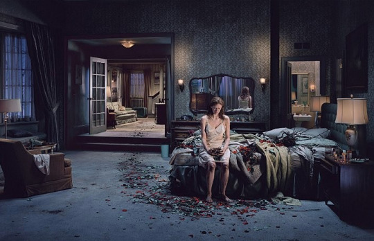
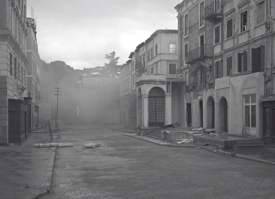
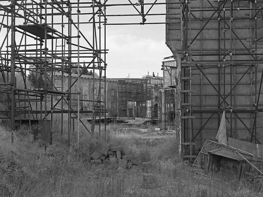
Gregory Crewdson: ‘Beneath the Roses’ and ‘Sanctuary’
Gregory Crewdson's work can be found on his website here
In this paper I will be exploring two bodies work by of Gregory Crewdson, Beneath the Roses and Sanctuary. His project Beneath the Roses was contains 49 color images shot between 2003 and 2007. The photographs were shot on location in various towns in Massachusetts and Vermont, as well as on specially built soundstages. Sanctuary contains 41 black and white images, shot over one month in Rome, in 2009. The two projects share various underlying similarities and yet feature striking differences, all of which will be explored throughout this paper.
Beneath the Roses was shot on a large format camera using color film. The prints are also large scale- 30 inches by 60 inches. They were shot on location throughout Massachusetts and Vermont, as well as on special built soundstages. Hallmarks of these images are Hollywood-style lighting, utilization of a large stage crew, detailed sets, models/actors as subjects, etc. The dramatic, near perfect sets remain the main focus of the images, despite stark, sometimes nude figures that are placed in them, as if they are simply props. Crewdson utilizes many film techniques including lights rigged on cranes, fog machines, rainmaking machines, etc. The scenes prominently feature anonymous townscapes, broad desolate streets, forest clearings, and highly detailed interiors. The tension is created by the dramatization of everyday environments via cinematic lighting, theatrical staging, detailed prop placement, special effects, and heavy digital retouching. All of these choices serve to convey an elaborately staged, yet intensely real experience which maintain undertones of sadness, isolation, fear, anxiety, alienation, beauty, repression, angst, longing, and desire. Underlying themes include the recesses of the American psyche, the secrets lying beneath the surface, which stems from his habit of eavesdropping on his father’s psychology sessions, which took place in the house basement, with clients in which he utilized freudian analysis.
In Beneath the Roses Crewdson creates a genre that is a blend of documentary and fiction, which moves the viewer to ponder the lines between dreams and reality, past and present, perfection and reality, creation and fabrication, nature and artifice, etc. The sense of mystery and wonder is created by utilizing the iconography of the American landscape in a style that is both unique and familiar- we are not used to seeing such common settings lit and staged in such a theatrical, cinematic tone. The atmosphere becomes tangible, and deeply disquieting. It instills in the viewer with a sense of haunted urgency emerging from a sense of isolation, fear, and/or anxiety created. There is a strong sense of dislocation- stemming from the lack of identifying details of time and location. These images could have been taken anywhere in America, at any point in modern time. The landscapes balance a fine line between every day American scenery and the dystopia of “anxious American imagination.”
The landscapes and interiors become staging grounds for bizarre human scenarios and interactions, it is stripped of any sentimentality we so frequently find in American landscapes, leaving behind stark locations devoid of human emotion, even highlighting cold physical intimacy between individuals, which serves to create an image that is both bleak and darkly comical. The image creates a larger narrative, which is limited by a single moment framed within the image, leaving the viewer with far more questions than answers.
Some people interpret this series as an artistic representation on the working poor or middle class in American, who are surrounded by lost hopes and failures; robbed of the American dream and the life that they were promised. Personally, I found myself leaning towards a mixture of interpretations- I do believe one layer of these images is the socio-economic struggle of America’s working class and the disconnect of the American dream and people’s reality. After all, one of Crewdson’s major topics in his images is the lines between reality and dreams, and the blurring of those lines. I believe another interpretation is the interpersonal struggle that families and communities face, each unique in their roots, yet unifying in their tension.
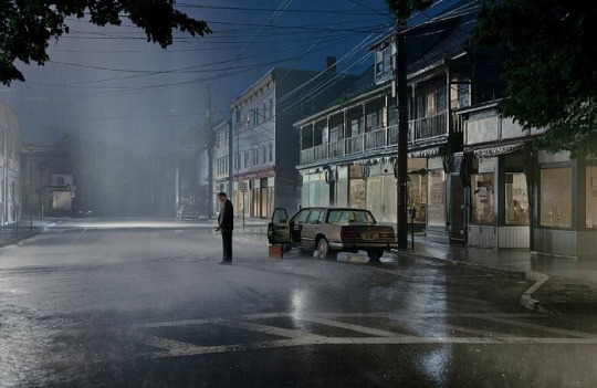
Untitled, Beneath the Roses, 2004 (Mass or Vt.)
Untitled, Beneath the Roses, 2004 (Soundstage)
Sanctuary was shot on a digital camera in black and white, with minimal reworking and exclusively shot on-location with a skeleton crew. The prints were relatively small in scale at 24 inches by 30 inches. This project was shot at Cinecitta Studios in Rome on an abandoned outdoor set, which serves as the subject and setting. In fact, in contrast to much of his other work, only one image contains people, creating a location seemingly devoid of human presence. The intimate scale of the photos brings a palpable melancholy into focus- utilizing distinct shafts of sunlight, and natural cloaks of shadows to draw attention to the scenographic architecture and near documentary characterics of the images. Crewdson seems to be showing us the hidden life of the artifacts and spaces remaining after productions cease.
The decaying sets, ruined statues, exposed scaffolding, underlying structures, plant overgrowth, and presence of puddles and debris emphasize the lack of human life and effects of time on former grandeur. The mid-grey tones achieved via ambient light from shooting at dawn and dusk seem to suspend time, and this technique creates an illusion in which the past seems to be fitting itself into the present, slowly turning what was once a concrete idea of past into a present illusion. This illusion extends into the blurred lines between cinematic fantasy and real life, life and death, desolation and energy, and the planes of awake and dreaming. The skyline is zigzagged and inconsistent, keeping the focus on the buildings themselves, the buildings in the distant background lead the viewer to question their reality- are they real buildings from the Eternal City or are they part of the sprawling set?
The tension in Sanctuary exists in the decay of the set and the dream-like tones, the presence of the camera (and the feeling of being drawn into the image) and the lack of human life, the material presence and clear fabrication of the buildings, the death of artifice and the flourishing life of the natural. The interpretation of these works is the exploration of realism and naturalism within the artificial leftovers of a cinematic reality.
Untitled, Sanctuary, 2009 (Rome)
Untitled, Sanctuary, 2009 (Rome)
Throughout all of Crewdson’s work we can see various themes- the tension of opposing forces, the exploration of artifice and reality, blurring the lines between photo and film, and the balance between beauty and sadness. He tends to contrast between man (or man-made) and nature. One technique he uses in many images is frame-in-frame, in which he utilizes a doorway or foreground object to frame a distant, background scene.
Bibliography
Bitici, Valerie, et al. “The Eternal Stage Set.” Vanity Fair, Vanity Fair, 12 May 2015, www.vanityfair.com/culture/2010/09/gregory-crewsdon-slide-show-201009.
Crewdson, Gregory, and Russell Banks. Beneath the Roses. Harry N. Abrams, Inc., a Subsidiary of La Martinière Groupe, 2008.
Crewdson, Gregory, and A.O. Scott. Sanctuary. Harry N. Abrams, Inc., a Subsidiary of La Martinière Groupe, 2010.
“Free Talks: Gregory Crewdson.” Film Society of Lincoln Center, HBO, www.filmlinc.org/events/free-talks-gregory-crewdson/.
“Gregory Crewdson.” Guggenheim, www.guggenheim.org/artwork/artist/gregory-crewdson.
“Gregory Crewdson.” Scripps College, Claremont, California, rcwg.scrippscollege.edu/blog/2009/04/30/gregory-crewdson/.
“Gregory Crewdson.” R . E . W . I . R . E . D, 10 Dec. 2015, rewired.edublogs.org/art/preliminary-hsc-art/case-studies/gregory-crewdson/.
“Gregory Crewdson: Beneath the Roses, Beverly Hills, May 21–July 16, 2005.” Gagosian, 12 Apr. 2018, gagosian.com/exhibitions/2005/gregory-crewdson-beneath-the-roses/.
“Gregory Crewdson: Sanctuary, 980 Madison Avenue, New York, September 23–October 30, 2010.” Gagosian, 12 Apr. 2018, gagosian.com/exhibitions/2010/gregory-crewdson-sanctuary/.
“Gregory Crewdson: Sanctuary, The Epic Photographer Shoots Rome’s Fabled Film Studio Cinecittà.” NOWNESS, www.nowness.com/story/gregory-crewdson-sanctuary.
Hodgson, Francis. “Sanctuary – Gregory Crewdson.” Francis Hodgson: Writing About Photographs, 25 Mar. 2012, francishodgson.com/2011/06/27/sanctuary-gregory-crewdson/.
Lim, Mike. “Book Review: 'Sanctuary', Gregory Crewdson.” Light Documents: On Photography, Documentary, Cinema, 20 May 2014, lightdocuments.wordpress.com/2014/05/20/crewdson-sanctuary/.
Reaves, Jessica. “Beneath the Roses by Gregory Crewdson.” PopMatters, Chicago Tribune, 25 Feb. 2018, www.popmatters.com/beneath-the-roses-by-gregory-crewdson-2496166147.html.
Sorace, Domnick. “Gregory Crewdson, beneath the Roses and Ambiguity.” DOMNICK SORACE, 27 Apr. 2017, domnicksorace.wordpress.com/2017/05/06/gregory-crewdson-beneath-the-roses-and-ambiguity/.
-Lauren F
0 notes
Text
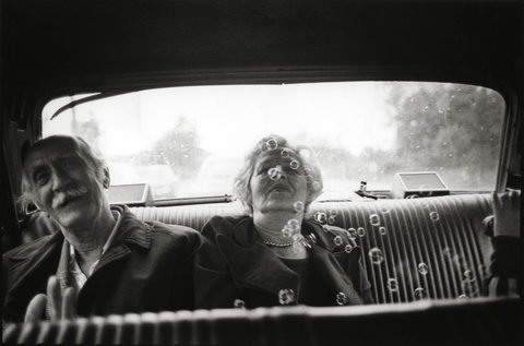
Comparing Sylvia Plachy’s ‘Self Portrait with Cows Going Home’ and ‘Unguided Tour’
View photos on her website here
In both collections, Plachy selects images from across her career (beginning in 1987) to match the narrative she is communicating. Though distinct bodies of work, they still feel like a continuous whole, and share the same feeling of being “bits of everything and everyone,” as she described in her introduction to Unguided Tour. Plachy admits to “[feathering her] nest with relics and bones of [her] ancestors” at the end of Self Portrait with Cows Going Home (SPWCGH), revealing her deeply sentimental nature that is similarly revealed through her images. This makes it especially appropriate that her work is primarily in black and white, with a handful of colour images snuck into SPWCGH.
Some photographs are even included in both collections, and others are different sides of the same moment (SPWCGH features a photograph of the backs of a couple of soldiers, whilst Unguided Tour features their fronts). This makes it evident that she’s very attached to particular instances/people/events, perhaps because they so specially embody how she experiences life. Thus, to speak of differences between the bodies of work is to speak primarily of the differences in the story she’s focused on, rather than of the images themselves, and how her writing colours the way audiences perceive the body of images.
In both cases, I read her books from cover to cover in one sitting. Published in 2004, 14 years after Unguided Tour, SPWCGH follows the relatively more explicit narrative arch of Plachy’s life, leaving a much heftier impression on me when consumed in this format.
In Self Portrait with Cows Going Home, she tells her and her families life stories, somewhat chronologically, from her family fleeing her beloved hometown of Budapest to her transition to living in Queens, New York. Plachy couples the anecdotes of her life with images that may be contextually irrelevant, but still capture the essence of the particular memory (e.g. “Trench Coat” [which I sadly could not find online], totally irrelevant, but the coat looks very much like a monk of sorts. An imposter. Coupled with the story of her grade school rebelliousness, a secret catholic who pieces holy photographs back together in the midst of Hungarian socialists).
Her narrative writing is beautiful and concise, and the spirit behind her works shone through in the anecdote she told of how her father taught her how to recite the ballads of Hungarian epic poet Arany János, a coping mechanism to survive the oppressive years in Budapest after WWII. They were brutal tales of suffering, and when performed by a child reminded “everyone present that life was tragic and always will be, but art could and had to sustain you,” (30).
Another anecdote from her youth included in SPWCGH accompanies a postcard sized image etched by her father for the announcement of her birth. A gold and beige sketch with a chunky, ornate border, and green handwritten script at the bottom that reads “The earth is on fire. A little baby is gliding down toward the flames by parachute. It is Budapest, May 1943,” (stylistically, it reminds me very much of the Little Prince). Even from her birth, Plachy was thrown into a world aflame, and I felt this puts our understanding of her and her work into perspective (especially the lens through which Plachy herself sees her own life).
The images in SPWCGH carry in equal parts a tranquil stillness and a heavy, burdensome sorrow, as though they were collected to reconcile with her own as well as her family’s history, and the absurd horrors they had to endure. Real life is stranger than fiction, in its horrors but also in it’s delights, and Plachy curates the anecdotes from her life and those around her to demonstrate that.
Finally, turning to Unguided Tour, Plachy selects images from across her then 25 year-long career. She mentions in her introduction how “life and art used to tug at [her] from opposite directions”, but at this moment in her works, her “body” is finally beginning to “warp to its [her art] demands”. By “body”, I can’t know for certain what she meant, but I’m guessing she refers to her body of work, which now that she has finally collected enough images can more closely resemble the art she aspires to create.
Unguided Tour features friends, strangers, families, celebrities, and all other manner of people. She pairs certain images with quotes about dreams by her toddler daughter, and others with quotes by famous writers. Some images are of rather extraordinary occurrences (a bullfight in Nicaragua, someone getting arrested, several celebrities), whilst others are of the quotidian. But what holds them together, is the way Plachy photographs everything as though they are all equally of the utmost importance.
She uses dramatic lighting and contrast, as well as formal looking composition, to heighten instances we know were just taken on the street, making the ordinary feel extra-ordinary. 2 images I especially loved were ‘Rhino Video, 1981’, and ‘Biker Girl, Daytona Beach, Florida, 1987’, which I unfortunately could not find online. Both of the images demonstrate Plachy’s uncanny ability to be in the right place at the right moment. Or rather, her incredible ability to really see what’s happening around her.
>> Xin-rui Lee
Bibliography
Plachy, Sylvia. Self portrait with cows going home. New York: Aperture, 2004. Print.
Plachy, Sylvia. Unguided Tour. New York: Aperture, 1990. Print.
Images from Unguided Tour that stood out to me:
Rhino Video, 1981
Biker Girl, Daytona Beach, Florida, 1987
Images from SPWCH that stood out to me:
Széchényi Pool, Budapest, 1988
Open Gate, Budapest, 1988
Trench Coat, East Berlin, 1998
Soldiers on Leave, Szentendre, Hungary, 1984
The Hermit’s dog, Csikszereda (Miercurea Ciuk), Romania, 1993
0 notes
Text
Larry Sultan


Link: https://docs.google.com/document/d/1Sf430R8gbKpWy8fPlhxbxVNCnVnqwfSq1z224DCfnNE/edit?usp=sharing
0 notes
Text
Paolo Raeli Mini Research Paper
DQ Kim
Mini-Research Paper with Professor Nichole Frocheur
Google Doc Link: https://docs.google.com/document/d/1568e1VEiJZ_93vTqN93uNMYu8UXivGlK6CYfXSRUBG8/edit?usp=sharing
Name: Paolo Raeli
Website: https://www.paoloraeli.com/
Instagram: @paoloraeli
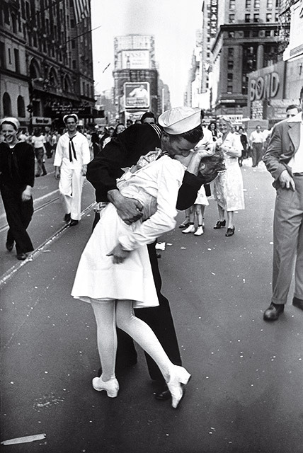
I accidentally came across his body of work while looking at my Instagram feed 2 years ago. At an instant sight, I was mesmerized by the color tone and the texture of the images on the screen. What makes his work so distinct are the two key elements; 1) the use of the soft highlights and blacks with vintage grading and 2) a lovely couple enjoying their beautiful moment in their lives. As a photographer born and raised in an island near by Palermo South Italy, the blend between the human love and the nature has always impacted his art. Capturing the most intimate moments is well portrayed in his projects, like Alfred Eisenstaedt’s V-J Day in Times Square.
When I was little, I thought love was about red roses and expensive dinners.. Truth is, love is giving her half your fries when she said she wasn’t hungry. It’s waking up at 4am to her snoring and refraining from shoving her off the bed. It’s talking in accents just for shits, and trying to embarrass one another in public. It’s going on adventures, and making fun of each other. It’s stupid fights and memorable make ups. Love isn’t pretty and romantic. Love is just stumbling through life with your best friend.
Unlike many other photographers who focus on the human subject, Paolo really loves the vivid facial expressions and colorful body movements. Their smiles and eyes are so genuine, as if Paolo is their friend taking a picture without ever noticing. The happiness they feel is transferred to the viewers directly and the subtle nature of the atmosphere balances the euphoric experience in the visual. Although love is not always the most artistic or fresh concept people utilize to express their creativity, Paolo successfully drags the viewers into his frame, as if we are part of the scene witnessing the beauty with them.
The use of the dominant mid-tone with magenta colors evoke surreal yet intimacy to the subject. It feels like the photo has been taken during the sunset or at a dusk. The sunlight in the sky and the the purple are blended well to produce a romantic vibe. If the photos were taken without any subjects, then it would have been just an abstract-looking images of the nature. However, because lovely couples bring up the tension by hugging and having fun together, the final photograph is so much more than just an adorable content.


Compare to his other projects, the photos underneath have a progression in the two scene sequence. While the single images had more emphasis on the atmosphere and the happy vibe, these photographs share a story. For example, the first bottom image illustrates how much the girl wanted to get on the ride and she successfully drags her boyfriend with her. The second bottom image portrays the van and how the friends traveled together in front of the bonfire. Although there is not much difference in terms of the colors or subjects, the way of presenting the content has changed. The diversity lets the audience to experience the new medium to explore the artist’s intention and focus.
Many people discard daily-style photos or love theme photographs because they are too mundane to be considered an art form. They argue that the creativity is not present. However, art doesn’t always have to be fresh and original. Instead, a photograph that evokes an intimacy and admiration is more powerful and genuine piece of art that fully absorbs in our mind. Paolo Raeli successfully demonstrated his vision and I look forward to see more of his work in the future.
Bibliography
1) Raeli, Paolo. “Paolo Raeli on Instagram.” Instagram, www.instagram.com/p/BZ8_F77AbfD/.
2) “Paoloraeli.” Paoloraeli, www.paoloraeli.com/.
3) Buksowicz, Anna. “Paolo Raeli on His Dreamlike Portraits of Teenage Years.” British Journal of Photography, 10 Aug. 2016, www.bjp-online.com/2016/08/paolo-raeli-on-his-dream-like-portraits-of-teenage-years/.
4) “Paolo Raeli.” YouTube, YouTube, www.youtube.com/channel/UC1tU4f8P_AtxL7YLYqeU7aQ.
0 notes
Text
Susan Meiselas- Emma Pettit
Susan Meiselas began making photographs in 1971, while she was a masters student at Harvard University. She first photographed her housemates at the boarding house she lived in, entitled 44 Irving Street. They are simple, intimate portraits of the men and women that she lived with. Meiselas had each of her subjects pose themselves and she photographed them. The photographs are accompanied by text, in which the subjects react to the portraits of themselves. The descriptions are included in the body of work, as well as portraits of the boarding house itself. Each photograph in this work feels like a moment frozen in time. Even though the subjects chose the way that they posed, many of them are performing specific actions. It seems like Meiselas’ camera was hidden, and she happened to catch these vulnerable moments, even though they were completely posed and premeditated. This is a common theme in much of Meiselas’ work: her ability to make a planned moment seem spontaneous and emotional. Her work also includes voyeuristic elements, she is clearly looking in at people and groups, hoping to capture their essence or learn more about them. For the purposes of this essay, I will compare one of her earlier works with a more contemporary project: Carnival Strippers and 9/11 Ground Zero.
Before creating Carnival Strippers in 1972, Susan Meiselas’ portfolio had been limited to the small project where she photographed her housemates. At 24, Meiselas’ learned about the carnival that traveled across New England, where women would strip in a collapsable tent for a few days at a time, before packing up and moving to the next spot. The girls ranged in age from 17 to 35, and there was one rule within the tent: no women or babies allowed. Meiselas’ had just graduated from college and was a part of the growing feminist movement, and she wanted to learn more about the carnival. She was confused; were the women promoting body/sex positivity? Or were they forced into being subjects of male desire? She wanted to answer these questions and document the experiences of the strippers, but first she had to gain their trust. Before taking any photographs, she had to find her way into the tent, where female spectators were strictly banned. Meiselas began shooting Carnival Strippers during the summer of 1972 and continued the project through the next three summers. Over the four summers, Meiselas gained access into the tent itself, and then to the back stage, and eventually into the incredibly personal life of the girls she documented. She became incredibly close with the girls; she not only documented them via photos, but she took recordings of their voices and wrote about their personal lives within the book Carnival Strippers. Meiselas not only documented the nightlife and profession of the strippers, but also their deeply personal lives. She became part of their inner circle, which allowed her to gain deeper insight and create a more well rounded project. In a profession where women are largely objectified, she gave them a voice and represented in a truer way. Meiselas also photographed show managers, stripper’s boyfriends, and customers, allowing her to gain even deeper access into the background of the carnival.
I decided to contrast Carnival Strippers with the photos that Meiselas made during 9/11 because I wanted to analyze her work from two completely different projects. The two projects cover completely different subjects, with drastically different narratives in disparate time periods. This work, as opposed to Carnival Strippers, was photographed in color. This was a strategic decision by Meiselas because color photography allowed her to capture the haze and fog from the collapse of the the towers. In black and white, I do not think that the clouds of dust that overwhelmed the city would be apparent. This work is also different from Carnival Strippers because Meiselas is less of an outsider. Because she is an American and an inhabitant of New York City, she is an automatic insider. She must deal with the viscerality of 9/11, while also making documentary photographs. These photographs are intensely emotional. One immediately understands the devastation and suffering that resulted from 9/11, even if they are not in the immediate vicinity, like Meiselas. This, in my opinion, is Meiselas main strength as a photographer. Her photographs insight a visceral reaction out of viewers. This combined with her artistic composition creates an incredibly dynamic style. Her photos are both journalistic and artistic. In my opinion, she is both a fine art photographer and a documentarian. The more artful, conceptual side of her photographs allows them to be more emotional for viewers, therefore enhancing the documentary aspect of her photographs.
In 2017, Susan Meiselas and Mark Holborn released a book about the photographers career and process, entitled Susan Meiselas: On the Frontline. In the book, Meiselas describes herself as something akin to an archaeologist. In her photo-making process, she pieces together shards of evidence to build a “three dimensional cultural understanding of her subject.” One witnesses this in both Carnival Strippers and 9/11 On the Frontline. She is not only documenting a subject, but she is making viewers think deeply about the subject. Her photographs insight questions, which are answered through a deeper investigation into and understanding of the subject.
Bibliography
Estrin, James. “Susan Meiselas: Breaching Boundaries in Photography.” The New York Times, The New York Times, 3 July 2018, www.nytimes.com/2018/07/03/lens/susan-meiselas-mediations.html.
Seymour, Tom. “Susan Meiselas on Shooting Carnival Strippers.” British Journal of Photography, 16 Mar. 2018, www.bjp-online.com/2018/01/susan-meiselas-carnival-strippers/.
0 notes
Text
Jason Hoon Lee (Research Paper)
PHOTOGRAPHER: Jonathan Torgovnik
WEBSITE: https://www.torgovnik.com/STORIES/Bollywood-Dreams/thumbs
Work 1: “INTENDED CONSEQUENCES”
Work 2: “BOLLYWOOD DREAMS”
LINK TO THE PAPER (GOOGLE DOC):
https://docs.google.com/document/d/1ICkuRvJBpWJTUKlkZKD2lrl1GWTza5Zc_Ng4gQFXtHc/edit?usp=sharing
INTENDED CONSEQUENCES
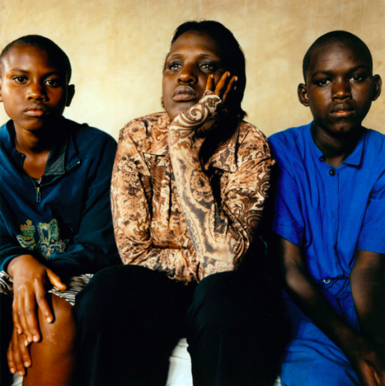
CONCEPT: Torgvnik documents a very personal subject for these Tutsi women who are rape victims during the Rwanda genocide.
These portraits draw empathy. I believe that is his focus for this body of work. Most portraits have the subjects looking directly at the camera or facing the camera. It forces us to build a connection to these women. With each portrait, a name is included, as well as a detailed interview about their individual story.
What Torgvnik accomplishes well in this body of work is that he captures the emotional tension between the individuals. He frames the portraits so that the subtle gestures, body positioning, and distance between each subject conveys information.
For example, in the photograph below, it shows Marie sitting next to her younger cousin to the left and daughter to her right. Her daughter was born from rape. Although, she is her own blood, the complications of raising a child born from her worst, traumatizing memory show. As close as they are positioned to each other in the photograph, they are distant. The simple gesture of her looking away from the camera with her teary eyes speaks volumes.
(Baby cousin to the left, Marie, and her daughter to the right)
“After the war my father constantly reminded me that this kid is bad. But to me she is innocent. But I can’t show it to my family members. So, I keep quiet about it. Deep in my heart I love this kid”.
(Daughter to the left, Philomena to the right)
“I’m a mother but unwilling to be a mother. I didn’t love this child.I didn’t make a choice to have this child. Whenever I looks at this child I trigger back to the memories of rape. Maybe with time I will love this daughter of mine but for now, no.“
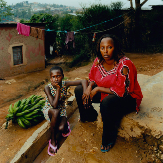
BOLLYWOOD DREAMS
CONCEPT: Torgovnik documents the movie culture in India. Movies are more than just entertainment. It’s more like religion.
Torgvnik documents the culture with the backdrop of everyday life in India. What we can tell right away is that these areas are impoverished. I believe that’s very intentional and important to the narrative.
Life in India is generally harder and they struggle a lot because they have less and it translates into the movie culture. Many theatres do not have air conditioning, they use fans. Many of them don’t even have seats. Movie billboards are hand-painted by artists to save money. Projectionists work long hours under very hot weather conditions in a small room. The consumer’s experience is not luxurious at all. It demands patience and tolerance from the people. Yet, interestingly it doesn’t take away from their experience at all. On the contrary, I believe the lack of accessibility deepens their appreciation for the culture. it gives them more of a reason to seek an escape. That’s exactly what it is for them. These movies don’t depict their reality. It’s a way for them to dream. That’s why this body of work is called “Bollywood Dreams”. It’s not just entertainment. It’s deeper than that.
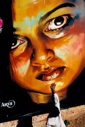
Little girl reaches up to touch her favorite celebrity star.
Many theatres don’t have AC. Fans are attached on the walls.
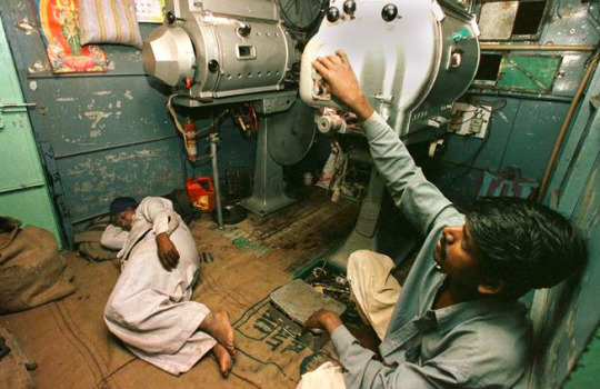
Projectionists work very long hours. They take turns sleeping while on the job.
BIBLIOGRAPHY
0 notes
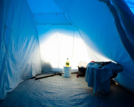
Photo
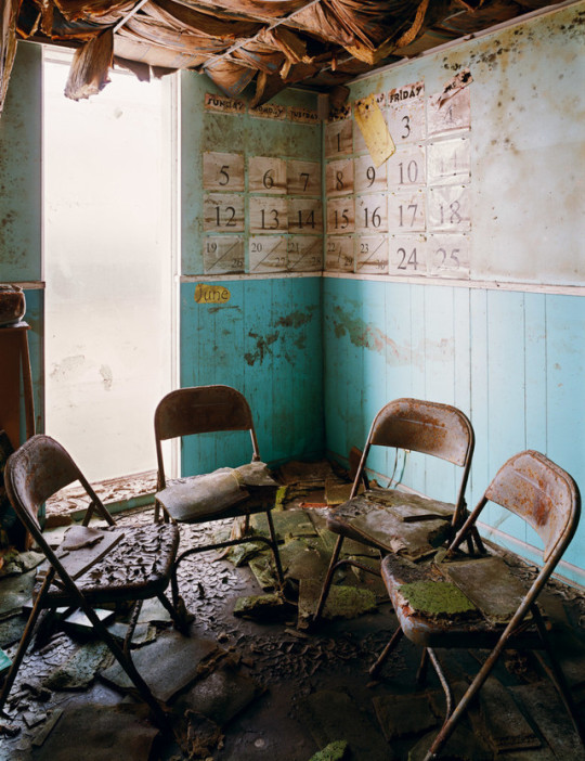
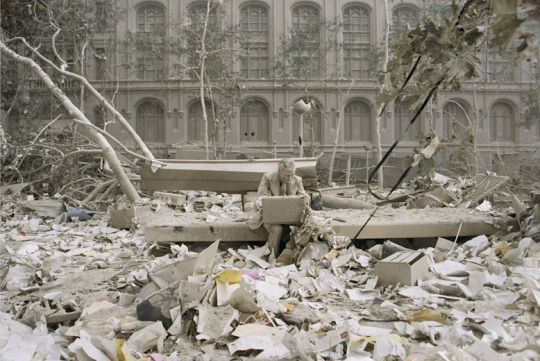
Wyatt Gallery, an American photographer born in 1976, is best known for his disaster photography, primarily his series on the 2010 Haiti earthquake, though he has also photographed the aftermath of Hurricane Katrina, Hurricane Sandy, and the 2004 Sri Lanka tsunami. Gallery’s work stands out amongst other similar photographers’ due to the vibrancy of his photographs and his careful composition. He’s very concerned with “the remnants, what is left behind that informs us of the type of society that once flourished there” (Pasulka). He always chooses to photograph the items he finds as though they are formal portraits lit by bright light – through the personification of familiar objects degraded by a disaster lit in a clear, unshaded way, he is able to generate universal sympathy for the event.
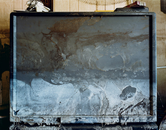
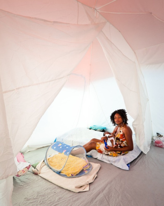
Remnants: After The Storm: Hurricane Katrina and Tent Life: Haiti are both projects by Gallery that showcase the aftermaths of natural disasters. Remnants: Hurricane Katrina documents the devastation of New Orleans, Louisiana after the hurricane from 2005 to 2006, while Tent Life: Haiti is a collection of photographs depicting the aftermath of the 2010 Haitian earthquake, focusing primarily on the tent cities in Port-au-Prince housing displaced survivors, photographed in March and September of 2010. Both bear the signature hallmarks of Gallery’s style – despite the grim subject, both series feature beautifully saturated colors, clean lights, and deliberately composed portraiture. It’s incredibly refreshing, especially after years of grungy, grimy poverty porn from other artists with similar themes. The bright white daylight illuminates the entirety of the scene, leaving little shadow, and literally highlights the objects found. There’s nothing left in the dark, nothing to question or fear – the worst is over, and the sun shines down on what’s left. Gallery’s clean presentation, along with the familiar subjects of everyday items, creates an almost cleansing feeling, a feeling of hope and rebuilding something still familiar and dear. The portraiture of the objects feel deliberate, almost staged at some points, like someone is a few moments away from walking in and righting a fallen chair, or grabbing a bag off the hook. This is especially apparent in both Blue Tent Interior (2010) and Chairs and Calendar (2005), where it doesn’t seem realistic that the objects in the photographs would happen to be perfectly in place for such a formal composition – the chairs happen to be in a perfect semicircle, untouched by the flooding, and the bottle is alight within a centered halo of light. His photographs “[show] us the strong effort to restore ordinary life even in circumstances of extraordinary difficulty” (Rennard) and how humanity continues to rail against entropy, even in the face of natural disasters. Sometimes the feeling of deliberateness is so strong that it turns away people. “I did not feel any real sense of connection to the subjects who remain, it seems, at an emotional distance. The interactions sometimes felt hurried; the subjects, posed” (Rennard).
As similar as the two series are, there are definitely striking differences between both the overall style and the thematic elements that speak to the growth of Gallery as a person and his change in focus as an artist. Remnants: Hurricane Katrina was born out of a desperate desire to understand the crisis – “In New Orleans, I was never able to fully grasp the severity of the impact of Katrina. Everyday that I ventured out to photograph a new neighborhood or one that I had visited before, it was like the first time seeing the disaster. I never got used to it. I never could fathom how high the level of destruction was, and is… in New Orleans there were no people, besides the Army.” (Pasulka). This grappling with the absence in life caused by the hurricane is apparent in the lack of people within his photographs. He focused on solely on the objects left behind, and the bright white light, while also illuminating the aftermath, also serves as a reveal of the grim truth, as evidenced by the well lit, but grimy screen in TV (2005). As wonderfully composed as Remnants: Hurricane Katrina is, there’s something very stark and leaden about the series. Tent Life: Haiti, on the other hand, is absolutely a celebration of the survivors. The presence of actual people looking steadily and firmly into the camera surrounded by their belongings – just as much a subject as the people themselves – heavily reinforces this idea, as does the lack of focus on physical devastation. This hopeful outlook was inspired entirely by the survivors who stayed and endured, but likely was also at least partially influenced by Gallery’s own personal involvement with the relief efforts. He, along with several other artists, volunteered as part of Healing Haiti and actively participated in giving both physical and financial aid. “It was not my plan in going there to have this outlook. This is what I saw in Haiti. I wanted to show how bad it is, the destruction, and make people feel so sad, but it just didn’t happen. I have a poet friend who was looking at the photographs and said, ‘These just aren’t sad. They give me hope and inspires me to believe that because they still have hope, we can have hope’” (Pasulka). In addition, Gallery makes much better and much fuller use of composed color in order to generate specific moods and create more cohesive photographs. Whereas for Remnants: Hurricane Katrina, Gallery utilized nothing but pure white light, for Tent Life: Haiti, he lets the color of the tent fabric saturate the light and play with how the color changes the feeling of the surroundings. The white light illuminates, but is diffused and colored, creating an overall softer atmosphere that complements the far more hopeful subjects, illustrated best by Vanessa with Newborn Baby (2010) – the gentle pink gradients and pastel colors highlights the maternal, new beginnings feel of the photograph, without sacrificing Gallery’s usual vibrancy and clarity. “For the viewer, at least, the hardships suffered by these people are mitigated by the way they are portrayed – a way that allows us to see their beauty and dignity. Their sadness is not absent but is overshadowed by elements such as the closing image of a smiling girl wearing a pristine white dress” (Rennard).
Wyatt Gallery’s work is a truly refreshing take on the unfortunate implications and stereotypical depictions of crisis photography. His vibrant colors, clear composition, and object portraiture – or lack of focus of – creates photographs that allow dignity and poise to the subjects, but also generates empathy, hope, and reality in the viewer, and are visually appealing.
Gallery, Wyatt. Chairs and Calendar. 2005. Remnants: After The Storm.
Gallery, Wyatt. Blue Tent Interior. Photograph. Wyatt Gallery. Tent Life: Haiti.
Gallery, Wyatt and Edwidge Danticat. Umbrage Editions, 2011.
Gallery, Wyatt.TV. 2005. Remnants: After The Storm.
Gallery, Wyatt. Vanessa with Newborn Baby. Photograph. Wyatt Gallery. Tent Life: Haiti.
Gallery, Wyatt and Edwidge Danticat. Umbrage Editions, 2011.
Gallery, Wyatt. Wyatt Gallery ... A Person Not A Place, Wyatt Gallery, 2018, www.wyattgallery.com.
Pasulka, Nicole. “After.” The Morning News, The Morning News LLC, 30 Apr. 2007, themorningnews.org/gallery/after.
Pasulka, Nicole. “Tent Life.” The Morning News, The Morning News LLC, 10 Jan. 2011, themorningnews.org/gallery/tent-life.
Rennard, Ellen. “Tent Life: Haiti.” Fraction Magazine, Fraction Magazine, Aug. 2011, www.fractionmagazine.com/review/tent-life-haiti.
“Tent Life: Haiti.” Open Society Foundations, Open Society Foundations, www.opensocietyfoundations.org/moving-walls/19/tent-life-haiti.
0 notes