#why would they go to the effort of updating all of the icons for pokemon like ampharos and dunsparce when they aren't relevant to rt's story
Text

incase you forgot about this i'm reminding you that it exists
#bwark#also i just remembered that for some reason they made hq versions of the icons from gti and psmd in rtdx#but only for pokemon in gens 1-3 (+ 4 if they got a new evo and also sylveon)#like that's still so weird to me#why would they go to the effort of updating all of the icons for pokemon like ampharos and dunsparce when they aren't relevant to rt's story#it's suspicious.....unless? 👀 (new pmd game for the switch after rtdx)
10 notes
·
View notes
Text
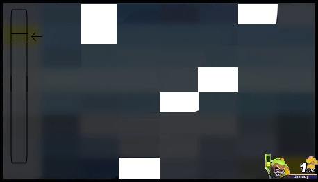
So, because I’m obsessive I decided to stretch out the partially visible pixels in the blurred Smash Ultimate update...


They’re not perfect, but they do help to paint a better picture of just what’s coming. Discussion below the cut.
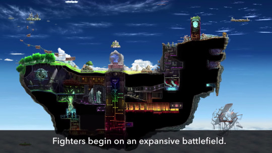
Now, the most common speculation for the first image is, of course, that it’s a form of Stage Builder.

A menu on the left with the selected item highlighted in yellow, and a test/save button on the bottom right, with the rest all being a view of the stage. It’s very plausible, and has been discussed at length by others, so I won’t be going over it in much more detail, but I will list the objectively observable evidence that points in its favor, such that those can be used when discussing other possibilities.
There is no dashboard: In Smash Ultimate, a black dashboard fills 10% of the screen when exploring the game’s upper menus. While this is present in Screenshot 2, it isn’t visible here, which would point towards the idea that this is either in-game, or in a menu that is too big or expansive to work with the dashboard, as is seen with the Character Select Screen. A Stage Builder is on the more resource intensive side of things, so it’s only logical for the Dashboard to be left out.
There are no visible characters, or character HUD elements. This would point towards it not being an ingame screenshot of a new stage or battle mode. However, one possibility is that the lower right yellow blob is an unconventional display for a character’s health, though yellow is not a colour one typically sees in a Smash Bros. display.
The white and yellow on the right is rather unprecedented. It’s highly unlikely to be a scroll bar, given that Smash already has a standardised scroll bar used in every other menu. This means it is most likely some kind of menu, or the HUD element of a game mode.
The bottom right yellow ‘button’ is consistent with many other buttons in the game, including the dark patch on the left, which is likely blurred together from the black on the button and the blue from the background.
In short, what we know is...
1) This is not a standard menu
2) This is not from a conventional game display
3) There is some sort of display or menu on the left hand side
4) There’s a button or other display on the bottom right side
From those, I’ll try and construct as many potential explanations as possible.
1. Tower-ascent side-game
This one’s a very loose idea, but in theory, the left side bar could be a marker used to show how far up a ‘tower’ the player is, while the ‘button’ on the bottom right is where the player’s % is displayed, rather than in the center as it usually is, likely so that enemies and hazards coming from directly below are easier to spot. However, the idea requires one to make lots of assumptions about what certain information is meant to be, ones that aren’t facilitated by currently known information.
2. Home-Run Contest

I think this one counts as wishful thinking. The idea of a back-wall for the Home-Run Contest makes enough sense (the yellow part could just be a giant yellow 🚫), but the colours aren’t ones that would be especially effective for the mode, as a white platform wouldn’t work very well when displayed alongside the Sandbag. Additionally, while maintaining thematic consistency isn’t necessarily going to happen, all previous Home-Run Contests have taken place in a stadium, not what appears to be an open field. Additionally, the perspective required to make this visual work is all wrong.
3. A DLC Character stage
This one doesn’t need a diagram, since the stage could potentially look like anything. If this is a stage, it’s most likely a Persona 5 stage, or the stage for the next DLC character. However, Persona 5 is far more visually distinct than this stage, usually displaying either lots of colours, or striking amounts of colour contrast, making the odds of it being a Persona 5 stage highly unlikely. While aa stage could be derived from a different Shin Megami Tensei game, those tend to be similarly distinct in terms of visuals.
If it’s a stage for one of the two commonly ‘leaked’ Square Enix characters, one feels fairly probable as a candidate to have a fairly generic stage, while the other doesn’t.
(After writing this Joker’s stage sorta leaked, and so things are even less likely to be his stage)
4. Trophy Rush
This one doesn’t really need a diagram either, for what little information would be displayed in the mode. As someone who greatly enjoyed this mode, I’d appreciate seeing it back, but I feel like there’s not much call for it, as the only collectibles in the game already have plenty of ways to obtain them. At least it’s not Coin Launcher. Ostensibly the bar on the left here would be some kind of gauge or countdown.
5. Poke Floats

Not that bad of a theory, but it fails to account for the bar on the left, and even with my best efforts, I couldn’t make a layout that I felt best represented all of the colours we could see. It’s also not the kind of thing I could see being advertised as a ‘feature’. It would make sense to try and bring back such a popular level and modernise it with new Pokemon, but while I wouldn’t rule it out as a possibility, I feel like that idea and this image are a round peg and an octagonal hole. It just doesn’t quite fit.
6. Board the Platforms/Break the Targets
The only evidence I’ve seen given to this is that the bar on the left could show how many platforms/targets are left, with the yellow being a boarded/broken one. I personally think that’s UI overkill.
Overall, I stand by the Stage Builder idea the most. However, when it comes to the other picture, there’s no single idea I see as standing above the rest in terms of likelihood, and in turn, I’ve not seen many suggestions for it. The community seems pretty stumped, but I’m going to go ahead and analyse what I’ve seen suggested, as well as my own spitballing.
Before I do, though, I want to go over some of the elements of this image first.

There is a dashboard: Unmistakable, that black bar on the right is most certainly the dashboard menu. It covers the right amount of screen space, and it’s a very safe assumption to make.
There is a coloured bar across the top: While there’s been some debate as to whether it’s an orange or red bar (it’s likely the brightness has been fiddled with to further confuse the image’s intention), it’s almost certainly one of the coloured bars that often decorates the top of certain menus in Smash Ultimate’s menus. However, most of these menus display these bars at a slant that gets very thin at one side, which would lead one to expect the visual to get a lot lighter towards the right side of the screen. That said, there are exceptions, such as in the options menu or the Tourney display, so it’s possible this is just another exception. The implication of this is that this menu is either under Online (if orange) or Smash (if red). From my edits, it appears more orange, though the original image is easier to see as red.
There are a loooooot of different colours, and they don’t seem to line up to any particular shape, making it very difficult to make an educated guess.
1. Character Editor
Starting out with the alleged leak that I heard while making this analysis. The rumour goes that the player will be able to create their own colour palettes for each of the game’s characters. The details on this are unclear, but for simplicity’s sake I choose to assume that players will be able to select various specific parts of a character’s body (Mario’s hat, buttons, or shoes, for example), and apply a colour to it.
This has a number of things going for it, moreso from design elements found outside of this image.
Firstly, it would explain why there are so many wildly conflicting colours in the image if the player is applying multiple different colours to a character’s model
This has been the first Smash game to take extra time to load in character colours on the character select screen. While this could be chalked up to the game having to load in almost 800 renders, it’s also possible that this is simply something that’s been designed to account for additional (possibly unlimited) extra costumes.
The added ability to select costumes by hitting A over your character portrait is mildly convenient (after everything has loaded), but it does seem slightly unnecessary. If the idea is to be prepared for when players are able to select from dozens of character costumes, this would make sense.
Additionally, the character colours are all labeled. But even in cases of split characters like Alph or the Koopalings, the label names are simply “Color 1″ through to “Color 8″. It really doesn’t make any sense to add these labels when they’re not going to add anything informative, so all they end up doing is filling up space, and forcing the stock icons to cover up some of the portrait. This in particular bodes well for this theory.
The recently datamined information on Joker having a special 8th costume would line up well with this, if the idea is that players will be able to freely add their own versions of that costume.
However, various things also go against this theory.
The bar up the top indicates this is a mode in Smash or Online, when such a character editor would probably be in Games & More (blue), Vault (Magenta, which this could just be a corruption of), or Options (purple).
It’s hard to make out any one specific character who is being modified, one would at least be able to see some elements that add up to a visible character in some shape or form, even if they were radically re-coloured.
The dashboard doesn’t appear in any parts of the game where a character model is being rendered. While it’s possible that the visual used for this mode is the character’s render instead, that seems somewhat dubious since one would likely want to see what they’re making.
Overall, it’s a solid idea, but more for what’s been seen on the character select screen than this image.
2. Additional Challenges
It would explain the eclectic colours, and the bar on the right is in order, but the colours at the top and bottom don’t match those of the blurred screenshot, regardless of what page of Challenges the player is on. The only way for this one to work would be if the intent is to add a special page to Challenges, one that has a different overall design to the rest. (Daily Challenges? Super Challenges?)
3. Destiny Islands stage
Now here’s a viewpoint I’m hard pressed to debunk, and that’s mostly because the idea here is that the image above is a screenshot of the stage within some kind of announcement display. We haven’t gotten any new stages yet, so having them get descriptions of some sort isn’t impossible, it’s just that it doesn’t strike me as likely. Additionally, aside from the blue of the water, most of the colours seem out of place.
4. Smash Run 2
Eh, it’s not impossible, just not a game mode that plays to the Switch’s strengths. Specifically that doing Smash in split-screen would likely be very taxing on the system’s resources, especially with all the enemies they’d be displaying. One possible explanation is that playing the mode requires multiple Switches (either online or locally), and so the orange bar could be explained that way. The dashboard only being there because the screenshot is of the mode’s submenu or explanation.
Overall I don’t think this is especially likely, as such a mode would absolutely require an exorbitant amount of development time, and so for it to release in spring, the bulk of it would need to be finished before release, and there’s simply no indication that such a thing has been worked on in the game’s data.
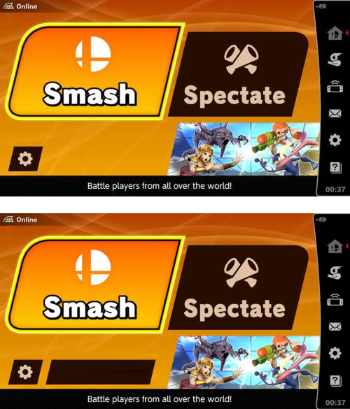
Overall, it’s hard to say for certain just what this second image is. Personally I lean in the direction of it being an additional online mode, mostly because of the orange bar, and due to the odd layout of buttons on the online menu that seems to indicate there’s more to come (as seen in my mockup):
When it comes right down to it, however, this kind of speculation is fun, and I’m so very glad the development team gave us something to pore over as we await the next batch of content. I’ve personally always felt that an ARG is a great way to keep fans invested in upcoming information, and this is possibly the closest Smash has ever gotten to one.
4 notes
·
View notes
Last Seen Blogs