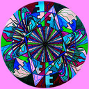
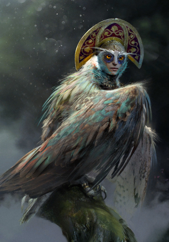
#which had the nicest color palette in the whole world
Text

oops i learned what pony town is and now i keep designing ponies
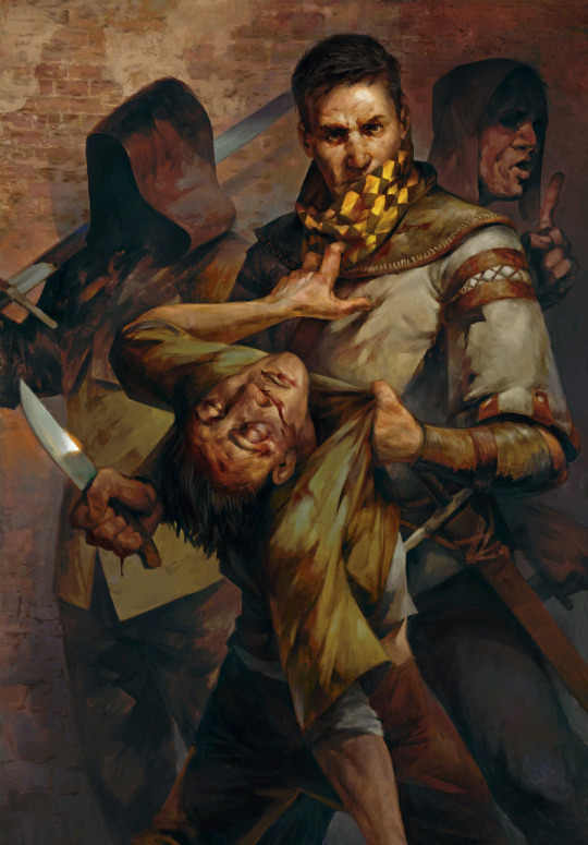
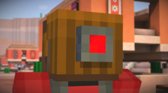
#pony town#mlp#my little pony#so the first one is actually based off a g3 valentines pony named All-My-Heart#but i decided to make her a pegasus so now her name is Hearts-A-Flutter#the 2nd is just some random design i did that was inspired by someone elses design#which had the nicest color palette in the whole world#of dark purples and gold#so credit to whomever that was on the purple/gold insp#and then the last one is my girl Kyllu lol#i can never enter a character creator and NOT make kyllu#im actually very happy with how they all look fjdklsa#god that site is strange though#some very nice people on it that i was talking to#but also some very... odd people. i did not talk to those people#its so interesting what people can do with the character designer though#like dang theres some creativity there#ok gnight i have to get my car inspected tomorrow#fluffle art
5 notes
·
View notes
Text
Since there won't be any more expansions (and i'm a chronic procrastinator), i updated my personal top 10 Gwent card arts into a top 20, including the few sets that came since then and shuffling things around a bit.
It's a long one, hence the cut.
Personal top 20 Gwent card arts:
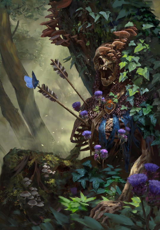
20: Bone Talisman by Bogna Gawrońska
It's still the most festive looking thing i like. My beloved blue-and-bright red fidget spinner. I really can't explain my weird attachment to it any other way; i generally tend to like the item arts, maybe it's the collector brain, maybe it's because after Homecoming and most of the expansion sets since later 2019 onwards, these base set trinket adjacent arts became more prominent to me among a lot of new, more dramatic and bleak character and scenery art.
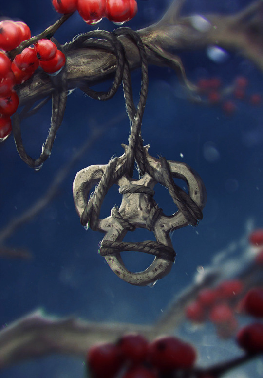
19: Ceremonial Dagger by Katarzyna Bekus
The entire set of strategem arts from Merchants of Ofir is honestly packed, but the dagger is the one i found myself putting in my in-game profile the most. Maybe it's the item hoarder brain again, maybe it's the color scheme i find relatable if that makes sense, most likely it's the premium helping a bunch to make that choice too. The background weirdly fascinates me. Does it have anything to do with The Spiral? I have never attempted to really assign any logical meaning to the strategem arts, they're clearly more symbolic than anything, but it still makes you wonder.
18: Ard Gaeth by Katarzyna Bekus
Somewhat related, here's another piece of wonky multiverse lore. And once again, it's the color that first grabs attention; the contrast of teal and this dusty red. Then one starts realizing the implied size and scope, the birds help with that, apart from being a cute composition detail. The shattery effect makes it look volatile, unstable, dangerous. Ominous. Which ultimately makes it fit with the rest of the Wild Hunt archetype in more than just lore.
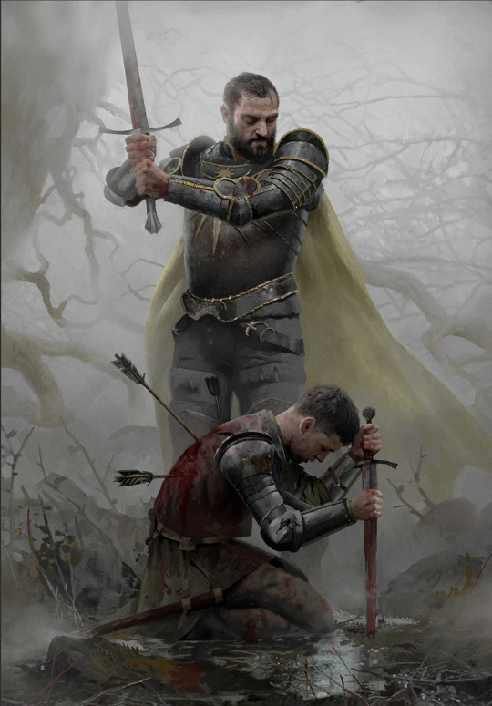
17: Coup de Grâce by Lorenzo Mastroianni
There are two wolves in me, one loves bright colors, the other actually enjoys a lot of the bleaker scenes. Although to be fair, Lorenzo Mastroianni is a big contributor to that. And it's no wonder, when he casually drops stuff like this. It's almost symbolic, lot less than strategems but certainly more than other, straightforward "war sucks" Gwent art. How do you visually represent something sad in a way that makes it hard to look away not just because of the tragedy but because of the beauty put into making that image?
You ask Lorenzo Mastroianni, the modern classical artist, to do it.
16: Viper Witcher by Valeriy Vegera
I once described Valeriy's art as "where Lorenzo uses a tight color palette, he uses every pencil in the case". This one is perhaps not as obvious an example, the whole piece has a very unified atmosphere especially from afar, but still, there are so many colors especially in textiles and skin. They're harder to register sometimes but it's how Valeriy does texture and shading. And somehow, he bridges the bleak and the colorful world too. Admittedly, this card also had to be here because mr. Viper is my son, and the voicelines are done by an actor with the nicest, smoothest bass i've heard since Peter Steele.
15: Naglfar's Crew by Anton Nazarenko
I was surprised by how much i ended up liking this one. It's the implications, i think; enchanted to laboriously upkeep this monster of a ship, this 'and if you see it emerge from a breach in the sky, you know you're fucked' symbol of death and decay. It's dark in a way i find compelling, i guess.
14: Serpent Trap by Marta Dettlaff
Back to the bright ones, i liked this art ever since i discovered it as Nature's Gift in post-Midwinter beta. The card saw play in Scoia'tael spell decks, and to me it became linked to Francesca Findabair for their shared spectral snake thing. But that all aside, the art is just so pretty. Vibrant, yet not oversaturated. And like the item arts, needed to balance out the cool and badass and the dramatic and tragic. Looking at it now, another point comes to mind; it's still grounded? The way Gwent art at large is grounded compared to other card games. Like it's not trying so hard (both this piece and the game's art in general). That's refreshing.
13: Chort by Bartłomiej Gaweł
It reminds me of the first game's main menu. The Witcher 1 main menu is, to me, one of the most accurate representations of this universe, its atmosphere. Even if the "you kill cows, you get ambushed by the fucking baphomet" is a meme game mechanic, something about it is...witchery. Superstition, folk legends, and ultimately, monsters. Or that's my takeaway, anyway. But the Chort art, beside being on the more rare side in-game, has always weirdly drawn me in.
12. Oneiromancy by Lorenzo Mastroianni
This was the Novigrad expansion key art before they turned it into a card, and i sure am glad they did. Lorenzo can get a bit weird, as a treat, someone said. Are they Condwiramurs and Corinne? Possibly! But i'll abstain from the schizo theories now. It's a gorgeous, well composed and executed surrealist piece. Inception if it had strong palpable atmosphere.
Denis Villeneuve > Christopher Nolan. but Lorenzo beats both
11: Funeral Boat by, you guessed it, Lorenzo Mastroianni
One final yippee for the last card set. And my god it's beautiful. Tight composition can get surprisingly hard to coordinate and make decisions for, but this is so well-balanced. The left end of the boat is closer to the frame, but right side has the most noticeable color, the character's face, and of course the bird to even it out.
As if to defend the title i gave him earlier, Lorenzo references Isle of the Dead in a way that, even if symbolic, fits into the universe perfectly. Someone stop me before i start rambling about similar concepts in different mythologies.
10: Dana Méadbh (now the token spawned by Call of Harmony) by Anna Podedworna
The most famous Gwent artist enters the list. With a piece made around two, when you think about it very bold choices. The goddess of nature and life, glowing with inhuman light in a black and barren forest. Obscured by thin, bare tree trunks. But to make her emerge and stand out, that was necessary. And it's working wonders. A lot of the Scoia'tael faction is obviously green, all kinds of green, but even a simple choice like making it pop out of black makes the card art stand out among others.
9: Circle of Life by Oleksandr Kozachenko
It has everything i usually look for in Gwent art; nature, color, atmosphere. A certain tranquility, perhaps. A little bit of story - the orange badge is the Kerack coat of arms. It's that environmental storytelling thing gamers keep talking about, complementing the character and faction drama of the rest of its card set.
There's a slightly changed, extended version, too, and somehow it's even better.
8: Gezras of Leyda by Bogdan Rezunenko
As much as i tend to dunk on Bogdan for having played Blasphemous once and making it his entire personality, Gezras is easily the best school founder card art of the set. Once again, the choice to have these prominent arts on the more symbolic side paid off, and the result is a stalking nocturnal animal out for revenge, backed by a giant image of what simultaneously did him irrepairable harm and gave him the means to defend himself. The premium doesn't disappoint either.
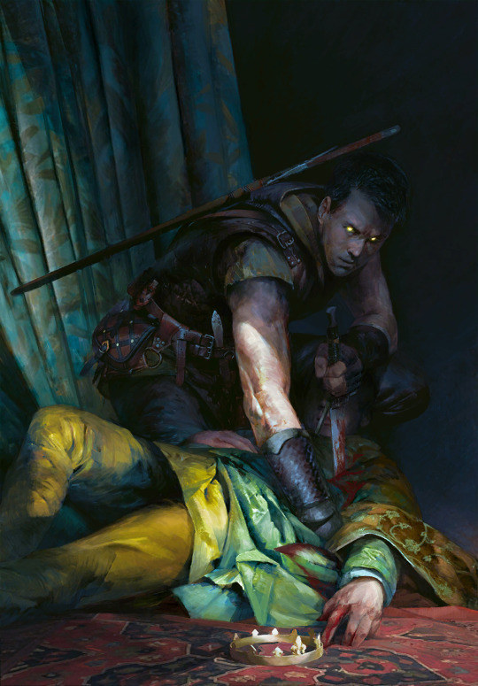
7: Rioghan the Undying by Daniel Valaisis
To nobody's surprise, the atmosphere, once again, got me hooked. I love the cold color, the dramatic flow, the big imposing silhouette of a ship in the background. Poor boy is the picture of misery. It's pure melancholy (something not that common in the Skellige faction by the way, which is a point in favor of Funeral Boat too), that i, of course, am inevitably drawn to.
he's just like me fr...
6: Witches' Sabbath by Michal Lisowski
Did i craft this card already or not? The realist's complaint towards near-greyscale card art. I share this sentiment, if only for the comedy of it, but with a few notable exceptions, and this piece is the main one. The Robert Eggers comparisons were made already i'm sure, but it really is a take on the last good Witcher 3 quest with a dramatic, more dreamy, or you could say cinematic quality ramped up to 11. Gone is the fanservice present in the game and the unnecessarily grotesque depictions of fatness of other parts of this card set, and what remains is a beautiful, ominous callback to folklore and classical art.
5: Tinboy by Valeriy Vegera
This is a baroque painting. The drama. Tinboy doesn't take that scarf off, ever. And here this poor soul is, their last will to live dragging it off him. On purpose? On accident? Probably both. The pattern marking Tinboy as a gang member staining with blood of a victim, something something symbolism. All in Valeriy's signature 'which pencil should i pick up next' style. Underrated piece.
4: Lara Dorren by Toni Muntean
They finally got our girl. And once again, despite heartbreak, it's gorgeous. Soft, sweet colors with a necessary hint of melancholy (the lighting suggests it's sunset?), and a pure, painted quality without the need for texture assets. A scene like this is better left a comparatively simple and laid back tribute. Beyond the technicalities, i also really, really applaud Toni for the outfit design. This is the Aen Elle princess, dressed well but for the weather. And the fact her mostly blue clothes with yellow sleeves mirror Cregennan's yellow jerkin with blue details, and her red brooch above the heart might, beside contrasting with the blue, very well reflect his fatal wounds... well.
As much as death on card art isn't always done the best, Lara is represented together with that which mattered to her the most. Despite being categorized among the Wild Hunt, she remains herself.
3: Lydia van Bredervoort by Igor Klymenko
The joy i felt when this was the art of Lydia they managed to get into the game. It's easily one of the best contest pieces and on par with the best Gwent has to offer - it has mood, and that ever present air of groundedness, realism, and in that, unfortunate tragedy. But similarly to Lara, it shows Lydia being her own person; doing what she loved and was good at without sight of Vilgefortz despite her being known as his ever loyal assistant. Likewise, it doesn't sensantionalize her condition, but references it in a subtle, tasteful, and even clever way. I also love her dress and the overall color palette. Igor understood.
2: Eldain by Anna Podedworna
Couldn't help it, this asshole has me in chokehold and he's enjoying it. In my defense, this piece highlights everything Anna is known for, because she's damn good at it. Incredibly sharp main subject of the piece contrasted against a blurry background, which allows for insane details like the strings extending from the top of the lute. To add more fun to it, Eldain isn't even in the absolute foreground, but the piece is still composed smart, so he remains the main focus. His silly red collar on mostly green helps. On top of all that, the art tells a little story, something Anna often does too, and in this case it delightfully sums Eldain up. It's also the best premium in the game.
look at his little red ears from sitting against the sun aww
Honorable mention: Lake Guardian by Anton Nazarenko
Like the following #1, this card has sentimental value to me as my second card reveal and artwork i made my best emote of. It was a perfect match, bird gals and all. It's a Sirin, bringing in a more obscure but not unwelcome mythology reference to the universe. And I love her vibrant, marble-like eyes.
1: Dol Blathanna Sentry by Lorenzo Mastroianni
...remains my favourite card art since that fateful day sometime in January 2018.
I was just discovering what there was to know about Witcher, downloading Gwent in the first place out of need for more content as i was slowly reading through the first book. Gwent has done a lot to explore and build on this universe, and it has helped me contextualize a lot of things early on. I remember scrolling through the deckbuilder, seeing this art, and being struck by its mood, this aura of secret and wonder. "Oh, so this is what Dol Blathanna looks like..."
It's quintessential older Lorenzo. Very much admitted brush work, fog, tight color palette. The little specks of blue in flowers and face paint work just right. Maybe it's a reference to Arthurian myth and Avalon, maybe to Greek myth and Hades, or maybe, as is often the case and was the case later (or earlier in this list), both.
It spoke to me and my sense of wonder back then. It speaks to me when i search for comfort now.
now, time to tear Karol Bem to shreds in the top 20 least favourites xd
#shut up elis#the witcher#gwent: the witcher card game#fingers crossed tungle doesn't obliterate the links
24 notes
·
View notes
Text
So I just noticed this detail
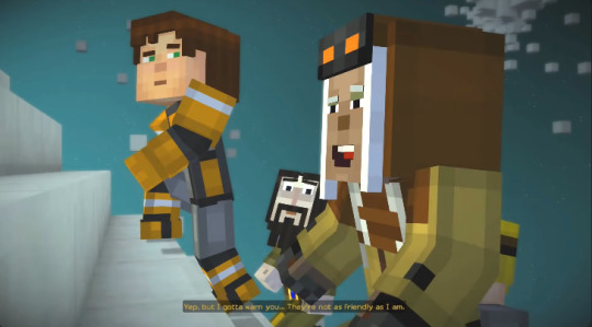
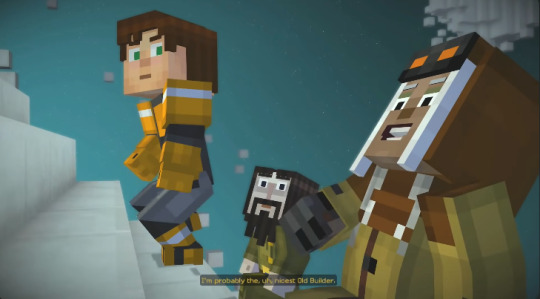
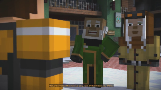
If Harper says she is the nicest old builder....
Unlike these two (Cause Otto's cool)

And she is an Expert in Redstone considering all the things we have seen her done in Episode 7

She did left the old builders group to settle in Crown Mesa
Could it be that she was the one who taught Cassie about Redstone?


You can even see in this background, that the banners color palette PERFECTLY match that of Otto and Tim's Armor
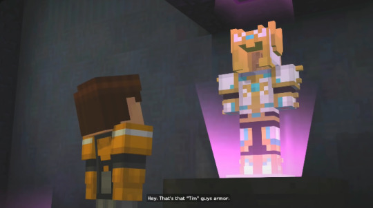
And sure they could be coincidence But did you notice this when the White Pumpkin, Lukas and Jesse chase was going on and we finish the interrogation with the Youtubers , we get a view of the main hall of the mansion.

We can see what could be the base for the Tim Armor, Maybe she was the one improvised the design for it?
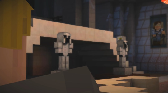
We even see a portrait of a snowy plain on the right side of this screenshot,
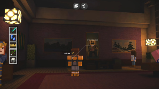
its possible she could have made this by her muscle memory if it is her home and she has been living there for years.
But how did she got into the Games in the first place? Well,


Maybe she was not from the games originally but instead from a random world which was her home world. She was snatched by the old builders to play in the games but seeing how young she is now she was probably 15 or something and Harper was their with the other old builders at that time and


she felt sympathy for her and decided to adopt her, taught her everything about Redstone which explains her exaptational talent and was taught all the techniques about buildings. She already had a talent for painting from the start and was the one who made all the paintings to promote the whole 'Tim was a hero and the one the games' image. She never played in The games but she observed all the games like the old builders, Mevia and Hadrian taught her how to use weapons and combat, especially AXES. She became some sort of Prodigy of the old builders. But she did something wrong maybe she broke a rule or few that didn't even exist and was kicked out into the two which made Harper angry and left them with the Redstone Heart in a fit of rage.
27 notes
·
View notes
Text
lunar artist!yeojin; chapter one~

warnings; none
genre; sci-fi, strangers to lovers, fluff, slight angst
pairing; im yeojin x gender neutral!reader
word count; 1.4k
summary; your small crater town on the moon was rarely visited. one day, artist!yeojin travels all the way from mars to paint the serene, wistful scenery of your planet.
staring out into the sparkling abyss beneath you is a favorite past-time of yours. something about floating a few inches above the dusty, grey surface of the moon and looking out at the endless glittering fireballs surrounding all that you can see appeals to the deep lunar being inside you.
sometimes it even feels as if you were born here.
your family was from neptune, a planet known for its imaginative artists with striking, green eyes that see more colors than any other species.
after you finished your first section of schooling, you moved to your current planet, the moon, as fast as possible. the dreary serenity of the planet had always piqued your interest. it was perfect for a budding writer like you.
and normally, you don’t find yourself regretting the decision to move.
but today is different. the small crater you call home is far-off from the large civilizations. upon your first meeting with the small floating cottage, you felt more inspired than you ever had before! the place seemed full of life, even in the gloomy atmosphere of the moon.
now, instead of new ideas and an enhanced imagination, you are left with exasperation at the bleak nothingness surrounding you.
however, apparently it was time for a change.
you felt the air and gravity messing around behind you. after four years on the moon, you knew what this meant- someone was coming.
glancing behind you, you saw arguably the most beautiful being you had ever laid your eyes upon.
her auburn hair was choppy, and bangs laid haphazardly across her face, like she’d just been caught up in a gust of wind. with a shake of her head to maneuver her hair back into place, you caught sight of a sigil painted across her forehead. the red symbol was a circle, with an arrow coming out of it, pointing north-east.
you recognized this emblem as a representation of mars. surprising, considering the tension between the moon and mars. history hadn’t been the nicest to the two of your planets, and there was always a struggle for food and wealth, which had caused your civilizations to prey on each other for as many resources as possible, in order to prosper off each other’s loss.
the girl continued towards you. her dark eyes surrounded by shimmering, golden glitter that was now visible enchanted you as she gradually got closer.
you stared back.
she wasn’t the tallest, most marsians weren’t, but her presence was overwhelming. it felt like a red storm was flying towards you, leaving stormy chaos in its wake.
once the girl was a few feet away form you, slightly hovering above ground, she asked, “can i paint you?”
finally noticing the art set filled with a fluorescent silver palette, you realized who she was- a marsian artist.
artists were scarce in the marsian society, most citizens pursued a career in mining or as warriors, but a few yahoos broke away and followed other paths.
“why?” you ask.
“i came here to illustrate the people of this planet, but it seems its almost completely barren. you’re the first being i’ve seen.”
she sits down, not waiting for an answer from you.
you’re a little awkward at this point. aggressive behavior isn’t a something you’re used to, and it throws you off guard. rolling your shoulders back a bit, you shift around, wondering how she’s going to paint you.
“what’s your name?” the girl says, almost accusingly. man, these marsians have a jarring way of speaking.
“y/n. you?” your softer, serene voice floats toward her.
“yeojin,” she says, slamming her painting utensils onto the ground. they hover a few inches above the surface, like all other things.
her upper lip pulls up and she growls at it.
weird, you think, and giggle.
“what do you do here? as a job.”
“i’m a journalist.”
“as you can see, i’m unemployed,” comes her response, and she grins at you.
your lips set into an easy half-smile, “wish this planet had more people, seems as if the war never ended. it’s been a century and we’re still suffering from a lack of people. this town used to be the hype-house of the lunar system, everyone wanted to live here, sphere-home prices were sky-rocketing, trade with the other galaxies was better than it ever was before, and now,” you gesture around to the nothingness, “it’s all gone.”
she stares. what is up with these marsians? no sense of social cues.
“hmm. this whole galaxy is in ruins. back home, we must be behind a decade in technology. power goes out frequently. food stores are running out. the government is eating up our money. we don’t know where it goes.”
you sigh, looking out at the stars.
“sounds like we’re both the only sane ones in this insane world”
“yeah,” yeojin nods, dipping her brush into a can of snowflakey gray paint.
you don’t notice her starting to paint. as you wrap your arms around your legs and tuck your knees into your chest, a lunar frog hops by. you call it over. it flops over to you, its speckled coat shining and reflecting the light given off by the distant sun, and sniffs at your outstretched finger.
“hi jerry,” you say, giving the amphibian a lazy smile.
“is that its name?” yeojin says, sounding surprised.
“no, i just like to name animals, you know? gives them more meaning- i feel like we don’t appreciate the little things in life enough, always rushing about, never stopping and smelling the flowers.”
“you live in a planet without oxygen. flowers don’t exist here” comes yeojin’s deadpan response.
“good point,” you say, giggling a bit. normally you’re not as smiley as this; your face is always stagnant, deep-set eyes staring blankly at the world. must be the social interaction that you’ve been craving for so long.
the frog licks your pinkie, making you shriek in happiness and fright at the same time. the frog is terrified by your loud exclamation, and bounds away as fast as possible.
“dang,” you say.
you look over at yeojin. she’s studying you intently. “i didn’t know lunar beings like you cursed.”
“dang is not a curse you eggshell,” you say lightheartedly, reaching out to smack her on the shoulder.
her tough skin doesn’t even move, and yeojin laughs at you. she puts her paintbrush down and tackles you. not used to physical contact this early, (you haven’t even learned 80% of her weaknesses yet! that’s a crime lunar society!) you try to flail around, but she has you pinned to the ground.
you have no idea how she defeated gravity like that, by pure force you guess, i mean the ground probably didn’t even bat an eye with how confidently she hovered over you.
you gain control of your limbs again after freezing for a hot second, and shove at her shoulders.
she doesn’t budge. these marsians live up to their prstince, atheltic reputation.
laughing, yeojin lets you up, grabbing your wrist and pulling you forward. you’re surprised again, and stumble forward into her chest.
gasping at the utter clicheness of this whole moment, you pull away and unfold into a standing position (which is like seven feet tall, neptunians are known to be massive.)
you realize that when upright, you stand a good two feet taller than yeojin, and now feel incredibly gangly. she glares up at you.
“sit down and stop being so tall,” she says grumpily, reaching down to pack up her stuff.
you do as she says and plop onto the surface-air.
seeing her putting all her supplies up, now seemingly in a hurry, you inquire, “where are you going?”
“i’m set to be back home around 17:33. right now it’s 17:30,” yeojin says, deflty throwing all her paints into a case. (you wonder how she’s not breaking them with how aggressive she is.)
“how are you going to get back so fast?” you ask her, curious and surprised beyond belief.
“you’ll see,” yeojin says, walking away at a fast pace.
“wait!” you yell after her, not wanting to lose her after such a short time together.
she keeps walking.
you get up, rushing after her. somehow, her stubby legs move faster than your massive ones, and she stays in front of you.
she turns around, staring at you, stormy eyed. fear graces her pupils,
“catch you later. i’ll be back soon,” yeojin says through gritted teeth. she doesn’t seem offended by anything you said or did, and disappointment in, herself? is written all over her face. you have no clue why she’s leaving, and neptunians are supposed to be good at this intuition stuff!
“wa- don’t go yet!” you exclaim, panicking at this point.
a cloud of dust envelops her, and she disappears.
masterlist - next
#femifics#loona astrology#loona imagines#loona fluff#loona angst#loona x reader#loona reactions#loona scenarios#loona#im yeojin
23 notes
·
View notes
Text
Ophelia By the Yard
Cobwebbed passages and wax-encrusted candelabra, dungeons festooned with wrist manacles, an iron maiden in every niche, carpets of dry ice fog, dead twig forests, painted hilltop castles, secret doorways through fireplaces or behind beds (both portals of hot passion), crypts, gloomy servants, cracking thunder and flashes of lightning, inexplicably tinted light sources, candles impossibly casting their own shadows, rubber bats on wires, grand staircases, long dining tables, huge doors with prodigiously pendulous knockers to rival anything in Hollywood.
Here was the precise moment — and it was nothing if not inevitable — when the darkness of horror film, both visible and inherent, leapt from the gothic toy box now joined by a no less disconcerting array of color. The best, brightest, sweetest, and most dazzling red-blooded palette that journeyman Italian cinematographers could coax from those tired cameras. Color, both its commercial necessity as well as all it promised the eye, would hereafter re-imagine the genre’s possibilities, in Italy and, gradually, everywhere else.
When color hit the Italian Gothic cycle, a truly new vision was born. In Hammer films and other UK horror productions, the cheapness of Eastmancolor made it possible for blood to be red. Indeed, very red. And, while we shouldn't underestimate the startling impact this had, it was a fairly literal use of the medium. In the Italian movies, and to a large extent in Roger Corman's Poe cycle, color was an unlikely vehicle to further dismantle realism rather than to assert it. Overrun with tinted lights and filters, none of which added to the film’s realistic qualities, the movies became delirious. In Corman's Masque of the Red Death, we learn of an experiment that uses color to drive a man insane; it seems that filmmakers like Corman and Mario Bava were attempting the very same trick on their audiences.
The application of candy-wrapper hues to a haunted castle flick like The Whip and the Body adds a pop art vibe at odds with the genre, and when you get to something like Kill, Baby...Kill! the Gothic trappings are barely able to mask a distinctly modern sensibility, so much so that Fellini could plunder its phantasmal elements for Toby Dammit, fitting them perfectly into his sixties Roman nightmare.
Blood and Black Lace brings the saturated lighting and Gothic fillips into the twentieth century -- a sign creaking in a gale is the first image, translated from Frankensteinland to the exterior of a contemporary fashion house. A literal faceless killer disposes of six women in diabolical ways. The sour-faced detective remains several deaths back on the killer’s trail because the movie knows its audience, knows that it has zero interest in detection, character, motivation — though it’s all inertly there as a pretext for sadism, set-pieces of partially-clad women being hacked up, dot the film like musical numbers or action sequences might appear in a different genre.
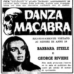
Since the 19th-century audience for literary Gothic Horror was comprised of far fewer men than women, would it be fair to ask whether Giallo’s advent might be an instrument of brutal violence, even revenge against “feminine” preoccupations? Consider 1964’s Danza Macabra, the film’s amorous vibes finding their ultimate source in that deathless screen goddess named Barbara Steele, whose marble white flesh photographs like some monument to classicism startled into unwanted Keatsian fever. Her presence practically demands that we ask ourselves: “Who is this wraith howling at a paper moon?” In other words, is it a coincidence that Steele’s “Elizabeth Blackwood” — a revenant temptress and undead sex symbol — hits screens the very same year as Giallo, which would transform Italian cinema into a decades-long death mill for women?
The name “giallo”, meaning yellow, derives from the crime paperbacks issued by Italian publisher Mondadori. The eye-catching covers, featuring a circular illustration of some act of infamy embedded in a yellow panel, became utterly associated with the genre of literature. These books were likely to be by Edgar Wallace, the most popular author in the western world, or Agatha Christie: cardboard characters sliding through the most mechanical of plots; or classier local equivalents, like Francesco Mastriani or Carolina Invernizio. The founding principles laid down concerned the elaborate deceptions concealed by their authors, traps for the unwary reader, and the use of a distinctive design motif. The tendency of the characterisation to lapse into sub-comic-book cliché, the figures incapable of expressing or inspiring real sympathy, was, perhaps, an unintended side-effect of the focus on narrative sleight-of-hand.
When Italian filmmakers sought to translate sensational literature to the screen, they looked to other filmic influences: American film noir, influenced by German expressionism and often made by German emigrés (Lang, Siodmak, Dieterle, Ulmer); and the popular krimi cycle being produced in West Germany, mostly based on Edgar Wallace's leaden "shockers." These deployed stock characters, bizarre methods of murder, deceptive plotting, and exuberant use of chiaroscuro, the stylistic palette of noir intensified by more fog, more shafts of light, more inky shadows. A certain amount of fun, but different from the coming bloodbath because Wallace, despite somewhat fascistic tendencies, is anodyne and anaemic by comparison. No open misogyny, a sadism sublimated in story, a touching faith in Scotland Yard and the class system. In the Giallo, Wallace's more sensational aspects are adopted but made to serve a sensibility quite alien to the stodgy Englander: people are generally rotten, the system stinks, and crime becomes a lurid spectator sport served up to a viewer both thrilled and appalled.
The Giallo fetishizes murder. But then, it fetishizes everything in sight. Every object, every half-filled wine glass and pastel-colored telephone, is photographed with obsessive, product-shot enthusiasm. Here, it must be emphasized that design implicates the viewer as the Italian camera-eye gawps like some unabashed tourist. Knife, wallpaper, onyx pinky ring — each detail transforms into an object made eerily subject: a sentient and glowering fragment of our own conscience, staring back at us in the darkened theater and pronouncing ineluctable guilt. And yet, for the directors who rode most dexterously the Giallo wave, homicide was something one did to women. Indulging in equal-opportunity lechery was merely an excuse to find other, more violent outlets for their misogyny. Please enter into evidence the demented enthusiasm for woman-killing evinced by Dario Argento, Mario Bava, Lucio Fulci, et al. — whatever trifling token massacres of men one might exhume from their respective oeuvres are inconsequential. Argento’s defense, “I love women, so I would rather see a beautiful woman killed than an ugly man,” should not satisfy us, and hardly seems designed to (also bear in mind Poe’s assertion that the death of a beautiful young woman was the most poetic of all subjects).
Filmmakers like Argento have no interest in sex per se. Suffering seems inessential, but terror and death are key, photographed with the same clinical absorption and aesthetic gloss as Giallo-maestros habitually apply to their interior design. Here, it must be emphasized that design implicates the viewer as the Italian camera-eye gawps like some unabashed tourist. Knife, wallpaper, onyx pinky ring – each detail transforms into an object made eerily subject: a sentient and glowering fragment of our own conscience, staring back at us in the darkened theater and pronouncing ineluctable guilt. That’s one important subtlety often lost amid Giallo’s vast antisocial hemorrhage.
Like a river of blood, homophobia, in the literal meaning of fear rather than hatred, runs through the genre. Lesbians are sinister and gay men barely exist. As we try to work out what in hell the Giallo is really up to, little dabs of dime-store Freudianism seem sufficient.
The filmmakers’ misogyny could be suspect, a sign of compromised masculinity, so they need fictional avatars to cloak their own feverish woman-hating. The subterfuge is clumsy at best, the desultory deceit embarrassingly macho. Giallo’s visual force, powerful enough to divorce eye from mind, is another matter, leaving us demoralized and ethically destitute; our hearts beating with all the righteous indignation of three dead shrubs (and maybe a half-eaten sandwich).
The Giallo is founded on an unstated assumption: the modern world brings forth monsters. Jack the Ripper was an aberration in his day, but now there's a Jack around every corner, behind every piece of modular furniture, every diving helmet lamp. Previously, disturbing events arose from what Ambrose Bierce called The Suitable Surroundings, or what the mad architect in Fritz Lang's The Secret Beyond the Door termed, with sly and sinister euphemism, "propitious rooms." There's the glorious line in Withnail and I: "That's the sort of window faces appear at." But now, in the modern world, evil occurs in the nicest of places, and tonal consistency died in a welter of cheerful stage blood. One needn’t enter an especially Bad Place to meet one’s worst nightmare, or perhaps better to say: the whole bright world qualified as a properly bad place. Imagine the pages of an interior design magazine invaded by anonymous psychopaths intent on painting the gleaming walls red.
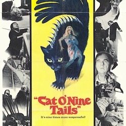
Though the victims are overwhelmingly female and their killers male (Argento typically photographed his own leather-gloved hands to stand in for his assassin’s), when the violence becomes over-the-top in its sexualized woman-hating (like the crotch-stabbing in What Have You Done to Solange?), it’s usually a clue that the movie’s murderer will turn out to be female: a simple case of projection. Only Lucio Fulci, the most twisted of the bunch, trained as a doctor and experienced as an art critic, not only assigns misogyny to a straight male killer (The New York Ripper) but plays the killer himself in A Cat in the Brain. Though, in another self-protecting twist of narrative, all psychological explanations in Gialli are bullshit, always. Criminology and clinical psychology are largely ignored, and Argento has a clear preference for outdated theories like the extra chromosome signaling psychopathy (Cat O’Nine Tails). Did anybody use phrenology, or Lombroso’s crackpot physiognomic theories, as plot device?
A tradition of the Giallo is that the characters all tend to be dislikable, something Argento at least resisted in Cat O’ Nine Tails and Deep Red. With disposable characters, each of whom might be the killer and each of whose violent demise is served up as a set-piece, this distancing and contempt might just be a byproduct of the form rather than a principle or ethos, but it’s of some interest, perhaps mitigating the misogyny with a wash of misanthropy. A Unified Field Theory of Gialli would find a more deep-seated reason for the obnoxious characters as well as the stylized snuff and the glamorous presentation. What urge is being satisfied, and why here, now, like this?
Class war? Though prostitute-ripping is encouraged in the Giallo, most victims are wealthy, slashed to ribbons amid opulent interiors. Urbane characters who might previously have graced the sleek “white telephone” films of forties Italian cinema were briefly edged out by neo-realism’s concentration on the working class. Now these exquisite mannequins are trundled back onscreen to be ritually slaughtered for our viewing pleasure.
Victims must always be enviable: either beautiful and sexy or rich and swellegant, or all of the above, so the average moviegoer can rejoice in their dismemberment with a clear conscience. Mario Bava bloodily birthed the genre in Blood and Black Lace (1964), brutally offing fashion models in a variety of Sade-approved ways, the killer a literally faceless assassin into whom the (presumed male) audience could pour their own animosities without ever admitting it, with the female killer finally unmasked to provide exculpatory relief.
If narrative formulas absolve the straight male viewer, compositions have a way of ensnaring him. Beyond that omnivorous indulgence of sensation for its own lurid sake one finds in Giallo, there is a more gilded emphasis placed on Beauty (in the Catholic sense), and it is only the women who are mounted upon its pedestal. That these avatars of beauty are to be savored, ravaged, and brutalized — in that order — is what concerns us. But the sex and the suffering that captivates most sadists is never what registers; no, it is the instance of death, the terror that afflicts the dying woman’s face that resonates. Once again, physical interiors become a negative form of emotional interiority, rooms amplified for the sole purpose of grisly annihilations; a kind of heretical, strictly anti-Catholic transcendence through amoral delight in what otherwise falls under trivial headings, either “the visuals” or “color palette” – neither of which touch the essential nerve endings of Giallo.
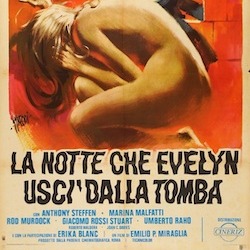
Swaddled inside an otherwise hyper-masculine castle lies a windowless chamber with feminine, if not psychotic, decor. Before he tortures and stabs her to death, “Lord Alan Cunningham” (fresh from his sojourn in the asylum) brings his first victim to this pageant of off-gassing plastic furniture, the single most obnoxious vision ever imposed on gothic environs. Risibly overblown ’70s chic rules The Night Evelyn Came Out of the Grave with nods to Edgar Allan Poe, as the modish Lord juggles sports cars and medieval persecution. Laughs escape the viewer’s throat in dry heaves when each new MacGuffin devours itself without warning. Take “Aunt Agatha” (easily two decades younger than her middle-aged nephews) suddenly rising from her motorized wheelchair, clobbered from behind seconds later, her body dragged into a cage where foxes promptly munch her entrails. Nothing comes of this. The phony paralysis, the aunt’s role in a half-dozen mysteries, which include a battalion of sexy maids in miniskirts and blonde Harpo Marx wigs – all gulped, swallowed.
About the only thing we know for certain is that “Aunt Agatha” is gorgeous. Though, in the end, she’s another casualty of the same nihilism that crashes Giallo aesthetics headlong into Poe country. That is into “Lord Alan” and his gaudy room crowded with designer goods to be catalogued in a horror vacui of visual intrusiveness – a trashy shrine to his late wife, the titular Evelyn. If lapses of good taste define The Night Evelyn Came Out of the Grave, they also reflect Giallo’s abiding obsession with real estate. After all, this Mod hypnagogia has to fill the eye somewhere. Why not bang in the middle of a castle? Poe’s The Fall of the House of Usher features a wealthy aristocrat burying his twin sister alive, thereby entombing his own femininity.
Evelyn represents both Usher’s primary theme of the divided self and the obdurate refusal to learn from it. “Alan,” who emerges a moral hero in the end (after his shrink aids and abets his murder spree), remains just as ornery, alienated, and vainglorious as Giallo itself. We’re never told precisely what the film’s fetish objects are supposed to mean. And since the camera seizes upon each one with existential grimness, we’re left with a visual style that begs its own questions.
Function follows form into the abyss. One Ophelia after another dies to satisfy our cruel delectation, even as will-o’-the-wisp light, taken from the bogs and neglected cemeteries of Gothic Horror, finds itself transformed into a crimson-dripping stiletto. Evelyn stands in for all Gialli, a genre which redefines film itself on the narrow front of visual impact: stainless steel cutlery and candy-colored light enact a sentient agenda as color becomes an instrument of hyperbolic misogyny that fills the eye and then some.
As with certain other Italian genres, notably the peplum, smart characterization, solid performances and decent dialogue seem not only unnecessary to the Giallo but unwelcome (the spaghetti western, conversely, in which many of the same directors dabbled, seemed to demand a steady stream of good, cold-blooded wise-cracks). Argento, in pursuit of that “non-Cartesian” quality he admired in Poe, took this to extremes, stringing non-sequiturs together to form absurdist cut-ups, torching his stars’ credibility merely by forcing them to utter such nonsense. And this wasn’t enough: from Suspiria (1977) on, the psychological thriller (which the Giallo is a sub-genre of, only the psychology has to be deliberately nonsensical) was increasingly replaced by the supernatural. So that the laws of nature could be suspended along with the laws of coherent motivation.
In Suspiria and its 1980 quasi-sequel Inferno, the traditional knifings are interspersed with more uncanny events, as when a stone eagle comes to life and somehow makes a seeing-eye dog kill his owner, and there are also grotesque incidents with no relation to story whatever: a shower of maggots, or an attack by voracious rats in Central Park. The Giallo’s quest for a solution, inspired as it was by the old-school whodunits, is all but abandoned, replaced by the search for the next sensational set-piece.
Argento’s villains are now witches, but, abandoning centuries of tradition, these witches show more interest in stabbing their fellow women with kitchen knives than with worshipping Satan or riding broomsticks. Regardless of who they’re meant to be, Argento’s characters must express his desires, enact the atrocities he dreams of. And inhabit places built for his aesthetic pleasure rather than their own. Following Bava’s cue, he saturates his rooms in light blasted through colored gels, making every scene a stained-glass icon, no naturalistic explanation offered for the lurid tinted hues. Just as no explanation is offered for the presence of a room full of coiled razor-wire in a ballet school, or for the behavior of the young woman who throws herself into its midst without looking.
Dario Argento’s true significance, at least with respect to Giallo, was perceiving in the nick of time the almost incandescent obviousness of its limitations; that Italian commercial cinema’s garish, polychromatic spin on the garden-variety psychological thriller – departing from its forebears mainly in the rampant senselessness of its “psychology” – had Dead End written all over it. It could never last. On the other hand, Giallo does take a fresh turn with Argento’s Inferno, thanks in no small measure to a woman screenwriter who sadly remains uncredited. Daria Nicolodi explains that “having fought so hard to see my humble but excellent work in Suspiria recognized (up until a few days before the première I didn’t know if I would see my name in the film credits), I didn’t want to live through that again, so I said, ‘Do as you please, in any case, the story will talk for me because I wrote it.’”
Daria Nicolodi
Nicolodi’s conception humanizes (it would be tempting to say “feminizes”) Argento’s usual sanguinary exercises du style, while at the same time summoning legitimate psychology. This has nothing to do with strong characterization – indeed, the characters barely speak – and everything to do with the elemental power of water, fire, wind.… Inferno rescues Giallo by plunging it into seemingly endless visual interludes, a cinema that draws its strength from absence.
by The Chiselers
Daniel Riccuito, David Cairns, Tom Sutpen, and Richard Chetwynd
4 notes
·
View notes
Text
Art F City: Material Light on Substance, Heavy With Dick Pics
Jesse Harris at Toronto’s Cooper Cole.
MEXICO CITY- Is a bigger fair necessarily a better fair?
Having doubled in floorspace since last year, Material Art Fair feels like a totally different beast. The fair has moved to two lower floors of Expo Reforma, with larger booths arranged around “courtyards” for conversation and concessions. There are plenty of new exhibitors, and much of the work looks far more market-friendly than the wares last year.
Opinions remain divided over whether or not these changes are a good thing. Several people praised the new layout and expansion. Last year’s fair felt chaotic—construction workers were still putting the finishing touches on the build-out as the doors opened—with a labyrinthine booth layout squeezed between a bar/performance area and panoramic windows looking out over the city. It was cramped but intimate, with a relaxed, party-like atmosphere. Importantly, I found this complimentary to (rather than distracting from) the artwork itself. One of the things that impressed Paddy and I so much was the sense that artists and galleries were here to network and the culture of display felt peer-oriented.
Nathalie Du Pasquier at the joint Sala Seis by MARSO & Apalazzo Gallery booth.
This year, though, the atmosphere was tense. During the VIP preview, it didn’t seem like much was happening in the way of sales or conversation. Exactly two gallerists seemed eager to talk about the work they were showing. Not looking like a collector (apparently), even simple inquiries about artists’ names were often met with exasperation. Several exhibitors were so unenthused about their booths they seemed downright embarrassed. And honestly, I can understand why—a majority of the work here is kinda boring. Most people I spoke with conceded that they found this year underwhelming after how much everyone enjoyed the last iteration. My friend described many booths—characterized by decor-friendly small paintings and ceramics—as akin to an interior decorator’s trade show. We joked that so many booths with faux-naïve paintings of flowers or “kooky” pottery looked like set dressing for a late-90s sitcom episode wherein the comic relief gets her “big break” with a show at a local coffee shop.
Maybe that assessment is unfair—looking back through my photos, there were plenty of good booths, but the majority of pieces don’t lend themselves to much discussion. The fact that they’re dispersed amongst so many unengaging booths doesn’t help—maybe last year’s smaller, more crowded presentation distilled the art-viewing experience? It doesn’t help that some of our favorite galleries from last year didn’t return. But no one seems quite sure of why the mood and quality is so uneven. One gallerist I spoke with (who asked to remain anonymous) praised the fair’s new layout and centering of project spaces, even as they conceded that the show leaves a lot to be desired:
“I think some of the booths fell flat—I’m not sure why exactly but I think it’s a combination of the distance some galleries traveled, getting work across the border/customs (which is notoriously difficult and problematic) or if it was just a weird year”
And a weird year it is. Perhaps the near-total lack of acknowledgment of current events weighed awkwardly over the fair (some friends have said they spotted Ivanka-Trump-inspired art, but I must’ve missed it). It seems so strange to have an art event (which we once praised for being more discursive than commercial) almost completely avoid political topics, particularly one where pieces are sold in US Dollars as the local currency plummets, with a majority of exhibitors from two countries threatened by a militarized border wall between them. Contrast this with Zona MACO, where discussion of Trump and socio-economic crises where never more than a few meters from polite abstraction.
Birgit Megerle at Vienna’s Galerie Emanuel Layr
At Material, I felt almost guilty for the escapism of pieces I liked—which, predictably, mainly comprised some combination of wigs, dicks, plants, and neon. Don’t get me wrong, I’m a big fan of genitalia and houseplants (really, though, aren’t we all?) but it bothers me that these age-old, lowest-common-denominator motifs are the highlights of a fair with an artist-centric reputation at such a politically fraught time and place. Gleefully snapping pictures of crude dick-and-foliage paintings, I had the sudden impression of an ancient Roman libertine—drunkenly admiring a bathhouse orgy fresco while the Republic burned outside.
Joani Tremblay, “Storming the Gates of Paradise: Landscapes for Politics,” 2017 at Projet Pangée. Of all the plants-and-ceramics booths, Projet Pangée stood out as the best curated group show (and nicest!)
That being said, two booths stand out for their engagement with politics: Tijuana’s Periférica and Miami’s perpetually-on-point Michael Jon & Alan. Though technically, neither the curators nor the artist behind Siebren Versteeg “Fake News” at the latter had control over its political content. The piece is an algorithm which grabs images from trending topics online and assembles them into surprisingly nice “paintings” in real time. These are displayed in stock-photo-looking white rooms that evoke pristine domestic spaces, displayed on a monitor that refreshes every few minutes. It felt like a ghost in the machine was reminding us of the awful world outside Expo Reforma, despite everyone’s collective best-effort to ignore it.
Siebren Versteeg “Fake News” at Michael Jon & Alan.
Periférica is showing prints by Omar Pimienta, who works with passports and notions of nationality. Here he’s reproduced his childhood passport as an editioned screen print, stamped with the name of the fair as if it’s a visa for exhibiting the work. The artist also invites people to trade in their old passports for new “Free Citizenship” ones he fabricates, so anyone can call his invented nation-state home. The gallerist showed me a photo of his collection of passports, which is in itself an inspiring image: I like the thought that so many people would trade a symbol of their national identity for a piece of artwork.
Omar Pimienta at Periférica
Also at Periférica, Juan Villavicencio. There’s something so satisfying about how snuggly these wigs fit these ceramics.
Wickerham & Lomax, “The Ginevra” and “The Deana” at Springsteen.
I loved these Wickerham & Lomax purse-shaped prints before I even realized they’re named after two of my favorite people in Baltimore: The Contemporary’s Artistic Director Ginevra Shay and outgoing Director Deana Haggag. The whole booth is great, including abstract pieces by Sofia Leiby.
Chelsea Culprit at Mexico City’s Yautepec.
Another random/personal highlight: I was immediately drawn to this mobile of a dancer in platform shoes. Then it struck me: I once stayed in a friend-of-a-friend’s apartment here in Mexico City and snapped a photo of a massive painting that looked similar because I loved it so much. The artist happened to be in the booth and overheard me telling this story, and told me that piece was actually a “sketch” to plan this! What a small, great world.
Mario García Torres at josé garcía.
The excellent Mexico City gallery josé garcía also has this wig on display, from Mario García Torres. It’s flattened and framed, and convincingly looks like a delicate painting from a distance. I also recognized this José León Cerrillo from a show Paddy and I loved at josé garcía’s brick-and-mortar location last year:
José León Cerrillo
A model being covered in band-aids, for Ryohta Shimamoto’s “Adhesive Plaster Man,” also at eitoeiko.
Chez Mohamed’s booth, featuring Ren Hang (photo), Thomas Mailaender (ceramics), and Luka Arbay (neon).
This Parisian gallery is named Chez Mohamed, but what they’re serving is anything but halal. I respect the fact that they’ve fully committed to obscenity with such gusto, including a Ren Hang photo, titled “Little Buddha,” which features a naked man ashing into an ashtray that he’s using to cover his anus while reclining at another person’s feet in an unhuman-looking pose. Also, a giant neon dick from Luka Arbay. This is what I imagine the anti-NEA Republicans think all big-city, taxpayer-funded art museums look like.
Celia Hempton at Sultana.
Sultana presented a solo show of paintings by Celia Hempton, each one of a blurry man’s crotch, with titles such as “Romania 25th of May, 2016” and “South Africa 5th November, 2015.” The names and distorted quality of the images evokes homemade webcam porn, buffering as it traverses international boundaries. These are really nice paintings, each with their own mark-making vocabulary that suggests haste but thoughtful color palette.
Ryan Patrick Quast at Wil Aballe Art Projects, of Vancouver. This cigarette is made entirely out of paint (no surface). So it’s technically a “painting”.
Nando Alvarez-Perez at Oakland’s City Limits.
Pablo Ravina at Lima’s Ginsberg Galería.
Kevin Rhinehart at L.A.’s Grice Bench.
I’m ending on this Kevin Rhinehart painting because A) it’s one of my favorite pieces from the fair. Rhinehart is an architect who paints things that are a little fucked up, like these ruffled Venetian blinds. It’s so quiet but so lovely up close—down to the care with which he physically embroidered the thread running down the canvas. And B) because it’s a bit of a caveat: I almost totally missed this until a friend pointed it out to me.
I’d like to head back to Material, because I’m sure there are more small highlights I’ve overlooked due to fair fatigue and how generally stressed the vibe felt opening day (several acquaintances remarked that many people were concerned about lack of collectors, a noticeable difference from last year). Maybe those of us complaining about the fair are just disappointed that last year’s magic is impossible to reproduce. At any rate, there’s good art in there—it’s just in a bigger playing field now.
from Art F City http://ift.tt/2keFpWW
via IFTTT
1 note
·
View note
Text
Palo Duro Canyon State Park
Palo Duro Canyon State Park
The first day of our roadtrip consisted of a whole lot of driving across the great state of Texas. Lunchtime found us picnicking at Palo Duro Canyon State Park which is about twenty or so miles outside of Amarillo, Texas. The park is Texas’s version of the Grand Canyon nestled in the Texas Panhandle Plains. The canyon is 120 miles long and 28 miles wide. The park boasts an artists palette of colors amidst the geological wonders waiting to be explored.
Discover an Artist’s Palette of Colors
Unfortunately, we arrived during the heat of day and during a heat-wave, no less. It was 102 degrees, but that did not stop us of from enjoying a short, and I mean short, picnic amidst the stunning scenery. The park offers over a dozen trails for every level of hiker, mountain biker, and equestrian enthusiast and plenty of camping areas for tent and camper-style camping.
Bedrock Mortar
Be sure to stop into the Visitors Center where you can explore the park’s history. The canyon is thought to have been inhabited for approximately 12,000 years. The Clovis and Folsom tribes are believed to have first inhabited the canyon. They hunted large herds of mammoth and giant bison. Later, Apache, Comanche and Kiowa, are believed to have used the canyon’s plentiful resources for their own tribes. These early cultures left behind rock art and bedrock mortars, where they ground mesquite beans and roots for food. It is thought that early Spanish explorers discovered the canyon, naming it Palo Duro a Spanish phrase meaning hard wood.
Borger, Texas
After leaving the park, we headed to Borger, Texas where we had decided to stay for the night. Considering how hot it was outside, we were looking for a break from the heat, and a good meal. We found them both in Borger. Borger s the home of the world’s largest inland petrochemical complexes. The original townsite is said to have been founded around 1898 by John F. Weatherly. There is a quaint old downtown area that is definetly worth exploring. The townfolk are friendly and wwe discovered a little hidden diner that may well have the best burgers in the Texas Panhandle; All About Burgers Etc.
All About Burgers Etc.
The outside may not have a whole lot of curb appeal, but once you open that front door and the smell of some seriously delicious home cooking hits you, you’ll be hooked. I have to admit that I was a little skeptical when I pulled up, but the great reviews on Google had me curious enough to give this place a try. Well, it was every bit as good as the reviews claimed…and then some.
Cim Baker -Owner
All About Burgers Etc. opened in September of 2016 and is owned by Daniel and Cim Baker. The restaurant was brimming with customers and Cim said smiling, “Sometimes we are so busy that its hard to keep up.” She is definitely a hands-on owner; she was helping her waitstaff take order, ringing people up at the register and walking around to share a bit of conversation, or a laugh with her regulars.
Cayla – Texas Hospitality at its Finest
Cim’s daughter, Cayla, is part of the family business, as well. She waited on our table and her attitude was as bright as a Texas Sunrise. She was very attentive to our needs and made us feel right at home in this little jewel of a Texas Diner. Cayla is the epitome of Texas hospitality.
Best Burger in the Texas Panhandle
Now a place that claims to be all about burger, better stand up to its name. This place sure did. The Burgers were definitely something for Daniel and Cim Baker to brag about, but that’s not all the bragging they should be doing, because the chicken strips were fantastic and that brownie sundae was almost too good to be true. If you pass this way in Texas and you do not stop by and give this diner a try…you will certainly be missing out.
Hampton Inn & Suites – Borger, Texas
We spent the night at the Hampton Inn and Suites in Borger, Texas. The hotel was one of the nicest Hampton Inn’s I have ever stayed at and I have stayed at a lot. The lobby was beautiful and spacious, the room was pristine clean, and the staff was friendly and welcoming. If you are ever in Borger this is without a doubt the place to stay.
The indoor pool is a great amenity in this area of Texas where the outdoor elements, sometimes heat and sometimes cold, could keep you from enjoying a pool. The hotel offers a free hot breakfast every morning and a managers social during the week. There was hot coffee around the clock and a fitness room for winding down for the day. The friendly staff greeted me as an Hilton Honors member and went above and beyond to make sure I enjoyed my stay. If I am ever back in Borger, this is my hotel pick.
What’s coming up on Day 2…
On day 2 we head out across New Mexico into Colorado. We have lunch in Colorado Springs and dinner in Fort Collins, Colorado where we stay the night at the Homewood Suites……
Roadtrip Through the West – Day 1 Palo Duro Canyon State Park The first day of our roadtrip consisted of a whole lot of driving across the great state of Texas.
0 notes
Last Seen Blogs

freelandpartytrash
Untitled

learnchina
chinese history

geniusbuilttm
❤️🧡💙💜

lifetimeyogisblog
Lifetimeyogi