#trying to go for a more representational/stylized thing? and practicing perspective
Text
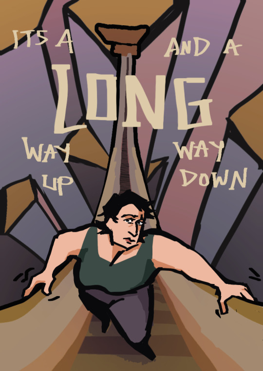
inktober #3
#inktober#my drawings#digital art#trying to go for a more representational/stylized thing? and practicing perspective#based on the character themes- a lot of ambition and a 'path' to success
10 notes
·
View notes
Photo
Péguy
Hi everybody!
In this news feed I've told you a few times about a project I named Péguy. Well today I dedicate a complete article to it to present it to you in more detail but also to show you the new features I brought to it at the beginning of the winter.
It's not the priority project (right now it's TGCM Comics) but I needed a little break during the holidays and coding vector graphics and 3D, it's a little bit addictive like playing Lego. x)
Let's go then!
Péguy, what is it?
It is a procedural generator of patterns, graphic effects and other scenery elements to speed up the realization of my drawings for my comics.
Basically, I enter a few parameters, click on a button, and my program generates a more or less regular pattern on its own.
The first lines of code were written in 2018 and since then, this tool has been constantly being enriched and helping me to work faster on my comics. :D
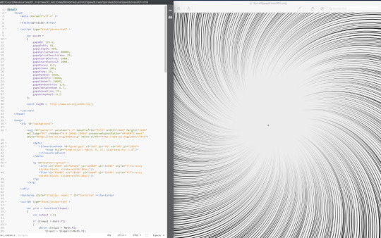
This project is coded with web languages and generates vector patterns in the format SVG.
In the beginning it was just small scripts that had to be modified directly to change the parameters and run individually for each effect or pattern generated.

Not very user friendly, is it? :’D
This first version was used on episode 2 of Dragon Cat's Galaxia 1/2.
During 2019 I thought it would be more practical to gather all these scripts and integrate them into a graphical user interface. Since then, I have enriched it with new features and improved its ergonomics to save more and more time.
Here is a small sample of what can be produced with Péguy currently.
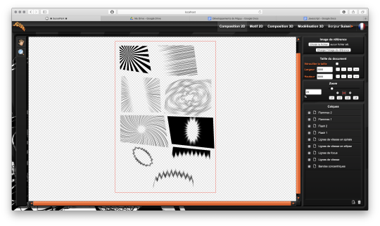
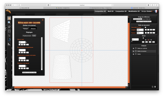
Graphic effects typical of manga and paving patterns in perspective or plated on a cylinder.
All these features were used on Tarkhan and Gonakin.
I plan to put this project online, but in order for it to be usable by others than me, I still need to fix a few ergonomy issues.
For the moment, to recover the rendering, you still need to open the browser debugger to find and copy the HTML node that contains the SVG.
In other words, if you don't know the HTML structure by heart, it's not practical. 8D
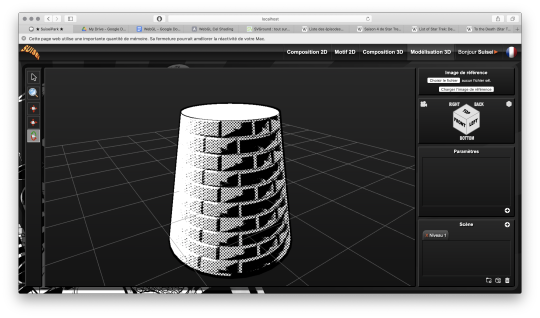
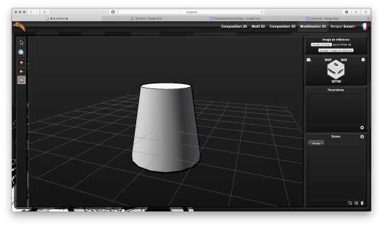
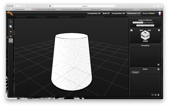
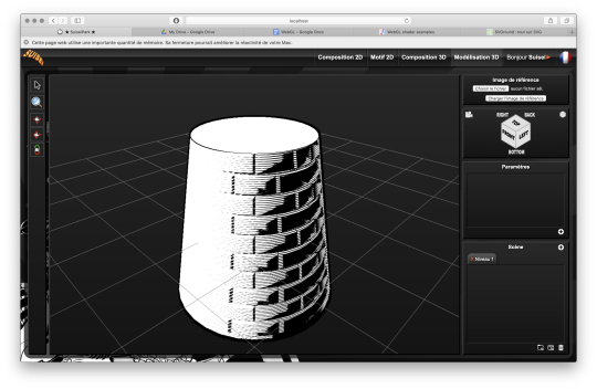
A 3D module!
The 2020 new feature is that I started to develop a 3D module. The idea, in the long run, is to be able to build my comics backgrounds, at least the architectural ones, a bit like a Lego game.
The interface is really still under development, a lot of things are missing, but basically it's going to look like this.
So there's no shortage of 3D modeling software, so why am I making one? What will make my project stand out from what already exists?
First, navigation around the 3D workspace. In short, the movement of the camera.
Well please excuse me, but in Blender, Maya, Sketchup and so on, to be able to frame according to your needs to get a rendering, it's just a pain in the ass!
So I developed a more practical camera navigation system depending on whether you're modeling an object or placing it in a map. The idea is to take inspiration from the map editors in some video games (like Age of Empire).
Secondly, I'm going to propose a small innovation. When you model an object in Blender or something else, it will always be frozen and if you use it several times in an environment, it will be strictly identical, which can be annoying for natural elements like trees for example. So I'm going to develop a kind of little "language" that will allow you to make an object customizable and incorporate random components. Thus, with a single definition for an object, we can obtain an infinite number of different instances, with random components for natural elements and variables such as the number of floors for a building.
I had already developed a prototype of this system many years ago in Java. I'm going to retrieve it and adapt it to Javascript.
And the last peculiarity will be in the proposed renderings. As this is about making comics (especially in black and white in my case), I'm developing a whole bunch of shaders to generate lines, screentones and other hatchings automatically with the possibility to use patterns generated in the existing vector module as textures! :D

What are shaders?
Well, you see the principle of post-production in cinema... (Editing, sound effects, various corrections, special effects... all the finishing work after shooting).
Well, shaders are about the same principle. They are programs executed just after the calculation of the 3D object as it should appear on the screen. They allow to apply patches, deformations, effects, filters... As long as you are not angry with mathematics, there is only limit to your imagination! :D
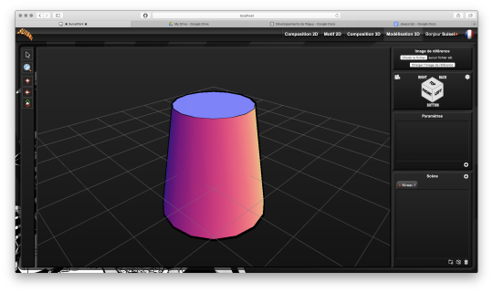
When you enter a normal vector in a color variable it gives funny results.
Yes! It's really with math that you can display all these things. :D
Now when you hear a smart guy tell you that math is cold, it's the opposite of art or incompatible with art... it's dry toast, you'll know it's ignorance. :p
Math is a tool just like the brush, it's all about knowing how to use it. :D
In truth, science is a representation of reality in the same way as a painting. It is photorealistic in the extreme, but it is nevertheless a human construction used to describe nature.
It remains an approximation of reality that continually escapes us and we try to fill in the margins of error over the centuries... Just like classical painting did.
But by the way? Aren't there a bunch of great painters who were also scholars, mathematicians? Yes, there are! Look hard! The Renaissance is a good breeding ground. x)
In short! Physics is a painting and mathematics is its brush.
But in painting, we don't only do figurative, not only realism, we can give free rein to our inspiration to stylize our representation of the world or make it abstract.
Well like any good brush, mathematics allows the same fantasy! All it takes is a little imagination for that.
Hold, for example, the good old Spirograph from our childhood. We all had one! Well, these pretty patterns drawn with the bic are nothing else than... parametric equations that make the students of math sup/math spe suffer. 8D
Even the famous celtic triskelion can be calculated from parametric equations.
Well, I digress, I digress, but let's get back to our shaders.
Since you can do whatever you want with it, I worked on typical manga effects. By combining the Dot Pattern Generator and the Hatch Generator but display them in white, I was able to simulate a scratch effect on screentones.

In the traditional way it is an effect that is obtained by scraping the screentones with a cutter or similar tool.
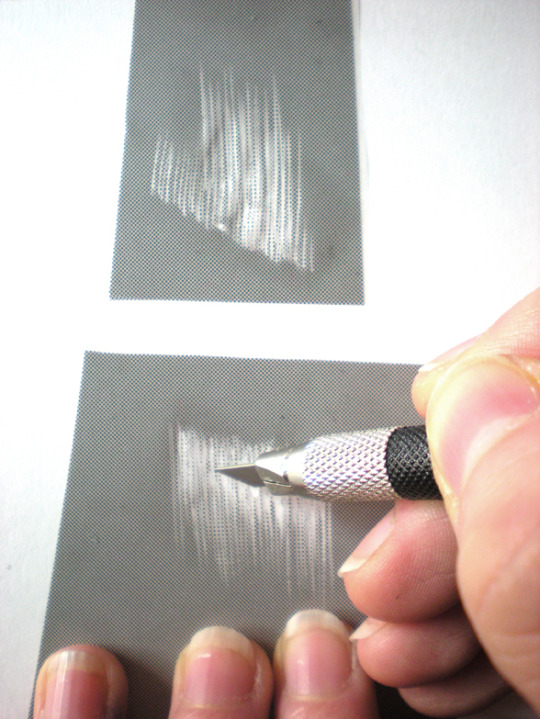
Péguy will therefore be able to calculate this effect alone on a 3D scene. :D
I extended this effect with a pattern calculated in SVG. So it will be possible to use the patterns created in the vector module as textures for the 3D module!
Here it is a pattern of dots distributed according to a Fibonacci spiral (I used a similar pattern in Tarkhan to make stone textures, very commonly used in manga).
Bump mapping
So this is where things get really interesting. We stay in the shaders but we're going to give an extra dimension to our rendering.
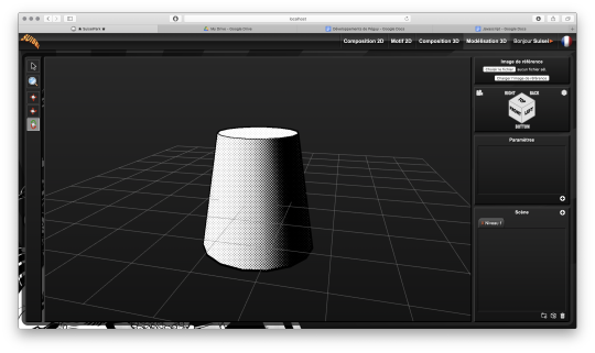
Basically, bump mapping consists in creating a bas-relief effect from a high map. And it gives this kind of result.
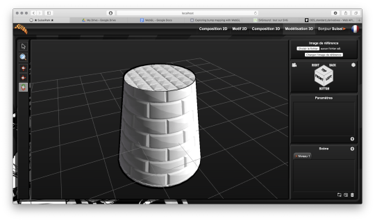
The defined object is always a simple cylinder (with 2 radii). It is the shaders that apply the pixel shift and recalculate the lighting thanks to the high map that looks like this.

This texture has also been calculated automatically in SVG. Thus we can dynamically set the number of bricks.
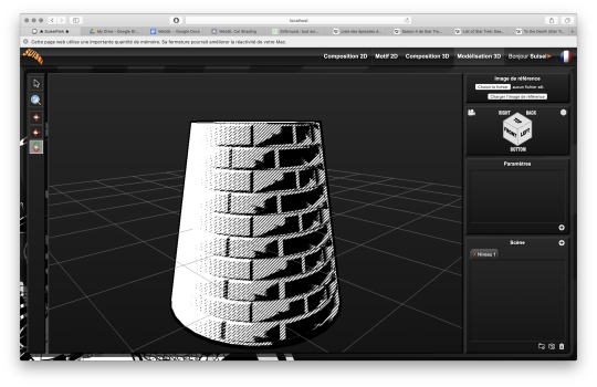
Well, this bas-relief story is very nice, but here we have a relatively realistic lighting, and we would like it to look like a drawing.
So by applying a threshold to have an area lit in white, a second threshold to have shadow areas in black, by applying the screentone pattern to the rest and by adding the hatching that simulates the scraped screentone, here is the result!
It's like a manga from the 80's! :D
I tested this rendering with other screentone patterns: Fibonnacci spiral dots, parallel lines or lines that follow the shape of the object.

Now we know what Péguy can do.
I think I can enrich this rendering a bit more with the shaders but the next time I work on this project the biggest part of the job will be to create what we call primitives, basic geometric objects.
After that I can start assembling them.
The concept of drawing while coding is so much fun that I'm starting to think about trying to make complete illustrations like this or making the backgrounds for some comic book projects only with Péguy just for the artistic process.
Finding tricks to generate organic objects, especially plants should be fun too.
That's all for today.
Next time we'll talk about drawing!
Have a nice week-end and see you soon! :D
Suisei
P.S. If you want miss no news and if you haven't already done so, you can subscribe to the newsletter here : https://www.suiseipark.com/User/SubscribeNewsletter/language/english/
Source : https://www.suiseipark.com/News/Entry/id/302/
1 note
·
View note
Text
Problematizing ´The East´: We need to talk more about the Parthians.
When I told friends and family I wanted to write my BA thesis about the Parthian War from 161-66 AD usual answers were:
- The Parthians? They were a enemy in forge of empires. („ooookay.“)
- I read about them in the bible. („really?“)
But most times it was:
- Who the hell are the Parthians?
Yes- I will try to answer the question in this essay. For starters: Parthia was an empire, locacted in the Middle-East and a ancient superpower, for many centuries on eye level with the Roman Empire and responsible for several Roman military desasters. So more interesting than „Who the hell were the Parthians?“ is the question „Why you never heard about it in history class?
This little “essay” will more focus on this overall state of not knowing and what it tells about our traditions in seiing and teaching history, about our image of modern and ancient ´world order´. It argues that the Parthian War is just an example of dividing the world in „Western“ and „Eastern“ societies. Still modern historians and history teachers making themself representives of an very old point of view without even reflecting it. So we reach the point in this essay where can I reassure you it´s- it´s not (entirely) your fault.I also didn´t really talked about this in my thesis. So I will talk about it now.
East vs. West is one of the most known examples of ethnogenesis. Some confuse it with ´racism´- and to be fair there can be a racist extreme of it esspecially when there are prejudices and judgmental components implicated, which (like we all know) happens everyday. But ethnogenesis in scientific terms starts with phrasing values, attributes and connecting them with geographical origin.
It´s a resource of orientation, which is quite natural, but it´s also important to realize: There is a time before ethnogenesis and also ethnogenesis can change over time. Two examples. The Greek – and the Parthians.
When we think about the Greek we often talk about the beginning of democratic and western values. Because of this some reminders:
- Greek democracy was really far away from everything we would call today „democratic“. There are also some scientists believing roots or at least hints of democratic ideas can be found in the Ancient middle east (for example the Babylonian Empire).
- Speaking of other ´western´ values: Before 600 BC the Greek seem to have been part of a lager entity which connected the eastern mediterran with the big kingdoms in the Middle East and Central Asia. We had something called peer policy in which the rulers of the different kingdoms shared similar values, cultural ideas and practices to keep their empires going. That explains a lot of similarities archaeologicans have for found in Mykene, Judäa and the ancestor oft he Babylonian Empire. A student of classics will notice early that many things we considered being „Greek“ existed before... thousands of miles away beyond the Mediterran Sea.
- The last and more important point: The republic of Greece was founded in 1827. In ancient times they was never a Greek state and therefore no greek nationalism. So even when we start talking about the GREEK it´s a consequence of a ethnogenesis.. It´s not even true when we talk about Greek and mean the population of roman province Achaia (= geographically a big part of modern Greece). In the time I researched for my BA (so 50-250 AD) being Greek was above all a cultural label. One could call himself Greek and lived in the province of Syria, Aegyptusor or even Britannia. All he needed to do was to read the „right“ books, manage rhetorical abilites and most important... to talk and write in attic greek. In contrast to coine – a kind of ancient aquivalent to kiezdeutsch – attic greek was spoken by the philosophers and politicans of the forth and fifht century BC. Language was important. For a reason the translation of barbaroi is just „not Greek speaking“. Things seem settled but there was a ongoing debate about what were the right books, the right way to talk ... and in general the nature of paideia (greek education).
The forth century is also the first time when we find the world divided in East and West- written down by Hippocratus. The „father of medicine“ shared his thoughts about four winds blowing in different parts and directions of the world and also how the local climate influenced the state of mind of its human inhabitants. In his opinion because of this the people living in „Greece“ and West of Greece were more zivilized than the people in the East. In doing this he created a mental map that hasn´t changed that much ideologically to the present day.
But Hippocratus text has also an interesting context. About 20 years before his birth Xerxes started a Invasion with his a big Persian Army but was defeated at the battle of Salamis. Starting from these days the Greek determined the image people associate till today with the people living in „the East“. – The cruel Persians. The timid Persians. The uncivilized Persians.
Why is this important when we talk about the Parthians? The Parthians – like the Seleucid before them- and the Sassanids after them belong to the alternating, western-asian superpowers ruling over large parts what had been Persia. They all were:
- Big. And big in the Parthian case means from Irak -to-Northern Iran-And-Caspian Sea-big. When you look at a map it´s a similar size than the Roman Empire. Also like the Romans it was mostly little „kingdoms“ being connected to a great entity. What we don´t know was whether there was a counterpart to the political role of being suddenly a „Roman citizen“ or how much the inhabitants of the Parthian empire saw themself as ´Parthians´.
Archaeologically we definitely have cultural similarities in different parts oft he Parthian Empire and from the first century AD something called „Parthian style“ (in art, buildings etc.)
- They had as well (cultural and economical) exchange with the Romans – and because Alexander the Great moreover Greek influences- but also intense military tensions. Both parties tried several times expanding their empire on the eastern (or western) border. Armenia was established as a neutral „puffer zone“. It was a weak compromise and soon enough things started escalating- again and again.
- From a modern historian point of view the source situation really IS a problem. The case of the Parthians is worse than it is with the Persians. They are pieces of arts, inscripts, buildings… but no written sources to be found. The reasons behind this problem are also different ones:
Just in the last century the focus of european historians slowly changed. They were just a few classicists being able to read Accadian or other middle eastern ancient languages. It wasn´t necessary to have anything else than Latin or Greek in your showcase- because Greek and Roman History was the only “important” parts of studies in antiquity. That’s still the impression of nowadays school education.
But in contrast to the Persians the Sassanid´ propaganda was playing also a big role in erasing the Parthians from collective memory. They tried to make Parthian sources vanish to outshine then- successfully. Most sources we have about the Parthians are from writers in early principate. Again: Written by the winners.
But is pretending that they´re weren´t there, just because we know not much about them and the are far away from Europa, is the right way? I don´t think so. In my BA I notice something interesting: Much like Alexander the Great, who framed the Persians as the “Arch Enemy” and his campaign as a “act of revenge” similar motifs appeared in the first and second century AD were used to justify war against the Parthians. The Roman (and Greek sophists) also stylized the Parthians as cruel and barbaric people.
Among others the river Euphrates was seen as a cultural border and beyond them lay the Parthian empire, untouched by paideia, exotic, but strange and terrifying on the same time. More important: Everything that wasn´t and isn´t “us”- western-european.
Reminds you of something? Try to think about it, anytime someone tells you migration doesn´t work because they people from this part of the world (especially the Middle East) are just too different from us. Anytime you read on posters about the “Patriotische Europäer gegen die Islamisierung des ABENDLANDES” (Pegida).
I´m not claiming people and culture didn´t develop from antiquity. For example there definitely were changes with the Rise of Islam. But not to forget: Like Christianity Islam developed from the same monotheism religion and still has many parallels to the our worldview.
What I wanted to adress is that the idea of a “superior Western society vs. a undercivilized Eastern society” isn´t new and this mental map, dividing the world into mostly two parts is not a natural one. There was a time before this perspective and who knows? Maybe someday there can be a time when we can overcome it. Recognizing and reflecting must be the first step. Not only in universities but also in the class room.
#quarantaine-boredom#:D#but i think it´s an important topic#and maybe some history nerd is interested in this ^^#and as bored as i am:D#history#classics#academia#archaeology
0 notes
Text
picture may be worth 1,000 words, but how do you take the 100,000 or so of them in a book and consolidate them into a single image? Book covers help readers instantly decide if a a book is meant for them. After all, a single image is a lot quicker to digest than 150+ pages of text.
So how do you make sure that a cover captures the soul of a book and intrigues the right reader to pick it off the shelf (whether physical or digital)? Start with genre. This article explores how to design book covers for different genres of literature, so when your book is judged by its cover, it’ll come up a winner.
Fantasy & sci fi covers
—
Sci fi and fantasy books are all about imagining scenarios and worlds that are impossible or improbable in our current state of technology, society or environment. Think long distance space travel, dragon-regulation politics, or even man-made atmospheres. There are several cover techniques to use in order to make these worlds seem more real:
Merge the real with the unreal
Sci fi and fantasy novels explore real world, human themes in far-fetched worlds. It should come as no surprise, therefore, that many of their book covers visually mimic this binary theme. To do this, they combine a representational style of illustration—grounding the design—and pair it with surprising or unusual elements, be in monsters or technology.
Show the drama
Another well-used technique in sci fi and fantasy book cover design is the depiction of dramatic actions, expressions and imagery. This should come as no surprise. Sci fi and fantasy books are often dramatic and action packed! Notice how Fall to Earth features a man abandoned, falling through space, or Rise of the First World shows the heroes in the middle of a battle. Very dramatic!
Create a mood
Lastly, we mustn’t forget the way in which sci fi and fantasy book covers attempt to create a world with looming tension. There is sometimes a sense of serenity, as if to depict the calm before the storm. A perfect example of this is 2001 A Space Odyssey which feels quiet and calm in it’s expansive use of negative space, yet somehow dark and frightening in it’s flat grey and bright red color palette. Alternatively, science fiction and fantasy book covers can create a sense of unease with surreal imagery—like cover for Swarm—or adventure—like Auf Dem Vulkan.
What to keep in mind
The subject matter and tone of your book are the most important things to keep in mind when designing a cover for sci fi or fantasy, but there are a couple of other design trends that help readers know the genre:
A large number of modern sci fi and fantasy novels use all caps titles. More classic, old-world looking serif fonts are in fantasy and modern, clean sans serif fonts in science fiction.
Blue and amber are the two most used colors. Blue creates the feeling of the calm before the storm, and amber lighting connotes something other worldly.
Smoke, clouds and fire are popular mood-setting textures.
Romance covers
—
The huge stereotype in romance cover design is two half-naked figures passionately staring at each other. Love it or hate it, this style of book design is vastly popular. It lets the reader know that these books offer something that’s hard to find in this world: love and passion. But this isn’t the only way to do a cover for a romance novel. The key to a good romance novel cover is to show that the book is, well, romantic, and to hint at what makes your book unique. Here are a few ideas:
Go traditional, with details.
Romance is about the connection between two people, so a great way to get that concept across is to show two people connecting. You can do this with the classic, irresistible hot-and-sweaty design style of showing bodies intertwined, or you can be more subtle about it. Many romance novels don’t show the faces in their cover image, because it allows readers to more easily get lost in the story, perhaps imagining themselves as the hero or heroine. A romance novel can be particularly evocative when you only show parts of a body, be it lips or feet. It focuses on sensual body parts makes the reader wonder what is happening that isn’t pictured. They key to making these covers unique? Bring in details that hint at characters, like on the Kings of Midnight cover, where the feet clearly belong to two very different types of people.
Have some solo fun
Some romance novels are more about one individual’s journey—whether it’s erotic or romantic. Often times these books picture the protagonist on the cover, with subtle cues that tell us what the book is about. The Vampire’s Throne, for example, puts the scantly clad heroine in a provocative stance, showing off a lot of leg. In the background, a man’s mouth hangs open with a drip of blood. It’s not an actual picture of sex, but damn if it doesn’t tell you that that’s what the book is about (at least in part).
Use objects as foreplay
In recent years, romance novels have taken to building the tension and appeal by using provocative objects as surrogates for bodies. Take for example Fifty Shades of Grey, which depicts a necktie. The choice of image clues the reader to the sexual practices of the main characters. It’s a great example of how to be provocative without showing any skin!
What to keep in mind
Romance novels are about the connection between two people. There are multiple ways of showing this. You should use what’s best for your individual book. A few things to think about:
More traditional romantic romance novels tend to prefer soft colors: lilacs, pinks and golds. More erotic romance novels go bold with deep, bright colors, often paired with dark images.
There is a lot of freedom to play with font: use it as a device to tell us what kind of romance novel you’re writing. If it’s classic or historical, perhaps choose a script-based font. Modern and edgy? Choose an equally modern and edgy font.
Font choice further reels the reader into the serious world of romance.
Thriller & mystery covers
—
Thrillers and mysteries get our hearts pumping and our brains working as we try to figure out whodunnit. A good book cover in these genres will do the same. Readers want to know just enough to draw them into the story, but don’t want the spoilers revealed (bonus points if you can hint at them so when the reader finishes the book they have an “oh yeah!” moment about your cover). Here are a couple of our favorite techniques:
Use perspective
Thrillers and mysteries have layers, and with each chapter you get deeper and deeper into it. Many thriller and mystery covers use images with deep perspective, leading the character (and the reader) down that path into the unknown. This technique is a favorite of renowned thriller author, John Grisham, and is used on many of his covers.
Make your title the focus
Mystery and thriller covers are unique in that a large percentage of them make the title the graphical focus. This is because the titles are often so good at setting the moods and building the tension—any visual image could spoil a twist. When the title is the focus, the text generally has some interesting graphical element to tie it to the surroundings or themes of the book. For example, The Girl on the Train cover shows a blurred background and some of the letters are offset, creating a discombobulating feeling, which could be caused by the movement of the aforementioned train, or something else…
Make it unclear what we’re looking at
When something is a mystery it’s unclear. That’s pretty much the definition. To bring this theme into your book cover, you can show us objects or use images that are an obscured or placed out of context, leaving the reader to wonder what they are and why they’re there. Take the Gone Girl cover: what are those white lines? Are they hairs of a girl fleeing? Hairs left at a crime scene? Or something else? Alternatively, you can use a silhouetted, blurred or partial view of a character. This design trick leaves us wondering if this is the good guy or the bad guy, and what exactly they’re up to.
What to keep in mind
The main goal of a thriller or mystery book cover is to build up the tension. You can do that in a number of ways. A few parting thoughts:
A large number of mystery and thrillers use red as an accent color, probably because of its association with blood and heightened emotions. Red screams danger!
Many mystery and thriller covers are high-contrast, meaning they use deep blacks and white whites (or bright colors) to heighten the tension.
Font choices are predominantly angular serif fonts. The harsh edges of this type of typography again helps create a stark, edgy feeling in the design. When serifs or softer fonts are used, it’s usually done so for a particular purpose.
Literary fiction novel covers
—
Literary fiction is a broad genre, but generally means any novel which is felt to have literary merit. Think fictional stories which could potentially be true in our reality. These books are often written to offer insight into the world we live in. At first, it sounds tough to design a cover which draws a reader into… the world they already live in? Ironically, because they’re rooted in the real world literary fiction novels tend to have some of the most stylized, least realistic covers of all the genres.
Trying to find patterns among literary fiction covers is nearly impossible; their artwork is as diverse as the books themselves. We see photography—both landscape and portrait. We see abstract and representational illustration. We see bold, bright books with just the title. We see images that represent the action and characters in the books, and those that use images as metaphor.
Here are a couple of our favorites, in very diverse styles:
What to keep in mind
If you’re writing literary fiction, make sure your cover art fits the mood and style of your book.
Epilogue
—
Next time a book cover “grabs” you, think about the book cover design techniques in this article. Also don’t forget, we’ve showcased only several of the more popular styles. There are many more! Don’t be afraid to experiment or identify different techniques used in other cover examples. Also if you’re doing a series, remember that designs need to be adaptable/flexible to look cohesive throughout the series. Think along the lines of aligning book spines, title placement and puzzle piecing. For more on series check out the full article here!
Ready to get the cover for your book? Launch a cover design contest now!
—
This article was written with input from workerbee.
https://99designs.co.uk/blog/uncategorized-en-gb/book-cover-design-by-genre/
NICHES IN GRAPHIC DESIGN: WHY AND HOW TO CHOOSE YOURS
0 Comments
0
By
Manuela Langella
graphic
organizing
2 January 2016
It is a priority to know which are Graphic Design Niches, to know which is the best way to choose.
When you come into Graphic Design world, it’s your choice, because you have passion, good taste for graphic and colors, drawing affinity.
You begin reading books, look at very talented artists, read so many good articles. Then you come to that point:
Can I reach a so high level?
Sure, you can.
But. I say yes but I’m not telling you the way it’s easy. It is not. It is a very long and difficult one, you need time to achieve some results and demonstrate your skills. It’s hard, but not impossible. You can do it.
How?
First of all, you need to choose your Niche in Graphic Design.
Then, you need to choose your Tool.
Let’s see how.
WHY YOU NEED TO CHOOSE A NICHE IN GRAPHIC DESIGN
Choosing a niche means choosing a piece of market to address your work to. As well as in Web Design, it is a good practice to choose your target customers in Graphic Design too.
You can choose which kind of works you like to execute, depending on your client. Why?
Because this way you can specialize in something and work even better when you know your target client. You will discover problems and solutions about that niche and you will be specialized to solve them.
That happens in every working environment, so in Graphic Design one too. It is no good to specialize in everything, even there.
“Specializing in everything” means doing everything bad. It’s better to concentrate on one thing, ignoring others deliberately.
“Don’t I loose clients, this way?”. Sure, but it’s the result of choosing. And as such it will bring to you target customers, I mean people interested to your products and ready to pay a specialist as you are.
HOW TO CHOOSE A NICHE IN GRAPHIC DESIGN
There are two ways to choose your niche:
doing what you do best
combine it with what you like to do
For instance, if you can draw and can use Photoshop fine, both things can be used to develop your own work and you can specialize doing just that.
I love using Illustrator and choose it to work on my niche.
WHERE YOU CAN CHOOSE A NICHE IN GRAPHIC DESIGN
It depends. You got two options:
working with clients close to you geographically
working online
If you want to work with clients you want to meet (geographically close), you have to choose an area.
Is it your town? Do you want to include close towns around?
Do you want to extend more?
Just choose which are geographical border you don’t want to overpass. Specialize on that area, and maybe you can take a larger area when you have done with the first one.
Remember: if you do this choice, your business success depends on locally economy.
So, before you can take a decision, just go around and ask people working in this area since time, to know if searching there is worth. Don’t be surprised if you receive negative answers: “It is not worth…there’s no much work…the best is changing your mind”. It often happens because people fear competition. For this reason, you could find co-workers who want to discourage you
But this is not the way we will be. Some kind of people don’t know that competition is exactly what we need to achieve success. But this is something else, maybe I will talk to you about it some day.
If you want to work online instead, things become different. In this case you will be able to work with customers from all over the world.
You can work choosing through many freelance sites, where you can find work. Here just someone:
https://www.freelancer.com/job/
https://www.peopleperhour.com/freelance-jobs
http://www.guru.com/d/jobs/
https://www.elance.com/q/find-work
Upwork.com
http://99designs.com/
https://www.behance.net/joblist
https://studio.envato.com/
Here you will be able to find so many job offers for graphic, design and illustration. You can choose an ad and propose your quote. Don’t forget to link to your portfolio.
Another valid way to work it with Passive Income. You are free to create resources you like and to sell them more and more. Places where you can do that are for instance Graphic River and Creative Market.
In both cases you can choose your reference market. A good example is the one from Flauntmydesign, who presents us a various schema:
WHICH NICHE TO CHOOSE GRAPHIC DESIGN
Now you know why you have to choose your niche, where to choose it and which tools to use. You miss just one step: which one to choose.
I show you here the great list of Millo:
Find your design niche in designing web sites for small businesses
Designing web sites that can be edited by non-programmer/coder clients
Designing extremely original business cards
Designing very fancy application icons
Designing mobile web sites
Find your niche in designing facebook pages
Designing facebook tabs
Designing twitter backgrounds
Designing web sites that turn a ‘boring’ business into an exciting one
Designing movie posters
Find your niche in designing concert posters
Designing microsites
Designing portfolio sites
Designing landing pages
Working exclusively with Dentists
Working exclusively with Doctors
Working exclusively with Small Businesses
Working exclusively with Large Corporations
Working exclusively with Grocery Stores
Working exclusively with Hair Salons
Working exclusively with Animal Shelters
Working exclusively with Restaurants
Find your design niche in working exclusively with Clothing companies
Working exclusively with Photographers
Working exclusively with other designers
Working exclusively with Online businesses
Working exclusively with Brick and Mortar Businesses
Targeting companies that have no well-established brand
Targeting companies that have a rich brand history
Targeting companies that are non-profit
Targeting fortune 500 companies
Targeting companies that have only a few employees
Find your design niche by targeting companies that have never done business online
Focusing on selling wordpress templates
Focusing on selling HTML templates
Focusing on selling stock logos
Focusing on selling branding strategies
Focusing on selling style guides
Focusing on selling CSS stylesheets
Specializing in HTML5 web sites
Specializing in Flash web sites
Specializing in Javascript applications
Specializing in Jquery-rich sites
Specializing in high-traffic design
Specializing in usability design
Specializing in logo design
Specializing in print design
Specializing in business card design
Specializing in internet marketing design
Specializing in web banner ads
Specializing in branding & identity design
Specializing in product design
Find your design niche by specializing in transportation design
Specializing in billboard design
Specializing in flyer design
Specializing in point-of-purchase design
Specializing in package design
Specializing in vintage design
Specializing in modern techniques
Specializing in style guide design
Blogging about the business of design
Blogging about where designers can find inspiration
Blogging about your own design projects
Blogging about freelance design
Blogging about printing techniques
Blogging exclusively about print design
Blogging exclusively about web design
Blogging about logo design
Blogging about design education
Or, like me, find your design niche while blogging about design entrepreneurship
BONUS UPDATE!
After posting this article, I received an interesting email from Tomas Fransson reporting me a very interesting niches collection he made, about Web & Graphic Designers, Photographers, Illustrators, Writers and more.
His collection name is The Niche Notebook and it’s very easy to read and consult through tabs, and many links to take examples from.
Thanks a lot Tomas for your email!
https://www.manuelalangella.com/niches-in-graphic-design-why-and-how-to-choose-yours/
How to find your design niche: 70 ideas to get you startedSHARE
PRESTON D LEE
There’s a continuous debate in the design community (that I don’t plan on diving into today. If you’re interested, read here.) about whether or not a designer should specialize in one specific area or strive to be a jack-of-all trades. For designers who think it would be beneficial to find a super-specific niche, today we give you 70 ideas to get your creative juices flowing.
This list of possible design niches will jumpstart your creativity and help you decide where you want to focus your efforts as you work to build your design business.
There’s an endless number of niches not mentioned here. Please share your ideas for design niches by leaving a comment!
Sidenote: Once you finish, read how 4 freelancers built recurring revenue models that changed their business. You'll love it.
How to find your design niche: 70 ideas
Find your design niche in designing web sites for small businesses
Designing web sites that can be edited by non-programmer/coder clients
Designing extremely original business cards
Designing very fancy application icons
Designing mobile web sites
Find your niche in designing facebook pages
Designing facebook tabs
Designing twitter backgrounds
Designing web sites that turn a ‘boring’ business into an exciting one
Designing movie posters
Find your niche in designing concert posters
Designing microsites
Designing portfolio sites
Designing landing pages
Working exclusively with Dentists
Working exclusively with Doctors
Working exclusively with Small Businesses
Working exclusively with Large Corporations
Working exclusively with Grocery Stores
Working exclusively with Hair Salons
Working exclusively with Animal Shelters
Working exclusively with Restaurants
Find your design niche in working exclusively with Clothing companies
Working exclusively with Photographers
Working exclusively with other designers
Working exclusively with Online businesses
Working exclusively with Brick and Mortar Businesses
Targeting companies that have no well-established brand
Targeting companies that have a rich brand history
Targeting companies that are non-profit
Targeting fortune 500 companies
Targeting companies that have only a few employees
Find your design niche by targeting companies that have never done business online
Focusing on selling wordpress templates
Focusing on selling HTML templates
Focusing on selling stock logos
Focusing on selling branding strategies
Focusing on selling style guides
Focusing on selling CSS stylesheets
Specializing in HTML5 web sites
Specializing in Flash web sites
Specializing in Javascript applications
Specializing in Jquery-rich sites
Specializing in high-traffic design
Specializing in usability design
Specializing in logo design
Specializing in print design
Specializing in business card design
Specializing in internet marketing design
Specializing in web banner ads
Specializing in branding & identity design
Specializing in product design
Find your design niche by specializing in transportation design
Specializing in billboard design
Specializing in flyer design
Specializing in point-of-purchase design
Specializing in package design
Specializing in vintage design
Specializing in modern techniques
Specializing in style guide design
Blogging about the business of design
Blogging about where designers can find inspiration
Blogging about your own design projects
Blogging about freelance design
Blogging about printing techniques
Blogging exclusively about print design
Blogging exclusively about web design
Blogging about logo design
Blogging about design education
Or, like me, find your design niche while blogging about design entrepreneurship
http://millo.co/how-to-find-your-design-niche
0 notes
Last Seen Blogs

herasokas
Untitled
manda-crossing
Guess Im Open

vijaysmith237
Denver Stump Grinding

22ratonthestreet
22 whole rats

gooseimagefinds
from the library of goose nuggets