#this app could be living proof that regular good people can still create something that makes a huge difference in society
Text
HEY GUYS I NEED YOUR HELP!!
ok so first off WE GOT INTO THE FINALIST ROUND FOR AWE'S FIGHT CLIMATE CHANGE CHALLENGE!!!!!!! 🎉🎉🎉🎉🎉🎉
we're in the running to win $100,000 to help us make digital objects into a realty for everyone. this is a huge deal. I am in a daze writing this and literally cannot articulate how major this is
we need people to watch our announcement video on Twitter multiple times to help more people see it! the twitter algorithm boosts things based on watch time, so just opening the link and letting the video run a couple times will be a HUGE help 🙏
VIDEO LINK IS HERE


Figmin XR will never have a subscription based cost model, and ALL of the things shown above are FREE to download within the app right now.
when this technology becomes as ubiquitous as smartphones (and it WILL, possibly even sooner than we think), this is the future we want people to be able to look forward to... and the first step of getting to that future is proving that it's one people actually want.
#figmin xr#art#3d art#digital art#artists on tumblr#ar#augmented reality#vr#virtual reality#technology#AAAAAAAAAAAAHHH!!!#seriously i wish i could be more coherent right now but i CANNOT#IF YOU THINK THIS IS EVEN REMOTELY INTERESTING PLS CONSIDER REBLOGGING#tumblr is still the only social media where i have a following so i'll be relying on you guys heavily for votes later on as well!!#all of this is very grassroots but if we bring this to enough people it will fundamentally change the world#and that is not an understatement#this app could be living proof that regular good people can still create something that makes a huge difference in society#and i am beyond humbled and grateful to be part of the tiny 4 person team working on this#everything you see from me about figmin is because i truly love it with my whole heart#and it's an honor to be able to share it here with people who have been following me since the beginning
132 notes
·
View notes
Note
Hey! I saw the post you answered about echolocation as a way to avoid writing canes, but I was wondering what you think of a character using a cane and echolocation at the same time? For things like knowing how big the room is or if there are large obstacles, get a feeling for the buildings in a street, etc. The cane would be their main mobility aid, along with sighted guides, but echolocation is a tool in their arsenal. Thank you!
Hi nonnie! Thank you for this question. It is a good one. You all come up with good questions. :)
First, here is the post anon is talking about. I would suggest reading the notes as well because some good discussions occurred. Check the notes of this current post as well, because I’m not as familiar with this topic and someone might be able to discuss it from more experience than I can.
I am working on a post about blind tropes I’m tired of, and that aren’t necessarily bad, but potentially bad if used for bad purposes, such as to avoid writing about canes or guide animals fir navigation. And how to possibly do them BETTER. Echolocation is one of the things I want to cover.
Why Do I Dislike the Echolocation Trope?
It’s overused and boring. Can it be done well and in an interesting way? Yes. Do people normally make it interesting? No.
The majority of things I see on echolocation are like “this character is blind and uses echolocation to SEE.” That’s it. That’s the skill the character has. It is also usually used to avoid writing about canes or guides dogs, or used in weird ways, like allowing characters to locate or ‘see’ things they would not be able to see with the echolocation method.
Obviously, you aren’t doing that. You’ve done your research and you understand that canes are important and provide a specific function that echolocation cannot fill. This includes interacting with their environment to map it out and remember it better, using stairs and escalators, feeling cracks or obstacles on the ground, signaling to drivers or other people that you cannot see well (this is essential when crossing the street).
Echolocation is just something people think blind people use regularly and that is not the case. It can be hard to learn and someone would have to already be able to use a cane before learning to use it. It requires good hearing and probably wouldn’t work in a crowded, noisy area. Rain and snow may hinder echolocation as well.
So Echolocation Has No Use?
Not necessarily. I just want to stress the trope is way too common for the extent that it is used in the blind community.
Here are a few ways I know people use active and passive echolocation:
-listening for the amount of echo in a room. A convention hall is going to sound way different from a small classroom. The amount of echo can also tell someone if there are things on the walls (such as posters or shelves with knickknacks) because empty walls sound more echo-y.
-The tap method for white canes. This can be seen as a kind of echolocation, although I think people mostly think of making click sounds. This can give a good idea of your surroundings, although it may not work if there is a lot of noise, and in my opinion, and the tap method can get tiring to use for a long time (although I suppose people who favor it get used to it). I don’t think this method is used all the time though.
What About Toph?
I guess Toph’s thing would be considered echolocation? Yes, I like Toph. Her ability is fun and even common in her world. She just took a tool she had and refined it to her needs. A blind blogger even wrote a post about Toph which you can find here.
Here is the part I find relevant to this discussion:
Also, even in an AU with bending, I think Toph would like the advantage of tapping her cane to create a stronger, more distinct vibration than a small shifting of her weight on her feet. It would have more control.
Where I Would Rather See Echolocation
There are places where I would prefer to see echolocation despite not being jazzed about the trope.
Non-human characters!
- sea creatures/half sea creatures who use echolocation in real life
- mermaids!
- animals or half animal characters who use echolocation in real life
- robots, cyborgs, or other similar characters
I’m okay with these because 1) characters who live in the sea might not be able to use a cane effectively and 2) some animals already have a precedent of being able to use echolocation, thus making them believably able to use it (although if they are able to hold a cane, echolocation should not replace white cane use).
I am also more open to robots and similar characters using echolocation because the techy side of them makes it more believable, especially since in order for it to be useful, it would need to be beyond human levels of echolocation. Which are currently not that great. Canes should also be used, at least in my opinion.
I bring this up because your questions were about echolocation being used “For things like knowing how big the room is or if there are large obstacles, get a feeling for the buildings in a street, etc”. This is an interesting way to think about echolocation, as these things would be out of reach of a cane and a person would certainly want to know about them.
To be honest, I don’t know if real echolocation is this good when done by humans. Thst’s why I suggest non-human characters use it. Also, just because you know the shape and size of something there does not mean you can tell what that object is.
However, I feel like instead of wanting to know about objects so far away, most people want to know about things they can run into that their cane cannot detect. This would include anything that is above the ground.
Sunu Bands and Sonar Canes
If you’re really interested in writing this with a human character, I would suggest researching the SUNU Band. It was co-created by a man with low vision, Fernando Albertorio, which I could only find in one video, which is concerning. For some reason I couldn’t find much about the creators, not that I need info they aren’t comfortable with. I personally feel that it is important to highlight blind inventors.
Here is the video
The creator describes it as providing information where a person turns their wrist in a specific direction. The band can give them an idea about objects or obstacles there. The band has an inside setting (with shorter range) and an outside setting (with longer range). He describes it as being useful for avoiding objects like branches that a cane cannot find, or a sign post a cane might miss.
The Sunu Band website is here.
It describes the Sunu Band as being useful for avoiding injuries to the upper body. I feel this is the most useful part of this kind of tool. While it is good to know how big a room is and where buildings are, I am more concerned with getting hit in the face by a tree branch lol. I have used this device myself and it can be hard to get angles right and understand the vibrations. However, I think it is a good device to have, especially because it can reduce injuries or maybe help you locate something you’re searching for, like a water fountain you know is there.
This type of technology is not meant to replace a cane or a guide dog and is even supposed to be worn on the wrist that isn’t using the cane (probably so you can turn your wrist more easily?)
This cool review pointed out the usefulness of this product when standing in lines because you can know when to move up. The review also has practical demonstrations of using the band indoors. You can watch it here.
Another review by the same channel is also helpful.
The channel also mentions one can distinguish moving objects from stagnant objects by the duration of the vibrations.
There are lots of canes that have similar functions, although I prefer a regular cane. If I’m going to use anything else, it would be a Sunu Band. These laser or sonar canes have, according to my research, been around since the 80s and are still in articles today. However, while I haven’t used one myself, I feel more interested in the apps they come with than the actual cane. I would rather my cane find objects than use this technology to avoid them and I wonder how good the range is, vertically, if the detection comes from a cane. Lastly, I’m sure these are very expensive, sensitive to extreme temperatures, not water proof, and harder to replace than a regular cane. At least, according to a few reviews I found for the WeWalk cane. Although their app sounds extremely useful.
So, if you want to use these for your story, it would probably be more realistic. Unless these or similar devices are what you were talking about, in which case I hope this helps.
If you have more questions or wanted to expand on this question, let me know.
Honestly, I feel out of my depth here. If anyone else wants to talk about their experiences with echolocation or any of the above devices, please share. Honestly, some tropes are a little more specific in how or why they don’t work and how or when they do work. I tried to show that here. As with anything, variety can help. If you feel a bit iffy on whether a trope will work, adding other blind characters with different experiences will do wonders, especially because most of these issues stem from stereotypes or myths.
60 notes
·
View notes
Text
2018 Year in REVIEW: Part 2

Hello everybody, JoyofCrimeArt here, and it's time to wrap up Deviant-cemnber by finishing this recap. If you're just joining us I'm going over all the events that happened to the cartoon community thought the year of 2018. I'm also ranking all the new series from best to worse, and deciding which network was the quote unquote "winner" of the year. If you haven't seen part one, you can check it out here. 2018 Year in REVIEW: Part 1 But for everyone else, let's get on with the review.
-------------------------------------------------------------------------------------------------------------------------------------------------------------
So at the end of the last part, we had to deal with that whole "Thundercats CalArts" debacle. Not exactly the most "positive" stopping point. So why don't we start this part with something light? Oh hey, look, people are talking about Butch Hartman! He's always good for a laugh. What's he up too?
Oh no...
https://www.youtube.com/watch?v=jBOMlWl7fFk
So Butch Hartman, America's dad, started a Kickstarter for his own streaming service. It's called Oaxis and is suppose to be a family friendly streaming service with original programming along the lines of Netflix. Butch asked for 250,000 dollars in order to get the basic groundwork for the site up and running. That's a lot of money to ask for, so there's no way he could actually...Holy crap, he actually did it! The madman pulled it off!
Now, there's a lot to unload here. Butch Hartman's streaming service initially was met with controversy due to how vague everything about it was. There were a lot of unanswered questions. We didn't know what kind of shows it would have outside of a few failed pilots that Butch had pitched to various networks in the years prior. Were there other creators had plans to affiliate themselves with the project? All of these unanswered questions lead a lot of people to think that this was all just a big scam. If I had to make a guess, I have a feeling that part of the point of the Kickstarter was to act as a proof of concept. A way to show investors that there was an interest in the service. While a quarter of a million dollars is a lot, that's still not anywhere NEAR enough to run an entire new entertainment platform.
However, I wanna be devil's advocate here. Butch Hartman has some experience in this field.The Noog Network, is an app that he developed that specializes in family friendly animated and live action shorts all created by Butch Hartman himself. Not exactly the same as a streaming service, but still. And consider that Butch has ties to people in the industry, and has experiences running a business in the form of his nonprofit charity The Hartman House, MAYBE he could pull it off? Maybe? Possibly...
But that's not where the controversy ends however! As footage leaked of old Butch-y boi speaking at a church event promoting Oaxis. Here he made several claims that many found to be a bit disconcerting. Such as claims that his streaming service would feature "Christian values" which is something not at all mentioned in his Kickstarter. As a Christian myself I've always thought of Christian values as things like kindness, generosity, respect. All things that aren't necessarily exclusive to Christianity. So maybe he meant like that. However, the fact that he was invited as a special guest to a church to speak about the service...It's definitely a little bit suspect. There's nothing wrong with making a streaming service aimed at Christian families, but you should at least mention it in the Kickstarter. That way people know what they're donating too. He later specified in a tweet that while the service wouldn't inherently be Christian themed, but since Butch Hartman is a devout Christian himself, that would always carry over into his work no matter what he does. It should be noted that in the same speech he list his previous shows as containing the same "Christian values" and I don't think anybody was ever converted to Christianity by T.U.F.F Puppy. I don't know.
Man, between this and last years Castlevania, I love being forced to talk about my religious views in a article that's suppose to be about dumb cartoon shows.
He also made a controversial claim saying that suicides are more common now of days because of peoples addition to cell phones and technology. Saying that because of these technology people not talking to their parents as much as a result. I'm not a researcher on this, so I have no idea if this is actually true. I could definitely see that could at least be partially true with things like cyber bulling and the lack of communication with parents COULD possibly be a factor in the increases of suicides. But it defiantly feels like a disservice to just ignore issues like mental health being a factor. I can defiantly see how people could of taken offense.
All of this backlash lead to everyone's favorite 2018 game! "Attack people online until they apologize!" Cause as we all know, nothing makes an apology more sincere than when it's forced out of them by an angry mob! But eventually all the heat died down when all the "Butch Hartman Rant" videos stopped getting views, I mean, when there was nothing left to talk about. Overall, I think that the situation was just bad on all fronts. Butch should of said something to explain himself, and not be so vague in his goals. But also, we live in a day and age where I honestly wonder if that would of been the smartest move. It feels like once people have their opinion set, there's no going back. I mean how often to celebrity apologizes even work? Still though, smart or not, it would of been the right thing to do.
However, I would like to point out that all of this hate started simply because he reached his goal. All the stuff about the church and his suicide comments all came after he was already getting hate for being a scam artist. But the thing is, we don't even know if he is a scam artist or not. Sure, the fact that he's barely talked about Oaxis at all since the Kickstarter was funded doesn't bode well. But from what I could fine, he's given out most of the rewards he promised. And on the Kickstarter page he says the site wasn't expected to launch until mid 2020. Do I think Butch will be able to pull this off? Probably not...but I hope he does. I want Oaxis to be a thing, cause I am interested in some of the shows he's talked about putting on there, like Elf Detective. And if you hate Butch and hope for Oaxis to fail, that's your prerogative. But if you are hoping for it to fail, than you're hoping that nearly thirteen hundred people got scammed out of their money. Just saying.
Ugh! I'm sick of this drama. I want more uplifting Kickstarter news!
-------------------------------------------------------------------------------------------------------------------------------------------------------------
https://www.youtube.com/watch?v=2rMCkNgHa3c
Homestar Runner was one of the first big web series that existed B.Y. Before Youtube. The series has been running off and on for about nineteen years now. And the creators, The Brother Chaps, decided to make a Kickstarter campaign to make a tabletop board game based on one of there series most popular characters. Trogdor, the Burniator. A poorly drawn dragon with an affinity for burning down cottages. The Kickstarter was set up for a goal seventy thousand dollars. Which feels like a lot for a board game, but hey, what do I know. While Homestar still has a very loyal fanbase, the series defiantly is nowhere near as popular as it was in the early to mid two thousands. And seventy thousand is a pretty hefty goal? Would a board game based on an outdated internet meme from 2004 really be able to make that kind of money?
It reached it's goal in less than a day. And by the end they ended up making over one point four million dollars! I don't know what exactly The Brothers Chaps are going to do with all that money, but it's nice to know that the Homestar fanbase is still alive and well after all that time. And it's also nice to just see a Kickstarter that reached it's goal, delivered everything it promised, and didn't get into any major controversies.
-------------------------------------------------------------------------------------------------------------------------------------------------------------
Anyway, back to controversy. Cyma Zarghami, president of Nickelodeon since 2006, resigned. And people hate her because of some...controversy. Something about unions I think? Yeah, I didn't bother looking into this one. Between the Thundercats Roar drama and Butch Hartman stuff, I just couldn't go through all of this again. Sometimes ignorance is bliss, so I'm perfectly happy to be the ostrich with it's head in the sand on this one! However, like I said last time, it'll be very interesting to see what happens to Nickelodeon in the next couple of years. Without Butch Hartman, Dan Schneider, and now Cyma Zarghami I feel like Nickelodeon five years from now could be something completely unrecognizable from what it is today. And hopefully it'll be in a good way.
-------------------------------------------------------------------------------------------------------------------------------------------------------------
But hey, this year wasn't all drama though. I mean look at all the new shows we got. Like Pinky Malinky.

DELAYED!
Okay, well at least we finally have Young Justice season three...
DELAYED!
The new Harley Quinn Cartoon...

DELAYED!
FXX's Deadpool?

CANCELED!
TBS's Close Enough from Regular Show creator JG Quintel?
WHO THE FU*K EVEN KNOWS AT THIS POINT?
Seriously, what's with this year? It's like everything has been delayed! What the heck?
-------------------------------------------------------------------------------------------------------------------------------------------------------------
Nickelodeon announced that they're making a reboot for the Rugrats. And just...why?
Money-
Yes, I know it's money! But it's a show about babies! When you make a reboot of something, the entire point is to update it. But when your show is about babies, how are you suppose to do that? Babies today are still doing the same things that babies did back in 1991. And with the first show having one hundred seventy two half hour episodes. What stories are left to tell?
Then again, anything can be good. That Muppet Babies reboot (Which I didn't watch and isn't on this list) seems to be pretty well received. So maybe it could work. I don't know. I've never seen to much Rugrats growing up, so it's hard for me to get excited for this. But I'm sure someone will enjoy it.
-------------------------------------------------------------------------------------------------------------------------------------------------------------
So Netflix decided to drop all of their new series all at the end of the year. Their first one is Matt Groening's Disenchantment.
https://www.youtube.com/watch?v=Gp_RnJcb8Ig
The series follows Bean, the princess of the magical kingdom of Dreamland. She's a bitter snarky alcoholic, cause AGAIN, NEVER SEEN THAT CHARACTER DONE BEFORE! The series follows her, as well as her personal demon Luci and her elf companion Elfo through various misadventures. Think what Futurama did with Sci-fi but with a fantasy setting and you have this show. Only...Comedy Centeral era Futurama.
I didn't really enjoy the first seven or so episodes of this show that much. The show wasn't bad per say, but it wasn't really anything great either. This show is aimed slightly more towards adults than Matt Groening's previous works, having a TV-14 rating instead of a TV-PG. The humor is a bit darker and edgier, and it lead to this very mean spirited feel over the entire show. The cast aren't particularly likable, and Dreamland just isn't a fun setting to be around. One thing I did like however was the fact that the show had an on going continuity and changing status quo. This is refreshing considering that Matt Groenings other shows (mainly The Simpsons) are famous for almost always returning to their status quo.
But here's the weird thing, starting with episode 8, the show suddenly has this MASSIVE spike in quality out of nowhere as all the plot points that have been building over the course of the season all start to pay off. The characters all become a lot more likable. The stakes are raised. Like, it's weird how different these last three episodes are. I'd go into more detail, but unfortunately I can't due to spoilers, but trust me, the show gets better. It's not "classic Simpsons" or "classic Futurama" good, but still. It's not THAT far off.
This sudden spike in quality makes it hard for me to decide how to rate this show. But since most of the run is pretty sub par, I kinda just have to average it out. Unfortunately due to the continuity you can't just skip till the end. It all really depends how patient you are. But even the bad stuff isn't awful or anything. It's just kinda bland. The show was picked up for a second season and I am looking forward to seeing where this show will go. I think that season two could be something great, but just talking about season one, it's...okay.
-------------------------------------------------------------------------------------------------------------------------------------------------------------
Hey, it feels like it's been a while since we had a controversy.
https://www.youtube.com/watch?v=PZSOGZFfSDk
It seems recently there are so many streaming services out there creating there own original series, it's hard to keep track. You got Netflix, Hulu, DC Universe, Soon they'll be Disney+...Oaxis-
So it only made since for a site like Cruchyroll to start making they're own exclusive content. You'd think they would just hire some anime studio to make originals for them like Netflix does. But no, they decided to go with a more American styled series. High Guardian Spice. The trailer doesn't reveal much about the show, but plot wise it sounds eerily similar similar to RWBY. About a group of girls all named after different spices going to school to become "Guardians." Whatever that means.
There were a lot of reason people were upset. From it be a more Americanized looking series. To the fact that Cruchyroll's (from what I hear) site having some interface problems that some people would rather have them devoting the money on fixing. But the main reason people were upset was because of the series trailer spent more time talking about the diversity of the crew and characters than they did the show plot. Outrage was also sparked from the fact that they use the fact that they have an all female writers room as a sign of there "diversity." Even though having a writers room were everyone is the same gender isn't actually diverse.
I have no problem with diversity in my stories. But the fact that they chose to focus on it as a highlight when they talked so little about the story of the characters is what has me worried. It makes me worried that the crew aren't confident enough in the series premise and characters to carry the series on it's own. It's better to make a story that's good first, and diverse second as oppose to the other way around. When you do it the other way, you end up with Ghostbusters 2016. I think. I never saw it, but I hear it's "okay" at BEST. People don't like things shoved down there throats, even if it's something they agree with. Most people support diversity. But when you tell them that they HAVE to support it, that's what makes people start to hate it. Humans are very spiteful creatures in that regard.
However, despite all of that, I'm still kinda excited for this show. I LOVE the art style. And you all know by now that I love me a good girly cartoon. And many other shows that boast about their diversity (Like Steven Universe and She Ra, which I'll get to in little bit) still manage to be good. It can be distracting when you see a cartoon and know what ideals the creators are trying to push. I get it. But sometimes you just have to take the death of the author approach, and just see the show for what it is on it's own. You might be surprised by what you can enjoy. We'll have to wait to see how this show pans out. But if they're able to include some Mike Toole, I'm sold.

-------------------------------------------------------------------------------------------------------------------------------------------------------------
It seems like every year we have one BIG cartoon finale. 2016 had Gravity Falls. 2017 had Regular Show. And now after eight long years, it's time for Adventure Times Grand Finn-ale.
...I'm not sorry.
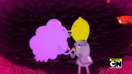
Adventure Time ended with an hour long episode "Come Along with Me." I'll try to not spoil the special TOO much for those who haven't seen it, but if you want to go in completely blind I suggest skipping down to the next segment cause this is your SPOILER WARNING. The special revolves around the Gum War between Princess Bubblegum and her Uncle Gumbald. A plot that had been slowly growing all season. On top of that, Betty and Normal Man are trying to find a way to turn Ice King back into Simon.
The things I do like about the finale is just the sheer number of callbacks that were made. While I think a few did go over my head, as there are a few episodes of Adventure Time I've never gotten around to seeing, it's nice to see so many returning concepts and characters. I'm glad they included things from the entire series run, instead of just the "classic" episodes that most people would recognizes. It rewards fans who stuck around for the long haul. It was also nice seeing most of the series lingering plot points wrap up. And we finally got to see the kiss that we've all been waiting years for. And kudos to CN for allowing them to do it. It was very brave of them.
I am of course talking about LSP and Lemongrab, baby! Wooh!
There's also the ending. Which is just a montage set to the end credits song showing where all the characters end up after the series. I love endings like this so damn much, and while it didn't hit me as hard as Regular Show's finales montage, it still hits the feels.
https://www.youtube.com/watch?v=mIkS8eGCKOU
The special does have it's flaws though. The Gum War really felt like an anti-climax and the shift to GOLB felt very out of left field. Also the fate of Uncle Gumbald left a very bad taste in my mouth. It kinda felt like they went against the whole point they tried to make. I admit that I didn't enjoy this finale as much as I did the Gravity Falls or Regular Show finales, but it's still sad seeing Adventure Time go. It defined cartoons of the 2010's. And I don't think they'res been a show since that's been quite like it. Even though the later seasons weren't as good, Adventure Time will always have a special place in my heart.
-------------------------------------------------------------------------------------------------------------------------------------------------------------
Netflix continues to pump out series after series with another new series, Dragon Prince.
https://www.youtube.com/watch?v=PWEtCsi3Eo8
Dragon Prince is a series set in a fantasy world in the midst of war. On one side is the humans, and on the other side the Elves and Dragons. The series follows two human princes, Callum and Ezran as well as a elf assassin named Rayla, as they go on a quest that will hopefully bring peace to there world.
The series features a lot of crew and voice actors who previously worked on Avatar: The Last Airbender. And it shows. I mean both shows follow a group of kids traveling through a fantasy world in the middle of a war. The seasons are called books, and each book based on a different element of the magic system. I was worried this show would falls end up being just a carbon copy of Avatar. But luckily, the show does manage to have it's own feel despite having a lot of stimulates.
The animation is a bit of a mixed bag. It's cel shaded CGI, similar to RWBY. But despite the series being made by a company much bigger than Rooster Teeth, the animation is so much more lag-y. Something about the frame rate seems off at times. Also I noticed background characters being copied and recolored a few times in my watch. But none of this took me to much out of the experience.
The characters and writing are all really good for the most part. One of the best parts of Avatar was how it showed that both sides of the war had normal people. And Dragon Prince takes this element and brings it one step further. Neither side of the war are depicted as wholly right or wholly wrong, with both sides committing terrible acts. That's a lot of complexity for a show that's aimed at children. However, there is a villain who, while I won't reveal who he/she is, feels very cartoonishly evil for this otherwise complex world. Like, you could make this character complex very easily. A lot of the villains goals and reasoning makes sense, and are even justifiable. But the methods used are just the most mustache twirling ways of achieving these goals, even when there are less evil ways of accomplishing the same thing. It's weirdly out of place.
However, despite the flaws, Dragon Prince is a really good show that manages to feel similar to Avatar while still being it's own thing. I highly recommend you check it out.
-------------------------------------------------------------------------------------------------------------------------------------------------------------
Speaking of Avatar, Netflix is making one! Particularly a live action reboot. And just...Why?
Money-
Yes, I know it's money! But everybody already love the original Avatar! What is there to change? What needs to be updated? And what can be done in live action that can't be done in animation. It feels like all these live action remakes only exist in order to "legitimize" their animated counterparts. Cause God forbid something animated be watched by adults. I dunno. There's a very good chance this could be good, but I doubt it'll be better than the original series. I have no interest in this. Netflix, you have Dragon Prince! You don't need this!
-------------------------------------------------------------------------------------------------------------------------------------------------------------
But Netflix isn't done yet! Cause we also have Hilda! Based on the series of graphic novels of the same name.
https://www.youtube.com/watch?v=XCojP2Ubuto
Hilda follows...Hilda. A young adventurous girl who spent her whole life living in a magical forest with her Mom. That is until one day her Mom decides to move to the city of Trolberg. Now Hilda has to learn to adapt to her new surroundings in the city, learn to make friends with normal humans, and deal with magical creatures. Cause despite the fact that Trolberg has a wall designed to keep magical creatures out, the city really sucks at doing so.
This shows really cute! The art style reminds me of a cross between Steven Universe and The Loud House. But with any series involving kids interacting with magical creatures the comparisons are going to be brought up. Is Hilda the next Over The Gravity Garden Falls? Seriously, ever video on Youtube about Hilda brings up this comparison.
And really, outside of the premise of "adventurous child exploring magical forest" Hilda isn't really like either of those shows. Hilda is a lot lighter in tone than those two series. The monsters aren't as scary and the humor is a lot less snarky. There aren't really that many "jokes" in Hilda as the series relies more on overall pleasantness. Also there isn't any real overarching mystery element in Hilda. It's more slice of life. Why can't Hilda just be the next...Hilda?
It's a quaint show. From the animation, to the tone, to the voice acting, it all just feels so cozy. I also love the creativity with all the different creatures they come up with. It's has a unique charm to it, and it's fun seeing a world where everyone just knows magic exist and society has integrated with it. If I had to point out a few flaws, I'd say that the subplot they have with Hilda's best friend Frieda wasn't very good. I really have no idea what they were going for with that. And the show can be a bit repetitive at times, but that might just be because I had to binge it in order to finish it in time for this review. But overall this is a really nice show. Check it out if you can.
-------------------------------------------------------------------------------------------------------------------------------------------------------------
OK KO is well known for it's crossovers from Captain Planet to Mighty Magiswords. But this year, they created the ultimate crossover. And if we could just appreciate the dedication to the past that the crew for OK KO clearly had when making this crossover? You all know what I'm talking about right? OK KO meet Scooby-Doo and the Ghoul School Baby! That's right, the crossover that we've all been waiting for.
...
AND THEY SAID AVENGERS: INFINITY WAR WAS THE MOST AMBITIOUS CROSSOVER OF ALL TIME!
They were even allowed to use the original Hannah-Barbara model sheets. This is notable as I think it's the first time OK KO has ever actually used a model sheet.
-------------------------------------------------------------------------------------------------------------------------------------------------------------
Hey, everybody loves Fallout 76, right? While we all agree the game is a flawless masterpiece, I just wish there was a way to somehow make it even better. Like, what if we got the twitch streamer Ninja, The rapper Logic, and RICK AND MORTY to all live stream the game together? Now THAT would be a lot of IQ....
https://www.youtube.com/watch?v=zMZhhTOF4l8
...
aNd ThEy SaId ThAt AvEnGeRs: InFiItY wAr WaS tHe MoSt AmBiTiOuS cRoSsOvEr oF AlL tImE!!
-------------------------------------------------------------------------------------------------------------------------------------------------------------
I swear, Netflix won't be satisfied until they make at least one thousand original animated series a year. Here's She-Ra and the Princess of Power. Not to be confused with She-Ra: Princess of Power. That's the 80's show.
Good job naming your show there, Netflix!
https://www.youtube.com/watch?v=OuFQxsRzUws
This is the cheesiest theme song ever, I love it so much!
Now, from what I understand, a lot of OG She-Ra fans don't like this reboot because it changed so much from the original. However, as someone who knows next to nothing about She-Ra or He-Man, I'm can't really comment on any inaccuracies. So I'm going to have to judge it as it's own thing.
She-Ra follows Adora, a child solider serving as force captain in The Horde army. But one day, after finding a magical sword in the forest, she gains the ability to transform into the Hero, She-Ra. Not long after that she finds out that, shock of all shock, the army that's literally called THE HORDE are actually the bad guys. so she defects from the Horde, and joins the Rebellion with her new friends Bow and Glimmer. Now Adora, along with a growing army of magical princesses, must find a way to fight back against the Horde. Meanwhile The Horde, specifically Adora adopted sister/possible...lover Catra try to bring her back to her "home."
I like this show. It's not amazing or anything. But it's a fun, girly action series. That's something I like about Netflix, it's one of the only channels out there that's not afraid to do action series. While the characters aren't that complex, they're fun and all have good chemistry together. Everybody feels like a real person. And this applies to both the Rebellion and the Horde. The show does a good job of juggling a lot of characters, while still keeping focus on the main cast.
AND YOU WANNA TALK SAD, LONELY LESBIANS! THIS WHOLE SHOW IS A SAD LONELY LESBIAN! Though did anyone else find it a bit strange that Adora's relationship with Catra seemingly bounces back and forth between "sister" and "lover." Like, I don't care which way you go with, but you really need to pick one or the other...
I know a lot of people are annoyed by the fact that a lot of classic designs and characters were changed to make the show more diverse. I didn't mind this to much. Adaptations change race, sexuality, and body types all the time. And I can only think of one time where it ever felt distracting, and even then it was brief. I never found it to bothersome.
Downsides though, the tone is kinda wonky at times. Nothing to noticeable, but sometimes it seems like the show is trying to be a serious action adventure, while other times it feels like it's trying to be campy like the 80's series. There's an episode called "Princess Prom" and it's one of the turning points in the season. Like, how am I suppose to take this seriously. But luckily it never gets that bad. I think the show is somewhat aware of a wink and nod nature to the show. It's a fun series.
-------------------------------------------------------------------------------------------------------------------------------------------------------------
And unfortunately, we have to end the year on a downer note. As Stephen Hillenburg, creator of Spongebob, passed away at the age of 57 from ALS. I don't know what to say. I hate taking an entire human beings life and acting like there art is all that mattered. But as I don't know the man personally, I'll just say that he created one of the most well know fictional characters of all time. Spongebob is the first thing most people think of when you say Nickelodeon. And it's one of the few characters that I think will be remembered even a hundred years in the future, along the likes of Mickey Mouse, Bugs Bunny, and Popeye. Even in death, his legacy will live on.
-------------------------------------------------------------------------------------------------------------------------------------------------------------
And with that, we end 2018 year in review! It's been a hell of a wild ride! But how does the year rank overall? First, we'll start with my old favorite. Ranking the series in a way that'll end up regretting in a month! Keep in mind this is a rough list. List aren't really my specially, and each show offers and is going for it's own unique thing. So sometimes it's hard to compare them. Also these rankings could change in the following year as new episodes come out. But if I had to rank them...
9. Apple and Onion
8. Craig of the Creek
7. Final Space
6. Disenchantment
5. Nomad of Nowhere
4. She Ra and The Princess of Power
3. Ballmastrz 9006
2. Hilda
1. Dragon Prince
And keep in mind that, due to both a lack of time and lack of cable, there were a lot of shows I wasn't able to check out or just wasn't interested in discussing. Like these!
(Big City Greens, Harvey Street Kids, Mega Man: Fully Charged, Muppet Babies, Our Cartoon President (HAHA! Trump jokes! Never seen those before!), Paradise PD (Cause we definitely need another show from the makers of Brickleberry!), Rise of the Teenage Mutant Ninja Turtles, Star Wars Resistance, Summer Camp Island, Super Drags, The Adventures of Kid Danger, The Epic Tales of Captain Underpants, The Hollow, The Shivering Truth, Total Dramarama)
As for the grade, it's a bit tricky. If I had to go just by the shows, I'd give it a B. They're weren't many shows I LOVED but they're weren't many shows I outright hated. Most shows this year were "good." But if we decide to count all the drama, that would drag the year all the way down to a C. There was just so much drama that, along with a few other personal reasons, I found myself kinda falling out of the animation community as a whole this year. And when the drama actually starts making you wonder why you entered this community in the first place, that's not a good thing. So take that for what you will.
As for best network, I once again have to give it to Netflix. I know it's kinda unfair since I didn't watch any Nickelodeon or Disney shows this year. But with so many more shows and channels watching a show from each is getting harder and harder. And Netflix is just pumping out series after series. And most of them are pretty good. It feels like the people at Netflix are really given free range to do whatever they want over there. And we get some really unique series as a result.
-------------------------------------------------------------------------------------------------------------------------------------------------------------
2018 may not have been the best year for animation, but I really think that 2019 is going to be a really good year. I mean just with what's already been announced we've got so many good series to look forward to! There's Infinity Train, Owl House, Amphibia, Los Casagrandes, Victor and Valentino, Gen: Lock, Harley Quinn, Young Justice Season Three, Theoretically Close Enough! Plus a lot more! Seriously, next year I'm either going to have to cut out a lot of anticipated series or make this a three part-er. Which would you prefer? And what did you think of 2018 for animation? What series were the best, and which were the worst? Leave any thoughts in the comments down bellow, I'd love to hear em. Fav, Follow, and comment if you like the review. And have a great new year. And let's all hope that 2019 can have a little less drama.
Um, isn't Thundercats Roar and High Guardian Spice coming out next year too? 2019 is going to be the biggest dumper fire ye-
Have a great day.
(I do not own any of the images or videos in this review. All credit goes to there original owners.)
https://www.deviantart.com/joyofcrimeart/journal/2018-Year-in-REVIEW-Part-2-779673316 DA Link
27 notes
·
View notes
Text
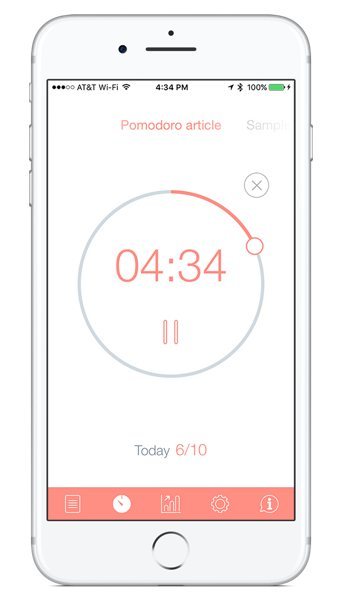
Mac Menu Bar Timer App

Alarms and timers are great productivity tools that are with us every step of the way. You wake up with an alarm, start and finish working with it. Alarms help you remember important events and make sure you don’t miss your friend’s birthday.
Timer App For Mac
Timer For Mac
Mac Menu Bar Timer App Download
Mac Menu Bar Timer Application
Mac Menu Bar Timer Apps
Mac Menu Bar Timer App Free
Some people can’t imagine doing their work without alarms and timers. Pomodoro productivity apps are a living proof of that. If you ever struggled meeting your deadlines, give this technique a try and you’ll see how much more efficient you can be.
Even though there are a few different options to set an alarm on a Mac, not every user knows how to do it. Let’s take a look at a few different options (both built-in and third-party). Then you can choose one that suits your needs best.
How to Set an Alarm on Mac Using Calendar
Your computer comes with a lot of pre-installed MacOS apps that are actually really good. One of the default apps is Calendar.
This menu bar app allows you to check your iCal appointments and create new ones right from within your menu bar. Fantastical is stylistically attractive, and all you have to do is type in your appointment, dates, and time (e.g. Dentist appointment, June 31, 11a.m.), and Fantastical will sort the information for you into a new iCal appointment. With InstaCal you can access your calendar from anywhere, simply by clicking the date in the menu bar. Always available in your Mac menu bar, InstaCal is quick and convenient and can be opened at any time. You can also add, view and edit reminders. The menu bar runs along the top of the screen on your Mac. Use the menus and icons in the menu bar to choose commands, perform tasks and check status. You can set an option in General preferences to automatically hide the menu bar; then it’s shown only when you move the pointer to the top of the screen. Jul 31, 2017 I have two Mac Pro laptops with the same version of OS and Word. On my older computer, the menu bar stays visible on all applications. On the new laptop, it disappears continually and is extremely irritating- it makes work much slower since each time I want to view info that is always visible on my older laptop. Nov 26, 2018 Forecast Bar – Weather + Radar is free for your Mac with in-app purchases for various update frequency options. Wrapping it up. Forget searching for or opening a weather app on your Mac to check the current conditions and forecast. These cool apps put the details in your menu bar and let you view what you need with a click.
Oct 09, 2012 I'm currently using Meteo, which I find to be a great app, especially for having the option of cycling whichever cities you want. The only issue that it has is that it hasn't been updated in quite a while, so it's sometimes buggy - for example sometimes when it's updating the weather conditions it just won't update so you'd have to quit and restart the app.
The app has many useful features, including setting a one-time alarm, and any alarm that you set on your computer using Apple Calendar will automatically sync with your other iOS devices. That way, you will still get the alert even if you’re away from your Mac.
Setting an alarm on Mac in Calendar is a very straightforward process:
To access Calendar, go to your dock. If you don’t see Calendar on your dock, go to Launchpad and find the app there using search tool.
Choose the date you want to set the alarm for.
When selecting the time for your alarm, double-click on the space next to the right hour. For example, if you want the alarm to go just after noon, click on the space between 12 and 1pm. Then drag the created time slot to adjust the minutes.
You can edit your event by creating a name for it, setting it to Home or Work event, adding location, notes, and even inviting other people.
To add an alert, tap on the date of your alarm. That will bring down a small menu. Click Alert.
Choose when you want the alarm to go off. You can choose from the default options or click Custom to set your own alarm length.
Hit Apply. If you’d like to add multiple alerts, click + next to the one you just created.
Removing an alarm is just as easy. Use the right-click to delete it, or tap on the event and click Delete.
How to Set an Alarm on Mac Using Reminders
If you’re someone who loves being in control and staying on top of your life, you’re probably using at least one of the great task-management apps out there. However, your Mac is already equipped with a simplistic to-do list type of app called Reminders.
This app���s main purpose is to remind you of important tasks you have to do throughout the day. It also works great for setting alarms on your Mac.
Go to Launchpad to locate the app. Open Reminders.
Inside the app, click on the + to add a reminder.
Type the name in. Then click the information (i) icon next to it.
Choose Remind me on a day.
Add the day and time you’d like to set the alarm for.
Click Done.
In order to remove the alarm, right-click the reminder and choose Delete.
Set an Alarm on Mac Using Siri
Digital assistants have their own strengths and weaknesses. On your smartphone, you can use Siri to set alarms. On your Mac, you can do it by using Siri to set a reminder.
But before you do it, make sure you have Siri enabled on your Mac.
Go to your System Preferences, choose Siri, and then check Enable Ask Siri.
To open Siri, use the key combination you have set up for it (the default one is Command + Space), or click Siri icon in the upper right corner of your Mac.
Say Set an alarm.
Siri will politely decline and offer to set a reminder instead.
Say Yes or click Confirm to set the reminder.
Ditch The Built-In Options
While Mac’s built-in options for setting alarms are useful, you might still find them rather limited. If you’re craving something more simple and straight-to-the-point, try one of the third-party sites and apps that serve the same purpose.
Use Online Alarm Clock To Set Alarms on Mac
If you have internet access, there’s no shortage of options for online alarm clocks. A simple Google search will bring up a few different options that you can choose from, like Onlineclock or Kukuklok.
Those sites are free to use, and they come with a set of basic options. You can set same-day alarms and timers, as well as choose the sound of the alert.
If you’re looking for a tool focused specifically on setting timers on Mac, E.ggtimer is a good pick. It comes with a countdown that you can set for certain time periods or even different tasks, like brushing your teeth or doing your morning exercise.
For those of you looking for a more interactive tool, give Setalarmclock a try. Aside from setting timers and alarms, it gives you advice on productivity, as well as a few fun options like naming your alarms and leaving a message for your future self.
When using these apps, make sure your computer isn’t muted and your volume is loud enough for you to hear the alarms go off.
Use Wake Up Time To Set Alarms
Wake Up Time is a great option for when you’re feeling old school. It’s basically a virtual embodiment of a physical alarm clock you used to have sitting on your bedside table.
The app will put a picture of a stylish-looking alarm clock on your Mac which you can use to set your alarms. To set an alarm, choose the time and date and then click the blue round button in the bottom-left corner of the clock. You can change what your alarm will sound like by tapping Sound in the menu.
When your alarm goes off, it won’t stop ringing until you hit the Stop button. The app works offline, and unlike other online tools on this list it will still work even if your Mac is muted.
A Mac is a great computer that comes with built-in really useful software. But like with any new gadget, there are always ways to improve your experience with it. So it never hurts to always be on the lookout for new apps and tools to take your Mac to the next level.
Being productive at work is a tough task. Even if you manage to block digital distractions, you cannot work all the day. That’s why it’s recommended to take regular breaks during your work. But, you’ve to make sure that you don’t get carried away by the break time. Pomodoro Technique was developed to address all these challenges at once. It does so by introducing a productivity-friendly schedule.
Read: 8 Best Pomodoro Timer For Windows to Boost Your Productivity
The Pomodoro Timer Technique for Work
You set up a working schedule of 25 minutes. After that, you have to take a 5-minute break. Once you’ve completed four Pomodoro sessions (2 hours in total), you can take a bigger break (I give myself 20 min). It’s scientifically proven, and I find it really effective to stay productive. That having said, you cannot rely on your Smartphone clock or the Mac time icon for checking the time. That’s why we need Pomodoro Timer apps.
Step 2: Select your iPad in iTunes. Transfer files from mac to pc. To transfer documents from Mac to iPad:.Click File Sharing on iTunes;.All your iPad apps that support File Sharing will show up;.Select an app and click Add to add files from Mac to iPad.How to Transfer Files from Mac to iPad without iTunesSyncing iPad to iTunes library on Mac could wipe some existing files on Mac. Click Music, Photos, Movies or TV Shows and click Sync button on the bottom.Share documents from Mac to iPadFile Sharing on iTunes enables apps like Pages, Keynote to share files between Mac and iPad.
Fortunately, there are a few good Pomodoro apps for Mac. Depending on functionalities, UI and the whole impact on workflow, you can find the best one. In this article, we have listed some of the most popular and effective Pomodoro timer apps for Mac. As said earlier, we have at least one tool for everyone out there. It should help you to find the best one.
#1 Be Focused Pro — Best Overall Pomodoro App
Be Focused Pro is one of the most popular Pomodoro apps for Mac out there. The best part is that it has an integrated task manager as well. Once you open the app, list all the tasks you have to do, and then start individual tasks as per the Pomodoro technique. If you don’t want those features, you can use Be Focused Pro as an easy-to-use 25-minute timer as well.
The interface is minimal and does not distract you. It does not have a fully-fledged window, but you can manage everything from the menu-bar icon. When it comes to customization aspect, Be Focused Pro does not disappoint you. You can decide the length of the intervals and how often they do appear during the work hours. By default, everything is set according to the Pomodoro technique.
Another impressive point in Be Focused Pro is the ability to track your progress. You can track how productive you were by looking at the Reports. What’s more, you can even export these reports to CSV. Since the app is available for iOS, you can benefit from Sync too. We would recommend it for professionals who value their time very much.
Pros
Simple UI
Multi-device Sync and Customization
Integrated Task Manager
Cons
None
Who Is It For
Be Focused Pro is the best solution when you’re hell-bent on productivity. No matter what you’re doing, this app lets you manage different tasks with proper intervals. We also liked the fact that it offers an integrated task manager.
Check Out Be Focused Pro ($4.99 on App Store)
Timer App For Mac
#2 Focus Booster — Best Pomodoro App with Timesheets
If you are looking for a multi-platform Pomodoro app with awesome features, Focus Booster is a great option indeed. Apart from Pomodoro-based timers and breaks, you will have access to Timesheets as well. That is, every single minute you work on a project will be counted. While you can use the service on the web or desktop, the Mac app is good enough.
Timer For Mac
Coming to the UI, Focus Booster has kept everything minimal. Unlike the previous app, Focus Booster has an actual window-based interface instead of the menu-bar icon. You will see the running timer on the screen, but there is also a Mini Timer. In the Customization department, you can change the basic things like Break Time, Timer duration and notification preferences. Focus Booster has a Dark Theme as well order to use Focus Booster, you should have an account for the service. Only after signing in can you start working on projects. It means everything you do will be synced with other apps, for iOS, Android and even Windows. Not all features are available in its free version though, to get features like Data Export and Unlimited Sessions of Pomodoro timer, you have to pay $4.99 per month.
Pros
A Simple Fully-Fledged Interface
Integrated support for Task and Timesheet management
Seamless Sync options
Cons
It doesn’t have a menu-bar icon
Who Is It For
If you need more control over timesheet and associated data, Focus Booster would be the best option. The app offers the standard Pomodoro timer experience, but that’s it. We’d recommend it for users who would not mind spending a bit more for time-tracking.
Check Out Focus Booster (Free, Premium Plans Start at $2.99)
#3 PomoDoneApp — Dedicated Pomodoro App for Mac
PomoDoneApp is one of the most popular timer apps for Mac and other platforms. Using the app is like a piece of cake. Once installed, you can launch the app and start working. https://cleverapt386.tumblr.com/post/655890752976683008/why-are-apps-taking-up-so-much-space-mac. Because it has an integrated task manager inside, you can start working on a single project itself.
PomoDoneApp does not have a minimal UI, but, that’s because the app has a few features in the Task Management department. However, at a glance, you can know about to-do tasks and start them. Instead of fixing on the 25-minute span, PomoDoneApp lets you choose a variety of timers — 5, 15 or 25.
This is what we love about PomoDoneApp. If you want, you can turn it into the complete space for managing your work and projects. On the other hand, if you are looking for something simple, you can use the app for Pomodoro timer setting. Coming to the Timer part, however, we liked the seamless nature. PomoDoneApp will work smoothly until you complete the four Pomodoro sessions.
Pros
Integrated Task Manager
Integration with online services
Time-tracking and scheduling
Cons
UI Could Have Been Simple
Mac Menu Bar Timer App Download
Who Is It For
PomoDoneApp is the best Pomodoro app when you need complete focus. It has been made with the sole intention of Pomodoro management. While the free version gives you a clean app, you have to pay a monthly subscription for team-based online features.
Check Out PomoDoneApp (Free, Premium Plans start at $2.33 per month)
#4 Tadam — Minimal Pomodoro App for Mac
At the core, Tadam is a minimalistic timer app for Mac, which promises to boost your productivity. What I love about Tadam is that it focuses on the right areas. It has an awesome way to let you know that it’s time for a break.
Tadam does not have much of a User Interface. It stays in the menu bar. Just click on the icon and you can enter the length of the timer. Once the timer is exhausted, you can get the break for 5 minutes. It, however, has a fully-fledged window for notifying the break. Even with this simplicity, Tadam has support for keyboard shortcuts.
You can master these keyboard shortcuts if you need quick timer management. There are also some superb features we loved: for instance, Tadam notifies you when you are almost near the end. You can actually add a few more minutes if interested — it’s not the Pomodoro way, though. It’s one of those Pomodoro apps that make you take a break.
Pros
Super-easy Interface
Impressive notifications and control
Cons
None
Who Is It For
Tadam is for everyone. It does not matter whether you’re a geek or a normal user. There is always a reason to use this app, even if not for Pomodoro. The best part about Tadam is that the app does not have anything to get you distracted. So, you keep working and taking breaks. It’s my personal favorite.
Check Out Tadam ($3.99 on App Store)
#5 Activity Timer — General Timer App with Pomodoro
Activity Timer is not a Pomodoro-specific timer for Mac, it’s more of general timer apps. However, it does comes with a preset for Pomodoro Technique. That is if you are trying to boost your productivity like never before, you can simply launch the Pomodoro timer. The timer will repeat 4 times, making it a full Pomodoro session.
Coming to the UI, Activity Timer does not have a fully-fledged window. Anything and everything needs to be managed from the menu-bar window. You can list out the popular presets, start or stop the timers and even check out the Preferences section. Although Activity Timer has an iOS counterpart, it does not offer options for content sync.
But, if you ask us why we love Activity Timer, we’d say it’s because of the workflow. It’s really awesome to use Activity Timer despite the huge number of features. The notifications work fine and you can even set up custom messages to display when it’s time for a break. And we love the fact that you can do all these from the menu-bar.
Pros
Easy to Use
Different Timers and Customization
Multi-device Sync
Cons
None
Who Is It For
Mac Menu Bar Timer Application
Activity Timer is the best option if you are looking for a general timer with proper customization. Although the app offers you complete control over the Pomodoro technique and customization, it does not consume many resources.
Check Out Activity Timer (Free)
#6 Marinara – Best Browser based Pomodoro for Mac
Unlike the others, Marinara is a chrome app (don’t worry, it runs offline). The way it works is pretty simple, simply install the app, click on the Pomodoro icon next to the browser’s address bar, the default timer is set to 25 mins but could be changed from Settings. Set your short break and long break length. Choose sound or screen notifications. And start doing your work.
It comes with a pack of sound notifications, but what I really like about the app is the history, which you can import and export.
Pros
Works on all platform that has Chrome installed
Different Timers and Customization
Sound or screen notifications
History
Cons
Mac Menu Bar Timer Apps
Lacks someadvancede options that Desktop app has
Who Is It For
If you constantly juggle between a Mac and PC, then it’s time for you to look for a browser-based Pomodoro timer. And Marinara fit the profile easily.
Pomodoro Do’s and Don’ts
Pomodoro timers work best for work which is independent of other people. For example, I’ll use a Pomodoro timer for writing my articles, but not during a sales call or brainstorming with my team; as you can’t control or quantify its results. Also, avoid 10 Pomodoro or more in a day. If you do, the work quality will suffer. There is only so much productivity you can achieve in a day. So don’t push it.
Start with 4 Pomodoro timers a day and avoid all kind of communication and distraction. Also, take breaks. It tempting to go with the flow, but your mind need rest to stay productive. So, yes, take frequent breaks.
Which is the best Pomodoro App for Mac?
Mac Menu Bar Timer App Free
So, we have listed the best Pomodoro mac apps for almost every need. Sure, we’ve done some comparison as well, so that you choose the best tool. Tadam, despite being our favorite, may not have many functions that people are looking for. For instance, if you need an integrated task manager, PomoDoneApp for Mac is the best option. On the other hand, we would recommend Focus Booster if you need enterprise-level options and timesheet support. The point is, all these tools would work according to the Pomodoro technique.
Also Read: 7 Best Pomodoro Apps for Android
0 notes
Text
Understanding the User
User Research
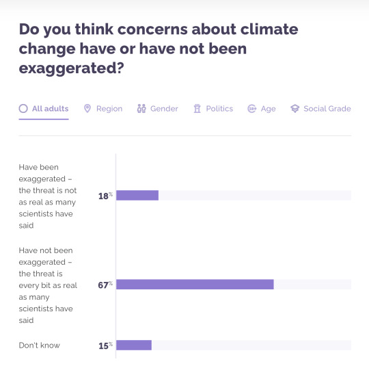
In a Survey conducted on December 3rd 2018, 3932 adults were asked if they thought concerns about climate change have or have not been exaggerated.
18% thought that concerns have been exaggerated, whilst 67% thought that concerns have been exaggerated. 15% didn't know, which highlights that they are unaware of not just climate change but their own carbon footprint.
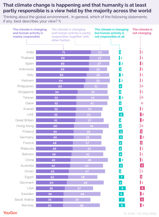
In a recent International Poll on September 15 2019, it was revealed that most of us expect to feel impact of climate change, and many think it will make us extinct. 30,000 participated in 28 countries and regions around the world.
51% of Great Britain believed that the climate is changing and human activity is mainly responsible, whilst 37% believed that the climate is changing and human activity is partly responsible, together with other factors.
A small percentage of 3% believed that the climate is changing but human activity is not responsible at all, and 2% staggeringly don’t believe that the climate is changing at all.
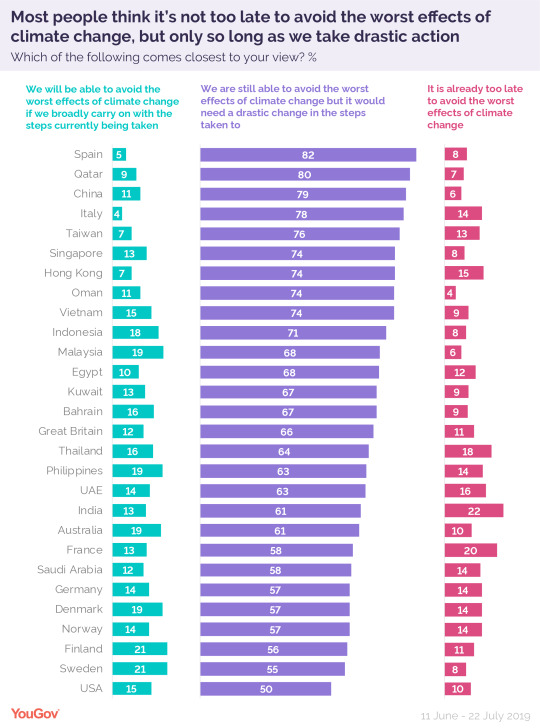
In the same survey, people were asked if it is too late to avoid the worst effects of climate change, as long as we take drastic action.
As we can see, there is an overwhelming purple visual on this chart below. 66% of the UK believe we are able to avoid the worst effects of climate change but only if we take drastic action. This was a positive result, and one that gives me great satisfaction as it is proof that people believe they can take the action required to not only halt climate change but to prevent it altogether; this is a positive attitude to have.
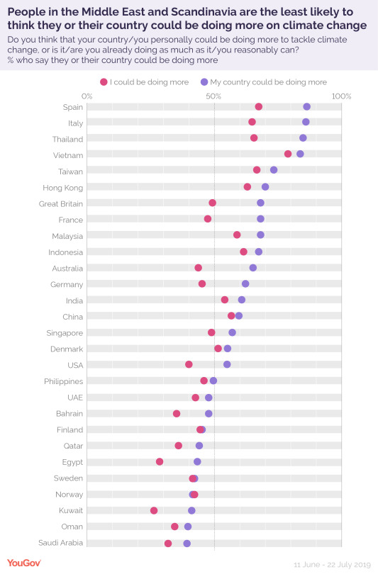
People were also asked whether they think their country and themselves could be doing more to help. Almost 50% of Britons believe they could be doing more, whilst almost 60% believe the UK should be doing more.
In a survey on October 8 2018, it was found that One in Three Britons prefer an approach that relies on technological solutions to counter climate change.
54% of the UK would prefer an attempt to reduce consumption of resources to slow or halt the negative effects of climate change.
Altogether, it seems that 86% of the UK want climate change to be tackled. An app would offer the UK a technological solution to reduce consumption, so it would benefit both participants in favour of tackling climate change in this survey.

When there is an issue in the world, it attracts protesters as the regular person doesn’t have the immediate power to change laws or make a difference instantaneously. That is the responsibility of the governments and world leaders to make decisions on how our societies are controlled by laws etc.
Climate change protestors have caused a divide among society, as the results of a survey below show that ultimately more people strongly oppose (33%) climate change protestors planning to disrupt roads and public transport in order to bring attention to their cause rather than support it. Because climate change is such an immediate threat, protests have had to go ahead because people want action from governments and people around them.

If we were to create a survey for the same people who answered these questions, I’m sure the people who strongly oppose protesting about the issue still believe climate change is a real threat. We as a society need to deal with the issue appropriately and as a team, instead of fighting with each other. I can understand the protesting, and I can understand where people are coming from in terms of opposing protesting too.
It seems to me that we need help in terms of educating ourselves on climate change and our own carbon footprints.
The one point that frustrates me about this subject is that there are people who (staggeringly) still don’t believe in climate change (albeit a minority), or some see climate change as a distant problem, and that the impacts won’t be seen until generations away when they are long gone. As well as this, there are also people that think that by themselves they can’t make a difference; so they don’t bother.
There is also a clash with businesses and climate change, with profits getting in the way of sustainability. In simple terms, there are a lot of humans that care more about money than the natural world. This needs to change.
In the video below, it is mentioned that we need to change the way we talk about climate change.
youtube
‘Doom & Gloom’ messaging isn’t working, we as humans seem to want to tune it out. This guilt is proven in psychology to not be conducive to engagement. When someone feels fearful or guilt-full, they will withdraw from the issue and try to think about something else to make themselves feel better.
Because climate change is so overwhelming, it is easy for people to just turn away and forget about it, leaving someone else to deal with the issue.
A lot of us believe that climate change is a distant threat, and that we won’t feel the effects in our lifetimes. This is true in a way, but it doesn’t take away the fact that it is happening and it needs to be stopped.
We as humans respond to immediate threats, such as someone trying to mug you in a street, or break into your home. For a lot of people, it's not clear how climate change is impacting them right now.
“If we’re not here in 10,000 years, it’s going to be because we underestimated the odds of our future pains and overestimated the value of our present pleasures.” - Dan Gilbert, Professor of Psychology, Harvard University
“One day everything will be well, that is our hope. Everything’s fine today, that is our illusion” - Voltaire
The problem for the user is that they need to know about what impact they are having on climate change. They can’t change their bad habits into good habits without any knowledge of having bad habits in the first place. In order to fix that, I plan to give them the information in a simple way. Ultimately, I cannot force any user to take drastic action in their lives. It would be too overwhelming and too much.
This is why it is essential for me to strike a balance with the quantity and quality of the information. Too much information will drive users away from my service.
The app would do the work, instead of forcing people to act through protesting. An app is a service on a personal device to each person. People can use an app without others knowing about it, so peace will be kept whilst people help in their own lives without stopping other people from getting to work for example if there was a protest in London.
Finding Out My Own Carbon Footprint
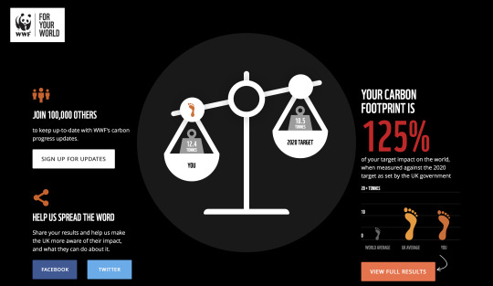
In order to put myself in the users shoes, I wanted to find out what my own actions were doing to the planet. I travel by public transport everywhere I go, and I walk a lot to get around, so I should be doing my bit, right?
I was truly shocked to realise that I was 25% over the limit for my carbon footprint. This was a real eye-opener to me, and it made me realise how important it is for the user to be aware of their own actions and data in order to adjust, thus making a difference for climate change.
It certainly made me reevaluate how I live and made me want to make adjustments. Beforehand, I was of the impression that I was helping the planet. Finding out that I wasn’t was upsetting.


User Statements for my Target User
From my research, I came up with these statements in order to find out who my target users are, understand their behaviours and ensure the features my service needs to include in order to make the best possible service:
1. I care a lot about climate change and want to make a contribution
2. I am overwhelmed by the amount of information to do with the subject
3. I want to be aware of my actions and if they are making a positive or negative impact
4. I believe the government and world leaders are not taking enough action on climate change
User Persona
From these statements and my research, I created my User Persona called Chris:

Chris cares deeply about the environment, Chris cares about the environment. He is aware of climate change, and wants to help the planet in any way he can. He feels like there isn’t any simplified information given to him that enables
him to help; in terms of what he is currently using and what changes he needs to make.
Chris needs an app that tells him what impact he is having on the planet, which will enable him to change his behaviours if he needs to.
After analysing Chris and his goals, needs, pain points and behaviours, I produced a problem statement which will serve as my guide throughout this project:
People are unaware of how they make an impact on climate change. This doesn’t mean that they don’t want to help
References
https://www.gov.uk/service-manual/user-research
http://www.theclimatechat.org/why-dont-we-care-more
https://www.theguardian.com/environment/2019/oct/30/climate-crisis-affects-how-majority-will-vote-in-uk-election-poll
https://friendsoftheearth.uk/climate-change/what-can-I-do-to-stop-climate-change
https://yougov.co.uk/topics/politics/survey-results/daily/2018/12/03/2dc80/1
https://yougov.co.uk/topics/science/articles-reports/2019/09/15/international-poll-most-expect-feel-impact-climate
https://yougov.co.uk/topics/politics/articles-reports/2018/10/08/how-should-we-combat-climate-change
https://yougov.co.uk/topics/politics/survey-results/daily/2019/10/07/dc0cc/1
https://footprint.wwf.org.uk/#/
0 notes
Text
Self Driving Economy?
This entry is gonna sound a bit out of place, but with the subject of AI having just been touched on at the same time that the economy, and specifically, fears of a coming recession have been in the news... well, I have a theory that maybe is worth exploring, even if it turns out to be wrong.
I’m old enough to have experienced several recessions in America, but by far the two worst... and the two which most affected the course of my life, were the Dot.Com Bust in 2001, and then the Housing Bust which hit full force in 2008.
Before the former, during the Dot.Com Boom, all well respected economic authorities were honestly out there saying there was no reason the economy couldn’t keep growing forever. And when that bubble burst (in early 2001, months before 9/11) it really took everybody by surprise.
In retrospect, everybody saw that all the booming internet start up companies everybody was scrambling to invest in, lacked any plan for turning an actual profit. The internet was still too much of a wild west, and... like the actual wild west... sparked a kind of gold rush that for many, did not pan out.
But, that was okay because there was still one reliable thing that everybody could invest in, whether the economy was booming or busting... good old real estate! Home equity! Always keeps growing over time... like a law of physics.
And while the broken Internet economy slowly nursed itself back to health for five years after 2001... everybody got really hyper about houses. New ones were being built. Old ones were being flipped. And mortgage loans became easier and easier to get for more and more people... and home values began to dramatically inflate.
That modest old bungalow on the East side, which had taken many decades to get to where it was worth a modest 60K, overnight went up to 90K, then 120K.... just sitting there... without being renovated in any way.
It got to the point where any shoebox sitting on any plot of dirt was worth 100K automatically, and everything else was correspondingly overvalued across the spectrum, and across the country.
Once again, economists weren’t too worried. Maybe they seemed a bit less ecstatic than during the Dot.Com Bubble, but they weren’t super worried.
Until, BLAM! Housing prices suddenly began to slide for the first time in seventy years... which began happening in late 2006... leading to the big bank collapse two years later in the Fall of 2008.
So, I’m gonna stop here and make the analogy of the economy being like a car.
Like a car, it’s a complex machine with a lot of moving parts that performs best when it gets regular maintenance... is well oiled... and has plenty of fuel.
But also like a car... if it’s being driven by a drunk... or a maniac... then the rest doesn’t matter, because it’s going to crash.
So in 2001, the car crashed... and it was a pretty bad accident. And in 2008, it crashed even worse... actually bursting into flames and requiring all kinds of first responders to put out the fire, and do a ton of damage control.
But since 2008, something’s been different... since 2008, the car has driven longer and faster than in it’s whole history, without a crash, or even a minor fender bender.
and weirder still... over the past two years, with history’s worst President at the wheel... the drunkest of drunk drivers... the stock market has been plunging and peaking, plunging and peaking.... like a crazy roller coaster ride... and yet... it never crashes.
Most recently we just had what they call an “inverted yield curve” which... in this analogy, is basically a loop the loop... but we did not fly off the rails.
And, knowing as I do, how fragile the economy used to be... not just in the early 2000s, but all through the 1970s, 1980s, and 1990s... this weirdly unshakable stability is not just new... it's beyond belief, and should not be possible!
Unless... this is an upgraded car, that now has more safety and self-driving features than ever imagined before.
Hmmmm...
Now, clearly if such self-driving features exist, they were not put there by legislation... I mean... they did try to pass some legislation in the Obama years to keep a crash like 2008 from happening again, but most of that got watered down or actively repealed in years quickly to follow.
Rich people hate regulation, and are famous for never learning their lessons, after all.
But legislation is not the only form of regulation... there is also just... administrative policy... namely, in Obama’s case, policies that once again favored science and technology... as well as global economic integration.
Clinton era policy, in the late 1990s, gave us the World Wide Web to begin with, but it was early on Obama’s watch that we saw the advent of the smart phone, which, transformed the internet all over again, as well as technology in general... and both on a global scale.
This, in turn, not only globalized the economy like never before, but created whole new avenues for it to explore.
In the early 1990s, you were paid with a paper paycheck that you deposited at the physical bank and then... you kept track of your bank balance in your checkbook or in your head.
If you wanted to buy something you got in your car and spent the day shopping the different stores to see what they had and who had the best deal.
The biggest convenience you had back then was your ATM card, with which you could get cash to pay for your thing at the cash register, before lugging it home in your vehicle.
By the early 2000s, you probably had direct deposit, and could do your banking in real time on the desktop PC at home. You could pre-shop the stores by going to their websites, before getting in the car, and you also had a debit card that functioned anywhere the same as cash.
But that was nothing compared to what was possible in the twenty-teens.
Now, thanks to a hand held device 1000 times more powerful than my 2001 desktop PC, that I carry on my person wherever I go... and thanks to an economic infrastructure which has entirely grown around that device... I can bank wherever I am... I can shop, and purchase nearly anything wherever I am standing, and have it delivered to my doorstep... and I can also give my money to any person, or cause I feel like, instantly, in whatever increments I wish, large or small.
Also, I can be part of, say... a fandom... and just by being a fan of some franchise, like Iron Man, can enable Marvel to spend ten years on a cinematic universe that employs hundreds of thousands of people to make movies that bring in billions of dollars, and also support a secondary economy of comic book movie reviewers online, etc.
Money moves more freely in the twenty teens than ever before... on the dollars and cents level. If my nephew, 2000 miles away, needs twenty bucks, I can give it to him immediately, in bed, in my underwear.
If my favorite YouTube channel needs twenty bucks, I can give it to them. If Amazon allows me to buy some new socks with one click... or Pokemon Go wants to sell me a few extra pokeballs with another click... you can bet I’m clicking to buy that stuff right now!
But it’s not just pocket devices and people making impulse buys.
If that’s all it was, it would still be a much larger buffer against recession than we had in the days of old, when money didn’t move around so freely, so quickly.
No, there are also the algorithms.
Two of the most famous algorithms, the Google search algorithm, and the YouTube algorithm (YouTube is owned by Google) predate the era of the smart phone, but definitely have come into their own post smart phone.
And now we live in a world where every single app worth it’s salt has an algorithm designed to learn your preferences, help you discover more preferences you weren’t aware of before... and ultimately help you either make some kind of purchase, or at least bring your eyeballs to something that will profit from your having viewed and liked it.
And all the modern algorithms arise from theories of computer learning. They learn how better to serve both you, and their corporate masters. And this is done kind of inside a black box, where random tweaks are made to each new generation of algorithms... without knowing what the effect of that tweak might be, and then, the tweaked algorithms are field tested, with only the top performing ones left to survive and be tweaked again.
It’s a process very similar to the breeding of animals and plants that humans did throughout the history of civilization... starting with some basic forms... getting them to fuck... keeping the good ones we like, and letting the failures die out... without any need to understand the molecular details involved on the level of the DNA.
Who knows how exactly they bred the husky? Doesn’t matter. They pull sleds and love snow so... they can stay! Same with corn... how did we mutate grass into doing that? Not sure... but we worked it for a long time, and we got there.
So, by the time Donald Trump took office in 2017, we had a fully developed smart phone economy (no coincidence he’s the first president to be a problem on Twitter) and a next gen internet teeming with AI in the form of learning algorithms... growing more effective every day... at the one job they were all conceived to do...
...keep the money flowing.
This is all to say nothing of the algorithms that must be out there for stock traders online, by the way.
While retailers and app developers have been busy making it as easy as possible for everybody on Earth with an income and a bank account to move the tiniest amounts of money anywhere instantly... all of the investors out there, playing with the big money, have also come to rely more on their AI algorithms, than their own gut instincts.
Now... I’m not saying all of this makes the economy crash proof...
But all taken together, it makes the global economy a hell of a lot more crash resistant than it ever was before.
It’s a different kind of car now... such that if you have a crazy drunk driver like Donald Trump at the wheel... well... those pedals and that wheel are no longer direct input devices.
He can be as violent as he wants with them, but the computer... in this case, the sum total of all economic algorithms out there, now controlling the real levers of commerce automatically... all working toward the common goal of maintaining the status quo no matter what... just ignores violent inputs that fall outside a given range.
This results in a stock market that peaks one day, and plummets the next... with the overall effect being that the spikes and dips cancel out over the week, and even the loop-the-loops, like that inverted yield curve... are just momentary thrills that amount to nothing over the week or month.
Now, if I’m wrong about this... then I’m not totally wrong. I’m still right that more globalism and better technology has given us a more stable economy for longer than ever before.
So even if there is a crash... I’d say tech and globalism are still the way forward... maybe with some actual government regulation... depending on what exactly caused the crash?
Whatever the case... AI is the future and... within the next ten years, everybody’s gonna have a Jarvis who handles their affairs in ways that make today’s Alexa, Siri, etc... look like silly pull string talking dolls... and make us wonder how we ever survived without them.
READ: even acts as your primary council in a court of law... level of effective cyber assistant.
That is my crazy take on things tonight.
0 notes
Photo

Top Social Media Stories For November 2016
Hey Guys this is Round up Raven bringing round up posts for No Shave November ! Guess what did I get as my thanksgiving present?? Well, my mom gave it to me…no it’s not a sweater !
A GoPro Camera <3. It is awesome, I can fly high and can shoot 4K videos, mounting it on my helmet..Yes I use helmet while flying.
It now supports live streaming via my periscope account, so I can fly high and livestream heights. I wish I could stream it in my Instagram.
No, I no crazy, Instagram now supports live streaming on its app and is one of the top social media news for month of November.
Let’s have a look at top social media news from month of November.
Live video and disappearing photos and videos for Instagram:
Instagram has officially announced two of its newest rollouts for its apps. Live video feature for Instagram stories and disappearing video and images for groups and friends in Instagram direct.
Live feature can directly be accessible by right swiping from feed, tapping “Start Live Video”, and you are live. Live feed is limited to 1 hour only. As you go live, your friends will get notification reflecting on your Instagram stories, in their profile. While you’re live, you can pin a comment for everyone to see or turn comments off altogether.
You can also check out new live stories on Explore, Tap on “Top Live” and see what’s happening live with other Instagrammers.
Live video on Instagram Stories and Explore soon be rolling out globally over the next few weeks.
Disappearing photos and videos is quite a fun feature. You can send disappearing videos and photos to your friends or in a group which will dispose as soon as they view it (feeling powerful and devilish at same time).
Swipe right into the camera, click a pic or record a video and then tap on arrow to send it privately to your friends or in group.
Send them anything from their 1st time beer experience pics to dedicated video of you singing a song.
Not to be afraid, they can view it only once and if they attempt to screenshot, Instagram will send you a notification.
You can send disappearing photos and videos to your followers only, irrespective of privacy setting.
You can access disappearing message directly in your inbox. Disappearing messages will appear in a bar at the top. This feature already has been rolled out in recent Instagram updates.
Twitter ranks your conversations:
Make ready your comments to rank in a Twitter conversation thread. Threaded conversations are one of the best way to interact over Twitter. When conversations get hot on Twitter, it gets hard for new people to know who is interacting the most in a thread.
Twitter now has added a reply counter and a ‘conversation ranking’ to its mobile apps engineered to push the most relevant discussions to the top of a tweet thread. Conversation ranking support threads that the original poster replied to or that includes a reply from a Twitter user that you follow. This feature also group replies into different sub-conversations.
The reply button under any given tweet will now show reply count to that tweet. This number only corresponds to direct replies to the original tweet and not the total number of tweets contained within a long conversation.
Telegram- Meet telegra.ph:
Telegram is spreading its roots from being a messaging platform to being a horse in race of online publlishing tools. Telegram recently introduced telegra.ph, an online publishing tool which empowers you to create rich content with traditional writing features like image and video embedding and text formatting.
It is quite similar to medium and quip but what’s interesting with telegra.ph is no account is required. Simply visit the website and start writing and when you are done, hit publish. Your content is now on web. Alike medium you cannot catalog your past work or arrange them in categories.
Want to create another story, clear your browser cache or user incognito mode.
Instagram’s Screenshot notification feature:
Few weeks back Twitter was flooded with tweets asking, trolling proofing whether Instagram will send a screenshot notification whenever you take screenshots on Instagram.
Rumors spread faster than forest fire.Before it gets worse intelligent Twitteratis figured out the truth in rumors.
Instagram has introduced screenshot feature in it’s recent app update. Whenever someone takes screenshot of your disappearing video or image, you will get notification from Instagram, but not regular messages or Instagram pics.
…phewww…(opening App store, reinstalling Instagram :grin:)
Adieu Content Keywords:
Google has said goodbye to most beloved tool of SEO people. The content keywords feature allows owner to see what keywords google bot has found relevant for your site. Officialy said “, users were often confused about the keywords listed in content keywords. And so, the time has come to retire the Content Keywords feature in Search Console.”
Well Davis and Sophia (our SEO Engineers) didn’t think so about getting confused from this tool.
Let’s see, Google’s suggestion “The words on your pages, the keywords if you will, are still important for Google’s (and your users’) understanding of your pages. While our systems have gotten better, they can’t read your mind: be clear about what your site is about, and what you’d like to be found for. Tell visitors what makes your site, your products and services, special!” find its way to sympathise people.
Facebook Messenger launches its public group chat feature:
Yes, some of you might have heard or used this feature on an app few year back. App was introduced by Facebook named “Rooms”.
Facebook has now relaunched “Rooms” for Australia and Canada users.This feature is again introduces to benefit users with like minded strangers, with whom they can chat and share knowledge with.
Users will be able to set rooms to private and are allowed once administrator approves.
It can prove to be beneficial for larger groups where users are not friends and for sending out alerts for an event with a single thread discussion.
Quick Replies and Welcome Message for Twitter:
Twitter has announced two new features to improve conversational experience between business and customers on Twitter. Quick replies and welcome messages in direct messege will ensure good customer experience in customer support through automation and human support.
Welcome messages let businesses to greet them with a welcome message as they enter direct message conversation. Businesses can create multiple welcome messages and deep link directly to a specific greeting from Tweets, websites, or apps.
Quick replies let businesses prompt people with the best ways to reply to a Direct Message. Here comes the automation part, they can either choose their response by choosing from a list of options or guide users to enter specific text to get response to.
Combining both the features will ensure less wait times and a good customer experience.
YouTube’s new Comments section for Creators:
Youtube has something new for content creators now. It has introduced some new tools to improve and shape conversations leading to better user experience.
It is like a toolbox for content creators. Tool include:
Pinned comments: Promote a specific comment by pinning it to the top of your feed. Just like Twitter pinned posts, it lets users see great engagement from your fans or share related information with the audience.
Creator hearts: It’s more of something given from heart. Shed some love by giving a heart to your favorite comments.
Creator usernames: When you comment on your channel, your username will appear under the text with a pop of color around it so that your viewers can differentiate your comments with others. If you are a verified creator, you will have a verification checkmark appear beside your name.
Some of the upcoming advance features to existing features include:
Choose moderators: A new comment feature that lets you delegate moderation, giving your trustworthy followers to remove public comments from your videos.
Blacklist words and phrases: You can opt for some keywords or phrases held for your review and approval before being published.
Hold potentially inappropriate comments for review: It’s a new beta feature that will allow you to hold potentially inappropriate comments for review.
As an optional add on to this feature you can you choose to opt-in for automatic filtering for moderation based on Youtube’s. When you review comments, the system will take that feedback into account and get better at identifying the types of comments to hold for review.
Introducing audience demographics in Linkedin :
That’s a very cool feature for LinkedIn marketers. They now have power to track down audience on their posts. With ability to know who the audience is, they can easily know their direction, are they leading to right audience or not.
This will also help in creating relevant content with better understanding of your audience.
(via Top Social Media Stories For November 2016 - Social9)
1 note
·
View note
Text
Is Your Website Stressing Out Visitors?
About The Author
Suzanne Scacca is a former WordPress implementer, trainer and agency manager who now works as a freelance copywriter. She specializes in crafting marketing agency, web …
More about
Suzanne
Scacca
…
Stress isn’t just something that makes people feel uncomfortable. It stimulates the urge to “fight” or “flight”. The very last thing you want is to design a website that stresses visitors out, leading them to dread the experience or abandon it entirely. There are many things that might invoke this response from your visitors, including the design. In the following guide, we’re going to look at some ways to de-stress your design.
Stress is a nasty thing and many of us deal with it on a regular basis. Our jobs, school, homes, relationships, and even things going on around the world can trigger feelings of panic, unease, and depression. And those are just chronic stressors. Think about the small things that send your body into instant fight-or-flight mode on a daily basis (e.g. traffic jams, unhelpful customer service reps, getting sick when you have a big project due).
The last thing you want is for someone to visit one of the websites you’ve built, only to feel like they:
Need to battle their way through it, or
Leave immediately and never come back.
There are a variety of ways a website can cause stress and leave visitors wondering if their response should be to fight or flight. Slow loading times. Overwhelming navigations. Excessive 404 errors. You get the point. But the design itself could be a problem, too.
If your bounce rates are really high and performance isn’t an issue, then this is something you need to look into. Today, we’re going to look at some ways for web designers to take traditional stress-busting tips and apply them to websites.
How To De-stress Your Web Design
Most stress relief guides provide a similar set of tips. But how exactly do you apply something like “Get outside for fresh air” to a website?
Here are some ideas:
1. Draw from Nature
There’s a reason why stress relief articles always suggest that people get outside. There’s something about nature that’s very calming.
If you think about the way we live our lives today — always on, always connected, always trying to make a better life for ourselves — it’s the exact opposite of nature. That’s probably why we’re so attracted to its simplicity and healing qualities in times of stress.
Companies with “natural” initiatives (think REI or CLIF) can get away with using imagery containing nature scenes and drawing on the feel-good vibes associated with them.
A snapshot from the CLIF website with nature images. (Source: CLIF) (Large preview)
For other companies, however, you’re going to have to think outside the box as nature photographs won’t make sense for most.
Something I’d recommend instead is to look at your color palette.
One of the great things about spending time in nature is the abundance of color you’ll find. Look at any travel blog or social media account and you’ll find proof of this immediately. For example, this is a snapshot of recent photos shared by @adventurefervor:
The @adventurefervor Instagram account shares nature content from all around the world. (Source: Instagram) (Large preview)
There is such a vast array of colors in nature that you could draw from.
That said, nature’s colors aren’t always peaceful or safe. Take, for instance, aposematism. This is the ability animals have to signal that there’s danger here — and they do it with color.
“The function of aposematism is to prevent attack, by warning potential predators that the prey animal has defenses such as being unpalatable or poisonous.”
The most commonly seen colors in aposematism are:
Red,
Yellow,
Black,
White.
Generally, when these colors are used, it’s in high contrast to the surrounding colors and scenery, so it’s not like the actual appearance of red or black is alarming. It has to do with the context.
What I’d recommend is that you take a look at your website and note if there are any colors sending the wrong signals.
Does a dark mode-like design seem too ominous for the lighter personality of the brand? Are red accents reminiscent of blood against the stark white background? Does the bright yellow coloring feel out of place?
Bear Grylls’s website, for example, feels a bit edgy and unnerving:
Adventurist Bear Grylls uses a combination of nature imagery and danger-evoking colors on his site. (Source: Bear Grylls) (Large preview)
I suspect the web designer went out of their way to imbue the website with the sharp black and red accent colors that appear here. Bear Grylls doesn’t run some feel-good travel show. He’s always putting himself (and others) in life-or-death situations. So, in this case, the aposematism-inspired color palette is a good choice.
For your website, though, I highly doubt you want your visitors to associate the brand with danger or death. So, spend some time studying nature photography (the stuff that makes you feel good) as well as reading up on color psychology to fix the signals your website is sending to visitors.
2. Create a Predictable Rhythm
Yoga is one of those activities often recommended for people experiencing stress. As the Mayo Clinic explains:
“Yoga brings together physical and mental disciplines that may help you achieve peacefulness of body and mind. This can help you relax and manage stress and anxiety.”
At the core of yoga, is a composite of physical poses and steady breathing. If you’ve ever practiced it before, you know how good it feels when you get into the rhythm of it. Breathing in… and breathing out.
Yoga isn’t the only mindfulness practice that draws on steady breathing to calm the nerves.
If you’ve ever used a meditation app like Calm before, you’re familiar with breath exercises:
[embedded content]
As you focus on breathing in, holding that breath and releasing, your body and mind relax. Breathing exercises also help people calm hyperventilation and other erratic breathing patterns that get the heart rate up and send the mind racing.
So, how does this correlate to your website? Well, what we need to do is identify elements and interactions that feel unpredictable and shocking — ones that make visitors feel as if they have no control over the experience, like they can’t slow down and take it one bit at a time.
Rhythm and repetition play an important role in this, but you know this already. That’s why button shapes and colors are designed consistently site-wide. That’s why you choose no more than two or three fonts to establish a rhythm and dictate hierarchy in your content. That’s why you build mobile-first websites within a grid (even if the design sometimes appears asymmetrical).
The thing is, when new design patterns or elements become popular, it’s easy for these good and calming practices to go out the window.
Take, for instance, websites that use scroll-triggered animations like Unleashed.
The Unleashed website uses a variety of scroll-triggered animations. (Source: Unleashed) (Large preview)
While it’s certainly an attractive website and one that’s going to stand out from the competition, it presents an uneven experience from start to finish. Visitors are more likely to focus on the surprises that wait for them around the corner instead of on reading the content on the site (which is difficult with the way it’s presented).
This website is all about building anticipation; not value.
If you look at the Smashing Magazine, for example, the design still has the opportunity to “surprise” visitors every now and again:
Smashing Magazine’s design goes light on the surprise factor, using it to call attention when it makes sense. (Source: Smashing Magazine) (Large preview)
The big difference here is that hover-triggered animations don’t have to come at the expense of the predictability of the design or your visitors’ comfort levels.
Just be mindful of this. While it might seem like trying something new is what your site needs to stand out, don’t forget that you’re designing primarily for the user experience. And if users aren’t responding well to the creative choices you’ve made, it’s time to bring back a more stable rhythm to it.
3. Remove the Excess Noise
For a long time now, researchers have studied and reported on the damaging and stress-inducing effects environmental noise can have on people.
“Babisch established the modern noise reaction model, postulating an ‘indirect pathway,’ in which disturbance of sleep, communication and activity by low-level noise exposure causes changes of emotional and cognitive parameters and annoyance, followed by chronic stress reactions and adverse health effects.”
That’s no surprise to anyone who’s lived in a major city or visited one before. They’re polluted with sounds of people honking and shouting, loud buses or trains passing by, construction workers chipping away at the streets and buildings. At a certain point, it eventually gets to be too much.
This is one of the reasons why white noise machines, nature sounds and classical music are a popular means of drowning out the excess noise in our environments. They take all of the harshness and overwhelming nature of our surroundings and mute it or, at the very least, turn it down to a minimum.
When a website is designed with too much “noise”, a similar solution is needed.
But how do we define noise on websites? It’s not as though we all have auto-playing music on them anymore (at least, I hope not).
The big thing is to look for things that don’t belong there. If your design is overcrowded, remove the elements that contribute little to the user experience and conversion rate.
For example, how frequently do people engage with your live chat window? If it’s not happening frequently or the interactions aren’t meaningful, just get rid of it. The same goes for other non-essential elements. Banner ads. Auto-play on videos. Exit-intent pop-ups.
Is the interruption to the user’s experience really worth it?
Let’s use Neil Patel’s website as an example:
Neil Patel’s website asks the question, ‘Do you want more traffic?’. (Source: Neil Patel) (Large preview)
When visitors enter the home page, they’re asked: “Do you want more traffic?”
Let’s say the answer to that is “no” because the visitor has come here to read more about marketing agency and SEO Company on the blog. However, the top of the blog page again asks them the same question:
The top of Neil Patel’s blog asks the question, ‘Do you want more traffic?’. (Source: Neil Patel) (Large preview)
Logic would dictate that clicking “No, I have enough traffic” would remove the banner from view since no “X” is available to dismiss it. Instead, visitors who click it are taken away from the blog and returned to the home page to start the loop all over again.
This type of website friction is no different than an environmental noise or irritant — kind of like a child asking “But why?” over and over again until you give them the answer they want. Eventually, visitors are going to get fed up with the pressure to convert and leave for good (maybe not in Patel’s case, but definitely on a website for lesser-known brands).
If you notice your visitors ignoring the noise you’ve placed before them on the website, don’t try and jam it down their throats even further. Just get rid of it.
Wrapping Up
Unlike the real world where people take time to identify their stressors, identify solutions to beat them and work through their issues, that’s not going to happen on a website.
They’re either going to suffer through the experience and be left with a sour taste in their mouth… or they’re going to immediately bounce off the site and be left with a sour taste in their mouth.
If you want to remove the stress from your web design, look to traditional stress relief activities to iron out the issues. If you can turn your website into a relaxing and welcoming environment — while still pushing all the right buttons to drive visitors to conversion — you’ll lower your bounce rates as well as visitors’ stress levels.
(ra, yk, il)
Website Design & SEO Delray Beach by DBL07.co
Delray Beach SEO
Via http://www.scpie.org/is-your-website-stressing-out-visitors/
source https://scpie.weebly.com/blog/is-your-website-stressing-out-visitors
0 notes
Text
Is Your Website Stressing Out Visitors?
About The Author
Suzanne Scacca is a former WordPress implementer, trainer and agency manager who now works as a freelance copywriter. She specializes in crafting marketing agency, web …
More about
Suzanne
Scacca
…
Stress isn’t just something that makes people feel uncomfortable. It stimulates the urge to “fight” or “flight”. The very last thing you want is to design a website that stresses visitors out, leading them to dread the experience or abandon it entirely. There are many things that might invoke this response from your visitors, including the design. In the following guide, we’re going to look at some ways to de-stress your design.
Stress is a nasty thing and many of us deal with it on a regular basis. Our jobs, school, homes, relationships, and even things going on around the world can trigger feelings of panic, unease, and depression. And those are just chronic stressors. Think about the small things that send your body into instant fight-or-flight mode on a daily basis (e.g. traffic jams, unhelpful customer service reps, getting sick when you have a big project due).
The last thing you want is for someone to visit one of the websites you’ve built, only to feel like they:
Need to battle their way through it, or
Leave immediately and never come back.
There are a variety of ways a website can cause stress and leave visitors wondering if their response should be to fight or flight. Slow loading times. Overwhelming navigations. Excessive 404 errors. You get the point. But the design itself could be a problem, too.
If your bounce rates are really high and performance isn’t an issue, then this is something you need to look into. Today, we’re going to look at some ways for web designers to take traditional stress-busting tips and apply them to websites.
How To De-stress Your Web Design
Most stress relief guides provide a similar set of tips. But how exactly do you apply something like “Get outside for fresh air” to a website?
Here are some ideas:
1. Draw from Nature
There’s a reason why stress relief articles always suggest that people get outside. There’s something about nature that’s very calming.
If you think about the way we live our lives today — always on, always connected, always trying to make a better life for ourselves — it’s the exact opposite of nature. That’s probably why we’re so attracted to its simplicity and healing qualities in times of stress.
Companies with “natural” initiatives (think REI or CLIF) can get away with using imagery containing nature scenes and drawing on the feel-good vibes associated with them.
A snapshot from the CLIF website with nature images. (Source: CLIF) (Large preview)
For other companies, however, you’re going to have to think outside the box as nature photographs won’t make sense for most.
Something I’d recommend instead is to look at your color palette.
One of the great things about spending time in nature is the abundance of color you’ll find. Look at any travel blog or social media account and you’ll find proof of this immediately. For example, this is a snapshot of recent photos shared by @adventurefervor:
The @adventurefervor Instagram account shares nature content from all around the world. (Source: Instagram) (Large preview)
There is such a vast array of colors in nature that you could draw from.
That said, nature’s colors aren’t always peaceful or safe. Take, for instance, aposematism. This is the ability animals have to signal that there’s danger here — and they do it with color.
“The function of aposematism is to prevent attack, by warning potential predators that the prey animal has defenses such as being unpalatable or poisonous.”
The most commonly seen colors in aposematism are:
Red,
Yellow,
Black,
White.
Generally, when these colors are used, it’s in high contrast to the surrounding colors and scenery, so it’s not like the actual appearance of red or black is alarming. It has to do with the context.
What I’d recommend is that you take a look at your website and note if there are any colors sending the wrong signals.
Does a dark mode-like design seem too ominous for the lighter personality of the brand? Are red accents reminiscent of blood against the stark white background? Does the bright yellow coloring feel out of place?
Bear Grylls’s website, for example, feels a bit edgy and unnerving:
Adventurist Bear Grylls uses a combination of nature imagery and danger-evoking colors on his site. (Source: Bear Grylls) (Large preview)
I suspect the web designer went out of their way to imbue the website with the sharp black and red accent colors that appear here. Bear Grylls doesn’t run some feel-good travel show. He’s always putting himself (and others) in life-or-death situations. So, in this case, the aposematism-inspired color palette is a good choice.
For your website, though, I highly doubt you want your visitors to associate the brand with danger or death. So, spend some time studying nature photography (the stuff that makes you feel good) as well as reading up on color psychology to fix the signals your website is sending to visitors.
2. Create a Predictable Rhythm
Yoga is one of those activities often recommended for people experiencing stress. As the Mayo Clinic explains:
“Yoga brings together physical and mental disciplines that may help you achieve peacefulness of body and mind. This can help you relax and manage stress and anxiety.”
At the core of yoga, is a composite of physical poses and steady breathing. If you’ve ever practiced it before, you know how good it feels when you get into the rhythm of it. Breathing in… and breathing out.
Yoga isn’t the only mindfulness practice that draws on steady breathing to calm the nerves.
If you’ve ever used a meditation app like Calm before, you’re familiar with breath exercises:
[embedded content]
As you focus on breathing in, holding that breath and releasing, your body and mind relax. Breathing exercises also help people calm hyperventilation and other erratic breathing patterns that get the heart rate up and send the mind racing.
So, how does this correlate to your website? Well, what we need to do is identify elements and interactions that feel unpredictable and shocking — ones that make visitors feel as if they have no control over the experience, like they can’t slow down and take it one bit at a time.
Rhythm and repetition play an important role in this, but you know this already. That’s why button shapes and colors are designed consistently site-wide. That’s why you choose no more than two or three fonts to establish a rhythm and dictate hierarchy in your content. That’s why you build mobile-first websites within a grid (even if the design sometimes appears asymmetrical).
The thing is, when new design patterns or elements become popular, it’s easy for these good and calming practices to go out the window.
Take, for instance, websites that use scroll-triggered animations like Unleashed.
The Unleashed website uses a variety of scroll-triggered animations. (Source: Unleashed) (Large preview)
While it’s certainly an attractive website and one that’s going to stand out from the competition, it presents an uneven experience from start to finish. Visitors are more likely to focus on the surprises that wait for them around the corner instead of on reading the content on the site (which is difficult with the way it’s presented).
This website is all about building anticipation; not value.
If you look at the Smashing Magazine, for example, the design still has the opportunity to “surprise” visitors every now and again:
Smashing Magazine’s design goes light on the surprise factor, using it to call attention when it makes sense. (Source: Smashing Magazine) (Large preview)
The big difference here is that hover-triggered animations don’t have to come at the expense of the predictability of the design or your visitors’ comfort levels.
Just be mindful of this. While it might seem like trying something new is what your site needs to stand out, don’t forget that you’re designing primarily for the user experience. And if users aren’t responding well to the creative choices you’ve made, it’s time to bring back a more stable rhythm to it.
3. Remove the Excess Noise
For a long time now, researchers have studied and reported on the damaging and stress-inducing effects environmental noise can have on people.
“Babisch established the modern noise reaction model, postulating an ‘indirect pathway,’ in which disturbance of sleep, communication and activity by low-level noise exposure causes changes of emotional and cognitive parameters and annoyance, followed by chronic stress reactions and adverse health effects.”
That’s no surprise to anyone who’s lived in a major city or visited one before. They’re polluted with sounds of people honking and shouting, loud buses or trains passing by, construction workers chipping away at the streets and buildings. At a certain point, it eventually gets to be too much.
This is one of the reasons why white noise machines, nature sounds and classical music are a popular means of drowning out the excess noise in our environments. They take all of the harshness and overwhelming nature of our surroundings and mute it or, at the very least, turn it down to a minimum.
When a website is designed with too much “noise”, a similar solution is needed.
But how do we define noise on websites? It’s not as though we all have auto-playing music on them anymore (at least, I hope not).
The big thing is to look for things that don’t belong there. If your design is overcrowded, remove the elements that contribute little to the user experience and conversion rate.
For example, how frequently do people engage with your live chat window? If it’s not happening frequently or the interactions aren’t meaningful, just get rid of it. The same goes for other non-essential elements. Banner ads. Auto-play on videos. Exit-intent pop-ups.
Is the interruption to the user’s experience really worth it?
Let’s use Neil Patel’s website as an example:
Neil Patel’s website asks the question, ‘Do you want more traffic?’. (Source: Neil Patel) (Large preview)
When visitors enter the home page, they’re asked: “Do you want more traffic?”
Let’s say the answer to that is “no” because the visitor has come here to read more about marketing agency and SEO Company on the blog. However, the top of the blog page again asks them the same question:
The top of Neil Patel’s blog asks the question, ‘Do you want more traffic?’. (Source: Neil Patel) (Large preview)
Logic would dictate that clicking “No, I have enough traffic” would remove the banner from view since no “X” is available to dismiss it. Instead, visitors who click it are taken away from the blog and returned to the home page to start the loop all over again.
This type of website friction is no different than an environmental noise or irritant — kind of like a child asking “But why?” over and over again until you give them the answer they want. Eventually, visitors are going to get fed up with the pressure to convert and leave for good (maybe not in Patel’s case, but definitely on a website for lesser-known brands).
If you notice your visitors ignoring the noise you’ve placed before them on the website, don’t try and jam it down their throats even further. Just get rid of it.
Wrapping Up
Unlike the real world where people take time to identify their stressors, identify solutions to beat them and work through their issues, that’s not going to happen on a website.
They’re either going to suffer through the experience and be left with a sour taste in their mouth… or they’re going to immediately bounce off the site and be left with a sour taste in their mouth.
If you want to remove the stress from your web design, look to traditional stress relief activities to iron out the issues. If you can turn your website into a relaxing and welcoming environment — while still pushing all the right buttons to drive visitors to conversion — you’ll lower your bounce rates as well as visitors’ stress levels.
(ra, yk, il)
Website Design & SEO Delray Beach by DBL07.co
Delray Beach SEO
source http://www.scpie.org/is-your-website-stressing-out-visitors/
source https://scpie.tumblr.com/post/620606246922452992
0 notes
Text
Is Your Website Stressing Out Visitors?
About The Author
Suzanne Scacca is a former WordPress implementer, trainer and agency manager who now works as a freelance copywriter. She specializes in crafting marketing agency, web …
More about
Suzanne
Scacca
…
Stress isn’t just something that makes people feel uncomfortable. It stimulates the urge to “fight” or “flight”. The very last thing you want is to design a website that stresses visitors out, leading them to dread the experience or abandon it entirely. There are many things that might invoke this response from your visitors, including the design. In the following guide, we’re going to look at some ways to de-stress your design.
Stress is a nasty thing and many of us deal with it on a regular basis. Our jobs, school, homes, relationships, and even things going on around the world can trigger feelings of panic, unease, and depression. And those are just chronic stressors. Think about the small things that send your body into instant fight-or-flight mode on a daily basis (e.g. traffic jams, unhelpful customer service reps, getting sick when you have a big project due).
The last thing you want is for someone to visit one of the websites you’ve built, only to feel like they:
Need to battle their way through it, or
Leave immediately and never come back.
There are a variety of ways a website can cause stress and leave visitors wondering if their response should be to fight or flight. Slow loading times. Overwhelming navigations. Excessive 404 errors. You get the point. But the design itself could be a problem, too.
If your bounce rates are really high and performance isn’t an issue, then this is something you need to look into. Today, we’re going to look at some ways for web designers to take traditional stress-busting tips and apply them to websites.
How To De-stress Your Web Design
Most stress relief guides provide a similar set of tips. But how exactly do you apply something like “Get outside for fresh air” to a website?
Here are some ideas:
1. Draw from Nature
There’s a reason why stress relief articles always suggest that people get outside. There’s something about nature that’s very calming.
If you think about the way we live our lives today — always on, always connected, always trying to make a better life for ourselves — it’s the exact opposite of nature. That’s probably why we’re so attracted to its simplicity and healing qualities in times of stress.
Companies with “natural” initiatives (think REI or CLIF) can get away with using imagery containing nature scenes and drawing on the feel-good vibes associated with them.
A snapshot from the CLIF website with nature images. (Source: CLIF) (Large preview)
For other companies, however, you’re going to have to think outside the box as nature photographs won’t make sense for most.
Something I’d recommend instead is to look at your color palette.
One of the great things about spending time in nature is the abundance of color you’ll find. Look at any travel blog or social media account and you’ll find proof of this immediately. For example, this is a snapshot of recent photos shared by @adventurefervor:
The @adventurefervor Instagram account shares nature content from all around the world. (Source: Instagram) (Large preview)
There is such a vast array of colors in nature that you could draw from.
That said, nature’s colors aren’t always peaceful or safe. Take, for instance, aposematism. This is the ability animals have to signal that there’s danger here — and they do it with color.
“The function of aposematism is to prevent attack, by warning potential predators that the prey animal has defenses such as being unpalatable or poisonous.”
The most commonly seen colors in aposematism are:
Red,
Yellow,
Black,
White.
Generally, when these colors are used, it’s in high contrast to the surrounding colors and scenery, so it’s not like the actual appearance of red or black is alarming. It has to do with the context.
What I’d recommend is that you take a look at your website and note if there are any colors sending the wrong signals.
Does a dark mode-like design seem too ominous for the lighter personality of the brand? Are red accents reminiscent of blood against the stark white background? Does the bright yellow coloring feel out of place?
Bear Grylls’s website, for example, feels a bit edgy and unnerving:
Adventurist Bear Grylls uses a combination of nature imagery and danger-evoking colors on his site. (Source: Bear Grylls) (Large preview)
I suspect the web designer went out of their way to imbue the website with the sharp black and red accent colors that appear here. Bear Grylls doesn’t run some feel-good travel show. He’s always putting himself (and others) in life-or-death situations. So, in this case, the aposematism-inspired color palette is a good choice.
For your website, though, I highly doubt you want your visitors to associate the brand with danger or death. So, spend some time studying nature photography (the stuff that makes you feel good) as well as reading up on color psychology to fix the signals your website is sending to visitors.
2. Create a Predictable Rhythm
Yoga is one of those activities often recommended for people experiencing stress. As the Mayo Clinic explains:
“Yoga brings together physical and mental disciplines that may help you achieve peacefulness of body and mind. This can help you relax and manage stress and anxiety.”
At the core of yoga, is a composite of physical poses and steady breathing. If you’ve ever practiced it before, you know how good it feels when you get into the rhythm of it. Breathing in… and breathing out.
Yoga isn’t the only mindfulness practice that draws on steady breathing to calm the nerves.
If you’ve ever used a meditation app like Calm before, you’re familiar with breath exercises:
[embedded content]
As you focus on breathing in, holding that breath and releasing, your body and mind relax. Breathing exercises also help people calm hyperventilation and other erratic breathing patterns that get the heart rate up and send the mind racing.
So, how does this correlate to your website? Well, what we need to do is identify elements and interactions that feel unpredictable and shocking — ones that make visitors feel as if they have no control over the experience, like they can’t slow down and take it one bit at a time.
Rhythm and repetition play an important role in this, but you know this already. That’s why button shapes and colors are designed consistently site-wide. That’s why you choose no more than two or three fonts to establish a rhythm and dictate hierarchy in your content. That’s why you build mobile-first websites within a grid (even if the design sometimes appears asymmetrical).
The thing is, when new design patterns or elements become popular, it’s easy for these good and calming practices to go out the window.
Take, for instance, websites that use scroll-triggered animations like Unleashed.
The Unleashed website uses a variety of scroll-triggered animations. (Source: Unleashed) (Large preview)
While it’s certainly an attractive website and one that’s going to stand out from the competition, it presents an uneven experience from start to finish. Visitors are more likely to focus on the surprises that wait for them around the corner instead of on reading the content on the site (which is difficult with the way it’s presented).
This website is all about building anticipation; not value.
If you look at the Smashing Magazine, for example, the design still has the opportunity to “surprise” visitors every now and again:
Smashing Magazine’s design goes light on the surprise factor, using it to call attention when it makes sense. (Source: Smashing Magazine) (Large preview)
The big difference here is that hover-triggered animations don’t have to come at the expense of the predictability of the design or your visitors’ comfort levels.
Just be mindful of this. While it might seem like trying something new is what your site needs to stand out, don’t forget that you’re designing primarily for the user experience. And if users aren’t responding well to the creative choices you’ve made, it’s time to bring back a more stable rhythm to it.
3. Remove the Excess Noise
For a long time now, researchers have studied and reported on the damaging and stress-inducing effects environmental noise can have on people.
“Babisch established the modern noise reaction model, postulating an ‘indirect pathway,’ in which disturbance of sleep, communication and activity by low-level noise exposure causes changes of emotional and cognitive parameters and annoyance, followed by chronic stress reactions and adverse health effects.”
That’s no surprise to anyone who’s lived in a major city or visited one before. They’re polluted with sounds of people honking and shouting, loud buses or trains passing by, construction workers chipping away at the streets and buildings. At a certain point, it eventually gets to be too much.
This is one of the reasons why white noise machines, nature sounds and classical music are a popular means of drowning out the excess noise in our environments. They take all of the harshness and overwhelming nature of our surroundings and mute it or, at the very least, turn it down to a minimum.
When a website is designed with too much “noise”, a similar solution is needed.
But how do we define noise on websites? It’s not as though we all have auto-playing music on them anymore (at least, I hope not).
The big thing is to look for things that don’t belong there. If your design is overcrowded, remove the elements that contribute little to the user experience and conversion rate.
For example, how frequently do people engage with your live chat window? If it’s not happening frequently or the interactions aren’t meaningful, just get rid of it. The same goes for other non-essential elements. Banner ads. Auto-play on videos. Exit-intent pop-ups.
Is the interruption to the user’s experience really worth it?
Let’s use Neil Patel’s website as an example:
Neil Patel’s website asks the question, ‘Do you want more traffic?’. (Source: Neil Patel) (Large preview)
When visitors enter the home page, they’re asked: “Do you want more traffic?”
Let’s say the answer to that is “no” because the visitor has come here to read more about marketing agency and SEO Company on the blog. However, the top of the blog page again asks them the same question:
The top of Neil Patel’s blog asks the question, ‘Do you want more traffic?’. (Source: Neil Patel) (Large preview)
Logic would dictate that clicking “No, I have enough traffic” would remove the banner from view since no “X” is available to dismiss it. Instead, visitors who click it are taken away from the blog and returned to the home page to start the loop all over again.
This type of website friction is no different than an environmental noise or irritant — kind of like a child asking “But why?” over and over again until you give them the answer they want. Eventually, visitors are going to get fed up with the pressure to convert and leave for good (maybe not in Patel’s case, but definitely on a website for lesser-known brands).
If you notice your visitors ignoring the noise you’ve placed before them on the website, don’t try and jam it down their throats even further. Just get rid of it.
Wrapping Up
Unlike the real world where people take time to identify their stressors, identify solutions to beat them and work through their issues, that’s not going to happen on a website.
They’re either going to suffer through the experience and be left with a sour taste in their mouth… or they’re going to immediately bounce off the site and be left with a sour taste in their mouth.
If you want to remove the stress from your web design, look to traditional stress relief activities to iron out the issues. If you can turn your website into a relaxing and welcoming environment — while still pushing all the right buttons to drive visitors to conversion — you’ll lower your bounce rates as well as visitors’ stress levels.
(ra, yk, il)
Website Design & SEO Delray Beach by DBL07.co
Delray Beach SEO
source http://www.scpie.org/is-your-website-stressing-out-visitors/
source https://scpie1.blogspot.com/2020/06/is-your-website-stressing-out-visitors.html
0 notes
Text
BEST MAGENTO ECOMMERCE ANALYTICS TOOLS
Technology has tremendously upgraded, we’ve got a great deal of knowledge and information surrounding our life. How we record and make use of these data will enable us to take a hold of the secret to success, especially in the emerging eCommerce field. As we tend to all recognize, information can get you the results only when the real utilization is tendered. Now, what is the way to this secret for the Magento platform user? This is why we entail the Magento eCommerce analytics.
KISSmetrics
If you’re searching for a comprehensive Magento eCommerce analytics resolution, then KISSmetrics ought to be your initial stop. the corporate offers a robust analytics tool that gives specific info that helps you increase client acquisition and retention rates. Through the very elaborated data given, you’ll create better choices on not solely the layout but also the marketing of your online store.
Kissmetricks offers the Magento eCommerce analytics tools to repair blind spots, maintain a 360-degree read, and strengthen marketing impact through seven key reports. There are areas throughout websites wherever guests don’t complete the step that users wish them to require. Segments the track to envision who converts best and grow that ideal audience. Users will even export lists to contact specific segments with a tailored message.
Magento eCommerce analytics tool – Kissmetrics
Kissmetricks permits seeing how marketing activities influence signup rates or rate churn from month to month. Kissmetrics could be a behavioral analytics system. It assigns site guests unique IDs and so tracks things like their clicks, pages visited, bounces (1-page visits followed by an exit), conversions (purchases/donations/registrations/signups/read times).
It does this over time and permits users to form segments or “cohorts” for more practical targeted marketing. engage permits users to focus on visitors specifically by how they found the user’s web site, whether or not it’s by marketing campaign or track referral source. engage makes the planning process straightforward – users will make a choice from ve goal-based design templates to kickstart their optimization.
An event relies on user interaction or activity that users care about and need to record. It may be simple as seeing a page, putting something into shopping cart, finishing a registration, watching a video or doing an in-app purchase. Kissmetrics solely reports the events that users have declared.
2. CrazyEgg
This Magento eCommerce analytics tool focuses on heatmaps. This feature permits you to check what elements of your website have gotten voluminous attention and what elements are being unnoted. Crazy Egg keeps its dashboards easy and simple to scan, thus you’ll study your information while not getting overwhelmed. This software records the mouse movements of website guests to supply you with real-time behavior analytics.
Magento eCommerce analytics tool – Crazy Egg
It’s a good Magento eCommerce analytics tool to use to visualize how well your site’s design is performing. Crazy Egg also offers scroll maps and A/B testing to assist you to visualize and experiment like never before.
Crazy Egg is so easy to use that it’s being implemented on non-eCommerce sites too. It’s a neat tool that makes tracking client moves simple.
3. Metrilo
Metrilo came to life in 2014 and has invented sturdy analytical impacts on others. Metrilo is helpful for taking assured growth choices faster; amplifies client engagement for enlarging eCommerce brand images and foot-steps. They embrace everything you wish to induce a much better grasp on the direction your webstore is heading. From store revenue-over-time and visitor conversion rates to top-performing merchandise and most worthy customers, it’s all here and more in this Magento eCommerce analytics tool.
The value of this information can’t be under-stressed either.
Being able to see the ins-and-outs of your revenue stream—what channels people are using to find your business and where your best sales are coming from—is critical to understanding and influencing the nature of your business’ future performance.
Magento eCommerce analytics tool – Metrilo
Some of the Biggest Benefits Metrilo Analytics Showed Off-the-Bat:
The software’s web traffic reporting was an excellent method for us to see our top-performing channels, and see wherever to focus our next promoting efforts.
Historical processing allowed us to simply import the shop information we tend to accumulate before using Metrilo to investigate the complete scope of our operations.
Retention analysis breakdowns allow us to track repeat orders to work out our retention rates by cohorts, and merchandise sales, to create knowledgeable enhancements across our campaigns.
Conversion funnel analysis that allows us to see that of our efforts were bringing in hesitant shoppers, that delivery in paying customers and the way we tend to may usher in additional of the latter.
Product performance tracking that provided an incredible window into understanding the way to optimize our product displays and promoting campaigns.
Gaining such deep insights into our store was encouraging, but this was still only half of what Metrilo promised. The platform also claims to offer store customer relationship management (CRM) features, and marketing email functionality, to help employ analytics empowered strategies.
4. Woopra
Getting laser-focused real-time client analytics isn’t a nightmare any longer, this is why Woopra has been launched. Woopra offers end-to-end client journey analytics, with not complicated SQL queries. it’ll directly answer your queries to create a smart call, a fast, data-driven approach.
Through many contact points in numerous devices, Woopra provides client data synchronization in real-time, with regular updates of client profiles and continuous activity observation. client reports based on proof may be created with Woopra’s client profiles and segments and these reports may be used for a variety of business functions. Custom live dashboards can be generated that integrate key KPIs of the organization. Woopra’s capabilities in data analytics may also be enlarged with integrations with third-party tools. Business choices may be created straight away, too, with the notifications Woopra sends automatically whenever a relevant action is formed by the client.
Magento eCommerce analytics tool – Woopra
The main benefits of Woopra are its augmentation of web analytics, its ability to create complete customer profiles, and its use of AppConnect.
Woopra users get a unique view of consumers as a result of how the answer helps with web analytics augmentation. Traffic is consolidated and captured across digital touchpoints, giving users a much better understanding of all of the client journey. With just the press of a button, questions users might have regarding a complete section or one client can be answered. the data gathered is then changed into insights regarding the behavior of individuals.
With Woopra, each one of a business’s customers can be fully profiled. client info may be synchronized and activities from totally different touchpoints — like live chat, help desk, email, mobile apps, and websites — may be monitored in real-time.
Data from corporate Support, CRM, Social, Mobile, and marketing automation tools will be gathered with AppConnect. instead of researching extra development and integration, AppConnect does the work, whereas at the same time creating marketing campaigns easier to orchestrate. Integration cycles can be sped up and content may be delivered through the correct channel at the most effective time.
Woopra makes it possible to make decisions and strategies based on data, as well as understand how customers behave.
5. Google Analytics
Google Analytics is perhaps the foremost recognizable self-service business intelligence (BI) platform on the market. It’s free to use and extremely popular corporations trying to use both Bi and data visualization features. In fact, it is so common that alternative Bi apps, as well as our Editors’ Choice winners Microsoft Power Bi and Tableau Desktop, provide connections to the platform. In an age where corporations survive off of click-throughs and alternative metrics, Google Analytics has become one thing of a household name within the Bi space.
Not solely does Google Analytics give you with information regarding how many guests have frequented your web site, however finely tuned details are added likewise. how long somebody stays on your website, what pages they viewed and if {they are|they’re} a daily visitor are only some of the options that this powerful tool has incorporated. this is often the fundamentals of how well-liked your website is.
Detailed demographics of the guests’ origin will help verify future content to appease native visitors. for example, if you want to extend your German audience, then further German content will be created to draw in them. This information is trained all the way down to the very city of the user’s ISP registration.
Magento eCommerce analytics tool – Google Analytics
Technical data will be force victimization Google Analytics like the browser and software system sorts. this may assist you confirm what systems square measure being employed on your web site and build to accommodate those users. you may conjointly use this data to enhance sure aspects of your web site to optimize for those who square measure less frequent to provoke those users to go to. This data will embody screen resolution sizes to assist you to develop the site’s graphics and layout to optimize the expertise.
Information relating to traffic sources will assist you confirm if sure selling aspects square measure operating likewise as you hoped. This data may embody those guests WHO have clicked links on your YouTube channel to go to your web site, numerous search engines likewise as some RSS reader applications.
As this can be a Google tool, Analytics links to all or any of your alternative Google services providing you with the last word expertise from victimization solely one login. Adsense and Adword campaigns can even be caterpillar-tracked through the tool to assist you to retain a watch on finances each in and outgoing.
These analytics tools definitely can help your business gain a detailed overview of your e-commerce website. This should enable sale boost if those pointed out drawbacks be improved. And to fix the problems, your e-commerce website should be designed properly with a stable technical base. Therefore, remember to look for both the best analytic tools and reputable e-commerce website builders.
CO-WELL ASIA with long experience in the field of e-commerce has brought about a variety of solution to our customers and are ready to be the drive behind your business’s success.
Bài viết BEST MAGENTO ECOMMERCE ANALYTICS TOOLS đã xuất hiện đầu tiên vào ngày Cowell Asia.
source https://co-well.vn/en/tech-blog/best-magento-ecommerce-analytics-tools/
0 notes
Text
14 Steps to Become a Great Online Fitness Coach
If you’re a trainer, you have a training business. Moving some or all of that business online can be a smart move.
Becoming an online fitness coach offers three huge benefits:
Help more people
Make more money
Have more freedom
For many trainers, it means no more waking up at 4:30 a.m., eating lunch from a Tupperware container, or dealing with your gym’s toilet-overflow incidents. (No guarantee the toilet won’t back up at home, but at least it’s your own mess.)
But before you make the leap, there are a few things you should know—14 things, to be exact.
They’re the 14 game-changing lessons I learned during my own transition from in-person to online fitness coach. I hope they help you as much as they helped me.
READ ALSO: How to Be an Online Personal Trainer
1. Create content for your audience, not your peers
It’s tempting to target your posts and videos to your fellow fitness professionals. That’s how you learned when you were starting out, and now you want to add your own ideas and opinions to the mix.
But if your goal is to help Ricky from accounting lose fat, you need to stop debating people online about CrossFit or fasted cardio.
Because Ricky doesn’t care. Ricky just wants abs.
What will he see when he looks at your content? Will he see evidence you understand his challenges, and want to help him achieve his goals? Or will he see a trainer trying to impress his peers or score points against people he disagrees with?
Everything you write should cater to the people you want to help. Choose the subject, format, and voice with that audience in mind.
READ ALSO: How to Build an Online Following from Scratch
2. Seek mentorship and guidance
“A single conversation across the table with a wise man is better than 10 years mere study of books.” —Henry Wadsworth Longfellow
Several years ago, I booked a same-day, one-way plane ticket to New York City for an internship with John Romaniello, and I’ve never looked back. Roman had the career I wanted, and I set out to learn everything I could from him.
I know that’s an extreme example, but there are simpler ways to connect and learn from potential mentors.
The first step is to identify someone whose career you admire. Then you need to learn what you can before you approach them. Have they written articles or posts about how they got started? Do they have a book or product offering a step-by-step plan to achieve success?
Once you know as much as possible about their history and process, you need to figure out how to gain access. Do they offer coaching services, or run a mastermind group? If so, they’ll expect you to join.
If not, or if personal coaching is out of your price range, consider how you can be useful to the person without being a pest, a sycophant, or a weirdo. Is there a new product you can amplify with a detailed, enthusiastic review? Can you volunteer to help with a seminar, bootcamp, or some other live event? Is there a skill you can offer that complements what they do?
The worst approach is to ask for help without any history with the person. Even if the person is well-known for helping trainers on the way up in the industry, you can’t build a relationship based on your need to receive something, with no consideration of the other person’s needs or motivations.
Focus on giving, and you’ll be surprised by how much you receive.
READ ALSO: How Eight Online Personal Trainers Earn Six-Figure Salaries
3. Practice what you preach
All trainers, online and off, are judged by their looks. It sucks, and it’s not fair. Lots of perfectly qualified coaches don’t quite look the part. And lots of complete morons are shredded out of their (empty) minds.
But there’s a logic to it. When the majority of your clients have appearance-based goals, it’s natural to assume a trainer with the physique they aspire to knows how to help them achieve it.
An online trainer can win people over with charisma and empathy, and of course nothing speaks more forcefully than impressive client transformations. But it’s hard to get clients to give you a chance when there’s a disconnect between your appearance and your expertise.
Clients who want to be lean and muscular aren’t likely to hire a coach who isn’t lean and muscular. Weight loss clients won’t expect you to be shredded (and might be intimidated if you are), but they do expect you to look healthy and represent their goals.
Put in the work, and get in the best shape you can.
READ ALSO: The Busy Trainer’s Guide to Staying in Shape
4. Clear your social calendar
Be prepared to work extremely hard at the beginning of your transition from gym to internet.
Writing, shooting videos, and posting on social media takes time. And if you’re trying to build an online presence while still maintaining a full client load in the gym, you must adopt a hustler’s mindset. Other parts of your life have to become a lower priority for a while.
You can still have it all, but not yet.
The Wealthy Fit Pro’s Guide to Online Training retails for $19.99, but we bought it for you. We just ask that you pay shipping & handling. Claim your copy at go.theptdc.com.
5. Bet on your strengths (part one)
Trainers ask me which social platform they should focus on, or whether they should build a video library, or if they should launch a podcast.
My answer: Let your personal strengths guide your platform of choice.
If you write well, write.
If you’re good on camera, get on YouTube, Instagram, and Snapchat. If you’re a great conversationalist and a good interviewer, consider starting a podcast, or becoming a regular guest on an established show.
Do whatever allows you to present your ideas, your personality, and your value to your target audience.
6. Coach the influencers
An influencer is anyone with a following, and if you’re the person they turn to for online coaching, you have instant validation.
Think about it from the potential client’s point of view: If she sees an advertisement for your coaching, or a promoted post on social media, she probably scrolls right past it.
But if someone she knows and respects talks about you, and shows off the fantastic results from your plan, she’s immediately more interested.
But how do you find a celebrity to train?
Obviously, you aren’t likely to snag the next Brad Pitt and lean him out for Fight Club 2: More Adventures in Nihilism with Tyler and Marla.
Think smaller, and think local. An influencer doesn’t have to be world-renowned. Train the chef at a popular restaurant. Train a doctor or a nutritionist who can then refer their patients to you. Or train a CEO with a huge online presence, like I did.
Whether their audience is small and local or massive and global, influencers will bring you more attention and referrals than you could get on your own.
7. Find unique or underutilized distribution channels
Creating great content is the most important thing you can do to grow your brand as an online fitness coach. But only if the content reaches your target audience.
You can do it organically, for free, by going where others aren’t.
Test new apps, and use them natively—that is, in a way that shows a genuine interest in helping others within the platform. Don’t try to push your services on people, or get them to connect with you on your own media.
Years ago, I did that on Fitocracy. I put in dozens if not hundreds of hours simply interacting in the community. It was crucial to the early growth of my online training business.
Like I said earlier: Good things happen when you help people and ask for nothing in return.
READ ALSO: How to Find the Right Fitness Niche for You
8. Get amazing results for your clients
None of this advice means anything if you can’t deliver.
You need to help your clients become leaner, or stronger, or more muscular, or pain-free, or whatever they hired you to do.
As an online fitness coach, there’s no substitute for good results.
READ ALSO: A Trainer’s Guide to Building Muscle
9. Coach friends and family for free
It doesn’t have to be friends and family, and it doesn’t have to be free. It could be steeply discounted online coaching to people you interact with online. Whoever it is, and however you know them, giving away your services provides two huge benefits:
1. You learn faster by doing
As Jonathan Goodman says, online coaching isn’t just personal training done differently. It requires different skills and practices. But you can’t develop those skills or practices without clients. Offering free or cheap coaching will give you the experience you need to accelerate your development.
2. You can showcase the results
Your clients are your portfolio. If they get great results, you’ll have visual proof. If they love working with you, they’ll be happy to share their stories. The combination will help you land future clients—the kind that pay you.
Take the financial hit now, if you can. It will pay off later.
READ ALSO: Personal Trainer Salary Survey: Who Earns the Most?
10. Master your craft
If the proliferation of Instagram trainers annoys you, or makes you cynical about the state of online fitness, I get it. But the truth is, the cream rises to the top.
Sure, abs are an easy way to land a few short-term clients. But for building long-term brand equity, and financial security, nothing beats word-of-mouth referrals. You don’t get those unless you’re good.
Read books, attend seminars, and interact with people smarter than you. Constantly learn better ways to serve your clients and improve their results. That’s what will set you apart.
READ ALSO: The Best Advanced and Specialized Personal Training Certifications
11. Bet on your strengths (part two)
Want a better snatch? Or a faster 5K?
That’s awesome! But you won’t get those things by training with me.
I get inquiries all the time from people whose goals aren’t in my wheelhouse. Sometimes I’d really like to work with the person, but I don’t take them on as a client. It would be unfair to them, and ensure future headaches for me.
No matter how tempting it is to take on anyone who applies, especially when you’re starting out, you need to be honest with yourself. Recognize who can achieve the best results under your watch, and who would be better served by a different coach.
Do it for the client’s sake, and your own.
12. Trust your gut
I once coached a woman who claimed to burn up to 1,000 additional calories a day from breastfeeding. She was sure she needed at least 2,500 calories per day.
My gut told me this was way too much food for a sedentary woman with 98 pounds of lean mass. But because I was afraid to lose her as a client, I didn’t tell her what I thought.
Can you guess how it worked out? That’s right: After four weeks with no progress, I lost her anyway.
Take it from me: When your gut tries to tell you something, listen.
READ ALSO: How to Tell a Client to Cut the Crap
13. Practice extreme empathy
Even the most perfectly designed, optimally periodized, exquisitely calibrated training program will never change a life. But you know what will? Really, truly caring about your client.
A personal or professional setback will sap a client’s focus and motivation. If you’re training in person, you’ll notice their lackluster workouts, and the scale will tell you they’re backsliding on their diet. If you ask what’s going on, the client isn’t likely to air out the problems on a crowded gym floor.
But an online client may be more comfortable opening up in texts, emails, or calls from the comfort of home.
When you pay attention and care, you might just change a life.
14. Be insanely honest
Don’t tell clients you’re giving them personal access and full support if you’re really sending them to a 1,000-person Facebook group, where their questions will be answered by your newly hired assistant coach.
It’s easy to cash-grab with dishonest marketing and empty promises. It may even work for a year or two. But sooner or later, it catches up to you, ruining your reputation and the value of your brand.
If you want to make it in the long run, you need to be honest.
Final thought: Online fitness coaching isn’t for everybody
I know dozens of trainers who coach clients online. They don’t all love it. Some prefer traditional, hands-on personal training, and that’s awesome.
My purpose isn’t to convince you that online training is better. It’s not. Just because it works for me doesn’t mean it’s the right choice for you. Nor are the two types of training mutually exclusive. Lots of trainers do some of each, and get the best of both worlds.
But if you do want to make the transition to online training, these 14 lessons will help you get started the right way, and I hope they help you avoid some of the mistakes I made.
Launch Your Online Personal Training Career Today!
Have more freedom. Make more money. Help more people.
The Wealthy Fit Pro’s Guide to Online Training is the gateway for trainers and gym owners looking to break out of the grind of long hours and unpredictable income.
Let Jonathan Goodman show you …
The foundational skills successful online trainers develop (pg. 3)
How to price and package your services to get what you’re worth (pg. 67)
The tech you need to deliver world-class results — it’s simpler than you think (pg. 103)
Insider secrets for getting and keeping your ideal clients (pg. 109)
The truth about marketing your online business (pg. 125)
And much, much more!
If you’re ready to take the next step in your personal training career, or know someone who is, you won’t find a more authoritative or comprehensive resource.
Order the paperback today and get the audiobook and ebook versions FREE (a $40 value).
Ready to start? Just click here: The Wealthy Fit Pro’s Guide to Online Training
The post 14 Steps to Become a Great Online Fitness Coach appeared first on The PTDC.
14 Steps to Become a Great Online Fitness Coach published first on https://onezeroonesarms.tumblr.com/
0 notes
Text
helshades
reblogged your post and added:
“helshades: valiha: helshades: valiha: helshades: @valiha, it...”
Groupie! Sycophant! Fan!
OK, so it took me the better part of the night, after being constantly interrupted by people coming and going (it’s Laylat al-Qadr and it is tradition for families to gather for iftar and afterwards). I had to just add my replies and the numbers they refer to, because it turned out long and rambling and probably rubbish, but whatever. Now, how do I add a read more?
1. Re: ‘Earth-616 versus Earth-19999′ - got it!
2. OK, then it's simply that I'm not getting the explanation. It's not getting through. Or it's honestly that I don't like the idea of creating a divergent timeline when time-travelers go back to the past - that's again creating an entire universe that has to suffer these consequences?? (you'll probably say, they're fictional! but what if this were real? aren't you at least a little uncomfortable about that??)
3. Yes I do, if I want to enjoy the movie. I have trouble staying immersed in a movie if I can't at least be somewhat ok with the choices on the screen. Am I not allowed to express my dissatisfction with a plot point of a movie/show I'm watching? Even if my view might not be correct by someone else's opinion? (Also, I didn't like that the conflict between Steve and Tony. They were always in conflict; always yammer yammer fight fight; why?? That's boring to me. I'm finding I don't really like interpersonal conflict I guess? Not even in movies.)
4. But aren't your at least a little uncomfortable with that exodus at this moment in time, where there is a real live exodus of refugees, people fleeing their homes and countries, which have been utterly destroyed and they left desolate, forever scarred and at the mercy of others?? That is like a knife in my chest. Even in Avatar, which everybody is derisive about, when that scene of the Na'vi's home being destroyed came up and the were wailing on the screen you could have heard a pin drop at the theater. It was deathly silent, people were sitting in their seats holding each other, some were rying. The war had been over for nearly 15 years, yet this light-fare scifi flick had enough power to make grown people cry by showing alien people's home destroyed, inhabitants dead, wounded or fleeing. How do I explain how powerful that feeling was then, and is now, watching similar scenes, in the kind of world we live?
Re: Hela... I'd like to think everyone's redeemable. The kind of fics I like to read the most are often redemption stories. And I'm thinking, Odin lead those conquering wars, He had Hela as his right hand, pointed her towards his goals and had her "execute his vision", let's say. We can imagine their conquests were bloody: his father exterminated (to his knowledge) an entire race of people (I refuse to believe each and every member of a species is evil). He nearly did the same with the Jotnar. Something finally made him stop and look, and ask himself if he truly whated that to be his legacy. The movie says there's no hope for Hela, she's too far gone and perhaps she is - sometimes people truly are eveil; but what if? What if she decided to put down her sword when Odin asked, and Thor and Loki grew up beside her? If Odin gets his chance, can't she? These are the kinds of stories I am interested in.
This is something I've been thinking of often these past few days, with the anniversaries of some heinous acts of war committed in my country. I found myself thinking, would I try to rehabilitate and redeem the war criminals, the gun wielders, and the order givers? Would I forgive, or tolerate their presence, see them on the streets of my every day, see them working as police officers, businessmen, mayors the way some of them do on the streets of the cities they operated in years ago? Would I, provided they paid their dues, and retired to live out their lives far from the eyes of the public?
I struggle with this. Thing is, I don't owe anybody forgiveness for wronging me, and nobody owes me the same if I was the guilty party. But I'd like to think I would give a second chance, if it were earned. If we all keep enacting vengeance, eventually we'll exterminate each other.
(ugh I've again written a wall of text, and don't know if I managed to get across what I was trying to...)
5. No attacks, and I do know; and again I have to shake my head at that disgusting anon message. Nothing, in fandom or in brickspace, no kind of disagreement on what are maginary wrlds and people (even if the feelings are real) justifies that kind of behavior.
6. Re: your own sacrifie - have I missed a sentence somewhere in the MCU that said you could sacrifice yourself? And how would you get the Soul stone then - or were you always supposed to bring another person with you?? Have I missed something?
7. Back up - what Sif show? I thought Jamie Alexander was still filming her own series?
If you remember, I wasn't all that keen on the new look of Asgard they were leaking while the Dark World was filming - I already liked the, er, gilded design of the first movie, and its Shakespearean background. :) I guess the kind of audience that movie found wasn't the audience the TPTB were looking for... TDW did grow on me, eventually. What I dislike thmost abot Ragnarok is exactly that irreverent treatment of previous movies - it might be the thing in Maori culture, but it didn't at all feel respectfully disrespectful, dammit, but plain malicious. They just plain didn't care about what came before. It felt insulting. :( It may not have been meant that way, but that's how a lot of people viewed it.
Foster’s Fellows Forever! And no, unfortunatelly, from what I see except the peope on my dash and people whose fics I read at AO3, most of the wider audience really didn't like Dr. Foster. I'm not sure about the comics - I'm not a regular reader, and I spend even less time in comic spaces, but based on fandom osmosis, I thought her Thor run was popular?
(Lets make yet another Disney+ series - after all, aparently we've got the multiverse now - let's make it the kind of universe where everything ends well and the good doctor gets te recognition she deserves.)
I may have misread the comment on the issue between Marvel and Portman - would you agree that they had a problem with her (or her character) and not the other way around??
(Hel, I must admit a guilty pleasure: I too sometimes like watching cool fights against colourful aliens, as evidenced by a certain movie with a gaseous giant as the name of the main character. :D )
8. I'm not sure that Loki did fake his death either time. The scene on the bridge certainly felt like watching someone decide that's it, it's finally over. I think he knew of the passageways between Yggdrasil's branches, but didn't care if he happened upon one or not. He was lucky (or not so lucky I guess). Same with TDW - there's resignation on his face, plus apparently TPTB decree was that he would die and it was filmed as a genuine death, but the audience wanted him back. In-story explanation might then be his magic healed him, or his Jotun healing, or the Norns had other plans for him or whatever. I don't have any proof really, but I prefer this explanation.
(I should probably heed spoilers which say my facorite characters will die; I do the same for fic so why don't I learn the same for movies?!)
Re: Gamora, I'm sad about the loss of development she went through, all the small moments with Groot, the time she spent with the others on Milano. That hurts. This Gamora hasn't had that, and who's to say she will gravitate towards them again? If she doesn't, I at least hope the new companions she finds will be good for her.
Thanos, get your grubby hands off my Earth, thank you very much. Let's have that battle out in space, away from any populated planets, shall we?
9. Attack: criticize or oppose fiercely and publicly. No attacks whatsoever, not for opposing views in fandom, not for liking/disliking characters, not for anything. Thankfully there's a blacklist (even a native one for the Tumblr app), so I can hide whatever I don't want to see. But even if I do see and read it with my own eyes, if I interact with the post I will not do it maliciously. If we can't agree, we don't agree, and we change the topic. How's that?
0 notes
Text
Need Extra Income? One of These 10 Best Side Hustles Can Help You Out
Is your financial situation making you think about starting a side hustle?
Side hustles, also known as side gigs, are jobs you do outside your primary day job. These gigs can be a great way to pay off debt or earn some extra spending money. They can also be a means to tap into unused skills or explore passions.
So if you’re about to start searching for a side hustle, you’ve come to the right place. Here are some tips on what makes a great side hustle, what qualities workers need to have for success and 10 gigs to consider.
What The Best Side Hustles Have in Common
Not all side hustles are the same. To help you choose the 10 best side gigs, we researched numerous jobs and found some commonalities such as having a low barrier of entry, flexible schedules and availability in most areas. Here are some tips on what to look for in a good one.
Schedule Flexibility
Rule No. 1 when starting a side hustle: Don’t let it interfere with your day job. The last thing you want to do is mess up your primary source of income, as some companies may have policies in place that prevent employees from taking on extra gigs. If you’re cleared to do side hustles outside of your 9-to-5, make sure the gig allows for a flexible schedule.
By day, Brandon Ballweg works in the Kansas City, Missouri area as a marketer for an e-commerce business. At night, he runs a photography website and works app-based gig jobs. He says he enjoys app-based jobs like ride-share driving and meal delivery because there’s no set schedule.
“When you get off your regular job, you can just turn on the app and go,” he says. “It gives you a lot of flexibility, and that’s a big thing for me.” So find a job that works with your schedule.
It’s Something You Enjoy Doing
No matter what you end up choosing for your side hustle, pick something you enjoy doing. Seek out a gig that fits your personality and interests because it’s going to take up a lot of your free time. Krystal Covington, CEO of the networking service Women of Denver, has worked several side hustles over the years and currently puts in between 15 and 20 hours per month as a freelancer on Upwork doing marketing, public relations and internal business communications.
“If you have a [day] job and you’re side hustling, that’s a lot of work to be doing,” she says. “You’re not getting as much leisure time, so if you hate it, it’s going to be a terrible life.”
Low Cost of Entry
Another thing to factor in when choosing a side hustle is how much it’s going to cost to get it off the ground. Some gigs, such as those that are app-based, can be done right away, while others, like selling goods online, may need more time and money upfront. The cost of running your business will eat into your earnings as a self-employed worker. “If the side gig costs more money than it makes you, then it’s a problem, and I’ve seen people get into that trap,” Covington says.
The 10 Best Side Hustles
No gigs coming to mind? Below is a list of the 10 best side hustles that can be done outside your regular 9-to-5. Some gigs are easily obtainable, some provide passive income and others offer opportunities to use specialized skills.
1. Ride-share Driving
Your car can be a valuable asset in the gig economy. Ride-share companies, such as Uber and Lyft, are always looking for drivers interested in making extra money. To become a ride-share driver, you need to be at least 21-years old, have a valid U.S. driver’s license, proof of car insurance and vehicle registration, a four-door vehicle that seats five people, and pass criminal and driving background checks.
The earnings potential of ride-share drivers varies depending on how often and when they drive. Driving at peak “surge” times can put more money in your pocket. Drivers can earn $18 to $40 per hour, with many earning around $25 per hour.
2. Meal Delivery
If driving around strangers in the back of your car doesn’t sound appealing to you, then try meal delivery. Services like Uber Eats, Grubhub and DoorDash, allow people to order takeout and have it delivered to their door. One difference between traditional Uber and Uber Eats is that you’re not required to have a four-door vehicle. Drivers can use two-door cars, motorized scooters and bicycles. Uber Eats drivers earn pickup, drop-off and trip mileage fees, plus tips. Also, like traditional Uber, surge pricing can boost your payout during peak times. Here’s how you can learn more about delivering for Uber Eats.
3. Freelance Work
If you have a particular set of skills and want to make some money using them, join a freelance network. Services like Fiverr and Upwork connect people with freelancers specializing in fields like copywriting, graphic design, coding, digital marketing, financial consulting and much more. Freelancer decide how much to charge for their services. Fiverr user Charmaine Pocek started writing resumes and cover letters for $5 a pop. Now she charges about $30 to $800 to write resumes, cover letters and optimize LinkedIn profiles. According to Fiverr, she’s earned more than $2 million using the site. Check out how she made her first million. It’s free to join Fiverr, and users keep 80% of your earnings made using the service.
4. Renting on Airbnb
Have a spare room? Might as well try to earn some money by listing it on Airbnb.
If you’re a good host with a desirable space, you could add hundreds — even thousands — of dollars to your savings account with Airbnb.
A few simple steps can make the difference between a great experience and a less-than-satisfactory one. We talked to Terence Michael, an Airbnb superhost based in Los Angeles.
Here are some of his tips:
Break out the labelmaker. “I have the entire house loaded with labels,” Michael says. “They look nice; they’re modern. This helps people feel less helpless.”
Be a good host, and stock your place with the toiletries you’d expect at a hotel — toilet paper, soap and towels. Here’s a little hack from Michael: “I order on Amazon and have it delivered when people are there.”
Be kind to your neighbors. “I say, ‘I’m not going to put anyone here who I think won’t be good for you,’” Michael explains. “And I turn a lot of big groups away, especially in Nashville. I don’t want anyone going to the cops or the city.”
(Hosting laws vary from city to city. Please understand the rules and regulations applicable to your city and listing.)
5. Online Tutoring
If you have teaching experience, then here’s an opportunity to make some extra money from home. Online tutoring companies such as Tutor.com, Brainfuse and TutorMe allow people with teaching or tutoring experience to instruct K-12 students and adults on different topics. These topics include your basic grade school subjects (math, English, science, reading and social studies), SAT/ACT prep and college-level courses. Online tutors can earn anywhere between $9 and $25 per hour depending on the service, and sometimes the subject. Here’s a roundup of 10 online tutoring companies.
6. Teaching English as a Second Language
This is another opportunity for teachers looking for work-from-home opportunities. Companies like VIPKid, QKids and Italki connect U.S. instructors with students wanting to learn English as a second language. Jennifer Ross, a former schoolteacher from Mount Dora, Florida, told The Penny Hoarder in 2018, that she earns $520 working 24 hours a week as a VIPKid instructor.
“And now I can live the stay-at-home dog-mom life,” Ross says with a laugh.
7. Selling Craft Goods
Not all side hustles have to be service jobs. Consider making some money using your craft skills. Thanks to online platforms such as Etsy, eBay, Shopify and Amazon Handmade, artists have several outlets to sell their items without leaving their home or studio.
Each selling platform comes with its own pros and cons. Selling on Amazon, for example, gives you access to a huge online marketplace, but crafters will be up against stiff competition. Etsy seller Katrin Lerman told The Penny Hoarder in 2018 she has shops with Amazon Handmade and Shopify, but Etsy is her favorite platform.
“Etsy really caters to the handmade,” she says. “They understand [handmade] better than Amazon… [which] is very strict with all the rules.”
8. Delivering Groceries
Some people hate going to the supermarket, which is why grocery delivery services are on the rise. Instacart and Shipt employ gig workers who go shopping, pick out requested items and deliver them to customers’ homes. Shipt shoppers are paid per order — the price is higher for bigger orders — and they also receive tips. Destiny Firth, a Shipt shopper in Nashville, told The Penny Hoarder in 2017 she makes $17.50 an hour.
9. Creating Online Courses
If you’re a master of a topic and wish to make some passive income, then consider creating an online course. Massive Open Online Courses, or MOOCs, provided by companies like Udemy allow teachers and professionals to instruct students wanting to broaden their skills.
Instructors create the courses, which consist of audio, video, a PowerPoint-style presentation, practice assignments and exams, then charge a fee to enroll. The longer the course, the higher the pay. According to Udemy, the site keeps 50% of the cost if the student finds the class on their platform, but the instructor keeps 97% of the course cost when the student signs up using an instructor coupon.
10. Selling T-Shirts Online
If you’ve got ideas for catchy slogans or eye-catching graphics, why not put them on a T-shirt? Print-on-demand services such as Merch by Amazon, Printful and Redbubble allow people to upload their designs and sell products without dealing with the hassles of inventory and shipping. Each shirt is made to order, and the designer receives a percentage of the sale.
Stacy Caprio, a former designer who made shirts from April 2017 to Feb. 2018, says she still makes between $200 and $300 per month in passive income from T-shirt sales.
“I think it’s cool that there are so many platforms you can put your designs on,” she says. “There’s a lot of opportunity, especially for people who spend the time making high-quality designs.”
What Skills Do Side Hustlers Need to Have?
Finding a great side hustle is important, but that’s only half the equation. Each side hustler needs to have a set of intangible qualities to succeed.
Being a Self-Starter
A significant adjustment newbie side hustlers need to make is learning how to be a self-starter. Covington says you get used to the systems and workflows of your day job because they have always been there. It’s up to you as the sole employee to create your workflow and stay motivated so your products or assignments get done on time.
Keeping Things in Perspective
Side hustlers need to have realistic expectations. Ballweg says it’s most likely going to take awhile before your side hustle gets up to full speed and — hopefully someday — makes you a lot of money. “Keeping that in the back of your mind is a healthy way of looking at it,” he says.
Always Willing to Learn
You’re never too old or too experienced to learn something new. Covington listened to podcasts and audiobooks about side hustles to learn how to improve her businesses when juggling multiple side gigs. She says side hustle-focused podcasts can be a great place to gain inspiration and learn about the different ways people make money during their off hours.
Being Able to Forgive Your Mistakes
You’ll be better off knowing from the beginning that you’re going to make mistakes. This may be your first attempt trying to do a side hustle while balancing a day job and a personal life. Covington says there will be long nights and a lot of trial and error when learning how to run your business the best way possible. She says you have to be willing to forgive yourself if any setbacks occur.
Matt Reinstetle is a staff writer at The Penny Hoarder.
This was originally published on The Penny Hoarder, which helps millions of readers worldwide earn and save money by sharing unique job opportunities, personal stories, freebies and more. The Inc. 5000 ranked The Penny Hoarder as the fastest-growing private media company in the U.S. in 2017.
Need Extra Income? One of These 10 Best Side Hustles Can Help You Out published first on https://justinbetreviews.tumblr.com/
0 notes
Last Seen Blogs

steelthyzine
Steel Thy Zine!

freeusegoonertits
Free use big titty gooner

piste5
Piste 5 psd
piste5
Piste 5 psd

dokabe
Dr Abe