#the thing i used to make the font was easy-ish to use in every aspect OTHER than that
Text
A week or so ago, I made a post about Yukari's letter from episode 42 of Kamen Rider Agito, asking if anyone had turned the stylized English it was written in into a font. From what I could find, no one had.
So I did.
Say hello to Limitless Evolution, my first (and so far only) custom font, based off what's more or less the catalyst for the entire plot of the 2001 tokusatsu, Kamen Rider Agito. It's available in both OTF and SVG formats, and I've included the .txt save file for the website I used to make it, in case you want to mess around with that.

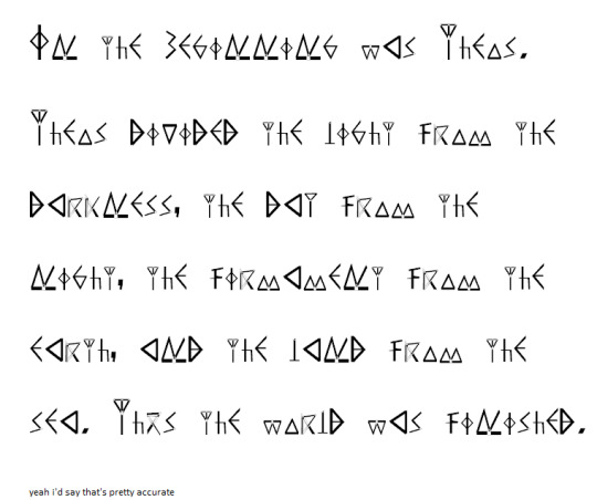
left: the screencap from my original post. right: the first paragraph of the letter, typed up in wordpad using the Limitless Evolution font.
And if you're wondering, here's what it says in readable English:
"In the beginning was Theos.
Theos divided the light from the darkness, the day from the night, the
firmament from the earth, and the land from the sea. Thus the world
was finished."
A list of changes I had to make, for those curious:
The letter never uses the letters J, Q, X, and Z, so I had to come up with my own designs for them.
There are no parentheses, mainly because by the time I got to those characters, I couldn't think of any way to make them look good and consistent with the rest of the font.
Idk where else I can mention this but I realized partway through making this that, because all of the characters use straight lines, the Unknown (or whatever entity is responsible for this "language") likely used to write on wax or stone, since straight lines are much easier to legibly write with on those surfaces. Of course, this means there are absolutely no curves anywhere in this font (at least in the custom characters).
You might notice a few re-uses of specific characters here and there in other characters. Had I not done that, I 100% would've gotten burnt out halfway thru and never finished this.
The numerals are obviously not Arabic. I took inspiration from the weird "gang signs" the Unknown do before they commit murder and made the signs for numbers look like fingers on hands. I imagine their counting system works exactly like Arabic/base-10 counting, just with different symbols.
I replaced the tilde with a "does not equal" sign. The tilde sometimes signifies "is approximately equal to", and I figured the Unknown probably wouldn't vibe with that kinda thing.
I was gonna make the @ sign the Agito symbol but I forgor. 💀
The dollar sign ($) is also custom. It's the symbol for G with a line thru it. The Unknown strike me as a culture that would use Gold, plus it looks kinda like a crystal, which they might also perhaps use.
The ampersand (&) and plus (+) use the same symbol. I figured they mean basically the same thing, so why not, y'know? Also I couldn't come up with a good design for it.
I literally just realized as I'm writing this that the lowercase M is only slightly smaller than the capital M, and the lowercase and capital Ns are the same size. My bad. When/If I make an updated version of this, I'll be sure to fix that.
I used the comma in like six different characters. It's not laziness, it's resourcefulness.
Lastly, the greater than (>) and less than (<) symbols are meant to represent people bowing/praying, since I figured the Unknown would probably see it as whichever number was more "powerful". Kinda like the alligator thing but with fighting instead of eating.
So yeah. If you want, you can download the font by clicking its name earlier in this post, or here if you'd prefer:
Lemme know if there's any improvements or adjustments I should make in the next version that may or may not come out some time in the near or distant future. ¯\_(ツ)_/¯ idk. Hope you enjoy regardless!
Update: In case you missed it, I released an updated version of the font that adds parentheses, brackets, some diacritics, and other fun things. It, along with the original version are both downloadable from the Google Drive link above (hopefully). I’m still planning on updating it again in the future, so if you have any suggestions or issues you’d like to see fixed in the future, lemme know and I’ll see what I can do.
#kamen rider#kamen rider agito#kr agito#masked rider agito#agito#agito spoilers#font#fonts#custom font#custom fonts#thing i made#sorry if the inconsistent sizes of the letters bothers you#the thing i used to make the font was easy-ish to use in every aspect OTHER than that#and for some odd reason the thing they give you to test the font before downloading it just didn't work for me#but anyway imma go relax#it's 6:30 and i've been working on this since noon#i am so tired
49 notes
·
View notes
Text
Free Online Program.
Is Devops Challenging? Please Note
#toc background: #f9f9f9;border: 1px solid #aaa;display: table;margin-bottom: 1em;padding: 1em;width: 350px; .toctitle font-weight: 700;text-align: center;
Content
ÄHnliche JobsuchezurüCkweiter.
Easy Ways To Be A Reliable Software Program Tester.
An Aim To The Future Of Software Application Testing.
User Interface Designer.
Leading 10 Software Application Testing Courses.
ÄHnliche JobsuchezurüCkweiter.
Which type of software testing is in demand?
Yes, of course, you can learn Selenium without knowing Java. Selenium IDE is a GUI based tool but it works only in Mozilla Firefox. However, if you want to create test cases using Selenium WebDriver, you should know one programming language out of - Java, C#, Python, Perl, Ruby, PHP.
A subreddit for those with concerns about operating in the tech market or in a computer-science-related job. I feel that in Workflow as well as QA you can easily 'burn-out' because of the lengthy hrs and repetitive job. For me development tends to be one of the most 'fun' and also therefore lowers the stress degrees. I don't recognize how difficult QA job is as I've never done it.
Easy Ways To Be An Efficient Software Tester.
Is DevOps easy to learn?
Java language and programming for Selenium
Java is a vast language. However, You don't need to learn full features of Java as that's not required for selenium automation testing. You only need to learn a selected portion of Java language. That's a good news.

Experience shows that the optimum length of a test instance is between 3-8 steps. Then you will do every person on your team a huge favor, if you write clean and also thorough insect records. It's great technique to keep every one of your important communication in one place. You will require to take another look at information traded in between you and participants of your group. You will certainly do your future self a support by making it available.
How long does it take to learn software testing?
Many employers look for software tester candidates with a bachelor's degree in computer science, math or engineering, although it's not always required. If you've got a lot of experience, a stable work history and solid references or letters of recommendation, it's possible to land a job without a college degree.
and also new ones are still being produced, one should note that roughly 90% of the concepts one learns in a specific language are likewise suitable to totally different languages. When opleiding java testers knows with the core essentials, establishing comparable skills with another language just boils down to understanding the syntactical nuances. creating or coding automation script, I am expanding a lot more burnt out. # 13) Find out more books, short articles, attend testing meetup and also seminars.
Constantly think of what you can do today to relocate closer to that goal and also act appropriately. Testers are extremely passionate at the start of their professions. But when the discovering curve is filled they start feeling bored. They promptly obtain tired of writing the exact same Pest reports and performing the same test situations repeatedly.
An Aim To The Future Of Software Program Testing.
When you develop an arranged framework to store all of your important information you have the ability to collect the appropriate information and form your testing approach for that task. If you do not have a method to keep this details, after that you will certainly miss vital details.

So, quick responses, supported by smart test automation systems, is going to be essential.
A lot more software is being developed, with a lower obstacle to entry, and faster time to market.
At the very same time, testing will certainly continue to become native to the island across other components of the software program lifecycle process, with fast-evolving devices bringing tests within the reach of a lot more staff member.
While they are frequently still the unsung heroes, the work that QA professionals do is significantly acknowledged for its contributions to DevOps.
You will certainly get advice on real-world software program testing, QA, monitoring, test automation, and also advancement proficiency in a wide variety of software growth firms varying from little to large scale.
You and also the developer need to be honored and also satisfied that what has simply been launched is pest totally free (" ish"), not just you. Eventually, as others have claimed, it's a different sort of anxiety. As QA, I was continuously worried that I missed bugs I should have caught. As a programmer, my anxiety comes from feeling like I should understand how to do something already as well as I don't. That stated, it is completely possible that my anxiety degrees in a dev function are not as high because I. still do not make a great deal of huge decisions.
How can I be good tester?
Robotic Process Automation (RPA):
Advances in software and AI world have paved the way for Robotic Process Automation (RPA). It is the most recent technology which has the capability to re-invent the business process management landscape. To know more about RPA's role in the software testing industry.
It is important in this regard to look for some advice and real-world assistance from gamers who have some experience in the field, as well as whose insights can aid you when making that critical pre-development decision. to script code, over time, differences will certainly emerge in between the languages. Consequently, activities that operate well in a specific language could be counter and repetitive user-friendly in a various one.

youtube
Interface Designer.
Growth can be rather difficult during crunch time when you're required to make style concessions as well as provided no time to clean up your work. But it can be a lot of enjoyable, also, which is in fact more frequently the situation for me. It's a GREAT DEAL easier to handle the job anxiety when you recognize the work and also your coworkers. Much easier to reduce, yes, equally as simple to outsource as development is however. QA is only demanding in that you have much less job safety and security than a dev.
I will collaborate with various other devs on my group if I'm unsure concerning a specific means of doing something, or the pros and cons of 2 things that, to me, appear similarly good/bad. I angle speak for QA given that my experience is in dev however from my interactions with them, it definitely does not appear like a cinch. As soon as you begin surrounding deadlines, everybody in the process feels the warm. I've done both, and also I've been burnt out by numerous aspects of each of them.
When your goals as a tester straighten with the goals of the app, you will certainly have the ability to provide significant outcomes. A tester's mindset can indicate the distinction in between discovering the most important insect in the app and finding absolutely nothing. You simply need to choose which response makes the a lot of sense once you comprehend what the inquiry is. You are provided an application, and also you should decide what must be evaluated, what the result should be, and apply a testing technique. You raise the possibility of somebody on your team falling short to carry out a job when you include more actions to an examination situation.
Discuss what they are doing, what they have actually developed, what situations they have taken into consideration, is there anything you can contribute to help them recognize the product much better. # 7) Collaborate with the QA groups from various other projects also.
Leading 10 Software Application Testing Courses.
youtube
Consistency provided by the WebDriver API across languages, simplifies the procedure of porting examination expertise of one language to one more. Examination engineers come to be better assets to their organizations as they can be transferred to any kind of internet project, created in any programs language, and also still have the ability to produce tests for it instantaneously.
1 note
·
View note
Text
Contempo, Soho, Emporio, and Notable: New @Blogger Themes!
Which new Blogger theme will you choose?
Blogger finally steps their game up to take back the crown from all the wordpress themes out there with their latest release of four new theme styles for your Blogger blogs. It's been about a week now since they released them and they are:
Notable [example]
Emporio [example]
Soho [example]
Contempo [example]
The Overall Review
Other than the fact that the names sound like they should be fancy 90s clothing brands, I genuinely like all the four theme styles. Blogger now finally has some themes that follow the minimalist approach and don't come with a million caveats of what doesn't work. Having said that, there are a couple of areas that don't work as expected and I'm hoping that those are just bugs that they are working on. For now, let's review these themes. Note that I'm focusing more on functionality and ease-of-use.
What's amah-zing
Minimalist Style Design: Almost all the new Blogger themes sport hamburger style pull-out menus and overlays. These designs are aimed at the fangirl/boy aspect of a user rather than a garrish commercial look that used to be the case in the earlier models of Blogger themes.
Sharing: Blogger has finally caught on that people want to have easier and prettier ways to share their blog. Sharing options are probably the main reason why you may want to switch to one of these new template styles. It is easier, more available, comes native to each template, and is well integrated into not only the main posts page but also in each post entry.
Subscribing: These new template styles also favor the subscriber-happy users. Earlier, you had to contend with a clunky subscription widget that was confusing and scary to the average user. In the new themes, a, the subscription widget is automatically enabled (but hidden from view when you first activate one of these themes), and b, it is natively integrated with these themes which is a huge blessing compared to the veritable jumping through hoops you had to do to have people subscribe to your blog in the dynamic views theme.
The subscription gadget aka 'Follow by email' widget also looks pleasing with a simple overlay onto the screen with one, and thankfully only one, option to enter your email address. Thank you!!! [Raises arms to the sky]
Featured Post: The concept of featured posts has been very well integrated in all the four template styles.
The themes come with a pre-installed featured posts widget which is defaulted to pick your latest post to focus on at the top of the page. You could alternatively pick your preferred post from whenever and put that right at the top as well.
Popular Posts: Another cool widget which was hard to integrate automatically into Blogger earlier is the Popular Posts gadget that now comes pre-installed and shows up under your post entry. You can change the settings to show popular posts from a particular time period, like last year, last 30 days, all time, etc. You can even choose if you want an image and a snippet to accompany it. Fanning my face. Phew.
Changing colors & styles: Other frustrating thing with Blogger themes used to be changing the colors and styles of widgets that have been installed. Either you got lucky with the widget or had to use CSS to modify the fonts and/or colors on your page. NOT with these four themes! Every time you add or remove a widget, it throws up options to change their styles and colors in your Blogger Template Designer, keeping all the customizations in one place and making your life hella easier. This means that the widgets are integrated into the blogger theme designer and is available on the layouts page as well. Good job Google!
The advanced section of the Blogger Theme Designer now has an extended menu of color and styling options for almost every part of a post page (not just the main page), including header, footer, blockquote text, and captions. Love!
Better integration with the native Blogger platform: What I mean by this requires a long-ish explanation.
If you have been using Blogger for a while, you would recognize the telltale signs of the mess with which Blogger features are released sometimes. For example, the last theme "upgrade" was the 'dynamic views template' themes and most, if not all, widgets that the Blogger platform had to offer natively didn't even work on the dynamic views templates, including the super-useful basic HTML/Javascript gagdet. Other times, even if you did pick a theme, you would still have to figure out the 'Layout' yourself to match with what the example theme looked like. It was frustrating and could make you rage-quit Blogger altogether.
With these new themes however, they integrated the 'Download your theme' feature whenever you switch over to another theme - which means, when you change your theme style, the layout widgets also change to reflect what the preview looked like. And, you get to download your previous version, just in case you don't like the new one. You could download your theme earlier as well but now a warning appears, so you are not making changes willy nilly. Plus, the available Blogger widgets/gadgets all work on all the four new theme styles.
Layout: The 'Layout' page is now more organized and easier to understand with understandable iconography and tooltips. A subtle but effective change. Kudos Blogger team!
Mobile Portability and Responsive web design: It goes without saying that this is something that these themes have got it right! Like, it's so well integrated, it makes me love it more and more as I keep using it. Considering how you have to dig through the deep recesses of the Internet to figure out how to customize the mobile version of your website, these new Blogger themes are a blessing!
Other special mentions: The fixed top navigation bar that follows you as you scroll. The blog title text changes sizes very easily to be unobtrusive to the reader's eyes as they go down the blog's content.
What needs work!
Twitter Cards: Though they finally figured out sharing options with these new Blogger themes, they seem to have now forgotten about Twitter Cards functionality. Twitter Cards do not work at all! Any meta tags you throw in there won't work. I am hoping that this is just a bug, and needs a simple fix, because this here is a huge loss otherwise. I haven't experimented with other social media meta tags yet but this was the first major snag I encountered.
Navigation to move from post to post: Currently when you are reading a post, you can't seem to jump to the next or previous post unless you go back to the main posts page. This is one of those features that is very well done in the dynamic views templates, complete with keyboard support using arrow keys to jump from post to post and navigating the entire blog without ever touching your mouse. Not comparing (yes, comparing), just saying.
Blogger Header is not a link (gasp): A small fix but an important to consider. Clicking on the title of a blog in order to go back to the main landing page is usually as basic as a feature as can be, but it isn't available in the new Blogger themes. Again, I think it's a bug and hopefully, an easy one to fix.
Number of Posts per Page: Keeping to the minimalist idea, all four of these new Blogger themes show a very limited number of posts on the main page supplemented with a discreet 'Older Posts' or 'More Posts' link on the bottom right corner of the page for the user to click on. Now, no matter how many times you tinker with the 'Blog Posts' widget on the Layout page to increase the number of posts you want to see (so far, I have seen five to six posts that can fit in one page at the most) per page, this does not affect the page at all. I dug around some more and found out that this is because the div container that holds the posts to show has a pre-programmed set height. Which means that it can only a few posts within that height limitation. Pout.
I am sincerely hoping this is something that they can fix so that the setting on the 'Blog Posts' gadget overrides this height limitation. Fingers crossed.
Search: Another point of comparison that needs to be brought up is the search functionality. This is a ranting point for me when it comes to Google products. For a search company, there is a severe disconnect in the products that do their search functionality well. The best in-blog search functionality I have seen is in the dynamic views template. It, in fact, was one of the few reasons that made Rumi and I stick with our dynamic views template for over a year. The 'search bar' in that template supported autocomplete, preview (with image!) of the search results within the search menu, and even a partial word search!
In these new Blogger themes, unfortunately, you need to have exactly matching whole words in the search box and even then, you can't figure out how many search results it really matches to. It also doesn't consider labels as keywords that could be searched for. Bummer.
The 'About Me' Widget: If you notice the style of these four new Blogger themes, the focus is on the personal aspect of the blog owner - which I love, but what it is a little confusing is the sole use of the 'About Me' gadget to do so. Don't get me wrong, it seems quite obvious why they would want to leverage the 'Profile' gadget (what can also be called the 'About Me' gadget) as developers. However, it doesn't support those blogs that have connected their Blogger to their Google+ profiles, which is ironically incentivized in other parts of the Blogger platform.
I wish they have a seamless integration for the Google+ connected blogs as well for these new themes.
Previewing Color & Style Customizations in the Blogger Theme Designer: I'm loving the direction that the new Theme Designer is taking with respect to the multiple sections of any and all pages that you can now customize. Now the problem is that with so many options to customize, it's difficult to visualize and trace what is changing when the preview pane always shows only the main posts summary page. This is not exactly a deal breaker, just a humble plea from a style-crazy blogger to the developers. :)
Let's look at the Theme Templates!
Notable
Meant for people who type out short scribbles of their thoughts or anyone looking for a text-focused notebook-style theme. The Notable Blogger theme does a good job maintaining ample white space with large text sizes keeping the focus on the text content. A hamburger style hidden pull-out menu allows the blog content to spread out comfortably across the screen and dominate the reader's mind.
The sidebar is placed to the right and overlays over the site content once you hit the hamburger menu on the top right corner. It also applies a gray tinge to the rest of the blog when the hamburger sidebard menu is open which highlights and focuses the sidebar content.
I like that the focus is on the post blurb/snippet and the 'one post summary per row' makes the user go browsing (and scrolling) more and more to find the content that really catches their fancy.
Other than the featured posts, I find the images on the rest of the posts quite small in size for the content. Also, the Notable Blogger template does an added restriction for a blogger who has to find images which won't look odd in the square preview box.
Emporio
Two things I really love about the Emporio Blogger theme is
a) when you mouseover any post, it shows you all the labels associated with the post and direct links to them. So, if you pick this theme, you would need to be smart about your labeling and not have ridiculously long lists there.
b) The post opens up no matter whether you click on the summary, image, or the title, unlike the other new Blogger themes.
The sidebar is static and placed to the right. This theme might be perfect for those who want to add many funky widgets on the sidebar. Since the sidebar doesn't follow the user as they scroll down, it could feel like a waste of space on the right for the below-the-fold content.
Other than the featured post, the rest of the posts are fit into a square grid style format which fits more posts per page when compared to the other new themes.
Along with the Soho Blogger theme, Emporio does not show the text snippet on the main page. Not my personal preference, but perfect for image-focused blogs.
Soho
I love that the Soho theme has a long banner image that runs across the top of website. Even though it appears as a highlight of the above-the-fold content, it's actually a background image and with some creative thinking can really get some interesting looking blogs. I also love that it uses the background image feature in blogger which is sadly underrated.
This is the only theme of the four Blogger templates that where the posts are spread out in a column-wise grid but maintains the aspect ratio of the post's images. For bloggers who have content that focuses on both text and photographs, this is a great theme to choose. I just wish the theme also allowed text snippets in the post summary page.
Contempo
Similar to the Notable Blogger theme, the focus of this theme is on the text aspect of a blog though it is comparatively more picturesque. There is a big banner image that runs across the top of the blog header and the featured post also focuses on the image. However, for the rest of the posts, the thumbnail images are quite small. Though the Contempo theme is one of the prettier themes in the new line of Blogger themes, it only feels like for the above-the-fold content.
The sidebar is a pull-out menu triggered by a hamburger icon on the left side of the page which overlays quite nicely over the content. For first-time bloggers, I would recommend the Contempo Blogger theme.
What else?
I have been enjoying playing around with the new Blogger themes and as you may have noticed, we didn't take long to switch from our earlier Dynamic Views template (which we made awesome!) to one of the new Blogger themes.
I hope this release marks the intention of Blogger to listen to their Blogger users more and make this platform truly the best blogging platform out there.
...o0o...
Ray out! Peace!
Photo credit: Blogger
READ MORE BLOGGER TIPS ON CUTIECODING
0 notes
Last Seen Blogs

we-do-bones-bracket
round 1

dimitresc
alcinadimitresku

plumbobtortoise
plumbobtortoise

hippiekara
Welcome To My Escape

gavanah
Gavanah Resto Dance