#the brightest night
Text
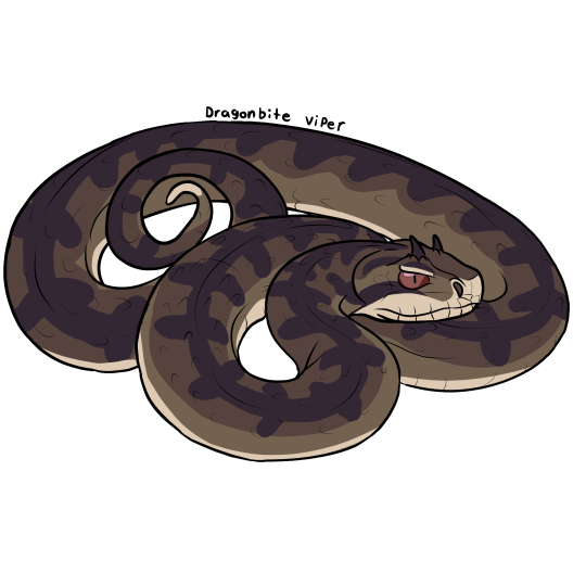
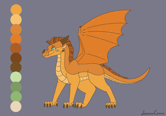
Dragonbite Viper
Threw in drawing a design for this fantasy snake species as well for funsies. Thank you for over 700 followers! I'm really happy people are enjoying this fun little side project I've been doing in my free time. I'm going to be taking another break to recuperate and work on other art projects for a bit before drawing the arc 2 dragons. Until then, keep your eyes peeled for any more adopts, bases or other goodies I may post in the mean time :3c
[Image Description: A digital drawing depicting the fictional species, dragon bite viper from Wings of Fire. It's curled around itself, colored with brown scales and a warm creamy underbelly. It has dark reddish purple vertical stripes all on its back and tail. Its eyes are light red with slit pupils, and it has horns on its brow, similar to real life horned vipers. /.End ID]
#wof#wings of fire#wof art#dragonbite viper#dragon bite viper#snake#viper#fantasy species#wof arc 1#wof arc 3#snake art#the brightest night#the poison jungle#wings of fire art
85 notes
·
View notes
Text
I was interested to check can I draw backgrounds so here are the redraws of WOF GN covers

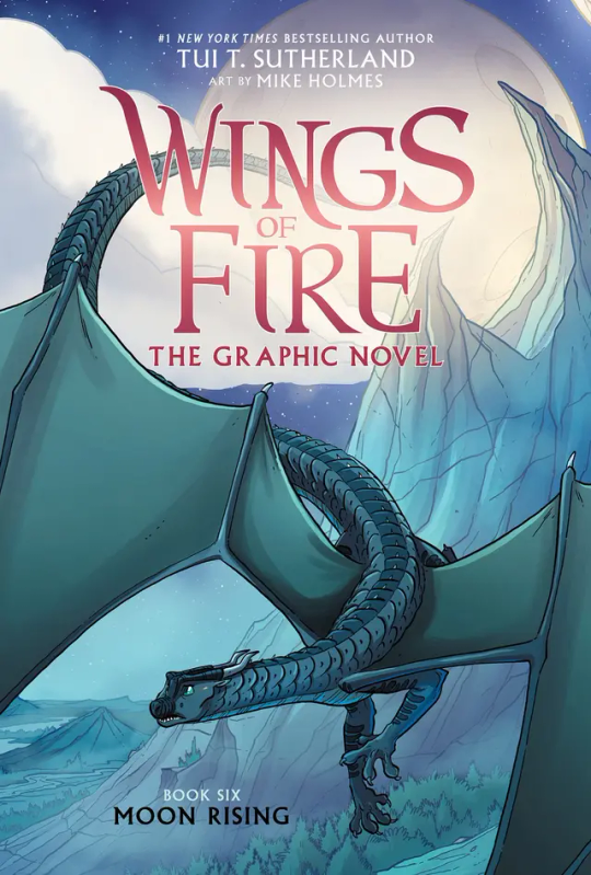
#wings of fire#wof#traditional art#український tumblr#wof gn#wof graphic novel#mike holmes#background practice#graphic novel redraw#the brightest night#moon rising#traditional painting#укртумбочка#I spent too much time on this#Also I`m tired of my sketchboock so I can finish it faster#redraw#my art
514 notes
·
View notes
Text


Tui really nerfed Qibli’s speech in the second arc. He used to be so scrunkly
#wof#wings of fire#wingsoffire#the brightest night#qibli wof#imagine him speaking like that to Winter
667 notes
·
View notes
Text
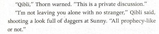
Queen Glacier of the Icewing Kingdom :O
Made her look like the most Icewing Icewing to ever exist, my headcanons here are that all Icewing royalty has antlers. Something interesting is that Glacier specifically stated that she wanted to help Blaze run the sanding kingdom not take advantage of her like the dragonets thought, so Blacier for the win! I feel like she could have been explored a bit more cause she often feels like a blank state that only thinks and does as the plot demands. Although her scene in Snowfall's vision and her death scene was great.
#wof#wingsoffire#wings of fire#glacier#queen glacier#dragon character#dragon art#the dangerous gift#icewing#queen#winter turning#darkness of dragons#the brightest night
329 notes
·
View notes
Text

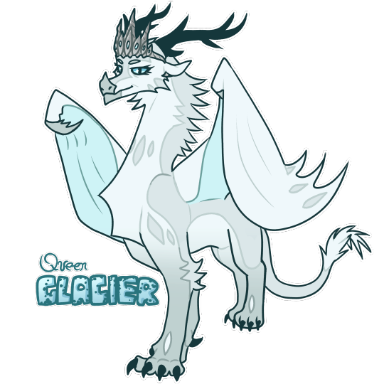
Some designs for Clay and Sunny! The two sweethearts of the dragonets of destiny :)
#art#artwork#digitalart#fanart#furryart#wings of fire#wof#wof mudwing#wof sandwing#wof nightwing#wings of fire clay#wings of fire sunny#clay wof#clay wings of fire#sunny wings of fire#sunny wof#dragonets of destiny#dragon#the dragonet prophecy#the brightest night#wof fanart#wof fandom#wings of fire fanart#wings of fire fandom
46 notes
·
View notes
Text

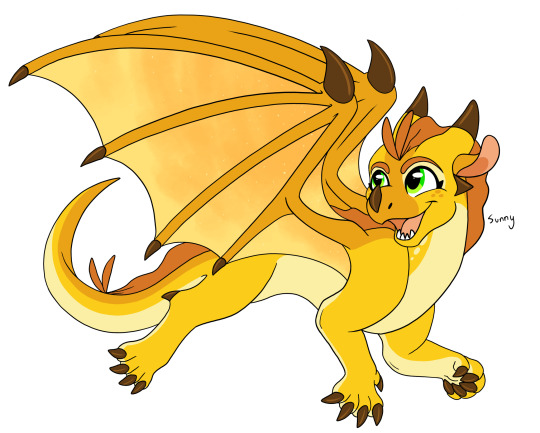
Clay the Mudwing.
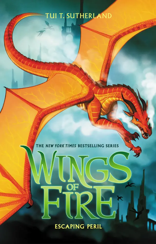
#Clay#Mudwing#Dragonet of Destiny#Clay wings of fire#Wings of Fire#The Dragonet Prophecy#The Lost Heir#The Hidden Kingdom#The Dark Secret#The Brightest Night#Moon Rising#Escaping Peril#Talons of Power#Darkness of Dragons#Dragonslayer#Wings of Fire Design#I don't think I did him much justice but I am proud of this nonetheless!
27 notes
·
View notes
Text
Decided ro redesign the Dragonets of Destiny a little
First goes Sunny, my favorite, my beloved
#wings of fire#wof#wings of fire art#wings of fire fanart#sandwing#nightwing#wof fanart#wof designs#wof design#sunny wof#wof sunny#sunny#dragonets of destiny#the brightest night#my art
51 notes
·
View notes
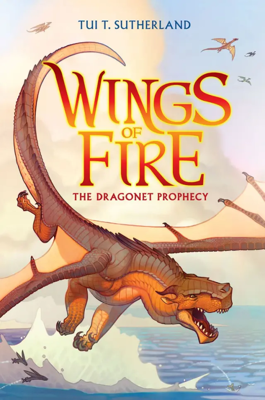
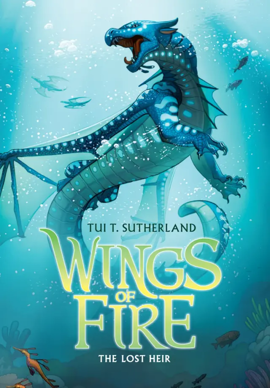
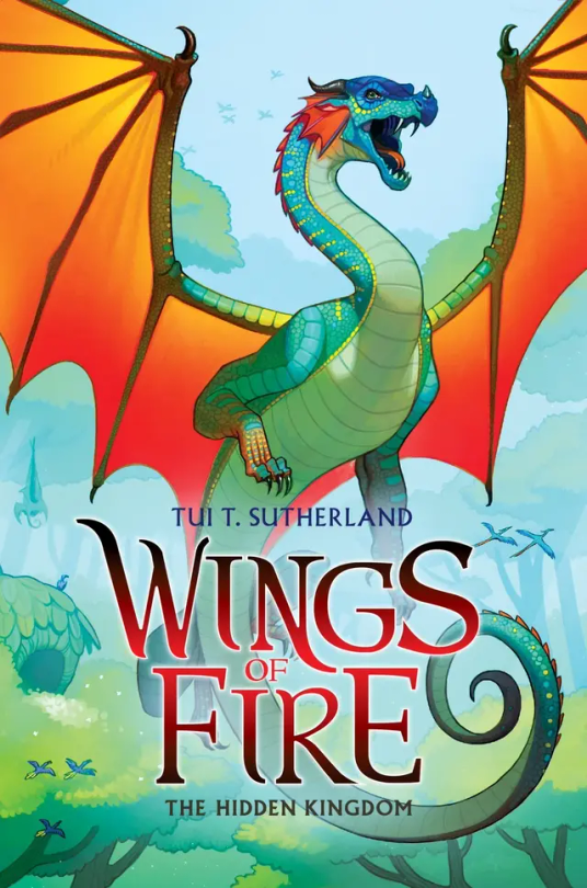
Text
Ranking all Wof Cover (except winglets and graphic novels) because I’m bored :p (Some spoilers!)
#1: The Dragonet Prophecy. Personally, I think it’s cool, although I think it could have a little more action on it. In the drafts, it was gonna have Queen Scarlet’s arena, which I think would’ve been a cool edition to the cover, but sadly they removed it. 7/10
#2: The Lost Heir. Ok this one is awesome. It really shows Tsunami’s personality in her pose and it has so much action yet not to much. But they did forget to put the royal markings on her wings, which kinda makes her seem a little less important if you’re just looking at the cover. Originally it was gonna be called “The Last Heir” which sounds epic, but then again Anemone is in the book, so it wouldn’t make sense. 9.5/10
#3: The Hidden Kingdom. One of the coolest covers, I’m a sucker for the wings contrasting with the background (which is a reason I love The Dangerous Gift) but to be honest, Glory just kinda doesn’t stand out. Even with Tsunami being blue on blue, she stands out while Glory just… doesn’t. I think it would be cool if we saw her using venom, and if you say “But she doesn’t use venom in the Rainforest in the book!” Boy are you gonna do a flip when you see The Lost Continent. 5/10.
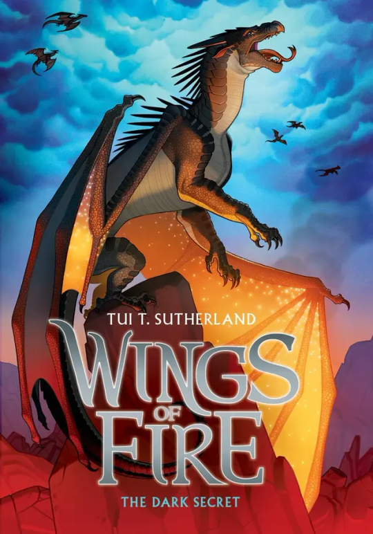
#4: The Dark Secret: Honestly… just kinda… meh. I mean sure Starflight’s pose is cool, as it shows how the Nightwings are supposedly these evil mind reading future seeing beings that are going to rule the world, but it’s not really as cool as Tsunami’s or Clay’s. If anything I think the background makes up for it. The blue cloudy sky contrasting with the dimly red lit stone just catches my eyes immediately. 5/10.
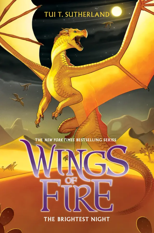
#5: The Brightest Night: I love this cover. Mainly because I love the way Sunny is portrayed on it as she is a hybrid but also I love the three moons in the background and the Sand Kingdom. Sunny’s golden yellow on the black night in the back is just perfection to my eyes. 10/10.
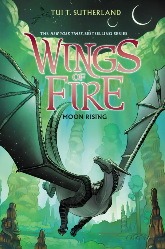
#6: Moon Rising: I adore this cover. And not because Turtle is on the back but that’s a reason I love it as well. Moon having that green fade on her wings is just really cool imo, and this is one of the covers that actually takes place in the book. I think it would be a little bit better if MoonWATCHER was look in the direction of the MOONS, but other than that I love this cover. 9/10.
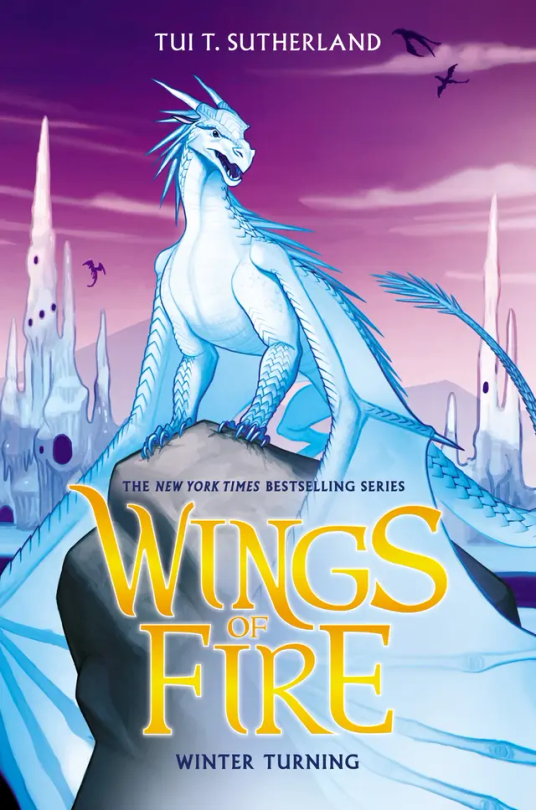
#7: Winter Turning: The draft for this wasn’t going to have purple on it, and to be honest, I’m glad they added that. The purple really brings out Winter and the Ice Kingdom, and it really makes everything pop. 10/10.
#8: Escaping Peril: Ok so maybe I’m a sucker for red on blue but Peril’s cover is just, wow. Her being chased by Scarlet is awesome, but I’m a little sad it didn’t happen in the book. (I think? Haven’t read this in like a year) My only complaint is that it doesn’t look like the Sky Kingdom in the back. Like if I first saw this cover and didn’t read WOF, I would think they’re flying over human city’s. 7/10.
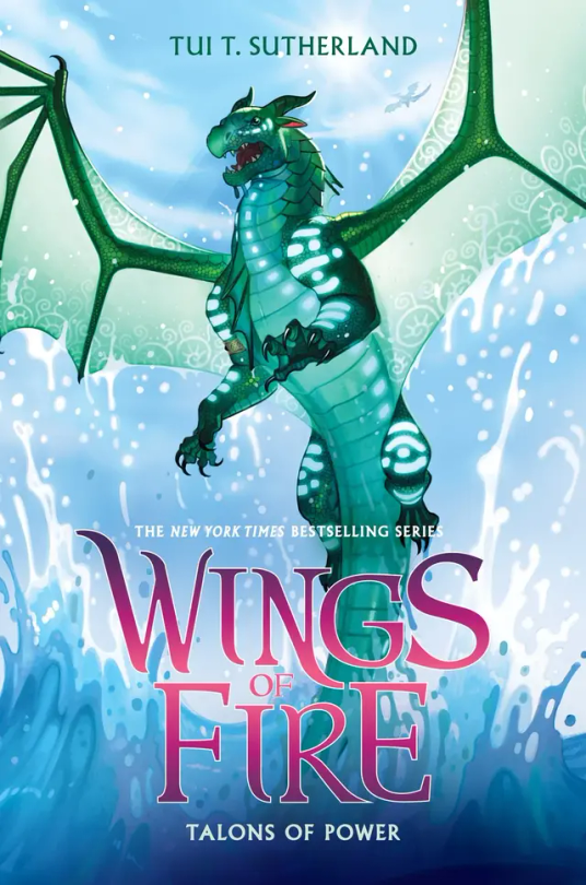
#9: Talons of Powers: Don’t be bias about this one because Turtle's in it, Don’t be bias about this one because Turtle’s in it, can you tell that this is my favorite cover? Other than the fact that Turtle’s on it, I love the fight between Turtle and Anemone on the cover, giving away a key point, but not too much spoilers. I also love all the action on the cover, with Turtle soaring out the water. But they did forget Anemone’s royal patterns, so it’s not perfect. 9.9/10
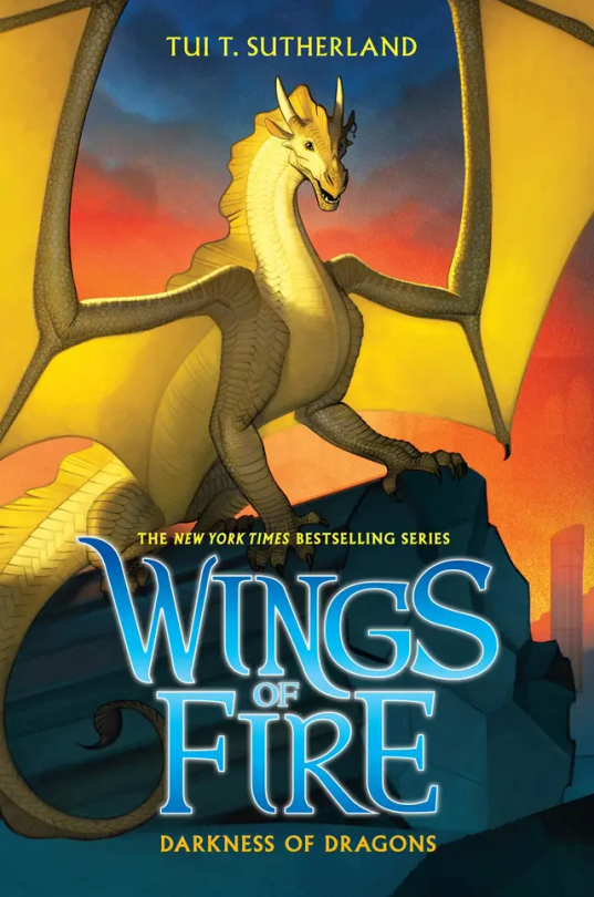
#10: Darkness of Dragons: Qibli’s yellow on the sunset background is just perfect, alongside the dark pieces of stone from the ancient Nightwing city. His pose really shows how Qibli is brave and daring, but they did forget his snout scar, which is like the one thing that makes Qibli, Qibli. 8/10.
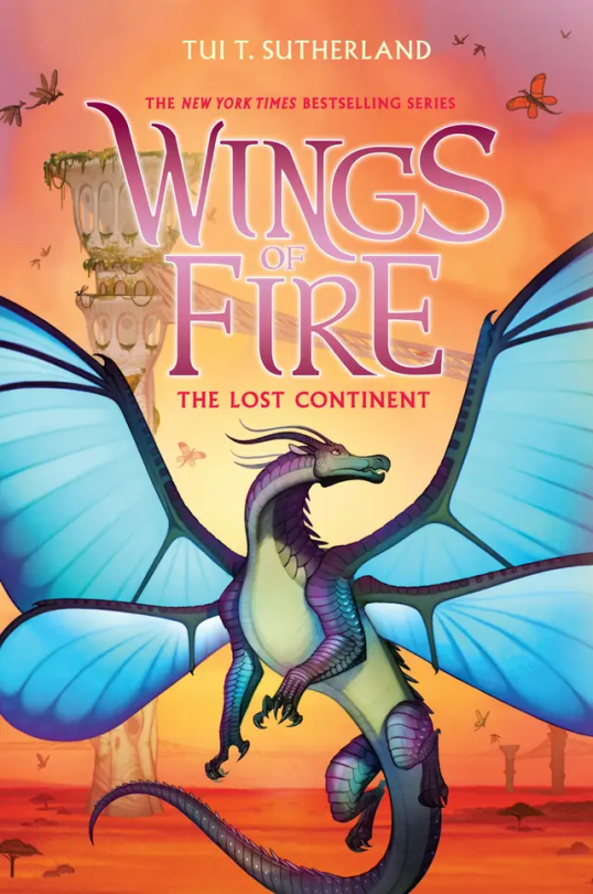
#11: The Lost Continent: Blue’s, well blue is the perfect contrast to the orange Pantalan savanna and the tan hives. Now, most people don’t like this cover because, “Blue doesn’t get his wings in the book!” or, “Cricket described him as blue, but on the cover he’s purple and green!” And my response to these are, 1: Tui actually was going to make Blue have no wings on the cover, but she thought he looked more pretty with wings than without. And 2: I personally love purple and green blue, It makes him look more related to Admiral and it makes him less of an eyesore imo. (If you seen the book description version of him on the wiki, you know what I mean). 10/10.
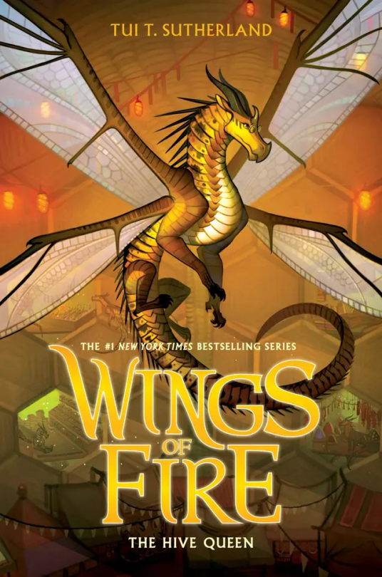
#12: The Hive Queen: Again, even though it’s yellow on yellow, Cricket still manages to stand out. I think it’s because Cricket’s more yellow, while the hive is more orange. I think the lights and the.. hole dens? Really just make the background so visible but not the main focus. 10/10
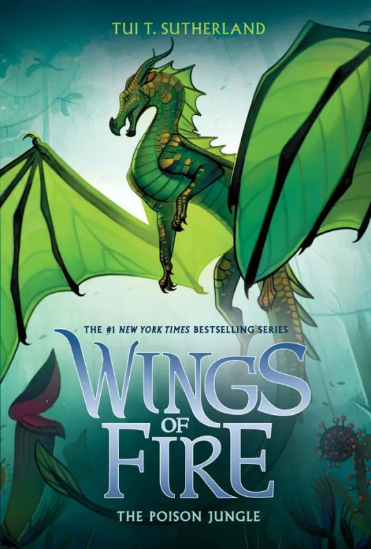
#13: The Poison Jungle: How does Joy Ang manage to put the same colored character on the same colored background and still make them stand out? Magic. Anyways, Sundews pose and the Poison Jungle in the back just really shows how fierce she is. Her small gold scales make her pop from the background, and I think the light behind her is the key to not have her blend it. 10/10
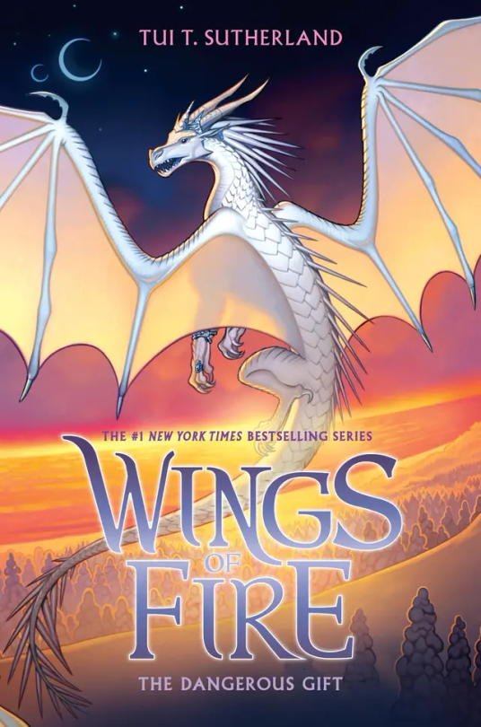
#14: The Dangerous Gift: Like I said in THK, I love wings that stand out from the background, so this is one of my favorite covers. Snowfall flying with Lynx by the coast where the Silkwings would fly in gives away so much yet so little. Also I love Snowfalls pose, no reason why it just looks cool :). 10/10
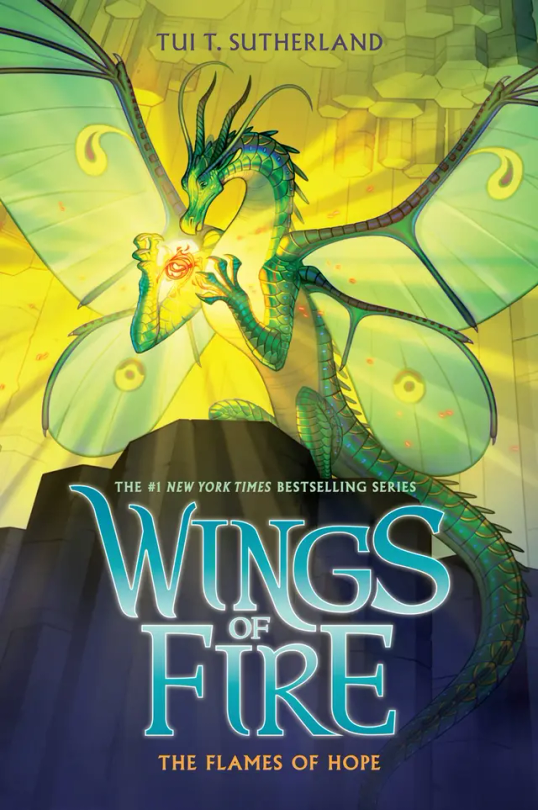
#15: The Flames of Hope. Honestly…. This cover is the worst in the Lost Continent Arc. Honestly Lunas pose is cool, and I think it would look really awesome if it wasn’t for the lighting of the flamesilk. That kind of blends her into the background at makes it a little boring to look at. But I do have to say I love Sky with Wren on the back and even thought Sky is described as pale, I love a red Sky. 6/10.
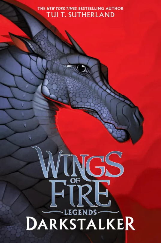
#16: Darkstalker: Darkstalker in on his mewing streak on this cover 🤫🧏♂️👌. I love his black on red background, but it’s boring. There’s nothing going on in the back, and he’s just standing there doing nothing. 6/10.
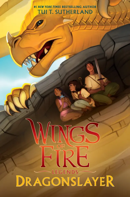
#16: Dragonslayer: I don’t have much to say about this cover. It has so much action but so little at the same time. It catches my eye but at the same time it doesn’t. I’m honestly very meh about this cover. 5/10.
#wings of fire#wof#the dragonet prophecy#the lost heir#the hidden kingdom#the dark secret#the brightest night#moon rising#winter turning#escaping peril#talons of power#darkness of dragons#the lost continent#the hive queen#the poison jungle#the dangerous gift#the flames of hope#Clay wof#tsunami wof#glory wof#starflight wof#sunny wof#moon wof#winter wof#peril wof#wof turtle#qibli wof#blue wof#cricket wof#sundew wof
16 notes
·
View notes
Text

Panel redraw from The Brightest Night. Awesome to see all my improvement!
#itswrenly#wings of fire#wingsoffire#wof twisted fates au#wings of fire au#itswrenly art#woftf art#wof#wings of fire fanart#wof au#wof art#wof blaze#wof headcanon#wof sandwing#blaze wof#the brightest night#tw blood
54 notes
·
View notes
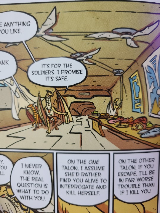
Text
I know I'm late to the party (just now reading this gn) but I LOVE this ceiling fan concept
64 notes
·
View notes
Text
idk man maybe in tbn blaze didn’t attack or try to kill her sisters because they are her family and she truly loved them,, but nah tui said “no its bc shes dumb!! and cant fight!!”
285 notes
·
View notes
Text
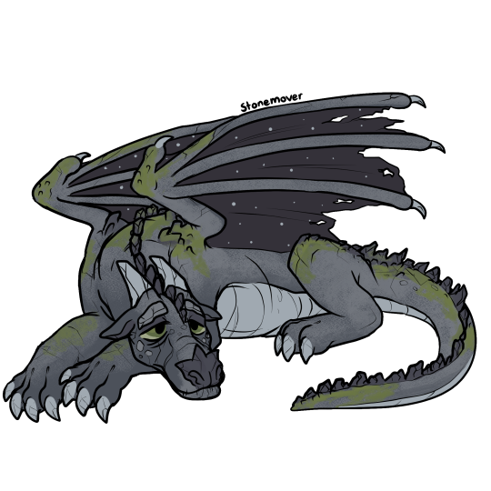
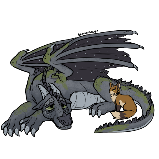
Stonemover the Nightwing (and Dinner!)
[Image Description: A digital drawing depicting Stonemover from Wings of Fire. He is a stony gray nightwing dragon with tired green eyes and spots of mossy green growing on his legs, tail, back and wings. His eyebrows, nose, horns and spines are like crumbling rocks and stalagmites and he has cracks all over his body. He is laying down with a sort of tired and glum look on his face. In a second picture, dinner the fox is added to it. He's a red fox with a creamy underbelly, and brown sock markings and ears. He is sitting close to Stonemover, next to his back leg. /.End ID]
#wings of fire#wof#dragon#wof arc 1#wof arc 2#nightwing#stonemover#wof stonemover#wof nightwing#the brightest night#moon rising#talons of power#darkness of dragons#my faves#wof dinner
504 notes
·
View notes
Text
#wings of fire#wof#sunny wof#sunny#sandwing#nightwings wof#hybrid#peril wof#peril#skywing#sundew wof#snudoo#leafwing#the brightest night#escaping peril#the poison jungle
12 notes
·
View notes
Text
Glorybringer Appreciation Post
Tonight is not a getting stuff (writing) done night. Tonight is a "compile at least ten of your favorite moments between a dragon couple from a kid's series" night. So without further ado, my favorite Glorybringer scenes throughout the series!
The Hidden Kingdom:

The Dark Secret:


The Brightest Night (partially with the help of @laughingphoenixleader) :


Winter Turning:

#i think that's about it!#glorybringer#queen glory#deathbringer#wof#wings of fire#the hidden kingdom#the dark secret#the brightest night#winter turning#these two are an amazing couple and i love them#10/10 enemies to lovers with some fun flirting thrown in
68 notes
·
View notes
Text
I'm sure someone else must have noticed but I absolutely love analyzing the WoF book covers and the character designs especially for Sunny cause she's the only look at hybridization we really get with the more realistic official art. And I was doing so to get some ideas for the character I'm working on.
And I just realized in her cover the end of her tail is a lot darker than the rest of her scales! I've noticed her other Nightwing features easily such as her scale patterns, face shape, and sail turning into spines, but somehow I didn't catch that one and I don't think it's something I've seen people use in designs for her too often. I did think it was maybe shading at first but I really don't think it is.
I'm just very excited about it idk why lol
30 notes
·
View notes

Last Seen Blogs

blackgoldskkn
•Saint•

eeaatgrl
eeaatgrl

eternaljourneyofhappiness
The Eternal Journey of Happiness

styl-inc
Styl Inc.

cv-045
my soul is always with you …