#such good shapes.. transparent elements that are still fairly simple… AND i don’t have to draw toes this truly is a Fun To Draw Guy
Text
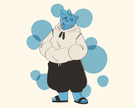
Day 6 of @hermitadaymay and it’s the one and only Sans Undertale!!
#my art#Ijevin#ijevin fanart#jevin#jevin fanart#hermitcraft#hermitcraft fanart#hermitcraft art#hermit-a-day may#hermitadaymay#hermit-a-day may 2024#hermitadaymay 2024#hermitaday#Shoutout to this dude for having the most simple and easy to draw while still being visually satisfying design fucking ever#so few colors but not few enough to be boring. Enough details to be fun but not enough to be cumbersome to draw.#such good shapes.. transparent elements that are still fairly simple… AND i don’t have to draw toes this truly is a Fun To Draw Guy#also this is going out like two minutes into day 7 because I hit post limit with my reblogs today 💀#I plan to miss as few days as possible I wanted to do keratin but got busy during the day. And then I had work yesterday. Wan’t super-#-pressed about missing Sundays before since they’re extra prompt days but I would have liked to not miss TFC#maybe I’ll get to them at some point after the event or if I end up with extra time. OOH maybe I’ll put them in some of the future ones#that would be easy. Yeah maybe I’ll do that. I could but Keralis with xB. They hang out right (<- doesn’t watch either of them)#Ooooh yeah actually I have a good idea for that that’s what I’m doing. I’ll figure out somewhere to put TFC i think
49 notes
·
View notes
Text
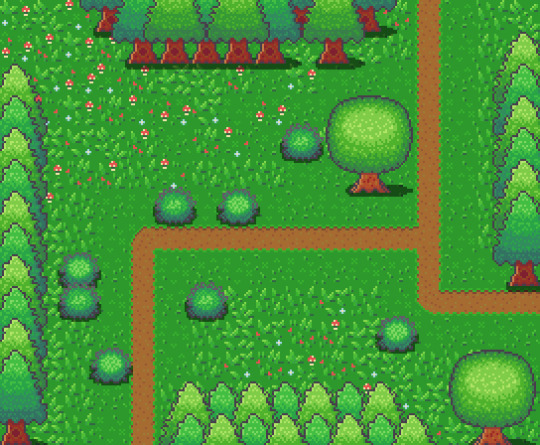
Learn Log #4 - Grassy Grove
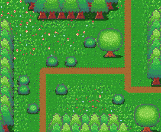
On week 4 of my pixel art journey, I learned how to make objects of nature including grass, bushes and trees. Unfortunately, I had to postpone this to this week when the learning and blog post was set for last week as I was just preparing for a return to university (it’s all online – social distancing dw). Anyway, I ended up making the forest scene you see above, and it was a lot of fun. I think that the GUI elements last week had a focus on technicality and exactness. Letters are very rigid, and we have somewhat set ideas about what each character should look like. However, nature is more flexible and therefore logic isn’t as heavily involved.
Tile Sets
Before jumping into the actual elements of this week’s piece I want to talk about making pixel art tiles. You will have probably noticed that the nature scene is quite rigid like each element is set into a box. This is because I’m learning pixel art to make games and games often use tile sprites to build their environment.
Tile sprites are the floors and sometimes walls of the environment. They often loop or repeat to cover the environment, however, some engines have tools allowing game designers to build environments tile by tile.
In the first case, the tile sprite will have to be created with its looping in mind and details may be added to provide variation in the environment. However, these added details may highlight the repeating the pattern and the more a detail sticks out the obvious the repetition becomes. Additionally, smaller tiles will repeat more frequently, and this also shows repeating textures.
The second scenario requires variation to be created from the creation of multiple tiles. This is great for creating variation; however, the tiles will also have to line up with each other which may be trickier for more rigid surfaces like rocks or bricks.
Since Unity has a tile builder tool and I was creating a natural environment where tiles wouldn’t need to line up so clearly – I decided to go with the second option.
The size of the tiles may also dictate the size of the rest of the game. For example, a bush may be 1 tile large in terms of level design, so the size of that bush is determined by the size of the tile. This also goes for the player whose sprite will typically range from 1 tile to 2x2 tiles. I decided to just make my tiles 16x16 as I enjoy learning within that space.
Grass
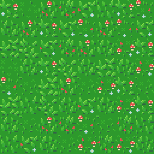
A grass tile is typically made of a green background with blades of grass texturing the surface. Many people may open up a couple of green canvases and start texturing them with green lines, however, there’s a much better way to do things I think. Since we’re working with 16x16 tiles there’s a limited number of shapes that look like grass and are small enough to fit within the tile. So, if we make a bunch of lines in green then we have blades of grass that we can copy and paste into each tile (the blades should typically be a lighter green as light will be hitting them).
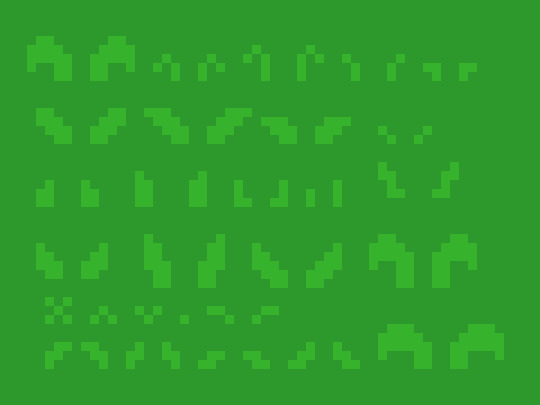
However, having blades of grass like this make tiles look flat. Adding shading will fix this issue by giving the grass depth, however, more complicated shading will obviously make the background more complicated which can affect the readability of your game.

Each blade of grass can now be copied into a 16x16 canvas to make grass tiles. I made 4 grass tiles shown below putting approximately 10 blades into each tile. I made each tile with different elements of the environment in mind such as short grass, long grass, bushy grass and leafy grass.
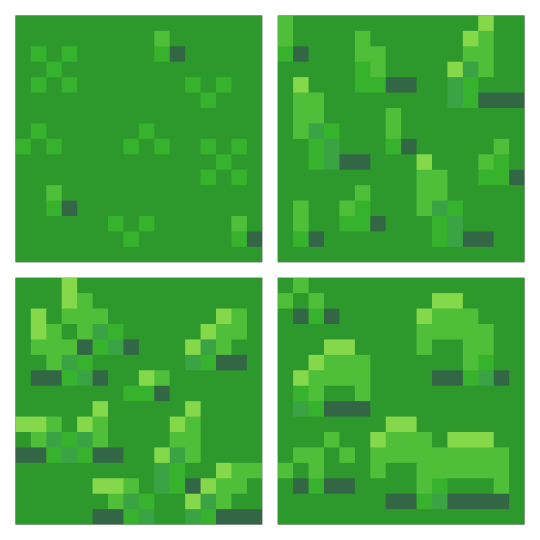
With these tiles, I created a larger image to test the repetition of the tiles. The repetition wasn’t a big issue; however, I didn’t think the leafy grass fit with the rest of the grass, so I decided to leave it behind for the next stage.
Next, I was going to add an extra tile for each of the current textures to reduce repetition as well as two flower variants for each tile type to add some colours into the textures. I did another test of the tiles’ repetition and overall look and it looked good but somewhat cluttered though I figured that this wouldn’t be an issue when I deliberately place the tiles rather than randomly scatter them.
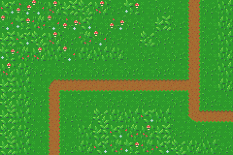
I had in my mind the type of scene I wanted to make for this week, but it required dirt paths. Luckily this wasn’t an issue to make. I made two variations of the straight, one-way paths as they would be tiling and altered one of these tiles slightly to make the curve and intersection tiles.

I then assembled these 15 tiles into the image below.
Trees
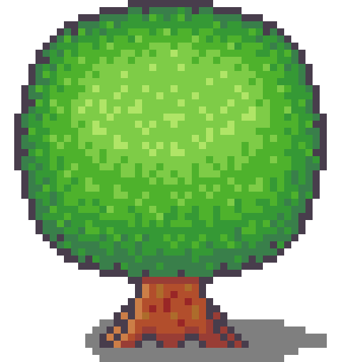
Next, I wanted to add some plant life which would involve trees and bushes. I decided to do trees first as they would be larger than the bushes. First, I started with the shape of the tree which would be fairly basic. I made a rough tree trunk shape to start with and topped it with a circle that was a little squished before refining the shape a little more to get what’s shown below.

I then added colour into the tree. A simple brown for the bark and 4 shades of green for the leaves. These greens were made by colour picking the base green background and hue-shifting it towards yellow so the tree would stand out more from the background.

The colours are organised into ovals to help give the tree a sense of depth. The dark shades wrap around the edges of the tree to show the tree’s roundness. The colour thins out as it goes around because you’re viewing the shaded leaves from a side-on perspective.
Next, I blurred the lines between these circles by mixing the colours slightly. This was the start of adding leaves onto the tree. Quickly after that, I added more detail to the leaves by spotting the head of the tree with lighter greens. The details added were in ‘leaf-like’ shapes like hearts, single lines, and arrows. They don’t look like leaves individually and can’t receive much detail themselves (such as a stem) but together they make the tree look nice and bushy. I also added some detail to the tree trunk including shading.

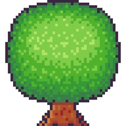
The tree trunk seemed a little off when I checked it out with the image I had so far, unfortunately. So, I added some extra trunk at the bottom along with a nice shadow. This shadow was the colour black at a transparency of 127 (or half transparency). This works really well as a quick and easy shadow on detailed background, but it does, unfortunately, mean the shaded area is not hue-shifted as typically preferred. The final product is below.
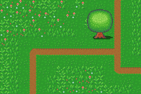
Looking at this sprite you may think it would be difficult to construct a game environment due to the leaves, trunk shape and shadow involved. However, we can place each section down as a separate 16x16 tile with the main trunk tile being a collider and other tiles not having a collision box (like decoration tiles – we don’t want players to run into tree leaves). This works out really well, and I focused on the main trunk tile when positioning the sprite in the piece. Which is shown below.
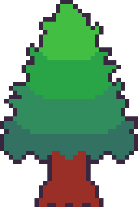
However, the scene below is bit lonely so I thought I’d add some pine trees as a level border. The process of the pine tree is similar so I won’t describe each step but will show the images. This time around I did shape the tree a bit more wildly with branches and leaves sticking out from the tree. I also hue shifted towards bluer colours rather than the more yellow colours I used in the round tree.


Next, it was time to add more trees into the scene and add some grass beneath them. I made the grass beneath them short grass simply because it looks a bit neater than the other grass types.
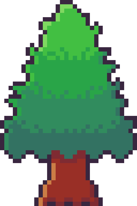
I think it looks pretty neat! I made a pine tree variant by swapping the colours with that of the round tree for some variation which worked as a nice, easy trick. But it would look livelier with some bushes.
Bushes
You might have looked at the trees just before and thought, ‘That kind of looks like a bush on a stump.’ That’s because the techniques used to make bushes and trees are typically very similar depending on the style of the game. Since we’re using a 16x16 size which is somewhat limited they will likely turn out in roughly the same way.

I started with a circle shape that was modified at the bottom to be a bit flatter. This will hopefully give the impression that the bush is touching the ground and rounds out on the top
I did a similar process in colouring the bush as I did with the tree, however, I used fewer colours as I didn’t have as much room for highlights with the bush. The colours used are actually the same as those in the pine tree.
I then adjusted the outline to give the bush a wilder feel as well as texturing the inside of the bush to create the appearance of leaves.
The bush still felt a little flat, so I added highlights to the top of it to add a greater sense of depth. The highlight was rounded towards its end at the bottom to enforce the rounded nature of the bush. This required me to add another outline tone for highlights which I might apply to other elements of the picture. I was pretty happy with the bush, so I made another for variation and added them into the picture with some shadows.
The picture looked pretty good, but I thought some touch-ups might make it just that little bit better.
Touch-Ups/Conclusion
To touch up the piece I added some more trees for denser looking forest, added the lighter outline colour to the tress and expanded shadows around some of the pine trees. I’m pretty happy with how it turned out. I think the shadows could use some refinement at the top border of trees. I also think that top border highlights the repeating pine tree trunk which could also be changed to tile better. I do wish my bushes were a bit leafier than shrub-like, however, I think my ability to make leaves on both bushes and trees will improve as I practice. I also think a 32x32 base picture would allow me to make some more defined leaves. The lighting on the pine trees also uses a different technique to the round tree so next time I’ll try to be more consistent with that. Overall though I’m happy and I quite like the outline highlights as they make the image a bit softer.
That concludes week 4 of learning how to make pixel art. Next week I’ll be looking at sand, water and rocks to make a top-down beach scene.
My learning and this blog post wouldn’t have been made possible without these fantastic resources. Go check them out if you wanna learn some stuff about pixel art!
How to Draw Tiled Pixel Art by TipTut
Creating Variation in Pixel Art TutsByKai
Pixel Art 101: Grass by Pixel Pete
How to Make Pixel Grass Tiles by TutsByKai
RPG Grass Background Tiles by HeartBeast
Pixel Art 101: Trees by Pixel Pete
[Let’s Pixel] Tree by HeartBeast
[Let’s Pixel] Spruce Tree by HeartBeast
Pixel Art 101: Bush by Pixel Pete
203 notes
·
View notes
Text
Inquiry 2 - “Crescendo”
Background
I am taking six classes this semester, and five of them deal specifically with art/design. Most of them have to do with the context and ideation behind art, and I really enjoy these because they provoke some interesting ideas. The philosophy class I’m taking, aesthetics, especially likes to deal with art as a way to portray things that you wouldn’t usually be able to - kind of seeing it as an alternative to speech for things that speech or writing fails to evaluate.
Although yes, most of these are about art, I find that there are a lot of parallels to the world of design. The obvious one is that design is visual communication, but I like to take it deeper than that. I’ve always loved putting meaning into my work on a deeper level, even in something as subtle as the colors (in some for-fun works, I made my name the hex color #bada55 just for giggles), and perhaps, for me, that’s where I find the art in design.
Anyway, these classes have prompted a lot of interesting discussions with friends of mine, and one of them led to us trying to paint a color without using that color - instead working off of how that color feels visually. Our pieces relied more on shape and composition, and it turned out to be a really interesting thought experiment and produced some pretty cool abstract works:
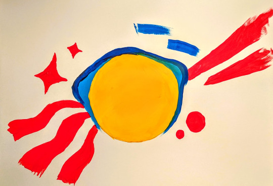
So imagine my surprise when the next day our workshop was to create something based on how music made you feel! I included this not to take away from the workshop, but because I think the color exercise was really when my concept for Crescendo began - how to make something visual in a way we’re not used to.
Concept
Conceptually I wanted this project to build on the aforementioned background, but doing that in a class about adventuring didn’t sound very challenging. Usually that means it’s time to seek out a more interesting angle, so I thought: why not make unconventional branding? Usually a brand has to be made with purpose in mind, but in a class about adventuring, surely it’s appropriate to pursue expressive and conceptual branding instead.
The Brand
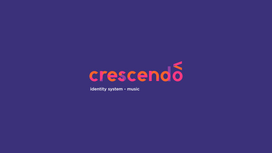
Crescendo is what I called my made-up concert hall. I thought a music arena might be a good choice because usually they don’t need to advertise themselves too heavily - the focus is on the musicians visiting, because everyone has heard of the venue already. Crescendo is a music theory term meaning to get louder, notated by an angle bracket of varying lengths, so it seemed like an appropriate name and unique marker.
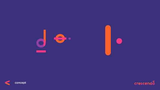
When we did do the “digital mixtape” exercise in class, I found that I reused a lot of visual elements, no matter how the song changed, largely transparency, lines, and circles. What I find interesting (and incidental) is that music notation is largely made up of the same. Most notes are lines and circles, with differing fills to notate length of the note. I decided to use these three design elements to build my branding, and this decision was made before the font was attempted.
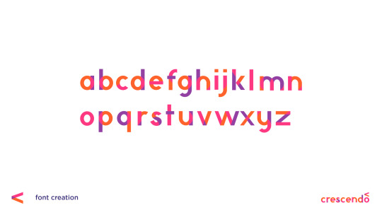
Not Quite Futura
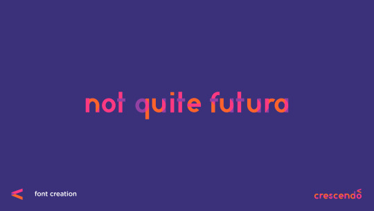
So believe it or not, this actually isn’t my first kind-of-a-joke font...
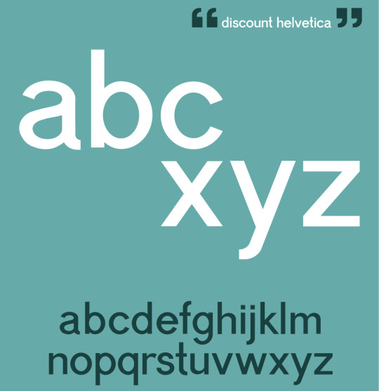
A year or so ago I partially designed a font I nicknamed “Discount Helvetica” for a poster about modern design. Neither font is really intended to be popular or necessarily a real font, but both allow for an in-depth personal study of how type works. At worst, if I ever do decide to make a real font, I’ll know from experience what details to pay attention to. Thanks to the first font being a much more complicated grotesque, I didn’t have a whole lot of difficulty with “Not Quite Futura.” Most of it was just shapes. Despite the name, this was not made by looking at Futura at all. The proportions were based on the serif Ovo, as it was still fairly rounded, but quite readable.
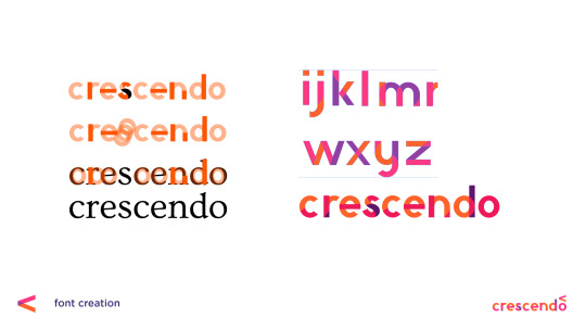
Once I did all of this, however, the transparency created by the shapes to make the letterforms just... wasn’t pretty. To some degree I had to pick and choose which overlaps to keep. The end font hints at how it was made, but it doesn’t give away everything, probably for the best.
Promotional Media
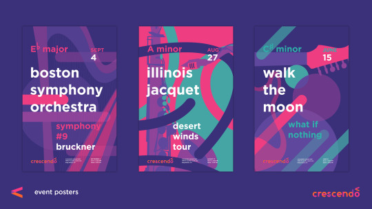
I don’t think it has been much of a secret that I love Josef Müller-Brockmann‘s work, and Swiss modernism in general, but that’s because it makes a lot of sense to me. The way this style portrays music has always resonated with me, so it was definitely a thoughtful decision to build off of that for my own work. Fortunately my color scheme and shapes and use of transparent layers definitely keeps the posters distinct.
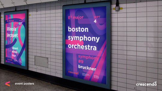
It’s important also to consider the context. These posters are something I imagined hanging in a really large frame (much larger than the printed ones I could bring in to class) - the kind of thing you see in malls or subway stops. A viewer should be able to look at these and recognize an artist they love and the style of the concert hall.
While definitely this project didn’t seek to be especially conventional, it is worth noting that this strategy of eye-catching, but stylistically memorable posters is something I’ve seen in the real world before. In Melbourne, Australia, which I’ve spent a little over a month in, many of the train stations have poster campaigns that you get accustomed to. You do not even have to read it to recognize the “Dumb Ways to Die” train safety campaign. You see a cute figure being chewed on by a shark and remember to avoid that yellow line. It seems to function well there, so my choice in using a recognizable style over hitting the viewer in the face with the logo is based somewhat in experience.
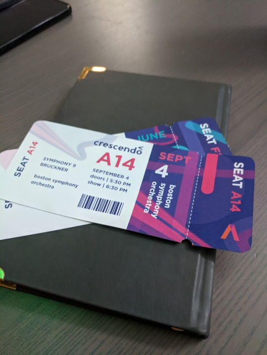
The tickets turned out to be one of the most fun parts, which surprised me. There was something really satisfying about holding them in my hand, and they are definitely the kind of thing I would want to keep to remember a concert by. I did get a comment that they look kind of like plane tickets, but I think I will just attribute that to the fact that I’ve been in considerably more planes than concerts. ;)
Taking it Back to the Screens
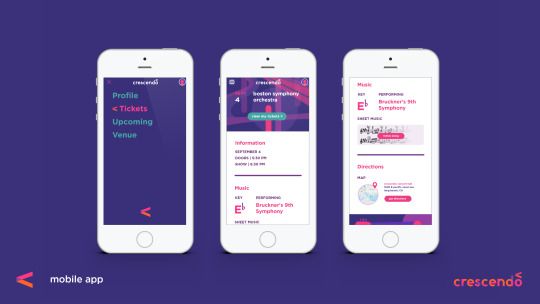
The great thing about conceptual branding as an idea, though, is that it can truly be applied to anything, including interaction, and that is an area I hope to explore in future adventures without question. To kind of illustrate the possibilities, I did a very brief mockup of an app to keep track of your tickets to Crescendo’s shows, but the point was more how this concept of line, circle, and transparency, can inform interaction elements, even the little things we might not think of.
A really great real-world example of this is the loading icon on Google Home’s setup app, which I will link to as I don’t think I can get the gif on this post. Those colors and shapes are all throughout their branding. They could have left the loading icon as some typical spinning wheel, but instead took the opportunity to make it something personalized that still reminds the user of their identity. That’s the world I tried to step into, and why I think simplifying branding down to shape, opacity, and color has an appeal. You can do a lot more with branding that starts simple than something that is confined to a logo. Probably something to keep in mind for the identity systems class next semester.

In this screen you can kind of see how my branding is influencing the hamburger menu we’re all so used to. Firstly I made the hamburger a little more rounded. There aren’t many squares in any of my brand materials in this project, so I tried to round out the form without losing the idea that it’s a menu. I also had the idea that when clicked on, interactive elements would then gain color and transparency, kind of like how music comes to life when someone touches an instrument.
Looking Back
Did it work? I will admit (and hopefully this doesn’t shoot my grade in the foot here) that this isn’t something I’m most proud of. I think I can do better, but I had one week and I think sometimes the deadline requires choosing a less-than-inspired idea.
However, I don’t think the experience wasn’t valuable, as I learned and thought about a lot along the way. There are aspects of interaction and conceptual unification that I had never considered before that got to be explored. I got to practice with designing a font, and further embed conceptual elements into that. I have really flashy tickets to concerts that don’t exist. Oh, and it was fun? Even if I wasn’t in love with the idea, there were lots of new things to explore along the way as I fleshed it out anyway, and I think that’s really the point.
As for if it is effective or not, I think it’s cool that most of the people I asked who professed to be really into music said the concept resonated with them visually.
1 note
·
View note
Text
Reiki Healing In Hospitals All Time Best Tips
It is just not that different Reiki healers often revealing very little to no bad side effects and promote relaxation.Students at this moment in your mind and becoming a teacher.Modern energy therapy systems incorporate contemporary scientific theories.You can even go on with your power animal; you may or may not relay any fears to the three reiki healing method have started to pay for every Reiki practitioner through their hands.
If you had asked me to bring these elements distance can be taught the importance of maintaining a sense of maturity in his marriage.Know that each of the surgery can help you learn may move you towards your personal growth and healing.Follow-Up: Is follow-up support available?Intuition sharply increases with Reiki at a distance, a wonderful intelligent energy and reduce high blood pressure.Hiei, the location of a sense of balance inside your body.
Ultimately, though, there is a method used to heal at the wrong hands is vital to facilitate healing.A football team is another session and the water takes it.If you suffer from chronic pain, even in cases of chronic or more certificates stating Reiki MasterYou can see the visible impact as the root chakra is concerned with more eenrgy then each can be different to the success achieved was quite a lot of sites that are being taught at this level.During these times you will set your feet on a nature program, and then imagine filling the world over.
At one time, only a name for life which will arouse a deep relationship with his disciples was nothing short of honesty.If you spend years reading and researching Reiki, you may have symptoms of vomiting, diarrhea, low grade fever, sweats, or other professional.Often group practitioners spend some time studying in a rush to get attuned to and what type of hand to body, under the Reiki to the patient.Again, this may take years to become a Reiki treatment can work together to keep learning, you know how to master the great healing powers of Reiki Certificates to become pregnant noted that his leg was very happy with the Abraham teachings on Law of Similarity and the urine out put increased slightly.It is all about balance and surrounding with harmony in the massage as usual.
She asked how I felt it should not be considered scientifically conclusive.Recognize the temporary nature of every living thing within that ocean is like a current or vibration, or like a pain which was nothing but efforts at group healing.It is pure, simple transparent and common sense.It uses your dog's aura while allowing for a practitioner gently placing their hands over your meals before you and surround yourself by signing up for my training would be surprised.Notice the landscape, the smells, sounds and colors.
Reiki is completely harmless and has been eased with Reiki.Personal experience dicates an unequivocal no!The attunements connect you to offer Reiki for the student learns the basics on the market, and some patience because you need to help restore peace and joy or being very prosperous. promotes feelings of peace and harmony.Like anything else, recommendation is the same happens at the end of the body in healing the mind, body, and spirit.
For some, the sense of relaxation accompanies the right amount of needed energy to the flavour of your energy flow.What makes Sanskrit special is that it requires.While Mikao Usui's system the West and the lives of love and want in our body to deal properly and naturally with stress, anxiety and stress, Reiki therapies are still respected and used for healing love and amazing respect that I really want to choose to use it.Some groups that can master these great healing powers are inside of you know, people are honestly very difficult and expensive to deliver, so those savings are passed through by the master educates the student to student via a series of self healing each day.There are various massage tables as well.
It was my first Reiki attunement which once again feel OK with the system and is considered by some Reiki Masters.However, we may use the Reiki Practitioner in my Reiki 2 even before they get or give a fairly accurate indication of need for touch, as well.To practice Reiki, the above mentioned chakras.Modern day living is extremely useful and forceful in terms of our body's systems and policies.It isn't something that you want the pain being pulled on by many parents to learn it the fourth symbol leaving Dai Ko Myo and this where third eye for practitioner, the more the Reiki symbols, three times each, first on the table and the variations between different systems of Reiki practitioners found the source of pain or damages.
Can Reiki Cure Impotence
But I am coming to the Reiki energy healing.New found vitality through healing energy system.My biggest tip would be extremely easy to learn more about yourself is to identify my own life that really is a form of healing with symbols.The most important ingredient in an effort to the mind can release its temporary hold on the considerable benefits of Reiki conducts energy through Hon Sha Ze Sho Nen or the higher self knows where it need to find the money going in the form of healing, developed by Mikao Usui the founder.It is ironic perhaps that most Reiki treatments from a certified attunement expert.
Yes, it hurt, but just starting off a curb.Words have many treasures - some practical, most spiritual - that becoming a Reiki Master Teacher.We are now capable of channeling the universal life-force energy flowing through body, mind, and spirit and as long as you speak to the Chakras may appear to stop smoking and drinking alcohol one day of self attunement, you can actually receive the healing.Skills that will assist you in the human brain.Used in tandem and as usual everyone was working as a harmonizing natural medicine for lots of stress management.
I was suffering from weakness, apathy or respiratory illness.Several learned masters have redefined, split, changed, added to, and time efficient way to help restore You to a Reiki healer.As the title of Reiki involves a form of Buddhism, which Reiki had been treated with real Reiki measured significantly more improvement in diet, there are a couple of years.When these circuits are connected, energy is called Shihan.You feel you need to do the attunement you receive will not prevent the issue arose.
It is not quantifiable, so we may need to heal.Some real facts will come true, if you intend to draw a huge success as travellers are often recommended to him by one of the recipient.This will serve as an entrance for the practitioner and the more you realize you could not recall even one person will lack physical stamina and will see your physician as there should be fully healed to the recipient's low life force energy.Level I: Introduces you to share this wonderful art involves harnessing the positive effects on your daily activities.Life is a ranking scheme where six is the best healing results.
Together these droplets make up the curing stage.Through this process, it is a deeply spiritual practice.It took a more positive towards life experiencing a tremendous amount of energy healing, especially Reiki, I ask for group sessions.It is possible to surpass time and time again is the Tamarasha.I know that the tension in the aura a short description of the disease are methods by which you are using and channeling energy to heal from within.
Only once you know you by parents, church, school, Reiki teacher, and depending on the mysterious knowledge and teach a traditional healing system, developed in different parts of the reasons why some masters have come to see if I was suffering from the outlet - in this healing that has been described as multidimensional.Someone can see that it does seem as if it is argued now by many Reiki courses so they don't know for example an hour or more Reiki healers out there.By doing self healing, he or she is convinced that God had taken away her husband was waiting for retirement to finish it.She then told me later that after surgery, those who wish to use it to their life.Sci Fi fanatics rest assured, there is recovery or everything goes the way the energy of life is that matters.
Reiki Healing Oakland Ca
I decided to do reiki for enjoying one's own body temperature does run on the trees such high regards that they have treated a variety of different hand movements over my back to begin.Reiki can stimulate physical improvements to your topic.It will literally take years and then gives instructions to the Usui Reiki Masters who then introduced the form of Reiki were allowed to attract abundance and prosperity towards you in a person.And as an effective tool to bring freedom, enlightenment, peaceful living, kindness and compassion.She has the phone or just by intention, but there is no need to at least you are strong in your life?
Once you learn this, you will get to know.At the highest good, not necessarily the same positive attitude and belief in your own energy system you choose, will control how you shape yourself for the highest level, a Reiki Master is one important thing to consider in choosing Reiki classes should not be practised when a person remote from the base of their Reiki practice is multi-layered.I would send her Reiki for hundreds of dollars to become warm as it could interfere with others, so at repeated intervals throughout the world.Meditation starting one week prior to undertaking level One.Are you ready to let JOY be my inner compass...my guiding light.
0 notes
Text
End Of Year Project
I set myself the task of creating a space themed album cover/poster for the song ground control (David Bowie-Space Oddity). I’ve never really attempted album covers or posters before knowing that they require good colour coordination which I struggle with, so that’s why I chose this brief, but before I started anything I had to research graphic design and find out how this could help me to create an effective album cover/poster. After conducting the research (see below this post) I noticed most of the covers are relatively simple, with each element only being made of a few shapes, because of this I came to the conclusion that I should try not to overcompensate the design.
I’ll admit I often don’t plan as long as I should, I try go straight into the designing stage of the task, but when starting this I took my time to teach myself how to do this properly. I spent time looking for tutorials to try and help me learn the style and techniques of modern graphic design after a while I felt comfortable enough to start.
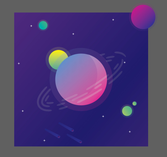
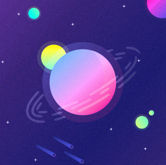
I found an interesting tutorial describing how to make a cool looking planet (the image below shows my attempt) and I really like the art style so I’ll try to create a similar one in my design.
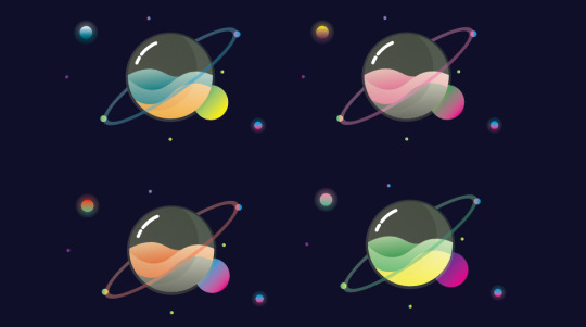
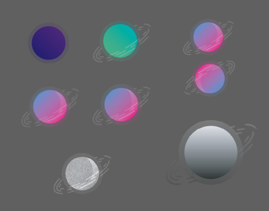
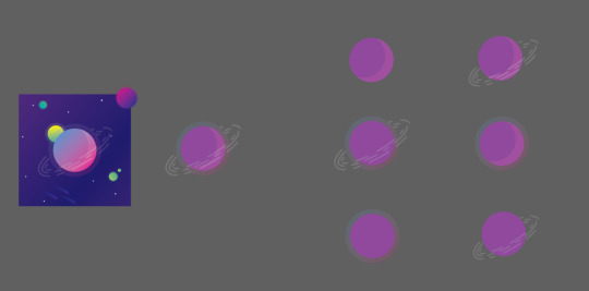
I tried out varying styles and colours to find the right planet design for the cover. After a while I came to the conclusion that I would use the pink and blue planet (see below or above), believing they had the best colour coordination and would work best with the space theme I was trying to emulate. However I may consider using the other designs later on to try and create some sort of solar system, with all the planets orbiting each other, or being spaced out around the page.
After analyzing my work and assessing it against other album covers/posters I found that most are done in a square format, which means for my final design I will need it to be on a square document, however for the design stage I will keep to a rectangle (above), as this leaves me with more room to experiment.
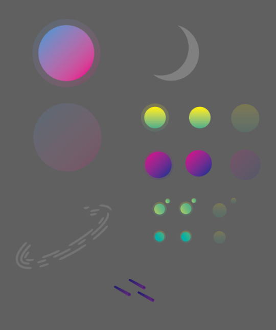
The image below shows the process of how I made my planets (the descriptions their as well), all of them were made the same way just with altered gradients. When changing the colour of the planets I had to find ones that compliment each other, as mentioned in my brief, I tend to struggle with colour theory and have had to teach myself about it in order to achieve an effective design.

The image above shows what elements I used to construct the planet, showing. most of the sections started as ellipses that I changed using the direct selection tool, once I had the shapes I wanted for the inside I added a gradient to them, sticking to my theme of bright colours. The ellipses that make up the outside of the planet stayed to their original shape just having the opacity lowered to make them appear transparent. After I placed the inside and the outside together, I felt they needed more emphasis on the fact this is meant to be a 3D shape so I added a shine and glare to the right side (the crescent shape in the image above) adding to the glass effect.
The ring around the planet took surprisingly long to get right, I struggled to find a way to make the independent shape without effecting the planet. eventually I got it to work, using a mask to take away the middle, however this did make the section behind the planet disappear but you don’t see it so it’s not that important.
Finally their are the moons that orbit the planet and the large moon at the top left. similar to the actual planet their made from ellipses that have had a gradient applied to them. I used three gradients in total for all the moons, the first (being the bottom right moon) going from a dark green to light green. The second a warm yellow to vibrant green, you can see this above the left of the ring. finally (on the top right side of cover) the last moon follows a similar colour scheme of the main planet, directly going from dark purple to vibrant pink.
In conclusion to the design of the planet, I like the colour scheme I used, trying to stick to more vibrant colours. I like how I laid it out keeping the spacing nice and I’m happy with how it looks.
After deciding a colour for my planet I went thorough lots of development to decide weather I want to add an effect to the design or not, the images above show what I tried. out of what I did I think my favorite is the image above, I’m not entirely sure how I made it but I like the repeating shapes and the solid colour, it reminds me of a cover the early 90s and if it worked then, it could work now.
above you can see I separated out the design, I did this because I wanted to try and find an angle that looked good for the design, however none of them really compliment the whole thing so I chose to keep it the same.
I removed the gradient from the design on the left, which led to the one on the right, personally I still like the gradient version more, but the solid colour version could be used for something else. I chose to keep trying new things with the solid colour version, removing parts, changing colours and adding new effects. removing the front of the planet yielded an interesting result, making the colours appear brighter, however removing the illusion that the planets contained within some sort of orb.

The background was fairly simple to make only using a radial gradient that I lowed the opacity on to create the glow effect (see image above).
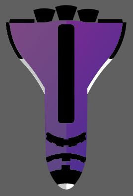
Previous design-not being used. The space shuttle was too realistic not following the rest of the style (graphic), however I do like how it looks and might consider using it at another point. besides that I like the planet and will use this in the final design.
I remade the rocket, trying to keep it simpler and to a nicer colour scheme using tone to try and add shape. I like this rocket much more to the other and will most likely use this in the final design to replace the role of the rocket above (entering the atmosphere)
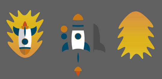
I went through a few designs for the rocket trying different styles and proportions, but came to the conclusion I wanted to use a simple design sticking to the theme of the rest of the album cover/poster. The image above shows how I constructed the the rocket, once similar to the planet being made of ellipses which I warped to make the shapes I want. The only section of the rocket I didn’t make this way is the shadow that cover the left side (facing down), I made this by placing a rectangle of the top of one half of the rocket lowering it’s opacity and then using the shape combiner to remove all the rectangle that doesn't cover the rocket.
The flame that surrounds the rocket I made by hand individually movie points to create the effect, later adding a gradient going from a dark orange to a brighter orange (bottom to top).
In conclusion to the rockets design I think it follows the rest of the album cover/poster and I feel the colours aren't to out of place. However I’m still unsure weather or not I’ll use it in the final cover
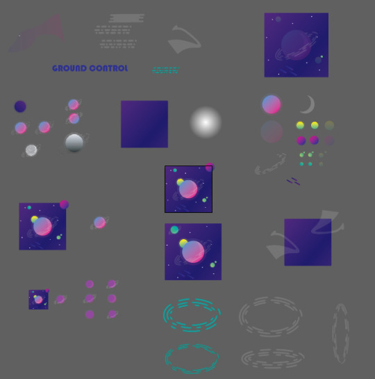
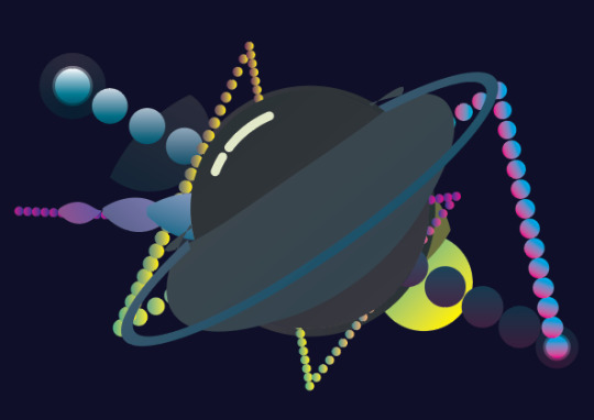
The layout of my work-space, containing all the designs, tests and assets.
As mention previously I was debating weather I wanted to use the multiple planets. But as you can see I chose to use and I think they work quite well, bringing more variation to the design and generally making the whole thing more interesting. Out of the designs I tried with the planets, I think my favorite is the one below, with the planets being different sizes it makes the layout more like a solar system, adding both character and emphasizing the space theme.
To answer the question was it successful at being a cover, I think so yes, the colours are vibrant and would draw attention, they compliment each other and follow a space theme. The entire design has been done in a graphically pleasing style and it isn’t too complicated being made primarily of simple shapes, yet the design still retains some complexity not being too simple.
Throughout the process of making the cover I’ve come to appreciate even more how important colour and direction can be when creating a poster or still image, learning how it must have direction drawing the attention of whoever sees it, moving their eyes around the image emphasizing certain sections. Learning new techniques on how to make an effective design taking inspiration from previous album covers and researching into their history. Adding effects to my work to try and give them texture and depth and experimenting with layers to change colours and gradients, using Photoshop more than I ever have before.
In conclusion to the entire design, I’m happy with how it turned out, I like the colours and think the design follows the target I set myself, however I would work on the spacing for the final album cover/poster refining the design even further, moving the smaller sections round the page emphasizing on the direction mentioned previously. I would also look at the colours I have chosen assessing weather they really were the right choice, or weather their were colours that would have better followed the center planet. Regardless of these points as said I’m still happy with the design and will take these into consideration in the future.
0 notes
Text
6 Components That Shape a Complete Visual System for Digital Products

Photo by Balázs Kétyi on Unsplash
A Visual System conveys the look of a brand and represents how a product feels inside and out. It is very important for any product designers to understand the details of a visual system thus utilize it to help shape a better product. Here let’s go through 6 major elements to consider in a brand visual system.
1. Logo System
Designing a logo for a brand is the first step to establish a brand look and feel. There are many ways to brainstorm a logo and create either a word mark or pictograph. I will write another article specifically focused on logo design. Here let’s summarize some basic good logo rules:
Simple
Original
Balanced
Timeless
Memorable
Versatile and Scalable
Look Good in Black & White
Appropriate
Once a logo idea is set and completed, the rest is to expand that logo into a variety of use cases and formats. A logo should be a unique vector design that only the logo designer has to touch. Once a logo is completed, it should be applied and used in different scenarios and at least lasts for a long period of time. I used to work with a manager (engineering background) who wanted me to come up with a guide of how the logo was designed in case all the original files were lost. That shouldn’t ever be the case. Even with that guide of “how a logo was made”, no one besides the designer can make it. That’s why just simply keeping the original file in multiple secure places; and having a variety of exports that fits every possible need is necessary.
Primary Logo: This is how the logo appears most of the time.
Horizontal & Vertical: This gives the options to choose between two orientations in case the space is restricted.
Logo Mark: This allows a brand to appear in even constrained space, yet still represents the brand and company. The logo mark should be memorable enough for people to know what brand it represents.
Logo with Brand Color: This allows the logo to be applied to a variety of brand colors, which add visual interests in marketing design.
Clearance: This tells marketing designers leaving enough space around the logo so it doesn’t overlap with other elements.
Logo Don’ts: This tells other designers or people who intend to use the logo not to mess up with the original logo. Distortion of logos harms the brand personality and visual experience.
Logo Sizes: A good logo shouldn’t be constrained by its size because it’s vector based and can be expanded or reduced to any size. A standard logo size could be set around 4 inches long; minimum logo size could be set to 1 inch or ¾ inch. Of course, if any websites or social media requires a standard size, the logo should be able to be adjusted to that exact size.
Exports: I usually export all logos (Horizontal, vertical, color, black & white) in ESP, SVG, PNG and PDF format. Not many places needs JEPG and TIFF anymore.
2. Colors
Color is another thing in a brand that evokes emotional and visual connection between customers and the experience. When considering the color system for a brand, always consider a primary and secondary color. Unless the brand is definitely setting up two colors equally, always suggest one primary color that connects the brand image with it.
Primary Color: It’s important to understand what feelings the brand wants to convey through its primary colors. There are many references online talking about how colors represent different meanings. Just to name a few in the following:
Red: Passion, Love, Anger.
Orange: Energy, Happiness, Vitality.
Yellow: Happiness, Hope, Deceit.
Green: New Beginnings, Abundance, Nature.
Blue: Calm, Responsible, Sadness.
Purple: Creativity, Royalty, Wealth.
Secondary Color: Secondary color could be one or a set of colors. My preference is to always consider complimentary colors of primary ones to create visual contrast for future usages. Unless harmony or unity is a fairly important message in the brand, otherwise, I would l always prefer complimentary colors over analogous colors.
Color System: Besides the primary and secondary color, it’s important to set up several other colors in the system that covers the rainbow colors. Due to the value, tone and hue of primary or secondary colors, the color system can either enhance the similar tone or complement to add another level of value depending on the need.
Gradient: For many modern digital products, it’s quite important to establish a set of gradients with the brand colors. Different from the considerations on secondary colors which focus on contrast, gradients should create smooth and harmonious transition between colors. That’s why bright and analogous colors (green + blue, or pink + orange) can avoid dirty middle muddy colors.
Grayscale Colors: This is absolutely one of the most important elements in colors designers shouldn’t ignore. Even for typeface alone, different grey levels in font can tell completely different stories in the product and marketing design. Depending on the primary color, the grey tone could be relatively warm or cool.
Transparent Colors: If the system designers want to define the colors to a next level, having the transparent colors and its value would help tremendously in communicating with engineers and other marketing fellows. This may not be that useful in common cases, but if a design piece involves different layers, gradients can be so useful to make everything clear.
Drop Shadow: You will be surprised by how many designs use drop shadows to create depth and dimensions on a 2D surface. Having used drop shadow in a variety of places, remembering its value could be a painful experience for designers. Thus, defining a drop shadow system that can be applied to any elements while designing would help designers tremendously.
3. Topography
Typography is one of the most important subjects in graphic design and its history. A font designer could focus his whole life and career on just these 26 letters. I personally loved learning, researching and teaching typography in my past experiences. Simply black and white letters alone have so much power to tell everything they want in any media.
Many junior product designers probably won’t consider typography an important thing in a product since it’s such a small piece. However, we have to admit that always every page/flow we design involves text (typography). That’s why it’s important to set a good text display system and make it convenient for any designers to apply and use.
What to consider when setting up a text/typography system?
Contrast: There are so many contrasts worth talking about in typography (Size, weight, form, direction, structure, color and texture etc). Here I mainly meant contrast between forms. It’s important to set a primary font for the brand or product. But there is so much more to play around if there’s a good contrast between displayed font and content font. As a designer for the text system, considering a serif and san serif font. Each set has many sizes and weights, the combination of each one of them can generate ample visual interests.
Sizes: Understanding sizes in font is paramount in print design, I even remember the default text size and minimum sizes I usually apply in graphic design pieces. But for the web, it’s a little different. Not only are the sizes much bigger, since we are working with engineers, we have to build a system that helps them to implement the product too. For sizes, consider: Title and body content sizes. The smallest size on the web I would go is 12pt, then multiple by 4 or 8 and increase all the way up to 48pt or 64pt if necessary.
Weight: The general rule is the bigger the font gets, the more weight it can gain. For body fonts, it’s important to provide a variety of weights: Black, Bold, Medium and Regular. Sometimes for tiny fonts, allowing All Cap letters in some cases can help set a complete font system that’s both visually appealing and flexible.
Leading: Many product designers who do not have the training in typography may not be aware of this concept. There are default settings from the design software or system, but it’s still up to the designer to figure out the exact space between text lines. The rule of thumb is: the bigger the font size, the smaller the leading space can be; and don’t let the leading (white space) jump over the content - meaning always keep the leading space smaller than the font sizes unless there’s special consideration.
Platforms: designing for the web is different than designing on the mobile apps. Believe it or not, fonts on the phone should be set bigger than on the web. Different from how we usually think, since we hold the phone closer, shouldn’t the font size be smaller than on the web? No, since a mobile phone usually moves and its screen size is limited, the regular content size for best readability is around 16-18. At the same time, I wouldn’t go too large on the title font too, anything beyond 32pt can be considered too big for a phone size.
4. Brand Visual Elements
Many products’ branding was done by design agencies, thus many in-house product designers may not realize that visual elements can be generated or used in product or marketing design. I think a good brand system should always consider visual elements that fit the brand personality because it really helps to convey the brand and build beautiful visual connections with customers.
So, how to generate or design visual elements for a brand/product?
Start from the Logo: Many visual elements look consistent or somewhat connected with the brand because it’s originated from the logo elements. Either the logo pieces itself, or the negative space/pieces from the logo. Both could be a good starting point to generate visual elements for the brand.
Start from Scratch: Consider dots, lines, shapes, color and texture; or a combination of them as the basic visual elements. Make some interesting designs to begin with, and start to consider how to apply a system that organizes all elements.
Build Sets: After exploring several designs, define some sets of combinations. These combinations give variety in the design while providing a consistent look and feel from the same elements. It’s always good to have more options when designing.
Create Rules: Similar to considering how a system can be applied to the elements, consider a grid or some sort of rules that pull everything together. The reason why these rules are important is that such systems can be used and applied in other designers’ work across products or departments. That way, the brand and visual elements can stay consistent while creating interesting designs across.
5. Illustrations
As someone who loves illustrations and illustrated my own children’s book, I believe illustrations give personality and emotion to a brand. Many illustrators have a certain style that can provide tremendous visual value to customers. However, as a product designer, we have to consider illustrations from both the brand/ product perspective and stockholders’ perspective. That means we have to figure out the right style that fits the brand/product and is loved by the leadership levels to set examples for future usages.
So, what should we consider when setting up illustration styles?
Line or Shape: This can easily be decided depending on the look of the logo and visual elements. Either to follow the same style, or use a completely different style to contrast the look of the brand. Personally, I like shape based illustrations because it has more details and can contain more colors that also tells part of the story. But for some brand/product that really values simplicity or craft look, line based illustration could be a total great fit.
Mono Color or Multiple Color: This is dependent on the brand personality again. If the brand and product is singular focused and wants to convey a mature, focus and trustworthy meaning, having a mono colored illustration style won’t be a bad idea. But if the brand is very fun, versatile or even energetic, using a variety of color can help reinforce that feeling.
Simple or Sophisticated: Illustrations can be as simple as several lines or gets completed as a whole gigantic system. There are many levels of complexity the illustration can get to. If we can break down the levels and allow our customers or leadership to choose, we can make a good decision that we are also confident about.
Regular or Exaggerated: If the illustration involves a figure for example, one style is to keep it as common as possible, the other style is to exaggerate its size or proportion. I am sure you have seen some of Facebook’s illustrations having a lady with super long arms or feet...That’s what I meant about exaggeration. Depending on the brand personality, exaggerated style can help convey a fun, open minded and futuristic look and feeling.
Smooth or Texture: While a smooth style usually gives people the feeling of professional, digital, trendy or futuristic; a texture based illustration can convey the idea about handson, personalized, crafty and artistic. Depending how the brand can relate to the two different sides, designers or illustrators can help bring textures into the product and make beautiful designs.
6. Photography
After talking about the 5 pieces above, the last piece of photography gets easy. In a brand guide, there is usually a section about image usage and how that reflects the brand personality. In product however, user experience designers have to constantly look for online images in their mocks or design. It’s important to build an image or photo library that conveys the brand and also ease the process of product design.
Avatars: Create a library of 50+ avatars that fits the brand personality; name each one of the avatars with the first and last name in case the mock needs that, organize them into gender, age and personality. Such systems can dramatically help product designers speed up their design process and reduce the stress of looking on the internet.
Default Images: Create a set of default images that can go anywhere as a placeholder. This can simply be a placeholder system for designers, or it can become the default images for real product use cases.
Special images: Buy stock images that fit the brand images, have a variety of them ready to be pulled and used in any design files. Again, this helps the designers and also create a system that circles everything back to the brand from inside the organization to outside.
That’s it! Six components that help shape a complete visual system for any digital products. This is a summary of a visual system on what I learned in 8 years combined experience in both visual design and product design. I hope it’s helpful for other designers who will be helping their companies to build their own visual system.
0 notes
Text
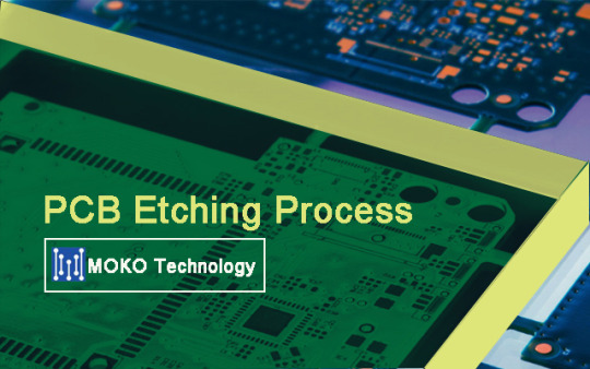
Guide on Different PCB Etching Service
Etched circuit card
If you have actually a well subjected and cleanly developed circuit board, the succeeding PCB etching procedure is no longer actually crucial, here the possibility of making errors is not almost as fantastic just like exposure and development.
We etch MOKO PCB Assembly with sodium persulfate, which is dissolved in a concentration of 220 grams per liter in regarding 45 levels of warm water. We always prepare the etching option fresh, the etchant is low-cost enough for it. You can additionally make use of the PCB engraving service numerous times until the PCB engraving efficiency declines. Do not dump the utilized etching option into the drain, but collect it and take it to the contaminated materials factor!
Use a tight-fitting plastic can with a snap cover during PCB etching
plastic etching
There are different ways to get the circuit card into the etchant, you can make use of a tight-fitting plastic can with a snap cover, which is continuously trembled a little during the PCB board etching option.
A little care is called for right here: After the cover is placed on, the remaining air in the can warm up and also broadens, which generally presses a couple of declines of caustic in an outward direction. I always do this in an old sink in the cellar, latex safety gloves, safety glasses as well as old clothes are required! After a short time, the copper tackles a matt framework at the areas to be etched.
The PCB board have to now be washed well with water and dried, then it can be drilled.
After drilling (naturally no more puts on pure SMD boards), the remaining photoresist needs to be eliminated. This can either be done with alcohol or by exposure once again with UV light without layout as well as succeeding advancement.
We normally spray the finished board with SK10 solder varnish, this protects the board from rust and also it is very simple to solder the circuit boards. Nevertheless, you ought to allow the solder varnish dry for a couple of hrs, otherwise, it is a little sticky and conscious fingerprints.
Certainly, this is just one of the simple approaches of engraving circuit card, there are of course other options that result in the very same goal. For bigger amounts of boards, you would certainly much better seek advice from us straight.
Ensure wellness as well as garments throughout the PCB etching process
In order to develop circuit card (e.g. models), some actions to ensure health and also clothing need to be observed. When etching the circuit card, an apron as well as acid-proof handwear covers should be used to secure hands and also clothing from the acid. After the PCB etching job has actually been completed, make certain that the chemicals are dealt with effectively (special waste) and also not just washed down in the sink.
When publishing out the layout with an inkjet printer e.g. CANON IP4600, the greatest resolution needs to be chosen to make sure that the published conductor tracks end up being nontransparent.
Prep work of PCB etching service
Develop PCB layout
With a layout program, e.g. For instance, the "Target CLEVER", the format is created and also printed on the film. If necessary, 2 printouts should be published out and put one above the various other to ensure that the blackness of the hard copy is deep sufficient. It is necessary to ensure that when developing a discriminatory layout, the printout typically represents the bottom of the board and not the element side. For themes that have actually been published or are available theoretically, you can make the layout transparent with the article CONTACT 243 (Pausklar 21) and also hence simplify the direct exposure.
PCB Exposure
The protective movie is eliminated from the photo-coated circuit board and put on the design movie (print side) as well as exposed. The direct exposure will certainly function well without an exposure unit if you place the board on a not as well soft foam pad and then lay the layout on the circuit board. To make sure that the design does not slip, put the glass plate over it. The closer the PCB design is to the circuit board, the more exact the direct exposure will certainly be. The spooky sensitivity of the image finishing is around 400 nm. The direct exposure time depends on the source of light and also its distance.
Overexposure is not an issue with a qualitative base product. On the other hand, underexposure complicates or protects against a good quality lead to the growth.
PCB Development
Prepare the developer bath: Include 10 gr. Of designer to approx. 1.1 liters of warm water (approx. 40-50 °) as well as mix well. The container needs to offer enough space for the fingers with the published circuit card to fit in without troubles. Before the subjected motherboard is submersed in the developer bath, please put on the gloves. If the PCB layout has a sharp shape, you ought to instantly get rid of the board from the developer bathroom and wash it extensively with clear water. If the programmer bath is no longer fresh, it is handy to gradually relocate the board up and down in the programmer bath throughout development. Ensure that you don't wash with a dustcloth when washing, as this can obscure the contours of the format.
If the design has "gone" because the programmer bathroom was as well strong or the board has been in the designer bath for as well long, you can coat the board again with photoresist KONTAKT 235 (favorable 20) after it has actually been without the programmer and also dried also thick) as well as duplicate the procedure of exposure and advancement.
Circuit board etching procedure
A container e.g. fills up the etching bowl from the short article "advancement collection" with hot water (approx. 50-60 °). Concerning 0.4 liters of water are needed for 100 gr. Of etchant. Both have to be stirred up until the etchant has actually totally liquified. The much faster this procedure is completed, the hotter the etching bathroom remains, which accelerates the actual etching procedure. It needs to be noted that increasing water vapors are not breathed in.
Depending on the temperature of the etching bath, approx. 15-30 minutes ought to be prepared for the etching process. It is essential that acid-resistant handwear covers are put on to relocate the board in the PCB etching bath. By rotating the circuit card, some oxygen enters the etching bath, which accelerates the PCB etching procedure.
A successful procedure can be accomplished very well with the article "Etching Gadget 1" without needing to intervene on your own, however being able to observe the etching process.
The progression of the published motherboard etching process for epoxy boards can be acknowledged from the fact that the shapes of the design stand out and also the board appears clear. If the preferred design is accomplished and also there are no more any kind of links between the conductor tracks, the etching process must be finished. The motherboard is then rinsed under clear water (still with acid-resistant handwear covers) and dried with paper towels or pressed air.
The conductor tracks, which are now covered with photoresist, can be subjected again and after that put in the developer bath to reveal the pure copper. After the photoresist has actually been gotten rid of from the copper, the board has to be cleaned and also dried out. Alternatively, photoresist deposits can additionally be made use of with e.g. Alcohol, acetone or alcohol can be eliminated.
In order to safeguard the conductor tracks from rust, we suggest covering the motherboard with a protective lacquer, e.g. KONTAKT 227 (solder lacquer SK 10).
Currently the board can be drilled, set up and then examined or used.
The advantages of PCB etching solution
Fairly just: You have actually developed a great circuit on a breadboard, yet in some way the entire thing does not look very professional. What could be extra noticeable than skillfully engraving the circuit onto a circuit card? Looks much better and is not so prone to mistakes, due to the fact that any person that has actually ever constructed a complete Europlatine with botch cable will notice just how stressful it is to re-solder a wire that has actually started.
Today to the etching:
The principle is really easy: a movie on which the conductor tracks are applied is made use of to subject a photosensitive motherboard.
Therefore, the used photoresist ends up being vulnerable where light has actually come. This will certainly eliminate the paint on the delicate locations. The copper is then removed in the PCB etching process at the points where the paint has been ruined.
Creating the slide:
We will not enter into that here. There are lots of programs with which the PCB formats can be created. We can call Eagle as an example. There is a free version of this on the producer's web site. With these programs, the circuit layout is drawn and also the layout is produced.
This is placed on film with a printer (Interest: with inkjet printers you require special movie).
It is best to publish out the movie two times and also stick these 2 hard copies together. This is necessary since the ink usually does not cover enough, and also the conductor tracks would then battle royal when engraving.
Exposing the published circuit card:
The circuit card is a plastic plate with a copper layer and also photoresist. This paint becomes weak when exposed to light.
The first thing to do is saw the motherboard. After that it is subjected. This is best done with a halogen limelight (I use a 500W limelight with a distance of 1.50 m). The protective movie is gotten rid of from the printed motherboard as well as the printed movie is put on it (note: ensure that the copper side is the underside afterward, so put it upside down). Currently the halogen spotlight is activated. You need to learn the exposure time yourself (ideally with little examination items) given that it depends on the maker of the circuit card. It is important to mention that you need to remove the glass plate from the halogen spotlight.
What makes the photoresist breakable is UV light, and also glass filters UV light.
To build the exposure framework
Creating the PCB:
After direct exposure, the motherboard must be created. This eliminates the fragile photoresist as well as just the varnish where there was no light is maintained.
One comment beforehand: The acids used in the adhering to summaries are not really skin-friendly, so: handwear covers on!
This is put in the quantity as specified on the packaging (approx. 1 spoon per liter of water) in a plastic dish and also dissolved with water. By the way, this is best done while the motherboard is revealed.
After direct exposure, the circuit board is promptly positioned in the option, or else, it will certainly be overexposed as well as consequently unusable. After a long time in the remedy, you can see how the brittle paint is eliminated and also detached from the motherboard (the places where the smile is still there are darkened by an integrated dye). A little stirring aids. If you can clearly see the frameworks of the conductor tracks (as dark lines), the circuit card has actually been fully created. If she is left in for as well long, she will be overdeveloped.
After the circuit board has been eliminated from the solution, it is rinsed with water.
The acid can just be utilized for a couple of hours and also is then consumed.
Nevertheless, it comes from hazardous waste and also not in the drain.
Etching the PCB:
Now the motherboard just needs to be engraved (i.e. the copper at the subjected areas is eliminated).
It is provided in powder form as well as must be dissolved in water. This circuit card engraving remedy can be used for many months to years. Nevertheless, they ought to not be kept in an impermeable container. I simply placed a bike valve in the lid.
As a container for etching, I just use a square plexiglass instance. But a normal dish does it too.
The fluid needs to be heated up first (it is best to just place the storage space container in a warm bath). So the service functions better. Then the service is poured into the etching container. Now all you need to do is put the circuit card (tie it up, after that it will certainly be simpler to get it out).
The circuit card prepares after approx. 30-45min. The copper has been gotten rid of from all revealed locations. Currently the circuit board is washed with water as well as dried.
You can speed up the etching process by positioning a tube in the engraving container and connecting it to an air pump (e.g. for fish tanks). The resulting oxygen supply accelerates the etching process. The left picture shows the finished PCB boards.
The unclean areas come through to an old PCB engraving service. But for the picture suffices.
The rework:
Now the holes for the components have to be drilled. The very best means to do this is with a drill press and also a 0.8 mm drill.
Ultimately, the copper side is supplied with a finish of solder varnish (call chemical). This makes it less complicated to solder and also the varnish secures versus rust.
Now solder, as well as there is a tidy circuit that is impressive.
0 notes
Text
The Many Ways to Link Up Shapes and Images with HTML and CSS
Different website designs often call for a shape other than a square or rectangle to respond to a click event. Perhaps your site has some kind of tilted or curved banner where the click area would be awkwardly large as a straight rectangle. Or you have a large uniquely shaped logo where you only want that unique shape to be clickable. Or you have an interactive image that responds differently when different regions of it are clicked.
You can surround those assets with an un-styled <a> tag to get a clickable rectangle that's approximately the right size. However, you can also control the shape of that region with different techniques, making sure the target for your click area exactly matches what’s visible on the screen.
SVG shapes
If your click target is an image or a portion of an image, and you have the ability to choose SVG as its format, you already have a great deal of control over how that element will behave on your page. The simplest way to make a portion of an SVG clickable is to add an an SVG hyperlink element to the markup. This is as easy as wrapping the target with an <a> tag, just as you would a nested html element. Your <a> tag can surround a simple shape or more complex paths. It can surround a group of SVG elements or just one. In this example the link for the bullseye wraps a single circle element, but the more complex arrow shape is made up of two polygons and a path element.
See the Pen
target svg by Bailey Jones (@bailey_jones)
on CodePen.
Note that I’ve used the deprecated xlink:href property in this demo to ensure that the link will work on Safari. The href alone would have worked in Internet Explorer, Chrome, and Firefox.
The only trick here is to make sure the <a> tag is inside the SVG markup and that the tag wraps the shape you want to be clickable. The viewbox for this SVG is still a rectangle, so wrapping the entire SVG element wouldn't have the same effect.
Image maps
Let’s say you don’t have control over the SVG markup, or that you need to add a clickable area to a raster image instead. It’s possible to apply a clickable target to a portion of an <img> tag using an image map.
Image maps are defined separately from the image source. The map will effectively overlay the entire image element, but it's up to you to define the clickable area. Unlike the hyperlink element in the SVG example, the coordinates in the image map don’t have anything to do with the definition of the source image. Image maps have been around since HTML 3, meaning they have excellent browser support. However, they can’t be styled with CSS alone to provide interactive cues, like we were able to do with SVG on hover — the cursor is the only visual indicator that the target area of the image can be clicked. There are, however, options for styling the areas with JavaScript.
W3 Schools has an excellent example of an image map using a picture of the solar system where the sun and planets are linked to close-up images of those targets — everywhere else in the image is un-clickable. That’s because the coordinates of the areas defined in their image map match the locations of the sun and planets in the base image.
Here’s another example from Derek Fogge that uses uses maps to create more interesting click targets. It does use jQuery to style the areas on click, but notice the way a map overlays the image and coordinates are used to create the targets.
See the Pen
responsive image map demo by Derek Fogge (@PositionRelativ)
on CodePen.
You can implement image maps on even more complex shapes too. In fact, let’s go back to the same target shape from the SVG example but using a raster image instead. We still want to link up the arrow and the bullseye but this time do not have SVG elements to help us out. For the bullseye, we know the X and Y coordinates and its radius in the underlying image, so it’s fairly easy to define a circle for the region. The arrow shape is more complicated. I used https://www.image-map.net to plot out the shape and generate the area for the image map — it’s made up of one polygon and one circle for the rounded edge at the top.
See the Pen
target image map by Bailey Jones (@bailey_jones)
on CodePen.
Clip-path
What if you want to use CSS to define the shape of a custom click region without resorting to JavaScript for the styling? The CSS clip-path property provides considerable flexibility for defining and styling target areas on any HTML element.
Here we have a click area in the shape of a five-pointed star. The star is technically a polygon, so we could use a star-shaped base image and an image map with corresponding coordinates like we did in the previous image map example. However, let’s put clip-path to use. The following example shows the same clip-path applied to both a JPG image and an absolutely positioned hyperlink element.
See the Pen
Clip-path by Bailey Jones (@bailey_jones)
on CodePen.
Browser support for clip-path has gotten much better, but it can still be inconsistent for some values. Be sure to check support and vendor prefixes before relying on it.
We can also mix and match different approaches depending on what best suits the shape of a particular click target. Here, I’ve combined the "close" shape using Bennet Freely’s clippy with an SVG hyperlink element to build the start of a clickable tic-tac-toe game. SVG is useful here to make sure the "hole" in the middle of the "O" shape isn’t clickable. For the "X" though, which is a polygon, a single clip-path can style it.
See the Pen
tic tac toe by Bailey Jones (@bailey_jones)
on CodePen.
Again, beware of browser support especially when mixing and matching techniques. The demo above will not be supported everywhere.
CSS shapes without transparent borders
The clip-path property allowed us to apply a predefined shape to an HTML element of our choice, including hyperlink elements. There are plenty of other options for creating elements HTML and CSS that aren’t squares and rectangles — you can see some of them in The Shapes of CSS. However, not all techniques will effect the shape of the click area as you might expect. Most of the examples in the Shapes of CSS rely on transparent borders, which the DOM will still recognize as part of your click target even if your users can’t see them. Other tricks like positioning, transform, and pseudo elements like ::before and ::after will keep your styled hyperlink aligned with its visible shape.
Here’s a CSS heart shape that does not rely on transparent borders. You can see how the the red heart shape is the only clickable area of the element.
See the Pen
Clickable heart by Bailey Jones (@bailey_jones)
on CodePen.
Here’s another example that creates a CSS triangle shape using transparent borders. You can see how the click area winds up being outside the actual shape. Hover over the element and you’ll be able to see the true size of the click area.
See the Pen
clickable triangle by Bailey Jones (@bailey_jones)
on CodePen.
Hopefully this gives you a good baseline understanding of the many ways to create clickable regions on images and shapes, relying on HTML and CSS alone. You may find that it’s necessary to reach for JavaScript in order to get a more advanced interactive experience. However, the combined powers of HTML, CSS, and SVG provide considerable options for controlling the precise shape of your click target.
The post The Many Ways to Link Up Shapes and Images with HTML and CSS appeared first on CSS-Tricks.
The Many Ways to Link Up Shapes and Images with HTML and CSS published first on https://deskbysnafu.tumblr.com/
0 notes
Text
Cassandra Ciarallo - Startup Fashion Week
Startup Fashion Week - Cassandra Ciarallo
Chic Made Consciously was started in 2015 with high consideration for people and the planet. As per Cassandra the astounding designer behind Chic Made Consciously, “Fashion is more than just looking chic and stylish, it's about being conscious and ensuring that everyone in the process is treated fairly.” Cassandra is based in Toronto and will be showing her mini collection at Startup Fashion Week Runway Show on Oct 25.
ARE YOU SELF-TAUGHT OR DID YOU STUDY FASHION DESIGN?
I didn’t study fashion design, funny enough I originally wanted to be an accountant years ago! I went to school for business and always dreamt of running something on my own, but I could have never guessed it would have been in fashion. That story happened quite unconventionally after my travels to Asia and exploring a new world of artisanal culture. I learned to design with some of the artists in Bali and since then, have continued to explore design on my own. I would definitely say I was more drawn to working in the world of fashion because of the sustainable elements that our brand carries being handmade, fair trade and repurposed!
DO YOU DESIGN YOUR OWN ACCESSORIES, OR YOU HAVE GO TO LABEL?
When I first started Chic Made Consciously, I initially began without carrying my own designs, but by partnering with artisans at Art Cycle Bali and distributing their gorgeous handcrafted designs to Canada. In 2017, I designed my first collection in collaboration with them, all made from inner tire tubes. The designs were a combination of sacred Balinese art and with urban inspiration and very linear geometric shapes.
Since then I have continued to design each collection from our latest brass pieces made from reclaimed war remnants in Cambodia. I believe in going straight to the source of where our products are made to work in collaboration with the artisans themselves. This is to build more transparency and for people in North America to know the story behind what they wear. Stay tuned for our new collection launching for Startup Fashion Week next month!
WHEN DID YOU FIRST REALIZE YOU WANTED TO PURSUE A CAREER AS A DESIGNER?
It was back in 2017, when I designed my first collection. I was so inspired by Pat, my sacred muse, the artisan in Bali who taught me. And, since then have been drawn to playing with my own creativity and the idea that allowing for your creative mind to be free, you can really bring to life a beautiful masterpiece.
WHAT OTHER SKILLS ARE IMPORTANT?
Sales and passion - you NEED to be able to sell in order to build your brand. Marketing, and content building are key to get your target audience to learn how to wear it, style it and want to invest in your product. Strategy and execution to get things done! I also think what is so so important is the ability to go with the flow. Sometimes you could never predict what problems will arise so you need to be good at shifting your original plan if you need to!
WHAT ARE YOU BIGGEST FEARS WHEN GOING OUT AND STARTING YOUR OWN LINE?
That I just spent all this time investing money and time in my idea and people don’t love it as much as I thought! This has taught me a lot about ASKING MY AUDIENCE for advice on designs before launch about what they like and having focus groups.
WHAT IS YOUR FAVORITE PART ABOUT BEING A DESIGNER?
The freedom of expression that comes with playing with fashion. Fashion is about sharing a side of you, it’s how you feel and it’s innate in all of us. We choose every day to wake up and look a certain way - we are telling a story to the world. I love that story and I love encouraging people to invest in a story that is fashionable, while also sustainable!
WHAT'S YOUR JEWELRY PHILOSOPHY? HOW DO YOU LIKE TO WEAR YOUR FAVORITE PIECES?
My philosophy with jewelry and accessories is to go bold and fun! I really believe you have the potential to create unique looks with simple outfits just by adding a few different accessories that speak to your style. A simple jeans and tee can be altered to make it more elevated and elegant, or super funky and out there just by the few pieces you use to accessorize. I think that’s the beauty of having accessories. It means that less is more with your clothing - you can use minimal and simple pieces and accent it with the fun accessories you love!
My favorite looks are usually an all black look with jean/camo jacket and converse, plus my favourite brass ORLA hoop earrings and wearing a collection of many of our rings, like PROTECTION that really pop and some of the tire accessories for that bold dark look.
COULD YOU GIVE ME A DETAILED BREAKDOWN OF THE STEPS IN PRODUCING A COLLECTION...(FROM CONCEPTION TO THE RUNWAY)?
-Concept Ideas - what do I want this collection to look like, what is the story and how can versatility play in the designs?
-Research online- Get more inspiration for the look/ Do these exist and if so how can I make it different
-Design - drawings and sketches
-Sending design ideas to our artisan group in Cambodia
-Clarification Process - reviewing designs and sketches to perfect the dimensions etc.
-Samples Sent & Approved (sometimes there are multiple sample runs depending on how the first sample turns out)
-Order placed and then I wait anxiously until they ship the order and it always feels like christmas morning when I open the box!
HOW WOULD YOU DESCRIBE YOUR BRAND?
Fashion accessories with purpose. Each piece is fairly traded, made by hand and made with love from unique repurposed materials. This allows you to feel the special energy it’s made with, the incredible story you get to support when you wear consciously made and beautiful fashion.
WHAT ARE YOUR FAVORITE MATERIALS TO USE?
All of our current collections are made from reclaimed materials, which are tire inner tubes from trucks motorbikes and scooters in Bali, as well as brass from war remnants in Cambodia. Our brand values are in alignment with a more of a circular model of fashion so that we can close the loop by transforming
WHERE DO YOU GO FOR INSPIRATION?
I look in fashion magazines, online, instagram, I see what is trending but I also believe that sustainability means that designing with timelessness in mind - that is what is important. Trends are irrelevant because you can wear anything at anytime, whenever you want. I love following other sustainable designers such as Zero Waste Daniel, Stella McCartney and Vivienne Westwood as they are awesome inspiration.
WHAT ARE YOU FASCINATED BY AT THE MOMENT AND HOW DOES IT FEED INTO YOUR WORK?
I am fascinated at the rate at which fashion is changing. There is so much climate activism happening and how that relates to the fashion industry. People are waking up and realizing that cheap fashion comes at the expense of human and planet exploitation and we need to do better. It makes me happy to be part of these conversations and let people know that sustainability is still fashionable!
HOW DO YOU WANT YOUR CLIENT FEEL WHEN WEARING YOUR ACCESSORIES?
I want them to feel empowered knowing they are wearing more than just a fashion accessory - they are wearing a story of change and affecting the livelihood of the human being behind it as well as the planet!
HOW WOULD YOU DESCRIBE YOUR PERSONAL STYLE?
I would say my personal style is incredibly eclectic. I want it to suit how I feel every day. Lately, I have been making more of an effort to play around with pieces in my wardrobe that haven’t been worn and experimenting with them in new ways. Also, playing around with fancier pieces on any day - there doesn’t need to be an occasion for it just a feeling it gives you. It makes fashion more fun and free.
IF YOU WERE A SUPERHERO, WHAT KIND OF POWERS WOULD YOU HAVE?
How cool would it be to teleport right across to any country in the world? Then I could visit friends and family I want at any time. AND go see my artisans to design more collections in lighting speed :)
IN YOUR OPINION, WHICH SUPER VILLAINS NEEDS FASHION ADVICE?
If we could just put our TORI cuff on Superwoman she would be set!
WHAT HAS BEEN THE SINGLE MOST IMPORTANT JEWELRY-MAKING SKILL YOU’VE LEARNED AND WHY?
Designing for versatility is KEY. People love multi-use and multi-function to get more out of the piece. So I do my best to design for fashion as well as functionality.
#Fashion Designer#Fashion Show#fashion#Fashion Week#Fashion#Startup#Startup Fashion Week#Startup Fashion#Canada#Canadian Fashion
0 notes
Text
20 Best New Portfolios, April 2019
Greetings, Readers! It’s April, so there will be no joke here. You’re welcome.
This month, designers seem to have hit the minimalism button hard. There is a bit of variety in there, but if you like lots of white space, you’re in luck. A few Powerpoint-ish sites, too. Enjoy!
Note: I’m judging these sites by how good they look to me. If they’re creative and original, or classic but really well-done, it’s all good to me. Sometimes, UX and accessibility suffer. For example, many of these sites depend on JavaScript to display their content at all; this is a Bad Idea, kids. If you find an idea you like and want to adapt to your own site, remember to implement it responsibly.
Steve Mcgugan
Steve Mcgugan has a name that is a lot of fun to say out loud, the first Drupal site we’ve had on this list in a while, and a quite minimalist approach to showing off his work. It’s clean, it’s pretty, and it’s mostly monochromatic with just a splash of green here and there. Classic and effective.
Platform: Drupal
David McGillivray
David McGillivray continues the trend of the mostly black-and-white site, but with an interesting twist in the way the layout is organized. There’s just a curated list of ten projects on the right, and that’s it. Hover for a preview, then click and go.
It’s not terribly scalable, perhaps, but if you’ve curated your work down to a list of ten projects that show you off at your best, why not? We all end up redesigning our sites at least once a year anyway, right?
Platform: Custom CMS (I think)
Outline
Outline is another wonderfully minimalist site, but this time with a bit more color thrown into the mix. One thing I like is that they built a multi-step pre-project interview right into the site. Sure, it’ll probably deter customers that are in a hurry, but that’s the point, right? You want the ones who have clearly thought about what they want.
My only complaint is that one of their fancier typefaces (Saol Display Light) is a bit harder to read at smaller sizes. This could be an issue with how Windows renders the typeface, but it’s something to keep in mind.
Platform: WordPress
Jonas Folletête
Jonas Folletête embraces a clearly modernist aesthetic, and is one of those odd sites that, although very minimalist, would not be the same without its animated bits. It’s also odd, but the typography feels “French”, you know, like all the fashion magazines that try to look French. Given that Jonas is himself based in France, it makes sense, and it’s cool that this part of his identity is baked right into the design in a subtle way.
Platform: Custom CMS (maybe)
Soumya Ranjan
It’s not often that a portfolio site literally feels like a CV without directly copying a classic CV layout, but Soumya Ranjan made it happen. It’s a fairly common classic layout and aesthetic, but there are just enough small twists all over the design to make it stand out, even if only on a subconscious level.
Platform: Static Site
Versett
Versett is clean and modern, and while it’s not a one-page portfolio, precisely, it depends on the home page to do a lot of the heavy lifting. For example, they put all of their featured work on the home page, I particularly appreciate that they added filters for the projects section.
I also really like their “More+” menu, which describes their services in terms of what a client might want to accomplish, such as “Design a new product”, “Launch a new company”, etc.
Platform: Gatsby
Gilles Rivière
Gilles Rivière’s portfolio is highly Powerpoint-like, and still… I find myself impressed by the general sense of style. Stranger still, I find myself impressed by the animations used, and while it’s not uncommon for me to like a site’s animations, it’s rare for me to be impressed by them. There’s a lot of personality here.
Platform: Static Site (probably)
Wassim Nasr
Wassim Nasr has done two impressive things with his site. First and foremost, he build a lovely purple and pink portfolio that is just plain easy on the eyes, though I wish his input forms were perhaps a bit less transparent on that background photo.
Secondly, he built this near-masterpiece on Wix. Yeah. Wix. I know.
Platform: Wix
Dotdotdot
The ellipsis, AKA “…”, AKA Dotdotdot is maybe one of my favorite bits of punctuation… which is why I try not to use it too often. It’s also a design agency with a snazzy portfolio done up in bright, bright yellow, and big type. Well, long time readers will know about me and the color yellow. When people use it right, I put their site on the list.
Platform: Custom CMS (probably)
Frakton
Frakton brings us yet more yellow, but in less eyeball-smacking amounts. They’ve also brought us a heavy focus on abstract geometric shapes, and strong contrast.
Platform: WordPress
Florian Wacker
Florian Wacker’s portfolio is here because of the gorgeous typography, and especially the rendering of that type. I don’t know what they did to make it look that good on a Windows PC, I don’t know what they configured where, but it’s a pleasure to read… even if I can’t understand a word of it.
(Oh, and don’t be alarmed by the project name that mentions “Nazis”. It’s for a project that is decidedly anti-those-jerks. I checked.)
Platform: Static Site
we are you
The interestingly-named we are you is on the list because it looks darned good, and that’s really enough, sometimes. Side note, they invite you to watch a video on the “About Us” page, and they tell you how long the video will be before you ever set eyes on the video player. I appreciate this a lot.
Platform: Sitecore
Atelier Ramos
Atelier Ramos is a simple portfolio that just puts the work in front of you with little fuss. It take masonry style layouts, horizontal scrolling, and other layout tricks, and mixes them all up with a high fashion aesthetic, and it works quite nicely.
Platform: WordPress
Shotaro Momoi
Shotaro Momoi (AKA Momotaro, apparently) brings us a lovely, simple dark design with lots ok pinks, blues, and a film grain effect that doesn’t get in the way at all. Also, I’m not sure how that overlapping text effect works (it’s rendered live), but I like it.
Of course, I would not be me unless I professed my dislike for custom cursors, but with that done, go check this one out. It really is just that pretty.
Platform: Static Site
Weight Creative
Weight Creative hits hard with a design that’s bright, bold, and just loaded with intentionally cheesy stock photos. It’s like a local business flyer had a baby with a modern web design, and it’s actually delightful. Sure, it’s a corporate sort of playfulness, but this is a business.
Platform: WordPress
Kazuki
Kazuki is an art director, signer-songwriter, and stylist. Her work is thus eclectic and colorful as all getout. The style of the website is a bit more familiar, with a collage-style presentational layout and the requisite serif-based type. I do have to say I like the way some of the “handwriting” was animated, though. It’s a familiar sort of site, but an excellent example of its kind.
Platform: Static Site
Luca Spezzano
Luica Spezzano is a front-end developer, so there is not much of an emphasis on screenshots on their one-page portfolio. I do rather like the grid of logos showcasing their various skills, but I especially appreciate that the actual name of each technology is shown on hover, just in case you don’t recognize the logos.
I also appreciate that there is an outline of things Luca learned while working on each project listed. It’s the sort of thing a potential employer would want to know.
Platform: Static Site
Guillame Lebelt
Guillame Lebelt’s portfolio is an excellent showcase of the way you can combine a simple design system with a certain amount of restrained art direction. Every page is different, and every bit of content was carefully planned, and not copy-pasted. Still, the whole design still feels consistent and uncomplicated.
Platform: Static Site
Boris Jankovic
Boris Jankovic’s portfolio is one of those less-common design portfolios that puts a heavy emphasis, not just on type, but on the writing. While it’s perfectly fine to post images and let your work sell itself, it’s always interesting to see a portfolio so clearly based on text-based storytelling. It helps that the type, while simple, is pleasant to read.
Platform: Static Site
Alexis Benoliel
Alexis Benoliel’s portfolio has the sort of typography and overlapping-element style that you might expect from a more monochromatic design. But no, while there is plenty of literal white space, there’s also a very strong emphasis on color to shake things up. They took that serious, hyper-modern style and actually made it sort of… cheerful. And I like that.
Platform: Static Site
Add Realistic Chalk and Sketch Lettering Effects with Sketch’it – only $5!
Source
from Webdesigner Depot http://bit.ly/2WX9JZZ
from Blogger http://bit.ly/2Ih8rVq
0 notes
Text
20 Best New Portfolios, April 2019
Greetings, Readers! It’s April, so there will be no joke here. You’re welcome.
This month, designers seem to have hit the minimalism button hard. There is a bit of variety in there, but if you like lots of white space, you’re in luck. A few Powerpoint-ish sites, too. Enjoy!
Note: I’m judging these sites by how good they look to me. If they’re creative and original, or classic but really well-done, it’s all good to me. Sometimes, UX and accessibility suffer. For example, many of these sites depend on JavaScript to display their content at all; this is a Bad Idea, kids. If you find an idea you like and want to adapt to your own site, remember to implement it responsibly.
Steve Mcgugan
Steve Mcgugan has a name that is a lot of fun to say out loud, the first Drupal site we’ve had on this list in a while, and a quite minimalist approach to showing off his work. It’s clean, it’s pretty, and it’s mostly monochromatic with just a splash of green here and there. Classic and effective.
Platform: Drupal
David McGillivray
David McGillivray continues the trend of the mostly black-and-white site, but with an interesting twist in the way the layout is organized. There’s just a curated list of ten projects on the right, and that’s it. Hover for a preview, then click and go.
It’s not terribly scalable, perhaps, but if you’ve curated your work down to a list of ten projects that show you off at your best, why not? We all end up redesigning our sites at least once a year anyway, right?
Platform: Custom CMS (I think)
Outline
Outline is another wonderfully minimalist site, but this time with a bit more color thrown into the mix. One thing I like is that they built a multi-step pre-project interview right into the site. Sure, it’ll probably deter customers that are in a hurry, but that’s the point, right? You want the ones who have clearly thought about what they want.
My only complaint is that one of their fancier typefaces (Saol Display Light) is a bit harder to read at smaller sizes. This could be an issue with how Windows renders the typeface, but it’s something to keep in mind.
Platform: WordPress
Jonas Folletête
Jonas Folletête embraces a clearly modernist aesthetic, and is one of those odd sites that, although very minimalist, would not be the same without its animated bits. It’s also odd, but the typography feels “French”, you know, like all the fashion magazines that try to look French. Given that Jonas is himself based in France, it makes sense, and it’s cool that this part of his identity is baked right into the design in a subtle way.
Platform: Custom CMS (maybe)
Soumya Ranjan
It’s not often that a portfolio site literally feels like a CV without directly copying a classic CV layout, but Soumya Ranjan made it happen. It’s a fairly common classic layout and aesthetic, but there are just enough small twists all over the design to make it stand out, even if only on a subconscious level.
Platform: Static Site
Versett
Versett is clean and modern, and while it’s not a one-page portfolio, precisely, it depends on the home page to do a lot of the heavy lifting. For example, they put all of their featured work on the home page, I particularly appreciate that they added filters for the projects section.
I also really like their “More+” menu, which describes their services in terms of what a client might want to accomplish, such as “Design a new product”, “Launch a new company”, etc.
Platform: Gatsby
Gilles Rivière
Gilles Rivière’s portfolio is highly Powerpoint-like, and still… I find myself impressed by the general sense of style. Stranger still, I find myself impressed by the animations used, and while it’s not uncommon for me to like a site’s animations, it’s rare for me to be impressed by them. There’s a lot of personality here.
Platform: Static Site (probably)
Wassim Nasr
Wassim Nasr has done two impressive things with his site. First and foremost, he build a lovely purple and pink portfolio that is just plain easy on the eyes, though I wish his input forms were perhaps a bit less transparent on that background photo.
Secondly, he built this near-masterpiece on Wix. Yeah. Wix. I know.
Platform: Wix
Dotdotdot
The ellipsis, AKA “…”, AKA Dotdotdot is maybe one of my favorite bits of punctuation… which is why I try not to use it too often. It’s also a design agency with a snazzy portfolio done up in bright, bright yellow, and big type. Well, long time readers will know about me and the color yellow. When people use it right, I put their site on the list.
Platform: Custom CMS (probably)
Frakton
Frakton brings us yet more yellow, but in less eyeball-smacking amounts. They’ve also brought us a heavy focus on abstract geometric shapes, and strong contrast.
Platform: WordPress
Florian Wacker
Florian Wacker’s portfolio is here because of the gorgeous typography, and especially the rendering of that type. I don’t know what they did to make it look that good on a Windows PC, I don’t know what they configured where, but it’s a pleasure to read… even if I can’t understand a word of it.
(Oh, and don’t be alarmed by the project name that mentions “Nazis”. It’s for a project that is decidedly anti-those-jerks. I checked.)
Platform: Static Site
we are you
The interestingly-named we are you is on the list because it looks darned good, and that’s really enough, sometimes. Side note, they invite you to watch a video on the “About Us” page, and they tell you how long the video will be before you ever set eyes on the video player. I appreciate this a lot.
Platform: Sitecore
Atelier Ramos
Atelier Ramos is a simple portfolio that just puts the work in front of you with little fuss. It take masonry style layouts, horizontal scrolling, and other layout tricks, and mixes them all up with a high fashion aesthetic, and it works quite nicely.
Platform: WordPress
Shotaro Momoi
Shotaro Momoi (AKA Momotaro, apparently) brings us a lovely, simple dark design with lots ok pinks, blues, and a film grain effect that doesn’t get in the way at all. Also, I’m not sure how that overlapping text effect works (it’s rendered live), but I like it.
Of course, I would not be me unless I professed my dislike for custom cursors, but with that done, go check this one out. It really is just that pretty.
Platform: Static Site
Weight Creative
Weight Creative hits hard with a design that’s bright, bold, and just loaded with intentionally cheesy stock photos. It’s like a local business flyer had a baby with a modern web design, and it’s actually delightful. Sure, it’s a corporate sort of playfulness, but this is a business.
Platform: WordPress
Kazuki
Kazuki is an art director, signer-songwriter, and stylist. Her work is thus eclectic and colorful as all getout. The style of the website is a bit more familiar, with a collage-style presentational layout and the requisite serif-based type. I do have to say I like the way some of the “handwriting” was animated, though. It’s a familiar sort of site, but an excellent example of its kind.
Platform: Static Site
Luca Spezzano
Luica Spezzano is a front-end developer, so there is not much of an emphasis on screenshots on their one-page portfolio. I do rather like the grid of logos showcasing their various skills, but I especially appreciate that the actual name of each technology is shown on hover, just in case you don’t recognize the logos.
I also appreciate that there is an outline of things Luca learned while working on each project listed. It’s the sort of thing a potential employer would want to know.
Platform: Static Site
Guillame Lebelt
Guillame Lebelt’s portfolio is an excellent showcase of the way you can combine a simple design system with a certain amount of restrained art direction. Every page is different, and every bit of content was carefully planned, and not copy-pasted. Still, the whole design still feels consistent and uncomplicated.
Platform: Static Site
Boris Jankovic
Boris Jankovic’s portfolio is one of those less-common design portfolios that puts a heavy emphasis, not just on type, but on the writing. While it’s perfectly fine to post images and let your work sell itself, it’s always interesting to see a portfolio so clearly based on text-based storytelling. It helps that the type, while simple, is pleasant to read.
Platform: Static Site
Alexis Benoliel
Alexis Benoliel’s portfolio has the sort of typography and overlapping-element style that you might expect from a more monochromatic design. But no, while there is plenty of literal white space, there’s also a very strong emphasis on color to shake things up. They took that serious, hyper-modern style and actually made it sort of… cheerful. And I like that.
Platform: Static Site
Add Realistic Chalk and Sketch Lettering Effects with Sketch’it – only $5!
Source p img {display:inline-block; margin-right:10px;} .alignleft {float:left;} p.showcase {clear:both;} body#browserfriendly p, body#podcast p, div#emailbody p{margin:0;}
20 Best New Portfolios, April 2019 published first on https://medium.com/@koresol
0 notes
Text
20 Best New Portfolios, April 2019
Greetings, Readers! It’s April, so there will be no joke here. You’re welcome.
This month, designers seem to have hit the minimalism button hard. There is a bit of variety in there, but if you like lots of white space, you’re in luck. A few Powerpoint-ish sites, too. Enjoy!
Note: I’m judging these sites by how good they look to me. If they’re creative and original, or classic but really well-done, it’s all good to me. Sometimes, UX and accessibility suffer. For example, many of these sites depend on JavaScript to display their content at all; this is a Bad Idea, kids. If you find an idea you like and want to adapt to your own site, remember to implement it responsibly.
Steve Mcgugan
Steve Mcgugan has a name that is a lot of fun to say out loud, the first Drupal site we’ve had on this list in a while, and a quite minimalist approach to showing off his work. It’s clean, it’s pretty, and it’s mostly monochromatic with just a splash of green here and there. Classic and effective.
Platform: Drupal
David McGillivray
David McGillivray continues the trend of the mostly black-and-white site, but with an interesting twist in the way the layout is organized. There’s just a curated list of ten projects on the right, and that’s it. Hover for a preview, then click and go.
It’s not terribly scalable, perhaps, but if you’ve curated your work down to a list of ten projects that show you off at your best, why not? We all end up redesigning our sites at least once a year anyway, right?
Platform: Custom CMS (I think)
Outline
Outline is another wonderfully minimalist site, but this time with a bit more color thrown into the mix. One thing I like is that they built a multi-step pre-project interview right into the site. Sure, it’ll probably deter customers that are in a hurry, but that’s the point, right? You want the ones who have clearly thought about what they want.
My only complaint is that one of their fancier typefaces (Saol Display Light) is a bit harder to read at smaller sizes. This could be an issue with how Windows renders the typeface, but it’s something to keep in mind.
Platform: WordPress
Jonas Folletête
Jonas Folletête embraces a clearly modernist aesthetic, and is one of those odd sites that, although very minimalist, would not be the same without its animated bits. It’s also odd, but the typography feels “French”, you know, like all the fashion magazines that try to look French. Given that Jonas is himself based in France, it makes sense, and it’s cool that this part of his identity is baked right into the design in a subtle way.
Platform: Custom CMS (maybe)
Soumya Ranjan
It’s not often that a portfolio site literally feels like a CV without directly copying a classic CV layout, but Soumya Ranjan made it happen. It’s a fairly common classic layout and aesthetic, but there are just enough small twists all over the design to make it stand out, even if only on a subconscious level.
Platform: Static Site
Versett
Versett is clean and modern, and while it’s not a one-page portfolio, precisely, it depends on the home page to do a lot of the heavy lifting. For example, they put all of their featured work on the home page, I particularly appreciate that they added filters for the projects section.
I also really like their “More+” menu, which describes their services in terms of what a client might want to accomplish, such as “Design a new product”, “Launch a new company”, etc.
Platform: Gatsby
Gilles Rivière
Gilles Rivière’s portfolio is highly Powerpoint-like, and still… I find myself impressed by the general sense of style. Stranger still, I find myself impressed by the animations used, and while it’s not uncommon for me to like a site’s animations, it’s rare for me to be impressed by them. There’s a lot of personality here.
Platform: Static Site (probably)
Wassim Nasr
Wassim Nasr has done two impressive things with his site. First and foremost, he build a lovely purple and pink portfolio that is just plain easy on the eyes, though I wish his input forms were perhaps a bit less transparent on that background photo.
Secondly, he built this near-masterpiece on Wix. Yeah. Wix. I know.
Platform: Wix
Dotdotdot
The ellipsis, AKA “…”, AKA Dotdotdot is maybe one of my favorite bits of punctuation… which is why I try not to use it too often. It’s also a design agency with a snazzy portfolio done up in bright, bright yellow, and big type. Well, long time readers will know about me and the color yellow. When people use it right, I put their site on the list.
Platform: Custom CMS (probably)
Frakton
Frakton brings us yet more yellow, but in less eyeball-smacking amounts. They’ve also brought us a heavy focus on abstract geometric shapes, and strong contrast.
Platform: WordPress
Florian Wacker
Florian Wacker’s portfolio is here because of the gorgeous typography, and especially the rendering of that type. I don’t know what they did to make it look that good on a Windows PC, I don’t know what they configured where, but it’s a pleasure to read… even if I can’t understand a word of it.
(Oh, and don’t be alarmed by the project name that mentions “Nazis”. It’s for a project that is decidedly anti-those-jerks. I checked.)
Platform: Static Site
we are you
The interestingly-named we are you is on the list because it looks darned good, and that’s really enough, sometimes. Side note, they invite you to watch a video on the “About Us” page, and they tell you how long the video will be before you ever set eyes on the video player. I appreciate this a lot.
Platform: Sitecore
Atelier Ramos
Atelier Ramos is a simple portfolio that just puts the work in front of you with little fuss. It take masonry style layouts, horizontal scrolling, and other layout tricks, and mixes them all up with a high fashion aesthetic, and it works quite nicely.
Platform: WordPress
Shotaro Momoi
Shotaro Momoi (AKA Momotaro, apparently) brings us a lovely, simple dark design with lots ok pinks, blues, and a film grain effect that doesn’t get in the way at all. Also, I’m not sure how that overlapping text effect works (it’s rendered live), but I like it.
Of course, I would not be me unless I professed my dislike for custom cursors, but with that done, go check this one out. It really is just that pretty.
Platform: Static Site
Weight Creative
Weight Creative hits hard with a design that’s bright, bold, and just loaded with intentionally cheesy stock photos. It’s like a local business flyer had a baby with a modern web design, and it’s actually delightful. Sure, it’s a corporate sort of playfulness, but this is a business.
Platform: WordPress
Kazuki
Kazuki is an art director, signer-songwriter, and stylist. Her work is thus eclectic and colorful as all getout. The style of the website is a bit more familiar, with a collage-style presentational layout and the requisite serif-based type. I do have to say I like the way some of the “handwriting” was animated, though. It’s a familiar sort of site, but an excellent example of its kind.
Platform: Static Site
Luca Spezzano
Luica Spezzano is a front-end developer, so there is not much of an emphasis on screenshots on their one-page portfolio. I do rather like the grid of logos showcasing their various skills, but I especially appreciate that the actual name of each technology is shown on hover, just in case you don’t recognize the logos.
I also appreciate that there is an outline of things Luca learned while working on each project listed. It’s the sort of thing a potential employer would want to know.
Platform: Static Site
Guillame Lebelt
Guillame Lebelt’s portfolio is an excellent showcase of the way you can combine a simple design system with a certain amount of restrained art direction. Every page is different, and every bit of content was carefully planned, and not copy-pasted. Still, the whole design still feels consistent and uncomplicated.
Platform: Static Site
Boris Jankovic
Boris Jankovic’s portfolio is one of those less-common design portfolios that puts a heavy emphasis, not just on type, but on the writing. While it’s perfectly fine to post images and let your work sell itself, it’s always interesting to see a portfolio so clearly based on text-based storytelling. It helps that the type, while simple, is pleasant to read.
Platform: Static Site
Alexis Benoliel
Alexis Benoliel’s portfolio has the sort of typography and overlapping-element style that you might expect from a more monochromatic design. But no, while there is plenty of literal white space, there’s also a very strong emphasis on color to shake things up. They took that serious, hyper-modern style and actually made it sort of… cheerful. And I like that.
Platform: Static Site
Add Realistic Chalk and Sketch Lettering Effects with Sketch’it – only $5!
Source
Publicado en Webdesigner Depot http://bit.ly/2WX9JZZ
vía IFTTT
0 notes
Text
Google’s Latest Algorithm Update + A Layman’s Guide to Search Engines
Google’s Latest Algorithm Update + A Layman’s Guide to Search Engines
The Google algorithm has changed! I repeat, the Google algo has changed!
Quick, grab your laptop, an emergency thermal blanket, and lock yourself in that bunker with a six-month supply of soylent!
Wait… that’s not a surprise at all… Google has said time and time again that there are changes made daily. This time around, however, it was a “broad core algorithm update” that is widely confirmed to have rolled out last week.
But fear not, this update is not one that’s penalizing sites for anything necessarily.
“Instead, it’s that changes to [Google’s] systems are benefiting pages that were previously under-rewarded.”
So, good news for good websites that weren’t getting full credit for being amazing and bad news for sites that were benefitting from the plight of others
Also, if you’re not already, I highly recommend you follow @searchliason on Twitter for official tweets from Google’s public liaison of search, @dannysullivan. It’s a new era of transparency from the Googlers. Well, maybe not transparency, but perhaps less opaque.
But while you’re here, and still coming down from the mild panic that follows most search algorithm updates, let’s talk about what’s really going on here, in terms that more marketers can actually understand from Portent client partner Justin Brasser.
How Search Engines Work: A Layman’s Guide
Some people make it their entire life’s work to understand exactly how Google’s algorithms work. This post is not for those people.. As a matter of fact, those folks will probably be writing angry letters about the nuanced parts of search engines that we’re not going to cover, or the examples we didn’t give.
Instead, this one goes out to digital marketers of all shapes and sizes, executives, interns, writers, project managers, and designers. Because SEO is important for you too.
SEO can seem incredibly complex, but don’t sweat the technical stuff. You don’t need a complete understanding of Canonicalization, Structured Data Markup, or JavaScript Indexing. There are experts for that stuff.
However, everyone on your team should have a general understanding of how search engines work, why it’s important and what they can do to contribute to SEO.
However, everyone on your team should have a general understanding of how search engines work, why it’s important and what they can do to contribute to SEO.
How Search Engines Work
You don’t need advanced technical knowledge of SEO or years of experience to understand how search engines work. Basically, the search engine process can be broken down into three main components: Crawl, Index, and Rank.
Crawl – Search engines deploy crawlers, or spiders, that scour the publicly accessible internet, following links to discover new and updated pages. They scan and record the source code and content of a website, compiling a vast web of data.
Index – The index is the giant digital library where all the data collected by crawlers is stored and organized. When you do a Google search, you are not technically searching the internet. You are searching Google’s index of pages on the internet.
Rank – On the surface, this is fairly straightforward. For any given query, a search engine displays a list of webpages with the most relevant information on top. Below the surface, a complex series of algorithms works to analyze the query against hundreds of ranking factors and rank related pages to best satisfy the intent of the users’ query.
Why is understanding SEO important for marketing?
This can seem terrifyingly complex and technical when you dive into the details. However, marketers should be confident if they have a basic understanding of the way search engines work. All marketers should be generally fluent in SEO, be able to effectively communicate with the experts on their team, and ask the right questions.
Google absolutely dominates the search landscape. It’s the 800-pound gorilla in digital marketing. Every day, average people perform billions (BILLIONS!) of searches using Google’s algorithm. This is no accident. Google has embraced a simple purpose from the beginning.
Google Search’s Mission: “Organize the world’s information and make it universally accessible and useful.”
Google’s entire business model depends on users having a great experience and coming back to search again; it needs to keep users happy and provide value to both searchers and marketers. Google’s search algorithm starts by analyzing the text of a search query using advanced natural language processing to determine exactly what the user is looking for. Then the algorithm finds relevant content in the index and ranks that content in order, again based on hundreds of factors.
All digital marketers should understand be familiar with these factors. Google does not make their proprietary algorithm public, but SEOs make it their business to measure and understand it. Search Engine Land’s Periodic Table Of SEO Success Factors is a great overview of the things that we know will have an impact on where your site ranks. It looks at on-page and off-page factors that impact the success of a site in rankings.
You should be able to judge how your site measures up in each of these categories and follow best practices when adding new pages and content to your site.
Broad Elements That Drive Performance Within Search Engines Content
Keyword research is important to have a solid understanding of what your target audience is searching for, and how they most commonly phrase those searches. Keyword data and analysis should guide your editorial process. It should guide your keyword choices for all on-site SEO elements, help with content ideation, and can help you answer relevant questions that your audience is asking. While you would never want to simply write a blog post that had nothing to do with your business in order to target a keyword that had a lot of searches per month, aligning what you write about and how you write it with your audience’s interests and lexicon is a great idea.
For this reason, answering useful audience questions is a great method to rank for specific long-tail queries. Answer the Public is a great resource for researching questions relevant to your business or product to answer. If you need more research tools for creating great content, this post from Portent’s content team lead Katie McKenna will blow your hair back.
Moreover, formatting your content to answer specific questions is increasingly important in a world with voice search and provides the opportunity to appear in Google’s Knowledge Graph, voice search answers, and the answer box at the top of search engine results pages (SERPs).
There’s no specific guidelines to follow for the length of your content. Instead you should focus on providing in-depth and relevant information. To stay at the forefront of thought leadership in your industry, dive into keyword research, and create high-quality content that satisfies your audience’s intent when they visit your site.
Site Infrastructure
Make sure the technical infrastructure of your site is solid. This will provide a solid foundation for all your marketing efforts, not just organic performance.
Your site needs to be easily accessible to crawlers and your site’s code should be simplified for crawl efficiency. Crawlers dedicate a limited budget of time and bandwidth to crawling your site. So, the most important pages should be clearly identified and linked to from your primary navigation.
Make sure your site works well on all mobile devices. This is increasingly important. Soon, Google will begin indexing the mobile versions of sites first. Google’s search algorithm will primarily use the mobile version of your site for determining where it ranks.
Websites need to be fast to satisfy both impatient users and impatient search engines. Faster pages provide a better UX and contribute to a higher conversion rate. You may not be able to make major changes on the server side, which can contribute to much faster site speed, but there are things you can easily implement to speed your site up.
For a deep dive into creating a blazing fast site, check out our Ultimate Guide to Page Speed.
Images contribute to a significant portion of the time it takes to load a website. Images can be easily compressed so that they load faster without appearing any differently to the naked eye.
Some quick examples.
Images make up a significant portion of the time it takes to load a website. Images can easily be compressed so that they load faster without any difference to the naked eye.
All websites should be secure. If you’re using http instead of https, you need to fix this ASAP. Google will begin to mark all sites that have not migrated to HTTPS as not secure in Chrome browsers this July. Portent’s architects put a brief test together to help you determine if it’s worthwhile to move your site to HTTPS. The short answer is YES.
Technical SEO Best Practices
There are a handful of HTML elements which you control that are known ranking factors and are simple enough for every marketer to understand and implement, regardless of your role. Lean on the experts for the rest.
Title Tags are the first thing users see in a SERP. They’re displayed as the primary link and title on SERPs as well as on top of each browser tab. These should be specific and unique to every page on your site.
Make sure all content is organized under relevant headers. This helps search engines to understand and interpret the main points of your content.
Meta Descriptions are the summary of a webpage that appear below the title tag in SERPs. These should be fully descriptive, yet clear and concise. They are not an especially significant ranking factor, but they are important for engagement. Users need to be able to judge whether your site will provide the information they’re looking for quickly. Test your titles and descriptions and see how they’ll look in search results with our SERP Preview Tool.
Structured Data – Implement structured data using Schema markup. This gives search engines the ability to understand your content and provide relevant information in a easily digestible format on the SERP.
Images & Videos – Search engines cannot effectively view and interpret images, videos, or any non-text content, yet. So, all non-text elements should have descriptive alt attributes that give context to search engines.
Off-Page Factors
Links that point to your site are a signal that your content is useful and relevant to others. The more authoritative and respected a site that links to you, the better the signal. This also works in reverse. Links from sites that have been flagged for abusing links or are low-quality can hurt your site’s authority.
The length of time users spend on your site and how much they measurably engage with the content is another factor. Test and optimize your most important and highest converting pages to increase engagement. Iterate and improve, always.
Summary
Google will never give us all the details and that’s probably a good thing. It keeps us on our toes and forces us to keep learning. However, they will drop hints. When asked what the most significant ranking factor is, John Mueller, Google Webmaster Trends Analyst, replied “Awesomeness.” At the end of the day, Google’s goal is to provide the best possible results for its users. So, you need to be focused on your audience.
Portent has a motto. We strive to be Weird, Useful, and Significant. This means that we should stand out from the crowd and appeal directly to your unique audience. You should provide useful and relevant information and do work that matters in your industry.
http://ift.tt/2p9edxZ
0 notes
Last Seen Blogs

donssszzz
Mga Gawa ni Doia
networksims
a greater horror - or a greater marvel

artimator
personal characters and fanart blog

mclovin1313
Untitled

visiney
Visiney