#professionalpracticepromotion
Text
APhotoEditor; Ask Anything – Photographer Rep Fees, Relationships and Responsibilities
I read the article APhotoEditor; Ask Anything – Photographer Rep Fees, Relationships and Responsibilities that feature former Art Buyers and current photography consultants Amanda Sosa Stone and Suzanne Sease speak about they roles within photography and how their roles work within the wider industry, of which will further my knowledge of the agency industry.
QUESTION:
I am wondering if we might hear from some reps, consultants and photographers about what they think the rough breakdown is for rep commissions and what a photographer should be expecting in return for these fees. I currently pay 25% of my fees on jobs my agent negotiates. My rep is not participating in social media AT ALL and is often unavailable to do quotes leaving me to either do them myself or revise them myself if I want the deal closed. I am not entirely sure how many meetings they go on every month, but would love opinions on what I could reasonable expect here. I am also not sure there is much beyond e-promos being done on my agent’s part, I do a LOT of my own promotion and do not rely on my agent for much in that department. Since I am very active in promotion myself we are often bidding with clients I have been pursuing through my own efforts for years before I started working with my agent. Perhaps this is just one of the many struggles of the photog/rep relationship but I am wondering at what point I ask about a percentage reduction if I can’t get certain things from my agent, and what might some others in the industry feel those standards are?’
Amanda and Suzanne:
Having a rep requires open communication. Does a rep relationship change over time, of course it does. But you have to both have an understanding of what each of you will do. Many of our clients assume that marketing can cease once a rep comes into play. In our opinion, a rep’s goal #1 is to be there to negotiate, projects and land the job. A rep’s 2nd goal is to help you keep up your exposure, but it’s a role that is not one sided, both parties need to commit to a plan that works for everyone.
ANSWERS:
AGENT 1:
While every agent/artist relationship is different, the one thing that is constant is that you are partners working toward a mutually beneficial goal. You are a team and there are times each one needs to help the other. It is reasonable to expect your agent to go on appointments and be available for estimates. There is no set number of meetings every month and getting appointments is much harder than it used to be (many creative shops are limiting portfolio reviews to once or twice a year). As for social media & other forms of promotion, it sounds like you both need to have a conversation and discuss/define each others expectations and who’s handling what. If after that, there is no clear cut definition, then a percentage reduction is probably not the answer. It might be time to sever the relationship.
AGENT 2:
As I am sure you know, every rep/photographer relationship is different. It is important to discuss expectations at the onset of the partnership. These questions should have been answered prior to the agreement. That being said, I think it is critical that the agent be involved in the estimating and negotiating process. If your agent is good, this is where they earn their commission. I find it strange that the agent in question is not involved during those critical times. As an agent, I love this part of the job and know that I create a lot of value for my artists in this area. Rather than a percentage reduction, I would suggest a serious discussion regarding responsibilities and expectations. Even if the agent in question agreed to a percentage reduction, I would imagine that their level of commitment and actual work for you as an artist would subsequently be “reduced.” If a discussion doesn’t work or is not desirable, it may be time to look for a new rep. Good luck!
AGENT 3:
Regarding our respective obligations, we first and foremost view our relationship with all of our talent as a collaborative one and feel that to be successful, we must have great communication, mutual trust, a shared vision and a firm belief in the value of both parties’ contributions towards realising that vision. We are fortunate to have had longer lasting relationships with our talent than normal in this business and are quite proud of that fact. While there have been and will be challenges, we’ve worked through them due to our shared interests, respect and trust.
We strive for excellent communication and complete transparency with regards to what we are doing on our talent’s behalf. To that end, we provide quarterly call report summaries to each party detailing all of the calls that we received pertinent to them, the source of the calls (if that can be ascertained) and the results. In addition, we also provide follow up summaries after all of our portfolio shows, specifying where we went and who saw the work. We also encourage anyone in the group who is free and interested, to join us for the shows (locally or out-of-town).
Our financial arrangement is consistent with all of our photographers, as we feel that a common agreement is most fair. Our commission is 25% of all negotiated fees (travel/prep/shoot/post) and any retouching fees not being expensed to either an outside or studio staff person. We are the exclusive representatives for all of our photographers in North America, and worldwide for those who don’t have international representation. We would assume the same would apply to you, specific to your print/still photography business. We are also interested in bringing you motion projects, and given your relationship with outside production companies, need to work out the specifics on how that might work to the satisfaction of all.
Our photographers cover 100% of any individual marketing efforts they do or have us do on their behalf, plus the cost of creating and updating their portfolios/sites and any general mailing/shipping specific to them.
We see the AGENCY’s primary responsibilities are as follows:
– To build awareness for our photographers’ work through consistent and well-coordinated direct sales, promotion and PR efforts.
– To identify and pursue market opportunities for individual photographers as feasible.
– To develop production budgets with input from photographers and producers and negotiate those budgets with the clients to which they apply.
– To review all contracts/purchase orders and handle all billing and administration duties related to our photographers’ productions.
– To provide timely feedback/input from our sales activities, in-coming calls and pertinent results.
– To provide input on portfolio imagery.
– To aid in the development and execution of any individual marketing efforts done in addition to the group campaigns we coordinate.
Our photographers’ primary responsibilities are:
– To maintain updated, professional portfolio materials (individual and group books).
– To provide a minimum number of portfolios needed to meet market demands.
– To provide timely updates to their individual web sites, and rep website.
– To provide the necessary files and and proofs for any promotional efforts we coordinate, in a timely manner.
– Oh yeah! – to handle the communication and creative challenges of high level advertising productions with great aplomb!
In addition to all of the above, the only other item we need to discuss is whether or not we will be involved with any of your existing/current clients or “house accounts”, and either way, detailing who they are and how we intend to work with them. Normally, I would a define a “current client or house account” as someone with whom you’ve worked with within the past six months, or on a regular basis over a longer period of time, but am open to your interpretation.
AGENT 4:
Obviously every relationship is different but it is important to communicate with each other regularly. Both photographers and agents wear so many more hats these days and must keep up with the new frontier, which includes social media. Both need to get on this bandwagon, but need to coordinate their efforts. Coordination with emails blasts, social sites, portfolio shows and estimating projects is so very important.
Both photographers and agents need to speak up if either feels something is missing. It sounds like this artist is pissed but may not be expressing his concerns to his rep. This is the first think you need to do. NOW! Frankly I can’t understand the quote thing. That’s what we live for. Maybe it’s time for a new relationship? A fee reduction, no matter who’s offering it, is always insulting.
PHOTOGRAPHER WITH AGENT:
I’m sure others will say, a rep relationship is like any other partnership, including marriage, and is based on trust and mutual respect. Without these things there isn’t much you can count on. I am working with my second rep, the first was not successful in my eyes based upon their lack of participation in promoting their own brand (and therefore my brand) outside of email blasts. They did not seem to have a plan for marketing and advertising but instead saw the possibility of success based upon adding more talent to their roster, cheating their current core talent of resources already in shortage.
With the second rep, it is the polar opposite. There is a strong communication, dollars invested in making our target audience aware of our talents, and respect for ideas expressed.
I have also seen the rep relationship up close when working as an assistant. What I have come to expect is that the talent and the rep should all be contributing to the marketing efforts, and it costs money for everyone. As far as I know 25% is still the norm though I have seen 30%. A photographer cannot expect a rep to handle all of these costs or efforts, and neither can a rep expect the photographer to do it alone (otherwise why would you need a rep?). Once you have a rep, you still have to be as diligent as ever in keeping contacts alive and well.
‘A rep is only as good as their communication, estimate deliveries, client support and marketing exposure delivered.’
This is interesting to look at as this gives me an idea on what problems do occur within the agency industries, and gives me a clearer insight into how to rectify these problems / what I should and should not be doing as an agent. It has made me think more deeply about the agencies roles as a negotiator as well as getting the photographer the job and gain ultimate exposure, and how I can do all these things without letting the photographer down. With future work experience I can begin to learn these roles more thoroughly as well as through work experience now to improve upon this so I don’t gain problems like this. Another element highlighted frequently in this article is the relationship between the agency and the photographer, agents within the article have stated how important it is to create a rapport - and when looking for new talent this is one aspect I will really think about, because as shown above, it can lead to problems if they are not the right fit. Agent 3 improved my insight greatly f into the roles of an agent, with some I haven't seen / heard of before. This has helped me in looking at how I can do these roles and what skills I need to improve on as well as what I should avoid (mistakes) whilst to do when doing them. Overall, this article has given me further understanding of the agency role, as well as what to mistakes to avoid when being an agent, and what I should expect when being an agent, all of which has helped me for the future.
1 note
·
View note
Text
Role as a Curator
When researching, I was curious to find out the role of a curator, which I found on the Tate website, describing the role as;
The ‘somebody else’ who is usually primarily responsible for how and where a work of art is shown is the curator. The curator selects a work for exhibition and makes decisions about the context within which it will be displayed. This requires sensitivity to the interests and intentions of the artist. The curator also needs to ensure that the work is displayed in such a way that it is accessible and meaningful to the public. Furthermore, curators working within a museum environment, have an added responsibility to their institution. It is their role, along with conservators and art technicians, to delineate a comprehensive and accurate record of the artwork for the future.
The Curator and the Artist
Artists working with less traditional forms of art - including video and installation are increasingly realising the importance of providing detailed information to curators to ensure that aspects such as size, placement, and technical specifications for works of installation art, are understood. This provides curators planning an installation with parameters within which to work, helping to ensure that there is consistency to the installation each time it is shown.
However, while some artists are very precise about how the work is realised in the gallery, providing detailed instructions for the layout of the work, other artists specify their work more loosely, leaving it to the custodians of the work to be sensitive to what is important to its realisation. In earlier discussion on this site relating to the preservation of installation art an analogy to the performance of musical works was made. With musical works there is no one answer as to the role of the performer, different composers and musical traditions allow for different degrees of interpretation, and the same is true of artists’ installations. One could argue that the role of those installing the piece is to present "the work" accurately and the role of interpretation is to endeavour to understand what that means for any given “work”. In interviewing artists you find a variety of views. Some artists want to limit the influence of those installing the work and others directly invite the involvement of installation staff.
Tate Curator Jessica Morgan makes the point that the context of a display will also affect the curator's approach. She makes a distinction between the approach taken to curating exhibitions and the approach taken to curating the work as part of a Collection.
‘As a collecting institution, the curator takes a different approach to a curated exhibition – where somehow the curator has more license with how to present the work…the work is chosen for a particular reason, or to fit a particular concept.’
- Interview with Jessica Morgan by Pip Laurenson, 2005
In installing any work of art, a curator is very aware of how it will be seen or experienced by the viewer. They aim to ensure that the viewer's response to the work is as useful, inspiring and enjoyable as possible. Non-traditional art forms such as installation and time-based media, are often perceived of as less accessible to many people, so the curator is faced with an added challenge of overcoming an audience's possible unfamiliarity with the medium. Interpretative tools such as display and catalogue texts and audio guides play an important role in informing the viewer, but the actual installation of the work, impacts immediately on how the work is experienced.
The duration of a work of time-based media, and the artist's approach to its content will obviously affect how it is installed. With many video or audio works, it is not necessary to watch all of the film or listen to the full length of a soundtrack in order to 'experience' the work. With Mapping the Studio II, its sameness is part of its point, and the audience can come and go as the day unfolds. Thus the gallery has to be a room which is easily accessible and sufficiently informal to welcome the presence of the viewer and allow them to feel comfortable about entering and exiting the space. Whether to provide seating – and the type of seating selected will also affect how a viewer experiences a work of art. The inclusion of seating in an installation encourages the viewer to linger and spend more time in the gallery.
Maintaining a flow through an exhibition if possible, and ensuring that a video work does not feel cut off from other works on display, is something that Jessica Morgan has suggested is important. In an interview with Pip Laurenson she discusses her dislike of 'black box' spaces for showing video and film. These can be defined as pitch black rooms, with a door or curtain enclosing the space.
‘I am very interested with video installation in trying to avoid these black box situations, because, particularly in a museum…there are many reasons why it doesn’t work. They are dead end situations where people don’t want to enter the work; the obstruction of total darkness which one has in these environments is unwelcoming; and I’m not sure if many of the artists who are making this work, Nauman included, really think of the work in this way either. They think of themselves as multi-media artists, they are not exclusively video artists in that sense and certainly not cinema film artists, so why try and create that type of environment for the piece? But, more importantly, the flow through the museum is very important and to try not to create this separate, entirely other type of experience in terms of darkness and seating and so on is desirable…to create a good looking and good feeling environment.’
Overall reading this article has given me great insight into the role as a curator, giving me an understanding of the roles, the skills and how to be a successful as curating. This also gives me a better understanding of the relationship between the artist and the curator, and how they work together to create a successful exhibition.
1 note
·
View note
Text
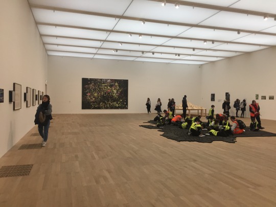
The Photographers Gallery
When visiting the Photographers Gallery, I was inspired by multiple elements that the gallery presented, all of which inspired me in regards to myself and Sam company, and our gallery space.
Firstly the Gallery have an award The Deutsche Börse Photography Foundation Prize, which brings an audience to the gallery, already writing about the previously, the award inspires me to be able to do something like this in the future, to celebrate photographers. When visiting the gallery, I was able to see how the gallery presented the prize to the viewers. The way the gallery exhibited the photographers, let the viewers be the judge. In one small space, there were four books which featured the competing photographers work, and this made you feel as though you were comparing the work, and becoming the judge which made the exhibition and award much more interactive and exciting. This was also a good use of space, as the room the books were in was tiny, and exampled to me how to use space effectively in the gallery. The gallery also had paper that you were encouraged to write your opinion on your favourite photographer and why, which is a great idea as it gets the audience involved and makes their opinions matter, creating a community with the Photographers Gallery. This is a really good idea to begin to create a community and show an audience you value their opinion, as well as getting the audience involved with the gallery. This has inspired me to begin to think of ideas in how I can get an audience involved in myself and Sams business by showing that we value their opinion.

There were also notes that could be written on, asking for your feedback which you could then stick on the wall, which again encourages the viewer not only to give feedback, but to interact with the gallery once more. This also gives the gallery feedback in which they can note and improve on accordingly, and as it is interactive, the viewers are more compelled to take part, giving more feedback to the gallery. Tis inspires me to think of new ways to get feedback, but still make it fun and interactive for the viewers, much like how the Photographers Gallery do, benefiting both the gallery and the viewers.
Overall, going to the Photographers Gallery gives me valuable insight into how the gallery make use of their space as well as how they get the viewers involved with the gallery, valuing their opinion and creating a community, which in turn strengthens their following. The gallery do this using interaction and this is something myself and Sam must consider in the future to appeal to a wider audience and create a community.
0 notes
Text
Michael Hoppen Gallery
The Michael Hoppen Gallery is renowned for nurturing the careers of new and interesting artists and exhibiting them alongside acknowledged nineteenth, twentieth and twenty-first century photographic masters. The gallery is spaced over three floors and provide both a white-wall arena for their contemporary artists and wood lined context for the smaller and more eclectic works that are exhibited.
I visited the gallery twice this year, both times with different works exhibited. When going the first time I noticed that the work didn't have any writing next to it, only numbers, I only later found out that the numbers related to numbers within a book. The exhibition was on a number system in which you could look into the book and find the number, which then displayed information about the artwork you were looking at. I find this an interesting way to exhibit work, however I didn’t like how the system worked, this is because there was no indication of the number system until we were told, and it also meant you had to take more time and effort to find out about the image you were looking at. Although I did find a positive to this, it did make the viewers, including myself look more at the work, and take your time with each piece. It also made the viewer go on a journey, take in all the detail and information as it takes time to find it. This makes me think of what journey I want the viewers to go on in mine and Sams gallery space, and the numbering system is something I do not want to replicate in the gallery as I find it too time consuming and for myself, makes me focus more on finding the information that appreciating the photographs.
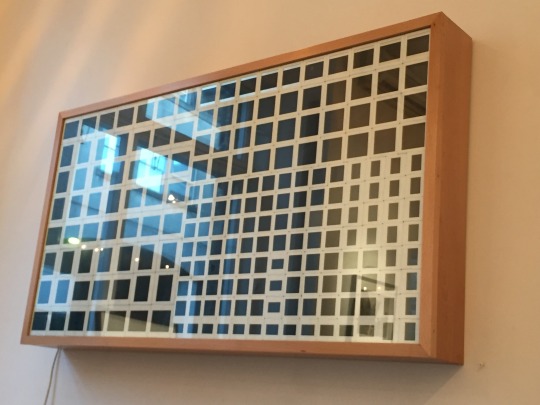
One piece I found interesting was ‘Apagamento #4’ by Rosangela Renno, 2004 - 2005. The work is displayed as negative slides, which are fit in to a lightbox. Each negative slide is a different photograph, and together they create an abstract image. I find this really interesting as you don’t normally see the negative slides of an image, only of the printed finalised product. This is another different way of exhibiting and gives me further insight into the various ways to display work, of which I need to know about and broaden my insight if I want to be a curator in the future.

Overall, seeing the Michael Hoppen Gallery in two different ways makes me understand how important curation is in the gallery, due to the transformation of space. It has also given me further insight into the displays of both archival and contemporary practices, and how they can work together or contrast with each other. Furthermore, it has made me think about how I want to display information in mine and Sams gallery, of which I want to display the information with the images to inform the viewer, and not make them consume their time in finding the information. Lastly, visiting the Michael Hoppen Gallery opened my eyes to new display techniques as well as curating (archives and contemporary work), which has extended my knowledge further, which in turn will give me more knowledge on curation and the gallery.
0 notes
Text
Tate Modern
The class visited the Tate Modern, in which we explored all galleries within, looking at how the space is used in different ways, as well as how the work dominates a space, and exploring the use of different presentation and framing techniques, all of which will give me further insight and knowledge into exhibiting and curation.
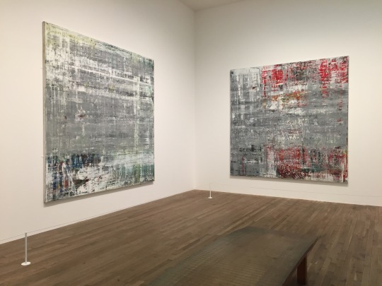
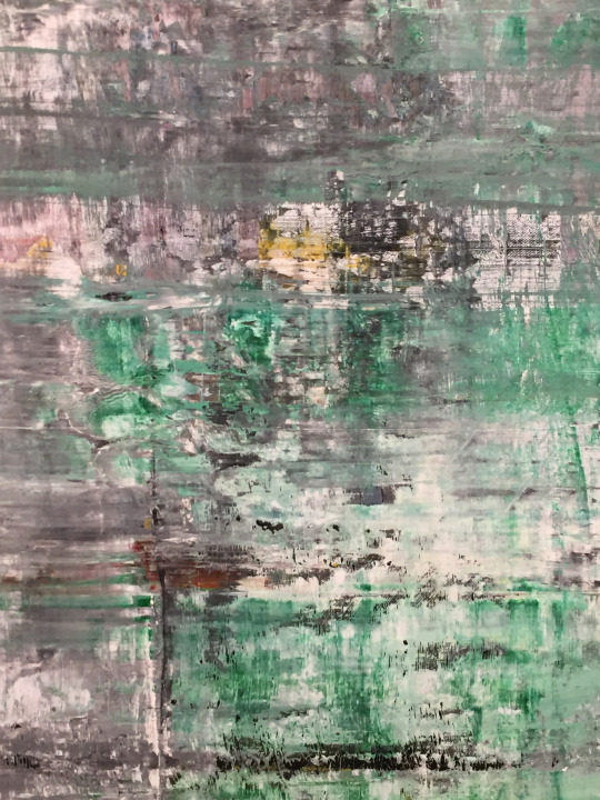
Gerhard Richter; Cage (1) - (6), 2006; I was extremely excited to be able to experience and see Richters Cage project as it gave me much inspiration in my Pilot Major Project, and researching / hearing about how people view the work and the journey it takes you on, made me want to visit them space and see it for myself. The series consists of six large, square abstract paintings, three at 2900 x 2900mm and three at 3000 x 3000mm. The paintings all have a similar thickly painted surface that is rough and textured in appearance. They are composed of a progression of horizontal and vertical bands and a series of multi-directional scratches and indentations that are scraped into the painted surface. In specific areas of the paintings, the upper layers of paint have been removed and several sublayers of colour exposed. When viewing the work, the scale of the paintings create spatial disorientation, making it hard for the viewers to know where they are placed within the painting, and this is emphasises by the large abstraction taking place. When viewing the images I found that the scratched and indents in the painting gave violence to the rather soft and happier splashed of colour within the grey background. Seeing the paintings up close made me think further about texture and materiality within both paintings and images, and how important it is to be able to see and sense the texture. What inspired me about this abstract journey was the large scale, it overwhelms the viewer, and invites them into the abstraction. Scale is a highly important element in exhibiting and seeing Richters paintings have made me think more about the importance of scale, and how it is used to create certain affects with the viewers. Materiality and texture is another element I thought about deeply when seeing this series, and again is something ton consider when exhibiting work of my own as well of others in the future, people should be able to almost feel the texture in paintings and some photographs - this could be explored further in the future.
Lorna Simpson; Five Day Forecast, 1991; Simpson explores the use of repetition in imagery, as well as processing how meaning and understanding takes place. The use of subtle variation and repetition and the use of text questions how images and text impact one another. In this, Simpson also looks at how the bare minimal elements within an image characterise. I found this installation really interesting due to the display techniques as well as the fact it related to my next project, which was using archives. The archival images that Simpson displays are scattered on the wall, displayed in black frames. I found that the black frames created distance between the image and the viewer, making the viewer aware that they are observing the images, the personal aspect is taken out of the relationship between the viewer due to the framing. This was quite interesting on the impact and change of narrative that the frame gave, and this gave me further knowledge into the use of frames, of which I can implicate and use in the future when curating. The scattered images on the wall resembled a displaced family tree to myself, and this made me create connections between the images. This made me think about the use of composition and how if they were in a grid for example, it would completely change the context of the images. This gave me further insight into the sequencing and composition of work, and how this impacts the viewer, as well as inspiring me for my own project in regards to the composition - creating links between the displacement - interesting connection.


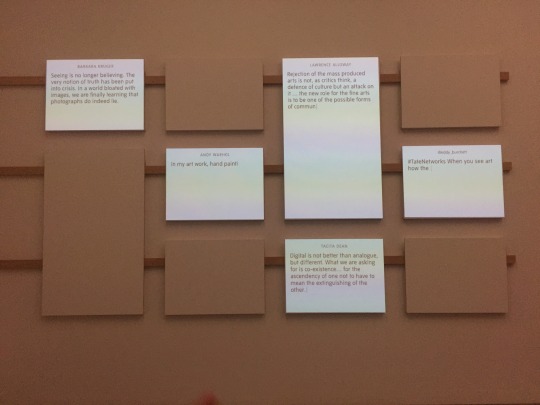
Barbara Kruger; Explore Media Networks; This space brings together artwork by Barbara Kruger, with resources produced by the Tate, which explores how contemporary art has responded to the rise of media and technology. The combination of such brings together quotes from the artist as well as others about the impact of the rise of digital technology and how this impacts how we look at art. I found this installation really interesting as it was so different, the installation included 10 screens, of which at different times quotes would appear on various screens, creating a show of text. What I found interesting about the screens, was that at first, before reading the context, I thought the words were tweets, which highlights the idea of digital technology being so engrained in our brains. This was a very different installation and gave me further insight into how artists can display work differently, and is useful for the future for both my own work as well as curating in the future, understanding about displaying in other mediums will make myself and Sams gallery more interesting and exciting to others, as well as developing the display of photography.
Living Cities; various artists; Living cities is a space that involves artists from around the world, who examine the modern city, ranging from panoramic views to close-up recordings of the minutiae of daily life. The space displayed a vast and diverse selection of materials, all of which reflect the many different locations and cultural contexts in which the artists are working in. One piece of work I found interesting was ‘Red’ by Boris Mikhailov. The work is made from newspapers, magazines etc, and explores the propaganda in Russia. The work itself, although exploring a negative element, creates a stark contrast against the physical outcome, the work almost resembles flowers or a colourful firework. I find it interesting to explore the context within projects and to interpret the piece of work myself, this is something I would like to explore further with work, and this is something I want to look for in artists - someone who uses materials, and creates work that can be interpreted in different ways, I would also like to exhibit artists like this also. Another work I enjoyed in this space was ‘Los Moscos’ by Mark Bradford, who explored the streets of Los Angeles, and used fragments of paper to act as memories of past things. The work itself reflects the artists interests in the subcultures of the inner city. Again, I find this another interesting exploration of a city, using different materials such as paper fragments and polaroids to create memory snapshots that the fragments then emphasise. It was interesting to see how different materials can be interpreted, and used. This has furthered my insight into the various materials that can be used in projects and how they are displayed within exhibitions, opening my eyes to different directions that projects can take. This has also furthered my knowledge into exhibitions, which will help me when in the future in terms of curating.


Overall, I found the Tate extremely insightful in regard to new techniques of display as well as how artists use various materials to add context and narration to their work. Understanding these methods and approaches will help me in the future in regards to my own work, as well as when curating myself and Sam gallery space.
0 notes
Text
Art Partner
Art Partner is the leading artists management and creative content agency with offices in New York, London and Paris. In addition to artist management and representation, Art Partner provides a full range of services to its artists and clients including syndication and licensing, fine art print sales and the development and promotion of books and exhibitions.
The agency also offers complete production services for print, internet and television. Founded in 1992, Art Partner now works on over 1000 projects a year including both editorial and advertising. Art Partner licensing provides content from the world’s leading image makers. Our robust archive delivers a collection of content that is featured across influential media platforms, magazines, international advertising outlets, commercial and retail spaces, films, exhibitions, and more. We strive to give our clients a discerning creative solution through the use of our diverse media archive. The imagery we provide becomes an integral part in the process of uniquely shaping the visual identity of a brand.
Film & Print; Mert Alas & Marcus Piggott, Lachlan Bailey, Anthony Cotsifas, Colin Dodgson, Zoe Ghertner, Steven Klein, Glen Luchford, Alasdair McLellan, Terry Richardson, Dan Tobin Smith, Mario Sorrenti, Harley Weir and Theo Wenner.
Creative Direction; Ezra Petronio, Julien Gallico and Christopher Simmonds.
Fashion & Creative Consultant; Joe McKenna
Some advertising clients include; Louis Vuitton, Burberry, Benetton, Versace, Dior, Giorgio Armani, Chanel, Shiseido, Miu Miu, Estee Lauder, Bulgari, D&G, Michael Kors, Hugo Boss, Revlon, Calvin Klein, GAP, Mango, Givenchy, L’OREAL and Zara.
Some editorial clients include; US Vogue, French Vogue, British Vogue, Italian Vogue, L'Uomo Vogue, German Vogue, Australian Vogue, V Magazine, W Magazine, Vanity Fair, Harper's Bazaar and LOVE.
Interns; Art Partner is looking for interns for their offices in New York, London and Paris. Candidates must be extremely organised, detail oriented, and have a strong interest in fashion, photography and film. Experience in fast-paced work environments and multi-tasking skills are a must. Some knowledge of photoshop and mac platforms preferred
Website; http://www.artpartner.com - the homepage for the website is really interesting and different to others that I have seen, the homepage features four vertical slideshows that move in different directions from each other, and creates a very unique and strong homepage that strikes the viewer with the amount of images, all of which are moving. The images can be clicked on, all of which are news, and therefore you will be taken to the news article. This is a very powerful homepage, and is something that the viewers will remember, however for myself and Sam, this type of homepage design is not right for us as it is rather loud, and as a company, we are not loud or overwhelming and therefore wouldn't represent us as a company.

This has made me think about what homepage does represent us, and how we can design one to do this. The artist page features images that represented the artists, and this is laid out in a fragmented fashion, which I think works really well with the artists and creates a more interesting layout that entice viewers to explore further. This something myself and Sam want to look at, as fragmented creates a more contemporary feel to the page, which I think represents us as a duo. The artist page features another fragmented layout of images, keeping constant to the design of the summary of artists, highlighting to myself the importance of consistency.


The page itself has no information of the artist, only their instagram and their images that have been printed or can be printed. Although I prefer minimal text, I believe it is best to have some information to give the viewer a quick idea of who the photographer is / what they focus on, especially clients. The exhibition and edition page is laid out slightly different, with a structural grid layout compared to their fragmented images as before. However I understand why they have done this with this page, due to the use of text, the viewer may get the image and text confused with one another, having structure within a website is sometimes needed, and seeing art partners site alliterates this. The exhibition page features a small slideshow of what images feature in the exhibition, as well as a short description of what the exhibition is about.

I thought the small amount of text was good for the description of an exhibition as it didn’t give too much away, there was also only a small amount of images to represent the exhibition, again giving nothing away. This has made me think about how we display our exhibitions, I think that giving the viewers enough information is important so they attend, however not too much information or it ruins the element of surprise. The news page features another fragmented layout of images, keeping consistent with the other designed pages, and works will with the images as the text is in a box with the image, so you are able to see what text accompanies what image. This is important with a news feed, as viewers need to know what the news is, not just the image, and myself and Sam must think carefully about what design we use so that it is clear to what text is accompanying what image. Lastly, the contact page included contact details for all three locations, however again, there was no information about the company, and this is something I do not want to do as I believe it is important to know what the company stands for and their aims, especially as myself and Sam want to create a community, it is valuable for them to know who we are.
Twitter; https://twitter.com/art_partner - The twitter for this agency is really interesting and rathe entertaining due to the text they accompany with the images. For example, with a image of an actor for star wars they include the photographer, the stylists and who commissioned the shoot as well as a title that is ‘the force is w/ him’, which I found quite funny. And looking through, they don’t take themselves too seriously on twitter, and have funny titles, that as a viewer, attracts me to them more. This is something I haven’t thought about, and looking through art partners twitter, this is definitely something myself and Sam should consider. Overall, the Twitter is entertaining and interesting to read through due to the use of images and fun text.

Instagram; https://www.instagram.com/artpartner/?hl=en - the instagram is different to the twitter, and has a more soft approach to the platform, showing more fine art and gentle images. The agency uses white borders around the image to create a frame for instagram, so that the images are not zoomed in upon when viewing the whole account, which is clever, it also gives a feel of thought in design and curation. Overall, the images on instagram give a more curated and fashion approach, which contrasts with the bolder, twitter platform which is an interesting mix as it applies to two different audiences. For myself and Sam, I think it is best to stay consistent in both platforms so that we appeal to the same audience.

This last piece of agency research heighten my knowledge and understanding of agencies, and gave me further insight into how myself and Sam can present our company as our portfolio submission online.
0 notes
Text
The Radical Eye
As a class, we were lucky enough to be able to go to ‘The Radical Eye’, an exhibition held by the Tate that featured modernist photography from the collection of Sir Elton John. The collection within the exhibition focuses on the first half of the twentieth century, and it was at this time where artists were transforming how photography was used, of which their experimentations and innovations still impact how we see the world today.
The exhibition was curated into six areas, of which are listed in order;
The Radical Eye
Portraits
Portraits, Experiments and Bodies
Exhibition Film
Documents
Objects, Perspectives and Abstractions
This was effective to have themes as there were so many images that it would have been overwhelming for the audience to have seen all at once, splitting the images up into sections so each viewer can appreciate an area at a time is best, especially when organised into specific areas (bodies etc), meaning that the audience can compare images, and see the differences between each photographer and their style. This is something for myself and Sam to consider in the future if we were to curate large exhibitions, dividing a large exhibitions into themes works well to not overwhelm the viewer and to also be able to connect with each theme, and compare work within that area.
The photographs were all printed on gelatine silver prints, and were all in large elegant and regal silver or gold frames. This was a strange combination to myself and one I was not able to look past. Some frames were nearly as large as the photographs, which made me look at them and figure out why the frames had to be so significant with the photograph. Many of the images on display were ones of which I have seen singularly, and seeing a large, bold frame around them distanced the image for me, it was definitely a different experience to see such images framed like so. This highlights to me the importance of framing, and how it can have such an impact on photographs and how the viewer experiences them. As I want to begin to curate in the future, I must think about how frames can affect the viewers, and this is something to be highly cautious about.
The compositioning of the frames was really intriguing, some photographs were displayed in grids, whilst some were in rows, and other scattered over a wall. All of which made me think about why some were placed in groups and others in different sequences. The images were extremely varied, but all area’s still worked well as a whole series, and I found this interesting that although so varied, the images could still create a journey and complement each other. This has made me think further about how to position and sequence images, and how this works together as an exhibition.
One composition that stood out to me was a grid at the beginning of the exhibition which replicated how the images hang in Elton John’s office. The grid includes portraits, still life and street images. The grid gives an insight into the exhibition, and introduces the new and radical approaches that was created at the beginning of the 20th Century. I found this display interesting due to the frame and image ratio, the frame was the same thickness as the images, and this made me question why the frames were as large as the photographs, the frame almost overpowered the images, and drew your eyes to the grid. This gave me further insight into the use of frames, and how they can affect the images that are displayed, in either a positive or negative way, for me, the frames overpowered the images and I was unable to appreciate the photographs due to the bold frames.
Another sequence I found interesting was one that was displayed in the Portrait section. The 5 framed images included that from Man Ray and Andre Breton. The portrait subjects were a gathering of writers and musicians. The 3 portraits in the middle faced the viewers, whilst the two portraits at the end of the sequence faced into the portraits that were facing the viewers. I found this extremely interesting and something I had not seen before, the portrait at either end made you follow their eyes into the three middle portraits, in which you would then follow the end portrait back again. It made me think about my gaze, and how I was following the gazes of others, and it was a really interesting and unusual experience as well as making me reflect on the creativity of each individual and whether we can see this in the images. I think you can, and this is purely due to the sequencing that made me think about the gaze, which in turn made me think about what I’m looking at and why, I think creatives make you question. This display has given me further insight into how a sequence of images can affect how the viewer thinks and relates to the image, this sequence really struck me and made me think about when myself and Sam curate, how we can implicate the same sort of thought provoking powers.
The film that is featured within the exhibition gives the viewers context to the exhibition, giving the viewer a much clearer idea of how large Elton John’s collection is, and how it is displayed in his house. This makes the viewer also see how passionate Elton John is about the photographs, and makes you look at the images in a different light. It was interesting to see the context of the exhibition be explained in a video rather than just on paper, as it really pushed the context and passion for photography, making the viewers see the images in a different light. This is something to think about in the future when curating galleries - what is the best method to give context to the viewers?
Overall, I found The Radical Eye exhibition very different to exhibitions I have seen before, and it gave me an insight into what I do and do not like with exhibiting, as well as the different uses of sequencing and display and how this affects the readers. It also made me think about the use of themes in exhibitions, and how this works with photographs. Lastly, it gave me further insight into how to present context to the viewers, and the various ways in doing so. To conclude, I found the exhibition highly interesting in terms of work, and it gave me many new elements within exhibiting and curation to think about in the future.
0 notes
Text
Wandering Bears
Wandering Bears is a creative studio & photographic led community – a centre for new work, ideas and collaborative projects. Founded in 2010, Wandering Bears organise exhibitions, talks, podcasts and workshops, looking to showcase and collaborate with both emerging and established artists from around the world to create something unique within the photographic community.
Wandering Bears was founded by Nik Adam, Luke Norman & Peter Haynes.
Wandering Bears Studio was established in 2017 and is located in South East London. Wandering Bears Studio offers a large daylight photographic studio available for single or multiple day rental.
Our clients include 10 Magazine, Elle Magazine, Refinery29, System Magazine & More.
Wandering Bears has inspired me due to their involvement in organising events including talks, podcasts and workshops as this is something myself and Sam want to become involved in, and create our own community to involve an audience in photography. Not only have they inspired me due to their active involvement in events, but also as they work together. The three individuals involved have worked together to create a company, and this is something I have not seen as much in this industry, as most agencies etc are founded by one individual. This has given both myself and Sam the encouragement and confidence needed to work together to create our own company, as seeing these three becoming successful has made us feel confident in our own abilities.
One event that Wandering Bears hosted was at Webber Represents, where they produced an
exhibition that featured a curated series of ‘likes’ from a range of renowned contemporary photographers, artists & editors from their own Instagram. The idea of their exhibition was to present the viewer with a visual representation of what a selected group of industry leaders are looking at on a daily basis, providing an insight into today’s viewing habits and image consumption. The final outcome consisted of stream of images, printed and displayed in an A3 scroll, the length of which is dictated by the amount of their month’s ‘liking’. Furthermore, there were 18 editioned prints by each of the participants on sale at the opening event, with all profits going to The Light House Refugee Relief charity. Doing this made it a fun way to enable the audience to take something away from the show, as well as making a donation to a charity.
This has inspired myself and Sam to already begin to think about how we can use social media to being to promote our company, and have thought of ideas as using our Instagram as material for a newspaper handout that we can send to professionals in the industry. Another idea that this has inspired is myself and Sam using spaces (that we can rent) as pop-up exhibitions or events, and begin to create events this was, much like Wandering Bears did when using Webber as a space. We could also involved prints etc to sell, like Wandering Bears, in which we could then donate the money to charity, which is not only for a good cause, but it also promote our company further and highlights our values. Beginning to do things such as these suggested will begin to get our company recognised in the industry, become engaged and interactive with an audience as well as get ourselves more experience in the industry.
Another aspect that Wandering Bears has that interests me is their podcasts, in which they interview professionals in the industry, as this is rather unusual and a different approach, however it is a clever one. Having a podcast stands out Wandering Bears and makes them unique in the industry, and this inspired myself and Sam to being to interview professionals ourselves and present in writing. Although we used ours for research, and are unable to display the interviews due to permission, we thoroughly enjoyed interviewing professionals and we want to continue this further to learn for ourselves, but to also give an insight into the industry to others, creating a community further.
Lastly, Wander Bears own a studio in which they rent out, and although myself and Sam are not particularly interested in owning a studio, we are interested in owning a gallery space, and when first starting up our business, to make more money we could rent our gallery out to photographers and the curate their exhibitions, which gives us further experience and also makes us money in the mean time.
Overall, reading about Wandering Bears and their involvement in the photographic community was greatly inspiring, and has made me more confident in going into business with Sam, as well as giving us ideas in how we can begin to start our company. We did contact Wandering Bears to have a chat with them about their business and how they started up, in which they replied to us and told us to pop over, however when we emailed back about dates they never replied which was a shame, however we understand they are very busy. However this is something we could go back to, and gain further insight into how they set up their business.
0 notes
Text
M.A.P LTD - Fashion
M.A.P (Management and Production) is an agency representing leading talent in the creative fields of photography, styling, art direction, prop/set design and illustration. MAP is based in London, New York and Sydney.
Photographers that are represented by Map LTD include; Will Davidson, Matthew Donaldso, Charlie Engman, Ethan James Green, Jamie Hawkesworth, Derek Henderson, David Hughes, Andreas Laszlo Konrath, Tyronne Lebon, Christian MacDonald, Dan Martensen, James Mollison, Julia Noni, Nigel Shafran, Amy Troost, Jack Webb and Paul Wetherell.
Motion include; Will Davidson, Matthew Donaldson, Charlie Engman, Jamie Hawkesworth, Derek Henderson, Andreas Laszlo Konrath, Tyrone Lebon, Dan Martensen, Angelo Pennetta, Nigel Shafran and Paul Wetherell.
Clients include; Glamour, Vogue, WSJ magazine, Calvin Klein, Dazed, FT Weekend magazine, Fantastic Man, i-D, Gap, Adidas, W, Love magazine and Alexander McQueen.
Website; http://www.mapltd.com/news/london/ - the homepage of the website is the news, and therefore introduces the audience to what is happening in the agency in regards to the photographers and their commissions. This is an interesting way to introduce the viewers, as it does give a large insight into the agency’s photographers and clients, highlighting their company and success. The news is set up in two columns in which you are able to scroll down and search through, with both large text accompanying the images. I find the layout interesting as it gives a fragmented layout, which highlights the use of design and creativity, however it can get confusing with the text and images, as when you keep scrolling, you forget which is which. This makes me think about how important spacing is in a website, and this is something myself and Sam must consider to not confuse the viewers.

I would also prefer to have an actual homepage that displays a strong project from an artist as well as news, as this breaks the website up more, and gives the viewers a strong first impression. The artist page features two images per artist in a grid layout, this has inspired me in regards to compositions with the images, and is something I would like to experiment with (juxtapositions) as it gives the viewers a better insight into the artists work, as well as highlighting the curation and design from the agency.


However, I still prefer a more fragmented layout to that of a grid as it is too structured and I feel as though photography and art itself should be displayed more freely. The artist page features images of their personal work as well as their portfolio, which is something myself and Sam want to feature, both commercial and personal projects to highlight that we support the photographer in both aspects. There is a large amount of text with the artist, that features; the photographers background, how they started, where they are from, what they are interested in, what they are known for, what they experiment with and who their clients are. This has given me further insight into what content is used to describe and represent an artist, and although I am to write less as I prefer less information and more visual, it is still useful to know for I could include. The information page includes their three locations, emails and telephone numbers. The contact page also features a mailing list, which is something myself and Sam want to include to promote out business further and appeal to a wider audience, keeping them updated and interested. There is no information on the information page about the agency, and again this is something I want to avoid, I want to be able to inform our viewers of what myself and Sam aim to do and why we are unique as a company. I believe this also makes the viewers more aware of the agency in regards to their aims, making them more engaged. Lastly, there is a lightbox page in which you are able to save artists work and create a mood board, this is something myself and Sam can look to do in the future to engage further with the audiences.
Twitter; https://twitter.com/mapltd - the twitter page of M.A.P features links and text of news from their presented artists, however there are no images to accompany the tweets which creates a less enticing and interesting twitter account. This has made me think about how I want to show images with the tweets to make them more interesting and enticing for the viewers to see and become interested in.

Instagram; https://www.instagram.com/mapltd/ - the instgram of M.A.P is highly insightful and inspiring to me due to the thought and design put into it. The instagram acts as a gallery for the artists to be presented in, and this works extremely well as it appeals to the eye and makes the viewer want to follow the agency, therefore gaining an audience. The layout of the images are in juxtapositions, which is an element I have not seen before and is something myself and Sam are extremely interested in and enjoy doing. Juxtapositions are something we have considered for our website, and therefore we should be consistent and feature these in our instagram too, like M.A.P. Seeing this agency do the juxtapositions really well gives me inspiration and confidence to do be able to do the same. The text on the instagram is simple and states the simple facts of the shoot - who shot it and who for, which again is something myself and Sam aim to do, as most of the audience are only interested it the visuals, who shot it and the commission. Overall, I found this instagram exciting and unusual due to the compositions, and this has inspired me greatly in terms of our online platforms.
To conclude, this has heightened my awareness of the agency industry further, giving me ideas i regards to juxtapositions, as well as what to avoid on social media. This has narrowed down my design ideas further in regards to the website, as well as further my knowledge on competition.
0 notes
Text
White Cube
White Cube is a contemporary art gallery owned by Jay Jopling with two permanent branches in London: Mason's Yard in central London and Bermondsey in South East London as well as one in Victoria City, Hong Kong Island. White Cube Bermondsey opened in October 2011 and is the largest of all the gallery's sites. The 'South Galleries' provide the principal display area for White Cube's expanding programme of exhibitions and three smaller galleries, known collectively as the 'North Galleries', are used for an innovative series of shows. In addition, at the centre of the building, a top-lit, 81m² gallery entitled '9 x 9 x 9', is used for special projects or for the display of a single artwork or installation. Since its inception, the building has hosted a variety of important exhibitions such as the first UK showing of work by American artist Theaster Gates, a comprehensive retrospective of prints by Chuck Close and the largest presentation of Anselm Kiefer work's ever staged in London. To accompany these exhibitions, an education programme and an ongoing series of artists films, feature films and lectures takes place in the purpose-built 60 seat auditorium. White Cube Mason’s Yard houses two galleries that provide a total of 1110m² (11,900 sq ft) of exhibition space, comprising of a ground floor gallery on street level and a double-height, naturally-lit basement gallery. Used for White Cube's expanding programme of exhibitions, White Cube Mason's Yard has hosted a wide range of exhibitions by international artists including Andreas Gursky, Georg Baselitz, Jeff Wall, Anselm Kiefer, Robert Irwin and Miroslaw Balka. The gallery opened with an inaugural exhibition by Mexican artist Gabriel Orozco.
The galleries artists include; Franz Ackermann, Etel Adnan, Darren Almond, Ellen Altfest, Michael Armitage, Miroslaw Balka, Georg Baselitz, Larry Bell, Chuck Close, Tracey Emin, Katharina Fritsch, Theaster Gates, Gilbert & George, Antony Gormley, Andreas Gursky, David Hammons, Mona Hatoum, He Xiangyu, Damien Hirst, Robert Irwin, Runa Islam, Sergej Jensen, Anselm Kiefer, Imi Knoebel, Rachel Kneebone, Elad Lassry, Liza Lou, Jac Leirner. Liu Wei, Ibrahim Mahama, Christian Marclay, Josiah McElheny, Julie Mehretu, Beatriz Milhazes, Harland Miller, Sarah Morris, Gabriel Orozco, Damián Ortega, Virginia Overton, Eddie Peake, Magnus Plessen, Jessica Rankin, Doris Salcedo, Raqib Shaw, Haim Steinbach, Sam Taylor-Johnson, Fred Tomaselli, Jeff Wall and Cerith Wyn Evans.
White Cube hold events throughout the year, which include; artist talks, previews, exhibitions, book launches, film screenings and performances. They also have a channel which features videos of discussions and talks with professionals in the industry, all within different locations and categorised as such; In The Auditorium - one to one discussions about certain topics, In The Museum - installations, In The Gallery: Current - installations, Beyond The White Cube - outside artistic ventures, In The Studio - artist makings and processes in the studio and In The Gallery; Past - installations / exhibitions. I haven't seen this type of channel before on a smaller gallery site (not public i.e - Tate), and this is an interesting addition to the gallery, as it gives context to the exhibitions and the world that the gallery is interested and involved in, it gives the viewers more knowledge and insight into this industry. I think this is a good idea to get viewers more engaged with the artists, the processes, the exhibitions and the gallery as a company. I think creating more interactive aspects such as interviews whether it be by video or writing could be a good way to get people more interested in our company as well as keeping viewers interested.
When reading an article about the owner of White Cube, Jay Jopling, I found out more information about the owner and the gallery that has given me a better insight into how Jay became a successful business man, which inspires me to be a successful business woman. I picked out key information for the article that inspired me.
Jay Jopling, the founder of London's White Cube gallery empire, launched its third outpost in the capital to coincide with the Frieze art fair. - I then researched Frieze Art Fair, which is an international contemporary art fair that takes place every October in London's Regent's Park. The fair features more than 160 of the world’s leading galleries in which customers can view and buy art from over 1,000 present day leading artists, and experience the fair’s critically acclaimed Frieze Projects and Talks programmes. It see’s thousands of the world's wealthiest collectors flock to London over the next three days. This is interesting to know as this is something myself and Sam can aspire to become apart of, as well as attend to gain further insight into the gallery world and most importantly, our competitors.
The article went on to state that one London-based art collector said that some poorer galleries are currently "walking on eggshells" because of the financial downturn. Yet Jopling's mixture of charm, savvy and bullish behaviour will make him this week's most surefire victor. - interesting skills to know about, makes me think about how personality can affect how you succeed - mine and Sams personality combined I believe is strong, determined, friendly and charming - could get us far.
"Jay told me a long time ago that if he couldn't be the best at what he does he wasn't interested," says White Cube's exhibitions director Tim Marlow. "The Bermondsey gallery is an affirmation of that. He wants a complex of galleries that will allow him to do the best shows with the best possible artists.” - long term goal for myself, I want to succeed in this industry, and as a determined person, I won’t give up easily - need to be strong in this industry and I think I have this personality / determination to go along with work experience that I will gain more of in the future.
Inside the White Cube: Ideologies of the Gallery Space, which emphasised that the blank walls of modern galleries had become "the archetypal image of 20th-century art". According to Melanie Gerlis, art market editor of The Art Newspaper, Jopling's "business-like" approach appealed to bankers with loose wallets "who wanted to put art on bare walls". "He's astute, he runs galleries like a business, not a cottage industry," she says. - Although I want to build a community and a space for all to enjoy, reading this makes me realise that I must not lose focus in terms of making money to keep the company afloat and to be able to do certain events and represent photographers. Myself and Sam must keep focus on having a business approach that makes us successful so we are able to move the company in whatever direction we wish.
Art buyers put his success down to his polish. "He's very charming," notes collector Kenny Schacter. "He didn't get to where he is without being a very effective communicator.” - always improving my communication skills, and will continue to improve with working with people as well as interning in the future. He also has a reputation for looking after his artists. "He's great, he's got good energy, and he works with creatives across different generations throughout the process," says the Serpentine Gallery's co-director Hans-Ulrich Obrist. "He does get a kick out of doing unusual things and doing them with absolute conviction," adds sculptor Antony Gormley, whom Jopling represents. "You know he wants to push what's possible, and understands an artist's interest in that, as well as being a very good businessman. That's a very rare combination”. - It is all about understanding the artist, having that strong relationship will push an exhibition to the right direction and as a result, succeed, I think this skill of nurturing will be improved when working at agencies as I will be nurturing artists then - I think that the two aspects of the company in regards to skills will benefit each other well.
Website; http://whitecube.com - the homepage is simple and clean, reminding us of the physical space of the white cube, and therefore represents the gallery extremely well. Myself and Sam must think about this, what design represents us as a company? The homepage present the viewers with a piece of work that is currently being exhibited at the Bermondsey space. The simply composed image on the white background gives a reflection of the work that is featured on the white wall in the Bermondsey space, which is extremely clever and again, makes me consider how myself and Sam can reflect our own space in time.
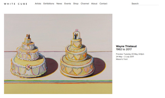
The information on the homepage next to the image includes the name of the exhibition, the artist, the date and the location, keeping the theme simple once more. When clicking on the exhibitions page, the images displayed are on rotation, switching between the gallery locations and therefore exhibitions, which is a good way to attract viewers to the other exhibitions as they have no choice to see other images. When clicking on an exhibition page, the images shown are views of the gallery as well as a few close ups on the physical work, which is rare as I have only recently seen digital images, rather than the whole room, giving you an overview to the exhibition, enticing viewers to go and see physically. The way the images are taken of the gallery really works well with the design of the site, a clean image that is bright and simple.

This again is something to consider, how the images work with the design - they need to compliment each other. I also find the grey and black texts works well together on the site and with the information, as it gives a separation of information and an element of contemporary design. The information included within the exhibitions are; artist, name of exhibition, dates, location, description of exhibition, format, number of images, why the format works with the images - what it portrays, narrative of the exhibition - structure, artist comments, in depth description of themes / groups of images, colour analysis and what the work suggests. The images that represent single images in the exhibition also give details of the name, date, size and what it is printed on / how it is framed. White Cube gallery gives an extensive description of the exhibition both with text and visually, and there are many elements in regards to what they include in their descriptions that I will take away with me - narrative structure of the exhibition, what it suggests, comments etc. The way the images are taken is also something to consider when portraying an exhibition. The news page keeps in design with a simple layout and text (grey / black), the page is neat, with only one news articles appearing at a time, as the viewer uses the scroll on the left hand side to read the articles. I find this a really good way to display news updates as it gives a clean look that doe not overwhelm the viewers, letting them read the news at their own pace due to no pressure with other texts as they are not seen. The news features updates on the gallerys’ ventures (i.e - participating at Venice Biennale), upcoming exhibitions and artists the are represented by the gallery in regards to prints. The artist page again, is simple, with a list of artists in grey text. The artists page is a similar layout the exhibitions, presenting the viewers with images of the prints (or other formats) placed within a gallery setting, with the relevant information that is previously stated with the exhibition images.

The site is consistent not only with design, but the way the images are taken - work placed in galleries rather than just the digital prints showing, which attracts clients as they are able to see the work in a blank space and are therefore able to imagine the work within their own home, which is an extremely well thought out business tactic. Myself and Sam must consider how we present artists work in regards to exhibitions, as this could increase sales, much White Cube. The information that features on the page includes; name, exhibitions, films, news, shop, their background, what the artist focuses on, how they stand out, theories that are relevant to them, examples of work - explained, timeline of their work and progress - in great detail, what the work does to the viewer, description of installations, biography and comments from a professional within the industry. This again, has given me a better understanding of new things that myself and Sam can add to the website, how we can talk about our represented artists as well as artists that are exhibited, it also gives me an insight into what language is used when discussing work and artists, giving me a more formal and professional outlook. The event page has a similar layout to the exhibitions / artist pages, simple and clear, giving viewers easy navigation.

The text that is presented with an image that is chosen for the event features; small description, location, doors open, event commences, admission, reserve place, contact details and programme details. This is a lot less information than other pages give, which seems less consistent, however I think this works with an event, as it gives an element of surprise. Again, there are elements in the text that I have not considered when thinking about myself and Sams website, and these elements will be put forward when creating the website. The about page gives the viewers information about the gallery itself in terms of the size, and details on the actual space, however it does not give any information about the company itself. Again, for myself and Sam company, I think it is important for us to tell people our aims and values, as we want to create a community, and telling viewers this will open them up to us more and want to get involved. The contact page features the location of the gallery, and the opening times as well as a contact number, all of whch are relevant, however I also think it is necessary to have an email for people to contact you that way as well, a telephone number I believe is limiting.
Twitter; https://twitter.com/_WhiteCube - the twitter account for the gallery promotes the exhibitions that it has, and does this by featuring work from the exhibition as well as articles and quotes about / from the exhibitions. The twitter is highly active and uses different materials to promote the exhibitor sheikh I think is highly clever and something that myself and Sam should think about when promoting exhibitions, as this is more unique and interesting, and appeals more the an audience. The twitter also uses images and text to entice the viewers to read more, in which they are able to click on a link, and again this is an element myself and Sam should think about - the option for viewers to see more by using a link.

Instagram; http://instagram.com/whitecubeofficial - the instagram includes images of both the work separately as well as featured within the gallery and the space itself. The text that accompanies the images are large, the content includes; the artist, name of the piece, a description of the piece of work and the exhibition dates. I think myself and Sam will limit our text, as we want to be clear and concise, and focus the viewers attention on the image, not overwhelm them with text. Although, this instagram has inspired me to include images of the work being displayed as well as the spaces we use - which could be interesting when doing pop-up events, this could make our instagram more unique.

Again, this is further insight into more galleries, looking at the gallery, the businessman himself as well as how they portray themselves online, all of which is extremely important to know and understand for myself and Sams company, giving us further ideas and inspiration.
0 notes
Text
PrintSpace Workshop
The class was invited to attend a workshop that the PrintSpace was holding, in which we were introduced to Dave who was running the workshop.
Dave ran through with us the different types of printing, going through the differences between c-type and giclee, as well as showing us different examples of the prints, and highlighting what images worked for the different paper types. He also spoke to us about the printers, and what paper (due to printed) could hold the best colours, speaking in depth about the colour gamma range. All of which was extremely to useful to know for my own photography work but also for the future in regards to advising photographers on printing as both an agency and as a curator.
Dave then spoke to us about the various mounts and framing that Printspace offers, and he gave us an example of each one which was extremely helpful to see visually, to give me a better idea of what he was describing to us. He told us about the positives and negatives of each, and where / how we would use the various frames and mounts. All of which again was useful to know about as it furthered my insight on framing and mounting, both ins regards to the process and the final outcome, which is helpful for my own photography, and again for the future in regards to being an agent and a curator.
Dave then gave us tips on our own work with printing, showing us how to use Photoshop to get a more accurate representation of the print, using the Profile converter to convert the image to how it will be printed, which enables you to look at the colours, brightness etc. This is something I was unaware of, and is extremely helpful for the future when printing my own work as well as when offering advice to photographers that are represented by myself and Sam.
Being involved in this workshop was also helpful to gain insight into how a company uses their space to hold workshops as well as exhibitions (which Printspace also does). This has given myself and Sam inspiration to be able to hold both workshops and exhibitions in the same space, and to be able to do this successfully like Printspace. This has also given us both more insight and understanding into how workshops run, and how the run in a company space.
Overall, the workshop extended my knowledge on the printing practice, which will help me in the future with my work as well as being able to give advice to represented photographers and as a curator. I have also gained further knowledge into mounting and framing, which again will help me in the future as an agent and as a curator. Lastly, attending this workshop has shown me how companies use their space to hold workshops, as well as giving me insight into the process of a workshop and how to hold one successfully, which again will help me in the future as myself and Sam want to hold workshops in our company space.
0 notes
Text
FASSI
Another exhibition I have visited was the FASSI exhibition in Borough Road Gallery, photographed by the South Bank Collective, and curated by Daniel, Chris, Hannah, Sam and I. Seeing the opening night exhibition was extremely rewarding that all the hard work myself and the team put in had paid off as the exhibition looked powerful and strong, resembling the commission of the cranes.
The work displayed in the gallery was a result of a commission from FASSI that the SBC photographed last year. The exhibition displayed a selection of photographs that featured in the FASSI calendar. It was interesting to see this space transformed into a completely different journey, compared to other exhibitions that have been in the gallery previously, highlighting to me how much a curation and images can transform a space. This has made me want to research galleries and exhibitions further, to look at how others transform spaces.
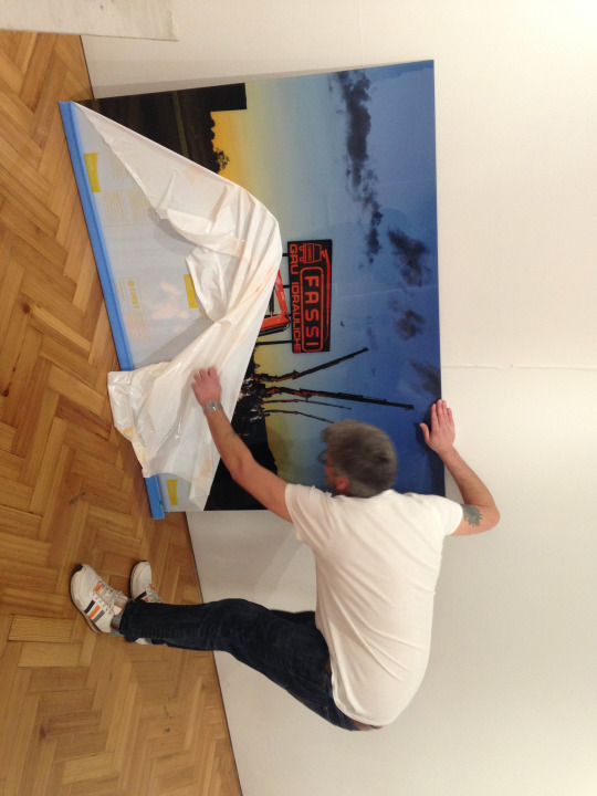
When seeing the exhibition, the removable wall was the first thing to be seen from the door, with Trix’s image displayed on it, which drew your attention to the gallery and enticed you in. We curated this in this way to entice people and create a good first impression. Understanding this and seeing this work when at the exhibition has made me more confident in understanding how to draw people into exhibitions.

The series worked extremely well together, being curated carefully so that no image was overpowered by another, meaning that all images stood alone individually as well as together. The spacing between the work gave enough space so that the images could sit alone, and viewers were able to use the spaces as a break, meaning they could appreciate the images in time. This has made me understand about how important spacing is within the gallery, and what effects it can give to the viewer as well as how it can change the speed and pace of the sequencing, and therefore how the viewers see the images.

The work gave the viewers a journey through the gallery, experiencing the different settings of the factory that was photographed. The gallery set up let the viewers walk freely amongst the images, and the viewers were able to discover the calendars behind the removable wall, which gave context to the whole series. This made the viewers understand the context, and enticing them to view the images once again. Curating and experiencing this made me think further and learn about how to navigate the viewers via sequencing the images.
Overall, having curated the exhibition, it was then very helpful to experience the exhibition with other viewers, and be able to see first hand how the curation has changed the space and created a journey for the viewers, and being able to see small elements come to play such as the context surprise, spacing and sequencing. This has given me further insight into how curation works, as well as extended knowledge of the gallery.
0 notes
Text
FASSI
Daniel offered myself and Sam to help out with the FASSI exhibition that was occurring in the Borough Road Gallery. The exhibition will feature nine of the final images that were photographed by the collective for the FASSI calendar. The FASSI Italian Crane company sent out a brief last year to universities to shoot their calendar, and The South Bank Collective were able to do this due to the proposed brief. The team of photographers flew over to Italy to photograph for the calendar, which is now being presented at the university gallery.
As myself and Sam are interested in curating, we decided to help with the gallery, which included organising the prints, quotes, delivery, sequencing and hanging the work. We first had a meeting with Daniel to discuss the exhibition. Lee Carter is the Head of FASSI UK and was interested to make an exhibition out go the images, they were willing to pay for the prints and to arrange to come to the exhibition when they were next in the UK for a meeting. Lee wanted the exhibition to show all the images created as well as the calendars, which show how the images were made. Myself and Sam first job was to work out the space for the exhibition and get a quote to Lee as soon as possible. We worked out the side wall was 10m, whilst the back was 6-7m, and there was also the 3m removable white walls and the two separate front walls between the door. We decided to do three separate quotes in regards to size, (1 / 1.5 / 2m) and also the prices with disband mount, aluminium sub frame matt fine, aluminium sub frame and acrylic reverse sub frame.
Myself and Sam sat down together and researched the prices using the PrintSpace website, and then created an excel spreadsheet with all the quotes for the different sizes, mounts and finishes. This was really interesting to do, not only to see the prices of these prints, but also to learn about the different types of mounts and finishes. This is extremely helpful for my knowledge within the photographic industry and also for curating / exhibiting, understanding the various types of mounts, prints and finishes gives me a better insight into how people envision their work when talking about these elements and it also gives me the understanding to be able to suggest these elements to photographers who want to exhibit.
Once the spreadsheet was sent to Daniel to check over, once it was checked, we all discussed other quotes to include. Chris had many stills that could cover the 3m removable walls en masse, so we also factored the prices for these in and a final quote was then sent to Lee as a quote .
Myself and Sam then contacted Dave via the phone to get a final quote, and then confirmed this via email in which we negotiated a discount due to the large priced purchase from the company. The email myself and Sam constructed was as followed;
Hi Dave,
Thank you for all of your help on the phone earlier.
We would like to purchase from you 9x 1500mmx 1122mm Images on C-type Matt paper to be mounted on Acrylic Reverse.
After your advice earlier we have decided to go for the Dibond backing.
With our specifications we have used the print space website to calculate a total price of £8,160.48 and have budgeted the exhibition around this price. As we discussed it would be greatly appreciated if there is anything you can do by way of discount.
We can get the photographs to you by Monday (20th Feb) in order for them to be ready and sent to the university for the 7th March. Should the photographs be uploaded through the hub or sent to you directly?
It would be great if you could get the quote to us today so that we can make sure they can be sent off on Monday.
I look forward to hearing from you.
Many Thanks
Samantha Thompson
Once hearing back from Dave, we were told that the prices were due to be increase by the following week with printing increasing by 8% and mounting by 5% as they hadn’t adjusted their prices in the last year. However as the website hadn’t changed their prices, and following our friendly and polite conversation, Dave was happy to honour the quoted prices as well as a 10% discount. We then confirmed the details for a final invoice from Dave, in which he updates for us.
Dave recommended we go for either black or white perspex backing, as this way the edges can be dibond polished. He also told us that the mounting specialists would need 10 working days to produce the order, so he would need to have the order confirmed and paid for on Monday. This is useful to know for the future, being bale to understand what type of mount and framing we have chosen and why has increased my knowledge of printing as well as understanding the process of ordering prints. Myself and Sam were also able to improve our skills in negotiating (discount) and this is extremely useful as I will need to be able to negotiate in the future with budgets etc when being an agent, as well as for exhibitions.
Daniel then we-transferred the prepared files to test print and myself and Sam went to collect the Fuji Matt and Epson Semi - Gloss test strips. Once collected we went back to the print room so myself, Sam and Daniel could see the prints in natural lighting, giving us a more accurate view of the colours and brightness in the prints. I learnt a lot when looking through the test strips, we began by comparing the colours to the images on the screen, and discussed what was different - the test strips were slightly too dark, and the red colour was more orange than red. We called up Dave who said that this was due to the gamma limitation of the red in the printer, we discussed what could be done to improve upon this. This was interesting to hear this discussion as I developed a greater insight into how printing companies work, as well as fine details such as gamma limitations, and what type of prints help project certain textures and colours.
Once the images were edited, they were then sent back to Printspace to be printed, myself and Sam had to keep updated on how the prints were going, as well as checking the anticipated date for delivery. We also had to speak to Dave about mounting, clarifying to be mounted on black foamex. Once the mounted prints were delivered, myself and Sam discussed the FASSI invites and who to send them to, we then liaised with Chris, discussing that we could send them to all students, the FASSI team, FASSI’s clients and the SBC clients. I really pushed the SBC client invites as I wanted to be able to show them what the South Bank Collective could do in regards to production, images, editing and presenting work as an exhibition - this would then promote ourselves to new and more jobs.
Overall, it was really interesting and exciting to be apart of the FASSI team in regards to producing the prints, I improved skills in liaising with companies, negotiating, learning about the process of ordering prints for an exhibition, promoting and understanding in more depth about printing technicalities such as gamma limitations as well as more knowledge on framing and mounting. Understanding this will greatly help me in the future in regards to exhibiting artists at myself and Sams company, as we have now been through the whole process in a more professional manner and representing a company at the same time. This has also helped my communication and negotiation skills which will help me in the future when being a photography agent, being able to communicate effectively and clearly is crucial, as is being able to negotiate budgets, all of which I have done with this job. Lastly, this has made mine and Sams working relationship stronger, as we were again able to work together and help each other effectively throughout the process.
0 notes
Text
Other interviews
These were the questions myself and Sam created for the other professionals, of which we are meeting up with Kate and Chantal in the summer.
Digital Curator (Katrina)
1.What attracted you to the role of a curator within the gallery?
2.How would you describe your approach to curating?
3.What are the steps in curating an exhibition?
4.How long does it take to plan an exhibition?
5.How did the idea of ‘The Wall’ in the photographer’s gallery come about?
6.Do you think that the Digital representation of work within the gallery has changed the expectations of a gallery?
7.Where will the introduction of digital platforms advance to?
8.Why Digital?
9.What advice would you give to people trying to get into the curating industry to make themselves unique?
10.Now that you are coming back to work, what is next?
11.How do you go about choosing which artist to exhibit?
General (Ioanna)
1.What has your involvement been with the Photographers Gallery?
2.Why did you want to get involved with this?
3.What is your opinion of the gallery/ do you value the gallery/ is it important?
4.Where do you feel the gallery industry/ curating is going?
5.What do you think the purpose of the gallery is?
6.What is your view on online gallery spaces?
7.What do you feel makes a gallery unique?
8.In what ways do you think a curator could be unique within the industry?
9.How would you go about choosing which artist to exhibit?
10.Now that you have increased your involvement within the photographic industry where do you see yourself going next?
Head of photography (Kate)
1.Do you use agencies to find particular photographers?
2.How does the role of an agent affect the exposure of the photographer?
3.What are you views on agencies now?
4.What skills have you adopted from the transition from an agent to head of photography at Wallpaper?
5.What are the important skills and traits which make you a successful leader?
6.What would you consider the challenges to be for a creative business like wallpaper in the future?
7.What advice would you give to people interested in getting involved with business’ such as Webber and Wallpaper?
8.What do you think makes an intern applicant stand out?
9.What personal attribute did you find helped her become a successful agent?
10. How do you balance your work load?
Company owner (Chantal)
1.What are the important skills and traits which make you a successful leader?
2.What would you consider the challenges to be for a creative business like Webber in the future?
3.What do you think makes an intern applicant stand out?
4.Where do you feel the gallery industry is going?
5.Where do you feel the agency industry is going?
6.What do you feel the relationship is between the agency and the gallery?
7.What do you feel the future is for Webber?
8.How do Webber get their clients for the agency?
9.What inspired you to go about starting your own business?
10.What skills and traits do you look for in an agent?
11.How do you choose a photographer to represent?
12.What advice would you give to people starting their own business?
0 notes
Text
Interview
Another professional myself and Sam interviewed was Dominic Bell, curator for Webber Represents. We were excited to get a reply from Dom due to his expertise in curation, as well as working with Webber previously.
1. How did you begin your career as a curator?
I'm not sure if it has ever 'began'. What I do know is a crossover between gallery director/registrar/installer/gallery manager + a tiny bit of curating. For me, curating is a slippery term, it's glamourised in to thinking you spend time picking and choosing and editing work, but in reality what I have to do is weigh up financial costs of pieces, shipping of those pieces and what effectively communicates a body of work without showing all the pieces.... What we do with Webber is curate with the artists, and collaborate throughout this process for the best results. I guess I'm entering in to other questions, simple answer is, I started at the bottom of the gallery module as an assistant registrar, I learnt about framing, editions and editing - that then gave me the confidence to talk about how works should be exhibited and why, which has probably led me to my job I have today.
2. How would you describe your approach to curating?
Minimal, photography is a relatively easy medium and unless I was curating a historical exhibition which brought together works from various time periods and styles - the hangs are always very easy and shouldn't be made complex. The viewer, in my opinion, should be presented with the cleanest hang, photographs and artists should have space.
3. What are the steps in curating an exhibition?
After finding the artist I like, I contact them and start a conversation about what i would like the exhibition to achieve and why our audience would be interested. Then we look at a wide edit of the work, looking at which images would sell, which ones are important tot eh body of the work and which ones would work well in the space, this helps determine the edit a lot. After this, we would make some to-scale mock-ups of the prints and sit with them for a few days to see if they work at certain sizes. After that, we look at different framing options and if we want any vinyl text on the walls or a printed press release.
4. How long does it take to plan an exhibition?
It can take anywhere from 1/3 weeks for a solo show usually right up to 6 months for an art fair like photo London. It's easy to turn around a show quickly, but as soon as you have an extensive project, it's worth putting the time in to build up press.
5. How do you familiarise yourself with new curatorial practices?
I don't. I read and study photography as a medium and that's it. For me, the curating is already in the work, it's just up to the curator to tease it out in the right order.
6. What do you think you bring to the Webber gallery space?
I guess energy. Working is relatively easy in most departments, it's just about how much your willing to put in. Being able to actually talk about photography with strong resolve has always done me well, a lot of people don't know what they're talking about, so if you can make measured suggestions with conviction, you're strong suited to do well.
7. Where do you feel the gallery industry/ curating is going?
Galleries will start to disband because they are too rigid, especially in photography. They have put up high walls to create a stable market for high level collectors when in reality photography's strength lie in its ability to collaborate and merge with other industries; fashion/advertising/editorial/design. More galleries should have no roster, and only work with artists/collectives as and when. Curating will probably have a rise, in this capacity, but will also take a severe hit by the amount of online Instagram accounts who are masked as 'visual curators' which are essentially just pretty image editing. Curators are going to have to have more education certificates to put them head and shoulders above the rest, and in reality it will be the glitzy kid on Instagram who might get the job because they have the brand, the followers.... Having said this, I think there is now more need for curators, ones who are interested in the forward direction of the medium, rather than the current visual trends that slip through the internet.
8. How do you make your curating style stand out from others?
Don't know if I have a style, there are probably only 3 curators I know who could claim to have a style. I put my work lower than other peoples if that helps.... I'm open, each exhibition changes, photography is so varied that it's hard to maintain a style as it would conflict from one project to the next. I don't know if you can have style hidden in adaptability.
9. How do you work alongside the agency?
I guess I get involved if there are special projects, or a more fine art client in advertising needs talking to. As I said, being able to talk about photography in a fine art context is a huge tool to have in both industries.
The gallery can have huge positive impact on the agency side of things and act as a shop window. However, we have to stay consistently conscious that all the photographers here want to do a show, and at the same time they all want to earn money. It's about being fair to the agency side and not closing them out but allowing them in at the right level.
10. How do Webber choose who is going to exhibit?
Through discussions with Chantal. We talk to people constantly and try to keep open about collaborating with people who we don't represent. It's about finding the people with the right style who aren't going to be difficult to work with.
11. How do you work alongside the photographer successfully?
Constant communication and being honest from the start. Be realistic with them and not raise their hopes about sales.
12. Do you think there is more pressure on photographers make a profit with their work within the gallery? How do you attract this type of audience?
The pressure comes from the photographer themselves, not us. Every photographer can't escape from the feeling that a successful exhibition means sales, it's just the way it is. It's hard to make money as a fine art sales photographer, it's just not going to be that much, only about 1% of the photographers who I know who regularly do exhibitions make enough money to live from it, probably even less than that......
We find the high level clients by getting printed press and doing art fairs, but it's not that easy - they like a direct and ongoing relationship, they don't want to drop in and buy something - most collectors want to be sold something, have the luxury of learning about the work and even meeting and starting a relationship with the work - it is very time consuming and doesn't always work out.
Overall, Dom’s answered gave me great insight into the gallery and the relationship between photographer and curator. Which will aid myself and Sams knowledge in the future for our own gallery space.
0 notes
Text
Interview
Simon Terrill was another professional who allowed us to interview him, in which we did so at his studio in Somerset House, which was really interesting to be able to see a different creative atmosphere. We asked the following questions;
1.What is your opinion of the gallery from a photographer’s perspective / do you value the gallery/ is it important?
It is central to me - because of what gallery is, it can be critical but I find them unique. When you enter a gallery you leave the world behind, you are in the realm of someone else ideas - their mind. People can be too critical, name a better space for presentation of your mind.
2.Have you approached the galleries or do they approach you?
If you see yourself as fine artist, do not approach galleries. Approach curators, but not galleries themselves, they like to find talent, it is about their ego, they find you.
3.What is your participation in the curation of your own exhibitions?
Wit is always a different relationship when working with a curator. When exhibiting in Melbourne, I put up the work. At the National Portrait Gallery - the curator was more of a mentor / support. With the Brutalist Playground, the curators really full on. As a curator, it is important to understand the photographers intentions, as this is how work evolves.
4.What method do you use to keep up to date with the gallery industry?
By going to shows, reading, and funnily enough people - talking to people - recommendation, friends shows.
5.What do you get out of exhibiting your own work?
Why make art I guess? Ultimately it is the personal adventure, personal transformation, making art changes me. Depends what kind of artist you are.
6.What is your opinion of agencies?
Never dealt with any, I am in a different world to agencies. The good ones are exactly the same as fine art galleries.
7.If there was a company with an agency, gallery and workshop space, could you see this working?
YES. There are spaces like that but they are all really different - it all comes down to people - your personality, that is what will make it distinct. Ultimately, it is about character - thats how we will be defined.
Simon also spoke to us about Whitechapel Gallery and their art night 2017 they hold, signalling we could dos something like that. He also suggested to us to curate an exhibition in the Borough Road Gallery that we had previously discussed, which could be a possibility in the future. He also said that as a duo, we are a good idea.
Overall, Simon gave me further insight into the gallery world, and gave us some really important tips and suggestions, making us think about who we are as a company and what our aims are, this is something myself and Sam need to consider before making our website.
0 notes
Last Seen Blogs
shivamit08
shivamit08

wizardwatson
Watson's Media Dungeon
colorfromphoto-blog
Color From Photo

caweedle
neato caweedo